Extract Sample code into examples/api (#87280)

This extracts the sample code out from the API doc comments, and places them in separate files on disk, allowing running of the examples locally, testing them, and building of slightly larger examples.
diff --git a/examples/api/lib/animation/curves/curve2_d.0.dart b/examples/api/lib/animation/curves/curve2_d.0.dart
new file mode 100644
index 0000000..cda16b1
--- /dev/null
+++ b/examples/api/lib/animation/curves/curve2_d.0.dart
@@ -0,0 +1,151 @@
+// Copyright 2014 The Flutter Authors. All rights reserved.
+// Use of this source code is governed by a BSD-style license that can be
+// found in the LICENSE file.
+
+// Template: dev/snippets/config/templates/stateless_widget_material.tmpl
+//
+// Comment lines marked with "▼▼▼" and "▲▲▲" are used for authoring
+// of samples, and may be ignored if you are just exploring the sample.
+
+// Flutter code sample for Curve2D
+//
+//***************************************************************************
+//* ▼▼▼▼▼▼▼▼ description ▼▼▼▼▼▼▼▼ (do not modify or remove section marker)
+
+// This example shows how to use a [Curve2D] to modify the position of a widget
+// so that it can follow an arbitrary path.
+
+//* ▲▲▲▲▲▲▲▲ description ▲▲▲▲▲▲▲▲ (do not modify or remove section marker)
+//***************************************************************************
+
+import 'package:flutter/material.dart';
+
+void main() => runApp(const MyApp());
+
+/// This is the main application widget.
+class MyApp extends StatelessWidget {
+  const MyApp({Key? key}) : super(key: key);
+
+  static const String _title = 'Flutter Code Sample';
+
+  @override
+  Widget build(BuildContext context) {
+    return const MaterialApp(
+      title: _title,
+      home: MyStatelessWidget(),
+    );
+  }
+}
+
+//*****************************************************************************
+//* ▼▼▼▼▼▼▼▼ code-preamble ▼▼▼▼▼▼▼▼ (do not modify or remove section marker)
+
+// This is the path that the child will follow. It's a CatmullRomSpline so
+// that the coordinates can be specified that it must pass through. If the
+// tension is set to 1.0, it will linearly interpolate between those points,
+// instead of interpolating smoothly.
+final CatmullRomSpline path = CatmullRomSpline(
+  const <Offset>[
+    Offset(0.05, 0.75),
+    Offset(0.18, 0.23),
+    Offset(0.32, 0.04),
+    Offset(0.73, 0.5),
+    Offset(0.42, 0.74),
+    Offset(0.73, 0.01),
+    Offset(0.93, 0.93),
+    Offset(0.05, 0.75),
+  ],
+  startHandle: const Offset(0.93, 0.93),
+  endHandle: const Offset(0.18, 0.23),
+  tension: 0.0,
+);
+
+class FollowCurve2D extends StatefulWidget {
+  const FollowCurve2D({
+    Key? key,
+    required this.path,
+    this.curve = Curves.easeInOut,
+    required this.child,
+    this.duration = const Duration(seconds: 1),
+  }) : super(key: key);
+
+  final Curve2D path;
+  final Curve curve;
+  final Duration duration;
+  final Widget child;
+
+  @override
+  State<FollowCurve2D> createState() => _FollowCurve2DState();
+}
+
+class _FollowCurve2DState extends State<FollowCurve2D>
+    with TickerProviderStateMixin {
+  // The animation controller for this animation.
+  late AnimationController controller;
+  // The animation that will be used to apply the widget's animation curve.
+  late Animation<double> animation;
+
+  @override
+  void initState() {
+    super.initState();
+    controller = AnimationController(duration: widget.duration, vsync: this);
+    animation = CurvedAnimation(parent: controller, curve: widget.curve);
+    // Have the controller repeat indefinitely.  If you want it to "bounce" back
+    // and forth, set the reverse parameter to true.
+    controller.repeat(reverse: false);
+    controller.addListener(() => setState(() {}));
+  }
+
+  @override
+  void dispose() {
+    super.dispose();
+    // Always have to dispose of animation controllers when done.
+    controller.dispose();
+  }
+
+  @override
+  Widget build(BuildContext context) {
+    // Scale the path values to match the -1.0 to 1.0 domain of the Alignment widget.
+    final Offset position =
+        widget.path.transform(animation.value) * 2.0 - const Offset(1.0, 1.0);
+    return Align(
+      alignment: Alignment(position.dx, position.dy),
+      child: widget.child,
+    );
+  }
+}
+
+//* ▲▲▲▲▲▲▲▲ code-preamble ▲▲▲▲▲▲▲▲ (do not modify or remove section marker)
+//*****************************************************************************
+
+/// This is the stateless widget that the main application instantiates.
+class MyStatelessWidget extends StatelessWidget {
+  const MyStatelessWidget({Key? key}) : super(key: key);
+
+  @override
+//********************************************************************
+//* ▼▼▼▼▼▼▼▼ code ▼▼▼▼▼▼▼▼ (do not modify or remove section marker)
+
+  Widget build(BuildContext context) {
+    return Container(
+      color: Colors.white,
+      alignment: Alignment.center,
+      child: FollowCurve2D(
+        path: path,
+        curve: Curves.easeInOut,
+        duration: const Duration(seconds: 3),
+        child: CircleAvatar(
+          backgroundColor: Colors.yellow,
+          child: DefaultTextStyle(
+            style: Theme.of(context).textTheme.headline6!,
+            child: const Text('B'), // Buzz, buzz!
+          ),
+        ),
+      ),
+    );
+  }
+
+//* ▲▲▲▲▲▲▲▲ code ▲▲▲▲▲▲▲▲ (do not modify or remove section marker)
+//********************************************************************
+
+}
diff --git a/examples/api/lib/cupertino/context_menu/cupertino_context_menu.0.dart b/examples/api/lib/cupertino/context_menu/cupertino_context_menu.0.dart
new file mode 100644
index 0000000..73b5e75
--- /dev/null
+++ b/examples/api/lib/cupertino/context_menu/cupertino_context_menu.0.dart
@@ -0,0 +1,89 @@
+// Copyright 2014 The Flutter Authors. All rights reserved.
+// Use of this source code is governed by a BSD-style license that can be
+// found in the LICENSE file.
+
+// Template: dev/snippets/config/templates/stateless_widget_material.tmpl
+//
+// Comment lines marked with "▼▼▼" and "▲▲▲" are used for authoring
+// of samples, and may be ignored if you are just exploring the sample.
+
+// Flutter code sample for CupertinoContextMenu
+//
+//***************************************************************************
+//* ▼▼▼▼▼▼▼▼ description ▼▼▼▼▼▼▼▼ (do not modify or remove section marker)
+
+// This sample shows a very simple CupertinoContextMenu for an empty red
+// 100x100 Container. Simply long press on it to open.
+
+//* ▲▲▲▲▲▲▲▲ description ▲▲▲▲▲▲▲▲ (do not modify or remove section marker)
+//***************************************************************************
+
+//****************************************************************************
+//* ▼▼▼▼▼▼▼▼ code-imports ▼▼▼▼▼▼▼▼ (do not modify or remove section marker)
+
+import 'package:flutter/cupertino.dart';
+
+//* ▲▲▲▲▲▲▲▲ code-imports ▲▲▲▲▲▲▲▲ (do not modify or remove section marker)
+//****************************************************************************
+
+import 'package:flutter/material.dart';
+
+void main() => runApp(const MyApp());
+
+/// This is the main application widget.
+class MyApp extends StatelessWidget {
+  const MyApp({Key? key}) : super(key: key);
+
+  static const String _title = 'Flutter Code Sample';
+
+  @override
+  Widget build(BuildContext context) {
+    return const MaterialApp(
+      title: _title,
+      home: MyStatelessWidget(),
+    );
+  }
+}
+
+/// This is the stateless widget that the main application instantiates.
+class MyStatelessWidget extends StatelessWidget {
+  const MyStatelessWidget({Key? key}) : super(key: key);
+
+  @override
+//********************************************************************
+//* ▼▼▼▼▼▼▼▼ code ▼▼▼▼▼▼▼▼ (do not modify or remove section marker)
+
+  Widget build(BuildContext context) {
+    return Scaffold(
+      body: Center(
+        child: SizedBox(
+          width: 100,
+          height: 100,
+          child: CupertinoContextMenu(
+            child: Container(
+              color: Colors.red,
+            ),
+            actions: <Widget>[
+              CupertinoContextMenuAction(
+                child: const Text('Action one'),
+                onPressed: () {
+                  Navigator.pop(context);
+                },
+              ),
+              CupertinoContextMenuAction(
+                child: const Text('Action two'),
+                onPressed: () {
+                  Navigator.pop(context);
+                },
+              ),
+            ],
+          ),
+        ),
+      ),
+    );
+  }
+
+//* ▲▲▲▲▲▲▲▲ code ▲▲▲▲▲▲▲▲ (do not modify or remove section marker)
+//********************************************************************
+
+}
diff --git a/examples/api/lib/cupertino/nav_bar/cupertino_navigation_bar.0.dart b/examples/api/lib/cupertino/nav_bar/cupertino_navigation_bar.0.dart
new file mode 100644
index 0000000..7b37407
--- /dev/null
+++ b/examples/api/lib/cupertino/nav_bar/cupertino_navigation_bar.0.dart
@@ -0,0 +1,76 @@
+// Copyright 2014 The Flutter Authors. All rights reserved.
+// Use of this source code is governed by a BSD-style license that can be
+// found in the LICENSE file.
+
+// Template: dev/snippets/config/templates/stateful_widget_cupertino.tmpl
+//
+// Comment lines marked with "▼▼▼" and "▲▲▲" are used for authoring
+// of samples, and may be ignored if you are just exploring the sample.
+
+// Flutter code sample for CupertinoNavigationBar
+//
+//***************************************************************************
+//* ▼▼▼▼▼▼▼▼ description ▼▼▼▼▼▼▼▼ (do not modify or remove section marker)
+
+// This example shows a [CupertinoNavigationBar] placed in a [CupertinoPageScaffold].
+// Since [backgroundColor]'s opacity is not 1.0, there is a blur effect and
+// content slides underneath.
+
+//* ▲▲▲▲▲▲▲▲ description ▲▲▲▲▲▲▲▲ (do not modify or remove section marker)
+//***************************************************************************
+
+import 'package:flutter/cupertino.dart';
+
+void main() => runApp(const MyApp());
+
+/// This is the main application widget.
+class MyApp extends StatelessWidget {
+  const MyApp({Key? key}) : super(key: key);
+
+  static const String _title = 'Flutter Code Sample';
+
+  @override
+  Widget build(BuildContext context) {
+    return const CupertinoApp(
+      title: _title,
+      home: MyStatefulWidget(),
+    );
+  }
+}
+
+/// This is the stateful widget that the main application instantiates.
+class MyStatefulWidget extends StatefulWidget {
+  const MyStatefulWidget({Key? key}) : super(key: key);
+
+  @override
+  State<MyStatefulWidget> createState() => _MyStatefulWidgetState();
+}
+
+/// This is the private State class that goes with MyStatefulWidget.
+class _MyStatefulWidgetState extends State<MyStatefulWidget> {
+//********************************************************************
+//* ▼▼▼▼▼▼▼▼ code ▼▼▼▼▼▼▼▼ (do not modify or remove section marker)
+
+  @override
+  Widget build(BuildContext context) {
+    return CupertinoPageScaffold(
+      navigationBar: CupertinoNavigationBar(
+        // Try removing opacity to observe the lack of a blur effect and of sliding content.
+        backgroundColor: CupertinoColors.systemGrey.withOpacity(0.5),
+        middle: const Text('Sample Code'),
+      ),
+      child: Column(
+        children: <Widget>[
+          Container(height: 50, color: CupertinoColors.systemRed),
+          Container(height: 50, color: CupertinoColors.systemGreen),
+          Container(height: 50, color: CupertinoColors.systemBlue),
+          Container(height: 50, color: CupertinoColors.systemYellow),
+        ],
+      ),
+    );
+  }
+
+//* ▲▲▲▲▲▲▲▲ code ▲▲▲▲▲▲▲▲ (do not modify or remove section marker)
+//********************************************************************
+
+}
diff --git a/examples/api/lib/cupertino/page_scaffold/cupertino_page_scaffold.0.dart b/examples/api/lib/cupertino/page_scaffold/cupertino_page_scaffold.0.dart
new file mode 100644
index 0000000..42903e9
--- /dev/null
+++ b/examples/api/lib/cupertino/page_scaffold/cupertino_page_scaffold.0.dart
@@ -0,0 +1,81 @@
+// Copyright 2014 The Flutter Authors. All rights reserved.
+// Use of this source code is governed by a BSD-style license that can be
+// found in the LICENSE file.
+
+// Template: dev/snippets/config/templates/stateful_widget_cupertino.tmpl
+//
+// Comment lines marked with "▼▼▼" and "▲▲▲" are used for authoring
+// of samples, and may be ignored if you are just exploring the sample.
+
+// Flutter code sample for CupertinoPageScaffold
+//
+//***************************************************************************
+//* ▼▼▼▼▼▼▼▼ description ▼▼▼▼▼▼▼▼ (do not modify or remove section marker)
+
+// This example shows a [CupertinoPageScaffold] with a [ListView] as a [child].
+// The [CupertinoButton] is connected to a callback that increments a counter.
+// The [backgroundColor] can be changed.
+
+//* ▲▲▲▲▲▲▲▲ description ▲▲▲▲▲▲▲▲ (do not modify or remove section marker)
+//***************************************************************************
+
+import 'package:flutter/cupertino.dart';
+
+void main() => runApp(const MyApp());
+
+/// This is the main application widget.
+class MyApp extends StatelessWidget {
+  const MyApp({Key? key}) : super(key: key);
+
+  static const String _title = 'Flutter Code Sample';
+
+  @override
+  Widget build(BuildContext context) {
+    return const CupertinoApp(
+      title: _title,
+      home: MyStatefulWidget(),
+    );
+  }
+}
+
+/// This is the stateful widget that the main application instantiates.
+class MyStatefulWidget extends StatefulWidget {
+  const MyStatefulWidget({Key? key}) : super(key: key);
+
+  @override
+  State<MyStatefulWidget> createState() => _MyStatefulWidgetState();
+}
+
+/// This is the private State class that goes with MyStatefulWidget.
+class _MyStatefulWidgetState extends State<MyStatefulWidget> {
+//********************************************************************
+//* ▼▼▼▼▼▼▼▼ code ▼▼▼▼▼▼▼▼ (do not modify or remove section marker)
+
+  int _count = 0;
+
+  @override
+  Widget build(BuildContext context) {
+    return CupertinoPageScaffold(
+      // Uncomment to change the background color
+      // backgroundColor: CupertinoColors.systemPink,
+      navigationBar: const CupertinoNavigationBar(
+        middle: Text('Sample Code'),
+      ),
+      child: ListView(
+        children: <Widget>[
+          CupertinoButton(
+            onPressed: () => setState(() => _count++),
+            child: const Icon(CupertinoIcons.add),
+          ),
+          Center(
+            child: Text('You have pressed the button $_count times.'),
+          ),
+        ],
+      ),
+    );
+  }
+
+//* ▲▲▲▲▲▲▲▲ code ▲▲▲▲▲▲▲▲ (do not modify or remove section marker)
+//********************************************************************
+
+}
diff --git a/examples/api/lib/cupertino/refresh/cupertino_sliver_refresh_control.0.dart b/examples/api/lib/cupertino/refresh/cupertino_sliver_refresh_control.0.dart
new file mode 100644
index 0000000..c1c7822
--- /dev/null
+++ b/examples/api/lib/cupertino/refresh/cupertino_sliver_refresh_control.0.dart
@@ -0,0 +1,98 @@
+// Copyright 2014 The Flutter Authors. All rights reserved.
+// Use of this source code is governed by a BSD-style license that can be
+// found in the LICENSE file.
+
+// Template: dev/snippets/config/templates/stateful_widget_cupertino.tmpl
+//
+// Comment lines marked with "▼▼▼" and "▲▲▲" are used for authoring
+// of samples, and may be ignored if you are just exploring the sample.
+
+// Flutter code sample for CupertinoSliverRefreshControl
+//
+//***************************************************************************
+//* ▼▼▼▼▼▼▼▼ description ▼▼▼▼▼▼▼▼ (do not modify or remove section marker)
+
+// When the user scrolls past [refreshTriggerPullDistance],
+// this sample shows the default iOS pull to refresh indicator for 1 second and
+// adds a new item to the top of the list view.
+
+//* ▲▲▲▲▲▲▲▲ description ▲▲▲▲▲▲▲▲ (do not modify or remove section marker)
+//***************************************************************************
+
+import 'package:flutter/cupertino.dart';
+
+void main() => runApp(const MyApp());
+
+/// This is the main application widget.
+class MyApp extends StatelessWidget {
+  const MyApp({Key? key}) : super(key: key);
+
+  static const String _title = 'Flutter Code Sample';
+
+  @override
+  Widget build(BuildContext context) {
+    return const CupertinoApp(
+      title: _title,
+      home: MyStatefulWidget(),
+    );
+  }
+}
+
+/// This is the stateful widget that the main application instantiates.
+class MyStatefulWidget extends StatefulWidget {
+  const MyStatefulWidget({Key? key}) : super(key: key);
+
+  @override
+  State<MyStatefulWidget> createState() => _MyStatefulWidgetState();
+}
+
+/// This is the private State class that goes with MyStatefulWidget.
+class _MyStatefulWidgetState extends State<MyStatefulWidget> {
+//********************************************************************
+//* ▼▼▼▼▼▼▼▼ code ▼▼▼▼▼▼▼▼ (do not modify or remove section marker)
+
+  List<Color> colors = <Color>[
+    CupertinoColors.systemYellow,
+    CupertinoColors.systemOrange,
+    CupertinoColors.systemPink
+  ];
+  List<Widget> items = <Widget>[
+    Container(color: CupertinoColors.systemPink, height: 100.0),
+    Container(color: CupertinoColors.systemOrange, height: 100.0),
+    Container(color: CupertinoColors.systemYellow, height: 100.0),
+  ];
+
+  @override
+  Widget build(BuildContext context) {
+    return CupertinoApp(
+        home: CupertinoPageScaffold(
+            child: CustomScrollView(
+      physics:
+          const BouncingScrollPhysics(parent: AlwaysScrollableScrollPhysics()),
+      slivers: <Widget>[
+        const CupertinoSliverNavigationBar(largeTitle: Text('Scroll down')),
+        CupertinoSliverRefreshControl(
+          refreshTriggerPullDistance: 100.0,
+          refreshIndicatorExtent: 60.0,
+          onRefresh: () async {
+            await Future<void>.delayed(const Duration(milliseconds: 1000));
+            setState(() {
+              items.insert(
+                  0, Container(color: colors[items.length % 3], height: 100.0));
+            });
+          },
+        ),
+        SliverList(
+          delegate: SliverChildBuilderDelegate(
+            (BuildContext context, int index) => items[index],
+            childCount: items.length,
+          ),
+        ),
+      ],
+    )));
+  }
+
+//* ▲▲▲▲▲▲▲▲ code ▲▲▲▲▲▲▲▲ (do not modify or remove section marker)
+//********************************************************************
+
+}
diff --git a/examples/api/lib/cupertino/route/show_cupertino_dialog.0.dart b/examples/api/lib/cupertino/route/show_cupertino_dialog.0.dart
new file mode 100644
index 0000000..721e732
--- /dev/null
+++ b/examples/api/lib/cupertino/route/show_cupertino_dialog.0.dart
@@ -0,0 +1,88 @@
+// Copyright 2014 The Flutter Authors. All rights reserved.
+// Use of this source code is governed by a BSD-style license that can be
+// found in the LICENSE file.
+
+// Template: dev/snippets/config/templates/stateless_widget_restoration_cupertino.tmpl
+//
+// Comment lines marked with "▼▼▼" and "▲▲▲" are used for authoring
+// of samples, and may be ignored if you are just exploring the sample.
+
+// Flutter code sample for showCupertinoDialog
+//
+//***************************************************************************
+//* ▼▼▼▼▼▼▼▼ description ▼▼▼▼▼▼▼▼ (do not modify or remove section marker)
+
+// This sample demonstrates how to create a restorable Cupertino dialog. This is
+// accomplished by enabling state restoration by specifying
+// [CupertinoApp.restorationScopeId] and using [Navigator.restorablePush] to
+// push [CupertinoDialogRoute] when the [CupertinoButton] is tapped.
+//
+// {@macro flutter.widgets.RestorationManager}
+
+//* ▲▲▲▲▲▲▲▲ description ▲▲▲▲▲▲▲▲ (do not modify or remove section marker)
+//***************************************************************************
+
+import 'package:flutter/cupertino.dart';
+
+void main() => runApp(const MyApp());
+
+/// This is the main application widget.
+class MyApp extends StatelessWidget {
+  const MyApp({Key? key}) : super(key: key);
+
+  static const String _title = 'Flutter Code Sample';
+
+  @override
+  Widget build(BuildContext context) {
+    return const CupertinoApp(
+      restorationScopeId: 'app',
+      title: _title,
+      home: MyStatelessWidget(),
+    );
+  }
+}
+
+/// This is the stateless widget that the main application instantiates.
+class MyStatelessWidget extends StatelessWidget {
+  const MyStatelessWidget({Key? key}) : super(key: key);
+
+  @override
+//********************************************************************
+//* ▼▼▼▼▼▼▼▼ code ▼▼▼▼▼▼▼▼ (do not modify or remove section marker)
+
+  Widget build(BuildContext context) {
+    return CupertinoPageScaffold(
+      navigationBar: const CupertinoNavigationBar(
+        middle: Text('Home'),
+      ),
+      child: Center(
+          child: CupertinoButton(
+        onPressed: () {
+          Navigator.of(context).restorablePush(_dialogBuilder);
+        },
+        child: const Text('Open Dialog'),
+      )),
+    );
+  }
+
+  static Route<Object?> _dialogBuilder(
+      BuildContext context, Object? arguments) {
+    return CupertinoDialogRoute<void>(
+      context: context,
+      builder: (BuildContext context) {
+        return const CupertinoAlertDialog(
+          title: Text('Title'),
+          content: Text('Content'),
+          actions: <Widget>[
+            CupertinoDialogAction(child: Text('Yes')),
+            CupertinoDialogAction(child: Text('No')),
+          ],
+        );
+      },
+    );
+  }
+
+//* ▲▲▲▲▲▲▲▲ code ▲▲▲▲▲▲▲▲ (do not modify or remove section marker)
+//********************************************************************
+
+}
diff --git a/examples/api/lib/cupertino/route/show_cupertino_modal_popup.0.dart b/examples/api/lib/cupertino/route/show_cupertino_modal_popup.0.dart
new file mode 100644
index 0000000..2148565
--- /dev/null
+++ b/examples/api/lib/cupertino/route/show_cupertino_modal_popup.0.dart
@@ -0,0 +1,96 @@
+// Copyright 2014 The Flutter Authors. All rights reserved.
+// Use of this source code is governed by a BSD-style license that can be
+// found in the LICENSE file.
+
+// Template: dev/snippets/config/templates/stateless_widget_restoration_cupertino.tmpl
+//
+// Comment lines marked with "▼▼▼" and "▲▲▲" are used for authoring
+// of samples, and may be ignored if you are just exploring the sample.
+
+// Flutter code sample for showCupertinoModalPopup
+//
+//***************************************************************************
+//* ▼▼▼▼▼▼▼▼ description ▼▼▼▼▼▼▼▼ (do not modify or remove section marker)
+
+// This sample demonstrates how to create a restorable Cupertino modal route.
+// This is accomplished by enabling state restoration by specifying
+// [CupertinoApp.restorationScopeId] and using [Navigator.restorablePush] to
+// push [CupertinoModalPopupRoute] when the [CupertinoButton] is tapped.
+//
+// {@macro flutter.widgets.RestorationManager}
+
+//* ▲▲▲▲▲▲▲▲ description ▲▲▲▲▲▲▲▲ (do not modify or remove section marker)
+//***************************************************************************
+
+import 'package:flutter/cupertino.dart';
+
+void main() => runApp(const MyApp());
+
+/// This is the main application widget.
+class MyApp extends StatelessWidget {
+  const MyApp({Key? key}) : super(key: key);
+
+  static const String _title = 'Flutter Code Sample';
+
+  @override
+  Widget build(BuildContext context) {
+    return const CupertinoApp(
+      restorationScopeId: 'app',
+      title: _title,
+      home: MyStatelessWidget(),
+    );
+  }
+}
+
+/// This is the stateless widget that the main application instantiates.
+class MyStatelessWidget extends StatelessWidget {
+  const MyStatelessWidget({Key? key}) : super(key: key);
+
+  @override
+//********************************************************************
+//* ▼▼▼▼▼▼▼▼ code ▼▼▼▼▼▼▼▼ (do not modify or remove section marker)
+
+  Widget build(BuildContext context) {
+    return CupertinoPageScaffold(
+      navigationBar: const CupertinoNavigationBar(
+        middle: Text('Home'),
+      ),
+      child: Center(
+          child: CupertinoButton(
+        onPressed: () {
+          Navigator.of(context).restorablePush(_modalBuilder);
+        },
+        child: const Text('Open Modal'),
+      )),
+    );
+  }
+
+  static Route<void> _modalBuilder(BuildContext context, Object? arguments) {
+    return CupertinoModalPopupRoute<void>(
+      builder: (BuildContext context) {
+        return CupertinoActionSheet(
+          title: const Text('Title'),
+          message: const Text('Message'),
+          actions: <CupertinoActionSheetAction>[
+            CupertinoActionSheetAction(
+              child: const Text('Action One'),
+              onPressed: () {
+                Navigator.pop(context);
+              },
+            ),
+            CupertinoActionSheetAction(
+              child: const Text('Action Two'),
+              onPressed: () {
+                Navigator.pop(context);
+              },
+            ),
+          ],
+        );
+      },
+    );
+  }
+
+//* ▲▲▲▲▲▲▲▲ code ▲▲▲▲▲▲▲▲ (do not modify or remove section marker)
+//********************************************************************
+
+}
diff --git a/examples/api/lib/cupertino/scrollbar/cupertino_scrollbar.0.dart b/examples/api/lib/cupertino/scrollbar/cupertino_scrollbar.0.dart
new file mode 100644
index 0000000..8cc9c65
--- /dev/null
+++ b/examples/api/lib/cupertino/scrollbar/cupertino_scrollbar.0.dart
@@ -0,0 +1,83 @@
+// Copyright 2014 The Flutter Authors. All rights reserved.
+// Use of this source code is governed by a BSD-style license that can be
+// found in the LICENSE file.
+
+// Template: dev/snippets/config/templates/stateless_widget_scaffold.tmpl
+//
+// Comment lines marked with "▼▼▼" and "▲▲▲" are used for authoring
+// of samples, and may be ignored if you are just exploring the sample.
+
+// Flutter code sample for CupertinoScrollbar
+//
+//***************************************************************************
+//* ▼▼▼▼▼▼▼▼ description ▼▼▼▼▼▼▼▼ (do not modify or remove section marker)
+
+// This sample shows a [CupertinoScrollbar] that fades in and out of view as scrolling occurs.
+// The scrollbar will fade into view as the user scrolls, and fade out when scrolling stops.
+// The `thickness` of the scrollbar will animate from 6 pixels to the `thicknessWhileDragging` of 10
+// when it is dragged by the user. The `radius` of the scrollbar thumb corners will animate from 34
+// to the `radiusWhileDragging` of 0 when the scrollbar is being dragged by the user.
+
+//* ▲▲▲▲▲▲▲▲ description ▲▲▲▲▲▲▲▲ (do not modify or remove section marker)
+//***************************************************************************
+
+//****************************************************************************
+//* ▼▼▼▼▼▼▼▼ code-imports ▼▼▼▼▼▼▼▼ (do not modify or remove section marker)
+
+import 'package:flutter/cupertino.dart';
+
+//* ▲▲▲▲▲▲▲▲ code-imports ▲▲▲▲▲▲▲▲ (do not modify or remove section marker)
+//****************************************************************************
+
+import 'package:flutter/material.dart';
+
+void main() => runApp(const MyApp());
+
+/// This is the main application widget.
+class MyApp extends StatelessWidget {
+  const MyApp({Key? key}) : super(key: key);
+
+  static const String _title = 'Flutter Code Sample';
+
+  @override
+  Widget build(BuildContext context) {
+    return MaterialApp(
+      title: _title,
+      home: Scaffold(
+        appBar: AppBar(title: const Text(_title)),
+        body: const MyStatelessWidget(),
+      ),
+    );
+  }
+}
+
+/// This is the stateless widget that the main application instantiates.
+class MyStatelessWidget extends StatelessWidget {
+  const MyStatelessWidget({Key? key}) : super(key: key);
+
+  @override
+//********************************************************************
+//* ▼▼▼▼▼▼▼▼ code ▼▼▼▼▼▼▼▼ (do not modify or remove section marker)
+
+  @override
+  Widget build(BuildContext context) {
+    return CupertinoScrollbar(
+      thickness: 6.0,
+      thicknessWhileDragging: 10.0,
+      radius: const Radius.circular(34.0),
+      radiusWhileDragging: Radius.zero,
+      child: ListView.builder(
+        itemCount: 120,
+        itemBuilder: (BuildContext context, int index) {
+          return Center(
+            child: Text('item $index'),
+          );
+        },
+      ),
+    );
+  }
+
+//* ▲▲▲▲▲▲▲▲ code ▲▲▲▲▲▲▲▲ (do not modify or remove section marker)
+//********************************************************************
+
+}
diff --git a/examples/api/lib/cupertino/scrollbar/cupertino_scrollbar.1.dart b/examples/api/lib/cupertino/scrollbar/cupertino_scrollbar.1.dart
new file mode 100644
index 0000000..7abe4cd
--- /dev/null
+++ b/examples/api/lib/cupertino/scrollbar/cupertino_scrollbar.1.dart
@@ -0,0 +1,91 @@
+// Copyright 2014 The Flutter Authors. All rights reserved.
+// Use of this source code is governed by a BSD-style license that can be
+// found in the LICENSE file.
+
+// Template: dev/snippets/config/templates/stateful_widget_scaffold.tmpl
+//
+// Comment lines marked with "▼▼▼" and "▲▲▲" are used for authoring
+// of samples, and may be ignored if you are just exploring the sample.
+
+// Flutter code sample for CupertinoScrollbar
+//
+//***************************************************************************
+//* ▼▼▼▼▼▼▼▼ description ▼▼▼▼▼▼▼▼ (do not modify or remove section marker)
+
+// When `isAlwaysShown` is true, the scrollbar thumb will remain visible without the
+// fade animation. This requires that a [ScrollController] is provided to controller,
+// or that the [PrimaryScrollController] is available.
+
+//* ▲▲▲▲▲▲▲▲ description ▲▲▲▲▲▲▲▲ (do not modify or remove section marker)
+//***************************************************************************
+
+//****************************************************************************
+//* ▼▼▼▼▼▼▼▼ code-imports ▼▼▼▼▼▼▼▼ (do not modify or remove section marker)
+
+import 'package:flutter/cupertino.dart';
+
+//* ▲▲▲▲▲▲▲▲ code-imports ▲▲▲▲▲▲▲▲ (do not modify or remove section marker)
+//****************************************************************************
+
+import 'package:flutter/material.dart';
+
+void main() => runApp(const MyApp());
+
+/// This is the main application widget.
+class MyApp extends StatelessWidget {
+  const MyApp({Key? key}) : super(key: key);
+
+  static const String _title = 'Flutter Code Sample';
+
+  @override
+  Widget build(BuildContext context) {
+    return MaterialApp(
+      title: _title,
+      home: Scaffold(
+        appBar: AppBar(title: const Text(_title)),
+        body: const MyStatefulWidget(),
+      ),
+    );
+  }
+}
+
+/// This is the stateful widget that the main application instantiates.
+class MyStatefulWidget extends StatefulWidget {
+  const MyStatefulWidget({Key? key}) : super(key: key);
+
+  @override
+  State<MyStatefulWidget> createState() => _MyStatefulWidgetState();
+}
+
+/// This is the private State class that goes with MyStatefulWidget.
+class _MyStatefulWidgetState extends State<MyStatefulWidget> {
+//********************************************************************
+//* ▼▼▼▼▼▼▼▼ code ▼▼▼▼▼▼▼▼ (do not modify or remove section marker)
+
+  final ScrollController _controllerOne = ScrollController();
+
+  @override
+  Widget build(BuildContext context) {
+    return CupertinoScrollbar(
+      thickness: 6.0,
+      thicknessWhileDragging: 10.0,
+      radius: const Radius.circular(34.0),
+      radiusWhileDragging: Radius.zero,
+      controller: _controllerOne,
+      isAlwaysShown: true,
+      child: ListView.builder(
+        controller: _controllerOne,
+        itemCount: 120,
+        itemBuilder: (BuildContext context, int index) {
+          return Center(
+            child: Text('item $index'),
+          );
+        },
+      ),
+    );
+  }
+
+//* ▲▲▲▲▲▲▲▲ code ▲▲▲▲▲▲▲▲ (do not modify or remove section marker)
+//********************************************************************
+
+}
diff --git a/examples/api/lib/cupertino/text_form_field_row/cupertino_text_form_field_row.1.dart b/examples/api/lib/cupertino/text_form_field_row/cupertino_text_form_field_row.1.dart
new file mode 100644
index 0000000..0bca543
--- /dev/null
+++ b/examples/api/lib/cupertino/text_form_field_row/cupertino_text_form_field_row.1.dart
@@ -0,0 +1,93 @@
+// Copyright 2014 The Flutter Authors. All rights reserved.
+// Use of this source code is governed by a BSD-style license that can be
+// found in the LICENSE file.
+
+// Template: dev/snippets/config/templates/stateful_widget_material.tmpl
+//
+// Comment lines marked with "▼▼▼" and "▲▲▲" are used for authoring
+// of samples, and may be ignored if you are just exploring the sample.
+
+// Flutter code sample for CupertinoTextFormFieldRow
+//
+//***************************************************************************
+//* ▼▼▼▼▼▼▼▼ description ▼▼▼▼▼▼▼▼ (do not modify or remove section marker)
+
+// This example shows how to move the focus to the next field when the user
+// presses the SPACE key.
+
+//* ▲▲▲▲▲▲▲▲ description ▲▲▲▲▲▲▲▲ (do not modify or remove section marker)
+//***************************************************************************
+
+//****************************************************************************
+//* ▼▼▼▼▼▼▼▼ code-imports ▼▼▼▼▼▼▼▼ (do not modify or remove section marker)
+
+import 'package:flutter/cupertino.dart';
+
+//* ▲▲▲▲▲▲▲▲ code-imports ▲▲▲▲▲▲▲▲ (do not modify or remove section marker)
+//****************************************************************************
+
+import 'package:flutter/material.dart';
+
+void main() => runApp(const MyApp());
+
+/// This is the main application widget.
+class MyApp extends StatelessWidget {
+  const MyApp({Key? key}) : super(key: key);
+
+  static const String _title = 'Flutter Code Sample';
+
+  @override
+  Widget build(BuildContext context) {
+    return const MaterialApp(
+      title: _title,
+      home: MyStatefulWidget(),
+    );
+  }
+}
+
+/// This is the stateful widget that the main application instantiates.
+class MyStatefulWidget extends StatefulWidget {
+  const MyStatefulWidget({Key? key}) : super(key: key);
+
+  @override
+  State<MyStatefulWidget> createState() => _MyStatefulWidgetState();
+}
+
+/// This is the private State class that goes with MyStatefulWidget.
+class _MyStatefulWidgetState extends State<MyStatefulWidget> {
+//********************************************************************
+//* ▼▼▼▼▼▼▼▼ code ▼▼▼▼▼▼▼▼ (do not modify or remove section marker)
+
+  @override
+  Widget build(BuildContext context) {
+    return CupertinoPageScaffold(
+      child: Center(
+        child: Form(
+          autovalidateMode: AutovalidateMode.always,
+          onChanged: () {
+            Form.of(primaryFocus!.context!)?.save();
+          },
+          child: CupertinoFormSection.insetGrouped(
+            header: const Text('SECTION 1'),
+            children: List<Widget>.generate(5, (int index) {
+              return CupertinoTextFormFieldRow(
+                prefix: const Text('Enter text'),
+                placeholder: 'Enter text',
+                validator: (String? value) {
+                  if (value == null || value.isEmpty) {
+                    return 'Please enter a value';
+                  }
+                  return null;
+                },
+              );
+            }),
+          ),
+        ),
+      ),
+    );
+  }
+
+//* ▲▲▲▲▲▲▲▲ code ▲▲▲▲▲▲▲▲ (do not modify or remove section marker)
+//********************************************************************
+
+}
diff --git a/examples/api/lib/gestures/pointer_signal_resolver/pointer_signal_resolver.0.dart b/examples/api/lib/gestures/pointer_signal_resolver/pointer_signal_resolver.0.dart
new file mode 100644
index 0000000..d04aaf9
--- /dev/null
+++ b/examples/api/lib/gestures/pointer_signal_resolver/pointer_signal_resolver.0.dart
@@ -0,0 +1,186 @@
+// Copyright 2014 The Flutter Authors. All rights reserved.
+// Use of this source code is governed by a BSD-style license that can be
+// found in the LICENSE file.
+
+// Template: dev/snippets/config/templates/stateful_widget_material.tmpl
+//
+// Comment lines marked with "▼▼▼" and "▲▲▲" are used for authoring
+// of samples, and may be ignored if you are just exploring the sample.
+
+// Flutter code sample for PointerSignalResolver
+//
+//***************************************************************************
+//* ▼▼▼▼▼▼▼▼ description ▼▼▼▼▼▼▼▼ (do not modify or remove section marker)
+
+// Here is an example that demonstrates the effect of not using the resolver
+// versus using it.
+//
+// When this example is set to _not_ use the resolver, then triggering the
+// mouse wheel over the outer box will cause only the outer box to change
+// color, but triggering the mouse wheel over the inner box will cause _both_
+// the outer and the inner boxes to change color (because they're both
+// receiving the event).
+//
+// When this example is set to _use_ the resolver, then only the box located
+// directly under the cursor will change color when the mouse wheel is
+// triggered.
+
+//* ▲▲▲▲▲▲▲▲ description ▲▲▲▲▲▲▲▲ (do not modify or remove section marker)
+//***************************************************************************
+
+//****************************************************************************
+//* ▼▼▼▼▼▼▼▼ code-imports ▼▼▼▼▼▼▼▼ (do not modify or remove section marker)
+
+import 'package:flutter/gestures.dart';
+
+//* ▲▲▲▲▲▲▲▲ code-imports ▲▲▲▲▲▲▲▲ (do not modify or remove section marker)
+//****************************************************************************
+
+import 'package:flutter/material.dart';
+
+void main() => runApp(const MyApp());
+
+/// This is the main application widget.
+class MyApp extends StatelessWidget {
+  const MyApp({Key? key}) : super(key: key);
+
+  static const String _title = 'Flutter Code Sample';
+
+  @override
+  Widget build(BuildContext context) {
+    return const MaterialApp(
+      title: _title,
+      home: MyStatefulWidget(),
+    );
+  }
+}
+
+//*****************************************************************************
+//* ▼▼▼▼▼▼▼▼ code-preamble ▼▼▼▼▼▼▼▼ (do not modify or remove section marker)
+
+class ColorChanger extends StatefulWidget {
+  const ColorChanger({
+    Key? key,
+    required this.initialColor,
+    required this.useResolver,
+    this.child,
+  }) : super(key: key);
+
+  final HSVColor initialColor;
+  final bool useResolver;
+  final Widget? child;
+
+  @override
+  State<ColorChanger> createState() => _ColorChangerState();
+}
+
+class _ColorChangerState extends State<ColorChanger> {
+  late HSVColor color;
+
+  void rotateColor() {
+    setState(() {
+      color = color.withHue((color.hue + 3) % 360.0);
+    });
+  }
+
+  @override
+  void initState() {
+    super.initState();
+    color = widget.initialColor;
+  }
+
+  @override
+  Widget build(BuildContext context) {
+    return DecoratedBox(
+      decoration: BoxDecoration(
+        border: const Border.fromBorderSide(BorderSide()),
+        color: color.toColor(),
+      ),
+      child: Listener(
+        onPointerSignal: (PointerSignalEvent event) {
+          if (widget.useResolver) {
+            GestureBinding.instance!.pointerSignalResolver.register(event,
+                (PointerSignalEvent event) {
+              rotateColor();
+            });
+          } else {
+            rotateColor();
+          }
+        },
+        child: Stack(
+          fit: StackFit.expand,
+          children: <Widget>[
+            const AbsorbPointer(),
+            if (widget.child != null) widget.child!,
+          ],
+        ),
+      ),
+    );
+  }
+}
+
+//* ▲▲▲▲▲▲▲▲ code-preamble ▲▲▲▲▲▲▲▲ (do not modify or remove section marker)
+//*****************************************************************************
+
+/// This is the stateful widget that the main application instantiates.
+class MyStatefulWidget extends StatefulWidget {
+  const MyStatefulWidget({Key? key}) : super(key: key);
+
+  @override
+  State<MyStatefulWidget> createState() => _MyStatefulWidgetState();
+}
+
+/// This is the private State class that goes with MyStatefulWidget.
+class _MyStatefulWidgetState extends State<MyStatefulWidget> {
+//********************************************************************
+//* ▼▼▼▼▼▼▼▼ code ▼▼▼▼▼▼▼▼ (do not modify or remove section marker)
+
+  bool useResolver = false;
+
+  @override
+  Widget build(BuildContext context) {
+    return Material(
+      child: Stack(
+        fit: StackFit.expand,
+        children: <Widget>[
+          ColorChanger(
+            initialColor: const HSVColor.fromAHSV(0.2, 120.0, 1, 1),
+            useResolver: useResolver,
+            child: FractionallySizedBox(
+              widthFactor: 0.5,
+              heightFactor: 0.5,
+              child: ColorChanger(
+                initialColor: const HSVColor.fromAHSV(1, 60.0, 1, 1),
+                useResolver: useResolver,
+              ),
+            ),
+          ),
+          Align(
+            alignment: Alignment.topLeft,
+            child: Row(
+              crossAxisAlignment: CrossAxisAlignment.center,
+              children: <Widget>[
+                Switch(
+                  value: useResolver,
+                  onChanged: (bool value) {
+                    setState(() {
+                      useResolver = value;
+                    });
+                  },
+                ),
+                const Text(
+                  'Use the PointerSignalResolver?',
+                  style: TextStyle(fontWeight: FontWeight.bold),
+                ),
+              ],
+            ),
+          ),
+        ],
+      ),
+    );
+  }
+
+//* ▲▲▲▲▲▲▲▲ code ▲▲▲▲▲▲▲▲ (do not modify or remove section marker)
+//********************************************************************
+
+}
diff --git a/examples/api/lib/material/about/about_list_tile.0.dart b/examples/api/lib/material/about/about_list_tile.0.dart
new file mode 100644
index 0000000..6c3906f
--- /dev/null
+++ b/examples/api/lib/material/about/about_list_tile.0.dart
@@ -0,0 +1,109 @@
+// Copyright 2014 The Flutter Authors. All rights reserved.
+// Use of this source code is governed by a BSD-style license that can be
+// found in the LICENSE file.
+
+// Template: dev/snippets/config/templates/stateless_widget_material.tmpl
+//
+// Comment lines marked with "▼▼▼" and "▲▲▲" are used for authoring
+// of samples, and may be ignored if you are just exploring the sample.
+
+// Flutter code sample for AboutListTile
+//
+//***************************************************************************
+//* ▼▼▼▼▼▼▼▼ description ▼▼▼▼▼▼▼▼ (do not modify or remove section marker)
+
+// This sample shows two ways to open [AboutDialog]. The first one
+// uses an [AboutListTile], and the second uses the [showAboutDialog] function.
+
+//* ▲▲▲▲▲▲▲▲ description ▲▲▲▲▲▲▲▲ (do not modify or remove section marker)
+//***************************************************************************
+
+import 'package:flutter/material.dart';
+
+void main() => runApp(const MyApp());
+
+/// This is the main application widget.
+class MyApp extends StatelessWidget {
+  const MyApp({Key? key}) : super(key: key);
+
+  static const String _title = 'Flutter Code Sample';
+
+  @override
+  Widget build(BuildContext context) {
+    return const MaterialApp(
+      title: _title,
+      home: MyStatelessWidget(),
+    );
+  }
+}
+
+/// This is the stateless widget that the main application instantiates.
+class MyStatelessWidget extends StatelessWidget {
+  const MyStatelessWidget({Key? key}) : super(key: key);
+
+  @override
+//********************************************************************
+//* ▼▼▼▼▼▼▼▼ code ▼▼▼▼▼▼▼▼ (do not modify or remove section marker)
+
+  Widget build(BuildContext context) {
+    final ThemeData theme = Theme.of(context);
+    final TextStyle textStyle = theme.textTheme.bodyText2!;
+    final List<Widget> aboutBoxChildren = <Widget>[
+      const SizedBox(height: 24),
+      RichText(
+        text: TextSpan(
+          children: <TextSpan>[
+            TextSpan(
+                style: textStyle,
+                text: "Flutter is Google's UI toolkit for building beautiful, "
+                    'natively compiled applications for mobile, web, and desktop '
+                    'from a single codebase. Learn more about Flutter at '),
+            TextSpan(
+                style: textStyle.copyWith(color: theme.colorScheme.primary),
+                text: 'https://flutter.dev'),
+            TextSpan(style: textStyle, text: '.'),
+          ],
+        ),
+      ),
+    ];
+
+    return Scaffold(
+      appBar: AppBar(
+        title: const Text('Show About Example'),
+      ),
+      drawer: Drawer(
+        child: SingleChildScrollView(
+          child: SafeArea(
+            child: AboutListTile(
+              icon: const Icon(Icons.info),
+              applicationIcon: const FlutterLogo(),
+              applicationName: 'Show About Example',
+              applicationVersion: 'August 2019',
+              applicationLegalese: '\u{a9} 2014 The Flutter Authors',
+              aboutBoxChildren: aboutBoxChildren,
+            ),
+          ),
+        ),
+      ),
+      body: Center(
+        child: ElevatedButton(
+          child: const Text('Show About Example'),
+          onPressed: () {
+            showAboutDialog(
+              context: context,
+              applicationIcon: const FlutterLogo(),
+              applicationName: 'Show About Example',
+              applicationVersion: 'August 2019',
+              applicationLegalese: '\u{a9} 2014 The Flutter Authors',
+              children: aboutBoxChildren,
+            );
+          },
+        ),
+      ),
+    );
+  }
+
+//* ▲▲▲▲▲▲▲▲ code ▲▲▲▲▲▲▲▲ (do not modify or remove section marker)
+//********************************************************************
+
+}
diff --git a/examples/api/lib/material/app_bar/app_bar.0.dart b/examples/api/lib/material/app_bar/app_bar.0.dart
new file mode 100644
index 0000000..cb168a4
--- /dev/null
+++ b/examples/api/lib/material/app_bar/app_bar.0.dart
@@ -0,0 +1,96 @@
+// Copyright 2014 The Flutter Authors. All rights reserved.
+// Use of this source code is governed by a BSD-style license that can be
+// found in the LICENSE file.
+
+// Template: dev/snippets/config/templates/stateless_widget_material.tmpl
+//
+// Comment lines marked with "▼▼▼" and "▲▲▲" are used for authoring
+// of samples, and may be ignored if you are just exploring the sample.
+
+// Flutter code sample for AppBar
+//
+//***************************************************************************
+//* ▼▼▼▼▼▼▼▼ description ▼▼▼▼▼▼▼▼ (do not modify or remove section marker)
+
+// This sample shows an [AppBar] with two simple actions. The first action
+// opens a [SnackBar], while the second action navigates to a new page.
+
+//* ▲▲▲▲▲▲▲▲ description ▲▲▲▲▲▲▲▲ (do not modify or remove section marker)
+//***************************************************************************
+
+import 'package:flutter/material.dart';
+
+void main() => runApp(const MyApp());
+
+/// This is the main application widget.
+class MyApp extends StatelessWidget {
+  const MyApp({Key? key}) : super(key: key);
+
+  static const String _title = 'Flutter Code Sample';
+
+  @override
+  Widget build(BuildContext context) {
+    return const MaterialApp(
+      title: _title,
+      home: MyStatelessWidget(),
+    );
+  }
+}
+
+/// This is the stateless widget that the main application instantiates.
+class MyStatelessWidget extends StatelessWidget {
+  const MyStatelessWidget({Key? key}) : super(key: key);
+
+  @override
+//********************************************************************
+//* ▼▼▼▼▼▼▼▼ code ▼▼▼▼▼▼▼▼ (do not modify or remove section marker)
+
+  Widget build(BuildContext context) {
+    return Scaffold(
+      appBar: AppBar(
+        title: const Text('AppBar Demo'),
+        actions: <Widget>[
+          IconButton(
+            icon: const Icon(Icons.add_alert),
+            tooltip: 'Show Snackbar',
+            onPressed: () {
+              ScaffoldMessenger.of(context).showSnackBar(
+                  const SnackBar(content: Text('This is a snackbar')));
+            },
+          ),
+          IconButton(
+            icon: const Icon(Icons.navigate_next),
+            tooltip: 'Go to the next page',
+            onPressed: () {
+              Navigator.push(context, MaterialPageRoute<void>(
+                builder: (BuildContext context) {
+                  return Scaffold(
+                    appBar: AppBar(
+                      title: const Text('Next page'),
+                    ),
+                    body: const Center(
+                      child: Text(
+                        'This is the next page',
+                        style: TextStyle(fontSize: 24),
+                      ),
+                    ),
+                  );
+                },
+              ));
+            },
+          ),
+        ],
+      ),
+      body: const Center(
+        child: Text(
+          'This is the home page',
+          style: TextStyle(fontSize: 24),
+        ),
+      ),
+    );
+  }
+
+//* ▲▲▲▲▲▲▲▲ code ▲▲▲▲▲▲▲▲ (do not modify or remove section marker)
+//********************************************************************
+
+}
diff --git a/examples/api/lib/material/app_bar/app_bar.1.dart b/examples/api/lib/material/app_bar/app_bar.1.dart
new file mode 100644
index 0000000..279c75b
--- /dev/null
+++ b/examples/api/lib/material/app_bar/app_bar.1.dart
@@ -0,0 +1,71 @@
+// Copyright 2014 The Flutter Authors. All rights reserved.
+// Use of this source code is governed by a BSD-style license that can be
+// found in the LICENSE file.
+
+// Template: dev/snippets/config/templates/stateless_widget_material.tmpl
+//
+// Comment lines marked with "▼▼▼" and "▲▲▲" are used for authoring
+// of samples, and may be ignored if you are just exploring the sample.
+
+// Flutter code sample for AppBar
+//
+//***************************************************************************
+//* ▼▼▼▼▼▼▼▼ description ▼▼▼▼▼▼▼▼ (do not modify or remove section marker)
+
+//
+
+//* ▲▲▲▲▲▲▲▲ description ▲▲▲▲▲▲▲▲ (do not modify or remove section marker)
+//***************************************************************************
+
+import 'package:flutter/material.dart';
+
+void main() => runApp(const MyApp());
+
+/// This is the main application widget.
+class MyApp extends StatelessWidget {
+  const MyApp({Key? key}) : super(key: key);
+
+  static const String _title = 'Flutter Code Sample';
+
+  @override
+  Widget build(BuildContext context) {
+    return const MaterialApp(
+      title: _title,
+      home: MyStatelessWidget(),
+    );
+  }
+}
+
+/// This is the stateless widget that the main application instantiates.
+class MyStatelessWidget extends StatelessWidget {
+  const MyStatelessWidget({Key? key}) : super(key: key);
+
+  @override
+//********************************************************************
+//* ▼▼▼▼▼▼▼▼ code ▼▼▼▼▼▼▼▼ (do not modify or remove section marker)
+
+  Widget build(BuildContext context) {
+    final ButtonStyle style =
+        TextButton.styleFrom(primary: Theme.of(context).colorScheme.onPrimary);
+    return Scaffold(
+      appBar: AppBar(
+        actions: <Widget>[
+          TextButton(
+            style: style,
+            onPressed: () {},
+            child: const Text('Action 1'),
+          ),
+          TextButton(
+            style: style,
+            onPressed: () {},
+            child: const Text('Action 2'),
+          )
+        ],
+      ),
+    );
+  }
+
+//* ▲▲▲▲▲▲▲▲ code ▲▲▲▲▲▲▲▲ (do not modify or remove section marker)
+//********************************************************************
+
+}
diff --git a/examples/api/lib/material/app_bar/sliver_app_bar.1.dart b/examples/api/lib/material/app_bar/sliver_app_bar.1.dart
new file mode 100644
index 0000000..31e2f64
--- /dev/null
+++ b/examples/api/lib/material/app_bar/sliver_app_bar.1.dart
@@ -0,0 +1,159 @@
+// Copyright 2014 The Flutter Authors. All rights reserved.
+// Use of this source code is governed by a BSD-style license that can be
+// found in the LICENSE file.
+
+// Template: dev/snippets/config/templates/stateful_widget_material.tmpl
+//
+// Comment lines marked with "▼▼▼" and "▲▲▲" are used for authoring
+// of samples, and may be ignored if you are just exploring the sample.
+
+// Flutter code sample for SliverAppBar
+//
+//***************************************************************************
+//* ▼▼▼▼▼▼▼▼ description ▼▼▼▼▼▼▼▼ (do not modify or remove section marker)
+
+// This sample shows a [SliverAppBar] and it's behavior when using the
+// [pinned], [snap] and [floating] parameters.
+
+//* ▲▲▲▲▲▲▲▲ description ▲▲▲▲▲▲▲▲ (do not modify or remove section marker)
+//***************************************************************************
+
+import 'package:flutter/material.dart';
+
+void main() => runApp(const MyApp());
+
+/// This is the main application widget.
+class MyApp extends StatelessWidget {
+  const MyApp({Key? key}) : super(key: key);
+
+  static const String _title = 'Flutter Code Sample';
+
+  @override
+  Widget build(BuildContext context) {
+    return const MaterialApp(
+      title: _title,
+      home: MyStatefulWidget(),
+    );
+  }
+}
+
+/// This is the stateful widget that the main application instantiates.
+class MyStatefulWidget extends StatefulWidget {
+  const MyStatefulWidget({Key? key}) : super(key: key);
+
+  @override
+  State<MyStatefulWidget> createState() => _MyStatefulWidgetState();
+}
+
+/// This is the private State class that goes with MyStatefulWidget.
+class _MyStatefulWidgetState extends State<MyStatefulWidget> {
+//********************************************************************
+//* ▼▼▼▼▼▼▼▼ code ▼▼▼▼▼▼▼▼ (do not modify or remove section marker)
+
+  bool _pinned = true;
+  bool _snap = false;
+  bool _floating = false;
+
+// [SliverAppBar]s are typically used in [CustomScrollView.slivers], which in
+// turn can be placed in a [Scaffold.body].
+  @override
+  Widget build(BuildContext context) {
+    return Scaffold(
+      body: CustomScrollView(
+        slivers: <Widget>[
+          SliverAppBar(
+            pinned: _pinned,
+            snap: _snap,
+            floating: _floating,
+            expandedHeight: 160.0,
+            flexibleSpace: const FlexibleSpaceBar(
+              title: Text('SliverAppBar'),
+              background: FlutterLogo(),
+            ),
+          ),
+          const SliverToBoxAdapter(
+            child: SizedBox(
+              height: 20,
+              child: Center(
+                child: Text('Scroll to see the SliverAppBar in effect.'),
+              ),
+            ),
+          ),
+          SliverList(
+            delegate: SliverChildBuilderDelegate(
+              (BuildContext context, int index) {
+                return Container(
+                  color: index.isOdd ? Colors.white : Colors.black12,
+                  height: 100.0,
+                  child: Center(
+                    child: Text('$index', textScaleFactor: 5),
+                  ),
+                );
+              },
+              childCount: 20,
+            ),
+          ),
+        ],
+      ),
+      bottomNavigationBar: BottomAppBar(
+        child: Padding(
+          padding: const EdgeInsets.all(8),
+          child: OverflowBar(
+            overflowAlignment: OverflowBarAlignment.center,
+            children: <Widget>[
+              Row(
+                mainAxisSize: MainAxisSize.min,
+                children: <Widget>[
+                  const Text('pinned'),
+                  Switch(
+                    onChanged: (bool val) {
+                      setState(() {
+                        _pinned = val;
+                      });
+                    },
+                    value: _pinned,
+                  ),
+                ],
+              ),
+              Row(
+                mainAxisSize: MainAxisSize.min,
+                children: <Widget>[
+                  const Text('snap'),
+                  Switch(
+                    onChanged: (bool val) {
+                      setState(() {
+                        _snap = val;
+                        // Snapping only applies when the app bar is floating.
+                        _floating = _floating || _snap;
+                      });
+                    },
+                    value: _snap,
+                  ),
+                ],
+              ),
+              Row(
+                mainAxisSize: MainAxisSize.min,
+                children: <Widget>[
+                  const Text('floating'),
+                  Switch(
+                    onChanged: (bool val) {
+                      setState(() {
+                        _floating = val;
+                        _snap = _snap && _floating;
+                      });
+                    },
+                    value: _floating,
+                  ),
+                ],
+              ),
+            ],
+          ),
+        ),
+      ),
+    );
+  }
+
+//* ▲▲▲▲▲▲▲▲ code ▲▲▲▲▲▲▲▲ (do not modify or remove section marker)
+//********************************************************************
+
+}
diff --git a/examples/api/lib/material/autocomplete/autocomplete.0.dart b/examples/api/lib/material/autocomplete/autocomplete.0.dart
new file mode 100644
index 0000000..3275c2e
--- /dev/null
+++ b/examples/api/lib/material/autocomplete/autocomplete.0.dart
@@ -0,0 +1,74 @@
+// Copyright 2014 The Flutter Authors. All rights reserved.
+// Use of this source code is governed by a BSD-style license that can be
+// found in the LICENSE file.
+
+// Template: dev/snippets/config/templates/freeform.tmpl
+//
+// Comment lines marked with "▼▼▼" and "▲▲▲" are used for authoring
+// of samples, and may be ignored if you are just exploring the sample.
+
+// Flutter code sample for Autocomplete
+//
+//***************************************************************************
+//* ▼▼▼▼▼▼▼▼ description ▼▼▼▼▼▼▼▼ (do not modify or remove section marker)
+
+// This example shows how to create a very basic Autocomplete widget using the
+// default UI.
+
+//* ▲▲▲▲▲▲▲▲ description ▲▲▲▲▲▲▲▲ (do not modify or remove section marker)
+//***************************************************************************
+
+//*************************************************************************
+//* ▼▼▼▼▼▼▼▼ code-main ▼▼▼▼▼▼▼▼ (do not modify or remove section marker)
+
+import 'package:flutter/material.dart';
+
+void main() => runApp(const AutocompleteExampleApp());
+
+class AutocompleteExampleApp extends StatelessWidget {
+  const AutocompleteExampleApp({Key? key}) : super(key: key);
+
+  @override
+  Widget build(BuildContext context) {
+    return MaterialApp(
+      home: Scaffold(
+        appBar: AppBar(
+          title: const Text('Autocomplete Basic'),
+        ),
+        body: const Center(
+          child: AutocompleteBasicExample(),
+        ),
+      ),
+    );
+  }
+}
+
+class AutocompleteBasicExample extends StatelessWidget {
+  const AutocompleteBasicExample({Key? key}) : super(key: key);
+
+  static const List<String> _kOptions = <String>[
+    'aardvark',
+    'bobcat',
+    'chameleon',
+  ];
+
+  @override
+  Widget build(BuildContext context) {
+    return Autocomplete<String>(
+      optionsBuilder: (TextEditingValue textEditingValue) {
+        if (textEditingValue.text == '') {
+          return const Iterable<String>.empty();
+        }
+        return _kOptions.where((String option) {
+          return option.contains(textEditingValue.text.toLowerCase());
+        });
+      },
+      onSelected: (String selection) {
+        print('You just selected $selection');
+      },
+    );
+  }
+}
+
+//* ▲▲▲▲▲▲▲▲ code-main ▲▲▲▲▲▲▲▲ (do not modify or remove section marker)
+//*************************************************************************
diff --git a/examples/api/lib/material/autocomplete/autocomplete.1.dart b/examples/api/lib/material/autocomplete/autocomplete.1.dart
new file mode 100644
index 0000000..3a3c6cb
--- /dev/null
+++ b/examples/api/lib/material/autocomplete/autocomplete.1.dart
@@ -0,0 +1,106 @@
+// Copyright 2014 The Flutter Authors. All rights reserved.
+// Use of this source code is governed by a BSD-style license that can be
+// found in the LICENSE file.
+
+// Template: dev/snippets/config/templates/freeform.tmpl
+//
+// Comment lines marked with "▼▼▼" and "▲▲▲" are used for authoring
+// of samples, and may be ignored if you are just exploring the sample.
+
+// Flutter code sample for Autocomplete
+//
+//***************************************************************************
+//* ▼▼▼▼▼▼▼▼ description ▼▼▼▼▼▼▼▼ (do not modify or remove section marker)
+
+// This example shows how to create an Autocomplete widget with a custom type.
+// Try searching with text from the name or email field.
+
+//* ▲▲▲▲▲▲▲▲ description ▲▲▲▲▲▲▲▲ (do not modify or remove section marker)
+//***************************************************************************
+
+//*************************************************************************
+//* ▼▼▼▼▼▼▼▼ code-main ▼▼▼▼▼▼▼▼ (do not modify or remove section marker)
+
+import 'package:flutter/material.dart';
+
+void main() => runApp(const AutocompleteExampleApp());
+
+class AutocompleteExampleApp extends StatelessWidget {
+  const AutocompleteExampleApp({Key? key}) : super(key: key);
+
+  @override
+  Widget build(BuildContext context) {
+    return MaterialApp(
+      home: Scaffold(
+        appBar: AppBar(
+          title: const Text('Autocomplete Basic User'),
+        ),
+        body: const Center(
+          child: AutocompleteBasicUserExample(),
+        ),
+      ),
+    );
+  }
+}
+
+@immutable
+class User {
+  const User({
+    required this.email,
+    required this.name,
+  });
+
+  final String email;
+  final String name;
+
+  @override
+  String toString() {
+    return '$name, $email';
+  }
+
+  @override
+  bool operator ==(Object other) {
+    if (other.runtimeType != runtimeType) {
+      return false;
+    }
+    return other is User && other.name == name && other.email == email;
+  }
+
+  @override
+  int get hashCode => hashValues(email, name);
+}
+
+class AutocompleteBasicUserExample extends StatelessWidget {
+  const AutocompleteBasicUserExample({Key? key}) : super(key: key);
+
+  static const List<User> _userOptions = <User>[
+    User(name: 'Alice', email: 'alice@example.com'),
+    User(name: 'Bob', email: 'bob@example.com'),
+    User(name: 'Charlie', email: 'charlie123@gmail.com'),
+  ];
+
+  static String _displayStringForOption(User option) => option.name;
+
+  @override
+  Widget build(BuildContext context) {
+    return Autocomplete<User>(
+      displayStringForOption: _displayStringForOption,
+      optionsBuilder: (TextEditingValue textEditingValue) {
+        if (textEditingValue.text == '') {
+          return const Iterable<User>.empty();
+        }
+        return _userOptions.where((User option) {
+          return option
+              .toString()
+              .contains(textEditingValue.text.toLowerCase());
+        });
+      },
+      onSelected: (User selection) {
+        print('You just selected ${_displayStringForOption(selection)}');
+      },
+    );
+  }
+}
+
+//* ▲▲▲▲▲▲▲▲ code-main ▲▲▲▲▲▲▲▲ (do not modify or remove section marker)
+//*************************************************************************
diff --git a/examples/api/lib/material/banner/material_banner.0.dart b/examples/api/lib/material/banner/material_banner.0.dart
new file mode 100644
index 0000000..dedd2d3
--- /dev/null
+++ b/examples/api/lib/material/banner/material_banner.0.dart
@@ -0,0 +1,74 @@
+// Copyright 2014 The Flutter Authors. All rights reserved.
+// Use of this source code is governed by a BSD-style license that can be
+// found in the LICENSE file.
+
+// Template: dev/snippets/config/templates/stateless_widget_material.tmpl
+//
+// Comment lines marked with "▼▼▼" and "▲▲▲" are used for authoring
+// of samples, and may be ignored if you are just exploring the sample.
+
+// Flutter code sample for MaterialBanner
+//
+//***************************************************************************
+//* ▼▼▼▼▼▼▼▼ description ▼▼▼▼▼▼▼▼ (do not modify or remove section marker)
+
+// Banners placed directly into the widget tree are static.
+
+//* ▲▲▲▲▲▲▲▲ description ▲▲▲▲▲▲▲▲ (do not modify or remove section marker)
+//***************************************************************************
+
+import 'package:flutter/material.dart';
+
+void main() => runApp(const MyApp());
+
+/// This is the main application widget.
+class MyApp extends StatelessWidget {
+  const MyApp({Key? key}) : super(key: key);
+
+  static const String _title = 'Flutter Code Sample';
+
+  @override
+  Widget build(BuildContext context) {
+    return const MaterialApp(
+      title: _title,
+      home: MyStatelessWidget(),
+    );
+  }
+}
+
+/// This is the stateless widget that the main application instantiates.
+class MyStatelessWidget extends StatelessWidget {
+  const MyStatelessWidget({Key? key}) : super(key: key);
+
+  @override
+//********************************************************************
+//* ▼▼▼▼▼▼▼▼ code ▼▼▼▼▼▼▼▼ (do not modify or remove section marker)
+
+  Widget build(BuildContext context) {
+    return Scaffold(
+      appBar: AppBar(
+        title: const Text('The MaterialBanner is below'),
+      ),
+      body: const MaterialBanner(
+        padding: EdgeInsets.all(20),
+        content: Text('Hello, I am a Material Banner'),
+        leading: Icon(Icons.agriculture_outlined),
+        backgroundColor: Color(0xFFE0E0E0),
+        actions: <Widget>[
+          TextButton(
+            child: Text('OPEN'),
+            onPressed: null,
+          ),
+          TextButton(
+            child: Text('DISMISS'),
+            onPressed: null,
+          ),
+        ],
+      ),
+    );
+  }
+
+//* ▲▲▲▲▲▲▲▲ code ▲▲▲▲▲▲▲▲ (do not modify or remove section marker)
+//********************************************************************
+
+}
diff --git a/examples/api/lib/material/banner/material_banner.1.dart b/examples/api/lib/material/banner/material_banner.1.dart
new file mode 100644
index 0000000..9ff96d7
--- /dev/null
+++ b/examples/api/lib/material/banner/material_banner.1.dart
@@ -0,0 +1,78 @@
+// Copyright 2014 The Flutter Authors. All rights reserved.
+// Use of this source code is governed by a BSD-style license that can be
+// found in the LICENSE file.
+
+// Template: dev/snippets/config/templates/stateless_widget_material.tmpl
+//
+// Comment lines marked with "▼▼▼" and "▲▲▲" are used for authoring
+// of samples, and may be ignored if you are just exploring the sample.
+
+// Flutter code sample for MaterialBanner
+//
+//***************************************************************************
+//* ▼▼▼▼▼▼▼▼ description ▼▼▼▼▼▼▼▼ (do not modify or remove section marker)
+
+// MaterialBanner's can also be presented through a [ScaffoldMessenger].
+// Here is an example where ScaffoldMessengerState.showMaterialBanner() is used to show the MaterialBanner.
+
+//* ▲▲▲▲▲▲▲▲ description ▲▲▲▲▲▲▲▲ (do not modify or remove section marker)
+//***************************************************************************
+
+import 'package:flutter/material.dart';
+
+void main() => runApp(const MyApp());
+
+/// This is the main application widget.
+class MyApp extends StatelessWidget {
+  const MyApp({Key? key}) : super(key: key);
+
+  static const String _title = 'Flutter Code Sample';
+
+  @override
+  Widget build(BuildContext context) {
+    return const MaterialApp(
+      title: _title,
+      home: MyStatelessWidget(),
+    );
+  }
+}
+
+/// This is the stateless widget that the main application instantiates.
+class MyStatelessWidget extends StatelessWidget {
+  const MyStatelessWidget({Key? key}) : super(key: key);
+
+  @override
+//********************************************************************
+//* ▼▼▼▼▼▼▼▼ code ▼▼▼▼▼▼▼▼ (do not modify or remove section marker)
+
+  Widget build(BuildContext context) {
+    return Scaffold(
+      appBar: AppBar(
+        title: const Text('The MaterialBanner is below'),
+      ),
+      body: Center(
+        child: ElevatedButton(
+          child: const Text('Show MaterialBanner'),
+          onPressed: () => ScaffoldMessenger.of(context).showMaterialBanner(
+            const MaterialBanner(
+              padding: EdgeInsets.all(20),
+              content: Text('Hello, I am a Material Banner'),
+              leading: Icon(Icons.agriculture_outlined),
+              backgroundColor: Colors.green,
+              actions: <Widget>[
+                TextButton(
+                  child: Text('DISMISS'),
+                  onPressed: null,
+                ),
+              ],
+            ),
+          ),
+        ),
+      ),
+    );
+  }
+
+//* ▲▲▲▲▲▲▲▲ code ▲▲▲▲▲▲▲▲ (do not modify or remove section marker)
+//********************************************************************
+
+}
diff --git a/examples/api/lib/material/bottom_app_bar/bottom_app_bar.1.dart b/examples/api/lib/material/bottom_app_bar/bottom_app_bar.1.dart
new file mode 100644
index 0000000..43f5128
--- /dev/null
+++ b/examples/api/lib/material/bottom_app_bar/bottom_app_bar.1.dart
@@ -0,0 +1,186 @@
+// Copyright 2014 The Flutter Authors. All rights reserved.
+// Use of this source code is governed by a BSD-style license that can be
+// found in the LICENSE file.
+
+// Template: dev/snippets/config/templates/freeform.tmpl
+//
+// Comment lines marked with "▼▼▼" and "▲▲▲" are used for authoring
+// of samples, and may be ignored if you are just exploring the sample.
+
+// Flutter code sample for BottomAppBar
+//
+//***************************************************************************
+//* ▼▼▼▼▼▼▼▼ description ▼▼▼▼▼▼▼▼ (do not modify or remove section marker)
+
+// This example shows the [BottomAppBar], which can be configured to have a notch using the
+// [BottomAppBar.shape] property. This also includes an optional [FloatingActionButton], which illustrates
+// the [FloatingActionButtonLocation]s in relation to the [BottomAppBar].
+
+//* ▲▲▲▲▲▲▲▲ description ▲▲▲▲▲▲▲▲ (do not modify or remove section marker)
+//***************************************************************************
+
+//****************************************************************************
+//* ▼▼▼▼▼▼▼▼ code-imports ▼▼▼▼▼▼▼▼ (do not modify or remove section marker)
+
+import 'package:flutter/material.dart';
+
+//* ▲▲▲▲▲▲▲▲ code-imports ▲▲▲▲▲▲▲▲ (do not modify or remove section marker)
+//****************************************************************************
+
+//********************************************************************
+//* ▼▼▼▼▼▼▼▼ code ▼▼▼▼▼▼▼▼ (do not modify or remove section marker)
+
+void main() {
+  runApp(const BottomAppBarDemo());
+}
+
+class BottomAppBarDemo extends StatefulWidget {
+  const BottomAppBarDemo({Key? key}) : super(key: key);
+
+  @override
+  State createState() => _BottomAppBarDemoState();
+}
+
+class _BottomAppBarDemoState extends State<BottomAppBarDemo> {
+  bool _showFab = true;
+  bool _showNotch = true;
+  FloatingActionButtonLocation _fabLocation =
+      FloatingActionButtonLocation.endDocked;
+
+  void _onShowNotchChanged(bool value) {
+    setState(() {
+      _showNotch = value;
+    });
+  }
+
+  void _onShowFabChanged(bool value) {
+    setState(() {
+      _showFab = value;
+    });
+  }
+
+  void _onFabLocationChanged(FloatingActionButtonLocation? value) {
+    setState(() {
+      _fabLocation = value ?? FloatingActionButtonLocation.endDocked;
+    });
+  }
+
+  @override
+  Widget build(BuildContext context) {
+    return MaterialApp(
+      home: Scaffold(
+        appBar: AppBar(
+          automaticallyImplyLeading: false,
+          title: const Text('Bottom App Bar Demo'),
+        ),
+        body: ListView(
+          padding: const EdgeInsets.only(bottom: 88),
+          children: <Widget>[
+            SwitchListTile(
+              title: const Text(
+                'Floating Action Button',
+              ),
+              value: _showFab,
+              onChanged: _onShowFabChanged,
+            ),
+            SwitchListTile(
+              title: const Text('Notch'),
+              value: _showNotch,
+              onChanged: _onShowNotchChanged,
+            ),
+            const Padding(
+              padding: EdgeInsets.all(16),
+              child: Text('Floating action button position'),
+            ),
+            RadioListTile<FloatingActionButtonLocation>(
+              title: const Text('Docked - End'),
+              value: FloatingActionButtonLocation.endDocked,
+              groupValue: _fabLocation,
+              onChanged: _onFabLocationChanged,
+            ),
+            RadioListTile<FloatingActionButtonLocation>(
+              title: const Text('Docked - Center'),
+              value: FloatingActionButtonLocation.centerDocked,
+              groupValue: _fabLocation,
+              onChanged: _onFabLocationChanged,
+            ),
+            RadioListTile<FloatingActionButtonLocation>(
+              title: const Text('Floating - End'),
+              value: FloatingActionButtonLocation.endFloat,
+              groupValue: _fabLocation,
+              onChanged: _onFabLocationChanged,
+            ),
+            RadioListTile<FloatingActionButtonLocation>(
+              title: const Text('Floating - Center'),
+              value: FloatingActionButtonLocation.centerFloat,
+              groupValue: _fabLocation,
+              onChanged: _onFabLocationChanged,
+            ),
+          ],
+        ),
+        floatingActionButton: _showFab
+            ? FloatingActionButton(
+                onPressed: () {},
+                child: const Icon(Icons.add),
+                tooltip: 'Create',
+              )
+            : null,
+        floatingActionButtonLocation: _fabLocation,
+        bottomNavigationBar: _DemoBottomAppBar(
+          fabLocation: _fabLocation,
+          shape: _showNotch ? const CircularNotchedRectangle() : null,
+        ),
+      ),
+    );
+  }
+}
+
+class _DemoBottomAppBar extends StatelessWidget {
+  const _DemoBottomAppBar({
+    this.fabLocation = FloatingActionButtonLocation.endDocked,
+    this.shape = const CircularNotchedRectangle(),
+  });
+
+  final FloatingActionButtonLocation fabLocation;
+  final NotchedShape? shape;
+
+  static final List<FloatingActionButtonLocation> centerLocations =
+      <FloatingActionButtonLocation>[
+    FloatingActionButtonLocation.centerDocked,
+    FloatingActionButtonLocation.centerFloat,
+  ];
+
+  @override
+  Widget build(BuildContext context) {
+    return BottomAppBar(
+      shape: shape,
+      color: Colors.blue,
+      child: IconTheme(
+        data: IconThemeData(color: Theme.of(context).colorScheme.onPrimary),
+        child: Row(
+          children: <Widget>[
+            IconButton(
+              tooltip: 'Open navigation menu',
+              icon: const Icon(Icons.menu),
+              onPressed: () {},
+            ),
+            if (centerLocations.contains(fabLocation)) const Spacer(),
+            IconButton(
+              tooltip: 'Search',
+              icon: const Icon(Icons.search),
+              onPressed: () {},
+            ),
+            IconButton(
+              tooltip: 'Favorite',
+              icon: const Icon(Icons.favorite),
+              onPressed: () {},
+            ),
+          ],
+        ),
+      ),
+    );
+  }
+}
+
+//* ▲▲▲▲▲▲▲▲ code ▲▲▲▲▲▲▲▲ (do not modify or remove section marker)
+//********************************************************************
diff --git a/examples/api/lib/material/bottom_navigation_bar/bottom_navigation_bar.0.dart b/examples/api/lib/material/bottom_navigation_bar/bottom_navigation_bar.0.dart
new file mode 100644
index 0000000..a84ad21
--- /dev/null
+++ b/examples/api/lib/material/bottom_navigation_bar/bottom_navigation_bar.0.dart
@@ -0,0 +1,115 @@
+// Copyright 2014 The Flutter Authors. All rights reserved.
+// Use of this source code is governed by a BSD-style license that can be
+// found in the LICENSE file.
+
+// Template: dev/snippets/config/templates/stateful_widget_material.tmpl
+//
+// Comment lines marked with "▼▼▼" and "▲▲▲" are used for authoring
+// of samples, and may be ignored if you are just exploring the sample.
+
+// Flutter code sample for BottomNavigationBar
+//
+//***************************************************************************
+//* ▼▼▼▼▼▼▼▼ description ▼▼▼▼▼▼▼▼ (do not modify or remove section marker)
+
+// This example shows a [BottomNavigationBar] as it is used within a [Scaffold]
+// widget. The [BottomNavigationBar] has three [BottomNavigationBarItem]
+// widgets, which means it defaults to [BottomNavigationBarType.fixed], and
+// the [currentIndex] is set to index 0. The selected item is
+// amber. The `_onItemTapped` function changes the selected item's index
+// and displays a corresponding message in the center of the [Scaffold].
+
+//* ▲▲▲▲▲▲▲▲ description ▲▲▲▲▲▲▲▲ (do not modify or remove section marker)
+//***************************************************************************
+
+import 'package:flutter/material.dart';
+
+void main() => runApp(const MyApp());
+
+/// This is the main application widget.
+class MyApp extends StatelessWidget {
+  const MyApp({Key? key}) : super(key: key);
+
+  static const String _title = 'Flutter Code Sample';
+
+  @override
+  Widget build(BuildContext context) {
+    return const MaterialApp(
+      title: _title,
+      home: MyStatefulWidget(),
+    );
+  }
+}
+
+/// This is the stateful widget that the main application instantiates.
+class MyStatefulWidget extends StatefulWidget {
+  const MyStatefulWidget({Key? key}) : super(key: key);
+
+  @override
+  State<MyStatefulWidget> createState() => _MyStatefulWidgetState();
+}
+
+/// This is the private State class that goes with MyStatefulWidget.
+class _MyStatefulWidgetState extends State<MyStatefulWidget> {
+//********************************************************************
+//* ▼▼▼▼▼▼▼▼ code ▼▼▼▼▼▼▼▼ (do not modify or remove section marker)
+
+  int _selectedIndex = 0;
+  static const TextStyle optionStyle =
+      TextStyle(fontSize: 30, fontWeight: FontWeight.bold);
+  static const List<Widget> _widgetOptions = <Widget>[
+    Text(
+      'Index 0: Home',
+      style: optionStyle,
+    ),
+    Text(
+      'Index 1: Business',
+      style: optionStyle,
+    ),
+    Text(
+      'Index 2: School',
+      style: optionStyle,
+    ),
+  ];
+
+  void _onItemTapped(int index) {
+    setState(() {
+      _selectedIndex = index;
+    });
+  }
+
+  @override
+  Widget build(BuildContext context) {
+    return Scaffold(
+      appBar: AppBar(
+        title: const Text('BottomNavigationBar Sample'),
+      ),
+      body: Center(
+        child: _widgetOptions.elementAt(_selectedIndex),
+      ),
+      bottomNavigationBar: BottomNavigationBar(
+        items: const <BottomNavigationBarItem>[
+          BottomNavigationBarItem(
+            icon: Icon(Icons.home),
+            label: 'Home',
+          ),
+          BottomNavigationBarItem(
+            icon: Icon(Icons.business),
+            label: 'Business',
+          ),
+          BottomNavigationBarItem(
+            icon: Icon(Icons.school),
+            label: 'School',
+          ),
+        ],
+        currentIndex: _selectedIndex,
+        selectedItemColor: Colors.amber[800],
+        onTap: _onItemTapped,
+      ),
+    );
+  }
+
+//* ▲▲▲▲▲▲▲▲ code ▲▲▲▲▲▲▲▲ (do not modify or remove section marker)
+//********************************************************************
+
+}
diff --git a/examples/api/lib/material/bottom_navigation_bar/bottom_navigation_bar.1.dart b/examples/api/lib/material/bottom_navigation_bar/bottom_navigation_bar.1.dart
new file mode 100644
index 0000000..8aa6124
--- /dev/null
+++ b/examples/api/lib/material/bottom_navigation_bar/bottom_navigation_bar.1.dart
@@ -0,0 +1,130 @@
+// Copyright 2014 The Flutter Authors. All rights reserved.
+// Use of this source code is governed by a BSD-style license that can be
+// found in the LICENSE file.
+
+// Template: dev/snippets/config/templates/stateful_widget_material.tmpl
+//
+// Comment lines marked with "▼▼▼" and "▲▲▲" are used for authoring
+// of samples, and may be ignored if you are just exploring the sample.
+
+// Flutter code sample for BottomNavigationBar
+//
+//***************************************************************************
+//* ▼▼▼▼▼▼▼▼ description ▼▼▼▼▼▼▼▼ (do not modify or remove section marker)
+
+// This example shows a [BottomNavigationBar] as it is used within a [Scaffold]
+// widget. The [BottomNavigationBar] has four [BottomNavigationBarItem]
+// widgets, which means it defaults to [BottomNavigationBarType.shifting], and
+// the [currentIndex] is set to index 0. The selected item is amber in color.
+// With each [BottomNavigationBarItem] widget, backgroundColor property is
+// also defined, which changes the background color of [BottomNavigationBar],
+// when that item is selected. The `_onItemTapped` function changes the
+// selected item's index and displays a corresponding message in the center of
+// the [Scaffold].
+
+//* ▲▲▲▲▲▲▲▲ description ▲▲▲▲▲▲▲▲ (do not modify or remove section marker)
+//***************************************************************************
+
+import 'package:flutter/material.dart';
+
+void main() => runApp(const MyApp());
+
+/// This is the main application widget.
+class MyApp extends StatelessWidget {
+  const MyApp({Key? key}) : super(key: key);
+
+  static const String _title = 'Flutter Code Sample';
+
+  @override
+  Widget build(BuildContext context) {
+    return const MaterialApp(
+      title: _title,
+      home: MyStatefulWidget(),
+    );
+  }
+}
+
+/// This is the stateful widget that the main application instantiates.
+class MyStatefulWidget extends StatefulWidget {
+  const MyStatefulWidget({Key? key}) : super(key: key);
+
+  @override
+  State<MyStatefulWidget> createState() => _MyStatefulWidgetState();
+}
+
+/// This is the private State class that goes with MyStatefulWidget.
+class _MyStatefulWidgetState extends State<MyStatefulWidget> {
+//********************************************************************
+//* ▼▼▼▼▼▼▼▼ code ▼▼▼▼▼▼▼▼ (do not modify or remove section marker)
+
+  int _selectedIndex = 0;
+  static const TextStyle optionStyle =
+      TextStyle(fontSize: 30, fontWeight: FontWeight.bold);
+  static const List<Widget> _widgetOptions = <Widget>[
+    Text(
+      'Index 0: Home',
+      style: optionStyle,
+    ),
+    Text(
+      'Index 1: Business',
+      style: optionStyle,
+    ),
+    Text(
+      'Index 2: School',
+      style: optionStyle,
+    ),
+    Text(
+      'Index 3: Settings',
+      style: optionStyle,
+    ),
+  ];
+
+  void _onItemTapped(int index) {
+    setState(() {
+      _selectedIndex = index;
+    });
+  }
+
+  @override
+  Widget build(BuildContext context) {
+    return Scaffold(
+      appBar: AppBar(
+        title: const Text('BottomNavigationBar Sample'),
+      ),
+      body: Center(
+        child: _widgetOptions.elementAt(_selectedIndex),
+      ),
+      bottomNavigationBar: BottomNavigationBar(
+        items: const <BottomNavigationBarItem>[
+          BottomNavigationBarItem(
+            icon: Icon(Icons.home),
+            label: 'Home',
+            backgroundColor: Colors.red,
+          ),
+          BottomNavigationBarItem(
+            icon: Icon(Icons.business),
+            label: 'Business',
+            backgroundColor: Colors.green,
+          ),
+          BottomNavigationBarItem(
+            icon: Icon(Icons.school),
+            label: 'School',
+            backgroundColor: Colors.purple,
+          ),
+          BottomNavigationBarItem(
+            icon: Icon(Icons.settings),
+            label: 'Settings',
+            backgroundColor: Colors.pink,
+          ),
+        ],
+        currentIndex: _selectedIndex,
+        selectedItemColor: Colors.amber[800],
+        onTap: _onItemTapped,
+      ),
+    );
+  }
+
+//* ▲▲▲▲▲▲▲▲ code ▲▲▲▲▲▲▲▲ (do not modify or remove section marker)
+//********************************************************************
+
+}
diff --git a/examples/api/lib/material/bottom_sheet/show_modal_bottom_sheet.0.dart b/examples/api/lib/material/bottom_sheet/show_modal_bottom_sheet.0.dart
new file mode 100644
index 0000000..7cae3c7
--- /dev/null
+++ b/examples/api/lib/material/bottom_sheet/show_modal_bottom_sheet.0.dart
@@ -0,0 +1,88 @@
+// Copyright 2014 The Flutter Authors. All rights reserved.
+// Use of this source code is governed by a BSD-style license that can be
+// found in the LICENSE file.
+
+// Template: dev/snippets/config/templates/stateless_widget_scaffold.tmpl
+//
+// Comment lines marked with "▼▼▼" and "▲▲▲" are used for authoring
+// of samples, and may be ignored if you are just exploring the sample.
+
+// Flutter code sample for showModalBottomSheet
+//
+//***************************************************************************
+//* ▼▼▼▼▼▼▼▼ description ▼▼▼▼▼▼▼▼ (do not modify or remove section marker)
+
+// This example demonstrates how to use `showModalBottomSheet` to display a
+// bottom sheet that obscures the content behind it when a user taps a button.
+// It also demonstrates how to close the bottom sheet using the [Navigator]
+// when a user taps on a button inside the bottom sheet.
+
+//* ▲▲▲▲▲▲▲▲ description ▲▲▲▲▲▲▲▲ (do not modify or remove section marker)
+//***************************************************************************
+
+import 'package:flutter/material.dart';
+
+void main() => runApp(const MyApp());
+
+/// This is the main application widget.
+class MyApp extends StatelessWidget {
+  const MyApp({Key? key}) : super(key: key);
+
+  static const String _title = 'Flutter Code Sample';
+
+  @override
+  Widget build(BuildContext context) {
+    return MaterialApp(
+      title: _title,
+      home: Scaffold(
+        appBar: AppBar(title: const Text(_title)),
+        body: const MyStatelessWidget(),
+      ),
+    );
+  }
+}
+
+/// This is the stateless widget that the main application instantiates.
+class MyStatelessWidget extends StatelessWidget {
+  const MyStatelessWidget({Key? key}) : super(key: key);
+
+  @override
+//********************************************************************
+//* ▼▼▼▼▼▼▼▼ code ▼▼▼▼▼▼▼▼ (do not modify or remove section marker)
+
+  Widget build(BuildContext context) {
+    return Center(
+      child: ElevatedButton(
+        child: const Text('showModalBottomSheet'),
+        onPressed: () {
+          showModalBottomSheet<void>(
+            context: context,
+            builder: (BuildContext context) {
+              return Container(
+                height: 200,
+                color: Colors.amber,
+                child: Center(
+                  child: Column(
+                    mainAxisAlignment: MainAxisAlignment.center,
+                    mainAxisSize: MainAxisSize.min,
+                    children: <Widget>[
+                      const Text('Modal BottomSheet'),
+                      ElevatedButton(
+                        child: const Text('Close BottomSheet'),
+                        onPressed: () => Navigator.pop(context),
+                      )
+                    ],
+                  ),
+                ),
+              );
+            },
+          );
+        },
+      ),
+    );
+  }
+
+//* ▲▲▲▲▲▲▲▲ code ▲▲▲▲▲▲▲▲ (do not modify or remove section marker)
+//********************************************************************
+
+}
diff --git a/examples/api/lib/material/card/card.0.dart b/examples/api/lib/material/card/card.0.dart
new file mode 100644
index 0000000..abafd5c
--- /dev/null
+++ b/examples/api/lib/material/card/card.0.dart
@@ -0,0 +1,86 @@
+// Copyright 2014 The Flutter Authors. All rights reserved.
+// Use of this source code is governed by a BSD-style license that can be
+// found in the LICENSE file.
+
+// Template: dev/snippets/config/templates/stateless_widget_scaffold.tmpl
+//
+// Comment lines marked with "▼▼▼" and "▲▲▲" are used for authoring
+// of samples, and may be ignored if you are just exploring the sample.
+
+// Flutter code sample for Card
+//
+//***************************************************************************
+//* ▼▼▼▼▼▼▼▼ description ▼▼▼▼▼▼▼▼ (do not modify or remove section marker)
+
+// This sample shows creation of a [Card] widget that shows album information
+// and two actions.
+
+//* ▲▲▲▲▲▲▲▲ description ▲▲▲▲▲▲▲▲ (do not modify or remove section marker)
+//***************************************************************************
+
+import 'package:flutter/material.dart';
+
+void main() => runApp(const MyApp());
+
+/// This is the main application widget.
+class MyApp extends StatelessWidget {
+  const MyApp({Key? key}) : super(key: key);
+
+  static const String _title = 'Flutter Code Sample';
+
+  @override
+  Widget build(BuildContext context) {
+    return MaterialApp(
+      title: _title,
+      home: Scaffold(
+        appBar: AppBar(title: const Text(_title)),
+        body: const MyStatelessWidget(),
+      ),
+    );
+  }
+}
+
+/// This is the stateless widget that the main application instantiates.
+class MyStatelessWidget extends StatelessWidget {
+  const MyStatelessWidget({Key? key}) : super(key: key);
+
+  @override
+//********************************************************************
+//* ▼▼▼▼▼▼▼▼ code ▼▼▼▼▼▼▼▼ (do not modify or remove section marker)
+
+  Widget build(BuildContext context) {
+    return Center(
+      child: Card(
+        child: Column(
+          mainAxisSize: MainAxisSize.min,
+          children: <Widget>[
+            const ListTile(
+              leading: Icon(Icons.album),
+              title: Text('The Enchanted Nightingale'),
+              subtitle: Text('Music by Julie Gable. Lyrics by Sidney Stein.'),
+            ),
+            Row(
+              mainAxisAlignment: MainAxisAlignment.end,
+              children: <Widget>[
+                TextButton(
+                  child: const Text('BUY TICKETS'),
+                  onPressed: () {/* ... */},
+                ),
+                const SizedBox(width: 8),
+                TextButton(
+                  child: const Text('LISTEN'),
+                  onPressed: () {/* ... */},
+                ),
+                const SizedBox(width: 8),
+              ],
+            ),
+          ],
+        ),
+      ),
+    );
+  }
+
+//* ▲▲▲▲▲▲▲▲ code ▲▲▲▲▲▲▲▲ (do not modify or remove section marker)
+//********************************************************************
+
+}
diff --git a/examples/api/lib/material/card/card.1.dart b/examples/api/lib/material/card/card.1.dart
new file mode 100644
index 0000000..09ccd12
--- /dev/null
+++ b/examples/api/lib/material/card/card.1.dart
@@ -0,0 +1,73 @@
+// Copyright 2014 The Flutter Authors. All rights reserved.
+// Use of this source code is governed by a BSD-style license that can be
+// found in the LICENSE file.
+
+// Template: dev/snippets/config/templates/stateless_widget_scaffold.tmpl
+//
+// Comment lines marked with "▼▼▼" and "▲▲▲" are used for authoring
+// of samples, and may be ignored if you are just exploring the sample.
+
+// Flutter code sample for Card
+//
+//***************************************************************************
+//* ▼▼▼▼▼▼▼▼ description ▼▼▼▼▼▼▼▼ (do not modify or remove section marker)
+
+// This sample shows creation of a [Card] widget that can be tapped. When
+// tapped this [Card]'s [InkWell] displays an "ink splash" that fills the
+// entire card.
+
+//* ▲▲▲▲▲▲▲▲ description ▲▲▲▲▲▲▲▲ (do not modify or remove section marker)
+//***************************************************************************
+
+import 'package:flutter/material.dart';
+
+void main() => runApp(const MyApp());
+
+/// This is the main application widget.
+class MyApp extends StatelessWidget {
+  const MyApp({Key? key}) : super(key: key);
+
+  static const String _title = 'Flutter Code Sample';
+
+  @override
+  Widget build(BuildContext context) {
+    return MaterialApp(
+      title: _title,
+      home: Scaffold(
+        appBar: AppBar(title: const Text(_title)),
+        body: const MyStatelessWidget(),
+      ),
+    );
+  }
+}
+
+/// This is the stateless widget that the main application instantiates.
+class MyStatelessWidget extends StatelessWidget {
+  const MyStatelessWidget({Key? key}) : super(key: key);
+
+  @override
+//********************************************************************
+//* ▼▼▼▼▼▼▼▼ code ▼▼▼▼▼▼▼▼ (do not modify or remove section marker)
+
+  Widget build(BuildContext context) {
+    return Center(
+      child: Card(
+        child: InkWell(
+          splashColor: Colors.blue.withAlpha(30),
+          onTap: () {
+            print('Card tapped.');
+          },
+          child: const SizedBox(
+            width: 300,
+            height: 100,
+            child: Text('A card that can be tapped'),
+          ),
+        ),
+      ),
+    );
+  }
+
+//* ▲▲▲▲▲▲▲▲ code ▲▲▲▲▲▲▲▲ (do not modify or remove section marker)
+//********************************************************************
+
+}
diff --git a/examples/api/lib/material/checkbox/checkbox.0.dart b/examples/api/lib/material/checkbox/checkbox.0.dart
new file mode 100644
index 0000000..c5a4a90
--- /dev/null
+++ b/examples/api/lib/material/checkbox/checkbox.0.dart
@@ -0,0 +1,92 @@
+// Copyright 2014 The Flutter Authors. All rights reserved.
+// Use of this source code is governed by a BSD-style license that can be
+// found in the LICENSE file.
+
+// Template: dev/snippets/config/templates/stateful_widget_scaffold_center.tmpl
+//
+// Comment lines marked with "▼▼▼" and "▲▲▲" are used for authoring
+// of samples, and may be ignored if you are just exploring the sample.
+
+// Flutter code sample for Checkbox
+//
+//***************************************************************************
+//* ▼▼▼▼▼▼▼▼ description ▼▼▼▼▼▼▼▼ (do not modify or remove section marker)
+
+// This example shows how you can override the default theme of
+// of a [Checkbox] with a [MaterialStateProperty].
+// In this example, the checkbox's color will be `Colors.blue` when the [Checkbox]
+// is being pressed, hovered, or focused. Otherwise, the checkbox's color will
+// be `Colors.red`.
+
+//* ▲▲▲▲▲▲▲▲ description ▲▲▲▲▲▲▲▲ (do not modify or remove section marker)
+//***************************************************************************
+
+import 'package:flutter/material.dart';
+
+void main() => runApp(const MyApp());
+
+/// This is the main application widget.
+class MyApp extends StatelessWidget {
+  const MyApp({Key? key}) : super(key: key);
+
+  static const String _title = 'Flutter Code Sample';
+
+  @override
+  Widget build(BuildContext context) {
+    return MaterialApp(
+      title: _title,
+      home: Scaffold(
+        appBar: AppBar(title: const Text(_title)),
+        body: const Center(
+          child: MyStatefulWidget(),
+        ),
+      ),
+    );
+  }
+}
+
+/// This is the stateful widget that the main application instantiates.
+class MyStatefulWidget extends StatefulWidget {
+  const MyStatefulWidget({Key? key}) : super(key: key);
+
+  @override
+  State<MyStatefulWidget> createState() => _MyStatefulWidgetState();
+}
+
+/// This is the private State class that goes with MyStatefulWidget.
+class _MyStatefulWidgetState extends State<MyStatefulWidget> {
+//********************************************************************
+//* ▼▼▼▼▼▼▼▼ code ▼▼▼▼▼▼▼▼ (do not modify or remove section marker)
+
+  bool isChecked = false;
+
+  @override
+  Widget build(BuildContext context) {
+    Color getColor(Set<MaterialState> states) {
+      const Set<MaterialState> interactiveStates = <MaterialState>{
+        MaterialState.pressed,
+        MaterialState.hovered,
+        MaterialState.focused,
+      };
+      if (states.any(interactiveStates.contains)) {
+        return Colors.blue;
+      }
+      return Colors.red;
+    }
+
+    return Checkbox(
+      checkColor: Colors.white,
+      fillColor: MaterialStateProperty.resolveWith(getColor),
+      value: isChecked,
+      onChanged: (bool? value) {
+        setState(() {
+          isChecked = value!;
+        });
+      },
+    );
+  }
+
+//* ▲▲▲▲▲▲▲▲ code ▲▲▲▲▲▲▲▲ (do not modify or remove section marker)
+//********************************************************************
+
+}
diff --git a/examples/api/lib/material/checkbox_list_tile/checkbox_list_tile.0.dart b/examples/api/lib/material/checkbox_list_tile/checkbox_list_tile.0.dart
new file mode 100644
index 0000000..b4252ad
--- /dev/null
+++ b/examples/api/lib/material/checkbox_list_tile/checkbox_list_tile.0.dart
@@ -0,0 +1,87 @@
+// Copyright 2014 The Flutter Authors. All rights reserved.
+// Use of this source code is governed by a BSD-style license that can be
+// found in the LICENSE file.
+
+// Template: dev/snippets/config/templates/stateful_widget_scaffold_center.tmpl
+//
+// Comment lines marked with "▼▼▼" and "▲▲▲" are used for authoring
+// of samples, and may be ignored if you are just exploring the sample.
+
+// Flutter code sample for CheckboxListTile
+//
+//***************************************************************************
+//* ▼▼▼▼▼▼▼▼ description ▼▼▼▼▼▼▼▼ (do not modify or remove section marker)
+
+// 
+//
+// This widget shows a checkbox that, when checked, slows down all animations
+// (including the animation of the checkbox itself getting checked!).
+//
+// This sample requires that you also import 'package:flutter/scheduler.dart',
+// so that you can reference [timeDilation].
+
+//* ▲▲▲▲▲▲▲▲ description ▲▲▲▲▲▲▲▲ (do not modify or remove section marker)
+//***************************************************************************
+
+import 'package:flutter/material.dart';
+//****************************************************************************
+//* ▼▼▼▼▼▼▼▼ code-imports ▼▼▼▼▼▼▼▼ (do not modify or remove section marker)
+
+import 'package:flutter/scheduler.dart' show timeDilation;
+
+//* ▲▲▲▲▲▲▲▲ code-imports ▲▲▲▲▲▲▲▲ (do not modify or remove section marker)
+//****************************************************************************
+
+void main() => runApp(const MyApp());
+
+/// This is the main application widget.
+class MyApp extends StatelessWidget {
+ const MyApp({Key? key}) : super(key: key);
+
+ static const String _title = 'Flutter Code Sample';
+
+ @override
+ Widget build(BuildContext context) {
+ return MaterialApp(
+ title: _title,
+ home: Scaffold(
+ appBar: AppBar(title: const Text(_title)),
+ body: const Center(
+ child: MyStatefulWidget(),
+ ),
+ ),
+ );
+ }
+}
+
+/// This is the stateful widget that the main application instantiates.
+class MyStatefulWidget extends StatefulWidget {
+ const MyStatefulWidget({Key? key}) : super(key: key);
+
+ @override
+ State<MyStatefulWidget> createState() => _MyStatefulWidgetState();
+}
+
+/// This is the private State class that goes with MyStatefulWidget.
+class _MyStatefulWidgetState extends State<MyStatefulWidget> {
+//********************************************************************
+//* ▼▼▼▼▼▼▼▼ code ▼▼▼▼▼▼▼▼ (do not modify or remove section marker)
+
+ @override
+ Widget build(BuildContext context) {
+ return CheckboxListTile(
+ title: const Text('Animate Slowly'),
+ value: timeDilation != 1.0,
+ onChanged: (bool? value) {
+ setState(() {
+ timeDilation = value! ? 10.0 : 1.0;
+ });
+ },
+ secondary: const Icon(Icons.hourglass_empty),
+ );
+ }
+
+//* ▲▲▲▲▲▲▲▲ code ▲▲▲▲▲▲▲▲ (do not modify or remove section marker)
+//********************************************************************
+
+}
diff --git a/examples/api/lib/material/checkbox_list_tile/checkbox_list_tile.1.dart b/examples/api/lib/material/checkbox_list_tile/checkbox_list_tile.1.dart
new file mode 100644
index 0000000..9885838
--- /dev/null
+++ b/examples/api/lib/material/checkbox_list_tile/checkbox_list_tile.1.dart
@@ -0,0 +1,141 @@
+// Copyright 2014 The Flutter Authors. All rights reserved.
+// Use of this source code is governed by a BSD-style license that can be
+// found in the LICENSE file.
+
+// Template: dev/snippets/config/templates/stateful_widget_scaffold_center.tmpl
+//
+// Comment lines marked with "▼▼▼" and "▲▲▲" are used for authoring
+// of samples, and may be ignored if you are just exploring the sample.
+
+// Flutter code sample for CheckboxListTile
+//
+//***************************************************************************
+//* ▼▼▼▼▼▼▼▼ description ▼▼▼▼▼▼▼▼ (do not modify or remove section marker)
+
+// 
+//
+// Here is an example of a custom labeled checkbox widget, called
+// LinkedLabelCheckbox, that includes an interactive [RichText] widget that
+// handles tap gestures.
+
+//* ▲▲▲▲▲▲▲▲ description ▲▲▲▲▲▲▲▲ (do not modify or remove section marker)
+//***************************************************************************
+
+//****************************************************************************
+//* ▼▼▼▼▼▼▼▼ code-imports ▼▼▼▼▼▼▼▼ (do not modify or remove section marker)
+
+import 'package:flutter/gestures.dart';
+
+//* ▲▲▲▲▲▲▲▲ code-imports ▲▲▲▲▲▲▲▲ (do not modify or remove section marker)
+//****************************************************************************
+
+import 'package:flutter/material.dart';
+
+void main() => runApp(const MyApp());
+
+/// This is the main application widget.
+class MyApp extends StatelessWidget {
+ const MyApp({Key? key}) : super(key: key);
+
+ static const String _title = 'Flutter Code Sample';
+
+ @override
+ Widget build(BuildContext context) {
+ return MaterialApp(
+ title: _title,
+ home: Scaffold(
+ appBar: AppBar(title: const Text(_title)),
+ body: const Center(
+ child: MyStatefulWidget(),
+ ),
+ ),
+ );
+ }
+}
+
+//*****************************************************************************
+//* ▼▼▼▼▼▼▼▼ code-preamble ▼▼▼▼▼▼▼▼ (do not modify or remove section marker)
+
+class LinkedLabelCheckbox extends StatelessWidget {
+ const LinkedLabelCheckbox({
+ Key? key,
+ required this.label,
+ required this.padding,
+ required this.value,
+ required this.onChanged,
+ }) : super(key: key);
+
+ final String label;
+ final EdgeInsets padding;
+ final bool value;
+ final ValueChanged<bool> onChanged;
+
+ @override
+ Widget build(BuildContext context) {
+ return Padding(
+ padding: padding,
+ child: Row(
+ children: <Widget>[
+ Expanded(
+ child: RichText(
+ text: TextSpan(
+ text: label,
+ style: const TextStyle(
+ color: Colors.blueAccent,
+ decoration: TextDecoration.underline,
+ ),
+ recognizer: TapGestureRecognizer()
+ ..onTap = () {
+ print('Label has been tapped.');
+ },
+ ),
+ ),
+ ),
+ Checkbox(
+ value: value,
+ onChanged: (bool? newValue) {
+ onChanged(newValue!);
+ },
+ ),
+ ],
+ ),
+ );
+ }
+}
+
+//* ▲▲▲▲▲▲▲▲ code-preamble ▲▲▲▲▲▲▲▲ (do not modify or remove section marker)
+//*****************************************************************************
+
+/// This is the stateful widget that the main application instantiates.
+class MyStatefulWidget extends StatefulWidget {
+ const MyStatefulWidget({Key? key}) : super(key: key);
+
+ @override
+ State<MyStatefulWidget> createState() => _MyStatefulWidgetState();
+}
+
+/// This is the private State class that goes with MyStatefulWidget.
+class _MyStatefulWidgetState extends State<MyStatefulWidget> {
+//********************************************************************
+//* ▼▼▼▼▼▼▼▼ code ▼▼▼▼▼▼▼▼ (do not modify or remove section marker)
+
+ bool _isSelected = false;
+
+ @override
+ Widget build(BuildContext context) {
+ return LinkedLabelCheckbox(
+ label: 'Linked, tappable label text',
+ padding: const EdgeInsets.symmetric(horizontal: 20.0),
+ value: _isSelected,
+ onChanged: (bool newValue) {
+ setState(() {
+ _isSelected = newValue;
+ });
+ },
+ );
+ }
+
+//* ▲▲▲▲▲▲▲▲ code ▲▲▲▲▲▲▲▲ (do not modify or remove section marker)
+//********************************************************************
+
+}
diff --git a/examples/api/lib/material/checkbox_list_tile/checkbox_list_tile.2.dart b/examples/api/lib/material/checkbox_list_tile/checkbox_list_tile.2.dart
new file mode 100644
index 0000000..3b06398
--- /dev/null
+++ b/examples/api/lib/material/checkbox_list_tile/checkbox_list_tile.2.dart
@@ -0,0 +1,123 @@
+// Copyright 2014 The Flutter Authors. All rights reserved.
+// Use of this source code is governed by a BSD-style license that can be
+// found in the LICENSE file.
+
+// Template: dev/snippets/config/templates/stateful_widget_scaffold_center.tmpl
+//
+// Comment lines marked with "▼▼▼" and "▲▲▲" are used for authoring
+// of samples, and may be ignored if you are just exploring the sample.
+
+// Flutter code sample for CheckboxListTile
+//
+//***************************************************************************
+//* ▼▼▼▼▼▼▼▼ description ▼▼▼▼▼▼▼▼ (do not modify or remove section marker)
+
+// 
+//
+// Here is an example of a custom LabeledCheckbox widget, but you can easily
+// make your own configurable widget.
+
+//* ▲▲▲▲▲▲▲▲ description ▲▲▲▲▲▲▲▲ (do not modify or remove section marker)
+//***************************************************************************
+
+import 'package:flutter/material.dart';
+
+void main() => runApp(const MyApp());
+
+/// This is the main application widget.
+class MyApp extends StatelessWidget {
+ const MyApp({Key? key}) : super(key: key);
+
+ static const String _title = 'Flutter Code Sample';
+
+ @override
+ Widget build(BuildContext context) {
+ return MaterialApp(
+ title: _title,
+ home: Scaffold(
+ appBar: AppBar(title: const Text(_title)),
+ body: const Center(
+ child: MyStatefulWidget(),
+ ),
+ ),
+ );
+ }
+}
+
+//*****************************************************************************
+//* ▼▼▼▼▼▼▼▼ code-preamble ▼▼▼▼▼▼▼▼ (do not modify or remove section marker)
+
+class LabeledCheckbox extends StatelessWidget {
+ const LabeledCheckbox({
+ Key? key,
+ required this.label,
+ required this.padding,
+ required this.value,
+ required this.onChanged,
+ }) : super(key: key);
+
+ final String label;
+ final EdgeInsets padding;
+ final bool value;
+ final ValueChanged<bool> onChanged;
+
+ @override
+ Widget build(BuildContext context) {
+ return InkWell(
+ onTap: () {
+ onChanged(!value);
+ },
+ child: Padding(
+ padding: padding,
+ child: Row(
+ children: <Widget>[
+ Expanded(child: Text(label)),
+ Checkbox(
+ value: value,
+ onChanged: (bool? newValue) {
+ onChanged(newValue!);
+ },
+ ),
+ ],
+ ),
+ ),
+ );
+ }
+}
+
+//* ▲▲▲▲▲▲▲▲ code-preamble ▲▲▲▲▲▲▲▲ (do not modify or remove section marker)
+//*****************************************************************************
+
+/// This is the stateful widget that the main application instantiates.
+class MyStatefulWidget extends StatefulWidget {
+ const MyStatefulWidget({Key? key}) : super(key: key);
+
+ @override
+ State<MyStatefulWidget> createState() => _MyStatefulWidgetState();
+}
+
+/// This is the private State class that goes with MyStatefulWidget.
+class _MyStatefulWidgetState extends State<MyStatefulWidget> {
+//********************************************************************
+//* ▼▼▼▼▼▼▼▼ code ▼▼▼▼▼▼▼▼ (do not modify or remove section marker)
+
+ bool _isSelected = false;
+
+ @override
+ Widget build(BuildContext context) {
+ return LabeledCheckbox(
+ label: 'This is the label text',
+ padding: const EdgeInsets.symmetric(horizontal: 20.0),
+ value: _isSelected,
+ onChanged: (bool newValue) {
+ setState(() {
+ _isSelected = newValue;
+ });
+ },
+ );
+ }
+
+//* ▲▲▲▲▲▲▲▲ code ▲▲▲▲▲▲▲▲ (do not modify or remove section marker)
+//********************************************************************
+
+}
diff --git a/examples/api/lib/material/chip/deletable_chip_attributes.on_deleted.0.dart b/examples/api/lib/material/chip/deletable_chip_attributes.on_deleted.0.dart
new file mode 100644
index 0000000..816c0b9
--- /dev/null
+++ b/examples/api/lib/material/chip/deletable_chip_attributes.on_deleted.0.dart
@@ -0,0 +1,120 @@
+// Copyright 2014 The Flutter Authors. All rights reserved.
+// Use of this source code is governed by a BSD-style license that can be
+// found in the LICENSE file.
+
+// Template: dev/snippets/config/templates/stateful_widget_scaffold_center.tmpl
+//
+// Comment lines marked with "▼▼▼" and "▲▲▲" are used for authoring
+// of samples, and may be ignored if you are just exploring the sample.
+
+// Flutter code sample for DeletableChipAttributes.onDeleted
+//
+//***************************************************************************
+//* ▼▼▼▼▼▼▼▼ description ▼▼▼▼▼▼▼▼ (do not modify or remove section marker)
+
+// This sample shows how to use [onDeleted] to remove an entry when the
+// delete button is tapped.
+
+//* ▲▲▲▲▲▲▲▲ description ▲▲▲▲▲▲▲▲ (do not modify or remove section marker)
+//***************************************************************************
+
+import 'package:flutter/material.dart';
+
+void main() => runApp(const MyApp());
+
+/// This is the main application widget.
+class MyApp extends StatelessWidget {
+  const MyApp({Key? key}) : super(key: key);
+
+  static const String _title = 'Flutter Code Sample';
+
+  @override
+  Widget build(BuildContext context) {
+    return MaterialApp(
+      title: _title,
+      home: Scaffold(
+        appBar: AppBar(title: const Text(_title)),
+        body: const Center(
+          child: MyStatefulWidget(),
+        ),
+      ),
+    );
+  }
+}
+
+//*****************************************************************************
+//* ▼▼▼▼▼▼▼▼ code-preamble ▼▼▼▼▼▼▼▼ (do not modify or remove section marker)
+
+class Actor {
+  const Actor(this.name, this.initials);
+  final String name;
+  final String initials;
+}
+
+class CastList extends StatefulWidget {
+  const CastList({Key? key}) : super(key: key);
+
+  @override
+  State createState() => CastListState();
+}
+
+class CastListState extends State<CastList> {
+  final List<Actor> _cast = <Actor>[
+    const Actor('Aaron Burr', 'AB'),
+    const Actor('Alexander Hamilton', 'AH'),
+    const Actor('Eliza Hamilton', 'EH'),
+    const Actor('James Madison', 'JM'),
+  ];
+
+  Iterable<Widget> get actorWidgets sync* {
+    for (final Actor actor in _cast) {
+      yield Padding(
+        padding: const EdgeInsets.all(4.0),
+        child: Chip(
+          avatar: CircleAvatar(child: Text(actor.initials)),
+          label: Text(actor.name),
+          onDeleted: () {
+            setState(() {
+              _cast.removeWhere((Actor entry) {
+                return entry.name == actor.name;
+              });
+            });
+          },
+        ),
+      );
+    }
+  }
+
+  @override
+  Widget build(BuildContext context) {
+    return Wrap(
+      children: actorWidgets.toList(),
+    );
+  }
+}
+
+//* ▲▲▲▲▲▲▲▲ code-preamble ▲▲▲▲▲▲▲▲ (do not modify or remove section marker)
+//*****************************************************************************
+
+/// This is the stateful widget that the main application instantiates.
+class MyStatefulWidget extends StatefulWidget {
+  const MyStatefulWidget({Key? key}) : super(key: key);
+
+  @override
+  State<MyStatefulWidget> createState() => _MyStatefulWidgetState();
+}
+
+/// This is the private State class that goes with MyStatefulWidget.
+class _MyStatefulWidgetState extends State<MyStatefulWidget> {
+//********************************************************************
+//* ▼▼▼▼▼▼▼▼ code ▼▼▼▼▼▼▼▼ (do not modify or remove section marker)
+
+  @override
+  Widget build(BuildContext context) {
+    return const CastList();
+  }
+
+//* ▲▲▲▲▲▲▲▲ code ▲▲▲▲▲▲▲▲ (do not modify or remove section marker)
+//********************************************************************
+
+}
diff --git a/examples/api/lib/material/data_table/data_table.0.dart b/examples/api/lib/material/data_table/data_table.0.dart
new file mode 100644
index 0000000..9df6657
--- /dev/null
+++ b/examples/api/lib/material/data_table/data_table.0.dart
@@ -0,0 +1,106 @@
+// Copyright 2014 The Flutter Authors. All rights reserved.
+// Use of this source code is governed by a BSD-style license that can be
+// found in the LICENSE file.
+
+// Template: dev/snippets/config/templates/stateless_widget_scaffold.tmpl
+//
+// Comment lines marked with "▼▼▼" and "▲▲▲" are used for authoring
+// of samples, and may be ignored if you are just exploring the sample.
+
+// Flutter code sample for DataTable
+//
+//***************************************************************************
+//* ▼▼▼▼▼▼▼▼ description ▼▼▼▼▼▼▼▼ (do not modify or remove section marker)
+
+// This sample shows how to display a [DataTable] with three columns: name, age, and
+// role. The columns are defined by three [DataColumn] objects. The table
+// contains three rows of data for three example users, the data for which
+// is defined by three [DataRow] objects.
+//
+// 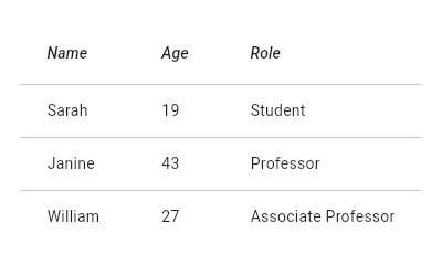
+
+//* ▲▲▲▲▲▲▲▲ description ▲▲▲▲▲▲▲▲ (do not modify or remove section marker)
+//***************************************************************************
+
+import 'package:flutter/material.dart';
+
+void main() => runApp(const MyApp());
+
+/// This is the main application widget.
+class MyApp extends StatelessWidget {
+ const MyApp({Key? key}) : super(key: key);
+
+ static const String _title = 'Flutter Code Sample';
+
+ @override
+ Widget build(BuildContext context) {
+ return MaterialApp(
+ title: _title,
+ home: Scaffold(
+ appBar: AppBar(title: const Text(_title)),
+ body: const MyStatelessWidget(),
+ ),
+ );
+ }
+}
+
+/// This is the stateless widget that the main application instantiates.
+class MyStatelessWidget extends StatelessWidget {
+ const MyStatelessWidget({Key? key}) : super(key: key);
+
+ @override
+//********************************************************************
+//* ▼▼▼▼▼▼▼▼ code ▼▼▼▼▼▼▼▼ (do not modify or remove section marker)
+
+ Widget build(BuildContext context) {
+ return DataTable(
+ columns: const <DataColumn>[
+ DataColumn(
+ label: Text(
+ 'Name',
+ style: TextStyle(fontStyle: FontStyle.italic),
+ ),
+ ),
+ DataColumn(
+ label: Text(
+ 'Age',
+ style: TextStyle(fontStyle: FontStyle.italic),
+ ),
+ ),
+ DataColumn(
+ label: Text(
+ 'Role',
+ style: TextStyle(fontStyle: FontStyle.italic),
+ ),
+ ),
+ ],
+ rows: const <DataRow>[
+ DataRow(
+ cells: <DataCell>[
+ DataCell(Text('Sarah')),
+ DataCell(Text('19')),
+ DataCell(Text('Student')),
+ ],
+ ),
+ DataRow(
+ cells: <DataCell>[
+ DataCell(Text('Janine')),
+ DataCell(Text('43')),
+ DataCell(Text('Professor')),
+ ],
+ ),
+ DataRow(
+ cells: <DataCell>[
+ DataCell(Text('William')),
+ DataCell(Text('27')),
+ DataCell(Text('Associate Professor')),
+ ],
+ ),
+ ],
+ );
+ }
+
+//* ▲▲▲▲▲▲▲▲ code ▲▲▲▲▲▲▲▲ (do not modify or remove section marker)
+//********************************************************************
+
+}
diff --git a/examples/api/lib/material/data_table/data_table.1.dart b/examples/api/lib/material/data_table/data_table.1.dart
new file mode 100644
index 0000000..454c248
--- /dev/null
+++ b/examples/api/lib/material/data_table/data_table.1.dart
@@ -0,0 +1,100 @@
+// Copyright 2014 The Flutter Authors. All rights reserved.
+// Use of this source code is governed by a BSD-style license that can be
+// found in the LICENSE file.
+
+// Template: dev/snippets/config/templates/stateful_widget_scaffold.tmpl
+//
+// Comment lines marked with "▼▼▼" and "▲▲▲" are used for authoring
+// of samples, and may be ignored if you are just exploring the sample.
+
+// Flutter code sample for DataTable
+//
+//***************************************************************************
+//* ▼▼▼▼▼▼▼▼ description ▼▼▼▼▼▼▼▼ (do not modify or remove section marker)
+
+// This sample shows how to display a [DataTable] with alternate colors per
+// row, and a custom color for when the row is selected.
+
+//* ▲▲▲▲▲▲▲▲ description ▲▲▲▲▲▲▲▲ (do not modify or remove section marker)
+//***************************************************************************
+
+import 'package:flutter/material.dart';
+
+void main() => runApp(const MyApp());
+
+/// This is the main application widget.
+class MyApp extends StatelessWidget {
+  const MyApp({Key? key}) : super(key: key);
+
+  static const String _title = 'Flutter Code Sample';
+
+  @override
+  Widget build(BuildContext context) {
+    return MaterialApp(
+      title: _title,
+      home: Scaffold(
+        appBar: AppBar(title: const Text(_title)),
+        body: const MyStatefulWidget(),
+      ),
+    );
+  }
+}
+
+/// This is the stateful widget that the main application instantiates.
+class MyStatefulWidget extends StatefulWidget {
+  const MyStatefulWidget({Key? key}) : super(key: key);
+
+  @override
+  State<MyStatefulWidget> createState() => _MyStatefulWidgetState();
+}
+
+/// This is the private State class that goes with MyStatefulWidget.
+class _MyStatefulWidgetState extends State<MyStatefulWidget> {
+//********************************************************************
+//* ▼▼▼▼▼▼▼▼ code ▼▼▼▼▼▼▼▼ (do not modify or remove section marker)
+
+  static const int numItems = 10;
+  List<bool> selected = List<bool>.generate(numItems, (int index) => false);
+
+  @override
+  Widget build(BuildContext context) {
+    return SizedBox(
+      width: double.infinity,
+      child: DataTable(
+        columns: const <DataColumn>[
+          DataColumn(
+            label: Text('Number'),
+          ),
+        ],
+        rows: List<DataRow>.generate(
+          numItems,
+          (int index) => DataRow(
+            color: MaterialStateProperty.resolveWith<Color?>(
+                (Set<MaterialState> states) {
+              // All rows will have the same selected color.
+              if (states.contains(MaterialState.selected)) {
+                return Theme.of(context).colorScheme.primary.withOpacity(0.08);
+              }
+              // Even rows will have a grey color.
+              if (index.isEven) {
+                return Colors.grey.withOpacity(0.3);
+              }
+              return null; // Use default value for other states and odd rows.
+            }),
+            cells: <DataCell>[DataCell(Text('Row $index'))],
+            selected: selected[index],
+            onSelectChanged: (bool? value) {
+              setState(() {
+                selected[index] = value!;
+              });
+            },
+          ),
+        ),
+      ),
+    );
+  }
+
+//* ▲▲▲▲▲▲▲▲ code ▲▲▲▲▲▲▲▲ (do not modify or remove section marker)
+//********************************************************************
+
+}
diff --git a/examples/api/lib/material/date_picker/show_date_picker.0.dart b/examples/api/lib/material/date_picker/show_date_picker.0.dart
new file mode 100644
index 0000000..09403e3
--- /dev/null
+++ b/examples/api/lib/material/date_picker/show_date_picker.0.dart
@@ -0,0 +1,132 @@
+// Copyright 2014 The Flutter Authors. All rights reserved.
+// Use of this source code is governed by a BSD-style license that can be
+// found in the LICENSE file.
+
+// Template: dev/snippets/config/templates/stateful_widget_restoration_material.tmpl
+//
+// Comment lines marked with "▼▼▼" and "▲▲▲" are used for authoring
+// of samples, and may be ignored if you are just exploring the sample.
+
+// Flutter code sample for showDatePicker
+//
+//***************************************************************************
+//* ▼▼▼▼▼▼▼▼ description ▼▼▼▼▼▼▼▼ (do not modify or remove section marker)
+
+// This sample demonstrates how to create a restorable Material date picker.
+// This is accomplished by enabling state restoration by specifying
+// [MaterialApp.restorationScopeId] and using [Navigator.restorablePush] to
+// push [DatePickerDialog] when the button is tapped.
+
+//* ▲▲▲▲▲▲▲▲ description ▲▲▲▲▲▲▲▲ (do not modify or remove section marker)
+//***************************************************************************
+
+import 'package:flutter/material.dart';
+
+void main() => runApp(const MyApp());
+
+/// This is the main application widget.
+class MyApp extends StatelessWidget {
+  const MyApp({Key? key}) : super(key: key);
+
+  static const String _title = 'Flutter Code Sample';
+
+  @override
+  Widget build(BuildContext context) {
+    return const MaterialApp(
+      restorationScopeId: 'app',
+      title: _title,
+      home: MyStatefulWidget(restorationId: 'main'),
+    );
+  }
+}
+
+/// This is the stateful widget that the main application instantiates.
+class MyStatefulWidget extends StatefulWidget {
+  const MyStatefulWidget({Key? key, this.restorationId}) : super(key: key);
+
+  final String? restorationId;
+
+  @override
+  State<MyStatefulWidget> createState() => _MyStatefulWidgetState();
+}
+
+/// This is the private State class that goes with MyStatefulWidget.
+/// RestorationProperty objects can be used because of RestorationMixin.
+class _MyStatefulWidgetState extends State<MyStatefulWidget>
+    with RestorationMixin {
+  // In this example, the restoration ID for the mixin is passed in through
+  // the [StatefulWidget]'s constructor.
+  @override
+  String? get restorationId => widget.restorationId;
+
+//********************************************************************
+//* ▼▼▼▼▼▼▼▼ code ▼▼▼▼▼▼▼▼ (do not modify or remove section marker)
+
+  final RestorableDateTime _selectedDate =
+      RestorableDateTime(DateTime(2021, 7, 25));
+  late final RestorableRouteFuture<DateTime?> _restorableDatePickerRouteFuture =
+      RestorableRouteFuture<DateTime?>(
+    onComplete: _selectDate,
+    onPresent: (NavigatorState navigator, Object? arguments) {
+      return navigator.restorablePush(
+        _datePickerRoute,
+        arguments: _selectedDate.value.millisecondsSinceEpoch,
+      );
+    },
+  );
+
+  static Route<DateTime> _datePickerRoute(
+    BuildContext context,
+    Object? arguments,
+  ) {
+    return DialogRoute<DateTime>(
+      context: context,
+      builder: (BuildContext context) {
+        return DatePickerDialog(
+          restorationId: 'date_picker_dialog',
+          initialEntryMode: DatePickerEntryMode.calendarOnly,
+          initialDate: DateTime.fromMillisecondsSinceEpoch(arguments! as int),
+          firstDate: DateTime(2021, 1, 1),
+          lastDate: DateTime(2022, 1, 1),
+        );
+      },
+    );
+  }
+
+  @override
+  void restoreState(RestorationBucket? oldBucket, bool initialRestore) {
+    registerForRestoration(_selectedDate, 'selected_date');
+    registerForRestoration(
+        _restorableDatePickerRouteFuture, 'date_picker_route_future');
+  }
+
+  void _selectDate(DateTime? newSelectedDate) {
+    if (newSelectedDate != null) {
+      setState(() {
+        _selectedDate.value = newSelectedDate;
+        ScaffoldMessenger.of(context).showSnackBar(SnackBar(
+          content: Text(
+              'Selected: ${_selectedDate.value.day}/${_selectedDate.value.month}/${_selectedDate.value.year}'),
+        ));
+      });
+    }
+  }
+
+  @override
+  Widget build(BuildContext context) {
+    return Scaffold(
+      body: Center(
+        child: OutlinedButton(
+          onPressed: () {
+            _restorableDatePickerRouteFuture.present();
+          },
+          child: const Text('Open Date Picker'),
+        ),
+      ),
+    );
+  }
+
+//* ▲▲▲▲▲▲▲▲ code ▲▲▲▲▲▲▲▲ (do not modify or remove section marker)
+//********************************************************************
+
+}
diff --git a/examples/api/lib/material/date_picker/show_date_range_picker.0.dart b/examples/api/lib/material/date_picker/show_date_range_picker.0.dart
new file mode 100644
index 0000000..7deac2c
--- /dev/null
+++ b/examples/api/lib/material/date_picker/show_date_range_picker.0.dart
@@ -0,0 +1,149 @@
+// Copyright 2014 The Flutter Authors. All rights reserved.
+// Use of this source code is governed by a BSD-style license that can be
+// found in the LICENSE file.
+
+// Template: dev/snippets/config/templates/stateful_widget_restoration_material.tmpl
+//
+// Comment lines marked with "▼▼▼" and "▲▲▲" are used for authoring
+// of samples, and may be ignored if you are just exploring the sample.
+
+// Flutter code sample for showDateRangePicker
+//
+//***************************************************************************
+//* ▼▼▼▼▼▼▼▼ description ▼▼▼▼▼▼▼▼ (do not modify or remove section marker)
+
+// This sample demonstrates how to create a restorable Material date range picker.
+// This is accomplished by enabling state restoration by specifying
+// [MaterialApp.restorationScopeId] and using [Navigator.restorablePush] to
+// push [DateRangePickerDialog] when the button is tapped.
+
+//* ▲▲▲▲▲▲▲▲ description ▲▲▲▲▲▲▲▲ (do not modify or remove section marker)
+//***************************************************************************
+
+import 'package:flutter/material.dart';
+
+void main() => runApp(const MyApp());
+
+/// This is the main application widget.
+class MyApp extends StatelessWidget {
+  const MyApp({Key? key}) : super(key: key);
+
+  static const String _title = 'Flutter Code Sample';
+
+  @override
+  Widget build(BuildContext context) {
+    return const MaterialApp(
+      restorationScopeId: 'app',
+      title: _title,
+      home: MyStatefulWidget(restorationId: 'main'),
+    );
+  }
+}
+
+/// This is the stateful widget that the main application instantiates.
+class MyStatefulWidget extends StatefulWidget {
+  const MyStatefulWidget({Key? key, this.restorationId}) : super(key: key);
+
+  final String? restorationId;
+
+  @override
+  State<MyStatefulWidget> createState() => _MyStatefulWidgetState();
+}
+
+/// This is the private State class that goes with MyStatefulWidget.
+/// RestorationProperty objects can be used because of RestorationMixin.
+class _MyStatefulWidgetState extends State<MyStatefulWidget>
+    with RestorationMixin {
+  // In this example, the restoration ID for the mixin is passed in through
+  // the [StatefulWidget]'s constructor.
+  @override
+  String? get restorationId => widget.restorationId;
+
+//********************************************************************
+//* ▼▼▼▼▼▼▼▼ code ▼▼▼▼▼▼▼▼ (do not modify or remove section marker)
+
+  final RestorableDateTimeN _startDate =
+      RestorableDateTimeN(DateTime(2021, 1, 1));
+  final RestorableDateTimeN _endDate =
+      RestorableDateTimeN(DateTime(2021, 1, 5));
+  late final RestorableRouteFuture<DateTimeRange?>
+      _restorableDateRangePickerRouteFuture =
+      RestorableRouteFuture<DateTimeRange?>(
+    onComplete: _selectDateRange,
+    onPresent: (NavigatorState navigator, Object? arguments) {
+      return navigator
+          .restorablePush(_dateRangePickerRoute, arguments: <String, dynamic>{
+        'initialStartDate': _startDate.value?.millisecondsSinceEpoch,
+        'initialEndDate': _endDate.value?.millisecondsSinceEpoch,
+      });
+    },
+  );
+
+  void _selectDateRange(DateTimeRange? newSelectedDate) {
+    if (newSelectedDate != null) {
+      setState(() {
+        _startDate.value = newSelectedDate.start;
+        _endDate.value = newSelectedDate.end;
+      });
+    }
+  }
+
+  @override
+  void restoreState(RestorationBucket? oldBucket, bool initialRestore) {
+    registerForRestoration(_startDate, 'start_date');
+    registerForRestoration(_endDate, 'end_date');
+    registerForRestoration(
+        _restorableDateRangePickerRouteFuture, 'date_picker_route_future');
+  }
+
+  static Route<DateTimeRange?> _dateRangePickerRoute(
+    BuildContext context,
+    Object? arguments,
+  ) {
+    return DialogRoute<DateTimeRange?>(
+      context: context,
+      builder: (BuildContext context) {
+        return DateRangePickerDialog(
+          restorationId: 'date_picker_dialog',
+          initialDateRange:
+              _initialDateTimeRange(arguments! as Map<dynamic, dynamic>),
+          firstDate: DateTime(2021, 1, 1),
+          currentDate: DateTime(2021, 1, 25),
+          lastDate: DateTime(2022, 1, 1),
+        );
+      },
+    );
+  }
+
+  static DateTimeRange? _initialDateTimeRange(Map<dynamic, dynamic> arguments) {
+    if (arguments['initialStartDate'] != null &&
+        arguments['initialEndDate'] != null) {
+      return DateTimeRange(
+        start: DateTime.fromMillisecondsSinceEpoch(
+            arguments['initialStartDate'] as int),
+        end: DateTime.fromMillisecondsSinceEpoch(
+            arguments['initialEndDate'] as int),
+      );
+    }
+
+    return null;
+  }
+
+  @override
+  Widget build(BuildContext context) {
+    return Scaffold(
+      body: Center(
+        child: OutlinedButton(
+          onPressed: () {
+            _restorableDateRangePickerRouteFuture.present();
+          },
+          child: const Text('Open Date Range Picker'),
+        ),
+      ),
+    );
+  }
+
+//* ▲▲▲▲▲▲▲▲ code ▲▲▲▲▲▲▲▲ (do not modify or remove section marker)
+//********************************************************************
+
+}
diff --git a/examples/api/lib/material/dialog/alert_dialog.1.dart b/examples/api/lib/material/dialog/alert_dialog.1.dart
new file mode 100644
index 0000000..98c7e1b
--- /dev/null
+++ b/examples/api/lib/material/dialog/alert_dialog.1.dart
@@ -0,0 +1,80 @@
+// Copyright 2014 The Flutter Authors. All rights reserved.
+// Use of this source code is governed by a BSD-style license that can be
+// found in the LICENSE file.
+
+// Template: dev/snippets/config/templates/stateless_widget_scaffold_center.tmpl
+//
+// Comment lines marked with "▼▼▼" and "▲▲▲" are used for authoring
+// of samples, and may be ignored if you are just exploring the sample.
+
+// Flutter code sample for AlertDialog
+//
+//***************************************************************************
+//* ▼▼▼▼▼▼▼▼ description ▼▼▼▼▼▼▼▼ (do not modify or remove section marker)
+
+// This demo shows a [TextButton] which when pressed, calls [showDialog]. When called, this method
+// displays a Material dialog above the current contents of the app and returns
+// a [Future] that completes when the dialog is dismissed.
+
+//* ▲▲▲▲▲▲▲▲ description ▲▲▲▲▲▲▲▲ (do not modify or remove section marker)
+//***************************************************************************
+
+import 'package:flutter/material.dart';
+
+void main() => runApp(const MyApp());
+
+/// This is the main application widget.
+class MyApp extends StatelessWidget {
+  const MyApp({Key? key}) : super(key: key);
+
+  static const String _title = 'Flutter Code Sample';
+
+  @override
+  Widget build(BuildContext context) {
+    return MaterialApp(
+      title: _title,
+      home: Scaffold(
+        appBar: AppBar(title: const Text(_title)),
+        body: const Center(
+          child: MyStatelessWidget(),
+        ),
+      ),
+    );
+  }
+}
+
+/// This is the stateless widget that the main application instantiates.
+class MyStatelessWidget extends StatelessWidget {
+  const MyStatelessWidget({Key? key}) : super(key: key);
+
+  @override
+//********************************************************************
+//* ▼▼▼▼▼▼▼▼ code ▼▼▼▼▼▼▼▼ (do not modify or remove section marker)
+
+  Widget build(BuildContext context) {
+    return TextButton(
+      onPressed: () => showDialog<String>(
+        context: context,
+        builder: (BuildContext context) => AlertDialog(
+          title: const Text('AlertDialog Title'),
+          content: const Text('AlertDialog description'),
+          actions: <Widget>[
+            TextButton(
+              onPressed: () => Navigator.pop(context, 'Cancel'),
+              child: const Text('Cancel'),
+            ),
+            TextButton(
+              onPressed: () => Navigator.pop(context, 'OK'),
+              child: const Text('OK'),
+            ),
+          ],
+        ),
+      ),
+      child: const Text('Show Dialog'),
+    );
+  }
+
+//* ▲▲▲▲▲▲▲▲ code ▲▲▲▲▲▲▲▲ (do not modify or remove section marker)
+//********************************************************************
+
+}
diff --git a/examples/api/lib/material/dialog/show_dialog.0.dart b/examples/api/lib/material/dialog/show_dialog.0.dart
new file mode 100644
index 0000000..0e44b63
--- /dev/null
+++ b/examples/api/lib/material/dialog/show_dialog.0.dart
@@ -0,0 +1,78 @@
+// Copyright 2014 The Flutter Authors. All rights reserved.
+// Use of this source code is governed by a BSD-style license that can be
+// found in the LICENSE file.
+
+// Template: dev/snippets/config/templates/stateless_widget_restoration_material.tmpl
+//
+// Comment lines marked with "▼▼▼" and "▲▲▲" are used for authoring
+// of samples, and may be ignored if you are just exploring the sample.
+
+// Flutter code sample for showDialog
+//
+//***************************************************************************
+//* ▼▼▼▼▼▼▼▼ description ▼▼▼▼▼▼▼▼ (do not modify or remove section marker)
+
+// This sample demonstrates how to create a restorable Material dialog. This is
+// accomplished by enabling state restoration by specifying
+// [MaterialApp.restorationScopeId] and using [Navigator.restorablePush] to
+// push [DialogRoute] when the button is tapped.
+//
+// {@macro flutter.widgets.RestorationManager}
+
+//* ▲▲▲▲▲▲▲▲ description ▲▲▲▲▲▲▲▲ (do not modify or remove section marker)
+//***************************************************************************
+
+import 'package:flutter/material.dart';
+
+void main() => runApp(const MyApp());
+
+/// This is the main application widget.
+class MyApp extends StatelessWidget {
+  const MyApp({Key? key}) : super(key: key);
+
+  static const String _title = 'Flutter Code Sample';
+
+  @override
+  Widget build(BuildContext context) {
+    return const MaterialApp(
+      restorationScopeId: 'app',
+      title: _title,
+      home: MyStatelessWidget(),
+    );
+  }
+}
+
+/// This is the stateless widget that the main application instantiates.
+class MyStatelessWidget extends StatelessWidget {
+  const MyStatelessWidget({Key? key}) : super(key: key);
+
+  @override
+//********************************************************************
+//* ▼▼▼▼▼▼▼▼ code ▼▼▼▼▼▼▼▼ (do not modify or remove section marker)
+
+  Widget build(BuildContext context) {
+    return Scaffold(
+      body: Center(
+        child: OutlinedButton(
+          onPressed: () {
+            Navigator.of(context).restorablePush(_dialogBuilder);
+          },
+          child: const Text('Open Dialog'),
+        ),
+      ),
+    );
+  }
+
+  static Route<Object?> _dialogBuilder(
+      BuildContext context, Object? arguments) {
+    return DialogRoute<void>(
+      context: context,
+      builder: (BuildContext context) =>
+          const AlertDialog(title: Text('Material Alert!')),
+    );
+  }
+
+//* ▲▲▲▲▲▲▲▲ code ▲▲▲▲▲▲▲▲ (do not modify or remove section marker)
+//********************************************************************
+
+}
diff --git a/examples/api/lib/material/divider/divider.0.dart b/examples/api/lib/material/divider/divider.0.dart
new file mode 100644
index 0000000..e44e495
--- /dev/null
+++ b/examples/api/lib/material/divider/divider.0.dart
@@ -0,0 +1,102 @@
+// Copyright 2014 The Flutter Authors. All rights reserved.
+// Use of this source code is governed by a BSD-style license that can be
+// found in the LICENSE file.
+
+// Template: dev/snippets/config/templates/stateless_widget_scaffold.tmpl
+//
+// Comment lines marked with "▼▼▼" and "▲▲▲" are used for authoring
+// of samples, and may be ignored if you are just exploring the sample.
+
+// Flutter code sample for Divider
+//
+//***************************************************************************
+//* ▼▼▼▼▼▼▼▼ description ▼▼▼▼▼▼▼▼ (do not modify or remove section marker)
+
+// This sample shows how to display a Divider between an orange and blue box
+// inside a column. The Divider is 20 logical pixels in height and contains a
+// vertically centered black line that is 5 logical pixels thick. The black
+// line is indented by 20 logical pixels.
+//
+// 
+
+//* ▲▲▲▲▲▲▲▲ description ▲▲▲▲▲▲▲▲ (do not modify or remove section marker)
+//***************************************************************************
+
+import 'package:flutter/material.dart';
+
+void main() => runApp(const MyApp());
+
+/// This is the main application widget.
+class MyApp extends StatelessWidget {
+ const MyApp({Key? key}) : super(key: key);
+
+ static const String _title = 'Flutter Code Sample';
+
+ @override
+ Widget build(BuildContext context) {
+ return MaterialApp(
+ title: _title,
+ home: Scaffold(
+ appBar: AppBar(title: const Text(_title)),
+ body: const MyStatelessWidget(),
+ ),
+ );
+ }
+}
+
+/// This is the stateless widget that the main application instantiates.
+class MyStatelessWidget extends StatelessWidget {
+ const MyStatelessWidget({Key? key}) : super(key: key);
+
+ @override
+//********************************************************************
+//* ▼▼▼▼▼▼▼▼ code ▼▼▼▼▼▼▼▼ (do not modify or remove section marker)
+
+ Widget build(BuildContext context) {
+ return Center(
+ child: Column(
+ children: <Widget>[
+ Expanded(
+ child: Container(
+ color: Colors.amber,
+ child: const Center(
+ child: Text('Above'),
+ ),
+ ),
+ ),
+ const Divider(
+ height: 20,
+ thickness: 5,
+ indent: 20,
+ endIndent: 20,
+ ),
+ // Subheader example from Material spec.
+ // https://material.io/components/dividers#types
+ Container(
+ padding: const EdgeInsets.only(left: 20),
+ child: Align(
+ alignment: AlignmentDirectional.centerStart,
+ child: Text(
+ 'Subheader',
+ style: Theme.of(context).textTheme.caption,
+ textAlign: TextAlign.start,
+ ),
+ ),
+ ),
+ Expanded(
+ child: Container(
+ color: Theme.of(context).colorScheme.primary,
+ child: const Center(
+ child: Text('Below'),
+ ),
+ ),
+ ),
+ ],
+ ),
+ );
+ }
+
+//* ▲▲▲▲▲▲▲▲ code ▲▲▲▲▲▲▲▲ (do not modify or remove section marker)
+//********************************************************************
+
+}
diff --git a/examples/api/lib/material/divider/vertical_divider.0.dart b/examples/api/lib/material/divider/vertical_divider.0.dart
new file mode 100644
index 0000000..daf05db
--- /dev/null
+++ b/examples/api/lib/material/divider/vertical_divider.0.dart
@@ -0,0 +1,89 @@
+// Copyright 2014 The Flutter Authors. All rights reserved.
+// Use of this source code is governed by a BSD-style license that can be
+// found in the LICENSE file.
+
+// Template: dev/snippets/config/templates/stateless_widget_scaffold.tmpl
+//
+// Comment lines marked with "▼▼▼" and "▲▲▲" are used for authoring
+// of samples, and may be ignored if you are just exploring the sample.
+
+// Flutter code sample for VerticalDivider
+//
+//***************************************************************************
+//* ▼▼▼▼▼▼▼▼ description ▼▼▼▼▼▼▼▼ (do not modify or remove section marker)
+
+// This sample shows how to display a [VerticalDivider] between an purple and orange box
+// inside a [Row]. The [VerticalDivider] is 20 logical pixels in width and contains a
+// horizontally centered black line that is 1 logical pixels thick. The grey
+// line is indented by 20 logical pixels.
+
+//* ▲▲▲▲▲▲▲▲ description ▲▲▲▲▲▲▲▲ (do not modify or remove section marker)
+//***************************************************************************
+
+import 'package:flutter/material.dart';
+
+void main() => runApp(const MyApp());
+
+/// This is the main application widget.
+class MyApp extends StatelessWidget {
+  const MyApp({Key? key}) : super(key: key);
+
+  static const String _title = 'Flutter Code Sample';
+
+  @override
+  Widget build(BuildContext context) {
+    return MaterialApp(
+      title: _title,
+      home: Scaffold(
+        appBar: AppBar(title: const Text(_title)),
+        body: const MyStatelessWidget(),
+      ),
+    );
+  }
+}
+
+/// This is the stateless widget that the main application instantiates.
+class MyStatelessWidget extends StatelessWidget {
+  const MyStatelessWidget({Key? key}) : super(key: key);
+
+  @override
+//********************************************************************
+//* ▼▼▼▼▼▼▼▼ code ▼▼▼▼▼▼▼▼ (do not modify or remove section marker)
+
+  Widget build(BuildContext context) {
+    return Container(
+      padding: const EdgeInsets.all(10),
+      child: Row(
+        children: <Widget>[
+          Expanded(
+            child: Container(
+              decoration: BoxDecoration(
+                borderRadius: BorderRadius.circular(10),
+                color: Colors.deepPurpleAccent,
+              ),
+            ),
+          ),
+          const VerticalDivider(
+            color: Colors.grey,
+            thickness: 1,
+            indent: 20,
+            endIndent: 0,
+            width: 20,
+          ),
+          Expanded(
+            child: Container(
+              decoration: BoxDecoration(
+                borderRadius: BorderRadius.circular(10),
+                color: Colors.deepOrangeAccent,
+              ),
+            ),
+          ),
+        ],
+      ),
+    );
+  }
+
+//* ▲▲▲▲▲▲▲▲ code ▲▲▲▲▲▲▲▲ (do not modify or remove section marker)
+//********************************************************************
+
+}
diff --git a/examples/api/lib/material/dropdown/dropdown_button.0.dart b/examples/api/lib/material/dropdown/dropdown_button.0.dart
new file mode 100644
index 0000000..98327b7
--- /dev/null
+++ b/examples/api/lib/material/dropdown/dropdown_button.0.dart
@@ -0,0 +1,93 @@
+// Copyright 2014 The Flutter Authors. All rights reserved.
+// Use of this source code is governed by a BSD-style license that can be
+// found in the LICENSE file.
+
+// Template: dev/snippets/config/templates/stateful_widget_scaffold_center.tmpl
+//
+// Comment lines marked with "▼▼▼" and "▲▲▲" are used for authoring
+// of samples, and may be ignored if you are just exploring the sample.
+
+// Flutter code sample for DropdownButton
+//
+//***************************************************************************
+//* ▼▼▼▼▼▼▼▼ description ▼▼▼▼▼▼▼▼ (do not modify or remove section marker)
+
+// This sample shows a `DropdownButton` with a large arrow icon,
+// purple text style, and bold purple underline, whose value is one of "One",
+// "Two", "Free", or "Four".
+//
+// 
+
+//* ▲▲▲▲▲▲▲▲ description ▲▲▲▲▲▲▲▲ (do not modify or remove section marker)
+//***************************************************************************
+
+import 'package:flutter/material.dart';
+
+void main() => runApp(const MyApp());
+
+/// This is the main application widget.
+class MyApp extends StatelessWidget {
+ const MyApp({Key? key}) : super(key: key);
+
+ static const String _title = 'Flutter Code Sample';
+
+ @override
+ Widget build(BuildContext context) {
+ return MaterialApp(
+ title: _title,
+ home: Scaffold(
+ appBar: AppBar(title: const Text(_title)),
+ body: const Center(
+ child: MyStatefulWidget(),
+ ),
+ ),
+ );
+ }
+}
+
+/// This is the stateful widget that the main application instantiates.
+class MyStatefulWidget extends StatefulWidget {
+ const MyStatefulWidget({Key? key}) : super(key: key);
+
+ @override
+ State<MyStatefulWidget> createState() => _MyStatefulWidgetState();
+}
+
+/// This is the private State class that goes with MyStatefulWidget.
+class _MyStatefulWidgetState extends State<MyStatefulWidget> {
+//********************************************************************
+//* ▼▼▼▼▼▼▼▼ code ▼▼▼▼▼▼▼▼ (do not modify or remove section marker)
+
+ String dropdownValue = 'One';
+
+ @override
+ Widget build(BuildContext context) {
+ return DropdownButton<String>(
+ value: dropdownValue,
+ icon: const Icon(Icons.arrow_downward),
+ iconSize: 24,
+ elevation: 16,
+ style: const TextStyle(color: Colors.deepPurple),
+ underline: Container(
+ height: 2,
+ color: Colors.deepPurpleAccent,
+ ),
+ onChanged: (String? newValue) {
+ setState(() {
+ dropdownValue = newValue!;
+ });
+ },
+ items: <String>['One', 'Two', 'Free', 'Four']
+ .map<DropdownMenuItem<String>>((String value) {
+ return DropdownMenuItem<String>(
+ value: value,
+ child: Text(value),
+ );
+ }).toList(),
+ );
+ }
+
+//* ▲▲▲▲▲▲▲▲ code ▲▲▲▲▲▲▲▲ (do not modify or remove section marker)
+//********************************************************************
+
+}
diff --git a/examples/api/lib/material/dropdown/dropdown_button.selected_item_builder.0.dart b/examples/api/lib/material/dropdown/dropdown_button.selected_item_builder.0.dart
new file mode 100644
index 0000000..ebd4982
--- /dev/null
+++ b/examples/api/lib/material/dropdown/dropdown_button.selected_item_builder.0.dart
@@ -0,0 +1,84 @@
+// Copyright 2014 The Flutter Authors. All rights reserved.
+// Use of this source code is governed by a BSD-style license that can be
+// found in the LICENSE file.
+
+// Template: dev/snippets/config/templates/stateful_widget_scaffold.tmpl
+//
+// Comment lines marked with "▼▼▼" and "▲▲▲" are used for authoring
+// of samples, and may be ignored if you are just exploring the sample.
+
+// Flutter code sample for DropdownButton.selectedItemBuilder
+//
+//***************************************************************************
+//* ▼▼▼▼▼▼▼▼ description ▼▼▼▼▼▼▼▼ (do not modify or remove section marker)
+
+// This sample shows a `DropdownButton` with a button with [Text] that
+// corresponds to but is unique from [DropdownMenuItem].
+
+//* ▲▲▲▲▲▲▲▲ description ▲▲▲▲▲▲▲▲ (do not modify or remove section marker)
+//***************************************************************************
+
+import 'package:flutter/material.dart';
+
+void main() => runApp(const MyApp());
+
+/// This is the main application widget.
+class MyApp extends StatelessWidget {
+  const MyApp({Key? key}) : super(key: key);
+
+  static const String _title = 'Flutter Code Sample';
+
+  @override
+  Widget build(BuildContext context) {
+    return MaterialApp(
+      title: _title,
+      home: Scaffold(
+        appBar: AppBar(title: const Text(_title)),
+        body: const MyStatefulWidget(),
+      ),
+    );
+  }
+}
+
+/// This is the stateful widget that the main application instantiates.
+class MyStatefulWidget extends StatefulWidget {
+  const MyStatefulWidget({Key? key}) : super(key: key);
+
+  @override
+  State<MyStatefulWidget> createState() => _MyStatefulWidgetState();
+}
+
+/// This is the private State class that goes with MyStatefulWidget.
+class _MyStatefulWidgetState extends State<MyStatefulWidget> {
+//********************************************************************
+//* ▼▼▼▼▼▼▼▼ code ▼▼▼▼▼▼▼▼ (do not modify or remove section marker)
+
+  final List<String> items = <String>['1', '2', '3'];
+  String selectedItem = '1';
+
+  @override
+  Widget build(BuildContext context) {
+    return Padding(
+      padding: const EdgeInsets.symmetric(horizontal: 12.0),
+      child: DropdownButton<String>(
+        value: selectedItem,
+        onChanged: (String? string) => setState(() => selectedItem = string!),
+        selectedItemBuilder: (BuildContext context) {
+          return items.map<Widget>((String item) {
+            return Text(item);
+          }).toList();
+        },
+        items: items.map((String item) {
+          return DropdownMenuItem<String>(
+            child: Text('Log $item'),
+            value: item,
+          );
+        }).toList(),
+      ),
+    );
+  }
+
+//* ▲▲▲▲▲▲▲▲ code ▲▲▲▲▲▲▲▲ (do not modify or remove section marker)
+//********************************************************************
+
+}
diff --git a/examples/api/lib/material/dropdown/dropdown_button.style.0.dart b/examples/api/lib/material/dropdown/dropdown_button.style.0.dart
new file mode 100644
index 0000000..1776848
--- /dev/null
+++ b/examples/api/lib/material/dropdown/dropdown_button.style.0.dart
@@ -0,0 +1,93 @@
+// Copyright 2014 The Flutter Authors. All rights reserved.
+// Use of this source code is governed by a BSD-style license that can be
+// found in the LICENSE file.
+
+// Template: dev/snippets/config/templates/stateful_widget_scaffold.tmpl
+//
+// Comment lines marked with "▼▼▼" and "▲▲▲" are used for authoring
+// of samples, and may be ignored if you are just exploring the sample.
+
+// Flutter code sample for DropdownButton.style
+//
+//***************************************************************************
+//* ▼▼▼▼▼▼▼▼ description ▼▼▼▼▼▼▼▼ (do not modify or remove section marker)
+
+// This sample shows a `DropdownButton` with a dropdown button text style
+// that is different than its menu items.
+
+//* ▲▲▲▲▲▲▲▲ description ▲▲▲▲▲▲▲▲ (do not modify or remove section marker)
+//***************************************************************************
+
+import 'package:flutter/material.dart';
+
+void main() => runApp(const MyApp());
+
+/// This is the main application widget.
+class MyApp extends StatelessWidget {
+  const MyApp({Key? key}) : super(key: key);
+
+  static const String _title = 'Flutter Code Sample';
+
+  @override
+  Widget build(BuildContext context) {
+    return MaterialApp(
+      title: _title,
+      home: Scaffold(
+        appBar: AppBar(title: const Text(_title)),
+        body: const MyStatefulWidget(),
+      ),
+    );
+  }
+}
+
+/// This is the stateful widget that the main application instantiates.
+class MyStatefulWidget extends StatefulWidget {
+  const MyStatefulWidget({Key? key}) : super(key: key);
+
+  @override
+  State<MyStatefulWidget> createState() => _MyStatefulWidgetState();
+}
+
+/// This is the private State class that goes with MyStatefulWidget.
+class _MyStatefulWidgetState extends State<MyStatefulWidget> {
+//********************************************************************
+//* ▼▼▼▼▼▼▼▼ code ▼▼▼▼▼▼▼▼ (do not modify or remove section marker)
+
+  List<String> options = <String>['One', 'Two', 'Free', 'Four'];
+  String dropdownValue = 'One';
+
+  @override
+  Widget build(BuildContext context) {
+    return Container(
+      alignment: Alignment.center,
+      color: Colors.blue,
+      child: DropdownButton<String>(
+        value: dropdownValue,
+        onChanged: (String? newValue) {
+          setState(() {
+            dropdownValue = newValue!;
+          });
+        },
+        style: const TextStyle(color: Colors.blue),
+        selectedItemBuilder: (BuildContext context) {
+          return options.map((String value) {
+            return Text(
+              dropdownValue,
+              style: const TextStyle(color: Colors.white),
+            );
+          }).toList();
+        },
+        items: options.map<DropdownMenuItem<String>>((String value) {
+          return DropdownMenuItem<String>(
+            value: value,
+            child: Text(value),
+          );
+        }).toList(),
+      ),
+    );
+  }
+
+//* ▲▲▲▲▲▲▲▲ code ▲▲▲▲▲▲▲▲ (do not modify or remove section marker)
+//********************************************************************
+
+}
diff --git a/examples/api/lib/material/elevated_button/elevated_button.0.dart b/examples/api/lib/material/elevated_button/elevated_button.0.dart
new file mode 100644
index 0000000..a87dc98
--- /dev/null
+++ b/examples/api/lib/material/elevated_button/elevated_button.0.dart
@@ -0,0 +1,83 @@
+// Copyright 2014 The Flutter Authors. All rights reserved.
+// Use of this source code is governed by a BSD-style license that can be
+// found in the LICENSE file.
+
+// Template: dev/snippets/config/templates/stateful_widget_scaffold.tmpl
+//
+// Comment lines marked with "▼▼▼" and "▲▲▲" are used for authoring
+// of samples, and may be ignored if you are just exploring the sample.
+
+// Flutter code sample for ElevatedButton
+//
+//***************************************************************************
+//* ▼▼▼▼▼▼▼▼ description ▼▼▼▼▼▼▼▼ (do not modify or remove section marker)
+
+// This sample produces an enabled and a disabled ElevatedButton.
+
+//* ▲▲▲▲▲▲▲▲ description ▲▲▲▲▲▲▲▲ (do not modify or remove section marker)
+//***************************************************************************
+
+import 'package:flutter/material.dart';
+
+void main() => runApp(const MyApp());
+
+/// This is the main application widget.
+class MyApp extends StatelessWidget {
+  const MyApp({Key? key}) : super(key: key);
+
+  static const String _title = 'Flutter Code Sample';
+
+  @override
+  Widget build(BuildContext context) {
+    return MaterialApp(
+      title: _title,
+      home: Scaffold(
+        appBar: AppBar(title: const Text(_title)),
+        body: const MyStatefulWidget(),
+      ),
+    );
+  }
+}
+
+/// This is the stateful widget that the main application instantiates.
+class MyStatefulWidget extends StatefulWidget {
+  const MyStatefulWidget({Key? key}) : super(key: key);
+
+  @override
+  State<MyStatefulWidget> createState() => _MyStatefulWidgetState();
+}
+
+/// This is the private State class that goes with MyStatefulWidget.
+class _MyStatefulWidgetState extends State<MyStatefulWidget> {
+//********************************************************************
+//* ▼▼▼▼▼▼▼▼ code ▼▼▼▼▼▼▼▼ (do not modify or remove section marker)
+
+  @override
+  Widget build(BuildContext context) {
+    final ButtonStyle style =
+        ElevatedButton.styleFrom(textStyle: const TextStyle(fontSize: 20));
+
+    return Center(
+      child: Column(
+        mainAxisSize: MainAxisSize.min,
+        children: <Widget>[
+          ElevatedButton(
+            style: style,
+            onPressed: null,
+            child: const Text('Disabled'),
+          ),
+          const SizedBox(height: 30),
+          ElevatedButton(
+            style: style,
+            onPressed: () {},
+            child: const Text('Enabled'),
+          ),
+        ],
+      ),
+    );
+  }
+
+//* ▲▲▲▲▲▲▲▲ code ▲▲▲▲▲▲▲▲ (do not modify or remove section marker)
+//********************************************************************
+
+}
diff --git a/examples/api/lib/material/expansion_panel/expansion_panel_list.0.dart b/examples/api/lib/material/expansion_panel/expansion_panel_list.0.dart
new file mode 100644
index 0000000..54335dc
--- /dev/null
+++ b/examples/api/lib/material/expansion_panel/expansion_panel_list.0.dart
@@ -0,0 +1,127 @@
+// Copyright 2014 The Flutter Authors. All rights reserved.
+// Use of this source code is governed by a BSD-style license that can be
+// found in the LICENSE file.
+
+// Template: dev/snippets/config/templates/stateful_widget_scaffold.tmpl
+//
+// Comment lines marked with "▼▼▼" and "▲▲▲" are used for authoring
+// of samples, and may be ignored if you are just exploring the sample.
+
+// Flutter code sample for ExpansionPanelList
+//
+//***************************************************************************
+//* ▼▼▼▼▼▼▼▼ description ▼▼▼▼▼▼▼▼ (do not modify or remove section marker)
+
+// Here is a simple example of how to implement ExpansionPanelList.
+
+//* ▲▲▲▲▲▲▲▲ description ▲▲▲▲▲▲▲▲ (do not modify or remove section marker)
+//***************************************************************************
+
+import 'package:flutter/material.dart';
+
+void main() => runApp(const MyApp());
+
+/// This is the main application widget.
+class MyApp extends StatelessWidget {
+  const MyApp({Key? key}) : super(key: key);
+
+  static const String _title = 'Flutter Code Sample';
+
+  @override
+  Widget build(BuildContext context) {
+    return MaterialApp(
+      title: _title,
+      home: Scaffold(
+        appBar: AppBar(title: const Text(_title)),
+        body: const MyStatefulWidget(),
+      ),
+    );
+  }
+}
+
+//*****************************************************************************
+//* ▼▼▼▼▼▼▼▼ code-preamble ▼▼▼▼▼▼▼▼ (do not modify or remove section marker)
+
+// stores ExpansionPanel state information
+class Item {
+  Item({
+    required this.expandedValue,
+    required this.headerValue,
+    this.isExpanded = false,
+  });
+
+  String expandedValue;
+  String headerValue;
+  bool isExpanded;
+}
+
+List<Item> generateItems(int numberOfItems) {
+  return List<Item>.generate(numberOfItems, (int index) {
+    return Item(
+      headerValue: 'Panel $index',
+      expandedValue: 'This is item number $index',
+    );
+  });
+}
+
+//* ▲▲▲▲▲▲▲▲ code-preamble ▲▲▲▲▲▲▲▲ (do not modify or remove section marker)
+//*****************************************************************************
+
+/// This is the stateful widget that the main application instantiates.
+class MyStatefulWidget extends StatefulWidget {
+  const MyStatefulWidget({Key? key}) : super(key: key);
+
+  @override
+  State<MyStatefulWidget> createState() => _MyStatefulWidgetState();
+}
+
+/// This is the private State class that goes with MyStatefulWidget.
+class _MyStatefulWidgetState extends State<MyStatefulWidget> {
+//********************************************************************
+//* ▼▼▼▼▼▼▼▼ code ▼▼▼▼▼▼▼▼ (do not modify or remove section marker)
+
+  final List<Item> _data = generateItems(8);
+
+  @override
+  Widget build(BuildContext context) {
+    return SingleChildScrollView(
+      child: Container(
+        child: _buildPanel(),
+      ),
+    );
+  }
+
+  Widget _buildPanel() {
+    return ExpansionPanelList(
+      expansionCallback: (int index, bool isExpanded) {
+        setState(() {
+          _data[index].isExpanded = !isExpanded;
+        });
+      },
+      children: _data.map<ExpansionPanel>((Item item) {
+        return ExpansionPanel(
+          headerBuilder: (BuildContext context, bool isExpanded) {
+            return ListTile(
+              title: Text(item.headerValue),
+            );
+          },
+          body: ListTile(
+              title: Text(item.expandedValue),
+              subtitle:
+                  const Text('To delete this panel, tap the trash can icon'),
+              trailing: const Icon(Icons.delete),
+              onTap: () {
+                setState(() {
+                  _data.removeWhere((Item currentItem) => item == currentItem);
+                });
+              }),
+          isExpanded: item.isExpanded,
+        );
+      }).toList(),
+    );
+  }
+
+//* ▲▲▲▲▲▲▲▲ code ▲▲▲▲▲▲▲▲ (do not modify or remove section marker)
+//********************************************************************
+
+}
diff --git a/examples/api/lib/material/expansion_panel/expansion_panel_list.expansion_panel_list_radio.0.dart b/examples/api/lib/material/expansion_panel/expansion_panel_list.expansion_panel_list_radio.0.dart
new file mode 100644
index 0000000..7c68edd
--- /dev/null
+++ b/examples/api/lib/material/expansion_panel/expansion_panel_list.expansion_panel_list_radio.0.dart
@@ -0,0 +1,124 @@
+// Copyright 2014 The Flutter Authors. All rights reserved.
+// Use of this source code is governed by a BSD-style license that can be
+// found in the LICENSE file.
+
+// Template: dev/snippets/config/templates/stateful_widget_scaffold.tmpl
+//
+// Comment lines marked with "▼▼▼" and "▲▲▲" are used for authoring
+// of samples, and may be ignored if you are just exploring the sample.
+
+// Flutter code sample for ExpansionPanelList.ExpansionPanelList.radio
+//
+//***************************************************************************
+//* ▼▼▼▼▼▼▼▼ description ▼▼▼▼▼▼▼▼ (do not modify or remove section marker)
+
+// Here is a simple example of how to implement ExpansionPanelList.radio.
+
+//* ▲▲▲▲▲▲▲▲ description ▲▲▲▲▲▲▲▲ (do not modify or remove section marker)
+//***************************************************************************
+
+import 'package:flutter/material.dart';
+
+void main() => runApp(const MyApp());
+
+/// This is the main application widget.
+class MyApp extends StatelessWidget {
+  const MyApp({Key? key}) : super(key: key);
+
+  static const String _title = 'Flutter Code Sample';
+
+  @override
+  Widget build(BuildContext context) {
+    return MaterialApp(
+      title: _title,
+      home: Scaffold(
+        appBar: AppBar(title: const Text(_title)),
+        body: const MyStatefulWidget(),
+      ),
+    );
+  }
+}
+
+//*****************************************************************************
+//* ▼▼▼▼▼▼▼▼ code-preamble ▼▼▼▼▼▼▼▼ (do not modify or remove section marker)
+
+// stores ExpansionPanel state information
+class Item {
+  Item({
+    required this.id,
+    required this.expandedValue,
+    required this.headerValue,
+  });
+
+  int id;
+  String expandedValue;
+  String headerValue;
+}
+
+List<Item> generateItems(int numberOfItems) {
+  return List<Item>.generate(numberOfItems, (int index) {
+    return Item(
+      id: index,
+      headerValue: 'Panel $index',
+      expandedValue: 'This is item number $index',
+    );
+  });
+}
+
+//* ▲▲▲▲▲▲▲▲ code-preamble ▲▲▲▲▲▲▲▲ (do not modify or remove section marker)
+//*****************************************************************************
+
+/// This is the stateful widget that the main application instantiates.
+class MyStatefulWidget extends StatefulWidget {
+  const MyStatefulWidget({Key? key}) : super(key: key);
+
+  @override
+  State<MyStatefulWidget> createState() => _MyStatefulWidgetState();
+}
+
+/// This is the private State class that goes with MyStatefulWidget.
+class _MyStatefulWidgetState extends State<MyStatefulWidget> {
+//********************************************************************
+//* ▼▼▼▼▼▼▼▼ code ▼▼▼▼▼▼▼▼ (do not modify or remove section marker)
+
+  final List<Item> _data = generateItems(8);
+
+  @override
+  Widget build(BuildContext context) {
+    return SingleChildScrollView(
+      child: Container(
+        child: _buildPanel(),
+      ),
+    );
+  }
+
+  Widget _buildPanel() {
+    return ExpansionPanelList.radio(
+      initialOpenPanelValue: 2,
+      children: _data.map<ExpansionPanelRadio>((Item item) {
+        return ExpansionPanelRadio(
+            value: item.id,
+            headerBuilder: (BuildContext context, bool isExpanded) {
+              return ListTile(
+                title: Text(item.headerValue),
+              );
+            },
+            body: ListTile(
+                title: Text(item.expandedValue),
+                subtitle:
+                    const Text('To delete this panel, tap the trash can icon'),
+                trailing: const Icon(Icons.delete),
+                onTap: () {
+                  setState(() {
+                    _data
+                        .removeWhere((Item currentItem) => item == currentItem);
+                  });
+                }));
+      }).toList(),
+    );
+  }
+
+//* ▲▲▲▲▲▲▲▲ code ▲▲▲▲▲▲▲▲ (do not modify or remove section marker)
+//********************************************************************
+
+}
diff --git a/examples/api/lib/material/expansion_tile/expansion_tile.0.dart b/examples/api/lib/material/expansion_tile/expansion_tile.0.dart
new file mode 100644
index 0000000..9ac967e
--- /dev/null
+++ b/examples/api/lib/material/expansion_tile/expansion_tile.0.dart
@@ -0,0 +1,98 @@
+// Copyright 2014 The Flutter Authors. All rights reserved.
+// Use of this source code is governed by a BSD-style license that can be
+// found in the LICENSE file.
+
+// Template: dev/snippets/config/templates/stateful_widget_scaffold.tmpl
+//
+// Comment lines marked with "▼▼▼" and "▲▲▲" are used for authoring
+// of samples, and may be ignored if you are just exploring the sample.
+
+// Flutter code sample for ExpansionTile
+//
+//***************************************************************************
+//* ▼▼▼▼▼▼▼▼ description ▼▼▼▼▼▼▼▼ (do not modify or remove section marker)
+
+// This example demonstrates different configurations of ExpansionTile.
+
+//* ▲▲▲▲▲▲▲▲ description ▲▲▲▲▲▲▲▲ (do not modify or remove section marker)
+//***************************************************************************
+
+import 'package:flutter/material.dart';
+
+void main() => runApp(const MyApp());
+
+/// This is the main application widget.
+class MyApp extends StatelessWidget {
+  const MyApp({Key? key}) : super(key: key);
+
+  static const String _title = 'Flutter Code Sample';
+
+  @override
+  Widget build(BuildContext context) {
+    return MaterialApp(
+      title: _title,
+      home: Scaffold(
+        appBar: AppBar(title: const Text(_title)),
+        body: const MyStatefulWidget(),
+      ),
+    );
+  }
+}
+
+/// This is the stateful widget that the main application instantiates.
+class MyStatefulWidget extends StatefulWidget {
+  const MyStatefulWidget({Key? key}) : super(key: key);
+
+  @override
+  State<MyStatefulWidget> createState() => _MyStatefulWidgetState();
+}
+
+/// This is the private State class that goes with MyStatefulWidget.
+class _MyStatefulWidgetState extends State<MyStatefulWidget> {
+//********************************************************************
+//* ▼▼▼▼▼▼▼▼ code ▼▼▼▼▼▼▼▼ (do not modify or remove section marker)
+
+  bool _customTileExpanded = false;
+
+  @override
+  Widget build(BuildContext context) {
+    return Column(
+      children: <Widget>[
+        const ExpansionTile(
+          title: Text('ExpansionTile 1'),
+          subtitle: Text('Trailing expansion arrow icon'),
+          children: <Widget>[
+            ListTile(title: Text('This is tile number 1')),
+          ],
+        ),
+        ExpansionTile(
+          title: const Text('ExpansionTile 2'),
+          subtitle: const Text('Custom expansion arrow icon'),
+          trailing: Icon(
+            _customTileExpanded
+                ? Icons.arrow_drop_down_circle
+                : Icons.arrow_drop_down,
+          ),
+          children: const <Widget>[
+            ListTile(title: Text('This is tile number 2')),
+          ],
+          onExpansionChanged: (bool expanded) {
+            setState(() => _customTileExpanded = expanded);
+          },
+        ),
+        const ExpansionTile(
+          title: Text('ExpansionTile 3'),
+          subtitle: Text('Leading expansion arrow icon'),
+          controlAffinity: ListTileControlAffinity.leading,
+          children: <Widget>[
+            ListTile(title: Text('This is tile number 3')),
+          ],
+        ),
+      ],
+    );
+  }
+
+//* ▲▲▲▲▲▲▲▲ code ▲▲▲▲▲▲▲▲ (do not modify or remove section marker)
+//********************************************************************
+
+}
diff --git a/examples/api/lib/material/flexible_space_bar/flexible_space_bar.0.dart b/examples/api/lib/material/flexible_space_bar/flexible_space_bar.0.dart
new file mode 100644
index 0000000..beff081
--- /dev/null
+++ b/examples/api/lib/material/flexible_space_bar/flexible_space_bar.0.dart
@@ -0,0 +1,110 @@
+// Copyright 2014 The Flutter Authors. All rights reserved.
+// Use of this source code is governed by a BSD-style license that can be
+// found in the LICENSE file.
+
+// Template: dev/snippets/config/templates/freeform.tmpl
+//
+// Comment lines marked with "▼▼▼" and "▲▲▲" are used for authoring
+// of samples, and may be ignored if you are just exploring the sample.
+
+// Flutter code sample for FlexibleSpaceBar
+//
+//***************************************************************************
+//* ▼▼▼▼▼▼▼▼ description ▼▼▼▼▼▼▼▼ (do not modify or remove section marker)
+
+// This sample application demonstrates the different features of the
+// [FlexibleSpaceBar] when used in a [SliverAppBar]. This app bar is configured
+// to stretch into the overscroll space, and uses the
+// [FlexibleSpaceBar.stretchModes] to apply `fadeTitle`, `blurBackground` and
+// `zoomBackground`. The app bar also makes use of [CollapseMode.parallax] by
+// default.
+
+//* ▲▲▲▲▲▲▲▲ description ▲▲▲▲▲▲▲▲ (do not modify or remove section marker)
+//***************************************************************************
+
+//****************************************************************************
+//* ▼▼▼▼▼▼▼▼ code-imports ▼▼▼▼▼▼▼▼ (do not modify or remove section marker)
+
+import 'package:flutter/material.dart';
+
+//* ▲▲▲▲▲▲▲▲ code-imports ▲▲▲▲▲▲▲▲ (do not modify or remove section marker)
+//****************************************************************************
+
+//********************************************************************
+//* ▼▼▼▼▼▼▼▼ code ▼▼▼▼▼▼▼▼ (do not modify or remove section marker)
+
+void main() => runApp(const MaterialApp(home: MyApp()));
+
+class MyApp extends StatelessWidget {
+  const MyApp({Key? key}) : super(key: key);
+
+  @override
+  Widget build(BuildContext context) {
+    return Scaffold(
+      body: CustomScrollView(
+        physics: const BouncingScrollPhysics(
+            parent: AlwaysScrollableScrollPhysics()),
+        slivers: <Widget>[
+          SliverAppBar(
+            stretch: true,
+            onStretchTrigger: () {
+              // Function callback for stretch
+              return Future<void>.value();
+            },
+            expandedHeight: 300.0,
+            flexibleSpace: FlexibleSpaceBar(
+              stretchModes: const <StretchMode>[
+                StretchMode.zoomBackground,
+                StretchMode.blurBackground,
+                StretchMode.fadeTitle,
+              ],
+              centerTitle: true,
+              title: const Text('Flight Report'),
+              background: Stack(
+                fit: StackFit.expand,
+                children: <Widget>[
+                  Image.network(
+                    'https://flutter.github.io/assets-for-api-docs/assets/widgets/owl-2.jpg',
+                    fit: BoxFit.cover,
+                  ),
+                  const DecoratedBox(
+                    decoration: BoxDecoration(
+                      gradient: LinearGradient(
+                        begin: Alignment(0.0, 0.5),
+                        end: Alignment.center,
+                        colors: <Color>[
+                          Color(0x60000000),
+                          Color(0x00000000),
+                        ],
+                      ),
+                    ),
+                  ),
+                ],
+              ),
+            ),
+          ),
+          SliverList(
+            delegate: SliverChildListDelegate(
+              const <Widget>[
+                ListTile(
+                  leading: Icon(Icons.wb_sunny),
+                  title: Text('Sunday'),
+                  subtitle: Text('sunny, h: 80, l: 65'),
+                ),
+                ListTile(
+                  leading: Icon(Icons.wb_sunny),
+                  title: Text('Monday'),
+                  subtitle: Text('sunny, h: 80, l: 65'),
+                ),
+                // ListTiles++
+              ],
+            ),
+          ),
+        ],
+      ),
+    );
+  }
+}
+
+//* ▲▲▲▲▲▲▲▲ code ▲▲▲▲▲▲▲▲ (do not modify or remove section marker)
+//********************************************************************
diff --git a/examples/api/lib/material/floating_action_button/floating_action_button.0.dart b/examples/api/lib/material/floating_action_button/floating_action_button.0.dart
new file mode 100644
index 0000000..e515da1
--- /dev/null
+++ b/examples/api/lib/material/floating_action_button/floating_action_button.0.dart
@@ -0,0 +1,69 @@
+// Copyright 2014 The Flutter Authors. All rights reserved.
+// Use of this source code is governed by a BSD-style license that can be
+// found in the LICENSE file.
+
+// Template: dev/snippets/config/templates/stateless_widget_material.tmpl
+//
+// Comment lines marked with "▼▼▼" and "▲▲▲" are used for authoring
+// of samples, and may be ignored if you are just exploring the sample.
+
+// Flutter code sample for FloatingActionButton
+//
+//***************************************************************************
+//* ▼▼▼▼▼▼▼▼ description ▼▼▼▼▼▼▼▼ (do not modify or remove section marker)
+
+// This example shows how to display a [FloatingActionButton] in a
+// [Scaffold], with a pink [backgroundColor] and a thumbs up [Icon].
+//
+// 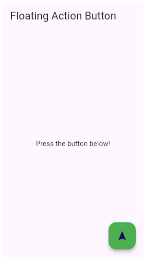
+
+//* ▲▲▲▲▲▲▲▲ description ▲▲▲▲▲▲▲▲ (do not modify or remove section marker)
+//***************************************************************************
+
+import 'package:flutter/material.dart';
+
+void main() => runApp(const MyApp());
+
+/// This is the main application widget.
+class MyApp extends StatelessWidget {
+ const MyApp({Key? key}) : super(key: key);
+
+ static const String _title = 'Flutter Code Sample';
+
+ @override
+ Widget build(BuildContext context) {
+ return const MaterialApp(
+ title: _title,
+ home: MyStatelessWidget(),
+ );
+ }
+}
+
+/// This is the stateless widget that the main application instantiates.
+class MyStatelessWidget extends StatelessWidget {
+ const MyStatelessWidget({Key? key}) : super(key: key);
+
+ @override
+//********************************************************************
+//* ▼▼▼▼▼▼▼▼ code ▼▼▼▼▼▼▼▼ (do not modify or remove section marker)
+
+ Widget build(BuildContext context) {
+ return Scaffold(
+ appBar: AppBar(
+ title: const Text('Floating Action Button'),
+ ),
+ body: const Center(child: Text('Press the button below!')),
+ floatingActionButton: FloatingActionButton(
+ onPressed: () {
+ // Add your onPressed code here!
+ },
+ child: const Icon(Icons.navigation),
+ backgroundColor: Colors.green,
+ ),
+ );
+ }
+
+//* ▲▲▲▲▲▲▲▲ code ▲▲▲▲▲▲▲▲ (do not modify or remove section marker)
+//********************************************************************
+
+}
diff --git a/examples/api/lib/material/floating_action_button/floating_action_button.1.dart b/examples/api/lib/material/floating_action_button/floating_action_button.1.dart
new file mode 100644
index 0000000..81b99e6
--- /dev/null
+++ b/examples/api/lib/material/floating_action_button/floating_action_button.1.dart
@@ -0,0 +1,73 @@
+// Copyright 2014 The Flutter Authors. All rights reserved.
+// Use of this source code is governed by a BSD-style license that can be
+// found in the LICENSE file.
+
+// Template: dev/snippets/config/templates/stateless_widget_material.tmpl
+//
+// Comment lines marked with "▼▼▼" and "▲▲▲" are used for authoring
+// of samples, and may be ignored if you are just exploring the sample.
+
+// Flutter code sample for FloatingActionButton
+//
+//***************************************************************************
+//* ▼▼▼▼▼▼▼▼ description ▼▼▼▼▼▼▼▼ (do not modify or remove section marker)
+
+// This example shows how to make an extended [FloatingActionButton] in a
+// [Scaffold], with a pink [backgroundColor], a thumbs up [Icon] and a
+// [Text] label that reads "Approve".
+//
+// 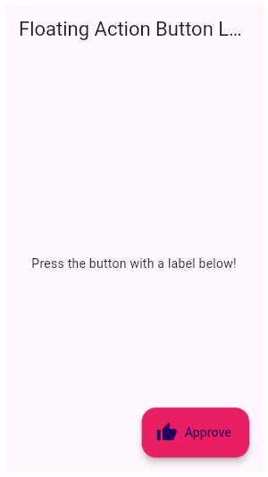
+
+//* ▲▲▲▲▲▲▲▲ description ▲▲▲▲▲▲▲▲ (do not modify or remove section marker)
+//***************************************************************************
+
+import 'package:flutter/material.dart';
+
+void main() => runApp(const MyApp());
+
+/// This is the main application widget.
+class MyApp extends StatelessWidget {
+ const MyApp({Key? key}) : super(key: key);
+
+ static const String _title = 'Flutter Code Sample';
+
+ @override
+ Widget build(BuildContext context) {
+ return const MaterialApp(
+ title: _title,
+ home: MyStatelessWidget(),
+ );
+ }
+}
+
+/// This is the stateless widget that the main application instantiates.
+class MyStatelessWidget extends StatelessWidget {
+ const MyStatelessWidget({Key? key}) : super(key: key);
+
+ @override
+//********************************************************************
+//* ▼▼▼▼▼▼▼▼ code ▼▼▼▼▼▼▼▼ (do not modify or remove section marker)
+
+ Widget build(BuildContext context) {
+ return Scaffold(
+ appBar: AppBar(
+ title: const Text('Floating Action Button Label'),
+ ),
+ body: const Center(
+ child: Text('Press the button with a label below!'),
+ ),
+ floatingActionButton: FloatingActionButton.extended(
+ onPressed: () {
+ // Add your onPressed code here!
+ },
+ label: const Text('Approve'),
+ icon: const Icon(Icons.thumb_up),
+ backgroundColor: Colors.pink,
+ ),
+ );
+ }
+
+//* ▲▲▲▲▲▲▲▲ code ▲▲▲▲▲▲▲▲ (do not modify or remove section marker)
+//********************************************************************
+
+}
diff --git a/examples/api/lib/material/floating_action_button_location/standard_fab_location.0.dart b/examples/api/lib/material/floating_action_button_location/standard_fab_location.0.dart
new file mode 100644
index 0000000..13b1ff9
--- /dev/null
+++ b/examples/api/lib/material/floating_action_button_location/standard_fab_location.0.dart
@@ -0,0 +1,94 @@
+// Copyright 2014 The Flutter Authors. All rights reserved.
+// Use of this source code is governed by a BSD-style license that can be
+// found in the LICENSE file.
+
+// Template: dev/snippets/config/templates/stateless_widget_material.tmpl
+//
+// Comment lines marked with "▼▼▼" and "▲▲▲" are used for authoring
+// of samples, and may be ignored if you are just exploring the sample.
+
+// Flutter code sample for StandardFabLocation
+//
+//***************************************************************************
+//* ▼▼▼▼▼▼▼▼ description ▼▼▼▼▼▼▼▼ (do not modify or remove section marker)
+
+// This is an example of a user-defined [FloatingActionButtonLocation].
+//
+// The example shows a [Scaffold] with an [AppBar], a [BottomAppBar], and a
+// [FloatingActionButton] using a custom [FloatingActionButtonLocation].
+//
+// The new [FloatingActionButtonLocation] is defined
+// by extending [StandardFabLocation] with two mixins,
+// [FabEndOffsetX] and [FabFloatOffsetY], and overriding the
+// [getOffsetX] method to adjust the FAB's x-coordinate, creating a
+// [FloatingActionButtonLocation] slightly different from
+// [FloatingActionButtonLocation.endFloat].
+
+//* ▲▲▲▲▲▲▲▲ description ▲▲▲▲▲▲▲▲ (do not modify or remove section marker)
+//***************************************************************************
+
+import 'package:flutter/material.dart';
+
+void main() => runApp(const MyApp());
+
+/// This is the main application widget.
+class MyApp extends StatelessWidget {
+  const MyApp({Key? key}) : super(key: key);
+
+  static const String _title = 'Flutter Code Sample';
+
+  @override
+  Widget build(BuildContext context) {
+    return const MaterialApp(
+      title: _title,
+      home: MyStatelessWidget(),
+    );
+  }
+}
+
+//*****************************************************************************
+//* ▼▼▼▼▼▼▼▼ code-preamble ▼▼▼▼▼▼▼▼ (do not modify or remove section marker)
+
+class AlmostEndFloatFabLocation extends StandardFabLocation
+    with FabEndOffsetX, FabFloatOffsetY {
+  @override
+  double getOffsetX(
+      ScaffoldPrelayoutGeometry scaffoldGeometry, double adjustment) {
+    final double directionalAdjustment =
+        scaffoldGeometry.textDirection == TextDirection.ltr ? -50.0 : 50.0;
+    return super.getOffsetX(scaffoldGeometry, adjustment) +
+        directionalAdjustment;
+  }
+}
+
+//* ▲▲▲▲▲▲▲▲ code-preamble ▲▲▲▲▲▲▲▲ (do not modify or remove section marker)
+//*****************************************************************************
+
+/// This is the stateless widget that the main application instantiates.
+class MyStatelessWidget extends StatelessWidget {
+  const MyStatelessWidget({Key? key}) : super(key: key);
+
+  @override
+//********************************************************************
+//* ▼▼▼▼▼▼▼▼ code ▼▼▼▼▼▼▼▼ (do not modify or remove section marker)
+
+  Widget build(BuildContext context) {
+    return Scaffold(
+      appBar: AppBar(
+        title: const Text('Home page'),
+      ),
+      floatingActionButton: FloatingActionButton(
+        onPressed: () {
+          print('FAB pressed.');
+        },
+        tooltip: 'Increment',
+        child: const Icon(Icons.add),
+      ),
+      floatingActionButtonLocation: AlmostEndFloatFabLocation(),
+    );
+  }
+
+//* ▲▲▲▲▲▲▲▲ code ▲▲▲▲▲▲▲▲ (do not modify or remove section marker)
+//********************************************************************
+
+}
diff --git a/examples/api/lib/material/icon_button/icon_button.0.dart b/examples/api/lib/material/icon_button/icon_button.0.dart
new file mode 100644
index 0000000..83ac195
--- /dev/null
+++ b/examples/api/lib/material/icon_button/icon_button.0.dart
@@ -0,0 +1,90 @@
+// Copyright 2014 The Flutter Authors. All rights reserved.
+// Use of this source code is governed by a BSD-style license that can be
+// found in the LICENSE file.
+
+// Template: dev/snippets/config/templates/stateful_widget_scaffold_center.tmpl
+//
+// Comment lines marked with "▼▼▼" and "▲▲▲" are used for authoring
+// of samples, and may be ignored if you are just exploring the sample.
+
+// Flutter code sample for IconButton
+//
+//***************************************************************************
+//* ▼▼▼▼▼▼▼▼ description ▼▼▼▼▼▼▼▼ (do not modify or remove section marker)
+
+// This sample shows an `IconButton` that uses the Material icon "volume_up" to
+// increase the volume.
+//
+// 
+
+//* ▲▲▲▲▲▲▲▲ description ▲▲▲▲▲▲▲▲ (do not modify or remove section marker)
+//***************************************************************************
+
+import 'package:flutter/material.dart';
+
+void main() => runApp(const MyApp());
+
+/// This is the main application widget.
+class MyApp extends StatelessWidget {
+ const MyApp({Key? key}) : super(key: key);
+
+ static const String _title = 'Flutter Code Sample';
+
+ @override
+ Widget build(BuildContext context) {
+ return MaterialApp(
+ title: _title,
+ home: Scaffold(
+ appBar: AppBar(title: const Text(_title)),
+ body: const Center(
+ child: MyStatefulWidget(),
+ ),
+ ),
+ );
+ }
+}
+
+//*****************************************************************************
+//* ▼▼▼▼▼▼▼▼ code-preamble ▼▼▼▼▼▼▼▼ (do not modify or remove section marker)
+
+double _volume = 0.0;
+
+//* ▲▲▲▲▲▲▲▲ code-preamble ▲▲▲▲▲▲▲▲ (do not modify or remove section marker)
+//*****************************************************************************
+
+/// This is the stateful widget that the main application instantiates.
+class MyStatefulWidget extends StatefulWidget {
+ const MyStatefulWidget({Key? key}) : super(key: key);
+
+ @override
+ State<MyStatefulWidget> createState() => _MyStatefulWidgetState();
+}
+
+/// This is the private State class that goes with MyStatefulWidget.
+class _MyStatefulWidgetState extends State<MyStatefulWidget> {
+//********************************************************************
+//* ▼▼▼▼▼▼▼▼ code ▼▼▼▼▼▼▼▼ (do not modify or remove section marker)
+
+ @override
+ Widget build(BuildContext context) {
+ return Column(
+ mainAxisSize: MainAxisSize.min,
+ children: <Widget>[
+ IconButton(
+ icon: const Icon(Icons.volume_up),
+ tooltip: 'Increase volume by 10',
+ onPressed: () {
+ setState(() {
+ _volume += 10;
+ });
+ },
+ ),
+ Text('Volume : $_volume')
+ ],
+ );
+ }
+
+//* ▲▲▲▲▲▲▲▲ code ▲▲▲▲▲▲▲▲ (do not modify or remove section marker)
+//********************************************************************
+
+}
diff --git a/examples/api/lib/material/icon_button/icon_button.1.dart b/examples/api/lib/material/icon_button/icon_button.1.dart
new file mode 100644
index 0000000..1e9df6e
--- /dev/null
+++ b/examples/api/lib/material/icon_button/icon_button.1.dart
@@ -0,0 +1,78 @@
+// Copyright 2014 The Flutter Authors. All rights reserved.
+// Use of this source code is governed by a BSD-style license that can be
+// found in the LICENSE file.
+
+// Template: dev/snippets/config/templates/stateless_widget_scaffold.tmpl
+//
+// Comment lines marked with "▼▼▼" and "▲▲▲" are used for authoring
+// of samples, and may be ignored if you are just exploring the sample.
+
+// Flutter code sample for IconButton
+//
+//***************************************************************************
+//* ▼▼▼▼▼▼▼▼ description ▼▼▼▼▼▼▼▼ (do not modify or remove section marker)
+
+// In this sample the icon button's background color is defined with an [Ink]
+// widget whose child is an [IconButton]. The icon button's filled background
+// is a light shade of blue, it's a filled circle, and it's as big as the
+// button is.
+//
+// 
+
+//* ▲▲▲▲▲▲▲▲ description ▲▲▲▲▲▲▲▲ (do not modify or remove section marker)
+//***************************************************************************
+
+import 'package:flutter/material.dart';
+
+void main() => runApp(const MyApp());
+
+/// This is the main application widget.
+class MyApp extends StatelessWidget {
+ const MyApp({Key? key}) : super(key: key);
+
+ static const String _title = 'Flutter Code Sample';
+
+ @override
+ Widget build(BuildContext context) {
+ return MaterialApp(
+ title: _title,
+ home: Scaffold(
+ appBar: AppBar(title: const Text(_title)),
+ body: const MyStatelessWidget(),
+ ),
+ );
+ }
+}
+
+/// This is the stateless widget that the main application instantiates.
+class MyStatelessWidget extends StatelessWidget {
+ const MyStatelessWidget({Key? key}) : super(key: key);
+
+ @override
+//********************************************************************
+//* ▼▼▼▼▼▼▼▼ code ▼▼▼▼▼▼▼▼ (do not modify or remove section marker)
+
+ @override
+ Widget build(BuildContext context) {
+ return Material(
+ color: Colors.white,
+ child: Center(
+ child: Ink(
+ decoration: const ShapeDecoration(
+ color: Colors.lightBlue,
+ shape: CircleBorder(),
+ ),
+ child: IconButton(
+ icon: const Icon(Icons.android),
+ color: Colors.white,
+ onPressed: () {},
+ ),
+ ),
+ ),
+ );
+ }
+
+//* ▲▲▲▲▲▲▲▲ code ▲▲▲▲▲▲▲▲ (do not modify or remove section marker)
+//********************************************************************
+
+}
diff --git a/examples/api/lib/material/ink_well/ink_well.0.dart b/examples/api/lib/material/ink_well/ink_well.0.dart
new file mode 100644
index 0000000..62dfdfd
--- /dev/null
+++ b/examples/api/lib/material/ink_well/ink_well.0.dart
@@ -0,0 +1,83 @@
+// Copyright 2014 The Flutter Authors. All rights reserved.
+// Use of this source code is governed by a BSD-style license that can be
+// found in the LICENSE file.
+
+// Template: dev/snippets/config/templates/stateful_widget_scaffold_center.tmpl
+//
+// Comment lines marked with "▼▼▼" and "▲▲▲" are used for authoring
+// of samples, and may be ignored if you are just exploring the sample.
+
+// Flutter code sample for InkWell
+//
+//***************************************************************************
+//* ▼▼▼▼▼▼▼▼ description ▼▼▼▼▼▼▼▼ (do not modify or remove section marker)
+
+// Tap the container to cause it to grow. Then, tap it again and hold before
+// the widget reaches its maximum size to observe the clipped ink splash.
+
+//* ▲▲▲▲▲▲▲▲ description ▲▲▲▲▲▲▲▲ (do not modify or remove section marker)
+//***************************************************************************
+
+import 'package:flutter/material.dart';
+
+void main() => runApp(const MyApp());
+
+/// This is the main application widget.
+class MyApp extends StatelessWidget {
+  const MyApp({Key? key}) : super(key: key);
+
+  static const String _title = 'Flutter Code Sample';
+
+  @override
+  Widget build(BuildContext context) {
+    return MaterialApp(
+      title: _title,
+      home: Scaffold(
+        appBar: AppBar(title: const Text(_title)),
+        body: const Center(
+          child: MyStatefulWidget(),
+        ),
+      ),
+    );
+  }
+}
+
+/// This is the stateful widget that the main application instantiates.
+class MyStatefulWidget extends StatefulWidget {
+  const MyStatefulWidget({Key? key}) : super(key: key);
+
+  @override
+  State<MyStatefulWidget> createState() => _MyStatefulWidgetState();
+}
+
+/// This is the private State class that goes with MyStatefulWidget.
+class _MyStatefulWidgetState extends State<MyStatefulWidget> {
+//********************************************************************
+//* ▼▼▼▼▼▼▼▼ code ▼▼▼▼▼▼▼▼ (do not modify or remove section marker)
+
+  double sideLength = 50;
+
+  @override
+  Widget build(BuildContext context) {
+    return AnimatedContainer(
+      height: sideLength,
+      width: sideLength,
+      duration: const Duration(seconds: 2),
+      curve: Curves.easeIn,
+      child: Material(
+        color: Colors.yellow,
+        child: InkWell(
+          onTap: () {
+            setState(() {
+              sideLength == 50 ? sideLength = 100 : sideLength = 50;
+            });
+          },
+        ),
+      ),
+    );
+  }
+
+//* ▲▲▲▲▲▲▲▲ code ▲▲▲▲▲▲▲▲ (do not modify or remove section marker)
+//********************************************************************
+
+}
diff --git a/examples/api/lib/material/input_decorator/input_decoration.0.dart b/examples/api/lib/material/input_decorator/input_decoration.0.dart
new file mode 100644
index 0000000..7b1bb00
--- /dev/null
+++ b/examples/api/lib/material/input_decorator/input_decoration.0.dart
@@ -0,0 +1,71 @@
+// Copyright 2014 The Flutter Authors. All rights reserved.
+// Use of this source code is governed by a BSD-style license that can be
+// found in the LICENSE file.
+
+// Template: dev/snippets/config/templates/stateless_widget_scaffold.tmpl
+//
+// Comment lines marked with "▼▼▼" and "▲▲▲" are used for authoring
+// of samples, and may be ignored if you are just exploring the sample.
+
+// Flutter code sample for InputDecoration
+//
+//***************************************************************************
+//* ▼▼▼▼▼▼▼▼ description ▼▼▼▼▼▼▼▼ (do not modify or remove section marker)
+
+// This sample shows how to style a `TextField` using an `InputDecorator`. The
+// TextField displays a "send message" icon to the left of the input area,
+// which is surrounded by a border an all sides. It displays the `hintText`
+// inside the input area to help the user understand what input is required. It
+// displays the `helperText` and `counterText` below the input area.
+//
+// 
+
+//* ▲▲▲▲▲▲▲▲ description ▲▲▲▲▲▲▲▲ (do not modify or remove section marker)
+//***************************************************************************
+
+import 'package:flutter/material.dart';
+
+void main() => runApp(const MyApp());
+
+/// This is the main application widget.
+class MyApp extends StatelessWidget {
+ const MyApp({Key? key}) : super(key: key);
+
+ static const String _title = 'Flutter Code Sample';
+
+ @override
+ Widget build(BuildContext context) {
+ return MaterialApp(
+ title: _title,
+ home: Scaffold(
+ appBar: AppBar(title: const Text(_title)),
+ body: const MyStatelessWidget(),
+ ),
+ );
+ }
+}
+
+/// This is the stateless widget that the main application instantiates.
+class MyStatelessWidget extends StatelessWidget {
+ const MyStatelessWidget({Key? key}) : super(key: key);
+
+ @override
+//********************************************************************
+//* ▼▼▼▼▼▼▼▼ code ▼▼▼▼▼▼▼▼ (do not modify or remove section marker)
+
+ Widget build(BuildContext context) {
+ return const TextField(
+ decoration: InputDecoration(
+ icon: Icon(Icons.send),
+ hintText: 'Hint Text',
+ helperText: 'Helper Text',
+ counterText: '0 characters',
+ border: OutlineInputBorder(),
+ ),
+ );
+ }
+
+//* ▲▲▲▲▲▲▲▲ code ▲▲▲▲▲▲▲▲ (do not modify or remove section marker)
+//********************************************************************
+
+}
diff --git a/examples/api/lib/material/input_decorator/input_decoration.1.dart b/examples/api/lib/material/input_decorator/input_decoration.1.dart
new file mode 100644
index 0000000..a0368b7
--- /dev/null
+++ b/examples/api/lib/material/input_decorator/input_decoration.1.dart
@@ -0,0 +1,66 @@
+// Copyright 2014 The Flutter Authors. All rights reserved.
+// Use of this source code is governed by a BSD-style license that can be
+// found in the LICENSE file.
+
+// Template: dev/snippets/config/templates/stateless_widget_scaffold.tmpl
+//
+// Comment lines marked with "▼▼▼" and "▲▲▲" are used for authoring
+// of samples, and may be ignored if you are just exploring the sample.
+
+// Flutter code sample for InputDecoration
+//
+//***************************************************************************
+//* ▼▼▼▼▼▼▼▼ description ▼▼▼▼▼▼▼▼ (do not modify or remove section marker)
+
+// This sample shows how to style a "collapsed" `TextField` using an
+// `InputDecorator`. The collapsed `TextField` surrounds the hint text and
+// input area with a border, but does not add padding around them.
+//
+// 
+
+//* ▲▲▲▲▲▲▲▲ description ▲▲▲▲▲▲▲▲ (do not modify or remove section marker)
+//***************************************************************************
+
+import 'package:flutter/material.dart';
+
+void main() => runApp(const MyApp());
+
+/// This is the main application widget.
+class MyApp extends StatelessWidget {
+ const MyApp({Key? key}) : super(key: key);
+
+ static const String _title = 'Flutter Code Sample';
+
+ @override
+ Widget build(BuildContext context) {
+ return MaterialApp(
+ title: _title,
+ home: Scaffold(
+ appBar: AppBar(title: const Text(_title)),
+ body: const MyStatelessWidget(),
+ ),
+ );
+ }
+}
+
+/// This is the stateless widget that the main application instantiates.
+class MyStatelessWidget extends StatelessWidget {
+ const MyStatelessWidget({Key? key}) : super(key: key);
+
+ @override
+//********************************************************************
+//* ▼▼▼▼▼▼▼▼ code ▼▼▼▼▼▼▼▼ (do not modify or remove section marker)
+
+ Widget build(BuildContext context) {
+ return const TextField(
+ decoration: InputDecoration.collapsed(
+ hintText: 'Hint Text',
+ border: OutlineInputBorder(),
+ ),
+ );
+ }
+
+//* ▲▲▲▲▲▲▲▲ code ▲▲▲▲▲▲▲▲ (do not modify or remove section marker)
+//********************************************************************
+
+}
diff --git a/examples/api/lib/material/input_decorator/input_decoration.2.dart b/examples/api/lib/material/input_decorator/input_decoration.2.dart
new file mode 100644
index 0000000..a04d025
--- /dev/null
+++ b/examples/api/lib/material/input_decorator/input_decoration.2.dart
@@ -0,0 +1,67 @@
+// Copyright 2014 The Flutter Authors. All rights reserved.
+// Use of this source code is governed by a BSD-style license that can be
+// found in the LICENSE file.
+
+// Template: dev/snippets/config/templates/stateless_widget_scaffold.tmpl
+//
+// Comment lines marked with "▼▼▼" and "▲▲▲" are used for authoring
+// of samples, and may be ignored if you are just exploring the sample.
+
+// Flutter code sample for InputDecoration
+//
+//***************************************************************************
+//* ▼▼▼▼▼▼▼▼ description ▼▼▼▼▼▼▼▼ (do not modify or remove section marker)
+
+// This sample shows how to create a `TextField` with hint text, a red border
+// on all sides, and an error message. To display a red border and error
+// message, provide `errorText` to the `InputDecoration` constructor.
+//
+// 
+
+//* ▲▲▲▲▲▲▲▲ description ▲▲▲▲▲▲▲▲ (do not modify or remove section marker)
+//***************************************************************************
+
+import 'package:flutter/material.dart';
+
+void main() => runApp(const MyApp());
+
+/// This is the main application widget.
+class MyApp extends StatelessWidget {
+ const MyApp({Key? key}) : super(key: key);
+
+ static const String _title = 'Flutter Code Sample';
+
+ @override
+ Widget build(BuildContext context) {
+ return MaterialApp(
+ title: _title,
+ home: Scaffold(
+ appBar: AppBar(title: const Text(_title)),
+ body: const MyStatelessWidget(),
+ ),
+ );
+ }
+}
+
+/// This is the stateless widget that the main application instantiates.
+class MyStatelessWidget extends StatelessWidget {
+ const MyStatelessWidget({Key? key}) : super(key: key);
+
+ @override
+//********************************************************************
+//* ▼▼▼▼▼▼▼▼ code ▼▼▼▼▼▼▼▼ (do not modify or remove section marker)
+
+ Widget build(BuildContext context) {
+ return const TextField(
+ decoration: InputDecoration(
+ hintText: 'Hint Text',
+ errorText: 'Error Text',
+ border: OutlineInputBorder(),
+ ),
+ );
+ }
+
+//* ▲▲▲▲▲▲▲▲ code ▲▲▲▲▲▲▲▲ (do not modify or remove section marker)
+//********************************************************************
+
+}
diff --git a/examples/api/lib/material/input_decorator/input_decoration.3.dart b/examples/api/lib/material/input_decorator/input_decoration.3.dart
new file mode 100644
index 0000000..b2dd8ba
--- /dev/null
+++ b/examples/api/lib/material/input_decorator/input_decoration.3.dart
@@ -0,0 +1,68 @@
+// Copyright 2014 The Flutter Authors. All rights reserved.
+// Use of this source code is governed by a BSD-style license that can be
+// found in the LICENSE file.
+
+// Template: dev/snippets/config/templates/stateless_widget_scaffold.tmpl
+//
+// Comment lines marked with "▼▼▼" and "▲▲▲" are used for authoring
+// of samples, and may be ignored if you are just exploring the sample.
+
+// Flutter code sample for InputDecoration
+//
+//***************************************************************************
+//* ▼▼▼▼▼▼▼▼ description ▼▼▼▼▼▼▼▼ (do not modify or remove section marker)
+
+// This sample shows how to style a `TextField` with a round border and
+// additional text before and after the input area. It displays "Prefix" before
+// the input area, and "Suffix" after the input area.
+//
+// 
+
+//* ▲▲▲▲▲▲▲▲ description ▲▲▲▲▲▲▲▲ (do not modify or remove section marker)
+//***************************************************************************
+
+import 'package:flutter/material.dart';
+
+void main() => runApp(const MyApp());
+
+/// This is the main application widget.
+class MyApp extends StatelessWidget {
+ const MyApp({Key? key}) : super(key: key);
+
+ static const String _title = 'Flutter Code Sample';
+
+ @override
+ Widget build(BuildContext context) {
+ return MaterialApp(
+ title: _title,
+ home: Scaffold(
+ appBar: AppBar(title: const Text(_title)),
+ body: const MyStatelessWidget(),
+ ),
+ );
+ }
+}
+
+/// This is the stateless widget that the main application instantiates.
+class MyStatelessWidget extends StatelessWidget {
+ const MyStatelessWidget({Key? key}) : super(key: key);
+
+ @override
+//********************************************************************
+//* ▼▼▼▼▼▼▼▼ code ▼▼▼▼▼▼▼▼ (do not modify or remove section marker)
+
+ Widget build(BuildContext context) {
+ return TextFormField(
+ initialValue: 'abc',
+ decoration: const InputDecoration(
+ prefix: Text('Prefix'),
+ suffix: Text('Suffix'),
+ border: OutlineInputBorder(),
+ ),
+ );
+ }
+
+//* ▲▲▲▲▲▲▲▲ code ▲▲▲▲▲▲▲▲ (do not modify or remove section marker)
+//********************************************************************
+
+}
diff --git a/examples/api/lib/material/input_decorator/input_decoration.label.0.dart b/examples/api/lib/material/input_decorator/input_decoration.label.0.dart
new file mode 100644
index 0000000..93eec55
--- /dev/null
+++ b/examples/api/lib/material/input_decorator/input_decoration.label.0.dart
@@ -0,0 +1,80 @@
+// Copyright 2014 The Flutter Authors. All rights reserved.
+// Use of this source code is governed by a BSD-style license that can be
+// found in the LICENSE file.
+
+// Template: dev/snippets/config/templates/stateless_widget_scaffold.tmpl
+//
+// Comment lines marked with "▼▼▼" and "▲▲▲" are used for authoring
+// of samples, and may be ignored if you are just exploring the sample.
+
+// Flutter code sample for InputDecoration.label
+//
+//***************************************************************************
+//* ▼▼▼▼▼▼▼▼ description ▼▼▼▼▼▼▼▼ (do not modify or remove section marker)
+
+// This example shows a `TextField` with a [Text.rich] widget as the [label].
+// The widget contains multiple [Text] widgets with different [TextStyle]'s.
+
+//* ▲▲▲▲▲▲▲▲ description ▲▲▲▲▲▲▲▲ (do not modify or remove section marker)
+//***************************************************************************
+
+import 'package:flutter/material.dart';
+
+void main() => runApp(const MyApp());
+
+/// This is the main application widget.
+class MyApp extends StatelessWidget {
+  const MyApp({Key? key}) : super(key: key);
+
+  static const String _title = 'Flutter Code Sample';
+
+  @override
+  Widget build(BuildContext context) {
+    return MaterialApp(
+      title: _title,
+      home: Scaffold(
+        appBar: AppBar(title: const Text(_title)),
+        body: const MyStatelessWidget(),
+      ),
+    );
+  }
+}
+
+/// This is the stateless widget that the main application instantiates.
+class MyStatelessWidget extends StatelessWidget {
+  const MyStatelessWidget({Key? key}) : super(key: key);
+
+  @override
+//********************************************************************
+//* ▼▼▼▼▼▼▼▼ code ▼▼▼▼▼▼▼▼ (do not modify or remove section marker)
+
+  Widget build(BuildContext context) {
+    return const Center(
+      child: TextField(
+        decoration: InputDecoration(
+          label: Text.rich(
+            TextSpan(
+              children: <InlineSpan>[
+                WidgetSpan(
+                  child: Text(
+                    'Username',
+                  ),
+                ),
+                WidgetSpan(
+                  child: Text(
+                    '*',
+                    style: TextStyle(color: Colors.red),
+                  ),
+                ),
+              ],
+            ),
+          ),
+        ),
+      ),
+    );
+  }
+
+//* ▲▲▲▲▲▲▲▲ code ▲▲▲▲▲▲▲▲ (do not modify or remove section marker)
+//********************************************************************
+
+}
diff --git a/examples/api/lib/material/input_decorator/input_decoration.prefix_icon_constraints.0.dart b/examples/api/lib/material/input_decorator/input_decoration.prefix_icon_constraints.0.dart
new file mode 100644
index 0000000..439dfc0
--- /dev/null
+++ b/examples/api/lib/material/input_decorator/input_decoration.prefix_icon_constraints.0.dart
@@ -0,0 +1,89 @@
+// Copyright 2014 The Flutter Authors. All rights reserved.
+// Use of this source code is governed by a BSD-style license that can be
+// found in the LICENSE file.
+
+// Template: dev/snippets/config/templates/stateless_widget_scaffold.tmpl
+//
+// Comment lines marked with "▼▼▼" and "▲▲▲" are used for authoring
+// of samples, and may be ignored if you are just exploring the sample.
+
+// Flutter code sample for InputDecoration.prefixIconConstraints
+//
+//***************************************************************************
+//* ▼▼▼▼▼▼▼▼ description ▼▼▼▼▼▼▼▼ (do not modify or remove section marker)
+
+// This example shows the differences between two `TextField` widgets when
+// [prefixIconConstraints] is set to the default value and when one is not.
+//
+// Note that [isDense] must be set to true to be able to
+// set the constraints smaller than 48px.
+//
+// If null, [BoxConstraints] with a minimum width and height of 48px is
+// used.
+
+//* ▲▲▲▲▲▲▲▲ description ▲▲▲▲▲▲▲▲ (do not modify or remove section marker)
+//***************************************************************************
+
+import 'package:flutter/material.dart';
+
+void main() => runApp(const MyApp());
+
+/// This is the main application widget.
+class MyApp extends StatelessWidget {
+  const MyApp({Key? key}) : super(key: key);
+
+  static const String _title = 'Flutter Code Sample';
+
+  @override
+  Widget build(BuildContext context) {
+    return MaterialApp(
+      title: _title,
+      home: Scaffold(
+        appBar: AppBar(title: const Text(_title)),
+        body: const MyStatelessWidget(),
+      ),
+    );
+  }
+}
+
+/// This is the stateless widget that the main application instantiates.
+class MyStatelessWidget extends StatelessWidget {
+  const MyStatelessWidget({Key? key}) : super(key: key);
+
+  @override
+//********************************************************************
+//* ▼▼▼▼▼▼▼▼ code ▼▼▼▼▼▼▼▼ (do not modify or remove section marker)
+
+  Widget build(BuildContext context) {
+    return Padding(
+      padding: const EdgeInsets.symmetric(horizontal: 8.0),
+      child: Column(
+        mainAxisAlignment: MainAxisAlignment.center,
+        children: const <Widget>[
+          TextField(
+            decoration: InputDecoration(
+              hintText: 'Normal Icon Constraints',
+              prefixIcon: Icon(Icons.search),
+            ),
+          ),
+          SizedBox(height: 10),
+          TextField(
+            decoration: InputDecoration(
+              isDense: true,
+              hintText: 'Smaller Icon Constraints',
+              prefixIcon: Icon(Icons.search),
+              prefixIconConstraints: BoxConstraints(
+                minHeight: 32,
+                minWidth: 32,
+              ),
+            ),
+          ),
+        ],
+      ),
+    );
+  }
+
+//* ▲▲▲▲▲▲▲▲ code ▲▲▲▲▲▲▲▲ (do not modify or remove section marker)
+//********************************************************************
+
+}
diff --git a/examples/api/lib/material/input_decorator/input_decoration.suffix_icon_constraints.0.dart b/examples/api/lib/material/input_decorator/input_decoration.suffix_icon_constraints.0.dart
new file mode 100644
index 0000000..231c95f
--- /dev/null
+++ b/examples/api/lib/material/input_decorator/input_decoration.suffix_icon_constraints.0.dart
@@ -0,0 +1,89 @@
+// Copyright 2014 The Flutter Authors. All rights reserved.
+// Use of this source code is governed by a BSD-style license that can be
+// found in the LICENSE file.
+
+// Template: dev/snippets/config/templates/stateless_widget_scaffold.tmpl
+//
+// Comment lines marked with "▼▼▼" and "▲▲▲" are used for authoring
+// of samples, and may be ignored if you are just exploring the sample.
+
+// Flutter code sample for InputDecoration.suffixIconConstraints
+//
+//***************************************************************************
+//* ▼▼▼▼▼▼▼▼ description ▼▼▼▼▼▼▼▼ (do not modify or remove section marker)
+
+// This example shows the differences between two `TextField` widgets when
+// [suffixIconConstraints] is set to the default value and when one is not.
+//
+// Note that [isDense] must be set to true to be able to
+// set the constraints smaller than 48px.
+//
+// If null, [BoxConstraints] with a minimum width and height of 48px is
+// used.
+
+//* ▲▲▲▲▲▲▲▲ description ▲▲▲▲▲▲▲▲ (do not modify or remove section marker)
+//***************************************************************************
+
+import 'package:flutter/material.dart';
+
+void main() => runApp(const MyApp());
+
+/// This is the main application widget.
+class MyApp extends StatelessWidget {
+  const MyApp({Key? key}) : super(key: key);
+
+  static const String _title = 'Flutter Code Sample';
+
+  @override
+  Widget build(BuildContext context) {
+    return MaterialApp(
+      title: _title,
+      home: Scaffold(
+        appBar: AppBar(title: const Text(_title)),
+        body: const MyStatelessWidget(),
+      ),
+    );
+  }
+}
+
+/// This is the stateless widget that the main application instantiates.
+class MyStatelessWidget extends StatelessWidget {
+  const MyStatelessWidget({Key? key}) : super(key: key);
+
+  @override
+//********************************************************************
+//* ▼▼▼▼▼▼▼▼ code ▼▼▼▼▼▼▼▼ (do not modify or remove section marker)
+
+  Widget build(BuildContext context) {
+    return Padding(
+      padding: const EdgeInsets.symmetric(horizontal: 8.0),
+      child: Column(
+        mainAxisAlignment: MainAxisAlignment.center,
+        children: const <Widget>[
+          TextField(
+            decoration: InputDecoration(
+              hintText: 'Normal Icon Constraints',
+              suffixIcon: Icon(Icons.search),
+            ),
+          ),
+          SizedBox(height: 10),
+          TextField(
+            decoration: InputDecoration(
+              isDense: true,
+              hintText: 'Smaller Icon Constraints',
+              suffixIcon: Icon(Icons.search),
+              suffixIconConstraints: BoxConstraints(
+                minHeight: 32,
+                minWidth: 32,
+              ),
+            ),
+          ),
+        ],
+      ),
+    );
+  }
+
+//* ▲▲▲▲▲▲▲▲ code ▲▲▲▲▲▲▲▲ (do not modify or remove section marker)
+//********************************************************************
+
+}
diff --git a/examples/api/lib/material/list_tile/list_tile.4.dart b/examples/api/lib/material/list_tile/list_tile.4.dart
new file mode 100644
index 0000000..c9703c0
--- /dev/null
+++ b/examples/api/lib/material/list_tile/list_tile.4.dart
@@ -0,0 +1,172 @@
+// Copyright 2014 The Flutter Authors. All rights reserved.
+// Use of this source code is governed by a BSD-style license that can be
+// found in the LICENSE file.
+
+// Template: dev/snippets/config/templates/stateless_widget_scaffold.tmpl
+//
+// Comment lines marked with "▼▼▼" and "▲▲▲" are used for authoring
+// of samples, and may be ignored if you are just exploring the sample.
+
+// Flutter code sample for ListTile
+//
+//***************************************************************************
+//* ▼▼▼▼▼▼▼▼ description ▼▼▼▼▼▼▼▼ (do not modify or remove section marker)
+
+// Here is an example of a custom list item that resembles a YouTube-related
+// video list item created with [Expanded] and [Container] widgets.
+//
+// 
+
+//* ▲▲▲▲▲▲▲▲ description ▲▲▲▲▲▲▲▲ (do not modify or remove section marker)
+//***************************************************************************
+
+import 'package:flutter/material.dart';
+
+void main() => runApp(const MyApp());
+
+/// This is the main application widget.
+class MyApp extends StatelessWidget {
+ const MyApp({Key? key}) : super(key: key);
+
+ static const String _title = 'Flutter Code Sample';
+
+ @override
+ Widget build(BuildContext context) {
+ return MaterialApp(
+ title: _title,
+ home: Scaffold(
+ appBar: AppBar(title: const Text(_title)),
+ body: const MyStatelessWidget(),
+ ),
+ );
+ }
+}
+
+//*****************************************************************************
+//* ▼▼▼▼▼▼▼▼ code-preamble ▼▼▼▼▼▼▼▼ (do not modify or remove section marker)
+
+class CustomListItem extends StatelessWidget {
+ const CustomListItem({
+ Key? key,
+ required this.thumbnail,
+ required this.title,
+ required this.user,
+ required this.viewCount,
+ }) : super(key: key);
+
+ final Widget thumbnail;
+ final String title;
+ final String user;
+ final int viewCount;
+
+ @override
+ Widget build(BuildContext context) {
+ return Padding(
+ padding: const EdgeInsets.symmetric(vertical: 5.0),
+ child: Row(
+ crossAxisAlignment: CrossAxisAlignment.start,
+ children: <Widget>[
+ Expanded(
+ flex: 2,
+ child: thumbnail,
+ ),
+ Expanded(
+ flex: 3,
+ child: _VideoDescription(
+ title: title,
+ user: user,
+ viewCount: viewCount,
+ ),
+ ),
+ const Icon(
+ Icons.more_vert,
+ size: 16.0,
+ ),
+ ],
+ ),
+ );
+ }
+}
+
+class _VideoDescription extends StatelessWidget {
+ const _VideoDescription({
+ Key? key,
+ required this.title,
+ required this.user,
+ required this.viewCount,
+ }) : super(key: key);
+
+ final String title;
+ final String user;
+ final int viewCount;
+
+ @override
+ Widget build(BuildContext context) {
+ return Padding(
+ padding: const EdgeInsets.fromLTRB(5.0, 0.0, 0.0, 0.0),
+ child: Column(
+ crossAxisAlignment: CrossAxisAlignment.start,
+ children: <Widget>[
+ Text(
+ title,
+ style: const TextStyle(
+ fontWeight: FontWeight.w500,
+ fontSize: 14.0,
+ ),
+ ),
+ const Padding(padding: EdgeInsets.symmetric(vertical: 2.0)),
+ Text(
+ user,
+ style: const TextStyle(fontSize: 10.0),
+ ),
+ const Padding(padding: EdgeInsets.symmetric(vertical: 1.0)),
+ Text(
+ '$viewCount views',
+ style: const TextStyle(fontSize: 10.0),
+ ),
+ ],
+ ),
+ );
+ }
+}
+
+//* ▲▲▲▲▲▲▲▲ code-preamble ▲▲▲▲▲▲▲▲ (do not modify or remove section marker)
+//*****************************************************************************
+
+/// This is the stateless widget that the main application instantiates.
+class MyStatelessWidget extends StatelessWidget {
+ const MyStatelessWidget({Key? key}) : super(key: key);
+
+ @override
+//********************************************************************
+//* ▼▼▼▼▼▼▼▼ code ▼▼▼▼▼▼▼▼ (do not modify or remove section marker)
+
+ Widget build(BuildContext context) {
+ return ListView(
+ padding: const EdgeInsets.all(8.0),
+ itemExtent: 106.0,
+ children: <CustomListItem>[
+ CustomListItem(
+ user: 'Flutter',
+ viewCount: 999000,
+ thumbnail: Container(
+ decoration: const BoxDecoration(color: Colors.blue),
+ ),
+ title: 'The Flutter YouTube Channel',
+ ),
+ CustomListItem(
+ user: 'Dash',
+ viewCount: 884000,
+ thumbnail: Container(
+ decoration: const BoxDecoration(color: Colors.yellow),
+ ),
+ title: 'Announcing Flutter 1.0',
+ ),
+ ],
+ );
+ }
+
+//* ▲▲▲▲▲▲▲▲ code ▲▲▲▲▲▲▲▲ (do not modify or remove section marker)
+//********************************************************************
+
+}
diff --git a/examples/api/lib/material/list_tile/list_tile.5.dart b/examples/api/lib/material/list_tile/list_tile.5.dart
new file mode 100644
index 0000000..b777770
--- /dev/null
+++ b/examples/api/lib/material/list_tile/list_tile.5.dart
@@ -0,0 +1,217 @@
+// Copyright 2014 The Flutter Authors. All rights reserved.
+// Use of this source code is governed by a BSD-style license that can be
+// found in the LICENSE file.
+
+// Template: dev/snippets/config/templates/stateless_widget_scaffold.tmpl
+//
+// Comment lines marked with "▼▼▼" and "▲▲▲" are used for authoring
+// of samples, and may be ignored if you are just exploring the sample.
+
+// Flutter code sample for ListTile
+//
+//***************************************************************************
+//* ▼▼▼▼▼▼▼▼ description ▼▼▼▼▼▼▼▼ (do not modify or remove section marker)
+
+// Here is an example of an article list item with multiline titles and
+// subtitles. It utilizes [Row]s and [Column]s, as well as [Expanded] and
+// [AspectRatio] widgets to organize its layout.
+//
+// 
+
+//* ▲▲▲▲▲▲▲▲ description ▲▲▲▲▲▲▲▲ (do not modify or remove section marker)
+//***************************************************************************
+
+import 'package:flutter/material.dart';
+
+void main() => runApp(const MyApp());
+
+/// This is the main application widget.
+class MyApp extends StatelessWidget {
+ const MyApp({Key? key}) : super(key: key);
+
+ static const String _title = 'Flutter Code Sample';
+
+ @override
+ Widget build(BuildContext context) {
+ return MaterialApp(
+ title: _title,
+ home: Scaffold(
+ appBar: AppBar(title: const Text(_title)),
+ body: const MyStatelessWidget(),
+ ),
+ );
+ }
+}
+
+//*****************************************************************************
+//* ▼▼▼▼▼▼▼▼ code-preamble ▼▼▼▼▼▼▼▼ (do not modify or remove section marker)
+
+class _ArticleDescription extends StatelessWidget {
+ const _ArticleDescription({
+ Key? key,
+ required this.title,
+ required this.subtitle,
+ required this.author,
+ required this.publishDate,
+ required this.readDuration,
+ }) : super(key: key);
+
+ final String title;
+ final String subtitle;
+ final String author;
+ final String publishDate;
+ final String readDuration;
+
+ @override
+ Widget build(BuildContext context) {
+ return Column(
+ crossAxisAlignment: CrossAxisAlignment.start,
+ children: <Widget>[
+ Expanded(
+ flex: 1,
+ child: Column(
+ crossAxisAlignment: CrossAxisAlignment.start,
+ children: <Widget>[
+ Text(
+ title,
+ maxLines: 2,
+ overflow: TextOverflow.ellipsis,
+ style: const TextStyle(
+ fontWeight: FontWeight.bold,
+ ),
+ ),
+ const Padding(padding: EdgeInsets.only(bottom: 2.0)),
+ Text(
+ subtitle,
+ maxLines: 2,
+ overflow: TextOverflow.ellipsis,
+ style: const TextStyle(
+ fontSize: 12.0,
+ color: Colors.black54,
+ ),
+ ),
+ ],
+ ),
+ ),
+ Expanded(
+ flex: 1,
+ child: Column(
+ crossAxisAlignment: CrossAxisAlignment.start,
+ mainAxisAlignment: MainAxisAlignment.end,
+ children: <Widget>[
+ Text(
+ author,
+ style: const TextStyle(
+ fontSize: 12.0,
+ color: Colors.black87,
+ ),
+ ),
+ Text(
+ '$publishDate - $readDuration',
+ style: const TextStyle(
+ fontSize: 12.0,
+ color: Colors.black54,
+ ),
+ ),
+ ],
+ ),
+ ),
+ ],
+ );
+ }
+}
+
+class CustomListItemTwo extends StatelessWidget {
+ const CustomListItemTwo({
+ Key? key,
+ required this.thumbnail,
+ required this.title,
+ required this.subtitle,
+ required this.author,
+ required this.publishDate,
+ required this.readDuration,
+ }) : super(key: key);
+
+ final Widget thumbnail;
+ final String title;
+ final String subtitle;
+ final String author;
+ final String publishDate;
+ final String readDuration;
+
+ @override
+ Widget build(BuildContext context) {
+ return Padding(
+ padding: const EdgeInsets.symmetric(vertical: 10.0),
+ child: SizedBox(
+ height: 100,
+ child: Row(
+ crossAxisAlignment: CrossAxisAlignment.start,
+ children: <Widget>[
+ AspectRatio(
+ aspectRatio: 1.0,
+ child: thumbnail,
+ ),
+ Expanded(
+ child: Padding(
+ padding: const EdgeInsets.fromLTRB(20.0, 0.0, 2.0, 0.0),
+ child: _ArticleDescription(
+ title: title,
+ subtitle: subtitle,
+ author: author,
+ publishDate: publishDate,
+ readDuration: readDuration,
+ ),
+ ),
+ )
+ ],
+ ),
+ ),
+ );
+ }
+}
+
+//* ▲▲▲▲▲▲▲▲ code-preamble ▲▲▲▲▲▲▲▲ (do not modify or remove section marker)
+//*****************************************************************************
+
+/// This is the stateless widget that the main application instantiates.
+class MyStatelessWidget extends StatelessWidget {
+ const MyStatelessWidget({Key? key}) : super(key: key);
+
+ @override
+//********************************************************************
+//* ▼▼▼▼▼▼▼▼ code ▼▼▼▼▼▼▼▼ (do not modify or remove section marker)
+
+ Widget build(BuildContext context) {
+ return ListView(
+ padding: const EdgeInsets.all(10.0),
+ children: <Widget>[
+ CustomListItemTwo(
+ thumbnail: Container(
+ decoration: const BoxDecoration(color: Colors.pink),
+ ),
+ title: 'Flutter 1.0 Launch',
+ subtitle: 'Flutter continues to improve and expand its horizons. '
+ 'This text should max out at two lines and clip',
+ author: 'Dash',
+ publishDate: 'Dec 28',
+ readDuration: '5 mins',
+ ),
+ CustomListItemTwo(
+ thumbnail: Container(
+ decoration: const BoxDecoration(color: Colors.blue),
+ ),
+ title: 'Flutter 1.2 Release - Continual updates to the framework',
+ subtitle: 'Flutter once again improves and makes updates.',
+ author: 'Flutter',
+ publishDate: 'Feb 26',
+ readDuration: '12 mins',
+ ),
+ ],
+ );
+ }
+
+//* ▲▲▲▲▲▲▲▲ code ▲▲▲▲▲▲▲▲ (do not modify or remove section marker)
+//********************************************************************
+
+}
diff --git a/examples/api/lib/material/list_tile/list_tile.selected.0.dart b/examples/api/lib/material/list_tile/list_tile.selected.0.dart
new file mode 100644
index 0000000..7429b95
--- /dev/null
+++ b/examples/api/lib/material/list_tile/list_tile.selected.0.dart
@@ -0,0 +1,80 @@
+// Copyright 2014 The Flutter Authors. All rights reserved.
+// Use of this source code is governed by a BSD-style license that can be
+// found in the LICENSE file.
+
+// Template: dev/snippets/config/templates/stateful_widget_scaffold.tmpl
+//
+// Comment lines marked with "▼▼▼" and "▲▲▲" are used for authoring
+// of samples, and may be ignored if you are just exploring the sample.
+
+// Flutter code sample for ListTile.selected
+//
+//***************************************************************************
+//* ▼▼▼▼▼▼▼▼ description ▼▼▼▼▼▼▼▼ (do not modify or remove section marker)
+
+// Here is an example of using a [StatefulWidget] to keep track of the
+// selected index, and using that to set the `selected` property on the
+// corresponding [ListTile].
+
+//* ▲▲▲▲▲▲▲▲ description ▲▲▲▲▲▲▲▲ (do not modify or remove section marker)
+//***************************************************************************
+
+import 'package:flutter/material.dart';
+
+void main() => runApp(const MyApp());
+
+/// This is the main application widget.
+class MyApp extends StatelessWidget {
+  const MyApp({Key? key}) : super(key: key);
+
+  static const String _title = 'Flutter Code Sample';
+
+  @override
+  Widget build(BuildContext context) {
+    return MaterialApp(
+      title: _title,
+      home: Scaffold(
+        appBar: AppBar(title: const Text(_title)),
+        body: const MyStatefulWidget(),
+      ),
+    );
+  }
+}
+
+/// This is the stateful widget that the main application instantiates.
+class MyStatefulWidget extends StatefulWidget {
+  const MyStatefulWidget({Key? key}) : super(key: key);
+
+  @override
+  State<MyStatefulWidget> createState() => _MyStatefulWidgetState();
+}
+
+/// This is the private State class that goes with MyStatefulWidget.
+class _MyStatefulWidgetState extends State<MyStatefulWidget> {
+//********************************************************************
+//* ▼▼▼▼▼▼▼▼ code ▼▼▼▼▼▼▼▼ (do not modify or remove section marker)
+
+  int _selectedIndex = 0;
+
+  @override
+  Widget build(BuildContext context) {
+    return ListView.builder(
+      itemCount: 10,
+      itemBuilder: (BuildContext context, int index) {
+        return ListTile(
+          title: Text('Item $index'),
+          selected: index == _selectedIndex,
+          onTap: () {
+            setState(() {
+              _selectedIndex = index;
+            });
+          },
+        );
+      },
+    );
+  }
+
+//* ▲▲▲▲▲▲▲▲ code ▲▲▲▲▲▲▲▲ (do not modify or remove section marker)
+//********************************************************************
+
+}
diff --git a/examples/api/lib/material/material_state/material_state_border_side.0.dart b/examples/api/lib/material/material_state/material_state_border_side.0.dart
new file mode 100644
index 0000000..2f5882d
--- /dev/null
+++ b/examples/api/lib/material/material_state/material_state_border_side.0.dart
@@ -0,0 +1,77 @@
+// Copyright 2014 The Flutter Authors. All rights reserved.
+// Use of this source code is governed by a BSD-style license that can be
+// found in the LICENSE file.
+
+// Template: dev/snippets/config/templates/stateful_widget_material.tmpl
+//
+// Comment lines marked with "▼▼▼" and "▲▲▲" are used for authoring
+// of samples, and may be ignored if you are just exploring the sample.
+
+// Flutter code sample for MaterialStateBorderSide
+//
+//***************************************************************************
+//* ▼▼▼▼▼▼▼▼ description ▼▼▼▼▼▼▼▼ (do not modify or remove section marker)
+
+// This example defines a subclass of [MaterialStateBorderSide], that resolves
+// to a red border side when its widget is selected.
+
+//* ▲▲▲▲▲▲▲▲ description ▲▲▲▲▲▲▲▲ (do not modify or remove section marker)
+//***************************************************************************
+
+import 'package:flutter/material.dart';
+
+void main() => runApp(const MyApp());
+
+/// This is the main application widget.
+class MyApp extends StatelessWidget {
+  const MyApp({Key? key}) : super(key: key);
+
+  static const String _title = 'Flutter Code Sample';
+
+  @override
+  Widget build(BuildContext context) {
+    return const MaterialApp(
+      title: _title,
+      home: MyStatefulWidget(),
+    );
+  }
+}
+
+/// This is the stateful widget that the main application instantiates.
+class MyStatefulWidget extends StatefulWidget {
+  const MyStatefulWidget({Key? key}) : super(key: key);
+
+  @override
+  State<MyStatefulWidget> createState() => _MyStatefulWidgetState();
+}
+
+/// This is the private State class that goes with MyStatefulWidget.
+class _MyStatefulWidgetState extends State<MyStatefulWidget> {
+//********************************************************************
+//* ▼▼▼▼▼▼▼▼ code ▼▼▼▼▼▼▼▼ (do not modify or remove section marker)
+
+  bool isSelected = true;
+
+  @override
+  Widget build(BuildContext context) {
+    return FilterChip(
+      label: const Text('Select chip'),
+      selected: isSelected,
+      onSelected: (bool value) {
+        setState(() {
+          isSelected = value;
+        });
+      },
+      side: MaterialStateBorderSide.resolveWith((Set<MaterialState> states) {
+        if (states.contains(MaterialState.selected)) {
+          return const BorderSide(width: 1, color: Colors.red);
+        }
+        return null; // Defer to default value on the theme or widget.
+      }),
+    );
+  }
+
+//* ▲▲▲▲▲▲▲▲ code ▲▲▲▲▲▲▲▲ (do not modify or remove section marker)
+//********************************************************************
+
+}
diff --git a/examples/api/lib/material/material_state/material_state_mouse_cursor.0.dart b/examples/api/lib/material/material_state/material_state_mouse_cursor.0.dart
new file mode 100644
index 0000000..d3e9d56
--- /dev/null
+++ b/examples/api/lib/material/material_state/material_state_mouse_cursor.0.dart
@@ -0,0 +1,90 @@
+// Copyright 2014 The Flutter Authors. All rights reserved.
+// Use of this source code is governed by a BSD-style license that can be
+// found in the LICENSE file.
+
+// Template: dev/snippets/config/templates/stateless_widget_scaffold_center.tmpl
+//
+// Comment lines marked with "▼▼▼" and "▲▲▲" are used for authoring
+// of samples, and may be ignored if you are just exploring the sample.
+
+// Flutter code sample for MaterialStateMouseCursor
+//
+//***************************************************************************
+//* ▼▼▼▼▼▼▼▼ description ▼▼▼▼▼▼▼▼ (do not modify or remove section marker)
+
+// This example defines a mouse cursor that resolves to
+// [SystemMouseCursors.forbidden] when its widget is disabled.
+
+//* ▲▲▲▲▲▲▲▲ description ▲▲▲▲▲▲▲▲ (do not modify or remove section marker)
+//***************************************************************************
+
+import 'package:flutter/material.dart';
+//****************************************************************************
+//* ▼▼▼▼▼▼▼▼ code-imports ▼▼▼▼▼▼▼▼ (do not modify or remove section marker)
+
+import 'package:flutter/rendering.dart';
+
+//* ▲▲▲▲▲▲▲▲ code-imports ▲▲▲▲▲▲▲▲ (do not modify or remove section marker)
+//****************************************************************************
+
+void main() => runApp(const MyApp());
+
+/// This is the main application widget.
+class MyApp extends StatelessWidget {
+  const MyApp({Key? key}) : super(key: key);
+
+  static const String _title = 'Flutter Code Sample';
+
+  @override
+  Widget build(BuildContext context) {
+    return MaterialApp(
+      title: _title,
+      home: Scaffold(
+        appBar: AppBar(title: const Text(_title)),
+        body: const Center(
+          child: MyStatelessWidget(),
+        ),
+      ),
+    );
+  }
+}
+
+//*****************************************************************************
+//* ▼▼▼▼▼▼▼▼ code-preamble ▼▼▼▼▼▼▼▼ (do not modify or remove section marker)
+
+class ListTileCursor extends MaterialStateMouseCursor {
+  @override
+  MouseCursor resolve(Set<MaterialState> states) {
+    if (states.contains(MaterialState.disabled)) {
+      return SystemMouseCursors.forbidden;
+    }
+    return SystemMouseCursors.click;
+  }
+
+  @override
+  String get debugDescription => 'ListTileCursor()';
+}
+
+//* ▲▲▲▲▲▲▲▲ code-preamble ▲▲▲▲▲▲▲▲ (do not modify or remove section marker)
+//*****************************************************************************
+
+/// This is the stateless widget that the main application instantiates.
+class MyStatelessWidget extends StatelessWidget {
+  const MyStatelessWidget({Key? key}) : super(key: key);
+
+  @override
+//********************************************************************
+//* ▼▼▼▼▼▼▼▼ code ▼▼▼▼▼▼▼▼ (do not modify or remove section marker)
+
+  Widget build(BuildContext context) {
+    return ListTile(
+      title: const Text('Disabled ListTile'),
+      enabled: false,
+      mouseCursor: ListTileCursor(),
+    );
+  }
+
+//* ▲▲▲▲▲▲▲▲ code ▲▲▲▲▲▲▲▲ (do not modify or remove section marker)
+//********************************************************************
+
+}
diff --git a/examples/api/lib/material/material_state/material_state_outlined_border.0.dart b/examples/api/lib/material/material_state/material_state_outlined_border.0.dart
new file mode 100644
index 0000000..e9fb8a4
--- /dev/null
+++ b/examples/api/lib/material/material_state/material_state_outlined_border.0.dart
@@ -0,0 +1,92 @@
+// Copyright 2014 The Flutter Authors. All rights reserved.
+// Use of this source code is governed by a BSD-style license that can be
+// found in the LICENSE file.
+
+// Template: dev/snippets/config/templates/stateful_widget_material.tmpl
+//
+// Comment lines marked with "▼▼▼" and "▲▲▲" are used for authoring
+// of samples, and may be ignored if you are just exploring the sample.
+
+// Flutter code sample for MaterialStateOutlinedBorder
+//
+//***************************************************************************
+//* ▼▼▼▼▼▼▼▼ description ▼▼▼▼▼▼▼▼ (do not modify or remove section marker)
+
+// This example defines a subclass of [RoundedRectangleBorder] and an
+// implementation of [MaterialStateOutlinedBorder], that resolves to
+// [RoundedRectangleBorder] when its widget is selected.
+
+//* ▲▲▲▲▲▲▲▲ description ▲▲▲▲▲▲▲▲ (do not modify or remove section marker)
+//***************************************************************************
+
+import 'package:flutter/material.dart';
+
+void main() => runApp(const MyApp());
+
+/// This is the main application widget.
+class MyApp extends StatelessWidget {
+  const MyApp({Key? key}) : super(key: key);
+
+  static const String _title = 'Flutter Code Sample';
+
+  @override
+  Widget build(BuildContext context) {
+    return const MaterialApp(
+      title: _title,
+      home: MyStatefulWidget(),
+    );
+  }
+}
+
+//*****************************************************************************
+//* ▼▼▼▼▼▼▼▼ code-preamble ▼▼▼▼▼▼▼▼ (do not modify or remove section marker)
+
+class SelectedBorder extends RoundedRectangleBorder
+    implements MaterialStateOutlinedBorder {
+  @override
+  OutlinedBorder? resolve(Set<MaterialState> states) {
+    if (states.contains(MaterialState.selected)) {
+      return const RoundedRectangleBorder();
+    }
+    return null; // Defer to default value on the theme or widget.
+  }
+}
+
+//* ▲▲▲▲▲▲▲▲ code-preamble ▲▲▲▲▲▲▲▲ (do not modify or remove section marker)
+//*****************************************************************************
+
+/// This is the stateful widget that the main application instantiates.
+class MyStatefulWidget extends StatefulWidget {
+  const MyStatefulWidget({Key? key}) : super(key: key);
+
+  @override
+  State<MyStatefulWidget> createState() => _MyStatefulWidgetState();
+}
+
+/// This is the private State class that goes with MyStatefulWidget.
+class _MyStatefulWidgetState extends State<MyStatefulWidget> {
+//********************************************************************
+//* ▼▼▼▼▼▼▼▼ code ▼▼▼▼▼▼▼▼ (do not modify or remove section marker)
+
+  bool isSelected = true;
+
+  @override
+  Widget build(BuildContext context) {
+    return Material(
+      child: FilterChip(
+        label: const Text('Select chip'),
+        selected: isSelected,
+        onSelected: (bool value) {
+          setState(() {
+            isSelected = value;
+          });
+        },
+        shape: SelectedBorder(),
+      ),
+    );
+  }
+
+//* ▲▲▲▲▲▲▲▲ code ▲▲▲▲▲▲▲▲ (do not modify or remove section marker)
+//********************************************************************
+
+}
diff --git a/examples/api/lib/material/material_state/material_state_property.0.dart b/examples/api/lib/material/material_state/material_state_property.0.dart
new file mode 100644
index 0000000..57f7021
--- /dev/null
+++ b/examples/api/lib/material/material_state/material_state_property.0.dart
@@ -0,0 +1,81 @@
+// Copyright 2014 The Flutter Authors. All rights reserved.
+// Use of this source code is governed by a BSD-style license that can be
+// found in the LICENSE file.
+
+// Template: dev/snippets/config/templates/stateless_widget_scaffold_center.tmpl
+//
+// Comment lines marked with "▼▼▼" and "▲▲▲" are used for authoring
+// of samples, and may be ignored if you are just exploring the sample.
+
+// Flutter code sample for MaterialStateProperty
+//
+//***************************************************************************
+//* ▼▼▼▼▼▼▼▼ description ▼▼▼▼▼▼▼▼ (do not modify or remove section marker)
+
+// This example shows how you can override the default text and icon
+// color (the "foreground color") of a [TextButton] with a
+// [MaterialStateProperty]. In this example, the button's text color
+// will be `Colors.blue` when the button is being pressed, hovered,
+// or focused. Otherwise, the text color will be `Colors.red`.
+
+//* ▲▲▲▲▲▲▲▲ description ▲▲▲▲▲▲▲▲ (do not modify or remove section marker)
+//***************************************************************************
+
+import 'package:flutter/material.dart';
+
+void main() => runApp(const MyApp());
+
+/// This is the main application widget.
+class MyApp extends StatelessWidget {
+  const MyApp({Key? key}) : super(key: key);
+
+  static const String _title = 'Flutter Code Sample';
+
+  @override
+  Widget build(BuildContext context) {
+    return MaterialApp(
+      title: _title,
+      home: Scaffold(
+        appBar: AppBar(title: const Text(_title)),
+        body: const Center(
+          child: MyStatelessWidget(),
+        ),
+      ),
+    );
+  }
+}
+
+/// This is the stateless widget that the main application instantiates.
+class MyStatelessWidget extends StatelessWidget {
+  const MyStatelessWidget({Key? key}) : super(key: key);
+
+  @override
+//********************************************************************
+//* ▼▼▼▼▼▼▼▼ code ▼▼▼▼▼▼▼▼ (do not modify or remove section marker)
+
+  Widget build(BuildContext context) {
+    Color getColor(Set<MaterialState> states) {
+      const Set<MaterialState> interactiveStates = <MaterialState>{
+        MaterialState.pressed,
+        MaterialState.hovered,
+        MaterialState.focused,
+      };
+      if (states.any(interactiveStates.contains)) {
+        return Colors.blue;
+      }
+      return Colors.red;
+    }
+
+    return TextButton(
+      style: ButtonStyle(
+        foregroundColor: MaterialStateProperty.resolveWith(getColor),
+      ),
+      onPressed: () {},
+      child: const Text('TextButton'),
+    );
+  }
+
+//* ▲▲▲▲▲▲▲▲ code ▲▲▲▲▲▲▲▲ (do not modify or remove section marker)
+//********************************************************************
+
+}
diff --git a/examples/api/lib/material/navigation_rail/navigation_rail.0.dart b/examples/api/lib/material/navigation_rail/navigation_rail.0.dart
new file mode 100644
index 0000000..2bb70b8
--- /dev/null
+++ b/examples/api/lib/material/navigation_rail/navigation_rail.0.dart
@@ -0,0 +1,103 @@
+// Copyright 2014 The Flutter Authors. All rights reserved.
+// Use of this source code is governed by a BSD-style license that can be
+// found in the LICENSE file.
+
+// Template: dev/snippets/config/templates/stateful_widget_material.tmpl
+//
+// Comment lines marked with "▼▼▼" and "▲▲▲" are used for authoring
+// of samples, and may be ignored if you are just exploring the sample.
+
+// Flutter code sample for NavigationRail
+//
+//***************************************************************************
+//* ▼▼▼▼▼▼▼▼ description ▼▼▼▼▼▼▼▼ (do not modify or remove section marker)
+
+// This example shows a [NavigationRail] used within a Scaffold with 3
+// [NavigationRailDestination]s. The main content is separated by a divider
+// (although elevation on the navigation rail can be used instead). The
+// `_selectedIndex` is updated by the `onDestinationSelected` callback.
+
+//* ▲▲▲▲▲▲▲▲ description ▲▲▲▲▲▲▲▲ (do not modify or remove section marker)
+//***************************************************************************
+
+import 'package:flutter/material.dart';
+
+void main() => runApp(const MyApp());
+
+/// This is the main application widget.
+class MyApp extends StatelessWidget {
+  const MyApp({Key? key}) : super(key: key);
+
+  static const String _title = 'Flutter Code Sample';
+
+  @override
+  Widget build(BuildContext context) {
+    return const MaterialApp(
+      title: _title,
+      home: MyStatefulWidget(),
+    );
+  }
+}
+
+/// This is the stateful widget that the main application instantiates.
+class MyStatefulWidget extends StatefulWidget {
+  const MyStatefulWidget({Key? key}) : super(key: key);
+
+  @override
+  State<MyStatefulWidget> createState() => _MyStatefulWidgetState();
+}
+
+/// This is the private State class that goes with MyStatefulWidget.
+class _MyStatefulWidgetState extends State<MyStatefulWidget> {
+//********************************************************************
+//* ▼▼▼▼▼▼▼▼ code ▼▼▼▼▼▼▼▼ (do not modify or remove section marker)
+
+  int _selectedIndex = 0;
+
+  @override
+  Widget build(BuildContext context) {
+    return Scaffold(
+      body: Row(
+        children: <Widget>[
+          NavigationRail(
+            selectedIndex: _selectedIndex,
+            onDestinationSelected: (int index) {
+              setState(() {
+                _selectedIndex = index;
+              });
+            },
+            labelType: NavigationRailLabelType.selected,
+            destinations: const <NavigationRailDestination>[
+              NavigationRailDestination(
+                icon: Icon(Icons.favorite_border),
+                selectedIcon: Icon(Icons.favorite),
+                label: Text('First'),
+              ),
+              NavigationRailDestination(
+                icon: Icon(Icons.bookmark_border),
+                selectedIcon: Icon(Icons.book),
+                label: Text('Second'),
+              ),
+              NavigationRailDestination(
+                icon: Icon(Icons.star_border),
+                selectedIcon: Icon(Icons.star),
+                label: Text('Third'),
+              ),
+            ],
+          ),
+          const VerticalDivider(thickness: 1, width: 1),
+          // This is the main content.
+          Expanded(
+            child: Center(
+              child: Text('selectedIndex: $_selectedIndex'),
+            ),
+          )
+        ],
+      ),
+    );
+  }
+
+//* ▲▲▲▲▲▲▲▲ code ▲▲▲▲▲▲▲▲ (do not modify or remove section marker)
+//********************************************************************
+
+}
diff --git a/examples/api/lib/material/navigation_rail/navigation_rail.extended_animation.0.dart b/examples/api/lib/material/navigation_rail/navigation_rail.extended_animation.0.dart
new file mode 100644
index 0000000..bfe949d
--- /dev/null
+++ b/examples/api/lib/material/navigation_rail/navigation_rail.extended_animation.0.dart
@@ -0,0 +1,97 @@
+// Copyright 2014 The Flutter Authors. All rights reserved.
+// Use of this source code is governed by a BSD-style license that can be
+// found in the LICENSE file.
+
+// Template: dev/snippets/config/templates/stateless_widget_material.tmpl
+//
+// Comment lines marked with "▼▼▼" and "▲▲▲" are used for authoring
+// of samples, and may be ignored if you are just exploring the sample.
+
+// Flutter code sample for NavigationRail.extendedAnimation
+//
+//***************************************************************************
+//* ▼▼▼▼▼▼▼▼ description ▼▼▼▼▼▼▼▼ (do not modify or remove section marker)
+
+// This example shows how to use this animation to create a
+// [FloatingActionButton] that animates itself between the normal and
+// extended states of the [NavigationRail].
+//
+// An instance of `ExtendableFab` would be created for
+// [NavigationRail.leading].
+
+//* ▲▲▲▲▲▲▲▲ description ▲▲▲▲▲▲▲▲ (do not modify or remove section marker)
+//***************************************************************************
+
+//********************************************************************************
+//* ▼▼▼▼▼▼▼▼ code-dartImports ▼▼▼▼▼▼▼▼ (do not modify or remove section marker)
+
+import 'dart:ui';
+
+//* ▲▲▲▲▲▲▲▲ code-dartImports ▲▲▲▲▲▲▲▲ (do not modify or remove section marker)
+//********************************************************************************
+
+import 'package:flutter/material.dart';
+
+void main() => runApp(const MyApp());
+
+/// This is the main application widget.
+class MyApp extends StatelessWidget {
+  const MyApp({Key? key}) : super(key: key);
+
+  static const String _title = 'Flutter Code Sample';
+
+  @override
+  Widget build(BuildContext context) {
+    return const MaterialApp(
+      title: _title,
+      home: MyStatelessWidget(),
+    );
+  }
+}
+
+/// This is the stateless widget that the main application instantiates.
+class MyStatelessWidget extends StatelessWidget {
+  const MyStatelessWidget({Key? key}) : super(key: key);
+
+  @override
+//********************************************************************
+//* ▼▼▼▼▼▼▼▼ code ▼▼▼▼▼▼▼▼ (do not modify or remove section marker)
+
+  Widget build(BuildContext context) {
+    final Animation<double> animation =
+        NavigationRail.extendedAnimation(context);
+    return AnimatedBuilder(
+      animation: animation,
+      builder: (BuildContext context, Widget? child) {
+        // The extended fab has a shorter height than the regular fab.
+        return Container(
+          height: 56,
+          padding: EdgeInsets.symmetric(
+            vertical: lerpDouble(0, 6, animation.value)!,
+          ),
+          child: animation.value == 0
+              ? FloatingActionButton(
+                  child: const Icon(Icons.add),
+                  onPressed: () {},
+                )
+              : Align(
+                  alignment: AlignmentDirectional.centerStart,
+                  widthFactor: animation.value,
+                  child: Padding(
+                    padding: const EdgeInsetsDirectional.only(start: 8),
+                    child: FloatingActionButton.extended(
+                      icon: const Icon(Icons.add),
+                      label: const Text('CREATE'),
+                      onPressed: () {},
+                    ),
+                  ),
+                ),
+        );
+      },
+    );
+  }
+
+//* ▲▲▲▲▲▲▲▲ code ▲▲▲▲▲▲▲▲ (do not modify or remove section marker)
+//********************************************************************
+
+}
diff --git a/examples/api/lib/material/outlined_button/outlined_button.0.dart b/examples/api/lib/material/outlined_button/outlined_button.0.dart
new file mode 100644
index 0000000..c7f0735
--- /dev/null
+++ b/examples/api/lib/material/outlined_button/outlined_button.0.dart
@@ -0,0 +1,64 @@
+// Copyright 2014 The Flutter Authors. All rights reserved.
+// Use of this source code is governed by a BSD-style license that can be
+// found in the LICENSE file.
+
+// Template: dev/snippets/config/templates/stateless_widget_scaffold_center.tmpl
+//
+// Comment lines marked with "▼▼▼" and "▲▲▲" are used for authoring
+// of samples, and may be ignored if you are just exploring the sample.
+
+// Flutter code sample for OutlinedButton
+//
+//***************************************************************************
+//* ▼▼▼▼▼▼▼▼ description ▼▼▼▼▼▼▼▼ (do not modify or remove section marker)
+
+// Here is an example of a basic [OutlinedButton].
+
+//* ▲▲▲▲▲▲▲▲ description ▲▲▲▲▲▲▲▲ (do not modify or remove section marker)
+//***************************************************************************
+
+import 'package:flutter/material.dart';
+
+void main() => runApp(const MyApp());
+
+/// This is the main application widget.
+class MyApp extends StatelessWidget {
+  const MyApp({Key? key}) : super(key: key);
+
+  static const String _title = 'Flutter Code Sample';
+
+  @override
+  Widget build(BuildContext context) {
+    return MaterialApp(
+      title: _title,
+      home: Scaffold(
+        appBar: AppBar(title: const Text(_title)),
+        body: const Center(
+          child: MyStatelessWidget(),
+        ),
+      ),
+    );
+  }
+}
+
+/// This is the stateless widget that the main application instantiates.
+class MyStatelessWidget extends StatelessWidget {
+  const MyStatelessWidget({Key? key}) : super(key: key);
+
+  @override
+//********************************************************************
+//* ▼▼▼▼▼▼▼▼ code ▼▼▼▼▼▼▼▼ (do not modify or remove section marker)
+
+  Widget build(BuildContext context) {
+    return OutlinedButton(
+      onPressed: () {
+        print('Received click');
+      },
+      child: const Text('Click Me'),
+    );
+  }
+
+//* ▲▲▲▲▲▲▲▲ code ▲▲▲▲▲▲▲▲ (do not modify or remove section marker)
+//********************************************************************
+
+}
diff --git a/examples/api/lib/material/progress_indicator/circular_progress_indicator.0.dart b/examples/api/lib/material/progress_indicator/circular_progress_indicator.0.dart
new file mode 100644
index 0000000..45b39cf
--- /dev/null
+++ b/examples/api/lib/material/progress_indicator/circular_progress_indicator.0.dart
@@ -0,0 +1,99 @@
+// Copyright 2014 The Flutter Authors. All rights reserved.
+// Use of this source code is governed by a BSD-style license that can be
+// found in the LICENSE file.
+
+// Template: dev/snippets/config/templates/stateful_widget_material_ticker.tmpl
+//
+// Comment lines marked with "▼▼▼" and "▲▲▲" are used for authoring
+// of samples, and may be ignored if you are just exploring the sample.
+
+// Flutter code sample for CircularProgressIndicator
+//
+//***************************************************************************
+//* ▼▼▼▼▼▼▼▼ description ▼▼▼▼▼▼▼▼ (do not modify or remove section marker)
+
+// This example shows a [CircularProgressIndicator] with a changing value.
+
+//* ▲▲▲▲▲▲▲▲ description ▲▲▲▲▲▲▲▲ (do not modify or remove section marker)
+//***************************************************************************
+
+import 'package:flutter/material.dart';
+
+void main() => runApp(const MyApp());
+
+/// This is the main application widget.
+class MyApp extends StatelessWidget {
+  const MyApp({Key? key}) : super(key: key);
+
+  static const String _title = 'Flutter Code Sample';
+
+  @override
+  Widget build(BuildContext context) {
+    return const MaterialApp(
+      title: _title,
+      home: MyStatefulWidget(),
+    );
+  }
+}
+
+/// This is the stateful widget that the main application instantiates.
+class MyStatefulWidget extends StatefulWidget {
+  const MyStatefulWidget({Key? key}) : super(key: key);
+
+  @override
+  State<MyStatefulWidget> createState() => _MyStatefulWidgetState();
+}
+
+/// This is the private State class that goes with MyStatefulWidget.
+/// AnimationControllers can be created with `vsync: this` because of TickerProviderStateMixin.
+class _MyStatefulWidgetState extends State<MyStatefulWidget>
+    with TickerProviderStateMixin {
+//********************************************************************
+//* ▼▼▼▼▼▼▼▼ code ▼▼▼▼▼▼▼▼ (do not modify or remove section marker)
+
+  late AnimationController controller;
+
+  @override
+  void initState() {
+    controller = AnimationController(
+      vsync: this,
+      duration: const Duration(seconds: 5),
+    )..addListener(() {
+        setState(() {});
+      });
+    controller.repeat(reverse: true);
+    super.initState();
+  }
+
+  @override
+  void dispose() {
+    controller.dispose();
+    super.dispose();
+  }
+
+  @override
+  Widget build(BuildContext context) {
+    return Scaffold(
+      body: Padding(
+        padding: const EdgeInsets.all(20.0),
+        child: Column(
+          mainAxisAlignment: MainAxisAlignment.spaceEvenly,
+          children: <Widget>[
+            Text(
+              'Linear progress indicator with a fixed color',
+              style: Theme.of(context).textTheme.headline6,
+            ),
+            CircularProgressIndicator(
+              value: controller.value,
+              semanticsLabel: 'Linear progress indicator',
+            ),
+          ],
+        ),
+      ),
+    );
+  }
+
+//* ▲▲▲▲▲▲▲▲ code ▲▲▲▲▲▲▲▲ (do not modify or remove section marker)
+//********************************************************************
+
+}
diff --git a/examples/api/lib/material/progress_indicator/linear_progress_indicator.0.dart b/examples/api/lib/material/progress_indicator/linear_progress_indicator.0.dart
new file mode 100644
index 0000000..d2f0ee1
--- /dev/null
+++ b/examples/api/lib/material/progress_indicator/linear_progress_indicator.0.dart
@@ -0,0 +1,99 @@
+// Copyright 2014 The Flutter Authors. All rights reserved.
+// Use of this source code is governed by a BSD-style license that can be
+// found in the LICENSE file.
+
+// Template: dev/snippets/config/templates/stateful_widget_material_ticker.tmpl
+//
+// Comment lines marked with "▼▼▼" and "▲▲▲" are used for authoring
+// of samples, and may be ignored if you are just exploring the sample.
+
+// Flutter code sample for LinearProgressIndicator
+//
+//***************************************************************************
+//* ▼▼▼▼▼▼▼▼ description ▼▼▼▼▼▼▼▼ (do not modify or remove section marker)
+
+// This example shows a [LinearProgressIndicator] with a changing value.
+
+//* ▲▲▲▲▲▲▲▲ description ▲▲▲▲▲▲▲▲ (do not modify or remove section marker)
+//***************************************************************************
+
+import 'package:flutter/material.dart';
+
+void main() => runApp(const MyApp());
+
+/// This is the main application widget.
+class MyApp extends StatelessWidget {
+  const MyApp({Key? key}) : super(key: key);
+
+  static const String _title = 'Flutter Code Sample';
+
+  @override
+  Widget build(BuildContext context) {
+    return const MaterialApp(
+      title: _title,
+      home: MyStatefulWidget(),
+    );
+  }
+}
+
+/// This is the stateful widget that the main application instantiates.
+class MyStatefulWidget extends StatefulWidget {
+  const MyStatefulWidget({Key? key}) : super(key: key);
+
+  @override
+  State<MyStatefulWidget> createState() => _MyStatefulWidgetState();
+}
+
+/// This is the private State class that goes with MyStatefulWidget.
+/// AnimationControllers can be created with `vsync: this` because of TickerProviderStateMixin.
+class _MyStatefulWidgetState extends State<MyStatefulWidget>
+    with TickerProviderStateMixin {
+//********************************************************************
+//* ▼▼▼▼▼▼▼▼ code ▼▼▼▼▼▼▼▼ (do not modify or remove section marker)
+
+  late AnimationController controller;
+
+  @override
+  void initState() {
+    controller = AnimationController(
+      vsync: this,
+      duration: const Duration(seconds: 5),
+    )..addListener(() {
+        setState(() {});
+      });
+    controller.repeat(reverse: true);
+    super.initState();
+  }
+
+  @override
+  void dispose() {
+    controller.dispose();
+    super.dispose();
+  }
+
+  @override
+  Widget build(BuildContext context) {
+    return Scaffold(
+      body: Padding(
+        padding: const EdgeInsets.all(20.0),
+        child: Column(
+          mainAxisAlignment: MainAxisAlignment.spaceEvenly,
+          children: <Widget>[
+            const Text(
+              'Linear progress indicator with a fixed color',
+              style: TextStyle(fontSize: 20),
+            ),
+            LinearProgressIndicator(
+              value: controller.value,
+              semanticsLabel: 'Linear progress indicator',
+            ),
+          ],
+        ),
+      ),
+    );
+  }
+
+//* ▲▲▲▲▲▲▲▲ code ▲▲▲▲▲▲▲▲ (do not modify or remove section marker)
+//********************************************************************
+
+}
diff --git a/examples/api/lib/material/radio/radio.0.dart b/examples/api/lib/material/radio/radio.0.dart
new file mode 100644
index 0000000..a814bfb
--- /dev/null
+++ b/examples/api/lib/material/radio/radio.0.dart
@@ -0,0 +1,115 @@
+// Copyright 2014 The Flutter Authors. All rights reserved.
+// Use of this source code is governed by a BSD-style license that can be
+// found in the LICENSE file.
+
+// Template: dev/snippets/config/templates/stateful_widget_scaffold_center.tmpl
+//
+// Comment lines marked with "▼▼▼" and "▲▲▲" are used for authoring
+// of samples, and may be ignored if you are just exploring the sample.
+
+// Flutter code sample for Radio
+//
+//***************************************************************************
+//* ▼▼▼▼▼▼▼▼ description ▼▼▼▼▼▼▼▼ (do not modify or remove section marker)
+
+// Here is an example of Radio widgets wrapped in ListTiles, which is similar
+// to what you could get with the RadioListTile widget.
+//
+// The currently selected character is passed into `groupValue`, which is
+// maintained by the example's `State`. In this case, the first `Radio`
+// will start off selected because `_character` is initialized to
+// `SingingCharacter.lafayette`.
+//
+// If the second radio button is pressed, the example's state is updated
+// with `setState`, updating `_character` to `SingingCharacter.jefferson`.
+// This causes the buttons to rebuild with the updated `groupValue`, and
+// therefore the selection of the second button.
+//
+// Requires one of its ancestors to be a [Material] widget.
+
+//* ▲▲▲▲▲▲▲▲ description ▲▲▲▲▲▲▲▲ (do not modify or remove section marker)
+//***************************************************************************
+
+import 'package:flutter/material.dart';
+
+void main() => runApp(const MyApp());
+
+/// This is the main application widget.
+class MyApp extends StatelessWidget {
+  const MyApp({Key? key}) : super(key: key);
+
+  static const String _title = 'Flutter Code Sample';
+
+  @override
+  Widget build(BuildContext context) {
+    return MaterialApp(
+      title: _title,
+      home: Scaffold(
+        appBar: AppBar(title: const Text(_title)),
+        body: const Center(
+          child: MyStatefulWidget(),
+        ),
+      ),
+    );
+  }
+}
+
+//*****************************************************************************
+//* ▼▼▼▼▼▼▼▼ code-preamble ▼▼▼▼▼▼▼▼ (do not modify or remove section marker)
+
+enum SingingCharacter { lafayette, jefferson }
+
+//* ▲▲▲▲▲▲▲▲ code-preamble ▲▲▲▲▲▲▲▲ (do not modify or remove section marker)
+//*****************************************************************************
+
+/// This is the stateful widget that the main application instantiates.
+class MyStatefulWidget extends StatefulWidget {
+  const MyStatefulWidget({Key? key}) : super(key: key);
+
+  @override
+  State<MyStatefulWidget> createState() => _MyStatefulWidgetState();
+}
+
+/// This is the private State class that goes with MyStatefulWidget.
+class _MyStatefulWidgetState extends State<MyStatefulWidget> {
+//********************************************************************
+//* ▼▼▼▼▼▼▼▼ code ▼▼▼▼▼▼▼▼ (do not modify or remove section marker)
+
+  SingingCharacter? _character = SingingCharacter.lafayette;
+
+  @override
+  Widget build(BuildContext context) {
+    return Column(
+      children: <Widget>[
+        ListTile(
+          title: const Text('Lafayette'),
+          leading: Radio<SingingCharacter>(
+            value: SingingCharacter.lafayette,
+            groupValue: _character,
+            onChanged: (SingingCharacter? value) {
+              setState(() {
+                _character = value;
+              });
+            },
+          ),
+        ),
+        ListTile(
+          title: const Text('Thomas Jefferson'),
+          leading: Radio<SingingCharacter>(
+            value: SingingCharacter.jefferson,
+            groupValue: _character,
+            onChanged: (SingingCharacter? value) {
+              setState(() {
+                _character = value;
+              });
+            },
+          ),
+        ),
+      ],
+    );
+  }
+
+//* ▲▲▲▲▲▲▲▲ code ▲▲▲▲▲▲▲▲ (do not modify or remove section marker)
+//********************************************************************
+
+}
diff --git a/examples/api/lib/material/radio/radio.toggleable.0.dart b/examples/api/lib/material/radio/radio.toggleable.0.dart
new file mode 100644
index 0000000..4c80494
--- /dev/null
+++ b/examples/api/lib/material/radio/radio.toggleable.0.dart
@@ -0,0 +1,97 @@
+// Copyright 2014 The Flutter Authors. All rights reserved.
+// Use of this source code is governed by a BSD-style license that can be
+// found in the LICENSE file.
+
+// Template: dev/snippets/config/templates/stateful_widget_scaffold.tmpl
+//
+// Comment lines marked with "▼▼▼" and "▲▲▲" are used for authoring
+// of samples, and may be ignored if you are just exploring the sample.
+
+// Flutter code sample for Radio.toggleable
+//
+//***************************************************************************
+//* ▼▼▼▼▼▼▼▼ description ▼▼▼▼▼▼▼▼ (do not modify or remove section marker)
+
+// This example shows how to enable deselecting a radio button by setting the
+// [toggleable] attribute.
+
+//* ▲▲▲▲▲▲▲▲ description ▲▲▲▲▲▲▲▲ (do not modify or remove section marker)
+//***************************************************************************
+
+import 'package:flutter/material.dart';
+
+void main() => runApp(const MyApp());
+
+/// This is the main application widget.
+class MyApp extends StatelessWidget {
+  const MyApp({Key? key}) : super(key: key);
+
+  static const String _title = 'Flutter Code Sample';
+
+  @override
+  Widget build(BuildContext context) {
+    return MaterialApp(
+      title: _title,
+      home: Scaffold(
+        appBar: AppBar(title: const Text(_title)),
+        body: const MyStatefulWidget(),
+      ),
+    );
+  }
+}
+
+/// This is the stateful widget that the main application instantiates.
+class MyStatefulWidget extends StatefulWidget {
+  const MyStatefulWidget({Key? key}) : super(key: key);
+
+  @override
+  State<MyStatefulWidget> createState() => _MyStatefulWidgetState();
+}
+
+/// This is the private State class that goes with MyStatefulWidget.
+class _MyStatefulWidgetState extends State<MyStatefulWidget> {
+//********************************************************************
+//* ▼▼▼▼▼▼▼▼ code ▼▼▼▼▼▼▼▼ (do not modify or remove section marker)
+
+  int? groupValue;
+  static const List<String> selections = <String>[
+    'Hercules Mulligan',
+    'Eliza Hamilton',
+    'Philip Schuyler',
+    'Maria Reynolds',
+    'Samuel Seabury',
+  ];
+
+  @override
+  Widget build(BuildContext context) {
+    return Scaffold(
+      body: ListView.builder(
+        itemBuilder: (BuildContext context, int index) {
+          return Row(
+            mainAxisSize: MainAxisSize.min,
+            crossAxisAlignment: CrossAxisAlignment.center,
+            children: <Widget>[
+              Radio<int>(
+                  value: index,
+                  groupValue: groupValue,
+                  // TRY THIS: Try setting the toggleable value to false and
+                  // see how that changes the behavior of the widget.
+                  toggleable: true,
+                  onChanged: (int? value) {
+                    setState(() {
+                      groupValue = value;
+                    });
+                  }),
+              Text(selections[index]),
+            ],
+          );
+        },
+        itemCount: selections.length,
+      ),
+    );
+  }
+
+//* ▲▲▲▲▲▲▲▲ code ▲▲▲▲▲▲▲▲ (do not modify or remove section marker)
+//********************************************************************
+
+}
diff --git a/examples/api/lib/material/radio_list_tile/radio_list_tile.0.dart b/examples/api/lib/material/radio_list_tile/radio_list_tile.0.dart
new file mode 100644
index 0000000..1c6dfb1
--- /dev/null
+++ b/examples/api/lib/material/radio_list_tile/radio_list_tile.0.dart
@@ -0,0 +1,99 @@
+// Copyright 2014 The Flutter Authors. All rights reserved.
+// Use of this source code is governed by a BSD-style license that can be
+// found in the LICENSE file.
+
+// Template: dev/snippets/config/templates/stateful_widget_scaffold.tmpl
+//
+// Comment lines marked with "▼▼▼" and "▲▲▲" are used for authoring
+// of samples, and may be ignored if you are just exploring the sample.
+
+// Flutter code sample for RadioListTile
+//
+//***************************************************************************
+//* ▼▼▼▼▼▼▼▼ description ▼▼▼▼▼▼▼▼ (do not modify or remove section marker)
+
+// 
+//
+// This widget shows a pair of radio buttons that control the `_character`
+// field. The field is of the type `SingingCharacter`, an enum.
+
+//* ▲▲▲▲▲▲▲▲ description ▲▲▲▲▲▲▲▲ (do not modify or remove section marker)
+//***************************************************************************
+
+import 'package:flutter/material.dart';
+
+void main() => runApp(const MyApp());
+
+/// This is the main application widget.
+class MyApp extends StatelessWidget {
+ const MyApp({Key? key}) : super(key: key);
+
+ static const String _title = 'Flutter Code Sample';
+
+ @override
+ Widget build(BuildContext context) {
+ return MaterialApp(
+ title: _title,
+ home: Scaffold(
+ appBar: AppBar(title: const Text(_title)),
+ body: const MyStatefulWidget(),
+ ),
+ );
+ }
+}
+
+//*****************************************************************************
+//* ▼▼▼▼▼▼▼▼ code-preamble ▼▼▼▼▼▼▼▼ (do not modify or remove section marker)
+
+enum SingingCharacter { lafayette, jefferson }
+
+//* ▲▲▲▲▲▲▲▲ code-preamble ▲▲▲▲▲▲▲▲ (do not modify or remove section marker)
+//*****************************************************************************
+
+/// This is the stateful widget that the main application instantiates.
+class MyStatefulWidget extends StatefulWidget {
+ const MyStatefulWidget({Key? key}) : super(key: key);
+
+ @override
+ State<MyStatefulWidget> createState() => _MyStatefulWidgetState();
+}
+
+/// This is the private State class that goes with MyStatefulWidget.
+class _MyStatefulWidgetState extends State<MyStatefulWidget> {
+//********************************************************************
+//* ▼▼▼▼▼▼▼▼ code ▼▼▼▼▼▼▼▼ (do not modify or remove section marker)
+
+ SingingCharacter? _character = SingingCharacter.lafayette;
+
+ @override
+ Widget build(BuildContext context) {
+ return Column(
+ children: <Widget>[
+ RadioListTile<SingingCharacter>(
+ title: const Text('Lafayette'),
+ value: SingingCharacter.lafayette,
+ groupValue: _character,
+ onChanged: (SingingCharacter? value) {
+ setState(() {
+ _character = value;
+ });
+ },
+ ),
+ RadioListTile<SingingCharacter>(
+ title: const Text('Thomas Jefferson'),
+ value: SingingCharacter.jefferson,
+ groupValue: _character,
+ onChanged: (SingingCharacter? value) {
+ setState(() {
+ _character = value;
+ });
+ },
+ ),
+ ],
+ );
+ }
+
+//* ▲▲▲▲▲▲▲▲ code ▲▲▲▲▲▲▲▲ (do not modify or remove section marker)
+//********************************************************************
+
+}
diff --git a/examples/api/lib/material/radio_list_tile/radio_list_tile.1.dart b/examples/api/lib/material/radio_list_tile/radio_list_tile.1.dart
new file mode 100644
index 0000000..bc40b81
--- /dev/null
+++ b/examples/api/lib/material/radio_list_tile/radio_list_tile.1.dart
@@ -0,0 +1,158 @@
+// Copyright 2014 The Flutter Authors. All rights reserved.
+// Use of this source code is governed by a BSD-style license that can be
+// found in the LICENSE file.
+
+// Template: dev/snippets/config/templates/stateful_widget_scaffold.tmpl
+//
+// Comment lines marked with "▼▼▼" and "▲▲▲" are used for authoring
+// of samples, and may be ignored if you are just exploring the sample.
+
+// Flutter code sample for RadioListTile
+//
+//***************************************************************************
+//* ▼▼▼▼▼▼▼▼ description ▼▼▼▼▼▼▼▼ (do not modify or remove section marker)
+
+// 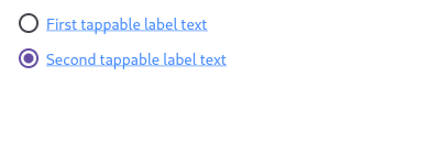
+//
+// Here is an example of a custom labeled radio widget, called
+// LinkedLabelRadio, that includes an interactive [RichText] widget that
+// handles tap gestures.
+
+//* ▲▲▲▲▲▲▲▲ description ▲▲▲▲▲▲▲▲ (do not modify or remove section marker)
+//***************************************************************************
+
+//****************************************************************************
+//* ▼▼▼▼▼▼▼▼ code-imports ▼▼▼▼▼▼▼▼ (do not modify or remove section marker)
+
+import 'package:flutter/gestures.dart';
+
+//* ▲▲▲▲▲▲▲▲ code-imports ▲▲▲▲▲▲▲▲ (do not modify or remove section marker)
+//****************************************************************************
+
+import 'package:flutter/material.dart';
+
+void main() => runApp(const MyApp());
+
+/// This is the main application widget.
+class MyApp extends StatelessWidget {
+ const MyApp({Key? key}) : super(key: key);
+
+ static const String _title = 'Flutter Code Sample';
+
+ @override
+ Widget build(BuildContext context) {
+ return MaterialApp(
+ title: _title,
+ home: Scaffold(
+ appBar: AppBar(title: const Text(_title)),
+ body: const MyStatefulWidget(),
+ ),
+ );
+ }
+}
+
+//*****************************************************************************
+//* ▼▼▼▼▼▼▼▼ code-preamble ▼▼▼▼▼▼▼▼ (do not modify or remove section marker)
+
+class LinkedLabelRadio extends StatelessWidget {
+ const LinkedLabelRadio({
+ Key? key,
+ required this.label,
+ required this.padding,
+ required this.groupValue,
+ required this.value,
+ required this.onChanged,
+ }) : super(key: key);
+
+ final String label;
+ final EdgeInsets padding;
+ final bool groupValue;
+ final bool value;
+ final ValueChanged<bool> onChanged;
+
+ @override
+ Widget build(BuildContext context) {
+ return Padding(
+ padding: padding,
+ child: Row(
+ children: <Widget>[
+ Radio<bool>(
+ groupValue: groupValue,
+ value: value,
+ onChanged: (bool? newValue) {
+ onChanged(newValue!);
+ }),
+ RichText(
+ text: TextSpan(
+ text: label,
+ style: const TextStyle(
+ color: Colors.blueAccent,
+ decoration: TextDecoration.underline,
+ ),
+ recognizer: TapGestureRecognizer()
+ ..onTap = () {
+ print('Label has been tapped.');
+ },
+ ),
+ ),
+ ],
+ ),
+ );
+ }
+}
+
+//* ▲▲▲▲▲▲▲▲ code-preamble ▲▲▲▲▲▲▲▲ (do not modify or remove section marker)
+//*****************************************************************************
+
+/// This is the stateful widget that the main application instantiates.
+class MyStatefulWidget extends StatefulWidget {
+ const MyStatefulWidget({Key? key}) : super(key: key);
+
+ @override
+ State<MyStatefulWidget> createState() => _MyStatefulWidgetState();
+}
+
+/// This is the private State class that goes with MyStatefulWidget.
+class _MyStatefulWidgetState extends State<MyStatefulWidget> {
+//********************************************************************
+//* ▼▼▼▼▼▼▼▼ code ▼▼▼▼▼▼▼▼ (do not modify or remove section marker)
+
+ bool _isRadioSelected = false;
+
+ @override
+ Widget build(BuildContext context) {
+ return Scaffold(
+ body: Column(
+ mainAxisAlignment: MainAxisAlignment.center,
+ children: <Widget>[
+ LinkedLabelRadio(
+ label: 'First tappable label text',
+ padding: const EdgeInsets.symmetric(horizontal: 5.0),
+ value: true,
+ groupValue: _isRadioSelected,
+ onChanged: (bool newValue) {
+ setState(() {
+ _isRadioSelected = newValue;
+ });
+ },
+ ),
+ LinkedLabelRadio(
+ label: 'Second tappable label text',
+ padding: const EdgeInsets.symmetric(horizontal: 5.0),
+ value: false,
+ groupValue: _isRadioSelected,
+ onChanged: (bool newValue) {
+ setState(() {
+ _isRadioSelected = newValue;
+ });
+ },
+ ),
+ ],
+ ),
+ );
+ }
+
+//* ▲▲▲▲▲▲▲▲ code ▲▲▲▲▲▲▲▲ (do not modify or remove section marker)
+//********************************************************************
+
+}
diff --git a/examples/api/lib/material/radio_list_tile/radio_list_tile.2.dart b/examples/api/lib/material/radio_list_tile/radio_list_tile.2.dart
new file mode 100644
index 0000000..968360c
--- /dev/null
+++ b/examples/api/lib/material/radio_list_tile/radio_list_tile.2.dart
@@ -0,0 +1,145 @@
+// Copyright 2014 The Flutter Authors. All rights reserved.
+// Use of this source code is governed by a BSD-style license that can be
+// found in the LICENSE file.
+
+// Template: dev/snippets/config/templates/stateful_widget_scaffold.tmpl
+//
+// Comment lines marked with "▼▼▼" and "▲▲▲" are used for authoring
+// of samples, and may be ignored if you are just exploring the sample.
+
+// Flutter code sample for RadioListTile
+//
+//***************************************************************************
+//* ▼▼▼▼▼▼▼▼ description ▼▼▼▼▼▼▼▼ (do not modify or remove section marker)
+
+// 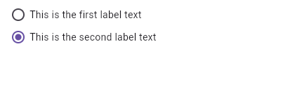
+//
+// Here is an example of a custom LabeledRadio widget, but you can easily
+// make your own configurable widget.
+
+//* ▲▲▲▲▲▲▲▲ description ▲▲▲▲▲▲▲▲ (do not modify or remove section marker)
+//***************************************************************************
+
+import 'package:flutter/material.dart';
+
+void main() => runApp(const MyApp());
+
+/// This is the main application widget.
+class MyApp extends StatelessWidget {
+ const MyApp({Key? key}) : super(key: key);
+
+ static const String _title = 'Flutter Code Sample';
+
+ @override
+ Widget build(BuildContext context) {
+ return MaterialApp(
+ title: _title,
+ home: Scaffold(
+ appBar: AppBar(title: const Text(_title)),
+ body: const MyStatefulWidget(),
+ ),
+ );
+ }
+}
+
+//*****************************************************************************
+//* ▼▼▼▼▼▼▼▼ code-preamble ▼▼▼▼▼▼▼▼ (do not modify or remove section marker)
+
+class LabeledRadio extends StatelessWidget {
+ const LabeledRadio({
+ Key? key,
+ required this.label,
+ required this.padding,
+ required this.groupValue,
+ required this.value,
+ required this.onChanged,
+ }) : super(key: key);
+
+ final String label;
+ final EdgeInsets padding;
+ final bool groupValue;
+ final bool value;
+ final ValueChanged<bool> onChanged;
+
+ @override
+ Widget build(BuildContext context) {
+ return InkWell(
+ onTap: () {
+ if (value != groupValue) {
+ onChanged(value);
+ }
+ },
+ child: Padding(
+ padding: padding,
+ child: Row(
+ children: <Widget>[
+ Radio<bool>(
+ groupValue: groupValue,
+ value: value,
+ onChanged: (bool? newValue) {
+ onChanged(newValue!);
+ },
+ ),
+ Text(label),
+ ],
+ ),
+ ),
+ );
+ }
+}
+
+//* ▲▲▲▲▲▲▲▲ code-preamble ▲▲▲▲▲▲▲▲ (do not modify or remove section marker)
+//*****************************************************************************
+
+/// This is the stateful widget that the main application instantiates.
+class MyStatefulWidget extends StatefulWidget {
+ const MyStatefulWidget({Key? key}) : super(key: key);
+
+ @override
+ State<MyStatefulWidget> createState() => _MyStatefulWidgetState();
+}
+
+/// This is the private State class that goes with MyStatefulWidget.
+class _MyStatefulWidgetState extends State<MyStatefulWidget> {
+//********************************************************************
+//* ▼▼▼▼▼▼▼▼ code ▼▼▼▼▼▼▼▼ (do not modify or remove section marker)
+
+ bool _isRadioSelected = false;
+
+ @override
+ Widget build(BuildContext context) {
+ return Scaffold(
+ body: Column(
+ mainAxisAlignment: MainAxisAlignment.center,
+ children: <LabeledRadio>[
+ LabeledRadio(
+ label: 'This is the first label text',
+ padding: const EdgeInsets.symmetric(horizontal: 5.0),
+ value: true,
+ groupValue: _isRadioSelected,
+ onChanged: (bool newValue) {
+ setState(() {
+ _isRadioSelected = newValue;
+ });
+ },
+ ),
+ LabeledRadio(
+ label: 'This is the second label text',
+ padding: const EdgeInsets.symmetric(horizontal: 5.0),
+ value: false,
+ groupValue: _isRadioSelected,
+ onChanged: (bool newValue) {
+ setState(() {
+ _isRadioSelected = newValue;
+ });
+ },
+ ),
+ ],
+ ),
+ );
+ }
+
+//* ▲▲▲▲▲▲▲▲ code ▲▲▲▲▲▲▲▲ (do not modify or remove section marker)
+//********************************************************************
+
+}
diff --git a/examples/api/lib/material/radio_list_tile/radio_list_tile.toggleable.0.dart b/examples/api/lib/material/radio_list_tile/radio_list_tile.toggleable.0.dart
new file mode 100644
index 0000000..1cde466
--- /dev/null
+++ b/examples/api/lib/material/radio_list_tile/radio_list_tile.toggleable.0.dart
@@ -0,0 +1,90 @@
+// Copyright 2014 The Flutter Authors. All rights reserved.
+// Use of this source code is governed by a BSD-style license that can be
+// found in the LICENSE file.
+
+// Template: dev/snippets/config/templates/stateful_widget_scaffold.tmpl
+//
+// Comment lines marked with "▼▼▼" and "▲▲▲" are used for authoring
+// of samples, and may be ignored if you are just exploring the sample.
+
+// Flutter code sample for RadioListTile.toggleable
+//
+//***************************************************************************
+//* ▼▼▼▼▼▼▼▼ description ▼▼▼▼▼▼▼▼ (do not modify or remove section marker)
+
+// This example shows how to enable deselecting a radio button by setting the
+// [toggleable] attribute.
+
+//* ▲▲▲▲▲▲▲▲ description ▲▲▲▲▲▲▲▲ (do not modify or remove section marker)
+//***************************************************************************
+
+import 'package:flutter/material.dart';
+
+void main() => runApp(const MyApp());
+
+/// This is the main application widget.
+class MyApp extends StatelessWidget {
+  const MyApp({Key? key}) : super(key: key);
+
+  static const String _title = 'Flutter Code Sample';
+
+  @override
+  Widget build(BuildContext context) {
+    return MaterialApp(
+      title: _title,
+      home: Scaffold(
+        appBar: AppBar(title: const Text(_title)),
+        body: const MyStatefulWidget(),
+      ),
+    );
+  }
+}
+
+/// This is the stateful widget that the main application instantiates.
+class MyStatefulWidget extends StatefulWidget {
+  const MyStatefulWidget({Key? key}) : super(key: key);
+
+  @override
+  State<MyStatefulWidget> createState() => _MyStatefulWidgetState();
+}
+
+/// This is the private State class that goes with MyStatefulWidget.
+class _MyStatefulWidgetState extends State<MyStatefulWidget> {
+//********************************************************************
+//* ▼▼▼▼▼▼▼▼ code ▼▼▼▼▼▼▼▼ (do not modify or remove section marker)
+
+  int? groupValue;
+  static const List<String> selections = <String>[
+    'Hercules Mulligan',
+    'Eliza Hamilton',
+    'Philip Schuyler',
+    'Maria Reynolds',
+    'Samuel Seabury',
+  ];
+
+  @override
+  Widget build(BuildContext context) {
+    return Scaffold(
+      body: ListView.builder(
+        itemBuilder: (BuildContext context, int index) {
+          return RadioListTile<int>(
+            value: index,
+            groupValue: groupValue,
+            toggleable: true,
+            title: Text(selections[index]),
+            onChanged: (int? value) {
+              setState(() {
+                groupValue = value;
+              });
+            },
+          );
+        },
+        itemCount: selections.length,
+      ),
+    );
+  }
+
+//* ▲▲▲▲▲▲▲▲ code ▲▲▲▲▲▲▲▲ (do not modify or remove section marker)
+//********************************************************************
+
+}
diff --git a/examples/api/lib/material/range_slider/range_slider.0.dart b/examples/api/lib/material/range_slider/range_slider.0.dart
new file mode 100644
index 0000000..56b414f
--- /dev/null
+++ b/examples/api/lib/material/range_slider/range_slider.0.dart
@@ -0,0 +1,84 @@
+// Copyright 2014 The Flutter Authors. All rights reserved.
+// Use of this source code is governed by a BSD-style license that can be
+// found in the LICENSE file.
+
+// Template: dev/snippets/config/templates/stateful_widget_scaffold.tmpl
+//
+// Comment lines marked with "▼▼▼" and "▲▲▲" are used for authoring
+// of samples, and may be ignored if you are just exploring the sample.
+
+// Flutter code sample for RangeSlider
+//
+//***************************************************************************
+//* ▼▼▼▼▼▼▼▼ description ▼▼▼▼▼▼▼▼ (do not modify or remove section marker)
+
+// 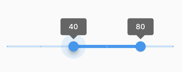
+//
+// This range values are in intervals of 20 because the Range Slider has 5
+// divisions, from 0 to 100. This means are values are split between 0, 20, 40,
+// 60, 80, and 100. The range values are initialized with 40 and 80 in this demo.
+
+//* ▲▲▲▲▲▲▲▲ description ▲▲▲▲▲▲▲▲ (do not modify or remove section marker)
+//***************************************************************************
+
+import 'package:flutter/material.dart';
+
+void main() => runApp(const MyApp());
+
+/// This is the main application widget.
+class MyApp extends StatelessWidget {
+ const MyApp({Key? key}) : super(key: key);
+
+ static const String _title = 'Flutter Code Sample';
+
+ @override
+ Widget build(BuildContext context) {
+ return MaterialApp(
+ title: _title,
+ home: Scaffold(
+ appBar: AppBar(title: const Text(_title)),
+ body: const MyStatefulWidget(),
+ ),
+ );
+ }
+}
+
+/// This is the stateful widget that the main application instantiates.
+class MyStatefulWidget extends StatefulWidget {
+ const MyStatefulWidget({Key? key}) : super(key: key);
+
+ @override
+ State<MyStatefulWidget> createState() => _MyStatefulWidgetState();
+}
+
+/// This is the private State class that goes with MyStatefulWidget.
+class _MyStatefulWidgetState extends State<MyStatefulWidget> {
+//********************************************************************
+//* ▼▼▼▼▼▼▼▼ code ▼▼▼▼▼▼▼▼ (do not modify or remove section marker)
+
+ RangeValues _currentRangeValues = const RangeValues(40, 80);
+
+ @override
+ Widget build(BuildContext context) {
+ return RangeSlider(
+ values: _currentRangeValues,
+ min: 0,
+ max: 100,
+ divisions: 5,
+ labels: RangeLabels(
+ _currentRangeValues.start.round().toString(),
+ _currentRangeValues.end.round().toString(),
+ ),
+ onChanged: (RangeValues values) {
+ setState(() {
+ _currentRangeValues = values;
+ });
+ },
+ );
+ }
+
+//* ▲▲▲▲▲▲▲▲ code ▲▲▲▲▲▲▲▲ (do not modify or remove section marker)
+//********************************************************************
+
+}
diff --git a/examples/api/lib/material/reorderable_list/reorderable_list_view.0.dart b/examples/api/lib/material/reorderable_list/reorderable_list_view.0.dart
new file mode 100644
index 0000000..76b8a1b
--- /dev/null
+++ b/examples/api/lib/material/reorderable_list/reorderable_list_view.0.dart
@@ -0,0 +1,88 @@
+// Copyright 2014 The Flutter Authors. All rights reserved.
+// Use of this source code is governed by a BSD-style license that can be
+// found in the LICENSE file.
+
+// Template: dev/snippets/config/templates/stateful_widget_scaffold.tmpl
+//
+// Comment lines marked with "▼▼▼" and "▲▲▲" are used for authoring
+// of samples, and may be ignored if you are just exploring the sample.
+
+// Flutter code sample for ReorderableListView
+//
+//***************************************************************************
+//* ▼▼▼▼▼▼▼▼ description ▼▼▼▼▼▼▼▼ (do not modify or remove section marker)
+
+//
+
+//* ▲▲▲▲▲▲▲▲ description ▲▲▲▲▲▲▲▲ (do not modify or remove section marker)
+//***************************************************************************
+
+import 'package:flutter/material.dart';
+
+void main() => runApp(const MyApp());
+
+/// This is the main application widget.
+class MyApp extends StatelessWidget {
+  const MyApp({Key? key}) : super(key: key);
+
+  static const String _title = 'Flutter Code Sample';
+
+  @override
+  Widget build(BuildContext context) {
+    return MaterialApp(
+      title: _title,
+      home: Scaffold(
+        appBar: AppBar(title: const Text(_title)),
+        body: const MyStatefulWidget(),
+      ),
+    );
+  }
+}
+
+/// This is the stateful widget that the main application instantiates.
+class MyStatefulWidget extends StatefulWidget {
+  const MyStatefulWidget({Key? key}) : super(key: key);
+
+  @override
+  State<MyStatefulWidget> createState() => _MyStatefulWidgetState();
+}
+
+/// This is the private State class that goes with MyStatefulWidget.
+class _MyStatefulWidgetState extends State<MyStatefulWidget> {
+//********************************************************************
+//* ▼▼▼▼▼▼▼▼ code ▼▼▼▼▼▼▼▼ (do not modify or remove section marker)
+
+  final List<int> _items = List<int>.generate(50, (int index) => index);
+
+  @override
+  Widget build(BuildContext context) {
+    final ColorScheme colorScheme = Theme.of(context).colorScheme;
+    final Color oddItemColor = colorScheme.primary.withOpacity(0.05);
+    final Color evenItemColor = colorScheme.primary.withOpacity(0.15);
+
+    return ReorderableListView(
+      padding: const EdgeInsets.symmetric(horizontal: 40),
+      children: <Widget>[
+        for (int index = 0; index < _items.length; index++)
+          ListTile(
+            key: Key('$index'),
+            tileColor: _items[index].isOdd ? oddItemColor : evenItemColor,
+            title: Text('Item ${_items[index]}'),
+          ),
+      ],
+      onReorder: (int oldIndex, int newIndex) {
+        setState(() {
+          if (oldIndex < newIndex) {
+            newIndex -= 1;
+          }
+          final int item = _items.removeAt(oldIndex);
+          _items.insert(newIndex, item);
+        });
+      },
+    );
+  }
+
+//* ▲▲▲▲▲▲▲▲ code ▲▲▲▲▲▲▲▲ (do not modify or remove section marker)
+//********************************************************************
+
+}
diff --git a/examples/api/lib/material/reorderable_list/reorderable_list_view.build_default_drag_handles.0.dart b/examples/api/lib/material/reorderable_list/reorderable_list_view.build_default_drag_handles.0.dart
new file mode 100644
index 0000000..bd0ad6b
--- /dev/null
+++ b/examples/api/lib/material/reorderable_list/reorderable_list_view.build_default_drag_handles.0.dart
@@ -0,0 +1,104 @@
+// Copyright 2014 The Flutter Authors. All rights reserved.
+// Use of this source code is governed by a BSD-style license that can be
+// found in the LICENSE file.
+
+// Template: dev/snippets/config/templates/stateful_widget_scaffold.tmpl
+//
+// Comment lines marked with "▼▼▼" and "▲▲▲" are used for authoring
+// of samples, and may be ignored if you are just exploring the sample.
+
+// Flutter code sample for ReorderableListView.buildDefaultDragHandles
+//
+//***************************************************************************
+//* ▼▼▼▼▼▼▼▼ description ▼▼▼▼▼▼▼▼ (do not modify or remove section marker)
+
+//
+
+//* ▲▲▲▲▲▲▲▲ description ▲▲▲▲▲▲▲▲ (do not modify or remove section marker)
+//***************************************************************************
+
+import 'package:flutter/material.dart';
+
+void main() => runApp(const MyApp());
+
+/// This is the main application widget.
+class MyApp extends StatelessWidget {
+  const MyApp({Key? key}) : super(key: key);
+
+  static const String _title = 'Flutter Code Sample';
+
+  @override
+  Widget build(BuildContext context) {
+    return MaterialApp(
+      title: _title,
+      home: Scaffold(
+        appBar: AppBar(title: const Text(_title)),
+        body: const MyStatefulWidget(),
+      ),
+    );
+  }
+}
+
+/// This is the stateful widget that the main application instantiates.
+class MyStatefulWidget extends StatefulWidget {
+  const MyStatefulWidget({Key? key}) : super(key: key);
+
+  @override
+  State<MyStatefulWidget> createState() => _MyStatefulWidgetState();
+}
+
+/// This is the private State class that goes with MyStatefulWidget.
+class _MyStatefulWidgetState extends State<MyStatefulWidget> {
+//********************************************************************
+//* ▼▼▼▼▼▼▼▼ code ▼▼▼▼▼▼▼▼ (do not modify or remove section marker)
+
+  final List<int> _items = List<int>.generate(50, (int index) => index);
+
+  @override
+  Widget build(BuildContext context) {
+    final ColorScheme colorScheme = Theme.of(context).colorScheme;
+    final Color oddItemColor = colorScheme.primary.withOpacity(0.05);
+    final Color evenItemColor = colorScheme.primary.withOpacity(0.15);
+
+    return ReorderableListView(
+      buildDefaultDragHandles: false,
+      children: <Widget>[
+        for (int index = 0; index < _items.length; index++)
+          Container(
+            key: Key('$index'),
+            color: _items[index].isOdd ? oddItemColor : evenItemColor,
+            child: Row(
+              children: <Widget>[
+                Container(
+                  width: 64,
+                  height: 64,
+                  padding: const EdgeInsets.all(8),
+                  child: ReorderableDragStartListener(
+                    index: index,
+                    child: Card(
+                      color: colorScheme.primary,
+                      elevation: 2,
+                    ),
+                  ),
+                ),
+                Text('Item ${_items[index]}'),
+              ],
+            ),
+          ),
+      ],
+      onReorder: (int oldIndex, int newIndex) {
+        setState(() {
+          if (oldIndex < newIndex) {
+            newIndex -= 1;
+          }
+          final int item = _items.removeAt(oldIndex);
+          _items.insert(newIndex, item);
+        });
+      },
+    );
+  }
+
+//* ▲▲▲▲▲▲▲▲ code ▲▲▲▲▲▲▲▲ (do not modify or remove section marker)
+//********************************************************************
+
+}
diff --git a/examples/api/lib/material/reorderable_list/reorderable_list_view.reorderable_list_view_builder.0.dart b/examples/api/lib/material/reorderable_list/reorderable_list_view.reorderable_list_view_builder.0.dart
new file mode 100644
index 0000000..2f22157
--- /dev/null
+++ b/examples/api/lib/material/reorderable_list/reorderable_list_view.reorderable_list_view_builder.0.dart
@@ -0,0 +1,85 @@
+// Copyright 2014 The Flutter Authors. All rights reserved.
+// Use of this source code is governed by a BSD-style license that can be
+// found in the LICENSE file.
+
+// Template: dev/snippets/config/templates/stateful_widget_material.tmpl
+//
+// Comment lines marked with "▼▼▼" and "▲▲▲" are used for authoring
+// of samples, and may be ignored if you are just exploring the sample.
+
+// Flutter code sample for ReorderableListView.ReorderableListView.builder
+//
+//***************************************************************************
+//* ▼▼▼▼▼▼▼▼ description ▼▼▼▼▼▼▼▼ (do not modify or remove section marker)
+
+//
+
+//* ▲▲▲▲▲▲▲▲ description ▲▲▲▲▲▲▲▲ (do not modify or remove section marker)
+//***************************************************************************
+
+import 'package:flutter/material.dart';
+
+void main() => runApp(const MyApp());
+
+/// This is the main application widget.
+class MyApp extends StatelessWidget {
+  const MyApp({Key? key}) : super(key: key);
+
+  static const String _title = 'Flutter Code Sample';
+
+  @override
+  Widget build(BuildContext context) {
+    return const MaterialApp(
+      title: _title,
+      home: MyStatefulWidget(),
+    );
+  }
+}
+
+/// This is the stateful widget that the main application instantiates.
+class MyStatefulWidget extends StatefulWidget {
+  const MyStatefulWidget({Key? key}) : super(key: key);
+
+  @override
+  State<MyStatefulWidget> createState() => _MyStatefulWidgetState();
+}
+
+/// This is the private State class that goes with MyStatefulWidget.
+class _MyStatefulWidgetState extends State<MyStatefulWidget> {
+//********************************************************************
+//* ▼▼▼▼▼▼▼▼ code ▼▼▼▼▼▼▼▼ (do not modify or remove section marker)
+
+  final List<int> _items = List<int>.generate(50, (int index) => index);
+
+  @override
+  Widget build(BuildContext context) {
+    final ColorScheme colorScheme = Theme.of(context).colorScheme;
+    final Color oddItemColor = colorScheme.primary.withOpacity(0.05);
+    final Color evenItemColor = colorScheme.primary.withOpacity(0.15);
+
+    return ReorderableListView.builder(
+      padding: const EdgeInsets.symmetric(horizontal: 40),
+      itemCount: _items.length,
+      itemBuilder: (BuildContext context, int index) {
+        return ListTile(
+          key: Key('$index'),
+          tileColor: _items[index].isOdd ? oddItemColor : evenItemColor,
+          title: Text('Item ${_items[index]}'),
+        );
+      },
+      onReorder: (int oldIndex, int newIndex) {
+        setState(() {
+          if (oldIndex < newIndex) {
+            newIndex -= 1;
+          }
+          final int item = _items.removeAt(oldIndex);
+          _items.insert(newIndex, item);
+        });
+      },
+    );
+  }
+
+//* ▲▲▲▲▲▲▲▲ code ▲▲▲▲▲▲▲▲ (do not modify or remove section marker)
+//********************************************************************
+
+}
diff --git a/examples/api/lib/material/scaffold/scaffold.0.dart b/examples/api/lib/material/scaffold/scaffold.0.dart
new file mode 100644
index 0000000..7026226
--- /dev/null
+++ b/examples/api/lib/material/scaffold/scaffold.0.dart
@@ -0,0 +1,77 @@
+// Copyright 2014 The Flutter Authors. All rights reserved.
+// Use of this source code is governed by a BSD-style license that can be
+// found in the LICENSE file.
+
+// Template: dev/snippets/config/templates/stateful_widget_material.tmpl
+//
+// Comment lines marked with "▼▼▼" and "▲▲▲" are used for authoring
+// of samples, and may be ignored if you are just exploring the sample.
+
+// Flutter code sample for Scaffold
+//
+//***************************************************************************
+//* ▼▼▼▼▼▼▼▼ description ▼▼▼▼▼▼▼▼ (do not modify or remove section marker)
+
+// This example shows a [Scaffold] with a [body] and [FloatingActionButton].
+// The [body] is a [Text] placed in a [Center] in order to center the text
+// within the [Scaffold]. The [FloatingActionButton] is connected to a
+// callback that increments a counter.
+//
+// 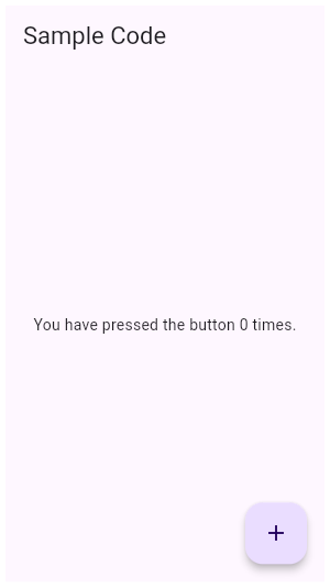
+
+//* ▲▲▲▲▲▲▲▲ description ▲▲▲▲▲▲▲▲ (do not modify or remove section marker)
+//***************************************************************************
+
+import 'package:flutter/material.dart';
+
+void main() => runApp(const MyApp());
+
+/// This is the main application widget.
+class MyApp extends StatelessWidget {
+ const MyApp({Key? key}) : super(key: key);
+
+ static const String _title = 'Flutter Code Sample';
+
+ @override
+ Widget build(BuildContext context) {
+ return const MaterialApp(
+ title: _title,
+ home: MyStatefulWidget(),
+ );
+ }
+}
+
+/// This is the stateful widget that the main application instantiates.
+class MyStatefulWidget extends StatefulWidget {
+ const MyStatefulWidget({Key? key}) : super(key: key);
+
+ @override
+ State<MyStatefulWidget> createState() => _MyStatefulWidgetState();
+}
+
+/// This is the private State class that goes with MyStatefulWidget.
+class _MyStatefulWidgetState extends State<MyStatefulWidget> {
+//********************************************************************
+//* ▼▼▼▼▼▼▼▼ code ▼▼▼▼▼▼▼▼ (do not modify or remove section marker)
+
+ int _count = 0;
+
+ @override
+ Widget build(BuildContext context) {
+ return Scaffold(
+ appBar: AppBar(
+ title: const Text('Sample Code'),
+ ),
+ body: Center(child: Text('You have pressed the button $_count times.')),
+ floatingActionButton: FloatingActionButton(
+ onPressed: () => setState(() => _count++),
+ tooltip: 'Increment Counter',
+ child: const Icon(Icons.add),
+ ),
+ );
+ }
+
+//* ▲▲▲▲▲▲▲▲ code ▲▲▲▲▲▲▲▲ (do not modify or remove section marker)
+//********************************************************************
+
+}
diff --git a/examples/api/lib/material/scaffold/scaffold.1.dart b/examples/api/lib/material/scaffold/scaffold.1.dart
new file mode 100644
index 0000000..8b84ce8
--- /dev/null
+++ b/examples/api/lib/material/scaffold/scaffold.1.dart
@@ -0,0 +1,78 @@
+// Copyright 2014 The Flutter Authors. All rights reserved.
+// Use of this source code is governed by a BSD-style license that can be
+// found in the LICENSE file.
+
+// Template: dev/snippets/config/templates/stateful_widget_material.tmpl
+//
+// Comment lines marked with "▼▼▼" and "▲▲▲" are used for authoring
+// of samples, and may be ignored if you are just exploring the sample.
+
+// Flutter code sample for Scaffold
+//
+//***************************************************************************
+//* ▼▼▼▼▼▼▼▼ description ▼▼▼▼▼▼▼▼ (do not modify or remove section marker)
+
+// This example shows a [Scaffold] with a blueGrey [backgroundColor], [body]
+// and [FloatingActionButton]. The [body] is a [Text] placed in a [Center] in
+// order to center the text within the [Scaffold]. The [FloatingActionButton]
+// is connected to a callback that increments a counter.
+//
+// 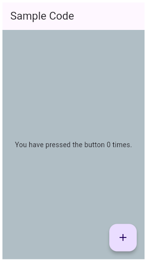
+
+//* ▲▲▲▲▲▲▲▲ description ▲▲▲▲▲▲▲▲ (do not modify or remove section marker)
+//***************************************************************************
+
+import 'package:flutter/material.dart';
+
+void main() => runApp(const MyApp());
+
+/// This is the main application widget.
+class MyApp extends StatelessWidget {
+ const MyApp({Key? key}) : super(key: key);
+
+ static const String _title = 'Flutter Code Sample';
+
+ @override
+ Widget build(BuildContext context) {
+ return const MaterialApp(
+ title: _title,
+ home: MyStatefulWidget(),
+ );
+ }
+}
+
+/// This is the stateful widget that the main application instantiates.
+class MyStatefulWidget extends StatefulWidget {
+ const MyStatefulWidget({Key? key}) : super(key: key);
+
+ @override
+ State<MyStatefulWidget> createState() => _MyStatefulWidgetState();
+}
+
+/// This is the private State class that goes with MyStatefulWidget.
+class _MyStatefulWidgetState extends State<MyStatefulWidget> {
+//********************************************************************
+//* ▼▼▼▼▼▼▼▼ code ▼▼▼▼▼▼▼▼ (do not modify or remove section marker)
+
+ int _count = 0;
+
+ @override
+ Widget build(BuildContext context) {
+ return Scaffold(
+ appBar: AppBar(
+ title: const Text('Sample Code'),
+ ),
+ body: Center(child: Text('You have pressed the button $_count times.')),
+ backgroundColor: Colors.blueGrey.shade200,
+ floatingActionButton: FloatingActionButton(
+ onPressed: () => setState(() => _count++),
+ tooltip: 'Increment Counter',
+ child: const Icon(Icons.add),
+ ),
+ );
+ }
+
+//* ▲▲▲▲▲▲▲▲ code ▲▲▲▲▲▲▲▲ (do not modify or remove section marker)
+//********************************************************************
+
+}
diff --git a/examples/api/lib/material/scaffold/scaffold.2.dart b/examples/api/lib/material/scaffold/scaffold.2.dart
new file mode 100644
index 0000000..cf27d3d
--- /dev/null
+++ b/examples/api/lib/material/scaffold/scaffold.2.dart
@@ -0,0 +1,88 @@
+// Copyright 2014 The Flutter Authors. All rights reserved.
+// Use of this source code is governed by a BSD-style license that can be
+// found in the LICENSE file.
+
+// Template: dev/snippets/config/templates/stateful_widget_material.tmpl
+//
+// Comment lines marked with "▼▼▼" and "▲▲▲" are used for authoring
+// of samples, and may be ignored if you are just exploring the sample.
+
+// Flutter code sample for Scaffold
+//
+//***************************************************************************
+//* ▼▼▼▼▼▼▼▼ description ▼▼▼▼▼▼▼▼ (do not modify or remove section marker)
+
+// This example shows a [Scaffold] with an [AppBar], a [BottomAppBar] and a
+// [FloatingActionButton]. The [body] is a [Text] placed in a [Center] in order
+// to center the text within the [Scaffold]. The [FloatingActionButton] is
+// centered and docked within the [BottomAppBar] using
+// [FloatingActionButtonLocation.centerDocked]. The [FloatingActionButton] is
+// connected to a callback that increments a counter.
+//
+// 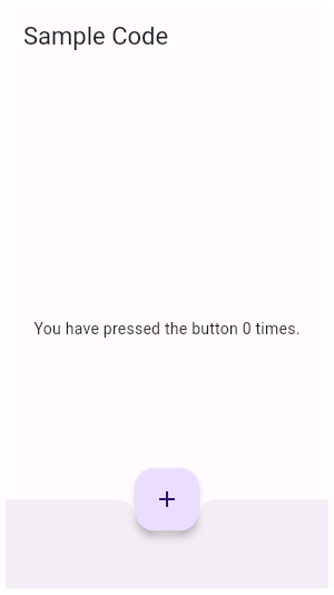
+
+//* ▲▲▲▲▲▲▲▲ description ▲▲▲▲▲▲▲▲ (do not modify or remove section marker)
+//***************************************************************************
+
+import 'package:flutter/material.dart';
+
+void main() => runApp(const MyApp());
+
+/// This is the main application widget.
+class MyApp extends StatelessWidget {
+ const MyApp({Key? key}) : super(key: key);
+
+ static const String _title = 'Flutter Code Sample';
+
+ @override
+ Widget build(BuildContext context) {
+ return const MaterialApp(
+ title: _title,
+ home: MyStatefulWidget(),
+ );
+ }
+}
+
+/// This is the stateful widget that the main application instantiates.
+class MyStatefulWidget extends StatefulWidget {
+ const MyStatefulWidget({Key? key}) : super(key: key);
+
+ @override
+ State<MyStatefulWidget> createState() => _MyStatefulWidgetState();
+}
+
+/// This is the private State class that goes with MyStatefulWidget.
+class _MyStatefulWidgetState extends State<MyStatefulWidget> {
+//********************************************************************
+//* ▼▼▼▼▼▼▼▼ code ▼▼▼▼▼▼▼▼ (do not modify or remove section marker)
+
+ int _count = 0;
+
+ @override
+ Widget build(BuildContext context) {
+ return Scaffold(
+ appBar: AppBar(
+ title: const Text('Sample Code'),
+ ),
+ body: Center(
+ child: Text('You have pressed the button $_count times.'),
+ ),
+ bottomNavigationBar: BottomAppBar(
+ shape: const CircularNotchedRectangle(),
+ child: Container(height: 50.0),
+ ),
+ floatingActionButton: FloatingActionButton(
+ onPressed: () => setState(() {
+ _count++;
+ }),
+ tooltip: 'Increment Counter',
+ child: const Icon(Icons.add),
+ ),
+ floatingActionButtonLocation: FloatingActionButtonLocation.centerDocked,
+ );
+ }
+
+//* ▲▲▲▲▲▲▲▲ code ▲▲▲▲▲▲▲▲ (do not modify or remove section marker)
+//********************************************************************
+
+}
diff --git a/examples/api/lib/material/scaffold/scaffold.drawer.0.dart b/examples/api/lib/material/scaffold/scaffold.drawer.0.dart
new file mode 100644
index 0000000..906e260
--- /dev/null
+++ b/examples/api/lib/material/scaffold/scaffold.drawer.0.dart
@@ -0,0 +1,98 @@
+// Copyright 2014 The Flutter Authors. All rights reserved.
+// Use of this source code is governed by a BSD-style license that can be
+// found in the LICENSE file.
+
+// Template: dev/snippets/config/templates/stateful_widget_material.tmpl
+//
+// Comment lines marked with "▼▼▼" and "▲▲▲" are used for authoring
+// of samples, and may be ignored if you are just exploring the sample.
+
+// Flutter code sample for Scaffold.drawer
+//
+//***************************************************************************
+//* ▼▼▼▼▼▼▼▼ description ▼▼▼▼▼▼▼▼ (do not modify or remove section marker)
+
+// To disable the drawer edge swipe, set the
+// [Scaffold.drawerEnableOpenDragGesture] to false. Then, use
+// [ScaffoldState.openDrawer] to open the drawer and [Navigator.pop] to close
+// it.
+
+//* ▲▲▲▲▲▲▲▲ description ▲▲▲▲▲▲▲▲ (do not modify or remove section marker)
+//***************************************************************************
+
+import 'package:flutter/material.dart';
+
+void main() => runApp(const MyApp());
+
+/// This is the main application widget.
+class MyApp extends StatelessWidget {
+  const MyApp({Key? key}) : super(key: key);
+
+  static const String _title = 'Flutter Code Sample';
+
+  @override
+  Widget build(BuildContext context) {
+    return const MaterialApp(
+      title: _title,
+      home: MyStatefulWidget(),
+    );
+  }
+}
+
+/// This is the stateful widget that the main application instantiates.
+class MyStatefulWidget extends StatefulWidget {
+  const MyStatefulWidget({Key? key}) : super(key: key);
+
+  @override
+  State<MyStatefulWidget> createState() => _MyStatefulWidgetState();
+}
+
+/// This is the private State class that goes with MyStatefulWidget.
+class _MyStatefulWidgetState extends State<MyStatefulWidget> {
+//********************************************************************
+//* ▼▼▼▼▼▼▼▼ code ▼▼▼▼▼▼▼▼ (do not modify or remove section marker)
+
+  final GlobalKey<ScaffoldState> _scaffoldKey = GlobalKey<ScaffoldState>();
+
+  void _openDrawer() {
+    _scaffoldKey.currentState!.openDrawer();
+  }
+
+  void _closeDrawer() {
+    Navigator.of(context).pop();
+  }
+
+  @override
+  Widget build(BuildContext context) {
+    return Scaffold(
+      key: _scaffoldKey,
+      appBar: AppBar(title: const Text('Drawer Demo')),
+      body: Center(
+        child: ElevatedButton(
+          onPressed: _openDrawer,
+          child: const Text('Open Drawer'),
+        ),
+      ),
+      drawer: Drawer(
+        child: Center(
+          child: Column(
+            mainAxisAlignment: MainAxisAlignment.center,
+            children: <Widget>[
+              const Text('This is the Drawer'),
+              ElevatedButton(
+                onPressed: _closeDrawer,
+                child: const Text('Close Drawer'),
+              ),
+            ],
+          ),
+        ),
+      ),
+      // Disable opening the drawer with a swipe gesture.
+      drawerEnableOpenDragGesture: false,
+    );
+  }
+
+//* ▲▲▲▲▲▲▲▲ code ▲▲▲▲▲▲▲▲ (do not modify or remove section marker)
+//********************************************************************
+
+}
diff --git a/examples/api/lib/material/scaffold/scaffold.end_drawer.0.dart b/examples/api/lib/material/scaffold/scaffold.end_drawer.0.dart
new file mode 100644
index 0000000..9930556
--- /dev/null
+++ b/examples/api/lib/material/scaffold/scaffold.end_drawer.0.dart
@@ -0,0 +1,98 @@
+// Copyright 2014 The Flutter Authors. All rights reserved.
+// Use of this source code is governed by a BSD-style license that can be
+// found in the LICENSE file.
+
+// Template: dev/snippets/config/templates/stateful_widget_material.tmpl
+//
+// Comment lines marked with "▼▼▼" and "▲▲▲" are used for authoring
+// of samples, and may be ignored if you are just exploring the sample.
+
+// Flutter code sample for Scaffold.endDrawer
+//
+//***************************************************************************
+//* ▼▼▼▼▼▼▼▼ description ▼▼▼▼▼▼▼▼ (do not modify or remove section marker)
+
+// To disable the drawer edge swipe, set the
+// [Scaffold.endDrawerEnableOpenDragGesture] to false. Then, use
+// [ScaffoldState.openEndDrawer] to open the drawer and [Navigator.pop] to
+// close it.
+
+//* ▲▲▲▲▲▲▲▲ description ▲▲▲▲▲▲▲▲ (do not modify or remove section marker)
+//***************************************************************************
+
+import 'package:flutter/material.dart';
+
+void main() => runApp(const MyApp());
+
+/// This is the main application widget.
+class MyApp extends StatelessWidget {
+  const MyApp({Key? key}) : super(key: key);
+
+  static const String _title = 'Flutter Code Sample';
+
+  @override
+  Widget build(BuildContext context) {
+    return const MaterialApp(
+      title: _title,
+      home: MyStatefulWidget(),
+    );
+  }
+}
+
+/// This is the stateful widget that the main application instantiates.
+class MyStatefulWidget extends StatefulWidget {
+  const MyStatefulWidget({Key? key}) : super(key: key);
+
+  @override
+  State<MyStatefulWidget> createState() => _MyStatefulWidgetState();
+}
+
+/// This is the private State class that goes with MyStatefulWidget.
+class _MyStatefulWidgetState extends State<MyStatefulWidget> {
+//********************************************************************
+//* ▼▼▼▼▼▼▼▼ code ▼▼▼▼▼▼▼▼ (do not modify or remove section marker)
+
+  final GlobalKey<ScaffoldState> _scaffoldKey = GlobalKey<ScaffoldState>();
+
+  void _openEndDrawer() {
+    _scaffoldKey.currentState!.openEndDrawer();
+  }
+
+  void _closeEndDrawer() {
+    Navigator.of(context).pop();
+  }
+
+  @override
+  Widget build(BuildContext context) {
+    return Scaffold(
+      key: _scaffoldKey,
+      appBar: AppBar(title: const Text('Drawer Demo')),
+      body: Center(
+        child: ElevatedButton(
+          onPressed: _openEndDrawer,
+          child: const Text('Open End Drawer'),
+        ),
+      ),
+      endDrawer: Drawer(
+        child: Center(
+          child: Column(
+            mainAxisAlignment: MainAxisAlignment.center,
+            children: <Widget>[
+              const Text('This is the Drawer'),
+              ElevatedButton(
+                onPressed: _closeEndDrawer,
+                child: const Text('Close Drawer'),
+              ),
+            ],
+          ),
+        ),
+      ),
+      // Disable opening the end drawer with a swipe gesture.
+      endDrawerEnableOpenDragGesture: false,
+    );
+  }
+
+//* ▲▲▲▲▲▲▲▲ code ▲▲▲▲▲▲▲▲ (do not modify or remove section marker)
+//********************************************************************
+
+}
diff --git a/examples/api/lib/material/scaffold/scaffold.of.0.dart b/examples/api/lib/material/scaffold/scaffold.of.0.dart
new file mode 100644
index 0000000..817be5a
--- /dev/null
+++ b/examples/api/lib/material/scaffold/scaffold.of.0.dart
@@ -0,0 +1,105 @@
+// Copyright 2014 The Flutter Authors. All rights reserved.
+// Use of this source code is governed by a BSD-style license that can be
+// found in the LICENSE file.
+
+// Template: dev/snippets/config/templates/freeform.tmpl
+//
+// Comment lines marked with "▼▼▼" and "▲▲▲" are used for authoring
+// of samples, and may be ignored if you are just exploring the sample.
+
+// Flutter code sample for Scaffold.of
+//
+//***************************************************************************
+//* ▼▼▼▼▼▼▼▼ description ▼▼▼▼▼▼▼▼ (do not modify or remove section marker)
+
+// Typical usage of the [Scaffold.of] function is to call it from within the
+// `build` method of a child of a [Scaffold].
+
+//* ▲▲▲▲▲▲▲▲ description ▲▲▲▲▲▲▲▲ (do not modify or remove section marker)
+//***************************************************************************
+
+//****************************************************************************
+//* ▼▼▼▼▼▼▼▼ code-imports ▼▼▼▼▼▼▼▼ (do not modify or remove section marker)
+
+import 'package:flutter/material.dart';
+
+//* ▲▲▲▲▲▲▲▲ code-imports ▲▲▲▲▲▲▲▲ (do not modify or remove section marker)
+//****************************************************************************
+
+//*************************************************************************
+//* ▼▼▼▼▼▼▼▼ code-main ▼▼▼▼▼▼▼▼ (do not modify or remove section marker)
+
+void main() => runApp(const MyApp());
+
+//* ▲▲▲▲▲▲▲▲ code-main ▲▲▲▲▲▲▲▲ (do not modify or remove section marker)
+//*************************************************************************
+
+//*****************************************************************************
+//* ▼▼▼▼▼▼▼▼ code-preamble ▼▼▼▼▼▼▼▼ (do not modify or remove section marker)
+
+class MyApp extends StatelessWidget {
+  const MyApp({Key? key}) : super(key: key);
+
+  // This widget is the root of your application.
+  @override
+  Widget build(BuildContext context) {
+    return MaterialApp(
+      title: 'Flutter Code Sample for Scaffold.of.',
+      theme: ThemeData(
+        primarySwatch: Colors.blue,
+      ),
+      home: Scaffold(
+        body: const MyScaffoldBody(),
+        appBar: AppBar(title: const Text('Scaffold.of Example')),
+      ),
+      color: Colors.white,
+    );
+  }
+}
+
+//* ▲▲▲▲▲▲▲▲ code-preamble ▲▲▲▲▲▲▲▲ (do not modify or remove section marker)
+//*****************************************************************************
+
+//********************************************************************
+//* ▼▼▼▼▼▼▼▼ code ▼▼▼▼▼▼▼▼ (do not modify or remove section marker)
+
+class MyScaffoldBody extends StatelessWidget {
+  const MyScaffoldBody({Key? key}) : super(key: key);
+
+  @override
+  Widget build(BuildContext context) {
+    return Center(
+      child: ElevatedButton(
+        child: const Text('SHOW BOTTOM SHEET'),
+        onPressed: () {
+          Scaffold.of(context).showBottomSheet<void>(
+            (BuildContext context) {
+              return Container(
+                alignment: Alignment.center,
+                height: 200,
+                color: Colors.amber,
+                child: Center(
+                  child: Column(
+                    mainAxisSize: MainAxisSize.min,
+                    children: <Widget>[
+                      const Text('BottomSheet'),
+                      ElevatedButton(
+                        child: const Text('Close BottomSheet'),
+                        onPressed: () {
+                          Navigator.pop(context);
+                        },
+                      )
+                    ],
+                  ),
+                ),
+              );
+            },
+          );
+        },
+      ),
+    );
+  }
+}
+
+//* ▲▲▲▲▲▲▲▲ code ▲▲▲▲▲▲▲▲ (do not modify or remove section marker)
+//********************************************************************
diff --git a/examples/api/lib/material/scaffold/scaffold.of.1.dart b/examples/api/lib/material/scaffold/scaffold.of.1.dart
new file mode 100644
index 0000000..045af59
--- /dev/null
+++ b/examples/api/lib/material/scaffold/scaffold.of.1.dart
@@ -0,0 +1,97 @@
+// Copyright 2014 The Flutter Authors. All rights reserved.
+// Use of this source code is governed by a BSD-style license that can be
+// found in the LICENSE file.
+
+// Template: dev/snippets/config/templates/stateless_widget_material.tmpl
+//
+// Comment lines marked with "▼▼▼" and "▲▲▲" are used for authoring
+// of samples, and may be ignored if you are just exploring the sample.
+
+// Flutter code sample for Scaffold.of
+//
+//***************************************************************************
+//* ▼▼▼▼▼▼▼▼ description ▼▼▼▼▼▼▼▼ (do not modify or remove section marker)
+
+// When the [Scaffold] is actually created in the same `build` function, the
+// `context` argument to the `build` function can't be used to find the
+// [Scaffold] (since it's "above" the widget being returned in the widget
+// tree). In such cases, the following technique with a [Builder] can be used
+// to provide a new scope with a [BuildContext] that is "under" the
+// [Scaffold]:
+
+//* ▲▲▲▲▲▲▲▲ description ▲▲▲▲▲▲▲▲ (do not modify or remove section marker)
+//***************************************************************************
+
+import 'package:flutter/material.dart';
+
+void main() => runApp(const MyApp());
+
+/// This is the main application widget.
+class MyApp extends StatelessWidget {
+  const MyApp({Key? key}) : super(key: key);
+
+  static const String _title = 'Flutter Code Sample';
+
+  @override
+  Widget build(BuildContext context) {
+    return const MaterialApp(
+      title: _title,
+      home: MyStatelessWidget(),
+    );
+  }
+}
+
+/// This is the stateless widget that the main application instantiates.
+class MyStatelessWidget extends StatelessWidget {
+  const MyStatelessWidget({Key? key}) : super(key: key);
+
+  @override
+//********************************************************************
+//* ▼▼▼▼▼▼▼▼ code ▼▼▼▼▼▼▼▼ (do not modify or remove section marker)
+
+  Widget build(BuildContext context) {
+    return Scaffold(
+      appBar: AppBar(title: const Text('Demo')),
+      body: Builder(
+        // Create an inner BuildContext so that the onPressed methods
+        // can refer to the Scaffold with Scaffold.of().
+        builder: (BuildContext context) {
+          return Center(
+            child: ElevatedButton(
+              child: const Text('SHOW BOTTOM SHEET'),
+              onPressed: () {
+                Scaffold.of(context).showBottomSheet<void>(
+                  (BuildContext context) {
+                    return Container(
+                      alignment: Alignment.center,
+                      height: 200,
+                      color: Colors.amber,
+                      child: Center(
+                        child: Column(
+                          mainAxisSize: MainAxisSize.min,
+                          children: <Widget>[
+                            const Text('BottomSheet'),
+                            ElevatedButton(
+                              child: const Text('Close BottomSheet'),
+                              onPressed: () {
+                                Navigator.pop(context);
+                              },
+                            )
+                          ],
+                        ),
+                      ),
+                    );
+                  },
+                );
+              },
+            ),
+          );
+        },
+      ),
+    );
+  }
+
+//* ▲▲▲▲▲▲▲▲ code ▲▲▲▲▲▲▲▲ (do not modify or remove section marker)
+//********************************************************************
+
+}
diff --git a/examples/api/lib/material/scaffold/scaffold_messenger.0.dart b/examples/api/lib/material/scaffold/scaffold_messenger.0.dart
new file mode 100644
index 0000000..273e65a
--- /dev/null
+++ b/examples/api/lib/material/scaffold/scaffold_messenger.0.dart
@@ -0,0 +1,68 @@
+// Copyright 2014 The Flutter Authors. All rights reserved.
+// Use of this source code is governed by a BSD-style license that can be
+// found in the LICENSE file.
+
+// Template: dev/snippets/config/templates/stateless_widget_scaffold_center.tmpl
+//
+// Comment lines marked with "▼▼▼" and "▲▲▲" are used for authoring
+// of samples, and may be ignored if you are just exploring the sample.
+
+// Flutter code sample for ScaffoldMessenger
+//
+//***************************************************************************
+//* ▼▼▼▼▼▼▼▼ description ▼▼▼▼▼▼▼▼ (do not modify or remove section marker)
+
+// Here is an example of showing a [SnackBar] when the user presses a button.
+
+//* ▲▲▲▲▲▲▲▲ description ▲▲▲▲▲▲▲▲ (do not modify or remove section marker)
+//***************************************************************************
+
+import 'package:flutter/material.dart';
+
+void main() => runApp(const MyApp());
+
+/// This is the main application widget.
+class MyApp extends StatelessWidget {
+  const MyApp({Key? key}) : super(key: key);
+
+  static const String _title = 'Flutter Code Sample';
+
+  @override
+  Widget build(BuildContext context) {
+    return MaterialApp(
+      title: _title,
+      home: Scaffold(
+        appBar: AppBar(title: const Text(_title)),
+        body: const Center(
+          child: MyStatelessWidget(),
+        ),
+      ),
+    );
+  }
+}
+
+/// This is the stateless widget that the main application instantiates.
+class MyStatelessWidget extends StatelessWidget {
+  const MyStatelessWidget({Key? key}) : super(key: key);
+
+  @override
+//********************************************************************
+//* ▼▼▼▼▼▼▼▼ code ▼▼▼▼▼▼▼▼ (do not modify or remove section marker)
+
+  Widget build(BuildContext context) {
+    return OutlinedButton(
+      onPressed: () {
+        ScaffoldMessenger.of(context).showSnackBar(
+          const SnackBar(
+            content: Text('A SnackBar has been shown.'),
+          ),
+        );
+      },
+      child: const Text('Show SnackBar'),
+    );
+  }
+
+//* ▲▲▲▲▲▲▲▲ code ▲▲▲▲▲▲▲▲ (do not modify or remove section marker)
+//********************************************************************
+
+}
diff --git a/examples/api/lib/material/scaffold/scaffold_messenger.of.0.dart b/examples/api/lib/material/scaffold/scaffold_messenger.of.0.dart
new file mode 100644
index 0000000..ba6c6af
--- /dev/null
+++ b/examples/api/lib/material/scaffold/scaffold_messenger.of.0.dart
@@ -0,0 +1,69 @@
+// Copyright 2014 The Flutter Authors. All rights reserved.
+// Use of this source code is governed by a BSD-style license that can be
+// found in the LICENSE file.
+
+// Template: dev/snippets/config/templates/stateless_widget_scaffold_center.tmpl
+//
+// Comment lines marked with "▼▼▼" and "▲▲▲" are used for authoring
+// of samples, and may be ignored if you are just exploring the sample.
+
+// Flutter code sample for ScaffoldMessenger.of
+//
+//***************************************************************************
+//* ▼▼▼▼▼▼▼▼ description ▼▼▼▼▼▼▼▼ (do not modify or remove section marker)
+
+// Typical usage of the [ScaffoldMessenger.of] function is to call it in
+// response to a user gesture or an application state change.
+
+//* ▲▲▲▲▲▲▲▲ description ▲▲▲▲▲▲▲▲ (do not modify or remove section marker)
+//***************************************************************************
+
+import 'package:flutter/material.dart';
+
+void main() => runApp(const MyApp());
+
+/// This is the main application widget.
+class MyApp extends StatelessWidget {
+  const MyApp({Key? key}) : super(key: key);
+
+  static const String _title = 'Flutter Code Sample';
+
+  @override
+  Widget build(BuildContext context) {
+    return MaterialApp(
+      title: _title,
+      home: Scaffold(
+        appBar: AppBar(title: const Text(_title)),
+        body: const Center(
+          child: MyStatelessWidget(),
+        ),
+      ),
+    );
+  }
+}
+
+/// This is the stateless widget that the main application instantiates.
+class MyStatelessWidget extends StatelessWidget {
+  const MyStatelessWidget({Key? key}) : super(key: key);
+
+  @override
+//********************************************************************
+//* ▼▼▼▼▼▼▼▼ code ▼▼▼▼▼▼▼▼ (do not modify or remove section marker)
+
+  Widget build(BuildContext context) {
+    return ElevatedButton(
+      child: const Text('SHOW A SNACKBAR'),
+      onPressed: () {
+        ScaffoldMessenger.of(context).showSnackBar(
+          const SnackBar(
+            content: Text('Have a snack!'),
+          ),
+        );
+      },
+    );
+  }
+
+//* ▲▲▲▲▲▲▲▲ code ▲▲▲▲▲▲▲▲ (do not modify or remove section marker)
+//********************************************************************
+
+}
diff --git a/examples/api/lib/material/scaffold/scaffold_messenger.of.1.dart b/examples/api/lib/material/scaffold/scaffold_messenger.of.1.dart
new file mode 100644
index 0000000..1cfac77
--- /dev/null
+++ b/examples/api/lib/material/scaffold/scaffold_messenger.of.1.dart
@@ -0,0 +1,92 @@
+// Copyright 2014 The Flutter Authors. All rights reserved.
+// Use of this source code is governed by a BSD-style license that can be
+// found in the LICENSE file.
+
+// Template: dev/snippets/config/templates/freeform.tmpl
+//
+// Comment lines marked with "▼▼▼" and "▲▲▲" are used for authoring
+// of samples, and may be ignored if you are just exploring the sample.
+
+// Flutter code sample for ScaffoldMessenger.of
+//
+//***************************************************************************
+//* ▼▼▼▼▼▼▼▼ description ▼▼▼▼▼▼▼▼ (do not modify or remove section marker)
+
+// Sometimes [SnackBar]s are produced by code that doesn't have ready access
+// to a valid [BuildContext]. One such example of this is when you show a
+// SnackBar from a method outside of the `build` function. In these
+// cases, you can assign a [GlobalKey] to the [ScaffoldMessenger]. This
+// example shows a key being used to obtain the [ScaffoldMessengerState]
+// provided by the [MaterialApp].
+
+//* ▲▲▲▲▲▲▲▲ description ▲▲▲▲▲▲▲▲ (do not modify or remove section marker)
+//***************************************************************************
+
+//****************************************************************************
+//* ▼▼▼▼▼▼▼▼ code-imports ▼▼▼▼▼▼▼▼ (do not modify or remove section marker)
+
+import 'package:flutter/material.dart';
+
+//* ▲▲▲▲▲▲▲▲ code-imports ▲▲▲▲▲▲▲▲ (do not modify or remove section marker)
+//****************************************************************************
+
+//********************************************************************
+//* ▼▼▼▼▼▼▼▼ code ▼▼▼▼▼▼▼▼ (do not modify or remove section marker)
+
+void main() => runApp(const MyApp());
+
+class MyApp extends StatefulWidget {
+  const MyApp({Key? key}) : super(key: key);
+
+  @override
+  State<MyApp> createState() => _MyAppState();
+}
+
+class _MyAppState extends State<MyApp> {
+  final GlobalKey<ScaffoldMessengerState> _scaffoldMessengerKey =
+      GlobalKey<ScaffoldMessengerState>();
+  int _counter = 0;
+
+  void _incrementCounter() {
+    setState(() {
+      _counter++;
+    });
+    if (_counter % 10 == 0) {
+      _scaffoldMessengerKey.currentState!.showSnackBar(const SnackBar(
+        content: Text('A multiple of ten!'),
+      ));
+    }
+  }
+
+  @override
+  Widget build(BuildContext context) {
+    return MaterialApp(
+      scaffoldMessengerKey: _scaffoldMessengerKey,
+      home: Scaffold(
+        appBar: AppBar(title: const Text('ScaffoldMessenger Demo')),
+        body: Center(
+          child: Column(
+            mainAxisAlignment: MainAxisAlignment.center,
+            children: <Widget>[
+              const Text(
+                'You have pushed the button this many times:',
+              ),
+              Text(
+                '$_counter',
+                style: Theme.of(context).textTheme.headline4,
+              ),
+            ],
+          ),
+        ),
+        floatingActionButton: FloatingActionButton(
+          onPressed: _incrementCounter,
+          tooltip: 'Increment',
+          child: const Icon(Icons.add),
+        ),
+      ),
+    );
+  }
+}
+
+//* ▲▲▲▲▲▲▲▲ code ▲▲▲▲▲▲▲▲ (do not modify or remove section marker)
+//********************************************************************
diff --git a/examples/api/lib/material/scaffold/scaffold_messenger_state.show_material_banner.0.dart b/examples/api/lib/material/scaffold/scaffold_messenger_state.show_material_banner.0.dart
new file mode 100644
index 0000000..bd607e6
--- /dev/null
+++ b/examples/api/lib/material/scaffold/scaffold_messenger_state.show_material_banner.0.dart
@@ -0,0 +1,74 @@
+// Copyright 2014 The Flutter Authors. All rights reserved.
+// Use of this source code is governed by a BSD-style license that can be
+// found in the LICENSE file.
+
+// Template: dev/snippets/config/templates/stateless_widget_scaffold_center.tmpl
+//
+// Comment lines marked with "▼▼▼" and "▲▲▲" are used for authoring
+// of samples, and may be ignored if you are just exploring the sample.
+
+// Flutter code sample for ScaffoldMessengerState.showMaterialBanner
+//
+//***************************************************************************
+//* ▼▼▼▼▼▼▼▼ description ▼▼▼▼▼▼▼▼ (do not modify or remove section marker)
+
+// Here is an example of showing a [MaterialBanner] when the user presses a button.
+
+//* ▲▲▲▲▲▲▲▲ description ▲▲▲▲▲▲▲▲ (do not modify or remove section marker)
+//***************************************************************************
+
+import 'package:flutter/material.dart';
+
+void main() => runApp(const MyApp());
+
+/// This is the main application widget.
+class MyApp extends StatelessWidget {
+  const MyApp({Key? key}) : super(key: key);
+
+  static const String _title = 'Flutter Code Sample';
+
+  @override
+  Widget build(BuildContext context) {
+    return MaterialApp(
+      title: _title,
+      home: Scaffold(
+        appBar: AppBar(title: const Text(_title)),
+        body: const Center(
+          child: MyStatelessWidget(),
+        ),
+      ),
+    );
+  }
+}
+
+/// This is the stateless widget that the main application instantiates.
+class MyStatelessWidget extends StatelessWidget {
+  const MyStatelessWidget({Key? key}) : super(key: key);
+
+  @override
+//********************************************************************
+//* ▼▼▼▼▼▼▼▼ code ▼▼▼▼▼▼▼▼ (do not modify or remove section marker)
+
+  Widget build(BuildContext context) {
+    return OutlinedButton(
+      onPressed: () {
+        ScaffoldMessenger.of(context).showMaterialBanner(
+          const MaterialBanner(
+            content: Text('This is a MaterialBanner'),
+            actions: <Widget>[
+              TextButton(
+                child: Text('DISMISS'),
+                onPressed: null,
+              ),
+            ],
+          ),
+        );
+      },
+      child: const Text('Show MaterialBanner'),
+    );
+  }
+
+//* ▲▲▲▲▲▲▲▲ code ▲▲▲▲▲▲▲▲ (do not modify or remove section marker)
+//********************************************************************
+
+}
diff --git a/examples/api/lib/material/scaffold/scaffold_messenger_state.show_snack_bar.0.dart b/examples/api/lib/material/scaffold/scaffold_messenger_state.show_snack_bar.0.dart
new file mode 100644
index 0000000..b3d0f4c
--- /dev/null
+++ b/examples/api/lib/material/scaffold/scaffold_messenger_state.show_snack_bar.0.dart
@@ -0,0 +1,68 @@
+// Copyright 2014 The Flutter Authors. All rights reserved.
+// Use of this source code is governed by a BSD-style license that can be
+// found in the LICENSE file.
+
+// Template: dev/snippets/config/templates/stateless_widget_scaffold_center.tmpl
+//
+// Comment lines marked with "▼▼▼" and "▲▲▲" are used for authoring
+// of samples, and may be ignored if you are just exploring the sample.
+
+// Flutter code sample for ScaffoldMessengerState.showSnackBar
+//
+//***************************************************************************
+//* ▼▼▼▼▼▼▼▼ description ▼▼▼▼▼▼▼▼ (do not modify or remove section marker)
+
+// Here is an example of showing a [SnackBar] when the user presses a button.
+
+//* ▲▲▲▲▲▲▲▲ description ▲▲▲▲▲▲▲▲ (do not modify or remove section marker)
+//***************************************************************************
+
+import 'package:flutter/material.dart';
+
+void main() => runApp(const MyApp());
+
+/// This is the main application widget.
+class MyApp extends StatelessWidget {
+  const MyApp({Key? key}) : super(key: key);
+
+  static const String _title = 'Flutter Code Sample';
+
+  @override
+  Widget build(BuildContext context) {
+    return MaterialApp(
+      title: _title,
+      home: Scaffold(
+        appBar: AppBar(title: const Text(_title)),
+        body: const Center(
+          child: MyStatelessWidget(),
+        ),
+      ),
+    );
+  }
+}
+
+/// This is the stateless widget that the main application instantiates.
+class MyStatelessWidget extends StatelessWidget {
+  const MyStatelessWidget({Key? key}) : super(key: key);
+
+  @override
+//********************************************************************
+//* ▼▼▼▼▼▼▼▼ code ▼▼▼▼▼▼▼▼ (do not modify or remove section marker)
+
+  Widget build(BuildContext context) {
+    return OutlinedButton(
+      onPressed: () {
+        ScaffoldMessenger.of(context).showSnackBar(
+          const SnackBar(
+            content: Text('A SnackBar has been shown.'),
+          ),
+        );
+      },
+      child: const Text('Show SnackBar'),
+    );
+  }
+
+//* ▲▲▲▲▲▲▲▲ code ▲▲▲▲▲▲▲▲ (do not modify or remove section marker)
+//********************************************************************
+
+}
diff --git a/examples/api/lib/material/scaffold/scaffold_state.show_bottom_sheet.0.dart b/examples/api/lib/material/scaffold/scaffold_state.show_bottom_sheet.0.dart
new file mode 100644
index 0000000..84fa82e
--- /dev/null
+++ b/examples/api/lib/material/scaffold/scaffold_state.show_bottom_sheet.0.dart
@@ -0,0 +1,87 @@
+// Copyright 2014 The Flutter Authors. All rights reserved.
+// Use of this source code is governed by a BSD-style license that can be
+// found in the LICENSE file.
+
+// Template: dev/snippets/config/templates/stateless_widget_scaffold.tmpl
+//
+// Comment lines marked with "▼▼▼" and "▲▲▲" are used for authoring
+// of samples, and may be ignored if you are just exploring the sample.
+
+// Flutter code sample for ScaffoldState.showBottomSheet
+//
+//***************************************************************************
+//* ▼▼▼▼▼▼▼▼ description ▼▼▼▼▼▼▼▼ (do not modify or remove section marker)
+
+// This example demonstrates how to use `showBottomSheet` to display a
+// bottom sheet when a user taps a button. It also demonstrates how to
+// close a bottom sheet using the Navigator.
+
+//* ▲▲▲▲▲▲▲▲ description ▲▲▲▲▲▲▲▲ (do not modify or remove section marker)
+//***************************************************************************
+
+import 'package:flutter/material.dart';
+
+void main() => runApp(const MyApp());
+
+/// This is the main application widget.
+class MyApp extends StatelessWidget {
+  const MyApp({Key? key}) : super(key: key);
+
+  static const String _title = 'Flutter Code Sample';
+
+  @override
+  Widget build(BuildContext context) {
+    return MaterialApp(
+      title: _title,
+      home: Scaffold(
+        appBar: AppBar(title: const Text(_title)),
+        body: const MyStatelessWidget(),
+      ),
+    );
+  }
+}
+
+/// This is the stateless widget that the main application instantiates.
+class MyStatelessWidget extends StatelessWidget {
+  const MyStatelessWidget({Key? key}) : super(key: key);
+
+  @override
+//********************************************************************
+//* ▼▼▼▼▼▼▼▼ code ▼▼▼▼▼▼▼▼ (do not modify or remove section marker)
+
+  Widget build(BuildContext context) {
+    return Center(
+      child: ElevatedButton(
+        child: const Text('showBottomSheet'),
+        onPressed: () {
+          Scaffold.of(context).showBottomSheet<void>(
+            (BuildContext context) {
+              return Container(
+                height: 200,
+                color: Colors.amber,
+                child: Center(
+                  child: Column(
+                    mainAxisAlignment: MainAxisAlignment.center,
+                    mainAxisSize: MainAxisSize.min,
+                    children: <Widget>[
+                      const Text('BottomSheet'),
+                      ElevatedButton(
+                          child: const Text('Close BottomSheet'),
+                          onPressed: () {
+                            Navigator.pop(context);
+                          })
+                    ],
+                  ),
+                ),
+              );
+            },
+          );
+        },
+      ),
+    );
+  }
+
+//* ▲▲▲▲▲▲▲▲ code ▲▲▲▲▲▲▲▲ (do not modify or remove section marker)
+//********************************************************************
+
+}
diff --git a/examples/api/lib/material/scaffold/scaffold_state.show_snack_bar.0.dart b/examples/api/lib/material/scaffold/scaffold_state.show_snack_bar.0.dart
new file mode 100644
index 0000000..a61bcb4
--- /dev/null
+++ b/examples/api/lib/material/scaffold/scaffold_state.show_snack_bar.0.dart
@@ -0,0 +1,68 @@
+// Copyright 2014 The Flutter Authors. All rights reserved.
+// Use of this source code is governed by a BSD-style license that can be
+// found in the LICENSE file.
+
+// Template: dev/snippets/config/templates/stateless_widget_scaffold_center.tmpl
+//
+// Comment lines marked with "▼▼▼" and "▲▲▲" are used for authoring
+// of samples, and may be ignored if you are just exploring the sample.
+
+// Flutter code sample for ScaffoldState.showSnackBar
+//
+//***************************************************************************
+//* ▼▼▼▼▼▼▼▼ description ▼▼▼▼▼▼▼▼ (do not modify or remove section marker)
+
+// Here is an example of showing a [SnackBar] when the user presses a button.
+
+//* ▲▲▲▲▲▲▲▲ description ▲▲▲▲▲▲▲▲ (do not modify or remove section marker)
+//***************************************************************************
+
+import 'package:flutter/material.dart';
+
+void main() => runApp(const MyApp());
+
+/// This is the main application widget.
+class MyApp extends StatelessWidget {
+  const MyApp({Key? key}) : super(key: key);
+
+  static const String _title = 'Flutter Code Sample';
+
+  @override
+  Widget build(BuildContext context) {
+    return MaterialApp(
+      title: _title,
+      home: Scaffold(
+        appBar: AppBar(title: const Text(_title)),
+        body: const Center(
+          child: MyStatelessWidget(),
+        ),
+      ),
+    );
+  }
+}
+
+/// This is the stateless widget that the main application instantiates.
+class MyStatelessWidget extends StatelessWidget {
+  const MyStatelessWidget({Key? key}) : super(key: key);
+
+  @override
+//********************************************************************
+//* ▼▼▼▼▼▼▼▼ code ▼▼▼▼▼▼▼▼ (do not modify or remove section marker)
+
+  Widget build(BuildContext context) {
+    return OutlinedButton(
+      onPressed: () {
+        ScaffoldMessenger.of(context).showSnackBar(
+          const SnackBar(
+            content: Text('A SnackBar has been shown.'),
+          ),
+        );
+      },
+      child: const Text('Show SnackBar'),
+    );
+  }
+
+//* ▲▲▲▲▲▲▲▲ code ▲▲▲▲▲▲▲▲ (do not modify or remove section marker)
+//********************************************************************
+
+}
diff --git a/examples/api/lib/material/scrollbar/scrollbar.0.dart b/examples/api/lib/material/scrollbar/scrollbar.0.dart
new file mode 100644
index 0000000..74658df
--- /dev/null
+++ b/examples/api/lib/material/scrollbar/scrollbar.0.dart
@@ -0,0 +1,69 @@
+// Copyright 2014 The Flutter Authors. All rights reserved.
+// Use of this source code is governed by a BSD-style license that can be
+// found in the LICENSE file.
+
+// Template: dev/snippets/config/templates/stateless_widget_scaffold.tmpl
+//
+// Comment lines marked with "▼▼▼" and "▲▲▲" are used for authoring
+// of samples, and may be ignored if you are just exploring the sample.
+
+// Flutter code sample for Scrollbar
+//
+//***************************************************************************
+//* ▼▼▼▼▼▼▼▼ description ▼▼▼▼▼▼▼▼ (do not modify or remove section marker)
+
+// This sample shows a [Scrollbar] that executes a fade animation as scrolling occurs.
+// The Scrollbar will fade into view as the user scrolls, and fade out when scrolling stops.
+
+//* ▲▲▲▲▲▲▲▲ description ▲▲▲▲▲▲▲▲ (do not modify or remove section marker)
+//***************************************************************************
+
+import 'package:flutter/material.dart';
+
+void main() => runApp(const MyApp());
+
+/// This is the main application widget.
+class MyApp extends StatelessWidget {
+  const MyApp({Key? key}) : super(key: key);
+
+  static const String _title = 'Flutter Code Sample';
+
+  @override
+  Widget build(BuildContext context) {
+    return MaterialApp(
+      title: _title,
+      home: Scaffold(
+        appBar: AppBar(title: const Text(_title)),
+        body: const MyStatelessWidget(),
+      ),
+    );
+  }
+}
+
+/// This is the stateless widget that the main application instantiates.
+class MyStatelessWidget extends StatelessWidget {
+  const MyStatelessWidget({Key? key}) : super(key: key);
+
+  @override
+//********************************************************************
+//* ▼▼▼▼▼▼▼▼ code ▼▼▼▼▼▼▼▼ (do not modify or remove section marker)
+
+  Widget build(BuildContext context) {
+    return Scrollbar(
+      child: GridView.builder(
+        itemCount: 120,
+        gridDelegate:
+            const SliverGridDelegateWithFixedCrossAxisCount(crossAxisCount: 3),
+        itemBuilder: (BuildContext context, int index) {
+          return Center(
+            child: Text('item $index'),
+          );
+        },
+      ),
+    );
+  }
+
+//* ▲▲▲▲▲▲▲▲ code ▲▲▲▲▲▲▲▲ (do not modify or remove section marker)
+//********************************************************************
+
+}
diff --git a/examples/api/lib/material/scrollbar/scrollbar.1.dart b/examples/api/lib/material/scrollbar/scrollbar.1.dart
new file mode 100644
index 0000000..27fa0b9
--- /dev/null
+++ b/examples/api/lib/material/scrollbar/scrollbar.1.dart
@@ -0,0 +1,81 @@
+// Copyright 2014 The Flutter Authors. All rights reserved.
+// Use of this source code is governed by a BSD-style license that can be
+// found in the LICENSE file.
+
+// Template: dev/snippets/config/templates/stateful_widget_scaffold.tmpl
+//
+// Comment lines marked with "▼▼▼" and "▲▲▲" are used for authoring
+// of samples, and may be ignored if you are just exploring the sample.
+
+// Flutter code sample for Scrollbar
+//
+//***************************************************************************
+//* ▼▼▼▼▼▼▼▼ description ▼▼▼▼▼▼▼▼ (do not modify or remove section marker)
+
+// When isAlwaysShown is true, the scrollbar thumb will remain visible without the
+// fade animation. This requires that a ScrollController is provided to controller,
+// or that the PrimaryScrollController is available.
+
+//* ▲▲▲▲▲▲▲▲ description ▲▲▲▲▲▲▲▲ (do not modify or remove section marker)
+//***************************************************************************
+
+import 'package:flutter/material.dart';
+
+void main() => runApp(const MyApp());
+
+/// This is the main application widget.
+class MyApp extends StatelessWidget {
+  const MyApp({Key? key}) : super(key: key);
+
+  static const String _title = 'Flutter Code Sample';
+
+  @override
+  Widget build(BuildContext context) {
+    return MaterialApp(
+      title: _title,
+      home: Scaffold(
+        appBar: AppBar(title: const Text(_title)),
+        body: const MyStatefulWidget(),
+      ),
+    );
+  }
+}
+
+/// This is the stateful widget that the main application instantiates.
+class MyStatefulWidget extends StatefulWidget {
+  const MyStatefulWidget({Key? key}) : super(key: key);
+
+  @override
+  State<MyStatefulWidget> createState() => _MyStatefulWidgetState();
+}
+
+/// This is the private State class that goes with MyStatefulWidget.
+class _MyStatefulWidgetState extends State<MyStatefulWidget> {
+//********************************************************************
+//* ▼▼▼▼▼▼▼▼ code ▼▼▼▼▼▼▼▼ (do not modify or remove section marker)
+
+  final ScrollController _controllerOne = ScrollController();
+
+  @override
+  Widget build(BuildContext context) {
+    return Scrollbar(
+      controller: _controllerOne,
+      isAlwaysShown: true,
+      child: GridView.builder(
+        controller: _controllerOne,
+        itemCount: 120,
+        gridDelegate:
+            const SliverGridDelegateWithFixedCrossAxisCount(crossAxisCount: 3),
+        itemBuilder: (BuildContext context, int index) {
+          return Center(
+            child: Text('item $index'),
+          );
+        },
+      ),
+    );
+  }
+
+//* ▲▲▲▲▲▲▲▲ code ▲▲▲▲▲▲▲▲ (do not modify or remove section marker)
+//********************************************************************
+
+}
diff --git a/examples/api/lib/material/slider/slider.0.dart b/examples/api/lib/material/slider/slider.0.dart
new file mode 100644
index 0000000..0c86e40
--- /dev/null
+++ b/examples/api/lib/material/slider/slider.0.dart
@@ -0,0 +1,80 @@
+// Copyright 2014 The Flutter Authors. All rights reserved.
+// Use of this source code is governed by a BSD-style license that can be
+// found in the LICENSE file.
+
+// Template: dev/snippets/config/templates/stateful_widget_scaffold.tmpl
+//
+// Comment lines marked with "▼▼▼" and "▲▲▲" are used for authoring
+// of samples, and may be ignored if you are just exploring the sample.
+
+// Flutter code sample for Slider
+//
+//***************************************************************************
+//* ▼▼▼▼▼▼▼▼ description ▼▼▼▼▼▼▼▼ (do not modify or remove section marker)
+
+// 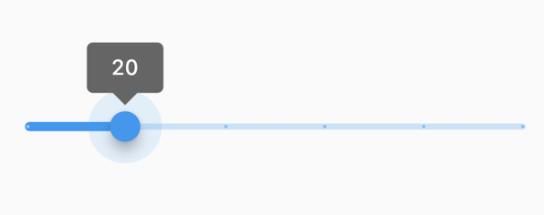
+//
+// The Sliders value is part of the Stateful widget subclass to change the value
+// setState was called.
+
+//* ▲▲▲▲▲▲▲▲ description ▲▲▲▲▲▲▲▲ (do not modify or remove section marker)
+//***************************************************************************
+
+import 'package:flutter/material.dart';
+
+void main() => runApp(const MyApp());
+
+/// This is the main application widget.
+class MyApp extends StatelessWidget {
+ const MyApp({Key? key}) : super(key: key);
+
+ static const String _title = 'Flutter Code Sample';
+
+ @override
+ Widget build(BuildContext context) {
+ return MaterialApp(
+ title: _title,
+ home: Scaffold(
+ appBar: AppBar(title: const Text(_title)),
+ body: const MyStatefulWidget(),
+ ),
+ );
+ }
+}
+
+/// This is the stateful widget that the main application instantiates.
+class MyStatefulWidget extends StatefulWidget {
+ const MyStatefulWidget({Key? key}) : super(key: key);
+
+ @override
+ State<MyStatefulWidget> createState() => _MyStatefulWidgetState();
+}
+
+/// This is the private State class that goes with MyStatefulWidget.
+class _MyStatefulWidgetState extends State<MyStatefulWidget> {
+//********************************************************************
+//* ▼▼▼▼▼▼▼▼ code ▼▼▼▼▼▼▼▼ (do not modify or remove section marker)
+
+ double _currentSliderValue = 20;
+
+ @override
+ Widget build(BuildContext context) {
+ return Slider(
+ value: _currentSliderValue,
+ min: 0,
+ max: 100,
+ divisions: 5,
+ label: _currentSliderValue.round().toString(),
+ onChanged: (double value) {
+ setState(() {
+ _currentSliderValue = value;
+ });
+ },
+ );
+ }
+
+//* ▲▲▲▲▲▲▲▲ code ▲▲▲▲▲▲▲▲ (do not modify or remove section marker)
+//********************************************************************
+
+}
diff --git a/examples/api/lib/material/snack_bar/snack_bar.0.dart b/examples/api/lib/material/snack_bar/snack_bar.0.dart
new file mode 100644
index 0000000..72887d1
--- /dev/null
+++ b/examples/api/lib/material/snack_bar/snack_bar.0.dart
@@ -0,0 +1,75 @@
+// Copyright 2014 The Flutter Authors. All rights reserved.
+// Use of this source code is governed by a BSD-style license that can be
+// found in the LICENSE file.
+
+// Template: dev/snippets/config/templates/stateless_widget_scaffold_center.tmpl
+//
+// Comment lines marked with "▼▼▼" and "▲▲▲" are used for authoring
+// of samples, and may be ignored if you are just exploring the sample.
+
+// Flutter code sample for SnackBar
+//
+//***************************************************************************
+//* ▼▼▼▼▼▼▼▼ description ▼▼▼▼▼▼▼▼ (do not modify or remove section marker)
+
+// Here is an example of a [SnackBar] with an [action] button implemented using
+// [SnackBarAction].
+
+//* ▲▲▲▲▲▲▲▲ description ▲▲▲▲▲▲▲▲ (do not modify or remove section marker)
+//***************************************************************************
+
+import 'package:flutter/material.dart';
+
+void main() => runApp(const MyApp());
+
+/// This is the main application widget.
+class MyApp extends StatelessWidget {
+  const MyApp({Key? key}) : super(key: key);
+
+  static const String _title = 'Flutter Code Sample';
+
+  @override
+  Widget build(BuildContext context) {
+    return MaterialApp(
+      title: _title,
+      home: Scaffold(
+        appBar: AppBar(title: const Text(_title)),
+        body: const Center(
+          child: MyStatelessWidget(),
+        ),
+      ),
+    );
+  }
+}
+
+/// This is the stateless widget that the main application instantiates.
+class MyStatelessWidget extends StatelessWidget {
+  const MyStatelessWidget({Key? key}) : super(key: key);
+
+  @override
+//********************************************************************
+//* ▼▼▼▼▼▼▼▼ code ▼▼▼▼▼▼▼▼ (do not modify or remove section marker)
+
+  Widget build(BuildContext context) {
+    return ElevatedButton(
+      child: const Text('Show Snackbar'),
+      onPressed: () {
+        ScaffoldMessenger.of(context).showSnackBar(
+          SnackBar(
+            content: const Text('Awesome Snackbar!'),
+            action: SnackBarAction(
+              label: 'Action',
+              onPressed: () {
+                // Code to execute.
+              },
+            ),
+          ),
+        );
+      },
+    );
+  }
+
+//* ▲▲▲▲▲▲▲▲ code ▲▲▲▲▲▲▲▲ (do not modify or remove section marker)
+//********************************************************************
+
+}
diff --git a/examples/api/lib/material/snack_bar/snack_bar.1.dart b/examples/api/lib/material/snack_bar/snack_bar.1.dart
new file mode 100644
index 0000000..a2347b9
--- /dev/null
+++ b/examples/api/lib/material/snack_bar/snack_bar.1.dart
@@ -0,0 +1,85 @@
+// Copyright 2014 The Flutter Authors. All rights reserved.
+// Use of this source code is governed by a BSD-style license that can be
+// found in the LICENSE file.
+
+// Template: dev/snippets/config/templates/stateless_widget_scaffold_center.tmpl
+//
+// Comment lines marked with "▼▼▼" and "▲▲▲" are used for authoring
+// of samples, and may be ignored if you are just exploring the sample.
+
+// Flutter code sample for SnackBar
+//
+//***************************************************************************
+//* ▼▼▼▼▼▼▼▼ description ▼▼▼▼▼▼▼▼ (do not modify or remove section marker)
+
+// Here is an example of a customized [SnackBar]. It utilizes
+// [behavior], [shape], [padding], [width], and [duration] to customize the
+// location, appearance, and the duration for which the [SnackBar] is visible.
+
+//* ▲▲▲▲▲▲▲▲ description ▲▲▲▲▲▲▲▲ (do not modify or remove section marker)
+//***************************************************************************
+
+import 'package:flutter/material.dart';
+
+void main() => runApp(const MyApp());
+
+/// This is the main application widget.
+class MyApp extends StatelessWidget {
+ const MyApp({Key? key}) : super(key: key);
+
+ static const String _title = 'Flutter Code Sample';
+
+ @override
+ Widget build(BuildContext context) {
+ return MaterialApp(
+ title: _title,
+ home: Scaffold(
+ appBar: AppBar(title: const Text(_title)),
+ body: const Center(
+ child: MyStatelessWidget(),
+ ),
+ ),
+ );
+ }
+}
+
+/// This is the stateless widget that the main application instantiates.
+class MyStatelessWidget extends StatelessWidget {
+ const MyStatelessWidget({Key? key}) : super(key: key);
+
+ @override
+//********************************************************************
+//* ▼▼▼▼▼▼▼▼ code ▼▼▼▼▼▼▼▼ (do not modify or remove section marker)
+
+ Widget build(BuildContext context) {
+ return ElevatedButton(
+ child: const Text('Show Snackbar'),
+ onPressed: () {
+ ScaffoldMessenger.of(context).showSnackBar(
+ SnackBar(
+ action: SnackBarAction(
+ label: 'Action',
+ onPressed: () {
+ // Code to execute.
+ },
+ ),
+ content: const Text('Awesome SnackBar!'),
+ duration: const Duration(milliseconds: 1500),
+ width: 280.0, // Width of the SnackBar.
+ padding: const EdgeInsets.symmetric(
+ horizontal: 8.0, // Inner padding for SnackBar content.
+ ),
+ behavior: SnackBarBehavior.floating,
+ shape: RoundedRectangleBorder(
+ borderRadius: BorderRadius.circular(10.0),
+ ),
+ ),
+ );
+ },
+ );
+ }
+
+//* ▲▲▲▲▲▲▲▲ code ▲▲▲▲▲▲▲▲ (do not modify or remove section marker)
+//********************************************************************
+
+}
diff --git a/examples/api/lib/material/stepper/stepper.0.dart b/examples/api/lib/material/stepper/stepper.0.dart
new file mode 100644
index 0000000..1e6aec6
--- /dev/null
+++ b/examples/api/lib/material/stepper/stepper.0.dart
@@ -0,0 +1,100 @@
+// Copyright 2014 The Flutter Authors. All rights reserved.
+// Use of this source code is governed by a BSD-style license that can be
+// found in the LICENSE file.
+
+// Template: dev/snippets/config/templates/stateful_widget_scaffold_center.tmpl
+//
+// Comment lines marked with "▼▼▼" and "▲▲▲" are used for authoring
+// of samples, and may be ignored if you are just exploring the sample.
+
+// Flutter code sample for Stepper
+//
+//***************************************************************************
+//* ▼▼▼▼▼▼▼▼ description ▼▼▼▼▼▼▼▼ (do not modify or remove section marker)
+
+//
+
+//* ▲▲▲▲▲▲▲▲ description ▲▲▲▲▲▲▲▲ (do not modify or remove section marker)
+//***************************************************************************
+
+import 'package:flutter/material.dart';
+
+void main() => runApp(const MyApp());
+
+/// This is the main application widget.
+class MyApp extends StatelessWidget {
+ const MyApp({Key? key}) : super(key: key);
+
+ static const String _title = 'Flutter Code Sample';
+
+ @override
+ Widget build(BuildContext context) {
+ return MaterialApp(
+ title: _title,
+ home: Scaffold(
+ appBar: AppBar(title: const Text(_title)),
+ body: const Center(
+ child: MyStatefulWidget(),
+ ),
+ ),
+ );
+ }
+}
+
+/// This is the stateful widget that the main application instantiates.
+class MyStatefulWidget extends StatefulWidget {
+ const MyStatefulWidget({Key? key}) : super(key: key);
+
+ @override
+ State<MyStatefulWidget> createState() => _MyStatefulWidgetState();
+}
+
+/// This is the private State class that goes with MyStatefulWidget.
+class _MyStatefulWidgetState extends State<MyStatefulWidget> {
+//********************************************************************
+//* ▼▼▼▼▼▼▼▼ code ▼▼▼▼▼▼▼▼ (do not modify or remove section marker)
+
+ int _index = 0;
+
+ @override
+ Widget build(BuildContext context) {
+ return Stepper(
+ currentStep: _index,
+ onStepCancel: () {
+ if (_index > 0) {
+ setState(() {
+ _index -= 1;
+ });
+ }
+ },
+ onStepContinue: () {
+ if (_index <= 0) {
+ setState(() {
+ _index += 1;
+ });
+ }
+ },
+ onStepTapped: (int index) {
+ setState(() {
+ _index = index;
+ });
+ },
+ steps: <Step>[
+ Step(
+ title: const Text('Step 1 title'),
+ content: Container(
+ alignment: Alignment.centerLeft,
+ child: const Text('Content for Step 1')),
+ ),
+ const Step(
+ title: Text('Step 2 title'),
+ content: Text('Content for Step 2'),
+ ),
+ ],
+ );
+ }
+
+//* ▲▲▲▲▲▲▲▲ code ▲▲▲▲▲▲▲▲ (do not modify or remove section marker)
+//********************************************************************
+
+}
diff --git a/examples/api/lib/material/stepper/stepper.controls_builder.0.dart b/examples/api/lib/material/stepper/stepper.controls_builder.0.dart
new file mode 100644
index 0000000..de179cf
--- /dev/null
+++ b/examples/api/lib/material/stepper/stepper.controls_builder.0.dart
@@ -0,0 +1,89 @@
+// Copyright 2014 The Flutter Authors. All rights reserved.
+// Use of this source code is governed by a BSD-style license that can be
+// found in the LICENSE file.
+
+// Template: dev/snippets/config/templates/stateless_widget_scaffold.tmpl
+//
+// Comment lines marked with "▼▼▼" and "▲▲▲" are used for authoring
+// of samples, and may be ignored if you are just exploring the sample.
+
+// Flutter code sample for Stepper.controlsBuilder
+//
+//***************************************************************************
+//* ▼▼▼▼▼▼▼▼ description ▼▼▼▼▼▼▼▼ (do not modify or remove section marker)
+
+// Creates a stepper control with custom buttons.
+
+//* ▲▲▲▲▲▲▲▲ description ▲▲▲▲▲▲▲▲ (do not modify or remove section marker)
+//***************************************************************************
+
+import 'package:flutter/material.dart';
+
+void main() => runApp(const MyApp());
+
+/// This is the main application widget.
+class MyApp extends StatelessWidget {
+ const MyApp({Key? key}) : super(key: key);
+
+ static const String _title = 'Flutter Code Sample';
+
+ @override
+ Widget build(BuildContext context) {
+ return MaterialApp(
+ title: _title,
+ home: Scaffold(
+ appBar: AppBar(title: const Text(_title)),
+ body: const MyStatelessWidget(),
+ ),
+ );
+ }
+}
+
+/// This is the stateless widget that the main application instantiates.
+class MyStatelessWidget extends StatelessWidget {
+ const MyStatelessWidget({Key? key}) : super(key: key);
+
+ @override
+//********************************************************************
+//* ▼▼▼▼▼▼▼▼ code ▼▼▼▼▼▼▼▼ (do not modify or remove section marker)
+
+ Widget build(BuildContext context) {
+ return Stepper(
+ controlsBuilder: (BuildContext context,
+ {VoidCallback? onStepContinue, VoidCallback? onStepCancel}) {
+ return Row(
+ children: <Widget>[
+ TextButton(
+ onPressed: onStepContinue,
+ child: const Text('NEXT'),
+ ),
+ TextButton(
+ onPressed: onStepCancel,
+ child: const Text('CANCEL'),
+ ),
+ ],
+ );
+ },
+ steps: const <Step>[
+ Step(
+ title: Text('A'),
+ content: SizedBox(
+ width: 100.0,
+ height: 100.0,
+ ),
+ ),
+ Step(
+ title: Text('B'),
+ content: SizedBox(
+ width: 100.0,
+ height: 100.0,
+ ),
+ ),
+ ],
+ );
+ }
+
+//* ▲▲▲▲▲▲▲▲ code ▲▲▲▲▲▲▲▲ (do not modify or remove section marker)
+//********************************************************************
+
+}
diff --git a/examples/api/lib/material/switch_list_tile/switch_list_tile.0.dart b/examples/api/lib/material/switch_list_tile/switch_list_tile.0.dart
new file mode 100644
index 0000000..73b26de
--- /dev/null
+++ b/examples/api/lib/material/switch_list_tile/switch_list_tile.0.dart
@@ -0,0 +1,79 @@
+// Copyright 2014 The Flutter Authors. All rights reserved.
+// Use of this source code is governed by a BSD-style license that can be
+// found in the LICENSE file.
+
+// Template: dev/snippets/config/templates/stateful_widget_scaffold_center.tmpl
+//
+// Comment lines marked with "▼▼▼" and "▲▲▲" are used for authoring
+// of samples, and may be ignored if you are just exploring the sample.
+
+// Flutter code sample for SwitchListTile
+//
+//***************************************************************************
+//* ▼▼▼▼▼▼▼▼ description ▼▼▼▼▼▼▼▼ (do not modify or remove section marker)
+
+// 
+//
+// This widget shows a switch that, when toggled, changes the state of a [bool]
+// member field called `_lights`.
+
+//* ▲▲▲▲▲▲▲▲ description ▲▲▲▲▲▲▲▲ (do not modify or remove section marker)
+//***************************************************************************
+
+import 'package:flutter/material.dart';
+
+void main() => runApp(const MyApp());
+
+/// This is the main application widget.
+class MyApp extends StatelessWidget {
+ const MyApp({Key? key}) : super(key: key);
+
+ static const String _title = 'Flutter Code Sample';
+
+ @override
+ Widget build(BuildContext context) {
+ return MaterialApp(
+ title: _title,
+ home: Scaffold(
+ appBar: AppBar(title: const Text(_title)),
+ body: const Center(
+ child: MyStatefulWidget(),
+ ),
+ ),
+ );
+ }
+}
+
+/// This is the stateful widget that the main application instantiates.
+class MyStatefulWidget extends StatefulWidget {
+ const MyStatefulWidget({Key? key}) : super(key: key);
+
+ @override
+ State<MyStatefulWidget> createState() => _MyStatefulWidgetState();
+}
+
+/// This is the private State class that goes with MyStatefulWidget.
+class _MyStatefulWidgetState extends State<MyStatefulWidget> {
+//********************************************************************
+//* ▼▼▼▼▼▼▼▼ code ▼▼▼▼▼▼▼▼ (do not modify or remove section marker)
+
+ bool _lights = false;
+
+ @override
+ Widget build(BuildContext context) {
+ return SwitchListTile(
+ title: const Text('Lights'),
+ value: _lights,
+ onChanged: (bool value) {
+ setState(() {
+ _lights = value;
+ });
+ },
+ secondary: const Icon(Icons.lightbulb_outline),
+ );
+ }
+
+//* ▲▲▲▲▲▲▲▲ code ▲▲▲▲▲▲▲▲ (do not modify or remove section marker)
+//********************************************************************
+
+}
diff --git a/examples/api/lib/material/switch_list_tile/switch_list_tile.1.dart b/examples/api/lib/material/switch_list_tile/switch_list_tile.1.dart
new file mode 100644
index 0000000..3931541
--- /dev/null
+++ b/examples/api/lib/material/switch_list_tile/switch_list_tile.1.dart
@@ -0,0 +1,141 @@
+// Copyright 2014 The Flutter Authors. All rights reserved.
+// Use of this source code is governed by a BSD-style license that can be
+// found in the LICENSE file.
+
+// Template: dev/snippets/config/templates/stateful_widget_scaffold_center.tmpl
+//
+// Comment lines marked with "▼▼▼" and "▲▲▲" are used for authoring
+// of samples, and may be ignored if you are just exploring the sample.
+
+// Flutter code sample for SwitchListTile
+//
+//***************************************************************************
+//* ▼▼▼▼▼▼▼▼ description ▼▼▼▼▼▼▼▼ (do not modify or remove section marker)
+
+// 
+//
+// Here is an example of a custom labeled radio widget, called
+// LinkedLabelRadio, that includes an interactive [RichText] widget that
+// handles tap gestures.
+
+//* ▲▲▲▲▲▲▲▲ description ▲▲▲▲▲▲▲▲ (do not modify or remove section marker)
+//***************************************************************************
+
+//****************************************************************************
+//* ▼▼▼▼▼▼▼▼ code-imports ▼▼▼▼▼▼▼▼ (do not modify or remove section marker)
+
+import 'package:flutter/gestures.dart';
+
+//* ▲▲▲▲▲▲▲▲ code-imports ▲▲▲▲▲▲▲▲ (do not modify or remove section marker)
+//****************************************************************************
+
+import 'package:flutter/material.dart';
+
+void main() => runApp(const MyApp());
+
+/// This is the main application widget.
+class MyApp extends StatelessWidget {
+ const MyApp({Key? key}) : super(key: key);
+
+ static const String _title = 'Flutter Code Sample';
+
+ @override
+ Widget build(BuildContext context) {
+ return MaterialApp(
+ title: _title,
+ home: Scaffold(
+ appBar: AppBar(title: const Text(_title)),
+ body: const Center(
+ child: MyStatefulWidget(),
+ ),
+ ),
+ );
+ }
+}
+
+//*****************************************************************************
+//* ▼▼▼▼▼▼▼▼ code-preamble ▼▼▼▼▼▼▼▼ (do not modify or remove section marker)
+
+class LinkedLabelSwitch extends StatelessWidget {
+ const LinkedLabelSwitch({
+ Key? key,
+ required this.label,
+ required this.padding,
+ required this.value,
+ required this.onChanged,
+ }) : super(key: key);
+
+ final String label;
+ final EdgeInsets padding;
+ final bool value;
+ final ValueChanged<bool> onChanged;
+
+ @override
+ Widget build(BuildContext context) {
+ return Padding(
+ padding: padding,
+ child: Row(
+ children: <Widget>[
+ Expanded(
+ child: RichText(
+ text: TextSpan(
+ text: label,
+ style: const TextStyle(
+ color: Colors.blueAccent,
+ decoration: TextDecoration.underline,
+ ),
+ recognizer: TapGestureRecognizer()
+ ..onTap = () {
+ print('Label has been tapped.');
+ },
+ ),
+ ),
+ ),
+ Switch(
+ value: value,
+ onChanged: (bool newValue) {
+ onChanged(newValue);
+ },
+ ),
+ ],
+ ),
+ );
+ }
+}
+
+//* ▲▲▲▲▲▲▲▲ code-preamble ▲▲▲▲▲▲▲▲ (do not modify or remove section marker)
+//*****************************************************************************
+
+/// This is the stateful widget that the main application instantiates.
+class MyStatefulWidget extends StatefulWidget {
+ const MyStatefulWidget({Key? key}) : super(key: key);
+
+ @override
+ State<MyStatefulWidget> createState() => _MyStatefulWidgetState();
+}
+
+/// This is the private State class that goes with MyStatefulWidget.
+class _MyStatefulWidgetState extends State<MyStatefulWidget> {
+//********************************************************************
+//* ▼▼▼▼▼▼▼▼ code ▼▼▼▼▼▼▼▼ (do not modify or remove section marker)
+
+ bool _isSelected = false;
+
+ @override
+ Widget build(BuildContext context) {
+ return LinkedLabelSwitch(
+ label: 'Linked, tappable label text',
+ padding: const EdgeInsets.symmetric(horizontal: 20.0),
+ value: _isSelected,
+ onChanged: (bool newValue) {
+ setState(() {
+ _isSelected = newValue;
+ });
+ },
+ );
+ }
+
+//* ▲▲▲▲▲▲▲▲ code ▲▲▲▲▲▲▲▲ (do not modify or remove section marker)
+//********************************************************************
+
+}
diff --git a/examples/api/lib/material/switch_list_tile/switch_list_tile.2.dart b/examples/api/lib/material/switch_list_tile/switch_list_tile.2.dart
new file mode 100644
index 0000000..2939ad8
--- /dev/null
+++ b/examples/api/lib/material/switch_list_tile/switch_list_tile.2.dart
@@ -0,0 +1,123 @@
+// Copyright 2014 The Flutter Authors. All rights reserved.
+// Use of this source code is governed by a BSD-style license that can be
+// found in the LICENSE file.
+
+// Template: dev/snippets/config/templates/stateful_widget_scaffold_center.tmpl
+//
+// Comment lines marked with "▼▼▼" and "▲▲▲" are used for authoring
+// of samples, and may be ignored if you are just exploring the sample.
+
+// Flutter code sample for SwitchListTile
+//
+//***************************************************************************
+//* ▼▼▼▼▼▼▼▼ description ▼▼▼▼▼▼▼▼ (do not modify or remove section marker)
+
+// 
+//
+// Here is an example of a custom LabeledSwitch widget, but you can easily
+// make your own configurable widget.
+
+//* ▲▲▲▲▲▲▲▲ description ▲▲▲▲▲▲▲▲ (do not modify or remove section marker)
+//***************************************************************************
+
+import 'package:flutter/material.dart';
+
+void main() => runApp(const MyApp());
+
+/// This is the main application widget.
+class MyApp extends StatelessWidget {
+ const MyApp({Key? key}) : super(key: key);
+
+ static const String _title = 'Flutter Code Sample';
+
+ @override
+ Widget build(BuildContext context) {
+ return MaterialApp(
+ title: _title,
+ home: Scaffold(
+ appBar: AppBar(title: const Text(_title)),
+ body: const Center(
+ child: MyStatefulWidget(),
+ ),
+ ),
+ );
+ }
+}
+
+//*****************************************************************************
+//* ▼▼▼▼▼▼▼▼ code-preamble ▼▼▼▼▼▼▼▼ (do not modify or remove section marker)
+
+class LabeledSwitch extends StatelessWidget {
+ const LabeledSwitch({
+ Key? key,
+ required this.label,
+ required this.padding,
+ required this.value,
+ required this.onChanged,
+ }) : super(key: key);
+
+ final String label;
+ final EdgeInsets padding;
+ final bool value;
+ final ValueChanged<bool> onChanged;
+
+ @override
+ Widget build(BuildContext context) {
+ return InkWell(
+ onTap: () {
+ onChanged(!value);
+ },
+ child: Padding(
+ padding: padding,
+ child: Row(
+ children: <Widget>[
+ Expanded(child: Text(label)),
+ Switch(
+ value: value,
+ onChanged: (bool newValue) {
+ onChanged(newValue);
+ },
+ ),
+ ],
+ ),
+ ),
+ );
+ }
+}
+
+//* ▲▲▲▲▲▲▲▲ code-preamble ▲▲▲▲▲▲▲▲ (do not modify or remove section marker)
+//*****************************************************************************
+
+/// This is the stateful widget that the main application instantiates.
+class MyStatefulWidget extends StatefulWidget {
+ const MyStatefulWidget({Key? key}) : super(key: key);
+
+ @override
+ State<MyStatefulWidget> createState() => _MyStatefulWidgetState();
+}
+
+/// This is the private State class that goes with MyStatefulWidget.
+class _MyStatefulWidgetState extends State<MyStatefulWidget> {
+//********************************************************************
+//* ▼▼▼▼▼▼▼▼ code ▼▼▼▼▼▼▼▼ (do not modify or remove section marker)
+
+ bool _isSelected = false;
+
+ @override
+ Widget build(BuildContext context) {
+ return LabeledSwitch(
+ label: 'This is the label text',
+ padding: const EdgeInsets.symmetric(horizontal: 20.0),
+ value: _isSelected,
+ onChanged: (bool newValue) {
+ setState(() {
+ _isSelected = newValue;
+ });
+ },
+ );
+ }
+
+//* ▲▲▲▲▲▲▲▲ code ▲▲▲▲▲▲▲▲ (do not modify or remove section marker)
+//********************************************************************
+
+}
diff --git a/examples/api/lib/material/tab_controller/tab_controller.1.dart b/examples/api/lib/material/tab_controller/tab_controller.1.dart
new file mode 100644
index 0000000..7ebb657
--- /dev/null
+++ b/examples/api/lib/material/tab_controller/tab_controller.1.dart
@@ -0,0 +1,97 @@
+// Copyright 2014 The Flutter Authors. All rights reserved.
+// Use of this source code is governed by a BSD-style license that can be
+// found in the LICENSE file.
+
+// Template: dev/snippets/config/templates/stateless_widget_material.tmpl
+//
+// Comment lines marked with "▼▼▼" and "▲▲▲" are used for authoring
+// of samples, and may be ignored if you are just exploring the sample.
+
+// Flutter code sample for TabController
+//
+//***************************************************************************
+//* ▼▼▼▼▼▼▼▼ description ▼▼▼▼▼▼▼▼ (do not modify or remove section marker)
+
+// This example shows how to listen to page updates in [TabBar] and [TabBarView]
+// when using [DefaultTabController].
+
+//* ▲▲▲▲▲▲▲▲ description ▲▲▲▲▲▲▲▲ (do not modify or remove section marker)
+//***************************************************************************
+
+import 'package:flutter/material.dart';
+
+void main() => runApp(const MyApp());
+
+/// This is the main application widget.
+class MyApp extends StatelessWidget {
+ const MyApp({Key? key}) : super(key: key);
+
+ static const String _title = 'Flutter Code Sample';
+
+ @override
+ Widget build(BuildContext context) {
+ return const MaterialApp(
+ title: _title,
+ home: MyStatelessWidget(),
+ );
+ }
+}
+
+//*****************************************************************************
+//* ▼▼▼▼▼▼▼▼ code-preamble ▼▼▼▼▼▼▼▼ (do not modify or remove section marker)
+
+const List<Tab> tabs = <Tab>[
+ Tab(text: 'Zeroth'),
+ Tab(text: 'First'),
+ Tab(text: 'Second'),
+];
+
+//* ▲▲▲▲▲▲▲▲ code-preamble ▲▲▲▲▲▲▲▲ (do not modify or remove section marker)
+//*****************************************************************************
+
+/// This is the stateless widget that the main application instantiates.
+class MyStatelessWidget extends StatelessWidget {
+ const MyStatelessWidget({Key? key}) : super(key: key);
+
+ @override
+//********************************************************************
+//* ▼▼▼▼▼▼▼▼ code ▼▼▼▼▼▼▼▼ (do not modify or remove section marker)
+
+ Widget build(BuildContext context) {
+ return DefaultTabController(
+ length: tabs.length,
+ // The Builder widget is used to have a different BuildContext to access
+ // closest DefaultTabController.
+ child: Builder(builder: (BuildContext context) {
+ final TabController tabController = DefaultTabController.of(context)!;
+ tabController.addListener(() {
+ if (!tabController.indexIsChanging) {
+ // Your code goes here.
+ // To get index of current tab use tabController.index
+ }
+ });
+ return Scaffold(
+ appBar: AppBar(
+ bottom: const TabBar(
+ tabs: tabs,
+ ),
+ ),
+ body: TabBarView(
+ children: tabs.map((Tab tab) {
+ return Center(
+ child: Text(
+ '${tab.text!} Tab',
+ style: Theme.of(context).textTheme.headline5,
+ ),
+ );
+ }).toList(),
+ ),
+ );
+ }),
+ );
+ }
+
+//* ▲▲▲▲▲▲▲▲ code ▲▲▲▲▲▲▲▲ (do not modify or remove section marker)
+//********************************************************************
+
+}
diff --git a/examples/api/lib/material/tabs/tab_bar.0.dart b/examples/api/lib/material/tabs/tab_bar.0.dart
new file mode 100644
index 0000000..0919b9f
--- /dev/null
+++ b/examples/api/lib/material/tabs/tab_bar.0.dart
@@ -0,0 +1,89 @@
+// Copyright 2014 The Flutter Authors. All rights reserved.
+// Use of this source code is governed by a BSD-style license that can be
+// found in the LICENSE file.
+
+// Template: dev/snippets/config/templates/stateless_widget_material.tmpl
+//
+// Comment lines marked with "▼▼▼" and "▲▲▲" are used for authoring
+// of samples, and may be ignored if you are just exploring the sample.
+
+// Flutter code sample for TabBar
+//
+//***************************************************************************
+//* ▼▼▼▼▼▼▼▼ description ▼▼▼▼▼▼▼▼ (do not modify or remove section marker)
+
+// This sample shows the implementation of [TabBar] and [TabBarView] using a [DefaultTabController].
+// Each [Tab] corresponds to a child of the [TabBarView] in the order they are written.
+
+//* ▲▲▲▲▲▲▲▲ description ▲▲▲▲▲▲▲▲ (do not modify or remove section marker)
+//***************************************************************************
+
+import 'package:flutter/material.dart';
+
+void main() => runApp(const MyApp());
+
+/// This is the main application widget.
+class MyApp extends StatelessWidget {
+ const MyApp({Key? key}) : super(key: key);
+
+ static const String _title = 'Flutter Code Sample';
+
+ @override
+ Widget build(BuildContext context) {
+ return const MaterialApp(
+ title: _title,
+ home: MyStatelessWidget(),
+ );
+ }
+}
+
+/// This is the stateless widget that the main application instantiates.
+class MyStatelessWidget extends StatelessWidget {
+ const MyStatelessWidget({Key? key}) : super(key: key);
+
+ @override
+//********************************************************************
+//* ▼▼▼▼▼▼▼▼ code ▼▼▼▼▼▼▼▼ (do not modify or remove section marker)
+
+ Widget build(BuildContext context) {
+ return DefaultTabController(
+ initialIndex: 1,
+ length: 3,
+ child: Scaffold(
+ appBar: AppBar(
+ title: const Text('TabBar Widget'),
+ bottom: const TabBar(
+ tabs: <Widget>[
+ Tab(
+ icon: Icon(Icons.cloud_outlined),
+ ),
+ Tab(
+ icon: Icon(Icons.beach_access_sharp),
+ ),
+ Tab(
+ icon: Icon(Icons.brightness_5_sharp),
+ ),
+ ],
+ ),
+ ),
+ body: const TabBarView(
+ children: <Widget>[
+ Center(
+ child: Text("It's cloudy here"),
+ ),
+ Center(
+ child: Text("It's rainy here"),
+ ),
+ Center(
+ child: Text("It's sunny here"),
+ ),
+ ],
+ ),
+ ),
+ );
+ }
+
+//* ▲▲▲▲▲▲▲▲ code ▲▲▲▲▲▲▲▲ (do not modify or remove section marker)
+//********************************************************************
+
+}
diff --git a/examples/api/lib/material/tabs/tab_bar.1.dart b/examples/api/lib/material/tabs/tab_bar.1.dart
new file mode 100644
index 0000000..387450c
--- /dev/null
+++ b/examples/api/lib/material/tabs/tab_bar.1.dart
@@ -0,0 +1,104 @@
+// Copyright 2014 The Flutter Authors. All rights reserved.
+// Use of this source code is governed by a BSD-style license that can be
+// found in the LICENSE file.
+
+// Template: dev/snippets/config/templates/stateful_widget_material_ticker.tmpl
+//
+// Comment lines marked with "▼▼▼" and "▲▲▲" are used for authoring
+// of samples, and may be ignored if you are just exploring the sample.
+
+// Flutter code sample for TabBar
+//
+//***************************************************************************
+//* ▼▼▼▼▼▼▼▼ description ▼▼▼▼▼▼▼▼ (do not modify or remove section marker)
+
+// [TabBar] can also be implemented by using a [TabController] which provides more options
+// to control the behavior of the [TabBar] and [TabBarView]. This can be used instead of
+// a [DefaultTabController], demonstrated below.
+
+//* ▲▲▲▲▲▲▲▲ description ▲▲▲▲▲▲▲▲ (do not modify or remove section marker)
+//***************************************************************************
+
+import 'package:flutter/material.dart';
+
+void main() => runApp(const MyApp());
+
+/// This is the main application widget.
+class MyApp extends StatelessWidget {
+ const MyApp({Key? key}) : super(key: key);
+
+ static const String _title = 'Flutter Code Sample';
+
+ @override
+ Widget build(BuildContext context) {
+ return const MaterialApp(
+ title: _title,
+ home: MyStatefulWidget(),
+ );
+ }
+}
+
+/// This is the stateful widget that the main application instantiates.
+class MyStatefulWidget extends StatefulWidget {
+ const MyStatefulWidget({Key? key}) : super(key: key);
+
+ @override
+ State<MyStatefulWidget> createState() => _MyStatefulWidgetState();
+}
+
+/// This is the private State class that goes with MyStatefulWidget.
+/// AnimationControllers can be created with `vsync: this` because of TickerProviderStateMixin.
+class _MyStatefulWidgetState extends State<MyStatefulWidget>
+ with TickerProviderStateMixin {
+//********************************************************************
+//* ▼▼▼▼▼▼▼▼ code ▼▼▼▼▼▼▼▼ (do not modify or remove section marker)
+
+ late TabController _tabController;
+
+ @override
+ void initState() {
+ super.initState();
+ _tabController = TabController(length: 3, vsync: this);
+ }
+
+ @override
+ Widget build(BuildContext context) {
+ return Scaffold(
+ appBar: AppBar(
+ title: const Text('TabBar Widget'),
+ bottom: TabBar(
+ controller: _tabController,
+ tabs: const <Widget>[
+ Tab(
+ icon: Icon(Icons.cloud_outlined),
+ ),
+ Tab(
+ icon: Icon(Icons.beach_access_sharp),
+ ),
+ Tab(
+ icon: Icon(Icons.brightness_5_sharp),
+ ),
+ ],
+ ),
+ ),
+ body: TabBarView(
+ controller: _tabController,
+ children: const <Widget>[
+ Center(
+ child: Text("It's cloudy here"),
+ ),
+ Center(
+ child: Text("It's rainy here"),
+ ),
+ Center(
+ child: Text("It's sunny here"),
+ ),
+ ],
+ ),
+ );
+ }
+
+//* ▲▲▲▲▲▲▲▲ code ▲▲▲▲▲▲▲▲ (do not modify or remove section marker)
+//********************************************************************
+
+}
diff --git a/examples/api/lib/material/text_button/text_button.0.dart b/examples/api/lib/material/text_button/text_button.0.dart
new file mode 100644
index 0000000..6d183c4
--- /dev/null
+++ b/examples/api/lib/material/text_button/text_button.0.dart
@@ -0,0 +1,109 @@
+// Copyright 2014 The Flutter Authors. All rights reserved.
+// Use of this source code is governed by a BSD-style license that can be
+// found in the LICENSE file.
+
+// Template: dev/snippets/config/templates/stateless_widget_scaffold.tmpl
+//
+// Comment lines marked with "▼▼▼" and "▲▲▲" are used for authoring
+// of samples, and may be ignored if you are just exploring the sample.
+
+// Flutter code sample for TextButton
+//
+//***************************************************************************
+//* ▼▼▼▼▼▼▼▼ description ▼▼▼▼▼▼▼▼ (do not modify or remove section marker)
+
+// This sample shows how to render a disabled TextButton, an enabled TextButton
+// and lastly a TextButton with gradient background.
+
+//* ▲▲▲▲▲▲▲▲ description ▲▲▲▲▲▲▲▲ (do not modify or remove section marker)
+//***************************************************************************
+
+import 'package:flutter/material.dart';
+
+void main() => runApp(const MyApp());
+
+/// This is the main application widget.
+class MyApp extends StatelessWidget {
+ const MyApp({Key? key}) : super(key: key);
+
+ static const String _title = 'Flutter Code Sample';
+
+ @override
+ Widget build(BuildContext context) {
+ return MaterialApp(
+ title: _title,
+ home: Scaffold(
+ appBar: AppBar(title: const Text(_title)),
+ body: const MyStatelessWidget(),
+ ),
+ );
+ }
+}
+
+/// This is the stateless widget that the main application instantiates.
+class MyStatelessWidget extends StatelessWidget {
+ const MyStatelessWidget({Key? key}) : super(key: key);
+
+ @override
+//********************************************************************
+//* ▼▼▼▼▼▼▼▼ code ▼▼▼▼▼▼▼▼ (do not modify or remove section marker)
+
+ Widget build(BuildContext context) {
+ return Center(
+ child: Column(
+ mainAxisSize: MainAxisSize.min,
+ children: <Widget>[
+ TextButton(
+ style: TextButton.styleFrom(
+ textStyle: const TextStyle(fontSize: 20),
+ ),
+ onPressed: null,
+ child: const Text('Disabled'),
+ ),
+ const SizedBox(height: 30),
+ TextButton(
+ style: TextButton.styleFrom(
+ textStyle: const TextStyle(fontSize: 20),
+ ),
+ onPressed: () {},
+ child: const Text('Enabled'),
+ ),
+ const SizedBox(height: 30),
+ ClipRRect(
+ borderRadius: BorderRadius.circular(4),
+ child: Stack(
+ children: <Widget>[
+ Positioned.fill(
+ child: Container(
+ decoration: const BoxDecoration(
+ gradient: LinearGradient(
+ colors: <Color>[
+ Color(0xFF0D47A1),
+ Color(0xFF1976D2),
+ Color(0xFF42A5F5),
+ ],
+ ),
+ ),
+ ),
+ ),
+ TextButton(
+ style: TextButton.styleFrom(
+ padding: const EdgeInsets.all(16.0),
+ primary: Colors.white,
+ textStyle: const TextStyle(fontSize: 20),
+ ),
+ onPressed: () {},
+ child: const Text('Gradient'),
+ ),
+ ],
+ ),
+ ),
+ ],
+ ),
+ );
+ }
+
+//* ▲▲▲▲▲▲▲▲ code ▲▲▲▲▲▲▲▲ (do not modify or remove section marker)
+//********************************************************************
+
+}
diff --git a/examples/api/lib/material/text_field/text_field.1.dart b/examples/api/lib/material/text_field/text_field.1.dart
new file mode 100644
index 0000000..cfa0418
--- /dev/null
+++ b/examples/api/lib/material/text_field/text_field.1.dart
@@ -0,0 +1,101 @@
+// Copyright 2014 The Flutter Authors. All rights reserved.
+// Use of this source code is governed by a BSD-style license that can be
+// found in the LICENSE file.
+
+// Template: dev/snippets/config/templates/stateful_widget_material.tmpl
+//
+// Comment lines marked with "▼▼▼" and "▲▲▲" are used for authoring
+// of samples, and may be ignored if you are just exploring the sample.
+
+// Flutter code sample for TextField
+//
+//***************************************************************************
+//* ▼▼▼▼▼▼▼▼ description ▼▼▼▼▼▼▼▼ (do not modify or remove section marker)
+
+// This sample shows how to get a value from a TextField via the [onSubmitted]
+// callback.
+
+//* ▲▲▲▲▲▲▲▲ description ▲▲▲▲▲▲▲▲ (do not modify or remove section marker)
+//***************************************************************************
+
+import 'package:flutter/material.dart';
+
+void main() => runApp(const MyApp());
+
+/// This is the main application widget.
+class MyApp extends StatelessWidget {
+ const MyApp({Key? key}) : super(key: key);
+
+ static const String _title = 'Flutter Code Sample';
+
+ @override
+ Widget build(BuildContext context) {
+ return const MaterialApp(
+ title: _title,
+ home: MyStatefulWidget(),
+ );
+ }
+}
+
+/// This is the stateful widget that the main application instantiates.
+class MyStatefulWidget extends StatefulWidget {
+ const MyStatefulWidget({Key? key}) : super(key: key);
+
+ @override
+ State<MyStatefulWidget> createState() => _MyStatefulWidgetState();
+}
+
+/// This is the private State class that goes with MyStatefulWidget.
+class _MyStatefulWidgetState extends State<MyStatefulWidget> {
+//********************************************************************
+//* ▼▼▼▼▼▼▼▼ code ▼▼▼▼▼▼▼▼ (do not modify or remove section marker)
+
+ late TextEditingController _controller;
+
+ @override
+ void initState() {
+ super.initState();
+ _controller = TextEditingController();
+ }
+
+ @override
+ void dispose() {
+ _controller.dispose();
+ super.dispose();
+ }
+
+ @override
+ Widget build(BuildContext context) {
+ return Scaffold(
+ body: Center(
+ child: TextField(
+ controller: _controller,
+ onSubmitted: (String value) async {
+ await showDialog<void>(
+ context: context,
+ builder: (BuildContext context) {
+ return AlertDialog(
+ title: const Text('Thanks!'),
+ content: Text(
+ 'You typed "$value", which has length ${value.characters.length}.'),
+ actions: <Widget>[
+ TextButton(
+ onPressed: () {
+ Navigator.pop(context);
+ },
+ child: const Text('OK'),
+ ),
+ ],
+ );
+ },
+ );
+ },
+ ),
+ ),
+ );
+ }
+
+//* ▲▲▲▲▲▲▲▲ code ▲▲▲▲▲▲▲▲ (do not modify or remove section marker)
+//********************************************************************
+
+}
diff --git a/examples/api/lib/material/text_form_field/text_form_field.1.dart b/examples/api/lib/material/text_form_field/text_form_field.1.dart
new file mode 100644
index 0000000..97f0e0d
--- /dev/null
+++ b/examples/api/lib/material/text_form_field/text_form_field.1.dart
@@ -0,0 +1,100 @@
+// Copyright 2014 The Flutter Authors. All rights reserved.
+// Use of this source code is governed by a BSD-style license that can be
+// found in the LICENSE file.
+
+// Template: dev/snippets/config/templates/stateful_widget_material.tmpl
+//
+// Comment lines marked with "▼▼▼" and "▲▲▲" are used for authoring
+// of samples, and may be ignored if you are just exploring the sample.
+
+// Flutter code sample for TextFormField
+//
+//***************************************************************************
+//* ▼▼▼▼▼▼▼▼ description ▼▼▼▼▼▼▼▼ (do not modify or remove section marker)
+
+// This example shows how to move the focus to the next field when the user
+// presses the SPACE key.
+
+//* ▲▲▲▲▲▲▲▲ description ▲▲▲▲▲▲▲▲ (do not modify or remove section marker)
+//***************************************************************************
+
+import 'package:flutter/material.dart';
+//****************************************************************************
+//* ▼▼▼▼▼▼▼▼ code-imports ▼▼▼▼▼▼▼▼ (do not modify or remove section marker)
+
+import 'package:flutter/services.dart';
+
+//* ▲▲▲▲▲▲▲▲ code-imports ▲▲▲▲▲▲▲▲ (do not modify or remove section marker)
+//****************************************************************************
+
+void main() => runApp(const MyApp());
+
+/// This is the main application widget.
+class MyApp extends StatelessWidget {
+ const MyApp({Key? key}) : super(key: key);
+
+ static const String _title = 'Flutter Code Sample';
+
+ @override
+ Widget build(BuildContext context) {
+ return const MaterialApp(
+ title: _title,
+ home: MyStatefulWidget(),
+ );
+ }
+}
+
+/// This is the stateful widget that the main application instantiates.
+class MyStatefulWidget extends StatefulWidget {
+ const MyStatefulWidget({Key? key}) : super(key: key);
+
+ @override
+ State<MyStatefulWidget> createState() => _MyStatefulWidgetState();
+}
+
+/// This is the private State class that goes with MyStatefulWidget.
+class _MyStatefulWidgetState extends State<MyStatefulWidget> {
+//********************************************************************
+//* ▼▼▼▼▼▼▼▼ code ▼▼▼▼▼▼▼▼ (do not modify or remove section marker)
+
+ @override
+ Widget build(BuildContext context) {
+ return Material(
+ child: Center(
+ child: Shortcuts(
+ shortcuts: const <ShortcutActivator, Intent>{
+ // Pressing space in the field will now move to the next field.
+ SingleActivator(LogicalKeyboardKey.space): NextFocusIntent(),
+ },
+ child: FocusTraversalGroup(
+ child: Form(
+ autovalidateMode: AutovalidateMode.always,
+ onChanged: () {
+ Form.of(primaryFocus!.context!)!.save();
+ },
+ child: Wrap(
+ children: List<Widget>.generate(5, (int index) {
+ return Padding(
+ padding: const EdgeInsets.all(8.0),
+ child: ConstrainedBox(
+ constraints: BoxConstraints.tight(const Size(200, 50)),
+ child: TextFormField(
+ onSaved: (String? value) {
+ print('Value for field $index saved as "$value"');
+ },
+ ),
+ ),
+ );
+ }),
+ ),
+ ),
+ ),
+ ),
+ ),
+ );
+ }
+
+//* ▲▲▲▲▲▲▲▲ code ▲▲▲▲▲▲▲▲ (do not modify or remove section marker)
+//********************************************************************
+
+}
diff --git a/examples/api/lib/material/tooltip/tooltip.0.dart b/examples/api/lib/material/tooltip/tooltip.0.dart
new file mode 100644
index 0000000..06cc953
--- /dev/null
+++ b/examples/api/lib/material/tooltip/tooltip.0.dart
@@ -0,0 +1,65 @@
+// Copyright 2014 The Flutter Authors. All rights reserved.
+// Use of this source code is governed by a BSD-style license that can be
+// found in the LICENSE file.
+
+// Template: dev/snippets/config/templates/stateless_widget_scaffold_center.tmpl
+//
+// Comment lines marked with "▼▼▼" and "▲▲▲" are used for authoring
+// of samples, and may be ignored if you are just exploring the sample.
+
+// Flutter code sample for Tooltip
+//
+//***************************************************************************
+//* ▼▼▼▼▼▼▼▼ description ▼▼▼▼▼▼▼▼ (do not modify or remove section marker)
+
+// This example show a basic [Tooltip] which has a [Text] as child.
+// [message] contains your label to be shown by the tooltip when
+// the child that Tooltip wraps is hovered over on web or desktop. On mobile,
+// the tooltip is shown when the widget is long pressed.
+
+//* ▲▲▲▲▲▲▲▲ description ▲▲▲▲▲▲▲▲ (do not modify or remove section marker)
+//***************************************************************************
+
+import 'package:flutter/material.dart';
+
+void main() => runApp(const MyApp());
+
+/// This is the main application widget.
+class MyApp extends StatelessWidget {
+ const MyApp({Key? key}) : super(key: key);
+
+ static const String _title = 'Flutter Code Sample';
+
+ @override
+ Widget build(BuildContext context) {
+ return MaterialApp(
+ title: _title,
+ home: Scaffold(
+ appBar: AppBar(title: const Text(_title)),
+ body: const Center(
+ child: MyStatelessWidget(),
+ ),
+ ),
+ );
+ }
+}
+
+/// This is the stateless widget that the main application instantiates.
+class MyStatelessWidget extends StatelessWidget {
+ const MyStatelessWidget({Key? key}) : super(key: key);
+
+ @override
+//********************************************************************
+//* ▼▼▼▼▼▼▼▼ code ▼▼▼▼▼▼▼▼ (do not modify or remove section marker)
+
+ Widget build(BuildContext context) {
+ return const Tooltip(
+ message: 'I am a Tooltip',
+ child: Text('Hover over the text to show a tooltip.'),
+ );
+ }
+
+//* ▲▲▲▲▲▲▲▲ code ▲▲▲▲▲▲▲▲ (do not modify or remove section marker)
+//********************************************************************
+
+}
diff --git a/examples/api/lib/material/tooltip/tooltip.1.dart b/examples/api/lib/material/tooltip/tooltip.1.dart
new file mode 100644
index 0000000..6ab2a7c
--- /dev/null
+++ b/examples/api/lib/material/tooltip/tooltip.1.dart
@@ -0,0 +1,85 @@
+// Copyright 2014 The Flutter Authors. All rights reserved.
+// Use of this source code is governed by a BSD-style license that can be
+// found in the LICENSE file.
+
+// Template: dev/snippets/config/templates/stateless_widget_scaffold_center.tmpl
+//
+// Comment lines marked with "▼▼▼" and "▲▲▲" are used for authoring
+// of samples, and may be ignored if you are just exploring the sample.
+
+// Flutter code sample for Tooltip
+//
+//***************************************************************************
+//* ▼▼▼▼▼▼▼▼ description ▼▼▼▼▼▼▼▼ (do not modify or remove section marker)
+
+// This example covers most of the attributes available in Tooltip.
+// `decoration` has been used to give a gradient and borderRadius to Tooltip.
+// `height` has been used to set a specific height of the Tooltip.
+// `preferBelow` is false, the tooltip will prefer showing above [Tooltip]'s child widget.
+// However, it may show the tooltip below if there's not enough space
+// above the widget.
+// `textStyle` has been used to set the font size of the 'message'.
+// `showDuration` accepts a Duration to continue showing the message after the long
+// press has been released or the mouse pointer exits the child widget.
+// `waitDuration` accepts a Duration for which a mouse pointer has to hover over the child
+// widget before the tooltip is shown.
+
+//* ▲▲▲▲▲▲▲▲ description ▲▲▲▲▲▲▲▲ (do not modify or remove section marker)
+//***************************************************************************
+
+import 'package:flutter/material.dart';
+
+void main() => runApp(const MyApp());
+
+/// This is the main application widget.
+class MyApp extends StatelessWidget {
+ const MyApp({Key? key}) : super(key: key);
+
+ static const String _title = 'Flutter Code Sample';
+
+ @override
+ Widget build(BuildContext context) {
+ return MaterialApp(
+ title: _title,
+ home: Scaffold(
+ appBar: AppBar(title: const Text(_title)),
+ body: const Center(
+ child: MyStatelessWidget(),
+ ),
+ ),
+ );
+ }
+}
+
+/// This is the stateless widget that the main application instantiates.
+class MyStatelessWidget extends StatelessWidget {
+ const MyStatelessWidget({Key? key}) : super(key: key);
+
+ @override
+//********************************************************************
+//* ▼▼▼▼▼▼▼▼ code ▼▼▼▼▼▼▼▼ (do not modify or remove section marker)
+
+ Widget build(BuildContext context) {
+ return Tooltip(
+ message: 'I am a Tooltip',
+ child: const Text('Tap this text and hold down to show a tooltip.'),
+ decoration: BoxDecoration(
+ borderRadius: BorderRadius.circular(25),
+ gradient:
+ const LinearGradient(colors: <Color>[Colors.amber, Colors.red]),
+ ),
+ height: 50,
+ padding: const EdgeInsets.all(8.0),
+ preferBelow: false,
+ textStyle: const TextStyle(
+ fontSize: 24,
+ ),
+ showDuration: const Duration(seconds: 2),
+ waitDuration: const Duration(seconds: 1),
+ );
+ }
+
+//* ▲▲▲▲▲▲▲▲ code ▲▲▲▲▲▲▲▲ (do not modify or remove section marker)
+//********************************************************************
+
+}
diff --git a/examples/api/lib/painting/gradient/linear_gradient.0.dart b/examples/api/lib/painting/gradient/linear_gradient.0.dart
new file mode 100644
index 0000000..a6416fd
--- /dev/null
+++ b/examples/api/lib/painting/gradient/linear_gradient.0.dart
@@ -0,0 +1,68 @@
+// Copyright 2014 The Flutter Authors. All rights reserved.
+// Use of this source code is governed by a BSD-style license that can be
+// found in the LICENSE file.
+
+// Template: dev/snippets/config/templates/stateless_widget_material.tmpl
+//
+// Comment lines marked with "▼▼▼" and "▲▲▲" are used for authoring
+// of samples, and may be ignored if you are just exploring the sample.
+
+// Flutter code sample for LinearGradient
+//
+//***************************************************************************
+//* ▼▼▼▼▼▼▼▼ description ▼▼▼▼▼▼▼▼ (do not modify or remove section marker)
+
+// This sample draws a picture that looks like vertical window shades by having
+// a [Container] display a [BoxDecoration] with a [LinearGradient].
+
+//* ▲▲▲▲▲▲▲▲ description ▲▲▲▲▲▲▲▲ (do not modify or remove section marker)
+//***************************************************************************
+
+import 'package:flutter/material.dart';
+
+void main() => runApp(const MyApp());
+
+/// This is the main application widget.
+class MyApp extends StatelessWidget {
+ const MyApp({Key? key}) : super(key: key);
+
+ static const String _title = 'Flutter Code Sample';
+
+ @override
+ Widget build(BuildContext context) {
+ return const MaterialApp(
+ title: _title,
+ home: MyStatelessWidget(),
+ );
+ }
+}
+
+/// This is the stateless widget that the main application instantiates.
+class MyStatelessWidget extends StatelessWidget {
+ const MyStatelessWidget({Key? key}) : super(key: key);
+
+ @override
+//********************************************************************
+//* ▼▼▼▼▼▼▼▼ code ▼▼▼▼▼▼▼▼ (do not modify or remove section marker)
+
+ Widget build(BuildContext context) {
+ return Container(
+ decoration: const BoxDecoration(
+ gradient: LinearGradient(
+ begin: Alignment.topLeft,
+ end:
+ Alignment(0.8, 0.0), // 10% of the width, so there are ten blinds.
+ colors: <Color>[
+ Color(0xffee0000),
+ Color(0xffeeee00)
+ ], // red to yellow
+ tileMode: TileMode.repeated, // repeats the gradient over the canvas
+ ),
+ ),
+ );
+ }
+
+//* ▲▲▲▲▲▲▲▲ code ▲▲▲▲▲▲▲▲ (do not modify or remove section marker)
+//********************************************************************
+
+}
diff --git a/examples/api/lib/rendering/sliver_grid/sliver_grid_delegate_with_fixed_cross_axis_count.0.dart b/examples/api/lib/rendering/sliver_grid/sliver_grid_delegate_with_fixed_cross_axis_count.0.dart
new file mode 100644
index 0000000..3161cf5
--- /dev/null
+++ b/examples/api/lib/rendering/sliver_grid/sliver_grid_delegate_with_fixed_cross_axis_count.0.dart
@@ -0,0 +1,69 @@
+// Copyright 2014 The Flutter Authors. All rights reserved.
+// Use of this source code is governed by a BSD-style license that can be
+// found in the LICENSE file.
+
+// Template: dev/snippets/config/templates/stateless_widget_scaffold.tmpl
+//
+// Comment lines marked with "▼▼▼" and "▲▲▲" are used for authoring
+// of samples, and may be ignored if you are just exploring the sample.
+
+// Flutter code sample for SliverGridDelegateWithFixedCrossAxisCount
+//
+//***************************************************************************
+//* ▼▼▼▼▼▼▼▼ description ▼▼▼▼▼▼▼▼ (do not modify or remove section marker)
+
+// Here is an example using the [childAspectRatio] property. On a device with a
+// screen width of 800.0, it creates a GridView with each tile with a width of
+// 200.0 and a height of 100.0.
+
+//* ▲▲▲▲▲▲▲▲ description ▲▲▲▲▲▲▲▲ (do not modify or remove section marker)
+//***************************************************************************
+
+import 'package:flutter/material.dart';
+
+void main() => runApp(const MyApp());
+
+/// This is the main application widget.
+class MyApp extends StatelessWidget {
+ const MyApp({Key? key}) : super(key: key);
+
+ static const String _title = 'Flutter Code Sample';
+
+ @override
+ Widget build(BuildContext context) {
+ return MaterialApp(
+ title: _title,
+ home: Scaffold(
+ appBar: AppBar(title: const Text(_title)),
+ body: const MyStatelessWidget(),
+ ),
+ );
+ }
+}
+
+/// This is the stateless widget that the main application instantiates.
+class MyStatelessWidget extends StatelessWidget {
+ const MyStatelessWidget({Key? key}) : super(key: key);
+
+ @override
+//********************************************************************
+//* ▼▼▼▼▼▼▼▼ code ▼▼▼▼▼▼▼▼ (do not modify or remove section marker)
+
+ Widget build(BuildContext context) {
+ return GridView(
+ gridDelegate: const SliverGridDelegateWithFixedCrossAxisCount(
+ crossAxisCount: 4,
+ childAspectRatio: 0.5,
+ ),
+ children: List<Widget>.generate(20, (int i) {
+ return Builder(builder: (BuildContext context) {
+ return Text('$i');
+ });
+ }),
+ );
+ }
+
+//* ▲▲▲▲▲▲▲▲ code ▲▲▲▲▲▲▲▲ (do not modify or remove section marker)
+//********************************************************************
+
+}
diff --git a/examples/api/lib/rendering/sliver_grid/sliver_grid_delegate_with_fixed_cross_axis_count.1.dart b/examples/api/lib/rendering/sliver_grid/sliver_grid_delegate_with_fixed_cross_axis_count.1.dart
new file mode 100644
index 0000000..237ec95
--- /dev/null
+++ b/examples/api/lib/rendering/sliver_grid/sliver_grid_delegate_with_fixed_cross_axis_count.1.dart
@@ -0,0 +1,69 @@
+// Copyright 2014 The Flutter Authors. All rights reserved.
+// Use of this source code is governed by a BSD-style license that can be
+// found in the LICENSE file.
+
+// Template: dev/snippets/config/templates/stateless_widget_scaffold.tmpl
+//
+// Comment lines marked with "▼▼▼" and "▲▲▲" are used for authoring
+// of samples, and may be ignored if you are just exploring the sample.
+
+// Flutter code sample for SliverGridDelegateWithFixedCrossAxisCount
+//
+//***************************************************************************
+//* ▼▼▼▼▼▼▼▼ description ▼▼▼▼▼▼▼▼ (do not modify or remove section marker)
+
+// Here is an example using the [mainAxisExtent] property. On a device with a
+// screen width of 800.0, it creates a GridView with each tile with a width of
+// 200.0 and a height of 150.0.
+
+//* ▲▲▲▲▲▲▲▲ description ▲▲▲▲▲▲▲▲ (do not modify or remove section marker)
+//***************************************************************************
+
+import 'package:flutter/material.dart';
+
+void main() => runApp(const MyApp());
+
+/// This is the main application widget.
+class MyApp extends StatelessWidget {
+ const MyApp({Key? key}) : super(key: key);
+
+ static const String _title = 'Flutter Code Sample';
+
+ @override
+ Widget build(BuildContext context) {
+ return MaterialApp(
+ title: _title,
+ home: Scaffold(
+ appBar: AppBar(title: const Text(_title)),
+ body: const MyStatelessWidget(),
+ ),
+ );
+ }
+}
+
+/// This is the stateless widget that the main application instantiates.
+class MyStatelessWidget extends StatelessWidget {
+ const MyStatelessWidget({Key? key}) : super(key: key);
+
+ @override
+//********************************************************************
+//* ▼▼▼▼▼▼▼▼ code ▼▼▼▼▼▼▼▼ (do not modify or remove section marker)
+
+ Widget build(BuildContext context) {
+ return GridView(
+ gridDelegate: const SliverGridDelegateWithFixedCrossAxisCount(
+ crossAxisCount: 4,
+ mainAxisExtent: 150.0,
+ ),
+ children: List<Widget>.generate(20, (int i) {
+ return Builder(builder: (BuildContext context) {
+ return Text('$i');
+ });
+ }),
+ );
+ }
+
+//* ▲▲▲▲▲▲▲▲ code ▲▲▲▲▲▲▲▲ (do not modify or remove section marker)
+//********************************************************************
+
+}
diff --git a/examples/api/lib/services/keyboard_key/logical_keyboard_key.0.dart b/examples/api/lib/services/keyboard_key/logical_keyboard_key.0.dart
new file mode 100644
index 0000000..6815402
--- /dev/null
+++ b/examples/api/lib/services/keyboard_key/logical_keyboard_key.0.dart
@@ -0,0 +1,127 @@
+// Copyright 2014 The Flutter Authors. All rights reserved.
+// Use of this source code is governed by a BSD-style license that can be
+// found in the LICENSE file.
+
+// Template: dev/snippets/config/templates/stateful_widget_scaffold.tmpl
+//
+// Comment lines marked with "▼▼▼" and "▲▲▲" are used for authoring
+// of samples, and may be ignored if you are just exploring the sample.
+
+// Flutter code sample for LogicalKeyboardKey
+//
+//***************************************************************************
+//* ▼▼▼▼▼▼▼▼ description ▼▼▼▼▼▼▼▼ (do not modify or remove section marker)
+
+// This example shows how to detect if the user has selected the logical "Q"
+// key.
+
+//* ▲▲▲▲▲▲▲▲ description ▲▲▲▲▲▲▲▲ (do not modify or remove section marker)
+//***************************************************************************
+
+//****************************************************************************
+//* ▼▼▼▼▼▼▼▼ code-imports ▼▼▼▼▼▼▼▼ (do not modify or remove section marker)
+
+import 'package:flutter/foundation.dart';
+import 'package:flutter/material.dart';
+import 'package:flutter/services.dart';
+
+//* ▲▲▲▲▲▲▲▲ code-imports ▲▲▲▲▲▲▲▲ (do not modify or remove section marker)
+//****************************************************************************
+
+void main() => runApp(const MyApp());
+
+/// This is the main application widget.
+class MyApp extends StatelessWidget {
+ const MyApp({Key? key}) : super(key: key);
+
+ static const String _title = 'Flutter Code Sample';
+
+ @override
+ Widget build(BuildContext context) {
+ return MaterialApp(
+ title: _title,
+ home: Scaffold(
+ appBar: AppBar(title: const Text(_title)),
+ body: const MyStatefulWidget(),
+ ),
+ );
+ }
+}
+
+/// This is the stateful widget that the main application instantiates.
+class MyStatefulWidget extends StatefulWidget {
+ const MyStatefulWidget({Key? key}) : super(key: key);
+
+ @override
+ State<MyStatefulWidget> createState() => _MyStatefulWidgetState();
+}
+
+/// This is the private State class that goes with MyStatefulWidget.
+class _MyStatefulWidgetState extends State<MyStatefulWidget> {
+//********************************************************************
+//* ▼▼▼▼▼▼▼▼ code ▼▼▼▼▼▼▼▼ (do not modify or remove section marker)
+
+// The node used to request the keyboard focus.
+ final FocusNode _focusNode = FocusNode();
+// The message to display.
+ String? _message;
+
+// Focus nodes need to be disposed.
+ @override
+ void dispose() {
+ _focusNode.dispose();
+ super.dispose();
+ }
+
+// Handles the key events from the RawKeyboardListener and update the
+// _message.
+ void _handleKeyEvent(RawKeyEvent event) {
+ setState(() {
+ if (event.logicalKey == LogicalKeyboardKey.keyQ) {
+ _message = 'Pressed the "Q" key!';
+ } else {
+ if (kReleaseMode) {
+ _message =
+ 'Not a Q: Pressed 0x${event.logicalKey.keyId.toRadixString(16)}';
+ } else {
+ // The debugName will only print useful information in debug mode.
+ _message = 'Not a Q: Pressed ${event.logicalKey.debugName}';
+ }
+ }
+ });
+ }
+
+ @override
+ Widget build(BuildContext context) {
+ final TextTheme textTheme = Theme.of(context).textTheme;
+ return Container(
+ color: Colors.white,
+ alignment: Alignment.center,
+ child: DefaultTextStyle(
+ style: textTheme.headline4!,
+ child: RawKeyboardListener(
+ focusNode: _focusNode,
+ onKey: _handleKeyEvent,
+ child: AnimatedBuilder(
+ animation: _focusNode,
+ builder: (BuildContext context, Widget? child) {
+ if (!_focusNode.hasFocus) {
+ return GestureDetector(
+ onTap: () {
+ FocusScope.of(context).requestFocus(_focusNode);
+ },
+ child: const Text('Tap to focus'),
+ );
+ }
+ return Text(_message ?? 'Press a key');
+ },
+ ),
+ ),
+ ),
+ );
+ }
+
+//* ▲▲▲▲▲▲▲▲ code ▲▲▲▲▲▲▲▲ (do not modify or remove section marker)
+//********************************************************************
+
+}
diff --git a/examples/api/lib/services/keyboard_key/physical_keyboard_key.0.dart b/examples/api/lib/services/keyboard_key/physical_keyboard_key.0.dart
new file mode 100644
index 0000000..01b046d
--- /dev/null
+++ b/examples/api/lib/services/keyboard_key/physical_keyboard_key.0.dart
@@ -0,0 +1,120 @@
+// Copyright 2014 The Flutter Authors. All rights reserved.
+// Use of this source code is governed by a BSD-style license that can be
+// found in the LICENSE file.
+
+// Template: dev/snippets/config/templates/stateful_widget_scaffold.tmpl
+//
+// Comment lines marked with "▼▼▼" and "▲▲▲" are used for authoring
+// of samples, and may be ignored if you are just exploring the sample.
+
+// Flutter code sample for PhysicalKeyboardKey
+//
+//***************************************************************************
+//* ▼▼▼▼▼▼▼▼ description ▼▼▼▼▼▼▼▼ (do not modify or remove section marker)
+
+// This example shows how to detect if the user has selected the physical key
+// to the right of the CAPS LOCK key.
+
+//* ▲▲▲▲▲▲▲▲ description ▲▲▲▲▲▲▲▲ (do not modify or remove section marker)
+//***************************************************************************
+
+import 'package:flutter/material.dart';
+//****************************************************************************
+//* ▼▼▼▼▼▼▼▼ code-imports ▼▼▼▼▼▼▼▼ (do not modify or remove section marker)
+
+import 'package:flutter/services.dart';
+
+//* ▲▲▲▲▲▲▲▲ code-imports ▲▲▲▲▲▲▲▲ (do not modify or remove section marker)
+//****************************************************************************
+
+void main() => runApp(const MyApp());
+
+/// This is the main application widget.
+class MyApp extends StatelessWidget {
+ const MyApp({Key? key}) : super(key: key);
+
+ static const String _title = 'Flutter Code Sample';
+
+ @override
+ Widget build(BuildContext context) {
+ return MaterialApp(
+ title: _title,
+ home: Scaffold(
+ appBar: AppBar(title: const Text(_title)),
+ body: const MyStatefulWidget(),
+ ),
+ );
+ }
+}
+
+/// This is the stateful widget that the main application instantiates.
+class MyStatefulWidget extends StatefulWidget {
+ const MyStatefulWidget({Key? key}) : super(key: key);
+
+ @override
+ State<MyStatefulWidget> createState() => _MyStatefulWidgetState();
+}
+
+/// This is the private State class that goes with MyStatefulWidget.
+class _MyStatefulWidgetState extends State<MyStatefulWidget> {
+//********************************************************************
+//* ▼▼▼▼▼▼▼▼ code ▼▼▼▼▼▼▼▼ (do not modify or remove section marker)
+
+// The node used to request the keyboard focus.
+ final FocusNode _focusNode = FocusNode();
+// The message to display.
+ String? _message;
+
+// Focus nodes need to be disposed.
+ @override
+ void dispose() {
+ _focusNode.dispose();
+ super.dispose();
+ }
+
+// Handles the key events from the RawKeyboardListener and update the
+// _message.
+ void _handleKeyEvent(RawKeyEvent event) {
+ setState(() {
+ if (event.physicalKey == PhysicalKeyboardKey.keyA) {
+ _message = 'Pressed the key next to CAPS LOCK!';
+ } else {
+ _message = 'Wrong key.';
+ }
+ });
+ }
+
+ @override
+ Widget build(BuildContext context) {
+ final TextTheme textTheme = Theme.of(context).textTheme;
+ return Container(
+ color: Colors.white,
+ alignment: Alignment.center,
+ child: DefaultTextStyle(
+ style: textTheme.headline4!,
+ child: RawKeyboardListener(
+ focusNode: _focusNode,
+ onKey: _handleKeyEvent,
+ child: AnimatedBuilder(
+ animation: _focusNode,
+ builder: (BuildContext context, Widget? child) {
+ if (!_focusNode.hasFocus) {
+ return GestureDetector(
+ onTap: () {
+ FocusScope.of(context).requestFocus(_focusNode);
+ },
+ child: const Text('Tap to focus'),
+ );
+ }
+ return Text(_message ?? 'Press a key');
+ },
+ ),
+ ),
+ ),
+ );
+ }
+
+//* ▲▲▲▲▲▲▲▲ code ▲▲▲▲▲▲▲▲ (do not modify or remove section marker)
+//********************************************************************
+
+}
diff --git a/examples/api/lib/services/system_chrome/system_chrome.set_system_u_i_overlay_style.1.dart b/examples/api/lib/services/system_chrome/system_chrome.set_system_u_i_overlay_style.1.dart
new file mode 100644
index 0000000..2d61616
--- /dev/null
+++ b/examples/api/lib/services/system_chrome/system_chrome.set_system_u_i_overlay_style.1.dart
@@ -0,0 +1,101 @@
+// Copyright 2014 The Flutter Authors. All rights reserved.
+// Use of this source code is governed by a BSD-style license that can be
+// found in the LICENSE file.
+
+// Template: dev/snippets/config/templates/stateful_widget_material.tmpl
+//
+// Comment lines marked with "▼▼▼" and "▲▲▲" are used for authoring
+// of samples, and may be ignored if you are just exploring the sample.
+
+// Flutter code sample for SystemChrome.setSystemUIOverlayStyle
+//
+//***************************************************************************
+//* ▼▼▼▼▼▼▼▼ description ▼▼▼▼▼▼▼▼ (do not modify or remove section marker)
+
+// The following example creates a widget that changes the status bar color
+// to a random value on Android.
+
+//* ▲▲▲▲▲▲▲▲ description ▲▲▲▲▲▲▲▲ (do not modify or remove section marker)
+//***************************************************************************
+
+//********************************************************************************
+//* ▼▼▼▼▼▼▼▼ code-dartImports ▼▼▼▼▼▼▼▼ (do not modify or remove section marker)
+
+import 'dart:math' as math;
+
+//* ▲▲▲▲▲▲▲▲ code-dartImports ▲▲▲▲▲▲▲▲ (do not modify or remove section marker)
+//********************************************************************************
+
+import 'package:flutter/material.dart';
+//****************************************************************************
+//* ▼▼▼▼▼▼▼▼ code-imports ▼▼▼▼▼▼▼▼ (do not modify or remove section marker)
+
+import 'package:flutter/services.dart';
+
+//* ▲▲▲▲▲▲▲▲ code-imports ▲▲▲▲▲▲▲▲ (do not modify or remove section marker)
+//****************************************************************************
+
+void main() => runApp(const MyApp());
+
+/// This is the main application widget.
+class MyApp extends StatelessWidget {
+ const MyApp({Key? key}) : super(key: key);
+
+ static const String _title = 'Flutter Code Sample';
+
+ @override
+ Widget build(BuildContext context) {
+ return const MaterialApp(
+ title: _title,
+ home: MyStatefulWidget(),
+ );
+ }
+}
+
+/// This is the stateful widget that the main application instantiates.
+class MyStatefulWidget extends StatefulWidget {
+ const MyStatefulWidget({Key? key}) : super(key: key);
+
+ @override
+ State<MyStatefulWidget> createState() => _MyStatefulWidgetState();
+}
+
+/// This is the private State class that goes with MyStatefulWidget.
+class _MyStatefulWidgetState extends State<MyStatefulWidget> {
+//********************************************************************
+//* ▼▼▼▼▼▼▼▼ code ▼▼▼▼▼▼▼▼ (do not modify or remove section marker)
+
+ final math.Random _random = math.Random();
+ SystemUiOverlayStyle _currentStyle = SystemUiOverlayStyle.light;
+
+ void _changeColor() {
+ final Color color = Color.fromRGBO(
+ _random.nextInt(255),
+ _random.nextInt(255),
+ _random.nextInt(255),
+ 1.0,
+ );
+ setState(() {
+ _currentStyle = SystemUiOverlayStyle.dark.copyWith(
+ statusBarColor: color,
+ );
+ });
+ }
+
+ @override
+ Widget build(BuildContext context) {
+ return AnnotatedRegion<SystemUiOverlayStyle>(
+ value: _currentStyle,
+ child: Center(
+ child: ElevatedButton(
+ child: const Text('Change Color'),
+ onPressed: _changeColor,
+ ),
+ ),
+ );
+ }
+
+//* ▲▲▲▲▲▲▲▲ code ▲▲▲▲▲▲▲▲ (do not modify or remove section marker)
+//********************************************************************
+
+}
diff --git a/examples/api/lib/widgets/actions/action.action_overridable.0.dart b/examples/api/lib/widgets/actions/action.action_overridable.0.dart
new file mode 100644
index 0000000..0f35817
--- /dev/null
+++ b/examples/api/lib/widgets/actions/action.action_overridable.0.dart
@@ -0,0 +1,201 @@
+// Copyright 2014 The Flutter Authors. All rights reserved.
+// Use of this source code is governed by a BSD-style license that can be
+// found in the LICENSE file.
+
+// Template: dev/snippets/config/templates/freeform.tmpl
+//
+// Comment lines marked with "▼▼▼" and "▲▲▲" are used for authoring
+// of samples, and may be ignored if you are just exploring the sample.
+
+// Flutter code sample for Action.Action.overridable
+//
+//***************************************************************************
+//* ▼▼▼▼▼▼▼▼ description ▼▼▼▼▼▼▼▼ (do not modify or remove section marker)
+
+// This sample implements a custom text input field that handles the
+// [DeleteTextIntent] intent, as well as a US telephone number input widget
+// that consists of multiple text fields for area code, prefix and line
+// number. When the backspace key is pressed, the phone number input widget
+// sends the focus to the preceding text field when the currently focused
+// field becomes empty.
+
+//* ▲▲▲▲▲▲▲▲ description ▲▲▲▲▲▲▲▲ (do not modify or remove section marker)
+//***************************************************************************
+
+//****************************************************************************
+//* ▼▼▼▼▼▼▼▼ code-imports ▼▼▼▼▼▼▼▼ (do not modify or remove section marker)
+
+import 'package:flutter/material.dart';
+import 'package:flutter/services.dart';
+
+//* ▲▲▲▲▲▲▲▲ code-imports ▲▲▲▲▲▲▲▲ (do not modify or remove section marker)
+//****************************************************************************
+
+//*************************************************************************
+//* ▼▼▼▼▼▼▼▼ code-main ▼▼▼▼▼▼▼▼ (do not modify or remove section marker)
+
+void main() {
+ runApp(
+ const MaterialApp(
+ home: Scaffold(
+ body: Center(child: SimpleUSPhoneNumberEntry()),
+ ),
+ ),
+ );
+}
+
+//* ▲▲▲▲▲▲▲▲ code-main ▲▲▲▲▲▲▲▲ (do not modify or remove section marker)
+//*************************************************************************
+
+//********************************************************************
+//* ▼▼▼▼▼▼▼▼ code ▼▼▼▼▼▼▼▼ (do not modify or remove section marker)
+
+// This implements a custom phone number input field that handles the
+// [DeleteTextIntent] intent.
+class DigitInput extends StatefulWidget {
+ const DigitInput({
+ Key? key,
+ required this.controller,
+ required this.focusNode,
+ this.maxLength,
+ this.textInputAction = TextInputAction.next,
+ }) : super(key: key);
+
+ final int? maxLength;
+ final TextEditingController controller;
+ final TextInputAction textInputAction;
+ final FocusNode focusNode;
+
+ @override
+ DigitInputState createState() => DigitInputState();
+}
+
+class DigitInputState extends State<DigitInput> {
+ late final Action<DeleteTextIntent> _deleteTextAction =
+ CallbackAction<DeleteTextIntent>(
+ onInvoke: (DeleteTextIntent intent) {
+ // For simplicity we delete everything in the section.
+ widget.controller.clear();
+ },
+ );
+
+ @override
+ Widget build(BuildContext context) {
+ return Actions(
+ actions: <Type, Action<Intent>>{
+ // Make the default `DeleteTextIntent` handler overridable.
+ DeleteTextIntent: Action<DeleteTextIntent>.overridable(
+ defaultAction: _deleteTextAction, context: context),
+ },
+ child: TextField(
+ controller: widget.controller,
+ textInputAction: TextInputAction.next,
+ keyboardType: TextInputType.phone,
+ focusNode: widget.focusNode,
+ decoration: const InputDecoration(
+ border: OutlineInputBorder(),
+ ),
+ inputFormatters: <TextInputFormatter>[
+ FilteringTextInputFormatter.digitsOnly,
+ LengthLimitingTextInputFormatter(widget.maxLength),
+ ],
+ ),
+ );
+ }
+}
+
+class SimpleUSPhoneNumberEntry extends StatefulWidget {
+ const SimpleUSPhoneNumberEntry({Key? key}) : super(key: key);
+
+ @override
+ State<SimpleUSPhoneNumberEntry> createState() =>
+ _SimpleUSPhoneNumberEntryState();
+}
+
+class _DeleteDigit extends Action<DeleteTextIntent> {
+ _DeleteDigit(this.state);
+
+ final _SimpleUSPhoneNumberEntryState state;
+ @override
+ Object? invoke(DeleteTextIntent intent) {
+ assert(callingAction != null);
+ callingAction?.invoke(intent);
+
+ if (state.lineNumberController.text.isEmpty &&
+ state.lineNumberFocusNode.hasFocus) {
+ state.prefixFocusNode.requestFocus();
+ }
+
+ if (state.prefixController.text.isEmpty && state.prefixFocusNode.hasFocus) {
+ state.areaCodeFocusNode.requestFocus();
+ }
+ }
+
+ // This action is only enabled when the `callingAction` exists and is
+ // enabled.
+ @override
+ bool get isActionEnabled => callingAction?.isActionEnabled ?? false;
+}
+
+class _SimpleUSPhoneNumberEntryState extends State<SimpleUSPhoneNumberEntry> {
+ final FocusNode areaCodeFocusNode = FocusNode();
+ final TextEditingController areaCodeController = TextEditingController();
+ final FocusNode prefixFocusNode = FocusNode();
+ final TextEditingController prefixController = TextEditingController();
+ final FocusNode lineNumberFocusNode = FocusNode();
+ final TextEditingController lineNumberController = TextEditingController();
+
+ @override
+ Widget build(BuildContext context) {
+ return Actions(
+ actions: <Type, Action<Intent>>{
+ DeleteTextIntent: _DeleteDigit(this),
+ },
+ child: Row(
+ mainAxisAlignment: MainAxisAlignment.spaceBetween,
+ children: <Widget>[
+ const Expanded(
+ child: Text(
+ '(',
+ textAlign: TextAlign.center,
+ ),
+ flex: 1),
+ Expanded(
+ child: DigitInput(
+ focusNode: areaCodeFocusNode,
+ controller: areaCodeController,
+ maxLength: 3),
+ flex: 3),
+ const Expanded(
+ child: Text(
+ ')',
+ textAlign: TextAlign.center,
+ ),
+ flex: 1),
+ Expanded(
+ child: DigitInput(
+ focusNode: prefixFocusNode,
+ controller: prefixController,
+ maxLength: 3),
+ flex: 3),
+ const Expanded(
+ child: Text(
+ '-',
+ textAlign: TextAlign.center,
+ ),
+ flex: 1),
+ Expanded(
+ child: DigitInput(
+ focusNode: lineNumberFocusNode,
+ controller: lineNumberController,
+ textInputAction: TextInputAction.done,
+ maxLength: 4),
+ flex: 4),
+ ],
+ ),
+ );
+ }
+}
+
+//* ▲▲▲▲▲▲▲▲ code ▲▲▲▲▲▲▲▲ (do not modify or remove section marker)
+//********************************************************************
diff --git a/examples/api/lib/widgets/actions/action_listener.0.dart b/examples/api/lib/widgets/actions/action_listener.0.dart
new file mode 100644
index 0000000..0a1a43b
--- /dev/null
+++ b/examples/api/lib/widgets/actions/action_listener.0.dart
@@ -0,0 +1,156 @@
+// Copyright 2014 The Flutter Authors. All rights reserved.
+// Use of this source code is governed by a BSD-style license that can be
+// found in the LICENSE file.
+
+// Template: dev/snippets/config/templates/stateful_widget_scaffold_center.tmpl
+//
+// Comment lines marked with "▼▼▼" and "▲▲▲" are used for authoring
+// of samples, and may be ignored if you are just exploring the sample.
+
+// Flutter code sample for ActionListener
+//
+//***************************************************************************
+//* ▼▼▼▼▼▼▼▼ description ▼▼▼▼▼▼▼▼ (do not modify or remove section marker)
+
+// This example shows how ActionListener handles adding and removing of
+// the [listener] in the widget lifecycle.
+
+//* ▲▲▲▲▲▲▲▲ description ▲▲▲▲▲▲▲▲ (do not modify or remove section marker)
+//***************************************************************************
+
+import 'package:flutter/material.dart';
+
+void main() => runApp(const MyApp());
+
+/// This is the main application widget.
+class MyApp extends StatelessWidget {
+ const MyApp({Key? key}) : super(key: key);
+
+ static const String _title = 'Flutter Code Sample';
+
+ @override
+ Widget build(BuildContext context) {
+ return MaterialApp(
+ title: _title,
+ home: Scaffold(
+ appBar: AppBar(title: const Text(_title)),
+ body: const Center(
+ child: MyStatefulWidget(),
+ ),
+ ),
+ );
+ }
+}
+
+//*****************************************************************************
+//* ▼▼▼▼▼▼▼▼ code-preamble ▼▼▼▼▼▼▼▼ (do not modify or remove section marker)
+
+class ActionListenerExample extends StatefulWidget {
+ const ActionListenerExample({Key? key}) : super(key: key);
+
+ @override
+ State<ActionListenerExample> createState() => _ActionListenerExampleState();
+}
+
+class _ActionListenerExampleState extends State<ActionListenerExample> {
+ bool _on = false;
+ late final MyAction _myAction;
+
+ @override
+ void initState() {
+ super.initState();
+ _myAction = MyAction();
+ }
+
+ void _toggleState() {
+ setState(() {
+ _on = !_on;
+ });
+ }
+
+ @override
+ Widget build(BuildContext context) {
+ return Row(
+ crossAxisAlignment: CrossAxisAlignment.center,
+ mainAxisAlignment: MainAxisAlignment.center,
+ children: <Widget>[
+ Padding(
+ padding: const EdgeInsets.all(8.0),
+ child: OutlinedButton(
+ onPressed: _toggleState,
+ child: Text(_on ? 'Disable' : 'Enable'),
+ ),
+ ),
+ if (_on)
+ Padding(
+ padding: const EdgeInsets.all(8.0),
+ child: ActionListener(
+ listener: (Action<Intent> action) {
+ if (action.intentType == MyIntent) {
+ ScaffoldMessenger.of(context).showSnackBar(const SnackBar(
+ content: Text('Action Listener Called'),
+ ));
+ }
+ },
+ action: _myAction,
+ child: ElevatedButton(
+ onPressed: () => const ActionDispatcher()
+ .invokeAction(_myAction, const MyIntent()),
+ child: const Text('Call Action Listener'),
+ ),
+ ),
+ ),
+ if (!_on) Container(),
+ ],
+ );
+ }
+}
+
+class MyAction extends Action<MyIntent> {
+ @override
+ void addActionListener(ActionListenerCallback listener) {
+ super.addActionListener(listener);
+ print('Action Listener was added');
+ }
+
+ @override
+ void removeActionListener(ActionListenerCallback listener) {
+ super.removeActionListener(listener);
+ print('Action Listener was removed');
+ }
+
+ @override
+ void invoke(covariant MyIntent intent) {
+ notifyActionListeners();
+ }
+}
+
+class MyIntent extends Intent {
+ const MyIntent();
+}
+
+//* ▲▲▲▲▲▲▲▲ code-preamble ▲▲▲▲▲▲▲▲ (do not modify or remove section marker)
+//*****************************************************************************
+
+/// This is the stateful widget that the main application instantiates.
+class MyStatefulWidget extends StatefulWidget {
+ const MyStatefulWidget({Key? key}) : super(key: key);
+
+ @override
+ State<MyStatefulWidget> createState() => _MyStatefulWidgetState();
+}
+
+/// This is the private State class that goes with MyStatefulWidget.
+class _MyStatefulWidgetState extends State<MyStatefulWidget> {
+//********************************************************************
+//* ▼▼▼▼▼▼▼▼ code ▼▼▼▼▼▼▼▼ (do not modify or remove section marker)
+
+ @override
+ Widget build(BuildContext context) {
+ return const ActionListenerExample();
+ }
+
+//* ▲▲▲▲▲▲▲▲ code ▲▲▲▲▲▲▲▲ (do not modify or remove section marker)
+//********************************************************************
+
+}
diff --git a/examples/api/lib/widgets/actions/actions.0.dart b/examples/api/lib/widgets/actions/actions.0.dart
new file mode 100644
index 0000000..2a7c3a7
--- /dev/null
+++ b/examples/api/lib/widgets/actions/actions.0.dart
@@ -0,0 +1,219 @@
+// Copyright 2014 The Flutter Authors. All rights reserved.
+// Use of this source code is governed by a BSD-style license that can be
+// found in the LICENSE file.
+
+// Template: dev/snippets/config/templates/stateful_widget_scaffold_center.tmpl
+//
+// Comment lines marked with "▼▼▼" and "▲▲▲" are used for authoring
+// of samples, and may be ignored if you are just exploring the sample.
+
+// Flutter code sample for Actions
+//
+//***************************************************************************
+//* ▼▼▼▼▼▼▼▼ description ▼▼▼▼▼▼▼▼ (do not modify or remove section marker)
+
+// This example creates a custom [Action] subclass `ModifyAction` for modifying
+// a model, and another, `SaveAction` for saving it.
+//
+// This example demonstrates passing arguments to the [Intent] to be carried to
+// the [Action]. Actions can get data either from their own construction (like
+// the `model` in this example), or from the intent passed to them when invoked
+// (like the increment `amount` in this example).
+//
+// This example also demonstrates how to use Intents to limit a widget's
+// dependencies on its surroundings. The `SaveButton` widget defined in this
+// example can invoke actions defined in its ancestor widgets, which can be
+// customized to match the part of the widget tree that it is in. It doesn't
+// need to know about the `SaveAction` class, only the `SaveIntent`, and it
+// only needs to know about a value notifier, not the entire model.
+
+//* ▲▲▲▲▲▲▲▲ description ▲▲▲▲▲▲▲▲ (do not modify or remove section marker)
+//***************************************************************************
+
+import 'package:flutter/material.dart';
+
+void main() => runApp(const MyApp());
+
+/// This is the main application widget.
+class MyApp extends StatelessWidget {
+ const MyApp({Key? key}) : super(key: key);
+
+ static const String _title = 'Flutter Code Sample';
+
+ @override
+ Widget build(BuildContext context) {
+ return MaterialApp(
+ title: _title,
+ home: Scaffold(
+ appBar: AppBar(title: const Text(_title)),
+ body: const Center(
+ child: MyStatefulWidget(),
+ ),
+ ),
+ );
+ }
+}
+
+//*****************************************************************************
+//* ▼▼▼▼▼▼▼▼ code-preamble ▼▼▼▼▼▼▼▼ (do not modify or remove section marker)
+
+// A simple model class that notifies listeners when it changes.
+class Model {
+ ValueNotifier<bool> isDirty = ValueNotifier<bool>(false);
+ ValueNotifier<int> data = ValueNotifier<int>(0);
+
+ int save() {
+ if (isDirty.value) {
+ print('Saved Data: ${data.value}');
+ isDirty.value = false;
+ }
+ return data.value;
+ }
+
+ void setValue(int newValue) {
+ isDirty.value = data.value != newValue;
+ data.value = newValue;
+ }
+}
+
+class ModifyIntent extends Intent {
+ const ModifyIntent(this.value);
+
+ final int value;
+}
+
+// An Action that modifies the model by setting it to the value that it gets
+// from the Intent passed to it when invoked.
+class ModifyAction extends Action<ModifyIntent> {
+ ModifyAction(this.model);
+
+ final Model model;
+
+ @override
+ void invoke(covariant ModifyIntent intent) {
+ model.setValue(intent.value);
+ }
+}
+
+// An intent for saving data.
+class SaveIntent extends Intent {
+ const SaveIntent();
+}
+
+// An Action that saves the data in the model it is created with.
+class SaveAction extends Action<SaveIntent> {
+ SaveAction(this.model);
+
+ final Model model;
+
+ @override
+ int invoke(covariant SaveIntent intent) => model.save();
+}
+
+class SaveButton extends StatefulWidget {
+ const SaveButton(this.valueNotifier, {Key? key}) : super(key: key);
+
+ final ValueNotifier<bool> valueNotifier;
+
+ @override
+ State<SaveButton> createState() => _SaveButtonState();
+}
+
+class _SaveButtonState extends State<SaveButton> {
+ int savedValue = 0;
+
+ @override
+ Widget build(BuildContext context) {
+ return AnimatedBuilder(
+ animation: widget.valueNotifier,
+ builder: (BuildContext context, Widget? child) {
+ return TextButton.icon(
+ icon: const Icon(Icons.save),
+ label: Text('$savedValue'),
+ style: ButtonStyle(
+ foregroundColor: MaterialStateProperty.all<Color>(
+ widget.valueNotifier.value ? Colors.red : Colors.green,
+ ),
+ ),
+ onPressed: () {
+ setState(() {
+ savedValue = Actions.invoke(context, const SaveIntent())! as int;
+ });
+ },
+ );
+ },
+ );
+ }
+}
+
+//* ▲▲▲▲▲▲▲▲ code-preamble ▲▲▲▲▲▲▲▲ (do not modify or remove section marker)
+//*****************************************************************************
+
+/// This is the stateful widget that the main application instantiates.
+class MyStatefulWidget extends StatefulWidget {
+ const MyStatefulWidget({Key? key}) : super(key: key);
+
+ @override
+ State<MyStatefulWidget> createState() => _MyStatefulWidgetState();
+}
+
+/// This is the private State class that goes with MyStatefulWidget.
+class _MyStatefulWidgetState extends State<MyStatefulWidget> {
+//********************************************************************
+//* ▼▼▼▼▼▼▼▼ code ▼▼▼▼▼▼▼▼ (do not modify or remove section marker)
+
+ Model model = Model();
+ int count = 0;
+
+ @override
+ Widget build(BuildContext context) {
+ return Actions(
+ actions: <Type, Action<Intent>>{
+ ModifyIntent: ModifyAction(model),
+ SaveIntent: SaveAction(model),
+ },
+ child: Builder(
+ builder: (BuildContext context) {
+ return Row(
+ mainAxisAlignment: MainAxisAlignment.spaceAround,
+ children: <Widget>[
+ const Spacer(),
+ Column(
+ mainAxisAlignment: MainAxisAlignment.center,
+ children: <Widget>[
+ IconButton(
+ icon: const Icon(Icons.exposure_plus_1),
+ onPressed: () {
+ Actions.invoke(context, ModifyIntent(++count));
+ },
+ ),
+ AnimatedBuilder(
+ animation: model.data,
+ builder: (BuildContext context, Widget? child) {
+ return Padding(
+ padding: const EdgeInsets.all(8.0),
+ child: Text('${model.data.value}',
+ style: Theme.of(context).textTheme.headline4),
+ );
+ }),
+ IconButton(
+ icon: const Icon(Icons.exposure_minus_1),
+ onPressed: () {
+ Actions.invoke(context, ModifyIntent(--count));
+ },
+ ),
+ ],
+ ),
+ SaveButton(model.isDirty),
+ const Spacer(),
+ ],
+ );
+ },
+ ),
+ );
+ }
+
+//* ▲▲▲▲▲▲▲▲ code ▲▲▲▲▲▲▲▲ (do not modify or remove section marker)
+//********************************************************************
+
+}
diff --git a/examples/api/lib/widgets/actions/focusable_action_detector.0.dart b/examples/api/lib/widgets/actions/focusable_action_detector.0.dart
new file mode 100644
index 0000000..b650993
--- /dev/null
+++ b/examples/api/lib/widgets/actions/focusable_action_detector.0.dart
@@ -0,0 +1,194 @@
+// Copyright 2014 The Flutter Authors. All rights reserved.
+// Use of this source code is governed by a BSD-style license that can be
+// found in the LICENSE file.
+
+// Template: dev/snippets/config/templates/stateful_widget_material.tmpl
+//
+// Comment lines marked with "▼▼▼" and "▲▲▲" are used for authoring
+// of samples, and may be ignored if you are just exploring the sample.
+
+// Flutter code sample for FocusableActionDetector
+//
+//***************************************************************************
+//* ▼▼▼▼▼▼▼▼ description ▼▼▼▼▼▼▼▼ (do not modify or remove section marker)
+
+// This example shows how keyboard interaction can be added to a custom control
+// that changes color when hovered and focused, and can toggle a light when
+// activated, either by touch or by hitting the `X` key on the keyboard when
+// the "And Me" button has the keyboard focus (be sure to use TAB to move the
+// focus to the "And Me" button before trying it out).
+//
+// This example defines its own key binding for the `X` key, but in this case,
+// there is also a default key binding for [ActivateAction] in the default key
+// bindings created by [WidgetsApp] (the parent for [MaterialApp], and
+// [CupertinoApp]), so the `ENTER` key will also activate the buttons.
+
+//* ▲▲▲▲▲▲▲▲ description ▲▲▲▲▲▲▲▲ (do not modify or remove section marker)
+//***************************************************************************
+
+import 'package:flutter/material.dart';
+//****************************************************************************
+//* ▼▼▼▼▼▼▼▼ code-imports ▼▼▼▼▼▼▼▼ (do not modify or remove section marker)
+
+import 'package:flutter/services.dart';
+
+//* ▲▲▲▲▲▲▲▲ code-imports ▲▲▲▲▲▲▲▲ (do not modify or remove section marker)
+//****************************************************************************
+
+void main() => runApp(const MyApp());
+
+/// This is the main application widget.
+class MyApp extends StatelessWidget {
+ const MyApp({Key? key}) : super(key: key);
+
+ static const String _title = 'Flutter Code Sample';
+
+ @override
+ Widget build(BuildContext context) {
+ return const MaterialApp(
+ title: _title,
+ home: MyStatefulWidget(),
+ );
+ }
+}
+
+//*****************************************************************************
+//* ▼▼▼▼▼▼▼▼ code-preamble ▼▼▼▼▼▼▼▼ (do not modify or remove section marker)
+
+class FadButton extends StatefulWidget {
+ const FadButton({
+ Key? key,
+ required this.onPressed,
+ required this.child,
+ }) : super(key: key);
+
+ final VoidCallback onPressed;
+ final Widget child;
+
+ @override
+ State<FadButton> createState() => _FadButtonState();
+}
+
+class _FadButtonState extends State<FadButton> {
+ bool _focused = false;
+ bool _hovering = false;
+ bool _on = false;
+ late final Map<Type, Action<Intent>> _actionMap;
+ final Map<ShortcutActivator, Intent> _shortcutMap =
+ const <ShortcutActivator, Intent>{
+ SingleActivator(LogicalKeyboardKey.keyX): ActivateIntent(),
+ };
+
+ @override
+ void initState() {
+ super.initState();
+ _actionMap = <Type, Action<Intent>>{
+ ActivateIntent: CallbackAction<Intent>(
+ onInvoke: (Intent intent) => _toggleState(),
+ ),
+ };
+ }
+
+ Color get color {
+ Color baseColor = Colors.lightBlue;
+ if (_focused) {
+ baseColor = Color.alphaBlend(Colors.black.withOpacity(0.25), baseColor);
+ }
+ if (_hovering) {
+ baseColor = Color.alphaBlend(Colors.black.withOpacity(0.1), baseColor);
+ }
+ return baseColor;
+ }
+
+ void _toggleState() {
+ setState(() {
+ _on = !_on;
+ });
+ }
+
+ void _handleFocusHighlight(bool value) {
+ setState(() {
+ _focused = value;
+ });
+ }
+
+ void _handleHoveHighlight(bool value) {
+ setState(() {
+ _hovering = value;
+ });
+ }
+
+ @override
+ Widget build(BuildContext context) {
+ return GestureDetector(
+ onTap: _toggleState,
+ child: FocusableActionDetector(
+ actions: _actionMap,
+ shortcuts: _shortcutMap,
+ onShowFocusHighlight: _handleFocusHighlight,
+ onShowHoverHighlight: _handleHoveHighlight,
+ child: Row(
+ children: <Widget>[
+ Container(
+ padding: const EdgeInsets.all(10.0),
+ color: color,
+ child: widget.child,
+ ),
+ Container(
+ width: 30,
+ height: 30,
+ margin: const EdgeInsets.all(10.0),
+ color: _on ? Colors.red : Colors.transparent,
+ ),
+ ],
+ ),
+ ),
+ );
+ }
+}
+
+//* ▲▲▲▲▲▲▲▲ code-preamble ▲▲▲▲▲▲▲▲ (do not modify or remove section marker)
+//*****************************************************************************
+
+/// This is the stateful widget that the main application instantiates.
+class MyStatefulWidget extends StatefulWidget {
+ const MyStatefulWidget({Key? key}) : super(key: key);
+
+ @override
+ State<MyStatefulWidget> createState() => _MyStatefulWidgetState();
+}
+
+/// This is the private State class that goes with MyStatefulWidget.
+class _MyStatefulWidgetState extends State<MyStatefulWidget> {
+//********************************************************************
+//* ▼▼▼▼▼▼▼▼ code ▼▼▼▼▼▼▼▼ (do not modify or remove section marker)
+
+ @override
+ Widget build(BuildContext context) {
+ return Scaffold(
+ appBar: AppBar(
+ title: const Text('FocusableActionDetector Example'),
+ ),
+ body: Center(
+ child: Row(
+ mainAxisAlignment: MainAxisAlignment.center,
+ children: <Widget>[
+ Padding(
+ padding: const EdgeInsets.all(8.0),
+ child:
+ TextButton(onPressed: () {}, child: const Text('Press Me')),
+ ),
+ Padding(
+ padding: const EdgeInsets.all(8.0),
+ child: FadButton(onPressed: () {}, child: const Text('And Me')),
+ ),
+ ],
+ ),
+ ),
+ );
+ }
+
+//* ▲▲▲▲▲▲▲▲ code ▲▲▲▲▲▲▲▲ (do not modify or remove section marker)
+//********************************************************************
+
+}
diff --git a/examples/api/lib/widgets/animated_list/animated_list.0.dart b/examples/api/lib/widgets/animated_list/animated_list.0.dart
new file mode 100644
index 0000000..6dcb51c
--- /dev/null
+++ b/examples/api/lib/widgets/animated_list/animated_list.0.dart
@@ -0,0 +1,243 @@
+// Copyright 2014 The Flutter Authors. All rights reserved.
+// Use of this source code is governed by a BSD-style license that can be
+// found in the LICENSE file.
+
+// Template: dev/snippets/config/templates/freeform.tmpl
+//
+// Comment lines marked with "▼▼▼" and "▲▲▲" are used for authoring
+// of samples, and may be ignored if you are just exploring the sample.
+
+// Flutter code sample for AnimatedList
+//
+//***************************************************************************
+//* ▼▼▼▼▼▼▼▼ description ▼▼▼▼▼▼▼▼ (do not modify or remove section marker)
+
+// This sample application uses an [AnimatedList] to create an effect when
+// items are removed or added to the list.
+
+//* ▲▲▲▲▲▲▲▲ description ▲▲▲▲▲▲▲▲ (do not modify or remove section marker)
+//***************************************************************************
+
+//****************************************************************************
+//* ▼▼▼▼▼▼▼▼ code-imports ▼▼▼▼▼▼▼▼ (do not modify or remove section marker)
+
+import 'package:flutter/foundation.dart';
+import 'package:flutter/material.dart';
+
+//* ▲▲▲▲▲▲▲▲ code-imports ▲▲▲▲▲▲▲▲ (do not modify or remove section marker)
+//****************************************************************************
+
+//********************************************************************
+//* ▼▼▼▼▼▼▼▼ code ▼▼▼▼▼▼▼▼ (do not modify or remove section marker)
+
+void main() {
+ runApp(const AnimatedListSample());
+}
+
+class AnimatedListSample extends StatefulWidget {
+ const AnimatedListSample({Key? key}) : super(key: key);
+
+ @override
+ State<AnimatedListSample> createState() => _AnimatedListSampleState();
+}
+
+class _AnimatedListSampleState extends State<AnimatedListSample> {
+ final GlobalKey<AnimatedListState> _listKey = GlobalKey<AnimatedListState>();
+ late ListModel<int> _list;
+ int? _selectedItem;
+ late int
+ _nextItem; // The next item inserted when the user presses the '+' button.
+
+ @override
+ void initState() {
+ super.initState();
+ _list = ListModel<int>(
+ listKey: _listKey,
+ initialItems: <int>[0, 1, 2],
+ removedItemBuilder: _buildRemovedItem,
+ );
+ _nextItem = 3;
+ }
+
+ // Used to build list items that haven't been removed.
+ Widget _buildItem(
+ BuildContext context, int index, Animation<double> animation) {
+ return CardItem(
+ animation: animation,
+ item: _list[index],
+ selected: _selectedItem == _list[index],
+ onTap: () {
+ setState(() {
+ _selectedItem = _selectedItem == _list[index] ? null : _list[index];
+ });
+ },
+ );
+ }
+
+ // Used to build an item after it has been removed from the list. This
+ // method is needed because a removed item remains visible until its
+ // animation has completed (even though it's gone as far this ListModel is
+ // concerned). The widget will be used by the
+ // [AnimatedListState.removeItem] method's
+ // [AnimatedListRemovedItemBuilder] parameter.
+ Widget _buildRemovedItem(
+ int item, BuildContext context, Animation<double> animation) {
+ return CardItem(
+ animation: animation,
+ item: item,
+ selected: false,
+ // No gesture detector here: we don't want removed items to be interactive.
+ );
+ }
+
+ // Insert the "next item" into the list model.
+ void _insert() {
+ final int index =
+ _selectedItem == null ? _list.length : _list.indexOf(_selectedItem!);
+ _list.insert(index, _nextItem++);
+ }
+
+ // Remove the selected item from the list model.
+ void _remove() {
+ if (_selectedItem != null) {
+ _list.removeAt(_list.indexOf(_selectedItem!));
+ setState(() {
+ _selectedItem = null;
+ });
+ }
+ }
+
+ @override
+ Widget build(BuildContext context) {
+ return MaterialApp(
+ home: Scaffold(
+ appBar: AppBar(
+ title: const Text('AnimatedList'),
+ actions: <Widget>[
+ IconButton(
+ icon: const Icon(Icons.add_circle),
+ onPressed: _insert,
+ tooltip: 'insert a new item',
+ ),
+ IconButton(
+ icon: const Icon(Icons.remove_circle),
+ onPressed: _remove,
+ tooltip: 'remove the selected item',
+ ),
+ ],
+ ),
+ body: Padding(
+ padding: const EdgeInsets.all(16.0),
+ child: AnimatedList(
+ key: _listKey,
+ initialItemCount: _list.length,
+ itemBuilder: _buildItem,
+ ),
+ ),
+ ),
+ );
+ }
+}
+
+typedef RemovedItemBuilder<T> = Widget Function(
+ T item, BuildContext context, Animation<double> animation);
+
+/// Keeps a Dart [List] in sync with an [AnimatedList].
+///
+/// The [insert] and [removeAt] methods apply to both the internal list and
+/// the animated list that belongs to [listKey].
+///
+/// This class only exposes as much of the Dart List API as is needed by the
+/// sample app. More list methods are easily added, however methods that
+/// mutate the list must make the same changes to the animated list in terms
+/// of [AnimatedListState.insertItem] and [AnimatedList.removeItem].
+class ListModel<E> {
+ ListModel({
+ required this.listKey,
+ required this.removedItemBuilder,
+ Iterable<E>? initialItems,
+ }) : _items = List<E>.from(initialItems ?? <E>[]);
+
+ final GlobalKey<AnimatedListState> listKey;
+ final RemovedItemBuilder<E> removedItemBuilder;
+ final List<E> _items;
+
+ AnimatedListState? get _animatedList => listKey.currentState;
+
+ void insert(int index, E item) {
+ _items.insert(index, item);
+ _animatedList!.insertItem(index);
+ }
+
+ E removeAt(int index) {
+ final E removedItem = _items.removeAt(index);
+ if (removedItem != null) {
+ _animatedList!.removeItem(
+ index,
+ (BuildContext context, Animation<double> animation) {
+ return removedItemBuilder(removedItem, context, animation);
+ },
+ );
+ }
+ return removedItem;
+ }
+
+ int get length => _items.length;
+
+ E operator [](int index) => _items[index];
+
+ int indexOf(E item) => _items.indexOf(item);
+}
+
+/// Displays its integer item as 'item N' on a Card whose color is based on
+/// the item's value.
+///
+/// The text is displayed in bright green if [selected] is
+/// true. This widget's height is based on the [animation] parameter, it
+/// varies from 0 to 128 as the animation varies from 0.0 to 1.0.
+class CardItem extends StatelessWidget {
+ const CardItem({
+ Key? key,
+ this.onTap,
+ this.selected = false,
+ required this.animation,
+ required this.item,
+ }) : assert(item >= 0),
+ super(key: key);
+
+ final Animation<double> animation;
+ final VoidCallback? onTap;
+ final int item;
+ final bool selected;
+
+ @override
+ Widget build(BuildContext context) {
+ TextStyle textStyle = Theme.of(context).textTheme.headline4!;
+ if (selected) {
+ textStyle = textStyle.copyWith(color: Colors.lightGreenAccent[400]);
+ }
+ return Padding(
+ padding: const EdgeInsets.all(2.0),
+ child: SizeTransition(
+ axis: Axis.vertical,
+ sizeFactor: animation,
+ child: GestureDetector(
+ behavior: HitTestBehavior.opaque,
+ onTap: onTap,
+ child: SizedBox(
+ height: 80.0,
+ child: Card(
+ color: Colors.primaries[item % Colors.primaries.length],
+ child: Center(
+ child: Text('Item $item', style: textStyle),
+ ),
+ ),
+ ),
+ ),
+ ),
+ );
+ }
+}
+
+//* ▲▲▲▲▲▲▲▲ code ▲▲▲▲▲▲▲▲ (do not modify or remove section marker)
+//********************************************************************
diff --git a/examples/api/lib/widgets/animated_list/sliver_animated_list.0.dart b/examples/api/lib/widgets/animated_list/sliver_animated_list.0.dart
new file mode 100644
index 0000000..1e809e6
--- /dev/null
+++ b/examples/api/lib/widgets/animated_list/sliver_animated_list.0.dart
@@ -0,0 +1,267 @@
+// Copyright 2014 The Flutter Authors. All rights reserved.
+// Use of this source code is governed by a BSD-style license that can be
+// found in the LICENSE file.
+
+// Template: dev/snippets/config/templates/freeform.tmpl
+//
+// Comment lines marked with "▼▼▼" and "▲▲▲" are used for authoring
+// of samples, and may be ignored if you are just exploring the sample.
+
+// Flutter code sample for SliverAnimatedList
+//
+//***************************************************************************
+//* ▼▼▼▼▼▼▼▼ description ▼▼▼▼▼▼▼▼ (do not modify or remove section marker)
+
+// This sample application uses a [SliverAnimatedList] to create an animated
+// effect when items are removed or added to the list.
+
+//* ▲▲▲▲▲▲▲▲ description ▲▲▲▲▲▲▲▲ (do not modify or remove section marker)
+//***************************************************************************
+
+//****************************************************************************
+//* ▼▼▼▼▼▼▼▼ code-imports ▼▼▼▼▼▼▼▼ (do not modify or remove section marker)
+
+import 'package:flutter/foundation.dart';
+import 'package:flutter/material.dart';
+
+//* ▲▲▲▲▲▲▲▲ code-imports ▲▲▲▲▲▲▲▲ (do not modify or remove section marker)
+//****************************************************************************
+
+//********************************************************************
+//* ▼▼▼▼▼▼▼▼ code ▼▼▼▼▼▼▼▼ (do not modify or remove section marker)
+
+void main() => runApp(const SliverAnimatedListSample());
+
+class SliverAnimatedListSample extends StatefulWidget {
+ const SliverAnimatedListSample({Key? key}) : super(key: key);
+
+ @override
+ State<SliverAnimatedListSample> createState() =>
+ _SliverAnimatedListSampleState();
+}
+
+class _SliverAnimatedListSampleState extends State<SliverAnimatedListSample> {
+ final GlobalKey<SliverAnimatedListState> _listKey =
+ GlobalKey<SliverAnimatedListState>();
+ final GlobalKey<ScaffoldState> _scaffoldKey = GlobalKey<ScaffoldState>();
+ final GlobalKey<ScaffoldMessengerState> _scaffoldMessengerKey =
+ GlobalKey<ScaffoldMessengerState>();
+ late ListModel<int> _list;
+ int? _selectedItem;
+ late int
+ _nextItem; // The next item inserted when the user presses the '+' button.
+
+ @override
+ void initState() {
+ super.initState();
+ _list = ListModel<int>(
+ listKey: _listKey,
+ initialItems: <int>[0, 1, 2],
+ removedItemBuilder: _buildRemovedItem,
+ );
+ _nextItem = 3;
+ }
+
+ // Used to build list items that haven't been removed.
+ Widget _buildItem(
+ BuildContext context, int index, Animation<double> animation) {
+ return CardItem(
+ animation: animation,
+ item: _list[index],
+ selected: _selectedItem == _list[index],
+ onTap: () {
+ setState(() {
+ _selectedItem = _selectedItem == _list[index] ? null : _list[index];
+ });
+ },
+ );
+ }
+
+ // Used to build an item after it has been removed from the list. This
+ // method is needed because a removed item remains visible until its
+ // animation has completed (even though it's gone as far this ListModel is
+ // concerned). The widget will be used by the
+ // [AnimatedListState.removeItem] method's
+ // [AnimatedListRemovedItemBuilder] parameter.
+ Widget _buildRemovedItem(
+ int item, BuildContext context, Animation<double> animation) {
+ return CardItem(
+ animation: animation,
+ item: item,
+ selected: false,
+ );
+ }
+
+ // Insert the "next item" into the list model.
+ void _insert() {
+ final int index =
+ _selectedItem == null ? _list.length : _list.indexOf(_selectedItem!);
+ _list.insert(index, _nextItem++);
+ }
+
+ // Remove the selected item from the list model.
+ void _remove() {
+ if (_selectedItem != null) {
+ _list.removeAt(_list.indexOf(_selectedItem!));
+ setState(() {
+ _selectedItem = null;
+ });
+ } else {
+ _scaffoldMessengerKey.currentState!.showSnackBar(const SnackBar(
+ content: Text(
+ 'Select an item to remove from the list.',
+ style: TextStyle(fontSize: 20),
+ ),
+ ));
+ }
+ }
+
+ @override
+ Widget build(BuildContext context) {
+ return MaterialApp(
+ scaffoldMessengerKey: _scaffoldMessengerKey,
+ home: Scaffold(
+ key: _scaffoldKey,
+ body: CustomScrollView(
+ slivers: <Widget>[
+ SliverAppBar(
+ title: const Text(
+ 'SliverAnimatedList',
+ style: TextStyle(fontSize: 30),
+ ),
+ expandedHeight: 60,
+ centerTitle: true,
+ backgroundColor: Colors.amber[900],
+ leading: IconButton(
+ icon: const Icon(Icons.add_circle),
+ onPressed: _insert,
+ tooltip: 'Insert a new item.',
+ iconSize: 32,
+ ),
+ actions: <Widget>[
+ IconButton(
+ icon: const Icon(Icons.remove_circle),
+ onPressed: _remove,
+ tooltip: 'Remove the selected item.',
+ iconSize: 32,
+ ),
+ ],
+ ),
+ SliverAnimatedList(
+ key: _listKey,
+ initialItemCount: _list.length,
+ itemBuilder: _buildItem,
+ ),
+ ],
+ ),
+ ),
+ );
+ }
+}
+
+typedef RemovedItemBuilder = Widget Function(
+ int item, BuildContext context, Animation<double> animation);
+
+// Keeps a Dart [List] in sync with an [AnimatedList].
+//
+// The [insert] and [removeAt] methods apply to both the internal list and
+// the animated list that belongs to [listKey].
+//
+// This class only exposes as much of the Dart List API as is needed by the
+// sample app. More list methods are easily added, however methods that
+// mutate the list must make the same changes to the animated list in terms
+// of [AnimatedListState.insertItem] and [AnimatedList.removeItem].
+class ListModel<E> {
+ ListModel({
+ required this.listKey,
+ required this.removedItemBuilder,
+ Iterable<E>? initialItems,
+ }) : _items = List<E>.from(initialItems ?? <E>[]);
+
+ final GlobalKey<SliverAnimatedListState> listKey;
+ final RemovedItemBuilder removedItemBuilder;
+ final List<E> _items;
+
+ SliverAnimatedListState get _animatedList => listKey.currentState!;
+
+ void insert(int index, E item) {
+ _items.insert(index, item);
+ _animatedList.insertItem(index);
+ }
+
+ E removeAt(int index) {
+ final E removedItem = _items.removeAt(index);
+ if (removedItem != null) {
+ _animatedList.removeItem(
+ index,
+ (BuildContext context, Animation<double> animation) =>
+ removedItemBuilder(index, context, animation),
+ );
+ }
+ return removedItem;
+ }
+
+ int get length => _items.length;
+
+ E operator [](int index) => _items[index];
+
+ int indexOf(E item) => _items.indexOf(item);
+}
+
+// Displays its integer item as 'Item N' on a Card whose color is based on
+// the item's value.
+//
+// The card turns gray when [selected] is true. This widget's height
+// is based on the [animation] parameter. It varies as the animation value
+// transitions from 0.0 to 1.0.
+class CardItem extends StatelessWidget {
+ const CardItem({
+ Key? key,
+ this.onTap,
+ this.selected = false,
+ required this.animation,
+ required this.item,
+ }) : assert(item >= 0),
+ super(key: key);
+
+ final Animation<double> animation;
+ final VoidCallback? onTap;
+ final int item;
+ final bool selected;
+
+ @override
+ Widget build(BuildContext context) {
+ return Padding(
+ padding: const EdgeInsets.only(
+ left: 2.0,
+ right: 2.0,
+ top: 2.0,
+ bottom: 0.0,
+ ),
+ child: SizeTransition(
+ axis: Axis.vertical,
+ sizeFactor: animation,
+ child: GestureDetector(
+ onTap: onTap,
+ child: SizedBox(
+ height: 80.0,
+ child: Card(
+ color: selected
+ ? Colors.black12
+ : Colors.primaries[item % Colors.primaries.length],
+ child: Center(
+ child: Text(
+ 'Item $item',
+ style: Theme.of(context).textTheme.headline4,
+ ),
+ ),
+ ),
+ ),
+ ),
+ ),
+ );
+ }
+}
+
+//* ▲▲▲▲▲▲▲▲ code ▲▲▲▲▲▲▲▲ (do not modify or remove section marker)
+//********************************************************************
diff --git a/examples/api/lib/widgets/animated_size/animated_size.0.dart b/examples/api/lib/widgets/animated_size/animated_size.0.dart
new file mode 100644
index 0000000..1512250
--- /dev/null
+++ b/examples/api/lib/widgets/animated_size/animated_size.0.dart
@@ -0,0 +1,85 @@
+// Copyright 2014 The Flutter Authors. All rights reserved.
+// Use of this source code is governed by a BSD-style license that can be
+// found in the LICENSE file.
+
+// Template: dev/snippets/config/templates/stateful_widget_scaffold_center_freeform_state.tmpl
+//
+// Comment lines marked with "▼▼▼" and "▲▲▲" are used for authoring
+// of samples, and may be ignored if you are just exploring the sample.
+
+// Flutter code sample for AnimatedSize
+//
+//***************************************************************************
+//* ▼▼▼▼▼▼▼▼ description ▼▼▼▼▼▼▼▼ (do not modify or remove section marker)
+
+// This example makes a [Container] react to being touched, causing the child
+// of the [AnimatedSize] widget, here a [FlutterLogo], to animate.
+
+//* ▲▲▲▲▲▲▲▲ description ▲▲▲▲▲▲▲▲ (do not modify or remove section marker)
+//***************************************************************************
+
+import 'package:flutter/material.dart';
+
+void main() => runApp(const MyApp());
+
+/// This is the main application widget.
+class MyApp extends StatelessWidget {
+ const MyApp({Key? key}) : super(key: key);
+
+ static const String _title = 'Flutter Code Sample';
+
+ @override
+ Widget build(BuildContext context) {
+ return MaterialApp(
+ title: _title,
+ home: Scaffold(
+ appBar: AppBar(title: const Text(_title)),
+ body: const Center(
+ child: MyStatefulWidget(),
+ ),
+ ),
+ );
+ }
+}
+
+/// This is the stateful widget that the main application instantiates.
+class MyStatefulWidget extends StatefulWidget {
+ const MyStatefulWidget({Key? key}) : super(key: key);
+
+ @override
+ State<MyStatefulWidget> createState() => _MyStatefulWidgetState();
+}
+
+/// This is the private State class that goes with MyStatefulWidget.
+//********************************************************************
+//* ▼▼▼▼▼▼▼▼ code ▼▼▼▼▼▼▼▼ (do not modify or remove section marker)
+
+class _MyStatefulWidgetState extends State<MyStatefulWidget> {
+ double _size = 50.0;
+ bool _large = false;
+
+ void _updateSize() {
+ setState(() {
+ _size = _large ? 250.0 : 100.0;
+ _large = !_large;
+ });
+ }
+
+ @override
+ Widget build(BuildContext context) {
+ return GestureDetector(
+ onTap: () => _updateSize(),
+ child: Container(
+ color: Colors.amberAccent,
+ child: AnimatedSize(
+ curve: Curves.easeIn,
+ duration: const Duration(seconds: 1),
+ child: FlutterLogo(size: _size),
+ ),
+ ),
+ );
+ }
+}
+
+//* ▲▲▲▲▲▲▲▲ code ▲▲▲▲▲▲▲▲ (do not modify or remove section marker)
+//********************************************************************
diff --git a/examples/api/lib/widgets/animated_switcher/animated_switcher.0.dart b/examples/api/lib/widgets/animated_switcher/animated_switcher.0.dart
new file mode 100644
index 0000000..15622a4
--- /dev/null
+++ b/examples/api/lib/widgets/animated_switcher/animated_switcher.0.dart
@@ -0,0 +1,92 @@
+// Copyright 2014 The Flutter Authors. All rights reserved.
+// Use of this source code is governed by a BSD-style license that can be
+// found in the LICENSE file.
+
+// Template: dev/snippets/config/templates/stateful_widget_material.tmpl
+//
+// Comment lines marked with "▼▼▼" and "▲▲▲" are used for authoring
+// of samples, and may be ignored if you are just exploring the sample.
+
+// Flutter code sample for AnimatedSwitcher
+//
+//***************************************************************************
+//* ▼▼▼▼▼▼▼▼ description ▼▼▼▼▼▼▼▼ (do not modify or remove section marker)
+
+// This sample shows a counter that animates the scale of a text widget
+// whenever the value changes.
+
+//* ▲▲▲▲▲▲▲▲ description ▲▲▲▲▲▲▲▲ (do not modify or remove section marker)
+//***************************************************************************
+
+import 'package:flutter/material.dart';
+
+void main() => runApp(const MyApp());
+
+/// This is the main application widget.
+class MyApp extends StatelessWidget {
+ const MyApp({Key? key}) : super(key: key);
+
+ static const String _title = 'Flutter Code Sample';
+
+ @override
+ Widget build(BuildContext context) {
+ return const MaterialApp(
+ title: _title,
+ home: MyStatefulWidget(),
+ );
+ }
+}
+
+/// This is the stateful widget that the main application instantiates.
+class MyStatefulWidget extends StatefulWidget {
+ const MyStatefulWidget({Key? key}) : super(key: key);
+
+ @override
+ State<MyStatefulWidget> createState() => _MyStatefulWidgetState();
+}
+
+/// This is the private State class that goes with MyStatefulWidget.
+class _MyStatefulWidgetState extends State<MyStatefulWidget> {
+//********************************************************************
+//* ▼▼▼▼▼▼▼▼ code ▼▼▼▼▼▼▼▼ (do not modify or remove section marker)
+
+ int _count = 0;
+
+ @override
+ Widget build(BuildContext context) {
+ return Container(
+ color: Colors.white,
+ child: Column(
+ mainAxisAlignment: MainAxisAlignment.center,
+ children: <Widget>[
+ AnimatedSwitcher(
+ duration: const Duration(milliseconds: 500),
+ transitionBuilder: (Widget child, Animation<double> animation) {
+ return ScaleTransition(child: child, scale: animation);
+ },
+ child: Text(
+ '$_count',
+ // This key causes the AnimatedSwitcher to interpret this as a "new"
+ // child each time the count changes, so that it will begin its animation
+ // when the count changes.
+ key: ValueKey<int>(_count),
+ style: Theme.of(context).textTheme.headline4,
+ ),
+ ),
+ ElevatedButton(
+ child: const Text('Increment'),
+ onPressed: () {
+ setState(() {
+ _count += 1;
+ });
+ },
+ ),
+ ],
+ ),
+ );
+ }
+
+//* ▲▲▲▲▲▲▲▲ code ▲▲▲▲▲▲▲▲ (do not modify or remove section marker)
+//********************************************************************
+
+}
diff --git a/examples/api/lib/widgets/async/future_builder.0.dart b/examples/api/lib/widgets/async/future_builder.0.dart
new file mode 100644
index 0000000..8d684d6
--- /dev/null
+++ b/examples/api/lib/widgets/async/future_builder.0.dart
@@ -0,0 +1,122 @@
+// Copyright 2014 The Flutter Authors. All rights reserved.
+// Use of this source code is governed by a BSD-style license that can be
+// found in the LICENSE file.
+
+// Template: dev/snippets/config/templates/stateful_widget_material.tmpl
+//
+// Comment lines marked with "▼▼▼" and "▲▲▲" are used for authoring
+// of samples, and may be ignored if you are just exploring the sample.
+
+// Flutter code sample for FutureBuilder
+//
+//***************************************************************************
+//* ▼▼▼▼▼▼▼▼ description ▼▼▼▼▼▼▼▼ (do not modify or remove section marker)
+
+// This sample shows a [FutureBuilder] that displays a loading spinner while it
+// loads data. It displays a success icon and text if the [Future] completes
+// with a result, or an error icon and text if the [Future] completes with an
+// error. Assume the `_calculation` field is set by pressing a button elsewhere
+// in the UI.
+
+//* ▲▲▲▲▲▲▲▲ description ▲▲▲▲▲▲▲▲ (do not modify or remove section marker)
+//***************************************************************************
+
+import 'package:flutter/material.dart';
+
+void main() => runApp(const MyApp());
+
+/// This is the main application widget.
+class MyApp extends StatelessWidget {
+ const MyApp({Key? key}) : super(key: key);
+
+ static const String _title = 'Flutter Code Sample';
+
+ @override
+ Widget build(BuildContext context) {
+ return const MaterialApp(
+ title: _title,
+ home: MyStatefulWidget(),
+ );
+ }
+}
+
+/// This is the stateful widget that the main application instantiates.
+class MyStatefulWidget extends StatefulWidget {
+ const MyStatefulWidget({Key? key}) : super(key: key);
+
+ @override
+ State<MyStatefulWidget> createState() => _MyStatefulWidgetState();
+}
+
+/// This is the private State class that goes with MyStatefulWidget.
+class _MyStatefulWidgetState extends State<MyStatefulWidget> {
+//********************************************************************
+//* ▼▼▼▼▼▼▼▼ code ▼▼▼▼▼▼▼▼ (do not modify or remove section marker)
+
+ final Future<String> _calculation = Future<String>.delayed(
+ const Duration(seconds: 2),
+ () => 'Data Loaded',
+ );
+
+ @override
+ Widget build(BuildContext context) {
+ return DefaultTextStyle(
+ style: Theme.of(context).textTheme.headline2!,
+ textAlign: TextAlign.center,
+ child: FutureBuilder<String>(
+ future: _calculation, // a previously-obtained Future<String> or null
+ builder: (BuildContext context, AsyncSnapshot<String> snapshot) {
+ List<Widget> children;
+ if (snapshot.hasData) {
+ children = <Widget>[
+ const Icon(
+ Icons.check_circle_outline,
+ color: Colors.green,
+ size: 60,
+ ),
+ Padding(
+ padding: const EdgeInsets.only(top: 16),
+ child: Text('Result: ${snapshot.data}'),
+ )
+ ];
+ } else if (snapshot.hasError) {
+ children = <Widget>[
+ const Icon(
+ Icons.error_outline,
+ color: Colors.red,
+ size: 60,
+ ),
+ Padding(
+ padding: const EdgeInsets.only(top: 16),
+ child: Text('Error: ${snapshot.error}'),
+ )
+ ];
+ } else {
+ children = const <Widget>[
+ SizedBox(
+ child: CircularProgressIndicator(),
+ width: 60,
+ height: 60,
+ ),
+ Padding(
+ padding: EdgeInsets.only(top: 16),
+ child: Text('Awaiting result...'),
+ )
+ ];
+ }
+ return Center(
+ child: Column(
+ mainAxisAlignment: MainAxisAlignment.center,
+ crossAxisAlignment: CrossAxisAlignment.center,
+ children: children,
+ ),
+ );
+ },
+ ),
+ );
+ }
+
+//* ▲▲▲▲▲▲▲▲ code ▲▲▲▲▲▲▲▲ (do not modify or remove section marker)
+//********************************************************************
+
+}
diff --git a/examples/api/lib/widgets/async/stream_builder.0.dart b/examples/api/lib/widgets/async/stream_builder.0.dart
new file mode 100644
index 0000000..b25bdc9
--- /dev/null
+++ b/examples/api/lib/widgets/async/stream_builder.0.dart
@@ -0,0 +1,161 @@
+// Copyright 2014 The Flutter Authors. All rights reserved.
+// Use of this source code is governed by a BSD-style license that can be
+// found in the LICENSE file.
+
+// Template: dev/snippets/config/templates/stateful_widget_material.tmpl
+//
+// Comment lines marked with "▼▼▼" and "▲▲▲" are used for authoring
+// of samples, and may be ignored if you are just exploring the sample.
+
+// Flutter code sample for StreamBuilder
+//
+//***************************************************************************
+//* ▼▼▼▼▼▼▼▼ description ▼▼▼▼▼▼▼▼ (do not modify or remove section marker)
+
+// This sample shows a [StreamBuilder] that listens to a Stream that emits bids
+// for an auction. Every time the StreamBuilder receives a bid from the Stream,
+// it will display the price of the bid below an icon. If the Stream emits an
+// error, the error is displayed below an error icon. When the Stream finishes
+// emitting bids, the final price is displayed.
+
+//* ▲▲▲▲▲▲▲▲ description ▲▲▲▲▲▲▲▲ (do not modify or remove section marker)
+//***************************************************************************
+
+import 'package:flutter/material.dart';
+
+void main() => runApp(const MyApp());
+
+/// This is the main application widget.
+class MyApp extends StatelessWidget {
+ const MyApp({Key? key}) : super(key: key);
+
+ static const String _title = 'Flutter Code Sample';
+
+ @override
+ Widget build(BuildContext context) {
+ return const MaterialApp(
+ title: _title,
+ home: MyStatefulWidget(),
+ );
+ }
+}
+
+/// This is the stateful widget that the main application instantiates.
+class MyStatefulWidget extends StatefulWidget {
+ const MyStatefulWidget({Key? key}) : super(key: key);
+
+ @override
+ State<MyStatefulWidget> createState() => _MyStatefulWidgetState();
+}
+
+/// This is the private State class that goes with MyStatefulWidget.
+class _MyStatefulWidgetState extends State<MyStatefulWidget> {
+//********************************************************************
+//* ▼▼▼▼▼▼▼▼ code ▼▼▼▼▼▼▼▼ (do not modify or remove section marker)
+
+ final Stream<int> _bids = (() async* {
+ await Future<void>.delayed(const Duration(seconds: 1));
+ yield 1;
+ await Future<void>.delayed(const Duration(seconds: 1));
+ })();
+
+ @override
+ Widget build(BuildContext context) {
+ return DefaultTextStyle(
+ style: Theme.of(context).textTheme.headline2!,
+ textAlign: TextAlign.center,
+ child: Container(
+ alignment: FractionalOffset.center,
+ color: Colors.white,
+ child: StreamBuilder<int>(
+ stream: _bids,
+ builder: (BuildContext context, AsyncSnapshot<int> snapshot) {
+ List<Widget> children;
+ if (snapshot.hasError) {
+ children = <Widget>[
+ const Icon(
+ Icons.error_outline,
+ color: Colors.red,
+ size: 60,
+ ),
+ Padding(
+ padding: const EdgeInsets.only(top: 16),
+ child: Text('Error: ${snapshot.error}'),
+ ),
+ Padding(
+ padding: const EdgeInsets.only(top: 8),
+ child: Text('Stack trace: ${snapshot.stackTrace}'),
+ ),
+ ];
+ } else {
+ switch (snapshot.connectionState) {
+ case ConnectionState.none:
+ children = const <Widget>[
+ Icon(
+ Icons.info,
+ color: Colors.blue,
+ size: 60,
+ ),
+ Padding(
+ padding: EdgeInsets.only(top: 16),
+ child: Text('Select a lot'),
+ )
+ ];
+ break;
+ case ConnectionState.waiting:
+ children = const <Widget>[
+ SizedBox(
+ child: CircularProgressIndicator(),
+ width: 60,
+ height: 60,
+ ),
+ Padding(
+ padding: EdgeInsets.only(top: 16),
+ child: Text('Awaiting bids...'),
+ )
+ ];
+ break;
+ case ConnectionState.active:
+ children = <Widget>[
+ const Icon(
+ Icons.check_circle_outline,
+ color: Colors.green,
+ size: 60,
+ ),
+ Padding(
+ padding: const EdgeInsets.only(top: 16),
+ child: Text('\$${snapshot.data}'),
+ )
+ ];
+ break;
+ case ConnectionState.done:
+ children = <Widget>[
+ const Icon(
+ Icons.info,
+ color: Colors.blue,
+ size: 60,
+ ),
+ Padding(
+ padding: const EdgeInsets.only(top: 16),
+ child: Text('\$${snapshot.data} (closed)'),
+ )
+ ];
+ break;
+ }
+ }
+
+ return Column(
+ mainAxisAlignment: MainAxisAlignment.center,
+ crossAxisAlignment: CrossAxisAlignment.center,
+ children: children,
+ );
+ },
+ ),
+ ),
+ );
+ }
+
+//* ▲▲▲▲▲▲▲▲ code ▲▲▲▲▲▲▲▲ (do not modify or remove section marker)
+//********************************************************************
+
+}
diff --git a/examples/api/lib/widgets/autocomplete/raw_autocomplete.0.dart b/examples/api/lib/widgets/autocomplete/raw_autocomplete.0.dart
new file mode 100644
index 0000000..1c8b315
--- /dev/null
+++ b/examples/api/lib/widgets/autocomplete/raw_autocomplete.0.dart
@@ -0,0 +1,108 @@
+// Copyright 2014 The Flutter Authors. All rights reserved.
+// Use of this source code is governed by a BSD-style license that can be
+// found in the LICENSE file.
+
+// Template: dev/snippets/config/templates/freeform.tmpl
+//
+// Comment lines marked with "▼▼▼" and "▲▲▲" are used for authoring
+// of samples, and may be ignored if you are just exploring the sample.
+
+// Flutter code sample for RawAutocomplete
+//
+//***************************************************************************
+//* ▼▼▼▼▼▼▼▼ description ▼▼▼▼▼▼▼▼ (do not modify or remove section marker)
+
+// This example shows how to create a very basic autocomplete widget using the
+// [fieldViewBuilder] and [optionsViewBuilder] parameters.
+
+//* ▲▲▲▲▲▲▲▲ description ▲▲▲▲▲▲▲▲ (do not modify or remove section marker)
+//***************************************************************************
+
+//*************************************************************************
+//* ▼▼▼▼▼▼▼▼ code-main ▼▼▼▼▼▼▼▼ (do not modify or remove section marker)
+
+import 'package:flutter/material.dart';
+import 'package:flutter/widgets.dart';
+
+void main() => runApp(const AutocompleteExampleApp());
+
+class AutocompleteExampleApp extends StatelessWidget {
+ const AutocompleteExampleApp({Key? key}) : super(key: key);
+
+ @override
+ Widget build(BuildContext context) {
+ return MaterialApp(
+ home: Scaffold(
+ appBar: AppBar(
+ title: const Text('RawAutocomplete Basic'),
+ ),
+ body: const Center(
+ child: AutocompleteBasicExample(),
+ ),
+ ),
+ );
+ }
+}
+
+class AutocompleteBasicExample extends StatelessWidget {
+ const AutocompleteBasicExample({Key? key}) : super(key: key);
+
+ static const List<String> _options = <String>[
+ 'aardvark',
+ 'bobcat',
+ 'chameleon',
+ ];
+
+ @override
+ Widget build(BuildContext context) {
+ return RawAutocomplete<String>(
+ optionsBuilder: (TextEditingValue textEditingValue) {
+ return _options.where((String option) {
+ return option.contains(textEditingValue.text.toLowerCase());
+ });
+ },
+ fieldViewBuilder: (BuildContext context,
+ TextEditingController textEditingController,
+ FocusNode focusNode,
+ VoidCallback onFieldSubmitted) {
+ return TextFormField(
+ controller: textEditingController,
+ focusNode: focusNode,
+ onFieldSubmitted: (String value) {
+ onFieldSubmitted();
+ },
+ );
+ },
+ optionsViewBuilder: (BuildContext context,
+ AutocompleteOnSelected<String> onSelected, Iterable<String> options) {
+ return Align(
+ alignment: Alignment.topLeft,
+ child: Material(
+ elevation: 4.0,
+ child: SizedBox(
+ height: 200.0,
+ child: ListView.builder(
+ padding: const EdgeInsets.all(8.0),
+ itemCount: options.length,
+ itemBuilder: (BuildContext context, int index) {
+ final String option = options.elementAt(index);
+ return GestureDetector(
+ onTap: () {
+ onSelected(option);
+ },
+ child: ListTile(
+ title: Text(option),
+ ),
+ );
+ },
+ ),
+ ),
+ ),
+ );
+ },
+ );
+ }
+}
+
+//* ▲▲▲▲▲▲▲▲ code-main ▲▲▲▲▲▲▲▲ (do not modify or remove section marker)
+//*************************************************************************
diff --git a/examples/api/lib/widgets/autocomplete/raw_autocomplete.1.dart b/examples/api/lib/widgets/autocomplete/raw_autocomplete.1.dart
new file mode 100644
index 0000000..2a16259
--- /dev/null
+++ b/examples/api/lib/widgets/autocomplete/raw_autocomplete.1.dart
@@ -0,0 +1,143 @@
+// Copyright 2014 The Flutter Authors. All rights reserved.
+// Use of this source code is governed by a BSD-style license that can be
+// found in the LICENSE file.
+
+// Template: dev/snippets/config/templates/freeform.tmpl
+//
+// Comment lines marked with "▼▼▼" and "▲▲▲" are used for authoring
+// of samples, and may be ignored if you are just exploring the sample.
+
+// Flutter code sample for RawAutocomplete
+//
+//***************************************************************************
+//* ▼▼▼▼▼▼▼▼ description ▼▼▼▼▼▼▼▼ (do not modify or remove section marker)
+
+// This example is similar to the previous example, but it uses a custom T data
+// type instead of directly using String.
+
+//* ▲▲▲▲▲▲▲▲ description ▲▲▲▲▲▲▲▲ (do not modify or remove section marker)
+//***************************************************************************
+
+//*************************************************************************
+//* ▼▼▼▼▼▼▼▼ code-main ▼▼▼▼▼▼▼▼ (do not modify or remove section marker)
+
+import 'package:flutter/material.dart';
+import 'package:flutter/widgets.dart';
+
+void main() => runApp(const AutocompleteExampleApp());
+
+class AutocompleteExampleApp extends StatelessWidget {
+ const AutocompleteExampleApp({Key? key}) : super(key: key);
+
+ @override
+ Widget build(BuildContext context) {
+ return MaterialApp(
+ home: Scaffold(
+ appBar: AppBar(
+ title: const Text('RawAutocomplete Custom Type'),
+ ),
+ body: const Center(
+ child: AutocompleteCustomTypeExample(),
+ ),
+ ),
+ );
+ }
+}
+
+// An example of a type that someone might want to autocomplete a list of.
+@immutable
+class User {
+ const User({
+ required this.email,
+ required this.name,
+ });
+
+ final String email;
+ final String name;
+
+ @override
+ String toString() {
+ return '$name, $email';
+ }
+
+ @override
+ bool operator ==(Object other) {
+ if (other.runtimeType != runtimeType) {
+ return false;
+ }
+ return other is User && other.name == name && other.email == email;
+ }
+
+ @override
+ int get hashCode => hashValues(email, name);
+}
+
+class AutocompleteCustomTypeExample extends StatelessWidget {
+ const AutocompleteCustomTypeExample({Key? key}) : super(key: key);
+
+ static const List<User> _userOptions = <User>[
+ User(name: 'Alice', email: 'alice@example.com'),
+ User(name: 'Bob', email: 'bob@example.com'),
+ User(name: 'Charlie', email: 'charlie123@gmail.com'),
+ ];
+
+ static String _displayStringForOption(User option) => option.name;
+
+ @override
+ Widget build(BuildContext context) {
+ return RawAutocomplete<User>(
+ optionsBuilder: (TextEditingValue textEditingValue) {
+ return _userOptions.where((User option) {
+ // Search based on User.toString, which includes both name and
+ // email, even though the display string is just the name.
+ return option
+ .toString()
+ .contains(textEditingValue.text.toLowerCase());
+ });
+ },
+ displayStringForOption: _displayStringForOption,
+ fieldViewBuilder: (BuildContext context,
+ TextEditingController textEditingController,
+ FocusNode focusNode,
+ VoidCallback onFieldSubmitted) {
+ return TextFormField(
+ controller: textEditingController,
+ focusNode: focusNode,
+ onFieldSubmitted: (String value) {
+ onFieldSubmitted();
+ },
+ );
+ },
+ optionsViewBuilder: (BuildContext context,
+ AutocompleteOnSelected<User> onSelected, Iterable<User> options) {
+ return Align(
+ alignment: Alignment.topLeft,
+ child: Material(
+ elevation: 4.0,
+ child: SizedBox(
+ height: 200.0,
+ child: ListView.builder(
+ padding: const EdgeInsets.all(8.0),
+ itemCount: options.length,
+ itemBuilder: (BuildContext context, int index) {
+ final User option = options.elementAt(index);
+ return GestureDetector(
+ onTap: () {
+ onSelected(option);
+ },
+ child: ListTile(
+ title: Text(_displayStringForOption(option)),
+ ),
+ );
+ },
+ ),
+ ),
+ ),
+ );
+ },
+ );
+ }
+}
+
+//* ▲▲▲▲▲▲▲▲ code-main ▲▲▲▲▲▲▲▲ (do not modify or remove section marker)
+//*************************************************************************
diff --git a/examples/api/lib/widgets/autocomplete/raw_autocomplete.2.dart b/examples/api/lib/widgets/autocomplete/raw_autocomplete.2.dart
new file mode 100644
index 0000000..253e616
--- /dev/null
+++ b/examples/api/lib/widgets/autocomplete/raw_autocomplete.2.dart
@@ -0,0 +1,212 @@
+// Copyright 2014 The Flutter Authors. All rights reserved.
+// Use of this source code is governed by a BSD-style license that can be
+// found in the LICENSE file.
+
+// Template: dev/snippets/config/templates/freeform.tmpl
+//
+// Comment lines marked with "▼▼▼" and "▲▲▲" are used for authoring
+// of samples, and may be ignored if you are just exploring the sample.
+
+// Flutter code sample for RawAutocomplete
+//
+//***************************************************************************
+//* ▼▼▼▼▼▼▼▼ description ▼▼▼▼▼▼▼▼ (do not modify or remove section marker)
+
+// This example shows the use of RawAutocomplete in a form.
+
+//* ▲▲▲▲▲▲▲▲ description ▲▲▲▲▲▲▲▲ (do not modify or remove section marker)
+//***************************************************************************
+
+//*************************************************************************
+//* ▼▼▼▼▼▼▼▼ code-main ▼▼▼▼▼▼▼▼ (do not modify or remove section marker)
+
+import 'package:flutter/material.dart';
+import 'package:flutter/widgets.dart';
+
+void main() => runApp(const AutocompleteExampleApp());
+
+class AutocompleteExampleApp extends StatelessWidget {
+ const AutocompleteExampleApp({Key? key}) : super(key: key);
+
+ @override
+ Widget build(BuildContext context) {
+ return MaterialApp(
+ home: Scaffold(
+ appBar: AppBar(
+ title: const Text('RawAutocomplete Form'),
+ ),
+ body: const Center(
+ child: AutocompleteFormExample(),
+ ),
+ ),
+ );
+ }
+}
+
+class AutocompleteFormExample extends StatefulWidget {
+ const AutocompleteFormExample({Key? key}) : super(key: key);
+
+ @override
+ AutocompleteFormExampleState createState() => AutocompleteFormExampleState();
+}
+
+class AutocompleteFormExampleState extends State<AutocompleteFormExample> {
+ final GlobalKey<FormState> _formKey = GlobalKey<FormState>();
+ final TextEditingController _textEditingController = TextEditingController();
+ String? _dropdownValue;
+ String? _autocompleteSelection;
+
+ static const List<String> _options = <String>[
+ 'aardvark',
+ 'bobcat',
+ 'chameleon',
+ ];
+
+ @override
+ Widget build(BuildContext context) {
+ return Form(
+ key: _formKey,
+ child: Column(
+ children: <Widget>[
+ DropdownButtonFormField<String>(
+ value: _dropdownValue,
+ icon: const Icon(Icons.arrow_downward),
+ hint: const Text('This is a regular DropdownButtonFormField'),
+ iconSize: 24,
+ elevation: 16,
+ style: const TextStyle(color: Colors.deepPurple),
+ onChanged: (String? newValue) {
+ setState(() {
+ _dropdownValue = newValue;
+ });
+ },
+ items: <String>['One', 'Two', 'Free', 'Four']
+ .map<DropdownMenuItem<String>>((String value) {
+ return DropdownMenuItem<String>(
+ value: value,
+ child: Text(value),
+ );
+ }).toList(),
+ validator: (String? value) {
+ if (value == null) {
+ return 'Must make a selection.';
+ }
+ return null;
+ },
+ ),
+ TextFormField(
+ controller: _textEditingController,
+ decoration: const InputDecoration(
+ hintText: 'This is a regular TextFormField',
+ ),
+ validator: (String? value) {
+ if (value == null || value.isEmpty) {
+ return "Can't be empty.";
+ }
+ return null;
+ },
+ ),
+ RawAutocomplete<String>(
+ optionsBuilder: (TextEditingValue textEditingValue) {
+ return _options.where((String option) {
+ return option.contains(textEditingValue.text.toLowerCase());
+ });
+ },
+ onSelected: (String selection) {
+ setState(() {
+ _autocompleteSelection = selection;
+ });
+ },
+ fieldViewBuilder: (BuildContext context,
+ TextEditingController textEditingController,
+ FocusNode focusNode,
+ VoidCallback onFieldSubmitted) {
+ return TextFormField(
+ controller: textEditingController,
+ decoration: const InputDecoration(
+ hintText: 'This is a RawAutocomplete!',
+ ),
+ focusNode: focusNode,
+ onFieldSubmitted: (String value) {
+ onFieldSubmitted();
+ },
+ validator: (String? value) {
+ if (!_options.contains(value)) {
+ return 'Nothing selected.';
+ }
+ return null;
+ },
+ );
+ },
+ optionsViewBuilder: (BuildContext context,
+ AutocompleteOnSelected<String> onSelected,
+ Iterable<String> options) {
+ return Align(
+ alignment: Alignment.topLeft,
+ child: Material(
+ elevation: 4.0,
+ child: SizedBox(
+ height: 200.0,
+ child: ListView.builder(
+ padding: const EdgeInsets.all(8.0),
+ itemCount: options.length,
+ itemBuilder: (BuildContext context, int index) {
+ final String option = options.elementAt(index);
+ return GestureDetector(
+ onTap: () {
+ onSelected(option);
+ },
+ child: ListTile(
+ title: Text(option),
+ ),
+ );
+ },
+ ),
+ ),
+ ),
+ );
+ },
+ ),
+ ElevatedButton(
+ onPressed: () {
+ FocusScope.of(context).unfocus();
+ if (!_formKey.currentState!.validate()) {
+ return;
+ }
+ showDialog<void>(
+ context: context,
+ builder: (BuildContext context) {
+ return AlertDialog(
+ title: const Text('Successfully submitted'),
+ content: SingleChildScrollView(
+ child: ListBody(
+ children: <Widget>[
+ Text('DropdownButtonFormField: "$_dropdownValue"'),
+ Text(
+ 'TextFormField: "${_textEditingController.text}"'),
+ Text('RawAutocomplete: "$_autocompleteSelection"'),
+ ],
+ ),
+ ),
+ actions: <Widget>[
+ TextButton(
+ child: const Text('Ok'),
+ onPressed: () {
+ Navigator.of(context).pop();
+ },
+ ),
+ ],
+ );
+ },
+ );
+ },
+ child: const Text('Submit'),
+ ),
+ ],
+ ),
+ );
+ }
+}
+
+//* ▲▲▲▲▲▲▲▲ code-main ▲▲▲▲▲▲▲▲ (do not modify or remove section marker)
+//*************************************************************************
diff --git a/examples/api/lib/widgets/autocomplete/raw_autocomplete.focus_node.0.dart b/examples/api/lib/widgets/autocomplete/raw_autocomplete.focus_node.0.dart
new file mode 100644
index 0000000..42b800e
--- /dev/null
+++ b/examples/api/lib/widgets/autocomplete/raw_autocomplete.focus_node.0.dart
@@ -0,0 +1,111 @@
+// Copyright 2014 The Flutter Authors. All rights reserved.
+// Use of this source code is governed by a BSD-style license that can be
+// found in the LICENSE file.
+
+// Template: dev/snippets/config/templates/freeform.tmpl
+//
+// Comment lines marked with "▼▼▼" and "▲▲▲" are used for authoring
+// of samples, and may be ignored if you are just exploring the sample.
+
+// Flutter code sample for RawAutocomplete.focusNode
+//
+//***************************************************************************
+//* ▼▼▼▼▼▼▼▼ description ▼▼▼▼▼▼▼▼ (do not modify or remove section marker)
+
+// This examples shows how to create an autocomplete widget with the text
+// field in the AppBar and the results in the main body of the app.
+
+//* ▲▲▲▲▲▲▲▲ description ▲▲▲▲▲▲▲▲ (do not modify or remove section marker)
+//***************************************************************************
+
+//*************************************************************************
+//* ▼▼▼▼▼▼▼▼ code-main ▼▼▼▼▼▼▼▼ (do not modify or remove section marker)
+
+import 'package:flutter/material.dart';
+import 'package:flutter/widgets.dart';
+
+void main() => runApp(const AutocompleteExampleApp());
+
+class AutocompleteExampleApp extends StatelessWidget {
+ const AutocompleteExampleApp({Key? key}) : super(key: key);
+
+ @override
+ Widget build(BuildContext context) {
+ return const MaterialApp(
+ home: RawAutocompleteSplit(),
+ );
+ }
+}
+
+const List<String> _options = <String>[
+ 'aardvark',
+ 'bobcat',
+ 'chameleon',
+];
+
+class RawAutocompleteSplit extends StatefulWidget {
+ const RawAutocompleteSplit({Key? key}) : super(key: key);
+
+ @override
+ RawAutocompleteSplitState createState() => RawAutocompleteSplitState();
+}
+
+class RawAutocompleteSplitState extends State<RawAutocompleteSplit> {
+ final TextEditingController _textEditingController = TextEditingController();
+ final FocusNode _focusNode = FocusNode();
+ final GlobalKey _autocompleteKey = GlobalKey();
+
+ @override
+ Widget build(BuildContext context) {
+ return Scaffold(
+ appBar: AppBar(
+ // This is where the real field is being built.
+ title: TextFormField(
+ controller: _textEditingController,
+ focusNode: _focusNode,
+ decoration: const InputDecoration(
+ hintText: 'Split RawAutocomplete App',
+ ),
+ onFieldSubmitted: (String value) {
+ RawAutocomplete.onFieldSubmitted<String>(_autocompleteKey);
+ },
+ ),
+ ),
+ body: Align(
+ alignment: Alignment.topLeft,
+ child: RawAutocomplete<String>(
+ key: _autocompleteKey,
+ focusNode: _focusNode,
+ textEditingController: _textEditingController,
+ optionsBuilder: (TextEditingValue textEditingValue) {
+ return _options.where((String option) {
+ return option.contains(textEditingValue.text.toLowerCase());
+ }).toList();
+ },
+ optionsViewBuilder: (BuildContext context,
+ AutocompleteOnSelected<String> onSelected,
+ Iterable<String> options) {
+ return Material(
+ elevation: 4.0,
+ child: ListView(
+ children: options
+ .map((String option) => GestureDetector(
+ onTap: () {
+ onSelected(option);
+ },
+ child: ListTile(
+ title: Text(option),
+ ),
+ ))
+ .toList(),
+ ),
+ );
+ },
+ ),
+ ),
+ );
+ }
+}
+
+//* ▲▲▲▲▲▲▲▲ code-main ▲▲▲▲▲▲▲▲ (do not modify or remove section marker)
+//*************************************************************************
diff --git a/examples/api/lib/widgets/autofill/autofill_group.0.dart b/examples/api/lib/widgets/autofill/autofill_group.0.dart
new file mode 100644
index 0000000..ef41276
--- /dev/null
+++ b/examples/api/lib/widgets/autofill/autofill_group.0.dart
@@ -0,0 +1,152 @@
+// Copyright 2014 The Flutter Authors. All rights reserved.
+// Use of this source code is governed by a BSD-style license that can be
+// found in the LICENSE file.
+
+// Template: dev/snippets/config/templates/stateful_widget_scaffold.tmpl
+//
+// Comment lines marked with "▼▼▼" and "▲▲▲" are used for authoring
+// of samples, and may be ignored if you are just exploring the sample.
+
+// Flutter code sample for AutofillGroup
+//
+//***************************************************************************
+//* ▼▼▼▼▼▼▼▼ description ▼▼▼▼▼▼▼▼ (do not modify or remove section marker)
+
+// An example form with autofillable fields grouped into different
+// `AutofillGroup`s.
+
+//* ▲▲▲▲▲▲▲▲ description ▲▲▲▲▲▲▲▲ (do not modify or remove section marker)
+//***************************************************************************
+
+import 'package:flutter/material.dart';
+
+void main() => runApp(const MyApp());
+
+/// This is the main application widget.
+class MyApp extends StatelessWidget {
+ const MyApp({Key? key}) : super(key: key);
+
+ static const String _title = 'Flutter Code Sample';
+
+ @override
+ Widget build(BuildContext context) {
+ return MaterialApp(
+ title: _title,
+ home: Scaffold(
+ appBar: AppBar(title: const Text(_title)),
+ body: const MyStatefulWidget(),
+ ),
+ );
+ }
+}
+
+/// This is the stateful widget that the main application instantiates.
+class MyStatefulWidget extends StatefulWidget {
+ const MyStatefulWidget({Key? key}) : super(key: key);
+
+ @override
+ State<MyStatefulWidget> createState() => _MyStatefulWidgetState();
+}
+
+/// This is the private State class that goes with MyStatefulWidget.
+class _MyStatefulWidgetState extends State<MyStatefulWidget> {
+//********************************************************************
+//* ▼▼▼▼▼▼▼▼ code ▼▼▼▼▼▼▼▼ (do not modify or remove section marker)
+
+ bool isSameAddress = true;
+ final TextEditingController shippingAddress1 = TextEditingController();
+ final TextEditingController shippingAddress2 = TextEditingController();
+ final TextEditingController billingAddress1 = TextEditingController();
+ final TextEditingController billingAddress2 = TextEditingController();
+
+ final TextEditingController creditCardNumber = TextEditingController();
+ final TextEditingController creditCardSecurityCode = TextEditingController();
+
+ final TextEditingController phoneNumber = TextEditingController();
+
+ @override
+ Widget build(BuildContext context) {
+ return ListView(
+ children: <Widget>[
+ const Text('Shipping address'),
+ // The address fields are grouped together as some platforms are
+ // capable of autofilling all of these fields in one go.
+ AutofillGroup(
+ child: Column(
+ children: <Widget>[
+ TextField(
+ controller: shippingAddress1,
+ autofillHints: const <String>[AutofillHints.streetAddressLine1],
+ ),
+ TextField(
+ controller: shippingAddress2,
+ autofillHints: const <String>[AutofillHints.streetAddressLine2],
+ ),
+ ],
+ ),
+ ),
+ const Text('Billing address'),
+ Checkbox(
+ value: isSameAddress,
+ onChanged: (bool? newValue) {
+ if (newValue != null) {
+ setState(() {
+ isSameAddress = newValue;
+ });
+ }
+ },
+ ),
+ // Again the address fields are grouped together for the same reason.
+ if (!isSameAddress)
+ AutofillGroup(
+ child: Column(
+ children: <Widget>[
+ TextField(
+ controller: billingAddress1,
+ autofillHints: const <String>[
+ AutofillHints.streetAddressLine1
+ ],
+ ),
+ TextField(
+ controller: billingAddress2,
+ autofillHints: const <String>[
+ AutofillHints.streetAddressLine2
+ ],
+ ),
+ ],
+ ),
+ ),
+ const Text('Credit Card Information'),
+ // The credit card number and the security code are grouped together
+ // as some platforms are capable of autofilling both fields.
+ AutofillGroup(
+ child: Column(
+ children: <Widget>[
+ TextField(
+ controller: creditCardNumber,
+ autofillHints: const <String>[AutofillHints.creditCardNumber],
+ ),
+ TextField(
+ controller: creditCardSecurityCode,
+ autofillHints: const <String>[
+ AutofillHints.creditCardSecurityCode
+ ],
+ ),
+ ],
+ ),
+ ),
+ const Text('Contact Phone Number'),
+ // The phone number field can still be autofilled despite lacking an
+ // `AutofillScope`.
+ TextField(
+ controller: phoneNumber,
+ autofillHints: const <String>[AutofillHints.telephoneNumber],
+ ),
+ ],
+ );
+ }
+
+//* ▲▲▲▲▲▲▲▲ code ▲▲▲▲▲▲▲▲ (do not modify or remove section marker)
+//********************************************************************
+
+}
diff --git a/examples/api/lib/widgets/basic/absorb_pointer.0.dart b/examples/api/lib/widgets/basic/absorb_pointer.0.dart
new file mode 100644
index 0000000..a5f5960
--- /dev/null
+++ b/examples/api/lib/widgets/basic/absorb_pointer.0.dart
@@ -0,0 +1,87 @@
+// Copyright 2014 The Flutter Authors. All rights reserved.
+// Use of this source code is governed by a BSD-style license that can be
+// found in the LICENSE file.
+
+// Template: dev/snippets/config/templates/stateless_widget_scaffold_center.tmpl
+//
+// Comment lines marked with "▼▼▼" and "▲▲▲" are used for authoring
+// of samples, and may be ignored if you are just exploring the sample.
+
+// Flutter code sample for AbsorbPointer
+//
+//***************************************************************************
+//* ▼▼▼▼▼▼▼▼ description ▼▼▼▼▼▼▼▼ (do not modify or remove section marker)
+
+// The following sample has an [AbsorbPointer] widget wrapping the button on
+// top of the stack, which absorbs pointer events, preventing its child button
+// __and__ the button below it in the stack from receiving the pointer events.
+
+//* ▲▲▲▲▲▲▲▲ description ▲▲▲▲▲▲▲▲ (do not modify or remove section marker)
+//***************************************************************************
+
+import 'package:flutter/material.dart';
+
+void main() => runApp(const MyApp());
+
+/// This is the main application widget.
+class MyApp extends StatelessWidget {
+ const MyApp({Key? key}) : super(key: key);
+
+ static const String _title = 'Flutter Code Sample';
+
+ @override
+ Widget build(BuildContext context) {
+ return MaterialApp(
+ title: _title,
+ home: Scaffold(
+ appBar: AppBar(title: const Text(_title)),
+ body: const Center(
+ child: MyStatelessWidget(),
+ ),
+ ),
+ );
+ }
+}
+
+/// This is the stateless widget that the main application instantiates.
+class MyStatelessWidget extends StatelessWidget {
+ const MyStatelessWidget({Key? key}) : super(key: key);
+
+ @override
+//********************************************************************
+//* ▼▼▼▼▼▼▼▼ code ▼▼▼▼▼▼▼▼ (do not modify or remove section marker)
+
+ Widget build(BuildContext context) {
+ return Stack(
+ alignment: AlignmentDirectional.center,
+ children: <Widget>[
+ SizedBox(
+ width: 200.0,
+ height: 100.0,
+ child: ElevatedButton(
+ onPressed: () {},
+ child: null,
+ ),
+ ),
+ SizedBox(
+ width: 100.0,
+ height: 200.0,
+ child: AbsorbPointer(
+ absorbing: true,
+ child: ElevatedButton(
+ style: ElevatedButton.styleFrom(
+ primary: Colors.blue.shade200,
+ ),
+ onPressed: () {},
+ child: null,
+ ),
+ ),
+ ),
+ ],
+ );
+ }
+
+//* ▲▲▲▲▲▲▲▲ code ▲▲▲▲▲▲▲▲ (do not modify or remove section marker)
+//********************************************************************
+
+}
diff --git a/examples/api/lib/widgets/basic/aspect_ratio.0.dart b/examples/api/lib/widgets/basic/aspect_ratio.0.dart
new file mode 100644
index 0000000..81f928c
--- /dev/null
+++ b/examples/api/lib/widgets/basic/aspect_ratio.0.dart
@@ -0,0 +1,73 @@
+// Copyright 2014 The Flutter Authors. All rights reserved.
+// Use of this source code is governed by a BSD-style license that can be
+// found in the LICENSE file.
+
+// Template: dev/snippets/config/templates/stateless_widget_scaffold.tmpl
+//
+// Comment lines marked with "▼▼▼" and "▲▲▲" are used for authoring
+// of samples, and may be ignored if you are just exploring the sample.
+
+// Flutter code sample for AspectRatio
+//
+//***************************************************************************
+//* ▼▼▼▼▼▼▼▼ description ▼▼▼▼▼▼▼▼ (do not modify or remove section marker)
+
+// This examples shows how AspectRatio sets width when its parent's width
+// constraint is infinite. Since its parent's allowed height is a fixed value,
+// the actual width is determined via the given AspectRatio.
+//
+// Since the height is fixed at 100.0 in this example and the aspect ratio is
+// set to 16 / 9, the width should then be 100.0 / 9 * 16.
+
+//* ▲▲▲▲▲▲▲▲ description ▲▲▲▲▲▲▲▲ (do not modify or remove section marker)
+//***************************************************************************
+
+import 'package:flutter/material.dart';
+
+void main() => runApp(const MyApp());
+
+/// This is the main application widget.
+class MyApp extends StatelessWidget {
+ const MyApp({Key? key}) : super(key: key);
+
+ static const String _title = 'Flutter Code Sample';
+
+ @override
+ Widget build(BuildContext context) {
+ return MaterialApp(
+ title: _title,
+ home: Scaffold(
+ appBar: AppBar(title: const Text(_title)),
+ body: const MyStatelessWidget(),
+ ),
+ );
+ }
+}
+
+/// This is the stateless widget that the main application instantiates.
+class MyStatelessWidget extends StatelessWidget {
+ const MyStatelessWidget({Key? key}) : super(key: key);
+
+ @override
+//********************************************************************
+//* ▼▼▼▼▼▼▼▼ code ▼▼▼▼▼▼▼▼ (do not modify or remove section marker)
+
+ Widget build(BuildContext context) {
+ return Container(
+ color: Colors.blue,
+ alignment: Alignment.center,
+ width: double.infinity,
+ height: 100.0,
+ child: AspectRatio(
+ aspectRatio: 16 / 9,
+ child: Container(
+ color: Colors.green,
+ ),
+ ),
+ );
+ }
+
+//* ▲▲▲▲▲▲▲▲ code ▲▲▲▲▲▲▲▲ (do not modify or remove section marker)
+//********************************************************************
+
+}
diff --git a/examples/api/lib/widgets/basic/aspect_ratio.1.dart b/examples/api/lib/widgets/basic/aspect_ratio.1.dart
new file mode 100644
index 0000000..e114038
--- /dev/null
+++ b/examples/api/lib/widgets/basic/aspect_ratio.1.dart
@@ -0,0 +1,70 @@
+// Copyright 2014 The Flutter Authors. All rights reserved.
+// Use of this source code is governed by a BSD-style license that can be
+// found in the LICENSE file.
+
+// Template: dev/snippets/config/templates/stateless_widget_scaffold.tmpl
+//
+// Comment lines marked with "▼▼▼" and "▲▲▲" are used for authoring
+// of samples, and may be ignored if you are just exploring the sample.
+
+// Flutter code sample for AspectRatio
+//
+//***************************************************************************
+//* ▼▼▼▼▼▼▼▼ description ▼▼▼▼▼▼▼▼ (do not modify or remove section marker)
+
+//
+
+//* ▲▲▲▲▲▲▲▲ description ▲▲▲▲▲▲▲▲ (do not modify or remove section marker)
+//***************************************************************************
+
+import 'package:flutter/material.dart';
+
+void main() => runApp(const MyApp());
+
+/// This is the main application widget.
+class MyApp extends StatelessWidget {
+ const MyApp({Key? key}) : super(key: key);
+
+ static const String _title = 'Flutter Code Sample';
+
+ @override
+ Widget build(BuildContext context) {
+ return MaterialApp(
+ title: _title,
+ home: Scaffold(
+ appBar: AppBar(title: const Text(_title)),
+ body: const MyStatelessWidget(),
+ ),
+ );
+ }
+}
+
+/// This is the stateless widget that the main application instantiates.
+class MyStatelessWidget extends StatelessWidget {
+ const MyStatelessWidget({Key? key}) : super(key: key);
+
+ @override
+//********************************************************************
+//* ▼▼▼▼▼▼▼▼ code ▼▼▼▼▼▼▼▼ (do not modify or remove section marker)
+
+ Widget build(BuildContext context) {
+ return Container(
+ color: Colors.blue,
+ alignment: Alignment.center,
+ width: 100.0,
+ height: 100.0,
+ child: AspectRatio(
+ aspectRatio: 2.0,
+ child: Container(
+ width: 100.0,
+ height: 50.0,
+ color: Colors.green,
+ ),
+ ),
+ );
+ }
+
+//* ▲▲▲▲▲▲▲▲ code ▲▲▲▲▲▲▲▲ (do not modify or remove section marker)
+//********************************************************************
+
+}
diff --git a/examples/api/lib/widgets/basic/aspect_ratio.2.dart b/examples/api/lib/widgets/basic/aspect_ratio.2.dart
new file mode 100644
index 0000000..a43cf5d
--- /dev/null
+++ b/examples/api/lib/widgets/basic/aspect_ratio.2.dart
@@ -0,0 +1,70 @@
+// Copyright 2014 The Flutter Authors. All rights reserved.
+// Use of this source code is governed by a BSD-style license that can be
+// found in the LICENSE file.
+
+// Template: dev/snippets/config/templates/stateless_widget_scaffold.tmpl
+//
+// Comment lines marked with "▼▼▼" and "▲▲▲" are used for authoring
+// of samples, and may be ignored if you are just exploring the sample.
+
+// Flutter code sample for AspectRatio
+//
+//***************************************************************************
+//* ▼▼▼▼▼▼▼▼ description ▼▼▼▼▼▼▼▼ (do not modify or remove section marker)
+
+//
+
+//* ▲▲▲▲▲▲▲▲ description ▲▲▲▲▲▲▲▲ (do not modify or remove section marker)
+//***************************************************************************
+
+import 'package:flutter/material.dart';
+
+void main() => runApp(const MyApp());
+
+/// This is the main application widget.
+class MyApp extends StatelessWidget {
+ const MyApp({Key? key}) : super(key: key);
+
+ static const String _title = 'Flutter Code Sample';
+
+ @override
+ Widget build(BuildContext context) {
+ return MaterialApp(
+ title: _title,
+ home: Scaffold(
+ appBar: AppBar(title: const Text(_title)),
+ body: const MyStatelessWidget(),
+ ),
+ );
+ }
+}
+
+/// This is the stateless widget that the main application instantiates.
+class MyStatelessWidget extends StatelessWidget {
+ const MyStatelessWidget({Key? key}) : super(key: key);
+
+ @override
+//********************************************************************
+//* ▼▼▼▼▼▼▼▼ code ▼▼▼▼▼▼▼▼ (do not modify or remove section marker)
+
+ Widget build(BuildContext context) {
+ return Container(
+ color: Colors.blue,
+ alignment: Alignment.center,
+ width: 100.0,
+ height: 100.0,
+ child: AspectRatio(
+ aspectRatio: 0.5,
+ child: Container(
+ width: 100.0,
+ height: 50.0,
+ color: Colors.green,
+ ),
+ ),
+ );
+ }
+
+//* ▲▲▲▲▲▲▲▲ code ▲▲▲▲▲▲▲▲ (do not modify or remove section marker)
+//********************************************************************
+
+}
diff --git a/examples/api/lib/widgets/basic/expanded.0.dart b/examples/api/lib/widgets/basic/expanded.0.dart
new file mode 100644
index 0000000..214dd80
--- /dev/null
+++ b/examples/api/lib/widgets/basic/expanded.0.dart
@@ -0,0 +1,83 @@
+// Copyright 2014 The Flutter Authors. All rights reserved.
+// Use of this source code is governed by a BSD-style license that can be
+// found in the LICENSE file.
+
+// Template: dev/snippets/config/templates/stateless_widget_material.tmpl
+//
+// Comment lines marked with "▼▼▼" and "▲▲▲" are used for authoring
+// of samples, and may be ignored if you are just exploring the sample.
+
+// Flutter code sample for Expanded
+//
+//***************************************************************************
+//* ▼▼▼▼▼▼▼▼ description ▼▼▼▼▼▼▼▼ (do not modify or remove section marker)
+
+// This example shows how to use an [Expanded] widget in a [Column] so that
+// its middle child, a [Container] here, expands to fill the space.
+//
+// 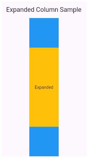
+
+//* ▲▲▲▲▲▲▲▲ description ▲▲▲▲▲▲▲▲ (do not modify or remove section marker)
+//***************************************************************************
+
+import 'package:flutter/material.dart';
+
+void main() => runApp(const MyApp());
+
+/// This is the main application widget.
+class MyApp extends StatelessWidget {
+ const MyApp({Key? key}) : super(key: key);
+
+ static const String _title = 'Flutter Code Sample';
+
+ @override
+ Widget build(BuildContext context) {
+ return const MaterialApp(
+ title: _title,
+ home: MyStatelessWidget(),
+ );
+ }
+}
+
+/// This is the stateless widget that the main application instantiates.
+class MyStatelessWidget extends StatelessWidget {
+ const MyStatelessWidget({Key? key}) : super(key: key);
+
+ @override
+//********************************************************************
+//* ▼▼▼▼▼▼▼▼ code ▼▼▼▼▼▼▼▼ (do not modify or remove section marker)
+
+ Widget build(BuildContext context) {
+ return Scaffold(
+ appBar: AppBar(
+ title: const Text('Expanded Column Sample'),
+ ),
+ body: Center(
+ child: Column(
+ children: <Widget>[
+ Container(
+ color: Colors.blue,
+ height: 100,
+ width: 100,
+ ),
+ Expanded(
+ child: Container(
+ color: Colors.amber,
+ width: 100,
+ ),
+ ),
+ Container(
+ color: Colors.blue,
+ height: 100,
+ width: 100,
+ ),
+ ],
+ ),
+ ),
+ );
+ }
+
+//* ▲▲▲▲▲▲▲▲ code ▲▲▲▲▲▲▲▲ (do not modify or remove section marker)
+//********************************************************************
+
+}
diff --git a/examples/api/lib/widgets/basic/expanded.1.dart b/examples/api/lib/widgets/basic/expanded.1.dart
new file mode 100644
index 0000000..dd705fe
--- /dev/null
+++ b/examples/api/lib/widgets/basic/expanded.1.dart
@@ -0,0 +1,86 @@
+// Copyright 2014 The Flutter Authors. All rights reserved.
+// Use of this source code is governed by a BSD-style license that can be
+// found in the LICENSE file.
+
+// Template: dev/snippets/config/templates/stateless_widget_material.tmpl
+//
+// Comment lines marked with "▼▼▼" and "▲▲▲" are used for authoring
+// of samples, and may be ignored if you are just exploring the sample.
+
+// Flutter code sample for Expanded
+//
+//***************************************************************************
+//* ▼▼▼▼▼▼▼▼ description ▼▼▼▼▼▼▼▼ (do not modify or remove section marker)
+
+// This example shows how to use an [Expanded] widget in a [Row] with multiple
+// children expanded, utilizing the [flex] factor to prioritize available space.
+//
+// 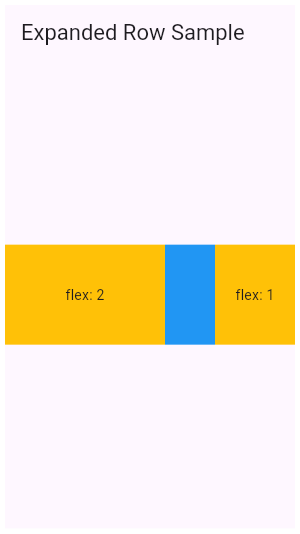
+
+//* ▲▲▲▲▲▲▲▲ description ▲▲▲▲▲▲▲▲ (do not modify or remove section marker)
+//***************************************************************************
+
+import 'package:flutter/material.dart';
+
+void main() => runApp(const MyApp());
+
+/// This is the main application widget.
+class MyApp extends StatelessWidget {
+ const MyApp({Key? key}) : super(key: key);
+
+ static const String _title = 'Flutter Code Sample';
+
+ @override
+ Widget build(BuildContext context) {
+ return const MaterialApp(
+ title: _title,
+ home: MyStatelessWidget(),
+ );
+ }
+}
+
+/// This is the stateless widget that the main application instantiates.
+class MyStatelessWidget extends StatelessWidget {
+ const MyStatelessWidget({Key? key}) : super(key: key);
+
+ @override
+//********************************************************************
+//* ▼▼▼▼▼▼▼▼ code ▼▼▼▼▼▼▼▼ (do not modify or remove section marker)
+
+ Widget build(BuildContext context) {
+ return Scaffold(
+ appBar: AppBar(
+ title: const Text('Expanded Row Sample'),
+ ),
+ body: Center(
+ child: Row(
+ children: <Widget>[
+ Expanded(
+ flex: 2,
+ child: Container(
+ color: Colors.amber,
+ height: 100,
+ ),
+ ),
+ Container(
+ color: Colors.blue,
+ height: 100,
+ width: 50,
+ ),
+ Expanded(
+ flex: 1,
+ child: Container(
+ color: Colors.amber,
+ height: 100,
+ ),
+ ),
+ ],
+ ),
+ ),
+ );
+ }
+
+//* ▲▲▲▲▲▲▲▲ code ▲▲▲▲▲▲▲▲ (do not modify or remove section marker)
+//********************************************************************
+
+}
diff --git a/examples/api/lib/widgets/basic/fitted_box.0.dart b/examples/api/lib/widgets/basic/fitted_box.0.dart
new file mode 100644
index 0000000..262a695
--- /dev/null
+++ b/examples/api/lib/widgets/basic/fitted_box.0.dart
@@ -0,0 +1,69 @@
+// Copyright 2014 The Flutter Authors. All rights reserved.
+// Use of this source code is governed by a BSD-style license that can be
+// found in the LICENSE file.
+
+// Template: dev/snippets/config/templates/stateless_widget_scaffold_center.tmpl
+//
+// Comment lines marked with "▼▼▼" and "▲▲▲" are used for authoring
+// of samples, and may be ignored if you are just exploring the sample.
+
+// Flutter code sample for FittedBox
+//
+//***************************************************************************
+//* ▼▼▼▼▼▼▼▼ description ▼▼▼▼▼▼▼▼ (do not modify or remove section marker)
+
+// In this example, the image is stretched to fill the entire [Container], which would
+// not happen normally without using FittedBox.
+
+//* ▲▲▲▲▲▲▲▲ description ▲▲▲▲▲▲▲▲ (do not modify or remove section marker)
+//***************************************************************************
+
+import 'package:flutter/material.dart';
+
+void main() => runApp(const MyApp());
+
+/// This is the main application widget.
+class MyApp extends StatelessWidget {
+ const MyApp({Key? key}) : super(key: key);
+
+ static const String _title = 'Flutter Code Sample';
+
+ @override
+ Widget build(BuildContext context) {
+ return MaterialApp(
+ title: _title,
+ home: Scaffold(
+ appBar: AppBar(title: const Text(_title)),
+ body: const Center(
+ child: MyStatelessWidget(),
+ ),
+ ),
+ );
+ }
+}
+
+/// This is the stateless widget that the main application instantiates.
+class MyStatelessWidget extends StatelessWidget {
+ const MyStatelessWidget({Key? key}) : super(key: key);
+
+ @override
+//********************************************************************
+//* ▼▼▼▼▼▼▼▼ code ▼▼▼▼▼▼▼▼ (do not modify or remove section marker)
+
+ Widget build(BuildContext context) {
+ return Container(
+ height: 400,
+ width: 300,
+ color: Colors.red,
+ child: FittedBox(
+ child: Image.network(
+ 'https://flutter.github.io/assets-for-api-docs/assets/widgets/owl-2.jpg'),
+ fit: BoxFit.fill,
+ ),
+ );
+ }
+
+//* ▲▲▲▲▲▲▲▲ code ▲▲▲▲▲▲▲▲ (do not modify or remove section marker)
+//********************************************************************
+
+}
diff --git a/examples/api/lib/widgets/basic/flow.0.dart b/examples/api/lib/widgets/basic/flow.0.dart
new file mode 100644
index 0000000..6c1c12e
--- /dev/null
+++ b/examples/api/lib/widgets/basic/flow.0.dart
@@ -0,0 +1,143 @@
+// Copyright 2014 The Flutter Authors. All rights reserved.
+// Use of this source code is governed by a BSD-style license that can be
+// found in the LICENSE file.
+
+// Template: dev/snippets/config/templates/freeform.tmpl
+//
+// Comment lines marked with "▼▼▼" and "▲▲▲" are used for authoring
+// of samples, and may be ignored if you are just exploring the sample.
+
+// Flutter code sample for Flow
+//
+//***************************************************************************
+//* ▼▼▼▼▼▼▼▼ description ▼▼▼▼▼▼▼▼ (do not modify or remove section marker)
+
+// This example uses the [Flow] widget to create a menu that opens and closes
+// as it is interacted with, shown above. The color of the button in the menu
+// changes to indicate which one has been selected.
+
+//* ▲▲▲▲▲▲▲▲ description ▲▲▲▲▲▲▲▲ (do not modify or remove section marker)
+//***************************************************************************
+
+//*************************************************************************
+//* ▼▼▼▼▼▼▼▼ code-main ▼▼▼▼▼▼▼▼ (do not modify or remove section marker)
+
+import 'package:flutter/material.dart';
+
+void main() => runApp(const FlowApp());
+
+class FlowApp extends StatelessWidget {
+ const FlowApp({Key? key}) : super(key: key);
+
+ @override
+ Widget build(BuildContext context) {
+ return MaterialApp(
+ home: Scaffold(
+ appBar: AppBar(
+ title: const Text('Flow Example'),
+ ),
+ body: const FlowMenu(),
+ ),
+ );
+ }
+}
+
+class FlowMenu extends StatefulWidget {
+ const FlowMenu({Key? key}) : super(key: key);
+
+ @override
+ State<FlowMenu> createState() => _FlowMenuState();
+}
+
+class _FlowMenuState extends State<FlowMenu>
+ with SingleTickerProviderStateMixin {
+ late AnimationController menuAnimation;
+ IconData lastTapped = Icons.notifications;
+ final List<IconData> menuItems = <IconData>[
+ Icons.home,
+ Icons.new_releases,
+ Icons.notifications,
+ Icons.settings,
+ Icons.menu,
+ ];
+
+ void _updateMenu(IconData icon) {
+ if (icon != Icons.menu) {
+ setState(() => lastTapped = icon);
+ }
+ }
+
+ @override
+ void initState() {
+ super.initState();
+ menuAnimation = AnimationController(
+ duration: const Duration(milliseconds: 250),
+ vsync: this,
+ );
+ }
+
+ Widget flowMenuItem(IconData icon) {
+ final double buttonDiameter =
+ MediaQuery.of(context).size.width / menuItems.length;
+ return Padding(
+ padding: const EdgeInsets.symmetric(vertical: 8.0),
+ child: RawMaterialButton(
+ fillColor: lastTapped == icon ? Colors.amber[700] : Colors.blue,
+ splashColor: Colors.amber[100],
+ shape: const CircleBorder(),
+ constraints: BoxConstraints.tight(Size(buttonDiameter, buttonDiameter)),
+ onPressed: () {
+ _updateMenu(icon);
+ menuAnimation.status == AnimationStatus.completed
+ ? menuAnimation.reverse()
+ : menuAnimation.forward();
+ },
+ child: Icon(
+ icon,
+ color: Colors.white,
+ size: 45.0,
+ ),
+ ),
+ );
+ }
+
+ @override
+ Widget build(BuildContext context) {
+ return Flow(
+ delegate: FlowMenuDelegate(menuAnimation: menuAnimation),
+ children:
+ menuItems.map<Widget>((IconData icon) => flowMenuItem(icon)).toList(),
+ );
+ }
+}
+
+class FlowMenuDelegate extends FlowDelegate {
+ FlowMenuDelegate({required this.menuAnimation})
+ : super(repaint: menuAnimation);
+
+ final Animation<double> menuAnimation;
+
+ @override
+ bool shouldRepaint(FlowMenuDelegate oldDelegate) {
+ return menuAnimation != oldDelegate.menuAnimation;
+ }
+
+ @override
+ void paintChildren(FlowPaintingContext context) {
+ double dx = 0.0;
+ for (int i = 0; i < context.childCount; ++i) {
+ dx = context.getChildSize(i)!.width * i;
+ context.paintChild(
+ i,
+ transform: Matrix4.translationValues(
+ dx * menuAnimation.value,
+ 0,
+ 0,
+ ),
+ );
+ }
+ }
+}
+
+//* ▲▲▲▲▲▲▲▲ code-main ▲▲▲▲▲▲▲▲ (do not modify or remove section marker)
+//*************************************************************************
diff --git a/examples/api/lib/widgets/basic/fractionally_sized_box.0.dart b/examples/api/lib/widgets/basic/fractionally_sized_box.0.dart
new file mode 100644
index 0000000..2bf6b55
--- /dev/null
+++ b/examples/api/lib/widgets/basic/fractionally_sized_box.0.dart
@@ -0,0 +1,73 @@
+// Copyright 2014 The Flutter Authors. All rights reserved.
+// Use of this source code is governed by a BSD-style license that can be
+// found in the LICENSE file.
+
+// Template: dev/snippets/config/templates/stateless_widget_scaffold.tmpl
+//
+// Comment lines marked with "▼▼▼" and "▲▲▲" are used for authoring
+// of samples, and may be ignored if you are just exploring the sample.
+
+// Flutter code sample for FractionallySizedBox
+//
+//***************************************************************************
+//* ▼▼▼▼▼▼▼▼ description ▼▼▼▼▼▼▼▼ (do not modify or remove section marker)
+
+// This sample shows a [FractionallySizedBox] whose one child is 50% of
+// the box's size per the width and height factor parameters, and centered
+// within that box by the alignment parameter.
+
+//* ▲▲▲▲▲▲▲▲ description ▲▲▲▲▲▲▲▲ (do not modify or remove section marker)
+//***************************************************************************
+
+import 'package:flutter/material.dart';
+
+void main() => runApp(const MyApp());
+
+/// This is the main application widget.
+class MyApp extends StatelessWidget {
+ const MyApp({Key? key}) : super(key: key);
+
+ static const String _title = 'Flutter Code Sample';
+
+ @override
+ Widget build(BuildContext context) {
+ return MaterialApp(
+ title: _title,
+ home: Scaffold(
+ appBar: AppBar(title: const Text(_title)),
+ body: const MyStatelessWidget(),
+ ),
+ );
+ }
+}
+
+/// This is the stateless widget that the main application instantiates.
+class MyStatelessWidget extends StatelessWidget {
+ const MyStatelessWidget({Key? key}) : super(key: key);
+
+ @override
+//********************************************************************
+//* ▼▼▼▼▼▼▼▼ code ▼▼▼▼▼▼▼▼ (do not modify or remove section marker)
+
+ Widget build(BuildContext context) {
+ return SizedBox.expand(
+ child: FractionallySizedBox(
+ widthFactor: 0.5,
+ heightFactor: 0.5,
+ alignment: FractionalOffset.center,
+ child: DecoratedBox(
+ decoration: BoxDecoration(
+ border: Border.all(
+ color: Colors.blue,
+ width: 4,
+ ),
+ ),
+ ),
+ ),
+ );
+ }
+
+//* ▲▲▲▲▲▲▲▲ code ▲▲▲▲▲▲▲▲ (do not modify or remove section marker)
+//********************************************************************
+
+}
diff --git a/examples/api/lib/widgets/basic/ignore_pointer.0.dart b/examples/api/lib/widgets/basic/ignore_pointer.0.dart
new file mode 100644
index 0000000..d1ede6c
--- /dev/null
+++ b/examples/api/lib/widgets/basic/ignore_pointer.0.dart
@@ -0,0 +1,98 @@
+// Copyright 2014 The Flutter Authors. All rights reserved.
+// Use of this source code is governed by a BSD-style license that can be
+// found in the LICENSE file.
+
+// Template: dev/snippets/config/templates/stateful_widget_material.tmpl
+//
+// Comment lines marked with "▼▼▼" and "▲▲▲" are used for authoring
+// of samples, and may be ignored if you are just exploring the sample.
+
+// Flutter code sample for IgnorePointer
+//
+//***************************************************************************
+//* ▼▼▼▼▼▼▼▼ description ▼▼▼▼▼▼▼▼ (do not modify or remove section marker)
+
+// The following sample has an [IgnorePointer] widget wrapping the `Column`
+// which contains a button.
+// When [ignoring] is set to `true` anything inside the `Column` can
+// not be tapped. When [ignoring] is set to `false` anything
+// inside the `Column` can be tapped.
+
+//* ▲▲▲▲▲▲▲▲ description ▲▲▲▲▲▲▲▲ (do not modify or remove section marker)
+//***************************************************************************
+
+import 'package:flutter/material.dart';
+
+void main() => runApp(const MyApp());
+
+/// This is the main application widget.
+class MyApp extends StatelessWidget {
+ const MyApp({Key? key}) : super(key: key);
+
+ static const String _title = 'Flutter Code Sample';
+
+ @override
+ Widget build(BuildContext context) {
+ return const MaterialApp(
+ title: _title,
+ home: MyStatefulWidget(),
+ );
+ }
+}
+
+/// This is the stateful widget that the main application instantiates.
+class MyStatefulWidget extends StatefulWidget {
+ const MyStatefulWidget({Key? key}) : super(key: key);
+
+ @override
+ State<MyStatefulWidget> createState() => _MyStatefulWidgetState();
+}
+
+/// This is the private State class that goes with MyStatefulWidget.
+class _MyStatefulWidgetState extends State<MyStatefulWidget> {
+//********************************************************************
+//* ▼▼▼▼▼▼▼▼ code ▼▼▼▼▼▼▼▼ (do not modify or remove section marker)
+
+ bool ignoring = false;
+ void setIgnoring(bool newValue) {
+ setState(() {
+ ignoring = newValue;
+ });
+ }
+
+ @override
+ Widget build(BuildContext context) {
+ return Scaffold(
+ appBar: AppBar(
+ centerTitle: true,
+ title: ElevatedButton(
+ onPressed: () {
+ setIgnoring(!ignoring);
+ },
+ child: Text(
+ ignoring ? 'Set ignoring to false' : 'Set ignoring to true',
+ ),
+ ),
+ ),
+ body: Center(
+ child: IgnorePointer(
+ ignoring: ignoring,
+ child: Column(
+ mainAxisAlignment: MainAxisAlignment.spaceEvenly,
+ children: <Widget>[
+ Text('Ignoring: $ignoring'),
+ ElevatedButton(
+ onPressed: () {},
+ child: const Text('Click me!'),
+ ),
+ ],
+ ),
+ ),
+ ),
+ );
+ }
+
+//* ▲▲▲▲▲▲▲▲ code ▲▲▲▲▲▲▲▲ (do not modify or remove section marker)
+//********************************************************************
+
+}
diff --git a/examples/api/lib/widgets/basic/listener.0.dart b/examples/api/lib/widgets/basic/listener.0.dart
new file mode 100644
index 0000000..99282bd
--- /dev/null
+++ b/examples/api/lib/widgets/basic/listener.0.dart
@@ -0,0 +1,123 @@
+// Copyright 2014 The Flutter Authors. All rights reserved.
+// Use of this source code is governed by a BSD-style license that can be
+// found in the LICENSE file.
+
+// Template: dev/snippets/config/templates/stateful_widget_scaffold_center.tmpl
+//
+// Comment lines marked with "▼▼▼" and "▲▲▲" are used for authoring
+// of samples, and may be ignored if you are just exploring the sample.
+
+// Flutter code sample for Listener
+//
+//***************************************************************************
+//* ▼▼▼▼▼▼▼▼ description ▼▼▼▼▼▼▼▼ (do not modify or remove section marker)
+
+// This example makes a [Container] react to being touched, showing a count of
+// the number of pointer downs and ups.
+
+//* ▲▲▲▲▲▲▲▲ description ▲▲▲▲▲▲▲▲ (do not modify or remove section marker)
+//***************************************************************************
+
+import 'package:flutter/material.dart';
+//****************************************************************************
+//* ▼▼▼▼▼▼▼▼ code-imports ▼▼▼▼▼▼▼▼ (do not modify or remove section marker)
+
+import 'package:flutter/widgets.dart';
+
+//* ▲▲▲▲▲▲▲▲ code-imports ▲▲▲▲▲▲▲▲ (do not modify or remove section marker)
+//****************************************************************************
+
+void main() => runApp(const MyApp());
+
+/// This is the main application widget.
+class MyApp extends StatelessWidget {
+ const MyApp({Key? key}) : super(key: key);
+
+ static const String _title = 'Flutter Code Sample';
+
+ @override
+ Widget build(BuildContext context) {
+ return MaterialApp(
+ title: _title,
+ home: Scaffold(
+ appBar: AppBar(title: const Text(_title)),
+ body: const Center(
+ child: MyStatefulWidget(),
+ ),
+ ),
+ );
+ }
+}
+
+/// This is the stateful widget that the main application instantiates.
+class MyStatefulWidget extends StatefulWidget {
+ const MyStatefulWidget({Key? key}) : super(key: key);
+
+ @override
+ State<MyStatefulWidget> createState() => _MyStatefulWidgetState();
+}
+
+/// This is the private State class that goes with MyStatefulWidget.
+class _MyStatefulWidgetState extends State<MyStatefulWidget> {
+//********************************************************************
+//* ▼▼▼▼▼▼▼▼ code ▼▼▼▼▼▼▼▼ (do not modify or remove section marker)
+
+ int _downCounter = 0;
+ int _upCounter = 0;
+ double x = 0.0;
+ double y = 0.0;
+
+ void _incrementDown(PointerEvent details) {
+ _updateLocation(details);
+ setState(() {
+ _downCounter++;
+ });
+ }
+
+ void _incrementUp(PointerEvent details) {
+ _updateLocation(details);
+ setState(() {
+ _upCounter++;
+ });
+ }
+
+ void _updateLocation(PointerEvent details) {
+ setState(() {
+ x = details.position.dx;
+ y = details.position.dy;
+ });
+ }
+
+ @override
+ Widget build(BuildContext context) {
+ return ConstrainedBox(
+ constraints: BoxConstraints.tight(const Size(300.0, 200.0)),
+ child: Listener(
+ onPointerDown: _incrementDown,
+ onPointerMove: _updateLocation,
+ onPointerUp: _incrementUp,
+ child: Container(
+ color: Colors.lightBlueAccent,
+ child: Column(
+ mainAxisAlignment: MainAxisAlignment.center,
+ children: <Widget>[
+ const Text(
+ 'You have pressed or released in this area this many times:'),
+ Text(
+ '$_downCounter presses\n$_upCounter releases',
+ style: Theme.of(context).textTheme.headline4,
+ ),
+ Text(
+ 'The cursor is here: (${x.toStringAsFixed(2)}, ${y.toStringAsFixed(2)})',
+ ),
+ ],
+ ),
+ ),
+ ),
+ );
+ }
+
+//* ▲▲▲▲▲▲▲▲ code ▲▲▲▲▲▲▲▲ (do not modify or remove section marker)
+//********************************************************************
+
+}
diff --git a/examples/api/lib/widgets/basic/mouse_region.0.dart b/examples/api/lib/widgets/basic/mouse_region.0.dart
new file mode 100644
index 0000000..3b11edc
--- /dev/null
+++ b/examples/api/lib/widgets/basic/mouse_region.0.dart
@@ -0,0 +1,121 @@
+// Copyright 2014 The Flutter Authors. All rights reserved.
+// Use of this source code is governed by a BSD-style license that can be
+// found in the LICENSE file.
+
+// Template: dev/snippets/config/templates/stateful_widget_scaffold_center.tmpl
+//
+// Comment lines marked with "▼▼▼" and "▲▲▲" are used for authoring
+// of samples, and may be ignored if you are just exploring the sample.
+
+// Flutter code sample for MouseRegion
+//
+//***************************************************************************
+//* ▼▼▼▼▼▼▼▼ description ▼▼▼▼▼▼▼▼ (do not modify or remove section marker)
+
+// This example makes a [Container] react to being entered by a mouse
+// pointer, showing a count of the number of entries and exits.
+
+//* ▲▲▲▲▲▲▲▲ description ▲▲▲▲▲▲▲▲ (do not modify or remove section marker)
+//***************************************************************************
+
+import 'package:flutter/material.dart';
+//****************************************************************************
+//* ▼▼▼▼▼▼▼▼ code-imports ▼▼▼▼▼▼▼▼ (do not modify or remove section marker)
+
+import 'package:flutter/widgets.dart';
+
+//* ▲▲▲▲▲▲▲▲ code-imports ▲▲▲▲▲▲▲▲ (do not modify or remove section marker)
+//****************************************************************************
+
+void main() => runApp(const MyApp());
+
+/// This is the main application widget.
+class MyApp extends StatelessWidget {
+ const MyApp({Key? key}) : super(key: key);
+
+ static const String _title = 'Flutter Code Sample';
+
+ @override
+ Widget build(BuildContext context) {
+ return MaterialApp(
+ title: _title,
+ home: Scaffold(
+ appBar: AppBar(title: const Text(_title)),
+ body: const Center(
+ child: MyStatefulWidget(),
+ ),
+ ),
+ );
+ }
+}
+
+/// This is the stateful widget that the main application instantiates.
+class MyStatefulWidget extends StatefulWidget {
+ const MyStatefulWidget({Key? key}) : super(key: key);
+
+ @override
+ State<MyStatefulWidget> createState() => _MyStatefulWidgetState();
+}
+
+/// This is the private State class that goes with MyStatefulWidget.
+class _MyStatefulWidgetState extends State<MyStatefulWidget> {
+//********************************************************************
+//* ▼▼▼▼▼▼▼▼ code ▼▼▼▼▼▼▼▼ (do not modify or remove section marker)
+
+ int _enterCounter = 0;
+ int _exitCounter = 0;
+ double x = 0.0;
+ double y = 0.0;
+
+ void _incrementEnter(PointerEvent details) {
+ setState(() {
+ _enterCounter++;
+ });
+ }
+
+ void _incrementExit(PointerEvent details) {
+ setState(() {
+ _exitCounter++;
+ });
+ }
+
+ void _updateLocation(PointerEvent details) {
+ setState(() {
+ x = details.position.dx;
+ y = details.position.dy;
+ });
+ }
+
+ @override
+ Widget build(BuildContext context) {
+ return ConstrainedBox(
+ constraints: BoxConstraints.tight(const Size(300.0, 200.0)),
+ child: MouseRegion(
+ onEnter: _incrementEnter,
+ onHover: _updateLocation,
+ onExit: _incrementExit,
+ child: Container(
+ color: Colors.lightBlueAccent,
+ child: Column(
+ mainAxisAlignment: MainAxisAlignment.center,
+ children: <Widget>[
+ const Text(
+ 'You have entered or exited this box this many times:'),
+ Text(
+ '$_enterCounter Entries\n$_exitCounter Exits',
+ style: Theme.of(context).textTheme.headline4,
+ ),
+ Text(
+ 'The cursor is here: (${x.toStringAsFixed(2)}, ${y.toStringAsFixed(2)})',
+ ),
+ ],
+ ),
+ ),
+ ),
+ );
+ }
+
+//* ▲▲▲▲▲▲▲▲ code ▲▲▲▲▲▲▲▲ (do not modify or remove section marker)
+//********************************************************************
+
+}
diff --git a/examples/api/lib/widgets/basic/mouse_region.on_exit.0.dart b/examples/api/lib/widgets/basic/mouse_region.on_exit.0.dart
new file mode 100644
index 0000000..b930498
--- /dev/null
+++ b/examples/api/lib/widgets/basic/mouse_region.on_exit.0.dart
@@ -0,0 +1,86 @@
+// Copyright 2014 The Flutter Authors. All rights reserved.
+// Use of this source code is governed by a BSD-style license that can be
+// found in the LICENSE file.
+
+// Template: dev/snippets/config/templates/stateful_widget_scaffold_center.tmpl
+//
+// Comment lines marked with "▼▼▼" and "▲▲▲" are used for authoring
+// of samples, and may be ignored if you are just exploring the sample.
+
+// Flutter code sample for MouseRegion.onExit
+//
+//***************************************************************************
+//* ▼▼▼▼▼▼▼▼ description ▼▼▼▼▼▼▼▼ (do not modify or remove section marker)
+
+// The following example shows a blue rectangular that turns yellow when
+// hovered. Since the hover state is completely contained within a widget
+// that unconditionally creates the `MouseRegion`, you can ignore the
+// aforementioned restriction.
+
+//* ▲▲▲▲▲▲▲▲ description ▲▲▲▲▲▲▲▲ (do not modify or remove section marker)
+//***************************************************************************
+
+import 'package:flutter/material.dart';
+
+void main() => runApp(const MyApp());
+
+/// This is the main application widget.
+class MyApp extends StatelessWidget {
+ const MyApp({Key? key}) : super(key: key);
+
+ static const String _title = 'Flutter Code Sample';
+
+ @override
+ Widget build(BuildContext context) {
+ return MaterialApp(
+ title: _title,
+ home: Scaffold(
+ appBar: AppBar(title: const Text(_title)),
+ body: const Center(
+ child: MyStatefulWidget(),
+ ),
+ ),
+ );
+ }
+}
+
+/// This is the stateful widget that the main application instantiates.
+class MyStatefulWidget extends StatefulWidget {
+ const MyStatefulWidget({Key? key}) : super(key: key);
+
+ @override
+ State<MyStatefulWidget> createState() => _MyStatefulWidgetState();
+}
+
+/// This is the private State class that goes with MyStatefulWidget.
+class _MyStatefulWidgetState extends State<MyStatefulWidget> {
+//********************************************************************
+//* ▼▼▼▼▼▼▼▼ code ▼▼▼▼▼▼▼▼ (do not modify or remove section marker)
+
+ bool hovered = false;
+
+ @override
+ Widget build(BuildContext context) {
+ return Container(
+ height: 100,
+ width: 100,
+ decoration: BoxDecoration(color: hovered ? Colors.yellow : Colors.blue),
+ child: MouseRegion(
+ onEnter: (_) {
+ setState(() {
+ hovered = true;
+ });
+ },
+ onExit: (_) {
+ setState(() {
+ hovered = false;
+ });
+ },
+ ),
+ );
+ }
+
+//* ▲▲▲▲▲▲▲▲ code ▲▲▲▲▲▲▲▲ (do not modify or remove section marker)
+//********************************************************************
+
+}
diff --git a/examples/api/lib/widgets/basic/mouse_region.on_exit.1.dart b/examples/api/lib/widgets/basic/mouse_region.on_exit.1.dart
new file mode 100644
index 0000000..35cdbeb
--- /dev/null
+++ b/examples/api/lib/widgets/basic/mouse_region.on_exit.1.dart
@@ -0,0 +1,167 @@
+// Copyright 2014 The Flutter Authors. All rights reserved.
+// Use of this source code is governed by a BSD-style license that can be
+// found in the LICENSE file.
+
+// Template: dev/snippets/config/templates/stateful_widget_scaffold_center.tmpl
+//
+// Comment lines marked with "▼▼▼" and "▲▲▲" are used for authoring
+// of samples, and may be ignored if you are just exploring the sample.
+
+// Flutter code sample for MouseRegion.onExit
+//
+//***************************************************************************
+//* ▼▼▼▼▼▼▼▼ description ▼▼▼▼▼▼▼▼ (do not modify or remove section marker)
+
+// The following example shows a widget that hides its content one second
+// after being hovered, and also exposes the enter and exit callbacks.
+// Because the widget conditionally creates the `MouseRegion`, and leaks the
+// hover state, it needs to take the restriction into consideration. In this
+// case, since it has access to the event that triggers the disappearance of
+// the `MouseRegion`, it simply trigger the exit callback during that event
+// as well.
+
+//* ▲▲▲▲▲▲▲▲ description ▲▲▲▲▲▲▲▲ (do not modify or remove section marker)
+//***************************************************************************
+
+import 'package:flutter/material.dart';
+
+void main() => runApp(const MyApp());
+
+/// This is the main application widget.
+class MyApp extends StatelessWidget {
+ const MyApp({Key? key}) : super(key: key);
+
+ static const String _title = 'Flutter Code Sample';
+
+ @override
+ Widget build(BuildContext context) {
+ return MaterialApp(
+ title: _title,
+ home: Scaffold(
+ appBar: AppBar(title: const Text(_title)),
+ body: const Center(
+ child: MyStatefulWidget(),
+ ),
+ ),
+ );
+ }
+}
+
+//*****************************************************************************
+//* ▼▼▼▼▼▼▼▼ code-preamble ▼▼▼▼▼▼▼▼ (do not modify or remove section marker)
+
+// A region that hides its content one second after being hovered.
+class MyTimedButton extends StatefulWidget {
+ const MyTimedButton(
+ {Key? key, required this.onEnterButton, required this.onExitButton})
+ : super(key: key);
+
+ final VoidCallback onEnterButton;
+ final VoidCallback onExitButton;
+
+ @override
+ State<MyTimedButton> createState() => _MyTimedButton();
+}
+
+class _MyTimedButton extends State<MyTimedButton> {
+ bool regionIsHidden = false;
+ bool hovered = false;
+
+ Future<void> startCountdown() async {
+ await Future<void>.delayed(const Duration(seconds: 1));
+ hideButton();
+ }
+
+ void hideButton() {
+ setState(() {
+ regionIsHidden = true;
+ });
+ // This statement is necessary.
+ if (hovered) {
+ widget.onExitButton();
+ }
+ }
+
+ @override
+ Widget build(BuildContext context) {
+ return SizedBox(
+ width: 100,
+ height: 100,
+ child: MouseRegion(
+ child: regionIsHidden
+ ? null
+ : MouseRegion(
+ onEnter: (_) {
+ widget.onEnterButton();
+ setState(() {
+ hovered = true;
+ });
+ startCountdown();
+ },
+ onExit: (_) {
+ setState(() {
+ hovered = false;
+ });
+ widget.onExitButton();
+ },
+ child: Container(color: Colors.red),
+ ),
+ ),
+ );
+ }
+}
+
+//* ▲▲▲▲▲▲▲▲ code-preamble ▲▲▲▲▲▲▲▲ (do not modify or remove section marker)
+//*****************************************************************************
+
+/// This is the stateful widget that the main application instantiates.
+class MyStatefulWidget extends StatefulWidget {
+ const MyStatefulWidget({Key? key}) : super(key: key);
+
+ @override
+ State<MyStatefulWidget> createState() => _MyStatefulWidgetState();
+}
+
+/// This is the private State class that goes with MyStatefulWidget.
+class _MyStatefulWidgetState extends State<MyStatefulWidget> {
+//********************************************************************
+//* ▼▼▼▼▼▼▼▼ code ▼▼▼▼▼▼▼▼ (do not modify or remove section marker)
+
+ Key key = UniqueKey();
+ bool hovering = false;
+
+ @override
+ Widget build(BuildContext context) {
+ return Column(
+ children: <Widget>[
+ ElevatedButton(
+ onPressed: () {
+ setState(() {
+ key = UniqueKey();
+ });
+ },
+ child: const Text('Refresh'),
+ ),
+ if (hovering) const Text('Hovering'),
+ if (!hovering) const Text('Not hovering'),
+ MyTimedButton(
+ key: key,
+ onEnterButton: () {
+ setState(() {
+ hovering = true;
+ });
+ },
+ onExitButton: () {
+ setState(() {
+ hovering = false;
+ });
+ },
+ ),
+ ],
+ );
+ }
+
+//* ▲▲▲▲▲▲▲▲ code ▲▲▲▲▲▲▲▲ (do not modify or remove section marker)
+//********************************************************************
+
+}
diff --git a/examples/api/lib/widgets/basic/offstage.0.dart b/examples/api/lib/widgets/basic/offstage.0.dart
new file mode 100644
index 0000000..30ae69c
--- /dev/null
+++ b/examples/api/lib/widgets/basic/offstage.0.dart
@@ -0,0 +1,108 @@
+// Copyright 2014 The Flutter Authors. All rights reserved.
+// Use of this source code is governed by a BSD-style license that can be
+// found in the LICENSE file.
+
+// Template: dev/snippets/config/templates/stateful_widget_scaffold_center.tmpl
+//
+// Comment lines marked with "▼▼▼" and "▲▲▲" are used for authoring
+// of samples, and may be ignored if you are just exploring the sample.
+
+// Flutter code sample for Offstage
+//
+//***************************************************************************
+//* ▼▼▼▼▼▼▼▼ description ▼▼▼▼▼▼▼▼ (do not modify or remove section marker)
+
+// This example shows a [FlutterLogo] widget when the `_offstage` member field
+// is false, and hides it without any room in the parent when it is true. When
+// offstage, this app displays a button to get the logo size, which will be
+// displayed in a [SnackBar].
+
+//* ▲▲▲▲▲▲▲▲ description ▲▲▲▲▲▲▲▲ (do not modify or remove section marker)
+//***************************************************************************
+
+import 'package:flutter/material.dart';
+
+void main() => runApp(const MyApp());
+
+/// This is the main application widget.
+class MyApp extends StatelessWidget {
+ const MyApp({Key? key}) : super(key: key);
+
+ static const String _title = 'Flutter Code Sample';
+
+ @override
+ Widget build(BuildContext context) {
+ return MaterialApp(
+ title: _title,
+ home: Scaffold(
+ appBar: AppBar(title: const Text(_title)),
+ body: const Center(
+ child: MyStatefulWidget(),
+ ),
+ ),
+ );
+ }
+}
+
+/// This is the stateful widget that the main application instantiates.
+class MyStatefulWidget extends StatefulWidget {
+ const MyStatefulWidget({Key? key}) : super(key: key);
+
+ @override
+ State<MyStatefulWidget> createState() => _MyStatefulWidgetState();
+}
+
+/// This is the private State class that goes with MyStatefulWidget.
+class _MyStatefulWidgetState extends State<MyStatefulWidget> {
+//********************************************************************
+//* ▼▼▼▼▼▼▼▼ code ▼▼▼▼▼▼▼▼ (do not modify or remove section marker)
+
+ final GlobalKey _key = GlobalKey();
+ bool _offstage = true;
+
+ Size _getFlutterLogoSize() {
+ final RenderBox renderLogo =
+ _key.currentContext!.findRenderObject()! as RenderBox;
+ return renderLogo.size;
+ }
+
+ @override
+ Widget build(BuildContext context) {
+ return Column(
+ mainAxisAlignment: MainAxisAlignment.center,
+ children: <Widget>[
+ Offstage(
+ offstage: _offstage,
+ child: FlutterLogo(
+ key: _key,
+ size: 150.0,
+ ),
+ ),
+ Text('Flutter logo is offstage: $_offstage'),
+ ElevatedButton(
+ child: const Text('Toggle Offstage Value'),
+ onPressed: () {
+ setState(() {
+ _offstage = !_offstage;
+ });
+ },
+ ),
+ if (_offstage)
+ ElevatedButton(
+ child: const Text('Get Flutter Logo size'),
+ onPressed: () {
+ ScaffoldMessenger.of(context).showSnackBar(
+ SnackBar(
+ content:
+ Text('Flutter Logo size is ${_getFlutterLogoSize()}'),
+ ),
+ );
+ }),
+ ],
+ );
+ }
+
+//* ▲▲▲▲▲▲▲▲ code ▲▲▲▲▲▲▲▲ (do not modify or remove section marker)
+//********************************************************************
+
+}
diff --git a/examples/api/lib/widgets/basic/physical_shape.0.dart b/examples/api/lib/widgets/basic/physical_shape.0.dart
new file mode 100644
index 0000000..60845b4
--- /dev/null
+++ b/examples/api/lib/widgets/basic/physical_shape.0.dart
@@ -0,0 +1,83 @@
+// Copyright 2014 The Flutter Authors. All rights reserved.
+// Use of this source code is governed by a BSD-style license that can be
+// found in the LICENSE file.
+
+// Template: dev/snippets/config/templates/stateless_widget_material.tmpl
+//
+// Comment lines marked with "▼▼▼" and "▲▲▲" are used for authoring
+// of samples, and may be ignored if you are just exploring the sample.
+
+// Flutter code sample for PhysicalShape
+//
+//***************************************************************************
+//* ▼▼▼▼▼▼▼▼ description ▼▼▼▼▼▼▼▼ (do not modify or remove section marker)
+
+// This example shows how to use a [PhysicalShape] on a centered [SizedBox]
+// to clip it to a rounded rectangle using a [ShapeBorderClipper] and give it
+// an orange color along with a shadow.
+
+//* ▲▲▲▲▲▲▲▲ description ▲▲▲▲▲▲▲▲ (do not modify or remove section marker)
+//***************************************************************************
+
+import 'package:flutter/material.dart';
+
+void main() => runApp(const MyApp());
+
+/// This is the main application widget.
+class MyApp extends StatelessWidget {
+ const MyApp({Key? key}) : super(key: key);
+
+ static const String _title = 'Flutter Code Sample';
+
+ @override
+ Widget build(BuildContext context) {
+ return const MaterialApp(
+ title: _title,
+ home: MyStatelessWidget(),
+ );
+ }
+}
+
+/// This is the stateless widget that the main application instantiates.
+class MyStatelessWidget extends StatelessWidget {
+ const MyStatelessWidget({Key? key}) : super(key: key);
+
+ @override
+//********************************************************************
+//* ▼▼▼▼▼▼▼▼ code ▼▼▼▼▼▼▼▼ (do not modify or remove section marker)
+
+ Widget build(BuildContext context) {
+ return Scaffold(
+ appBar: AppBar(
+ title: const Text('PhysicalShape Sample'),
+ ),
+ body: Center(
+ child: PhysicalShape(
+ elevation: 5.0,
+ child: const SizedBox(
+ child: Center(
+ child: Text(
+ 'Hello, World!',
+ style: TextStyle(
+ color: Colors.white,
+ fontSize: 20.0,
+ ),
+ ),
+ ),
+ height: 200.0,
+ width: 200.0,
+ ),
+ clipper: ShapeBorderClipper(
+ shape: RoundedRectangleBorder(
+ borderRadius: BorderRadius.circular(10.0),
+ )),
+ color: Colors.orange,
+ ),
+ ),
+ );
+ }
+
+//* ▲▲▲▲▲▲▲▲ code ▲▲▲▲▲▲▲▲ (do not modify or remove section marker)
+//********************************************************************
+
+}
diff --git a/examples/api/lib/widgets/color_filter/color_filtered.0.dart b/examples/api/lib/widgets/color_filter/color_filtered.0.dart
new file mode 100644
index 0000000..75eb997
--- /dev/null
+++ b/examples/api/lib/widgets/color_filter/color_filtered.0.dart
@@ -0,0 +1,79 @@
+// Copyright 2014 The Flutter Authors. All rights reserved.
+// Use of this source code is governed by a BSD-style license that can be
+// found in the LICENSE file.
+
+// Template: dev/snippets/config/templates/stateless_widget_scaffold.tmpl
+//
+// Comment lines marked with "▼▼▼" and "▲▲▲" are used for authoring
+// of samples, and may be ignored if you are just exploring the sample.
+
+// Flutter code sample for ColorFiltered
+//
+//***************************************************************************
+//* ▼▼▼▼▼▼▼▼ description ▼▼▼▼▼▼▼▼ (do not modify or remove section marker)
+
+// These two images have two [ColorFilter]s applied with different [BlendMode]s,
+// one with red color and [BlendMode.modulate] another with a grey color and [BlendMode.saturation].
+
+//* ▲▲▲▲▲▲▲▲ description ▲▲▲▲▲▲▲▲ (do not modify or remove section marker)
+//***************************************************************************
+
+import 'package:flutter/material.dart';
+
+void main() => runApp(const MyApp());
+
+/// This is the main application widget.
+class MyApp extends StatelessWidget {
+ const MyApp({Key? key}) : super(key: key);
+
+ static const String _title = 'Flutter Code Sample';
+
+ @override
+ Widget build(BuildContext context) {
+ return MaterialApp(
+ title: _title,
+ home: Scaffold(
+ appBar: AppBar(title: const Text(_title)),
+ body: const MyStatelessWidget(),
+ ),
+ );
+ }
+}
+
+/// This is the stateless widget that the main application instantiates.
+class MyStatelessWidget extends StatelessWidget {
+ const MyStatelessWidget({Key? key}) : super(key: key);
+
+ @override
+//********************************************************************
+//* ▼▼▼▼▼▼▼▼ code ▼▼▼▼▼▼▼▼ (do not modify or remove section marker)
+
+ Widget build(BuildContext context) {
+ return SingleChildScrollView(
+ child: Column(
+ children: <Widget>[
+ ColorFiltered(
+ colorFilter: const ColorFilter.mode(
+ Colors.red,
+ BlendMode.modulate,
+ ),
+ child: Image.network(
+ 'https://flutter.github.io/assets-for-api-docs/assets/widgets/owl-2.jpg'),
+ ),
+ ColorFiltered(
+ colorFilter: const ColorFilter.mode(
+ Colors.grey,
+ BlendMode.saturation,
+ ),
+ child: Image.network(
+ 'https://flutter.github.io/assets-for-api-docs/assets/widgets/owl.jpg'),
+ ),
+ ],
+ ),
+ );
+ }
+
+//* ▲▲▲▲▲▲▲▲ code ▲▲▲▲▲▲▲▲ (do not modify or remove section marker)
+//********************************************************************
+
+}
diff --git a/examples/api/lib/widgets/dismissible/dismissible.0.dart b/examples/api/lib/widgets/dismissible/dismissible.0.dart
new file mode 100644
index 0000000..3523151
--- /dev/null
+++ b/examples/api/lib/widgets/dismissible/dismissible.0.dart
@@ -0,0 +1,88 @@
+// Copyright 2014 The Flutter Authors. All rights reserved.
+// Use of this source code is governed by a BSD-style license that can be
+// found in the LICENSE file.
+
+// Template: dev/snippets/config/templates/stateful_widget_scaffold.tmpl
+//
+// Comment lines marked with "▼▼▼" and "▲▲▲" are used for authoring
+// of samples, and may be ignored if you are just exploring the sample.
+
+// Flutter code sample for Dismissible
+//
+//***************************************************************************
+//* ▼▼▼▼▼▼▼▼ description ▼▼▼▼▼▼▼▼ (do not modify or remove section marker)
+
+// This sample shows how you can use the [Dismissible] widget to
+// remove list items using swipe gestures. Swipe any of the list
+// tiles to the left or right to dismiss them from the [ListView].
+
+//* ▲▲▲▲▲▲▲▲ description ▲▲▲▲▲▲▲▲ (do not modify or remove section marker)
+//***************************************************************************
+
+import 'package:flutter/material.dart';
+
+void main() => runApp(const MyApp());
+
+/// This is the main application widget.
+class MyApp extends StatelessWidget {
+ const MyApp({Key? key}) : super(key: key);
+
+ static const String _title = 'Flutter Code Sample';
+
+ @override
+ Widget build(BuildContext context) {
+ return MaterialApp(
+ title: _title,
+ home: Scaffold(
+ appBar: AppBar(title: const Text(_title)),
+ body: const MyStatefulWidget(),
+ ),
+ );
+ }
+}
+
+/// This is the stateful widget that the main application instantiates.
+class MyStatefulWidget extends StatefulWidget {
+ const MyStatefulWidget({Key? key}) : super(key: key);
+
+ @override
+ State<MyStatefulWidget> createState() => _MyStatefulWidgetState();
+}
+
+/// This is the private State class that goes with MyStatefulWidget.
+class _MyStatefulWidgetState extends State<MyStatefulWidget> {
+//********************************************************************
+//* ▼▼▼▼▼▼▼▼ code ▼▼▼▼▼▼▼▼ (do not modify or remove section marker)
+
+ List<int> items = List<int>.generate(100, (int index) => index);
+
+ @override
+ Widget build(BuildContext context) {
+ return ListView.builder(
+ itemCount: items.length,
+ padding: const EdgeInsets.symmetric(vertical: 16),
+ itemBuilder: (BuildContext context, int index) {
+ return Dismissible(
+ child: ListTile(
+ title: Text(
+ 'Item ${items[index]}',
+ ),
+ ),
+ background: Container(
+ color: Colors.green,
+ ),
+ key: ValueKey<int>(items[index]),
+ onDismissed: (DismissDirection direction) {
+ setState(() {
+ items.removeAt(index);
+ });
+ },
+ );
+ },
+ );
+ }
+
+//* ▲▲▲▲▲▲▲▲ code ▲▲▲▲▲▲▲▲ (do not modify or remove section marker)
+//********************************************************************
+
+}
diff --git a/examples/api/lib/widgets/drag_target/draggable.0.dart b/examples/api/lib/widgets/drag_target/draggable.0.dart
new file mode 100644
index 0000000..c5884af
--- /dev/null
+++ b/examples/api/lib/widgets/drag_target/draggable.0.dart
@@ -0,0 +1,118 @@
+// Copyright 2014 The Flutter Authors. All rights reserved.
+// Use of this source code is governed by a BSD-style license that can be
+// found in the LICENSE file.
+
+// Template: dev/snippets/config/templates/stateful_widget_scaffold.tmpl
+//
+// Comment lines marked with "▼▼▼" and "▲▲▲" are used for authoring
+// of samples, and may be ignored if you are just exploring the sample.
+
+// Flutter code sample for Draggable
+//
+//***************************************************************************
+//* ▼▼▼▼▼▼▼▼ description ▼▼▼▼▼▼▼▼ (do not modify or remove section marker)
+
+// The following example has a [Draggable] widget along with a [DragTarget]
+// in a row demonstrating an incremented `acceptedData` integer value when
+// you drag the element to the target.
+
+//* ▲▲▲▲▲▲▲▲ description ▲▲▲▲▲▲▲▲ (do not modify or remove section marker)
+//***************************************************************************
+
+import 'package:flutter/material.dart';
+
+void main() => runApp(const MyApp());
+
+/// This is the main application widget.
+class MyApp extends StatelessWidget {
+ const MyApp({Key? key}) : super(key: key);
+
+ static const String _title = 'Flutter Code Sample';
+
+ @override
+ Widget build(BuildContext context) {
+ return MaterialApp(
+ title: _title,
+ home: Scaffold(
+ appBar: AppBar(title: const Text(_title)),
+ body: const MyStatefulWidget(),
+ ),
+ );
+ }
+}
+
+/// This is the stateful widget that the main application instantiates.
+class MyStatefulWidget extends StatefulWidget {
+ const MyStatefulWidget({Key? key}) : super(key: key);
+
+ @override
+ State<MyStatefulWidget> createState() => _MyStatefulWidgetState();
+}
+
+/// This is the private State class that goes with MyStatefulWidget.
+class _MyStatefulWidgetState extends State<MyStatefulWidget> {
+//********************************************************************
+//* ▼▼▼▼▼▼▼▼ code ▼▼▼▼▼▼▼▼ (do not modify or remove section marker)
+
+ int acceptedData = 0;
+
+ @override
+ Widget build(BuildContext context) {
+ return Row(
+ mainAxisAlignment: MainAxisAlignment.spaceEvenly,
+ children: <Widget>[
+ Draggable<int>(
+ // Data is the value this Draggable stores.
+ data: 10,
+ child: Container(
+ height: 100.0,
+ width: 100.0,
+ color: Colors.lightGreenAccent,
+ child: const Center(
+ child: Text('Draggable'),
+ ),
+ ),
+ feedback: Container(
+ color: Colors.deepOrange,
+ height: 100,
+ width: 100,
+ child: const Icon(Icons.directions_run),
+ ),
+ childWhenDragging: Container(
+ height: 100.0,
+ width: 100.0,
+ color: Colors.pinkAccent,
+ child: const Center(
+ child: Text('Child When Dragging'),
+ ),
+ ),
+ ),
+ DragTarget<int>(
+ builder: (
+ BuildContext context,
+ List<dynamic> accepted,
+ List<dynamic> rejected,
+ ) {
+ return Container(
+ height: 100.0,
+ width: 100.0,
+ color: Colors.cyan,
+ child: Center(
+ child: Text('Value is updated to: $acceptedData'),
+ ),
+ );
+ },
+ onAccept: (int data) {
+ setState(() {
+ acceptedData += data;
+ });
+ },
+ ),
+ ],
+ );
+ }
+
+//* ▲▲▲▲▲▲▲▲ code ▲▲▲▲▲▲▲▲ (do not modify or remove section marker)
+//********************************************************************
+
+}
diff --git a/examples/api/lib/widgets/editable_text/editable_text.on_changed.0.dart b/examples/api/lib/widgets/editable_text/editable_text.on_changed.0.dart
new file mode 100644
index 0000000..81d7d91
--- /dev/null
+++ b/examples/api/lib/widgets/editable_text/editable_text.on_changed.0.dart
@@ -0,0 +1,102 @@
+// Copyright 2014 The Flutter Authors. All rights reserved.
+// Use of this source code is governed by a BSD-style license that can be
+// found in the LICENSE file.
+
+// Template: dev/snippets/config/templates/stateful_widget_material.tmpl
+//
+// Comment lines marked with "▼▼▼" and "▲▲▲" are used for authoring
+// of samples, and may be ignored if you are just exploring the sample.
+
+// Flutter code sample for EditableText.onChanged
+//
+//***************************************************************************
+//* ▼▼▼▼▼▼▼▼ description ▼▼▼▼▼▼▼▼ (do not modify or remove section marker)
+
+// This example shows how onChanged could be used to check the TextField's
+// current value each time the user inserts or deletes a character.
+
+//* ▲▲▲▲▲▲▲▲ description ▲▲▲▲▲▲▲▲ (do not modify or remove section marker)
+//***************************************************************************
+
+import 'package:flutter/material.dart';
+
+void main() => runApp(const MyApp());
+
+/// This is the main application widget.
+class MyApp extends StatelessWidget {
+ const MyApp({Key? key}) : super(key: key);
+
+ static const String _title = 'Flutter Code Sample';
+
+ @override
+ Widget build(BuildContext context) {
+ return const MaterialApp(
+ title: _title,
+ home: MyStatefulWidget(),
+ );
+ }
+}
+
+/// This is the stateful widget that the main application instantiates.
+class MyStatefulWidget extends StatefulWidget {
+ const MyStatefulWidget({Key? key}) : super(key: key);
+
+ @override
+ State<MyStatefulWidget> createState() => _MyStatefulWidgetState();
+}
+
+/// This is the private State class that goes with MyStatefulWidget.
+class _MyStatefulWidgetState extends State<MyStatefulWidget> {
+//********************************************************************
+//* ▼▼▼▼▼▼▼▼ code ▼▼▼▼▼▼▼▼ (do not modify or remove section marker)
+
+ final TextEditingController _controller = TextEditingController();
+
+ @override
+ void dispose() {
+ _controller.dispose();
+ super.dispose();
+ }
+
+ @override
+ Widget build(BuildContext context) {
+ return Scaffold(
+ body: Column(
+ mainAxisAlignment: MainAxisAlignment.center,
+ children: <Widget>[
+ const Text('What number comes next in the sequence?'),
+ const Text('1, 1, 2, 3, 5, 8...?'),
+ TextField(
+ controller: _controller,
+ onChanged: (String value) async {
+ if (value != '13') {
+ return;
+ }
+ await showDialog<void>(
+ context: context,
+ builder: (BuildContext context) {
+ return AlertDialog(
+ title: const Text('That is correct!'),
+ content: const Text('13 is the right answer.'),
+ actions: <Widget>[
+ TextButton(
+ onPressed: () {
+ Navigator.pop(context);
+ },
+ child: const Text('OK'),
+ ),
+ ],
+ );
+ },
+ );
+ },
+ ),
+ ],
+ ),
+ );
+ }
+
+//* ▲▲▲▲▲▲▲▲ code ▲▲▲▲▲▲▲▲ (do not modify or remove section marker)
+//********************************************************************
+
+}
diff --git a/examples/api/lib/widgets/editable_text/text_editing_controller.0.dart b/examples/api/lib/widgets/editable_text/text_editing_controller.0.dart
new file mode 100644
index 0000000..a8ff55f
--- /dev/null
+++ b/examples/api/lib/widgets/editable_text/text_editing_controller.0.dart
@@ -0,0 +1,93 @@
+// Copyright 2014 The Flutter Authors. All rights reserved.
+// Use of this source code is governed by a BSD-style license that can be
+// found in the LICENSE file.
+
+// Template: dev/snippets/config/templates/stateful_widget_material.tmpl
+//
+// Comment lines marked with "▼▼▼" and "▲▲▲" are used for authoring
+// of samples, and may be ignored if you are just exploring the sample.
+
+// Flutter code sample for TextEditingController
+//
+//***************************************************************************
+//* ▼▼▼▼▼▼▼▼ description ▼▼▼▼▼▼▼▼ (do not modify or remove section marker)
+
+// This example creates a [TextField] with a [TextEditingController] whose
+// change listener forces the entered text to be lower case and keeps the
+// cursor at the end of the input.
+
+//* ▲▲▲▲▲▲▲▲ description ▲▲▲▲▲▲▲▲ (do not modify or remove section marker)
+//***************************************************************************
+
+import 'package:flutter/material.dart';
+
+void main() => runApp(const MyApp());
+
+/// This is the main application widget.
+class MyApp extends StatelessWidget {
+ const MyApp({Key? key}) : super(key: key);
+
+ static const String _title = 'Flutter Code Sample';
+
+ @override
+ Widget build(BuildContext context) {
+ return const MaterialApp(
+ title: _title,
+ home: MyStatefulWidget(),
+ );
+ }
+}
+
+/// This is the stateful widget that the main application instantiates.
+class MyStatefulWidget extends StatefulWidget {
+ const MyStatefulWidget({Key? key}) : super(key: key);
+
+ @override
+ State<MyStatefulWidget> createState() => _MyStatefulWidgetState();
+}
+
+/// This is the private State class that goes with MyStatefulWidget.
+class _MyStatefulWidgetState extends State<MyStatefulWidget> {
+//********************************************************************
+//* ▼▼▼▼▼▼▼▼ code ▼▼▼▼▼▼▼▼ (do not modify or remove section marker)
+
+ final TextEditingController _controller = TextEditingController();
+
+ @override
+ void initState() {
+ super.initState();
+ _controller.addListener(() {
+ final String text = _controller.text.toLowerCase();
+ _controller.value = _controller.value.copyWith(
+ text: text,
+ selection:
+ TextSelection(baseOffset: text.length, extentOffset: text.length),
+ composing: TextRange.empty,
+ );
+ });
+ }
+
+ @override
+ void dispose() {
+ _controller.dispose();
+ super.dispose();
+ }
+
+ @override
+ Widget build(BuildContext context) {
+ return Scaffold(
+ body: Container(
+ alignment: Alignment.center,
+ padding: const EdgeInsets.all(6),
+ child: TextFormField(
+ controller: _controller,
+ decoration: const InputDecoration(border: OutlineInputBorder()),
+ ),
+ ),
+ );
+ }
+
+//* ▲▲▲▲▲▲▲▲ code ▲▲▲▲▲▲▲▲ (do not modify or remove section marker)
+//********************************************************************
+
+}
diff --git a/examples/api/lib/widgets/focus_manager/focus_node.0.dart b/examples/api/lib/widgets/focus_manager/focus_node.0.dart
new file mode 100644
index 0000000..a0dd6bb
--- /dev/null
+++ b/examples/api/lib/widgets/focus_manager/focus_node.0.dart
@@ -0,0 +1,164 @@
+// Copyright 2014 The Flutter Authors. All rights reserved.
+// Use of this source code is governed by a BSD-style license that can be
+// found in the LICENSE file.
+
+// Template: dev/snippets/config/templates/stateless_widget_scaffold.tmpl
+//
+// Comment lines marked with "▼▼▼" and "▲▲▲" are used for authoring
+// of samples, and may be ignored if you are just exploring the sample.
+
+// Flutter code sample for FocusNode
+//
+//***************************************************************************
+//* ▼▼▼▼▼▼▼▼ description ▼▼▼▼▼▼▼▼ (do not modify or remove section marker)
+
+// This example shows how a FocusNode should be managed if not using the
+// [Focus] or [FocusScope] widgets. See the [Focus] widget for a similar
+// example using [Focus] and [FocusScope] widgets.
+
+//* ▲▲▲▲▲▲▲▲ description ▲▲▲▲▲▲▲▲ (do not modify or remove section marker)
+//***************************************************************************
+
+import 'package:flutter/material.dart';
+//****************************************************************************
+//* ▼▼▼▼▼▼▼▼ code-imports ▼▼▼▼▼▼▼▼ (do not modify or remove section marker)
+
+import 'package:flutter/services.dart';
+
+//* ▲▲▲▲▲▲▲▲ code-imports ▲▲▲▲▲▲▲▲ (do not modify or remove section marker)
+//****************************************************************************
+
+void main() => runApp(const MyApp());
+
+/// This is the main application widget.
+class MyApp extends StatelessWidget {
+ const MyApp({Key? key}) : super(key: key);
+
+ static const String _title = 'Flutter Code Sample';
+
+ @override
+ Widget build(BuildContext context) {
+ return MaterialApp(
+ title: _title,
+ home: Scaffold(
+ appBar: AppBar(title: const Text(_title)),
+ body: const MyStatelessWidget(),
+ ),
+ );
+ }
+}
+
+//*****************************************************************************
+//* ▼▼▼▼▼▼▼▼ code-preamble ▼▼▼▼▼▼▼▼ (do not modify or remove section marker)
+
+class ColorfulButton extends StatefulWidget {
+ const ColorfulButton({Key? key}) : super(key: key);
+
+ @override
+ State<ColorfulButton> createState() => _ColorfulButtonState();
+}
+
+class _ColorfulButtonState extends State<ColorfulButton> {
+ late FocusNode _node;
+ bool _focused = false;
+ late FocusAttachment _nodeAttachment;
+ Color _color = Colors.white;
+
+ @override
+ void initState() {
+ super.initState();
+ _node = FocusNode(debugLabel: 'Button');
+ _node.addListener(_handleFocusChange);
+ _nodeAttachment = _node.attach(context, onKey: _handleKeyPress);
+ }
+
+ void _handleFocusChange() {
+ if (_node.hasFocus != _focused) {
+ setState(() {
+ _focused = _node.hasFocus;
+ });
+ }
+ }
+
+ KeyEventResult _handleKeyPress(FocusNode node, RawKeyEvent event) {
+ if (event is RawKeyDownEvent) {
+ print('Focus node ${node.debugLabel} got key event: ${event.logicalKey}');
+ if (event.logicalKey == LogicalKeyboardKey.keyR) {
+ print('Changing color to red.');
+ setState(() {
+ _color = Colors.red;
+ });
+ return KeyEventResult.handled;
+ } else if (event.logicalKey == LogicalKeyboardKey.keyG) {
+ print('Changing color to green.');
+ setState(() {
+ _color = Colors.green;
+ });
+ return KeyEventResult.handled;
+ } else if (event.logicalKey == LogicalKeyboardKey.keyB) {
+ print('Changing color to blue.');
+ setState(() {
+ _color = Colors.blue;
+ });
+ return KeyEventResult.handled;
+ }
+ }
+ return KeyEventResult.ignored;
+ }
+
+ @override
+ void dispose() {
+ _node.removeListener(_handleFocusChange);
+ // The attachment will automatically be detached in dispose().
+ _node.dispose();
+ super.dispose();
+ }
+
+ @override
+ Widget build(BuildContext context) {
+ _nodeAttachment.reparent();
+ return GestureDetector(
+ onTap: () {
+ if (_focused) {
+ _node.unfocus();
+ } else {
+ _node.requestFocus();
+ }
+ },
+ child: Center(
+ child: Container(
+ width: 400,
+ height: 100,
+ color: _focused ? _color : Colors.white,
+ alignment: Alignment.center,
+ child:
+ Text(_focused ? "I'm in color! Press R,G,B!" : 'Press to focus'),
+ ),
+ ),
+ );
+ }
+}
+
+//* ▲▲▲▲▲▲▲▲ code-preamble ▲▲▲▲▲▲▲▲ (do not modify or remove section marker)
+//*****************************************************************************
+
+/// This is the stateless widget that the main application instantiates.
+class MyStatelessWidget extends StatelessWidget {
+ const MyStatelessWidget({Key? key}) : super(key: key);
+
+ @override
+//********************************************************************
+//* ▼▼▼▼▼▼▼▼ code ▼▼▼▼▼▼▼▼ (do not modify or remove section marker)
+
+ Widget build(BuildContext context) {
+ final TextTheme textTheme = Theme.of(context).textTheme;
+ return DefaultTextStyle(
+ style: textTheme.headline4!,
+ child: const ColorfulButton(),
+ );
+ }
+
+//* ▲▲▲▲▲▲▲▲ code ▲▲▲▲▲▲▲▲ (do not modify or remove section marker)
+//********************************************************************
+
+}
diff --git a/examples/api/lib/widgets/focus_manager/focus_node.unfocus.0.dart b/examples/api/lib/widgets/focus_manager/focus_node.unfocus.0.dart
new file mode 100644
index 0000000..17b230d
--- /dev/null
+++ b/examples/api/lib/widgets/focus_manager/focus_node.unfocus.0.dart
@@ -0,0 +1,133 @@
+// Copyright 2014 The Flutter Authors. All rights reserved.
+// Use of this source code is governed by a BSD-style license that can be
+// found in the LICENSE file.
+
+// Template: dev/snippets/config/templates/stateful_widget_material.tmpl
+//
+// Comment lines marked with "▼▼▼" and "▲▲▲" are used for authoring
+// of samples, and may be ignored if you are just exploring the sample.
+
+// Flutter code sample for FocusNode.unfocus
+//
+//***************************************************************************
+//* ▼▼▼▼▼▼▼▼ description ▼▼▼▼▼▼▼▼ (do not modify or remove section marker)
+
+// This example shows the difference between the different [UnfocusDisposition]
+// values for [unfocus].
+//
+// Try setting focus on the four text fields by selecting them, and then
+// select "UNFOCUS" to see what happens when the current
+// [FocusManager.primaryFocus] is unfocused.
+//
+// Try pressing the TAB key after unfocusing to see what the next widget
+// chosen is.
+
+//* ▲▲▲▲▲▲▲▲ description ▲▲▲▲▲▲▲▲ (do not modify or remove section marker)
+//***************************************************************************
+
+//****************************************************************************
+//* ▼▼▼▼▼▼▼▼ code-imports ▼▼▼▼▼▼▼▼ (do not modify or remove section marker)
+
+import 'package:flutter/foundation.dart';
+
+//* ▲▲▲▲▲▲▲▲ code-imports ▲▲▲▲▲▲▲▲ (do not modify or remove section marker)
+//****************************************************************************
+
+import 'package:flutter/material.dart';
+
+void main() => runApp(const MyApp());
+
+/// This is the main application widget.
+class MyApp extends StatelessWidget {
+ const MyApp({Key? key}) : super(key: key);
+
+ static const String _title = 'Flutter Code Sample';
+
+ @override
+ Widget build(BuildContext context) {
+ return const MaterialApp(
+ title: _title,
+ home: MyStatefulWidget(),
+ );
+ }
+}
+
+/// This is the stateful widget that the main application instantiates.
+class MyStatefulWidget extends StatefulWidget {
+ const MyStatefulWidget({Key? key}) : super(key: key);
+
+ @override
+ State<MyStatefulWidget> createState() => _MyStatefulWidgetState();
+}
+
+/// This is the private State class that goes with MyStatefulWidget.
+class _MyStatefulWidgetState extends State<MyStatefulWidget> {
+//********************************************************************
+//* ▼▼▼▼▼▼▼▼ code ▼▼▼▼▼▼▼▼ (do not modify or remove section marker)
+
+ UnfocusDisposition disposition = UnfocusDisposition.scope;
+
+ @override
+ Widget build(BuildContext context) {
+ return Material(
+ child: Container(
+ color: Colors.white,
+ child: Column(
+ mainAxisAlignment: MainAxisAlignment.center,
+ children: <Widget>[
+ Wrap(
+ children: List<Widget>.generate(4, (int index) {
+ return const SizedBox(
+ width: 200,
+ child: Padding(
+ padding: EdgeInsets.all(8.0),
+ child: TextField(
+ decoration: InputDecoration(border: OutlineInputBorder()),
+ ),
+ ),
+ );
+ }),
+ ),
+ Row(
+ mainAxisAlignment: MainAxisAlignment.spaceAround,
+ children: <Widget>[
+ ...List<Widget>.generate(UnfocusDisposition.values.length,
+ (int index) {
+ return Row(
+ mainAxisSize: MainAxisSize.min,
+ children: <Widget>[
+ Radio<UnfocusDisposition>(
+ groupValue: disposition,
+ onChanged: (UnfocusDisposition? value) {
+ setState(() {
+ if (value != null) {
+ disposition = value;
+ }
+ });
+ },
+ value: UnfocusDisposition.values[index],
+ ),
+ Text(describeEnum(UnfocusDisposition.values[index])),
+ ],
+ );
+ }),
+ OutlinedButton(
+ child: const Text('UNFOCUS'),
+ onPressed: () {
+ setState(() {
+ primaryFocus!.unfocus(disposition: disposition);
+ });
+ },
+ ),
+ ],
+ ),
+ ],
+ ),
+ ),
+ );
+ }
+
+//* ▲▲▲▲▲▲▲▲ code ▲▲▲▲▲▲▲▲ (do not modify or remove section marker)
+//********************************************************************
+
+}
diff --git a/examples/api/lib/widgets/focus_scope/focus.0.dart b/examples/api/lib/widgets/focus_scope/focus.0.dart
new file mode 100644
index 0000000..3625b12
--- /dev/null
+++ b/examples/api/lib/widgets/focus_scope/focus.0.dart
@@ -0,0 +1,137 @@
+// Copyright 2014 The Flutter Authors. All rights reserved.
+// Use of this source code is governed by a BSD-style license that can be
+// found in the LICENSE file.
+
+// Template: dev/snippets/config/templates/stateful_widget_scaffold.tmpl
+//
+// Comment lines marked with "▼▼▼" and "▲▲▲" are used for authoring
+// of samples, and may be ignored if you are just exploring the sample.
+
+// Flutter code sample for Focus
+//
+//***************************************************************************
+//* ▼▼▼▼▼▼▼▼ description ▼▼▼▼▼▼▼▼ (do not modify or remove section marker)
+
+// This example shows how to manage focus using the [Focus] and [FocusScope]
+// widgets. See [FocusNode] for a similar example that doesn't use [Focus] or
+// [FocusScope].
+
+//* ▲▲▲▲▲▲▲▲ description ▲▲▲▲▲▲▲▲ (do not modify or remove section marker)
+//***************************************************************************
+
+import 'package:flutter/material.dart';
+//****************************************************************************
+//* ▼▼▼▼▼▼▼▼ code-imports ▼▼▼▼▼▼▼▼ (do not modify or remove section marker)
+
+import 'package:flutter/services.dart';
+
+//* ▲▲▲▲▲▲▲▲ code-imports ▲▲▲▲▲▲▲▲ (do not modify or remove section marker)
+//****************************************************************************
+
+void main() => runApp(const MyApp());
+
+/// This is the main application widget.
+class MyApp extends StatelessWidget {
+ const MyApp({Key? key}) : super(key: key);
+
+ static const String _title = 'Flutter Code Sample';
+
+ @override
+ Widget build(BuildContext context) {
+ return MaterialApp(
+ title: _title,
+ home: Scaffold(
+ appBar: AppBar(title: const Text(_title)),
+ body: const MyStatefulWidget(),
+ ),
+ );
+ }
+}
+
+/// This is the stateful widget that the main application instantiates.
+class MyStatefulWidget extends StatefulWidget {
+ const MyStatefulWidget({Key? key}) : super(key: key);
+
+ @override
+ State<MyStatefulWidget> createState() => _MyStatefulWidgetState();
+}
+
+/// This is the private State class that goes with MyStatefulWidget.
+class _MyStatefulWidgetState extends State<MyStatefulWidget> {
+//********************************************************************
+//* ▼▼▼▼▼▼▼▼ code ▼▼▼▼▼▼▼▼ (do not modify or remove section marker)
+
+ Color _color = Colors.white;
+
+ KeyEventResult _handleKeyPress(FocusNode node, RawKeyEvent event) {
+ if (event is RawKeyDownEvent) {
+ print('Focus node ${node.debugLabel} got key event: ${event.logicalKey}');
+ if (event.logicalKey == LogicalKeyboardKey.keyR) {
+ print('Changing color to red.');
+ setState(() {
+ _color = Colors.red;
+ });
+ return KeyEventResult.handled;
+ } else if (event.logicalKey == LogicalKeyboardKey.keyG) {
+ print('Changing color to green.');
+ setState(() {
+ _color = Colors.green;
+ });
+ return KeyEventResult.handled;
+ } else if (event.logicalKey == LogicalKeyboardKey.keyB) {
+ print('Changing color to blue.');
+ setState(() {
+ _color = Colors.blue;
+ });
+ return KeyEventResult.handled;
+ }
+ }
+ return KeyEventResult.ignored;
+ }
+
+ @override
+ Widget build(BuildContext context) {
+ final TextTheme textTheme = Theme.of(context).textTheme;
+ return FocusScope(
+ debugLabel: 'Scope',
+ autofocus: true,
+ child: DefaultTextStyle(
+ style: textTheme.headline4!,
+ child: Focus(
+ onKey: _handleKeyPress,
+ debugLabel: 'Button',
+ child: Builder(
+ builder: (BuildContext context) {
+ final FocusNode focusNode = Focus.of(context);
+ final bool hasFocus = focusNode.hasFocus;
+ return GestureDetector(
+ onTap: () {
+ if (hasFocus) {
+ focusNode.unfocus();
+ } else {
+ focusNode.requestFocus();
+ }
+ },
+ child: Center(
+ child: Container(
+ width: 400,
+ height: 100,
+ alignment: Alignment.center,
+ color: hasFocus ? _color : Colors.white,
+ child: Text(hasFocus
+ ? "I'm in color! Press R,G,B!"
+ : 'Press to focus'),
+ ),
+ ),
+ );
+ },
+ ),
+ ),
+ ),
+ );
+ }
+
+//* ▲▲▲▲▲▲▲▲ code ▲▲▲▲▲▲▲▲ (do not modify or remove section marker)
+//********************************************************************
+
+}
diff --git a/examples/api/lib/widgets/focus_scope/focus.1.dart b/examples/api/lib/widgets/focus_scope/focus.1.dart
new file mode 100644
index 0000000..e2a22f1
--- /dev/null
+++ b/examples/api/lib/widgets/focus_scope/focus.1.dart
@@ -0,0 +1,110 @@
+// Copyright 2014 The Flutter Authors. All rights reserved.
+// Use of this source code is governed by a BSD-style license that can be
+// found in the LICENSE file.
+
+// Template: dev/snippets/config/templates/stateless_widget_material.tmpl
+//
+// Comment lines marked with "▼▼▼" and "▲▲▲" are used for authoring
+// of samples, and may be ignored if you are just exploring the sample.
+
+// Flutter code sample for Focus
+//
+//***************************************************************************
+//* ▼▼▼▼▼▼▼▼ description ▼▼▼▼▼▼▼▼ (do not modify or remove section marker)
+
+// This example shows how to wrap another widget in a [Focus] widget to make it
+// focusable. It wraps a [Container], and changes the container's color when it
+// is set as the [FocusManager.primaryFocus].
+//
+// If you also want to handle mouse hover and/or keyboard actions on a widget,
+// consider using a [FocusableActionDetector], which combines several different
+// widgets to provide those capabilities.
+
+//* ▲▲▲▲▲▲▲▲ description ▲▲▲▲▲▲▲▲ (do not modify or remove section marker)
+//***************************************************************************
+
+import 'package:flutter/material.dart';
+
+void main() => runApp(const MyApp());
+
+/// This is the main application widget.
+class MyApp extends StatelessWidget {
+ const MyApp({Key? key}) : super(key: key);
+
+ static const String _title = 'Flutter Code Sample';
+
+ @override
+ Widget build(BuildContext context) {
+ return const MaterialApp(
+ title: _title,
+ home: MyStatelessWidget(),
+ );
+ }
+}
+
+//*****************************************************************************
+//* ▼▼▼▼▼▼▼▼ code-preamble ▼▼▼▼▼▼▼▼ (do not modify or remove section marker)
+
+class FocusableText extends StatelessWidget {
+ const FocusableText(
+ this.data, {
+ Key? key,
+ required this.autofocus,
+ }) : super(key: key);
+
+ /// The string to display as the text for this widget.
+ final String data;
+
+ /// Whether or not to focus this widget initially if nothing else is focused.
+ final bool autofocus;
+
+ @override
+ Widget build(BuildContext context) {
+ return Focus(
+ autofocus: autofocus,
+ child: Builder(builder: (BuildContext context) {
+ // The contents of this Builder are being made focusable. It is inside
+ // of a Builder because the builder provides the correct context
+ // variable for Focus.of() to be able to find the Focus widget that is
+ // the Builder's parent. Without the builder, the context variable used
+ // would be the one given the FocusableText build function, and that
+ // would start looking for a Focus widget ancestor of the FocusableText
+ // instead of finding the one inside of its build function.
+ return Container(
+ padding: const EdgeInsets.all(8.0),
+ // Change the color based on whether or not this Container has focus.
+ color: Focus.of(context).hasPrimaryFocus ? Colors.black12 : null,
+ child: Text(data),
+ );
+ }),
+ );
+ }
+}
+
+//* ▲▲▲▲▲▲▲▲ code-preamble ▲▲▲▲▲▲▲▲ (do not modify or remove section marker)
+//*****************************************************************************
+
+/// This is the stateless widget that the main application instantiates.
+class MyStatelessWidget extends StatelessWidget {
+ const MyStatelessWidget({Key? key}) : super(key: key);
+
+ @override
+//********************************************************************
+//* ▼▼▼▼▼▼▼▼ code ▼▼▼▼▼▼▼▼ (do not modify or remove section marker)
+
+ Widget build(BuildContext context) {
+ return Scaffold(
+ body: ListView.builder(
+ itemBuilder: (BuildContext context, int index) => FocusableText(
+ 'Item $index',
+ autofocus: index == 0,
+ ),
+ itemCount: 50,
+ ),
+ );
+ }
+
+//* ▲▲▲▲▲▲▲▲ code ▲▲▲▲▲▲▲▲ (do not modify or remove section marker)
+//********************************************************************
+
+}
diff --git a/examples/api/lib/widgets/focus_scope/focus.2.dart b/examples/api/lib/widgets/focus_scope/focus.2.dart
new file mode 100644
index 0000000..0dee82b
--- /dev/null
+++ b/examples/api/lib/widgets/focus_scope/focus.2.dart
@@ -0,0 +1,115 @@
+// Copyright 2014 The Flutter Authors. All rights reserved.
+// Use of this source code is governed by a BSD-style license that can be
+// found in the LICENSE file.
+
+// Template: dev/snippets/config/templates/stateful_widget_material.tmpl
+//
+// Comment lines marked with "▼▼▼" and "▲▲▲" are used for authoring
+// of samples, and may be ignored if you are just exploring the sample.
+
+// Flutter code sample for Focus
+//
+//***************************************************************************
+//* ▼▼▼▼▼▼▼▼ description ▼▼▼▼▼▼▼▼ (do not modify or remove section marker)
+
+// This example shows how to focus a newly-created widget immediately after it
+// is created.
+//
+// The focus node will not actually be given the focus until after the frame in
+// which it has requested focus is drawn, so it is OK to call
+// [FocusNode.requestFocus] on a node which is not yet in the focus tree.
+
+//* ▲▲▲▲▲▲▲▲ description ▲▲▲▲▲▲▲▲ (do not modify or remove section marker)
+//***************************************************************************
+
+import 'package:flutter/material.dart';
+
+void main() => runApp(const MyApp());
+
+/// This is the main application widget.
+class MyApp extends StatelessWidget {
+ const MyApp({Key? key}) : super(key: key);
+
+ static const String _title = 'Flutter Code Sample';
+
+ @override
+ Widget build(BuildContext context) {
+ return const MaterialApp(
+ title: _title,
+ home: MyStatefulWidget(),
+ );
+ }
+}
+
+/// This is the stateful widget that the main application instantiates.
+class MyStatefulWidget extends StatefulWidget {
+ const MyStatefulWidget({Key? key}) : super(key: key);
+
+ @override
+ State<MyStatefulWidget> createState() => _MyStatefulWidgetState();
+}
+
+/// This is the private State class that goes with MyStatefulWidget.
+class _MyStatefulWidgetState extends State<MyStatefulWidget> {
+//********************************************************************
+//* ▼▼▼▼▼▼▼▼ code ▼▼▼▼▼▼▼▼ (do not modify or remove section marker)
+
+ int focusedChild = 0;
+ List<Widget> children = <Widget>[];
+ List<FocusNode> childFocusNodes = <FocusNode>[];
+
+ @override
+ void initState() {
+ super.initState();
+ // Add the first child.
+ _addChild();
+ }
+
+ @override
+ void dispose() {
+ super.dispose();
+ for (final FocusNode node in childFocusNodes) {
+ node.dispose();
+ }
+ }
+
+ void _addChild() {
+ // Calling requestFocus here creates a deferred request for focus, since the
+ // node is not yet part of the focus tree.
+ childFocusNodes
+ .add(FocusNode(debugLabel: 'Child ${children.length}')..requestFocus());
+
+ children.add(Padding(
+ padding: const EdgeInsets.all(2.0),
+ child: ActionChip(
+ focusNode: childFocusNodes.last,
+ label: Text('CHILD ${children.length}'),
+ onPressed: () {},
+ ),
+ ));
+ }
+
+ @override
+ Widget build(BuildContext context) {
+ return Scaffold(
+ body: Center(
+ child: Wrap(
+ children: children,
+ ),
+ ),
+ floatingActionButton: FloatingActionButton(
+ onPressed: () {
+ setState(() {
+ focusedChild = children.length;
+ _addChild();
+ });
+ },
+ child: const Icon(Icons.add),
+ ),
+ );
+ }
+
+//* ▲▲▲▲▲▲▲▲ code ▲▲▲▲▲▲▲▲ (do not modify or remove section marker)
+//********************************************************************
+
+}
diff --git a/examples/api/lib/widgets/focus_scope/focus_scope.0.dart b/examples/api/lib/widgets/focus_scope/focus_scope.0.dart
new file mode 100644
index 0000000..9c1d79b
--- /dev/null
+++ b/examples/api/lib/widgets/focus_scope/focus_scope.0.dart
@@ -0,0 +1,196 @@
+// Copyright 2014 The Flutter Authors. All rights reserved.
+// Use of this source code is governed by a BSD-style license that can be
+// found in the LICENSE file.
+
+// Template: dev/snippets/config/templates/stateful_widget_material.tmpl
+//
+// Comment lines marked with "▼▼▼" and "▲▲▲" are used for authoring
+// of samples, and may be ignored if you are just exploring the sample.
+
+// Flutter code sample for FocusScope
+//
+//***************************************************************************
+//* ▼▼▼▼▼▼▼▼ description ▼▼▼▼▼▼▼▼ (do not modify or remove section marker)
+
+// This example demonstrates using a [FocusScope] to restrict focus to a particular
+// portion of the app. In this case, restricting focus to the visible part of a
+// Stack.
+
+//* ▲▲▲▲▲▲▲▲ description ▲▲▲▲▲▲▲▲ (do not modify or remove section marker)
+//***************************************************************************
+
+import 'package:flutter/material.dart';
+
+void main() => runApp(const MyApp());
+
+/// This is the main application widget.
+class MyApp extends StatelessWidget {
+ const MyApp({Key? key}) : super(key: key);
+
+ static const String _title = 'Flutter Code Sample';
+
+ @override
+ Widget build(BuildContext context) {
+ return const MaterialApp(
+ title: _title,
+ home: MyStatefulWidget(),
+ );
+ }
+}
+
+//*****************************************************************************
+//* ▼▼▼▼▼▼▼▼ code-preamble ▼▼▼▼▼▼▼▼ (do not modify or remove section marker)
+
+/// A demonstration pane.
+///
+/// This is just a separate widget to simplify the example.
+class Pane extends StatelessWidget {
+ const Pane({
+ Key? key,
+ required this.focusNode,
+ this.onPressed,
+ required this.backgroundColor,
+ required this.icon,
+ this.child,
+ }) : super(key: key);
+
+ final FocusNode focusNode;
+ final VoidCallback? onPressed;
+ final Color backgroundColor;
+ final Widget icon;
+ final Widget? child;
+
+ @override
+ Widget build(BuildContext context) {
+ return Material(
+ color: backgroundColor,
+ child: Stack(
+ fit: StackFit.expand,
+ children: <Widget>[
+ Center(
+ child: child,
+ ),
+ Align(
+ alignment: Alignment.topLeft,
+ child: IconButton(
+ autofocus: true,
+ focusNode: focusNode,
+ onPressed: onPressed,
+ icon: icon,
+ ),
+ ),
+ ],
+ ),
+ );
+ }
+}
+
+//* ▲▲▲▲▲▲▲▲ code-preamble ▲▲▲▲▲▲▲▲ (do not modify or remove section marker)
+//*****************************************************************************
+
+/// This is the stateful widget that the main application instantiates.
+class MyStatefulWidget extends StatefulWidget {
+ const MyStatefulWidget({Key? key}) : super(key: key);
+
+ @override
+ State<MyStatefulWidget> createState() => _MyStatefulWidgetState();
+}
+
+/// This is the private State class that goes with MyStatefulWidget.
+class _MyStatefulWidgetState extends State<MyStatefulWidget> {
+//********************************************************************
+//* ▼▼▼▼▼▼▼▼ code ▼▼▼▼▼▼▼▼ (do not modify or remove section marker)
+
+ bool backdropIsVisible = false;
+ FocusNode backdropNode = FocusNode(debugLabel: 'Close Backdrop Button');
+ FocusNode foregroundNode = FocusNode(debugLabel: 'Option Button');
+
+ @override
+ void dispose() {
+ super.dispose();
+ backdropNode.dispose();
+ foregroundNode.dispose();
+ }
+
+ Widget _buildStack(BuildContext context, BoxConstraints constraints) {
+ final Size stackSize = constraints.biggest;
+ return Stack(
+ fit: StackFit.expand,
+ // The backdrop is behind the front widget in the Stack, but the widgets
+ // would still be active and traversable without the FocusScope.
+ children: <Widget>[
+ // TRY THIS: Try removing this FocusScope entirely to see how it affects
+ // the behavior. Without this FocusScope, the "ANOTHER BUTTON TO FOCUS"
+ // button, and the IconButton in the backdrop Pane would be focusable
+ // even when the backdrop wasn't visible.
+ FocusScope(
+ // TRY THIS: Try commenting out this line. Notice that the focus
+ // starts on the backdrop and is stuck there? It seems like the app is
+ // non-responsive, but it actually isn't. This line makes sure that
+ // this focus scope and its children can't be focused when they're not
+ // visible. It might help to make the background color of the
+ // foreground pane semi-transparent to see it clearly.
+ canRequestFocus: backdropIsVisible,
+ child: Pane(
+ icon: const Icon(Icons.close),
+ focusNode: backdropNode,
+ backgroundColor: Colors.lightBlue,
+ onPressed: () => setState(() => backdropIsVisible = false),
+ child: Column(
+ mainAxisAlignment: MainAxisAlignment.center,
+ children: <Widget>[
+ // This button would be not visible, but still focusable from
+ // the foreground pane without the FocusScope.
+ ElevatedButton(
+ onPressed: () => print('You pressed the other button!'),
+ child: const Text('ANOTHER BUTTON TO FOCUS'),
+ ),
+ DefaultTextStyle(
+ style: Theme.of(context).textTheme.headline2!,
+ child: const Text('BACKDROP')),
+ ],
+ ),
+ ),
+ ),
+ AnimatedPositioned(
+ curve: Curves.easeInOut,
+ duration: const Duration(milliseconds: 300),
+ top: backdropIsVisible ? stackSize.height * 0.9 : 0.0,
+ width: stackSize.width,
+ height: stackSize.height,
+ onEnd: () {
+ if (backdropIsVisible) {
+ backdropNode.requestFocus();
+ } else {
+ foregroundNode.requestFocus();
+ }
+ },
+ child: Pane(
+ icon: const Icon(Icons.menu),
+ focusNode: foregroundNode,
+ // TRY THIS: Try changing this to Colors.green.withOpacity(0.8) to see for
+ // yourself that the hidden components do/don't get focus.
+ backgroundColor: Colors.green,
+ onPressed: backdropIsVisible
+ ? null
+ : () => setState(() => backdropIsVisible = true),
+ child: DefaultTextStyle(
+ style: Theme.of(context).textTheme.headline2!,
+ child: const Text('FOREGROUND')),
+ ),
+ ),
+ ],
+ );
+ }
+
+ @override
+ Widget build(BuildContext context) {
+ // Use a LayoutBuilder so that we can base the size of the stack on the size
+ // of its parent.
+ return LayoutBuilder(builder: _buildStack);
+ }
+
+//* ▲▲▲▲▲▲▲▲ code ▲▲▲▲▲▲▲▲ (do not modify or remove section marker)
+//********************************************************************
+
+}
diff --git a/examples/api/lib/widgets/focus_traversal/focus_traversal_group.0.dart b/examples/api/lib/widgets/focus_traversal/focus_traversal_group.0.dart
new file mode 100644
index 0000000..f9a3b38
--- /dev/null
+++ b/examples/api/lib/widgets/focus_traversal/focus_traversal_group.0.dart
@@ -0,0 +1,221 @@
+// Copyright 2014 The Flutter Authors. All rights reserved.
+// Use of this source code is governed by a BSD-style license that can be
+// found in the LICENSE file.
+
+// Template: dev/snippets/config/templates/stateless_widget_material.tmpl
+//
+// Comment lines marked with "▼▼▼" and "▲▲▲" are used for authoring
+// of samples, and may be ignored if you are just exploring the sample.
+
+// Flutter code sample for FocusTraversalGroup
+//
+//***************************************************************************
+//* ▼▼▼▼▼▼▼▼ description ▼▼▼▼▼▼▼▼ (do not modify or remove section marker)
+
+// This sample shows three rows of buttons, each grouped by a
+// [FocusTraversalGroup], each with different traversal order policies. Use tab
+// traversal to see the order they are traversed in. The first row follows a
+// numerical order, the second follows a lexical order (ordered to traverse
+// right to left), and the third ignores the numerical order assigned to it and
+// traverses in widget order.
+
+//* ▲▲▲▲▲▲▲▲ description ▲▲▲▲▲▲▲▲ (do not modify or remove section marker)
+//***************************************************************************
+
+import 'package:flutter/material.dart';
+
+void main() => runApp(const MyApp());
+
+/// This is the main application widget.
+class MyApp extends StatelessWidget {
+ const MyApp({Key? key}) : super(key: key);
+
+ static const String _title = 'Flutter Code Sample';
+
+ @override
+ Widget build(BuildContext context) {
+ return const MaterialApp(
+ title: _title,
+ home: MyStatelessWidget(),
+ );
+ }
+}
+
+//*****************************************************************************
+//* ▼▼▼▼▼▼▼▼ code-preamble ▼▼▼▼▼▼▼▼ (do not modify or remove section marker)
+
+/// A button wrapper that adds either a numerical or lexical order, depending on
+/// the type of T.
+class OrderedButton<T> extends StatefulWidget {
+ const OrderedButton({
+ Key? key,
+ required this.name,
+ this.canRequestFocus = true,
+ this.autofocus = false,
+ required this.order,
+ }) : super(key: key);
+
+ final String name;
+ final bool canRequestFocus;
+ final bool autofocus;
+ final T order;
+
+ @override
+ State<OrderedButton<T>> createState() => _OrderedButtonState<T>();
+}
+
+class _OrderedButtonState<T> extends State<OrderedButton<T>> {
+ late FocusNode focusNode;
+
+ @override
+ void initState() {
+ super.initState();
+ focusNode = FocusNode(
+ debugLabel: widget.name,
+ canRequestFocus: widget.canRequestFocus,
+ );
+ }
+
+ @override
+ void dispose() {
+ focusNode.dispose();
+ super.dispose();
+ }
+
+ @override
+ void didUpdateWidget(OrderedButton<T> oldWidget) {
+ super.didUpdateWidget(oldWidget);
+ focusNode.canRequestFocus = widget.canRequestFocus;
+ }
+
+ void _handleOnPressed() {
+ focusNode.requestFocus();
+ print('Button ${widget.name} pressed.');
+ debugDumpFocusTree();
+ }
+
+ @override
+ Widget build(BuildContext context) {
+ FocusOrder order;
+ if (widget.order is num) {
+ order = NumericFocusOrder((widget.order as num).toDouble());
+ } else {
+ order = LexicalFocusOrder(widget.order.toString());
+ }
+
+ Color? overlayColor(Set<MaterialState> states) {
+ if (states.contains(MaterialState.focused)) {
+ return Colors.red;
+ }
+ if (states.contains(MaterialState.hovered)) {
+ return Colors.blue;
+ }
+ return null; // defer to the default overlayColor
+ }
+
+ Color? foregroundColor(Set<MaterialState> states) {
+ if (states.contains(MaterialState.focused) ||
+ states.contains(MaterialState.hovered)) {
+ return Colors.white;
+ }
+ return null; // defer to the default foregroundColor
+ }
+
+ return FocusTraversalOrder(
+ order: order,
+ child: Padding(
+ padding: const EdgeInsets.all(8.0),
+ child: OutlinedButton(
+ focusNode: focusNode,
+ autofocus: widget.autofocus,
+ style: ButtonStyle(
+ overlayColor:
+ MaterialStateProperty.resolveWith<Color?>(overlayColor),
+ foregroundColor:
+ MaterialStateProperty.resolveWith<Color?>(foregroundColor),
+ ),
+ onPressed: () => _handleOnPressed(),
+ child: Text(widget.name),
+ ),
+ ),
+ );
+ }
+}
+
+//* ▲▲▲▲▲▲▲▲ code-preamble ▲▲▲▲▲▲▲▲ (do not modify or remove section marker)
+//*****************************************************************************
+
+/// This is the stateless widget that the main application instantiates.
+class MyStatelessWidget extends StatelessWidget {
+ const MyStatelessWidget({Key? key}) : super(key: key);
+
+ @override
+//********************************************************************
+//* ▼▼▼▼▼▼▼▼ code ▼▼▼▼▼▼▼▼ (do not modify or remove section marker)
+
+ Widget build(BuildContext context) {
+ return Container(
+ color: Colors.white,
+ child: FocusTraversalGroup(
+ policy: OrderedTraversalPolicy(),
+ child: Column(
+ mainAxisAlignment: MainAxisAlignment.center,
+ children: <Widget>[
+ // A group that is ordered with a numerical order, from left to right.
+ FocusTraversalGroup(
+ policy: OrderedTraversalPolicy(),
+ child: Row(
+ mainAxisAlignment: MainAxisAlignment.center,
+ children: List<Widget>.generate(3, (int index) {
+ return OrderedButton<num>(
+ name: 'num: $index',
+ // TRY THIS: change this to "3 - index" and see how the order changes.
+ order: index,
+ );
+ }),
+ ),
+ ),
+ // A group that is ordered with a lexical order, from right to left.
+ FocusTraversalGroup(
+ policy: OrderedTraversalPolicy(),
+ child: Row(
+ mainAxisAlignment: MainAxisAlignment.center,
+ children: List<Widget>.generate(3, (int index) {
+ // Order as "C" "B", "A".
+ final String order =
+ String.fromCharCode('A'.codeUnitAt(0) + (2 - index));
+ return OrderedButton<String>(
+ name: 'String: $order',
+ order: order,
+ );
+ }),
+ ),
+ ),
+ // A group that orders in widget order, regardless of what the order is set to.
+ FocusTraversalGroup(
+ // Note that because this is NOT an OrderedTraversalPolicy, the
+ // assigned order of these OrderedButtons is ignored, and they
+ // are traversed in widget order. TRY THIS: change this to
+ // "OrderedTraversalPolicy()" and see that it now follows the
+ // numeric order set on them instead of the widget order.
+ policy: WidgetOrderTraversalPolicy(),
+ child: Row(
+ mainAxisAlignment: MainAxisAlignment.center,
+ children: List<Widget>.generate(3, (int index) {
+ return OrderedButton<num>(
+ name: 'ignored num: ${3 - index}',
+ order: 3 - index,
+ );
+ }),
+ ),
+ ),
+ ],
+ ),
+ ),
+ );
+ }
+
+//* ▲▲▲▲▲▲▲▲ code ▲▲▲▲▲▲▲▲ (do not modify or remove section marker)
+//********************************************************************
+
+}
diff --git a/examples/api/lib/widgets/focus_traversal/ordered_traversal_policy.0.dart b/examples/api/lib/widgets/focus_traversal/ordered_traversal_policy.0.dart
new file mode 100644
index 0000000..2b24e00
--- /dev/null
+++ b/examples/api/lib/widgets/focus_traversal/ordered_traversal_policy.0.dart
@@ -0,0 +1,125 @@
+// Copyright 2014 The Flutter Authors. All rights reserved.
+// Use of this source code is governed by a BSD-style license that can be
+// found in the LICENSE file.
+
+// Template: dev/snippets/config/templates/stateless_widget_scaffold_center.tmpl
+//
+// Comment lines marked with "▼▼▼" and "▲▲▲" are used for authoring
+// of samples, and may be ignored if you are just exploring the sample.
+
+// Flutter code sample for OrderedTraversalPolicy
+//
+//***************************************************************************
+//* ▼▼▼▼▼▼▼▼ description ▼▼▼▼▼▼▼▼ (do not modify or remove section marker)
+
+// This sample shows how to assign a traversal order to a widget. In the
+// example, the focus order goes from bottom right (the "One" button) to top
+// left (the "Six" button).
+
+//* ▲▲▲▲▲▲▲▲ description ▲▲▲▲▲▲▲▲ (do not modify or remove section marker)
+//***************************************************************************
+
+import 'package:flutter/material.dart';
+
+void main() => runApp(const MyApp());
+
+/// This is the main application widget.
+class MyApp extends StatelessWidget {
+ const MyApp({Key? key}) : super(key: key);
+
+ static const String _title = 'Flutter Code Sample';
+
+ @override
+ Widget build(BuildContext context) {
+ return MaterialApp(
+ title: _title,
+ home: Scaffold(
+ appBar: AppBar(title: const Text(_title)),
+ body: const Center(
+ child: MyStatelessWidget(),
+ ),
+ ),
+ );
+ }
+}
+
+//*****************************************************************************
+//* ▼▼▼▼▼▼▼▼ code-preamble ▼▼▼▼▼▼▼▼ (do not modify or remove section marker)
+
+class DemoButton extends StatelessWidget {
+ const DemoButton({
+ Key? key,
+ required this.name,
+ this.autofocus = false,
+ required this.order,
+ }) : super(key: key);
+
+ final String name;
+ final bool autofocus;
+ final double order;
+
+ void _handleOnPressed() {
+ print('Button $name pressed.');
+ debugDumpFocusTree();
+ }
+
+ @override
+ Widget build(BuildContext context) {
+ return FocusTraversalOrder(
+ order: NumericFocusOrder(order),
+ child: TextButton(
+ autofocus: autofocus,
+ onPressed: () => _handleOnPressed(),
+ child: Text(name),
+ ),
+ );
+ }
+}
+
+//* ▲▲▲▲▲▲▲▲ code-preamble ▲▲▲▲▲▲▲▲ (do not modify or remove section marker)
+//*****************************************************************************
+
+/// This is the stateless widget that the main application instantiates.
+class MyStatelessWidget extends StatelessWidget {
+ const MyStatelessWidget({Key? key}) : super(key: key);
+
+ @override
+//********************************************************************
+//* ▼▼▼▼▼▼▼▼ code ▼▼▼▼▼▼▼▼ (do not modify or remove section marker)
+
+ Widget build(BuildContext context) {
+ return FocusTraversalGroup(
+ policy: OrderedTraversalPolicy(),
+ child: Column(
+ mainAxisAlignment: MainAxisAlignment.center,
+ children: <Widget>[
+ Row(
+ mainAxisAlignment: MainAxisAlignment.center,
+ children: const <Widget>[
+ DemoButton(name: 'Six', order: 6),
+ ],
+ ),
+ Row(
+ mainAxisAlignment: MainAxisAlignment.center,
+ children: const <Widget>[
+ DemoButton(name: 'Five', order: 5),
+ DemoButton(name: 'Four', order: 4),
+ ],
+ ),
+ Row(
+ mainAxisAlignment: MainAxisAlignment.center,
+ children: const <Widget>[
+ DemoButton(name: 'Three', order: 3),
+ DemoButton(name: 'Two', order: 2),
+ DemoButton(name: 'One', order: 1, autofocus: true),
+ ],
+ ),
+ ],
+ ),
+ );
+ }
+
+//* ▲▲▲▲▲▲▲▲ code ▲▲▲▲▲▲▲▲ (do not modify or remove section marker)
+//********************************************************************
+
+}
diff --git a/examples/api/lib/widgets/form/form.0.dart b/examples/api/lib/widgets/form/form.0.dart
new file mode 100644
index 0000000..1b3caf9
--- /dev/null
+++ b/examples/api/lib/widgets/form/form.0.dart
@@ -0,0 +1,100 @@
+// Copyright 2014 The Flutter Authors. All rights reserved.
+// Use of this source code is governed by a BSD-style license that can be
+// found in the LICENSE file.
+
+// Template: dev/snippets/config/templates/stateful_widget_scaffold.tmpl
+//
+// Comment lines marked with "▼▼▼" and "▲▲▲" are used for authoring
+// of samples, and may be ignored if you are just exploring the sample.
+
+// Flutter code sample for Form
+//
+//***************************************************************************
+//* ▼▼▼▼▼▼▼▼ description ▼▼▼▼▼▼▼▼ (do not modify or remove section marker)
+
+// This example shows a [Form] with one [TextFormField] to enter an email
+// address and an [ElevatedButton] to submit the form. A [GlobalKey] is used here
+// to identify the [Form] and validate input.
+//
+// 
+
+//* ▲▲▲▲▲▲▲▲ description ▲▲▲▲▲▲▲▲ (do not modify or remove section marker)
+//***************************************************************************
+
+import 'package:flutter/material.dart';
+
+void main() => runApp(const MyApp());
+
+/// This is the main application widget.
+class MyApp extends StatelessWidget {
+ const MyApp({Key? key}) : super(key: key);
+
+ static const String _title = 'Flutter Code Sample';
+
+ @override
+ Widget build(BuildContext context) {
+ return MaterialApp(
+ title: _title,
+ home: Scaffold(
+ appBar: AppBar(title: const Text(_title)),
+ body: const MyStatefulWidget(),
+ ),
+ );
+ }
+}
+
+/// This is the stateful widget that the main application instantiates.
+class MyStatefulWidget extends StatefulWidget {
+ const MyStatefulWidget({Key? key}) : super(key: key);
+
+ @override
+ State<MyStatefulWidget> createState() => _MyStatefulWidgetState();
+}
+
+/// This is the private State class that goes with MyStatefulWidget.
+class _MyStatefulWidgetState extends State<MyStatefulWidget> {
+//********************************************************************
+//* ▼▼▼▼▼▼▼▼ code ▼▼▼▼▼▼▼▼ (do not modify or remove section marker)
+
+ final GlobalKey<FormState> _formKey = GlobalKey<FormState>();
+
+ @override
+ Widget build(BuildContext context) {
+ return Form(
+ key: _formKey,
+ child: Column(
+ crossAxisAlignment: CrossAxisAlignment.start,
+ children: <Widget>[
+ TextFormField(
+ decoration: const InputDecoration(
+ hintText: 'Enter your email',
+ ),
+ validator: (String? value) {
+ if (value == null || value.isEmpty) {
+ return 'Please enter some text';
+ }
+ return null;
+ },
+ ),
+ Padding(
+ padding: const EdgeInsets.symmetric(vertical: 16.0),
+ child: ElevatedButton(
+ onPressed: () {
+ // Validate will return true if the form is valid, or false if
+ // the form is invalid.
+ if (_formKey.currentState!.validate()) {
+ // Process data.
+ }
+ },
+ child: const Text('Submit'),
+ ),
+ ),
+ ],
+ ),
+ );
+ }
+
+//* ▲▲▲▲▲▲▲▲ code ▲▲▲▲▲▲▲▲ (do not modify or remove section marker)
+//********************************************************************
+
+}
diff --git a/examples/api/lib/widgets/framework/build_owner.0.dart b/examples/api/lib/widgets/framework/build_owner.0.dart
new file mode 100644
index 0000000..b7d467d
--- /dev/null
+++ b/examples/api/lib/widgets/framework/build_owner.0.dart
@@ -0,0 +1,74 @@
+// Copyright 2014 The Flutter Authors. All rights reserved.
+// Use of this source code is governed by a BSD-style license that can be
+// found in the LICENSE file.
+
+// Template: dev/snippets/config/templates/freeform.tmpl
+//
+// Comment lines marked with "▼▼▼" and "▲▲▲" are used for authoring
+// of samples, and may be ignored if you are just exploring the sample.
+
+// Flutter code sample for BuildOwner
+//
+//***************************************************************************
+//* ▼▼▼▼▼▼▼▼ description ▼▼▼▼▼▼▼▼ (do not modify or remove section marker)
+
+// This example shows how to build an off-screen widget tree used to measure
+// the layout size of the rendered tree. For some use cases, the simpler
+// [Offstage] widget may be a better alternative to this approach.
+
+//* ▲▲▲▲▲▲▲▲ description ▲▲▲▲▲▲▲▲ (do not modify or remove section marker)
+//***************************************************************************
+
+//****************************************************************************
+//* ▼▼▼▼▼▼▼▼ code-imports ▼▼▼▼▼▼▼▼ (do not modify or remove section marker)
+
+import 'package:flutter/rendering.dart';
+import 'package:flutter/widgets.dart';
+
+//* ▲▲▲▲▲▲▲▲ code-imports ▲▲▲▲▲▲▲▲ (do not modify or remove section marker)
+//****************************************************************************
+
+//********************************************************************
+//* ▼▼▼▼▼▼▼▼ code ▼▼▼▼▼▼▼▼ (do not modify or remove section marker)
+
+void main() {
+ WidgetsFlutterBinding.ensureInitialized();
+ print(measureWidget(const SizedBox(width: 640, height: 480)));
+}
+
+Size measureWidget(Widget widget) {
+ final PipelineOwner pipelineOwner = PipelineOwner();
+ final MeasurementView rootView = pipelineOwner.rootNode = MeasurementView();
+ final BuildOwner buildOwner = BuildOwner(focusManager: FocusManager());
+ final RenderObjectToWidgetElement<RenderBox> element =
+ RenderObjectToWidgetAdapter<RenderBox>(
+ container: rootView,
+ debugShortDescription: '[root]',
+ child: widget,
+ ).attachToRenderTree(buildOwner);
+ try {
+ rootView.scheduleInitialLayout();
+ pipelineOwner.flushLayout();
+ return rootView.size;
+ } finally {
+ // Clean up.
+ element.update(RenderObjectToWidgetAdapter<RenderBox>(container: rootView));
+ buildOwner.finalizeTree();
+ }
+}
+
+class MeasurementView extends RenderBox
+ with RenderObjectWithChildMixin<RenderBox> {
+ @override
+ void performLayout() {
+ assert(child != null);
+ child!.layout(const BoxConstraints(), parentUsesSize: true);
+ size = child!.size;
+ }
+
+ @override
+ void debugAssertDoesMeetConstraints() => true;
+}
+
+//* ▲▲▲▲▲▲▲▲ code ▲▲▲▲▲▲▲▲ (do not modify or remove section marker)
+//********************************************************************
diff --git a/examples/api/lib/widgets/framework/error_widget.0.dart b/examples/api/lib/widgets/framework/error_widget.0.dart
new file mode 100644
index 0000000..0ba5f18
--- /dev/null
+++ b/examples/api/lib/widgets/framework/error_widget.0.dart
@@ -0,0 +1,57 @@
+// Copyright 2014 The Flutter Authors. All rights reserved.
+// Use of this source code is governed by a BSD-style license that can be
+// found in the LICENSE file.
+
+// Template: dev/snippets/config/templates/freeform.tmpl
+//
+// Comment lines marked with "▼▼▼" and "▲▲▲" are used for authoring
+// of samples, and may be ignored if you are just exploring the sample.
+
+// Flutter code sample for ErrorWidget
+//
+//***************************************************************************
+//* ▼▼▼▼▼▼▼▼ description ▼▼▼▼▼▼▼▼ (do not modify or remove section marker)
+
+//
+
+//* ▲▲▲▲▲▲▲▲ description ▲▲▲▲▲▲▲▲ (do not modify or remove section marker)
+//***************************************************************************
+
+//********************************************************************
+//* ▼▼▼▼▼▼▼▼ code ▼▼▼▼▼▼▼▼ (do not modify or remove section marker)
+
+import 'package:flutter/material.dart';
+
+void main() {
+ ErrorWidget.builder = (FlutterErrorDetails details) {
+ bool inDebug = false;
+ assert(() {
+ inDebug = true;
+ return true;
+ }());
+ // In debug mode, use the normal error widget which shows
+ // the error message:
+ if (inDebug) {
+ return ErrorWidget(details.exception);
+ }
+ // In release builds, show a yellow-on-blue message instead:
+ return Container(
+ alignment: Alignment.center,
+ child: const Text(
+ 'Error!',
+ style: TextStyle(color: Colors.yellow),
+ textDirection: TextDirection.ltr,
+ ),
+ );
+ };
+ // Here we would normally runApp() the root widget, but to demonstrate
+ // the error handling we artificially fail:
+ return runApp(Builder(
+ builder: (BuildContext context) {
+ throw 'oh no, an error';
+ },
+ ));
+}
+
+//* ▲▲▲▲▲▲▲▲ code ▲▲▲▲▲▲▲▲ (do not modify or remove section marker)
+//********************************************************************
diff --git a/examples/api/lib/widgets/gesture_detector/gesture_detector.0.dart b/examples/api/lib/widgets/gesture_detector/gesture_detector.0.dart
new file mode 100644
index 0000000..c2c7517
--- /dev/null
+++ b/examples/api/lib/widgets/gesture_detector/gesture_detector.0.dart
@@ -0,0 +1,95 @@
+// Copyright 2014 The Flutter Authors. All rights reserved.
+// Use of this source code is governed by a BSD-style license that can be
+// found in the LICENSE file.
+
+// Template: dev/snippets/config/templates/stateful_widget_material.tmpl
+//
+// Comment lines marked with "▼▼▼" and "▲▲▲" are used for authoring
+// of samples, and may be ignored if you are just exploring the sample.
+
+// Flutter code sample for GestureDetector
+//
+//***************************************************************************
+//* ▼▼▼▼▼▼▼▼ description ▼▼▼▼▼▼▼▼ (do not modify or remove section marker)
+
+// This example contains a black light bulb wrapped in a [GestureDetector]. It
+// turns the light bulb yellow when the "TURN LIGHT ON" button is tapped by
+// setting the `_lights` field, and off again when "TURN LIGHT OFF" is tapped.
+
+//* ▲▲▲▲▲▲▲▲ description ▲▲▲▲▲▲▲▲ (do not modify or remove section marker)
+//***************************************************************************
+
+import 'package:flutter/material.dart';
+
+void main() => runApp(const MyApp());
+
+/// This is the main application widget.
+class MyApp extends StatelessWidget {
+ const MyApp({Key? key}) : super(key: key);
+
+ static const String _title = 'Flutter Code Sample';
+
+ @override
+ Widget build(BuildContext context) {
+ return const MaterialApp(
+ title: _title,
+ home: MyStatefulWidget(),
+ );
+ }
+}
+
+/// This is the stateful widget that the main application instantiates.
+class MyStatefulWidget extends StatefulWidget {
+ const MyStatefulWidget({Key? key}) : super(key: key);
+
+ @override
+ State<MyStatefulWidget> createState() => _MyStatefulWidgetState();
+}
+
+/// This is the private State class that goes with MyStatefulWidget.
+class _MyStatefulWidgetState extends State<MyStatefulWidget> {
+//********************************************************************
+//* ▼▼▼▼▼▼▼▼ code ▼▼▼▼▼▼▼▼ (do not modify or remove section marker)
+
+ bool _lightIsOn = false;
+
+ @override
+ Widget build(BuildContext context) {
+ return Scaffold(
+ body: Container(
+ alignment: FractionalOffset.center,
+ child: Column(
+ mainAxisAlignment: MainAxisAlignment.center,
+ children: <Widget>[
+ Padding(
+ padding: const EdgeInsets.all(8.0),
+ child: Icon(
+ Icons.lightbulb_outline,
+ color: _lightIsOn ? Colors.yellow.shade600 : Colors.black,
+ size: 60,
+ ),
+ ),
+ GestureDetector(
+ onTap: () {
+ setState(() {
+ // Toggle light when tapped.
+ _lightIsOn = !_lightIsOn;
+ });
+ },
+ child: Container(
+ color: Colors.yellow.shade600,
+ padding: const EdgeInsets.all(8),
+ // Change button text when light changes state.
+ child: Text(_lightIsOn ? 'TURN LIGHT OFF' : 'TURN LIGHT ON'),
+ ),
+ ),
+ ],
+ ),
+ ),
+ );
+ }
+
+//* ▲▲▲▲▲▲▲▲ code ▲▲▲▲▲▲▲▲ (do not modify or remove section marker)
+//********************************************************************
+
+}
diff --git a/examples/api/lib/widgets/gesture_detector/gesture_detector.1.dart b/examples/api/lib/widgets/gesture_detector/gesture_detector.1.dart
new file mode 100644
index 0000000..06dd3e9
--- /dev/null
+++ b/examples/api/lib/widgets/gesture_detector/gesture_detector.1.dart
@@ -0,0 +1,81 @@
+// Copyright 2014 The Flutter Authors. All rights reserved.
+// Use of this source code is governed by a BSD-style license that can be
+// found in the LICENSE file.
+
+// Template: dev/snippets/config/templates/stateful_widget_material.tmpl
+//
+// Comment lines marked with "▼▼▼" and "▲▲▲" are used for authoring
+// of samples, and may be ignored if you are just exploring the sample.
+
+// Flutter code sample for GestureDetector
+//
+//***************************************************************************
+//* ▼▼▼▼▼▼▼▼ description ▼▼▼▼▼▼▼▼ (do not modify or remove section marker)
+
+// This example uses a [Container] that wraps a [GestureDetector] widget which
+// detects a tap.
+//
+// Since the [GestureDetector] does not have a child, it takes on the size of its
+// parent, making the entire area of the surrounding [Container] clickable. When
+// tapped, the [Container] turns yellow by setting the `_color` field. When
+// tapped again, it goes back to white.
+
+//* ▲▲▲▲▲▲▲▲ description ▲▲▲▲▲▲▲▲ (do not modify or remove section marker)
+//***************************************************************************
+
+import 'package:flutter/material.dart';
+
+void main() => runApp(const MyApp());
+
+/// This is the main application widget.
+class MyApp extends StatelessWidget {
+ const MyApp({Key? key}) : super(key: key);
+
+ static const String _title = 'Flutter Code Sample';
+
+ @override
+ Widget build(BuildContext context) {
+ return const MaterialApp(
+ title: _title,
+ home: MyStatefulWidget(),
+ );
+ }
+}
+
+/// This is the stateful widget that the main application instantiates.
+class MyStatefulWidget extends StatefulWidget {
+ const MyStatefulWidget({Key? key}) : super(key: key);
+
+ @override
+ State<MyStatefulWidget> createState() => _MyStatefulWidgetState();
+}
+
+/// This is the private State class that goes with MyStatefulWidget.
+class _MyStatefulWidgetState extends State<MyStatefulWidget> {
+//********************************************************************
+//* ▼▼▼▼▼▼▼▼ code ▼▼▼▼▼▼▼▼ (do not modify or remove section marker)
+
+ Color _color = Colors.white;
+
+ @override
+ Widget build(BuildContext context) {
+ return Container(
+ color: _color,
+ height: 200.0,
+ width: 200.0,
+ child: GestureDetector(
+ onTap: () {
+ setState(() {
+ _color == Colors.yellow
+ ? _color = Colors.white
+ : _color = Colors.yellow;
+ });
+ },
+ ),
+ );
+ }
+
+//* ▲▲▲▲▲▲▲▲ code ▲▲▲▲▲▲▲▲ (do not modify or remove section marker)
+//********************************************************************
+
+}
diff --git a/examples/api/lib/widgets/heroes/hero.0.dart b/examples/api/lib/widgets/heroes/hero.0.dart
new file mode 100644
index 0000000..9e9ca4d
--- /dev/null
+++ b/examples/api/lib/widgets/heroes/hero.0.dart
@@ -0,0 +1,108 @@
+// Copyright 2014 The Flutter Authors. All rights reserved.
+// Use of this source code is governed by a BSD-style license that can be
+// found in the LICENSE file.
+
+// Template: dev/snippets/config/templates/stateless_widget_material.tmpl
+//
+// Comment lines marked with "▼▼▼" and "▲▲▲" are used for authoring
+// of samples, and may be ignored if you are just exploring the sample.
+
+// Flutter code sample for Hero
+//
+//***************************************************************************
+//* ▼▼▼▼▼▼▼▼ description ▼▼▼▼▼▼▼▼ (do not modify or remove section marker)
+
+// This sample shows a [Hero] used within a [ListTile].
+//
+// Tapping on the Hero-wrapped rectangle triggers a hero
+// animation as a new [MaterialPageRoute] is pushed. Both the size
+// and location of the rectangle animates.
+//
+// Both widgets use the same [Hero.tag].
+//
+// The Hero widget uses the matching tags to identify and execute this
+// animation.
+
+//* ▲▲▲▲▲▲▲▲ description ▲▲▲▲▲▲▲▲ (do not modify or remove section marker)
+//***************************************************************************
+
+import 'package:flutter/material.dart';
+
+void main() => runApp(const MyApp());
+
+/// This is the main application widget.
+class MyApp extends StatelessWidget {
+ const MyApp({Key? key}) : super(key: key);
+
+ static const String _title = 'Flutter Code Sample';
+
+ @override
+ Widget build(BuildContext context) {
+ return const MaterialApp(
+ title: _title,
+ home: MyStatelessWidget(),
+ );
+ }
+}
+
+/// This is the stateless widget that the main application instantiates.
+class MyStatelessWidget extends StatelessWidget {
+ const MyStatelessWidget({Key? key}) : super(key: key);
+
+ @override
+//********************************************************************
+//* ▼▼▼▼▼▼▼▼ code ▼▼▼▼▼▼▼▼ (do not modify or remove section marker)
+
+ Widget build(BuildContext context) {
+ return Column(
+ crossAxisAlignment: CrossAxisAlignment.start,
+ children: <Widget>[
+ const SizedBox(
+ height: 20.0,
+ ),
+ ListTile(
+ leading: Hero(
+ tag: 'hero-rectangle',
+ child: _blueRectangle(const Size(50, 50)),
+ ),
+ onTap: () => _gotoDetailsPage(context),
+ title:
+ const Text('Tap on the icon to view hero animation transition.'),
+ ),
+ ],
+ );
+ }
+
+ Widget _blueRectangle(Size size) {
+ return Container(
+ width: size.width,
+ height: size.height,
+ color: Colors.blue,
+ );
+ }
+
+ void _gotoDetailsPage(BuildContext context) {
+ Navigator.of(context).push(MaterialPageRoute<void>(
+ builder: (BuildContext context) => Scaffold(
+ appBar: AppBar(
+ title: const Text('second Page'),
+ ),
+ body: Center(
+ child: Column(
+ mainAxisAlignment: MainAxisAlignment.center,
+ children: <Widget>[
+ Hero(
+ tag: 'hero-rectangle',
+ child: _blueRectangle(const Size(200, 200)),
+ ),
+ ],
+ ),
+ ),
+ ),
+ ));
+ }
+
+//* ▲▲▲▲▲▲▲▲ code ▲▲▲▲▲▲▲▲ (do not modify or remove section marker)
+//********************************************************************
+
+}
diff --git a/examples/api/lib/widgets/image/image.error_builder.0.dart b/examples/api/lib/widgets/image/image.error_builder.0.dart
new file mode 100644
index 0000000..338d051
--- /dev/null
+++ b/examples/api/lib/widgets/image/image.error_builder.0.dart
@@ -0,0 +1,74 @@
+// Copyright 2014 The Flutter Authors. All rights reserved.
+// Use of this source code is governed by a BSD-style license that can be
+// found in the LICENSE file.
+
+// Template: dev/snippets/config/templates/stateless_widget_material.tmpl
+//
+// Comment lines marked with "▼▼▼" and "▲▲▲" are used for authoring
+// of samples, and may be ignored if you are just exploring the sample.
+
+// Flutter code sample for Image.errorBuilder
+//
+//***************************************************************************
+//* ▼▼▼▼▼▼▼▼ description ▼▼▼▼▼▼▼▼ (do not modify or remove section marker)
+
+// The following sample uses [errorBuilder] to show a '😢' in place of the
+// image that fails to load, and prints the error to the console.
+
+//* ▲▲▲▲▲▲▲▲ description ▲▲▲▲▲▲▲▲ (do not modify or remove section marker)
+//***************************************************************************
+
+import 'package:flutter/material.dart';
+
+void main() => runApp(const MyApp());
+
+/// This is the main application widget.
+class MyApp extends StatelessWidget {
+ const MyApp({Key? key}) : super(key: key);
+
+ static const String _title = 'Flutter Code Sample';
+
+ @override
+ Widget build(BuildContext context) {
+ return const MaterialApp(
+ title: _title,
+ home: MyStatelessWidget(),
+ );
+ }
+}
+
+/// This is the stateless widget that the main application instantiates.
+class MyStatelessWidget extends StatelessWidget {
+ const MyStatelessWidget({Key? key}) : super(key: key);
+
+ @override
+//********************************************************************
+//* ▼▼▼▼▼▼▼▼ code ▼▼▼▼▼▼▼▼ (do not modify or remove section marker)
+
+ Widget build(BuildContext context) {
+ return DecoratedBox(
+ decoration: BoxDecoration(
+ color: Colors.white,
+ border: Border.all(),
+ borderRadius: BorderRadius.circular(20),
+ ),
+ child: Image.network(
+ 'https://example.does.not.exist/image.jpg',
+ errorBuilder:
+ (BuildContext context, Object exception, StackTrace? stackTrace) {
+ // Appropriate logging or analytics, e.g.
+ // myAnalytics.recordError(
+ // 'An error occurred loading "https://example.does.not.exist/image.jpg"',
+ // exception,
+ // stackTrace,
+ // );
+ return const Text('😢');
+ },
+ ),
+ );
+ }
+
+//* ▲▲▲▲▲▲▲▲ code ▲▲▲▲▲▲▲▲ (do not modify or remove section marker)
+//********************************************************************
+
+}
diff --git a/examples/api/lib/widgets/image/image.frame_builder.0.dart b/examples/api/lib/widgets/image/image.frame_builder.0.dart
new file mode 100644
index 0000000..c9b6569
--- /dev/null
+++ b/examples/api/lib/widgets/image/image.frame_builder.0.dart
@@ -0,0 +1,80 @@
+// Copyright 2014 The Flutter Authors. All rights reserved.
+// Use of this source code is governed by a BSD-style license that can be
+// found in the LICENSE file.
+
+// Template: dev/snippets/config/templates/stateless_widget_material.tmpl
+//
+// Comment lines marked with "▼▼▼" and "▲▲▲" are used for authoring
+// of samples, and may be ignored if you are just exploring the sample.
+
+// Flutter code sample for Image.frameBuilder
+//
+//***************************************************************************
+//* ▼▼▼▼▼▼▼▼ description ▼▼▼▼▼▼▼▼ (do not modify or remove section marker)
+
+// The following sample demonstrates how to use this builder to implement an
+// image that fades in once it's been loaded.
+//
+// This sample contains a limited subset of the functionality that the
+// [FadeInImage] widget provides out of the box.
+
+//* ▲▲▲▲▲▲▲▲ description ▲▲▲▲▲▲▲▲ (do not modify or remove section marker)
+//***************************************************************************
+
+import 'package:flutter/material.dart';
+
+void main() => runApp(const MyApp());
+
+/// This is the main application widget.
+class MyApp extends StatelessWidget {
+ const MyApp({Key? key}) : super(key: key);
+
+ static const String _title = 'Flutter Code Sample';
+
+ @override
+ Widget build(BuildContext context) {
+ return const MaterialApp(
+ title: _title,
+ home: MyStatelessWidget(),
+ );
+ }
+}
+
+/// This is the stateless widget that the main application instantiates.
+class MyStatelessWidget extends StatelessWidget {
+ const MyStatelessWidget({Key? key}) : super(key: key);
+
+ @override
+//********************************************************************
+//* ▼▼▼▼▼▼▼▼ code ▼▼▼▼▼▼▼▼ (do not modify or remove section marker)
+
+ @override
+ Widget build(BuildContext context) {
+ return DecoratedBox(
+ decoration: BoxDecoration(
+ color: Colors.white,
+ border: Border.all(),
+ borderRadius: BorderRadius.circular(20),
+ ),
+ child: Image.network(
+ 'https://flutter.github.io/assets-for-api-docs/assets/widgets/puffin.jpg',
+ frameBuilder: (BuildContext context, Widget child, int? frame,
+ bool wasSynchronouslyLoaded) {
+ if (wasSynchronouslyLoaded) {
+ return child;
+ }
+ return AnimatedOpacity(
+ child: child,
+ opacity: frame == null ? 0 : 1,
+ duration: const Duration(seconds: 1),
+ curve: Curves.easeOut,
+ );
+ },
+ ),
+ );
+ }
+
+//* ▲▲▲▲▲▲▲▲ code ▲▲▲▲▲▲▲▲ (do not modify or remove section marker)
+//********************************************************************
+
+}
diff --git a/examples/api/lib/widgets/image/image.loading_builder.0.dart b/examples/api/lib/widgets/image/image.loading_builder.0.dart
new file mode 100644
index 0000000..ef828b8
--- /dev/null
+++ b/examples/api/lib/widgets/image/image.loading_builder.0.dart
@@ -0,0 +1,78 @@
+// Copyright 2014 The Flutter Authors. All rights reserved.
+// Use of this source code is governed by a BSD-style license that can be
+// found in the LICENSE file.
+
+// Template: dev/snippets/config/templates/stateless_widget_material.tmpl
+//
+// Comment lines marked with "▼▼▼" and "▲▲▲" are used for authoring
+// of samples, and may be ignored if you are just exploring the sample.
+
+// Flutter code sample for Image.loadingBuilder
+//
+//***************************************************************************
+//* ▼▼▼▼▼▼▼▼ description ▼▼▼▼▼▼▼▼ (do not modify or remove section marker)
+
+// The following sample uses [loadingBuilder] to show a
+// [CircularProgressIndicator] while an image loads over the network.
+
+//* ▲▲▲▲▲▲▲▲ description ▲▲▲▲▲▲▲▲ (do not modify or remove section marker)
+//***************************************************************************
+
+import 'package:flutter/material.dart';
+
+void main() => runApp(const MyApp());
+
+/// This is the main application widget.
+class MyApp extends StatelessWidget {
+ const MyApp({Key? key}) : super(key: key);
+
+ static const String _title = 'Flutter Code Sample';
+
+ @override
+ Widget build(BuildContext context) {
+ return const MaterialApp(
+ title: _title,
+ home: MyStatelessWidget(),
+ );
+ }
+}
+
+/// This is the stateless widget that the main application instantiates.
+class MyStatelessWidget extends StatelessWidget {
+ const MyStatelessWidget({Key? key}) : super(key: key);
+
+ @override
+//********************************************************************
+//* ▼▼▼▼▼▼▼▼ code ▼▼▼▼▼▼▼▼ (do not modify or remove section marker)
+
+ Widget build(BuildContext context) {
+ return DecoratedBox(
+ decoration: BoxDecoration(
+ color: Colors.white,
+ border: Border.all(),
+ borderRadius: BorderRadius.circular(20),
+ ),
+ child: Image.network(
+ 'https://example.com/image.jpg',
+ loadingBuilder: (BuildContext context, Widget child,
+ ImageChunkEvent? loadingProgress) {
+ if (loadingProgress == null) {
+ return child;
+ }
+ return Center(
+ child: CircularProgressIndicator(
+ value: loadingProgress.expectedTotalBytes != null
+ ? loadingProgress.cumulativeBytesLoaded /
+ loadingProgress.expectedTotalBytes!
+ : null,
+ ),
+ );
+ },
+ ),
+ );
+ }
+
+//* ▲▲▲▲▲▲▲▲ code ▲▲▲▲▲▲▲▲ (do not modify or remove section marker)
+//********************************************************************
+
+}
diff --git a/examples/api/lib/widgets/implicit_animations/animated_align.0.dart b/examples/api/lib/widgets/implicit_animations/animated_align.0.dart
new file mode 100644
index 0000000..12f5527
--- /dev/null
+++ b/examples/api/lib/widgets/implicit_animations/animated_align.0.dart
@@ -0,0 +1,85 @@
+// Copyright 2014 The Flutter Authors. All rights reserved.
+// Use of this source code is governed by a BSD-style license that can be
+// found in the LICENSE file.
+
+// Template: dev/snippets/config/templates/stateful_widget_scaffold.tmpl
+//
+// Comment lines marked with "▼▼▼" and "▲▲▲" are used for authoring
+// of samples, and may be ignored if you are just exploring the sample.
+
+// Flutter code sample for AnimatedAlign
+//
+//***************************************************************************
+//* ▼▼▼▼▼▼▼▼ description ▼▼▼▼▼▼▼▼ (do not modify or remove section marker)
+
+// The following code implements the [AnimatedAlign] widget, using a [curve] of
+// [Curves.fastOutSlowIn].
+
+//* ▲▲▲▲▲▲▲▲ description ▲▲▲▲▲▲▲▲ (do not modify or remove section marker)
+//***************************************************************************
+
+import 'package:flutter/material.dart';
+
+void main() => runApp(const MyApp());
+
+/// This is the main application widget.
+class MyApp extends StatelessWidget {
+ const MyApp({Key? key}) : super(key: key);
+
+ static const String _title = 'Flutter Code Sample';
+
+ @override
+ Widget build(BuildContext context) {
+ return MaterialApp(
+ title: _title,
+ home: Scaffold(
+ appBar: AppBar(title: const Text(_title)),
+ body: const MyStatefulWidget(),
+ ),
+ );
+ }
+}
+
+/// This is the stateful widget that the main application instantiates.
+class MyStatefulWidget extends StatefulWidget {
+ const MyStatefulWidget({Key? key}) : super(key: key);
+
+ @override
+ State<MyStatefulWidget> createState() => _MyStatefulWidgetState();
+}
+
+/// This is the private State class that goes with MyStatefulWidget.
+class _MyStatefulWidgetState extends State<MyStatefulWidget> {
+//********************************************************************
+//* ▼▼▼▼▼▼▼▼ code ▼▼▼▼▼▼▼▼ (do not modify or remove section marker)
+
+ bool selected = false;
+
+ @override
+ Widget build(BuildContext context) {
+ return GestureDetector(
+ onTap: () {
+ setState(() {
+ selected = !selected;
+ });
+ },
+ child: Center(
+ child: Container(
+ width: 250.0,
+ height: 250.0,
+ color: Colors.red,
+ child: AnimatedAlign(
+ alignment: selected ? Alignment.topRight : Alignment.bottomLeft,
+ duration: const Duration(seconds: 1),
+ curve: Curves.fastOutSlowIn,
+ child: const FlutterLogo(size: 50.0),
+ ),
+ ),
+ ),
+ );
+ }
+
+//* ▲▲▲▲▲▲▲▲ code ▲▲▲▲▲▲▲▲ (do not modify or remove section marker)
+//********************************************************************
+
+}
diff --git a/examples/api/lib/widgets/implicit_animations/animated_container.0.dart b/examples/api/lib/widgets/implicit_animations/animated_container.0.dart
new file mode 100644
index 0000000..a089ee1
--- /dev/null
+++ b/examples/api/lib/widgets/implicit_animations/animated_container.0.dart
@@ -0,0 +1,85 @@
+// Copyright 2014 The Flutter Authors. All rights reserved.
+// Use of this source code is governed by a BSD-style license that can be
+// found in the LICENSE file.
+
+// Template: dev/snippets/config/templates/stateful_widget_scaffold.tmpl
+//
+// Comment lines marked with "▼▼▼" and "▲▲▲" are used for authoring
+// of samples, and may be ignored if you are just exploring the sample.
+
+// Flutter code sample for AnimatedContainer
+//
+//***************************************************************************
+//* ▼▼▼▼▼▼▼▼ description ▼▼▼▼▼▼▼▼ (do not modify or remove section marker)
+
+// The following example (depicted above) transitions an AnimatedContainer
+// between two states. It adjusts the `height`, `width`, `color`, and
+// [alignment] properties when tapped.
+
+//* ▲▲▲▲▲▲▲▲ description ▲▲▲▲▲▲▲▲ (do not modify or remove section marker)
+//***************************************************************************
+
+import 'package:flutter/material.dart';
+
+void main() => runApp(const MyApp());
+
+/// This is the main application widget.
+class MyApp extends StatelessWidget {
+ const MyApp({Key? key}) : super(key: key);
+
+ static const String _title = 'Flutter Code Sample';
+
+ @override
+ Widget build(BuildContext context) {
+ return MaterialApp(
+ title: _title,
+ home: Scaffold(
+ appBar: AppBar(title: const Text(_title)),
+ body: const MyStatefulWidget(),
+ ),
+ );
+ }
+}
+
+/// This is the stateful widget that the main application instantiates.
+class MyStatefulWidget extends StatefulWidget {
+ const MyStatefulWidget({Key? key}) : super(key: key);
+
+ @override
+ State<MyStatefulWidget> createState() => _MyStatefulWidgetState();
+}
+
+/// This is the private State class that goes with MyStatefulWidget.
+class _MyStatefulWidgetState extends State<MyStatefulWidget> {
+//********************************************************************
+//* ▼▼▼▼▼▼▼▼ code ▼▼▼▼▼▼▼▼ (do not modify or remove section marker)
+
+ bool selected = false;
+
+ @override
+ Widget build(BuildContext context) {
+ return GestureDetector(
+ onTap: () {
+ setState(() {
+ selected = !selected;
+ });
+ },
+ child: Center(
+ child: AnimatedContainer(
+ width: selected ? 200.0 : 100.0,
+ height: selected ? 100.0 : 200.0,
+ color: selected ? Colors.red : Colors.blue,
+ alignment:
+ selected ? Alignment.center : AlignmentDirectional.topCenter,
+ duration: const Duration(seconds: 2),
+ curve: Curves.fastOutSlowIn,
+ child: const FlutterLogo(size: 75),
+ ),
+ ),
+ );
+ }
+
+//* ▲▲▲▲▲▲▲▲ code ▲▲▲▲▲▲▲▲ (do not modify or remove section marker)
+//********************************************************************
+
+}
diff --git a/examples/api/lib/widgets/implicit_animations/animated_padding.0.dart b/examples/api/lib/widgets/implicit_animations/animated_padding.0.dart
new file mode 100644
index 0000000..e85e667
--- /dev/null
+++ b/examples/api/lib/widgets/implicit_animations/animated_padding.0.dart
@@ -0,0 +1,91 @@
+// Copyright 2014 The Flutter Authors. All rights reserved.
+// Use of this source code is governed by a BSD-style license that can be
+// found in the LICENSE file.
+
+// Template: dev/snippets/config/templates/stateful_widget_scaffold.tmpl
+//
+// Comment lines marked with "▼▼▼" and "▲▲▲" are used for authoring
+// of samples, and may be ignored if you are just exploring the sample.
+
+// Flutter code sample for AnimatedPadding
+//
+//***************************************************************************
+//* ▼▼▼▼▼▼▼▼ description ▼▼▼▼▼▼▼▼ (do not modify or remove section marker)
+
+// The following code implements the [AnimatedPadding] widget, using a [curve] of
+// [Curves.easeInOut].
+
+//* ▲▲▲▲▲▲▲▲ description ▲▲▲▲▲▲▲▲ (do not modify or remove section marker)
+//***************************************************************************
+
+import 'package:flutter/material.dart';
+
+void main() => runApp(const MyApp());
+
+/// This is the main application widget.
+class MyApp extends StatelessWidget {
+ const MyApp({Key? key}) : super(key: key);
+
+ static const String _title = 'Flutter Code Sample';
+
+ @override
+ Widget build(BuildContext context) {
+ return MaterialApp(
+ title: _title,
+ home: Scaffold(
+ appBar: AppBar(title: const Text(_title)),
+ body: const MyStatefulWidget(),
+ ),
+ );
+ }
+}
+
+/// This is the stateful widget that the main application instantiates.
+class MyStatefulWidget extends StatefulWidget {
+ const MyStatefulWidget({Key? key}) : super(key: key);
+
+ @override
+ State<MyStatefulWidget> createState() => _MyStatefulWidgetState();
+}
+
+/// This is the private State class that goes with MyStatefulWidget.
+class _MyStatefulWidgetState extends State<MyStatefulWidget> {
+//********************************************************************
+//* ▼▼▼▼▼▼▼▼ code ▼▼▼▼▼▼▼▼ (do not modify or remove section marker)
+
+ double padValue = 0.0;
+ void _updatePadding(double value) {
+ setState(() {
+ padValue = value;
+ });
+ }
+
+ @override
+ Widget build(BuildContext context) {
+ return Column(
+ mainAxisAlignment: MainAxisAlignment.center,
+ children: <Widget>[
+ AnimatedPadding(
+ padding: EdgeInsets.all(padValue),
+ duration: const Duration(seconds: 2),
+ curve: Curves.easeInOut,
+ child: Container(
+ width: MediaQuery.of(context).size.width,
+ height: MediaQuery.of(context).size.height / 5,
+ color: Colors.blue,
+ ),
+ ),
+ Text('Padding: $padValue'),
+ ElevatedButton(
+ child: const Text('Change padding'),
+ onPressed: () {
+ _updatePadding(padValue == 0.0 ? 100.0 : 0.0);
+ }),
+ ],
+ );
+ }
+
+//* ▲▲▲▲▲▲▲▲ code ▲▲▲▲▲▲▲▲ (do not modify or remove section marker)
+//********************************************************************
+
+}
diff --git a/examples/api/lib/widgets/implicit_animations/animated_positioned.0.dart b/examples/api/lib/widgets/implicit_animations/animated_positioned.0.dart
new file mode 100644
index 0000000..087e5b5
--- /dev/null
+++ b/examples/api/lib/widgets/implicit_animations/animated_positioned.0.dart
@@ -0,0 +1,94 @@
+// Copyright 2014 The Flutter Authors. All rights reserved.
+// Use of this source code is governed by a BSD-style license that can be
+// found in the LICENSE file.
+
+// Template: dev/snippets/config/templates/stateful_widget_scaffold_center.tmpl
+//
+// Comment lines marked with "▼▼▼" and "▲▲▲" are used for authoring
+// of samples, and may be ignored if you are just exploring the sample.
+
+// Flutter code sample for AnimatedPositioned
+//
+//***************************************************************************
+//* ▼▼▼▼▼▼▼▼ description ▼▼▼▼▼▼▼▼ (do not modify or remove section marker)
+
+// The following example transitions an AnimatedPositioned
+// between two states. It adjusts the `height`, `width`, and
+// [Positioned] properties when tapped.
+
+//* ▲▲▲▲▲▲▲▲ description ▲▲▲▲▲▲▲▲ (do not modify or remove section marker)
+//***************************************************************************
+
+import 'package:flutter/material.dart';
+
+void main() => runApp(const MyApp());
+
+/// This is the main application widget.
+class MyApp extends StatelessWidget {
+ const MyApp({Key? key}) : super(key: key);
+
+ static const String _title = 'Flutter Code Sample';
+
+ @override
+ Widget build(BuildContext context) {
+ return MaterialApp(
+ title: _title,
+ home: Scaffold(
+ appBar: AppBar(title: const Text(_title)),
+ body: const Center(
+ child: MyStatefulWidget(),
+ ),
+ ),
+ );
+ }
+}
+
+/// This is the stateful widget that the main application instantiates.
+class MyStatefulWidget extends StatefulWidget {
+ const MyStatefulWidget({Key? key}) : super(key: key);
+
+ @override
+ State<MyStatefulWidget> createState() => _MyStatefulWidgetState();
+}
+
+/// This is the private State class that goes with MyStatefulWidget.
+class _MyStatefulWidgetState extends State<MyStatefulWidget> {
+//********************************************************************
+//* ▼▼▼▼▼▼▼▼ code ▼▼▼▼▼▼▼▼ (do not modify or remove section marker)
+
+ bool selected = false;
+
+ @override
+ Widget build(BuildContext context) {
+ return SizedBox(
+ width: 200,
+ height: 350,
+ child: Stack(
+ children: <Widget>[
+ AnimatedPositioned(
+ width: selected ? 200.0 : 50.0,
+ height: selected ? 50.0 : 200.0,
+ top: selected ? 50.0 : 150.0,
+ duration: const Duration(seconds: 2),
+ curve: Curves.fastOutSlowIn,
+ child: GestureDetector(
+ onTap: () {
+ setState(() {
+ selected = !selected;
+ });
+ },
+ child: Container(
+ color: Colors.blue,
+ child: const Center(child: Text('Tap me')),
+ ),
+ ),
+ ),
+ ],
+ ),
+ );
+ }
+
+//* ▲▲▲▲▲▲▲▲ code ▲▲▲▲▲▲▲▲ (do not modify or remove section marker)
+//********************************************************************
+
+}
diff --git a/examples/api/lib/widgets/implicit_animations/animated_slide.0.dart b/examples/api/lib/widgets/implicit_animations/animated_slide.0.dart
new file mode 100644
index 0000000..f4242f7
--- /dev/null
+++ b/examples/api/lib/widgets/implicit_animations/animated_slide.0.dart
@@ -0,0 +1,95 @@
+// Copyright 2014 The Flutter Authors. All rights reserved.
+// Use of this source code is governed by a BSD-style license that can be
+// found in the LICENSE file.
+
+// Template: dev/snippets/config/templates/stateful_widget_scaffold.tmpl
+//
+// Comment lines marked with "▼▼▼" and "▲▲▲" are used for authoring
+// of samples, and may be ignored if you are just exploring the sample.
+
+// Flutter code sample for AnimatedSlide
+//
+//***************************************************************************
+//* ▼▼▼▼▼▼▼▼ description ▼▼▼▼▼▼▼▼ (do not modify or remove section marker)
+
+// This code defines a widget that uses [AnimatedSlide] to translate a [FlutterLogo]
+// up or down by the amount of it's height with each press of the corresponding button.
+
+//* ▲▲▲▲▲▲▲▲ description ▲▲▲▲▲▲▲▲ (do not modify or remove section marker)
+//***************************************************************************
+
+import 'package:flutter/material.dart';
+
+void main() => runApp(const MyApp());
+
+/// This is the main application widget.
+class MyApp extends StatelessWidget {
+ const MyApp({Key? key}) : super(key: key);
+
+ static const String _title = 'Flutter Code Sample';
+
+ @override
+ Widget build(BuildContext context) {
+ return MaterialApp(
+ title: _title,
+ home: Scaffold(
+ appBar: AppBar(title: const Text(_title)),
+ body: const MyStatefulWidget(),
+ ),
+ );
+ }
+}
+
+/// This is the stateful widget that the main application instantiates.
+class MyStatefulWidget extends StatefulWidget {
+ const MyStatefulWidget({Key? key}) : super(key: key);
+
+ @override
+ State<MyStatefulWidget> createState() => _MyStatefulWidgetState();
+}
+
+/// This is the private State class that goes with MyStatefulWidget.
+class _MyStatefulWidgetState extends State<MyStatefulWidget> {
+//********************************************************************
+//* ▼▼▼▼▼▼▼▼ code ▼▼▼▼▼▼▼▼ (do not modify or remove section marker)
+
+ Offset offset = Offset.zero;
+
+ void _slideUp() {
+ setState(() => offset -= const Offset(0, 1));
+ }
+
+ void _slideDown() {
+ setState(() => offset += const Offset(0, 1));
+ }
+
+ @override
+ Widget build(BuildContext context) {
+ return Column(
+ mainAxisSize: MainAxisSize.min,
+ children: <Widget>[
+ ElevatedButton(
+ child: const Text('Slide up'),
+ onPressed: _slideUp,
+ ),
+ ElevatedButton(
+ child: const Text('Slide down'),
+ onPressed: _slideDown,
+ ),
+ Padding(
+ padding: const EdgeInsets.all(50),
+ child: AnimatedSlide(
+ offset: offset,
+ duration: const Duration(milliseconds: 500),
+ curve: Curves.easeInOut,
+ child: const FlutterLogo(),
+ ),
+ ),
+ ],
+ );
+ }
+
+//* ▲▲▲▲▲▲▲▲ code ▲▲▲▲▲▲▲▲ (do not modify or remove section marker)
+//********************************************************************
+
+}
diff --git a/examples/api/lib/widgets/implicit_animations/sliver_animated_opacity.0.dart b/examples/api/lib/widgets/implicit_animations/sliver_animated_opacity.0.dart
new file mode 100644
index 0000000..d601f5c
--- /dev/null
+++ b/examples/api/lib/widgets/implicit_animations/sliver_animated_opacity.0.dart
@@ -0,0 +1,94 @@
+// Copyright 2014 The Flutter Authors. All rights reserved.
+// Use of this source code is governed by a BSD-style license that can be
+// found in the LICENSE file.
+
+// Template: dev/snippets/config/templates/stateful_widget_scaffold_center_freeform_state.tmpl
+//
+// Comment lines marked with "▼▼▼" and "▲▲▲" are used for authoring
+// of samples, and may be ignored if you are just exploring the sample.
+
+// Flutter code sample for SliverAnimatedOpacity
+//
+//***************************************************************************
+//* ▼▼▼▼▼▼▼▼ description ▼▼▼▼▼▼▼▼ (do not modify or remove section marker)
+
+// Creates a [CustomScrollView] with a [SliverFixedExtentList] and a
+// [FloatingActionButton]. Pressing the button animates the lists' opacity.
+
+//* ▲▲▲▲▲▲▲▲ description ▲▲▲▲▲▲▲▲ (do not modify or remove section marker)
+//***************************************************************************
+
+import 'package:flutter/material.dart';
+
+void main() => runApp(const MyApp());
+
+/// This is the main application widget.
+class MyApp extends StatelessWidget {
+ const MyApp({Key? key}) : super(key: key);
+
+ static const String _title = 'Flutter Code Sample';
+
+ @override
+ Widget build(BuildContext context) {
+ return MaterialApp(
+ title: _title,
+ home: Scaffold(
+ appBar: AppBar(title: const Text(_title)),
+ body: const Center(
+ child: MyStatefulWidget(),
+ ),
+ ),
+ );
+ }
+}
+
+/// This is the stateful widget that the main application instantiates.
+class MyStatefulWidget extends StatefulWidget {
+ const MyStatefulWidget({Key? key}) : super(key: key);
+
+ @override
+ State<MyStatefulWidget> createState() => _MyStatefulWidgetState();
+}
+
+/// This is the private State class that goes with MyStatefulWidget.
+//********************************************************************
+//* ▼▼▼▼▼▼▼▼ code ▼▼▼▼▼▼▼▼ (do not modify or remove section marker)
+
+class _MyStatefulWidgetState extends State<MyStatefulWidget>
+ with SingleTickerProviderStateMixin {
+ bool _visible = true;
+
+ @override
+ Widget build(BuildContext context) {
+ return CustomScrollView(slivers: <Widget>[
+ SliverAnimatedOpacity(
+ opacity: _visible ? 1.0 : 0.0,
+ duration: const Duration(milliseconds: 500),
+ sliver: SliverFixedExtentList(
+ itemExtent: 100.0,
+ delegate: SliverChildBuilderDelegate(
+ (BuildContext context, int index) {
+ return Container(
+ color: index.isEven ? Colors.indigo[200] : Colors.orange[200],
+ );
+ },
+ childCount: 5,
+ ),
+ ),
+ ),
+ SliverToBoxAdapter(
+ child: FloatingActionButton(
+ onPressed: () {
+ setState(() {
+ _visible = !_visible;
+ });
+ },
+ tooltip: 'Toggle opacity',
+ child: const Icon(Icons.flip),
+ )),
+ ]);
+ }
+}
+
+//* ▲▲▲▲▲▲▲▲ code ▲▲▲▲▲▲▲▲ (do not modify or remove section marker)
+//********************************************************************
diff --git a/examples/api/lib/widgets/inherited_notifier/inherited_notifier.0.dart b/examples/api/lib/widgets/inherited_notifier/inherited_notifier.0.dart
new file mode 100644
index 0000000..145634d
--- /dev/null
+++ b/examples/api/lib/widgets/inherited_notifier/inherited_notifier.0.dart
@@ -0,0 +1,148 @@
+// Copyright 2014 The Flutter Authors. All rights reserved.
+// Use of this source code is governed by a BSD-style license that can be
+// found in the LICENSE file.
+
+// Template: dev/snippets/config/templates/stateful_widget_material_ticker.tmpl
+//
+// Comment lines marked with "▼▼▼" and "▲▲▲" are used for authoring
+// of samples, and may be ignored if you are just exploring the sample.
+
+// Flutter code sample for InheritedNotifier
+//
+//***************************************************************************
+//* ▼▼▼▼▼▼▼▼ description ▼▼▼▼▼▼▼▼ (do not modify or remove section marker)
+
+// This example shows three spinning squares that use the value of the notifier
+// on an ancestor [InheritedNotifier] (`SpinModel`) to give them their
+// rotation. The [InheritedNotifier] doesn't need to know about the children,
+// and the `notifier` argument doesn't need to be an animation controller, it
+// can be anything that implements [Listenable] (like a [ChangeNotifier]).
+//
+// The `SpinModel` class could just as easily listen to another object (say, a
+// separate object that keeps the value of an input or data model value) that
+// is a [Listenable], and get the value from that. The descendants also don't
+// need to have an instance of the [InheritedNotifier] in order to use it, they
+// just need to know that there is one in their ancestry. This can help with
+// decoupling widgets from their models.
+
+//* ▲▲▲▲▲▲▲▲ description ▲▲▲▲▲▲▲▲ (do not modify or remove section marker)
+//***************************************************************************
+
+//********************************************************************************
+//* ▼▼▼▼▼▼▼▼ code-dartImports ▼▼▼▼▼▼▼▼ (do not modify or remove section marker)
+
+import 'dart:math' as math;
+
+//* ▲▲▲▲▲▲▲▲ code-dartImports ▲▲▲▲▲▲▲▲ (do not modify or remove section marker)
+//********************************************************************************
+
+import 'package:flutter/material.dart';
+
+void main() => runApp(const MyApp());
+
+/// This is the main application widget.
+class MyApp extends StatelessWidget {
+ const MyApp({Key? key}) : super(key: key);
+
+ static const String _title = 'Flutter Code Sample';
+
+ @override
+ Widget build(BuildContext context) {
+ return const MaterialApp(
+ title: _title,
+ home: MyStatefulWidget(),
+ );
+ }
+}
+
+//*****************************************************************************
+//* ▼▼▼▼▼▼▼▼ code-preamble ▼▼▼▼▼▼▼▼ (do not modify or remove section marker)
+
+class SpinModel extends InheritedNotifier<AnimationController> {
+ const SpinModel({
+ Key? key,
+ AnimationController? notifier,
+ required Widget child,
+ }) : super(key: key, notifier: notifier, child: child);
+
+ static double of(BuildContext context) {
+ return context
+ .dependOnInheritedWidgetOfExactType<SpinModel>()!
+ .notifier!
+ .value;
+ }
+}
+
+class Spinner extends StatelessWidget {
+ const Spinner({Key? key}) : super(key: key);
+
+ @override
+ Widget build(BuildContext context) {
+ return Transform.rotate(
+ angle: SpinModel.of(context) * 2.0 * math.pi,
+ child: Container(
+ width: 100,
+ height: 100,
+ color: Colors.green,
+ child: const Center(
+ child: Text('Whee!'),
+ ),
+ ),
+ );
+ }
+}
+
+//* ▲▲▲▲▲▲▲▲ code-preamble ▲▲▲▲▲▲▲▲ (do not modify or remove section marker)
+//*****************************************************************************
+
+/// This is the stateful widget that the main application instantiates.
+class MyStatefulWidget extends StatefulWidget {
+ const MyStatefulWidget({Key? key}) : super(key: key);
+
+ @override
+ State<MyStatefulWidget> createState() => _MyStatefulWidgetState();
+}
+
+/// This is the private State class that goes with MyStatefulWidget.
+/// AnimationControllers can be created with `vsync: this` because of TickerProviderStateMixin.
+class _MyStatefulWidgetState extends State<MyStatefulWidget>
+ with TickerProviderStateMixin {
+//********************************************************************
+//* ▼▼▼▼▼▼▼▼ code ▼▼▼▼▼▼▼▼ (do not modify or remove section marker)
+
+ late AnimationController _controller;
+
+ @override
+ void initState() {
+ super.initState();
+ _controller = AnimationController(
+ duration: const Duration(seconds: 10),
+ vsync: this,
+ )..repeat();
+ }
+
+ @override
+ void dispose() {
+ _controller.dispose();
+ super.dispose();
+ }
+
+ @override
+ Widget build(BuildContext context) {
+ return SpinModel(
+ notifier: _controller,
+ child: Row(
+ mainAxisAlignment: MainAxisAlignment.spaceAround,
+ children: const <Widget>[
+ Spinner(),
+ Spinner(),
+ Spinner(),
+ ],
+ ),
+ );
+ }
+
+//* ▲▲▲▲▲▲▲▲ code ▲▲▲▲▲▲▲▲ (do not modify or remove section marker)
+//********************************************************************
+
+}
diff --git a/examples/api/lib/widgets/inherited_theme/inherited_theme.0.dart b/examples/api/lib/widgets/inherited_theme/inherited_theme.0.dart
new file mode 100644
index 0000000..174902f
--- /dev/null
+++ b/examples/api/lib/widgets/inherited_theme/inherited_theme.0.dart
@@ -0,0 +1,105 @@
+// Copyright 2014 The Flutter Authors. All rights reserved.
+// Use of this source code is governed by a BSD-style license that can be
+// found in the LICENSE file.
+
+// Template: dev/snippets/config/templates/freeform.tmpl
+//
+// Comment lines marked with "▼▼▼" and "▲▲▲" are used for authoring
+// of samples, and may be ignored if you are just exploring the sample.
+
+// Flutter code sample for InheritedTheme
+//
+//***************************************************************************
+//* ▼▼▼▼▼▼▼▼ description ▼▼▼▼▼▼▼▼ (do not modify or remove section marker)
+
+// This example demonstrates how `InheritedTheme.capture()` can be used
+// to wrap the contents of a new route with the inherited themes that
+// are present when the route was built - but are not present when route
+// is actually shown.
+//
+// If the same code is run without `InheritedTheme.capture(), the
+// new route's Text widget will inherit the "something must be wrong"
+// fallback text style, rather than the default text style defined in MyApp.
+
+//* ▲▲▲▲▲▲▲▲ description ▲▲▲▲▲▲▲▲ (do not modify or remove section marker)
+//***************************************************************************
+
+//****************************************************************************
+//* ▼▼▼▼▼▼▼▼ code-imports ▼▼▼▼▼▼▼▼ (do not modify or remove section marker)
+
+import 'package:flutter/material.dart';
+
+//* ▲▲▲▲▲▲▲▲ code-imports ▲▲▲▲▲▲▲▲ (do not modify or remove section marker)
+//****************************************************************************
+
+//*************************************************************************
+//* ▼▼▼▼▼▼▼▼ code-main ▼▼▼▼▼▼▼▼ (do not modify or remove section marker)
+
+void main() {
+ runApp(const MyApp());
+}
+
+//* ▲▲▲▲▲▲▲▲ code-main ▲▲▲▲▲▲▲▲ (do not modify or remove section marker)
+//*************************************************************************
+
+//********************************************************************
+//* ▼▼▼▼▼▼▼▼ code ▼▼▼▼▼▼▼▼ (do not modify or remove section marker)
+
+class MyAppBody extends StatelessWidget {
+ const MyAppBody({Key? key}) : super(key: key);
+
+ @override
+ Widget build(BuildContext context) {
+ final NavigatorState navigator = Navigator.of(context);
+ // This InheritedTheme.capture() saves references to themes that are
+ // found above the context provided to this widget's build method
+ // excluding themes are found above the navigator. Those themes do
+ // not have to be captured, because they will already be visible from
+ // the new route pushed onto said navigator.
+ // Themes are captured outside of the route's builder because when the
+ // builder executes, the context may not be valid anymore.
+ final CapturedThemes themes =
+ InheritedTheme.capture(from: context, to: navigator.context);
+ return GestureDetector(
+ onTap: () {
+ Navigator.of(context).push(
+ MaterialPageRoute<void>(
+ builder: (BuildContext _) {
+ // Wrap the actual child of the route in the previously
+ // captured themes.
+ return themes.wrap(
+ Container(
+ alignment: Alignment.center,
+ color: Colors.white,
+ child: const Text('Hello World'),
+ ),
+ );
+ },
+ ),
+ );
+ },
+ child: const Center(child: Text('Tap Here')),
+ );
+ }
+}
+
+class MyApp extends StatelessWidget {
+ const MyApp({Key? key}) : super(key: key);
+
+ @override
+ Widget build(BuildContext context) {
+ return const MaterialApp(
+ home: Scaffold(
+ // Override the DefaultTextStyle defined by the Scaffold.
+ // Descendant widgets will inherit this big blue text style.
+ body: DefaultTextStyle(
+ style: TextStyle(fontSize: 48, color: Colors.blue),
+ child: MyAppBody(),
+ ),
+ ),
+ );
+ }
+}
+
+//* ▲▲▲▲▲▲▲▲ code ▲▲▲▲▲▲▲▲ (do not modify or remove section marker)
+//********************************************************************
diff --git a/examples/api/lib/widgets/interactive_viewer/interactive_viewer.0.dart b/examples/api/lib/widgets/interactive_viewer/interactive_viewer.0.dart
new file mode 100644
index 0000000..06261a6
--- /dev/null
+++ b/examples/api/lib/widgets/interactive_viewer/interactive_viewer.0.dart
@@ -0,0 +1,73 @@
+// Copyright 2014 The Flutter Authors. All rights reserved.
+// Use of this source code is governed by a BSD-style license that can be
+// found in the LICENSE file.
+
+// Template: dev/snippets/config/templates/stateless_widget_scaffold.tmpl
+//
+// Comment lines marked with "▼▼▼" and "▲▲▲" are used for authoring
+// of samples, and may be ignored if you are just exploring the sample.
+
+// Flutter code sample for InteractiveViewer
+//
+//***************************************************************************
+//* ▼▼▼▼▼▼▼▼ description ▼▼▼▼▼▼▼▼ (do not modify or remove section marker)
+
+// This example shows a simple Container that can be panned and zoomed.
+
+//* ▲▲▲▲▲▲▲▲ description ▲▲▲▲▲▲▲▲ (do not modify or remove section marker)
+//***************************************************************************
+
+import 'package:flutter/material.dart';
+
+void main() => runApp(const MyApp());
+
+/// This is the main application widget.
+class MyApp extends StatelessWidget {
+ const MyApp({Key? key}) : super(key: key);
+
+ static const String _title = 'Flutter Code Sample';
+
+ @override
+ Widget build(BuildContext context) {
+ return MaterialApp(
+ title: _title,
+ home: Scaffold(
+ appBar: AppBar(title: const Text(_title)),
+ body: const MyStatelessWidget(),
+ ),
+ );
+ }
+}
+
+/// This is the stateless widget that the main application instantiates.
+class MyStatelessWidget extends StatelessWidget {
+ const MyStatelessWidget({Key? key}) : super(key: key);
+
+ @override
+//********************************************************************
+//* ▼▼▼▼▼▼▼▼ code ▼▼▼▼▼▼▼▼ (do not modify or remove section marker)
+
+ Widget build(BuildContext context) {
+ return Center(
+ child: InteractiveViewer(
+ boundaryMargin: const EdgeInsets.all(20.0),
+ minScale: 0.1,
+ maxScale: 1.6,
+ child: Container(
+ decoration: const BoxDecoration(
+ gradient: LinearGradient(
+ begin: Alignment.topCenter,
+ end: Alignment.bottomCenter,
+ colors: <Color>[Colors.orange, Colors.red],
+ stops: <double>[0.0, 1.0],
+ ),
+ ),
+ ),
+ ),
+ );
+ }
+
+//* ▲▲▲▲▲▲▲▲ code ▲▲▲▲▲▲▲▲ (do not modify or remove section marker)
+//********************************************************************
+
+}
diff --git a/examples/api/lib/widgets/interactive_viewer/interactive_viewer.builder.0.dart b/examples/api/lib/widgets/interactive_viewer/interactive_viewer.builder.0.dart
new file mode 100644
index 0000000..27ee067
--- /dev/null
+++ b/examples/api/lib/widgets/interactive_viewer/interactive_viewer.builder.0.dart
@@ -0,0 +1,208 @@
+// Copyright 2014 The Flutter Authors. All rights reserved.
+// Use of this source code is governed by a BSD-style license that can be
+// found in the LICENSE file.
+
+// Template: dev/snippets/config/templates/freeform.tmpl
+//
+// Comment lines marked with "▼▼▼" and "▲▲▲" are used for authoring
+// of samples, and may be ignored if you are just exploring the sample.
+
+// Flutter code sample for InteractiveViewer.builder
+//
+//***************************************************************************
+//* ▼▼▼▼▼▼▼▼ description ▼▼▼▼▼▼▼▼ (do not modify or remove section marker)
+
+// This example shows how to use builder to create a [Table] whose cell
+// contents are only built when they are visible. Built and remove cells are
+// logged in the console for illustration.
+
+//* ▲▲▲▲▲▲▲▲ description ▲▲▲▲▲▲▲▲ (do not modify or remove section marker)
+//***************************************************************************
+
+import 'package:flutter/material.dart';
+import 'package:flutter/widgets.dart';
+//*************************************************************************
+//* ▼▼▼▼▼▼▼▼ code-main ▼▼▼▼▼▼▼▼ (do not modify or remove section marker)
+
+import 'package:vector_math/vector_math_64.dart' show Quad, Vector3;
+
+void main() => runApp(const IVBuilderExampleApp());
+
+class IVBuilderExampleApp extends StatelessWidget {
+ const IVBuilderExampleApp({Key? key}) : super(key: key);
+
+ @override
+ Widget build(BuildContext context) {
+ return MaterialApp(
+ home: Scaffold(
+ appBar: AppBar(
+ title: const Text('IV Builder Example'),
+ ),
+ body: _IVBuilderExample(),
+ ),
+ );
+ }
+}
+
+class _IVBuilderExample extends StatefulWidget {
+ @override
+ _IVBuilderExampleState createState() => _IVBuilderExampleState();
+}
+
+class _IVBuilderExampleState extends State<_IVBuilderExample> {
+ final TransformationController _transformationController =
+ TransformationController();
+
+ static const double _cellWidth = 200.0;
+ static const double _cellHeight = 26.0;
+
+ // Returns true iff the given cell is currently visible. Caches viewport
+ // calculations.
+ late Quad _cachedViewport;
+ late int _firstVisibleRow;
+ late int _firstVisibleColumn;
+ late int _lastVisibleRow;
+ late int _lastVisibleColumn;
+ bool _isCellVisible(int row, int column, Quad viewport) {
+ if (viewport != _cachedViewport) {
+ final Rect aabb = _axisAlignedBoundingBox(viewport);
+ _cachedViewport = viewport;
+ _firstVisibleRow = (aabb.top / _cellHeight).floor();
+ _firstVisibleColumn = (aabb.left / _cellWidth).floor();
+ _lastVisibleRow = (aabb.bottom / _cellHeight).floor();
+ _lastVisibleColumn = (aabb.right / _cellWidth).floor();
+ }
+ return row >= _firstVisibleRow &&
+ row <= _lastVisibleRow &&
+ column >= _firstVisibleColumn &&
+ column <= _lastVisibleColumn;
+ }
+
+ // Returns the axis aligned bounding box for the given Quad, which might not
+ // be axis aligned.
+ Rect _axisAlignedBoundingBox(Quad quad) {
+ double? xMin;
+ double? xMax;
+ double? yMin;
+ double? yMax;
+ for (final Vector3 point in <Vector3>[
+ quad.point0,
+ quad.point1,
+ quad.point2,
+ quad.point3
+ ]) {
+ if (xMin == null || point.x < xMin) {
+ xMin = point.x;
+ }
+ if (xMax == null || point.x > xMax) {
+ xMax = point.x;
+ }
+ if (yMin == null || point.y < yMin) {
+ yMin = point.y;
+ }
+ if (yMax == null || point.y > yMax) {
+ yMax = point.y;
+ }
+ }
+ return Rect.fromLTRB(xMin!, yMin!, xMax!, yMax!);
+ }
+
+ void _onChangeTransformation() {
+ setState(() {});
+ }
+
+ @override
+ void initState() {
+ super.initState();
+ _transformationController.addListener(_onChangeTransformation);
+ }
+
+ @override
+ void dispose() {
+ _transformationController.removeListener(_onChangeTransformation);
+ super.dispose();
+ }
+
+ @override
+ Widget build(BuildContext context) {
+ return Center(
+ child: LayoutBuilder(
+ builder: (BuildContext context, BoxConstraints constraints) {
+ return InteractiveViewer.builder(
+ alignPanAxis: true,
+ scaleEnabled: false,
+ transformationController: _transformationController,
+ builder: (BuildContext context, Quad viewport) {
+ // A simple extension of Table that builds cells.
+ return _TableBuilder(
+ rowCount: 60,
+ columnCount: 6,
+ cellWidth: _cellWidth,
+ builder: (BuildContext context, int row, int column) {
+ if (!_isCellVisible(row, column, viewport)) {
+ print('removing cell ($row, $column)');
+ return Container(height: _cellHeight);
+ }
+ print('building cell ($row, $column)');
+ return Container(
+ height: _cellHeight,
+ color: row % 2 + column % 2 == 1
+ ? Colors.white
+ : Colors.grey.withOpacity(0.1),
+ child: Align(
+ alignment: Alignment.centerLeft,
+ child: Text('$row x $column'),
+ ),
+ );
+ });
+ },
+ );
+ },
+ ),
+ );
+ }
+}
+
+typedef _CellBuilder = Widget Function(
+ BuildContext context, int row, int column);
+
+class _TableBuilder extends StatelessWidget {
+ const _TableBuilder({
+ required this.rowCount,
+ required this.columnCount,
+ required this.cellWidth,
+ required this.builder,
+ }) : assert(rowCount > 0),
+ assert(columnCount > 0);
+
+ final int rowCount;
+ final int columnCount;
+ final double cellWidth;
+ final _CellBuilder builder;
+
+ @override
+ Widget build(BuildContext context) {
+ return Table(
+ // ignore: prefer_const_literals_to_create_immutables
+ columnWidths: <int, TableColumnWidth>{
+ for (int column = 0; column < columnCount; column++)
+ column: FixedColumnWidth(cellWidth),
+ },
+ // ignore: prefer_const_literals_to_create_immutables
+ children: <TableRow>[
+ for (int row = 0; row < rowCount; row++)
+ // ignore: prefer_const_constructors
+ TableRow(
+ // ignore: prefer_const_literals_to_create_immutables
+ children: <Widget>[
+ for (int column = 0; column < columnCount; column++)
+ builder(context, row, column),
+ ],
+ ),
+ ],
+ );
+ }
+}
+
+//* ▲▲▲▲▲▲▲▲ code-main ▲▲▲▲▲▲▲▲ (do not modify or remove section marker)
+//*************************************************************************
diff --git a/examples/api/lib/widgets/interactive_viewer/interactive_viewer.constrained.0.dart b/examples/api/lib/widgets/interactive_viewer/interactive_viewer.constrained.0.dart
new file mode 100644
index 0000000..eb8e002
--- /dev/null
+++ b/examples/api/lib/widgets/interactive_viewer/interactive_viewer.constrained.0.dart
@@ -0,0 +1,91 @@
+// Copyright 2014 The Flutter Authors. All rights reserved.
+// Use of this source code is governed by a BSD-style license that can be
+// found in the LICENSE file.
+
+// Template: dev/snippets/config/templates/stateless_widget_scaffold.tmpl
+//
+// Comment lines marked with "▼▼▼" and "▲▲▲" are used for authoring
+// of samples, and may be ignored if you are just exploring the sample.
+
+// Flutter code sample for InteractiveViewer.constrained
+//
+//***************************************************************************
+//* ▼▼▼▼▼▼▼▼ description ▼▼▼▼▼▼▼▼ (do not modify or remove section marker)
+
+// This example shows how to create a pannable table. Because the table is
+// larger than the entire screen, setting `constrained` to false is necessary
+// to allow it to be drawn to its full size. The parts of the table that
+// exceed the screen size can then be panned into view.
+
+//* ▲▲▲▲▲▲▲▲ description ▲▲▲▲▲▲▲▲ (do not modify or remove section marker)
+//***************************************************************************
+
+import 'package:flutter/material.dart';
+
+void main() => runApp(const MyApp());
+
+/// This is the main application widget.
+class MyApp extends StatelessWidget {
+ const MyApp({Key? key}) : super(key: key);
+
+ static const String _title = 'Flutter Code Sample';
+
+ @override
+ Widget build(BuildContext context) {
+ return MaterialApp(
+ title: _title,
+ home: Scaffold(
+ appBar: AppBar(title: const Text(_title)),
+ body: const MyStatelessWidget(),
+ ),
+ );
+ }
+}
+
+/// This is the stateless widget that the main application instantiates.
+class MyStatelessWidget extends StatelessWidget {
+ const MyStatelessWidget({Key? key}) : super(key: key);
+
+ @override
+//********************************************************************
+//* ▼▼▼▼▼▼▼▼ code ▼▼▼▼▼▼▼▼ (do not modify or remove section marker)
+
+ Widget build(BuildContext context) {
+ const int _rowCount = 48;
+ const int _columnCount = 6;
+
+ return InteractiveViewer(
+ alignPanAxis: true,
+ constrained: false,
+ scaleEnabled: false,
+ child: Table(
+ columnWidths: <int, TableColumnWidth>{
+ for (int column = 0; column < _columnCount; column += 1)
+ column: const FixedColumnWidth(200.0),
+ },
+ children: <TableRow>[
+ for (int row = 0; row < _rowCount; row += 1)
+ TableRow(
+ children: <Widget>[
+ for (int column = 0; column < _columnCount; column += 1)
+ Container(
+ height: 26,
+ color: row % 2 + column % 2 == 1
+ ? Colors.white
+ : Colors.grey.withOpacity(0.1),
+ child: Align(
+ alignment: Alignment.centerLeft,
+ child: Text('$row x $column'),
+ ),
+ ),
+ ],
+ ),
+ ],
+ ),
+ );
+ }
+
+//* ▲▲▲▲▲▲▲▲ code ▲▲▲▲▲▲▲▲ (do not modify or remove section marker)
+//********************************************************************
+
+}
diff --git a/examples/api/lib/widgets/interactive_viewer/interactive_viewer.transformation_controller.0.dart b/examples/api/lib/widgets/interactive_viewer/interactive_viewer.transformation_controller.0.dart
new file mode 100644
index 0000000..9f9a18d
--- /dev/null
+++ b/examples/api/lib/widgets/interactive_viewer/interactive_viewer.transformation_controller.0.dart
@@ -0,0 +1,151 @@
+// Copyright 2014 The Flutter Authors. All rights reserved.
+// Use of this source code is governed by a BSD-style license that can be
+// found in the LICENSE file.
+
+// Template: dev/snippets/config/templates/stateful_widget_material_ticker.tmpl
+//
+// Comment lines marked with "▼▼▼" and "▲▲▲" are used for authoring
+// of samples, and may be ignored if you are just exploring the sample.
+
+// Flutter code sample for InteractiveViewer.transformationController
+//
+//***************************************************************************
+//* ▼▼▼▼▼▼▼▼ description ▼▼▼▼▼▼▼▼ (do not modify or remove section marker)
+
+// This example shows how transformationController can be used to animate the
+// transformation back to its starting position.
+
+//* ▲▲▲▲▲▲▲▲ description ▲▲▲▲▲▲▲▲ (do not modify or remove section marker)
+//***************************************************************************
+
+import 'package:flutter/material.dart';
+
+void main() => runApp(const MyApp());
+
+/// This is the main application widget.
+class MyApp extends StatelessWidget {
+ const MyApp({Key? key}) : super(key: key);
+
+ static const String _title = 'Flutter Code Sample';
+
+ @override
+ Widget build(BuildContext context) {
+ return const MaterialApp(
+ title: _title,
+ home: MyStatefulWidget(),
+ );
+ }
+}
+
+/// This is the stateful widget that the main application instantiates.
+class MyStatefulWidget extends StatefulWidget {
+ const MyStatefulWidget({Key? key}) : super(key: key);
+
+ @override
+ State<MyStatefulWidget> createState() => _MyStatefulWidgetState();
+}
+
+/// This is the private State class that goes with MyStatefulWidget.
+/// AnimationControllers can be created with `vsync: this` because of TickerProviderStateMixin.
+class _MyStatefulWidgetState extends State<MyStatefulWidget>
+ with TickerProviderStateMixin {
+//********************************************************************
+//* ▼▼▼▼▼▼▼▼ code ▼▼▼▼▼▼▼▼ (do not modify or remove section marker)
+
+ final TransformationController _transformationController =
+ TransformationController();
+ Animation<Matrix4>? _animationReset;
+ late final AnimationController _controllerReset;
+
+ void _onAnimateReset() {
+ _transformationController.value = _animationReset!.value;
+ if (!_controllerReset.isAnimating) {
+ _animationReset!.removeListener(_onAnimateReset);
+ _animationReset = null;
+ _controllerReset.reset();
+ }
+ }
+
+ void _animateResetInitialize() {
+ _controllerReset.reset();
+ _animationReset = Matrix4Tween(
+ begin: _transformationController.value,
+ end: Matrix4.identity(),
+ ).animate(_controllerReset);
+ _animationReset!.addListener(_onAnimateReset);
+ _controllerReset.forward();
+ }
+
+// Stop a running reset to home transform animation.
+ void _animateResetStop() {
+ _controllerReset.stop();
+ _animationReset?.removeListener(_onAnimateReset);
+ _animationReset = null;
+ _controllerReset.reset();
+ }
+
+ void _onInteractionStart(ScaleStartDetails details) {
+ // If the user tries to cause a transformation while the reset animation is
+ // running, cancel the reset animation.
+ if (_controllerReset.status == AnimationStatus.forward) {
+ _animateResetStop();
+ }
+ }
+
+ @override
+ void initState() {
+ super.initState();
+ _controllerReset = AnimationController(
+ vsync: this,
+ duration: const Duration(milliseconds: 400),
+ );
+ }
+
+ @override
+ void dispose() {
+ _controllerReset.dispose();
+ super.dispose();
+ }
+
+ @override
+ Widget build(BuildContext context) {
+ return Scaffold(
+ backgroundColor: Theme.of(context).colorScheme.primary,
+ appBar: AppBar(
+ automaticallyImplyLeading: false,
+ title: const Text('Controller demo'),
+ ),
+ body: Center(
+ child: InteractiveViewer(
+ boundaryMargin: const EdgeInsets.all(double.infinity),
+ transformationController: _transformationController,
+ minScale: 0.1,
+ maxScale: 1.0,
+ onInteractionStart: _onInteractionStart,
+ child: Container(
+ decoration: const BoxDecoration(
+ gradient: LinearGradient(
+ begin: Alignment.topCenter,
+ end: Alignment.bottomCenter,
+ colors: <Color>[Colors.orange, Colors.red],
+ stops: <double>[0.0, 1.0],
+ ),
+ ),
+ ),
+ ),
+ ),
+ persistentFooterButtons: <Widget>[
+ IconButton(
+ onPressed: _animateResetInitialize,
+ tooltip: 'Reset',
+ color: Theme.of(context).colorScheme.surface,
+ icon: const Icon(Icons.replay),
+ ),
+ ],
+ );
+ }
+
+//* ▲▲▲▲▲▲▲▲ code ▲▲▲▲▲▲▲▲ (do not modify or remove section marker)
+//********************************************************************
+
+}
diff --git a/examples/api/lib/widgets/layout_builder/layout_builder.0.dart b/examples/api/lib/widgets/layout_builder/layout_builder.0.dart
new file mode 100644
index 0000000..03cceff
--- /dev/null
+++ b/examples/api/lib/widgets/layout_builder/layout_builder.0.dart
@@ -0,0 +1,96 @@
+// Copyright 2014 The Flutter Authors. All rights reserved.
+// Use of this source code is governed by a BSD-style license that can be
+// found in the LICENSE file.
+
+// Template: dev/snippets/config/templates/stateless_widget_material.tmpl
+//
+// Comment lines marked with "▼▼▼" and "▲▲▲" are used for authoring
+// of samples, and may be ignored if you are just exploring the sample.
+
+// Flutter code sample for LayoutBuilder
+//
+//***************************************************************************
+//* ▼▼▼▼▼▼▼▼ description ▼▼▼▼▼▼▼▼ (do not modify or remove section marker)
+
+// This example uses a [LayoutBuilder] to build a different widget depending on the available width. Resize the
+// DartPad window to see [LayoutBuilder] in action!
+
+//* ▲▲▲▲▲▲▲▲ description ▲▲▲▲▲▲▲▲ (do not modify or remove section marker)
+//***************************************************************************
+
+import 'package:flutter/material.dart';
+
+void main() => runApp(const MyApp());
+
+/// This is the main application widget.
+class MyApp extends StatelessWidget {
+ const MyApp({Key? key}) : super(key: key);
+
+ static const String _title = 'Flutter Code Sample';
+
+ @override
+ Widget build(BuildContext context) {
+ return const MaterialApp(
+ title: _title,
+ home: MyStatelessWidget(),
+ );
+ }
+}
+
+/// This is the stateless widget that the main application instantiates.
+class MyStatelessWidget extends StatelessWidget {
+ const MyStatelessWidget({Key? key}) : super(key: key);
+
+ @override
+//********************************************************************
+//* ▼▼▼▼▼▼▼▼ code ▼▼▼▼▼▼▼▼ (do not modify or remove section marker)
+
+ Widget build(BuildContext context) {
+ return Scaffold(
+ appBar: AppBar(title: const Text('LayoutBuilder Example')),
+ body: LayoutBuilder(
+ builder: (BuildContext context, BoxConstraints constraints) {
+ if (constraints.maxWidth > 600) {
+ return _buildWideContainers();
+ } else {
+ return _buildNormalContainer();
+ }
+ },
+ ),
+ );
+ }
+
+ Widget _buildNormalContainer() {
+ return Center(
+ child: Container(
+ height: 100.0,
+ width: 100.0,
+ color: Colors.red,
+ ),
+ );
+ }
+
+ Widget _buildWideContainers() {
+ return Center(
+ child: Row(
+ mainAxisAlignment: MainAxisAlignment.spaceEvenly,
+ children: <Widget>[
+ Container(
+ height: 100.0,
+ width: 100.0,
+ color: Colors.red,
+ ),
+ Container(
+ height: 100.0,
+ width: 100.0,
+ color: Colors.yellow,
+ ),
+ ],
+ ),
+ );
+ }
+
+//* ▲▲▲▲▲▲▲▲ code ▲▲▲▲▲▲▲▲ (do not modify or remove section marker)
+//********************************************************************
+
+}
diff --git a/examples/api/lib/widgets/media_query/media_query_data.system_gesture_insets.0.dart b/examples/api/lib/widgets/media_query/media_query_data.system_gesture_insets.0.dart
new file mode 100644
index 0000000..fec9c60
--- /dev/null
+++ b/examples/api/lib/widgets/media_query/media_query_data.system_gesture_insets.0.dart
@@ -0,0 +1,88 @@
+// Copyright 2014 The Flutter Authors. All rights reserved.
+// Use of this source code is governed by a BSD-style license that can be
+// found in the LICENSE file.
+
+// Template: dev/snippets/config/templates/stateful_widget_material.tmpl
+//
+// Comment lines marked with "▼▼▼" and "▲▲▲" are used for authoring
+// of samples, and may be ignored if you are just exploring the sample.
+
+// Flutter code sample for MediaQueryData.systemGestureInsets
+//
+//***************************************************************************
+//* ▼▼▼▼▼▼▼▼ description ▼▼▼▼▼▼▼▼ (do not modify or remove section marker)
+
+// For apps that might be deployed on Android Q devices with full gesture
+// navigation enabled, use [systemGestureInsets] with [Padding]
+// to avoid having the left and right edges of the [Slider] from appearing
+// within the area reserved for system gesture navigation.
+//
+// By default, [Slider]s expand to fill the available width. So, we pad the
+// left and right sides.
+
+//* ▲▲▲▲▲▲▲▲ description ▲▲▲▲▲▲▲▲ (do not modify or remove section marker)
+//***************************************************************************
+
+import 'package:flutter/material.dart';
+
+void main() => runApp(const MyApp());
+
+/// This is the main application widget.
+class MyApp extends StatelessWidget {
+ const MyApp({Key? key}) : super(key: key);
+
+ static const String _title = 'Flutter Code Sample';
+
+ @override
+ Widget build(BuildContext context) {
+ return const MaterialApp(
+ title: _title,
+ home: MyStatefulWidget(),
+ );
+ }
+}
+
+/// This is the stateful widget that the main application instantiates.
+class MyStatefulWidget extends StatefulWidget {
+ const MyStatefulWidget({Key? key}) : super(key: key);
+
+ @override
+ State<MyStatefulWidget> createState() => _MyStatefulWidgetState();
+}
+
+/// This is the private State class that goes with MyStatefulWidget.
+class _MyStatefulWidgetState extends State<MyStatefulWidget> {
+//********************************************************************
+//* ▼▼▼▼▼▼▼▼ code ▼▼▼▼▼▼▼▼ (do not modify or remove section marker)
+
+ double _currentValue = 0.2;
+
+ @override
+ Widget build(BuildContext context) {
+ final EdgeInsets systemGestureInsets =
+ MediaQuery.of(context).systemGestureInsets;
+ return Scaffold(
+ appBar:
+ AppBar(title: const Text('Pad Slider to avoid systemGestureInsets')),
+ body: Padding(
+ padding: EdgeInsets.only(
+ // only left and right padding are needed here
+ left: systemGestureInsets.left,
+ right: systemGestureInsets.right,
+ ),
+ child: Slider(
+ value: _currentValue,
+ onChanged: (double newValue) {
+ setState(() {
+ _currentValue = newValue;
+ });
+ },
+ ),
+ ),
+ );
+ }
+
+//* ▲▲▲▲▲▲▲▲ code ▲▲▲▲▲▲▲▲ (do not modify or remove section marker)
+//********************************************************************
+
+}
diff --git a/examples/api/lib/widgets/navigator/navigator.0.dart b/examples/api/lib/widgets/navigator/navigator.0.dart
new file mode 100644
index 0000000..9e8af24
--- /dev/null
+++ b/examples/api/lib/widgets/navigator/navigator.0.dart
@@ -0,0 +1,168 @@
+// Copyright 2014 The Flutter Authors. All rights reserved.
+// Use of this source code is governed by a BSD-style license that can be
+// found in the LICENSE file.
+
+// Template: dev/snippets/config/templates/freeform.tmpl
+//
+// Comment lines marked with "▼▼▼" and "▲▲▲" are used for authoring
+// of samples, and may be ignored if you are just exploring the sample.
+
+// Flutter code sample for Navigator
+//
+//***************************************************************************
+//* ▼▼▼▼▼▼▼▼ description ▼▼▼▼▼▼▼▼ (do not modify or remove section marker)
+
+// The following example demonstrates how a nested [Navigator] can be used to
+// present a standalone user registration journey.
+//
+// Even though this example uses two [Navigator]s to demonstrate nested
+// [Navigator]s, a similar result is possible using only a single [Navigator].
+//
+// Run this example with `flutter run --route=/signup` to start it with
+// the signup flow instead of on the home page.
+
+//* ▲▲▲▲▲▲▲▲ description ▲▲▲▲▲▲▲▲ (do not modify or remove section marker)
+//***************************************************************************
+
+//****************************************************************************
+//* ▼▼▼▼▼▼▼▼ code-imports ▼▼▼▼▼▼▼▼ (do not modify or remove section marker)
+
+import 'package:flutter/material.dart';
+
+//* ▲▲▲▲▲▲▲▲ code-imports ▲▲▲▲▲▲▲▲ (do not modify or remove section marker)
+//****************************************************************************
+
+//*************************************************************************
+//* ▼▼▼▼▼▼▼▼ code-main ▼▼▼▼▼▼▼▼ (do not modify or remove section marker)
+
+void main() => runApp(const MyApp());
+
+//* ▲▲▲▲▲▲▲▲ code-main ▲▲▲▲▲▲▲▲ (do not modify or remove section marker)
+//*************************************************************************
+
+//********************************************************************
+//* ▼▼▼▼▼▼▼▼ code ▼▼▼▼▼▼▼▼ (do not modify or remove section marker)
+
+class MyApp extends StatelessWidget {
+ const MyApp({Key? key}) : super(key: key);
+
+ @override
+ Widget build(BuildContext context) {
+ return MaterialApp(
+ title: 'Flutter Code Sample for Navigator',
+ // MaterialApp contains our top-level Navigator
+ initialRoute: '/',
+ routes: <String, WidgetBuilder>{
+ '/': (BuildContext context) => const HomePage(),
+ '/signup': (BuildContext context) => const SignUpPage(),
+ },
+ );
+ }
+}
+
+class HomePage extends StatelessWidget {
+ const HomePage({Key? key}) : super(key: key);
+
+ @override
+ Widget build(BuildContext context) {
+ return DefaultTextStyle(
+ style: Theme.of(context).textTheme.headline4!,
+ child: Container(
+ color: Colors.white,
+ alignment: Alignment.center,
+ child: const Text('Home Page'),
+ ),
+ );
+ }
+}
+
+class CollectPersonalInfoPage extends StatelessWidget {
+ const CollectPersonalInfoPage({Key? key}) : super(key: key);
+
+ @override
+ Widget build(BuildContext context) {
+ return DefaultTextStyle(
+ style: Theme.of(context).textTheme.headline4!,
+ child: GestureDetector(
+ onTap: () {
+ // This moves from the personal info page to the credentials page,
+ // replacing this page with that one.
+ Navigator.of(context)
+ .pushReplacementNamed('signup/choose_credentials');
+ },
+ child: Container(
+ color: Colors.lightBlue,
+ alignment: Alignment.center,
+ child: const Text('Collect Personal Info Page'),
+ ),
+ ),
+ );
+ }
+}
+
+class ChooseCredentialsPage extends StatelessWidget {
+ const ChooseCredentialsPage({
+ Key? key,
+ required this.onSignupComplete,
+ }) : super(key: key);
+
+ final VoidCallback onSignupComplete;
+
+ @override
+ Widget build(BuildContext context) {
+ return GestureDetector(
+ onTap: onSignupComplete,
+ child: DefaultTextStyle(
+ style: Theme.of(context).textTheme.headline4!,
+ child: Container(
+ color: Colors.pinkAccent,
+ alignment: Alignment.center,
+ child: const Text('Choose Credentials Page'),
+ ),
+ ),
+ );
+ }
+}
+
+class SignUpPage extends StatelessWidget {
+ const SignUpPage({Key? key}) : super(key: key);
+
+ @override
+ Widget build(BuildContext context) {
+ // SignUpPage builds its own Navigator which ends up being a nested
+ // Navigator in our app.
+ return Navigator(
+ initialRoute: 'signup/personal_info',
+ onGenerateRoute: (RouteSettings settings) {
+ WidgetBuilder builder;
+ switch (settings.name) {
+ case 'signup/personal_info':
+ // Assume CollectPersonalInfoPage collects personal info and then
+ // navigates to 'signup/choose_credentials'.
+ builder = (BuildContext context) => const CollectPersonalInfoPage();
+ break;
+ case 'signup/choose_credentials':
+ // Assume ChooseCredentialsPage collects new credentials and then
+ // invokes 'onSignupComplete()'.
+ builder = (BuildContext _) => ChooseCredentialsPage(
+ onSignupComplete: () {
+ // Referencing Navigator.of(context) from here refers to the
+ // top level Navigator because SignUpPage is above the
+ // nested Navigator that it created. Therefore, this pop()
+ // will pop the entire "sign up" journey and return to the
+ // "/" route, AKA HomePage.
+ Navigator.of(context).pop();
+ },
+ );
+ break;
+ default:
+ throw Exception('Invalid route: ${settings.name}');
+ }
+ return MaterialPageRoute<void>(builder: builder, settings: settings);
+ },
+ );
+ }
+}
+
+//* ▲▲▲▲▲▲▲▲ code ▲▲▲▲▲▲▲▲ (do not modify or remove section marker)
+//********************************************************************
diff --git a/examples/api/lib/widgets/navigator/navigator.restorable_push.0.dart b/examples/api/lib/widgets/navigator/navigator.restorable_push.0.dart
new file mode 100644
index 0000000..573e275
--- /dev/null
+++ b/examples/api/lib/widgets/navigator/navigator.restorable_push.0.dart
@@ -0,0 +1,75 @@
+// Copyright 2014 The Flutter Authors. All rights reserved.
+// Use of this source code is governed by a BSD-style license that can be
+// found in the LICENSE file.
+
+// Template: dev/snippets/config/templates/stateful_widget_material.tmpl
+//
+// Comment lines marked with "▼▼▼" and "▲▲▲" are used for authoring
+// of samples, and may be ignored if you are just exploring the sample.
+
+// Flutter code sample for Navigator.restorablePush
+//
+//***************************************************************************
+//* ▼▼▼▼▼▼▼▼ description ▼▼▼▼▼▼▼▼ (do not modify or remove section marker)
+
+// Typical usage is as follows:
+
+//* ▲▲▲▲▲▲▲▲ description ▲▲▲▲▲▲▲▲ (do not modify or remove section marker)
+//***************************************************************************
+
+import 'package:flutter/material.dart';
+
+void main() => runApp(const MyApp());
+
+/// This is the main application widget.
+class MyApp extends StatelessWidget {
+ const MyApp({Key? key}) : super(key: key);
+
+ static const String _title = 'Flutter Code Sample';
+
+ @override
+ Widget build(BuildContext context) {
+ return const MaterialApp(
+ title: _title,
+ home: MyStatefulWidget(),
+ );
+ }
+}
+
+/// This is the stateful widget that the main application instantiates.
+class MyStatefulWidget extends StatefulWidget {
+ const MyStatefulWidget({Key? key}) : super(key: key);
+
+ @override
+ State<MyStatefulWidget> createState() => _MyStatefulWidgetState();
+}
+
+/// This is the private State class that goes with MyStatefulWidget.
+class _MyStatefulWidgetState extends State<MyStatefulWidget> {
+//********************************************************************
+//* ▼▼▼▼▼▼▼▼ code ▼▼▼▼▼▼▼▼ (do not modify or remove section marker)
+
+ static Route<void> _myRouteBuilder(BuildContext context, Object? arguments) {
+ return MaterialPageRoute<void>(
+ builder: (BuildContext context) => const MyStatefulWidget(),
+ );
+ }
+
+ @override
+ Widget build(BuildContext context) {
+ return Scaffold(
+ appBar: AppBar(
+ title: const Text('Sample Code'),
+ ),
+ floatingActionButton: FloatingActionButton(
+ onPressed: () => Navigator.restorablePush(context, _myRouteBuilder),
+ tooltip: 'Increment Counter',
+ child: const Icon(Icons.add),
+ ),
+ );
+ }
+
+//* ▲▲▲▲▲▲▲▲ code ▲▲▲▲▲▲▲▲ (do not modify or remove section marker)
+//********************************************************************
+
+}
diff --git a/examples/api/lib/widgets/navigator/navigator.restorable_push_and_remove_until.0.dart b/examples/api/lib/widgets/navigator/navigator.restorable_push_and_remove_until.0.dart
new file mode 100644
index 0000000..a8575bf
--- /dev/null
+++ b/examples/api/lib/widgets/navigator/navigator.restorable_push_and_remove_until.0.dart
@@ -0,0 +1,79 @@
+// Copyright 2014 The Flutter Authors. All rights reserved.
+// Use of this source code is governed by a BSD-style license that can be
+// found in the LICENSE file.
+
+// Template: dev/snippets/config/templates/stateful_widget_material.tmpl
+//
+// Comment lines marked with "▼▼▼" and "▲▲▲" are used for authoring
+// of samples, and may be ignored if you are just exploring the sample.
+
+// Flutter code sample for Navigator.restorablePushAndRemoveUntil
+//
+//***************************************************************************
+//* ▼▼▼▼▼▼▼▼ description ▼▼▼▼▼▼▼▼ (do not modify or remove section marker)
+
+// Typical usage is as follows:
+
+//* ▲▲▲▲▲▲▲▲ description ▲▲▲▲▲▲▲▲ (do not modify or remove section marker)
+//***************************************************************************
+
+import 'package:flutter/material.dart';
+
+void main() => runApp(const MyApp());
+
+/// This is the main application widget.
+class MyApp extends StatelessWidget {
+ const MyApp({Key? key}) : super(key: key);
+
+ static const String _title = 'Flutter Code Sample';
+
+ @override
+ Widget build(BuildContext context) {
+ return const MaterialApp(
+ title: _title,
+ home: MyStatefulWidget(),
+ );
+ }
+}
+
+/// This is the stateful widget that the main application instantiates.
+class MyStatefulWidget extends StatefulWidget {
+ const MyStatefulWidget({Key? key}) : super(key: key);
+
+ @override
+ State<MyStatefulWidget> createState() => _MyStatefulWidgetState();
+}
+
+/// This is the private State class that goes with MyStatefulWidget.
+class _MyStatefulWidgetState extends State<MyStatefulWidget> {
+//********************************************************************
+//* ▼▼▼▼▼▼▼▼ code ▼▼▼▼▼▼▼▼ (do not modify or remove section marker)
+
+ static Route<void> _myRouteBuilder(BuildContext context, Object? arguments) {
+ return MaterialPageRoute<void>(
+ builder: (BuildContext context) => const MyStatefulWidget(),
+ );
+ }
+
+ @override
+ Widget build(BuildContext context) {
+ return Scaffold(
+ appBar: AppBar(
+ title: const Text('Sample Code'),
+ ),
+ floatingActionButton: FloatingActionButton(
+ onPressed: () => Navigator.restorablePushAndRemoveUntil(
+ context,
+ _myRouteBuilder,
+ ModalRoute.withName('/'),
+ ),
+ tooltip: 'Increment Counter',
+ child: const Icon(Icons.add),
+ ),
+ );
+ }
+
+//* ▲▲▲▲▲▲▲▲ code ▲▲▲▲▲▲▲▲ (do not modify or remove section marker)
+//********************************************************************
+
+}
diff --git a/examples/api/lib/widgets/navigator/navigator.restorable_push_replacement.0.dart b/examples/api/lib/widgets/navigator/navigator.restorable_push_replacement.0.dart
new file mode 100644
index 0000000..99e1204
--- /dev/null
+++ b/examples/api/lib/widgets/navigator/navigator.restorable_push_replacement.0.dart
@@ -0,0 +1,76 @@
+// Copyright 2014 The Flutter Authors. All rights reserved.
+// Use of this source code is governed by a BSD-style license that can be
+// found in the LICENSE file.
+
+// Template: dev/snippets/config/templates/stateful_widget_material.tmpl
+//
+// Comment lines marked with "▼▼▼" and "▲▲▲" are used for authoring
+// of samples, and may be ignored if you are just exploring the sample.
+
+// Flutter code sample for Navigator.restorablePushReplacement
+//
+//***************************************************************************
+//* ▼▼▼▼▼▼▼▼ description ▼▼▼▼▼▼▼▼ (do not modify or remove section marker)
+
+// Typical usage is as follows:
+
+//* ▲▲▲▲▲▲▲▲ description ▲▲▲▲▲▲▲▲ (do not modify or remove section marker)
+//***************************************************************************
+
+import 'package:flutter/material.dart';
+
+void main() => runApp(const MyApp());
+
+/// This is the main application widget.
+class MyApp extends StatelessWidget {
+ const MyApp({Key? key}) : super(key: key);
+
+ static const String _title = 'Flutter Code Sample';
+
+ @override
+ Widget build(BuildContext context) {
+ return const MaterialApp(
+ title: _title,
+ home: MyStatefulWidget(),
+ );
+ }
+}
+
+/// This is the stateful widget that the main application instantiates.
+class MyStatefulWidget extends StatefulWidget {
+ const MyStatefulWidget({Key? key}) : super(key: key);
+
+ @override
+ State<MyStatefulWidget> createState() => _MyStatefulWidgetState();
+}
+
+/// This is the private State class that goes with MyStatefulWidget.
+class _MyStatefulWidgetState extends State<MyStatefulWidget> {
+//********************************************************************
+//* ▼▼▼▼▼▼▼▼ code ▼▼▼▼▼▼▼▼ (do not modify or remove section marker)
+
+ static Route<void> _myRouteBuilder(BuildContext context, Object? arguments) {
+ return MaterialPageRoute<void>(
+ builder: (BuildContext context) => const MyStatefulWidget(),
+ );
+ }
+
+ @override
+ Widget build(BuildContext context) {
+ return Scaffold(
+ appBar: AppBar(
+ title: const Text('Sample Code'),
+ ),
+ floatingActionButton: FloatingActionButton(
+ onPressed: () =>
+ Navigator.restorablePushReplacement(context, _myRouteBuilder),
+ tooltip: 'Increment Counter',
+ child: const Icon(Icons.add),
+ ),
+ );
+ }
+
+//* ▲▲▲▲▲▲▲▲ code ▲▲▲▲▲▲▲▲ (do not modify or remove section marker)
+//********************************************************************
+
+}
diff --git a/examples/api/lib/widgets/navigator/navigator_state.restorable_push.0.dart b/examples/api/lib/widgets/navigator/navigator_state.restorable_push.0.dart
new file mode 100644
index 0000000..c5de28b
--- /dev/null
+++ b/examples/api/lib/widgets/navigator/navigator_state.restorable_push.0.dart
@@ -0,0 +1,75 @@
+// Copyright 2014 The Flutter Authors. All rights reserved.
+// Use of this source code is governed by a BSD-style license that can be
+// found in the LICENSE file.
+
+// Template: dev/snippets/config/templates/stateful_widget_material.tmpl
+//
+// Comment lines marked with "▼▼▼" and "▲▲▲" are used for authoring
+// of samples, and may be ignored if you are just exploring the sample.
+
+// Flutter code sample for NavigatorState.restorablePush
+//
+//***************************************************************************
+//* ▼▼▼▼▼▼▼▼ description ▼▼▼▼▼▼▼▼ (do not modify or remove section marker)
+
+// Typical usage is as follows:
+
+//* ▲▲▲▲▲▲▲▲ description ▲▲▲▲▲▲▲▲ (do not modify or remove section marker)
+//***************************************************************************
+
+import 'package:flutter/material.dart';
+
+void main() => runApp(const MyApp());
+
+/// This is the main application widget.
+class MyApp extends StatelessWidget {
+ const MyApp({Key? key}) : super(key: key);
+
+ static const String _title = 'Flutter Code Sample';
+
+ @override
+ Widget build(BuildContext context) {
+ return const MaterialApp(
+ title: _title,
+ home: MyStatefulWidget(),
+ );
+ }
+}
+
+/// This is the stateful widget that the main application instantiates.
+class MyStatefulWidget extends StatefulWidget {
+ const MyStatefulWidget({Key? key}) : super(key: key);
+
+ @override
+ State<MyStatefulWidget> createState() => _MyStatefulWidgetState();
+}
+
+/// This is the private State class that goes with MyStatefulWidget.
+class _MyStatefulWidgetState extends State<MyStatefulWidget> {
+//********************************************************************
+//* ▼▼▼▼▼▼▼▼ code ▼▼▼▼▼▼▼▼ (do not modify or remove section marker)
+
+ static Route<void> _myRouteBuilder(BuildContext context, Object? arguments) {
+ return MaterialPageRoute<void>(
+ builder: (BuildContext context) => const MyStatefulWidget(),
+ );
+ }
+
+ @override
+ Widget build(BuildContext context) {
+ return Scaffold(
+ appBar: AppBar(
+ title: const Text('Sample Code'),
+ ),
+ floatingActionButton: FloatingActionButton(
+ onPressed: () => Navigator.of(context).restorablePush(_myRouteBuilder),
+ tooltip: 'Increment Counter',
+ child: const Icon(Icons.add),
+ ),
+ );
+ }
+
+//* ▲▲▲▲▲▲▲▲ code ▲▲▲▲▲▲▲▲ (do not modify or remove section marker)
+//********************************************************************
+
+}
diff --git a/examples/api/lib/widgets/navigator/navigator_state.restorable_push_and_remove_until.0.dart b/examples/api/lib/widgets/navigator/navigator_state.restorable_push_and_remove_until.0.dart
new file mode 100644
index 0000000..f2e6b92
--- /dev/null
+++ b/examples/api/lib/widgets/navigator/navigator_state.restorable_push_and_remove_until.0.dart
@@ -0,0 +1,78 @@
+// Copyright 2014 The Flutter Authors. All rights reserved.
+// Use of this source code is governed by a BSD-style license that can be
+// found in the LICENSE file.
+
+// Template: dev/snippets/config/templates/stateful_widget_material.tmpl
+//
+// Comment lines marked with "▼▼▼" and "▲▲▲" are used for authoring
+// of samples, and may be ignored if you are just exploring the sample.
+
+// Flutter code sample for NavigatorState.restorablePushAndRemoveUntil
+//
+//***************************************************************************
+//* ▼▼▼▼▼▼▼▼ description ▼▼▼▼▼▼▼▼ (do not modify or remove section marker)
+
+// Typical usage is as follows:
+
+//* ▲▲▲▲▲▲▲▲ description ▲▲▲▲▲▲▲▲ (do not modify or remove section marker)
+//***************************************************************************
+
+import 'package:flutter/material.dart';
+
+void main() => runApp(const MyApp());
+
+/// This is the main application widget.
+class MyApp extends StatelessWidget {
+ const MyApp({Key? key}) : super(key: key);
+
+ static const String _title = 'Flutter Code Sample';
+
+ @override
+ Widget build(BuildContext context) {
+ return const MaterialApp(
+ title: _title,
+ home: MyStatefulWidget(),
+ );
+ }
+}
+
+/// This is the stateful widget that the main application instantiates.
+class MyStatefulWidget extends StatefulWidget {
+ const MyStatefulWidget({Key? key}) : super(key: key);
+
+ @override
+ State<MyStatefulWidget> createState() => _MyStatefulWidgetState();
+}
+
+/// This is the private State class that goes with MyStatefulWidget.
+class _MyStatefulWidgetState extends State<MyStatefulWidget> {
+//********************************************************************
+//* ▼▼▼▼▼▼▼▼ code ▼▼▼▼▼▼▼▼ (do not modify or remove section marker)
+
+ static Route<void> _myRouteBuilder(BuildContext context, Object? arguments) {
+ return MaterialPageRoute<void>(
+ builder: (BuildContext context) => const MyStatefulWidget(),
+ );
+ }
+
+ @override
+ Widget build(BuildContext context) {
+ return Scaffold(
+ appBar: AppBar(
+ title: const Text('Sample Code'),
+ ),
+ floatingActionButton: FloatingActionButton(
+ onPressed: () => Navigator.of(context).restorablePushAndRemoveUntil(
+ _myRouteBuilder,
+ ModalRoute.withName('/'),
+ ),
+ tooltip: 'Increment Counter',
+ child: const Icon(Icons.add),
+ ),
+ );
+ }
+
+//* ▲▲▲▲▲▲▲▲ code ▲▲▲▲▲▲▲▲ (do not modify or remove section marker)
+//********************************************************************
+
+}
diff --git a/examples/api/lib/widgets/navigator/navigator_state.restorable_push_replacement.0.dart b/examples/api/lib/widgets/navigator/navigator_state.restorable_push_replacement.0.dart
new file mode 100644
index 0000000..9d1bdf5
--- /dev/null
+++ b/examples/api/lib/widgets/navigator/navigator_state.restorable_push_replacement.0.dart
@@ -0,0 +1,77 @@
+// Copyright 2014 The Flutter Authors. All rights reserved.
+// Use of this source code is governed by a BSD-style license that can be
+// found in the LICENSE file.
+
+// Template: dev/snippets/config/templates/stateful_widget_material.tmpl
+//
+// Comment lines marked with "▼▼▼" and "▲▲▲" are used for authoring
+// of samples, and may be ignored if you are just exploring the sample.
+
+// Flutter code sample for NavigatorState.restorablePushReplacement
+//
+//***************************************************************************
+//* ▼▼▼▼▼▼▼▼ description ▼▼▼▼▼▼▼▼ (do not modify or remove section marker)
+
+// Typical usage is as follows:
+
+//* ▲▲▲▲▲▲▲▲ description ▲▲▲▲▲▲▲▲ (do not modify or remove section marker)
+//***************************************************************************
+
+import 'package:flutter/material.dart';
+
+void main() => runApp(const MyApp());
+
+/// This is the main application widget.
+class MyApp extends StatelessWidget {
+ const MyApp({Key? key}) : super(key: key);
+
+ static const String _title = 'Flutter Code Sample';
+
+ @override
+ Widget build(BuildContext context) {
+ return const MaterialApp(
+ title: _title,
+ home: MyStatefulWidget(),
+ );
+ }
+}
+
+/// This is the stateful widget that the main application instantiates.
+class MyStatefulWidget extends StatefulWidget {
+ const MyStatefulWidget({Key? key}) : super(key: key);
+
+ @override
+ State<MyStatefulWidget> createState() => _MyStatefulWidgetState();
+}
+
+/// This is the private State class that goes with MyStatefulWidget.
+class _MyStatefulWidgetState extends State<MyStatefulWidget> {
+//********************************************************************
+//* ▼▼▼▼▼▼▼▼ code ▼▼▼▼▼▼▼▼ (do not modify or remove section marker)
+
+ static Route<void> _myRouteBuilder(BuildContext context, Object? arguments) {
+ return MaterialPageRoute<void>(
+ builder: (BuildContext context) => const MyStatefulWidget(),
+ );
+ }
+
+ @override
+ Widget build(BuildContext context) {
+ return Scaffold(
+ appBar: AppBar(
+ title: const Text('Sample Code'),
+ ),
+ floatingActionButton: FloatingActionButton(
+ onPressed: () => Navigator.of(context).restorablePushReplacement(
+ _myRouteBuilder,
+ ),
+ tooltip: 'Increment Counter',
+ child: const Icon(Icons.add),
+ ),
+ );
+ }
+
+//* ▲▲▲▲▲▲▲▲ code ▲▲▲▲▲▲▲▲ (do not modify or remove section marker)
+//********************************************************************
+
+}
diff --git a/examples/api/lib/widgets/navigator/restorable_route_future.0.dart b/examples/api/lib/widgets/navigator/restorable_route_future.0.dart
new file mode 100644
index 0000000..7d952ed
--- /dev/null
+++ b/examples/api/lib/widgets/navigator/restorable_route_future.0.dart
@@ -0,0 +1,195 @@
+// Copyright 2014 The Flutter Authors. All rights reserved.
+// Use of this source code is governed by a BSD-style license that can be
+// found in the LICENSE file.
+
+// Template: dev/snippets/config/templates/freeform.tmpl
+//
+// Comment lines marked with "▼▼▼" and "▲▲▲" are used for authoring
+// of samples, and may be ignored if you are just exploring the sample.
+
+// Flutter code sample for RestorableRouteFuture
+//
+//***************************************************************************
+//* ▼▼▼▼▼▼▼▼ description ▼▼▼▼▼▼▼▼ (do not modify or remove section marker)
+
+// This example uses a [RestorableRouteFuture] in the `_MyHomeState` to push a
+// new `MyCounter` route and to retrieve its return value.
+
+//* ▲▲▲▲▲▲▲▲ description ▲▲▲▲▲▲▲▲ (do not modify or remove section marker)
+//***************************************************************************
+
+//****************************************************************************
+//* ▼▼▼▼▼▼▼▼ code-imports ▼▼▼▼▼▼▼▼ (do not modify or remove section marker)
+
+import 'package:flutter/material.dart';
+
+//* ▲▲▲▲▲▲▲▲ code-imports ▲▲▲▲▲▲▲▲ (do not modify or remove section marker)
+//****************************************************************************
+
+//*************************************************************************
+//* ▼▼▼▼▼▼▼▼ code-main ▼▼▼▼▼▼▼▼ (do not modify or remove section marker)
+
+void main() => runApp(const MyApp());
+
+//* ▲▲▲▲▲▲▲▲ code-main ▲▲▲▲▲▲▲▲ (do not modify or remove section marker)
+//*************************************************************************
+
+//*****************************************************************************
+//* ▼▼▼▼▼▼▼▼ code-preamble ▼▼▼▼▼▼▼▼ (do not modify or remove section marker)
+
+class MyApp extends StatelessWidget {
+ const MyApp({Key? key}) : super(key: key);
+
+ @override
+ Widget build(BuildContext context) {
+ return MaterialApp(
+ restorationScopeId: 'app',
+ home: Scaffold(
+ appBar: AppBar(title: const Text('RestorableRouteFuture Example')),
+ body: const MyHome(),
+ ),
+ );
+ }
+}
+
+//* ▲▲▲▲▲▲▲▲ code-preamble ▲▲▲▲▲▲▲▲ (do not modify or remove section marker)
+//*****************************************************************************
+
+//********************************************************************
+//* ▼▼▼▼▼▼▼▼ code ▼▼▼▼▼▼▼▼ (do not modify or remove section marker)
+
+class MyHome extends StatefulWidget {
+ const MyHome({Key? key}) : super(key: key);
+
+ @override
+ State<MyHome> createState() => _MyHomeState();
+}
+
+class _MyHomeState extends State<MyHome> with RestorationMixin {
+ final RestorableInt _lastCount = RestorableInt(0);
+ late RestorableRouteFuture<int> _counterRoute;
+
+ @override
+ String get restorationId => 'home';
+
+ @override
+ void initState() {
+ super.initState();
+ _counterRoute = RestorableRouteFuture<int>(
+ onPresent: (NavigatorState navigator, Object? arguments) {
+ // Defines what route should be shown (and how it should be added
+ // to the navigator) when `RestorableRouteFuture.present` is called.
+ return navigator.restorablePush(
+ _counterRouteBuilder,
+ arguments: arguments,
+ );
+ }, onComplete: (int count) {
+ // Defines what should happen with the return value when the route
+ // completes.
+ setState(() {
+ _lastCount.value = count;
+ });
+ });
+ }
+
+ @override
+ void restoreState(RestorationBucket? oldBucket, bool initialRestore) {
+ // Register the `RestorableRouteFuture` with the state restoration framework.
+ registerForRestoration(_counterRoute, 'route');
+ registerForRestoration(_lastCount, 'count');
+ }
+
+ @override
+ void dispose() {
+ super.dispose();
+ _lastCount.dispose();
+ _counterRoute.dispose();
+ }
+
+ // A static `RestorableRouteBuilder` that can re-create the route during
+ // state restoration.
+ static Route<int> _counterRouteBuilder(
+ BuildContext context, Object? arguments) {
+ return MaterialPageRoute<int>(
+ builder: (BuildContext context) => MyCounter(
+ title: arguments!.toString(),
+ ),
+ );
+ }
+
+ @override
+ Widget build(BuildContext context) {
+ return Center(
+ child: Column(
+ mainAxisSize: MainAxisSize.min,
+ children: <Widget>[
+ Text('Last count: ${_lastCount.value}'),
+ ElevatedButton(
+ onPressed: () {
+ // Show the route defined by the `RestorableRouteFuture`.
+ _counterRoute.present('Awesome Counter');
+ },
+ child: const Text('Open Counter'),
+ ),
+ ],
+ ),
+ );
+ }
+}
+
+// Widget for the route pushed by the `RestorableRouteFuture`.
+class MyCounter extends StatefulWidget {
+ const MyCounter({Key? key, required this.title}) : super(key: key);
+
+ final String title;
+
+ @override
+ State<MyCounter> createState() => _MyCounterState();
+}
+
+class _MyCounterState extends State<MyCounter> with RestorationMixin {
+ final RestorableInt _count = RestorableInt(0);
+
+ @override
+ String get restorationId => 'counter';
+
+ @override
+ void restoreState(RestorationBucket? oldBucket, bool initialRestore) {
+ registerForRestoration(_count, 'count');
+ }
+
+ @override
+ void dispose() {
+ super.dispose();
+ _count.dispose();
+ }
+
+ @override
+ Widget build(BuildContext context) {
+ return Scaffold(
+ appBar: AppBar(
+ title: Text(widget.title),
+ leading: BackButton(
+ onPressed: () {
+ // Return the current count of the counter from this route.
+ Navigator.of(context).pop(_count.value);
+ },
+ ),
+ ),
+ body: Center(
+ child: Text('Count: ${_count.value}'),
+ ),
+ floatingActionButton: FloatingActionButton(
+ child: const Icon(Icons.add),
+ onPressed: () {
+ setState(() {
+ _count.value++;
+ });
+ },
+ ),
+ );
+ }
+}
+
+//* ▲▲▲▲▲▲▲▲ code ▲▲▲▲▲▲▲▲ (do not modify or remove section marker)
+//********************************************************************
diff --git a/examples/api/lib/widgets/navigator/transition_delegate.0.dart b/examples/api/lib/widgets/navigator/transition_delegate.0.dart
new file mode 100644
index 0000000..40bb9a5
--- /dev/null
+++ b/examples/api/lib/widgets/navigator/transition_delegate.0.dart
@@ -0,0 +1,69 @@
+// Copyright 2014 The Flutter Authors. All rights reserved.
+// Use of this source code is governed by a BSD-style license that can be
+// found in the LICENSE file.
+
+// Template: dev/snippets/config/templates/freeform.tmpl
+//
+// Comment lines marked with "▼▼▼" and "▲▲▲" are used for authoring
+// of samples, and may be ignored if you are just exploring the sample.
+
+// Flutter code sample for TransitionDelegate
+//
+//***************************************************************************
+//* ▼▼▼▼▼▼▼▼ description ▼▼▼▼▼▼▼▼ (do not modify or remove section marker)
+
+// The following example demonstrates how to implement a subclass that always
+// removes or adds routes without animated transitions and puts the removed
+// routes at the top of the list.
+
+//* ▲▲▲▲▲▲▲▲ description ▲▲▲▲▲▲▲▲ (do not modify or remove section marker)
+//***************************************************************************
+
+//****************************************************************************
+//* ▼▼▼▼▼▼▼▼ code-imports ▼▼▼▼▼▼▼▼ (do not modify or remove section marker)
+
+import 'package:flutter/widgets.dart';
+
+//* ▲▲▲▲▲▲▲▲ code-imports ▲▲▲▲▲▲▲▲ (do not modify or remove section marker)
+//****************************************************************************
+
+//********************************************************************
+//* ▼▼▼▼▼▼▼▼ code ▼▼▼▼▼▼▼▼ (do not modify or remove section marker)
+
+class NoAnimationTransitionDelegate extends TransitionDelegate<void> {
+ @override
+ Iterable<RouteTransitionRecord> resolve({
+ required List<RouteTransitionRecord> newPageRouteHistory,
+ required Map<RouteTransitionRecord?, RouteTransitionRecord>
+ locationToExitingPageRoute,
+ required Map<RouteTransitionRecord?, List<RouteTransitionRecord>>
+ pageRouteToPagelessRoutes,
+ }) {
+ final List<RouteTransitionRecord> results = <RouteTransitionRecord>[];
+
+ for (final RouteTransitionRecord pageRoute in newPageRouteHistory) {
+ if (pageRoute.isWaitingForEnteringDecision) {
+ pageRoute.markForAdd();
+ }
+ results.add(pageRoute);
+ }
+ for (final RouteTransitionRecord exitingPageRoute
+ in locationToExitingPageRoute.values) {
+ if (exitingPageRoute.isWaitingForExitingDecision) {
+ exitingPageRoute.markForRemove();
+ final List<RouteTransitionRecord>? pagelessRoutes =
+ pageRouteToPagelessRoutes[exitingPageRoute];
+ if (pagelessRoutes != null) {
+ for (final RouteTransitionRecord pagelessRoute in pagelessRoutes) {
+ pagelessRoute.markForRemove();
+ }
+ }
+ }
+ results.add(exitingPageRoute);
+ }
+ return results;
+ }
+}
+
+//* ▲▲▲▲▲▲▲▲ code ▲▲▲▲▲▲▲▲ (do not modify or remove section marker)
+//********************************************************************
diff --git a/examples/api/lib/widgets/nested_scroll_view/nested_scroll_view.0.dart b/examples/api/lib/widgets/nested_scroll_view/nested_scroll_view.0.dart
new file mode 100644
index 0000000..ce4ae4c
--- /dev/null
+++ b/examples/api/lib/widgets/nested_scroll_view/nested_scroll_view.0.dart
@@ -0,0 +1,166 @@
+// Copyright 2014 The Flutter Authors. All rights reserved.
+// Use of this source code is governed by a BSD-style license that can be
+// found in the LICENSE file.
+
+// Template: dev/snippets/config/templates/stateless_widget_material.tmpl
+//
+// Comment lines marked with "▼▼▼" and "▲▲▲" are used for authoring
+// of samples, and may be ignored if you are just exploring the sample.
+
+// Flutter code sample for NestedScrollView
+//
+//***************************************************************************
+//* ▼▼▼▼▼▼▼▼ description ▼▼▼▼▼▼▼▼ (do not modify or remove section marker)
+
+// This example shows a [NestedScrollView] whose header is the combination of a
+// [TabBar] in a [SliverAppBar] and whose body is a [TabBarView]. It uses a
+// [SliverOverlapAbsorber]/[SliverOverlapInjector] pair to make the inner lists
+// align correctly, and it uses [SafeArea] to avoid any horizontal disturbances
+// (e.g. the "notch" on iOS when the phone is horizontal). In addition,
+// [PageStorageKey]s are used to remember the scroll position of each tab's
+// list.
+
+//* ▲▲▲▲▲▲▲▲ description ▲▲▲▲▲▲▲▲ (do not modify or remove section marker)
+//***************************************************************************
+
+import 'package:flutter/material.dart';
+
+void main() => runApp(const MyApp());
+
+/// This is the main application widget.
+class MyApp extends StatelessWidget {
+ const MyApp({Key? key}) : super(key: key);
+
+ static const String _title = 'Flutter Code Sample';
+
+ @override
+ Widget build(BuildContext context) {
+ return const MaterialApp(
+ title: _title,
+ home: MyStatelessWidget(),
+ );
+ }
+}
+
+/// This is the stateless widget that the main application instantiates.
+class MyStatelessWidget extends StatelessWidget {
+ const MyStatelessWidget({Key? key}) : super(key: key);
+
+ @override
+//********************************************************************
+//* ▼▼▼▼▼▼▼▼ code ▼▼▼▼▼▼▼▼ (do not modify or remove section marker)
+
+ Widget build(BuildContext context) {
+ final List<String> _tabs = <String>['Tab 1', 'Tab 2'];
+ return DefaultTabController(
+ length: _tabs.length, // This is the number of tabs.
+ child: Scaffold(
+ body: NestedScrollView(
+ headerSliverBuilder: (BuildContext context, bool innerBoxIsScrolled) {
+ // These are the slivers that show up in the "outer" scroll view.
+ return <Widget>[
+ SliverOverlapAbsorber(
+ // This widget takes the overlapping behavior of the SliverAppBar,
+ // and redirects it to the SliverOverlapInjector below. If it is
+ // missing, then it is possible for the nested "inner" scroll view
+ // below to end up under the SliverAppBar even when the inner
+ // scroll view thinks it has not been scrolled.
+ // This is not necessary if the "headerSliverBuilder" only builds
+ // widgets that do not overlap the next sliver.
+ handle:
+ NestedScrollView.sliverOverlapAbsorberHandleFor(context),
+ sliver: SliverAppBar(
+ title:
+ const Text('Books'), // This is the title in the app bar.
+ pinned: true,
+ expandedHeight: 150.0,
+ // The "forceElevated" property causes the SliverAppBar to show
+ // a shadow. The "innerBoxIsScrolled" parameter is true when the
+ // inner scroll view is scrolled beyond its "zero" point, i.e.
+ // when it appears to be scrolled below the SliverAppBar.
+ // Without this, there are cases where the shadow would appear
+ // or not appear inappropriately, because the SliverAppBar is
+ // not actually aware of the precise position of the inner
+ // scroll views.
+ forceElevated: innerBoxIsScrolled,
+ bottom: TabBar(
+ // These are the widgets to put in each tab in the tab bar.
+ tabs: _tabs.map((String name) => Tab(text: name)).toList(),
+ ),
+ ),
+ ),
+ ];
+ },
+ body: TabBarView(
+ // These are the contents of the tab views, below the tabs.
+ children: _tabs.map((String name) {
+ return SafeArea(
+ top: false,
+ bottom: false,
+ child: Builder(
+ // This Builder is needed to provide a BuildContext that is
+ // "inside" the NestedScrollView, so that
+ // sliverOverlapAbsorberHandleFor() can find the
+ // NestedScrollView.
+ builder: (BuildContext context) {
+ return CustomScrollView(
+ // The "controller" and "primary" members should be left
+ // unset, so that the NestedScrollView can control this
+ // inner scroll view.
+ // If the "controller" property is set, then this scroll
+ // view will not be associated with the NestedScrollView.
+ // The PageStorageKey should be unique to this ScrollView;
+ // it allows the list to remember its scroll position when
+ // the tab view is not on the screen.
+ key: PageStorageKey<String>(name),
+ slivers: <Widget>[
+ SliverOverlapInjector(
+ // This is the flip side of the SliverOverlapAbsorber
+ // above.
+ handle:
+ NestedScrollView.sliverOverlapAbsorberHandleFor(
+ context),
+ ),
+ SliverPadding(
+ padding: const EdgeInsets.all(8.0),
+ // In this example, the inner scroll view has
+ // fixed-height list items, hence the use of
+ // SliverFixedExtentList. However, one could use any
+ // sliver widget here, e.g. SliverList or SliverGrid.
+ sliver: SliverFixedExtentList(
+ // The items in this example are fixed to 48 pixels
+ // high. This matches the Material Design spec for
+ // ListTile widgets.
+ itemExtent: 48.0,
+ delegate: SliverChildBuilderDelegate(
+ (BuildContext context, int index) {
+ // This builder is called for each child.
+ // In this example, we just number each list item.
+ return ListTile(
+ title: Text('Item $index'),
+ );
+ },
+ // The childCount of the SliverChildBuilderDelegate
+ // specifies how many children this inner list
+ // has. In this example, each tab has a list of
+ // exactly 30 items, but this is arbitrary.
+ childCount: 30,
+ ),
+ ),
+ ),
+ ],
+ );
+ },
+ ),
+ );
+ }).toList(),
+ ),
+ ),
+ ),
+ );
+ }
+
+//* ▲▲▲▲▲▲▲▲ code ▲▲▲▲▲▲▲▲ (do not modify or remove section marker)
+//********************************************************************
+
+}
diff --git a/examples/api/lib/widgets/nested_scroll_view/nested_scroll_view.1.dart b/examples/api/lib/widgets/nested_scroll_view/nested_scroll_view.1.dart
new file mode 100644
index 0000000..8e982d1
--- /dev/null
+++ b/examples/api/lib/widgets/nested_scroll_view/nested_scroll_view.1.dart
@@ -0,0 +1,81 @@
+// Copyright 2014 The Flutter Authors. All rights reserved.
+// Use of this source code is governed by a BSD-style license that can be
+// found in the LICENSE file.
+
+// Template: dev/snippets/config/templates/stateless_widget_material.tmpl
+//
+// Comment lines marked with "▼▼▼" and "▲▲▲" are used for authoring
+// of samples, and may be ignored if you are just exploring the sample.
+
+// Flutter code sample for NestedScrollView
+//
+//***************************************************************************
+//* ▼▼▼▼▼▼▼▼ description ▼▼▼▼▼▼▼▼ (do not modify or remove section marker)
+
+// This simple example shows a [NestedScrollView] whose header contains a
+// floating [SliverAppBar]. By using the [floatHeaderSlivers] property, the
+// floating behavior is coordinated between the outer and inner [Scrollable]s,
+// so it behaves as it would in a single scrollable.
+
+//* ▲▲▲▲▲▲▲▲ description ▲▲▲▲▲▲▲▲ (do not modify or remove section marker)
+//***************************************************************************
+
+import 'package:flutter/material.dart';
+
+void main() => runApp(const MyApp());
+
+/// This is the main application widget.
+class MyApp extends StatelessWidget {
+ const MyApp({Key? key}) : super(key: key);
+
+ static const String _title = 'Flutter Code Sample';
+
+ @override
+ Widget build(BuildContext context) {
+ return const MaterialApp(
+ title: _title,
+ home: MyStatelessWidget(),
+ );
+ }
+}
+
+/// This is the stateless widget that the main application instantiates.
+class MyStatelessWidget extends StatelessWidget {
+ const MyStatelessWidget({Key? key}) : super(key: key);
+
+ @override
+//********************************************************************
+//* ▼▼▼▼▼▼▼▼ code ▼▼▼▼▼▼▼▼ (do not modify or remove section marker)
+
+ Widget build(BuildContext context) {
+ return Scaffold(
+ body: NestedScrollView(
+ // Setting floatHeaderSlivers to true is required in order to float
+ // the outer slivers over the inner scrollable.
+ floatHeaderSlivers: true,
+ headerSliverBuilder:
+ (BuildContext context, bool innerBoxIsScrolled) {
+ return <Widget>[
+ SliverAppBar(
+ title: const Text('Floating Nested SliverAppBar'),
+ floating: true,
+ expandedHeight: 200.0,
+ forceElevated: innerBoxIsScrolled,
+ ),
+ ];
+ },
+ body: ListView.builder(
+ padding: const EdgeInsets.all(8),
+ itemCount: 30,
+ itemBuilder: (BuildContext context, int index) {
+ return SizedBox(
+ height: 50,
+ child: Center(child: Text('Item $index')),
+ );
+ })));
+ }
+
+//* ▲▲▲▲▲▲▲▲ code ▲▲▲▲▲▲▲▲ (do not modify or remove section marker)
+//********************************************************************
+
+}
diff --git a/examples/api/lib/widgets/nested_scroll_view/nested_scroll_view.2.dart b/examples/api/lib/widgets/nested_scroll_view/nested_scroll_view.2.dart
new file mode 100644
index 0000000..da5a1dc
--- /dev/null
+++ b/examples/api/lib/widgets/nested_scroll_view/nested_scroll_view.2.dart
@@ -0,0 +1,94 @@
+// Copyright 2014 The Flutter Authors. All rights reserved.
+// Use of this source code is governed by a BSD-style license that can be
+// found in the LICENSE file.
+
+// Template: dev/snippets/config/templates/stateless_widget_material.tmpl
+//
+// Comment lines marked with "▼▼▼" and "▲▲▲" are used for authoring
+// of samples, and may be ignored if you are just exploring the sample.
+
+// Flutter code sample for NestedScrollView
+//
+//***************************************************************************
+//* ▼▼▼▼▼▼▼▼ description ▼▼▼▼▼▼▼▼ (do not modify or remove section marker)
+
+// This simple example shows a [NestedScrollView] whose header contains a
+// snapping, floating [SliverAppBar]. _Without_ setting any additional flags,
+// e.g [NestedScrollView.floatHeaderSlivers], the [SliverAppBar] will animate
+// in and out without floating. The [SliverOverlapAbsorber] and
+// [SliverOverlapInjector] maintain the proper alignment between the two
+// separate scroll views.
+
+//* ▲▲▲▲▲▲▲▲ description ▲▲▲▲▲▲▲▲ (do not modify or remove section marker)
+//***************************************************************************
+
+import 'package:flutter/material.dart';
+
+void main() => runApp(const MyApp());
+
+/// This is the main application widget.
+class MyApp extends StatelessWidget {
+ const MyApp({Key? key}) : super(key: key);
+
+ static const String _title = 'Flutter Code Sample';
+
+ @override
+ Widget build(BuildContext context) {
+ return const MaterialApp(
+ title: _title,
+ home: MyStatelessWidget(),
+ );
+ }
+}
+
+/// This is the stateless widget that the main application instantiates.
+class MyStatelessWidget extends StatelessWidget {
+ const MyStatelessWidget({Key? key}) : super(key: key);
+
+ @override
+//********************************************************************
+//* ▼▼▼▼▼▼▼▼ code ▼▼▼▼▼▼▼▼ (do not modify or remove section marker)
+
+ Widget build(BuildContext context) {
+ return Scaffold(
+ body: NestedScrollView(headerSliverBuilder:
+ (BuildContext context, bool innerBoxIsScrolled) {
+ return <Widget>[
+ SliverOverlapAbsorber(
+ handle: NestedScrollView.sliverOverlapAbsorberHandleFor(context),
+ sliver: SliverAppBar(
+ title: const Text('Snapping Nested SliverAppBar'),
+ floating: true,
+ snap: true,
+ expandedHeight: 200.0,
+ forceElevated: innerBoxIsScrolled,
+ ),
+ )
+ ];
+ }, body: Builder(builder: (BuildContext context) {
+ return CustomScrollView(
+ // The "controller" and "primary" members should be left
+ // unset, so that the NestedScrollView can control this
+ // inner scroll view.
+ // If the "controller" property is set, then this scroll
+ // view will not be associated with the NestedScrollView.
+ slivers: <Widget>[
+ SliverOverlapInjector(
+ handle: NestedScrollView.sliverOverlapAbsorberHandleFor(context)),
+ SliverFixedExtentList(
+ itemExtent: 48.0,
+ delegate: SliverChildBuilderDelegate(
+ (BuildContext context, int index) =>
+ ListTile(title: Text('Item $index')),
+ childCount: 30,
+ ),
+ ),
+ ],
+ );
+ })));
+ }
+
+//* ▲▲▲▲▲▲▲▲ code ▲▲▲▲▲▲▲▲ (do not modify or remove section marker)
+//********************************************************************
+
+}
diff --git a/examples/api/lib/widgets/nested_scroll_view/nested_scroll_view_state.0.dart b/examples/api/lib/widgets/nested_scroll_view/nested_scroll_view_state.0.dart
new file mode 100644
index 0000000..434342a
--- /dev/null
+++ b/examples/api/lib/widgets/nested_scroll_view/nested_scroll_view_state.0.dart
@@ -0,0 +1,81 @@
+// Copyright 2014 The Flutter Authors. All rights reserved.
+// Use of this source code is governed by a BSD-style license that can be
+// found in the LICENSE file.
+
+// Template: dev/snippets/config/templates/stateless_widget_material.tmpl
+//
+// Comment lines marked with "▼▼▼" and "▲▲▲" are used for authoring
+// of samples, and may be ignored if you are just exploring the sample.
+
+// Flutter code sample for NestedScrollViewState
+//
+//***************************************************************************
+//* ▼▼▼▼▼▼▼▼ description ▼▼▼▼▼▼▼▼ (do not modify or remove section marker)
+
+// [NestedScrollViewState] can be obtained using a [GlobalKey].
+// Using the following setup, you can access the inner scroll controller
+// using `globalKey.currentState.innerController`.
+
+//* ▲▲▲▲▲▲▲▲ description ▲▲▲▲▲▲▲▲ (do not modify or remove section marker)
+//***************************************************************************
+
+import 'package:flutter/material.dart';
+
+void main() => runApp(const MyApp());
+
+/// This is the main application widget.
+class MyApp extends StatelessWidget {
+ const MyApp({Key? key}) : super(key: key);
+
+ static const String _title = 'Flutter Code Sample';
+
+ @override
+ Widget build(BuildContext context) {
+ return const MaterialApp(
+ title: _title,
+ home: MyStatelessWidget(),
+ );
+ }
+}
+
+//*****************************************************************************
+//* ▼▼▼▼▼▼▼▼ code-preamble ▼▼▼▼▼▼▼▼ (do not modify or remove section marker)
+
+final GlobalKey<NestedScrollViewState> globalKey = GlobalKey();
+
+//* ▲▲▲▲▲▲▲▲ code-preamble ▲▲▲▲▲▲▲▲ (do not modify or remove section marker)
+//*****************************************************************************
+
+/// This is the stateless widget that the main application instantiates.
+class MyStatelessWidget extends StatelessWidget {
+ const MyStatelessWidget({Key? key}) : super(key: key);
+
+ @override
+//********************************************************************
+//* ▼▼▼▼▼▼▼▼ code ▼▼▼▼▼▼▼▼ (do not modify or remove section marker)
+
+ @override
+ Widget build(BuildContext context) {
+ return NestedScrollView(
+ key: globalKey,
+ headerSliverBuilder: (BuildContext context, bool innerBoxIsScrolled) {
+ return const <Widget>[
+ SliverAppBar(
+ title: Text('NestedScrollViewState Demo!'),
+ ),
+ ];
+ },
+ body: const CustomScrollView(
+ // Body slivers go here!
+ ),
+ );
+ }
+
+ ScrollController get innerController {
+ return globalKey.currentState!.innerController;
+ }
+
+//* ▲▲▲▲▲▲▲▲ code ▲▲▲▲▲▲▲▲ (do not modify or remove section marker)
+//********************************************************************
+
+}
diff --git a/examples/api/lib/widgets/notification_listener/notification.0.dart b/examples/api/lib/widgets/notification_listener/notification.0.dart
new file mode 100644
index 0000000..02ea516
--- /dev/null
+++ b/examples/api/lib/widgets/notification_listener/notification.0.dart
@@ -0,0 +1,116 @@
+// Copyright 2014 The Flutter Authors. All rights reserved.
+// Use of this source code is governed by a BSD-style license that can be
+// found in the LICENSE file.
+
+// Template: dev/snippets/config/templates/stateless_widget_material.tmpl
+//
+// Comment lines marked with "▼▼▼" and "▲▲▲" are used for authoring
+// of samples, and may be ignored if you are just exploring the sample.
+
+// Flutter code sample for Notification
+//
+//***************************************************************************
+//* ▼▼▼▼▼▼▼▼ description ▼▼▼▼▼▼▼▼ (do not modify or remove section marker)
+
+// This example shows a [NotificationListener] widget
+// that listens for [ScrollNotification] notifications. When a scroll
+// event occurs in the [NestedScrollView],
+// this widget is notified. The events could be either a
+// [ScrollStartNotification]or[ScrollEndNotification].
+
+//* ▲▲▲▲▲▲▲▲ description ▲▲▲▲▲▲▲▲ (do not modify or remove section marker)
+//***************************************************************************
+
+import 'package:flutter/material.dart';
+
+void main() => runApp(const MyApp());
+
+/// This is the main application widget.
+class MyApp extends StatelessWidget {
+ const MyApp({Key? key}) : super(key: key);
+
+ static const String _title = 'Flutter Code Sample';
+
+ @override
+ Widget build(BuildContext context) {
+ return const MaterialApp(
+ title: _title,
+ home: MyStatelessWidget(),
+ );
+ }
+}
+
+/// This is the stateless widget that the main application instantiates.
+class MyStatelessWidget extends StatelessWidget {
+ const MyStatelessWidget({Key? key}) : super(key: key);
+
+ @override
+//********************************************************************
+//* ▼▼▼▼▼▼▼▼ code ▼▼▼▼▼▼▼▼ (do not modify or remove section marker)
+
+ Widget build(BuildContext context) {
+ const List<String> _tabs = <String>['Months', 'Days'];
+ const List<String> _months = <String>[
+ 'January',
+ 'February',
+ 'March',
+ ];
+ const List<String> _days = <String>[
+ 'Sunday',
+ 'Monday',
+ 'Tuesday',
+ ];
+ return DefaultTabController(
+ length: _tabs.length,
+ child: Scaffold(
+ // Listens to the scroll events and returns the current position.
+ body: NotificationListener<ScrollNotification>(
+ onNotification: (ScrollNotification scrollNotification) {
+ if (scrollNotification is ScrollStartNotification) {
+ print('Scrolling has started');
+ } else if (scrollNotification is ScrollEndNotification) {
+ print('Scrolling has ended');
+ }
+ // Return true to cancel the notification bubbling.
+ return true;
+ },
+ child: NestedScrollView(
+ headerSliverBuilder:
+ (BuildContext context, bool innerBoxIsScrolled) {
+ return <Widget>[
+ SliverAppBar(
+ title: const Text('Flutter Code Sample'),
+ pinned: true,
+ floating: true,
+ bottom: TabBar(
+ tabs: _tabs.map((String name) => Tab(text: name)).toList(),
+ ),
+ ),
+ ];
+ },
+ body: TabBarView(
+ children: <Widget>[
+ ListView.builder(
+ itemCount: _months.length,
+ itemBuilder: (BuildContext context, int index) {
+ return ListTile(title: Text(_months[index]));
+ },
+ ),
+ ListView.builder(
+ itemCount: _days.length,
+ itemBuilder: (BuildContext context, int index) {
+ return ListTile(title: Text(_days[index]));
+ },
+ ),
+ ],
+ ),
+ ),
+ ),
+ ),
+ );
+ }
+
+//* ▲▲▲▲▲▲▲▲ code ▲▲▲▲▲▲▲▲ (do not modify or remove section marker)
+//********************************************************************
+
+}
diff --git a/examples/api/lib/widgets/overflow_bar/overflow_bar.0.dart b/examples/api/lib/widgets/overflow_bar/overflow_bar.0.dart
new file mode 100644
index 0000000..e210d23
--- /dev/null
+++ b/examples/api/lib/widgets/overflow_bar/overflow_bar.0.dart
@@ -0,0 +1,100 @@
+// Copyright 2014 The Flutter Authors. All rights reserved.
+// Use of this source code is governed by a BSD-style license that can be
+// found in the LICENSE file.
+
+// Template: dev/snippets/config/templates/stateless_widget_scaffold_center.tmpl
+//
+// Comment lines marked with "▼▼▼" and "▲▲▲" are used for authoring
+// of samples, and may be ignored if you are just exploring the sample.
+
+// Flutter code sample for OverflowBar
+//
+//***************************************************************************
+//* ▼▼▼▼▼▼▼▼ description ▼▼▼▼▼▼▼▼ (do not modify or remove section marker)
+
+// This example defines a simple approximation of a dialog
+// layout, where the layout of the dialog's action buttons are
+// defined by an [OverflowBar]. The content is wrapped in a
+// [SingleChildScrollView], so that if overflow occurs, the
+// action buttons will still be accessible by scrolling,
+// no matter how much vertical space is available.
+
+//* ▲▲▲▲▲▲▲▲ description ▲▲▲▲▲▲▲▲ (do not modify or remove section marker)
+//***************************************************************************
+
+import 'package:flutter/material.dart';
+
+void main() => runApp(const MyApp());
+
+/// This is the main application widget.
+class MyApp extends StatelessWidget {
+ const MyApp({Key? key}) : super(key: key);
+
+ static const String _title = 'Flutter Code Sample';
+
+ @override
+ Widget build(BuildContext context) {
+ return MaterialApp(
+ title: _title,
+ home: Scaffold(
+ appBar: AppBar(title: const Text(_title)),
+ body: const Center(
+ child: MyStatelessWidget(),
+ ),
+ ),
+ );
+ }
+}
+
+/// This is the stateless widget that the main application instantiates.
+class MyStatelessWidget extends StatelessWidget {
+ const MyStatelessWidget({Key? key}) : super(key: key);
+
+ @override
+//********************************************************************
+//* ▼▼▼▼▼▼▼▼ code ▼▼▼▼▼▼▼▼ (do not modify or remove section marker)
+
+ Widget build(BuildContext context) {
+ return Container(
+ alignment: Alignment.center,
+ padding: const EdgeInsets.all(16),
+ color: Colors.black.withOpacity(0.15),
+ child: Material(
+ color: Colors.white,
+ elevation: 24,
+ shape: const RoundedRectangleBorder(
+ borderRadius: BorderRadius.all(Radius.circular(4))),
+ child: Padding(
+ padding: const EdgeInsets.all(8),
+ child: SingleChildScrollView(
+ child: Column(
+ mainAxisSize: MainAxisSize.min,
+ crossAxisAlignment: CrossAxisAlignment.stretch,
+ children: <Widget>[
+ const SizedBox(height: 128, child: Placeholder()),
+ Align(
+ alignment: AlignmentDirectional.centerEnd,
+ child: OverflowBar(
+ spacing: 8,
+ overflowAlignment: OverflowBarAlignment.end,
+ children: <Widget>[
+ TextButton(child: const Text('Cancel'), onPressed: () {}),
+ TextButton(
+ child: const Text('Really Really Cancel'),
+ onPressed: () {}),
+ OutlinedButton(child: const Text('OK'), onPressed: () {}),
+ ],
+ ),
+ ),
+ ],
+ ),
+ ),
+ ),
+ ),
+ );
+ }
+
+//* ▲▲▲▲▲▲▲▲ code ▲▲▲▲▲▲▲▲ (do not modify or remove section marker)
+//********************************************************************
+
+}
diff --git a/examples/api/lib/widgets/overscroll_indicator/glowing_overscroll_indicator.0.dart b/examples/api/lib/widgets/overscroll_indicator/glowing_overscroll_indicator.0.dart
new file mode 100644
index 0000000..04da096
--- /dev/null
+++ b/examples/api/lib/widgets/overscroll_indicator/glowing_overscroll_indicator.0.dart
@@ -0,0 +1,82 @@
+// Copyright 2014 The Flutter Authors. All rights reserved.
+// Use of this source code is governed by a BSD-style license that can be
+// found in the LICENSE file.
+
+// Template: dev/snippets/config/templates/stateless_widget_scaffold.tmpl
+//
+// Comment lines marked with "▼▼▼" and "▲▲▲" are used for authoring
+// of samples, and may be ignored if you are just exploring the sample.
+
+// Flutter code sample for GlowingOverscrollIndicator
+//
+//***************************************************************************
+//* ▼▼▼▼▼▼▼▼ description ▼▼▼▼▼▼▼▼ (do not modify or remove section marker)
+
+// This example demonstrates how to use a [NotificationListener] to manipulate
+// the placement of a [GlowingOverscrollIndicator] when building a
+// [CustomScrollView]. Drag the scrollable to see the bounds of the overscroll
+// indicator.
+
+//* ▲▲▲▲▲▲▲▲ description ▲▲▲▲▲▲▲▲ (do not modify or remove section marker)
+//***************************************************************************
+
+import 'package:flutter/material.dart';
+
+void main() => runApp(const MyApp());
+
+/// This is the main application widget.
+class MyApp extends StatelessWidget {
+ const MyApp({Key? key}) : super(key: key);
+
+ static const String _title = 'Flutter Code Sample';
+
+ @override
+ Widget build(BuildContext context) {
+ return MaterialApp(
+ title: _title,
+ home: Scaffold(
+ appBar: AppBar(title: const Text(_title)),
+ body: const MyStatelessWidget(),
+ ),
+ );
+ }
+}
+
+/// This is the stateless widget that the main application instantiates.
+class MyStatelessWidget extends StatelessWidget {
+ const MyStatelessWidget({Key? key}) : super(key: key);
+
+ @override
+//********************************************************************
+//* ▼▼▼▼▼▼▼▼ code ▼▼▼▼▼▼▼▼ (do not modify or remove section marker)
+
+ Widget build(BuildContext context) {
+ final double leadingPaintOffset =
+ MediaQuery.of(context).padding.top + AppBar().preferredSize.height;
+ return NotificationListener<OverscrollIndicatorNotification>(
+ onNotification: (OverscrollIndicatorNotification notification) {
+ if (notification.leading) {
+ notification.paintOffset = leadingPaintOffset;
+ }
+ return false;
+ },
+ child: CustomScrollView(
+ slivers: <Widget>[
+ const SliverAppBar(title: Text('Custom PaintOffset')),
+ SliverToBoxAdapter(
+ child: Container(
+ color: Colors.amberAccent,
+ height: 100,
+ child: const Center(child: Text('Glow all day!')),
+ ),
+ ),
+ const SliverFillRemaining(child: FlutterLogo()),
+ ],
+ ),
+ );
+ }
+
+//* ▲▲▲▲▲▲▲▲ code ▲▲▲▲▲▲▲▲ (do not modify or remove section marker)
+//********************************************************************
+
+}
diff --git a/examples/api/lib/widgets/overscroll_indicator/glowing_overscroll_indicator.1.dart b/examples/api/lib/widgets/overscroll_indicator/glowing_overscroll_indicator.1.dart
new file mode 100644
index 0000000..a9edb9e
--- /dev/null
+++ b/examples/api/lib/widgets/overscroll_indicator/glowing_overscroll_indicator.1.dart
@@ -0,0 +1,78 @@
+// Copyright 2014 The Flutter Authors. All rights reserved.
+// Use of this source code is governed by a BSD-style license that can be
+// found in the LICENSE file.
+
+// Template: dev/snippets/config/templates/stateless_widget_scaffold.tmpl
+//
+// Comment lines marked with "▼▼▼" and "▲▲▲" are used for authoring
+// of samples, and may be ignored if you are just exploring the sample.
+
+// Flutter code sample for GlowingOverscrollIndicator
+//
+//***************************************************************************
+//* ▼▼▼▼▼▼▼▼ description ▼▼▼▼▼▼▼▼ (do not modify or remove section marker)
+
+// This example demonstrates how to use a [NestedScrollView] to manipulate the
+// placement of a [GlowingOverscrollIndicator] when building a
+// [CustomScrollView]. Drag the scrollable to see the bounds of the overscroll
+// indicator.
+
+//* ▲▲▲▲▲▲▲▲ description ▲▲▲▲▲▲▲▲ (do not modify or remove section marker)
+//***************************************************************************
+
+import 'package:flutter/material.dart';
+
+void main() => runApp(const MyApp());
+
+/// This is the main application widget.
+class MyApp extends StatelessWidget {
+ const MyApp({Key? key}) : super(key: key);
+
+ static const String _title = 'Flutter Code Sample';
+
+ @override
+ Widget build(BuildContext context) {
+ return MaterialApp(
+ title: _title,
+ home: Scaffold(
+ appBar: AppBar(title: const Text(_title)),
+ body: const MyStatelessWidget(),
+ ),
+ );
+ }
+}
+
+/// This is the stateless widget that the main application instantiates.
+class MyStatelessWidget extends StatelessWidget {
+ const MyStatelessWidget({Key? key}) : super(key: key);
+
+ @override
+//********************************************************************
+//* ▼▼▼▼▼▼▼▼ code ▼▼▼▼▼▼▼▼ (do not modify or remove section marker)
+
+ Widget build(BuildContext context) {
+ return NestedScrollView(
+ headerSliverBuilder: (BuildContext context, bool innerBoxIsScrolled) {
+ return const <Widget>[
+ SliverAppBar(title: Text('Custom NestedScrollViews')),
+ ];
+ },
+ body: CustomScrollView(
+ slivers: <Widget>[
+ SliverToBoxAdapter(
+ child: Container(
+ color: Colors.amberAccent,
+ height: 100,
+ child: const Center(child: Text('Glow all day!')),
+ ),
+ ),
+ const SliverFillRemaining(child: FlutterLogo()),
+ ],
+ ),
+ );
+ }
+
+//* ▲▲▲▲▲▲▲▲ code ▲▲▲▲▲▲▲▲ (do not modify or remove section marker)
+//********************************************************************
+
+}
diff --git a/examples/api/lib/widgets/page_storage/page_storage.0.dart b/examples/api/lib/widgets/page_storage/page_storage.0.dart
new file mode 100644
index 0000000..d25dbb4
--- /dev/null
+++ b/examples/api/lib/widgets/page_storage/page_storage.0.dart
@@ -0,0 +1,125 @@
+// Copyright 2014 The Flutter Authors. All rights reserved.
+// Use of this source code is governed by a BSD-style license that can be
+// found in the LICENSE file.
+
+// Template: dev/snippets/config/templates/freeform.tmpl
+//
+// Comment lines marked with "▼▼▼" and "▲▲▲" are used for authoring
+// of samples, and may be ignored if you are just exploring the sample.
+
+// Flutter code sample for PageStorage
+//
+//***************************************************************************
+//* ▼▼▼▼▼▼▼▼ description ▼▼▼▼▼▼▼▼ (do not modify or remove section marker)
+
+// This sample shows how to explicitly use a [PageStorage] to
+// store the states of its children pages. Each page includes a scrollable
+// list, whose position is preserved when switching between the tabs thanks to
+// the help of [PageStorageKey].
+
+//* ▲▲▲▲▲▲▲▲ description ▲▲▲▲▲▲▲▲ (do not modify or remove section marker)
+//***************************************************************************
+
+//****************************************************************************
+//* ▼▼▼▼▼▼▼▼ code-imports ▼▼▼▼▼▼▼▼ (do not modify or remove section marker)
+
+import 'package:flutter/material.dart';
+
+//* ▲▲▲▲▲▲▲▲ code-imports ▲▲▲▲▲▲▲▲ (do not modify or remove section marker)
+//****************************************************************************
+
+//*************************************************************************
+//* ▼▼▼▼▼▼▼▼ code-main ▼▼▼▼▼▼▼▼ (do not modify or remove section marker)
+
+void main() => runApp(const MyApp());
+
+//* ▲▲▲▲▲▲▲▲ code-main ▲▲▲▲▲▲▲▲ (do not modify or remove section marker)
+//*************************************************************************
+
+//********************************************************************
+//* ▼▼▼▼▼▼▼▼ code ▼▼▼▼▼▼▼▼ (do not modify or remove section marker)
+
+class MyApp extends StatelessWidget {
+ const MyApp({Key? key}) : super(key: key);
+
+ @override
+ Widget build(BuildContext context) {
+ return const MaterialApp(
+ home: MyHomePage(),
+ );
+ }
+}
+
+class MyHomePage extends StatefulWidget {
+ const MyHomePage({Key? key}) : super(key: key);
+
+ @override
+ State<MyHomePage> createState() => _MyHomePageState();
+}
+
+class _MyHomePageState extends State<MyHomePage> {
+ final List<Widget> pages = const <Widget>[
+ ColorBoxPage(
+ key: PageStorageKey<String>('pageOne'),
+ ),
+ ColorBoxPage(
+ key: PageStorageKey<String>('pageTwo'),
+ )
+ ];
+ int currentTab = 0;
+ final PageStorageBucket _bucket = PageStorageBucket();
+
+ @override
+ Widget build(BuildContext context) {
+ return Scaffold(
+ appBar: AppBar(
+ title: const Text('Persistence Example'),
+ ),
+ body: PageStorage(
+ child: pages[currentTab],
+ bucket: _bucket,
+ ),
+ bottomNavigationBar: BottomNavigationBar(
+ currentIndex: currentTab,
+ onTap: (int index) {
+ setState(() {
+ currentTab = index;
+ });
+ },
+ items: const <BottomNavigationBarItem>[
+ BottomNavigationBarItem(
+ icon: Icon(Icons.home),
+ label: 'page 1',
+ ),
+ BottomNavigationBarItem(
+ icon: Icon(Icons.settings),
+ label: 'page2',
+ ),
+ ],
+ ),
+ );
+ }
+}
+
+class ColorBoxPage extends StatelessWidget {
+ const ColorBoxPage({Key? key}) : super(key: key);
+
+ @override
+ Widget build(BuildContext context) {
+ return ListView.builder(
+ itemExtent: 250.0,
+ itemBuilder: (BuildContext context, int index) => Container(
+ padding: const EdgeInsets.all(10.0),
+ child: Material(
+ color: index.isEven ? Colors.cyan : Colors.deepOrange,
+ child: Center(
+ child: Text(index.toString()),
+ ),
+ ),
+ ),
+ );
+ }
+}
+
+//* ▲▲▲▲▲▲▲▲ code ▲▲▲▲▲▲▲▲ (do not modify or remove section marker)
+//********************************************************************
diff --git a/examples/api/lib/widgets/page_view/page_view.0.dart b/examples/api/lib/widgets/page_view/page_view.0.dart
new file mode 100644
index 0000000..a4e0038
--- /dev/null
+++ b/examples/api/lib/widgets/page_view/page_view.0.dart
@@ -0,0 +1,75 @@
+// Copyright 2014 The Flutter Authors. All rights reserved.
+// Use of this source code is governed by a BSD-style license that can be
+// found in the LICENSE file.
+
+// Template: dev/snippets/config/templates/stateless_widget_scaffold.tmpl
+//
+// Comment lines marked with "▼▼▼" and "▲▲▲" are used for authoring
+// of samples, and may be ignored if you are just exploring the sample.
+
+// Flutter code sample for PageView
+//
+//***************************************************************************
+//* ▼▼▼▼▼▼▼▼ description ▼▼▼▼▼▼▼▼ (do not modify or remove section marker)
+
+// Here is an example of [PageView]. It creates a centered [Text] in each of the three pages
+// which scroll horizontally.
+
+//* ▲▲▲▲▲▲▲▲ description ▲▲▲▲▲▲▲▲ (do not modify or remove section marker)
+//***************************************************************************
+
+import 'package:flutter/material.dart';
+
+void main() => runApp(const MyApp());
+
+/// This is the main application widget.
+class MyApp extends StatelessWidget {
+ const MyApp({Key? key}) : super(key: key);
+
+ static const String _title = 'Flutter Code Sample';
+
+ @override
+ Widget build(BuildContext context) {
+ return MaterialApp(
+ title: _title,
+ home: Scaffold(
+ appBar: AppBar(title: const Text(_title)),
+ body: const MyStatelessWidget(),
+ ),
+ );
+ }
+}
+
+/// This is the stateless widget that the main application instantiates.
+class MyStatelessWidget extends StatelessWidget {
+ const MyStatelessWidget({Key? key}) : super(key: key);
+
+ @override
+//********************************************************************
+//* ▼▼▼▼▼▼▼▼ code ▼▼▼▼▼▼▼▼ (do not modify or remove section marker)
+
+ Widget build(BuildContext context) {
+ final PageController controller = PageController(initialPage: 0);
+ return PageView(
+ /// [PageView.scrollDirection] defaults to [Axis.horizontal].
+ /// Use [Axis.vertical] to scroll vertically.
+ scrollDirection: Axis.horizontal,
+ controller: controller,
+ children: const <Widget>[
+ Center(
+ child: Text('First Page'),
+ ),
+ Center(
+ child: Text('Second Page'),
+ ),
+ Center(
+ child: Text('Third Page'),
+ )
+ ],
+ );
+ }
+
+//* ▲▲▲▲▲▲▲▲ code ▲▲▲▲▲▲▲▲ (do not modify or remove section marker)
+//********************************************************************
+
+}
diff --git a/examples/api/lib/widgets/preferred_size/preferred_size.0.dart b/examples/api/lib/widgets/preferred_size/preferred_size.0.dart
new file mode 100644
index 0000000..123dfc1
--- /dev/null
+++ b/examples/api/lib/widgets/preferred_size/preferred_size.0.dart
@@ -0,0 +1,119 @@
+// Copyright 2014 The Flutter Authors. All rights reserved.
+// Use of this source code is governed by a BSD-style license that can be
+// found in the LICENSE file.
+
+// Template: dev/snippets/config/templates/stateless_widget_material.tmpl
+//
+// Comment lines marked with "▼▼▼" and "▲▲▲" are used for authoring
+// of samples, and may be ignored if you are just exploring the sample.
+
+// Flutter code sample for PreferredSize
+//
+//***************************************************************************
+//* ▼▼▼▼▼▼▼▼ description ▼▼▼▼▼▼▼▼ (do not modify or remove section marker)
+
+// This sample shows a custom widget, similar to an [AppBar], which uses a
+// [PreferredSize] widget, with its height set to 80 logical pixels.
+// Changing the [PreferredSize] can be used to change the height
+// of the custom app bar.
+
+//* ▲▲▲▲▲▲▲▲ description ▲▲▲▲▲▲▲▲ (do not modify or remove section marker)
+//***************************************************************************
+
+import 'package:flutter/material.dart';
+
+void main() => runApp(const MyApp());
+
+/// This is the main application widget.
+class MyApp extends StatelessWidget {
+ const MyApp({Key? key}) : super(key: key);
+
+ static const String _title = 'Flutter Code Sample';
+
+ @override
+ Widget build(BuildContext context) {
+ return const MaterialApp(
+ title: _title,
+ home: MyStatelessWidget(),
+ );
+ }
+}
+
+//*****************************************************************************
+//* ▼▼▼▼▼▼▼▼ code-preamble ▼▼▼▼▼▼▼▼ (do not modify or remove section marker)
+
+class AppBarContent extends StatelessWidget {
+ const AppBarContent({Key? key}) : super(key: key);
+
+ @override
+ Widget build(BuildContext context) {
+ return Column(
+ mainAxisAlignment: MainAxisAlignment.end,
+ children: <Widget>[
+ Padding(
+ padding: const EdgeInsets.symmetric(horizontal: 10),
+ child: Row(
+ children: <Widget>[
+ const Text(
+ 'PreferredSize Sample',
+ style: TextStyle(color: Colors.white),
+ ),
+ const Spacer(),
+ IconButton(
+ icon: const Icon(
+ Icons.search,
+ size: 20,
+ ),
+ color: Colors.white,
+ onPressed: () {},
+ ),
+ IconButton(
+ icon: const Icon(
+ Icons.more_vert,
+ size: 20,
+ ),
+ color: Colors.white,
+ onPressed: () {},
+ ),
+ ],
+ ),
+ ),
+ ],
+ );
+ }
+}
+
+//* ▲▲▲▲▲▲▲▲ code-preamble ▲▲▲▲▲▲▲▲ (do not modify or remove section marker)
+//*****************************************************************************
+
+/// This is the stateless widget that the main application instantiates.
+class MyStatelessWidget extends StatelessWidget {
+ const MyStatelessWidget({Key? key}) : super(key: key);
+
+ @override
+//********************************************************************
+//* ▼▼▼▼▼▼▼▼ code ▼▼▼▼▼▼▼▼ (do not modify or remove section marker)
+
+ Widget build(BuildContext context) {
+ return Scaffold(
+ appBar: PreferredSize(
+ preferredSize: const Size.fromHeight(80.0),
+ child: Container(
+ decoration: const BoxDecoration(
+ gradient: LinearGradient(
+ colors: <Color>[Colors.blue, Colors.pink],
+ ),
+ ),
+ child: const AppBarContent(),
+ ),
+ ),
+ body: const Center(
+ child: Text('Content'),
+ ),
+ );
+ }
+
+//* ▲▲▲▲▲▲▲▲ code ▲▲▲▲▲▲▲▲ (do not modify or remove section marker)
+//********************************************************************
+
+}
diff --git a/examples/api/lib/widgets/restoration_properties/restorable_value.0.dart b/examples/api/lib/widgets/restoration_properties/restorable_value.0.dart
new file mode 100644
index 0000000..2547b17
--- /dev/null
+++ b/examples/api/lib/widgets/restoration_properties/restorable_value.0.dart
@@ -0,0 +1,102 @@
+// Copyright 2014 The Flutter Authors. All rights reserved.
+// Use of this source code is governed by a BSD-style license that can be
+// found in the LICENSE file.
+
+// Template: dev/snippets/config/templates/stateful_widget_restoration.tmpl
+//
+// Comment lines marked with "▼▼▼" and "▲▲▲" are used for authoring
+// of samples, and may be ignored if you are just exploring the sample.
+
+// Flutter code sample for RestorableValue
+//
+//***************************************************************************
+//* ▼▼▼▼▼▼▼▼ description ▼▼▼▼▼▼▼▼ (do not modify or remove section marker)
+
+// A [StatefulWidget] that has a restorable [int] property.
+
+//* ▲▲▲▲▲▲▲▲ description ▲▲▲▲▲▲▲▲ (do not modify or remove section marker)
+//***************************************************************************
+
+import 'package:flutter/material.dart';
+
+void main() => runApp(const MyApp());
+
+/// This is the main application widget.
+class MyApp extends StatelessWidget {
+ const MyApp({Key? key}) : super(key: key);
+
+ @override
+ Widget build(BuildContext context) {
+ return WidgetsApp(
+ title: 'Flutter Code Sample',
+ home: const Center(
+ child: MyStatefulWidget(restorationId: 'main'),
+ ),
+ color: const Color(0xffffffff),
+ );
+ }
+}
+
+/// This is the stateful widget that the main application instantiates.
+class MyStatefulWidget extends StatefulWidget {
+ const MyStatefulWidget({Key? key, this.restorationId}) : super(key: key);
+
+ final String? restorationId;
+
+ @override
+ State<MyStatefulWidget> createState() => _MyStatefulWidgetState();
+}
+
+/// This is the private State class that goes with MyStatefulWidget.
+/// RestorationProperty objects can be used because of RestorationMixin.
+class _MyStatefulWidgetState extends State<MyStatefulWidget>
+ with RestorationMixin {
+ // In this example, the restoration ID for the mixin is passed in through
+ // the [StatefulWidget]'s constructor.
+ @override
+ String? get restorationId => widget.restorationId;
+
+//********************************************************************
+//* ▼▼▼▼▼▼▼▼ code ▼▼▼▼▼▼▼▼ (do not modify or remove section marker)
+
+ // The current value of the answer is stored in a [RestorableProperty].
+ // During state restoration it is automatically restored to its old value.
+ // If no restoration data is available to restore the answer from, it is
+ // initialized to the specified default value, in this case 42.
+ final RestorableInt _answer = RestorableInt(42);
+
+ @override
+ void restoreState(RestorationBucket? oldBucket, bool initialRestore) {
+ // All restorable properties must be registered with the mixin. After
+ // registration, the answer either has its old value restored or is
+ // initialized to its default value.
+ registerForRestoration(_answer, 'answer');
+ }
+
+ void _incrementAnswer() {
+ setState(() {
+ // The current value of the property can be accessed and modified via
+ // the value getter and setter.
+ _answer.value += 1;
+ });
+ }
+
+ @override
+ void dispose() {
+ // Properties must be disposed when no longer used.
+ _answer.dispose();
+ super.dispose();
+ }
+
+ @override
+ Widget build(BuildContext context) {
+ return OutlinedButton(
+ child: Text('${_answer.value}'),
+ onPressed: _incrementAnswer,
+ );
+ }
+
+//* ▲▲▲▲▲▲▲▲ code ▲▲▲▲▲▲▲▲ (do not modify or remove section marker)
+//********************************************************************
+
+}
diff --git a/examples/api/lib/widgets/routes/show_general_dialog.0.dart b/examples/api/lib/widgets/routes/show_general_dialog.0.dart
new file mode 100644
index 0000000..5214a43
--- /dev/null
+++ b/examples/api/lib/widgets/routes/show_general_dialog.0.dart
@@ -0,0 +1,82 @@
+// Copyright 2014 The Flutter Authors. All rights reserved.
+// Use of this source code is governed by a BSD-style license that can be
+// found in the LICENSE file.
+
+// Template: dev/snippets/config/templates/stateless_widget_restoration_material.tmpl
+//
+// Comment lines marked with "▼▼▼" and "▲▲▲" are used for authoring
+// of samples, and may be ignored if you are just exploring the sample.
+
+// Flutter code sample for showGeneralDialog
+//
+//***************************************************************************
+//* ▼▼▼▼▼▼▼▼ description ▼▼▼▼▼▼▼▼ (do not modify or remove section marker)
+
+// This sample demonstrates how to create a restorable dialog. This is
+// accomplished by enabling state restoration by specifying
+// [WidgetsApp.restorationScopeId] and using [Navigator.restorablePush] to
+// push [RawDialogRoute] when the button is tapped.
+//
+// {@macro flutter.widgets.RestorationManager}
+
+//* ▲▲▲▲▲▲▲▲ description ▲▲▲▲▲▲▲▲ (do not modify or remove section marker)
+//***************************************************************************
+
+import 'package:flutter/material.dart';
+
+void main() => runApp(const MyApp());
+
+/// This is the main application widget.
+class MyApp extends StatelessWidget {
+ const MyApp({Key? key}) : super(key: key);
+
+ static const String _title = 'Flutter Code Sample';
+
+ @override
+ Widget build(BuildContext context) {
+ return const MaterialApp(
+ restorationScopeId: 'app',
+ title: _title,
+ home: MyStatelessWidget(),
+ );
+ }
+}
+
+/// This is the stateless widget that the main application instantiates.
+class MyStatelessWidget extends StatelessWidget {
+ const MyStatelessWidget({Key? key}) : super(key: key);
+
+ @override
+//********************************************************************
+//* ▼▼▼▼▼▼▼▼ code ▼▼▼▼▼▼▼▼ (do not modify or remove section marker)
+
+ Widget build(BuildContext context) {
+ return Scaffold(
+ body: Center(
+ child: OutlinedButton(
+ onPressed: () {
+ Navigator.of(context).restorablePush(_dialogBuilder);
+ },
+ child: const Text('Open Dialog'),
+ ),
+ ),
+ );
+ }
+
+ static Route<Object?> _dialogBuilder(
+ BuildContext context, Object? arguments) {
+ return RawDialogRoute<void>(
+ pageBuilder: (
+ BuildContext context,
+ Animation<double> animation,
+ Animation<double> secondaryAnimation,
+ ) {
+ return const AlertDialog(title: Text('Alert!'));
+ },
+ );
+ }
+
+//* ▲▲▲▲▲▲▲▲ code ▲▲▲▲▲▲▲▲ (do not modify or remove section marker)
+//********************************************************************
+
+}
diff --git a/examples/api/lib/widgets/scroll_position/scroll_metrics_notification.0.dart b/examples/api/lib/widgets/scroll_position/scroll_metrics_notification.0.dart
new file mode 100644
index 0000000..27bde4c
--- /dev/null
+++ b/examples/api/lib/widgets/scroll_position/scroll_metrics_notification.0.dart
@@ -0,0 +1,80 @@
+// Copyright 2014 The Flutter Authors. All rights reserved.
+// Use of this source code is governed by a BSD-style license that can be
+// found in the LICENSE file.
+
+// Template: dev/snippets/config/templates/freeform.tmpl
+//
+// Comment lines marked with "▼▼▼" and "▲▲▲" are used for authoring
+// of samples, and may be ignored if you are just exploring the sample.
+
+// Flutter code sample for ScrollMetricsNotification
+//
+//***************************************************************************
+//* ▼▼▼▼▼▼▼▼ description ▼▼▼▼▼▼▼▼ (do not modify or remove section marker)
+
+// This sample shows how a [ScrollMetricsNotification] is dispatched when
+// the `windowSize` is changed. Press the floating action button to increase
+// the scrollable window's size.
+
+//* ▲▲▲▲▲▲▲▲ description ▲▲▲▲▲▲▲▲ (do not modify or remove section marker)
+//***************************************************************************
+
+//*************************************************************************
+//* ▼▼▼▼▼▼▼▼ code-main ▼▼▼▼▼▼▼▼ (do not modify or remove section marker)
+
+import 'package:flutter/material.dart';
+
+void main() => runApp(const ScrollMetricsDemo());
+
+class ScrollMetricsDemo extends StatefulWidget {
+ const ScrollMetricsDemo({Key? key}) : super(key: key);
+
+ @override
+ State<ScrollMetricsDemo> createState() => ScrollMetricsDemoState();
+}
+
+class ScrollMetricsDemoState extends State<ScrollMetricsDemo> {
+ double windowSize = 200.0;
+
+ @override
+ Widget build(BuildContext context) {
+ return MaterialApp(
+ home: Scaffold(
+ appBar: AppBar(
+ title: const Text('ScrollMetrics Demo'),
+ ),
+ floatingActionButton: FloatingActionButton(
+ child: const Icon(Icons.add),
+ onPressed: () => setState(() {
+ windowSize += 10.0;
+ }),
+ ),
+ body: NotificationListener<ScrollMetricsNotification>(
+ onNotification: (ScrollMetricsNotification notification) {
+ ScaffoldMessenger.of(notification.context).showSnackBar(
+ const SnackBar(
+ content: Text('Scroll metrics changed!'),
+ ),
+ );
+ return false;
+ },
+ child: Scrollbar(
+ isAlwaysShown: true,
+ child: SizedBox(
+ height: windowSize,
+ width: double.infinity,
+ child: const SingleChildScrollView(
+ child: FlutterLogo(
+ size: 300.0,
+ ),
+ ),
+ ),
+ ),
+ ),
+ ),
+ );
+ }
+}
+
+//* ▲▲▲▲▲▲▲▲ code-main ▲▲▲▲▲▲▲▲ (do not modify or remove section marker)
+//*************************************************************************
diff --git a/examples/api/lib/widgets/scroll_view/custom_scroll_view.1.dart b/examples/api/lib/widgets/scroll_view/custom_scroll_view.1.dart
new file mode 100644
index 0000000..827328b
--- /dev/null
+++ b/examples/api/lib/widgets/scroll_view/custom_scroll_view.1.dart
@@ -0,0 +1,116 @@
+// Copyright 2014 The Flutter Authors. All rights reserved.
+// Use of this source code is governed by a BSD-style license that can be
+// found in the LICENSE file.
+
+// Template: dev/snippets/config/templates/stateful_widget_material.tmpl
+//
+// Comment lines marked with "▼▼▼" and "▲▲▲" are used for authoring
+// of samples, and may be ignored if you are just exploring the sample.
+
+// Flutter code sample for CustomScrollView
+//
+//***************************************************************************
+//* ▼▼▼▼▼▼▼▼ description ▼▼▼▼▼▼▼▼ (do not modify or remove section marker)
+
+// By default, if items are inserted at the "top" of a scrolling container like
+// [ListView] or [CustomScrollView], the top item and all of the items below it
+// are scrolled downwards. In some applications, it's preferable to have the
+// top of the list just grow upwards, without changing the scroll position.
+// This example demonstrates how to do that with a [CustomScrollView] with
+// two [SliverList] children, and the [CustomScrollView.center] set to the key
+// of the bottom SliverList. The top one SliverList will grow upwards, and the
+// bottom SliverList will grow downwards.
+
+//* ▲▲▲▲▲▲▲▲ description ▲▲▲▲▲▲▲▲ (do not modify or remove section marker)
+//***************************************************************************
+
+import 'package:flutter/material.dart';
+
+void main() => runApp(const MyApp());
+
+/// This is the main application widget.
+class MyApp extends StatelessWidget {
+ const MyApp({Key? key}) : super(key: key);
+
+ static const String _title = 'Flutter Code Sample';
+
+ @override
+ Widget build(BuildContext context) {
+ return const MaterialApp(
+ title: _title,
+ home: MyStatefulWidget(),
+ );
+ }
+}
+
+/// This is the stateful widget that the main application instantiates.
+class MyStatefulWidget extends StatefulWidget {
+ const MyStatefulWidget({Key? key}) : super(key: key);
+
+ @override
+ State<MyStatefulWidget> createState() => _MyStatefulWidgetState();
+}
+
+/// This is the private State class that goes with MyStatefulWidget.
+class _MyStatefulWidgetState extends State<MyStatefulWidget> {
+//********************************************************************
+//* ▼▼▼▼▼▼▼▼ code ▼▼▼▼▼▼▼▼ (do not modify or remove section marker)
+
+ List<int> top = <int>[];
+ List<int> bottom = <int>[0];
+
+ @override
+ Widget build(BuildContext context) {
+ const Key centerKey = ValueKey<String>('bottom-sliver-list');
+ return Scaffold(
+ appBar: AppBar(
+ title: const Text('Press on the plus to add items above and below'),
+ leading: IconButton(
+ icon: const Icon(Icons.add),
+ onPressed: () {
+ setState(() {
+ top.add(-top.length - 1);
+ bottom.add(bottom.length);
+ });
+ },
+ ),
+ ),
+ body: CustomScrollView(
+ center: centerKey,
+ slivers: <Widget>[
+ SliverList(
+ delegate: SliverChildBuilderDelegate(
+ (BuildContext context, int index) {
+ return Container(
+ alignment: Alignment.center,
+ color: Colors.blue[200 + top[index] % 4 * 100],
+ height: 100 + top[index] % 4 * 20.0,
+ child: Text('Item: ${top[index]}'),
+ );
+ },
+ childCount: top.length,
+ ),
+ ),
+ SliverList(
+ key: centerKey,
+ delegate: SliverChildBuilderDelegate(
+ (BuildContext context, int index) {
+ return Container(
+ alignment: Alignment.center,
+ color: Colors.blue[200 + bottom[index] % 4 * 100],
+ height: 100 + bottom[index] % 4 * 20.0,
+ child: Text('Item: ${bottom[index]}'),
+ );
+ },
+ childCount: bottom.length,
+ ),
+ ),
+ ],
+ ),
+ );
+ }
+
+//* ▲▲▲▲▲▲▲▲ code ▲▲▲▲▲▲▲▲ (do not modify or remove section marker)
+//********************************************************************
+
+}
diff --git a/examples/api/lib/widgets/scrollbar/raw_scrollbar.0.dart b/examples/api/lib/widgets/scrollbar/raw_scrollbar.0.dart
new file mode 100644
index 0000000..f6c497d
--- /dev/null
+++ b/examples/api/lib/widgets/scrollbar/raw_scrollbar.0.dart
@@ -0,0 +1,121 @@
+// Copyright 2014 The Flutter Authors. All rights reserved.
+// Use of this source code is governed by a BSD-style license that can be
+// found in the LICENSE file.
+
+// Template: dev/snippets/config/templates/stateful_widget_scaffold_center.tmpl
+//
+// Comment lines marked with "▼▼▼" and "▲▲▲" are used for authoring
+// of samples, and may be ignored if you are just exploring the sample.
+
+// Flutter code sample for RawScrollbar
+//
+//***************************************************************************
+//* ▼▼▼▼▼▼▼▼ description ▼▼▼▼▼▼▼▼ (do not modify or remove section marker)
+
+// This sample shows an app with two scrollables in the same route. Since by
+// default, there is one [PrimaryScrollController] per route, and they both have a
+// scroll direction of [Axis.vertical], they would both try to attach to that
+// controller. The [Scrollbar] cannot support multiple positions attached to
+// the same controller, so one [ListView], and its [Scrollbar] have been
+// provided a unique [ScrollController].
+//
+// Alternatively, a new PrimaryScrollController could be created above one of
+// the [ListView]s.
+
+//* ▲▲▲▲▲▲▲▲ description ▲▲▲▲▲▲▲▲ (do not modify or remove section marker)
+//***************************************************************************
+
+import 'package:flutter/material.dart';
+
+void main() => runApp(const MyApp());
+
+/// This is the main application widget.
+class MyApp extends StatelessWidget {
+ const MyApp({Key? key}) : super(key: key);
+
+ static const String _title = 'Flutter Code Sample';
+
+ @override
+ Widget build(BuildContext context) {
+ return MaterialApp(
+ title: _title,
+ home: Scaffold(
+ appBar: AppBar(title: const Text(_title)),
+ body: const Center(
+ child: MyStatefulWidget(),
+ ),
+ ),
+ );
+ }
+}
+
+/// This is the stateful widget that the main application instantiates.
+class MyStatefulWidget extends StatefulWidget {
+ const MyStatefulWidget({Key? key}) : super(key: key);
+
+ @override
+ State<MyStatefulWidget> createState() => _MyStatefulWidgetState();
+}
+
+/// This is the private State class that goes with MyStatefulWidget.
+class _MyStatefulWidgetState extends State<MyStatefulWidget> {
+//********************************************************************
+//* ▼▼▼▼▼▼▼▼ code ▼▼▼▼▼▼▼▼ (do not modify or remove section marker)
+
+ final ScrollController _firstController = ScrollController();
+
+ @override
+ Widget build(BuildContext context) {
+ return LayoutBuilder(
+ builder: (BuildContext context, BoxConstraints constraints) {
+ return Row(
+ children: <Widget>[
+ SizedBox(
+ width: constraints.maxWidth / 2,
+ // Only one scroll position can be attached to the
+ // PrimaryScrollController if using Scrollbars. Providing a
+ // unique scroll controller to this scroll view prevents it
+ // from attaching to the PrimaryScrollController.
+ child: Scrollbar(
+ isAlwaysShown: true,
+ controller: _firstController,
+ child: ListView.builder(
+ controller: _firstController,
+ itemCount: 100,
+ itemBuilder: (BuildContext context, int index) {
+ return Padding(
+ padding: const EdgeInsets.all(8.0),
+ child: Text('Scrollable 1 : Index $index'),
+ );
+ }),
+ )),
+ SizedBox(
+ width: constraints.maxWidth / 2,
+ // This vertical scroll view has not been provided a
+ // ScrollController, so it is using the
+ // PrimaryScrollController.
+ child: Scrollbar(
+ isAlwaysShown: true,
+ child: ListView.builder(
+ itemCount: 100,
+ itemBuilder: (BuildContext context, int index) {
+ return Container(
+ height: 50,
+ color: index.isEven
+ ? Colors.amberAccent
+ : Colors.blueAccent,
+ child: Padding(
+ padding: const EdgeInsets.all(8.0),
+ child: Text('Scrollable 2 : Index $index'),
+ ));
+ }),
+ )),
+ ],
+ );
+ });
+ }
+
+//* ▲▲▲▲▲▲▲▲ code ▲▲▲▲▲▲▲▲ (do not modify or remove section marker)
+//********************************************************************
+
+}
diff --git a/examples/api/lib/widgets/scrollbar/raw_scrollbar.1.dart b/examples/api/lib/widgets/scrollbar/raw_scrollbar.1.dart
new file mode 100644
index 0000000..08b2bda
--- /dev/null
+++ b/examples/api/lib/widgets/scrollbar/raw_scrollbar.1.dart
@@ -0,0 +1,72 @@
+// Copyright 2014 The Flutter Authors. All rights reserved.
+// Use of this source code is governed by a BSD-style license that can be
+// found in the LICENSE file.
+
+// Template: dev/snippets/config/templates/stateless_widget_scaffold.tmpl
+//
+// Comment lines marked with "▼▼▼" and "▲▲▲" are used for authoring
+// of samples, and may be ignored if you are just exploring the sample.
+
+// Flutter code sample for RawScrollbar
+//
+//***************************************************************************
+//* ▼▼▼▼▼▼▼▼ description ▼▼▼▼▼▼▼▼ (do not modify or remove section marker)
+
+// This sample shows a [RawScrollbar] that executes a fade animation as
+// scrolling occurs. The RawScrollbar will fade into view as the user scrolls,
+// and fade out when scrolling stops. The [GridView] uses the
+// [PrimaryScrollController] since it has an [Axis.vertical] scroll direction
+// and has not been provided a [ScrollController].
+
+//* ▲▲▲▲▲▲▲▲ description ▲▲▲▲▲▲▲▲ (do not modify or remove section marker)
+//***************************************************************************
+
+import 'package:flutter/material.dart';
+
+void main() => runApp(const MyApp());
+
+/// This is the main application widget.
+class MyApp extends StatelessWidget {
+ const MyApp({Key? key}) : super(key: key);
+
+ static const String _title = 'Flutter Code Sample';
+
+ @override
+ Widget build(BuildContext context) {
+ return MaterialApp(
+ title: _title,
+ home: Scaffold(
+ appBar: AppBar(title: const Text(_title)),
+ body: const MyStatelessWidget(),
+ ),
+ );
+ }
+}
+
+/// This is the stateless widget that the main application instantiates.
+class MyStatelessWidget extends StatelessWidget {
+ const MyStatelessWidget({Key? key}) : super(key: key);
+
+ @override
+//********************************************************************
+//* ▼▼▼▼▼▼▼▼ code ▼▼▼▼▼▼▼▼ (do not modify or remove section marker)
+
+ Widget build(BuildContext context) {
+ return RawScrollbar(
+ child: GridView.builder(
+ itemCount: 120,
+ gridDelegate:
+ const SliverGridDelegateWithFixedCrossAxisCount(crossAxisCount: 3),
+ itemBuilder: (BuildContext context, int index) {
+ return Center(
+ child: Text('item $index'),
+ );
+ },
+ ),
+ );
+ }
+
+//* ▲▲▲▲▲▲▲▲ code ▲▲▲▲▲▲▲▲ (do not modify or remove section marker)
+//********************************************************************
+
+}
diff --git a/examples/api/lib/widgets/scrollbar/raw_scrollbar.2.dart b/examples/api/lib/widgets/scrollbar/raw_scrollbar.2.dart
new file mode 100644
index 0000000..e9b8ec9
--- /dev/null
+++ b/examples/api/lib/widgets/scrollbar/raw_scrollbar.2.dart
@@ -0,0 +1,83 @@
+// Copyright 2014 The Flutter Authors. All rights reserved.
+// Use of this source code is governed by a BSD-style license that can be
+// found in the LICENSE file.
+
+// Template: dev/snippets/config/templates/stateful_widget_scaffold.tmpl
+//
+// Comment lines marked with "▼▼▼" and "▲▲▲" are used for authoring
+// of samples, and may be ignored if you are just exploring the sample.
+
+// Flutter code sample for RawScrollbar
+//
+//***************************************************************************
+//* ▼▼▼▼▼▼▼▼ description ▼▼▼▼▼▼▼▼ (do not modify or remove section marker)
+
+// When `isAlwaysShown` is true, the scrollbar thumb will remain visible without
+// the fade animation. This requires that a [ScrollController] is provided to
+// `controller` for both the [RawScrollbar] and the [GridView].
+// Alternatively, the [PrimaryScrollController] can be used automatically so long
+// as it is attached to the singular [ScrollPosition] associated with the GridView.
+
+//* ▲▲▲▲▲▲▲▲ description ▲▲▲▲▲▲▲▲ (do not modify or remove section marker)
+//***************************************************************************
+
+import 'package:flutter/material.dart';
+
+void main() => runApp(const MyApp());
+
+/// This is the main application widget.
+class MyApp extends StatelessWidget {
+ const MyApp({Key? key}) : super(key: key);
+
+ static const String _title = 'Flutter Code Sample';
+
+ @override
+ Widget build(BuildContext context) {
+ return MaterialApp(
+ title: _title,
+ home: Scaffold(
+ appBar: AppBar(title: const Text(_title)),
+ body: const MyStatefulWidget(),
+ ),
+ );
+ }
+}
+
+/// This is the stateful widget that the main application instantiates.
+class MyStatefulWidget extends StatefulWidget {
+ const MyStatefulWidget({Key? key}) : super(key: key);
+
+ @override
+ State<MyStatefulWidget> createState() => _MyStatefulWidgetState();
+}
+
+/// This is the private State class that goes with MyStatefulWidget.
+class _MyStatefulWidgetState extends State<MyStatefulWidget> {
+//********************************************************************
+//* ▼▼▼▼▼▼▼▼ code ▼▼▼▼▼▼▼▼ (do not modify or remove section marker)
+
+ final ScrollController _controllerOne = ScrollController();
+
+ @override
+ Widget build(BuildContext context) {
+ return RawScrollbar(
+ controller: _controllerOne,
+ isAlwaysShown: true,
+ child: GridView.builder(
+ controller: _controllerOne,
+ itemCount: 120,
+ gridDelegate:
+ const SliverGridDelegateWithFixedCrossAxisCount(crossAxisCount: 3),
+ itemBuilder: (BuildContext context, int index) {
+ return Center(
+ child: Text('item $index'),
+ );
+ },
+ ),
+ );
+ }
+
+//* ▲▲▲▲▲▲▲▲ code ▲▲▲▲▲▲▲▲ (do not modify or remove section marker)
+//********************************************************************
+
+}
diff --git a/examples/api/lib/widgets/shortcuts/character_activator.0.dart b/examples/api/lib/widgets/shortcuts/character_activator.0.dart
new file mode 100644
index 0000000..392d988
--- /dev/null
+++ b/examples/api/lib/widgets/shortcuts/character_activator.0.dart
@@ -0,0 +1,100 @@
+// Copyright 2014 The Flutter Authors. All rights reserved.
+// Use of this source code is governed by a BSD-style license that can be
+// found in the LICENSE file.
+
+// Template: dev/snippets/config/templates/stateful_widget_scaffold_center.tmpl
+//
+// Comment lines marked with "▼▼▼" and "▲▲▲" are used for authoring
+// of samples, and may be ignored if you are just exploring the sample.
+
+// Flutter code sample for CharacterActivator
+//
+//***************************************************************************
+//* ▼▼▼▼▼▼▼▼ description ▼▼▼▼▼▼▼▼ (do not modify or remove section marker)
+
+// In the following example, when a key combination results in a question mark,
+// the counter is increased:
+
+//* ▲▲▲▲▲▲▲▲ description ▲▲▲▲▲▲▲▲ (do not modify or remove section marker)
+//***************************************************************************
+
+import 'package:flutter/material.dart';
+
+void main() => runApp(const MyApp());
+
+/// This is the main application widget.
+class MyApp extends StatelessWidget {
+ const MyApp({Key? key}) : super(key: key);
+
+ static const String _title = 'Flutter Code Sample';
+
+ @override
+ Widget build(BuildContext context) {
+ return MaterialApp(
+ title: _title,
+ home: Scaffold(
+ appBar: AppBar(title: const Text(_title)),
+ body: const Center(
+ child: MyStatefulWidget(),
+ ),
+ ),
+ );
+ }
+}
+
+//*****************************************************************************
+//* ▼▼▼▼▼▼▼▼ code-preamble ▼▼▼▼▼▼▼▼ (do not modify or remove section marker)
+
+class HelpMenuIntent extends Intent {
+ const HelpMenuIntent();
+}
+
+//* ▲▲▲▲▲▲▲▲ code-preamble ▲▲▲▲▲▲▲▲ (do not modify or remove section marker)
+//*****************************************************************************
+
+/// This is the stateful widget that the main application instantiates.
+class MyStatefulWidget extends StatefulWidget {
+ const MyStatefulWidget({Key? key}) : super(key: key);
+
+ @override
+ State<MyStatefulWidget> createState() => _MyStatefulWidgetState();
+}
+
+/// This is the private State class that goes with MyStatefulWidget.
+class _MyStatefulWidgetState extends State<MyStatefulWidget> {
+//********************************************************************
+//* ▼▼▼▼▼▼▼▼ code ▼▼▼▼▼▼▼▼ (do not modify or remove section marker)
+
+ @override
+ Widget build(BuildContext context) {
+ return Shortcuts(
+ shortcuts: const <ShortcutActivator, Intent>{
+ CharacterActivator('?'): HelpMenuIntent(),
+ },
+ child: Actions(
+ actions: <Type, Action<Intent>>{
+ HelpMenuIntent: CallbackAction<HelpMenuIntent>(
+ onInvoke: (HelpMenuIntent intent) {
+ ScaffoldMessenger.of(context).showSnackBar(
+ const SnackBar(content: Text('Keep calm and carry on!')),
+ );
+ return null;
+ },
+ ),
+ },
+ child: Focus(
+ autofocus: true,
+ child: Column(
+ children: const <Widget>[
+ Text('Press question mark for help'),
+ ],
+ ),
+ ),
+ ),
+ );
+ }
+
+//* ▲▲▲▲▲▲▲▲ code ▲▲▲▲▲▲▲▲ (do not modify or remove section marker)
+//********************************************************************
+
+}
diff --git a/examples/api/lib/widgets/shortcuts/logical_key_set.0.dart b/examples/api/lib/widgets/shortcuts/logical_key_set.0.dart
new file mode 100644
index 0000000..fe5103a
--- /dev/null
+++ b/examples/api/lib/widgets/shortcuts/logical_key_set.0.dart
@@ -0,0 +1,116 @@
+// Copyright 2014 The Flutter Authors. All rights reserved.
+// Use of this source code is governed by a BSD-style license that can be
+// found in the LICENSE file.
+
+// Template: dev/snippets/config/templates/stateful_widget_scaffold_center.tmpl
+//
+// Comment lines marked with "▼▼▼" and "▲▲▲" are used for authoring
+// of samples, and may be ignored if you are just exploring the sample.
+
+// Flutter code sample for LogicalKeySet
+//
+//***************************************************************************
+//* ▼▼▼▼▼▼▼▼ description ▼▼▼▼▼▼▼▼ (do not modify or remove section marker)
+
+// In the following example, the counter is increased when the following key
+// sequences are pressed:
+//
+// * Control left, then C.
+// * Control right, then C.
+// * C, then Control left.
+//
+// But not when:
+//
+// * Control left, then A, then C.
+
+//* ▲▲▲▲▲▲▲▲ description ▲▲▲▲▲▲▲▲ (do not modify or remove section marker)
+//***************************************************************************
+
+import 'package:flutter/material.dart';
+//****************************************************************************
+//* ▼▼▼▼▼▼▼▼ code-imports ▼▼▼▼▼▼▼▼ (do not modify or remove section marker)
+
+import 'package:flutter/services.dart';
+
+//* ▲▲▲▲▲▲▲▲ code-imports ▲▲▲▲▲▲▲▲ (do not modify or remove section marker)
+//****************************************************************************
+
+void main() => runApp(const MyApp());
+
+/// This is the main application widget.
+class MyApp extends StatelessWidget {
+ const MyApp({Key? key}) : super(key: key);
+
+ static const String _title = 'Flutter Code Sample';
+
+ @override
+ Widget build(BuildContext context) {
+ return MaterialApp(
+ title: _title,
+ home: Scaffold(
+ appBar: AppBar(title: const Text(_title)),
+ body: const Center(
+ child: MyStatefulWidget(),
+ ),
+ ),
+ );
+ }
+}
+
+//*****************************************************************************
+//* ▼▼▼▼▼▼▼▼ code-preamble ▼▼▼▼▼▼▼▼ (do not modify or remove section marker)
+
+class IncrementIntent extends Intent {
+ const IncrementIntent();
+}
+
+//* ▲▲▲▲▲▲▲▲ code-preamble ▲▲▲▲▲▲▲▲ (do not modify or remove section marker)
+//*****************************************************************************
+
+/// This is the stateful widget that the main application instantiates.
+class MyStatefulWidget extends StatefulWidget {
+ const MyStatefulWidget({Key? key}) : super(key: key);
+
+ @override
+ State<MyStatefulWidget> createState() => _MyStatefulWidgetState();
+}
+
+/// This is the private State class that goes with MyStatefulWidget.
+class _MyStatefulWidgetState extends State<MyStatefulWidget> {
+//********************************************************************
+//* ▼▼▼▼▼▼▼▼ code ▼▼▼▼▼▼▼▼ (do not modify or remove section marker)
+
+ int count = 0;
+
+ @override
+ Widget build(BuildContext context) {
+ return Shortcuts(
+ shortcuts: <ShortcutActivator, Intent>{
+ LogicalKeySet(LogicalKeyboardKey.keyC, LogicalKeyboardKey.controlLeft):
+ const IncrementIntent(),
+ },
+ child: Actions(
+ actions: <Type, Action<Intent>>{
+ IncrementIntent: CallbackAction<IncrementIntent>(
+ onInvoke: (IncrementIntent intent) => setState(() {
+ count = count + 1;
+ }),
+ ),
+ },
+ child: Focus(
+ autofocus: true,
+ child: Column(
+ children: <Widget>[
+ const Text('Add to the counter by pressing Ctrl+C'),
+ Text('count: $count'),
+ ],
+ ),
+ ),
+ ),
+ );
+ }
+
+//* ▲▲▲▲▲▲▲▲ code ▲▲▲▲▲▲▲▲ (do not modify or remove section marker)
+//********************************************************************
+
+}
diff --git a/examples/api/lib/widgets/shortcuts/shortcuts.0.dart b/examples/api/lib/widgets/shortcuts/shortcuts.0.dart
new file mode 100644
index 0000000..f8448e2
--- /dev/null
+++ b/examples/api/lib/widgets/shortcuts/shortcuts.0.dart
@@ -0,0 +1,124 @@
+// Copyright 2014 The Flutter Authors. All rights reserved.
+// Use of this source code is governed by a BSD-style license that can be
+// found in the LICENSE file.
+
+// Template: dev/snippets/config/templates/stateful_widget_scaffold_center.tmpl
+//
+// Comment lines marked with "▼▼▼" and "▲▲▲" are used for authoring
+// of samples, and may be ignored if you are just exploring the sample.
+
+// Flutter code sample for Shortcuts
+//
+//***************************************************************************
+//* ▼▼▼▼▼▼▼▼ description ▼▼▼▼▼▼▼▼ (do not modify or remove section marker)
+
+// Here, we will use the [Shortcuts] and [Actions] widgets to add and subtract
+// from a counter. When the child widget has keyboard focus, and a user presses
+// the keys that have been defined in [Shortcuts], the action that is bound
+// to the appropriate [Intent] for the key is invoked.
+//
+// It also shows the use of a [CallbackAction] to avoid creating a new [Action]
+// subclass.
+
+//* ▲▲▲▲▲▲▲▲ description ▲▲▲▲▲▲▲▲ (do not modify or remove section marker)
+//***************************************************************************
+
+import 'package:flutter/material.dart';
+//****************************************************************************
+//* ▼▼▼▼▼▼▼▼ code-imports ▼▼▼▼▼▼▼▼ (do not modify or remove section marker)
+
+import 'package:flutter/services.dart';
+
+//* ▲▲▲▲▲▲▲▲ code-imports ▲▲▲▲▲▲▲▲ (do not modify or remove section marker)
+//****************************************************************************
+
+void main() => runApp(const MyApp());
+
+/// This is the main application widget.
+class MyApp extends StatelessWidget {
+ const MyApp({Key? key}) : super(key: key);
+
+ static const String _title = 'Flutter Code Sample';
+
+ @override
+ Widget build(BuildContext context) {
+ return MaterialApp(
+ title: _title,
+ home: Scaffold(
+ appBar: AppBar(title: const Text(_title)),
+ body: const Center(
+ child: MyStatefulWidget(),
+ ),
+ ),
+ );
+ }
+}
+
+//*****************************************************************************
+//* ▼▼▼▼▼▼▼▼ code-preamble ▼▼▼▼▼▼▼▼ (do not modify or remove section marker)
+
+class IncrementIntent extends Intent {
+ const IncrementIntent();
+}
+
+class DecrementIntent extends Intent {
+ const DecrementIntent();
+}
+
+//* ▲▲▲▲▲▲▲▲ code-preamble ▲▲▲▲▲▲▲▲ (do not modify or remove section marker)
+//*****************************************************************************
+
+/// This is the stateful widget that the main application instantiates.
+class MyStatefulWidget extends StatefulWidget {
+ const MyStatefulWidget({Key? key}) : super(key: key);
+
+ @override
+ State<MyStatefulWidget> createState() => _MyStatefulWidgetState();
+}
+
+/// This is the private State class that goes with MyStatefulWidget.
+class _MyStatefulWidgetState extends State<MyStatefulWidget> {
+//********************************************************************
+//* ▼▼▼▼▼▼▼▼ code ▼▼▼▼▼▼▼▼ (do not modify or remove section marker)
+
+ int count = 0;
+
+ @override
+ Widget build(BuildContext context) {
+ return Shortcuts(
+ shortcuts: <ShortcutActivator, Intent>{
+ LogicalKeySet(LogicalKeyboardKey.arrowUp): const IncrementIntent(),
+ LogicalKeySet(LogicalKeyboardKey.arrowDown): const DecrementIntent(),
+ },
+ child: Actions(
+ actions: <Type, Action<Intent>>{
+ IncrementIntent: CallbackAction<IncrementIntent>(
+ onInvoke: (IncrementIntent intent) => setState(() {
+ count = count + 1;
+ }),
+ ),
+ DecrementIntent: CallbackAction<DecrementIntent>(
+ onInvoke: (DecrementIntent intent) => setState(() {
+ count = count - 1;
+ }),
+ ),
+ },
+ child: Focus(
+ autofocus: true,
+ child: Column(
+ children: <Widget>[
+ const Text('Add to the counter by pressing the up arrow key'),
+ const Text(
+ 'Subtract from the counter by pressing the down arrow key'),
+ Text('count: $count'),
+ ],
+ ),
+ ),
+ ),
+ );
+ }
+
+//* ▲▲▲▲▲▲▲▲ code ▲▲▲▲▲▲▲▲ (do not modify or remove section marker)
+//********************************************************************
+
+}
diff --git a/examples/api/lib/widgets/shortcuts/shortcuts.1.dart b/examples/api/lib/widgets/shortcuts/shortcuts.1.dart
new file mode 100644
index 0000000..a556b2a
--- /dev/null
+++ b/examples/api/lib/widgets/shortcuts/shortcuts.1.dart
@@ -0,0 +1,164 @@
+// Copyright 2014 The Flutter Authors. All rights reserved.
+// Use of this source code is governed by a BSD-style license that can be
+// found in the LICENSE file.
+
+// Template: dev/snippets/config/templates/stateful_widget_scaffold_center.tmpl
+//
+// Comment lines marked with "▼▼▼" and "▲▲▲" are used for authoring
+// of samples, and may be ignored if you are just exploring the sample.
+
+// Flutter code sample for Shortcuts
+//
+//***************************************************************************
+//* ▼▼▼▼▼▼▼▼ description ▼▼▼▼▼▼▼▼ (do not modify or remove section marker)
+
+// This slightly more complicated, but more flexible, example creates a custom
+// [Action] subclass to increment and decrement within a widget (a [Column])
+// that has keyboard focus. When the user presses the up and down arrow keys,
+// the counter will increment and decrement a data model using the custom
+// actions.
+//
+// One thing that this demonstrates is passing arguments to the [Intent] to be
+// carried to the [Action]. This shows how actions can get data either from
+// their own construction (like the `model` in this example), or from the
+// intent passed to them when invoked (like the increment `amount` in this
+// example).
+
+//* ▲▲▲▲▲▲▲▲ description ▲▲▲▲▲▲▲▲ (do not modify or remove section marker)
+//***************************************************************************
+
+import 'package:flutter/material.dart';
+//****************************************************************************
+//* ▼▼▼▼▼▼▼▼ code-imports ▼▼▼▼▼▼▼▼ (do not modify or remove section marker)
+
+import 'package:flutter/services.dart';
+
+//* ▲▲▲▲▲▲▲▲ code-imports ▲▲▲▲▲▲▲▲ (do not modify or remove section marker)
+//****************************************************************************
+
+void main() => runApp(const MyApp());
+
+/// This is the main application widget.
+class MyApp extends StatelessWidget {
+ const MyApp({Key? key}) : super(key: key);
+
+ static const String _title = 'Flutter Code Sample';
+
+ @override
+ Widget build(BuildContext context) {
+ return MaterialApp(
+ title: _title,
+ home: Scaffold(
+ appBar: AppBar(title: const Text(_title)),
+ body: const Center(
+ child: MyStatefulWidget(),
+ ),
+ ),
+ );
+ }
+}
+
+//*****************************************************************************
+//* ▼▼▼▼▼▼▼▼ code-preamble ▼▼▼▼▼▼▼▼ (do not modify or remove section marker)
+
+class Model with ChangeNotifier {
+ int count = 0;
+ void incrementBy(int amount) {
+ count += amount;
+ notifyListeners();
+ }
+
+ void decrementBy(int amount) {
+ count -= amount;
+ notifyListeners();
+ }
+}
+
+class IncrementIntent extends Intent {
+ const IncrementIntent(this.amount);
+
+ final int amount;
+}
+
+class DecrementIntent extends Intent {
+ const DecrementIntent(this.amount);
+
+ final int amount;
+}
+
+class IncrementAction extends Action<IncrementIntent> {
+ IncrementAction(this.model);
+
+ final Model model;
+
+ @override
+ void invoke(covariant IncrementIntent intent) {
+ model.incrementBy(intent.amount);
+ }
+}
+
+class DecrementAction extends Action<DecrementIntent> {
+ DecrementAction(this.model);
+
+ final Model model;
+
+ @override
+ void invoke(covariant DecrementIntent intent) {
+ model.decrementBy(intent.amount);
+ }
+}
+
+//* ▲▲▲▲▲▲▲▲ code-preamble ▲▲▲▲▲▲▲▲ (do not modify or remove section marker)
+//*****************************************************************************
+
+/// This is the stateful widget that the main application instantiates.
+class MyStatefulWidget extends StatefulWidget {
+ const MyStatefulWidget({Key? key}) : super(key: key);
+
+ @override
+ State<MyStatefulWidget> createState() => _MyStatefulWidgetState();
+}
+
+/// This is the private State class that goes with MyStatefulWidget.
+class _MyStatefulWidgetState extends State<MyStatefulWidget> {
+//********************************************************************
+//* ▼▼▼▼▼▼▼▼ code ▼▼▼▼▼▼▼▼ (do not modify or remove section marker)
+
+ Model model = Model();
+
+ @override
+ Widget build(BuildContext context) {
+ return Shortcuts(
+ shortcuts: <ShortcutActivator, Intent>{
+ LogicalKeySet(LogicalKeyboardKey.arrowUp): const IncrementIntent(2),
+ LogicalKeySet(LogicalKeyboardKey.arrowDown): const DecrementIntent(2),
+ },
+ child: Actions(
+ actions: <Type, Action<Intent>>{
+ IncrementIntent: IncrementAction(model),
+ DecrementIntent: DecrementAction(model),
+ },
+ child: Focus(
+ autofocus: true,
+ child: Column(
+ children: <Widget>[
+ const Text('Add to the counter by pressing the up arrow key'),
+ const Text(
+ 'Subtract from the counter by pressing the down arrow key'),
+ AnimatedBuilder(
+ animation: model,
+ builder: (BuildContext context, Widget? child) {
+ return Text('count: ${model.count}');
+ },
+ ),
+ ],
+ ),
+ ),
+ ),
+ );
+ }
+
+//* ▲▲▲▲▲▲▲▲ code ▲▲▲▲▲▲▲▲ (do not modify or remove section marker)
+//********************************************************************
+
+}
diff --git a/examples/api/lib/widgets/shortcuts/single_activator.single_activator.0.dart b/examples/api/lib/widgets/shortcuts/single_activator.single_activator.0.dart
new file mode 100644
index 0000000..f1ad662
--- /dev/null
+++ b/examples/api/lib/widgets/shortcuts/single_activator.single_activator.0.dart
@@ -0,0 +1,107 @@
+// Copyright 2014 The Flutter Authors. All rights reserved.
+// Use of this source code is governed by a BSD-style license that can be
+// found in the LICENSE file.
+
+// Template: dev/snippets/config/templates/stateful_widget_scaffold_center.tmpl
+//
+// Comment lines marked with "▼▼▼" and "▲▲▲" are used for authoring
+// of samples, and may be ignored if you are just exploring the sample.
+
+// Flutter code sample for SingleActivator.SingleActivator
+//
+//***************************************************************************
+//* ▼▼▼▼▼▼▼▼ description ▼▼▼▼▼▼▼▼ (do not modify or remove section marker)
+
+// In the following example, the shortcut `Control + C` increases the counter:
+
+//* ▲▲▲▲▲▲▲▲ description ▲▲▲▲▲▲▲▲ (do not modify or remove section marker)
+//***************************************************************************
+
+import 'package:flutter/material.dart';
+//****************************************************************************
+//* ▼▼▼▼▼▼▼▼ code-imports ▼▼▼▼▼▼▼▼ (do not modify or remove section marker)
+
+import 'package:flutter/services.dart';
+
+//* ▲▲▲▲▲▲▲▲ code-imports ▲▲▲▲▲▲▲▲ (do not modify or remove section marker)
+//****************************************************************************
+
+void main() => runApp(const MyApp());
+
+/// This is the main application widget.
+class MyApp extends StatelessWidget {
+ const MyApp({Key? key}) : super(key: key);
+
+ static const String _title = 'Flutter Code Sample';
+
+ @override
+ Widget build(BuildContext context) {
+ return MaterialApp(
+ title: _title,
+ home: Scaffold(
+ appBar: AppBar(title: const Text(_title)),
+ body: const Center(
+ child: MyStatefulWidget(),
+ ),
+ ),
+ );
+ }
+}
+
+//*****************************************************************************
+//* ▼▼▼▼▼▼▼▼ code-preamble ▼▼▼▼▼▼▼▼ (do not modify or remove section marker)
+
+class IncrementIntent extends Intent {
+ const IncrementIntent();
+}
+
+//* ▲▲▲▲▲▲▲▲ code-preamble ▲▲▲▲▲▲▲▲ (do not modify or remove section marker)
+//*****************************************************************************
+
+/// This is the stateful widget that the main application instantiates.
+class MyStatefulWidget extends StatefulWidget {
+ const MyStatefulWidget({Key? key}) : super(key: key);
+
+ @override
+ State<MyStatefulWidget> createState() => _MyStatefulWidgetState();
+}
+
+/// This is the private State class that goes with MyStatefulWidget.
+class _MyStatefulWidgetState extends State<MyStatefulWidget> {
+//********************************************************************
+//* ▼▼▼▼▼▼▼▼ code ▼▼▼▼▼▼▼▼ (do not modify or remove section marker)
+
+ int count = 0;
+
+ @override
+ Widget build(BuildContext context) {
+ return Shortcuts(
+ shortcuts: const <ShortcutActivator, Intent>{
+ SingleActivator(LogicalKeyboardKey.keyC, control: true):
+ IncrementIntent(),
+ },
+ child: Actions(
+ actions: <Type, Action<Intent>>{
+ IncrementIntent: CallbackAction<IncrementIntent>(
+ onInvoke: (IncrementIntent intent) => setState(() {
+ count = count + 1;
+ }),
+ ),
+ },
+ child: Focus(
+ autofocus: true,
+ child: Column(
+ children: <Widget>[
+ const Text('Add to the counter by pressing Ctrl+C'),
+ Text('count: $count'),
+ ],
+ ),
+ ),
+ ),
+ );
+ }
+
+//* ▲▲▲▲▲▲▲▲ code ▲▲▲▲▲▲▲▲ (do not modify or remove section marker)
+//********************************************************************
+
+}
diff --git a/examples/api/lib/widgets/single_child_scroll_view/single_child_scroll_view.0.dart b/examples/api/lib/widgets/single_child_scroll_view/single_child_scroll_view.0.dart
new file mode 100644
index 0000000..2dbb01a
--- /dev/null
+++ b/examples/api/lib/widgets/single_child_scroll_view/single_child_scroll_view.0.dart
@@ -0,0 +1,92 @@
+// Copyright 2014 The Flutter Authors. All rights reserved.
+// Use of this source code is governed by a BSD-style license that can be
+// found in the LICENSE file.
+
+// Template: dev/snippets/config/templates/stateless_widget_material.tmpl
+//
+// Comment lines marked with "▼▼▼" and "▲▲▲" are used for authoring
+// of samples, and may be ignored if you are just exploring the sample.
+
+// Flutter code sample for SingleChildScrollView
+//
+//***************************************************************************
+//* ▼▼▼▼▼▼▼▼ description ▼▼▼▼▼▼▼▼ (do not modify or remove section marker)
+
+// In this example, the children are spaced out equally, unless there's no more
+// room, in which case they stack vertically and scroll.
+//
+// When using this technique, [Expanded] and [Flexible] are not useful, because
+// in both cases the "available space" is infinite (since this is in a viewport).
+// The next section describes a technique for providing a maximum height constraint.
+
+//* ▲▲▲▲▲▲▲▲ description ▲▲▲▲▲▲▲▲ (do not modify or remove section marker)
+//***************************************************************************
+
+import 'package:flutter/material.dart';
+
+void main() => runApp(const MyApp());
+
+/// This is the main application widget.
+class MyApp extends StatelessWidget {
+ const MyApp({Key? key}) : super(key: key);
+
+ static const String _title = 'Flutter Code Sample';
+
+ @override
+ Widget build(BuildContext context) {
+ return const MaterialApp(
+ title: _title,
+ home: MyStatelessWidget(),
+ );
+ }
+}
+
+/// This is the stateless widget that the main application instantiates.
+class MyStatelessWidget extends StatelessWidget {
+ const MyStatelessWidget({Key? key}) : super(key: key);
+
+ @override
+//********************************************************************
+//* ▼▼▼▼▼▼▼▼ code ▼▼▼▼▼▼▼▼ (do not modify or remove section marker)
+
+ Widget build(BuildContext context) {
+ return DefaultTextStyle(
+ style: Theme.of(context).textTheme.bodyText2!,
+ child: LayoutBuilder(
+ builder: (BuildContext context, BoxConstraints viewportConstraints) {
+ return SingleChildScrollView(
+ child: ConstrainedBox(
+ constraints: BoxConstraints(
+ minHeight: viewportConstraints.maxHeight,
+ ),
+ child: Column(
+ mainAxisSize: MainAxisSize.min,
+ mainAxisAlignment: MainAxisAlignment.spaceAround,
+ children: <Widget>[
+ Container(
+ // A fixed-height child.
+ color: const Color(0xffeeee00), // Yellow
+ height: 120.0,
+ alignment: Alignment.center,
+ child: const Text('Fixed Height Content'),
+ ),
+ Container(
+ // Another fixed-height child.
+ color: const Color(0xff008000), // Green
+ height: 120.0,
+ alignment: Alignment.center,
+ child: const Text('Fixed Height Content'),
+ ),
+ ],
+ ),
+ ),
+ );
+ },
+ ),
+ );
+ }
+
+//* ▲▲▲▲▲▲▲▲ code ▲▲▲▲▲▲▲▲ (do not modify or remove section marker)
+//********************************************************************
+
+}
diff --git a/examples/api/lib/widgets/single_child_scroll_view/single_child_scroll_view.1.dart b/examples/api/lib/widgets/single_child_scroll_view/single_child_scroll_view.1.dart
new file mode 100644
index 0000000..5c7d437
--- /dev/null
+++ b/examples/api/lib/widgets/single_child_scroll_view/single_child_scroll_view.1.dart
@@ -0,0 +1,91 @@
+// Copyright 2014 The Flutter Authors. All rights reserved.
+// Use of this source code is governed by a BSD-style license that can be
+// found in the LICENSE file.
+
+// Template: dev/snippets/config/templates/stateless_widget_material.tmpl
+//
+// Comment lines marked with "▼▼▼" and "▲▲▲" are used for authoring
+// of samples, and may be ignored if you are just exploring the sample.
+
+// Flutter code sample for SingleChildScrollView
+//
+//***************************************************************************
+//* ▼▼▼▼▼▼▼▼ description ▼▼▼▼▼▼▼▼ (do not modify or remove section marker)
+
+// In this example, the column becomes either as big as viewport, or as big as
+// the contents, whichever is biggest.
+
+//* ▲▲▲▲▲▲▲▲ description ▲▲▲▲▲▲▲▲ (do not modify or remove section marker)
+//***************************************************************************
+
+import 'package:flutter/material.dart';
+
+void main() => runApp(const MyApp());
+
+/// This is the main application widget.
+class MyApp extends StatelessWidget {
+ const MyApp({Key? key}) : super(key: key);
+
+ static const String _title = 'Flutter Code Sample';
+
+ @override
+ Widget build(BuildContext context) {
+ return const MaterialApp(
+ title: _title,
+ home: MyStatelessWidget(),
+ );
+ }
+}
+
+/// This is the stateless widget that the main application instantiates.
+class MyStatelessWidget extends StatelessWidget {
+ const MyStatelessWidget({Key? key}) : super(key: key);
+
+ @override
+//********************************************************************
+//* ▼▼▼▼▼▼▼▼ code ▼▼▼▼▼▼▼▼ (do not modify or remove section marker)
+
+ Widget build(BuildContext context) {
+ return DefaultTextStyle(
+ style: Theme.of(context).textTheme.bodyText2!,
+ child: LayoutBuilder(
+ builder: (BuildContext context, BoxConstraints viewportConstraints) {
+ return SingleChildScrollView(
+ child: ConstrainedBox(
+ constraints: BoxConstraints(
+ minHeight: viewportConstraints.maxHeight,
+ ),
+ child: IntrinsicHeight(
+ child: Column(
+ children: <Widget>[
+ Container(
+ // A fixed-height child.
+ color: const Color(0xffeeee00), // Yellow
+ height: 120.0,
+ alignment: Alignment.center,
+ child: const Text('Fixed Height Content'),
+ ),
+ Expanded(
+ // A flexible child that will grow to fit the viewport but
+ // still be at least as big as necessary to fit its contents.
+ child: Container(
+ color: const Color(0xffee0000), // Red
+ height: 120.0,
+ alignment: Alignment.center,
+ child: const Text('Flexible Content'),
+ ),
+ ),
+ ],
+ ),
+ ),
+ ),
+ );
+ },
+ ),
+ );
+ }
+
+//* ▲▲▲▲▲▲▲▲ code ▲▲▲▲▲▲▲▲ (do not modify or remove section marker)
+//********************************************************************
+
+}
diff --git a/examples/api/lib/widgets/sliver_fill/sliver_fill_remaining.0.dart b/examples/api/lib/widgets/sliver_fill/sliver_fill_remaining.0.dart
new file mode 100644
index 0000000..5ed1739
--- /dev/null
+++ b/examples/api/lib/widgets/sliver_fill/sliver_fill_remaining.0.dart
@@ -0,0 +1,79 @@
+// Copyright 2014 The Flutter Authors. All rights reserved.
+// Use of this source code is governed by a BSD-style license that can be
+// found in the LICENSE file.
+
+// Template: dev/snippets/config/templates/stateless_widget_scaffold.tmpl
+//
+// Comment lines marked with "▼▼▼" and "▲▲▲" are used for authoring
+// of samples, and may be ignored if you are just exploring the sample.
+
+// Flutter code sample for SliverFillRemaining
+//
+//***************************************************************************
+//* ▼▼▼▼▼▼▼▼ description ▼▼▼▼▼▼▼▼ (do not modify or remove section marker)
+
+// In this sample the [SliverFillRemaining] sizes its [child] to fill the
+// remaining extent of the viewport in both axes. The icon is centered in the
+// sliver, and would be in any computed extent for the sliver.
+
+//* ▲▲▲▲▲▲▲▲ description ▲▲▲▲▲▲▲▲ (do not modify or remove section marker)
+//***************************************************************************
+
+import 'package:flutter/material.dart';
+
+void main() => runApp(const MyApp());
+
+/// This is the main application widget.
+class MyApp extends StatelessWidget {
+ const MyApp({Key? key}) : super(key: key);
+
+ static const String _title = 'Flutter Code Sample';
+
+ @override
+ Widget build(BuildContext context) {
+ return MaterialApp(
+ title: _title,
+ home: Scaffold(
+ appBar: AppBar(title: const Text(_title)),
+ body: const MyStatelessWidget(),
+ ),
+ );
+ }
+}
+
+/// This is the stateless widget that the main application instantiates.
+class MyStatelessWidget extends StatelessWidget {
+ const MyStatelessWidget({Key? key}) : super(key: key);
+
+ @override
+//********************************************************************
+//* ▼▼▼▼▼▼▼▼ code ▼▼▼▼▼▼▼▼ (do not modify or remove section marker)
+
+ Widget build(BuildContext context) {
+ return CustomScrollView(
+ slivers: <Widget>[
+ SliverToBoxAdapter(
+ child: Container(
+ color: Colors.amber[300],
+ height: 150.0,
+ ),
+ ),
+ SliverFillRemaining(
+ hasScrollBody: false,
+ child: Container(
+ color: Colors.blue[100],
+ child: Icon(
+ Icons.sentiment_very_satisfied,
+ size: 75,
+ color: Colors.blue[900],
+ ),
+ ),
+ ),
+ ],
+ );
+ }
+
+//* ▲▲▲▲▲▲▲▲ code ▲▲▲▲▲▲▲▲ (do not modify or remove section marker)
+//********************************************************************
+
+}
diff --git a/examples/api/lib/widgets/sliver_fill/sliver_fill_remaining.1.dart b/examples/api/lib/widgets/sliver_fill/sliver_fill_remaining.1.dart
new file mode 100644
index 0000000..5c0f481
--- /dev/null
+++ b/examples/api/lib/widgets/sliver_fill/sliver_fill_remaining.1.dart
@@ -0,0 +1,83 @@
+// Copyright 2014 The Flutter Authors. All rights reserved.
+// Use of this source code is governed by a BSD-style license that can be
+// found in the LICENSE file.
+
+// Template: dev/snippets/config/templates/stateless_widget_scaffold.tmpl
+//
+// Comment lines marked with "▼▼▼" and "▲▲▲" are used for authoring
+// of samples, and may be ignored if you are just exploring the sample.
+
+// Flutter code sample for SliverFillRemaining
+//
+//***************************************************************************
+//* ▼▼▼▼▼▼▼▼ description ▼▼▼▼▼▼▼▼ (do not modify or remove section marker)
+
+// In this sample the [SliverFillRemaining] defers to the size of its [child]
+// because the child's extent exceeds that of the remaining extent of the
+// viewport's main axis.
+
+//* ▲▲▲▲▲▲▲▲ description ▲▲▲▲▲▲▲▲ (do not modify or remove section marker)
+//***************************************************************************
+
+import 'package:flutter/material.dart';
+
+void main() => runApp(const MyApp());
+
+/// This is the main application widget.
+class MyApp extends StatelessWidget {
+ const MyApp({Key? key}) : super(key: key);
+
+ static const String _title = 'Flutter Code Sample';
+
+ @override
+ Widget build(BuildContext context) {
+ return MaterialApp(
+ title: _title,
+ home: Scaffold(
+ appBar: AppBar(title: const Text(_title)),
+ body: const MyStatelessWidget(),
+ ),
+ );
+ }
+}
+
+/// This is the stateless widget that the main application instantiates.
+class MyStatelessWidget extends StatelessWidget {
+ const MyStatelessWidget({Key? key}) : super(key: key);
+
+ @override
+//********************************************************************
+//* ▼▼▼▼▼▼▼▼ code ▼▼▼▼▼▼▼▼ (do not modify or remove section marker)
+
+ Widget build(BuildContext context) {
+ return CustomScrollView(
+ slivers: <Widget>[
+ SliverFixedExtentList(
+ itemExtent: 100.0,
+ delegate: SliverChildBuilderDelegate(
+ (BuildContext context, int index) {
+ return Container(
+ color: index.isEven ? Colors.amber[200] : Colors.blue[200],
+ );
+ },
+ childCount: 3,
+ ),
+ ),
+ SliverFillRemaining(
+ hasScrollBody: false,
+ child: Container(
+ color: Colors.orange[300],
+ child: const Padding(
+ padding: EdgeInsets.all(50.0),
+ child: FlutterLogo(size: 100),
+ ),
+ ),
+ ),
+ ],
+ );
+ }
+
+//* ▲▲▲▲▲▲▲▲ code ▲▲▲▲▲▲▲▲ (do not modify or remove section marker)
+//********************************************************************
+
+}
diff --git a/examples/api/lib/widgets/sliver_fill/sliver_fill_remaining.2.dart b/examples/api/lib/widgets/sliver_fill/sliver_fill_remaining.2.dart
new file mode 100644
index 0000000..b0b9b92
--- /dev/null
+++ b/examples/api/lib/widgets/sliver_fill/sliver_fill_remaining.2.dart
@@ -0,0 +1,84 @@
+// Copyright 2014 The Flutter Authors. All rights reserved.
+// Use of this source code is governed by a BSD-style license that can be
+// found in the LICENSE file.
+
+// Template: dev/snippets/config/templates/stateless_widget_scaffold.tmpl
+//
+// Comment lines marked with "▼▼▼" and "▲▲▲" are used for authoring
+// of samples, and may be ignored if you are just exploring the sample.
+
+// Flutter code sample for SliverFillRemaining
+//
+//***************************************************************************
+//* ▼▼▼▼▼▼▼▼ description ▼▼▼▼▼▼▼▼ (do not modify or remove section marker)
+
+// In this sample the [SliverFillRemaining] defers to the size of its [child]
+// because the [SliverConstraints.precedingScrollExtent] has gone
+// beyond that of the viewport's main axis.
+
+//* ▲▲▲▲▲▲▲▲ description ▲▲▲▲▲▲▲▲ (do not modify or remove section marker)
+//***************************************************************************
+
+import 'package:flutter/material.dart';
+
+void main() => runApp(const MyApp());
+
+/// This is the main application widget.
+class MyApp extends StatelessWidget {
+ const MyApp({Key? key}) : super(key: key);
+
+ static const String _title = 'Flutter Code Sample';
+
+ @override
+ Widget build(BuildContext context) {
+ return MaterialApp(
+ title: _title,
+ home: Scaffold(
+ appBar: AppBar(title: const Text(_title)),
+ body: const MyStatelessWidget(),
+ ),
+ );
+ }
+}
+
+/// This is the stateless widget that the main application instantiates.
+class MyStatelessWidget extends StatelessWidget {
+ const MyStatelessWidget({Key? key}) : super(key: key);
+
+ @override
+//********************************************************************
+//* ▼▼▼▼▼▼▼▼ code ▼▼▼▼▼▼▼▼ (do not modify or remove section marker)
+
+ Widget build(BuildContext context) {
+ return CustomScrollView(
+ slivers: <Widget>[
+ SliverFixedExtentList(
+ itemExtent: 130.0,
+ delegate: SliverChildBuilderDelegate(
+ (BuildContext context, int index) {
+ return Container(
+ color: index.isEven ? Colors.indigo[200] : Colors.orange[200],
+ );
+ },
+ childCount: 5,
+ ),
+ ),
+ const SliverFillRemaining(
+ hasScrollBody: false,
+ child: Padding(
+ padding: EdgeInsets.all(50.0),
+ child: Icon(
+ Icons.pan_tool,
+ size: 60,
+ color: Colors.blueGrey,
+ ),
+ ),
+ ),
+ ],
+ );
+ }
+
+//* ▲▲▲▲▲▲▲▲ code ▲▲▲▲▲▲▲▲ (do not modify or remove section marker)
+//********************************************************************
+
+}
diff --git a/examples/api/lib/widgets/sliver_fill/sliver_fill_remaining.3.dart b/examples/api/lib/widgets/sliver_fill/sliver_fill_remaining.3.dart
new file mode 100644
index 0000000..a01414e
--- /dev/null
+++ b/examples/api/lib/widgets/sliver_fill/sliver_fill_remaining.3.dart
@@ -0,0 +1,104 @@
+// Copyright 2014 The Flutter Authors. All rights reserved.
+// Use of this source code is governed by a BSD-style license that can be
+// found in the LICENSE file.
+
+// Template: dev/snippets/config/templates/stateless_widget_scaffold.tmpl
+//
+// Comment lines marked with "▼▼▼" and "▲▲▲" are used for authoring
+// of samples, and may be ignored if you are just exploring the sample.
+
+// Flutter code sample for SliverFillRemaining
+//
+//***************************************************************************
+//* ▼▼▼▼▼▼▼▼ description ▼▼▼▼▼▼▼▼ (do not modify or remove section marker)
+
+// In this sample the [SliverFillRemaining]'s child stretches to fill the
+// overscroll area when [fillOverscroll] is true. This sample also features a
+// button that is pinned to the bottom of the sliver, regardless of size or
+// overscroll behavior. Try switching [fillOverscroll] to see the difference.
+//
+// This sample only shows the overscroll behavior on devices that support
+// overscroll.
+
+//* ▲▲▲▲▲▲▲▲ description ▲▲▲▲▲▲▲▲ (do not modify or remove section marker)
+//***************************************************************************
+
+import 'package:flutter/material.dart';
+
+void main() => runApp(const MyApp());
+
+/// This is the main application widget.
+class MyApp extends StatelessWidget {
+ const MyApp({Key? key}) : super(key: key);
+
+ static const String _title = 'Flutter Code Sample';
+
+ @override
+ Widget build(BuildContext context) {
+ return MaterialApp(
+ title: _title,
+ home: Scaffold(
+ appBar: AppBar(title: const Text(_title)),
+ body: const MyStatelessWidget(),
+ ),
+ );
+ }
+}
+
+/// This is the stateless widget that the main application instantiates.
+class MyStatelessWidget extends StatelessWidget {
+ const MyStatelessWidget({Key? key}) : super(key: key);
+
+ @override
+//********************************************************************
+//* ▼▼▼▼▼▼▼▼ code ▼▼▼▼▼▼▼▼ (do not modify or remove section marker)
+
+ Widget build(BuildContext context) {
+ return CustomScrollView(
+ // The ScrollPhysics are overridden here to illustrate the functionality
+ // of fillOverscroll on all devices this sample may be run on.
+ // fillOverscroll only changes the behavior of your layout when applied
+ // to Scrollables that allow for overscroll. BouncingScrollPhysics are
+ // one example, which are provided by default on the iOS platform.
+ // BouncingScrollPhysics is combined with AlwaysScrollableScrollPhysics
+ // to allow for the overscroll, regardless of the depth of the
+ // scrollable.
+ physics:
+ const BouncingScrollPhysics(parent: AlwaysScrollableScrollPhysics()),
+ slivers: <Widget>[
+ SliverToBoxAdapter(
+ child: Container(
+ color: Colors.tealAccent[700],
+ height: 150.0,
+ ),
+ ),
+ SliverFillRemaining(
+ hasScrollBody: false,
+ // Switch for different overscroll behavior in your layout.
+ // If your ScrollPhysics do not allow for overscroll, setting
+ // fillOverscroll to true will have no effect.
+ fillOverscroll: true,
+ child: Container(
+ color: Colors.teal[100],
+ child: Align(
+ alignment: Alignment.bottomCenter,
+ child: Padding(
+ padding: const EdgeInsets.all(16.0),
+ child: ElevatedButton(
+ onPressed: () {
+ /* Place your onPressed code here! */
+ },
+ child: const Text('Bottom Pinned Button!'),
+ ),
+ ),
+ ),
+ ),
+ ),
+ ],
+ );
+ }
+
+//* ▲▲▲▲▲▲▲▲ code ▲▲▲▲▲▲▲▲ (do not modify or remove section marker)
+//********************************************************************
+
+}
diff --git a/examples/api/lib/widgets/table/table.0.dart b/examples/api/lib/widgets/table/table.0.dart
new file mode 100644
index 0000000..622e005
--- /dev/null
+++ b/examples/api/lib/widgets/table/table.0.dart
@@ -0,0 +1,110 @@
+// Copyright 2014 The Flutter Authors. All rights reserved.
+// Use of this source code is governed by a BSD-style license that can be
+// found in the LICENSE file.
+
+// Template: dev/snippets/config/templates/stateless_widget_scaffold.tmpl
+//
+// Comment lines marked with "▼▼▼" and "▲▲▲" are used for authoring
+// of samples, and may be ignored if you are just exploring the sample.
+
+// Flutter code sample for Table
+//
+//***************************************************************************
+//* ▼▼▼▼▼▼▼▼ description ▼▼▼▼▼▼▼▼ (do not modify or remove section marker)
+
+// This sample shows a `Table` with borders, multiple types of column widths and different vertical cell alignments.
+
+//* ▲▲▲▲▲▲▲▲ description ▲▲▲▲▲▲▲▲ (do not modify or remove section marker)
+//***************************************************************************
+
+import 'package:flutter/material.dart';
+
+void main() => runApp(const MyApp());
+
+/// This is the main application widget.
+class MyApp extends StatelessWidget {
+ const MyApp({Key? key}) : super(key: key);
+
+ static const String _title = 'Flutter Code Sample';
+
+ @override
+ Widget build(BuildContext context) {
+ return MaterialApp(
+ title: _title,
+ home: Scaffold(
+ appBar: AppBar(title: const Text(_title)),
+ body: const MyStatelessWidget(),
+ ),
+ );
+ }
+}
+
+/// This is the stateless widget that the main application instantiates.
+class MyStatelessWidget extends StatelessWidget {
+ const MyStatelessWidget({Key? key}) : super(key: key);
+
+ @override
+//********************************************************************
+//* ▼▼▼▼▼▼▼▼ code ▼▼▼▼▼▼▼▼ (do not modify or remove section marker)
+
+ Widget build(BuildContext context) {
+ return Table(
+ border: TableBorder.all(),
+ columnWidths: const <int, TableColumnWidth>{
+ 0: IntrinsicColumnWidth(),
+ 1: FlexColumnWidth(),
+ 2: FixedColumnWidth(64),
+ },
+ defaultVerticalAlignment: TableCellVerticalAlignment.middle,
+ children: <TableRow>[
+ TableRow(
+ children: <Widget>[
+ Container(
+ height: 32,
+ color: Colors.green,
+ ),
+ TableCell(
+ verticalAlignment: TableCellVerticalAlignment.top,
+ child: Container(
+ height: 32,
+ width: 32,
+ color: Colors.red,
+ ),
+ ),
+ Container(
+ height: 64,
+ color: Colors.blue,
+ ),
+ ],
+ ),
+ TableRow(
+ decoration: const BoxDecoration(
+ color: Colors.grey,
+ ),
+ children: <Widget>[
+ Container(
+ height: 64,
+ width: 128,
+ color: Colors.purple,
+ ),
+ Container(
+ height: 32,
+ color: Colors.yellow,
+ ),
+ Center(
+ child: Container(
+ height: 32,
+ width: 32,
+ color: Colors.orange,
+ ),
+ ),
+ ],
+ ),
+ ],
+ );
+ }
+
+//* ▲▲▲▲▲▲▲▲ code ▲▲▲▲▲▲▲▲ (do not modify or remove section marker)
+//********************************************************************
+
+}
diff --git a/examples/api/lib/widgets/transitions/align_transition.0.dart b/examples/api/lib/widgets/transitions/align_transition.0.dart
new file mode 100644
index 0000000..0391f43
--- /dev/null
+++ b/examples/api/lib/widgets/transitions/align_transition.0.dart
@@ -0,0 +1,93 @@
+// Copyright 2014 The Flutter Authors. All rights reserved.
+// Use of this source code is governed by a BSD-style license that can be
+// found in the LICENSE file.
+
+// Template: dev/snippets/config/templates/stateful_widget_material_ticker.tmpl
+//
+// Comment lines marked with "▼▼▼" and "▲▲▲" are used for authoring
+// of samples, and may be ignored if you are just exploring the sample.
+
+// Flutter code sample for AlignTransition
+//
+//***************************************************************************
+//* ▼▼▼▼▼▼▼▼ description ▼▼▼▼▼▼▼▼ (do not modify or remove section marker)
+
+// The following code implements the [AlignTransition] as seen in the video
+// above:
+
+//* ▲▲▲▲▲▲▲▲ description ▲▲▲▲▲▲▲▲ (do not modify or remove section marker)
+//***************************************************************************
+
+import 'package:flutter/material.dart';
+
+void main() => runApp(const MyApp());
+
+/// This is the main application widget.
+class MyApp extends StatelessWidget {
+ const MyApp({Key? key}) : super(key: key);
+
+ static const String _title = 'Flutter Code Sample';
+
+ @override
+ Widget build(BuildContext context) {
+ return const MaterialApp(
+ title: _title,
+ home: MyStatefulWidget(),
+ );
+ }
+}
+
+/// This is the stateful widget that the main application instantiates.
+class MyStatefulWidget extends StatefulWidget {
+ const MyStatefulWidget({Key? key}) : super(key: key);
+
+ @override
+ State<MyStatefulWidget> createState() => _MyStatefulWidgetState();
+}
+
+/// This is the private State class that goes with MyStatefulWidget.
+/// AnimationControllers can be created with `vsync: this` because of TickerProviderStateMixin.
+class _MyStatefulWidgetState extends State<MyStatefulWidget>
+ with TickerProviderStateMixin {
+//********************************************************************
+//* ▼▼▼▼▼▼▼▼ code ▼▼▼▼▼▼▼▼ (do not modify or remove section marker)
+
+// Using `late final` for [lazy initialization](https://dart.dev/null-safety/understanding-null-safety#lazy-initialization).
+ late final AnimationController _controller = AnimationController(
+ duration: const Duration(seconds: 2),
+ vsync: this,
+ )..repeat(reverse: true);
+ late final Animation<AlignmentGeometry> _animation = Tween<AlignmentGeometry>(
+ begin: Alignment.bottomLeft,
+ end: Alignment.center,
+ ).animate(
+ CurvedAnimation(
+ parent: _controller,
+ curve: Curves.decelerate,
+ ),
+ );
+
+ @override
+ void dispose() {
+ _controller.dispose();
+ super.dispose();
+ }
+
+ @override
+ Widget build(BuildContext context) {
+ return Container(
+ color: Colors.white,
+ child: AlignTransition(
+ alignment: _animation,
+ child: const Padding(
+ padding: EdgeInsets.all(8),
+ child: FlutterLogo(size: 150.0),
+ ),
+ ),
+ );
+ }
+
+//* ▲▲▲▲▲▲▲▲ code ▲▲▲▲▲▲▲▲ (do not modify or remove section marker)
+//********************************************************************
+
+}
diff --git a/examples/api/lib/widgets/transitions/animated_builder.0.dart b/examples/api/lib/widgets/transitions/animated_builder.0.dart
new file mode 100644
index 0000000..efdc13d
--- /dev/null
+++ b/examples/api/lib/widgets/transitions/animated_builder.0.dart
@@ -0,0 +1,99 @@
+// Copyright 2014 The Flutter Authors. All rights reserved.
+// Use of this source code is governed by a BSD-style license that can be
+// found in the LICENSE file.
+
+// Template: dev/snippets/config/templates/stateful_widget_material_ticker.tmpl
+//
+// Comment lines marked with "▼▼▼" and "▲▲▲" are used for authoring
+// of samples, and may be ignored if you are just exploring the sample.
+
+// Flutter code sample for AnimatedBuilder
+//
+//***************************************************************************
+//* ▼▼▼▼▼▼▼▼ description ▼▼▼▼▼▼▼▼ (do not modify or remove section marker)
+
+// This code defines a widget that spins a green square continually. It is
+// built with an [AnimatedBuilder] and makes use of the [child] feature to
+// avoid having to rebuild the [Container] each time.
+
+//* ▲▲▲▲▲▲▲▲ description ▲▲▲▲▲▲▲▲ (do not modify or remove section marker)
+//***************************************************************************
+
+//********************************************************************************
+//* ▼▼▼▼▼▼▼▼ code-dartImports ▼▼▼▼▼▼▼▼ (do not modify or remove section marker)
+
+import 'dart:math' as math;
+
+//* ▲▲▲▲▲▲▲▲ code-dartImports ▲▲▲▲▲▲▲▲ (do not modify or remove section marker)
+//********************************************************************************
+
+import 'package:flutter/material.dart';
+
+void main() => runApp(const MyApp());
+
+/// This is the main application widget.
+class MyApp extends StatelessWidget {
+ const MyApp({Key? key}) : super(key: key);
+
+ static const String _title = 'Flutter Code Sample';
+
+ @override
+ Widget build(BuildContext context) {
+ return const MaterialApp(
+ title: _title,
+ home: MyStatefulWidget(),
+ );
+ }
+}
+
+/// This is the stateful widget that the main application instantiates.
+class MyStatefulWidget extends StatefulWidget {
+ const MyStatefulWidget({Key? key}) : super(key: key);
+
+ @override
+ State<MyStatefulWidget> createState() => _MyStatefulWidgetState();
+}
+
+/// This is the private State class that goes with MyStatefulWidget.
+/// AnimationControllers can be created with `vsync: this` because of TickerProviderStateMixin.
+class _MyStatefulWidgetState extends State<MyStatefulWidget>
+ with TickerProviderStateMixin {
+//********************************************************************
+//* ▼▼▼▼▼▼▼▼ code ▼▼▼▼▼▼▼▼ (do not modify or remove section marker)
+
+ late final AnimationController _controller = AnimationController(
+ duration: const Duration(seconds: 10),
+ vsync: this,
+ )..repeat();
+
+ @override
+ void dispose() {
+ _controller.dispose();
+ super.dispose();
+ }
+
+ @override
+ Widget build(BuildContext context) {
+ return AnimatedBuilder(
+ animation: _controller,
+ child: Container(
+ width: 200.0,
+ height: 200.0,
+ color: Colors.green,
+ child: const Center(
+ child: Text('Whee!'),
+ ),
+ ),
+ builder: (BuildContext context, Widget? child) {
+ return Transform.rotate(
+ angle: _controller.value * 2.0 * math.pi,
+ child: child,
+ );
+ },
+ );
+ }
+
+//* ▲▲▲▲▲▲▲▲ code ▲▲▲▲▲▲▲▲ (do not modify or remove section marker)
+//********************************************************************
+
+}
diff --git a/examples/api/lib/widgets/transitions/animated_widget.0.dart b/examples/api/lib/widgets/transitions/animated_widget.0.dart
new file mode 100644
index 0000000..928e7f7
--- /dev/null
+++ b/examples/api/lib/widgets/transitions/animated_widget.0.dart
@@ -0,0 +1,105 @@
+// Copyright 2014 The Flutter Authors. All rights reserved.
+// Use of this source code is governed by a BSD-style license that can be
+// found in the LICENSE file.
+
+// Template: dev/snippets/config/templates/stateful_widget_material_ticker.tmpl
+//
+// Comment lines marked with "▼▼▼" and "▲▲▲" are used for authoring
+// of samples, and may be ignored if you are just exploring the sample.
+
+// Flutter code sample for AnimatedWidget
+//
+//***************************************************************************
+//* ▼▼▼▼▼▼▼▼ description ▼▼▼▼▼▼▼▼ (do not modify or remove section marker)
+
+// This code defines a widget called `Spinner` that spins a green square
+// continually. It is built with an [AnimatedWidget].
+
+//* ▲▲▲▲▲▲▲▲ description ▲▲▲▲▲▲▲▲ (do not modify or remove section marker)
+//***************************************************************************
+
+//********************************************************************************
+//* ▼▼▼▼▼▼▼▼ code-dartImports ▼▼▼▼▼▼▼▼ (do not modify or remove section marker)
+
+import 'dart:math' as math;
+
+//* ▲▲▲▲▲▲▲▲ code-dartImports ▲▲▲▲▲▲▲▲ (do not modify or remove section marker)
+//********************************************************************************
+
+import 'package:flutter/material.dart';
+
+void main() => runApp(const MyApp());
+
+/// This is the main application widget.
+class MyApp extends StatelessWidget {
+ const MyApp({Key? key}) : super(key: key);
+
+ static const String _title = 'Flutter Code Sample';
+
+ @override
+ Widget build(BuildContext context) {
+ return const MaterialApp(
+ title: _title,
+ home: MyStatefulWidget(),
+ );
+ }
+}
+
+//*****************************************************************************
+//* ▼▼▼▼▼▼▼▼ code-preamble ▼▼▼▼▼▼▼▼ (do not modify or remove section marker)
+
+class SpinningContainer extends AnimatedWidget {
+ const SpinningContainer({
+ Key? key,
+ required AnimationController controller,
+ }) : super(key: key, listenable: controller);
+
+ Animation<double> get _progress => listenable as Animation<double>;
+
+ @override
+ Widget build(BuildContext context) {
+ return Transform.rotate(
+ angle: _progress.value * 2.0 * math.pi,
+ child: Container(width: 200.0, height: 200.0, color: Colors.green),
+ );
+ }
+}
+
+//* ▲▲▲▲▲▲▲▲ code-preamble ▲▲▲▲▲▲▲▲ (do not modify or remove section marker)
+//*****************************************************************************
+
+/// This is the stateful widget that the main application instantiates.
+class MyStatefulWidget extends StatefulWidget {
+ const MyStatefulWidget({Key? key}) : super(key: key);
+
+ @override
+ State<MyStatefulWidget> createState() => _MyStatefulWidgetState();
+}
+
+/// This is the private State class that goes with MyStatefulWidget.
+/// AnimationControllers can be created with `vsync: this` because of TickerProviderStateMixin.
+class _MyStatefulWidgetState extends State<MyStatefulWidget>
+ with TickerProviderStateMixin {
+//********************************************************************
+//* ▼▼▼▼▼▼▼▼ code ▼▼▼▼▼▼▼▼ (do not modify or remove section marker)
+
+ late final AnimationController _controller = AnimationController(
+ duration: const Duration(seconds: 10),
+ vsync: this,
+ )..repeat();
+
+ @override
+ void dispose() {
+ _controller.dispose();
+ super.dispose();
+ }
+
+ @override
+ Widget build(BuildContext context) {
+ return SpinningContainer(controller: _controller);
+ }
+
+//* ▲▲▲▲▲▲▲▲ code ▲▲▲▲▲▲▲▲ (do not modify or remove section marker)
+//********************************************************************
+
+}
diff --git a/examples/api/lib/widgets/transitions/decorated_box_transition.0.dart b/examples/api/lib/widgets/transitions/decorated_box_transition.0.dart
new file mode 100644
index 0000000..6c4f5b6
--- /dev/null
+++ b/examples/api/lib/widgets/transitions/decorated_box_transition.0.dart
@@ -0,0 +1,113 @@
+// Copyright 2014 The Flutter Authors. All rights reserved.
+// Use of this source code is governed by a BSD-style license that can be
+// found in the LICENSE file.
+
+// Template: dev/snippets/config/templates/stateful_widget_material_ticker.tmpl
+//
+// Comment lines marked with "▼▼▼" and "▲▲▲" are used for authoring
+// of samples, and may be ignored if you are just exploring the sample.
+
+// Flutter code sample for DecoratedBoxTransition
+//
+//***************************************************************************
+//* ▼▼▼▼▼▼▼▼ description ▼▼▼▼▼▼▼▼ (do not modify or remove section marker)
+
+// The following code implements the [DecoratedBoxTransition] as seen in the video
+// above:
+
+//* ▲▲▲▲▲▲▲▲ description ▲▲▲▲▲▲▲▲ (do not modify or remove section marker)
+//***************************************************************************
+
+import 'package:flutter/material.dart';
+
+void main() => runApp(const MyApp());
+
+/// This is the main application widget.
+class MyApp extends StatelessWidget {
+ const MyApp({Key? key}) : super(key: key);
+
+ static const String _title = 'Flutter Code Sample';
+
+ @override
+ Widget build(BuildContext context) {
+ return const MaterialApp(
+ title: _title,
+ home: MyStatefulWidget(),
+ );
+ }
+}
+
+/// This is the stateful widget that the main application instantiates.
+class MyStatefulWidget extends StatefulWidget {
+ const MyStatefulWidget({Key? key}) : super(key: key);
+
+ @override
+ State<MyStatefulWidget> createState() => _MyStatefulWidgetState();
+}
+
+/// This is the private State class that goes with MyStatefulWidget.
+/// AnimationControllers can be created with `vsync: this` because of TickerProviderStateMixin.
+class _MyStatefulWidgetState extends State<MyStatefulWidget>
+ with TickerProviderStateMixin {
+//********************************************************************
+//* ▼▼▼▼▼▼▼▼ code ▼▼▼▼▼▼▼▼ (do not modify or remove section marker)
+
+ final DecorationTween decorationTween = DecorationTween(
+ begin: BoxDecoration(
+ color: const Color(0xFFFFFFFF),
+ border: Border.all(style: BorderStyle.none),
+ borderRadius: BorderRadius.circular(60.0),
+ shape: BoxShape.rectangle,
+ boxShadow: const <BoxShadow>[
+ BoxShadow(
+ color: Color(0x66666666),
+ blurRadius: 10.0,
+ spreadRadius: 3.0,
+ offset: Offset(0, 6.0),
+ )
+ ],
+ ),
+ end: BoxDecoration(
+ color: const Color(0xFFFFFFFF),
+ border: Border.all(
+ style: BorderStyle.none,
+ ),
+ borderRadius: BorderRadius.zero,
+ // No shadow.
+ ),
+ );
+
+ late final AnimationController _controller = AnimationController(
+ vsync: this,
+ duration: const Duration(seconds: 3),
+ )..repeat(reverse: true);
+
+ @override
+ void dispose() {
+ _controller.dispose();
+ super.dispose();
+ }
+
+ @override
+ Widget build(BuildContext context) {
+ return Container(
+ color: Colors.white,
+ child: Center(
+ child: DecoratedBoxTransition(
+ position: DecorationPosition.background,
+ decoration: decorationTween.animate(_controller),
+ child: Container(
+ width: 200,
+ height: 200,
+ padding: const EdgeInsets.all(10),
+ child: const FlutterLogo(),
+ ),
+ ),
+ ),
+ );
+ }
+
+//* ▲▲▲▲▲▲▲▲ code ▲▲▲▲▲▲▲▲ (do not modify or remove section marker)
+//********************************************************************
+
+}
diff --git a/examples/api/lib/widgets/transitions/default_text_style_transition.0.dart b/examples/api/lib/widgets/transitions/default_text_style_transition.0.dart
new file mode 100644
index 0000000..2b5fa03
--- /dev/null
+++ b/examples/api/lib/widgets/transitions/default_text_style_transition.0.dart
@@ -0,0 +1,97 @@
+// Copyright 2014 The Flutter Authors. All rights reserved.
+// Use of this source code is governed by a BSD-style license that can be
+// found in the LICENSE file.
+
+// Template: dev/snippets/config/templates/stateful_widget_material_ticker.tmpl
+//
+// Comment lines marked with "▼▼▼" and "▲▲▲" are used for authoring
+// of samples, and may be ignored if you are just exploring the sample.
+
+// Flutter code sample for DefaultTextStyleTransition
+//
+//***************************************************************************
+//* ▼▼▼▼▼▼▼▼ description ▼▼▼▼▼▼▼▼ (do not modify or remove section marker)
+
+// The following code implements the [DefaultTextStyleTransition] that shows
+// a transition between thick blue font and thin red font.
+
+//* ▲▲▲▲▲▲▲▲ description ▲▲▲▲▲▲▲▲ (do not modify or remove section marker)
+//***************************************************************************
+
+import 'package:flutter/material.dart';
+
+void main() => runApp(const MyApp());
+
+/// This is the main application widget.
+class MyApp extends StatelessWidget {
+ const MyApp({Key? key}) : super(key: key);
+
+ static const String _title = 'Flutter Code Sample';
+
+ @override
+ Widget build(BuildContext context) {
+ return const MaterialApp(
+ title: _title,
+ home: MyStatefulWidget(),
+ );
+ }
+}
+
+/// This is the stateful widget that the main application instantiates.
+class MyStatefulWidget extends StatefulWidget {
+ const MyStatefulWidget({Key? key}) : super(key: key);
+
+ @override
+ State<MyStatefulWidget> createState() => _MyStatefulWidgetState();
+}
+
+/// This is the private State class that goes with MyStatefulWidget.
+/// AnimationControllers can be created with `vsync: this` because of TickerProviderStateMixin.
+class _MyStatefulWidgetState extends State<MyStatefulWidget>
+ with TickerProviderStateMixin {
+//********************************************************************
+//* ▼▼▼▼▼▼▼▼ code ▼▼▼▼▼▼▼▼ (do not modify or remove section marker)
+
+ late AnimationController _controller;
+ late TextStyleTween _styleTween;
+ late CurvedAnimation _curvedAnimation;
+
+ @override
+ void initState() {
+ super.initState();
+ _controller = AnimationController(
+ duration: const Duration(seconds: 2),
+ vsync: this,
+ )..repeat(reverse: true);
+ _styleTween = TextStyleTween(
+ begin: const TextStyle(
+ fontSize: 50, color: Colors.blue, fontWeight: FontWeight.w900),
+ end: const TextStyle(
+ fontSize: 50, color: Colors.red, fontWeight: FontWeight.w100),
+ );
+ _curvedAnimation = CurvedAnimation(
+ parent: _controller,
+ curve: Curves.elasticInOut,
+ );
+ }
+
+ @override
+ void dispose() {
+ _controller.dispose();
+ super.dispose();
+ }
+
+ @override
+ Widget build(BuildContext context) {
+ return Center(
+ child: DefaultTextStyleTransition(
+ style: _styleTween.animate(_curvedAnimation),
+ child: const Text('Flutter'),
+ ),
+ );
+ }
+
+//* ▲▲▲▲▲▲▲▲ code ▲▲▲▲▲▲▲▲ (do not modify or remove section marker)
+//********************************************************************
+
+}
diff --git a/examples/api/lib/widgets/transitions/fade_transition.0.dart b/examples/api/lib/widgets/transitions/fade_transition.0.dart
new file mode 100644
index 0000000..8e70c22
--- /dev/null
+++ b/examples/api/lib/widgets/transitions/fade_transition.0.dart
@@ -0,0 +1,84 @@
+// Copyright 2014 The Flutter Authors. All rights reserved.
+// Use of this source code is governed by a BSD-style license that can be
+// found in the LICENSE file.
+
+// Template: dev/snippets/config/templates/stateful_widget_material_ticker.tmpl
+//
+// Comment lines marked with "▼▼▼" and "▲▲▲" are used for authoring
+// of samples, and may be ignored if you are just exploring the sample.
+
+// Flutter code sample for FadeTransition
+//
+//***************************************************************************
+//* ▼▼▼▼▼▼▼▼ description ▼▼▼▼▼▼▼▼ (do not modify or remove section marker)
+
+// The following code implements the [FadeTransition] using
+// the Flutter logo:
+
+//* ▲▲▲▲▲▲▲▲ description ▲▲▲▲▲▲▲▲ (do not modify or remove section marker)
+//***************************************************************************
+
+import 'package:flutter/material.dart';
+
+void main() => runApp(const MyApp());
+
+/// This is the main application widget.
+class MyApp extends StatelessWidget {
+ const MyApp({Key? key}) : super(key: key);
+
+ static const String _title = 'Flutter Code Sample';
+
+ @override
+ Widget build(BuildContext context) {
+ return const MaterialApp(
+ title: _title,
+ home: MyStatefulWidget(),
+ );
+ }
+}
+
+/// This is the stateful widget that the main application instantiates.
+class MyStatefulWidget extends StatefulWidget {
+ const MyStatefulWidget({Key? key}) : super(key: key);
+
+ @override
+ State<MyStatefulWidget> createState() => _MyStatefulWidgetState();
+}
+
+/// This is the private State class that goes with MyStatefulWidget.
+/// AnimationControllers can be created with `vsync: this` because of TickerProviderStateMixin.
+class _MyStatefulWidgetState extends State<MyStatefulWidget>
+ with TickerProviderStateMixin {
+//********************************************************************
+//* ▼▼▼▼▼▼▼▼ code ▼▼▼▼▼▼▼▼ (do not modify or remove section marker)
+
+ late final AnimationController _controller = AnimationController(
+ duration: const Duration(seconds: 2),
+ vsync: this,
+ )..repeat(reverse: true);
+ late final Animation<double> _animation = CurvedAnimation(
+ parent: _controller,
+ curve: Curves.easeIn,
+ );
+
+ @override
+ void dispose() {
+ _controller.dispose();
+ super.dispose();
+ }
+
+ @override
+ Widget build(BuildContext context) {
+ return Container(
+ color: Colors.white,
+ child: FadeTransition(
+ opacity: _animation,
+ child: const Padding(padding: EdgeInsets.all(8), child: FlutterLogo()),
+ ),
+ );
+ }
+
+//* ▲▲▲▲▲▲▲▲ code ▲▲▲▲▲▲▲▲ (do not modify or remove section marker)
+//********************************************************************
+
+}
diff --git a/examples/api/lib/widgets/transitions/positioned_transition.0.dart b/examples/api/lib/widgets/transitions/positioned_transition.0.dart
new file mode 100644
index 0000000..7668968
--- /dev/null
+++ b/examples/api/lib/widgets/transitions/positioned_transition.0.dart
@@ -0,0 +1,100 @@
+// Copyright 2014 The Flutter Authors. All rights reserved.
+// Use of this source code is governed by a BSD-style license that can be
+// found in the LICENSE file.
+
+// Template: dev/snippets/config/templates/stateful_widget_material_ticker.tmpl
+//
+// Comment lines marked with "▼▼▼" and "▲▲▲" are used for authoring
+// of samples, and may be ignored if you are just exploring the sample.
+
+// Flutter code sample for PositionedTransition
+//
+//***************************************************************************
+//* ▼▼▼▼▼▼▼▼ description ▼▼▼▼▼▼▼▼ (do not modify or remove section marker)
+
+// The following code implements the [PositionedTransition] as seen in the video
+// above:
+
+//* ▲▲▲▲▲▲▲▲ description ▲▲▲▲▲▲▲▲ (do not modify or remove section marker)
+//***************************************************************************
+
+import 'package:flutter/material.dart';
+
+void main() => runApp(const MyApp());
+
+/// This is the main application widget.
+class MyApp extends StatelessWidget {
+ const MyApp({Key? key}) : super(key: key);
+
+ static const String _title = 'Flutter Code Sample';
+
+ @override
+ Widget build(BuildContext context) {
+ return const MaterialApp(
+ title: _title,
+ home: MyStatefulWidget(),
+ );
+ }
+}
+
+/// This is the stateful widget that the main application instantiates.
+class MyStatefulWidget extends StatefulWidget {
+ const MyStatefulWidget({Key? key}) : super(key: key);
+
+ @override
+ State<MyStatefulWidget> createState() => _MyStatefulWidgetState();
+}
+
+/// This is the private State class that goes with MyStatefulWidget.
+/// AnimationControllers can be created with `vsync: this` because of TickerProviderStateMixin.
+class _MyStatefulWidgetState extends State<MyStatefulWidget>
+ with TickerProviderStateMixin {
+//********************************************************************
+//* ▼▼▼▼▼▼▼▼ code ▼▼▼▼▼▼▼▼ (do not modify or remove section marker)
+
+ late final AnimationController _controller = AnimationController(
+ duration: const Duration(seconds: 2),
+ vsync: this,
+ )..repeat(reverse: true);
+
+ @override
+ void dispose() {
+ _controller.dispose();
+ super.dispose();
+ }
+
+ @override
+ Widget build(BuildContext context) {
+ const double smallLogo = 100;
+ const double bigLogo = 200;
+
+ return LayoutBuilder(
+ builder: (BuildContext context, BoxConstraints constraints) {
+ final Size biggest = constraints.biggest;
+ return Stack(
+ children: <Widget>[
+ PositionedTransition(
+ rect: RelativeRectTween(
+ begin: RelativeRect.fromSize(
+ const Rect.fromLTWH(0, 0, smallLogo, smallLogo), biggest),
+ end: RelativeRect.fromSize(
+ Rect.fromLTWH(biggest.width - bigLogo,
+ biggest.height - bigLogo, bigLogo, bigLogo),
+ biggest),
+ ).animate(CurvedAnimation(
+ parent: _controller,
+ curve: Curves.elasticInOut,
+ )),
+ child: const Padding(
+ padding: EdgeInsets.all(8), child: FlutterLogo()),
+ ),
+ ],
+ );
+ },
+ );
+ }
+
+//* ▲▲▲▲▲▲▲▲ code ▲▲▲▲▲▲▲▲ (do not modify or remove section marker)
+//********************************************************************
+
+}
diff --git a/examples/api/lib/widgets/transitions/relative_positioned_transition.0.dart b/examples/api/lib/widgets/transitions/relative_positioned_transition.0.dart
new file mode 100644
index 0000000..fa74a67
--- /dev/null
+++ b/examples/api/lib/widgets/transitions/relative_positioned_transition.0.dart
@@ -0,0 +1,98 @@
+// Copyright 2014 The Flutter Authors. All rights reserved.
+// Use of this source code is governed by a BSD-style license that can be
+// found in the LICENSE file.
+
+// Template: dev/snippets/config/templates/stateful_widget_material_ticker.tmpl
+//
+// Comment lines marked with "▼▼▼" and "▲▲▲" are used for authoring
+// of samples, and may be ignored if you are just exploring the sample.
+
+// Flutter code sample for RelativePositionedTransition
+//
+//***************************************************************************
+//* ▼▼▼▼▼▼▼▼ description ▼▼▼▼▼▼▼▼ (do not modify or remove section marker)
+
+// The following code implements the [RelativePositionedTransition] as seen in the video
+// above:
+
+//* ▲▲▲▲▲▲▲▲ description ▲▲▲▲▲▲▲▲ (do not modify or remove section marker)
+//***************************************************************************
+
+import 'package:flutter/material.dart';
+
+void main() => runApp(const MyApp());
+
+/// This is the main application widget.
+class MyApp extends StatelessWidget {
+ const MyApp({Key? key}) : super(key: key);
+
+ static const String _title = 'Flutter Code Sample';
+
+ @override
+ Widget build(BuildContext context) {
+ return const MaterialApp(
+ title: _title,
+ home: MyStatefulWidget(),
+ );
+ }
+}
+
+/// This is the stateful widget that the main application instantiates.
+class MyStatefulWidget extends StatefulWidget {
+ const MyStatefulWidget({Key? key}) : super(key: key);
+
+ @override
+ State<MyStatefulWidget> createState() => _MyStatefulWidgetState();
+}
+
+/// This is the private State class that goes with MyStatefulWidget.
+/// AnimationControllers can be created with `vsync: this` because of TickerProviderStateMixin.
+class _MyStatefulWidgetState extends State<MyStatefulWidget>
+ with TickerProviderStateMixin {
+//********************************************************************
+//* ▼▼▼▼▼▼▼▼ code ▼▼▼▼▼▼▼▼ (do not modify or remove section marker)
+
+ late final AnimationController _controller = AnimationController(
+ duration: const Duration(seconds: 2),
+ vsync: this,
+ )..repeat(reverse: true);
+
+ @override
+ void dispose() {
+ _controller.dispose();
+ super.dispose();
+ }
+
+ @override
+ Widget build(BuildContext context) {
+ const double smallLogo = 100;
+ const double bigLogo = 200;
+
+ return LayoutBuilder(
+ builder: (BuildContext context, BoxConstraints constraints) {
+ final Size biggest = constraints.biggest;
+ return Stack(
+ children: <Widget>[
+ RelativePositionedTransition(
+ size: biggest,
+ rect: RectTween(
+ begin: const Rect.fromLTWH(0, 0, bigLogo, bigLogo),
+ end: Rect.fromLTWH(biggest.width - smallLogo,
+ biggest.height - smallLogo, smallLogo, smallLogo),
+ ).animate(CurvedAnimation(
+ parent: _controller,
+ curve: Curves.elasticInOut,
+ )) as Animation<Rect>,
+ child: const Padding(
+ padding: EdgeInsets.all(8), child: FlutterLogo()),
+ ),
+ ],
+ );
+ },
+ );
+ }
+
+//* ▲▲▲▲▲▲▲▲ code ▲▲▲▲▲▲▲▲ (do not modify or remove section marker)
+//********************************************************************
+
+}
diff --git a/examples/api/lib/widgets/transitions/rotation_transition.0.dart b/examples/api/lib/widgets/transitions/rotation_transition.0.dart
new file mode 100644
index 0000000..1c22fd6
--- /dev/null
+++ b/examples/api/lib/widgets/transitions/rotation_transition.0.dart
@@ -0,0 +1,88 @@
+// Copyright 2014 The Flutter Authors. All rights reserved.
+// Use of this source code is governed by a BSD-style license that can be
+// found in the LICENSE file.
+
+// Template: dev/snippets/config/templates/stateful_widget_material_ticker.tmpl
+//
+// Comment lines marked with "▼▼▼" and "▲▲▲" are used for authoring
+// of samples, and may be ignored if you are just exploring the sample.
+
+// Flutter code sample for RotationTransition
+//
+//***************************************************************************
+//* ▼▼▼▼▼▼▼▼ description ▼▼▼▼▼▼▼▼ (do not modify or remove section marker)
+
+// The following code implements the [RotationTransition] as seen in the video
+// above:
+
+//* ▲▲▲▲▲▲▲▲ description ▲▲▲▲▲▲▲▲ (do not modify or remove section marker)
+//***************************************************************************
+
+import 'package:flutter/material.dart';
+
+void main() => runApp(const MyApp());
+
+/// This is the main application widget.
+class MyApp extends StatelessWidget {
+ const MyApp({Key? key}) : super(key: key);
+
+ static const String _title = 'Flutter Code Sample';
+
+ @override
+ Widget build(BuildContext context) {
+ return const MaterialApp(
+ title: _title,
+ home: MyStatefulWidget(),
+ );
+ }
+}
+
+/// This is the stateful widget that the main application instantiates.
+class MyStatefulWidget extends StatefulWidget {
+ const MyStatefulWidget({Key? key}) : super(key: key);
+
+ @override
+ State<MyStatefulWidget> createState() => _MyStatefulWidgetState();
+}
+
+/// This is the private State class that goes with MyStatefulWidget.
+/// AnimationControllers can be created with `vsync: this` because of TickerProviderStateMixin.
+class _MyStatefulWidgetState extends State<MyStatefulWidget>
+ with TickerProviderStateMixin {
+//********************************************************************
+//* ▼▼▼▼▼▼▼▼ code ▼▼▼▼▼▼▼▼ (do not modify or remove section marker)
+
+ late final AnimationController _controller = AnimationController(
+ duration: const Duration(seconds: 2),
+ vsync: this,
+ )..repeat(reverse: true);
+ late final Animation<double> _animation = CurvedAnimation(
+ parent: _controller,
+ curve: Curves.elasticOut,
+ );
+
+ @override
+ void dispose() {
+ _controller.dispose();
+ super.dispose();
+ }
+
+ @override
+ Widget build(BuildContext context) {
+ return Scaffold(
+ body: Center(
+ child: RotationTransition(
+ turns: _animation,
+ child: const Padding(
+ padding: EdgeInsets.all(8.0),
+ child: FlutterLogo(size: 150.0),
+ ),
+ ),
+ ),
+ );
+ }
+
+//* ▲▲▲▲▲▲▲▲ code ▲▲▲▲▲▲▲▲ (do not modify or remove section marker)
+//********************************************************************
+
+}
diff --git a/examples/api/lib/widgets/transitions/scale_transition.0.dart b/examples/api/lib/widgets/transitions/scale_transition.0.dart
new file mode 100644
index 0000000..789a348
--- /dev/null
+++ b/examples/api/lib/widgets/transitions/scale_transition.0.dart
@@ -0,0 +1,88 @@
+// Copyright 2014 The Flutter Authors. All rights reserved.
+// Use of this source code is governed by a BSD-style license that can be
+// found in the LICENSE file.
+
+// Template: dev/snippets/config/templates/stateful_widget_material_ticker.tmpl
+//
+// Comment lines marked with "▼▼▼" and "▲▲▲" are used for authoring
+// of samples, and may be ignored if you are just exploring the sample.
+
+// Flutter code sample for ScaleTransition
+//
+//***************************************************************************
+//* ▼▼▼▼▼▼▼▼ description ▼▼▼▼▼▼▼▼ (do not modify or remove section marker)
+
+// The following code implements the [ScaleTransition] as seen in the video
+// above:
+
+//* ▲▲▲▲▲▲▲▲ description ▲▲▲▲▲▲▲▲ (do not modify or remove section marker)
+//***************************************************************************
+
+import 'package:flutter/material.dart';
+
+void main() => runApp(const MyApp());
+
+/// This is the main application widget.
+class MyApp extends StatelessWidget {
+ const MyApp({Key? key}) : super(key: key);
+
+ static const String _title = 'Flutter Code Sample';
+
+ @override
+ Widget build(BuildContext context) {
+ return const MaterialApp(
+ title: _title,
+ home: MyStatefulWidget(),
+ );
+ }
+}
+
+/// This is the stateful widget that the main application instantiates.
+class MyStatefulWidget extends StatefulWidget {
+ const MyStatefulWidget({Key? key}) : super(key: key);
+
+ @override
+ State<MyStatefulWidget> createState() => _MyStatefulWidgetState();
+}
+
+/// This is the private State class that goes with MyStatefulWidget.
+/// AnimationControllers can be created with `vsync: this` because of TickerProviderStateMixin.
+class _MyStatefulWidgetState extends State<MyStatefulWidget>
+ with TickerProviderStateMixin {
+//********************************************************************
+//* ▼▼▼▼▼▼▼▼ code ▼▼▼▼▼▼▼▼ (do not modify or remove section marker)
+
+ late final AnimationController _controller = AnimationController(
+ duration: const Duration(seconds: 2),
+ vsync: this,
+ )..repeat(reverse: true);
+ late final Animation<double> _animation = CurvedAnimation(
+ parent: _controller,
+ curve: Curves.fastOutSlowIn,
+ );
+
+ @override
+ void dispose() {
+ super.dispose();
+ _controller.dispose();
+ }
+
+ @override
+ Widget build(BuildContext context) {
+ return Scaffold(
+ body: Center(
+ child: ScaleTransition(
+ scale: _animation,
+ child: const Padding(
+ padding: EdgeInsets.all(8.0),
+ child: FlutterLogo(size: 150.0),
+ ),
+ ),
+ ),
+ );
+ }
+
+//* ▲▲▲▲▲▲▲▲ code ▲▲▲▲▲▲▲▲ (do not modify or remove section marker)
+//********************************************************************
+
+}
diff --git a/examples/api/lib/widgets/transitions/size_transition.0.dart b/examples/api/lib/widgets/transitions/size_transition.0.dart
new file mode 100644
index 0000000..dc21bfa
--- /dev/null
+++ b/examples/api/lib/widgets/transitions/size_transition.0.dart
@@ -0,0 +1,88 @@
+// Copyright 2014 The Flutter Authors. All rights reserved.
+// Use of this source code is governed by a BSD-style license that can be
+// found in the LICENSE file.
+
+// Template: dev/snippets/config/templates/stateful_widget_material_ticker.tmpl
+//
+// Comment lines marked with "▼▼▼" and "▲▲▲" are used for authoring
+// of samples, and may be ignored if you are just exploring the sample.
+
+// Flutter code sample for SizeTransition
+//
+//***************************************************************************
+//* ▼▼▼▼▼▼▼▼ description ▼▼▼▼▼▼▼▼ (do not modify or remove section marker)
+
+// This code defines a widget that uses [SizeTransition] to change the size
+// of [FlutterLogo] continually. It is built with a [Scaffold]
+// where the internal widget has space to change its size.
+
+//* ▲▲▲▲▲▲▲▲ description ▲▲▲▲▲▲▲▲ (do not modify or remove section marker)
+//***************************************************************************
+
+import 'package:flutter/material.dart';
+
+void main() => runApp(const MyApp());
+
+/// This is the main application widget.
+class MyApp extends StatelessWidget {
+ const MyApp({Key? key}) : super(key: key);
+
+ static const String _title = 'Flutter Code Sample';
+
+ @override
+ Widget build(BuildContext context) {
+ return const MaterialApp(
+ title: _title,
+ home: MyStatefulWidget(),
+ );
+ }
+}
+
+/// This is the stateful widget that the main application instantiates.
+class MyStatefulWidget extends StatefulWidget {
+ const MyStatefulWidget({Key? key}) : super(key: key);
+
+ @override
+ State<MyStatefulWidget> createState() => _MyStatefulWidgetState();
+}
+
+/// This is the private State class that goes with MyStatefulWidget.
+/// AnimationControllers can be created with `vsync: this` because of TickerProviderStateMixin.
+class _MyStatefulWidgetState extends State<MyStatefulWidget>
+ with TickerProviderStateMixin {
+//********************************************************************
+//* ▼▼▼▼▼▼▼▼ code ▼▼▼▼▼▼▼▼ (do not modify or remove section marker)
+
+ late final AnimationController _controller = AnimationController(
+ duration: const Duration(seconds: 3),
+ vsync: this,
+ )..repeat();
+ late final Animation<double> _animation = CurvedAnimation(
+ parent: _controller,
+ curve: Curves.fastOutSlowIn,
+ );
+
+ @override
+ void dispose() {
+ super.dispose();
+ _controller.dispose();
+ }
+
+ @override
+ Widget build(BuildContext context) {
+ return Scaffold(
+ body: SizeTransition(
+ sizeFactor: _animation,
+ axis: Axis.horizontal,
+ axisAlignment: -1,
+ child: const Center(
+ child: FlutterLogo(size: 200.0),
+ ),
+ ),
+ );
+ }
+
+//* ▲▲▲▲▲▲▲▲ code ▲▲▲▲▲▲▲▲ (do not modify or remove section marker)
+//********************************************************************
+
+}
diff --git a/examples/api/lib/widgets/transitions/slide_transition.0.dart b/examples/api/lib/widgets/transitions/slide_transition.0.dart
new file mode 100644
index 0000000..a36758a
--- /dev/null
+++ b/examples/api/lib/widgets/transitions/slide_transition.0.dart
@@ -0,0 +1,90 @@
+// Copyright 2014 The Flutter Authors. All rights reserved.
+// Use of this source code is governed by a BSD-style license that can be
+// found in the LICENSE file.
+
+// Template: dev/snippets/config/templates/stateful_widget_scaffold_center_freeform_state.tmpl
+//
+// Comment lines marked with "▼▼▼" and "▲▲▲" are used for authoring
+// of samples, and may be ignored if you are just exploring the sample.
+
+// Flutter code sample for SlideTransition
+//
+//***************************************************************************
+//* ▼▼▼▼▼▼▼▼ description ▼▼▼▼▼▼▼▼ (do not modify or remove section marker)
+
+// The following code implements the [SlideTransition] as seen in the video
+// above:
+
+//* ▲▲▲▲▲▲▲▲ description ▲▲▲▲▲▲▲▲ (do not modify or remove section marker)
+//***************************************************************************
+
+import 'package:flutter/material.dart';
+
+void main() => runApp(const MyApp());
+
+/// This is the main application widget.
+class MyApp extends StatelessWidget {
+ const MyApp({Key? key}) : super(key: key);
+
+ static const String _title = 'Flutter Code Sample';
+
+ @override
+ Widget build(BuildContext context) {
+ return MaterialApp(
+ title: _title,
+ home: Scaffold(
+ appBar: AppBar(title: const Text(_title)),
+ body: const Center(
+ child: MyStatefulWidget(),
+ ),
+ ),
+ );
+ }
+}
+
+/// This is the stateful widget that the main application instantiates.
+class MyStatefulWidget extends StatefulWidget {
+ const MyStatefulWidget({Key? key}) : super(key: key);
+
+ @override
+ State<MyStatefulWidget> createState() => _MyStatefulWidgetState();
+}
+
+/// This is the private State class that goes with MyStatefulWidget.
+//********************************************************************
+//* ▼▼▼▼▼▼▼▼ code ▼▼▼▼▼▼▼▼ (do not modify or remove section marker)
+
+class _MyStatefulWidgetState extends State<MyStatefulWidget>
+ with SingleTickerProviderStateMixin {
+ late final AnimationController _controller = AnimationController(
+ duration: const Duration(seconds: 2),
+ vsync: this,
+ )..repeat(reverse: true);
+ late final Animation<Offset> _offsetAnimation = Tween<Offset>(
+ begin: Offset.zero,
+ end: const Offset(1.5, 0.0),
+ ).animate(CurvedAnimation(
+ parent: _controller,
+ curve: Curves.elasticIn,
+ ));
+
+ @override
+ void dispose() {
+ super.dispose();
+ _controller.dispose();
+ }
+
+ @override
+ Widget build(BuildContext context) {
+ return SlideTransition(
+ position: _offsetAnimation,
+ child: const Padding(
+ padding: EdgeInsets.all(8.0),
+ child: FlutterLogo(size: 150.0),
+ ),
+ );
+ }
+}
+
+//* ▲▲▲▲▲▲▲▲ code ▲▲▲▲▲▲▲▲ (do not modify or remove section marker)
+//********************************************************************
diff --git a/examples/api/lib/widgets/transitions/sliver_fade_transition.0.dart b/examples/api/lib/widgets/transitions/sliver_fade_transition.0.dart
new file mode 100644
index 0000000..825c046
--- /dev/null
+++ b/examples/api/lib/widgets/transitions/sliver_fade_transition.0.dart
@@ -0,0 +1,103 @@
+// Copyright 2014 The Flutter Authors. All rights reserved.
+// Use of this source code is governed by a BSD-style license that can be
+// found in the LICENSE file.
+
+// Template: dev/snippets/config/templates/stateful_widget_scaffold_center_freeform_state.tmpl
+//
+// Comment lines marked with "▼▼▼" and "▲▲▲" are used for authoring
+// of samples, and may be ignored if you are just exploring the sample.
+
+// Flutter code sample for SliverFadeTransition
+//
+//***************************************************************************
+//* ▼▼▼▼▼▼▼▼ description ▼▼▼▼▼▼▼▼ (do not modify or remove section marker)
+
+// Creates a [CustomScrollView] with a [SliverFixedExtentList] that uses a
+// [SliverFadeTransition] to fade the list in and out.
+
+//* ▲▲▲▲▲▲▲▲ description ▲▲▲▲▲▲▲▲ (do not modify or remove section marker)
+//***************************************************************************
+
+import 'package:flutter/material.dart';
+
+void main() => runApp(const MyApp());
+
+/// This is the main application widget.
+class MyApp extends StatelessWidget {
+ const MyApp({Key? key}) : super(key: key);
+
+ static const String _title = 'Flutter Code Sample';
+
+ @override
+ Widget build(BuildContext context) {
+ return MaterialApp(
+ title: _title,
+ home: Scaffold(
+ appBar: AppBar(title: const Text(_title)),
+ body: const Center(
+ child: MyStatefulWidget(),
+ ),
+ ),
+ );
+ }
+}
+
+/// This is the stateful widget that the main application instantiates.
+class MyStatefulWidget extends StatefulWidget {
+ const MyStatefulWidget({Key? key}) : super(key: key);
+
+ @override
+ State<MyStatefulWidget> createState() => _MyStatefulWidgetState();
+}
+
+/// This is the private State class that goes with MyStatefulWidget.
+//********************************************************************
+//* ▼▼▼▼▼▼▼▼ code ▼▼▼▼▼▼▼▼ (do not modify or remove section marker)
+
+class _MyStatefulWidgetState extends State<MyStatefulWidget>
+ with SingleTickerProviderStateMixin {
+ late final AnimationController controller = AnimationController(
+ duration: const Duration(milliseconds: 1000),
+ vsync: this,
+ );
+ late final Animation<double> animation = CurvedAnimation(
+ parent: controller,
+ curve: Curves.easeIn,
+ );
+
+ @override
+ void initState() {
+ super.initState();
+ animation.addStatusListener((AnimationStatus status) {
+ if (status == AnimationStatus.completed) {
+ controller.reverse();
+ } else if (status == AnimationStatus.dismissed) {
+ controller.forward();
+ }
+ });
+ controller.forward();
+ }
+
+ @override
+ Widget build(BuildContext context) {
+ return CustomScrollView(slivers: <Widget>[
+ SliverFadeTransition(
+ opacity: animation,
+ sliver: SliverFixedExtentList(
+ itemExtent: 100.0,
+ delegate: SliverChildBuilderDelegate(
+ (BuildContext context, int index) {
+ return Container(
+ color: index.isEven ? Colors.indigo[200] : Colors.orange[200],
+ );
+ },
+ childCount: 5,
+ ),
+ ),
+ )
+ ]);
+ }
+}
+
+//* ▲▲▲▲▲▲▲▲ code ▲▲▲▲▲▲▲▲ (do not modify or remove section marker)
+//********************************************************************
diff --git a/examples/api/lib/widgets/tween_animation_builder/tween_animation_builder.0.dart b/examples/api/lib/widgets/tween_animation_builder/tween_animation_builder.0.dart
new file mode 100644
index 0000000..189a87b
--- /dev/null
+++ b/examples/api/lib/widgets/tween_animation_builder/tween_animation_builder.0.dart
@@ -0,0 +1,86 @@
+// Copyright 2014 The Flutter Authors. All rights reserved.
+// Use of this source code is governed by a BSD-style license that can be
+// found in the LICENSE file.
+
+// Template: dev/snippets/config/templates/stateful_widget_scaffold_center.tmpl
+//
+// Comment lines marked with "▼▼▼" and "▲▲▲" are used for authoring
+// of samples, and may be ignored if you are just exploring the sample.
+
+// Flutter code sample for TweenAnimationBuilder
+//
+//***************************************************************************
+//* ▼▼▼▼▼▼▼▼ description ▼▼▼▼▼▼▼▼ (do not modify or remove section marker)
+
+// This example shows an [IconButton] that "zooms" in when the widget first
+// builds (its size smoothly increases from 0 to 24) and whenever the button
+// is pressed, it smoothly changes its size to the new target value of either
+// 48 or 24.
+
+//* ▲▲▲▲▲▲▲▲ description ▲▲▲▲▲▲▲▲ (do not modify or remove section marker)
+//***************************************************************************
+
+import 'package:flutter/material.dart';
+
+void main() => runApp(const MyApp());
+
+/// This is the main application widget.
+class MyApp extends StatelessWidget {
+ const MyApp({Key? key}) : super(key: key);
+
+ static const String _title = 'Flutter Code Sample';
+
+ @override
+ Widget build(BuildContext context) {
+ return MaterialApp(
+ title: _title,
+ home: Scaffold(
+ appBar: AppBar(title: const Text(_title)),
+ body: const Center(
+ child: MyStatefulWidget(),
+ ),
+ ),
+ );
+ }
+}
+
+/// This is the stateful widget that the main application instantiates.
+class MyStatefulWidget extends StatefulWidget {
+ const MyStatefulWidget({Key? key}) : super(key: key);
+
+ @override
+ State<MyStatefulWidget> createState() => _MyStatefulWidgetState();
+}
+
+/// This is the private State class that goes with MyStatefulWidget.
+class _MyStatefulWidgetState extends State<MyStatefulWidget> {
+//********************************************************************
+//* ▼▼▼▼▼▼▼▼ code ▼▼▼▼▼▼▼▼ (do not modify or remove section marker)
+
+ double targetValue = 24.0;
+
+ @override
+ Widget build(BuildContext context) {
+ return TweenAnimationBuilder<double>(
+ tween: Tween<double>(begin: 0, end: targetValue),
+ duration: const Duration(seconds: 1),
+ builder: (BuildContext context, double size, Widget? child) {
+ return IconButton(
+ iconSize: size,
+ color: Colors.blue,
+ icon: child!,
+ onPressed: () {
+ setState(() {
+ targetValue = targetValue == 24.0 ? 48.0 : 24.0;
+ });
+ },
+ );
+ },
+ child: const Icon(Icons.aspect_ratio),
+ );
+ }
+
+//* ▲▲▲▲▲▲▲▲ code ▲▲▲▲▲▲▲▲ (do not modify or remove section marker)
+//********************************************************************
+
+}
diff --git a/examples/api/lib/widgets/will_pop_scope/will_pop_scope.1.dart b/examples/api/lib/widgets/will_pop_scope/will_pop_scope.1.dart
new file mode 100644
index 0000000..b3a7922
--- /dev/null
+++ b/examples/api/lib/widgets/will_pop_scope/will_pop_scope.1.dart
@@ -0,0 +1,103 @@
+// Copyright 2014 The Flutter Authors. All rights reserved.
+// Use of this source code is governed by a BSD-style license that can be
+// found in the LICENSE file.
+
+// Template: dev/snippets/config/templates/stateful_widget_material.tmpl
+//
+// Comment lines marked with "▼▼▼" and "▲▲▲" are used for authoring
+// of samples, and may be ignored if you are just exploring the sample.
+
+// Flutter code sample for WillPopScope
+//
+//***************************************************************************
+//* ▼▼▼▼▼▼▼▼ description ▼▼▼▼▼▼▼▼ (do not modify or remove section marker)
+
+//
+
+//* ▲▲▲▲▲▲▲▲ description ▲▲▲▲▲▲▲▲ (do not modify or remove section marker)
+//***************************************************************************
+
+import 'package:flutter/material.dart';
+
+void main() => runApp(const MyApp());
+
+/// This is the main application widget.
+class MyApp extends StatelessWidget {
+ const MyApp({Key? key}) : super(key: key);
+
+ static const String _title = 'Flutter Code Sample';
+
+ @override
+ Widget build(BuildContext context) {
+ return const MaterialApp(
+ title: _title,
+ home: MyStatefulWidget(),
+ );
+ }
+}
+
+/// This is the stateful widget that the main application instantiates.
+class MyStatefulWidget extends StatefulWidget {
+ const MyStatefulWidget({Key? key}) : super(key: key);
+
+ @override
+ State<MyStatefulWidget> createState() => _MyStatefulWidgetState();
+}
+
+/// This is the private State class that goes with MyStatefulWidget.
+class _MyStatefulWidgetState extends State<MyStatefulWidget> {
+//********************************************************************
+//* ▼▼▼▼▼▼▼▼ code ▼▼▼▼▼▼▼▼ (do not modify or remove section marker)
+
+ bool shouldPop = true;
+ @override
+ Widget build(BuildContext context) {
+ return WillPopScope(
+ onWillPop: () async {
+ return shouldPop;
+ },
+ child: Scaffold(
+ appBar: AppBar(
+ title: const Text('Flutter WillPopScope demo'),
+ ),
+ body: Center(
+ child: Column(
+ mainAxisAlignment: MainAxisAlignment.center,
+ children: <Widget>[
+ OutlinedButton(
+ child: const Text('Push'),
+ onPressed: () {
+ Navigator.of(context).push<void>(
+ MaterialPageRoute<void>(
+ builder: (BuildContext context) {
+ return const MyStatefulWidget();
+ },
+ ),
+ );
+ },
+ ),
+ OutlinedButton(
+ child: Text('shouldPop: $shouldPop'),
+ onPressed: () {
+ setState(
+ () {
+ shouldPop = !shouldPop;
+ },
+ );
+ },
+ ),
+ const Text('Push to a new screen, then tap on shouldPop '
+ 'button to toggle its value. Press the back '
+ 'button in the appBar to check its behaviour '
+ 'for different values of shouldPop'),
+ ],
+ ),
+ ),
+ ),
+ );
+ }
+
+//* ▲▲▲▲▲▲▲▲ code ▲▲▲▲▲▲▲▲ (do not modify or remove section marker)
+//********************************************************************
+
+}
