| // Copyright 2014 The Flutter Authors. All rights reserved. |
| // Use of this source code is governed by a BSD-style license that can be |
| // found in the LICENSE file. |
| |
| import 'dart:math' as math; |
| import 'dart:ui' as ui show Image, ImageFilter, TextHeightBehavior; |
| |
| import 'package:flutter/animation.dart'; |
| import 'package:flutter/foundation.dart'; |
| import 'package:flutter/gestures.dart'; |
| import 'package:flutter/rendering.dart'; |
| import 'package:flutter/services.dart'; |
| |
| import 'binding.dart'; |
| import 'debug.dart'; |
| import 'framework.dart'; |
| import 'localizations.dart'; |
| import 'widget_span.dart'; |
| |
| export 'package:flutter/animation.dart'; |
| export 'package:flutter/foundation.dart' show |
| ChangeNotifier, |
| FlutterErrorDetails, |
| Listenable, |
| TargetPlatform, |
| ValueNotifier; |
| export 'package:flutter/painting.dart'; |
| export 'package:flutter/rendering.dart' show |
| AlignmentGeometryTween, |
| AlignmentTween, |
| Axis, |
| BoxConstraints, |
| BoxConstraintsTransform, |
| CrossAxisAlignment, |
| CustomClipper, |
| CustomPainter, |
| CustomPainterSemantics, |
| DecorationPosition, |
| FlexFit, |
| FlowDelegate, |
| FlowPaintingContext, |
| FractionalOffsetTween, |
| HitTestBehavior, |
| LayerLink, |
| MainAxisAlignment, |
| MainAxisSize, |
| MouseCursor, |
| MultiChildLayoutDelegate, |
| PaintingContext, |
| PointerCancelEvent, |
| PointerCancelEventListener, |
| PointerDownEvent, |
| PointerDownEventListener, |
| PointerEvent, |
| PointerMoveEvent, |
| PointerMoveEventListener, |
| PointerUpEvent, |
| PointerUpEventListener, |
| RelativeRect, |
| SemanticsBuilderCallback, |
| ShaderCallback, |
| ShapeBorderClipper, |
| SingleChildLayoutDelegate, |
| StackFit, |
| SystemMouseCursors, |
| TextOverflow, |
| ValueChanged, |
| ValueGetter, |
| WrapAlignment, |
| WrapCrossAlignment; |
| export 'package:flutter/services.dart' show |
| AssetBundle; |
| |
| // Examples can assume: |
| // class TestWidget extends StatelessWidget { const TestWidget({super.key}); @override Widget build(BuildContext context) => const Placeholder(); } |
| // late WidgetTester tester; |
| // late bool _visible; |
| // class Sky extends CustomPainter { @override void paint(Canvas c, Size s) {} @override bool shouldRepaint(Sky s) => false; } |
| // late BuildContext context; |
| // String userAvatarUrl = ''; |
| |
| // BIDIRECTIONAL TEXT SUPPORT |
| |
| /// An [InheritedElement] that has hundreds of dependencies but will |
| /// infrequently change. This provides a performance tradeoff where building |
| /// the [Widget]s is faster but performing updates is slower. |
| /// |
| /// | | _UbiquitiousInheritedElement | InheritedElement | |
| /// |---------------------|------------------------------|------------------| |
| /// | insert (best case) | O(1) | O(1) | |
| /// | insert (worst case) | O(1) | O(n) | |
| /// | search (best case) | O(n) | O(1) | |
| /// | search (worst case) | O(n) | O(n) | |
| /// |
| /// Insert happens when building the [Widget] tree, search happens when updating |
| /// [Widget]s. |
| class _UbiquitousInheritedElement extends InheritedElement { |
| /// Creates an element that uses the given widget as its configuration. |
| _UbiquitousInheritedElement(super.widget); |
| |
| @override |
| void setDependencies(Element dependent, Object? value) { |
| // This is where the cost of [InheritedElement] is incurred during build |
| // time of the widget tree. Omitting this bookkeeping is where the |
| // performance savings come from. |
| assert(value == null); |
| } |
| |
| @override |
| Object? getDependencies(Element dependent) { |
| return null; |
| } |
| |
| @override |
| void notifyClients(InheritedWidget oldWidget) { |
| _recurseChildren(this, (Element element) { |
| if (element.doesDependOnInheritedElement(this)) { |
| notifyDependent(oldWidget, element); |
| } |
| }); |
| } |
| |
| static void _recurseChildren(Element element, ElementVisitor visitor) { |
| element.visitChildren((Element child) { |
| _recurseChildren(child, visitor); |
| }); |
| visitor(element); |
| } |
| } |
| |
| /// See also: |
| /// |
| /// * [_UbiquitousInheritedElement], the [Element] for [_UbiquitousInheritedWidget]. |
| abstract class _UbiquitousInheritedWidget extends InheritedWidget { |
| const _UbiquitousInheritedWidget({super.key, required super.child}); |
| |
| @override |
| InheritedElement createElement() => _UbiquitousInheritedElement(this); |
| } |
| |
| /// A widget that determines the ambient directionality of text and |
| /// text-direction-sensitive render objects. |
| /// |
| /// For example, [Padding] depends on the [Directionality] to resolve |
| /// [EdgeInsetsDirectional] objects into absolute [EdgeInsets] objects. |
| class Directionality extends _UbiquitousInheritedWidget { |
| /// Creates a widget that determines the directionality of text and |
| /// text-direction-sensitive render objects. |
| /// |
| /// The [textDirection] and [child] arguments must not be null. |
| const Directionality({ |
| super.key, |
| required this.textDirection, |
| required super.child, |
| }) : assert(textDirection != null), |
| assert(child != null); |
| |
| /// The text direction for this subtree. |
| final TextDirection textDirection; |
| |
| /// The text direction from the closest instance of this class that encloses |
| /// the given context. |
| /// |
| /// If there is no [Directionality] ancestor widget in the tree at the given |
| /// context, then this will throw a descriptive [FlutterError] in debug mode |
| /// and an exception in release mode. |
| /// |
| /// Typical usage is as follows: |
| /// |
| /// ```dart |
| /// TextDirection textDirection = Directionality.of(context); |
| /// ``` |
| /// |
| /// See also: |
| /// |
| /// * [maybeOf], which will return null if no [Directionality] ancestor |
| /// widget is in the tree. |
| static TextDirection of(BuildContext context) { |
| assert(debugCheckHasDirectionality(context)); |
| final Directionality widget = context.dependOnInheritedWidgetOfExactType<Directionality>()!; |
| return widget.textDirection; |
| } |
| |
| /// The text direction from the closest instance of this class that encloses |
| /// the given context. |
| /// |
| /// If there is no [Directionality] ancestor widget in the tree at the given |
| /// context, then this will return null. |
| /// |
| /// Typical usage is as follows: |
| /// |
| /// ```dart |
| /// TextDirection? textDirection = Directionality.maybeOf(context); |
| /// ``` |
| /// |
| /// See also: |
| /// |
| /// * [of], which will throw if no [Directionality] ancestor widget is in the |
| /// tree. |
| static TextDirection? maybeOf(BuildContext context) { |
| final Directionality? widget = context.dependOnInheritedWidgetOfExactType<Directionality>(); |
| return widget?.textDirection; |
| } |
| |
| @override |
| bool updateShouldNotify(Directionality oldWidget) => textDirection != oldWidget.textDirection; |
| |
| @override |
| void debugFillProperties(DiagnosticPropertiesBuilder properties) { |
| super.debugFillProperties(properties); |
| properties.add(EnumProperty<TextDirection>('textDirection', textDirection)); |
| } |
| } |
| |
| |
| // PAINTING NODES |
| |
| /// A widget that makes its child partially transparent. |
| /// |
| /// This class paints its child into an intermediate buffer and then blends the |
| /// child back into the scene partially transparent. |
| /// |
| /// For values of opacity other than 0.0 and 1.0, this class is relatively |
| /// expensive because it requires painting the child into an intermediate |
| /// buffer. For the value 0.0, the child is simply not painted at all. For the |
| /// value 1.0, the child is painted immediately without an intermediate buffer. |
| /// |
| /// The presence of the intermediate buffer which has a transparent background |
| /// by default may cause some child widgets to behave differently. For example |
| /// a [BackdropFilter] child will only be able to apply its filter to the content |
| /// between this widget and the backdrop child and may require adjusting the |
| /// [BackdropFilter.blendMode] property to produce the desired results. |
| /// |
| /// {@youtube 560 315 https://www.youtube.com/watch?v=9hltevOHQBw} |
| /// |
| /// {@tool snippet} |
| /// |
| /// This example shows some [Text] when the `_visible` member field is true, and |
| /// hides it when it is false: |
| /// |
| /// ```dart |
| /// Opacity( |
| /// opacity: _visible ? 1.0 : 0.0, |
| /// child: const Text("Now you see me, now you don't!"), |
| /// ) |
| /// ``` |
| /// {@end-tool} |
| /// |
| /// This is more efficient than adding and removing the child widget from the |
| /// tree on demand. |
| /// |
| /// ## Performance considerations for opacity animation |
| /// |
| /// Animating an [Opacity] widget directly causes the widget (and possibly its |
| /// subtree) to rebuild each frame, which is not very efficient. Consider using |
| /// an [AnimatedOpacity] or a [FadeTransition] instead. |
| /// |
| /// ## Transparent image |
| /// |
| /// If only a single [Image] or [Color] needs to be composited with an opacity |
| /// between 0.0 and 1.0, it's much faster to directly use them without [Opacity] |
| /// widgets. |
| /// |
| /// For example, `Container(color: Color.fromRGBO(255, 0, 0, 0.5))` is much |
| /// faster than `Opacity(opacity: 0.5, child: Container(color: Colors.red))`. |
| /// |
| /// {@tool snippet} |
| /// |
| /// The following example draws an [Image] with 0.5 opacity without using |
| /// [Opacity]: |
| /// |
| /// ```dart |
| /// Image.network( |
| /// 'https://raw.githubusercontent.com/flutter/assets-for-api-docs/master/packages/diagrams/assets/blend_mode_destination.jpeg', |
| /// color: const Color.fromRGBO(255, 255, 255, 0.5), |
| /// colorBlendMode: BlendMode.modulate |
| /// ) |
| /// ``` |
| /// |
| /// {@end-tool} |
| /// |
| /// Directly drawing an [Image] or [Color] with opacity is faster than using |
| /// [Opacity] on top of them because [Opacity] could apply the opacity to a |
| /// group of widgets and therefore a costly offscreen buffer will be used. |
| /// Drawing content into the offscreen buffer may also trigger render target |
| /// switches and such switching is particularly slow in older GPUs. |
| /// |
| /// See also: |
| /// |
| /// * [Visibility], which can hide a child more efficiently (albeit less |
| /// subtly, because it is either visible or hidden, rather than allowing |
| /// fractional opacity values). Specifically, the [Visibility.maintain] |
| /// constructor is equivalent to using an opacity widget with values of |
| /// `0.0` or `1.0`. |
| /// * [ShaderMask], which can apply more elaborate effects to its child. |
| /// * [Transform], which applies an arbitrary transform to its child widget at |
| /// paint time. |
| /// * [AnimatedOpacity], which uses an animation internally to efficiently |
| /// animate opacity. |
| /// * [FadeTransition], which uses a provided animation to efficiently animate |
| /// opacity. |
| /// * [Image], which can directly provide a partially transparent image with |
| /// much less performance hit. |
| class Opacity extends SingleChildRenderObjectWidget { |
| /// Creates a widget that makes its child partially transparent. |
| /// |
| /// The [opacity] argument must not be null and must be between 0.0 and 1.0 |
| /// (inclusive). |
| const Opacity({ |
| super.key, |
| required this.opacity, |
| this.alwaysIncludeSemantics = false, |
| super.child, |
| }) : assert(opacity != null && opacity >= 0.0 && opacity <= 1.0), |
| assert(alwaysIncludeSemantics != null); |
| |
| /// The fraction to scale the child's alpha value. |
| /// |
| /// An opacity of 1.0 is fully opaque. An opacity of 0.0 is fully transparent |
| /// (i.e., invisible). |
| /// |
| /// The opacity must not be null. |
| /// |
| /// Values 1.0 and 0.0 are painted with a fast path. Other values |
| /// require painting the child into an intermediate buffer, which is |
| /// expensive. |
| final double opacity; |
| |
| /// Whether the semantic information of the children is always included. |
| /// |
| /// Defaults to false. |
| /// |
| /// When true, regardless of the opacity settings the child semantic |
| /// information is exposed as if the widget were fully visible. This is |
| /// useful in cases where labels may be hidden during animations that |
| /// would otherwise contribute relevant semantics. |
| final bool alwaysIncludeSemantics; |
| |
| @override |
| RenderOpacity createRenderObject(BuildContext context) { |
| return RenderOpacity( |
| opacity: opacity, |
| alwaysIncludeSemantics: alwaysIncludeSemantics, |
| ); |
| } |
| |
| @override |
| void updateRenderObject(BuildContext context, RenderOpacity renderObject) { |
| renderObject |
| ..opacity = opacity |
| ..alwaysIncludeSemantics = alwaysIncludeSemantics; |
| } |
| |
| @override |
| void debugFillProperties(DiagnosticPropertiesBuilder properties) { |
| super.debugFillProperties(properties); |
| properties.add(DoubleProperty('opacity', opacity)); |
| properties.add(FlagProperty('alwaysIncludeSemantics', value: alwaysIncludeSemantics, ifTrue: 'alwaysIncludeSemantics')); |
| } |
| } |
| |
| /// A widget that applies a mask generated by a [Shader] to its child. |
| /// |
| /// For example, [ShaderMask] can be used to gradually fade out the edge |
| /// of a child by using a [ui.Gradient.linear] mask. |
| /// |
| /// {@youtube 560 315 https://www.youtube.com/watch?v=7sUL66pTQ7Q} |
| /// |
| /// {@tool snippet} |
| /// |
| /// This example makes the text look like it is on fire: |
| /// |
| /// ```dart |
| /// ShaderMask( |
| /// shaderCallback: (Rect bounds) { |
| /// return RadialGradient( |
| /// center: Alignment.topLeft, |
| /// radius: 1.0, |
| /// colors: <Color>[Colors.yellow, Colors.deepOrange.shade900], |
| /// tileMode: TileMode.mirror, |
| /// ).createShader(bounds); |
| /// }, |
| /// child: const Text('I’m burning the memories'), |
| /// ) |
| /// ``` |
| /// {@end-tool} |
| /// |
| /// See also: |
| /// |
| /// * [Opacity], which can apply a uniform alpha effect to its child. |
| /// * [CustomPaint], which lets you draw directly on the canvas. |
| /// * [DecoratedBox], for another approach at decorating child widgets. |
| /// * [BackdropFilter], which applies an image filter to the background. |
| class ShaderMask extends SingleChildRenderObjectWidget { |
| /// Creates a widget that applies a mask generated by a [Shader] to its child. |
| /// |
| /// The [shaderCallback] and [blendMode] arguments must not be null. |
| const ShaderMask({ |
| super.key, |
| required this.shaderCallback, |
| this.blendMode = BlendMode.modulate, |
| super.child, |
| }) : assert(shaderCallback != null), |
| assert(blendMode != null); |
| |
| /// Called to create the [dart:ui.Shader] that generates the mask. |
| /// |
| /// The shader callback is called with the current size of the child so that |
| /// it can customize the shader to the size and location of the child. |
| /// |
| /// Typically this will use a [LinearGradient], [RadialGradient], or |
| /// [SweepGradient] to create the [dart:ui.Shader], though the |
| /// [dart:ui.ImageShader] class could also be used. |
| final ShaderCallback shaderCallback; |
| |
| /// The [BlendMode] to use when applying the shader to the child. |
| /// |
| /// The default, [BlendMode.modulate], is useful for applying an alpha blend |
| /// to the child. Other blend modes can be used to create other effects. |
| final BlendMode blendMode; |
| |
| @override |
| RenderShaderMask createRenderObject(BuildContext context) { |
| return RenderShaderMask( |
| shaderCallback: shaderCallback, |
| blendMode: blendMode, |
| ); |
| } |
| |
| @override |
| void updateRenderObject(BuildContext context, RenderShaderMask renderObject) { |
| renderObject |
| ..shaderCallback = shaderCallback |
| ..blendMode = blendMode; |
| } |
| } |
| |
| /// A widget that applies a filter to the existing painted content and then |
| /// paints [child]. |
| /// |
| /// The filter will be applied to all the area within its parent or ancestor |
| /// widget's clip. If there's no clip, the filter will be applied to the full |
| /// screen. |
| /// |
| /// The results of the filter will be blended back into the background using |
| /// the [blendMode] parameter. |
| /// {@template flutter.widgets.BackdropFilter.blendMode} |
| /// The only value for [blendMode] that is supported on all platforms is |
| /// [BlendMode.srcOver] which works well for most scenes. But that value may |
| /// produce surprising results when a parent of the [BackdropFilter] uses a |
| /// temporary buffer, or save layer, as does an [Opacity] widget. In that |
| /// situation, a value of [BlendMode.src] can produce more pleasing results, |
| /// but at the cost of incompatibility with some platforms, most notably the |
| /// html renderer for web applications. |
| /// {@endtemplate} |
| /// |
| /// {@youtube 560 315 https://www.youtube.com/watch?v=dYRs7Q1vfYI} |
| /// |
| /// {@tool snippet} |
| /// If the [BackdropFilter] needs to be applied to an area that exactly matches |
| /// its child, wraps the [BackdropFilter] with a clip widget that clips exactly |
| /// to that child. |
| /// |
| /// ```dart |
| /// Stack( |
| /// fit: StackFit.expand, |
| /// children: <Widget>[ |
| /// Text('0' * 10000), |
| /// Center( |
| /// child: ClipRect( // <-- clips to the 200x200 [Container] below |
| /// child: BackdropFilter( |
| /// filter: ui.ImageFilter.blur( |
| /// sigmaX: 5.0, |
| /// sigmaY: 5.0, |
| /// ), |
| /// child: Container( |
| /// alignment: Alignment.center, |
| /// width: 200.0, |
| /// height: 200.0, |
| /// child: const Text('Hello World'), |
| /// ), |
| /// ), |
| /// ), |
| /// ), |
| /// ], |
| /// ) |
| /// ``` |
| /// {@end-tool} |
| /// |
| /// This effect is relatively expensive, especially if the filter is non-local, |
| /// such as a blur. |
| /// |
| /// If all you want to do is apply an [ImageFilter] to a single widget |
| /// (as opposed to applying the filter to everything _beneath_ a widget), use |
| /// [ImageFiltered] instead. For that scenario, [ImageFiltered] is both |
| /// easier to use and less expensive than [BackdropFilter]. |
| /// |
| /// {@tool snippet} |
| /// |
| /// This example shows how the common case of applying a [BackdropFilter] blur |
| /// to a single sibling can be replaced with an [ImageFiltered] widget. This code |
| /// is generally simpler and the performance will be improved dramatically for |
| /// complex filters like blurs. |
| /// |
| /// The implementation below is unnecessarily expensive. |
| /// |
| /// ```dart |
| /// Widget buildBackdrop() { |
| /// return Stack( |
| /// children: <Widget>[ |
| /// Positioned.fill(child: Image.asset('image.png')), |
| /// Positioned.fill( |
| /// child: BackdropFilter( |
| /// filter: ui.ImageFilter.blur(sigmaX: 6, sigmaY: 6), |
| /// ), |
| /// ), |
| /// ], |
| /// ); |
| /// } |
| /// ``` |
| /// {@end-tool} |
| /// {@tool snippet} |
| /// Instead consider the following approach which directly applies a blur |
| /// to the child widget. |
| /// |
| /// ```dart |
| /// Widget buildFilter() { |
| /// return ImageFiltered( |
| /// imageFilter: ui.ImageFilter.blur(sigmaX: 6, sigmaY: 6), |
| /// child: Image.asset('image.png'), |
| /// ); |
| /// } |
| /// ``` |
| /// |
| /// {@end-tool} |
| /// |
| /// See also: |
| /// |
| /// * [ImageFiltered], which applies an [ImageFilter] to its child. |
| /// * [DecoratedBox], which draws a background under (or over) a widget. |
| /// * [Opacity], which changes the opacity of the widget itself. |
| class BackdropFilter extends SingleChildRenderObjectWidget { |
| /// Creates a backdrop filter. |
| /// |
| /// The [filter] argument must not be null. |
| /// The [blendMode] argument will default to [BlendMode.srcOver] and must not be |
| /// null if provided. |
| const BackdropFilter({ |
| super.key, |
| required this.filter, |
| super.child, |
| this.blendMode = BlendMode.srcOver, |
| }) : assert(filter != null); |
| |
| /// The image filter to apply to the existing painted content before painting the child. |
| /// |
| /// For example, consider using [ImageFilter.blur] to create a backdrop |
| /// blur effect. |
| final ui.ImageFilter filter; |
| |
| /// The blend mode to use to apply the filtered background content onto the background |
| /// surface. |
| /// |
| /// {@macro flutter.widgets.BackdropFilter.blendMode} |
| final BlendMode blendMode; |
| |
| @override |
| RenderBackdropFilter createRenderObject(BuildContext context) { |
| return RenderBackdropFilter(filter: filter, blendMode: blendMode); |
| } |
| |
| @override |
| void updateRenderObject(BuildContext context, RenderBackdropFilter renderObject) { |
| renderObject |
| ..filter = filter |
| ..blendMode = blendMode; |
| } |
| } |
| |
| /// A widget that provides a canvas on which to draw during the paint phase. |
| /// |
| /// When asked to paint, [CustomPaint] first asks its [painter] to paint on the |
| /// current canvas, then it paints its child, and then, after painting its |
| /// child, it asks its [foregroundPainter] to paint. The coordinate system of the |
| /// canvas matches the coordinate system of the [CustomPaint] object. The |
| /// painters are expected to paint within a rectangle starting at the origin and |
| /// encompassing a region of the given size. (If the painters paint outside |
| /// those bounds, there might be insufficient memory allocated to rasterize the |
| /// painting commands and the resulting behavior is undefined.) To enforce |
| /// painting within those bounds, consider wrapping this [CustomPaint] with a |
| /// [ClipRect] widget. |
| /// |
| /// Painters are implemented by subclassing [CustomPainter]. |
| /// |
| /// {@youtube 560 315 https://www.youtube.com/watch?v=kp14Y4uHpHs} |
| /// |
| /// Because custom paint calls its painters during paint, you cannot call |
| /// `setState` or `markNeedsLayout` during the callback (the layout for this |
| /// frame has already happened). |
| /// |
| /// Custom painters normally size themselves to their child. If they do not have |
| /// a child, they attempt to size themselves to the [size], which defaults to |
| /// [Size.zero]. [size] must not be null. |
| /// |
| /// [isComplex] and [willChange] are hints to the compositor's raster cache |
| /// and must not be null. |
| /// |
| /// {@tool snippet} |
| /// |
| /// This example shows how the sample custom painter shown at [CustomPainter] |
| /// could be used in a [CustomPaint] widget to display a background to some |
| /// text. |
| /// |
| /// ```dart |
| /// CustomPaint( |
| /// painter: Sky(), |
| /// child: const Center( |
| /// child: Text( |
| /// 'Once upon a time...', |
| /// style: TextStyle( |
| /// fontSize: 40.0, |
| /// fontWeight: FontWeight.w900, |
| /// color: Color(0xFFFFFFFF), |
| /// ), |
| /// ), |
| /// ), |
| /// ) |
| /// ``` |
| /// {@end-tool} |
| /// |
| /// See also: |
| /// |
| /// * [CustomPainter], the class to extend when creating custom painters. |
| /// * [Canvas], the class that a custom painter uses to paint. |
| class CustomPaint extends SingleChildRenderObjectWidget { |
| /// Creates a widget that delegates its painting. |
| const CustomPaint({ |
| super.key, |
| this.painter, |
| this.foregroundPainter, |
| this.size = Size.zero, |
| this.isComplex = false, |
| this.willChange = false, |
| super.child, |
| }) : assert(size != null), |
| assert(isComplex != null), |
| assert(willChange != null), |
| assert(painter != null || foregroundPainter != null || (!isComplex && !willChange)); |
| |
| /// The painter that paints before the children. |
| final CustomPainter? painter; |
| |
| /// The painter that paints after the children. |
| final CustomPainter? foregroundPainter; |
| |
| /// The size that this [CustomPaint] should aim for, given the layout |
| /// constraints, if there is no child. |
| /// |
| /// Defaults to [Size.zero]. |
| /// |
| /// If there's a child, this is ignored, and the size of the child is used |
| /// instead. |
| final Size size; |
| |
| /// Whether the painting is complex enough to benefit from caching. |
| /// |
| /// The compositor contains a raster cache that holds bitmaps of layers in |
| /// order to avoid the cost of repeatedly rendering those layers on each |
| /// frame. If this flag is not set, then the compositor will apply its own |
| /// heuristics to decide whether the this layer is complex enough to benefit |
| /// from caching. |
| /// |
| /// This flag can't be set to true if both [painter] and [foregroundPainter] |
| /// are null because this flag will be ignored in such case. |
| final bool isComplex; |
| |
| /// Whether the raster cache should be told that this painting is likely |
| /// to change in the next frame. |
| /// |
| /// This flag can't be set to true if both [painter] and [foregroundPainter] |
| /// are null because this flag will be ignored in such case. |
| final bool willChange; |
| |
| @override |
| RenderCustomPaint createRenderObject(BuildContext context) { |
| return RenderCustomPaint( |
| painter: painter, |
| foregroundPainter: foregroundPainter, |
| preferredSize: size, |
| isComplex: isComplex, |
| willChange: willChange, |
| ); |
| } |
| |
| @override |
| void updateRenderObject(BuildContext context, RenderCustomPaint renderObject) { |
| renderObject |
| ..painter = painter |
| ..foregroundPainter = foregroundPainter |
| ..preferredSize = size |
| ..isComplex = isComplex |
| ..willChange = willChange; |
| } |
| |
| @override |
| void didUnmountRenderObject(RenderCustomPaint renderObject) { |
| renderObject |
| ..painter = null |
| ..foregroundPainter = null; |
| } |
| } |
| |
| /// A widget that clips its child using a rectangle. |
| /// |
| /// By default, [ClipRect] prevents its child from painting outside its |
| /// bounds, but the size and location of the clip rect can be customized using a |
| /// custom [clipper]. |
| /// |
| /// [ClipRect] is commonly used with these widgets, which commonly paint outside |
| /// their bounds: |
| /// |
| /// * [CustomPaint] |
| /// * [CustomSingleChildLayout] |
| /// * [CustomMultiChildLayout] |
| /// * [Align] and [Center] (e.g., if [Align.widthFactor] or |
| /// [Align.heightFactor] is less than 1.0). |
| /// * [OverflowBox] |
| /// * [SizedOverflowBox] |
| /// |
| /// {@tool snippet} |
| /// |
| /// For example, by combining a [ClipRect] with an [Align], one can show just |
| /// the top half of an [Image]: |
| /// |
| /// ```dart |
| /// ClipRect( |
| /// child: Align( |
| /// alignment: Alignment.topCenter, |
| /// heightFactor: 0.5, |
| /// child: Image.network(userAvatarUrl), |
| /// ), |
| /// ) |
| /// ``` |
| /// {@end-tool} |
| /// |
| /// See also: |
| /// |
| /// * [CustomClipper], for information about creating custom clips. |
| /// * [ClipRRect], for a clip with rounded corners. |
| /// * [ClipOval], for an elliptical clip. |
| /// * [ClipPath], for an arbitrarily shaped clip. |
| class ClipRect extends SingleChildRenderObjectWidget { |
| /// Creates a rectangular clip. |
| /// |
| /// If [clipper] is null, the clip will match the layout size and position of |
| /// the child. |
| /// |
| /// The [clipBehavior] argument must not be null. If [clipBehavior] is |
| /// [Clip.none], no clipping will be applied. |
| const ClipRect({ |
| super.key, |
| this.clipper, |
| this.clipBehavior = Clip.hardEdge, |
| super.child, |
| }) : assert(clipBehavior != null); |
| |
| /// If non-null, determines which clip to use. |
| final CustomClipper<Rect>? clipper; |
| |
| /// {@macro flutter.rendering.ClipRectLayer.clipBehavior} |
| /// |
| /// Defaults to [Clip.hardEdge]. |
| final Clip clipBehavior; |
| |
| @override |
| RenderClipRect createRenderObject(BuildContext context) { |
| return RenderClipRect(clipper: clipper, clipBehavior: clipBehavior); |
| } |
| |
| @override |
| void updateRenderObject(BuildContext context, RenderClipRect renderObject) { |
| renderObject |
| ..clipper = clipper |
| ..clipBehavior = clipBehavior; |
| } |
| |
| @override |
| void didUnmountRenderObject(RenderClipRect renderObject) { |
| renderObject.clipper = null; |
| } |
| |
| @override |
| void debugFillProperties(DiagnosticPropertiesBuilder properties) { |
| super.debugFillProperties(properties); |
| properties.add(DiagnosticsProperty<CustomClipper<Rect>>('clipper', clipper, defaultValue: null)); |
| } |
| } |
| |
| /// A widget that clips its child using a rounded rectangle. |
| /// |
| /// By default, [ClipRRect] uses its own bounds as the base rectangle for the |
| /// clip, but the size and location of the clip can be customized using a custom |
| /// [clipper]. |
| /// |
| /// {@youtube 560 315 https://www.youtube.com/watch?v=eI43jkQkrvs} |
| /// |
| /// {@tool dartpad} |
| /// This example shows various [ClipRRect]s applied to containers. |
| /// |
| /// ** See code in examples/api/lib/widgets/basic/clip_rrect.0.dart ** |
| /// {@end-tool} |
| /// |
| /// ## Troubleshooting |
| /// |
| /// ### Why doesn't my [ClipRRect] child have rounded corners? |
| /// |
| /// When a [ClipRRect] is bigger than the child it contains, its rounded corners |
| /// could be drawn in unexpected positions. Make sure that [ClipRRect] and its child |
| /// have the same bounds (by shrinking the [ClipRRect] with a [FittedBox] or by |
| /// growing the child). |
| /// |
| /// {@tool dartpad} |
| /// This example shows a [ClipRRect] that adds round corners to an image. |
| /// |
| /// ** See code in examples/api/lib/widgets/basic/clip_rrect.1.dart ** |
| /// {@end-tool} |
| /// |
| /// See also: |
| /// |
| /// * [CustomClipper], for information about creating custom clips. |
| /// * [ClipRect], for more efficient clips without rounded corners. |
| /// * [ClipOval], for an elliptical clip. |
| /// * [ClipPath], for an arbitrarily shaped clip. |
| class ClipRRect extends SingleChildRenderObjectWidget { |
| /// Creates a rounded-rectangular clip. |
| /// |
| /// The [borderRadius] defaults to [BorderRadius.zero], i.e. a rectangle with |
| /// right-angled corners. |
| /// |
| /// If [clipper] is non-null, then [borderRadius] is ignored. |
| /// |
| /// The [clipBehavior] argument must not be null. If [clipBehavior] is |
| /// [Clip.none], no clipping will be applied. |
| const ClipRRect({ |
| super.key, |
| this.borderRadius = BorderRadius.zero, |
| this.clipper, |
| this.clipBehavior = Clip.antiAlias, |
| super.child, |
| }) : assert(borderRadius != null || clipper != null), |
| assert(clipBehavior != null); |
| |
| /// The border radius of the rounded corners. |
| /// |
| /// Values are clamped so that horizontal and vertical radii sums do not |
| /// exceed width/height. |
| /// |
| /// This value is ignored if [clipper] is non-null. |
| final BorderRadiusGeometry? borderRadius; |
| |
| /// If non-null, determines which clip to use. |
| final CustomClipper<RRect>? clipper; |
| |
| /// {@macro flutter.rendering.ClipRectLayer.clipBehavior} |
| /// |
| /// Defaults to [Clip.antiAlias]. |
| final Clip clipBehavior; |
| |
| @override |
| RenderClipRRect createRenderObject(BuildContext context) { |
| return RenderClipRRect( |
| borderRadius: borderRadius!, |
| clipper: clipper, |
| clipBehavior: clipBehavior, |
| textDirection: Directionality.maybeOf(context), |
| ); |
| } |
| |
| @override |
| void updateRenderObject(BuildContext context, RenderClipRRect renderObject) { |
| renderObject |
| ..borderRadius = borderRadius! |
| ..clipBehavior = clipBehavior |
| ..clipper = clipper |
| ..textDirection = Directionality.maybeOf(context); |
| } |
| |
| @override |
| void debugFillProperties(DiagnosticPropertiesBuilder properties) { |
| super.debugFillProperties(properties); |
| properties.add(DiagnosticsProperty<BorderRadiusGeometry>('borderRadius', borderRadius, showName: false, defaultValue: null)); |
| properties.add(DiagnosticsProperty<CustomClipper<RRect>>('clipper', clipper, defaultValue: null)); |
| } |
| } |
| |
| /// A widget that clips its child using an oval. |
| /// |
| /// {@youtube 560 315 https://www.youtube.com/watch?v=vzWWDO6whIM} |
| /// |
| /// By default, inscribes an axis-aligned oval into its layout dimensions and |
| /// prevents its child from painting outside that oval, but the size and |
| /// location of the clip oval can be customized using a custom [clipper]. |
| /// |
| /// See also: |
| /// |
| /// * [CustomClipper], for information about creating custom clips. |
| /// * [ClipRect], for more efficient clips without rounded corners. |
| /// * [ClipRRect], for a clip with rounded corners. |
| /// * [ClipPath], for an arbitrarily shaped clip. |
| class ClipOval extends SingleChildRenderObjectWidget { |
| /// Creates an oval-shaped clip. |
| /// |
| /// If [clipper] is null, the oval will be inscribed into the layout size and |
| /// position of the child. |
| /// |
| /// The [clipBehavior] argument must not be null. If [clipBehavior] is |
| /// [Clip.none], no clipping will be applied. |
| const ClipOval({ |
| super.key, |
| this.clipper, |
| this.clipBehavior = Clip.antiAlias, |
| super.child, |
| }) : assert(clipBehavior != null); |
| |
| /// If non-null, determines which clip to use. |
| /// |
| /// The delegate returns a rectangle that describes the axis-aligned |
| /// bounding box of the oval. The oval's axes will themselves also |
| /// be axis-aligned. |
| /// |
| /// If the [clipper] delegate is null, then the oval uses the |
| /// widget's bounding box (the layout dimensions of the render |
| /// object) instead. |
| final CustomClipper<Rect>? clipper; |
| |
| /// {@macro flutter.rendering.ClipRectLayer.clipBehavior} |
| /// |
| /// Defaults to [Clip.antiAlias]. |
| final Clip clipBehavior; |
| |
| @override |
| RenderClipOval createRenderObject(BuildContext context) { |
| return RenderClipOval(clipper: clipper, clipBehavior: clipBehavior); |
| } |
| |
| @override |
| void updateRenderObject(BuildContext context, RenderClipOval renderObject) { |
| renderObject |
| ..clipper = clipper |
| ..clipBehavior = clipBehavior; |
| } |
| |
| @override |
| void didUnmountRenderObject(RenderClipOval renderObject) { |
| renderObject.clipper = null; |
| } |
| |
| @override |
| void debugFillProperties(DiagnosticPropertiesBuilder properties) { |
| super.debugFillProperties(properties); |
| properties.add(DiagnosticsProperty<CustomClipper<Rect>>('clipper', clipper, defaultValue: null)); |
| } |
| } |
| |
| /// A widget that clips its child using a path. |
| /// |
| /// Calls a callback on a delegate whenever the widget is to be |
| /// painted. The callback returns a path and the widget prevents the |
| /// child from painting outside the path. |
| /// |
| /// {@youtube 560 315 https://www.youtube.com/watch?v=oAUebVIb-7s} |
| /// |
| /// Clipping to a path is expensive. Certain shapes have more |
| /// optimized widgets: |
| /// |
| /// * To clip to a rectangle, consider [ClipRect]. |
| /// * To clip to an oval or circle, consider [ClipOval]. |
| /// * To clip to a rounded rectangle, consider [ClipRRect]. |
| /// |
| /// To clip to a particular [ShapeBorder], consider using either the |
| /// [ClipPath.shape] static method or the [ShapeBorderClipper] custom clipper |
| /// class. |
| class ClipPath extends SingleChildRenderObjectWidget { |
| /// Creates a path clip. |
| /// |
| /// If [clipper] is null, the clip will be a rectangle that matches the layout |
| /// size and location of the child. However, rather than use this default, |
| /// consider using a [ClipRect], which can achieve the same effect more |
| /// efficiently. |
| /// |
| /// The [clipBehavior] argument must not be null. If [clipBehavior] is |
| /// [Clip.none], no clipping will be applied. |
| const ClipPath({ |
| super.key, |
| this.clipper, |
| this.clipBehavior = Clip.antiAlias, |
| super.child, |
| }) : assert(clipBehavior != null); |
| |
| /// Creates a shape clip. |
| /// |
| /// Uses a [ShapeBorderClipper] to configure the [ClipPath] to clip to the |
| /// given [ShapeBorder]. |
| static Widget shape({ |
| Key? key, |
| required ShapeBorder shape, |
| Clip clipBehavior = Clip.antiAlias, |
| Widget? child, |
| }) { |
| assert(clipBehavior != null); |
| assert(shape != null); |
| return Builder( |
| key: key, |
| builder: (BuildContext context) { |
| return ClipPath( |
| clipper: ShapeBorderClipper( |
| shape: shape, |
| textDirection: Directionality.maybeOf(context), |
| ), |
| clipBehavior: clipBehavior, |
| child: child, |
| ); |
| }, |
| ); |
| } |
| |
| /// If non-null, determines which clip to use. |
| /// |
| /// The default clip, which is used if this property is null, is the |
| /// bounding box rectangle of the widget. [ClipRect] is a more |
| /// efficient way of obtaining that effect. |
| final CustomClipper<Path>? clipper; |
| |
| /// {@macro flutter.rendering.ClipRectLayer.clipBehavior} |
| /// |
| /// Defaults to [Clip.antiAlias]. |
| final Clip clipBehavior; |
| |
| @override |
| RenderClipPath createRenderObject(BuildContext context) { |
| return RenderClipPath(clipper: clipper, clipBehavior: clipBehavior); |
| } |
| |
| @override |
| void updateRenderObject(BuildContext context, RenderClipPath renderObject) { |
| renderObject |
| ..clipper = clipper |
| ..clipBehavior = clipBehavior; |
| } |
| |
| @override |
| void didUnmountRenderObject(RenderClipPath renderObject) { |
| renderObject.clipper = null; |
| } |
| |
| @override |
| void debugFillProperties(DiagnosticPropertiesBuilder properties) { |
| super.debugFillProperties(properties); |
| properties.add(DiagnosticsProperty<CustomClipper<Path>>('clipper', clipper, defaultValue: null)); |
| } |
| } |
| |
| /// A widget representing a physical layer that clips its children to a shape. |
| /// |
| /// {@youtube 560 315 https://www.youtube.com/watch?v=XgUOSS30OQk} |
| /// |
| /// Physical layers cast shadows based on an [elevation] which is nominally in |
| /// logical pixels, coming vertically out of the rendering surface. |
| /// |
| /// For shapes that cannot be expressed as a rectangle with rounded corners use |
| /// [PhysicalShape]. |
| /// |
| /// See also: |
| /// |
| /// * [AnimatedPhysicalModel], which animates property changes smoothly over |
| /// a given duration. |
| /// * [DecoratedBox], which can apply more arbitrary shadow effects. |
| /// * [ClipRect], which applies a clip to its child. |
| class PhysicalModel extends SingleChildRenderObjectWidget { |
| /// Creates a physical model with a rounded-rectangular clip. |
| /// |
| /// The [color] is required; physical things have a color. |
| /// |
| /// The [shape], [elevation], [color], [clipBehavior], and [shadowColor] must |
| /// not be null. Additionally, the [elevation] must be non-negative. |
| const PhysicalModel({ |
| super.key, |
| this.shape = BoxShape.rectangle, |
| this.clipBehavior = Clip.none, |
| this.borderRadius, |
| this.elevation = 0.0, |
| required this.color, |
| this.shadowColor = const Color(0xFF000000), |
| super.child, |
| }) : assert(shape != null), |
| assert(elevation != null && elevation >= 0.0), |
| assert(color != null), |
| assert(shadowColor != null), |
| assert(clipBehavior != null); |
| |
| /// The type of shape. |
| final BoxShape shape; |
| |
| /// {@macro flutter.material.Material.clipBehavior} |
| /// |
| /// Defaults to [Clip.none]. |
| final Clip clipBehavior; |
| |
| /// The border radius of the rounded corners. |
| /// |
| /// Values are clamped so that horizontal and vertical radii sums do not |
| /// exceed width/height. |
| /// |
| /// This is ignored if the [shape] is not [BoxShape.rectangle]. |
| final BorderRadius? borderRadius; |
| |
| /// The z-coordinate relative to the parent at which to place this physical |
| /// object. |
| /// |
| /// The value is non-negative. |
| final double elevation; |
| |
| /// The background color. |
| final Color color; |
| |
| /// The shadow color. |
| final Color shadowColor; |
| |
| @override |
| RenderPhysicalModel createRenderObject(BuildContext context) { |
| return RenderPhysicalModel( |
| shape: shape, |
| clipBehavior: clipBehavior, |
| borderRadius: borderRadius, |
| elevation: elevation, |
| color: color, |
| shadowColor: shadowColor, |
| ); |
| } |
| |
| @override |
| void updateRenderObject(BuildContext context, RenderPhysicalModel renderObject) { |
| renderObject |
| ..shape = shape |
| ..clipBehavior = clipBehavior |
| ..borderRadius = borderRadius |
| ..elevation = elevation |
| ..color = color |
| ..shadowColor = shadowColor; |
| } |
| |
| @override |
| void debugFillProperties(DiagnosticPropertiesBuilder properties) { |
| super.debugFillProperties(properties); |
| properties.add(EnumProperty<BoxShape>('shape', shape)); |
| properties.add(DiagnosticsProperty<BorderRadius>('borderRadius', borderRadius)); |
| properties.add(DoubleProperty('elevation', elevation)); |
| properties.add(ColorProperty('color', color)); |
| properties.add(ColorProperty('shadowColor', shadowColor)); |
| } |
| } |
| |
| /// A widget representing a physical layer that clips its children to a path. |
| /// |
| /// Physical layers cast shadows based on an [elevation] which is nominally in |
| /// logical pixels, coming vertically out of the rendering surface. |
| /// |
| /// [PhysicalModel] does the same but only supports shapes that can be expressed |
| /// as rectangles with rounded corners. |
| /// |
| /// {@tool dartpad} |
| /// This example shows how to use a [PhysicalShape] on a centered [SizedBox] |
| /// to clip it to a rounded rectangle using a [ShapeBorderClipper] and give it |
| /// an orange color along with a shadow. |
| /// |
| /// ** See code in examples/api/lib/widgets/basic/physical_shape.0.dart ** |
| /// {@end-tool} |
| /// |
| /// See also: |
| /// |
| /// * [ShapeBorderClipper], which converts a [ShapeBorder] to a [CustomClipper], as |
| /// needed by this widget. |
| class PhysicalShape extends SingleChildRenderObjectWidget { |
| /// Creates a physical model with an arbitrary shape clip. |
| /// |
| /// The [color] is required; physical things have a color. |
| /// |
| /// The [clipper], [elevation], [color], [clipBehavior], and [shadowColor] |
| /// must not be null. Additionally, the [elevation] must be non-negative. |
| const PhysicalShape({ |
| super.key, |
| required this.clipper, |
| this.clipBehavior = Clip.none, |
| this.elevation = 0.0, |
| required this.color, |
| this.shadowColor = const Color(0xFF000000), |
| super.child, |
| }) : assert(clipper != null), |
| assert(clipBehavior != null), |
| assert(elevation != null && elevation >= 0.0), |
| assert(color != null), |
| assert(shadowColor != null); |
| |
| /// Determines which clip to use. |
| /// |
| /// If the path in question is expressed as a [ShapeBorder] subclass, |
| /// consider using the [ShapeBorderClipper] delegate class to adapt the |
| /// shape for use with this widget. |
| final CustomClipper<Path> clipper; |
| |
| /// {@macro flutter.material.Material.clipBehavior} |
| /// |
| /// Defaults to [Clip.none]. |
| final Clip clipBehavior; |
| |
| /// The z-coordinate relative to the parent at which to place this physical |
| /// object. |
| /// |
| /// The value is non-negative. |
| final double elevation; |
| |
| /// The background color. |
| final Color color; |
| |
| /// When elevation is non zero the color to use for the shadow color. |
| final Color shadowColor; |
| |
| @override |
| RenderPhysicalShape createRenderObject(BuildContext context) { |
| return RenderPhysicalShape( |
| clipper: clipper, |
| clipBehavior: clipBehavior, |
| elevation: elevation, |
| color: color, |
| shadowColor: shadowColor, |
| ); |
| } |
| |
| @override |
| void updateRenderObject(BuildContext context, RenderPhysicalShape renderObject) { |
| renderObject |
| ..clipper = clipper |
| ..clipBehavior = clipBehavior |
| ..elevation = elevation |
| ..color = color |
| ..shadowColor = shadowColor; |
| } |
| |
| @override |
| void debugFillProperties(DiagnosticPropertiesBuilder properties) { |
| super.debugFillProperties(properties); |
| properties.add(DiagnosticsProperty<CustomClipper<Path>>('clipper', clipper)); |
| properties.add(DoubleProperty('elevation', elevation)); |
| properties.add(ColorProperty('color', color)); |
| properties.add(ColorProperty('shadowColor', shadowColor)); |
| } |
| } |
| |
| // POSITIONING AND SIZING NODES |
| |
| /// A widget that applies a transformation before painting its child. |
| /// |
| /// Unlike [RotatedBox], which applies a rotation prior to layout, this object |
| /// applies its transformation just prior to painting, which means the |
| /// transformation is not taken into account when calculating how much space |
| /// this widget's child (and thus this widget) consumes. |
| /// |
| /// {@youtube 560 315 https://www.youtube.com/watch?v=9z_YNlRlWfA} |
| /// |
| /// {@tool snippet} |
| /// |
| /// This example rotates and skews an orange box containing text, keeping the |
| /// top right corner pinned to its original position. |
| /// |
| /// ```dart |
| /// Container( |
| /// color: Colors.black, |
| /// child: Transform( |
| /// alignment: Alignment.topRight, |
| /// transform: Matrix4.skewY(0.3)..rotateZ(-math.pi / 12.0), |
| /// child: Container( |
| /// padding: const EdgeInsets.all(8.0), |
| /// color: const Color(0xFFE8581C), |
| /// child: const Text('Apartment for rent!'), |
| /// ), |
| /// ), |
| /// ) |
| /// ``` |
| /// {@end-tool} |
| /// |
| /// See also: |
| /// |
| /// * [RotatedBox], which rotates the child widget during layout, not just |
| /// during painting. |
| /// * [FractionalTranslation], which applies a translation to the child |
| /// that is relative to the child's size. |
| /// * [FittedBox], which sizes and positions its child widget to fit the parent |
| /// according to a given [BoxFit] discipline. |
| /// * The [catalog of layout widgets](https://flutter.dev/widgets/layout/). |
| class Transform extends SingleChildRenderObjectWidget { |
| /// Creates a widget that transforms its child. |
| /// |
| /// The [transform] argument must not be null. |
| const Transform({ |
| super.key, |
| required this.transform, |
| this.origin, |
| this.alignment, |
| this.transformHitTests = true, |
| this.filterQuality, |
| super.child, |
| }) : assert(transform != null); |
| |
| /// Creates a widget that transforms its child using a rotation around the |
| /// center. |
| /// |
| /// The `angle` argument must not be null. It gives the rotation in clockwise |
| /// radians. |
| /// |
| /// {@tool snippet} |
| /// |
| /// This example rotates an orange box containing text around its center by |
| /// fifteen degrees. |
| /// |
| /// ```dart |
| /// Transform.rotate( |
| /// angle: -math.pi / 12.0, |
| /// child: Container( |
| /// padding: const EdgeInsets.all(8.0), |
| /// color: const Color(0xFFE8581C), |
| /// child: const Text('Apartment for rent!'), |
| /// ), |
| /// ) |
| /// ``` |
| /// {@end-tool} |
| /// |
| /// See also: |
| /// |
| /// * [RotationTransition], which animates changes in rotation smoothly |
| /// over a given duration. |
| Transform.rotate({ |
| super.key, |
| required double angle, |
| this.origin, |
| this.alignment = Alignment.center, |
| this.transformHitTests = true, |
| this.filterQuality, |
| super.child, |
| }) : transform = _computeRotation(angle); |
| |
| /// Creates a widget that transforms its child using a translation. |
| /// |
| /// The `offset` argument must not be null. It specifies the translation. |
| /// |
| /// {@tool snippet} |
| /// |
| /// This example shifts the silver-colored child down by fifteen pixels. |
| /// |
| /// ```dart |
| /// Transform.translate( |
| /// offset: const Offset(0.0, 15.0), |
| /// child: Container( |
| /// padding: const EdgeInsets.all(8.0), |
| /// color: const Color(0xFF7F7F7F), |
| /// child: const Text('Quarter'), |
| /// ), |
| /// ) |
| /// ``` |
| /// {@end-tool} |
| Transform.translate({ |
| super.key, |
| required Offset offset, |
| this.transformHitTests = true, |
| this.filterQuality, |
| super.child, |
| }) : transform = Matrix4.translationValues(offset.dx, offset.dy, 0.0), |
| origin = null, |
| alignment = null; |
| |
| /// Creates a widget that scales its child along the 2D plane. |
| /// |
| /// The `scaleX` argument provides the scalar by which to multiply the `x` axis, and the `scaleY` argument provides the scalar by which to multiply the `y` axis. Either may be omitted, in which case that axis defaults to 1.0. |
| /// |
| /// For convenience, to scale the child uniformly, instead of providing `scaleX` and `scaleY`, the `scale` parameter may be used. |
| /// |
| /// At least one of `scale`, `scaleX`, and `scaleY` must be non-null. If `scale` is provided, the other two must be null; similarly, if it is not provided, one of the other two must be provided. |
| /// |
| /// The [alignment] controls the origin of the scale; by default, this is |
| /// the center of the box. |
| /// |
| /// {@tool snippet} |
| /// |
| /// This example shrinks an orange box containing text such that each dimension |
| /// is half the size it would otherwise be. |
| /// |
| /// ```dart |
| /// Transform.scale( |
| /// scale: 0.5, |
| /// child: Container( |
| /// padding: const EdgeInsets.all(8.0), |
| /// color: const Color(0xFFE8581C), |
| /// child: const Text('Bad Idea Bears'), |
| /// ), |
| /// ) |
| /// ``` |
| /// {@end-tool} |
| /// |
| /// See also: |
| /// |
| /// * [ScaleTransition], which animates changes in scale smoothly |
| /// over a given duration. |
| Transform.scale({ |
| super.key, |
| double? scale, |
| double? scaleX, |
| double? scaleY, |
| this.origin, |
| this.alignment = Alignment.center, |
| this.transformHitTests = true, |
| this.filterQuality, |
| super.child, |
| }) : assert(!(scale == null && scaleX == null && scaleY == null), "At least one of 'scale', 'scaleX' and 'scaleY' is required to be non-null"), |
| assert(scale == null || (scaleX == null && scaleY == null), "If 'scale' is non-null then 'scaleX' and 'scaleY' must be left null"), |
| transform = Matrix4.diagonal3Values(scale ?? scaleX ?? 1.0, scale ?? scaleY ?? 1.0, 1.0); |
| |
| // Computes a rotation matrix for an angle in radians, attempting to keep rotations |
| // at integral values for angles of 0, π/2, π, 3π/2. |
| static Matrix4 _computeRotation(double radians) { |
| assert(radians.isFinite, 'Cannot compute the rotation matrix for a non-finite angle: $radians'); |
| if (radians == 0.0) { |
| return Matrix4.identity(); |
| } |
| final double sin = math.sin(radians); |
| if (sin == 1.0) { |
| return _createZRotation(1.0, 0.0); |
| } |
| if (sin == -1.0) { |
| return _createZRotation(-1.0, 0.0); |
| } |
| final double cos = math.cos(radians); |
| if (cos == -1.0) { |
| return _createZRotation(0.0, -1.0); |
| } |
| return _createZRotation(sin, cos); |
| } |
| |
| static Matrix4 _createZRotation(double sin, double cos) { |
| final Matrix4 result = Matrix4.zero(); |
| result.storage[0] = cos; |
| result.storage[1] = sin; |
| result.storage[4] = -sin; |
| result.storage[5] = cos; |
| result.storage[10] = 1.0; |
| result.storage[15] = 1.0; |
| return result; |
| } |
| |
| /// The matrix to transform the child by during painting. |
| final Matrix4 transform; |
| |
| /// The origin of the coordinate system (relative to the upper left corner of |
| /// this render object) in which to apply the matrix. |
| /// |
| /// Setting an origin is equivalent to conjugating the transform matrix by a |
| /// translation. This property is provided just for convenience. |
| final Offset? origin; |
| |
| /// The alignment of the origin, relative to the size of the box. |
| /// |
| /// This is equivalent to setting an origin based on the size of the box. |
| /// If it is specified at the same time as the [origin], both are applied. |
| /// |
| /// An [AlignmentDirectional.centerStart] value is the same as an [Alignment] |
| /// whose [Alignment.x] value is `-1.0` if [Directionality.of] returns |
| /// [TextDirection.ltr], and `1.0` if [Directionality.of] returns |
| /// [TextDirection.rtl]. Similarly [AlignmentDirectional.centerEnd] is the |
| /// same as an [Alignment] whose [Alignment.x] value is `1.0` if |
| /// [Directionality.of] returns [TextDirection.ltr], and `-1.0` if |
| /// [Directionality.of] returns [TextDirection.rtl]. |
| final AlignmentGeometry? alignment; |
| |
| /// Whether to apply the transformation when performing hit tests. |
| final bool transformHitTests; |
| |
| /// The filter quality with which to apply the transform as a bitmap operation. |
| /// |
| /// {@template flutter.widgets.Transform.optional.FilterQuality} |
| /// The transform will be applied by re-rendering the child if [filterQuality] is null, |
| /// otherwise it controls the quality of an [ImageFilter.matrix] applied to a bitmap |
| /// rendering of the child. |
| /// {@endtemplate} |
| final FilterQuality? filterQuality; |
| |
| @override |
| RenderTransform createRenderObject(BuildContext context) { |
| return RenderTransform( |
| transform: transform, |
| origin: origin, |
| alignment: alignment, |
| textDirection: Directionality.maybeOf(context), |
| transformHitTests: transformHitTests, |
| filterQuality: filterQuality, |
| ); |
| } |
| |
| @override |
| void updateRenderObject(BuildContext context, RenderTransform renderObject) { |
| renderObject |
| ..transform = transform |
| ..origin = origin |
| ..alignment = alignment |
| ..textDirection = Directionality.maybeOf(context) |
| ..transformHitTests = transformHitTests |
| ..filterQuality = filterQuality; |
| } |
| } |
| |
| /// A widget that can be targeted by a [CompositedTransformFollower]. |
| /// |
| /// When this widget is composited during the compositing phase (which comes |
| /// after the paint phase, as described in [WidgetsBinding.drawFrame]), it |
| /// updates the [link] object so that any [CompositedTransformFollower] widgets |
| /// that are subsequently composited in the same frame and were given the same |
| /// [LayerLink] can position themselves at the same screen location. |
| /// |
| /// A single [CompositedTransformTarget] can be followed by multiple |
| /// [CompositedTransformFollower] widgets. |
| /// |
| /// The [CompositedTransformTarget] must come earlier in the paint order than |
| /// any linked [CompositedTransformFollower]s. |
| /// |
| /// See also: |
| /// |
| /// * [CompositedTransformFollower], the widget that can target this one. |
| /// * [LeaderLayer], the layer that implements this widget's logic. |
| class CompositedTransformTarget extends SingleChildRenderObjectWidget { |
| /// Creates a composited transform target widget. |
| /// |
| /// The [link] property must not be null, and must not be currently being used |
| /// by any other [CompositedTransformTarget] object that is in the tree. |
| const CompositedTransformTarget({ |
| super.key, |
| required this.link, |
| super.child, |
| }) : assert(link != null); |
| |
| /// The link object that connects this [CompositedTransformTarget] with one or |
| /// more [CompositedTransformFollower]s. |
| /// |
| /// This property must not be null. The object must not be associated with |
| /// another [CompositedTransformTarget] that is also being painted. |
| final LayerLink link; |
| |
| @override |
| RenderLeaderLayer createRenderObject(BuildContext context) { |
| return RenderLeaderLayer( |
| link: link, |
| ); |
| } |
| |
| @override |
| void updateRenderObject(BuildContext context, RenderLeaderLayer renderObject) { |
| renderObject.link = link; |
| } |
| } |
| |
| /// A widget that follows a [CompositedTransformTarget]. |
| /// |
| /// When this widget is composited during the compositing phase (which comes |
| /// after the paint phase, as described in [WidgetsBinding.drawFrame]), it |
| /// applies a transformation that brings [targetAnchor] of the linked |
| /// [CompositedTransformTarget] and [followerAnchor] of this widget together. |
| /// The two anchor points will have the same global coordinates, unless [offset] |
| /// is not [Offset.zero], in which case [followerAnchor] will be offset by |
| /// [offset] in the linked [CompositedTransformTarget]'s coordinate space. |
| /// |
| /// The [LayerLink] object used as the [link] must be the same object as that |
| /// provided to the matching [CompositedTransformTarget]. |
| /// |
| /// The [CompositedTransformTarget] must come earlier in the paint order than |
| /// this [CompositedTransformFollower]. |
| /// |
| /// Hit testing on descendants of this widget will only work if the target |
| /// position is within the box that this widget's parent considers to be |
| /// hittable. If the parent covers the screen, this is trivially achievable, so |
| /// this widget is usually used as the root of an [OverlayEntry] in an app-wide |
| /// [Overlay] (e.g. as created by the [MaterialApp] widget's [Navigator]). |
| /// |
| /// See also: |
| /// |
| /// * [CompositedTransformTarget], the widget that this widget can target. |
| /// * [FollowerLayer], the layer that implements this widget's logic. |
| /// * [Transform], which applies an arbitrary transform to a child. |
| class CompositedTransformFollower extends SingleChildRenderObjectWidget { |
| /// Creates a composited transform target widget. |
| /// |
| /// The [link] property must not be null. If it was also provided to a |
| /// [CompositedTransformTarget], that widget must come earlier in the paint |
| /// order. |
| /// |
| /// The [showWhenUnlinked] and [offset] properties must also not be null. |
| const CompositedTransformFollower({ |
| super.key, |
| required this.link, |
| this.showWhenUnlinked = true, |
| this.offset = Offset.zero, |
| this.targetAnchor = Alignment.topLeft, |
| this.followerAnchor = Alignment.topLeft, |
| super.child, |
| }) : assert(link != null), |
| assert(showWhenUnlinked != null), |
| assert(offset != null), |
| assert(targetAnchor != null), |
| assert(followerAnchor != null); |
| |
| /// The link object that connects this [CompositedTransformFollower] with a |
| /// [CompositedTransformTarget]. |
| /// |
| /// This property must not be null. |
| final LayerLink link; |
| |
| /// Whether to show the widget's contents when there is no corresponding |
| /// [CompositedTransformTarget] with the same [link]. |
| /// |
| /// When the widget is linked, the child is positioned such that it has the |
| /// same global position as the linked [CompositedTransformTarget]. |
| /// |
| /// When the widget is not linked, then: if [showWhenUnlinked] is true, the |
| /// child is visible and not repositioned; if it is false, then child is |
| /// hidden. |
| final bool showWhenUnlinked; |
| |
| /// The anchor point on the linked [CompositedTransformTarget] that |
| /// [followerAnchor] will line up with. |
| /// |
| /// {@template flutter.widgets.CompositedTransformFollower.targetAnchor} |
| /// For example, when [targetAnchor] and [followerAnchor] are both |
| /// [Alignment.topLeft], this widget will be top left aligned with the linked |
| /// [CompositedTransformTarget]. When [targetAnchor] is |
| /// [Alignment.bottomLeft] and [followerAnchor] is [Alignment.topLeft], this |
| /// widget will be left aligned with the linked [CompositedTransformTarget], |
| /// and its top edge will line up with the [CompositedTransformTarget]'s |
| /// bottom edge. |
| /// {@endtemplate} |
| /// |
| /// Defaults to [Alignment.topLeft]. |
| final Alignment targetAnchor; |
| |
| /// The anchor point on this widget that will line up with [targetAnchor] on |
| /// the linked [CompositedTransformTarget]. |
| /// |
| /// {@macro flutter.widgets.CompositedTransformFollower.targetAnchor} |
| /// |
| /// Defaults to [Alignment.topLeft]. |
| final Alignment followerAnchor; |
| |
| /// The additional offset to apply to the [targetAnchor] of the linked |
| /// [CompositedTransformTarget] to obtain this widget's [followerAnchor] |
| /// position. |
| final Offset offset; |
| |
| @override |
| RenderFollowerLayer createRenderObject(BuildContext context) { |
| return RenderFollowerLayer( |
| link: link, |
| showWhenUnlinked: showWhenUnlinked, |
| offset: offset, |
| leaderAnchor: targetAnchor, |
| followerAnchor: followerAnchor, |
| ); |
| } |
| |
| @override |
| void updateRenderObject(BuildContext context, RenderFollowerLayer renderObject) { |
| renderObject |
| ..link = link |
| ..showWhenUnlinked = showWhenUnlinked |
| ..offset = offset |
| ..leaderAnchor = targetAnchor |
| ..followerAnchor = followerAnchor; |
| } |
| } |
| |
| /// Scales and positions its child within itself according to [fit]. |
| /// |
| /// {@youtube 560 315 https://www.youtube.com/watch?v=T4Uehk3_wlY} |
| /// |
| /// {@tool dartpad} |
| /// In this example, the image is stretched to fill the entire [Container], which would |
| /// not happen normally without using FittedBox. |
| /// |
| /// ** See code in examples/api/lib/widgets/basic/fitted_box.0.dart ** |
| /// {@end-tool} |
| /// |
| /// See also: |
| /// |
| /// * [Transform], which applies an arbitrary transform to its child widget at |
| /// paint time. |
| /// * The [catalog of layout widgets](https://flutter.dev/widgets/layout/). |
| class FittedBox extends SingleChildRenderObjectWidget { |
| /// Creates a widget that scales and positions its child within itself according to [fit]. |
| /// |
| /// The [fit] and [alignment] arguments must not be null. |
| const FittedBox({ |
| super.key, |
| this.fit = BoxFit.contain, |
| this.alignment = Alignment.center, |
| this.clipBehavior = Clip.none, |
| super.child, |
| }) : assert(fit != null), |
| assert(alignment != null), |
| assert(clipBehavior != null); |
| |
| /// How to inscribe the child into the space allocated during layout. |
| final BoxFit fit; |
| |
| /// How to align the child within its parent's bounds. |
| /// |
| /// An alignment of (-1.0, -1.0) aligns the child to the top-left corner of its |
| /// parent's bounds. An alignment of (1.0, 0.0) aligns the child to the middle |
| /// of the right edge of its parent's bounds. |
| /// |
| /// Defaults to [Alignment.center]. |
| /// |
| /// See also: |
| /// |
| /// * [Alignment], a class with convenient constants typically used to |
| /// specify an [AlignmentGeometry]. |
| /// * [AlignmentDirectional], like [Alignment] for specifying alignments |
| /// relative to text direction. |
| final AlignmentGeometry alignment; |
| |
| /// {@macro flutter.material.Material.clipBehavior} |
| /// |
| /// Defaults to [Clip.none]. |
| final Clip clipBehavior; |
| |
| @override |
| RenderFittedBox createRenderObject(BuildContext context) { |
| return RenderFittedBox( |
| fit: fit, |
| alignment: alignment, |
| textDirection: Directionality.maybeOf(context), |
| clipBehavior: clipBehavior, |
| ); |
| } |
| |
| @override |
| void updateRenderObject(BuildContext context, RenderFittedBox renderObject) { |
| renderObject |
| ..fit = fit |
| ..alignment = alignment |
| ..textDirection = Directionality.maybeOf(context) |
| ..clipBehavior = clipBehavior; |
| } |
| |
| @override |
| void debugFillProperties(DiagnosticPropertiesBuilder properties) { |
| super.debugFillProperties(properties); |
| properties.add(EnumProperty<BoxFit>('fit', fit)); |
| properties.add(DiagnosticsProperty<AlignmentGeometry>('alignment', alignment)); |
| } |
| } |
| |
| /// Applies a translation transformation before painting its child. |
| /// |
| /// The translation is expressed as a [Offset] scaled to the child's size. For |
| /// example, an [Offset] with a `dx` of 0.25 will result in a horizontal |
| /// translation of one quarter the width of the child. |
| /// |
| /// Hit tests will only be detected inside the bounds of the |
| /// [FractionalTranslation], even if the contents are offset such that |
| /// they overflow. |
| /// |
| /// See also: |
| /// |
| /// * [Transform], which applies an arbitrary transform to its child widget at |
| /// paint time. |
| /// * [Transform.translate], which applies an absolute offset translation |
| /// transformation instead of an offset scaled to the child. |
| /// * The [catalog of layout widgets](https://flutter.dev/widgets/layout/). |
| class FractionalTranslation extends SingleChildRenderObjectWidget { |
| /// Creates a widget that translates its child's painting. |
| /// |
| /// The [translation] argument must not be null. |
| const FractionalTranslation({ |
| super.key, |
| required this.translation, |
| this.transformHitTests = true, |
| super.child, |
| }) : assert(translation != null); |
| |
| /// The translation to apply to the child, scaled to the child's size. |
| /// |
| /// For example, an [Offset] with a `dx` of 0.25 will result in a horizontal |
| /// translation of one quarter the width of the child. |
| final Offset translation; |
| |
| /// Whether to apply the translation when performing hit tests. |
| final bool transformHitTests; |
| |
| @override |
| RenderFractionalTranslation createRenderObject(BuildContext context) { |
| return RenderFractionalTranslation( |
| translation: translation, |
| transformHitTests: transformHitTests, |
| ); |
| } |
| |
| @override |
| void updateRenderObject(BuildContext context, RenderFractionalTranslation renderObject) { |
| renderObject |
| ..translation = translation |
| ..transformHitTests = transformHitTests; |
| } |
| } |
| |
| /// A widget that rotates its child by a integral number of quarter turns. |
| /// |
| /// Unlike [Transform], which applies a transform just prior to painting, |
| /// this object applies its rotation prior to layout, which means the entire |
| /// rotated box consumes only as much space as required by the rotated child. |
| /// |
| /// {@youtube 560 315 https://www.youtube.com/watch?v=BFE6_UglLfQ} |
| /// |
| /// {@tool snippet} |
| /// |
| /// This snippet rotates the child (some [Text]) so that it renders from bottom |
| /// to top, like an axis label on a graph: |
| /// |
| /// ```dart |
| /// const RotatedBox( |
| /// quarterTurns: 3, |
| /// child: Text('Hello World!'), |
| /// ) |
| /// ``` |
| /// {@end-tool} |
| /// |
| /// See also: |
| /// |
| /// * [Transform], which is a paint effect that allows you to apply an |
| /// arbitrary transform to a child. |
| /// * [Transform.rotate], which applies a rotation paint effect. |
| /// * The [catalog of layout widgets](https://flutter.dev/widgets/layout/). |
| class RotatedBox extends SingleChildRenderObjectWidget { |
| /// A widget that rotates its child. |
| /// |
| /// The [quarterTurns] argument must not be null. |
| const RotatedBox({ |
| super.key, |
| required this.quarterTurns, |
| super.child, |
| }) : assert(quarterTurns != null); |
| |
| /// The number of clockwise quarter turns the child should be rotated. |
| final int quarterTurns; |
| |
| @override |
| RenderRotatedBox createRenderObject(BuildContext context) => RenderRotatedBox(quarterTurns: quarterTurns); |
| |
| @override |
| void updateRenderObject(BuildContext context, RenderRotatedBox renderObject) { |
| renderObject.quarterTurns = quarterTurns; |
| } |
| } |
| |
| /// A widget that insets its child by the given padding. |
| /// |
| /// {@youtube 560 315 https://www.youtube.com/watch?v=oD5RtLhhubg} |
| /// |
| /// When passing layout constraints to its child, padding shrinks the |
| /// constraints by the given padding, causing the child to layout at a smaller |
| /// size. Padding then sizes itself to its child's size, inflated by the |
| /// padding, effectively creating empty space around the child. |
| /// |
| /// {@tool snippet} |
| /// |
| /// This snippet creates "Hello World!" [Text] inside a [Card] that is indented |
| /// by sixteen pixels in each direction. |
| /// |
| /// 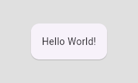 |
| /// |
| /// ```dart |
| /// const Card( |
| /// child: Padding( |
| /// padding: EdgeInsets.all(16.0), |
| /// child: Text('Hello World!'), |
| /// ), |
| /// ) |
| /// ``` |
| /// {@end-tool} |
| /// |
| /// ## Design discussion |
| /// |
| /// ### Why use a [Padding] widget rather than a [Container] with a [Container.padding] property? |
| /// |
| /// There isn't really any difference between the two. If you supply a |
| /// [Container.padding] argument, [Container] simply builds a [Padding] widget |
| /// for you. |
| /// |
| /// [Container] doesn't implement its properties directly. Instead, [Container] |
| /// combines a number of simpler widgets together into a convenient package. For |
| /// example, the [Container.padding] property causes the container to build a |
| /// [Padding] widget and the [Container.decoration] property causes the |
| /// container to build a [DecoratedBox] widget. If you find [Container] |
| /// convenient, feel free to use it. If not, feel free to build these simpler |
| /// widgets in whatever combination meets your needs. |
| /// |
| /// In fact, the majority of widgets in Flutter are simply combinations of other |
| /// simpler widgets. Composition, rather than inheritance, is the primary |
| /// mechanism for building up widgets. |
| /// |
| /// See also: |
| /// |
| /// * [AnimatedPadding], which animates changes in [padding] over a given |
| /// duration. |
| /// * [EdgeInsets], the class that is used to describe the padding dimensions. |
| /// * The [catalog of layout widgets](https://flutter.dev/widgets/layout/). |
| class Padding extends SingleChildRenderObjectWidget { |
| /// Creates a widget that insets its child. |
| /// |
| /// The [padding] argument must not be null. |
| const Padding({ |
| super.key, |
| required this.padding, |
| super.child, |
| }) : assert(padding != null); |
| |
| /// The amount of space by which to inset the child. |
| final EdgeInsetsGeometry padding; |
| |
| @override |
| RenderPadding createRenderObject(BuildContext context) { |
| return RenderPadding( |
| padding: padding, |
| textDirection: Directionality.maybeOf(context), |
| ); |
| } |
| |
| @override |
| void updateRenderObject(BuildContext context, RenderPadding renderObject) { |
| renderObject |
| ..padding = padding |
| ..textDirection = Directionality.maybeOf(context); |
| } |
| |
| @override |
| void debugFillProperties(DiagnosticPropertiesBuilder properties) { |
| super.debugFillProperties(properties); |
| properties.add(DiagnosticsProperty<EdgeInsetsGeometry>('padding', padding)); |
| } |
| } |
| |
| /// A widget that aligns its child within itself and optionally sizes itself |
| /// based on the child's size. |
| /// |
| /// For example, to align a box at the bottom right, you would pass this box a |
| /// tight constraint that is bigger than the child's natural size, |
| /// with an alignment of [Alignment.bottomRight]. |
| /// |
| /// {@youtube 560 315 https://www.youtube.com/watch?v=g2E7yl3MwMk} |
| /// |
| /// This widget will be as big as possible if its dimensions are constrained and |
| /// [widthFactor] and [heightFactor] are null. If a dimension is unconstrained |
| /// and the corresponding size factor is null then the widget will match its |
| /// child's size in that dimension. If a size factor is non-null then the |
| /// corresponding dimension of this widget will be the product of the child's |
| /// dimension and the size factor. For example if widthFactor is 2.0 then |
| /// the width of this widget will always be twice its child's width. |
| /// |
| /// ## How it works |
| /// |
| /// The [alignment] property describes a point in the `child`'s coordinate system |
| /// and a different point in the coordinate system of this widget. The [Align] |
| /// widget positions the `child` such that both points are lined up on top of |
| /// each other. |
| /// |
| /// {@tool snippet} |
| /// The [Align] widget in this example uses one of the defined constants from |
| /// [Alignment], [Alignment.topRight]. This places the [FlutterLogo] in the top |
| /// right corner of the parent blue [Container]. |
| /// |
| ///  |
| /// |
| /// ```dart |
| /// Center( |
| /// child: Container( |
| /// height: 120.0, |
| /// width: 120.0, |
| /// color: Colors.blue[50], |
| /// child: const Align( |
| /// alignment: Alignment.topRight, |
| /// child: FlutterLogo( |
| /// size: 60, |
| /// ), |
| /// ), |
| /// ), |
| /// ) |
| /// ``` |
| /// {@end-tool} |
| /// |
| /// {@tool snippet} |
| /// The [Alignment] used in the following example defines a single point: |
| /// |
| /// * (0.2 * width of [FlutterLogo]/2 + width of [FlutterLogo]/2, 0.6 * height |
| /// of [FlutterLogo]/2 + height of [FlutterLogo]/2) = (36.0, 48.0). |
| /// |
| /// The [Alignment] class uses a coordinate system with an origin in the center |
| /// of the [Container], as shown with the [Icon] above. [Align] will place the |
| /// [FlutterLogo] at (36.0, 48.0) according to this coordinate system. |
| /// |
| ///  |
| /// |
| /// ```dart |
| /// Center( |
| /// child: Container( |
| /// height: 120.0, |
| /// width: 120.0, |
| /// color: Colors.blue[50], |
| /// child: const Align( |
| /// alignment: Alignment(0.2, 0.6), |
| /// child: FlutterLogo( |
| /// size: 60, |
| /// ), |
| /// ), |
| /// ), |
| /// ) |
| /// ``` |
| /// {@end-tool} |
| /// |
| /// {@tool snippet} |
| /// The [FractionalOffset] used in the following example defines two points: |
| /// |
| /// * (0.2 * width of [FlutterLogo], 0.6 * height of [FlutterLogo]) = (12.0, 36.0) |
| /// in the coordinate system of the blue container. |
| /// * (0.2 * width of [Align], 0.6 * height of [Align]) = (24.0, 72.0) in the |
| /// coordinate system of the [Align] widget. |
| /// |
| /// The [Align] widget positions the [FlutterLogo] such that the two points are on |
| /// top of each other. In this example, the top left of the [FlutterLogo] will |
| /// be placed at (24.0, 72.0) - (12.0, 36.0) = (12.0, 36.0) from the top left of |
| /// the [Align] widget. |
| /// |
| /// The [FractionalOffset] class uses a coordinate system with an origin in the top-left |
| /// corner of the [Container] in difference to the center-oriented system used in |
| /// the example above with [Alignment]. |
| /// |
| ///  |
| /// |
| /// ```dart |
| /// Center( |
| /// child: Container( |
| /// height: 120.0, |
| /// width: 120.0, |
| /// color: Colors.blue[50], |
| /// child: const Align( |
| /// alignment: FractionalOffset(0.2, 0.6), |
| /// child: FlutterLogo( |
| /// size: 60, |
| /// ), |
| /// ), |
| /// ), |
| /// ) |
| /// ``` |
| /// {@end-tool} |
| /// |
| /// See also: |
| /// |
| /// * [AnimatedAlign], which animates changes in [alignment] smoothly over a |
| /// given duration. |
| /// * [CustomSingleChildLayout], which uses a delegate to control the layout of |
| /// a single child. |
| /// * [Center], which is the same as [Align] but with the [alignment] always |
| /// set to [Alignment.center]. |
| /// * [FractionallySizedBox], which sizes its child based on a fraction of its |
| /// own size and positions the child according to an [Alignment] value. |
| /// * The [catalog of layout widgets](https://flutter.dev/widgets/layout/). |
| class Align extends SingleChildRenderObjectWidget { |
| /// Creates an alignment widget. |
| /// |
| /// The alignment defaults to [Alignment.center]. |
| const Align({ |
| super.key, |
| this.alignment = Alignment.center, |
| this.widthFactor, |
| this.heightFactor, |
| super.child, |
| }) : assert(alignment != null), |
| assert(widthFactor == null || widthFactor >= 0.0), |
| assert(heightFactor == null || heightFactor >= 0.0); |
| |
| /// How to align the child. |
| /// |
| /// The x and y values of the [Alignment] control the horizontal and vertical |
| /// alignment, respectively. An x value of -1.0 means that the left edge of |
| /// the child is aligned with the left edge of the parent whereas an x value |
| /// of 1.0 means that the right edge of the child is aligned with the right |
| /// edge of the parent. Other values interpolate (and extrapolate) linearly. |
| /// For example, a value of 0.0 means that the center of the child is aligned |
| /// with the center of the parent. |
| /// |
| /// See also: |
| /// |
| /// * [Alignment], which has more details and some convenience constants for |
| /// common positions. |
| /// * [AlignmentDirectional], which has a horizontal coordinate orientation |
| /// that depends on the [TextDirection]. |
| final AlignmentGeometry alignment; |
| |
| /// If non-null, sets its width to the child's width multiplied by this factor. |
| /// |
| /// Can be both greater and less than 1.0 but must be non-negative. |
| final double? widthFactor; |
| |
| /// If non-null, sets its height to the child's height multiplied by this factor. |
| /// |
| /// Can be both greater and less than 1.0 but must be non-negative. |
| final double? heightFactor; |
| |
| @override |
| RenderPositionedBox createRenderObject(BuildContext context) { |
| return RenderPositionedBox( |
| alignment: alignment, |
| widthFactor: widthFactor, |
| heightFactor: heightFactor, |
| textDirection: Directionality.maybeOf(context), |
| ); |
| } |
| |
| @override |
| void updateRenderObject(BuildContext context, RenderPositionedBox renderObject) { |
| renderObject |
| ..alignment = alignment |
| ..widthFactor = widthFactor |
| ..heightFactor = heightFactor |
| ..textDirection = Directionality.maybeOf(context); |
| } |
| |
| @override |
| void debugFillProperties(DiagnosticPropertiesBuilder properties) { |
| super.debugFillProperties(properties); |
| properties.add(DiagnosticsProperty<AlignmentGeometry>('alignment', alignment)); |
| properties.add(DoubleProperty('widthFactor', widthFactor, defaultValue: null)); |
| properties.add(DoubleProperty('heightFactor', heightFactor, defaultValue: null)); |
| } |
| } |
| |
| /// A widget that centers its child within itself. |
| /// |
| /// This widget will be as big as possible if its dimensions are constrained and |
| /// [widthFactor] and [heightFactor] are null. If a dimension is unconstrained |
| /// and the corresponding size factor is null then the widget will match its |
| /// child's size in that dimension. If a size factor is non-null then the |
| /// corresponding dimension of this widget will be the product of the child's |
| /// dimension and the size factor. For example if widthFactor is 2.0 then |
| /// the width of this widget will always be twice its child's width. |
| /// |
| /// See also: |
| /// |
| /// * [Align], which lets you arbitrarily position a child within itself, |
| /// rather than just centering it. |
| /// * [Row], a widget that displays its children in a horizontal array. |
| /// * [Column], a widget that displays its children in a vertical array. |
| /// * [Container], a convenience widget that combines common painting, |
| /// positioning, and sizing widgets. |
| /// * The [catalog of layout widgets](https://flutter.dev/widgets/layout/). |
| class Center extends Align { |
| /// Creates a widget that centers its child. |
| const Center({ super.key, super.widthFactor, super.heightFactor, super.child }); |
| } |
| |
| /// A widget that defers the layout of its single child to a delegate. |
| /// |
| /// The delegate can determine the layout constraints for the child and can |
| /// decide where to position the child. The delegate can also determine the size |
| /// of the parent, but the size of the parent cannot depend on the size of the |
| /// child. |
| /// |
| /// See also: |
| /// |
| /// * [SingleChildLayoutDelegate], which controls the layout of the child. |
| /// * [Align], which sizes itself based on its child's size and positions |
| /// the child according to an [Alignment] value. |
| /// * [FractionallySizedBox], which sizes its child based on a fraction of its own |
| /// size and positions the child according to an [Alignment] value. |
| /// * [CustomMultiChildLayout], which uses a delegate to position multiple |
| /// children. |
| /// * The [catalog of layout widgets](https://flutter.dev/widgets/layout/). |
| class CustomSingleChildLayout extends SingleChildRenderObjectWidget { |
| /// Creates a custom single child layout. |
| /// |
| /// The [delegate] argument must not be null. |
| const CustomSingleChildLayout({ |
| super.key, |
| required this.delegate, |
| super.child, |
| }) : assert(delegate != null); |
| |
| /// The delegate that controls the layout of the child. |
| final SingleChildLayoutDelegate delegate; |
| |
| @override |
| RenderCustomSingleChildLayoutBox createRenderObject(BuildContext context) { |
| return RenderCustomSingleChildLayoutBox(delegate: delegate); |
| } |
| |
| @override |
| void updateRenderObject(BuildContext context, RenderCustomSingleChildLayoutBox renderObject) { |
| renderObject.delegate = delegate; |
| } |
| } |
| |
| /// Metadata for identifying children in a [CustomMultiChildLayout]. |
| /// |
| /// The [MultiChildLayoutDelegate.hasChild], |
| /// [MultiChildLayoutDelegate.layoutChild], and |
| /// [MultiChildLayoutDelegate.positionChild] methods use these identifiers. |
| class LayoutId extends ParentDataWidget<MultiChildLayoutParentData> { |
| /// Marks a child with a layout identifier. |
| /// |
| /// Both the child and the id arguments must not be null. |
| LayoutId({ |
| Key? key, |
| required this.id, |
| required super.child, |
| }) : assert(child != null), |
| assert(id != null), |
| super(key: key ?? ValueKey<Object>(id)); |
| |
| /// An object representing the identity of this child. |
| /// |
| /// The [id] needs to be unique among the children that the |
| /// [CustomMultiChildLayout] manages. |
| final Object id; |
| |
| @override |
| void applyParentData(RenderObject renderObject) { |
| assert(renderObject.parentData is MultiChildLayoutParentData); |
| final MultiChildLayoutParentData parentData = renderObject.parentData! as MultiChildLayoutParentData; |
| if (parentData.id != id) { |
| parentData.id = id; |
| final AbstractNode? targetParent = renderObject.parent; |
| if (targetParent is RenderObject) { |
| targetParent.markNeedsLayout(); |
| } |
| } |
| } |
| |
| @override |
| Type get debugTypicalAncestorWidgetClass => CustomMultiChildLayout; |
| |
| @override |
| void debugFillProperties(DiagnosticPropertiesBuilder properties) { |
| super.debugFillProperties(properties); |
| properties.add(DiagnosticsProperty<Object>('id', id)); |
| } |
| } |
| |
| /// A widget that uses a delegate to size and position multiple children. |
| /// |
| /// The delegate can determine the layout constraints for each child and can |
| /// decide where to position each child. The delegate can also determine the |
| /// size of the parent, but the size of the parent cannot depend on the sizes of |
| /// the children. |
| /// |
| /// [CustomMultiChildLayout] is appropriate when there are complex relationships |
| /// between the size and positioning of multiple widgets. To control the |
| /// layout of a single child, [CustomSingleChildLayout] is more appropriate. For |
| /// simple cases, such as aligning a widget to one or another edge, the [Stack] |
| /// widget is more appropriate. |
| /// |
| /// Each child must be wrapped in a [LayoutId] widget to identify the widget for |
| /// the delegate. |
| /// |
| /// {@tool dartpad} |
| /// This example shows a [CustomMultiChildLayout] widget being used to lay out |
| /// colored blocks from start to finish in a cascade that has some overlap. |
| /// |
| /// It responds to changes in [Directionality] by re-laying out its children. |
| /// |
| /// ** See code in examples/api/lib/widgets/basic/custom_multi_child_layout.0.dart ** |
| /// {@end-tool} |
| /// |
| /// See also: |
| /// |
| /// * [MultiChildLayoutDelegate], for details about how to control the layout of |
| /// the children. |
| /// * [CustomSingleChildLayout], which uses a delegate to control the layout of |
| /// a single child. |
| /// * [Stack], which arranges children relative to the edges of the container. |
| /// * [Flow], which provides paint-time control of its children using transform |
| /// matrices. |
| /// * The [catalog of layout widgets](https://flutter.dev/widgets/layout/). |
| class CustomMultiChildLayout extends MultiChildRenderObjectWidget { |
| /// Creates a custom multi-child layout. |
| /// |
| /// The [delegate] argument must not be null. |
| CustomMultiChildLayout({ |
| super.key, |
| required this.delegate, |
| super.children, |
| }) : assert(delegate != null); |
| |
| /// The delegate that controls the layout of the children. |
| final MultiChildLayoutDelegate delegate; |
| |
| @override |
| RenderCustomMultiChildLayoutBox createRenderObject(BuildContext context) { |
| return RenderCustomMultiChildLayoutBox(delegate: delegate); |
| } |
| |
| @override |
| void updateRenderObject(BuildContext context, RenderCustomMultiChildLayoutBox renderObject) { |
| renderObject.delegate = delegate; |
| } |
| } |
| |
| /// A box with a specified size. |
| /// |
| /// If given a child, this widget forces it to have a specific width and/or height. |
| /// These values will be ignored if this widget's parent does not permit them. |
| /// For example, this happens if the parent is the screen (forces the child to |
| /// be the same size as the parent), or another [SizedBox] (forces its child to |
| /// have a specific width and/or height). This can be remedied by wrapping the |
| /// child [SizedBox] in a widget that does permit it to be any size up to the |
| /// size of the parent, such as [Center] or [Align]. |
| /// |
| /// If either the width or height is null, this widget will try to size itself to |
| /// match the child's size in that dimension. If the child's size depends on the |
| /// size of its parent, the height and width must be provided. |
| /// |
| /// If not given a child, [SizedBox] will try to size itself as close to the |
| /// specified height and width as possible given the parent's constraints. If |
| /// [height] or [width] is null or unspecified, it will be treated as zero. |
| /// |
| /// The [SizedBox.expand] constructor can be used to make a [SizedBox] that |
| /// sizes itself to fit the parent. It is equivalent to setting [width] and |
| /// [height] to [double.infinity]. |
| /// |
| /// {@youtube 560 315 https://www.youtube.com/watch?v=EHPu_DzRfqA} |
| /// |
| /// {@tool snippet} |
| /// |
| /// This snippet makes the child widget (a [Card] with some [Text]) have the |
| /// exact size 200x300, parental constraints permitting: |
| /// |
| /// ```dart |
| /// const SizedBox( |
| /// width: 200.0, |
| /// height: 300.0, |
| /// child: Card(child: Text('Hello World!')), |
| /// ) |
| /// ``` |
| /// {@end-tool} |
| /// |
| /// See also: |
| /// |
| /// * [ConstrainedBox], a more generic version of this class that takes |
| /// arbitrary [BoxConstraints] instead of an explicit width and height. |
| /// * [UnconstrainedBox], a container that tries to let its child draw without |
| /// constraints. |
| /// * [FractionallySizedBox], a widget that sizes its child to a fraction of |
| /// the total available space. |
| /// * [AspectRatio], a widget that attempts to fit within the parent's |
| /// constraints while also sizing its child to match a given aspect ratio. |
| /// * [FittedBox], which sizes and positions its child widget to fit the parent |
| /// according to a given [BoxFit] discipline. |
| /// * The [catalog of layout widgets](https://flutter.dev/widgets/layout/). |
| /// * [Understanding constraints](https://flutter.dev/docs/development/ui/layout/constraints), |
| /// an in-depth article about layout in Flutter. |
| class SizedBox extends SingleChildRenderObjectWidget { |
| /// Creates a fixed size box. The [width] and [height] parameters can be null |
| /// to indicate that the size of the box should not be constrained in |
| /// the corresponding dimension. |
| const SizedBox({ super.key, this.width, this.height, super.child }); |
| |
| /// Creates a box that will become as large as its parent allows. |
| const SizedBox.expand({ super.key, super.child }) |
| : width = double.infinity, |
| height = double.infinity; |
| |
| /// Creates a box that will become as small as its parent allows. |
| const SizedBox.shrink({ super.key, super.child }) |
| : width = 0.0, |
| height = 0.0; |
| |
| /// Creates a box with the specified size. |
| SizedBox.fromSize({ super.key, super.child, Size? size }) |
| : width = size?.width, |
| height = size?.height; |
| |
| /// Creates a box whose [width] and [height] are equal. |
| const SizedBox.square({super.key, super.child, double? dimension}) |
| : width = dimension, |
| height = dimension; |
| |
| /// If non-null, requires the child to have exactly this width. |
| final double? width; |
| |
| /// If non-null, requires the child to have exactly this height. |
| final double? height; |
| |
| @override |
| RenderConstrainedBox createRenderObject(BuildContext context) { |
| return RenderConstrainedBox( |
| additionalConstraints: _additionalConstraints, |
| ); |
| } |
| |
| BoxConstraints get _additionalConstraints { |
| return BoxConstraints.tightFor(width: width, height: height); |
| } |
| |
| @override |
| void updateRenderObject(BuildContext context, RenderConstrainedBox renderObject) { |
| renderObject.additionalConstraints = _additionalConstraints; |
| } |
| |
| @override |
| String toStringShort() { |
| final String type; |
| if (width == double.infinity && height == double.infinity) { |
| type = '${objectRuntimeType(this, 'SizedBox')}.expand'; |
| } else if (width == 0.0 && height == 0.0) { |
| type = '${objectRuntimeType(this, 'SizedBox')}.shrink'; |
| } else { |
| type = objectRuntimeType(this, 'SizedBox'); |
| } |
| return key == null ? type : '$type-$key'; |
| } |
| |
| @override |
| void debugFillProperties(DiagnosticPropertiesBuilder properties) { |
| super.debugFillProperties(properties); |
| final DiagnosticLevel level; |
| if ((width == double.infinity && height == double.infinity) || |
| (width == 0.0 && height == 0.0)) { |
| level = DiagnosticLevel.hidden; |
| } else { |
| level = DiagnosticLevel.info; |
| } |
| properties.add(DoubleProperty('width', width, defaultValue: null, level: level)); |
| properties.add(DoubleProperty('height', height, defaultValue: null, level: level)); |
| } |
| } |
| |
| /// A widget that imposes additional constraints on its child. |
| /// |
| /// For example, if you wanted [child] to have a minimum height of 50.0 logical |
| /// pixels, you could use `const BoxConstraints(minHeight: 50.0)` as the |
| /// [constraints]. |
| /// |
| /// {@youtube 560 315 https://www.youtube.com/watch?v=o2KveVr7adg} |
| /// |
| /// {@tool snippet} |
| /// |
| /// This snippet makes the child widget (a [Card] with some [Text]) fill the |
| /// parent, by applying [BoxConstraints.expand] constraints: |
| /// |
| /// ```dart |
| /// ConstrainedBox( |
| /// constraints: const BoxConstraints.expand(), |
| /// child: const Card(child: Text('Hello World!')), |
| /// ) |
| /// ``` |
| /// {@end-tool} |
| /// |
| /// The same behavior can be obtained using the [SizedBox.expand] widget. |
| /// |
| /// See also: |
| /// |
| /// * [BoxConstraints], the class that describes constraints. |
| /// * [UnconstrainedBox], a container that tries to let its child draw without |
| /// constraints. |
| /// * [SizedBox], which lets you specify tight constraints by explicitly |
| /// specifying the height or width. |
| /// * [FractionallySizedBox], which sizes its child based on a fraction of its |
| /// own size and positions the child according to an [Alignment] value. |
| /// * [AspectRatio], a widget that attempts to fit within the parent's |
| /// constraints while also sizing its child to match a given aspect ratio. |
| /// * The [catalog of layout widgets](https://flutter.dev/widgets/layout/). |
| class ConstrainedBox extends SingleChildRenderObjectWidget { |
| /// Creates a widget that imposes additional constraints on its child. |
| /// |
| /// The [constraints] argument must not be null. |
| ConstrainedBox({ |
| super.key, |
| required this.constraints, |
| super.child, |
| }) : assert(constraints != null), |
| assert(constraints.debugAssertIsValid()); |
| |
| /// The additional constraints to impose on the child. |
| final BoxConstraints constraints; |
| |
| @override |
| RenderConstrainedBox createRenderObject(BuildContext context) { |
| return RenderConstrainedBox(additionalConstraints: constraints); |
| } |
| |
| @override |
| void updateRenderObject(BuildContext context, RenderConstrainedBox renderObject) { |
| renderObject.additionalConstraints = constraints; |
| } |
| |
| @override |
| void debugFillProperties(DiagnosticPropertiesBuilder properties) { |
| super.debugFillProperties(properties); |
| properties.add(DiagnosticsProperty<BoxConstraints>('constraints', constraints, showName: false)); |
| } |
| } |
| |
| /// A container widget that applies an arbitrary transform to its constraints, |
| /// and sizes its child using the resulting [BoxConstraints], optionally |
| /// clipping, or treating the overflow as an error. |
| /// |
| /// This container sizes its child using a [BoxConstraints] created by applying |
| /// [constraintsTransform] to its own constraints. This container will then |
| /// attempt to adopt the same size, within the limits of its own constraints. If |
| /// it ends up with a different size, it will align the child based on |
| /// [alignment]. If the container cannot expand enough to accommodate the entire |
| /// child, the child will be clipped if [clipBehavior] is not [Clip.none]. |
| /// |
| /// In debug mode, if [clipBehavior] is [Clip.none] and the child overflows the |
| /// container, a warning will be printed on the console, and black and yellow |
| /// striped areas will appear where the overflow occurs. |
| /// |
| /// When [child] is null, this widget becomes as small as possible and never |
| /// overflows. |
| /// |
| /// This widget can be used to ensure some of [child]'s natural dimensions are |
| /// honored, and get an early warning otherwise during development. For |
| /// instance, if [child] requires a minimum height to fully display its content, |
| /// [constraintsTransform] can be set to [maxHeightUnconstrained], so that if |
| /// the parent [RenderObject] fails to provide enough vertical space, a warning |
| /// will be displayed in debug mode, while still allowing [child] to grow |
| /// vertically: |
| /// |
| /// {@tool snippet} |
| /// In the following snippet, the [Card] is guaranteed to be at least as tall as |
| /// its "natural" height. Unlike [UnconstrainedBox], it will become taller if |
| /// its "natural" height is smaller than 40 px. If the [Container] isn't high |
| /// enough to show the full content of the [Card], in debug mode a warning will |
| /// be given. |
| /// |
| /// ```dart |
| /// Container( |
| /// constraints: const BoxConstraints(minHeight: 40, maxHeight: 100), |
| /// alignment: Alignment.center, |
| /// child: const ConstraintsTransformBox( |
| /// constraintsTransform: ConstraintsTransformBox.maxHeightUnconstrained, |
| /// child: Card(child: Text('Hello World!')), |
| /// ) |
| /// ) |
| /// ``` |
| /// {@end-tool} |
| /// |
| /// See also: |
| /// |
| /// * [ConstrainedBox], which renders a box which imposes constraints |
| /// on its child. |
| /// * [OverflowBox], a widget that imposes additional constraints on its child, |
| /// and allows the child to overflow itself. |
| /// * [UnconstrainedBox] which allows its children to render themselves |
| /// unconstrained and expands to fit them. |
| class ConstraintsTransformBox extends SingleChildRenderObjectWidget { |
| /// Creates a widget that uses a function to transform the constraints it |
| /// passes to its child. If the child overflows the parent's constraints, a |
| /// warning will be given in debug mode. |
| /// |
| /// The `debugTransformType` argument adds a debug label to this widget. |
| /// |
| /// The `alignment`, `clipBehavior` and `constraintsTransform` arguments must |
| /// not be null. |
| const ConstraintsTransformBox({ |
| super.key, |
| super.child, |
| this.textDirection, |
| this.alignment = Alignment.center, |
| required this.constraintsTransform, |
| this.clipBehavior = Clip.none, |
| String debugTransformType = '', |
| }) : _debugTransformLabel = debugTransformType, |
| assert(alignment != null), |
| assert(clipBehavior != null), |
| assert(constraintsTransform != null), |
| assert(debugTransformType != null); |
| |
| /// A [BoxConstraintsTransform] that always returns its argument as-is (i.e., |
| /// it is an identity function). |
| /// |
| /// The [ConstraintsTransformBox] becomes a proxy widget that has no effect on |
| /// layout if [constraintsTransform] is set to this. |
| static BoxConstraints unmodified(BoxConstraints constraints) => constraints; |
| |
| /// A [BoxConstraintsTransform] that always returns a [BoxConstraints] that |
| /// imposes no constraints on either dimension (i.e. `const BoxConstraints()`). |
| /// |
| /// Setting [constraintsTransform] to this allows [child] to render at its |
| /// "natural" size (equivalent to an [UnconstrainedBox] with `constrainedAxis` |
| /// set to null). |
| static BoxConstraints unconstrained(BoxConstraints constraints) => const BoxConstraints(); |
| |
| /// A [BoxConstraintsTransform] that removes the width constraints from the |
| /// input. |
| /// |
| /// Setting [constraintsTransform] to this allows [child] to render at its |
| /// "natural" width (equivalent to an [UnconstrainedBox] with |
| /// `constrainedAxis` set to [Axis.horizontal]). |
| static BoxConstraints widthUnconstrained(BoxConstraints constraints) => constraints.heightConstraints(); |
| |
| /// A [BoxConstraintsTransform] that removes the height constraints from the |
| /// input. |
| /// |
| /// Setting [constraintsTransform] to this allows [child] to render at its |
| /// "natural" height (equivalent to an [UnconstrainedBox] with |
| /// `constrainedAxis` set to [Axis.vertical]). |
| static BoxConstraints heightUnconstrained(BoxConstraints constraints) => constraints.widthConstraints(); |
| |
| /// A [BoxConstraintsTransform] that removes the `maxHeight` constraint from |
| /// the input. |
| /// |
| /// Setting [constraintsTransform] to this allows [child] to render at its |
| /// "natural" height or the `minHeight` of the incoming [BoxConstraints], |
| /// whichever is larger. |
| static BoxConstraints maxHeightUnconstrained(BoxConstraints constraints) => constraints.copyWith(maxHeight: double.infinity); |
| |
| /// A [BoxConstraintsTransform] that removes the `maxWidth` constraint from |
| /// the input. |
| /// |
| /// Setting [constraintsTransform] to this allows [child] to render at its |
| /// "natural" width or the `minWidth` of the incoming [BoxConstraints], |
| /// whichever is larger. |
| static BoxConstraints maxWidthUnconstrained(BoxConstraints constraints) => constraints.copyWith(maxWidth: double.infinity); |
| |
| /// A [BoxConstraintsTransform] that removes both the `maxWidth` and the |
| /// `maxHeight` constraints from the input. |
| /// |
| /// Setting [constraintsTransform] to this allows [child] to render at least |
| /// its "natural" size, and grow along an axis if the incoming |
| /// [BoxConstraints] has a larger minimum constraint on that axis. |
| static BoxConstraints maxUnconstrained(BoxConstraints constraints) => constraints.copyWith(maxWidth: double.infinity, maxHeight: double.infinity); |
| |
| static final Map<BoxConstraintsTransform, String> _debugKnownTransforms = <BoxConstraintsTransform, String>{ |
| unmodified: 'unmodified', |
| unconstrained: 'unconstrained', |
| widthUnconstrained: 'width constraints removed', |
| heightUnconstrained: 'height constraints removed', |
| maxWidthUnconstrained: 'maxWidth constraint removed', |
| maxHeightUnconstrained: 'maxHeight constraint removed', |
| maxUnconstrained: 'maxWidth & maxHeight constraints removed', |
| }; |
| |
| /// The text direction to use when interpreting the [alignment] if it is an |
| /// [AlignmentDirectional]. |
| /// |
| /// Defaults to null, in which case [Directionality.maybeOf] is used to determine |
| /// the text direction. |
| final TextDirection? textDirection; |
| |
| /// The alignment to use when laying out the child, if it has a different size |
| /// than this widget. |
| /// |
| /// If this is an [AlignmentDirectional], then [textDirection] must not be |
| /// null. |
| /// |
| /// See also: |
| /// |
| /// * [Alignment] for non-[Directionality]-aware alignments. |
| /// * [AlignmentDirectional] for [Directionality]-aware alignments. |
| final AlignmentGeometry alignment; |
| |
| /// {@template flutter.widgets.constraintsTransform} |
| /// The function used to transform the incoming [BoxConstraints], to size |
| /// [child]. |
| /// |
| /// The function must return a [BoxConstraints] that is |
| /// [BoxConstraints.isNormalized]. |
| /// |
| /// See [ConstraintsTransformBox] for predefined common |
| /// [BoxConstraintsTransform]s. |
| /// {@endtemplate} |
| final BoxConstraintsTransform constraintsTransform; |
| |
| /// {@macro flutter.material.Material.clipBehavior} |
| /// |
| /// {@template flutter.widgets.ConstraintsTransformBox.clipBehavior} |
| /// In debug mode, if [clipBehavior] is [Clip.none], and the child overflows |
| /// its constraints, a warning will be printed on the console, and black and |
| /// yellow striped areas will appear where the overflow occurs. For other |
| /// values of [clipBehavior], the contents are clipped accordingly. |
| /// {@endtemplate} |
| /// |
| /// Defaults to [Clip.none]. |
| final Clip clipBehavior; |
| |
| final String _debugTransformLabel; |
| |
| @override |
| RenderConstraintsTransformBox createRenderObject(BuildContext context) { |
| return RenderConstraintsTransformBox( |
| textDirection: textDirection ?? Directionality.maybeOf(context), |
| alignment: alignment, |
| constraintsTransform: constraintsTransform, |
| clipBehavior: clipBehavior, |
| ); |
| } |
| |
| @override |
| void updateRenderObject(BuildContext context, covariant RenderConstraintsTransformBox renderObject) { |
| renderObject |
| ..textDirection = textDirection ?? Directionality.maybeOf(context) |
| ..constraintsTransform = constraintsTransform |
| ..alignment = alignment |
| ..clipBehavior = clipBehavior; |
| } |
| |
| @override |
| void debugFillProperties(DiagnosticPropertiesBuilder properties) { |
| super.debugFillProperties(properties); |
| properties.add(DiagnosticsProperty<AlignmentGeometry>('alignment', alignment)); |
| properties.add(EnumProperty<TextDirection>('textDirection', textDirection, defaultValue: null)); |
| |
| final String? debugTransformLabel = _debugTransformLabel.isNotEmpty |
| ? _debugTransformLabel |
| : _debugKnownTransforms[constraintsTransform]; |
| |
| if (debugTransformLabel != null) { |
| properties.add(DiagnosticsProperty<String>('constraints transform', debugTransformLabel)); |
| } |
| } |
| } |
| |
| /// A widget that imposes no constraints on its child, allowing it to render |
| /// at its "natural" size. |
| /// |
| /// This allows a child to render at the size it would render if it were alone |
| /// on an infinite canvas with no constraints. This container will then attempt |
| /// to adopt the same size, within the limits of its own constraints. If it ends |
| /// up with a different size, it will align the child based on [alignment]. |
| /// If the box cannot expand enough to accommodate the entire child, the |
| /// child will be clipped. |
| /// |
| /// In debug mode, if the child overflows the container, a warning will be |
| /// printed on the console, and black and yellow striped areas will appear where |
| /// the overflow occurs. |
| /// |
| /// See also: |
| /// |
| /// * [ConstrainedBox], for a box which imposes constraints on its child. |
| /// * [Align], which loosens the constraints given to the child rather than |
| /// removing them entirely. |
| /// * [Container], a convenience widget that combines common painting, |
| /// positioning, and sizing widgets. |
| /// * [OverflowBox], a widget that imposes different constraints on its child |
| /// than it gets from its parent, possibly allowing the child to overflow |
| /// the parent. |
| /// * [ConstraintsTransformBox], a widget that sizes its child using a |
| /// transformed [BoxConstraints], and shows a warning if the child overflows |
| /// in debug mode. |
| class UnconstrainedBox extends StatelessWidget { |
| /// Creates a widget that imposes no constraints on its child, allowing it to |
| /// render at its "natural" size. If the child overflows the parents |
| /// constraints, a warning will be given in debug mode. |
| const UnconstrainedBox({ |
| super.key, |
| this.child, |
| this.textDirection, |
| this.alignment = Alignment.center, |
| this.constrainedAxis, |
| this.clipBehavior = Clip.none, |
| }) : assert(alignment != null), |
| assert(clipBehavior != null); |
| |
| /// The text direction to use when interpreting the [alignment] if it is an |
| /// [AlignmentDirectional]. |
| final TextDirection? textDirection; |
| |
| /// The alignment to use when laying out the child. |
| /// |
| /// If this is an [AlignmentDirectional], then [textDirection] must not be |
| /// null. |
| /// |
| /// See also: |
| /// |
| /// * [Alignment] for non-[Directionality]-aware alignments. |
| /// * [AlignmentDirectional] for [Directionality]-aware alignments. |
| final AlignmentGeometry alignment; |
| |
| /// The axis to retain constraints on, if any. |
| /// |
| /// If not set, or set to null (the default), neither axis will retain its |
| /// constraints. If set to [Axis.vertical], then vertical constraints will |
| /// be retained, and if set to [Axis.horizontal], then horizontal constraints |
| /// will be retained. |
| final Axis? constrainedAxis; |
| |
| /// {@macro flutter.material.Material.clipBehavior} |
| /// |
| /// Defaults to [Clip.none]. |
| final Clip clipBehavior; |
| |
| /// The widget below this widget in the tree. |
| /// |
| /// {@macro flutter.widgets.ProxyWidget.child} |
| final Widget? child; |
| |
| BoxConstraintsTransform _axisToTransform(Axis? constrainedAxis) { |
| if (constrainedAxis != null) { |
| switch (constrainedAxis) { |
| case Axis.horizontal: |
| return ConstraintsTransformBox.heightUnconstrained; |
| case Axis.vertical: |
| return ConstraintsTransformBox.widthUnconstrained; |
| } |
| } else { |
| return ConstraintsTransformBox.unconstrained; |
| } |
| } |
| |
| @override |
| Widget build(BuildContext context) { |
| return ConstraintsTransformBox( |
| textDirection: textDirection, |
| alignment: alignment, |
| clipBehavior: clipBehavior, |
| constraintsTransform: _axisToTransform(constrainedAxis), |
| child: child, |
| ); |
| } |
| |
| @override |
| void debugFillProperties(DiagnosticPropertiesBuilder properties) { |
| super.debugFillProperties(properties); |
| properties.add(DiagnosticsProperty<AlignmentGeometry>('alignment', alignment)); |
| properties.add(EnumProperty<Axis>('constrainedAxis', constrainedAxis, defaultValue: null)); |
| properties.add(EnumProperty<TextDirection>('textDirection', textDirection, defaultValue: null)); |
| } |
| } |
| |
| /// A widget that sizes its child to a fraction of the total available space. |
| /// For more details about the layout algorithm, see |
| /// [RenderFractionallySizedOverflowBox]. |
| /// |
| /// {@youtube 560 315 https://www.youtube.com/watch?v=PEsY654EGZ0} |
| /// |
| /// {@tool dartpad} |
| /// This sample shows a [FractionallySizedBox] whose one child is 50% of |
| /// the box's size per the width and height factor parameters, and centered |
| /// within that box by the alignment parameter. |
| /// |
| /// ** See code in examples/api/lib/widgets/basic/fractionally_sized_box.0.dart ** |
| /// {@end-tool} |
| /// |
| /// See also: |
| /// |
| /// * [Align], which sizes itself based on its child's size and positions |
| /// the child according to an [Alignment] value. |
| /// * [OverflowBox], a widget that imposes different constraints on its child |
| /// than it gets from its parent, possibly allowing the child to overflow the |
| /// parent. |
| /// * The [catalog of layout widgets](https://flutter.dev/widgets/layout/). |
| class FractionallySizedBox extends SingleChildRenderObjectWidget { |
| /// Creates a widget that sizes its child to a fraction of the total available space. |
| /// |
| /// If non-null, the [widthFactor] and [heightFactor] arguments must be |
| /// non-negative. |
| const FractionallySizedBox({ |
| super.key, |
| this.alignment = Alignment.center, |
| this.widthFactor, |
| this.heightFactor, |
| super.child, |
| }) : assert(alignment != null), |
| assert(widthFactor == null || widthFactor >= 0.0), |
| assert(heightFactor == null || heightFactor >= 0.0); |
| |
| /// {@template flutter.widgets.basic.fractionallySizedBox.widthFactor} |
| /// If non-null, the fraction of the incoming width given to the child. |
| /// |
| /// If non-null, the child is given a tight width constraint that is the max |
| /// incoming width constraint multiplied by this factor. |
| /// |
| /// If null, the incoming width constraints are passed to the child |
| /// unmodified. |
| /// {@endtemplate} |
| final double? widthFactor; |
| |
| /// {@template flutter.widgets.basic.fractionallySizedBox.heightFactor} |
| /// If non-null, the fraction of the incoming height given to the child. |
| /// |
| /// If non-null, the child is given a tight height constraint that is the max |
| /// incoming height constraint multiplied by this factor. |
| /// |
| /// If null, the incoming height constraints are passed to the child |
| /// unmodified. |
| /// {@endtemplate} |
| final double? heightFactor; |
| |
| /// {@template flutter.widgets.basic.fractionallySizedBox.alignment} |
| /// How to align the child. |
| /// |
| /// The x and y values of the alignment control the horizontal and vertical |
| /// alignment, respectively. An x value of -1.0 means that the left edge of |
| /// the child is aligned with the left edge of the parent whereas an x value |
| /// of 1.0 means that the right edge of the child is aligned with the right |
| /// edge of the parent. Other values interpolate (and extrapolate) linearly. |
| /// For example, a value of 0.0 means that the center of the child is aligned |
| /// with the center of the parent. |
| /// |
| /// Defaults to [Alignment.center]. |
| /// |
| /// See also: |
| /// |
| /// * [Alignment], a class with convenient constants typically used to |
| /// specify an [AlignmentGeometry]. |
| /// * [AlignmentDirectional], like [Alignment] for specifying alignments |
| /// relative to text direction. |
| /// {@endtemplate} |
| final AlignmentGeometry alignment; |
| |
| @override |
| RenderFractionallySizedOverflowBox createRenderObject(BuildContext context) { |
| return RenderFractionallySizedOverflowBox( |
| alignment: alignment, |
| widthFactor: widthFactor, |
| heightFactor: heightFactor, |
| textDirection: Directionality.maybeOf(context), |
| ); |
| } |
| |
| @override |
| void updateRenderObject(BuildContext context, RenderFractionallySizedOverflowBox renderObject) { |
| renderObject |
| ..alignment = alignment |
| ..widthFactor = widthFactor |
| ..heightFactor = heightFactor |
| ..textDirection = Directionality.maybeOf(context); |
| } |
| |
| @override |
| void debugFillProperties(DiagnosticPropertiesBuilder properties) { |
| super.debugFillProperties(properties); |
| properties.add(DiagnosticsProperty<AlignmentGeometry>('alignment', alignment)); |
| properties.add(DoubleProperty('widthFactor', widthFactor, defaultValue: null)); |
| properties.add(DoubleProperty('heightFactor', heightFactor, defaultValue: null)); |
| } |
| } |
| |
| /// A box that limits its size only when it's unconstrained. |
| /// |
| /// If this widget's maximum width is unconstrained then its child's width is |
| /// limited to [maxWidth]. Similarly, if this widget's maximum height is |
| /// unconstrained then its child's height is limited to [maxHeight]. |
| /// |
| /// This has the effect of giving the child a natural dimension in unbounded |
| /// environments. For example, by providing a [maxHeight] to a widget that |
| /// normally tries to be as big as possible, the widget will normally size |
| /// itself to fit its parent, but when placed in a vertical list, it will take |
| /// on the given height. |
| /// |
| /// This is useful when composing widgets that normally try to match their |
| /// parents' size, so that they behave reasonably in lists (which are |
| /// unbounded). |
| /// |
| /// {@youtube 560 315 https://www.youtube.com/watch?v=uVki2CIzBTs} |
| /// |
| /// See also: |
| /// |
| /// * [ConstrainedBox], which applies its constraints in all cases, not just |
| /// when the incoming constraints are unbounded. |
| /// * [SizedBox], which lets you specify tight constraints by explicitly |
| /// specifying the height or width. |
| /// * The [catalog of layout widgets](https://flutter.dev/widgets/layout/). |
| class LimitedBox extends SingleChildRenderObjectWidget { |
| /// Creates a box that limits its size only when it's unconstrained. |
| /// |
| /// The [maxWidth] and [maxHeight] arguments must not be null and must not be |
| /// negative. |
| const LimitedBox({ |
| super.key, |
| this.maxWidth = double.infinity, |
| this.maxHeight = double.infinity, |
| super.child, |
| }) : assert(maxWidth != null && maxWidth >= 0.0), |
| assert(maxHeight != null && maxHeight >= 0.0); |
| |
| /// The maximum width limit to apply in the absence of a |
| /// [BoxConstraints.maxWidth] constraint. |
| final double maxWidth; |
| |
| /// The maximum height limit to apply in the absence of a |
| /// [BoxConstraints.maxHeight] constraint. |
| final double maxHeight; |
| |
| @override |
| RenderLimitedBox createRenderObject(BuildContext context) { |
| return RenderLimitedBox( |
| maxWidth: maxWidth, |
| maxHeight: maxHeight, |
| ); |
| } |
| |
| @override |
| void updateRenderObject(BuildContext context, RenderLimitedBox renderObject) { |
| renderObject |
| ..maxWidth = maxWidth |
| ..maxHeight = maxHeight; |
| } |
| |
| @override |
| void debugFillProperties(DiagnosticPropertiesBuilder properties) { |
| super.debugFillProperties(properties); |
| properties.add(DoubleProperty('maxWidth', maxWidth, defaultValue: double.infinity)); |
| properties.add(DoubleProperty('maxHeight', maxHeight, defaultValue: double.infinity)); |
| } |
| } |
| |
| /// A widget that imposes different constraints on its child than it gets |
| /// from its parent, possibly allowing the child to overflow the parent. |
| /// |
| /// See also: |
| /// |
| /// * [RenderConstrainedOverflowBox] for details about how [OverflowBox] is |
| /// rendered. |
| /// * [SizedOverflowBox], a widget that is a specific size but passes its |
| /// original constraints through to its child, which may then overflow. |
| /// * [ConstrainedBox], a widget that imposes additional constraints on its |
| /// child. |
| /// * [UnconstrainedBox], a container that tries to let its child draw without |
| /// constraints. |
| /// * [SizedBox], a box with a specified size. |
| /// * The [catalog of layout widgets](https://flutter.dev/widgets/layout/). |
| class OverflowBox extends SingleChildRenderObjectWidget { |
| /// Creates a widget that lets its child overflow itself. |
| const OverflowBox({ |
| super.key, |
| this.alignment = Alignment.center, |
| this.minWidth, |
| this.maxWidth, |
| this.minHeight, |
| this.maxHeight, |
| super.child, |
| }); |
| |
| /// How to align the child. |
| /// |
| /// The x and y values of the alignment control the horizontal and vertical |
| /// alignment, respectively. An x value of -1.0 means that the left edge of |
| /// the child is aligned with the left edge of the parent whereas an x value |
| /// of 1.0 means that the right edge of the child is aligned with the right |
| /// edge of the parent. Other values interpolate (and extrapolate) linearly. |
| /// For example, a value of 0.0 means that the center of the child is aligned |
| /// with the center of the parent. |
| /// |
| /// Defaults to [Alignment.center]. |
| /// |
| /// See also: |
| /// |
| /// * [Alignment], a class with convenient constants typically used to |
| /// specify an [AlignmentGeometry]. |
| /// * [AlignmentDirectional], like [Alignment] for specifying alignments |
| /// relative to text direction. |
| final AlignmentGeometry alignment; |
| |
| /// The minimum width constraint to give the child. Set this to null (the |
| /// default) to use the constraint from the parent instead. |
| final double? minWidth; |
| |
| /// The maximum width constraint to give the child. Set this to null (the |
| /// default) to use the constraint from the parent instead. |
| final double? maxWidth; |
| |
| /// The minimum height constraint to give the child. Set this to null (the |
| /// default) to use the constraint from the parent instead. |
| final double? minHeight; |
| |
| /// The maximum height constraint to give the child. Set this to null (the |
| /// default) to use the constraint from the parent instead. |
| final double? maxHeight; |
| |
| @override |
| RenderConstrainedOverflowBox createRenderObject(BuildContext context) { |
| return RenderConstrainedOverflowBox( |
| alignment: alignment, |
| minWidth: minWidth, |
| maxWidth: maxWidth, |
| minHeight: minHeight, |
| maxHeight: maxHeight, |
| textDirection: Directionality.maybeOf(context), |
| ); |
| } |
| |
| @override |
| void updateRenderObject(BuildContext context, RenderConstrainedOverflowBox renderObject) { |
| renderObject |
| ..alignment = alignment |
| ..minWidth = minWidth |
| ..maxWidth = maxWidth |
| ..minHeight = minHeight |
| ..maxHeight = maxHeight |
| ..textDirection = Directionality.maybeOf(context); |
| } |
| |
| @override |
| void debugFillProperties(DiagnosticPropertiesBuilder properties) { |
| super.debugFillProperties(properties); |
| properties.add(DiagnosticsProperty<AlignmentGeometry>('alignment', alignment)); |
| properties.add(DoubleProperty('minWidth', minWidth, defaultValue: null)); |
| properties.add(DoubleProperty('maxWidth', maxWidth, defaultValue: null)); |
| properties.add(DoubleProperty('minHeight', minHeight, defaultValue: null)); |
| properties.add(DoubleProperty('maxHeight', maxHeight, defaultValue: null)); |
| } |
| } |
| |
| /// A widget that is a specific size but passes its original constraints |
| /// through to its child, which may then overflow. |
| /// |
| /// See also: |
| /// |
| /// * [OverflowBox], A widget that imposes different constraints on its child |
| /// than it gets from its parent, possibly allowing the child to overflow the |
| /// parent. |
| /// * [ConstrainedBox], a widget that imposes additional constraints on its |
| /// child. |
| /// * [UnconstrainedBox], a container that tries to let its child draw without |
| /// constraints. |
| /// * The [catalog of layout widgets](https://flutter.dev/widgets/layout/). |
| class SizedOverflowBox extends SingleChildRenderObjectWidget { |
| /// Creates a widget of a given size that lets its child overflow. |
| /// |
| /// The [size] argument must not be null. |
| const SizedOverflowBox({ |
| super.key, |
| required this.size, |
| this.alignment = Alignment.center, |
| super.child, |
| }) : assert(size != null), |
| assert(alignment != null); |
| |
| /// How to align the child. |
| /// |
| /// The x and y values of the alignment control the horizontal and vertical |
| /// alignment, respectively. An x value of -1.0 means that the left edge of |
| /// the child is aligned with the left edge of the parent whereas an x value |
| /// of 1.0 means that the right edge of the child is aligned with the right |
| /// edge of the parent. Other values interpolate (and extrapolate) linearly. |
| /// For example, a value of 0.0 means that the center of the child is aligned |
| /// with the center of the parent. |
| /// |
| /// Defaults to [Alignment.center]. |
| /// |
| /// See also: |
| /// |
| /// * [Alignment], a class with convenient constants typically used to |
| /// specify an [AlignmentGeometry]. |
| /// * [AlignmentDirectional], like [Alignment] for specifying alignments |
| /// relative to text direction. |
| final AlignmentGeometry alignment; |
| |
| /// The size this widget should attempt to be. |
| final Size size; |
| |
| @override |
| RenderSizedOverflowBox createRenderObject(BuildContext context) { |
| return RenderSizedOverflowBox( |
| alignment: alignment, |
| requestedSize: size, |
| textDirection: Directionality.of(context), |
| ); |
| } |
| |
| @override |
| void updateRenderObject(BuildContext context, RenderSizedOverflowBox renderObject) { |
| renderObject |
| ..alignment = alignment |
| ..requestedSize = size |
| ..textDirection = Directionality.of(context); |
| } |
| |
| @override |
| void debugFillProperties(DiagnosticPropertiesBuilder properties) { |
| super.debugFillProperties(properties); |
| properties.add(DiagnosticsProperty<AlignmentGeometry>('alignment', alignment)); |
| properties.add(DiagnosticsProperty<Size>('size', size, defaultValue: null)); |
| } |
| } |
| |
| /// A widget that lays the child out as if it was in the tree, but without |
| /// painting anything, without making the child available for hit testing, and |
| /// without taking any room in the parent. |
| /// |
| /// Offstage children are still active: they can receive focus and have keyboard |
| /// input directed to them. |
| /// |
| /// Animations continue to run in offstage children, and therefore use battery |
| /// and CPU time, regardless of whether the animations end up being visible. |
| /// |
| /// [Offstage] can be used to measure the dimensions of a widget without |
| /// bringing it on screen (yet). To hide a widget from view while it is not |
| /// needed, prefer removing the widget from the tree entirely rather than |
| /// keeping it alive in an [Offstage] subtree. |
| /// |
| /// {@tool dartpad} |
| /// This example shows a [FlutterLogo] widget when the `_offstage` member field |
| /// is false, and hides it without any room in the parent when it is true. When |
| /// offstage, this app displays a button to get the logo size, which will be |
| /// displayed in a [SnackBar]. |
| /// |
| /// ** See code in examples/api/lib/widgets/basic/offstage.0.dart ** |
| /// {@end-tool} |
| /// |
| /// See also: |
| /// |
| /// * [Visibility], which can hide a child more efficiently (albeit less |
| /// subtly). |
| /// * [TickerMode], which can be used to disable animations in a subtree. |
| /// * The [catalog of layout widgets](https://flutter.dev/widgets/layout/). |
| class Offstage extends SingleChildRenderObjectWidget { |
| /// Creates a widget that visually hides its child. |
| const Offstage({ super.key, this.offstage = true, super.child }) |
| : assert(offstage != null); |
| |
| /// Whether the child is hidden from the rest of the tree. |
| /// |
| /// If true, the child is laid out as if it was in the tree, but without |
| /// painting anything, without making the child available for hit testing, and |
| /// without taking any room in the parent. |
| /// |
| /// Offstage children are still active: they can receive focus and have keyboard |
| /// input directed to them. |
| /// |
| /// Animations continue to run in offstage children, and therefore use battery |
| /// and CPU time, regardless of whether the animations end up being visible. |
| /// |
| /// If false, the child is included in the tree as normal. |
| final bool offstage; |
| |
| @override |
| RenderOffstage createRenderObject(BuildContext context) => RenderOffstage(offstage: offstage); |
| |
| @override |
| void updateRenderObject(BuildContext context, RenderOffstage renderObject) { |
| renderObject.offstage = offstage; |
| } |
| |
| @override |
| void debugFillProperties(DiagnosticPropertiesBuilder properties) { |
| super.debugFillProperties(properties); |
| properties.add(DiagnosticsProperty<bool>('offstage', offstage)); |
| } |
| |
| @override |
| SingleChildRenderObjectElement createElement() => _OffstageElement(this); |
| } |
| |
| class _OffstageElement extends SingleChildRenderObjectElement { |
| _OffstageElement(Offstage super.widget); |
| |
| @override |
| void debugVisitOnstageChildren(ElementVisitor visitor) { |
| if (!(widget as Offstage).offstage) { |
| super.debugVisitOnstageChildren(visitor); |
| } |
| } |
| } |
| |
| /// A widget that attempts to size the child to a specific aspect ratio. |
| /// |
| /// The widget first tries the largest width permitted by the layout |
| /// constraints. The height of the widget is determined by applying the |
| /// given aspect ratio to the width, expressed as a ratio of width to height. |
| /// |
| /// {@youtube 560 315 https://www.youtube.com/watch?v=XcnP3_mO_Ms} |
| /// |
| /// For example, a 16:9 width:height aspect ratio would have a value of |
| /// 16.0/9.0. If the maximum width is infinite, the initial width is determined |
| /// by applying the aspect ratio to the maximum height. |
| /// |
| /// {@tool dartpad} |
| /// This examples shows how AspectRatio sets width when its parent's width |
| /// constraint is infinite. Since its parent's allowed height is a fixed value, |
| /// the actual width is determined via the given AspectRatio. |
| /// |
| /// Since the height is fixed at 100.0 in this example and the aspect ratio is |
| /// set to 16 / 9, the width should then be 100.0 / 9 * 16. |
| /// |
| /// ** See code in examples/api/lib/widgets/basic/aspect_ratio.0.dart ** |
| /// {@end-tool} |
| /// |
| /// Now consider a second example, this time with an aspect ratio of 2.0 and |
| /// layout constraints that require the width to be between 0.0 and 100.0 and |
| /// the height to be between 0.0 and 100.0. We'll select a width of 100.0 (the |
| /// biggest allowed) and a height of 50.0 (to match the aspect ratio). |
| /// |
| /// {@tool dartpad} |
| /// |
| /// |
| /// ** See code in examples/api/lib/widgets/basic/aspect_ratio.1.dart ** |
| /// {@end-tool} |
| /// |
| /// In that same situation, if the aspect ratio is 0.5, we'll also select a |
| /// width of 100.0 (still the biggest allowed) and we'll attempt to use a height |
| /// of 200.0. Unfortunately, that violates the constraints because the child can |
| /// be at most 100.0 pixels tall. The widget will then take that value |
| /// and apply the aspect ratio again to obtain a width of 50.0. That width is |
| /// permitted by the constraints and the child receives a width of 50.0 and a |
| /// height of 100.0. If the width were not permitted, the widget would |
| /// continue iterating through the constraints. If the widget does not |
| /// find a feasible size after consulting each constraint, the widget |
| /// will eventually select a size for the child that meets the layout |
| /// constraints but fails to meet the aspect ratio constraints. |
| /// |
| /// {@tool dartpad} |
| /// |
| /// |
| /// ** See code in examples/api/lib/widgets/basic/aspect_ratio.2.dart ** |
| /// {@end-tool} |
| /// |
| /// See also: |
| /// |
| /// * [Align], a widget that aligns its child within itself and optionally |
| /// sizes itself based on the child's size. |
| /// * [ConstrainedBox], a widget that imposes additional constraints on its |
| /// child. |
| /// * [UnconstrainedBox], a container that tries to let its child draw without |
| /// constraints. |
| /// * The [catalog of layout widgets](https://flutter.dev/widgets/layout/). |
| class AspectRatio extends SingleChildRenderObjectWidget { |
| /// Creates a widget with a specific aspect ratio. |
| /// |
| /// The [aspectRatio] argument must be a finite number greater than zero. |
| const AspectRatio({ |
| super.key, |
| required this.aspectRatio, |
| super.child, |
| }) : assert(aspectRatio != null), |
| assert(aspectRatio > 0.0); |
| |
| /// The aspect ratio to attempt to use. |
| /// |
| /// The aspect ratio is expressed as a ratio of width to height. For example, |
| /// a 16:9 width:height aspect ratio would have a value of 16.0/9.0. |
| final double aspectRatio; |
| |
| @override |
| RenderAspectRatio createRenderObject(BuildContext context) => RenderAspectRatio(aspectRatio: aspectRatio); |
| |
| @override |
| void updateRenderObject(BuildContext context, RenderAspectRatio renderObject) { |
| renderObject.aspectRatio = aspectRatio; |
| } |
| |
| @override |
| void debugFillProperties(DiagnosticPropertiesBuilder properties) { |
| super.debugFillProperties(properties); |
| properties.add(DoubleProperty('aspectRatio', aspectRatio)); |
| } |
| } |
| |
| /// A widget that sizes its child to the child's maximum intrinsic width. |
| /// |
| /// This class is useful, for example, when unlimited width is available and |
| /// you would like a child that would otherwise attempt to expand infinitely to |
| /// instead size itself to a more reasonable width. |
| /// |
| /// The constraints that this widget passes to its child will adhere to the |
| /// parent's constraints, so if the constraints are not large enough to satisfy |
| /// the child's maximum intrinsic width, then the child will get less width |
| /// than it otherwise would. Likewise, if the minimum width constraint is |
| /// larger than the child's maximum intrinsic width, the child will be given |
| /// more width than it otherwise would. |
| /// |
| /// If [stepWidth] is non-null, the child's width will be snapped to a multiple |
| /// of the [stepWidth]. Similarly, if [stepHeight] is non-null, the child's |
| /// height will be snapped to a multiple of the [stepHeight]. |
| /// |
| /// This class is relatively expensive, because it adds a speculative layout |
| /// pass before the final layout phase. Avoid using it where possible. In the |
| /// worst case, this widget can result in a layout that is O(N²) in the depth of |
| /// the tree. |
| /// |
| /// See also: |
| /// |
| /// * [Align], a widget that aligns its child within itself. This can be used |
| /// to loosen the constraints passed to the [RenderIntrinsicWidth], |
| /// allowing the [RenderIntrinsicWidth]'s child to be smaller than that of |
| /// its parent. |
| /// * [Row], which when used with [CrossAxisAlignment.stretch] can be used |
| /// to loosen just the width constraints that are passed to the |
| /// [RenderIntrinsicWidth], allowing the [RenderIntrinsicWidth]'s child's |
| /// width to be smaller than that of its parent. |
| /// * [The catalog of layout widgets](https://flutter.dev/widgets/layout/). |
| class IntrinsicWidth extends SingleChildRenderObjectWidget { |
| /// Creates a widget that sizes its child to the child's intrinsic width. |
| /// |
| /// This class is relatively expensive. Avoid using it where possible. |
| const IntrinsicWidth({ super.key, this.stepWidth, this.stepHeight, super.child }) |
| : assert(stepWidth == null || stepWidth >= 0.0), |
| assert(stepHeight == null || stepHeight >= 0.0); |
| |
| /// If non-null, force the child's width to be a multiple of this value. |
| /// |
| /// If null or 0.0 the child's width will be the same as its maximum |
| /// intrinsic width. |
| /// |
| /// This value must not be negative. |
| /// |
| /// See also: |
| /// |
| /// * [RenderBox.getMaxIntrinsicWidth], which defines a widget's max |
| /// intrinsic width in general. |
| final double? stepWidth; |
| |
| /// If non-null, force the child's height to be a multiple of this value. |
| /// |
| /// If null or 0.0 the child's height will not be constrained. |
| /// |
| /// This value must not be negative. |
| final double? stepHeight; |
| |
| double? get _stepWidth => stepWidth == 0.0 ? null : stepWidth; |
| double? get _stepHeight => stepHeight == 0.0 ? null : stepHeight; |
| |
| @override |
| RenderIntrinsicWidth createRenderObject(BuildContext context) { |
| return RenderIntrinsicWidth(stepWidth: _stepWidth, stepHeight: _stepHeight); |
| } |
| |
| @override |
| void updateRenderObject(BuildContext context, RenderIntrinsicWidth renderObject) { |
| renderObject |
| ..stepWidth = _stepWidth |
| ..stepHeight = _stepHeight; |
| } |
| } |
| |
| /// A widget that sizes its child to the child's intrinsic height. |
| /// |
| /// This class is useful, for example, when unlimited height is available and |
| /// you would like a child that would otherwise attempt to expand infinitely to |
| /// instead size itself to a more reasonable height. |
| /// |
| /// The constraints that this widget passes to its child will adhere to the |
| /// parent's constraints, so if the constraints are not large enough to satisfy |
| /// the child's maximum intrinsic height, then the child will get less height |
| /// than it otherwise would. Likewise, if the minimum height constraint is |
| /// larger than the child's maximum intrinsic height, the child will be given |
| /// more height than it otherwise would. |
| /// |
| /// This class is relatively expensive, because it adds a speculative layout |
| /// pass before the final layout phase. Avoid using it where possible. In the |
| /// worst case, this widget can result in a layout that is O(N²) in the depth of |
| /// the tree. |
| /// |
| /// See also: |
| /// |
| /// * [Align], a widget that aligns its child within itself. This can be used |
| /// to loosen the constraints passed to the [RenderIntrinsicHeight], |
| /// allowing the [RenderIntrinsicHeight]'s child to be smaller than that of |
| /// its parent. |
| /// * [Column], which when used with [CrossAxisAlignment.stretch] can be used |
| /// to loosen just the height constraints that are passed to the |
| /// [RenderIntrinsicHeight], allowing the [RenderIntrinsicHeight]'s child's |
| /// height to be smaller than that of its parent. |
| /// * [The catalog of layout widgets](https://flutter.dev/widgets/layout/). |
| class IntrinsicHeight extends SingleChildRenderObjectWidget { |
| /// Creates a widget that sizes its child to the child's intrinsic height. |
| /// |
| /// This class is relatively expensive. Avoid using it where possible. |
| const IntrinsicHeight({ super.key, super.child }); |
| |
| @override |
| RenderIntrinsicHeight createRenderObject(BuildContext context) => RenderIntrinsicHeight(); |
| } |
| |
| /// A widget that positions its child according to the child's baseline. |
| /// |
| /// This widget shifts the child down such that the child's baseline (or the |
| /// bottom of the child, if the child has no baseline) is [baseline] |
| /// logical pixels below the top of this box, then sizes this box to |
| /// contain the child. If [baseline] is less than the distance from |
| /// the top of the child to the baseline of the child, then the child |
| /// is top-aligned instead. |
| /// |
| /// {@youtube 560 315 https://www.youtube.com/watch?v=8ZaFk0yvNlI} |
| /// |
| /// See also: |
| /// |
| /// * [Align], a widget that aligns its child within itself and optionally |
| /// sizes itself based on the child's size. |
| /// * [Center], a widget that centers its child within itself. |
| /// * The [catalog of layout widgets](https://flutter.dev/widgets/layout/). |
| class Baseline extends SingleChildRenderObjectWidget { |
| /// Creates a widget that positions its child according to the child's baseline. |
| /// |
| /// The [baseline] and [baselineType] arguments must not be null. |
| const Baseline({ |
| super.key, |
| required this.baseline, |
| required this.baselineType, |
| super.child, |
| }) : assert(baseline != null), |
| assert(baselineType != null); |
| |
| /// The number of logical pixels from the top of this box at which to position |
| /// the child's baseline. |
| final double baseline; |
| |
| /// The type of baseline to use for positioning the child. |
| final TextBaseline baselineType; |
| |
| @override |
| RenderBaseline createRenderObject(BuildContext context) { |
| return RenderBaseline(baseline: baseline, baselineType: baselineType); |
| } |
| |
| @override |
| void updateRenderObject(BuildContext context, RenderBaseline renderObject) { |
| renderObject |
| ..baseline = baseline |
| ..baselineType = baselineType; |
| } |
| } |
| |
| |
| // SLIVERS |
| |
| /// A sliver that contains a single box widget. |
| /// |
| /// Slivers are special-purpose widgets that can be combined using a |
| /// [CustomScrollView] to create custom scroll effects. A [SliverToBoxAdapter] |
| /// is a basic sliver that creates a bridge back to one of the usual box-based |
| /// widgets. |
| /// |
| /// Rather than using multiple [SliverToBoxAdapter] widgets to display multiple |
| /// box widgets in a [CustomScrollView], consider using [SliverList], |
| /// [SliverFixedExtentList], [SliverPrototypeExtentList], or [SliverGrid], |
| /// which are more efficient because they instantiate only those children that |
| /// are actually visible through the scroll view's viewport. |
| /// |
| /// See also: |
| /// |
| /// * [CustomScrollView], which displays a scrollable list of slivers. |
| /// * [SliverList], which displays multiple box widgets in a linear array. |
| /// * [SliverFixedExtentList], which displays multiple box widgets with the |
| /// same main-axis extent in a linear array. |
| /// * [SliverPrototypeExtentList], which displays multiple box widgets with the |
| /// same main-axis extent as a prototype item, in a linear array. |
| /// * [SliverGrid], which displays multiple box widgets in arbitrary positions. |
| class SliverToBoxAdapter extends SingleChildRenderObjectWidget { |
| /// Creates a sliver that contains a single box widget. |
| const SliverToBoxAdapter({ |
| super.key, |
| super.child, |
| }); |
| |
| @override |
| RenderSliverToBoxAdapter createRenderObject(BuildContext context) => RenderSliverToBoxAdapter(); |
| } |
| |
| /// A sliver that applies padding on each side of another sliver. |
| /// |
| /// Slivers are special-purpose widgets that can be combined using a |
| /// [CustomScrollView] to create custom scroll effects. A [SliverPadding] |
| /// is a basic sliver that insets another sliver by applying padding on each |
| /// side. |
| /// |
| /// {@macro flutter.rendering.RenderSliverEdgeInsetsPadding} |
| /// |
| /// See also: |
| /// |
| /// * [CustomScrollView], which displays a scrollable list of slivers. |
| class SliverPadding extends SingleChildRenderObjectWidget { |
| /// Creates a sliver that applies padding on each side of another sliver. |
| /// |
| /// The [padding] argument must not be null. |
| const SliverPadding({ |
| super.key, |
| required this.padding, |
| Widget? sliver, |
| }) : assert(padding != null), |
| super(child: sliver); |
| |
| /// The amount of space by which to inset the child sliver. |
| final EdgeInsetsGeometry padding; |
| |
| @override |
| RenderSliverPadding createRenderObject(BuildContext context) { |
| return RenderSliverPadding( |
| padding: padding, |
| textDirection: Directionality.of(context), |
| ); |
| } |
| |
| @override |
| void updateRenderObject(BuildContext context, RenderSliverPadding renderObject) { |
| renderObject |
| ..padding = padding |
| ..textDirection = Directionality.of(context); |
| } |
| |
| @override |
| void debugFillProperties(DiagnosticPropertiesBuilder properties) { |
| super.debugFillProperties(properties); |
| properties.add(DiagnosticsProperty<EdgeInsetsGeometry>('padding', padding)); |
| } |
| } |
| |
| |
| // LAYOUT NODES |
| |
| /// Returns the [AxisDirection] in the given [Axis] in the current |
| /// [Directionality] (or the reverse if `reverse` is true). |
| /// |
| /// If `axis` is [Axis.vertical], this function returns [AxisDirection.down] |
| /// unless `reverse` is true, in which case this function returns |
| /// [AxisDirection.up]. |
| /// |
| /// If `axis` is [Axis.horizontal], this function checks the current |
| /// [Directionality]. If the current [Directionality] is right-to-left, then |
| /// this function returns [AxisDirection.left] (unless `reverse` is true, in |
| /// which case it returns [AxisDirection.right]). Similarly, if the current |
| /// [Directionality] is left-to-right, then this function returns |
| /// [AxisDirection.right] (unless `reverse` is true, in which case it returns |
| /// [AxisDirection.left]). |
| /// |
| /// This function is used by a number of scrolling widgets (e.g., [ListView], |
| /// [GridView], [PageView], and [SingleChildScrollView]) as well as [ListBody] |
| /// to translate their [Axis] and `reverse` properties into a concrete |
| /// [AxisDirection]. |
| AxisDirection getAxisDirectionFromAxisReverseAndDirectionality( |
| BuildContext context, |
| Axis axis, |
| bool reverse, |
| ) { |
| switch (axis) { |
| case Axis.horizontal: |
| assert(debugCheckHasDirectionality(context)); |
| final TextDirection textDirection = Directionality.of(context); |
| final AxisDirection axisDirection = textDirectionToAxisDirection(textDirection); |
| return reverse ? flipAxisDirection(axisDirection) : axisDirection; |
| case Axis.vertical: |
| return reverse ? AxisDirection.up : AxisDirection.down; |
| } |
| } |
| |
| /// A widget that arranges its children sequentially along a given axis, forcing |
| /// them to the dimension of the parent in the other axis. |
| /// |
| /// This widget is rarely used directly. Instead, consider using [ListView], |
| /// which combines a similar layout algorithm with scrolling behavior, or |
| /// [Column], which gives you more flexible control over the layout of a |
| /// vertical set of boxes. |
| /// |
| /// See also: |
| /// |
| /// * [RenderListBody], which implements this layout algorithm and the |
| /// documentation for which describes some of its subtleties. |
| /// * [SingleChildScrollView], which is sometimes used with [ListBody] to |
| /// make the contents scrollable. |
| /// * [Column] and [Row], which implement a more elaborate version of |
| /// this layout algorithm (at the cost of being slightly less efficient). |
| /// * [ListView], which implements an efficient scrolling version of this |
| /// layout algorithm. |
| /// * The [catalog of layout widgets](https://flutter.dev/widgets/layout/). |
| class ListBody extends MultiChildRenderObjectWidget { |
| /// Creates a layout widget that arranges its children sequentially along a |
| /// given axis. |
| /// |
| /// By default, the [mainAxis] is [Axis.vertical]. |
| ListBody({ |
| super.key, |
| this.mainAxis = Axis.vertical, |
| this.reverse = false, |
| super.children, |
| }) : assert(mainAxis != null); |
| |
| /// The direction to use as the main axis. |
| final Axis mainAxis; |
| |
| /// Whether the list body positions children in the reading direction. |
| /// |
| /// For example, if the reading direction is left-to-right and |
| /// [mainAxis] is [Axis.horizontal], then the list body positions children |
| /// from left to right when [reverse] is false and from right to left when |
| /// [reverse] is true. |
| /// |
| /// Similarly, if [mainAxis] is [Axis.vertical], then the list body positions |
| /// from top to bottom when [reverse] is false and from bottom to top when |
| /// [reverse] is true. |
| /// |
| /// Defaults to false. |
| final bool reverse; |
| |
| AxisDirection _getDirection(BuildContext context) { |
| return getAxisDirectionFromAxisReverseAndDirectionality(context, mainAxis, reverse); |
| } |
| |
| @override |
| RenderListBody createRenderObject(BuildContext context) { |
| return RenderListBody(axisDirection: _getDirection(context)); |
| } |
| |
| @override |
| void updateRenderObject(BuildContext context, RenderListBody renderObject) { |
| renderObject.axisDirection = _getDirection(context); |
| } |
| } |
| |
| /// A widget that positions its children relative to the edges of its box. |
| /// |
| /// This class is useful if you want to overlap several children in a simple |
| /// way, for example having some text and an image, overlaid with a gradient and |
| /// a button attached to the bottom. |
| /// |
| /// {@youtube 560 315 https://www.youtube.com/watch?v=liEGSeD3Zt8} |
| /// |
| /// Each child of a [Stack] widget is either _positioned_ or _non-positioned_. |
| /// Positioned children are those wrapped in a [Positioned] widget that has at |
| /// least one non-null property. The stack sizes itself to contain all the |
| /// non-positioned children, which are positioned according to [alignment] |
| /// (which defaults to the top-left corner in left-to-right environments and the |
| /// top-right corner in right-to-left environments). The positioned children are |
| /// then placed relative to the stack according to their top, right, bottom, and |
| /// left properties. |
| /// |
| /// The stack paints its children in order with the first child being at the |
| /// bottom. If you want to change the order in which the children paint, you |
| /// can rebuild the stack with the children in the new order. If you reorder |
| /// the children in this way, consider giving the children non-null keys. |
| /// These keys will cause the framework to move the underlying objects for |
| /// the children to their new locations rather than recreate them at their |
| /// new location. |
| /// |
| /// For more details about the stack layout algorithm, see [RenderStack]. |
| /// |
| /// If you want to lay a number of children out in a particular pattern, or if |
| /// you want to make a custom layout manager, you probably want to use |
| /// [CustomMultiChildLayout] instead. In particular, when using a [Stack] you |
| /// can't position children relative to their size or the stack's own size. |
| /// |
| /// {@tool snippet} |
| /// |
| /// Using a [Stack] you can position widgets over one another. |
| /// |
| ///  |
| /// |
| /// ```dart |
| /// Stack( |
| /// children: <Widget>[ |
| /// Container( |
| /// width: 100, |
| /// height: 100, |
| /// color: Colors.red, |
| /// ), |
| /// Container( |
| /// width: 90, |
| /// height: 90, |
| /// color: Colors.green, |
| /// ), |
| /// Container( |
| /// width: 80, |
| /// height: 80, |
| /// color: Colors.blue, |
| /// ), |
| /// ], |
| /// ) |
| /// ``` |
| /// {@end-tool} |
| /// |
| /// {@tool snippet} |
| /// |
| /// This example shows how [Stack] can be used to enhance text visibility |
| /// by adding gradient backdrops. |
| /// |
| ///  |
| /// |
| /// ```dart |
| /// SizedBox( |
| /// width: 250, |
| /// height: 250, |
| /// child: Stack( |
| /// children: <Widget>[ |
| /// Container( |
| /// width: 250, |
| /// height: 250, |
| /// color: Colors.white, |
| /// ), |
| /// Container( |
| /// padding: const EdgeInsets.all(5.0), |
| /// alignment: Alignment.bottomCenter, |
| /// decoration: BoxDecoration( |
| /// gradient: LinearGradient( |
| /// begin: Alignment.topCenter, |
| /// end: Alignment.bottomCenter, |
| /// colors: <Color>[ |
| /// Colors.black.withAlpha(0), |
| /// Colors.black12, |
| /// Colors.black45 |
| /// ], |
| /// ), |
| /// ), |
| /// child: const Text( |
| /// 'Foreground Text', |
| /// style: TextStyle(color: Colors.white, fontSize: 20.0), |
| /// ), |
| /// ), |
| /// ], |
| /// ), |
| /// ) |
| /// ``` |
| /// {@end-tool} |
| /// |
| /// See also: |
| /// |
| /// * [Align], which sizes itself based on its child's size and positions |
| /// the child according to an [Alignment] value. |
| /// * [CustomSingleChildLayout], which uses a delegate to control the layout of |
| /// a single child. |
| /// * [CustomMultiChildLayout], which uses a delegate to position multiple |
| /// children. |
| /// * [Flow], which provides paint-time control of its children using transform |
| /// matrices. |
| /// * The [catalog of layout widgets](https://flutter.dev/widgets/layout/). |
| class Stack extends MultiChildRenderObjectWidget { |
| /// Creates a stack layout widget. |
| /// |
| /// By default, the non-positioned children of the stack are aligned by their |
| /// top left corners. |
| Stack({ |
| super.key, |
| this.alignment = AlignmentDirectional.topStart, |
| this.textDirection, |
| this.fit = StackFit.loose, |
| this.clipBehavior = Clip.hardEdge, |
| super.children, |
| }) : assert(clipBehavior != null); |
| |
| /// How to align the non-positioned and partially-positioned children in the |
| /// stack. |
| /// |
| /// The non-positioned children are placed relative to each other such that |
| /// the points determined by [alignment] are co-located. For example, if the |
| /// [alignment] is [Alignment.topLeft], then the top left corner of |
| /// each non-positioned child will be located at the same global coordinate. |
| /// |
| /// Partially-positioned children, those that do not specify an alignment in a |
| /// particular axis (e.g. that have neither `top` nor `bottom` set), use the |
| /// alignment to determine how they should be positioned in that |
| /// under-specified axis. |
| /// |
| /// Defaults to [AlignmentDirectional.topStart]. |
| /// |
| /// See also: |
| /// |
| /// * [Alignment], a class with convenient constants typically used to |
| /// specify an [AlignmentGeometry]. |
| /// * [AlignmentDirectional], like [Alignment] for specifying alignments |
| /// relative to text direction. |
| final AlignmentGeometry alignment; |
| |
| /// The text direction with which to resolve [alignment]. |
| /// |
| /// Defaults to the ambient [Directionality]. |
| final TextDirection? textDirection; |
| |
| /// How to size the non-positioned children in the stack. |
| /// |
| /// The constraints passed into the [Stack] from its parent are either |
| /// loosened ([StackFit.loose]) or tightened to their biggest size |
| /// ([StackFit.expand]). |
| final StackFit fit; |
| |
| /// {@macro flutter.material.Material.clipBehavior} |
| /// |
| /// Defaults to [Clip.hardEdge]. |
| final Clip clipBehavior; |
| |
| bool _debugCheckHasDirectionality(BuildContext context) { |
| if (alignment is AlignmentDirectional && textDirection == null) { |
| assert(debugCheckHasDirectionality( |
| context, |
| why: "to resolve the 'alignment' argument", |
| hint: alignment == AlignmentDirectional.topStart ? "The default value for 'alignment' is AlignmentDirectional.topStart, which requires a text direction." : null, |
| alternative: "Instead of providing a Directionality widget, another solution would be passing a non-directional 'alignment', or an explicit 'textDirection', to the $runtimeType.", |
| )); |
| } |
| return true; |
| } |
| |
| @override |
| RenderStack createRenderObject(BuildContext context) { |
| assert(_debugCheckHasDirectionality(context)); |
| return RenderStack( |
| alignment: alignment, |
| textDirection: textDirection ?? Directionality.maybeOf(context), |
| fit: fit, |
| clipBehavior: clipBehavior, |
| ); |
| } |
| |
| @override |
| void updateRenderObject(BuildContext context, RenderStack renderObject) { |
| assert(_debugCheckHasDirectionality(context)); |
| renderObject |
| ..alignment = alignment |
| ..textDirection = textDirection ?? Directionality.maybeOf(context) |
| ..fit = fit |
| ..clipBehavior = clipBehavior; |
| } |
| |
| @override |
| void debugFillProperties(DiagnosticPropertiesBuilder properties) { |
| super.debugFillProperties(properties); |
| properties.add(DiagnosticsProperty<AlignmentGeometry>('alignment', alignment)); |
| properties.add(EnumProperty<TextDirection>('textDirection', textDirection, defaultValue: null)); |
| properties.add(EnumProperty<StackFit>('fit', fit)); |
| properties.add(EnumProperty<Clip>('clipBehavior', clipBehavior, defaultValue: Clip.hardEdge)); |
| } |
| } |
| |
| /// A [Stack] that shows a single child from a list of children. |
| /// |
| /// The displayed child is the one with the given [index]. The stack is |
| /// always as big as the largest child. |
| /// |
| /// If value is null, then nothing is displayed. |
| /// |
| /// {@youtube 560 315 https://www.youtube.com/watch?v=_O0PPD1Xfbk} |
| /// |
| /// {@tool dartpad} |
| /// This example shows a [IndexedStack] widget being used to lay out one card |
| /// at a time from a series of cards, each keeping their respective states. |
| /// |
| /// ** See code in examples/api/lib/widgets/basic/indexed_stack.0.dart ** |
| /// {@end-tool} |
| /// |
| /// See also: |
| /// |
| /// * [Stack], for more details about stacks. |
| /// * The [catalog of layout widgets](https://flutter.dev/widgets/layout/). |
| class IndexedStack extends Stack { |
| /// Creates a [Stack] widget that paints a single child. |
| /// |
| /// The [index] argument must not be null. |
| IndexedStack({ |
| super.key, |
| super.alignment, |
| super.textDirection, |
| super.clipBehavior, |
| StackFit sizing = StackFit.loose, |
| this.index = 0, |
| super.children, |
| }) : super(fit: sizing); |
| |
| /// The index of the child to show. |
| final int? index; |
| |
| @override |
| RenderIndexedStack createRenderObject(BuildContext context) { |
| assert(_debugCheckHasDirectionality(context)); |
| return RenderIndexedStack( |
| index: index, |
| fit:fit, |
| clipBehavior: clipBehavior, |
| alignment: alignment, |
| textDirection: textDirection ?? Directionality.maybeOf(context), |
| ); |
| } |
| |
| @override |
| void updateRenderObject(BuildContext context, RenderIndexedStack renderObject) { |
| assert(_debugCheckHasDirectionality(context)); |
| renderObject |
| ..index = index |
| ..fit = fit |
| ..clipBehavior = clipBehavior |
| ..alignment = alignment |
| ..textDirection = textDirection ?? Directionality.maybeOf(context); |
| } |
| } |
| |
| /// A widget that controls where a child of a [Stack] is positioned. |
| /// |
| /// A [Positioned] widget must be a descendant of a [Stack], and the path from |
| /// the [Positioned] widget to its enclosing [Stack] must contain only |
| /// [StatelessWidget]s or [StatefulWidget]s (not other kinds of widgets, like |
| /// [RenderObjectWidget]s). |
| /// |
| /// {@youtube 560 315 https://www.youtube.com/watch?v=EgtPleVwxBQ} |
| /// |
| /// If a widget is wrapped in a [Positioned], then it is a _positioned_ widget |
| /// in its [Stack]. If the [top] property is non-null, the top edge of this child |
| /// will be positioned [top] layout units from the top of the stack widget. The |
| /// [right], [bottom], and [left] properties work analogously. |
| /// |
| /// If both the [top] and [bottom] properties are non-null, then the child will |
| /// be forced to have exactly the height required to satisfy both constraints. |
| /// Similarly, setting the [right] and [left] properties to non-null values will |
| /// force the child to have a particular width. Alternatively the [width] and |
| /// [height] properties can be used to give the dimensions, with one |
| /// corresponding position property (e.g. [top] and [height]). |
| /// |
| /// If all three values on a particular axis are null, then the |
| /// [Stack.alignment] property is used to position the child. |
| /// |
| /// If all six values are null, the child is a non-positioned child. The [Stack] |
| /// uses only the non-positioned children to size itself. |
| /// |
| /// See also: |
| /// |
| /// * [AnimatedPositioned], which automatically transitions the child's |
| /// position over a given duration whenever the given position changes. |
| /// * [PositionedTransition], which takes a provided [Animation] to transition |
| /// changes in the child's position over a given duration. |
| /// * [PositionedDirectional], which adapts to the ambient [Directionality]. |
| class Positioned extends ParentDataWidget<StackParentData> { |
| /// Creates a widget that controls where a child of a [Stack] is positioned. |
| /// |
| /// Only two out of the three horizontal values ([left], [right], |
| /// [width]), and only two out of the three vertical values ([top], |
| /// [bottom], [height]), can be set. In each case, at least one of |
| /// the three must be null. |
| /// |
| /// See also: |
| /// |
| /// * [Positioned.directional], which specifies the widget's horizontal |
| /// position using `start` and `end` rather than `left` and `right`. |
| /// * [PositionedDirectional], which is similar to [Positioned.directional] |
| /// but adapts to the ambient [Directionality]. |
| const Positioned({ |
| super.key, |
| this.left, |
| this.top, |
| this.right, |
| this.bottom, |
| this.width, |
| this.height, |
| required super.child, |
| }) : assert(left == null || right == null || width == null), |
| assert(top == null || bottom == null || height == null); |
| |
| /// Creates a Positioned object with the values from the given [Rect]. |
| /// |
| /// This sets the [left], [top], [width], and [height] properties |
| /// from the given [Rect]. The [right] and [bottom] properties are |
| /// set to null. |
| Positioned.fromRect({ |
| super.key, |
| required Rect rect, |
| required super.child, |
| }) : left = rect.left, |
| top = rect.top, |
| width = rect.width, |
| height = rect.height, |
| right = null, |
| bottom = null; |
| |
| /// Creates a Positioned object with the values from the given [RelativeRect]. |
| /// |
| /// This sets the [left], [top], [right], and [bottom] properties from the |
| /// given [RelativeRect]. The [height] and [width] properties are set to null. |
| Positioned.fromRelativeRect({ |
| super.key, |
| required RelativeRect rect, |
| required super.child, |
| }) : left = rect.left, |
| top = rect.top, |
| right = rect.right, |
| bottom = rect.bottom, |
| width = null, |
| height = null; |
| |
| /// Creates a Positioned object with [left], [top], [right], and [bottom] set |
| /// to 0.0 unless a value for them is passed. |
| const Positioned.fill({ |
| super.key, |
| this.left = 0.0, |
| this.top = 0.0, |
| this.right = 0.0, |
| this.bottom = 0.0, |
| required super.child, |
| }) : width = null, |
| height = null; |
| |
| /// Creates a widget that controls where a child of a [Stack] is positioned. |
| /// |
| /// Only two out of the three horizontal values (`start`, `end`, |
| /// [width]), and only two out of the three vertical values ([top], |
| /// [bottom], [height]), can be set. In each case, at least one of |
| /// the three must be null. |
| /// |
| /// If `textDirection` is [TextDirection.rtl], then the `start` argument is |
| /// used for the [right] property and the `end` argument is used for the |
| /// [left] property. Otherwise, if `textDirection` is [TextDirection.ltr], |
| /// then the `start` argument is used for the [left] property and the `end` |
| /// argument is used for the [right] property. |
| /// |
| /// The `textDirection` argument must not be null. |
| /// |
| /// See also: |
| /// |
| /// * [PositionedDirectional], which adapts to the ambient [Directionality]. |
| factory Positioned.directional({ |
| Key? key, |
| required TextDirection textDirection, |
| double? start, |
| double? top, |
| double? end, |
| double? bottom, |
| double? width, |
| double? height, |
| required Widget child, |
| }) { |
| assert(textDirection != null); |
| double? left; |
| double? right; |
| switch (textDirection) { |
| case TextDirection.rtl: |
| left = end; |
| right = start; |
| break; |
| case TextDirection.ltr: |
| left = start; |
| right = end; |
| break; |
| } |
| return Positioned( |
| key: key, |
| left: left, |
| top: top, |
| right: right, |
| bottom: bottom, |
| width: width, |
| height: height, |
| child: child, |
| ); |
| } |
| |
| /// The distance that the child's left edge is inset from the left of the stack. |
| /// |
| /// Only two out of the three horizontal values ([left], [right], [width]) can be |
| /// set. The third must be null. |
| /// |
| /// If all three are null, the [Stack.alignment] is used to position the child |
| /// horizontally. |
| final double? left; |
| |
| /// The distance that the child's top edge is inset from the top of the stack. |
| /// |
| /// Only two out of the three vertical values ([top], [bottom], [height]) can be |
| /// set. The third must be null. |
| /// |
| /// If all three are null, the [Stack.alignment] is used to position the child |
| /// vertically. |
| final double? top; |
| |
| /// The distance that the child's right edge is inset from the right of the stack. |
| /// |
| /// Only two out of the three horizontal values ([left], [right], [width]) can be |
| /// set. The third must be null. |
| /// |
| /// If all three are null, the [Stack.alignment] is used to position the child |
| /// horizontally. |
| final double? right; |
| |
| /// The distance that the child's bottom edge is inset from the bottom of the stack. |
| /// |
| /// Only two out of the three vertical values ([top], [bottom], [height]) can be |
| /// set. The third must be null. |
| /// |
| /// If all three are null, the [Stack.alignment] is used to position the child |
| /// vertically. |
| final double? bottom; |
| |
| /// The child's width. |
| /// |
| /// Only two out of the three horizontal values ([left], [right], [width]) can be |
| /// set. The third must be null. |
| /// |
| /// If all three are null, the [Stack.alignment] is used to position the child |
| /// horizontally. |
| final double? width; |
| |
| /// The child's height. |
| /// |
| /// Only two out of the three vertical values ([top], [bottom], [height]) can be |
| /// set. The third must be null. |
| /// |
| /// If all three are null, the [Stack.alignment] is used to position the child |
| /// vertically. |
| final double? height; |
| |
| @override |
| void applyParentData(RenderObject renderObject) { |
| assert(renderObject.parentData is StackParentData); |
| final StackParentData parentData = renderObject.parentData! as StackParentData; |
| bool needsLayout = false; |
| |
| if (parentData.left != left) { |
| parentData.left = left; |
| needsLayout = true; |
| } |
| |
| if (parentData.top != top) { |
| parentData.top = top; |
| needsLayout = true; |
| } |
| |
| if (parentData.right != right) { |
| parentData.right = right; |
| needsLayout = true; |
| } |
| |
| if (parentData.bottom != bottom) { |
| parentData.bottom = bottom; |
| needsLayout = true; |
| } |
| |
| if (parentData.width != width) { |
| parentData.width = width; |
| needsLayout = true; |
| } |
| |
| if (parentData.height != height) { |
| parentData.height = height; |
| needsLayout = true; |
| } |
| |
| if (needsLayout) { |
| final AbstractNode? targetParent = renderObject.parent; |
| if (targetParent is RenderObject) { |
| targetParent.markNeedsLayout(); |
| } |
| } |
| } |
| |
| @override |
| Type get debugTypicalAncestorWidgetClass => Stack; |
| |
| @override |
| void debugFillProperties(DiagnosticPropertiesBuilder properties) { |
| super.debugFillProperties(properties); |
| properties.add(DoubleProperty('left', left, defaultValue: null)); |
| properties.add(DoubleProperty('top', top, defaultValue: null)); |
| properties.add(DoubleProperty('right', right, defaultValue: null)); |
| properties.add(DoubleProperty('bottom', bottom, defaultValue: null)); |
| properties.add(DoubleProperty('width', width, defaultValue: null)); |
| properties.add(DoubleProperty('height', height, defaultValue: null)); |
| } |
| } |
| |
| /// A widget that controls where a child of a [Stack] is positioned without |
| /// committing to a specific [TextDirection]. |
| /// |
| /// The ambient [Directionality] is used to determine whether [start] is to the |
| /// left or to the right. |
| /// |
| /// A [PositionedDirectional] widget must be a descendant of a [Stack], and the |
| /// path from the [PositionedDirectional] widget to its enclosing [Stack] must |
| /// contain only [StatelessWidget]s or [StatefulWidget]s (not other kinds of |
| /// widgets, like [RenderObjectWidget]s). |
| /// |
| /// If a widget is wrapped in a [PositionedDirectional], then it is a |
| /// _positioned_ widget in its [Stack]. If the [top] property is non-null, the |
| /// top edge of this child/ will be positioned [top] layout units from the top |
| /// of the stack widget. The [start], [bottom], and [end] properties work |
| /// analogously. |
| /// |
| /// If both the [top] and [bottom] properties are non-null, then the child will |
| /// be forced to have exactly the height required to satisfy both constraints. |
| /// Similarly, setting the [start] and [end] properties to non-null values will |
| /// force the child to have a particular width. Alternatively the [width] and |
| /// [height] properties can be used to give the dimensions, with one |
| /// corresponding position property (e.g. [top] and [height]). |
| /// |
| /// See also: |
| /// |
| /// * [Positioned], which specifies the widget's position visually. |
| /// * [Positioned.directional], which also specifies the widget's horizontal |
| /// position using [start] and [end] but has an explicit [TextDirection]. |
| /// * [AnimatedPositionedDirectional], which automatically transitions |
| /// the child's position over a given duration whenever the given position |
| /// changes. |
| class PositionedDirectional extends StatelessWidget { |
| /// Creates a widget that controls where a child of a [Stack] is positioned. |
| /// |
| /// Only two out of the three horizontal values (`start`, `end`, |
| /// [width]), and only two out of the three vertical values ([top], |
| /// [bottom], [height]), can be set. In each case, at least one of |
| /// the three must be null. |
| /// |
| /// See also: |
| /// |
| /// * [Positioned.directional], which also specifies the widget's horizontal |
| /// position using [start] and [end] but has an explicit [TextDirection]. |
| const PositionedDirectional({ |
| super.key, |
| this.start, |
| this.top, |
| this.end, |
| this.bottom, |
| this.width, |
| this.height, |
| required this.child, |
| }); |
| |
| /// The distance that the child's leading edge is inset from the leading edge |
| /// of the stack. |
| /// |
| /// Only two out of the three horizontal values ([start], [end], [width]) can be |
| /// set. The third must be null. |
| final double? start; |
| |
| /// The distance that the child's top edge is inset from the top of the stack. |
| /// |
| /// Only two out of the three vertical values ([top], [bottom], [height]) can be |
| /// set. The third must be null. |
| final double? top; |
| |
| /// The distance that the child's trailing edge is inset from the trailing |
| /// edge of the stack. |
| /// |
| /// Only two out of the three horizontal values ([start], [end], [width]) can be |
| /// set. The third must be null. |
| final double? end; |
| |
| /// The distance that the child's bottom edge is inset from the bottom of the stack. |
| /// |
| /// Only two out of the three vertical values ([top], [bottom], [height]) can be |
| /// set. The third must be null. |
| final double? bottom; |
| |
| /// The child's width. |
| /// |
| /// Only two out of the three horizontal values ([start], [end], [width]) can be |
| /// set. The third must be null. |
| final double? width; |
| |
| /// The child's height. |
| /// |
| /// Only two out of the three vertical values ([top], [bottom], [height]) can be |
| /// set. The third must be null. |
| final double? height; |
| |
| /// The widget below this widget in the tree. |
| /// |
| /// {@macro flutter.widgets.ProxyWidget.child} |
| final Widget child; |
| |
| @override |
| Widget build(BuildContext context) { |
| return Positioned.directional( |
| textDirection: Directionality.of(context), |
| start: start, |
| top: top, |
| end: end, |
| bottom: bottom, |
| width: width, |
| height: height, |
| child: child, |
| ); |
| } |
| } |
| |
| /// A widget that displays its children in a one-dimensional array. |
| /// |
| /// The [Flex] widget allows you to control the axis along which the children are |
| /// placed (horizontal or vertical). This is referred to as the _main axis_. If |
| /// you know the main axis in advance, then consider using a [Row] (if it's |
| /// horizontal) or [Column] (if it's vertical) instead, because that will be less |
| /// verbose. |
| /// |
| /// To cause a child to expand to fill the available space in the [direction] |
| /// of this widget's main axis, wrap the child in an [Expanded] widget. |
| /// |
| /// The [Flex] widget does not scroll (and in general it is considered an error |
| /// to have more children in a [Flex] than will fit in the available room). If |
| /// you have some widgets and want them to be able to scroll if there is |
| /// insufficient room, consider using a [ListView]. |
| /// |
| /// If you only have one child, then rather than using [Flex], [Row], or |
| /// [Column], consider using [Align] or [Center] to position the child. |
| /// |
| /// ## Layout algorithm |
| /// |
| /// _This section describes how a [Flex] is rendered by the framework._ |
| /// _See [BoxConstraints] for an introduction to box layout models._ |
| /// |
| /// Layout for a [Flex] proceeds in six steps: |
| /// |
| /// 1. Layout each child a null or zero flex factor (e.g., those that are not |
| /// [Expanded]) with unbounded main axis constraints and the incoming |
| /// cross axis constraints. If the [crossAxisAlignment] is |
| /// [CrossAxisAlignment.stretch], instead use tight cross axis constraints |
| /// that match the incoming max extent in the cross axis. |
| /// 2. Divide the remaining main axis space among the children with non-zero |
| /// flex factors (e.g., those that are [Expanded]) according to their flex |
| /// factor. For example, a child with a flex factor of 2.0 will receive twice |
| /// the amount of main axis space as a child with a flex factor of 1.0. |
| /// 3. Layout each of the remaining children with the same cross axis |
| /// constraints as in step 1, but instead of using unbounded main axis |
| /// constraints, use max axis constraints based on the amount of space |
| /// allocated in step 2. Children with [Flexible.fit] properties that are |
| /// [FlexFit.tight] are given tight constraints (i.e., forced to fill the |
| /// allocated space), and children with [Flexible.fit] properties that are |
| /// [FlexFit.loose] are given loose constraints (i.e., not forced to fill the |
| /// allocated space). |
| /// 4. The cross axis extent of the [Flex] is the maximum cross axis extent of |
| /// the children (which will always satisfy the incoming constraints). |
| /// 5. The main axis extent of the [Flex] is determined by the [mainAxisSize] |
| /// property. If the [mainAxisSize] property is [MainAxisSize.max], then the |
| /// main axis extent of the [Flex] is the max extent of the incoming main |
| /// axis constraints. If the [mainAxisSize] property is [MainAxisSize.min], |
| /// then the main axis extent of the [Flex] is the sum of the main axis |
| /// extents of the children (subject to the incoming constraints). |
| /// 6. Determine the position for each child according to the |
| /// [mainAxisAlignment] and the [crossAxisAlignment]. For example, if the |
| /// [mainAxisAlignment] is [MainAxisAlignment.spaceBetween], any main axis |
| /// space that has not been allocated to children is divided evenly and |
| /// placed between the children. |
| /// |
| /// See also: |
| /// |
| /// * [Row], for a version of this widget that is always horizontal. |
| /// * [Column], for a version of this widget that is always vertical. |
| /// * [Expanded], to indicate children that should take all the remaining room. |
| /// * [Flexible], to indicate children that should share the remaining room. |
| /// * [Spacer], a widget that takes up space proportional to its flex value. |
| /// that may be sized smaller (leaving some remaining room unused). |
| /// * The [catalog of layout widgets](https://flutter.dev/widgets/layout/). |
| class Flex extends MultiChildRenderObjectWidget { |
| /// Creates a flex layout. |
| /// |
| /// The [direction] is required. |
| /// |
| /// The [direction], [mainAxisAlignment], [crossAxisAlignment], and |
| /// [verticalDirection] arguments must not be null. If [crossAxisAlignment] is |
| /// [CrossAxisAlignment.baseline], then [textBaseline] must not be null. |
| /// |
| /// The [textDirection] argument defaults to the ambient [Directionality], if |
| /// any. If there is no ambient directionality, and a text direction is going |
| /// to be necessary to decide which direction to lay the children in or to |
| /// disambiguate `start` or `end` values for the main or cross axis |
| /// directions, the [textDirection] must not be null. |
| Flex({ |
| super.key, |
| required this.direction, |
| this.mainAxisAlignment = MainAxisAlignment.start, |
| this.mainAxisSize = MainAxisSize.max, |
| this.crossAxisAlignment = CrossAxisAlignment.center, |
| this.textDirection, |
| this.verticalDirection = VerticalDirection.down, |
| this.textBaseline, // NO DEFAULT: we don't know what the text's baseline should be |
| this.clipBehavior = Clip.none, |
| super.children, |
| }) : assert(direction != null), |
| assert(mainAxisAlignment != null), |
| assert(mainAxisSize != null), |
| assert(crossAxisAlignment != null), |
| assert(verticalDirection != null), |
| assert(crossAxisAlignment != CrossAxisAlignment.baseline || textBaseline != null, 'textBaseline is required if you specify the crossAxisAlignment with CrossAxisAlignment.baseline'), |
| assert(clipBehavior != null); |
| |
| /// The direction to use as the main axis. |
| /// |
| /// If you know the axis in advance, then consider using a [Row] (if it's |
| /// horizontal) or [Column] (if it's vertical) instead of a [Flex], since that |
| /// will be less verbose. (For [Row] and [Column] this property is fixed to |
| /// the appropriate axis.) |
| final Axis direction; |
| |
| /// How the children should be placed along the main axis. |
| /// |
| /// For example, [MainAxisAlignment.start], the default, places the children |
| /// at the start (i.e., the left for a [Row] or the top for a [Column]) of the |
| /// main axis. |
| final MainAxisAlignment mainAxisAlignment; |
| |
| /// How much space should be occupied in the main axis. |
| /// |
| /// After allocating space to children, there might be some remaining free |
| /// space. This value controls whether to maximize or minimize the amount of |
| /// free space, subject to the incoming layout constraints. |
| /// |
| /// If some children have a non-zero flex factors (and none have a fit of |
| /// [FlexFit.loose]), they will expand to consume all the available space and |
| /// there will be no remaining free space to maximize or minimize, making this |
| /// value irrelevant to the final layout. |
| final MainAxisSize mainAxisSize; |
| |
| /// How the children should be placed along the cross axis. |
| /// |
| /// For example, [CrossAxisAlignment.center], the default, centers the |
| /// children in the cross axis (e.g., horizontally for a [Column]). |
| final CrossAxisAlignment crossAxisAlignment; |
| |
| /// Determines the order to lay children out horizontally and how to interpret |
| /// `start` and `end` in the horizontal direction. |
| /// |
| /// Defaults to the ambient [Directionality]. |
| /// |
| /// If [textDirection] is [TextDirection.rtl], then the direction in which |
| /// text flows starts from right to left. Otherwise, if [textDirection] is |
| /// [TextDirection.ltr], then the direction in which text flows starts from |
| /// left to right. |
| /// |
| /// If the [direction] is [Axis.horizontal], this controls the order in which |
| /// the children are positioned (left-to-right or right-to-left), and the |
| /// meaning of the [mainAxisAlignment] property's [MainAxisAlignment.start] and |
| /// [MainAxisAlignment.end] values. |
| /// |
| /// If the [direction] is [Axis.horizontal], and either the |
| /// [mainAxisAlignment] is either [MainAxisAlignment.start] or |
| /// [MainAxisAlignment.end], or there's more than one child, then the |
| /// [textDirection] (or the ambient [Directionality]) must not be null. |
| /// |
| /// If the [direction] is [Axis.vertical], this controls the meaning of the |
| /// [crossAxisAlignment] property's [CrossAxisAlignment.start] and |
| /// [CrossAxisAlignment.end] values. |
| /// |
| /// If the [direction] is [Axis.vertical], and the [crossAxisAlignment] is |
| /// either [CrossAxisAlignment.start] or [CrossAxisAlignment.end], then the |
| /// [textDirection] (or the ambient [Directionality]) must not be null. |
| final TextDirection? textDirection; |
| |
| /// Determines the order to lay children out vertically and how to interpret |
| /// `start` and `end` in the vertical direction. |
| /// |
| /// Defaults to [VerticalDirection.down]. |
| /// |
| /// If the [direction] is [Axis.vertical], this controls which order children |
| /// are painted in (down or up), the meaning of the [mainAxisAlignment] |
| /// property's [MainAxisAlignment.start] and [MainAxisAlignment.end] values. |
| /// |
| /// If the [direction] is [Axis.vertical], and either the [mainAxisAlignment] |
| /// is either [MainAxisAlignment.start] or [MainAxisAlignment.end], or there's |
| /// more than one child, then the [verticalDirection] must not be null. |
| /// |
| /// If the [direction] is [Axis.horizontal], this controls the meaning of the |
| /// [crossAxisAlignment] property's [CrossAxisAlignment.start] and |
| /// [CrossAxisAlignment.end] values. |
| /// |
| /// If the [direction] is [Axis.horizontal], and the [crossAxisAlignment] is |
| /// either [CrossAxisAlignment.start] or [CrossAxisAlignment.end], then the |
| /// [verticalDirection] must not be null. |
| final VerticalDirection verticalDirection; |
| |
| /// If aligning items according to their baseline, which baseline to use. |
| /// |
| /// This must be set if using baseline alignment. There is no default because there is no |
| /// way for the framework to know the correct baseline _a priori_. |
| final TextBaseline? textBaseline; |
| |
| /// {@macro flutter.material.Material.clipBehavior} |
| /// |
| /// Defaults to [Clip.none]. |
| final Clip clipBehavior; |
| |
| bool get _needTextDirection { |
| assert(direction != null); |
| switch (direction) { |
| case Axis.horizontal: |
| return true; // because it affects the layout order. |
| case Axis.vertical: |
| assert(crossAxisAlignment != null); |
| return crossAxisAlignment == CrossAxisAlignment.start |
| || crossAxisAlignment == CrossAxisAlignment.end; |
| } |
| } |
| |
| /// The value to pass to [RenderFlex.textDirection]. |
| /// |
| /// This value is derived from the [textDirection] property and the ambient |
| /// [Directionality]. The value is null if there is no need to specify the |
| /// text direction. In practice there's always a need to specify the direction |
| /// except for vertical flexes (e.g. [Column]s) whose [crossAxisAlignment] is |
| /// not dependent on the text direction (not `start` or `end`). In particular, |
| /// a [Row] always needs a text direction because the text direction controls |
| /// its layout order. (For [Column]s, the layout order is controlled by |
| /// [verticalDirection], which is always specified as it does not depend on an |
| /// inherited widget and defaults to [VerticalDirection.down].) |
| /// |
| /// This method exists so that subclasses of [Flex] that create their own |
| /// render objects that are derived from [RenderFlex] can do so and still use |
| /// the logic for providing a text direction only when it is necessary. |
| @protected |
| TextDirection? getEffectiveTextDirection(BuildContext context) { |
| return textDirection ?? (_needTextDirection ? Directionality.maybeOf(context) : null); |
| } |
| |
| @override |
| RenderFlex createRenderObject(BuildContext context) { |
| return RenderFlex( |
| direction: direction, |
| mainAxisAlignment: mainAxisAlignment, |
| mainAxisSize: mainAxisSize, |
| crossAxisAlignment: crossAxisAlignment, |
| textDirection: getEffectiveTextDirection(context), |
| verticalDirection: verticalDirection, |
| textBaseline: textBaseline, |
| clipBehavior: clipBehavior, |
| ); |
| } |
| |
| @override |
| void updateRenderObject(BuildContext context, covariant RenderFlex renderObject) { |
| renderObject |
| ..direction = direction |
| ..mainAxisAlignment = mainAxisAlignment |
| ..mainAxisSize = mainAxisSize |
| ..crossAxisAlignment = crossAxisAlignment |
| ..textDirection = getEffectiveTextDirection(context) |
| ..verticalDirection = verticalDirection |
| ..textBaseline = textBaseline |
| ..clipBehavior = clipBehavior; |
| } |
| |
| @override |
| void debugFillProperties(DiagnosticPropertiesBuilder properties) { |
| super.debugFillProperties(properties); |
| properties.add(EnumProperty<Axis>('direction', direction)); |
| properties.add(EnumProperty<MainAxisAlignment>('mainAxisAlignment', mainAxisAlignment)); |
| properties.add(EnumProperty<MainAxisSize>('mainAxisSize', mainAxisSize, defaultValue: MainAxisSize.max)); |
| properties.add(EnumProperty<CrossAxisAlignment>('crossAxisAlignment', crossAxisAlignment)); |
| properties.add(EnumProperty<TextDirection>('textDirection', textDirection, defaultValue: null)); |
| properties.add(EnumProperty<VerticalDirection>('verticalDirection', verticalDirection, defaultValue: VerticalDirection.down)); |
| properties.add(EnumProperty<TextBaseline>('textBaseline', textBaseline, defaultValue: null)); |
| } |
| } |
| |
| /// A widget that displays its children in a horizontal array. |
| /// |
| /// To cause a child to expand to fill the available horizontal space, wrap the |
| /// child in an [Expanded] widget. |
| /// |
| /// The [Row] widget does not scroll (and in general it is considered an error |
| /// to have more children in a [Row] than will fit in the available room). If |
| /// you have a line of widgets and want them to be able to scroll if there is |
| /// insufficient room, consider using a [ListView]. |
| /// |
| /// For a vertical variant, see [Column]. |
| /// |
| /// If you only have one child, then consider using [Align] or [Center] to |
| /// position the child. |
| /// |
| /// {@tool snippet} |
| /// |
| /// This example divides the available space into three (horizontally), and |
| /// places text centered in the first two cells and the Flutter logo centered in |
| /// the third: |
| /// |
| ///  |
| /// |
| /// ```dart |
| /// Row( |
| /// children: const <Widget>[ |
| /// Expanded( |
| /// child: Text('Deliver features faster', textAlign: TextAlign.center), |
| /// ), |
| /// Expanded( |
| /// child: Text('Craft beautiful UIs', textAlign: TextAlign.center), |
| /// ), |
| /// Expanded( |
| /// child: FittedBox( |
| /// child: FlutterLogo(), |
| /// ), |
| /// ), |
| /// ], |
| /// ) |
| /// ``` |
| /// {@end-tool} |
| /// |
| /// ## Troubleshooting |
| /// |
| /// ### Why does my row have a yellow and black warning stripe? |
| /// |
| /// If the non-flexible contents of the row (those that are not wrapped in |
| /// [Expanded] or [Flexible] widgets) are together wider than the row itself, |
| /// then the row is said to have overflowed. When a row overflows, the row does |
| /// not have any remaining space to share between its [Expanded] and [Flexible] |
| /// children. The row reports this by drawing a yellow and black striped |
| /// warning box on the edge that is overflowing. If there is room on the outside |
| /// of the row, the amount of overflow is printed in red lettering. |
| /// |
| /// #### Story time |
| /// |
| /// Suppose, for instance, that you had this code: |
| /// |
| /// ```dart |
| /// Row( |
| /// children: const <Widget>[ |
| /// FlutterLogo(), |
| /// Text("Flutter's hot reload helps you quickly and easily experiment, build UIs, add features, and fix bug faster. Experience sub-second reload times, without losing state, on emulators, simulators, and hardware for iOS and Android."), |
| /// Icon(Icons.sentiment_very_satisfied), |
| /// ], |
| /// ) |
| /// ``` |
| /// |
| /// The row first asks its first child, the [FlutterLogo], to lay out, at |
| /// whatever size the logo would like. The logo is friendly and happily decides |
| /// to be 24 pixels to a side. This leaves lots of room for the next child. The |
| /// row then asks that next child, the text, to lay out, at whatever size it |
| /// thinks is best. |
| /// |
| /// At this point, the text, not knowing how wide is too wide, says "Ok, I will |
| /// be thiiiiiiiiiiiiiiiiiiiis wide.", and goes well beyond the space that the |
| /// row has available, not wrapping. The row responds, "That's not fair, now I |
| /// have no more room available for my other children!", and gets angry and |
| /// sprouts a yellow and black strip. |
| /// |
| ///  |
| /// |
| /// The fix is to wrap the second child in an [Expanded] widget, which tells the |
| /// row that the child should be given the remaining room: |
| /// |
| /// ```dart |
| /// Row( |
| /// children: const <Widget>[ |
| /// FlutterLogo(), |
| /// Expanded( |
| /// child: Text("Flutter's hot reload helps you quickly and easily experiment, build UIs, add features, and fix bug faster. Experience sub-second reload times, without losing state, on emulators, simulators, and hardware for iOS and Android."), |
| /// ), |
| /// Icon(Icons.sentiment_very_satisfied), |
| /// ], |
| /// ) |
| /// ``` |
| /// |
| /// Now, the row first asks the logo to lay out, and then asks the _icon_ to lay |
| /// out. The [Icon], like the logo, is happy to take on a reasonable size (also |
| /// 24 pixels, not coincidentally, since both [FlutterLogo] and [Icon] honor the |
| /// ambient [IconTheme]). This leaves some room left over, and now the row tells |
| /// the text exactly how wide to be: the exact width of the remaining space. The |
| /// text, now happy to comply to a reasonable request, wraps the text within |
| /// that width, and you end up with a paragraph split over several lines. |
| /// |
| ///  |
| /// |
| /// The [textDirection] property controls the direction that children are rendered in. |
| /// [TextDirection.ltr] is the default [textDirection] of [Row] children, so the first |
| /// child is rendered at the `start` of the [Row], to the left, with subsequent children |
| /// following to the right. If you want to order children in the opposite |
| /// direction (right to left), then [textDirection] can be set to |
| /// [TextDirection.rtl]. This is shown in the example below |
| /// |
| /// ```dart |
| /// Row( |
| /// textDirection: TextDirection.rtl, |
| /// children: const <Widget>[ |
| /// FlutterLogo(), |
| /// Expanded( |
| /// child: Text("Flutter's hot reload helps you quickly and easily experiment, build UIs, add features, and fix bug faster. Experience sub-second reload times, without losing state, on emulators, simulators, and hardware for iOS and Android."), |
| /// ), |
| /// Icon(Icons.sentiment_very_satisfied), |
| /// ], |
| /// ) |
| /// ``` |
| /// |
| ///  |
| /// |
| /// ## Layout algorithm |
| /// |
| /// _This section describes how a [Row] is rendered by the framework._ |
| /// _See [BoxConstraints] for an introduction to box layout models._ |
| /// |
| /// Layout for a [Row] proceeds in six steps: |
| /// |
| /// 1. Layout each child a null or zero flex factor (e.g., those that are not |
| /// [Expanded]) with unbounded horizontal constraints and the incoming |
| /// vertical constraints. If the [crossAxisAlignment] is |
| /// [CrossAxisAlignment.stretch], instead use tight vertical constraints that |
| /// match the incoming max height. |
| /// 2. Divide the remaining horizontal space among the children with non-zero |
| /// flex factors (e.g., those that are [Expanded]) according to their flex |
| /// factor. For example, a child with a flex factor of 2.0 will receive twice |
| /// the amount of horizontal space as a child with a flex factor of 1.0. |
| /// 3. Layout each of the remaining children with the same vertical constraints |
| /// as in step 1, but instead of using unbounded horizontal constraints, use |
| /// horizontal constraints based on the amount of space allocated in step 2. |
| /// Children with [Flexible.fit] properties that are [FlexFit.tight] are |
| /// given tight constraints (i.e., forced to fill the allocated space), and |
| /// children with [Flexible.fit] properties that are [FlexFit.loose] are |
| /// given loose constraints (i.e., not forced to fill the allocated space). |
| /// 4. The height of the [Row] is the maximum height of the children (which will |
| /// always satisfy the incoming vertical constraints). |
| /// 5. The width of the [Row] is determined by the [mainAxisSize] property. If |
| /// the [mainAxisSize] property is [MainAxisSize.max], then the width of the |
| /// [Row] is the max width of the incoming constraints. If the [mainAxisSize] |
| /// property is [MainAxisSize.min], then the width of the [Row] is the sum |
| /// of widths of the children (subject to the incoming constraints). |
| /// 6. Determine the position for each child according to the |
| /// [mainAxisAlignment] and the [crossAxisAlignment]. For example, if the |
| /// [mainAxisAlignment] is [MainAxisAlignment.spaceBetween], any horizontal |
| /// space that has not been allocated to children is divided evenly and |
| /// placed between the children. |
| /// |
| /// See also: |
| /// |
| /// * [Column], for a vertical equivalent. |
| /// * [Flex], if you don't know in advance if you want a horizontal or vertical |
| /// arrangement. |
| /// * [Expanded], to indicate children that should take all the remaining room. |
| /// * [Flexible], to indicate children that should share the remaining room but |
| /// that may by sized smaller (leaving some remaining room unused). |
| /// * [Spacer], a widget that takes up space proportional to its flex value. |
| /// * The [catalog of layout widgets](https://flutter.dev/widgets/layout/). |
| class Row extends Flex { |
| /// Creates a horizontal array of children. |
| /// |
| /// The [mainAxisAlignment], [mainAxisSize], [crossAxisAlignment], and |
| /// [verticalDirection] arguments must not be null. |
| /// If [crossAxisAlignment] is [CrossAxisAlignment.baseline], then |
| /// [textBaseline] must not be null. |
| /// |
| /// The [textDirection] argument defaults to the ambient [Directionality], if |
| /// any. If there is no ambient directionality, and a text direction is going |
| /// to be necessary to determine the layout order (which is always the case |
| /// unless the row has no children or only one child) or to disambiguate |
| /// `start` or `end` values for the [mainAxisAlignment], the [textDirection] |
| /// must not be null. |
| Row({ |
| super.key, |
| super.mainAxisAlignment, |
| super.mainAxisSize, |
| super.crossAxisAlignment, |
| super.textDirection, |
| super.verticalDirection, |
| super.textBaseline, // NO DEFAULT: we don't know what the text's baseline should be |
| super.children, |
| }) : super( |
| direction: Axis.horizontal, |
| ); |
| } |
| |
| /// A widget that displays its children in a vertical array. |
| /// |
| /// To cause a child to expand to fill the available vertical space, wrap the |
| /// child in an [Expanded] widget. |
| /// |
| /// The [Column] widget does not scroll (and in general it is considered an error |
| /// to have more children in a [Column] than will fit in the available room). If |
| /// you have a line of widgets and want them to be able to scroll if there is |
| /// insufficient room, consider using a [ListView]. |
| /// |
| /// For a horizontal variant, see [Row]. |
| /// |
| /// If you only have one child, then consider using [Align] or [Center] to |
| /// position the child. |
| /// |
| /// {@tool snippet} |
| /// |
| /// This example uses a [Column] to arrange three widgets vertically, the last |
| /// being made to fill all the remaining space. |
| /// |
| ///  |
| /// |
| /// ```dart |
| /// Column( |
| /// children: const <Widget>[ |
| /// Text('Deliver features faster'), |
| /// Text('Craft beautiful UIs'), |
| /// Expanded( |
| /// child: FittedBox( |
| /// child: FlutterLogo(), |
| /// ), |
| /// ), |
| /// ], |
| /// ) |
| /// ``` |
| /// {@end-tool} |
| /// {@tool snippet} |
| /// |
| /// In the sample above, the text and the logo are centered on each line. In the |
| /// following example, the [crossAxisAlignment] is set to |
| /// [CrossAxisAlignment.start], so that the children are left-aligned. The |
| /// [mainAxisSize] is set to [MainAxisSize.min], so that the column shrinks to |
| /// fit the children. |
| /// |
| ///  |
| /// |
| /// ```dart |
| /// Column( |
| /// crossAxisAlignment: CrossAxisAlignment.start, |
| /// mainAxisSize: MainAxisSize.min, |
| /// children: <Widget>[ |
| /// const Text('We move under cover and we move as one'), |
| /// const Text('Through the night, we have one shot to live another day'), |
| /// const Text('We cannot let a stray gunshot give us away'), |
| /// const Text('We will fight up close, seize the moment and stay in it'), |
| /// const Text('It’s either that or meet the business end of a bayonet'), |
| /// const Text('The code word is ‘Rochambeau,’ dig me?'), |
| /// Text('Rochambeau!', style: DefaultTextStyle.of(context).style.apply(fontSizeFactor: 2.0)), |
| /// ], |
| /// ) |
| /// ``` |
| /// {@end-tool} |
| /// |
| /// ## Troubleshooting |
| /// |
| /// ### When the incoming vertical constraints are unbounded |
| /// |
| /// When a [Column] has one or more [Expanded] or [Flexible] children, and is |
| /// placed in another [Column], or in a [ListView], or in some other context |
| /// that does not provide a maximum height constraint for the [Column], you will |
| /// get an exception at runtime saying that there are children with non-zero |
| /// flex but the vertical constraints are unbounded. |
| /// |
| /// The problem, as described in the details that accompany that exception, is |
| /// that using [Flexible] or [Expanded] means that the remaining space after |
| /// laying out all the other children must be shared equally, but if the |
| /// incoming vertical constraints are unbounded, there is infinite remaining |
| /// space. |
| /// |
| /// The key to solving this problem is usually to determine why the [Column] is |
| /// receiving unbounded vertical constraints. |
| /// |
| /// One common reason for this to happen is that the [Column] has been placed in |
| /// another [Column] (without using [Expanded] or [Flexible] around the inner |
| /// nested [Column]). When a [Column] lays out its non-flex children (those that |
| /// have neither [Expanded] or [Flexible] around them), it gives them unbounded |
| /// constraints so that they can determine their own dimensions (passing |
| /// unbounded constraints usually signals to the child that it should |
| /// shrink-wrap its contents). The solution in this case is typically to just |
| /// wrap the inner column in an [Expanded] to indicate that it should take the |
| /// remaining space of the outer column, rather than being allowed to take any |
| /// amount of room it desires. |
| /// |
| /// Another reason for this message to be displayed is nesting a [Column] inside |
| /// a [ListView] or other vertical scrollable. In that scenario, there really is |
| /// infinite vertical space (the whole point of a vertical scrolling list is to |
| /// allow infinite space vertically). In such scenarios, it is usually worth |
| /// examining why the inner [Column] should have an [Expanded] or [Flexible] |
| /// child: what size should the inner children really be? The solution in this |
| /// case is typically to remove the [Expanded] or [Flexible] widgets from around |
| /// the inner children. |
| /// |
| /// {@youtube 560 315 https://www.youtube.com/watch?v=jckqXR5CrPI} |
| /// |
| /// For more discussion about constraints, see [BoxConstraints]. |
| /// |
| /// ### The yellow and black striped banner |
| /// |
| /// When the contents of a [Column] exceed the amount of space available, the |
| /// [Column] overflows, and the contents are clipped. In debug mode, a yellow |
| /// and black striped bar is rendered at the overflowing edge to indicate the |
| /// problem, and a message is printed below the [Column] saying how much |
| /// overflow was detected. |
| /// |
| /// The usual solution is to use a [ListView] rather than a [Column], to enable |
| /// the contents to scroll when vertical space is limited. |
| /// |
| /// ## Layout algorithm |
| /// |
| /// _This section describes how a [Column] is rendered by the framework._ |
| /// _See [BoxConstraints] for an introduction to box layout models._ |
| /// |
| /// Layout for a [Column] proceeds in six steps: |
| /// |
| /// 1. Layout each child a null or zero flex factor (e.g., those that are not |
| /// [Expanded]) with unbounded vertical constraints and the incoming |
| /// horizontal constraints. If the [crossAxisAlignment] is |
| /// [CrossAxisAlignment.stretch], instead use tight horizontal constraints |
| /// that match the incoming max width. |
| /// 2. Divide the remaining vertical space among the children with non-zero |
| /// flex factors (e.g., those that are [Expanded]) according to their flex |
| /// factor. For example, a child with a flex factor of 2.0 will receive twice |
| /// the amount of vertical space as a child with a flex factor of 1.0. |
| /// 3. Layout each of the remaining children with the same horizontal |
| /// constraints as in step 1, but instead of using unbounded vertical |
| /// constraints, use vertical constraints based on the amount of space |
| /// allocated in step 2. Children with [Flexible.fit] properties that are |
| /// [FlexFit.tight] are given tight constraints (i.e., forced to fill the |
| /// allocated space), and children with [Flexible.fit] properties that are |
| /// [FlexFit.loose] are given loose constraints (i.e., not forced to fill the |
| /// allocated space). |
| /// 4. The width of the [Column] is the maximum width of the children (which |
| /// will always satisfy the incoming horizontal constraints). |
| /// 5. The height of the [Column] is determined by the [mainAxisSize] property. |
| /// If the [mainAxisSize] property is [MainAxisSize.max], then the height of |
| /// the [Column] is the max height of the incoming constraints. If the |
| /// [mainAxisSize] property is [MainAxisSize.min], then the height of the |
| /// [Column] is the sum of heights of the children (subject to the incoming |
| /// constraints). |
| /// 6. Determine the position for each child according to the |
| /// [mainAxisAlignment] and the [crossAxisAlignment]. For example, if the |
| /// [mainAxisAlignment] is [MainAxisAlignment.spaceBetween], any vertical |
| /// space that has not been allocated to children is divided evenly and |
| /// placed between the children. |
| /// |
| /// See also: |
| /// |
| /// * [Row], for a horizontal equivalent. |
| /// * [Flex], if you don't know in advance if you want a horizontal or vertical |
| /// arrangement. |
| /// * [Expanded], to indicate children that should take all the remaining room. |
| /// * [Flexible], to indicate children that should share the remaining room but |
| /// that may size smaller (leaving some remaining room unused). |
| /// * [SingleChildScrollView], whose documentation discusses some ways to |
| /// use a [Column] inside a scrolling container. |
| /// * [Spacer], a widget that takes up space proportional to its flex value. |
| /// * The [catalog of layout widgets](https://flutter.dev/widgets/layout/). |
| class Column extends Flex { |
| /// Creates a vertical array of children. |
| /// |
| /// The [mainAxisAlignment], [mainAxisSize], [crossAxisAlignment], and |
| /// [verticalDirection] arguments must not be null. |
| /// If [crossAxisAlignment] is [CrossAxisAlignment.baseline], then |
| /// [textBaseline] must not be null. |
| /// |
| /// The [textDirection] argument defaults to the ambient [Directionality], if |
| /// any. If there is no ambient directionality, and a text direction is going |
| /// to be necessary to disambiguate `start` or `end` values for the |
| /// [crossAxisAlignment], the [textDirection] must not be null. |
| Column({ |
| super.key, |
| super.mainAxisAlignment, |
| super.mainAxisSize, |
| super.crossAxisAlignment, |
| super.textDirection, |
| super.verticalDirection, |
| super.textBaseline, |
| super.children, |
| }) : super( |
| direction: Axis.vertical, |
| ); |
| } |
| |
| /// A widget that controls how a child of a [Row], [Column], or [Flex] flexes. |
| /// |
| /// Using a [Flexible] widget gives a child of a [Row], [Column], or [Flex] |
| /// the flexibility to expand to fill the available space in the main axis |
| /// (e.g., horizontally for a [Row] or vertically for a [Column]), but, unlike |
| /// [Expanded], [Flexible] does not require the child to fill the available |
| /// space. |
| /// |
| /// A [Flexible] widget must be a descendant of a [Row], [Column], or [Flex], |
| /// and the path from the [Flexible] widget to its enclosing [Row], [Column], or |
| /// [Flex] must contain only [StatelessWidget]s or [StatefulWidget]s (not other |
| /// kinds of widgets, like [RenderObjectWidget]s). |
| /// |
| /// {@youtube 560 315 https://www.youtube.com/watch?v=CI7x0mAZiY0} |
| /// |
| /// See also: |
| /// |
| /// * [Expanded], which forces the child to expand to fill the available space. |
| /// * [Spacer], a widget that takes up space proportional to its flex value. |
| /// * The [catalog of layout widgets](https://flutter.dev/widgets/layout/). |
| class Flexible extends ParentDataWidget<FlexParentData> { |
| /// Creates a widget that controls how a child of a [Row], [Column], or [Flex] |
| /// flexes. |
| const Flexible({ |
| super.key, |
| this.flex = 1, |
| this.fit = FlexFit.loose, |
| required super.child, |
| }); |
| |
| /// The flex factor to use for this child. |
| /// |
| /// If null or zero, the child is inflexible and determines its own size. If |
| /// non-zero, the amount of space the child's can occupy in the main axis is |
| /// determined by dividing the free space (after placing the inflexible |
| /// children) according to the flex factors of the flexible children. |
| final int flex; |
| |
| /// How a flexible child is inscribed into the available space. |
| /// |
| /// If [flex] is non-zero, the [fit] determines whether the child fills the |
| /// space the parent makes available during layout. If the fit is |
| /// [FlexFit.tight], the child is required to fill the available space. If the |
| /// fit is [FlexFit.loose], the child can be at most as large as the available |
| /// space (but is allowed to be smaller). |
| final FlexFit fit; |
| |
| @override |
| void applyParentData(RenderObject renderObject) { |
| assert(renderObject.parentData is FlexParentData); |
| final FlexParentData parentData = renderObject.parentData! as FlexParentData; |
| bool needsLayout = false; |
| |
| if (parentData.flex != flex) { |
| parentData.flex = flex; |
| needsLayout = true; |
| } |
| |
| if (parentData.fit != fit) { |
| parentData.fit = fit; |
| needsLayout = true; |
| } |
| |
| if (needsLayout) { |
| final AbstractNode? targetParent = renderObject.parent; |
| if (targetParent is RenderObject) { |
| targetParent.markNeedsLayout(); |
| } |
| } |
| } |
| |
| @override |
| Type get debugTypicalAncestorWidgetClass => Flex; |
| |
| @override |
| void debugFillProperties(DiagnosticPropertiesBuilder properties) { |
| super.debugFillProperties(properties); |
| properties.add(IntProperty('flex', flex)); |
| } |
| } |
| |
| /// A widget that expands a child of a [Row], [Column], or [Flex] |
| /// so that the child fills the available space. |
| /// |
| /// Using an [Expanded] widget makes a child of a [Row], [Column], or [Flex] |
| /// expand to fill the available space along the main axis (e.g., horizontally for |
| /// a [Row] or vertically for a [Column]). If multiple children are expanded, |
| /// the available space is divided among them according to the [flex] factor. |
| /// |
| /// An [Expanded] widget must be a descendant of a [Row], [Column], or [Flex], |
| /// and the path from the [Expanded] widget to its enclosing [Row], [Column], or |
| /// [Flex] must contain only [StatelessWidget]s or [StatefulWidget]s (not other |
| /// kinds of widgets, like [RenderObjectWidget]s). |
| /// |
| /// {@youtube 560 315 https://www.youtube.com/watch?v=_rnZaagadyo} |
| /// |
| /// {@tool dartpad} |
| /// This example shows how to use an [Expanded] widget in a [Column] so that |
| /// its middle child, a [Container] here, expands to fill the space. |
| /// |
| ///  |
| /// |
| /// ** See code in examples/api/lib/widgets/basic/expanded.0.dart ** |
| /// {@end-tool} |
| /// |
| /// {@tool dartpad} |
| /// This example shows how to use an [Expanded] widget in a [Row] with multiple |
| /// children expanded, utilizing the [flex] factor to prioritize available space. |
| /// |
| ///  |
| /// |
| /// ** See code in examples/api/lib/widgets/basic/expanded.1.dart ** |
| /// {@end-tool} |
| /// |
| /// See also: |
| /// |
| /// * [Flexible], which does not force the child to fill the available space. |
| /// * [Spacer], a widget that takes up space proportional to its flex value. |
| /// * The [catalog of layout widgets](https://flutter.dev/widgets/layout/). |
| class Expanded extends Flexible { |
| /// Creates a widget that expands a child of a [Row], [Column], or [Flex] |
| /// so that the child fills the available space along the flex widget's |
| /// main axis. |
| const Expanded({ |
| super.key, |
| super.flex, |
| required super.child, |
| }) : super(fit: FlexFit.tight); |
| } |
| |
| /// A widget that displays its children in multiple horizontal or vertical runs. |
| /// |
| /// A [Wrap] lays out each child and attempts to place the child adjacent to the |
| /// previous child in the main axis, given by [direction], leaving [spacing] |
| /// space in between. If there is not enough space to fit the child, [Wrap] |
| /// creates a new _run_ adjacent to the existing children in the cross axis. |
| /// |
| /// After all the children have been allocated to runs, the children within the |
| /// runs are positioned according to the [alignment] in the main axis and |
| /// according to the [crossAxisAlignment] in the cross axis. |
| /// |
| /// The runs themselves are then positioned in the cross axis according to the |
| /// [runSpacing] and [runAlignment]. |
| /// |
| /// {@youtube 560 315 https://www.youtube.com/watch?v=z5iw2SeFx2M} |
| /// |
| /// {@tool snippet} |
| /// |
| /// This example renders some [Chip]s representing four contacts in a [Wrap] so |
| /// that they flow across lines as necessary. |
| /// |
| /// ```dart |
| /// Wrap( |
| /// spacing: 8.0, // gap between adjacent chips |
| /// runSpacing: 4.0, // gap between lines |
| /// children: <Widget>[ |
| /// Chip( |
| /// avatar: CircleAvatar(backgroundColor: Colors.blue.shade900, child: const Text('AH')), |
| /// label: const Text('Hamilton'), |
| /// ), |
| /// Chip( |
| /// avatar: CircleAvatar(backgroundColor: Colors.blue.shade900, child: const Text('ML')), |
| /// label: const Text('Lafayette'), |
| /// ), |
| /// Chip( |
| /// avatar: CircleAvatar(backgroundColor: Colors.blue.shade900, child: const Text('HM')), |
| /// label: const Text('Mulligan'), |
| /// ), |
| /// Chip( |
| /// avatar: CircleAvatar(backgroundColor: Colors.blue.shade900, child: const Text('JL')), |
| /// label: const Text('Laurens'), |
| /// ), |
| /// ], |
| /// ) |
| /// ``` |
| /// {@end-tool} |
| /// |
| /// See also: |
| /// |
| /// * [Row], which places children in one line, and gives control over their |
| /// alignment and spacing. |
| /// * The [catalog of layout widgets](https://flutter.dev/widgets/layout/). |
| class Wrap extends MultiChildRenderObjectWidget { |
| /// Creates a wrap layout. |
| /// |
| /// By default, the wrap layout is horizontal and both the children and the |
| /// runs are aligned to the start. |
| /// |
| /// The [textDirection] argument defaults to the ambient [Directionality], if |
| /// any. If there is no ambient directionality, and a text direction is going |
| /// to be necessary to decide which direction to lay the children in or to |
| /// disambiguate `start` or `end` values for the main or cross axis |
| /// directions, the [textDirection] must not be null. |
| Wrap({ |
| super.key, |
| this.direction = Axis.horizontal, |
| this.alignment = WrapAlignment.start, |
| this.spacing = 0.0, |
| this.runAlignment = WrapAlignment.start, |
| this.runSpacing = 0.0, |
| this.crossAxisAlignment = WrapCrossAlignment.start, |
| this.textDirection, |
| this.verticalDirection = VerticalDirection.down, |
| this.clipBehavior = Clip.none, |
| super.children, |
| }) : assert(clipBehavior != null); |
| |
| /// The direction to use as the main axis. |
| /// |
| /// For example, if [direction] is [Axis.horizontal], the default, the |
| /// children are placed adjacent to one another in a horizontal run until the |
| /// available horizontal space is consumed, at which point a subsequent |
| /// children are placed in a new run vertically adjacent to the previous run. |
| final Axis direction; |
| |
| /// How the children within a run should be placed in the main axis. |
| /// |
| /// For example, if [alignment] is [WrapAlignment.center], the children in |
| /// each run are grouped together in the center of their run in the main axis. |
| /// |
| /// Defaults to [WrapAlignment.start]. |
| /// |
| /// See also: |
| /// |
| /// * [runAlignment], which controls how the runs are placed relative to each |
| /// other in the cross axis. |
| /// * [crossAxisAlignment], which controls how the children within each run |
| /// are placed relative to each other in the cross axis. |
| final WrapAlignment alignment; |
| |
| /// How much space to place between children in a run in the main axis. |
| /// |
| /// For example, if [spacing] is 10.0, the children will be spaced at least |
| /// 10.0 logical pixels apart in the main axis. |
| /// |
| /// If there is additional free space in a run (e.g., because the wrap has a |
| /// minimum size that is not filled or because some runs are longer than |
| /// others), the additional free space will be allocated according to the |
| /// [alignment]. |
| /// |
| /// Defaults to 0.0. |
| final double spacing; |
| |
| /// How the runs themselves should be placed in the cross axis. |
| /// |
| /// For example, if [runAlignment] is [WrapAlignment.center], the runs are |
| /// grouped together in the center of the overall [Wrap] in the cross axis. |
| /// |
| /// Defaults to [WrapAlignment.start]. |
| /// |
| /// See also: |
| /// |
| /// * [alignment], which controls how the children within each run are placed |
| /// relative to each other in the main axis. |
| /// * [crossAxisAlignment], which controls how the children within each run |
| /// are placed relative to each other in the cross axis. |
| final WrapAlignment runAlignment; |
| |
| /// How much space to place between the runs themselves in the cross axis. |
| /// |
| /// For example, if [runSpacing] is 10.0, the runs will be spaced at least |
| /// 10.0 logical pixels apart in the cross axis. |
| /// |
| /// If there is additional free space in the overall [Wrap] (e.g., because |
| /// the wrap has a minimum size that is not filled), the additional free space |
| /// will be allocated according to the [runAlignment]. |
| /// |
| /// Defaults to 0.0. |
| final double runSpacing; |
| |
| /// How the children within a run should be aligned relative to each other in |
| /// the cross axis. |
| /// |
| /// For example, if this is set to [WrapCrossAlignment.end], and the |
| /// [direction] is [Axis.horizontal], then the children within each |
| /// run will have their bottom edges aligned to the bottom edge of the run. |
| /// |
| /// Defaults to [WrapCrossAlignment.start]. |
| /// |
| /// See also: |
| /// |
| /// * [alignment], which controls how the children within each run are placed |
| /// relative to each other in the main axis. |
| /// * [runAlignment], which controls how the runs are placed relative to each |
| /// other in the cross axis. |
| final WrapCrossAlignment crossAxisAlignment; |
| |
| /// Determines the order to lay children out horizontally and how to interpret |
| /// `start` and `end` in the horizontal direction. |
| /// |
| /// Defaults to the ambient [Directionality]. |
| /// |
| /// If the [direction] is [Axis.horizontal], this controls order in which the |
| /// children are positioned (left-to-right or right-to-left), and the meaning |
| /// of the [alignment] property's [WrapAlignment.start] and |
| /// [WrapAlignment.end] values. |
| /// |
| /// If the [direction] is [Axis.horizontal], and either the |
| /// [alignment] is either [WrapAlignment.start] or [WrapAlignment.end], or |
| /// there's more than one child, then the [textDirection] (or the ambient |
| /// [Directionality]) must not be null. |
| /// |
| /// If the [direction] is [Axis.vertical], this controls the order in which |
| /// runs are positioned, the meaning of the [runAlignment] property's |
| /// [WrapAlignment.start] and [WrapAlignment.end] values, as well as the |
| /// [crossAxisAlignment] property's [WrapCrossAlignment.start] and |
| /// [WrapCrossAlignment.end] values. |
| /// |
| /// If the [direction] is [Axis.vertical], and either the |
| /// [runAlignment] is either [WrapAlignment.start] or [WrapAlignment.end], the |
| /// [crossAxisAlignment] is either [WrapCrossAlignment.start] or |
| /// [WrapCrossAlignment.end], or there's more than one child, then the |
| /// [textDirection] (or the ambient [Directionality]) must not be null. |
| final TextDirection? textDirection; |
| |
| /// Determines the order to lay children out vertically and how to interpret |
| /// `start` and `end` in the vertical direction. |
| /// |
| /// If the [direction] is [Axis.vertical], this controls which order children |
| /// are painted in (down or up), the meaning of the [alignment] property's |
| /// [WrapAlignment.start] and [WrapAlignment.end] values. |
| /// |
| /// If the [direction] is [Axis.vertical], and either the [alignment] |
| /// is either [WrapAlignment.start] or [WrapAlignment.end], or there's |
| /// more than one child, then the [verticalDirection] must not be null. |
| /// |
| /// If the [direction] is [Axis.horizontal], this controls the order in which |
| /// runs are positioned, the meaning of the [runAlignment] property's |
| /// [WrapAlignment.start] and [WrapAlignment.end] values, as well as the |
| /// [crossAxisAlignment] property's [WrapCrossAlignment.start] and |
| /// [WrapCrossAlignment.end] values. |
| /// |
| /// If the [direction] is [Axis.horizontal], and either the |
| /// [runAlignment] is either [WrapAlignment.start] or [WrapAlignment.end], the |
| /// [crossAxisAlignment] is either [WrapCrossAlignment.start] or |
| /// [WrapCrossAlignment.end], or there's more than one child, then the |
| /// [verticalDirection] must not be null. |
| final VerticalDirection verticalDirection; |
| |
| /// {@macro flutter.material.Material.clipBehavior} |
| /// |
| /// Defaults to [Clip.none]. |
| final Clip clipBehavior; |
| |
| @override |
| RenderWrap createRenderObject(BuildContext context) { |
| return RenderWrap( |
| direction: direction, |
| alignment: alignment, |
| spacing: spacing, |
| runAlignment: runAlignment, |
| runSpacing: runSpacing, |
| crossAxisAlignment: crossAxisAlignment, |
| textDirection: textDirection ?? Directionality.maybeOf(context), |
| verticalDirection: verticalDirection, |
| clipBehavior: clipBehavior, |
| ); |
| } |
| |
| @override |
| void updateRenderObject(BuildContext context, RenderWrap renderObject) { |
| renderObject |
| ..direction = direction |
| ..alignment = alignment |
| ..spacing = spacing |
| ..runAlignment = runAlignment |
| ..runSpacing = runSpacing |
| ..crossAxisAlignment = crossAxisAlignment |
| ..textDirection = textDirection ?? Directionality.maybeOf(context) |
| ..verticalDirection = verticalDirection |
| ..clipBehavior = clipBehavior; |
| } |
| |
| @override |
| void debugFillProperties(DiagnosticPropertiesBuilder properties) { |
| super.debugFillProperties(properties); |
| properties.add(EnumProperty<Axis>('direction', direction)); |
| properties.add(EnumProperty<WrapAlignment>('alignment', alignment)); |
| properties.add(DoubleProperty('spacing', spacing)); |
| properties.add(EnumProperty<WrapAlignment>('runAlignment', runAlignment)); |
| properties.add(DoubleProperty('runSpacing', runSpacing)); |
| properties.add(EnumProperty<WrapCrossAlignment>('crossAxisAlignment', crossAxisAlignment)); |
| properties.add(EnumProperty<TextDirection>('textDirection', textDirection, defaultValue: null)); |
| properties.add(EnumProperty<VerticalDirection>('verticalDirection', verticalDirection, defaultValue: VerticalDirection.down)); |
| } |
| } |
| |
| /// A widget that sizes and positions children efficiently, according to the |
| /// logic in a [FlowDelegate]. |
| /// |
| /// {@youtube 560 315 https://www.youtube.com/watch?v=NG6pvXpnIso} |
| /// |
| /// Flow layouts are optimized for repositioning children using transformation |
| /// matrices. |
| /// |
| /// The flow container is sized independently from the children by the |
| /// [FlowDelegate.getSize] function of the delegate. The children are then sized |
| /// independently given the constraints from the |
| /// [FlowDelegate.getConstraintsForChild] function. |
| /// |
| /// Rather than positioning the children during layout, the children are |
| /// positioned using transformation matrices during the paint phase using the |
| /// matrices from the [FlowDelegate.paintChildren] function. The children can be |
| /// repositioned efficiently by simply repainting the flow, which happens |
| /// without the children being laid out again (contrast this with a [Stack], |
| /// which does the sizing and positioning together during layout). |
| /// |
| /// The most efficient way to trigger a repaint of the flow is to supply an |
| /// animation to the constructor of the [FlowDelegate]. The flow will listen to |
| /// this animation and repaint whenever the animation ticks, avoiding both the |
| /// build and layout phases of the pipeline. |
| /// |
| /// See also: |
| /// |
| /// * [Wrap], which provides the layout model that some other frameworks call |
| /// "flow", and is otherwise unrelated to [Flow]. |
| /// * [FlowDelegate], which controls the visual presentation of the children. |
| /// * [Stack], which arranges children relative to the edges of the container. |
| /// * [CustomSingleChildLayout], which uses a delegate to control the layout of |
| /// a single child. |
| /// * [CustomMultiChildLayout], which uses a delegate to position multiple |
| /// children. |
| /// * The [catalog of layout widgets](https://flutter.dev/widgets/layout/). |
| /// |
| /// |
| /// {@tool dartpad} |
| /// This example uses the [Flow] widget to create a menu that opens and closes |
| /// as it is interacted with, shown above. The color of the button in the menu |
| /// changes to indicate which one has been selected. |
| /// |
| /// ** See code in examples/api/lib/widgets/basic/flow.0.dart ** |
| /// {@end-tool} |
| /// |
| class Flow extends MultiChildRenderObjectWidget { |
| /// Creates a flow layout. |
| /// |
| /// Wraps each of the given children in a [RepaintBoundary] to avoid |
| /// repainting the children when the flow repaints. |
| /// |
| /// The [delegate] argument must not be null. |
| Flow({ |
| super.key, |
| required this.delegate, |
| List<Widget> children = const <Widget>[], |
| this.clipBehavior = Clip.hardEdge, |
| }) : assert(delegate != null), |
| assert(clipBehavior != null), |
| super(children: RepaintBoundary.wrapAll(children)); |
| // https://github.com/dart-lang/sdk/issues/29277 |
| |
| /// Creates a flow layout. |
| /// |
| /// Does not wrap the given children in repaint boundaries, unlike the default |
| /// constructor. Useful when the child is trivial to paint or already contains |
| /// a repaint boundary. |
| /// |
| /// The [delegate] argument must not be null. |
| Flow.unwrapped({ |
| super.key, |
| required this.delegate, |
| super.children, |
| this.clipBehavior = Clip.hardEdge, |
| }) : assert(delegate != null), |
| assert(clipBehavior != null); |
| |
| /// The delegate that controls the transformation matrices of the children. |
| final FlowDelegate delegate; |
| |
| /// {@macro flutter.material.Material.clipBehavior} |
| /// |
| /// Defaults to [Clip.none], and must not be null. |
| final Clip clipBehavior; |
| |
| @override |
| RenderFlow createRenderObject(BuildContext context) => RenderFlow(delegate: delegate, clipBehavior: clipBehavior); |
| |
| @override |
| void updateRenderObject(BuildContext context, RenderFlow renderObject) { |
| renderObject.delegate = delegate; |
| renderObject.clipBehavior = clipBehavior; |
| } |
| } |
| |
| /// A paragraph of rich text. |
| /// |
| /// {@youtube 560 315 https://www.youtube.com/watch?v=rykDVh-QFfw} |
| /// |
| /// The [RichText] widget displays text that uses multiple different styles. The |
| /// text to display is described using a tree of [TextSpan] objects, each of |
| /// which has an associated style that is used for that subtree. The text might |
| /// break across multiple lines or might all be displayed on the same line |
| /// depending on the layout constraints. |
| /// |
| /// Text displayed in a [RichText] widget must be explicitly styled. When |
| /// picking which style to use, consider using [DefaultTextStyle.of] the current |
| /// [BuildContext] to provide defaults. For more details on how to style text in |
| /// a [RichText] widget, see the documentation for [TextStyle]. |
| /// |
| /// Consider using the [Text] widget to integrate with the [DefaultTextStyle] |
| /// automatically. When all the text uses the same style, the default constructor |
| /// is less verbose. The [Text.rich] constructor allows you to style multiple |
| /// spans with the default text style while still allowing specified styles per |
| /// span. |
| /// |
| /// {@tool snippet} |
| /// |
| /// This sample demonstrates how to mix and match text with different text |
| /// styles using the [RichText] Widget. It displays the text "Hello bold world," |
| /// emphasizing the word "bold" using a bold font weight. |
| /// |
| ///  |
| /// |
| /// ```dart |
| /// RichText( |
| /// text: TextSpan( |
| /// text: 'Hello ', |
| /// style: DefaultTextStyle.of(context).style, |
| /// children: const <TextSpan>[ |
| /// TextSpan(text: 'bold', style: TextStyle(fontWeight: FontWeight.bold)), |
| /// TextSpan(text: ' world!'), |
| /// ], |
| /// ), |
| /// ) |
| /// ``` |
| /// {@end-tool} |
| /// |
| /// ## Selections |
| /// |
| /// To make this [RichText] Selectable, the [RichText] needs to be in the |
| /// subtree of a [SelectionArea] or [SelectableRegion] and a |
| /// [SelectionRegistrar] needs to be assigned to the |
| /// [RichText.selectionRegistrar]. One can use |
| /// [SelectionContainer.maybeOf] to get the [SelectionRegistrar] from a |
| /// context. This enables users to select the text in [RichText]s with mice or |
| /// touch events. |
| /// |
| /// The [selectionColor] also needs to be set if the selection is enabled to |
| /// draw the selection highlights. |
| /// |
| /// {@tool snippet} |
| /// |
| /// This sample demonstrates how to assign a [SelectionRegistrar] for RichTexts |
| /// in the SelectionArea subtree. |
| /// |
| ///  |
| /// |
| /// ```dart |
| /// RichText( |
| /// text: const TextSpan(text: 'Hello'), |
| /// selectionRegistrar: SelectionContainer.maybeOf(context), |
| /// selectionColor: const Color(0xAF6694e8), |
| /// ) |
| /// ``` |
| /// {@end-tool} |
| /// |
| /// See also: |
| /// |
| /// * [TextStyle], which discusses how to style text. |
| /// * [TextSpan], which is used to describe the text in a paragraph. |
| /// * [Text], which automatically applies the ambient styles described by a |
| /// [DefaultTextStyle] to a single string. |
| /// * [Text.rich], a const text widget that provides similar functionality |
| /// as [RichText]. [Text.rich] will inherit [TextStyle] from [DefaultTextStyle]. |
| /// * [SelectableRegion], which provides an overview of the selection system. |
| class RichText extends MultiChildRenderObjectWidget { |
| /// Creates a paragraph of rich text. |
| /// |
| /// The [text], [textAlign], [softWrap], [overflow], and [textScaleFactor] |
| /// arguments must not be null. |
| /// |
| /// The [maxLines] property may be null (and indeed defaults to null), but if |
| /// it is not null, it must be greater than zero. |
| /// |
| /// The [textDirection], if null, defaults to the ambient [Directionality], |
| /// which in that case must not be null. |
| RichText({ |
| super.key, |
| required this.text, |
| this.textAlign = TextAlign.start, |
| this.textDirection, |
| this.softWrap = true, |
| this.overflow = TextOverflow.clip, |
| this.textScaleFactor = 1.0, |
| this.maxLines, |
| this.locale, |
| this.strutStyle, |
| this.textWidthBasis = TextWidthBasis.parent, |
| this.textHeightBehavior, |
| this.selectionRegistrar, |
| this.selectionColor, |
| }) : assert(text != null), |
| assert(textAlign != null), |
| assert(softWrap != null), |
| assert(overflow != null), |
| assert(textScaleFactor != null), |
| assert(maxLines == null || maxLines > 0), |
| assert(textWidthBasis != null), |
| assert(selectionRegistrar == null || selectionColor != null), |
| super(children: _extractChildren(text)); |
| |
| // Traverses the InlineSpan tree and depth-first collects the list of |
| // child widgets that are created in WidgetSpans. |
| static List<Widget> _extractChildren(InlineSpan span) { |
| int index = 0; |
| final List<Widget> result = <Widget>[]; |
| span.visitChildren((InlineSpan span) { |
| if (span is WidgetSpan) { |
| result.add(Semantics( |
| tagForChildren: PlaceholderSpanIndexSemanticsTag(index++), |
| child: span.child, |
| )); |
| } |
| return true; |
| }); |
| return result; |
| } |
| |
| /// The text to display in this widget. |
| final InlineSpan text; |
| |
| /// How the text should be aligned horizontally. |
| final TextAlign textAlign; |
| |
| /// The directionality of the text. |
| /// |
| /// This decides how [textAlign] values like [TextAlign.start] and |
| /// [TextAlign.end] are interpreted. |
| /// |
| /// This is also used to disambiguate how to render bidirectional text. For |
| /// example, if the [text] is an English phrase followed by a Hebrew phrase, |
| /// in a [TextDirection.ltr] context the English phrase will be on the left |
| /// and the Hebrew phrase to its right, while in a [TextDirection.rtl] |
| /// context, the English phrase will be on the right and the Hebrew phrase on |
| /// its left. |
| /// |
| /// Defaults to the ambient [Directionality], if any. If there is no ambient |
| /// [Directionality], then this must not be null. |
| final TextDirection? textDirection; |
| |
| /// Whether the text should break at soft line breaks. |
| /// |
| /// If false, the glyphs in the text will be positioned as if there was unlimited horizontal space. |
| final bool softWrap; |
| |
| /// How visual overflow should be handled. |
| final TextOverflow overflow; |
| |
| /// The number of font pixels for each logical pixel. |
| /// |
| /// For example, if the text scale factor is 1.5, text will be 50% larger than |
| /// the specified font size. |
| final double textScaleFactor; |
| |
| /// An optional maximum number of lines for the text to span, wrapping if necessary. |
| /// If the text exceeds the given number of lines, it will be truncated according |
| /// to [overflow]. |
| /// |
| /// If this is 1, text will not wrap. Otherwise, text will be wrapped at the |
| /// edge of the box. |
| final int? maxLines; |
| |
| /// Used to select a font when the same Unicode character can |
| /// be rendered differently, depending on the locale. |
| /// |
| /// It's rarely necessary to set this property. By default its value |
| /// is inherited from the enclosing app with `Localizations.localeOf(context)`. |
| /// |
| /// See [RenderParagraph.locale] for more information. |
| final Locale? locale; |
| |
| /// {@macro flutter.painting.textPainter.strutStyle} |
| final StrutStyle? strutStyle; |
| |
| /// {@macro flutter.painting.textPainter.textWidthBasis} |
| final TextWidthBasis textWidthBasis; |
| |
| /// {@macro dart.ui.textHeightBehavior} |
| final ui.TextHeightBehavior? textHeightBehavior; |
| |
| /// The [SelectionRegistrar] this rich text is subscribed to. |
| /// |
| /// If this is set, [selectionColor] must be non-null. |
| final SelectionRegistrar? selectionRegistrar; |
| |
| /// The color to use when painting the selection. |
| /// |
| /// This is ignored if [selectionRegistrar] is null. |
| /// |
| /// See the section on selections in the [RichText] top-level API |
| /// documentation for more details on enabling selection in [RichText] |
| /// widgets. |
| final Color? selectionColor; |
| |
| @override |
| RenderParagraph createRenderObject(BuildContext context) { |
| assert(textDirection != null || debugCheckHasDirectionality(context)); |
| return RenderParagraph(text, |
| textAlign: textAlign, |
| textDirection: textDirection ?? Directionality.of(context), |
| softWrap: softWrap, |
| overflow: overflow, |
| textScaleFactor: textScaleFactor, |
| maxLines: maxLines, |
| strutStyle: strutStyle, |
| textWidthBasis: textWidthBasis, |
| textHeightBehavior: textHeightBehavior, |
| locale: locale ?? Localizations.maybeLocaleOf(context), |
| registrar: selectionRegistrar, |
| selectionColor: selectionColor, |
| ); |
| } |
| |
| @override |
| void updateRenderObject(BuildContext context, RenderParagraph renderObject) { |
| assert(textDirection != null || debugCheckHasDirectionality(context)); |
| renderObject |
| ..text = text |
| ..textAlign = textAlign |
| ..textDirection = textDirection ?? Directionality.of(context) |
| ..softWrap = softWrap |
| ..overflow = overflow |
| ..textScaleFactor = textScaleFactor |
| ..maxLines = maxLines |
| ..strutStyle = strutStyle |
| ..textWidthBasis = textWidthBasis |
| ..textHeightBehavior = textHeightBehavior |
| ..locale = locale ?? Localizations.maybeLocaleOf(context) |
| ..registrar = selectionRegistrar |
| ..selectionColor = selectionColor; |
| } |
| |
| @override |
| void debugFillProperties(DiagnosticPropertiesBuilder properties) { |
| super.debugFillProperties(properties); |
| properties.add(EnumProperty<TextAlign>('textAlign', textAlign, defaultValue: TextAlign.start)); |
| properties.add(EnumProperty<TextDirection>('textDirection', textDirection, defaultValue: null)); |
| properties.add(FlagProperty('softWrap', value: softWrap, ifTrue: 'wrapping at box width', ifFalse: 'no wrapping except at line break characters', showName: true)); |
| properties.add(EnumProperty<TextOverflow>('overflow', overflow, defaultValue: TextOverflow.clip)); |
| properties.add(DoubleProperty('textScaleFactor', textScaleFactor, defaultValue: 1.0)); |
| properties.add(IntProperty('maxLines', maxLines, ifNull: 'unlimited')); |
| properties.add(EnumProperty<TextWidthBasis>('textWidthBasis', textWidthBasis, defaultValue: TextWidthBasis.parent)); |
| properties.add(StringProperty('text', text.toPlainText())); |
| properties.add(DiagnosticsProperty<Locale>('locale', locale, defaultValue: null)); |
| properties.add(DiagnosticsProperty<StrutStyle>('strutStyle', strutStyle, defaultValue: null)); |
| properties.add(DiagnosticsProperty<TextHeightBehavior>('textHeightBehavior', textHeightBehavior, defaultValue: null)); |
| } |
| } |
| |
| /// A widget that displays a [dart:ui.Image] directly. |
| /// |
| /// The image is painted using [paintImage], which describes the meanings of the |
| /// various fields on this class in more detail. |
| /// |
| /// The [image] is not disposed of by this widget. Creators of the widget are |
| /// expected to call [Image.dispose] on the [image] once the [RawImage] is no |
| /// longer buildable. |
| /// |
| /// This widget is rarely used directly. Instead, consider using [Image]. |
| class RawImage extends LeafRenderObjectWidget { |
| /// Creates a widget that displays an image. |
| /// |
| /// The [scale], [alignment], [repeat], [matchTextDirection] and [filterQuality] arguments must |
| /// not be null. |
| const RawImage({ |
| super.key, |
| this.image, |
| this.debugImageLabel, |
| this.width, |
| this.height, |
| this.scale = 1.0, |
| this.color, |
| this.opacity, |
| this.colorBlendMode, |
| this.fit, |
| this.alignment = Alignment.center, |
| this.repeat = ImageRepeat.noRepeat, |
| this.centerSlice, |
| this.matchTextDirection = false, |
| this.invertColors = false, |
| this.filterQuality = FilterQuality.low, |
| this.isAntiAlias = false, |
| }) : assert(scale != null), |
| assert(alignment != null), |
| assert(repeat != null), |
| assert(matchTextDirection != null), |
| assert(isAntiAlias != null); |
| |
| /// The image to display. |
| /// |
| /// Since a [RawImage] is stateless, it does not ever dispose this image. |
| /// Creators of a [RawImage] are expected to call [Image.dispose] on this |
| /// image handle when the [RawImage] will no longer be needed. |
| final ui.Image? image; |
| |
| /// A string identifying the source of the image. |
| final String? debugImageLabel; |
| |
| /// If non-null, require the image to have this width. |
| /// |
| /// If null, the image will pick a size that best preserves its intrinsic |
| /// aspect ratio. |
| final double? width; |
| |
| /// If non-null, require the image to have this height. |
| /// |
| /// If null, the image will pick a size that best preserves its intrinsic |
| /// aspect ratio. |
| final double? height; |
| |
| /// Specifies the image's scale. |
| /// |
| /// Used when determining the best display size for the image. |
| final double scale; |
| |
| /// If non-null, this color is blended with each image pixel using [colorBlendMode]. |
| final Color? color; |
| |
| /// If non-null, the value from the [Animation] is multiplied with the opacity |
| /// of each image pixel before painting onto the canvas. |
| /// |
| /// This is more efficient than using [FadeTransition] to change the opacity |
| /// of an image. |
| final Animation<double>? opacity; |
| |
| /// Used to set the filterQuality of the image. |
| /// |
| /// Defaults to [FilterQuality.low] to scale the image, which corresponds to |
| /// bilinear interpolation. |
| final FilterQuality filterQuality; |
| |
| /// Used to combine [color] with this image. |
| /// |
| /// The default is [BlendMode.srcIn]. In terms of the blend mode, [color] is |
| /// the source and this image is the destination. |
| /// |
| /// See also: |
| /// |
| /// * [BlendMode], which includes an illustration of the effect of each blend mode. |
| final BlendMode? colorBlendMode; |
| |
| /// How to inscribe the image into the space allocated during layout. |
| /// |
| /// The default varies based on the other fields. See the discussion at |
| /// [paintImage]. |
| final BoxFit? fit; |
| |
| /// How to align the image within its bounds. |
| /// |
| /// The alignment aligns the given position in the image to the given position |
| /// in the layout bounds. For example, an [Alignment] alignment of (-1.0, |
| /// -1.0) aligns the image to the top-left corner of its layout bounds, while a |
| /// [Alignment] alignment of (1.0, 1.0) aligns the bottom right of the |
| /// image with the bottom right corner of its layout bounds. Similarly, an |
| /// alignment of (0.0, 1.0) aligns the bottom middle of the image with the |
| /// middle of the bottom edge of its layout bounds. |
| /// |
| /// To display a subpart of an image, consider using a [CustomPainter] and |
| /// [Canvas.drawImageRect]. |
| /// |
| /// If the [alignment] is [TextDirection]-dependent (i.e. if it is a |
| /// [AlignmentDirectional]), then an ambient [Directionality] widget |
| /// must be in scope. |
| /// |
| /// Defaults to [Alignment.center]. |
| /// |
| /// See also: |
| /// |
| /// * [Alignment], a class with convenient constants typically used to |
| /// specify an [AlignmentGeometry]. |
| /// * [AlignmentDirectional], like [Alignment] for specifying alignments |
| /// relative to text direction. |
| final AlignmentGeometry alignment; |
| |
| /// How to paint any portions of the layout bounds not covered by the image. |
| final ImageRepeat repeat; |
| |
| /// The center slice for a nine-patch image. |
| /// |
| /// The region of the image inside the center slice will be stretched both |
| /// horizontally and vertically to fit the image into its destination. The |
| /// region of the image above and below the center slice will be stretched |
| /// only horizontally and the region of the image to the left and right of |
| /// the center slice will be stretched only vertically. |
| final Rect? centerSlice; |
| |
| /// Whether to paint the image in the direction of the [TextDirection]. |
| /// |
| /// If this is true, then in [TextDirection.ltr] contexts, the image will be |
| /// drawn with its origin in the top left (the "normal" painting direction for |
| /// images); and in [TextDirection.rtl] contexts, the image will be drawn with |
| /// a scaling factor of -1 in the horizontal direction so that the origin is |
| /// in the top right. |
| /// |
| /// This is occasionally used with images in right-to-left environments, for |
| /// images that were designed for left-to-right locales. Be careful, when |
| /// using this, to not flip images with integral shadows, text, or other |
| /// effects that will look incorrect when flipped. |
| /// |
| /// If this is true, there must be an ambient [Directionality] widget in |
| /// scope. |
| final bool matchTextDirection; |
| |
| /// Whether the colors of the image are inverted when drawn. |
| /// |
| /// Inverting the colors of an image applies a new color filter to the paint. |
| /// If there is another specified color filter, the invert will be applied |
| /// after it. This is primarily used for implementing smart invert on iOS. |
| /// |
| /// See also: |
| /// |
| /// * [Paint.invertColors], for the dart:ui implementation. |
| final bool invertColors; |
| |
| /// Whether to paint the image with anti-aliasing. |
| /// |
| /// Anti-aliasing alleviates the sawtooth artifact when the image is rotated. |
| final bool isAntiAlias; |
| |
| @override |
| RenderImage createRenderObject(BuildContext context) { |
| assert((!matchTextDirection && alignment is Alignment) || debugCheckHasDirectionality(context)); |
| assert( |
| image?.debugGetOpenHandleStackTraces()?.isNotEmpty ?? true, |
| 'Creator of a RawImage disposed of the image when the RawImage still ' |
| 'needed it.', |
| ); |
| return RenderImage( |
| image: image?.clone(), |
| debugImageLabel: debugImageLabel, |
| width: width, |
| height: height, |
| scale: scale, |
| color: color, |
| opacity: opacity, |
| colorBlendMode: colorBlendMode, |
| fit: fit, |
| alignment: alignment, |
| repeat: repeat, |
| centerSlice: centerSlice, |
| matchTextDirection: matchTextDirection, |
| textDirection: matchTextDirection || alignment is! Alignment ? Directionality.of(context) : null, |
| invertColors: invertColors, |
| isAntiAlias: isAntiAlias, |
| filterQuality: filterQuality, |
| ); |
| } |
| |
| @override |
| void updateRenderObject(BuildContext context, RenderImage renderObject) { |
| assert( |
| image?.debugGetOpenHandleStackTraces()?.isNotEmpty ?? true, |
| 'Creator of a RawImage disposed of the image when the RawImage still ' |
| 'needed it.', |
| ); |
| renderObject |
| ..image = image?.clone() |
| ..debugImageLabel = debugImageLabel |
| ..width = width |
| ..height = height |
| ..scale = scale |
| ..color = color |
| ..opacity = opacity |
| ..colorBlendMode = colorBlendMode |
| ..fit = fit |
| ..alignment = alignment |
| ..repeat = repeat |
| ..centerSlice = centerSlice |
| ..matchTextDirection = matchTextDirection |
| ..textDirection = matchTextDirection || alignment is! Alignment ? Directionality.of(context) : null |
| ..invertColors = invertColors |
| ..isAntiAlias = isAntiAlias |
| ..filterQuality = filterQuality; |
| } |
| |
| @override |
| void didUnmountRenderObject(RenderImage renderObject) { |
| // Have the render object dispose its image handle. |
| renderObject.image = null; |
| } |
| |
| @override |
| void debugFillProperties(DiagnosticPropertiesBuilder properties) { |
| super.debugFillProperties(properties); |
| properties.add(DiagnosticsProperty<ui.Image>('image', image)); |
| properties.add(DoubleProperty('width', width, defaultValue: null)); |
| properties.add(DoubleProperty('height', height, defaultValue: null)); |
| properties.add(DoubleProperty('scale', scale, defaultValue: 1.0)); |
| properties.add(ColorProperty('color', color, defaultValue: null)); |
| properties.add(DiagnosticsProperty<Animation<double>?>('opacity', opacity, defaultValue: null)); |
| properties.add(EnumProperty<BlendMode>('colorBlendMode', colorBlendMode, defaultValue: null)); |
| properties.add(EnumProperty<BoxFit>('fit', fit, defaultValue: null)); |
| properties.add(DiagnosticsProperty<AlignmentGeometry>('alignment', alignment, defaultValue: null)); |
| properties.add(EnumProperty<ImageRepeat>('repeat', repeat, defaultValue: ImageRepeat.noRepeat)); |
| properties.add(DiagnosticsProperty<Rect>('centerSlice', centerSlice, defaultValue: null)); |
| properties.add(FlagProperty('matchTextDirection', value: matchTextDirection, ifTrue: 'match text direction')); |
| properties.add(DiagnosticsProperty<bool>('invertColors', invertColors)); |
| properties.add(EnumProperty<FilterQuality>('filterQuality', filterQuality)); |
| } |
| } |
| |
| /// A widget that determines the default asset bundle for its descendants. |
| /// |
| /// For example, used by [Image] to determine which bundle to use for |
| /// [AssetImage]s if no bundle is specified explicitly. |
| /// |
| /// {@tool snippet} |
| /// |
| /// This can be used in tests to override what the current asset bundle is, thus |
| /// allowing specific resources to be injected into the widget under test. |
| /// |
| /// For example, a test could create a test asset bundle like this: |
| /// |
| /// ```dart |
| /// class TestAssetBundle extends CachingAssetBundle { |
| /// @override |
| /// Future<ByteData> load(String key) async { |
| /// if (key == 'resources/test') { |
| /// return ByteData.view(Uint8List.fromList(utf8.encode('Hello World!')).buffer); |
| /// } |
| /// return ByteData(0); |
| /// } |
| /// } |
| /// ``` |
| /// {@end-tool} |
| /// {@tool snippet} |
| /// |
| /// ...then wrap the widget under test with a [DefaultAssetBundle] using this |
| /// bundle implementation: |
| /// |
| /// ```dart |
| /// // continuing from previous example... |
| /// await tester.pumpWidget( |
| /// MaterialApp( |
| /// home: DefaultAssetBundle( |
| /// bundle: TestAssetBundle(), |
| /// child: const TestWidget(), |
| /// ), |
| /// ), |
| /// ); |
| /// ``` |
| /// {@end-tool} |
| /// |
| /// Assuming that `TestWidget` uses [DefaultAssetBundle.of] to obtain its |
| /// [AssetBundle], it will now see the `TestAssetBundle`'s "Hello World!" data |
| /// when requesting the "resources/test" asset. |
| /// |
| /// See also: |
| /// |
| /// * [AssetBundle], the interface for asset bundles. |
| /// * [rootBundle], the default asset bundle. |
| class DefaultAssetBundle extends InheritedWidget { |
| /// Creates a widget that determines the default asset bundle for its descendants. |
| /// |
| /// The [bundle] and [child] arguments must not be null. |
| const DefaultAssetBundle({ |
| super.key, |
| required this.bundle, |
| required super.child, |
| }) : assert(bundle != null), |
| assert(child != null); |
| |
| /// The bundle to use as a default. |
| final AssetBundle bundle; |
| |
| /// The bundle from the closest instance of this class that encloses |
| /// the given context. |
| /// |
| /// If there is no [DefaultAssetBundle] ancestor widget in the tree |
| /// at the given context, then this will return the [rootBundle]. |
| /// |
| /// Typical usage is as follows: |
| /// |
| /// ```dart |
| /// AssetBundle bundle = DefaultAssetBundle.of(context); |
| /// ``` |
| static AssetBundle of(BuildContext context) { |
| final DefaultAssetBundle? result = context.dependOnInheritedWidgetOfExactType<DefaultAssetBundle>(); |
| return result?.bundle ?? rootBundle; |
| } |
| |
| @override |
| bool updateShouldNotify(DefaultAssetBundle oldWidget) => bundle != oldWidget.bundle; |
| } |
| |
| /// An adapter for placing a specific [RenderBox] in the widget tree. |
| /// |
| /// A given render object can be placed at most once in the widget tree. This |
| /// widget enforces that restriction by keying itself using a [GlobalObjectKey] |
| /// for the given render object. |
| /// |
| /// This widget will call [RenderObject.dispose] on the [renderBox] when it is |
| /// unmounted. After that point, the [renderBox] will be unusable. If any |
| /// children have been added to the [renderBox], they must be disposed in the |
| /// [onUnmount] callback. |
| class WidgetToRenderBoxAdapter extends LeafRenderObjectWidget { |
| /// Creates an adapter for placing a specific [RenderBox] in the widget tree. |
| /// |
| /// The [renderBox] argument must not be null. |
| WidgetToRenderBoxAdapter({ |
| required this.renderBox, |
| this.onBuild, |
| this.onUnmount, |
| }) : assert(renderBox != null), |
| // WidgetToRenderBoxAdapter objects are keyed to their render box. This |
| // prevents the widget being used in the widget hierarchy in two different |
| // places, which would cause the RenderBox to get inserted in multiple |
| // places in the RenderObject tree. |
| super(key: GlobalObjectKey(renderBox)); |
| |
| /// The render box to place in the widget tree. |
| /// |
| /// This widget takes ownership of the render object. When it is unmounted, |
| /// it also calls [RenderObject.dispose]. |
| final RenderBox renderBox; |
| |
| /// Called when it is safe to update the render box and its descendants. If |
| /// you update the RenderObject subtree under this widget outside of |
| /// invocations of this callback, features like hit-testing will fail as the |
| /// tree will be dirty. |
| final VoidCallback? onBuild; |
| |
| /// Called when it is safe to dispose of children that were manually added to |
| /// the [renderBox]. |
| /// |
| /// Do not dispose the [renderBox] itself, as it will be disposed by the |
| /// framework automatically. However, during that process the framework will |
| /// check that all children of the [renderBox] have also been disposed. |
| /// Typically, child [RenderObject]s are disposed by corresponding [Element]s |
| /// when they are unmounted. However, child render objects that were manually |
| /// added do not have corresponding [Element]s to manage their lifecycle, and |
| /// need to be manually disposed here. |
| /// |
| /// See also: |
| /// |
| /// * [RenderObjectElement.unmount], which invokes this callback before |
| /// disposing of its render object. |
| /// * [RenderObject.dispose], which instructs a render object to release |
| /// any resources it may be holding. |
| final VoidCallback? onUnmount; |
| |
| @override |
| RenderBox createRenderObject(BuildContext context) => renderBox; |
| |
| @override |
| void updateRenderObject(BuildContext context, RenderBox renderObject) { |
| onBuild?.call(); |
| } |
| |
| @override |
| void didUnmountRenderObject(RenderObject renderObject) { |
| assert(renderObject == renderBox); |
| onUnmount?.call(); |
| } |
| } |
| |
| |
| // EVENT HANDLING |
| |
| /// A widget that calls callbacks in response to common pointer events. |
| /// |
| /// It listens to events that can construct gestures, such as when the |
| /// pointer is pressed, moved, then released or canceled. |
| /// |
| /// It does not listen to events that are exclusive to mouse, such as when the |
| /// mouse enters, exits or hovers a region without pressing any buttons. For |
| /// these events, use [MouseRegion]. |
| /// |
| /// Rather than listening for raw pointer events, consider listening for |
| /// higher-level gestures using [GestureDetector]. |
| /// |
| /// ## Layout behavior |
| /// |
| /// _See [BoxConstraints] for an introduction to box layout models._ |
| /// |
| /// If it has a child, this widget defers to the child for sizing behavior. If |
| /// it does not have a child, it grows to fit the parent instead. |
| /// |
| /// {@tool dartpad} |
| /// This example makes a [Container] react to being touched, showing a count of |
| /// the number of pointer downs and ups. |
| /// |
| /// ** See code in examples/api/lib/widgets/basic/listener.0.dart ** |
| /// {@end-tool} |
| class Listener extends SingleChildRenderObjectWidget { |
| /// Creates a widget that forwards point events to callbacks. |
| /// |
| /// The [behavior] argument defaults to [HitTestBehavior.deferToChild]. |
| const Listener({ |
| super.key, |
| this.onPointerDown, |
| this.onPointerMove, |
| this.onPointerUp, |
| this.onPointerHover, |
| this.onPointerCancel, |
| this.onPointerPanZoomStart, |
| this.onPointerPanZoomUpdate, |
| this.onPointerPanZoomEnd, |
| this.onPointerSignal, |
| this.behavior = HitTestBehavior.deferToChild, |
| super.child, |
| }) : assert(behavior != null); |
| |
| /// Called when a pointer comes into contact with the screen (for touch |
| /// pointers), or has its button pressed (for mouse pointers) at this widget's |
| /// location. |
| final PointerDownEventListener? onPointerDown; |
| |
| /// Called when a pointer that triggered an [onPointerDown] changes position. |
| final PointerMoveEventListener? onPointerMove; |
| |
| /// Called when a pointer that triggered an [onPointerDown] is no longer in |
| /// contact with the screen. |
| final PointerUpEventListener? onPointerUp; |
| |
| /// Called when a pointer that has not triggered an [onPointerDown] changes |
| /// position. |
| /// |
| /// This is only fired for pointers which report their location when not down |
| /// (e.g. mouse pointers, but not most touch pointers). |
| final PointerHoverEventListener? onPointerHover; |
| |
| /// Called when the input from a pointer that triggered an [onPointerDown] is |
| /// no longer directed towards this receiver. |
| final PointerCancelEventListener? onPointerCancel; |
| |
| /// Called when a pan/zoom begins such as from a trackpad gesture. |
| final PointerPanZoomStartEventListener? onPointerPanZoomStart; |
| |
| /// Called when a pan/zoom is updated. |
| final PointerPanZoomUpdateEventListener? onPointerPanZoomUpdate; |
| |
| /// Called when a pan/zoom finishes. |
| final PointerPanZoomEndEventListener? onPointerPanZoomEnd; |
| |
| /// Called when a pointer signal occurs over this object. |
| /// |
| /// See also: |
| /// |
| /// * [PointerSignalEvent], which goes into more detail on pointer signal |
| /// events. |
| final PointerSignalEventListener? onPointerSignal; |
| |
| /// How to behave during hit testing. |
| final HitTestBehavior behavior; |
| |
| @override |
| RenderPointerListener createRenderObject(BuildContext context) { |
| return RenderPointerListener( |
| onPointerDown: onPointerDown, |
| onPointerMove: onPointerMove, |
| onPointerUp: onPointerUp, |
| onPointerHover: onPointerHover, |
| onPointerCancel: onPointerCancel, |
| onPointerPanZoomStart: onPointerPanZoomStart, |
| onPointerPanZoomUpdate: onPointerPanZoomUpdate, |
| onPointerPanZoomEnd: onPointerPanZoomEnd, |
| onPointerSignal: onPointerSignal, |
| behavior: behavior, |
| ); |
| } |
| |
| @override |
| void updateRenderObject(BuildContext context, RenderPointerListener renderObject) { |
| renderObject |
| ..onPointerDown = onPointerDown |
| ..onPointerMove = onPointerMove |
| ..onPointerUp = onPointerUp |
| ..onPointerHover = onPointerHover |
| ..onPointerCancel = onPointerCancel |
| ..onPointerPanZoomStart = onPointerPanZoomStart |
| ..onPointerPanZoomUpdate = onPointerPanZoomUpdate |
| ..onPointerPanZoomEnd = onPointerPanZoomEnd |
| ..onPointerSignal = onPointerSignal |
| ..behavior = behavior; |
| } |
| |
| @override |
| void debugFillProperties(DiagnosticPropertiesBuilder properties) { |
| super.debugFillProperties(properties); |
| final List<String> listeners = <String>[ |
| if (onPointerDown != null) 'down', |
| if (onPointerMove != null) 'move', |
| if (onPointerUp != null) 'up', |
| if (onPointerHover != null) 'hover', |
| if (onPointerCancel != null) 'cancel', |
| if (onPointerPanZoomStart != null) 'panZoomStart', |
| if (onPointerPanZoomUpdate != null) 'panZoomUpdate', |
| if (onPointerPanZoomEnd != null) 'panZoomEnd', |
| if (onPointerSignal != null) 'signal', |
| ]; |
| properties.add(IterableProperty<String>('listeners', listeners, ifEmpty: '<none>')); |
| properties.add(EnumProperty<HitTestBehavior>('behavior', behavior)); |
| } |
| } |
| |
| /// A widget that tracks the movement of mice. |
| /// |
| /// {@youtube 560 315 https://www.youtube.com/watch?v=1oF3pI5umck} |
| /// |
| /// [MouseRegion] is used |
| /// when it is needed to compare the list of objects that a mouse pointer is |
| /// hovering over between this frame and the last frame. This means entering |
| /// events, exiting events, and mouse cursors. |
| /// |
| /// To listen to general pointer events, use [Listener], or more preferably, |
| /// [GestureDetector]. |
| /// |
| /// ## Layout behavior |
| /// |
| /// _See [BoxConstraints] for an introduction to box layout models._ |
| /// |
| /// If it has a child, this widget defers to the child for sizing behavior. If |
| /// it does not have a child, it grows to fit the parent instead. |
| /// |
| /// {@tool dartpad} |
| /// This example makes a [Container] react to being entered by a mouse |
| /// pointer, showing a count of the number of entries and exits. |
| /// |
| /// ** See code in examples/api/lib/widgets/basic/mouse_region.0.dart ** |
| /// {@end-tool} |
| /// |
| /// See also: |
| /// |
| /// * [Listener], a similar widget that tracks pointer events when the pointer |
| /// has buttons pressed. |
| class MouseRegion extends SingleChildRenderObjectWidget { |
| /// Creates a widget that forwards mouse events to callbacks. |
| /// |
| /// By default, all callbacks are empty, [cursor] is [MouseCursor.defer], and |
| /// [opaque] is true. The [cursor] must not be null. |
| const MouseRegion({ |
| super.key, |
| this.onEnter, |
| this.onExit, |
| this.onHover, |
| this.cursor = MouseCursor.defer, |
| this.opaque = true, |
| this.hitTestBehavior, |
| super.child, |
| }) : assert(cursor != null), |
| assert(opaque != null); |
| |
| /// Triggered when a mouse pointer has entered this widget. |
| /// |
| /// This callback is triggered when the pointer, with or without buttons |
| /// pressed, has started to be contained by the region of this widget. More |
| /// specifically, the callback is triggered by the following cases: |
| /// |
| /// * This widget has appeared under a pointer. |
| /// * This widget has moved to under a pointer. |
| /// * A new pointer has been added to somewhere within this widget. |
| /// * An existing pointer has moved into this widget. |
| /// |
| /// This callback is not always matched by an [onExit]. If the [MouseRegion] |
| /// is unmounted while being hovered by a pointer, the [onExit] of the widget |
| /// callback will never called. For more details, see [onExit]. |
| /// |
| /// {@template flutter.widgets.MouseRegion.onEnter.triggerTime} |
| /// The time that this callback is triggered is always between frames: either |
| /// during the post-frame callbacks, or during the callback of a pointer |
| /// event. |
| /// {@endtemplate} |
| /// |
| /// See also: |
| /// |
| /// * [onExit], which is triggered when a mouse pointer exits the region. |
| /// * [MouseTrackerAnnotation.onEnter], which is how this callback is |
| /// internally implemented. |
| final PointerEnterEventListener? onEnter; |
| |
| /// Triggered when a pointer moves into a position within this widget without |
| /// buttons pressed. |
| /// |
| /// Usually this is only fired for pointers which report their location when |
| /// not down (e.g. mouse pointers). Certain devices also fire this event on |
| /// single taps in accessibility mode. |
| /// |
| /// This callback is not triggered by the movement of the widget. |
| /// |
| /// The time that this callback is triggered is during the callback of a |
| /// pointer event, which is always between frames. |
| /// |
| /// See also: |
| /// |
| /// * [Listener.onPointerHover], which does the same job. Prefer using |
| /// [Listener.onPointerHover], since hover events are similar to other regular |
| /// events. |
| final PointerHoverEventListener? onHover; |
| |
| /// Triggered when a mouse pointer has exited this widget when the widget is |
| /// still mounted. |
| /// |
| /// This callback is triggered when the pointer, with or without buttons |
| /// pressed, has stopped being contained by the region of this widget, except |
| /// when the exit is caused by the disappearance of this widget. More |
| /// specifically, this callback is triggered by the following cases: |
| /// |
| /// * A pointer that is hovering this widget has moved away. |
| /// * A pointer that is hovering this widget has been removed. |
| /// * This widget, which is being hovered by a pointer, has moved away. |
| /// |
| /// And is __not__ triggered by the following case: |
| /// |
| /// * This widget, which is being hovered by a pointer, has disappeared. |
| /// |
| /// This means that a [MouseRegion.onExit] might not be matched by a |
| /// [MouseRegion.onEnter]. |
| /// |
| /// This restriction aims to prevent a common misuse: if [State.setState] is |
| /// called during [MouseRegion.onExit] without checking whether the widget is |
| /// still mounted, an exception will occur. This is because the callback is |
| /// triggered during the post-frame phase, at which point the widget has been |
| /// unmounted. Since [State.setState] is exclusive to widgets, the restriction |
| /// is specific to [MouseRegion], and does not apply to its lower-level |
| /// counterparts, [RenderMouseRegion] and [MouseTrackerAnnotation]. |
| /// |
| /// There are a few ways to mitigate this restriction: |
| /// |
| /// * If the hover state is completely contained within a widget that |
| /// unconditionally creates this [MouseRegion], then this will not be a |
| /// concern, since after the [MouseRegion] is unmounted the state is no |
| /// longer used. |
| /// * Otherwise, the outer widget very likely has access to the variable that |
| /// controls whether this [MouseRegion] is present. If so, call [onExit] at |
| /// the event that turns the condition from true to false. |
| /// * In cases where the solutions above won't work, you can always |
| /// override [State.dispose] and call [onExit], or create your own widget |
| /// using [RenderMouseRegion]. |
| /// |
| /// {@tool dartpad} |
| /// The following example shows a blue rectangular that turns yellow when |
| /// hovered. Since the hover state is completely contained within a widget |
| /// that unconditionally creates the `MouseRegion`, you can ignore the |
| /// aforementioned restriction. |
| /// |
| /// ** See code in examples/api/lib/widgets/basic/mouse_region.on_exit.0.dart ** |
| /// {@end-tool} |
| /// |
| /// {@tool dartpad} |
| /// The following example shows a widget that hides its content one second |
| /// after being hovered, and also exposes the enter and exit callbacks. |
| /// Because the widget conditionally creates the `MouseRegion`, and leaks the |
| /// hover state, it needs to take the restriction into consideration. In this |
| /// case, since it has access to the event that triggers the disappearance of |
| /// the `MouseRegion`, it simply trigger the exit callback during that event |
| /// as well. |
| /// |
| /// ** See code in examples/api/lib/widgets/basic/mouse_region.on_exit.1.dart ** |
| /// {@end-tool} |
| /// |
| /// {@macro flutter.widgets.MouseRegion.onEnter.triggerTime} |
| /// |
| /// See also: |
| /// |
| /// * [onEnter], which is triggered when a mouse pointer enters the region. |
| /// * [RenderMouseRegion] and [MouseTrackerAnnotation.onExit], which are how |
| /// this callback is internally implemented, but without the restriction. |
| final PointerExitEventListener? onExit; |
| |
| /// The mouse cursor for mouse pointers that are hovering over the region. |
| /// |
| /// When a mouse enters the region, its cursor will be changed to the [cursor]. |
| /// When the mouse leaves the region, the cursor will be decided by the region |
| /// found at the new location. |
| /// |
| /// The [cursor] defaults to [MouseCursor.defer], deferring the choice of |
| /// cursor to the next region behind it in hit-test order. |
| final MouseCursor cursor; |
| |
| /// Whether this widget should prevent other [MouseRegion]s visually behind it |
| /// from detecting the pointer. |
| /// |
| /// This changes the list of regions that a pointer hovers, thus affecting how |
| /// their [onHover], [onEnter], [onExit], and [cursor] behave. |
| /// |
| /// If [opaque] is true, this widget will absorb the mouse pointer and |
| /// prevent this widget's siblings (or any other widgets that are not |
| /// ancestors or descendants of this widget) from detecting the mouse |
| /// pointer even when the pointer is within their areas. |
| /// |
| /// If [opaque] is false, this object will not affect how [MouseRegion]s |
| /// behind it behave, which will detect the mouse pointer as long as the |
| /// pointer is within their areas. |
| /// |
| /// This defaults to true. |
| final bool opaque; |
| |
| /// How to behave during hit testing. |
| /// |
| /// This defaults to [HitTestBehavior.opaque] if null. |
| final HitTestBehavior? hitTestBehavior; |
| |
| @override |
| RenderMouseRegion createRenderObject(BuildContext context) { |
| return RenderMouseRegion( |
| onEnter: onEnter, |
| onHover: onHover, |
| onExit: onExit, |
| cursor: cursor, |
| opaque: opaque, |
| hitTestBehavior: hitTestBehavior, |
| ); |
| } |
| |
| @override |
| void updateRenderObject(BuildContext context, RenderMouseRegion renderObject) { |
| renderObject |
| ..onEnter = onEnter |
| ..onHover = onHover |
| ..onExit = onExit |
| ..cursor = cursor |
| ..opaque = opaque |
| ..hitTestBehavior = hitTestBehavior; |
| } |
| |
| @override |
| void debugFillProperties(DiagnosticPropertiesBuilder properties) { |
| super.debugFillProperties(properties); |
| final List<String> listeners = <String>[]; |
| if (onEnter != null) { |
| listeners.add('enter'); |
| } |
| if (onExit != null) { |
| listeners.add('exit'); |
| } |
| if (onHover != null) { |
| listeners.add('hover'); |
| } |
| properties.add(IterableProperty<String>('listeners', listeners, ifEmpty: '<none>')); |
| properties.add(DiagnosticsProperty<MouseCursor>('cursor', cursor, defaultValue: null)); |
| properties.add(DiagnosticsProperty<bool>('opaque', opaque, defaultValue: true)); |
| } |
| } |
| |
| /// A widget that creates a separate display list for its child. |
| /// |
| /// {@youtube 560 315 https://www.youtube.com/watch?v=cVAGLDuc2xE} |
| /// |
| /// This widget creates a separate display list for its child, which |
| /// can improve performance if the subtree repaints at different times than |
| /// the surrounding parts of the tree. |
| /// |
| /// This is useful since [RenderObject.paint] may be triggered even if its |
| /// associated [Widget] instances did not change or rebuild. A [RenderObject] |
| /// will repaint whenever any [RenderObject] that shares the same [Layer] is |
| /// marked as being dirty and needing paint (see [RenderObject.markNeedsPaint]), |
| /// such as when an ancestor scrolls or when an ancestor or descendant animates. |
| /// |
| /// Containing [RenderObject.paint] to parts of the render subtree that are |
| /// actually visually changing using [RepaintBoundary] explicitly or implicitly |
| /// is therefore critical to minimizing redundant work and improving the app's |
| /// performance. |
| /// |
| /// When a [RenderObject] is flagged as needing to paint via |
| /// [RenderObject.markNeedsPaint], the nearest ancestor [RenderObject] with |
| /// [RenderObject.isRepaintBoundary], up to possibly the root of the application, |
| /// is requested to repaint. That nearest ancestor's [RenderObject.paint] method |
| /// will cause _all_ of its descendant [RenderObject]s to repaint in the same |
| /// layer. |
| /// |
| /// [RepaintBoundary] is therefore used, both while propagating the |
| /// `markNeedsPaint` flag up the render tree and while traversing down the |
| /// render tree via [PaintingContext.paintChild], to strategically contain |
| /// repaints to the render subtree that visually changed for performance. This |
| /// is done because the [RepaintBoundary] widget creates a [RenderObject] that |
| /// always has a [Layer], decoupling ancestor render objects from the descendant |
| /// render objects. |
| /// |
| /// [RepaintBoundary] has the further side-effect of possibly hinting to the |
| /// engine that it should further optimize animation performance if the render |
| /// subtree behind the [RepaintBoundary] is sufficiently complex and is static |
| /// while the surrounding tree changes frequently. In those cases, the engine |
| /// may choose to pay a one time cost of rasterizing and caching the pixel |
| /// values of the subtree for faster future GPU re-rendering speed. |
| /// |
| /// Several framework widgets insert [RepaintBoundary] widgets to mark natural |
| /// separation points in applications. For instance, contents in Material Design |
| /// drawers typically don't change while the drawer opens and closes, so |
| /// repaints are automatically contained to regions inside or outside the drawer |
| /// when using the [Drawer] widget during transitions. |
| /// |
| /// See also: |
| /// |
| /// * [debugRepaintRainbowEnabled], a debugging flag to help visually monitor |
| /// render tree repaints in a running app. |
| /// * [debugProfilePaintsEnabled], a debugging flag to show render tree |
| /// repaints in the observatory's timeline view. |
| class RepaintBoundary extends SingleChildRenderObjectWidget { |
| /// Creates a widget that isolates repaints. |
| const RepaintBoundary({ super.key, super.child }); |
| |
| /// Wraps the given child in a [RepaintBoundary]. |
| /// |
| /// The key for the [RepaintBoundary] is derived either from the child's key |
| /// (if the child has a non-null key) or from the given `childIndex`. |
| factory RepaintBoundary.wrap(Widget child, int childIndex) { |
| assert(child != null); |
| final Key key = child.key != null ? ValueKey<Key>(child.key!) : ValueKey<int>(childIndex); |
| return RepaintBoundary(key: key, child: child); |
| } |
| |
| /// Wraps each of the given children in [RepaintBoundary]s. |
| /// |
| /// The key for each [RepaintBoundary] is derived either from the wrapped |
| /// child's key (if the wrapped child has a non-null key) or from the wrapped |
| /// child's index in the list. |
| static List<RepaintBoundary> wrapAll(List<Widget> widgets) => <RepaintBoundary>[ |
| for (int i = 0; i < widgets.length; ++i) RepaintBoundary.wrap(widgets[i], i), |
| ]; |
| |
| @override |
| RenderRepaintBoundary createRenderObject(BuildContext context) => RenderRepaintBoundary(); |
| } |
| |
| /// A widget that is invisible during hit testing. |
| /// |
| /// When [ignoring] is true, this widget (and its subtree) is invisible |
| /// to hit testing. It still consumes space during layout and paints its child |
| /// as usual. It just cannot be the target of located events, because it returns |
| /// false from [RenderBox.hitTest]. |
| /// |
| /// When [ignoringSemantics] is true, the subtree will be invisible to |
| /// the semantics layer (and thus e.g. accessibility tools). If |
| /// [ignoringSemantics] is null, it uses the value of [ignoring]. |
| /// |
| /// {@youtube 560 315 https://www.youtube.com/watch?v=qV9pqHWxYgI} |
| /// |
| /// {@tool dartpad} |
| /// The following sample has an [IgnorePointer] widget wrapping the `Column` |
| /// which contains a button. |
| /// When [ignoring] is set to `true` anything inside the `Column` can |
| /// not be tapped. When [ignoring] is set to `false` anything |
| /// inside the `Column` can be tapped. |
| /// |
| /// ** See code in examples/api/lib/widgets/basic/ignore_pointer.0.dart ** |
| /// {@end-tool} |
| /// |
| /// See also: |
| /// |
| /// * [AbsorbPointer], which also prevents its children from receiving pointer |
| /// events but is itself visible to hit testing. |
| class IgnorePointer extends SingleChildRenderObjectWidget { |
| /// Creates a widget that is invisible to hit testing. |
| /// |
| /// The [ignoring] argument must not be null. If [ignoringSemantics] is null, |
| /// this render object will be ignored for semantics if [ignoring] is true. |
| const IgnorePointer({ |
| super.key, |
| this.ignoring = true, |
| this.ignoringSemantics, |
| super.child, |
| }) : assert(ignoring != null); |
| |
| /// Whether this widget is ignored during hit testing. |
| /// |
| /// Regardless of whether this widget is ignored during hit testing, it will |
| /// still consume space during layout and be visible during painting. |
| final bool ignoring; |
| |
| /// Whether the semantics of this widget is ignored when compiling the semantics tree. |
| /// |
| /// If null, defaults to value of [ignoring]. |
| /// |
| /// See [SemanticsNode] for additional information about the semantics tree. |
| final bool? ignoringSemantics; |
| |
| @override |
| RenderIgnorePointer createRenderObject(BuildContext context) { |
| return RenderIgnorePointer( |
| ignoring: ignoring, |
| ignoringSemantics: ignoringSemantics, |
| ); |
| } |
| |
| @override |
| void updateRenderObject(BuildContext context, RenderIgnorePointer renderObject) { |
| renderObject |
| ..ignoring = ignoring |
| ..ignoringSemantics = ignoringSemantics; |
| } |
| |
| @override |
| void debugFillProperties(DiagnosticPropertiesBuilder properties) { |
| super.debugFillProperties(properties); |
| properties.add(DiagnosticsProperty<bool>('ignoring', ignoring)); |
| properties.add(DiagnosticsProperty<bool>('ignoringSemantics', ignoringSemantics, defaultValue: null)); |
| } |
| } |
| |
| /// A widget that absorbs pointers during hit testing. |
| /// |
| /// When [absorbing] is true, this widget prevents its subtree from receiving |
| /// pointer events by terminating hit testing at itself. It still consumes space |
| /// during layout and paints its child as usual. It just prevents its children |
| /// from being the target of located events, because it returns true from |
| /// [RenderBox.hitTest]. |
| /// |
| /// {@youtube 560 315 https://www.youtube.com/watch?v=65HoWqBboI8} |
| /// |
| /// {@tool dartpad} |
| /// The following sample has an [AbsorbPointer] widget wrapping the button on |
| /// top of the stack, which absorbs pointer events, preventing its child button |
| /// __and__ the button below it in the stack from receiving the pointer events. |
| /// |
| /// ** See code in examples/api/lib/widgets/basic/absorb_pointer.0.dart ** |
| /// {@end-tool} |
| /// |
| /// See also: |
| /// |
| /// * [IgnorePointer], which also prevents its children from receiving pointer |
| /// events but is itself invisible to hit testing. |
| class AbsorbPointer extends SingleChildRenderObjectWidget { |
| /// Creates a widget that absorbs pointers during hit testing. |
| /// |
| /// The [absorbing] argument must not be null. |
| const AbsorbPointer({ |
| super.key, |
| this.absorbing = true, |
| super.child, |
| this.ignoringSemantics, |
| }) : assert(absorbing != null); |
| |
| /// Whether this widget absorbs pointers during hit testing. |
| /// |
| /// Regardless of whether this render object absorbs pointers during hit |
| /// testing, it will still consume space during layout and be visible during |
| /// painting. |
| final bool absorbing; |
| |
| /// Whether the semantics of this render object is ignored when compiling the |
| /// semantics tree. |
| /// |
| /// If null, defaults to the value of [absorbing]. |
| /// |
| /// See [SemanticsNode] for additional information about the semantics tree. |
| final bool? ignoringSemantics; |
| |
| @override |
| RenderAbsorbPointer createRenderObject(BuildContext context) { |
| return RenderAbsorbPointer( |
| absorbing: absorbing, |
| ignoringSemantics: ignoringSemantics, |
| ); |
| } |
| |
| @override |
| void updateRenderObject(BuildContext context, RenderAbsorbPointer renderObject) { |
| renderObject |
| ..absorbing = absorbing |
| ..ignoringSemantics = ignoringSemantics; |
| } |
| |
| @override |
| void debugFillProperties(DiagnosticPropertiesBuilder properties) { |
| super.debugFillProperties(properties); |
| properties.add(DiagnosticsProperty<bool>('absorbing', absorbing)); |
| properties.add(DiagnosticsProperty<bool>('ignoringSemantics', ignoringSemantics, defaultValue: null)); |
| } |
| } |
| |
| /// Holds opaque meta data in the render tree. |
| /// |
| /// Useful for decorating the render tree with information that will be consumed |
| /// later. For example, you could store information in the render tree that will |
| /// be used when the user interacts with the render tree but has no visual |
| /// impact prior to the interaction. |
| class MetaData extends SingleChildRenderObjectWidget { |
| /// Creates a widget that hold opaque meta data. |
| /// |
| /// The [behavior] argument defaults to [HitTestBehavior.deferToChild]. |
| const MetaData({ |
| super.key, |
| this.metaData, |
| this.behavior = HitTestBehavior.deferToChild, |
| super.child, |
| }); |
| |
| /// Opaque meta data ignored by the render tree. |
| final dynamic metaData; |
| |
| /// How to behave during hit testing. |
| final HitTestBehavior behavior; |
| |
| @override |
| RenderMetaData createRenderObject(BuildContext context) { |
| return RenderMetaData( |
| metaData: metaData, |
| behavior: behavior, |
| ); |
| } |
| |
| @override |
| void updateRenderObject(BuildContext context, RenderMetaData renderObject) { |
| renderObject |
| ..metaData = metaData |
| ..behavior = behavior; |
| } |
| |
| @override |
| void debugFillProperties(DiagnosticPropertiesBuilder properties) { |
| super.debugFillProperties(properties); |
| properties.add(EnumProperty<HitTestBehavior>('behavior', behavior)); |
| properties.add(DiagnosticsProperty<dynamic>('metaData', metaData)); |
| } |
| } |
| |
| |
| // UTILITY NODES |
| |
| /// A widget that annotates the widget tree with a description of the meaning of |
| /// the widgets. |
| /// |
| /// Used by accessibility tools, search engines, and other semantic analysis |
| /// software to determine the meaning of the application. |
| /// |
| /// {@youtube 560 315 https://www.youtube.com/watch?v=NvtMt_DtFrQ} |
| /// |
| /// See also: |
| /// |
| /// * [MergeSemantics], which marks a subtree as being a single node for |
| /// accessibility purposes. |
| /// * [ExcludeSemantics], which excludes a subtree from the semantics tree |
| /// (which might be useful if it is, e.g., totally decorative and not |
| /// important to the user). |
| /// * [RenderObject.describeSemanticsConfiguration], the rendering library API |
| /// through which the [Semantics] widget is actually implemented. |
| /// * [SemanticsNode], the object used by the rendering library to represent |
| /// semantics in the semantics tree. |
| /// * [SemanticsDebugger], an overlay to help visualize the semantics tree. Can |
| /// be enabled using [WidgetsApp.showSemanticsDebugger] or |
| /// [MaterialApp.showSemanticsDebugger]. |
| @immutable |
| class Semantics extends SingleChildRenderObjectWidget { |
| /// Creates a semantic annotation. |
| /// |
| /// The [container] argument must not be null. To create a `const` instance |
| /// of [Semantics], use the [Semantics.fromProperties] constructor. |
| /// |
| /// See also: |
| /// |
| /// * [SemanticsSortKey] for a class that determines accessibility traversal |
| /// order. |
| Semantics({ |
| Key? key, |
| Widget? child, |
| bool container = false, |
| bool explicitChildNodes = false, |
| bool excludeSemantics = false, |
| bool? enabled, |
| bool? checked, |
| bool? mixed, |
| bool? selected, |
| bool? toggled, |
| bool? button, |
| bool? slider, |
| bool? keyboardKey, |
| bool? link, |
| bool? header, |
| bool? textField, |
| bool? readOnly, |
| bool? focusable, |
| bool? focused, |
| bool? inMutuallyExclusiveGroup, |
| bool? obscured, |
| bool? multiline, |
| bool? scopesRoute, |
| bool? namesRoute, |
| bool? hidden, |
| bool? image, |
| bool? liveRegion, |
| int? maxValueLength, |
| int? currentValueLength, |
| String? label, |
| AttributedString? attributedLabel, |
| String? value, |
| AttributedString? attributedValue, |
| String? increasedValue, |
| AttributedString? attributedIncreasedValue, |
| String? decreasedValue, |
| AttributedString? attributedDecreasedValue, |
| String? hint, |
| AttributedString? attributedHint, |
| String? tooltip, |
| String? onTapHint, |
| String? onLongPressHint, |
| TextDirection? textDirection, |
| SemanticsSortKey? sortKey, |
| SemanticsTag? tagForChildren, |
| VoidCallback? onTap, |
| VoidCallback? onLongPress, |
| VoidCallback? onScrollLeft, |
| VoidCallback? onScrollRight, |
| VoidCallback? onScrollUp, |
| VoidCallback? onScrollDown, |
| VoidCallback? onIncrease, |
| VoidCallback? onDecrease, |
| VoidCallback? onCopy, |
| VoidCallback? onCut, |
| VoidCallback? onPaste, |
| VoidCallback? onDismiss, |
| MoveCursorHandler? onMoveCursorForwardByCharacter, |
| MoveCursorHandler? onMoveCursorBackwardByCharacter, |
| SetSelectionHandler? onSetSelection, |
| SetTextHandler? onSetText, |
| VoidCallback? onDidGainAccessibilityFocus, |
| VoidCallback? onDidLoseAccessibilityFocus, |
| Map<CustomSemanticsAction, VoidCallback>? customSemanticsActions, |
| }) : this.fromProperties( |
| key: key, |
| child: child, |
| container: container, |
| explicitChildNodes: explicitChildNodes, |
| excludeSemantics: excludeSemantics, |
| properties: SemanticsProperties( |
| enabled: enabled, |
| checked: checked, |
| mixed: mixed, |
| toggled: toggled, |
| selected: selected, |
| button: button, |
| slider: slider, |
| keyboardKey: keyboardKey, |
| link: link, |
| header: header, |
| textField: textField, |
| readOnly: readOnly, |
| focusable: focusable, |
| focused: focused, |
| inMutuallyExclusiveGroup: inMutuallyExclusiveGroup, |
| obscured: obscured, |
| multiline: multiline, |
| scopesRoute: scopesRoute, |
| namesRoute: namesRoute, |
| hidden: hidden, |
| image: image, |
| liveRegion: liveRegion, |
| maxValueLength: maxValueLength, |
| currentValueLength: currentValueLength, |
| label: label, |
| attributedLabel: attributedLabel, |
| value: value, |
| attributedValue: attributedValue, |
| increasedValue: increasedValue, |
| attributedIncreasedValue: attributedIncreasedValue, |
| decreasedValue: decreasedValue, |
| attributedDecreasedValue: attributedDecreasedValue, |
| hint: hint, |
| attributedHint: attributedHint, |
| tooltip: tooltip, |
| textDirection: textDirection, |
| sortKey: sortKey, |
| tagForChildren: tagForChildren, |
| onTap: onTap, |
| onLongPress: onLongPress, |
| onScrollLeft: onScrollLeft, |
| onScrollRight: onScrollRight, |
| onScrollUp: onScrollUp, |
| onScrollDown: onScrollDown, |
| onIncrease: onIncrease, |
| onDecrease: onDecrease, |
| onCopy: onCopy, |
| onCut: onCut, |
| onPaste: onPaste, |
| onMoveCursorForwardByCharacter: onMoveCursorForwardByCharacter, |
| onMoveCursorBackwardByCharacter: onMoveCursorBackwardByCharacter, |
| onDidGainAccessibilityFocus: onDidGainAccessibilityFocus, |
| onDidLoseAccessibilityFocus: onDidLoseAccessibilityFocus, |
| onDismiss: onDismiss, |
| onSetSelection: onSetSelection, |
| onSetText: onSetText, |
| customSemanticsActions: customSemanticsActions, |
| hintOverrides: onTapHint != null || onLongPressHint != null ? |
| SemanticsHintOverrides( |
| onTapHint: onTapHint, |
| onLongPressHint: onLongPressHint, |
| ) : null, |
| ), |
| ); |
| |
| /// Creates a semantic annotation using [SemanticsProperties]. |
| /// |
| /// The [container] and [properties] arguments must not be null. |
| const Semantics.fromProperties({ |
| super.key, |
| super.child, |
| this.container = false, |
| this.explicitChildNodes = false, |
| this.excludeSemantics = false, |
| required this.properties, |
| }) : assert(container != null), |
| assert(properties != null); |
| |
| /// Contains properties used by assistive technologies to make the application |
| /// more accessible. |
| final SemanticsProperties properties; |
| |
| /// If [container] is true, this widget will introduce a new |
| /// node in the semantics tree. Otherwise, the semantics will be |
| /// merged with the semantics of any ancestors (if the ancestor allows that). |
| /// |
| /// Whether descendants of this widget can add their semantic information to the |
| /// [SemanticsNode] introduced by this configuration is controlled by |
| /// [explicitChildNodes]. |
| final bool container; |
| |
| /// Whether descendants of this widget are allowed to add semantic information |
| /// to the [SemanticsNode] annotated by this widget. |
| /// |
| /// When set to false descendants are allowed to annotate [SemanticsNode]s of |
| /// their parent with the semantic information they want to contribute to the |
| /// semantic tree. |
| /// When set to true the only way for descendants to contribute semantic |
| /// information to the semantic tree is to introduce new explicit |
| /// [SemanticsNode]s to the tree. |
| /// |
| /// If the semantics properties of this node include |
| /// [SemanticsProperties.scopesRoute] set to true, then [explicitChildNodes] |
| /// must be true also. |
| /// |
| /// This setting is often used in combination with [SemanticsConfiguration.isSemanticBoundary] |
| /// to create semantic boundaries that are either writable or not for children. |
| final bool explicitChildNodes; |
| |
| /// Whether to replace all child semantics with this node. |
| /// |
| /// Defaults to false. |
| /// |
| /// When this flag is set to true, all child semantics nodes are ignored. |
| /// This can be used as a convenience for cases where a child is wrapped in |
| /// an [ExcludeSemantics] widget and then another [Semantics] widget. |
| final bool excludeSemantics; |
| |
| @override |
| RenderSemanticsAnnotations createRenderObject(BuildContext context) { |
| return RenderSemanticsAnnotations( |
| container: container, |
| explicitChildNodes: explicitChildNodes, |
| excludeSemantics: excludeSemantics, |
| properties: properties, |
| textDirection: _getTextDirection(context), |
| ); |
| } |
| |
| TextDirection? _getTextDirection(BuildContext context) { |
| if (properties.textDirection != null) { |
| return properties.textDirection; |
| } |
| |
| final bool containsText = properties.attributedLabel != null || |
| properties.label != null || |
| properties.value != null || |
| properties.hint != null || |
| properties.tooltip != null; |
| |
| if (!containsText) { |
| return null; |
| } |
| |
| return Directionality.maybeOf(context); |
| } |
| |
| @override |
| void updateRenderObject(BuildContext context, RenderSemanticsAnnotations renderObject) { |
| renderObject |
| ..container = container |
| ..explicitChildNodes = explicitChildNodes |
| ..excludeSemantics = excludeSemantics |
| ..properties = properties |
| ..textDirection = _getTextDirection(context); |
| } |
| |
| @override |
| void debugFillProperties(DiagnosticPropertiesBuilder properties) { |
| super.debugFillProperties(properties); |
| properties.add(DiagnosticsProperty<bool>('container', container)); |
| properties.add(DiagnosticsProperty<SemanticsProperties>('properties', this.properties)); |
| this.properties.debugFillProperties(properties); |
| } |
| } |
| |
| /// A widget that merges the semantics of its descendants. |
| /// |
| /// Causes all the semantics of the subtree rooted at this node to be |
| /// merged into one node in the semantics tree. For example, if you |
| /// have a widget with a Text node next to a checkbox widget, this |
| /// could be used to merge the label from the Text node with the |
| /// "checked" semantic state of the checkbox into a single node that |
| /// had both the label and the checked state. Otherwise, the label |
| /// would be presented as a separate feature than the checkbox, and |
| /// the user would not be able to be sure that they were related. |
| /// |
| /// {@tool snippet} |
| /// This snippet shows how to use [MergeSemantics] to merge the semantics of |
| /// a [Checkbox] and [Text] widget. |
| /// |
| /// ```dart |
| /// MergeSemantics( |
| /// child: Row( |
| /// children: <Widget>[ |
| /// Checkbox( |
| /// value: true, |
| /// onChanged: (bool? value) {}, |
| /// ), |
| /// const Text('Settings'), |
| /// ], |
| /// ), |
| /// ) |
| /// ``` |
| /// {@end-tool} |
| /// |
| /// Be aware that if two nodes in the subtree have conflicting |
| /// semantics, the result may be nonsensical. For example, a subtree |
| /// with a checked checkbox and an unchecked checkbox will be |
| /// presented as checked. All the labels will be merged into a single |
| /// string (with newlines separating each label from the other). If |
| /// multiple nodes in the merged subtree can handle semantic gestures, |
| /// the first one in tree order will be the one to receive the |
| /// callbacks. |
| class MergeSemantics extends SingleChildRenderObjectWidget { |
| /// Creates a widget that merges the semantics of its descendants. |
| const MergeSemantics({ super.key, super.child }); |
| |
| @override |
| RenderMergeSemantics createRenderObject(BuildContext context) => RenderMergeSemantics(); |
| } |
| |
| /// A widget that drops the semantics of all widget that were painted before it |
| /// in the same semantic container. |
| /// |
| /// This is useful to hide widgets from accessibility tools that are painted |
| /// behind a certain widget, e.g. an alert should usually disallow interaction |
| /// with any widget located "behind" the alert (even when they are still |
| /// partially visible). Similarly, an open [Drawer] blocks interactions with |
| /// any widget outside the drawer. |
| /// |
| /// See also: |
| /// |
| /// * [ExcludeSemantics] which drops all semantics of its descendants. |
| class BlockSemantics extends SingleChildRenderObjectWidget { |
| /// Creates a widget that excludes the semantics of all widgets painted before |
| /// it in the same semantic container. |
| const BlockSemantics({ super.key, this.blocking = true, super.child }); |
| |
| /// Whether this widget is blocking semantics of all widget that were painted |
| /// before it in the same semantic container. |
| final bool blocking; |
| |
| @override |
| RenderBlockSemantics createRenderObject(BuildContext context) => RenderBlockSemantics(blocking: blocking); |
| |
| @override |
| void updateRenderObject(BuildContext context, RenderBlockSemantics renderObject) { |
| renderObject.blocking = blocking; |
| } |
| |
| @override |
| void debugFillProperties(DiagnosticPropertiesBuilder properties) { |
| super.debugFillProperties(properties); |
| properties.add(DiagnosticsProperty<bool>('blocking', blocking)); |
| } |
| } |
| |
| /// A widget that drops all the semantics of its descendants. |
| /// |
| /// When [excluding] is true, this widget (and its subtree) is excluded from |
| /// the semantics tree. |
| /// |
| /// This can be used to hide descendant widgets that would otherwise be |
| /// reported but that would only be confusing. For example, the |
| /// material library's [Chip] widget hides the avatar since it is |
| /// redundant with the chip label. |
| /// |
| /// See also: |
| /// |
| /// * [BlockSemantics] which drops semantics of widgets earlier in the tree. |
| class ExcludeSemantics extends SingleChildRenderObjectWidget { |
| /// Creates a widget that drops all the semantics of its descendants. |
| const ExcludeSemantics({ |
| super.key, |
| this.excluding = true, |
| super.child, |
| }) : assert(excluding != null); |
| |
| /// Whether this widget is excluded in the semantics tree. |
| final bool excluding; |
| |
| @override |
| RenderExcludeSemantics createRenderObject(BuildContext context) => RenderExcludeSemantics(excluding: excluding); |
| |
| @override |
| void updateRenderObject(BuildContext context, RenderExcludeSemantics renderObject) { |
| renderObject.excluding = excluding; |
| } |
| |
| @override |
| void debugFillProperties(DiagnosticPropertiesBuilder properties) { |
| super.debugFillProperties(properties); |
| properties.add(DiagnosticsProperty<bool>('excluding', excluding)); |
| } |
| } |
| |
| /// A widget that annotates the child semantics with an index. |
| /// |
| /// Semantic indexes are used by TalkBack/Voiceover to make announcements about |
| /// the current scroll state. Certain widgets like the [ListView] will |
| /// automatically provide a child index for building semantics. A user may wish |
| /// to manually provide semantic indexes if not all child of the scrollable |
| /// contribute semantics. |
| /// |
| /// {@tool snippet} |
| /// |
| /// The example below handles spacers in a scrollable that don't contribute |
| /// semantics. The automatic indexes would give the spaces a semantic index, |
| /// causing scroll announcements to erroneously state that there are four items |
| /// visible. |
| /// |
| /// ```dart |
| /// ListView( |
| /// addSemanticIndexes: false, |
| /// semanticChildCount: 2, |
| /// children: const <Widget>[ |
| /// IndexedSemantics(index: 0, child: Text('First')), |
| /// Spacer(), |
| /// IndexedSemantics(index: 1, child: Text('Second')), |
| /// Spacer(), |
| /// ], |
| /// ) |
| /// ``` |
| /// {@end-tool} |
| /// |
| /// See also: |
| /// |
| /// * [CustomScrollView], for an explanation of index semantics. |
| class IndexedSemantics extends SingleChildRenderObjectWidget { |
| /// Creates a widget that annotated the first child semantics node with an index. |
| /// |
| /// [index] must not be null. |
| const IndexedSemantics({ |
| super.key, |
| required this.index, |
| super.child, |
| }) : assert(index != null); |
| |
| /// The index used to annotate the first child semantics node. |
| final int index; |
| |
| @override |
| RenderIndexedSemantics createRenderObject(BuildContext context) => RenderIndexedSemantics(index: index); |
| |
| @override |
| void updateRenderObject(BuildContext context, RenderIndexedSemantics renderObject) { |
| renderObject.index = index; |
| } |
| @override |
| void debugFillProperties(DiagnosticPropertiesBuilder properties) { |
| super.debugFillProperties(properties); |
| properties.add(DiagnosticsProperty<int>('index', index)); |
| } |
| } |
| |
| /// A widget that builds its child. |
| /// |
| /// Useful for attaching a key to an existing widget. |
| class KeyedSubtree extends StatelessWidget { |
| /// Creates a widget that builds its child. |
| const KeyedSubtree({ |
| super.key, |
| required this.child, |
| }) : assert(child != null); |
| |
| /// Creates a KeyedSubtree for child with a key that's based on the child's existing key or childIndex. |
| factory KeyedSubtree.wrap(Widget child, int childIndex) { |
| final Key key = child.key != null ? ValueKey<Key>(child.key!) : ValueKey<int>(childIndex); |
| return KeyedSubtree(key: key, child: child); |
| } |
| |
| /// The widget below this widget in the tree. |
| /// |
| /// {@macro flutter.widgets.ProxyWidget.child} |
| final Widget child; |
| |
| /// Wrap each item in a KeyedSubtree whose key is based on the item's existing key or |
| /// the sum of its list index and `baseIndex`. |
| static List<Widget> ensureUniqueKeysForList(List<Widget> items, { int baseIndex = 0 }) { |
| if (items == null || items.isEmpty) { |
| return items; |
| } |
| |
| final List<Widget> itemsWithUniqueKeys = <Widget>[]; |
| int itemIndex = baseIndex; |
| for (final Widget item in items) { |
| itemsWithUniqueKeys.add(KeyedSubtree.wrap(item, itemIndex)); |
| itemIndex += 1; |
| } |
| |
| assert(!debugItemsHaveDuplicateKeys(itemsWithUniqueKeys)); |
| return itemsWithUniqueKeys; |
| } |
| |
| @override |
| Widget build(BuildContext context) => child; |
| } |
| |
| /// A stateless utility widget whose [build] method uses its |
| /// [builder] callback to create the widget's child. |
| /// |
| /// {@youtube 560 315 https://www.youtube.com/watch?v=xXNOkIuSYuA} |
| /// |
| /// This widget is an inline alternative to defining a [StatelessWidget] |
| /// subclass. For example, instead of defining a widget as follows: |
| /// |
| /// ```dart |
| /// class Foo extends StatelessWidget { |
| /// const Foo({super.key}); |
| /// @override |
| /// Widget build(BuildContext context) => const Text('foo'); |
| /// } |
| /// ``` |
| /// |
| /// ...and using it in the usual way: |
| /// |
| /// ```dart |
| /// // continuing from previous example... |
| /// const Center(child: Foo()) |
| /// ``` |
| /// |
| /// ...one could instead define and use it in a single step, without |
| /// defining a new widget class: |
| /// |
| /// ```dart |
| /// Center( |
| /// child: Builder( |
| /// builder: (BuildContext context) => const Text('foo'), |
| /// ), |
| /// ) |
| /// ``` |
| /// |
| /// The difference between either of the previous examples and simply |
| /// creating a child directly, without an intervening widget, is the |
| /// extra [BuildContext] element that the additional widget adds. This |
| /// is particularly noticeable when the tree contains an inherited |
| /// widget that is referred to by a method like [Scaffold.of], |
| /// which visits the child widget's BuildContext ancestors. |
| /// |
| /// In the following example the button's `onPressed` callback is unable |
| /// to find the enclosing [ScaffoldState] with [Scaffold.of]: |
| /// |
| /// ```dart |
| /// Widget build(BuildContext context) { |
| /// return Scaffold( |
| /// body: Center( |
| /// child: TextButton( |
| /// onPressed: () { |
| /// // Fails because Scaffold.of() doesn't find anything |
| /// // above this widget's context. |
| /// print(Scaffold.of(context).hasAppBar); |
| /// }, |
| /// child: const Text('hasAppBar'), |
| /// ) |
| /// ), |
| /// ); |
| /// } |
| /// ``` |
| /// |
| /// A [Builder] widget introduces an additional [BuildContext] element |
| /// and so the [Scaffold.of] method succeeds. |
| /// |
| /// ```dart |
| /// Widget build(BuildContext context) { |
| /// return Scaffold( |
| /// body: Builder( |
| /// builder: (BuildContext context) { |
| /// return Center( |
| /// child: TextButton( |
| /// onPressed: () { |
| /// print(Scaffold.of(context).hasAppBar); |
| /// }, |
| /// child: const Text('hasAppBar'), |
| /// ), |
| /// ); |
| /// }, |
| /// ), |
| /// ); |
| /// } |
| /// ``` |
| /// |
| /// See also: |
| /// |
| /// * [StatefulBuilder], A stateful utility widget whose [build] method uses its |
| /// [builder] callback to create the widget's child. |
| class Builder extends StatelessWidget { |
| /// Creates a widget that delegates its build to a callback. |
| /// |
| /// The [builder] argument must not be null. |
| const Builder({ |
| super.key, |
| required this.builder, |
| }) : assert(builder != null); |
| |
| /// Called to obtain the child widget. |
| /// |
| /// This function is called whenever this widget is included in its parent's |
| /// build and the old widget (if any) that it synchronizes with has a distinct |
| /// object identity. Typically the parent's build method will construct |
| /// a new tree of widgets and so a new Builder child will not be [identical] |
| /// to the corresponding old one. |
| final WidgetBuilder builder; |
| |
| @override |
| Widget build(BuildContext context) => builder(context); |
| } |
| |
| /// Signature for the builder callback used by [StatefulBuilder]. |
| /// |
| /// Call `setState` to schedule the [StatefulBuilder] to rebuild. |
| typedef StatefulWidgetBuilder = Widget Function(BuildContext context, StateSetter setState); |
| |
| /// A platonic widget that both has state and calls a closure to obtain its child widget. |
| /// |
| /// {@youtube 560 315 https://www.youtube.com/watch?v=syvT63CosNE} |
| /// |
| /// The [StateSetter] function passed to the [builder] is used to invoke a |
| /// rebuild instead of a typical [State]'s [State.setState]. |
| /// |
| /// Since the [builder] is re-invoked when the [StateSetter] is called, any |
| /// variables that represents state should be kept outside the [builder] function. |
| /// |
| /// {@tool snippet} |
| /// |
| /// {@youtube 560 315 https://www.youtube.com/watch?v=syvT63CosNE} |
| /// |
| /// This example shows using an inline StatefulBuilder that rebuilds and that |
| /// also has state. |
| /// |
| /// ```dart |
| /// await showDialog<void>( |
| /// context: context, |
| /// builder: (BuildContext context) { |
| /// int? selectedRadio = 0; |
| /// return AlertDialog( |
| /// content: StatefulBuilder( |
| /// builder: (BuildContext context, StateSetter setState) { |
| /// return Column( |
| /// mainAxisSize: MainAxisSize.min, |
| /// children: List<Widget>.generate(4, (int index) { |
| /// return Radio<int>( |
| /// value: index, |
| /// groupValue: selectedRadio, |
| /// onChanged: (int? value) { |
| /// setState(() => selectedRadio = value); |
| /// }, |
| /// ); |
| /// }), |
| /// ); |
| /// }, |
| /// ), |
| /// ); |
| /// }, |
| /// ); |
| /// ``` |
| /// {@end-tool} |
| /// |
| /// See also: |
| /// |
| /// * [Builder], the platonic stateless widget. |
| class StatefulBuilder extends StatefulWidget { |
| /// Creates a widget that both has state and delegates its build to a callback. |
| /// |
| /// The [builder] argument must not be null. |
| const StatefulBuilder({ |
| super.key, |
| required this.builder, |
| }) : assert(builder != null); |
| |
| /// Called to obtain the child widget. |
| /// |
| /// This function is called whenever this widget is included in its parent's |
| /// build and the old widget (if any) that it synchronizes with has a distinct |
| /// object identity. Typically the parent's build method will construct |
| /// a new tree of widgets and so a new Builder child will not be [identical] |
| /// to the corresponding old one. |
| final StatefulWidgetBuilder builder; |
| |
| @override |
| State<StatefulBuilder> createState() => _StatefulBuilderState(); |
| } |
| |
| class _StatefulBuilderState extends State<StatefulBuilder> { |
| @override |
| Widget build(BuildContext context) => widget.builder(context, setState); |
| } |
| |
| /// A widget that paints its area with a specified [Color] and then draws its |
| /// child on top of that color. |
| class ColoredBox extends SingleChildRenderObjectWidget { |
| /// Creates a widget that paints its area with the specified [Color]. |
| /// |
| /// The [color] parameter must not be null. |
| const ColoredBox({ required this.color, super.child, super.key }) |
| : assert(color != null); |
| |
| /// The color to paint the background area with. |
| final Color color; |
| |
| @override |
| RenderObject createRenderObject(BuildContext context) { |
| return _RenderColoredBox(color: color); |
| } |
| |
| @override |
| void updateRenderObject(BuildContext context, RenderObject renderObject) { |
| (renderObject as _RenderColoredBox).color = color; |
| } |
| |
| @override |
| void debugFillProperties(DiagnosticPropertiesBuilder properties) { |
| super.debugFillProperties(properties); |
| properties.add(DiagnosticsProperty<Color>('color', color)); |
| } |
| } |
| |
| class _RenderColoredBox extends RenderProxyBoxWithHitTestBehavior { |
| _RenderColoredBox({ required Color color }) |
| : _color = color, |
| super(behavior: HitTestBehavior.opaque); |
| |
| /// The fill color for this render object. |
| /// |
| /// This parameter must not be null. |
| Color get color => _color; |
| Color _color; |
| set color(Color value) { |
| assert(value != null); |
| if (value == _color) { |
| return; |
| } |
| _color = value; |
| markNeedsPaint(); |
| } |
| |
| @override |
| void paint(PaintingContext context, Offset offset) { |
| // It's tempting to want to optimize out this `drawRect()` call if the |
| // color is transparent (alpha==0), but doing so would be incorrect. See |
| // https://github.com/flutter/flutter/pull/72526#issuecomment-749185938 for |
| // a good description of why. |
| if (size > Size.zero) { |
| context.canvas.drawRect(offset & size, Paint()..color = color); |
| } |
| if (child != null) { |
| context.paintChild(child!, offset); |
| } |
| } |
| } |