Convert existing '## Sample code' samples to '{@tool sample}...{@end-tool}' form. (#24077)

This converts existing ## Sample code samples to {@tool sample}...{@end-tool} form.

Also:
1. Fixed a minor bug in analyze-sample-code.dart
2. Made the snippet tool only insert descriptions if the description is non-empty.
3. Moved the Card diagram to before the code sample.
diff --git a/dev/bots/analyze-sample-code.dart b/dev/bots/analyze-sample-code.dart
index 115c7c6..436803c 100644
--- a/dev/bots/analyze-sample-code.dart
+++ b/dev/bots/analyze-sample-code.dart
@@ -715,7 +715,7 @@
   final String code;

   String toStringWithColumn(int column) {
-    if (column != null) {
+    if (column != null && indent != null) {
       return '$filename:$line:${column + indent}: $code';
     }
     return toString();
diff --git a/dev/snippets/config/skeletons/application.html b/dev/snippets/config/skeletons/application.html
index 347b6e1..afe9c4c 100644
--- a/dev/snippets/config/skeletons/application.html
+++ b/dev/snippets/config/skeletons/application.html
@@ -5,11 +5,7 @@
 </div>
 <div class="snippet-container">
   <div class="snippet" id="shortSnippet">
-    <div class="snippet-description">
-      {@end-inject-html}
-      {{description}}
-      {@inject-html}
-    </div>
+    {{description}}
     <div class="copyable-container">
       <button class="copy-button-overlay copy-button" title="Copy to clipboard"
               onclick="copyTextToClipboard();">
diff --git a/dev/snippets/config/skeletons/sample.html b/dev/snippets/config/skeletons/sample.html
index 15a98ea..fbdc5fe 100644
--- a/dev/snippets/config/skeletons/sample.html
+++ b/dev/snippets/config/skeletons/sample.html
@@ -3,10 +3,7 @@
   <button id="shortSnippetButton" selected>Sample</button>
 </div>
 <div class="snippet-container">
-  <div class="snippet">
-    <div class="snippet-description">{@end-inject-html}
-{{description}}{@inject-html}
-    </div>
+  <div class="snippet">{{description}}
     <div class="copyable-container">
       <button class="copy-button-overlay copy-button" title="Copy to clipboard"
               onclick="copyTextToClipboard(findSiblingWithId(this, 'sample-code'));">
diff --git a/dev/snippets/config/templates/stateless_widget.tmpl b/dev/snippets/config/templates/stateless_widget.tmpl
index 728eb51..93512bb 100644
--- a/dev/snippets/config/templates/stateless_widget.tmpl
+++ b/dev/snippets/config/templates/stateless_widget.tmpl
@@ -25,6 +25,6 @@

   @override
   Widget build(BuildContext context) {
-    return {{code}}
+    return {{code}};
   }
 }
diff --git a/dev/snippets/lib/snippets.dart b/dev/snippets/lib/snippets.dart
index 482b3b1..3155ec4 100644
--- a/dev/snippets/lib/snippets.dart
+++ b/dev/snippets/lib/snippets.dart
@@ -113,10 +113,15 @@
     if (result.length > 3) {
       result.removeRange(result.length - 3, result.length);
     }
+    // Only insert a div for the description if there actually is some text there.
+    // This means that the {{description}} marker in the skeleton needs to
+    // be inside of an {@inject-html} block.
+    String description = injections.firstWhere((_ComponentTuple tuple) => tuple.name == 'description').mergedContent;
+    description = description.trim().isNotEmpty
+        ? '<div class="snippet-description">{@end-inject-html}$description{@inject-html}</div>'
+        : '';
     final Map<String, String> substitutions = <String, String>{
-      'description': injections
-          .firstWhere((_ComponentTuple tuple) => tuple.name == 'description')
-          .mergedContent,
+      'description': description,
       'code': htmlEscape.convert(result.join('\n')),
       'language': language ?? 'dart',
     }..addAll(type == SnippetType.application
diff --git a/dev/snippets/test/snippets_test.dart b/dev/snippets/test/snippets_test.dart
index f621d6d..c73e38d 100644
--- a/dev/snippets/test/snippets_test.dart
+++ b/dev/snippets/test/snippets_test.dart
@@ -106,7 +106,9 @@
expect(html, contains('<div>HTML Bits</div>'));
expect(html, contains('<div>More HTML Bits</div>'));
expect(html, contains(' print('The actual \$name.');'));
- expect(html, contains('A description of the snippet.\n\nOn several lines.\n'));
+ expect(html, contains('<div class="snippet-description">'
+ '{@end-inject-html}A description of the snippet.\n\n'
+ 'On several lines.{@inject-html}</div>\n'));
expect(html, contains('main() {'));
});
});
diff --git a/packages/flutter/lib/src/animation/animation.dart b/packages/flutter/lib/src/animation/animation.dart
index 3a0e775..041d1a2 100644
--- a/packages/flutter/lib/src/animation/animation.dart
+++ b/packages/flutter/lib/src/animation/animation.dart
@@ -101,7 +101,7 @@
   /// argument to the method (`child`), whose value is derived by applying the
   /// given [Tween] to the value of this [Animation].
   ///
-  /// ## Sample code
+  /// {@tool sample}
   ///
   /// Given an [AnimationController] `_controller`, the following code creates
   /// an `Animation<Alignment>` that swings from top left to top right as the
@@ -115,6 +115,8 @@
   ///   ),
   /// );
   /// ```
+  /// {@end-tool}
+  /// {@tool sample}
   ///
   /// The `_alignment.value` could then be used in a widget's build method, for
   /// instance, to position a child using an [Align] widget such that the
@@ -133,6 +135,8 @@
   /// // ...
   /// Animation<Alignment> _alignment2 = _controller.drive(_tween);
   /// ```
+  /// {@end-tool}
+  /// {@tool sample}
   ///
   /// The following code is exactly equivalent, and is typically clearer when
   /// the tweens are created inline, as might be preferred when the tweens have
@@ -146,6 +150,7 @@
   ///     end: Alignment.topRight,
   ///   ));
   /// ```
+  /// {@end-tool}
   ///
   /// See also:
   ///
diff --git a/packages/flutter/lib/src/animation/animation_controller.dart b/packages/flutter/lib/src/animation/animation_controller.dart
index 9bc0847..44e6d11 100644
--- a/packages/flutter/lib/src/animation/animation_controller.dart
+++ b/packages/flutter/lib/src/animation/animation_controller.dart
@@ -123,7 +123,7 @@
 /// This can be used to write code such as the `fadeOutAndUpdateState` method
 /// below.
 ///
-/// ## Sample code
+/// {@tool sample}
 ///
 /// Here is a stateful [Foo] widget. Its [State] uses the
 /// [SingleTickerProviderStateMixin] to implement the necessary
@@ -172,6 +172,8 @@
 ///   }
 /// }
 /// ```
+/// {@end-tool}
+/// {@tool sample}
 ///
 /// The following method (for a [State] subclass) drives two animation
 /// controllers using Dart's asynchronous syntax for awaiting [Future] objects:
@@ -189,6 +191,7 @@
 ///   }
 /// }
 /// ```
+/// {@end-tool}
 ///
 /// The assumption in the code above is that the animation controllers are being
 /// disposed in the [State] subclass' override of the [State.dispose] method.
diff --git a/packages/flutter/lib/src/animation/animations.dart b/packages/flutter/lib/src/animation/animations.dart
index e4062fb..531bfba 100644
--- a/packages/flutter/lib/src/animation/animations.dart
+++ b/packages/flutter/lib/src/animation/animations.dart
@@ -328,7 +328,7 @@
 ///
 /// If you want to apply a [Curve] to a [Tween], consider using [CurveTween].
 ///
-/// ## Sample code
+/// {@tool sample}
 ///
 /// The following code snippet shows how you can apply a curve to a linear
 /// animation produced by an [AnimationController] `controller`.
@@ -339,6 +339,8 @@
 ///   curve: Curves.ease,
 /// );
 /// ```
+/// {@end-tool}
+/// {@tool sample}
 ///
 /// This second code snippet shows how to apply a different curve in the forward
 /// direction than in the reverse direction. This can't be done using a
@@ -352,6 +354,7 @@
 ///   reverseCurve: Curves.easeOut,
 /// );
 /// ```
+/// {@end-tool}
 ///
 /// By default, the [reverseCurve] matches the forward [curve].
 ///
diff --git a/packages/flutter/lib/src/animation/tween.dart b/packages/flutter/lib/src/animation/tween.dart
index 0caec37..dc37823 100644
--- a/packages/flutter/lib/src/animation/tween.dart
+++ b/packages/flutter/lib/src/animation/tween.dart
@@ -128,7 +128,7 @@
 /// which results in two separate [Animation] objects, each configured with a
 /// single [Tween].
 ///
-/// ## Sample code
+/// {@tool sample}
 ///
 /// Suppose `_controller` is an [AnimationController], and we want to create an
 /// [Animation<Offset>] that is controlled by that controller, and save it in
@@ -142,6 +142,8 @@
 ///   ),
 /// );
 /// ```
+/// {@end-tool}
+/// {@tool sample}
 ///
 /// ```dart
 /// _animation = Tween<Offset>(
@@ -149,6 +151,7 @@
 ///   end: const Offset(200.0, 300.0),
 /// ).animate(_controller);
 /// ```
+/// {@end-tool}
 ///
 /// In both cases, the `_animation` variable holds an object that, over the
 /// lifetime of the `_controller`'s animation, returns a value
@@ -408,7 +411,7 @@
 /// curves when the animation is going forward vs when it is going backward,
 /// which can be useful in some scenarios.)
 ///
-/// ## Sample code
+/// {@tool sample}
 ///
 /// The following code snippet shows how you can apply a curve to a linear
 /// animation produced by an [AnimationController] `controller`:
@@ -418,6 +421,7 @@
 ///   CurveTween(curve: Curves.ease),
 /// );
 /// ```
+/// {@end-tool}
 ///
 /// See also:
 ///
diff --git a/packages/flutter/lib/src/animation/tween_sequence.dart b/packages/flutter/lib/src/animation/tween_sequence.dart
index 1ff8861..490526f 100644
--- a/packages/flutter/lib/src/animation/tween_sequence.dart
+++ b/packages/flutter/lib/src/animation/tween_sequence.dart
@@ -98,7 +98,7 @@
   /// animation's duration indicated by [weight] and this item's position
   /// in the list of items.
   ///
-  /// ## Sample code
+  /// {@tool sample}
   ///
   /// The value of this item can be "curved" by chaining it to a [CurveTween].
   /// For example to create a tween that eases from 0.0 to 10.0:
@@ -107,6 +107,7 @@
   /// Tween<double>(begin: 0.0, end: 10.0)
   ///   .chain(CurveTween(curve: Curves.ease))
   /// ```
+  /// {@end-tool}
   final Animatable<T> tween;

   /// An abitrary value that indicates the relative percentage of a
diff --git a/packages/flutter/lib/src/cupertino/segmented_control.dart b/packages/flutter/lib/src/cupertino/segmented_control.dart
index 24b4598..166c30d 100644
--- a/packages/flutter/lib/src/cupertino/segmented_control.dart
+++ b/packages/flutter/lib/src/cupertino/segmented_control.dart
@@ -125,7 +125,7 @@
   /// the parent [StatefulWidget] using the [State.setState] method, so that
   /// the parent gets rebuilt; for example:
   ///
-  /// ## Sample code
+  /// {@tool sample}
   ///
   /// ```dart
   /// class SegmentedControlExample extends StatefulWidget {
@@ -157,6 +157,7 @@
   ///   }
   /// }
   /// ```
+  /// {@end-tool}
   final ValueChanged<T> onValueChanged;

   /// The color used to fill the backgrounds of unselected widgets and as the
diff --git a/packages/flutter/lib/src/cupertino/slider.dart b/packages/flutter/lib/src/cupertino/slider.dart
index 1f3e37b..a22964e 100644
--- a/packages/flutter/lib/src/cupertino/slider.dart
+++ b/packages/flutter/lib/src/cupertino/slider.dart
@@ -114,7 +114,7 @@
   /// The value passed will be the last [value] that the slider had before the
   /// change began.
   ///
-  /// ## Sample code
+  /// {@tool sample}
   ///
   /// ```dart
   /// CupertinoSlider(
@@ -132,6 +132,7 @@
   ///   },
   /// )
   /// ```
+  /// {@end-tool}
   ///
   /// See also:
   ///
@@ -145,7 +146,7 @@
   /// [onChanged] for that), but rather to know when the user has completed
   /// selecting a new [value] by ending a drag.
   ///
-  /// ## Sample code
+  /// {@tool sample}
   ///
   /// ```dart
   /// CupertinoSlider(
@@ -163,6 +164,7 @@
   ///   },
   /// )
   /// ```
+  /// {@end-tool}
   ///
   /// See also:
   ///
diff --git a/packages/flutter/lib/src/cupertino/switch.dart b/packages/flutter/lib/src/cupertino/switch.dart
index 39bc058..da294cc 100644
--- a/packages/flutter/lib/src/cupertino/switch.dart
+++ b/packages/flutter/lib/src/cupertino/switch.dart
@@ -26,7 +26,7 @@
 /// that use a switch will listen for the [onChanged] callback and rebuild the
 /// switch with a new [value] to update the visual appearance of the switch.
 ///
-/// ## Sample code
+/// {@tool sample}
 ///
 /// This sample shows how to use a [CupertinoSwitch] in a [ListTile]. The
 /// [MergeSemantics] is used to turn the entire [ListTile] into a single item
@@ -44,6 +44,7 @@
 ///   ),
 /// )
 /// ```
+/// {@end-tool}
 ///
 /// See also:
 ///
diff --git a/packages/flutter/lib/src/cupertino/tab_scaffold.dart b/packages/flutter/lib/src/cupertino/tab_scaffold.dart
index 18d6687..69117ac 100644
--- a/packages/flutter/lib/src/cupertino/tab_scaffold.dart
+++ b/packages/flutter/lib/src/cupertino/tab_scaffold.dart
@@ -22,7 +22,7 @@
 /// Use [CupertinoTabView] as the content of each tab to support tabs with parallel
 /// navigation state and history.
 ///
-/// ## Sample code
+/// {@tool sample}
 ///
 /// A sample code implementing a typical iOS information architecture with tabs.
 ///
@@ -70,6 +70,7 @@
 ///   },
 /// )
 /// ```
+/// {@end-tool}
 ///
 /// To push a route above all tabs instead of inside the currently selected one
 /// (such as when showing a dialog on top of this scaffold), use
diff --git a/packages/flutter/lib/src/cupertino/text_field.dart b/packages/flutter/lib/src/cupertino/text_field.dart
index 9e5b8ca..a7c4f07 100644
--- a/packages/flutter/lib/src/cupertino/text_field.dart
+++ b/packages/flutter/lib/src/cupertino/text_field.dart
@@ -85,7 +85,7 @@
 /// [controller]. For example, to set the initial value of the text field, use
 /// a [controller] that already contains some text such as:
 ///
-/// ## Sample code
+/// {@tool sample}
 ///
 /// ```dart
 /// class MyPrefilledText extends StatefulWidget {
@@ -108,6 +108,7 @@
 ///   }
 /// }
 /// ```
+/// {@end-tool}
 ///
 /// The [controller] can also control the selection and composing region (and to
 /// observe changes to the text, selection, and composing region).
diff --git a/packages/flutter/lib/src/foundation/annotations.dart b/packages/flutter/lib/src/foundation/annotations.dart
index 7b8d8d7..80a684f 100644
--- a/packages/flutter/lib/src/foundation/annotations.dart
+++ b/packages/flutter/lib/src/foundation/annotations.dart
@@ -16,7 +16,7 @@
 ///
 /// A class can have multiple categories.
 ///
-/// ## Sample code
+/// {@tool sample}
 ///
 /// ```dart
 /// /// A copper coffee pot, as desired by Ben Turpin.
@@ -29,6 +29,7 @@
 ///   // ...code...
 /// }
 /// ```
+/// {@end-tool}
 ///
 /// See also:
 ///
@@ -53,7 +54,7 @@
 ///
 /// Each class should only have one [DocumentationIcon].
 ///
-/// ## Sample code
+/// {@tool sample}
 ///
 /// ```dart
 /// /// Utility class for beginning a dream-sharing sequence.
@@ -64,6 +65,7 @@
 ///   // ...code...
 /// }
 /// ```
+/// {@end-tool}
 ///
 /// See also:
 ///
@@ -85,7 +87,7 @@
 /// for this purpose, but on occasion the first paragraph is either too short
 /// or too long for use in isolation, without the remainder of the documentation.
 ///
-/// ## Sample code
+/// {@tool sample}
 ///
 /// ```dart
 /// /// A famous cat.
@@ -100,6 +102,7 @@
 ///   // ...code...
 /// }
 /// ```
+/// {@end-tool}
 ///
 /// See also:
 ///
diff --git a/packages/flutter/lib/src/foundation/diagnostics.dart b/packages/flutter/lib/src/foundation/diagnostics.dart
index 013266d..abcf27a 100644
--- a/packages/flutter/lib/src/foundation/diagnostics.dart
+++ b/packages/flutter/lib/src/foundation/diagnostics.dart
@@ -1012,7 +1012,7 @@

 /// Debugging message displayed like a property.
 ///
-/// ## Sample code
+/// {@tool sample}
 ///
 /// The following two properties are better expressed using this
 /// [MessageProperty] class, rather than [StringProperty], as the intent is to
@@ -1020,18 +1020,19 @@
 /// of an actual property of the object:
 ///
 /// ```dart
-/// MessageProperty('table size', '$columns\u00D7$rows')
+/// var table = MessageProperty('table size', '$columns\u00D7$rows');
+/// var usefulness = MessageProperty('usefulness ratio', 'no metrics collected yet (never painted)');
 /// ```
-/// ```dart
-/// MessageProperty('usefulness ratio', 'no metrics collected yet (never painted)')
-/// ```
+/// {@end-tool}
+/// {@tool sample}
 ///
 /// On the other hand, [StringProperty] is better suited when the property has a
 /// concrete value that is a string:
 ///
 /// ```dart
-/// StringProperty('name', _name)
+/// var name = StringProperty('name', _name);
 /// ```
+/// {@end-tool}
 ///
 /// See also:
 ///
@@ -1324,7 +1325,7 @@
 /// when `visible` is false and nothing when visible is true, in contrast to
 /// `visible: true` or `visible: false`.
 ///
-/// ## Sample code
+/// {@tool sample}
 ///
 /// ```dart
 /// FlagProperty(
@@ -1333,6 +1334,8 @@
 ///   ifFalse: 'hidden',
 /// )
 /// ```
+/// {@end-tool}
+/// {@tool sample}
 ///
 /// [FlagProperty] should also be used instead of [DiagnosticsProperty<bool>]
 /// if showing the bool value would not clearly indicate the meaning of the
@@ -1346,6 +1349,7 @@
 ///   ifFalse: '<no style specified>',
 /// )
 /// ```
+/// {@end-tool}
 ///
 /// See also:
 ///
@@ -2044,7 +2048,7 @@
 ///
 /// Strips off the enum class name from the `enumEntry.toString()`.
 ///
-/// ## Sample code
+/// {@tool sample}
 ///
 /// ```dart
 /// enum Day {
@@ -2056,6 +2060,7 @@
 ///   assert(describeEnum(Day.monday) == 'monday');
 /// }
 /// ```
+/// {@end-tool}
 String describeEnum(Object enumEntry) {
   final String description = enumEntry.toString();
   final int indexOfDot = description.indexOf('.');
@@ -2214,7 +2219,7 @@
   /// `toString` method implementation works fine using [DiagnosticsProperty]
   /// directly.
   ///
-  /// ## Sample code
+  /// {@tool sample}
   ///
   /// This example shows best practices for implementing [debugFillProperties]
   /// illustrating use of all common [DiagnosticsProperty] subclasses and all
@@ -2343,6 +2348,7 @@
   ///   }
   /// }
   /// ```
+  /// {@end-tool}
   ///
   /// Used by [toDiagnosticsNode] and [toString].
   @protected
diff --git a/packages/flutter/lib/src/foundation/licenses.dart b/packages/flutter/lib/src/foundation/licenses.dart
index c49c5cc..083e8c0 100644
--- a/packages/flutter/lib/src/foundation/licenses.dart
+++ b/packages/flutter/lib/src/foundation/licenses.dart
@@ -63,7 +63,7 @@
 /// unless they start with the same number of spaces as the previous line, in
 /// which case it's assumed they are a continuation of an indented paragraph.
 ///
-/// ## Sample code
+/// {@tool sample}
 ///
 /// For example, the BSD license in this format could be encoded as follows:
 ///
@@ -101,6 +101,7 @@
 ///   });
 /// }
 /// ```
+/// {@end-tool}
 ///
 /// This would result in a license with six [paragraphs], the third, fourth, and
 /// fifth being indented one level.
diff --git a/packages/flutter/lib/src/material/animated_icons/animated_icons.dart b/packages/flutter/lib/src/material/animated_icons/animated_icons.dart
index 6284d47..15286d0 100644
--- a/packages/flutter/lib/src/material/animated_icons/animated_icons.dart
+++ b/packages/flutter/lib/src/material/animated_icons/animated_icons.dart
@@ -16,7 +16,7 @@
 ///
 /// The available icons are specified in [AnimatedIcons].
 ///
-/// ### Sample code
+/// {@tool sample}
 ///
 /// ```dart
 /// AnimatedIcon(
@@ -25,6 +25,7 @@
 ///   semanticLabel: 'Show menu',
 /// )
 /// ```
+/// {@end-tool}
 ///
 class AnimatedIcon extends StatelessWidget {
diff --git a/packages/flutter/lib/src/material/app_bar.dart b/packages/flutter/lib/src/material/app_bar.dart
index 4e5f58f..7618bfa 100644
--- a/packages/flutter/lib/src/material/app_bar.dart
+++ b/packages/flutter/lib/src/material/app_bar.dart
@@ -89,7 +89,7 @@
 /// to false. In that case a null leading widget will result in the middle/title widget
 /// stretching to start.
 ///
-/// ## Sample code
+/// {@tool sample}
 ///
 /// ```dart
 /// AppBar(
@@ -113,6 +113,7 @@
 ///   ],
 /// )
 /// ```
+/// {@end-tool}
 ///
 /// See also:
 ///
@@ -169,7 +170,7 @@
   /// there's no [Drawer] and the parent [Navigator] can go back, the [AppBar]
   /// will use a [BackButton] that calls [Navigator.maybePop].
   ///
-  /// ## Sample code
+  /// {@tool sample}
   ///
   /// The following code shows how the drawer button could be manually specified
   /// instead of relying on [automaticallyImplyLeading]:
@@ -187,6 +188,7 @@
   ///   ),
   /// )
   /// ```
+  /// {@end-tool}
   ///
   /// The [Builder] is used in this example to ensure that the `context` refers
   /// to that part of the subtree. That way this code snippet can be used even
@@ -237,7 +239,7 @@
   ///       ),
   ///     ],
   ///   ),
-  /// );
+  /// )
   /// ```
   /// {@end-tool}
   final List<Widget> actions;
@@ -722,7 +724,7 @@
 /// [actions], above the [bottom] (if any). If a [flexibleSpace] widget is
 /// specified then it is stacked behind the toolbar and the bottom widget.
 ///
-/// ## Sample code
+/// {@tool sample}
 ///
 /// This is an example that could be included in a [CustomScrollView]'s
 /// [CustomScrollView.slivers] list:
@@ -742,6 +744,7 @@
 ///   ]
 /// )
 /// ```
+/// {@end-tool}
 ///
 /// See also:
 ///
@@ -820,7 +823,7 @@
   /// For less common operations, consider using a [PopupMenuButton] as the
   /// last action.
   ///
-  /// ## Sample code
+  /// {@tool sample}
   ///
   /// ```dart
   /// Scaffold(
@@ -844,6 +847,7 @@
   ///   ),
   /// )
   /// ```
+  /// {@end-tool}
   final List<Widget> actions;

   /// This widget is stacked behind the toolbar and the tabbar. It's height will
diff --git a/packages/flutter/lib/src/material/bottom_app_bar.dart b/packages/flutter/lib/src/material/bottom_app_bar.dart
index 9a220cb..a513b69 100644
--- a/packages/flutter/lib/src/material/bottom_app_bar.dart
+++ b/packages/flutter/lib/src/material/bottom_app_bar.dart
@@ -19,8 +19,7 @@
 ///
 /// Typically used with a [Scaffold] and a [FloatingActionButton].
 ///
-/// ## Sample code
-///
+/// {@tool sample}
 /// ```dart
 /// Scaffold(
 ///   bottomNavigationBar: BottomAppBar(
@@ -30,6 +29,7 @@
 ///   floatingActionButton: FloatingActionButton(onPressed: null),
 /// )
 /// ```
+/// {@end-tool}
 ///
 /// See also:
 ///
diff --git a/packages/flutter/lib/src/material/card.dart b/packages/flutter/lib/src/material/card.dart
index f791df4..d63b3f6 100644
--- a/packages/flutter/lib/src/material/card.dart
+++ b/packages/flutter/lib/src/material/card.dart
@@ -12,47 +12,49 @@
/// A card is a sheet of [Material] used to represent some related information,
/// for example an album, a geographical location, a meal, contact details, etc.
///
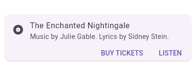
+/// This is what it looks like when run:
+///
+/// 
+///
/// {@tool snippet --template=stateless_widget}
///
/// This sample shows creation of a [Card] widget that shows album information
/// and two actions.
///
/// ```dart
-/// Card(
-/// child: Column(
-/// mainAxisSize: MainAxisSize.min,
-/// children: <Widget>[
-/// const ListTile(
-/// leading: Icon(Icons.album),
-/// title: Text('The Enchanted Nightingale'),
-/// subtitle: Text('Music by Julie Gable. Lyrics by Sidney Stein.'),
-/// ),
-/// ButtonTheme.bar( // make buttons use the appropriate styles for cards
-/// child: ButtonBar(
-/// children: <Widget>[
-/// FlatButton(
-/// child: const Text('BUY TICKETS'),
-/// onPressed: () { /* ... */ },
-/// ),
-/// FlatButton(
-/// child: const Text('LISTEN'),
-/// onPressed: () { /* ... */ },
-/// ),
-/// ],
+/// Center(
+/// child: Card(
+/// child: Column(
+/// mainAxisSize: MainAxisSize.min,
+/// children: <Widget>[
+/// const ListTile(
+/// leading: Icon(Icons.album),
+/// title: Text('The Enchanted Nightingale'),
+/// subtitle: Text('Music by Julie Gable. Lyrics by Sidney Stein.'),
/// ),
-/// ),
-/// ],
+/// ButtonTheme.bar( // make buttons use the appropriate styles for cards
+/// child: ButtonBar(
+/// children: <Widget>[
+/// FlatButton(
+/// child: const Text('BUY TICKETS'),
+/// onPressed: () { /* ... */ },
+/// ),
+/// FlatButton(
+/// child: const Text('LISTEN'),
+/// onPressed: () { /* ... */ },
+/// ),
+/// ],
+/// ),
+/// ),
+/// ],
+/// ),
/// ),
-/// );
+/// )
/// ```
/// {@end-tool}
///
-/// This is what it looks like when run:
-///
-/// 
-///
/// See also:
///
/// * [ListTile], to display icons and text in a card.
diff --git a/packages/flutter/lib/src/material/checkbox_list_tile.dart b/packages/flutter/lib/src/material/checkbox_list_tile.dart
index 73a30e4..1c1f429 100644
--- a/packages/flutter/lib/src/material/checkbox_list_tile.dart
+++ b/packages/flutter/lib/src/material/checkbox_list_tile.dart
@@ -37,11 +37,14 @@
 /// To show the [CheckboxListTile] as disabled, pass null as the [onChanged]
 /// callback.
 ///
-/// ## Sample code
+/// {@tool sample}
 ///
 /// This widget shows a checkbox that, when checked, slows down all animations
 /// (including the animation of the checkbox itself getting checked!).
 ///
+/// This sample requires that you also import 'package:flutter/scheduler.dart',
+/// so that you can reference [timeDilation].
+///
 /// ```dart
 /// CheckboxListTile(
 ///   title: const Text('Animate Slowly'),
@@ -52,9 +55,7 @@
 ///   secondary: const Icon(Icons.hourglass_empty),
 /// )
 /// ```
-///
-/// This sample requires that you also import 'package:flutter/scheduler.dart',
-/// so that you can reference [timeDilation].
+/// {@end-tool}
 ///
 /// See also:
 ///
diff --git a/packages/flutter/lib/src/material/chip.dart b/packages/flutter/lib/src/material/chip.dart
index e78a23f..951f9f1 100644
--- a/packages/flutter/lib/src/material/chip.dart
+++ b/packages/flutter/lib/src/material/chip.dart
@@ -377,7 +377,7 @@
   /// taps on the label or avatar parts of the chip. If [onPressed] is null,
   /// then the chip will be disabled.
   ///
-  /// ## Sample code
+  /// {@tool sample}
   ///
   /// ```dart
   /// class Blacksmith extends StatelessWidget {
@@ -394,6 +394,7 @@
   ///   }
   /// }
   /// ```
+  /// {@end-tool}
   VoidCallback get onPressed;

   /// Elevation to be applied on the chip during the press motion.
@@ -418,7 +419,7 @@
 /// Requires one of its ancestors to be a [Material] widget. The [label]
 /// and [clipBehavior] arguments must not be null.
 ///
-/// ## Sample code
+/// {@tool sample}
 ///
 /// ```dart
 /// Chip(
@@ -429,6 +430,7 @@
 ///   label: Text('Aaron Burr'),
 /// )
 /// ```
+/// {@end-tool}
 ///
 /// See also:
 ///
@@ -534,7 +536,7 @@
 ///  * In a horizontally scrollable list, like a [ListView] whose
 ///    scrollDirection is [Axis.horizontal].
 ///
-/// ## Sample code
+/// {@tool sample}
 ///
 /// ```dart
 /// InputChip(
@@ -548,6 +550,7 @@
 ///   }
 /// )
 /// ```
+/// {@end-tool}
 ///
 /// See also:
 ///
@@ -684,7 +687,7 @@
 /// Requires one of its ancestors to be a [Material] widget. The [selected] and
 /// [label] arguments must not be null.
 ///
-/// ## Sample code
+/// {@tool sample}
 ///
 /// ```dart
 /// class MyThreeOptions extends StatefulWidget {
@@ -716,6 +719,7 @@
 ///   }
 /// }
 /// ```
+/// {@end-tool}
 ///
 /// See also:
 ///
@@ -830,7 +834,7 @@
 ///
 /// Requires one of its ancestors to be a [Material] widget.
 ///
-/// ## Sample code
+/// {@tool sample}
 ///
 /// ```dart
 /// class ActorFilterEntry {
@@ -891,6 +895,7 @@
 ///   }
 /// }
 /// ```
+/// {@end-tool}
 ///
 /// See also:
 ///
@@ -1012,7 +1017,7 @@
 ///
 /// Requires one of its ancestors to be a [Material] widget.
 ///
-/// ## Sample code
+/// {@tool sample}
 ///
 /// ```dart
 /// ActionChip(
@@ -1026,6 +1031,7 @@
 ///   }
 /// )
 /// ```
+/// {@end-tool}
 ///
 /// See also:
 ///
diff --git a/packages/flutter/lib/src/material/chip_theme.dart b/packages/flutter/lib/src/material/chip_theme.dart
index f530dc6..048ec3e 100644
--- a/packages/flutter/lib/src/material/chip_theme.dart
+++ b/packages/flutter/lib/src/material/chip_theme.dart
@@ -60,7 +60,7 @@
   /// Defaults to the ambient [ThemeData.chipTheme] if there is no
   /// [ChipTheme] in the given build context.
   ///
-  /// ## Sample code
+  /// {@tool sample}
   ///
   /// ```dart
   /// class Spaceship extends StatelessWidget {
@@ -76,6 +76,7 @@
   ///   }
   /// }
   /// ```
+  /// {@end-tool}
   ///
   /// See also:
   ///
@@ -111,7 +112,7 @@
 /// you get from [ChipTheme.of], or create an entirely new one with
 /// [ChipThemeData..fromDefaults].
 ///
-/// ## Sample code
+/// {@tool sample}
 ///
 /// ```dart
 /// class CarColor extends StatefulWidget {
@@ -139,6 +140,7 @@
 ///   }
 /// }
 /// ```
+/// {@end-tool}
 ///
 /// See also:
 ///
diff --git a/packages/flutter/lib/src/material/circle_avatar.dart b/packages/flutter/lib/src/material/circle_avatar.dart
index 0f64540..e61eb69 100644
--- a/packages/flutter/lib/src/material/circle_avatar.dart
+++ b/packages/flutter/lib/src/material/circle_avatar.dart
@@ -17,7 +17,7 @@
 /// such an image, the user's initials. A given user's initials should
 /// always be paired with the same background color, for consistency.
 ///
-/// ## Sample code
+/// {@tool sample}
 ///
 /// If the avatar is to have an image, the image should be specified in the
 /// [backgroundImage] property:
@@ -27,9 +27,12 @@
 ///   backgroundImage: NetworkImage(userAvatarUrl),
 /// )
 /// ```
+/// {@end-tool}
 ///
 /// The image will be cropped to have a circle shape.
 ///
+/// {@tool sample}
+///
 /// If the avatar is to just have the user's initials, they are typically
 /// provided using a [Text] widget as the [child] and a [backgroundColor]:
 ///
@@ -39,6 +42,7 @@
 ///   child: Text('AH'),
 /// )
 /// ```
+/// {@end-tool}
 ///
 /// See also:
 ///
diff --git a/packages/flutter/lib/src/material/colors.dart b/packages/flutter/lib/src/material/colors.dart
index 5bd7af1..7b694ae 100644
--- a/packages/flutter/lib/src/material/colors.dart
+++ b/packages/flutter/lib/src/material/colors.dart
@@ -104,7 +104,7 @@
/// In addition, a series of blacks and whites with common opacities are
/// available. For example, [black54] is a pure black with 54% opacity.
///
-/// ## Sample code
+/// {@tool sample}
///
/// To select a specific color from one of the swatches, index into the swatch
/// using an integer for the specific color desired, as follows:
@@ -112,6 +112,8 @@
/// ```dart
/// Color selection = Colors.green[400]; // Selects a mid-range green.
/// ```
+/// {@end-tool}
+/// {@tool sample}
///
/// Each [ColorSwatch] constant is a color and can used directly. For example:
///
@@ -120,6 +122,7 @@
/// color: Colors.blue, // same as Colors.blue[500] or Colors.blue.shade500
/// )
/// ```
+/// {@end-tool}
///
/// ## Color palettes
///
@@ -395,7 +398,7 @@
/// 
/// 
///
- /// ## Sample code
+ /// {@tool sample}
///
/// ```dart
/// Icon(
@@ -403,6 +406,7 @@
/// color: Colors.red[400],
/// )
/// ```
+ /// {@end-tool}
///
/// See also:
///
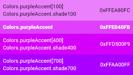
@@ -438,7 +442,7 @@
/// 
/// 
///
- /// ## Sample code
+ /// {@tool sample}
///
/// ```dart
/// Icon(
@@ -446,6 +450,7 @@
/// color: Colors.redAccent[400],
/// )
/// ```
+ /// {@end-tool}
///
/// See also:
///
@@ -475,7 +480,7 @@
/// 
/// 
///
- /// ## Sample code
+ /// {@tool sample}
///
/// ```dart
/// Icon(
@@ -483,6 +488,7 @@
/// color: Colors.pink[400],
/// )
/// ```
+ /// {@end-tool}
///
/// See also:
///
@@ -518,7 +524,7 @@
/// 
/// 
///
- /// ## Sample code
+ /// {@tool sample}
///
/// ```dart
/// Icon(
@@ -526,6 +532,7 @@
/// color: Colors.pinkAccent[400],
/// )
/// ```
+ /// {@end-tool}
///
/// See also:
///
@@ -555,7 +562,7 @@
/// 
/// 
///
- /// ## Sample code
+ /// {@tool sample}
///
/// ```dart
/// Icon(
@@ -563,6 +570,7 @@
/// color: Colors.purple[400],
/// )
/// ```
+ /// {@end-tool}
///
/// See also:
///
@@ -598,7 +606,7 @@
/// 
/// 
///
- /// ## Sample code
+ /// {@tool sample}
///
/// ```dart
/// Icon(
@@ -606,6 +614,7 @@
/// color: Colors.purpleAccent[400],
/// )
/// ```
+ /// {@end-tool}
///
/// See also:
///
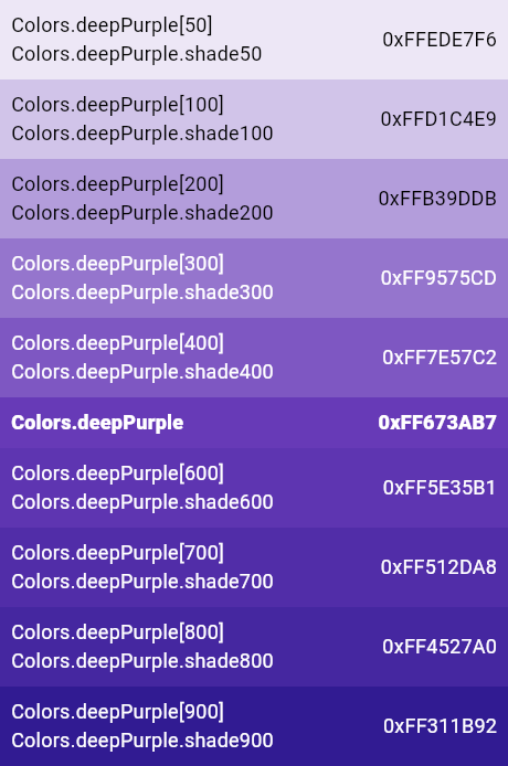
@@ -635,7 +644,7 @@
/// 
/// 
///
- /// ## Sample code
+ /// {@tool sample}
///
/// ```dart
/// Icon(
@@ -643,6 +652,7 @@
/// color: Colors.deepPurple[400],
/// )
/// ```
+ /// {@end-tool}
///
/// See also:
///
@@ -678,7 +688,7 @@
/// 
/// 
///
- /// ## Sample code
+ /// {@tool sample}
///
/// ```dart
/// Icon(
@@ -686,6 +696,7 @@
/// color: Colors.deepPurpleAccent[400],
/// )
/// ```
+ /// {@end-tool}
///
/// See also:
///
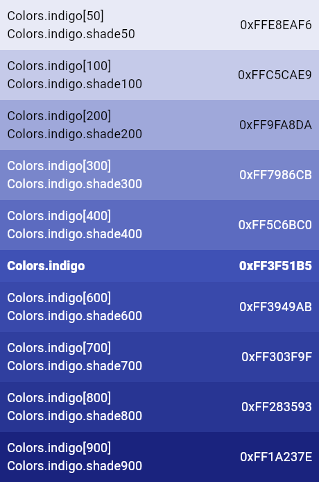
@@ -715,7 +726,7 @@
/// 
/// 
///
- /// ## Sample code
+ /// {@tool sample}
///
/// ```dart
/// Icon(
@@ -723,6 +734,7 @@
/// color: Colors.indigo[400],
/// )
/// ```
+ /// {@end-tool}
///
/// See also:
///
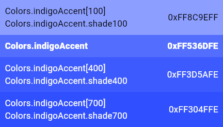
@@ -758,7 +770,7 @@
/// 
/// 
///
- /// ## Sample code
+ /// {@tool sample}
///
/// ```dart
/// Icon(
@@ -766,6 +778,7 @@
/// color: Colors.indigoAccent[400],
/// )
/// ```
+ /// {@end-tool}
///
/// See also:
///
@@ -797,7 +810,7 @@
///
/// 
///
- /// ## Sample code
+ /// {@tool sample}
///
/// ```dart
/// Icon(
@@ -805,6 +818,7 @@
/// color: Colors.blue[400],
/// )
/// ```
+ /// {@end-tool}
///
/// See also:
///
@@ -840,7 +854,7 @@
/// 
/// 
///
- /// ## Sample code
+ /// {@tool sample}
///
/// ```dart
/// Icon(
@@ -848,6 +862,7 @@
/// color: Colors.blueAccent[400],
/// )
/// ```
+ /// {@end-tool}
///
/// See also:
///
@@ -877,7 +892,7 @@
/// 
/// 
///
- /// ## Sample code
+ /// {@tool sample}
///
/// ```dart
/// Icon(
@@ -885,6 +900,7 @@
/// color: Colors.lightBlue[400],
/// )
/// ```
+ /// {@end-tool}
///
/// See also:
///
@@ -920,7 +936,7 @@
/// 
/// 
///
- /// ## Sample code
+ /// {@tool sample}
///
/// ```dart
/// Icon(
@@ -928,6 +944,7 @@
/// color: Colors.lightBlueAccent[400],
/// )
/// ```
+ /// {@end-tool}
///
/// See also:
///
@@ -959,7 +976,7 @@
///
/// 
///
- /// ## Sample code
+ /// {@tool sample}
///
/// ```dart
/// Icon(
@@ -967,6 +984,7 @@
/// color: Colors.cyan[400],
/// )
/// ```
+ /// {@end-tool}
///
/// See also:
///
@@ -1002,7 +1020,7 @@
/// 
/// 
///
- /// ## Sample code
+ /// {@tool sample}
///
/// ```dart
/// Icon(
@@ -1010,6 +1028,7 @@
/// color: Colors.cyanAccent[400],
/// )
/// ```
+ /// {@end-tool}
///
/// See also:
///
@@ -1039,7 +1058,7 @@
/// 
/// 
///
- /// ## Sample code
+ /// {@tool sample}
///
/// ```dart
/// Icon(
@@ -1047,6 +1066,7 @@
/// color: Colors.teal[400],
/// )
/// ```
+ /// {@end-tool}
///
/// See also:
///
@@ -1082,7 +1102,7 @@
/// 
/// 
///
- /// ## Sample code
+ /// {@tool sample}
///
/// ```dart
/// Icon(
@@ -1090,6 +1110,7 @@
/// color: Colors.tealAccent[400],
/// )
/// ```
+ /// {@end-tool}
///
/// See also:
///
@@ -1122,7 +1143,7 @@
/// 
/// 
///
- /// ## Sample code
+ /// {@tool sample}
///
/// ```dart
/// Icon(
@@ -1130,6 +1151,7 @@
/// color: Colors.green[400],
/// )
/// ```
+ /// {@end-tool}
///
/// See also:
///
@@ -1168,7 +1190,7 @@
/// 
/// 
///
- /// ## Sample code
+ /// {@tool sample}
///
/// ```dart
/// Icon(
@@ -1176,6 +1198,7 @@
/// color: Colors.greenAccent[400],
/// )
/// ```
+ /// {@end-tool}
///
/// See also:
///
@@ -1205,7 +1228,7 @@
/// 
/// 
///
- /// ## Sample code
+ /// {@tool sample}
///
/// ```dart
/// Icon(
@@ -1213,6 +1236,7 @@
/// color: Colors.lightGreen[400],
/// )
/// ```
+ /// {@end-tool}
///
/// See also:
///
@@ -1248,7 +1272,7 @@
/// 
/// 
///
- /// ## Sample code
+ /// {@tool sample}
///
/// ```dart
/// Icon(
@@ -1256,6 +1280,7 @@
/// color: Colors.lightGreenAccent[400],
/// )
/// ```
+ /// {@end-tool}
///
/// See also:
///
@@ -1285,7 +1310,7 @@
/// 
/// 
///
- /// ## Sample code
+ /// {@tool sample}
///
/// ```dart
/// Icon(
@@ -1293,6 +1318,7 @@
/// color: Colors.lime[400],
/// )
/// ```
+ /// {@end-tool}
///
/// See also:
///
@@ -1328,7 +1354,7 @@
/// 
/// 
///
- /// ## Sample code
+ /// {@tool sample}
///
/// ```dart
/// Icon(
@@ -1336,6 +1362,7 @@
/// color: Colors.limeAccent[400],
/// )
/// ```
+ /// {@end-tool}
///
/// See also:
///
@@ -1365,7 +1392,7 @@
/// 
/// 
///
- /// ## Sample code
+ /// {@tool sample}
///
/// ```dart
/// Icon(
@@ -1373,6 +1400,7 @@
/// color: Colors.yellow[400],
/// )
/// ```
+ /// {@end-tool}
///
/// See also:
///
@@ -1408,7 +1436,7 @@
/// 
/// 
///
- /// ## Sample code
+ /// {@tool sample}
///
/// ```dart
/// Icon(
@@ -1416,6 +1444,7 @@
/// color: Colors.yellowAccent[400],
/// )
/// ```
+ /// {@end-tool}
///
/// See also:
///
@@ -1445,7 +1474,7 @@
/// 
/// 
///
- /// ## Sample code
+ /// {@tool sample}
///
/// ```dart
/// Icon(
@@ -1453,6 +1482,7 @@
/// color: Colors.amber[400],
/// )
/// ```
+ /// {@end-tool}
///
/// See also:
///
@@ -1488,7 +1518,7 @@
/// 
/// 
///
- /// ## Sample code
+ /// {@tool sample}
///
/// ```dart
/// Icon(
@@ -1496,6 +1526,7 @@
/// color: Colors.amberAccent[400],
/// )
/// ```
+ /// {@end-tool}
///
/// See also:
///
@@ -1527,7 +1558,7 @@
///
/// 
///
- /// ## Sample code
+ /// {@tool sample}
///
/// ```dart
/// Icon(
@@ -1535,6 +1566,7 @@
/// color: Colors.orange[400],
/// )
/// ```
+ /// {@end-tool}
///
/// See also:
///
@@ -1570,7 +1602,7 @@
/// 
/// 
///
- /// ## Sample code
+ /// {@tool sample}
///
/// ```dart
/// Icon(
@@ -1578,6 +1610,7 @@
/// color: Colors.orangeAccent[400],
/// )
/// ```
+ /// {@end-tool}
///
/// See also:
///
@@ -1609,7 +1642,7 @@
///
/// 
///
- /// ## Sample code
+ /// {@tool sample}
///
/// ```dart
/// Icon(
@@ -1617,6 +1650,7 @@
/// color: Colors.deepOrange[400],
/// )
/// ```
+ /// {@end-tool}
///
/// See also:
///
@@ -1652,7 +1686,7 @@
/// 
/// 
///
- /// ## Sample code
+ /// {@tool sample}
///
/// ```dart
/// Icon(
@@ -1660,6 +1694,7 @@
/// color: Colors.deepOrangeAccent[400],
/// )
/// ```
+ /// {@end-tool}
///
/// See also:
///
@@ -1688,7 +1723,7 @@
///
/// This swatch has no corresponding accent color and swatch.
///
- /// ## Sample code
+ /// {@tool sample}
///
/// ```dart
/// Icon(
@@ -1696,6 +1731,7 @@
/// color: Colors.brown[400],
/// )
/// ```
+ /// {@end-tool}
///
/// See also:
///
@@ -1734,7 +1770,7 @@
/// used for raised button while pressed in light themes, and 850 is used for
/// the background color of the dark theme. See [ThemeData.brightness].
///
- /// ## Sample code
+ /// {@tool sample}
///
/// ```dart
/// Icon(
@@ -1742,6 +1778,7 @@
/// color: Colors.grey[400],
/// )
/// ```
+ /// {@end-tool}
///
/// See also:
///
@@ -1781,7 +1818,7 @@
///
/// This swatch has no corresponding accent swatch.
///
- /// ## Sample code
+ /// {@tool sample}
///
/// ```dart
/// Icon(
@@ -1789,6 +1826,7 @@
/// color: Colors.blueGrey[400],
/// )
/// ```
+ /// {@end-tool}
///
/// See also:
///
diff --git a/packages/flutter/lib/src/material/dialog.dart b/packages/flutter/lib/src/material/dialog.dart
index e3580e7..06a02e3 100644
--- a/packages/flutter/lib/src/material/dialog.dart
+++ b/packages/flutter/lib/src/material/dialog.dart
@@ -133,7 +133,7 @@
 /// Typically passed as the child widget to [showDialog], which displays the
 /// dialog.
 ///
-/// ## Sample code
+/// {@tool sample}
 ///
 /// This snippet shows a method in a [State] which, when called, displays a dialog box
 /// and returns a [Future] that completes when the dialog is dismissed.
@@ -167,6 +167,7 @@
 ///   );
 /// }
 /// ```
+/// {@end-tool}
 ///
 /// See also:
 ///
@@ -334,7 +335,7 @@
 /// title and the first option, and 24 pixels of spacing between the last option
 /// and the bottom of the dialog.
 ///
-/// ## Sample code
+/// {@tool sample}
 ///
 /// ```dart
 /// SimpleDialogOption(
@@ -342,6 +343,7 @@
 ///   child: const Text('Treasury department'),
 /// )
 /// ```
+/// {@end-tool}
 ///
 /// See also:
 ///
@@ -398,7 +400,7 @@
 /// Typically passed as the child widget to [showDialog], which displays the
 /// dialog.
 ///
-/// ## Sample code
+/// {@tool sample}
 ///
 /// In this example, the user is asked to select between two options. These
 /// options are represented as an enum. The [showDialog] method here returns
@@ -441,6 +443,7 @@
 ///   }
 /// }
 /// ```
+/// {@end-tool}
 ///
 /// See also:
 ///
diff --git a/packages/flutter/lib/src/material/divider.dart b/packages/flutter/lib/src/material/divider.dart
index 22db2f9..e1df01f 100644
--- a/packages/flutter/lib/src/material/divider.dart
+++ b/packages/flutter/lib/src/material/divider.dart
@@ -58,13 +58,14 @@
   /// Defaults to the current theme's divider color, given by
   /// [ThemeData.dividerColor].
   ///
-  /// ## Sample code
+  /// {@tool sample}
   ///
   /// ```dart
   /// Divider(
   ///   color: Colors.deepOrange,
   /// )
   /// ```
+  /// {@end-tool}
   final Color color;

   /// Computes the [BorderSide] that represents a divider of the specified
@@ -74,7 +75,7 @@
   /// The `width` argument can be used to override the default width of the
   /// divider border, which is usually 0.0 (a hairline border).
   ///
-  /// ## Sample code
+  /// {@tool sample}
   ///
   /// This example uses this method to create a box that has a divider above and
   /// below it. This is sometimes useful with lists, for instance, to separate a
@@ -91,6 +92,7 @@
   ///   // child: ...
   /// )
   /// ```
+  /// {@end-tool}
   static BorderSide createBorderSide(BuildContext context, { Color color, double width = 0.0 }) {
     assert(width != null);
     return BorderSide(
@@ -164,13 +166,14 @@
   /// Defaults to the current theme's divider color, given by
   /// [ThemeData.dividerColor].
   ///
-  /// ## Sample code
+  /// {@tool sample}
   ///
   /// ```dart
   /// Divider(
   ///   color: Colors.deepOrange,
   /// )
   /// ```
+  /// {@end-tool}
   final Color color;

   @override
diff --git a/packages/flutter/lib/src/material/feedback.dart b/packages/flutter/lib/src/material/feedback.dart
index 5dbe0a4..434b3b8 100644
--- a/packages/flutter/lib/src/material/feedback.dart
+++ b/packages/flutter/lib/src/material/feedback.dart
@@ -28,7 +28,7 @@
 /// [StatelessWidget.build] method or from a [State]'s methods as you have to
 /// provide a [BuildContext].
 ///
-/// ## Sample code
+/// {@tool sample}
 ///
 /// To trigger platform-specific feedback before executing the actual callback:
 ///
@@ -52,6 +52,8 @@
 ///   }
 /// }
 /// ```
+/// {@end-tool}
+/// {@tool sample}
 ///
 /// Alternatively, you can also call [forTap] or [forLongPress] directly within
 /// your tap or long press handler:
@@ -76,6 +78,7 @@
 ///   }
 /// }
 /// ```
+/// {@end-tool}
 class Feedback {
   Feedback._();
diff --git a/packages/flutter/lib/src/material/ink_decoration.dart b/packages/flutter/lib/src/material/ink_decoration.dart
index 7a40b72..4bf46e6 100644
--- a/packages/flutter/lib/src/material/ink_decoration.dart
+++ b/packages/flutter/lib/src/material/ink_decoration.dart
@@ -44,7 +44,7 @@
 /// generally speaking will match the order they are given in the widget tree,
 /// but this order may appear to be somewhat random in more dynamic situations.
 ///
-/// ## Sample code
+/// {@tool sample}
 ///
 /// This example shows how a [Material] widget can have a yellow rectangle drawn
 /// on it using [Ink], while still having ink effects over the yellow rectangle:
@@ -67,6 +67,8 @@
 ///   ),
 /// )
 /// ```
+/// {@end-tool}
+/// {@tool sample}
 ///
 /// The following example shows how an image can be printed on a [Material]
 /// widget with an [InkWell] above it:
@@ -94,6 +96,7 @@
 ///   ),
 /// )
 /// ```
+/// {@end-tool}
 ///
 /// See also:
 ///
diff --git a/packages/flutter/lib/src/material/list_tile.dart b/packages/flutter/lib/src/material/list_tile.dart
index cf89a7c..e8d3451 100644
--- a/packages/flutter/lib/src/material/list_tile.dart
+++ b/packages/flutter/lib/src/material/list_tile.dart
@@ -170,7 +170,7 @@
 ///
 /// Requires one of its ancestors to be a [Material] widget.
 ///
-/// ## Sample code
+/// {@tool sample}
 ///
 /// Here is a simple tile with an icon and some text.
 ///
@@ -180,6 +180,8 @@
 ///   title: const Text('The seat for the narrator'),
 /// )
 /// ```
+/// {@end-tool}
+/// {@tool sample}
 ///
 /// Tiles can be much more elaborate. Here is a tile which can be tapped, but
 /// which is disabled when the `_act` variable is not 2. When the tile is
@@ -196,6 +198,7 @@
 ///   onTap: () { /* react to the tile being tapped */ }
 /// )
 /// ```
+/// {@end-tool}
 ///
 /// See also:
 ///
diff --git a/packages/flutter/lib/src/material/popup_menu.dart b/packages/flutter/lib/src/material/popup_menu.dart
index 12ada19..fc6f70a 100644
--- a/packages/flutter/lib/src/material/popup_menu.dart
+++ b/packages/flutter/lib/src/material/popup_menu.dart
@@ -135,7 +135,7 @@
 /// [PopupMenuItem] is 48 pixels high. If you use a widget with a different
 /// height, it must be specified in the [height] property.
 ///
-/// ## Sample code
+/// {@tool sample}
 ///
 /// Here, a [Text] widget is used with a popup menu item. The `WhyFarther` type
 /// is an enum, not shown here.
@@ -146,6 +146,7 @@
 ///   child: Text('Working a lot harder'),
 /// )
 /// ```
+/// {@end-tool}
 ///
 /// See the example at [PopupMenuButton] for how this example could be used in a
 /// complete menu, and see the example at [CheckedPopupMenuItem] for one way to
@@ -286,7 +287,7 @@
 /// of a [PopupMenuItem]. The horizontal layout uses a [ListTile]; the checkmark
 /// is an [Icons.done] icon, shown in the [ListTile.leading] position.
 ///
-/// ## Sample code
+/// {@tool sample}
 ///
 /// Suppose a `Commands` enum exists that lists the possible commands from a
 /// particular popup menu, including `Commands.heroAndScholar` and
@@ -324,6 +325,7 @@
 ///   ],
 /// )
 /// ```
+/// {@end-tool}
 ///
 /// In particular, observe how the second menu item uses a [ListTile] with a
 /// blank [Icon] in the [ListTile.leading] position to get the same alignment as
@@ -770,7 +772,7 @@
 /// If both are null, then a standard overflow icon is created (depending on the
 /// platform).
 ///
-/// ## Sample code
+/// {@tool sample}
 ///
 /// This example shows a menu with four items, selecting between an enum's
 /// values and setting a `_selection` field based on the selection.
@@ -803,6 +805,7 @@
 ///   ],
 /// )
 /// ```
+/// {@end-tool}
 ///
 /// See also:
 ///
diff --git a/packages/flutter/lib/src/material/radio_list_tile.dart b/packages/flutter/lib/src/material/radio_list_tile.dart
index f10fe33..7fb021e 100644
--- a/packages/flutter/lib/src/material/radio_list_tile.dart
+++ b/packages/flutter/lib/src/material/radio_list_tile.dart
@@ -40,7 +40,7 @@
 /// To show the [RadioListTile] as disabled, pass null as the [onChanged]
 /// callback.
 ///
-/// ## Sample code
+/// {@tool sample}
 ///
 /// This widget shows a pair of radio buttons that control the `_character`
 /// field. The field is of the type `SingingCharacter`, an enum.
@@ -70,6 +70,7 @@
 ///   ],
 /// )
 /// ```
+/// {@end-tool}
 ///
 /// See also:
 ///
diff --git a/packages/flutter/lib/src/material/reorderable_list.dart b/packages/flutter/lib/src/material/reorderable_list.dart
index 67503af..e976720 100644
--- a/packages/flutter/lib/src/material/reorderable_list.dart
+++ b/packages/flutter/lib/src/material/reorderable_list.dart
@@ -25,9 +25,7 @@
 /// [ReorderableListView] will need to account for this when inserting before
 /// [newIndex].
 ///
-/// ## Sample code
-///
-/// Example implementation:
+/// {@tool sample}
 ///
 /// ```dart
 /// final List<MyDataObject> backingList = <MyDataObject>[/* ... */];
@@ -41,6 +39,7 @@
 ///   backingList.insert(newIndex, element);
 /// }
 /// ```
+/// {@end-tool}
 typedef ReorderCallback = void Function(int oldIndex, int newIndex);

 /// A list whose items the user can interactively reorder by dragging.
diff --git a/packages/flutter/lib/src/material/scaffold.dart b/packages/flutter/lib/src/material/scaffold.dart
index 558a89d..1741cb2 100644
--- a/packages/flutter/lib/src/material/scaffold.dart
+++ b/packages/flutter/lib/src/material/scaffold.dart
@@ -657,7 +657,7 @@
 /// [ScaffoldState] for the current [BuildContext] via [Scaffold.of] and use the
 /// [ScaffoldState.showSnackBar] and [ScaffoldState.showBottomSheet] functions.
 ///
-/// ## Sample code
+/// {@tool sample}
 ///
 /// This example shows a [Scaffold] with an [AppBar], a [BottomAppBar]
 /// and a [FloatingActionButton]. The [body] is a [Text] placed in a [Center]
@@ -684,6 +684,7 @@
 ///   floatingActionButtonLocation: FloatingActionButtonLocation.centerDocked,
 /// )
 /// ```
+/// {@end-tool}
 ///
 /// See also:
 ///
diff --git a/packages/flutter/lib/src/material/slider.dart b/packages/flutter/lib/src/material/slider.dart
index efbd4a6..d5b0405 100644
--- a/packages/flutter/lib/src/material/slider.dart
+++ b/packages/flutter/lib/src/material/slider.dart
@@ -146,7 +146,7 @@
   /// [StatefulWidget] using the [State.setState] method, so that the parent
   /// gets rebuilt; for example:
   ///
-  /// ## Sample code
+  /// {@tool sample}
   ///
   /// ```dart
   /// Slider(
@@ -162,6 +162,7 @@
   ///   },
   /// )
   /// ```
+  /// {@end-tool}
   ///
   /// See also:
   ///
@@ -180,7 +181,7 @@
   /// The value passed will be the last [value] that the slider had before the
   /// change began.
   ///
-  /// ## Sample code
+  /// {@tool sample}
   ///
   /// ```dart
   /// Slider(
@@ -199,6 +200,7 @@
   ///   },
   /// )
   /// ```
+  /// {@end-tool}
   ///
   /// See also:
   ///
@@ -212,7 +214,7 @@
   /// [onChanged] for that), but rather to know when the user has completed
   /// selecting a new [value] by ending a drag or a click.
   ///
-  /// ## Sample code
+  /// {@tool sample}
   ///
   /// ```dart
   /// Slider(
@@ -231,6 +233,7 @@
   ///   },
   /// )
   /// ```
+  /// {@end-tool}
   ///
   /// See also:
   ///
@@ -305,7 +308,7 @@
   /// This is used by accessibility frameworks like TalkBack on Android to
   /// inform users what the currently selected value is with more context.
   ///
-  /// ## Sample code:
+  /// {@tool sample}
   ///
   /// In the example below, a slider for currency values is configured to
   /// announce a value with a currency label.
@@ -326,6 +329,7 @@
   ///   }
   ///  )
   /// ```
+  /// {@end-tool}
   final SemanticFormatterCallback semanticFormatterCallback;

   @override
diff --git a/packages/flutter/lib/src/material/slider_theme.dart b/packages/flutter/lib/src/material/slider_theme.dart
index 73bcfe6..aa22e6a 100644
--- a/packages/flutter/lib/src/material/slider_theme.dart
+++ b/packages/flutter/lib/src/material/slider_theme.dart
@@ -48,7 +48,7 @@
   /// Defaults to the ambient [ThemeData.sliderTheme] if there is no
   /// [SliderTheme] in the given build context.
   ///
-  /// ## Sample code
+  /// {@tool sample}
   ///
   /// ```dart
   /// class Launch extends StatefulWidget {
@@ -71,6 +71,7 @@
   ///   }
   /// }
   /// ```
+  /// {@end-tool}
   ///
   /// See also:
   ///
@@ -155,7 +156,7 @@
   /// [copyWith] on the one you get from [SliderTheme.of], or create an
   /// entirely new one with [SliderThemeData.fromPrimaryColors].
   ///
-  /// ## Sample code
+  /// {@tool sample}
   ///
   /// ```dart
   /// class Blissful extends StatefulWidget {
@@ -178,6 +179,7 @@
   ///   }
   /// }
   /// ```
+  /// {@end-tool}
   const SliderThemeData({
     @required this.activeTrackColor,
     @required this.inactiveTrackColor,
diff --git a/packages/flutter/lib/src/material/switch_list_tile.dart b/packages/flutter/lib/src/material/switch_list_tile.dart
index 9c04e8f..f3b6a7f 100644
--- a/packages/flutter/lib/src/material/switch_list_tile.dart
+++ b/packages/flutter/lib/src/material/switch_list_tile.dart
@@ -39,7 +39,7 @@
 /// To show the [SwitchListTile] as disabled, pass null as the [onChanged]
 /// callback.
 ///
-/// ## Sample code
+/// {@tool sample}
 ///
 /// This widget shows a switch that, when toggled, changes the state of a [bool]
 /// member field called `_lights`.
@@ -52,6 +52,7 @@
 ///   secondary: const Icon(Icons.lightbulb_outline),
 /// )
 /// ```
+/// {@end-tool}
 ///
 /// See also:
 ///
diff --git a/packages/flutter/lib/src/material/tab_controller.dart b/packages/flutter/lib/src/material/tab_controller.dart
index c50b1b9..9c40c88 100644
--- a/packages/flutter/lib/src/material/tab_controller.dart
+++ b/packages/flutter/lib/src/material/tab_controller.dart
@@ -19,7 +19,7 @@
 /// ancestor, a [TabController] can be shared by providing a
 /// [DefaultTabController] inherited widget.
 ///
-/// ## Sample code
+/// {@tool sample}
 ///
 /// This widget introduces a [Scaffold] with an [AppBar] and a [TabBar].
 ///
@@ -69,6 +69,7 @@
 ///   }
 /// }
 /// ```
+/// {@end-tool}
 class TabController extends ChangeNotifier {
   /// Creates an object that manages the state required by [TabBar] and a [TabBarView].
   ///
diff --git a/packages/flutter/lib/src/material/text_form_field.dart b/packages/flutter/lib/src/material/text_form_field.dart
index dd3c51f..4a4ec2c 100644
--- a/packages/flutter/lib/src/material/text_form_field.dart
+++ b/packages/flutter/lib/src/material/text_form_field.dart
@@ -39,7 +39,7 @@
 ///  * [InputDecorator], which shows the labels and other visual elements that
 ///    surround the actual text editing widget.
 ///
-/// ## Sample code
+/// {@tool sample}
 ///
 /// Creates a [TextFormField] with an [InputDecoration] and validator function.
 ///
@@ -59,6 +59,7 @@
 ///   },
 /// )
 /// ```
+/// {@end-tool}
 class TextFormField extends FormField<String> {
   /// Creates a [FormField] that contains a [TextField].
   ///
diff --git a/packages/flutter/lib/src/material/text_theme.dart b/packages/flutter/lib/src/material/text_theme.dart
index 23ed045..dd518c0 100644
--- a/packages/flutter/lib/src/material/text_theme.dart
+++ b/packages/flutter/lib/src/material/text_theme.dart
@@ -176,7 +176,7 @@
   /// the typography styles in the material design specification, as a starting
   /// point.
   ///
-  /// ## Sample code
+  /// {@tool sample}
   ///
   /// ```dart
   /// /// A Widget that sets the ambient theme's title text color for its
@@ -203,6 +203,7 @@
   ///   }
   /// }
   /// ```
+  /// {@end-tool}
   ///
   /// See also:
   ///
@@ -259,7 +260,7 @@
   /// [TextTheme] has only some fields defined, and you want to define the rest
   /// by merging it with a default theme.
   ///
-  /// ## Sample code
+  /// {@tool sample}
   ///
   /// ```dart
   /// /// A Widget that sets the ambient theme's title text color for its
@@ -284,6 +285,7 @@
   ///   }
   /// }
   /// ```
+  /// {@end-tool}
   ///
   /// See also:
   ///
diff --git a/packages/flutter/lib/src/material/time.dart b/packages/flutter/lib/src/material/time.dart
index c551b57..6e82b74 100644
--- a/packages/flutter/lib/src/material/time.dart
+++ b/packages/flutter/lib/src/material/time.dart
@@ -29,13 +29,14 @@
 /// minute or using [DateTime] object.
 /// Hours are specified between 0 and 23, as in a 24-hour clock.
 ///
-/// ### Sample code
+/// {@tool sample}
 ///
 /// ```dart
 /// TimeOfDay now = TimeOfDay.now();
 /// TimeOfDay releaseTime = TimeOfDay(hour: 15, minute: 0); // 3:00pm
 /// TimeOfDay roomBooked = TimeOfDay.fromDateTime(DateTime.parse('2018-10-20 16:30:04Z')); // 4:30pm
 /// ```
+/// {@end-tool}
 ///
 /// See also:
 ///
diff --git a/packages/flutter/lib/src/painting/borders.dart b/packages/flutter/lib/src/painting/borders.dart
index c3eff32..2e8bcda 100644
--- a/packages/flutter/lib/src/painting/borders.dart
+++ b/packages/flutter/lib/src/painting/borders.dart
@@ -26,7 +26,7 @@
 /// A [Border] consists of four [BorderSide] objects: [Border.top],
 /// [Border.left], [Border.right], and [Border.bottom].
 ///
-/// ## Sample code
+/// {@tool sample}
 ///
 /// This sample shows how [BorderSide] objects can be used in a [Container], via
 /// a [BoxDecoration] and a [Border], to decorate some [Text]. In this example,
@@ -45,6 +45,7 @@
 ///   child: Text('Flutter in the sky', textAlign: TextAlign.center),
 /// )
 /// ```
+/// {@end-tool}
 ///
 /// See also:
 ///
diff --git a/packages/flutter/lib/src/painting/box_border.dart b/packages/flutter/lib/src/painting/box_border.dart
index 6160ff2..1c6d38a 100644
--- a/packages/flutter/lib/src/painting/box_border.dart
+++ b/packages/flutter/lib/src/painting/box_border.dart
@@ -239,19 +239,23 @@
 ///
 /// The sides are represented by [BorderSide] objects.
 ///
-/// ## Sample code
+/// {@tool sample}
 ///
 /// All four borders the same, two-pixel wide solid white:
 ///
 /// ```dart
 /// Border.all(width: 2.0, color: const Color(0xFFFFFFFF))
 /// ```
+/// {@end-tool}
+/// {@tool sample}
 ///
 /// The border for a material design divider:
 ///
 /// ```dart
 /// Border(bottom: BorderSide(color: Theme.of(context).dividerColor))
 /// ```
+/// {@end-tool}
+/// {@tool sample}
 ///
 /// A 1990s-era "OK" button:
 ///
@@ -284,6 +288,7 @@
 ///   ),
 /// )
 /// ```
+/// {@end-tool}
 ///
 /// See also:
 ///
diff --git a/packages/flutter/lib/src/painting/box_decoration.dart b/packages/flutter/lib/src/painting/box_decoration.dart
index daf80b2..b1c06e3 100644
--- a/packages/flutter/lib/src/painting/box_decoration.dart
+++ b/packages/flutter/lib/src/painting/box_decoration.dart
@@ -32,7 +32,7 @@
 ///
 /// The [border] paints over the body; the [boxShadow], naturally, paints below it.
 ///
-/// ## Sample code
+/// {@tool sample}
 ///
 /// The following example uses the [Container] widget from the widgets layer to
 /// draw an image with a border:
@@ -52,6 +52,7 @@
 ///   ),
 /// )
 /// ```
+/// {@end-tool}
 ///
 /// See also:
 ///
diff --git a/packages/flutter/lib/src/painting/box_fit.dart b/packages/flutter/lib/src/painting/box_fit.dart
index 236e6dc..1cbb27b 100644
--- a/packages/flutter/lib/src/painting/box_fit.dart
+++ b/packages/flutter/lib/src/painting/box_fit.dart
@@ -102,7 +102,7 @@
 /// convenience function, [Alignment.inscribe], for resolving the sizes to
 /// rects, as shown in the example below.
 ///
-/// ## Sample code
+/// {@tool sample}
 ///
 /// This function paints a [dart:ui.Image] `image` onto the [Rect] `outputRect` on a
 /// [Canvas] `canvas`, using a [Paint] `paint`, applying the [BoxFit] algorithm
@@ -117,6 +117,7 @@
 ///   canvas.drawImageRect(image, inputSubrect, outputSubrect, paint);
 /// }
 /// ```
+/// {@end-tool}
 ///
 /// See also:
 ///
diff --git a/packages/flutter/lib/src/painting/edge_insets.dart b/packages/flutter/lib/src/painting/edge_insets.dart
index 8963619..a485334 100644
--- a/packages/flutter/lib/src/painting/edge_insets.dart
+++ b/packages/flutter/lib/src/painting/edge_insets.dart
@@ -282,7 +282,7 @@
 /// _start_, top, _end_, and bottom, where start and end are resolved in terms
 /// of a [TextDirection] (typically obtained from the ambient [Directionality]).
 ///
-/// ## Sample code
+/// {@tool sample}
 ///
 /// Here are some examples of how to create [EdgeInsets] instances:
 ///
@@ -291,18 +291,23 @@
 /// ```dart
 /// const EdgeInsets.all(8.0)
 /// ```
+/// {@end-tool}
+/// {@tool sample}
 ///
 /// Eight pixel margin above and below, no horizontal margins:
 ///
 /// ```dart
 /// const EdgeInsets.symmetric(vertical: 8.0)
 /// ```
+/// {@end-tool}
+/// {@tool sample}
 ///
 /// Left margin indent of 40 pixels:
 ///
 /// ```dart
 /// const EdgeInsets.only(left: 40.0)
 /// ```
+/// {@end-tool}
 ///
 /// See also:
 ///
@@ -316,25 +321,27 @@

   /// Creates insets where all the offsets are `value`.
   ///
-  /// ## Sample code
+  /// {@tool sample}
   ///
   /// Typical eight-pixel margin on all sides:
   ///
   /// ```dart
   /// const EdgeInsets.all(8.0)
   /// ```
+  /// {@end-tool}
   const EdgeInsets.all(double value)
       : left = value, top = value, right = value, bottom = value;

   /// Creates insets with only the given values non-zero.
   ///
-  /// ## Sample code
+  /// {@tool sample}
   ///
   /// Left margin indent of 40 pixels:
   ///
   /// ```dart
   /// const EdgeInsets.only(left: 40.0)
   /// ```
+  /// {@end-tool}
   const EdgeInsets.only({
     this.left = 0.0,
     this.top = 0.0,
@@ -344,13 +351,14 @@

   /// Creates insets with symmetrical vertical and horizontal offsets.
   ///
-  /// ## Sample code
+  /// {@tool sample}
   ///
   /// Eight pixel margin above and below, no horizontal margins:
   ///
   /// ```dart
   /// const EdgeInsets.symmetric(vertical: 8.0)
   /// ```
+  /// {@end-tool}
   const EdgeInsets.symmetric({ double vertical = 0.0,
                              double horizontal = 0.0 })
     : left = horizontal, top = vertical, right = horizontal, bottom = vertical;
@@ -600,13 +608,14 @@

   /// Creates insets with only the given values non-zero.
   ///
-  /// ## Sample code
+  /// {@tool sample}
   ///
   /// A margin indent of 40 pixels on the leading side:
   ///
   /// ```dart
   /// const EdgeInsetsDirectional.only(start: 40.0)
   /// ```
+  /// {@end-tool}
   const EdgeInsetsDirectional.only({
     this.start = 0.0,
     this.top = 0.0,
diff --git a/packages/flutter/lib/src/painting/gradient.dart b/packages/flutter/lib/src/painting/gradient.dart
index d765f54..a345b1f 100644
--- a/packages/flutter/lib/src/painting/gradient.dart
+++ b/packages/flutter/lib/src/painting/gradient.dart
@@ -226,7 +226,7 @@
 /// Typically this class is used with [BoxDecoration], which does the painting.
 /// To use a [LinearGradient] to paint on a canvas directly, see [createShader].
 ///
-/// ## Sample code
+/// {@tool sample}
 ///
 /// This sample draws a picture that looks like vertical window shades by having
 /// a [Container] display a [BoxDecoration] with a [LinearGradient].
@@ -243,6 +243,7 @@
 ///   ),
 /// )
 /// ```
+/// {@end-tool}
 ///
 /// See also:
 ///
@@ -460,7 +461,7 @@
 /// Typically this class is used with [BoxDecoration], which does the painting.
 /// To use a [RadialGradient] to paint on a canvas directly, see [createShader].
 ///
-/// ## Sample code
+/// {@tool sample}
 ///
 /// This function draws a gradient that looks like a sun in a blue sky.
 ///
@@ -481,6 +482,7 @@
 ///   canvas.drawRect(rect, paint);
 /// }
 /// ```
+/// {@end-tool}
 ///
 /// See also:
 ///
@@ -718,7 +720,7 @@
 /// Typically this class is used with [BoxDecoration], which does the painting.
 /// To use a [SweepGradient] to paint on a canvas directly, see [createShader].
 ///
-/// ## Sample code
+/// {@tool sample}
 ///
 /// This sample draws a different color in each quadrant.
 ///
@@ -741,6 +743,7 @@
 ///   ),
 ///  )
 /// ```
+/// {@end-tool}
 ///
 /// See also:
 ///
diff --git a/packages/flutter/lib/src/painting/image_provider.dart b/packages/flutter/lib/src/painting/image_provider.dart
index 033575b..5bb5f99 100644
--- a/packages/flutter/lib/src/painting/image_provider.dart
+++ b/packages/flutter/lib/src/painting/image_provider.dart
@@ -170,7 +170,7 @@
 ///
 /// The following image formats are supported: {@macro flutter.dart:ui.imageFormats}
 ///
-/// ## Sample code
+/// {@tool sample}
 ///
 /// The following shows the code required to write a widget that fully conforms
 /// to the [ImageProvider] and [Widget] protocols. (It is essentially a
@@ -244,6 +244,7 @@
 ///   }
 /// }
 /// ```
+/// {@end-tool}
 @optionalTypeArgs
 abstract class ImageProvider<T> {
   /// Abstract const constructor. This constructor enables subclasses to provide
@@ -299,7 +300,7 @@
   /// The [configuration] is optional and defaults to
   /// [ImageConfiguration.empty].
   ///
-  /// ## Sample code
+  /// {@tool sample}
   ///
   /// The following sample code shows how an image loaded using the [Image]
   /// widget can be evicted using a [NetworkImage] with a matching url.
@@ -322,6 +323,7 @@
   ///   }
   /// }
   /// ```
+  /// {@end-tool}
   Future<bool> evict({ImageCache cache, ImageConfiguration configuration = ImageConfiguration.empty}) async {
     cache ??= imageCache;
     final T key = await obtainKey(configuration);
diff --git a/packages/flutter/lib/src/painting/shape_decoration.dart b/packages/flutter/lib/src/painting/shape_decoration.dart
index 76a2a70..8638099 100644
--- a/packages/flutter/lib/src/painting/shape_decoration.dart
+++ b/packages/flutter/lib/src/painting/shape_decoration.dart
@@ -23,7 +23,7 @@
 /// optionally filling it with a color or a gradient, optionally painting an
 /// image into it, and optionally casting a shadow.
 ///
-/// ## Sample code
+/// {@tool sample}
 ///
 /// The following example uses the [Container] widget from the widgets layer to
 /// draw a white rectangle with a 24-pixel multicolor outline, with the text
@@ -47,6 +47,7 @@
 ///   child: const Text('RGB', textAlign: TextAlign.center),
 /// )
 /// ```
+/// {@end-tool}
 ///
 /// See also:
 ///
diff --git a/packages/flutter/lib/src/painting/text_span.dart b/packages/flutter/lib/src/painting/text_span.dart
index 55a8f15..d139783 100644
--- a/packages/flutter/lib/src/painting/text_span.dart
+++ b/packages/flutter/lib/src/painting/text_span.dart
@@ -27,7 +27,7 @@
 /// span in a widget, use a [RichText]. For text with a single style, consider
 /// using the [Text] widget.
 ///
-/// ## Sample code
+/// {@tool sample}
 ///
 /// The text "Hello world!", in black:
 ///
@@ -37,6 +37,7 @@
 ///   style: TextStyle(color: Colors.black),
 /// )
 /// ```
+/// {@end-tool}
 ///
 /// _There is some more detailed sample code in the documentation for the
 /// [recognizer] property._
@@ -93,7 +94,7 @@
   /// The code that owns the [GestureRecognizer] object must call
   /// [GestureRecognizer.dispose] when the [TextSpan] object is no longer used.
   ///
-  /// ## Sample code
+  /// {@tool sample}
   ///
   /// This example shows how to manage the lifetime of a gesture recognizer
   /// provided to a [TextSpan] object. It defines a `BuzzingText` widget which
@@ -152,6 +153,7 @@
   ///   }
   /// }
   /// ```
+  /// {@end-tool}
   final GestureRecognizer recognizer;

   /// Apply the [style], [text], and [children] of this object to the
diff --git a/packages/flutter/lib/src/painting/text_style.dart b/packages/flutter/lib/src/painting/text_style.dart
index b906e06..102fb9c 100644
--- a/packages/flutter/lib/src/painting/text_style.dart
+++ b/packages/flutter/lib/src/painting/text_style.dart
@@ -18,7 +18,7 @@

 /// An immutable style in which paint text.
 ///
-/// ## Sample code
+/// {@tool sample}
 ///
 /// ### Bold
 ///
@@ -32,6 +32,8 @@
 ///   style: TextStyle(fontWeight: FontWeight.bold),
 /// )
 /// ```
+/// {@end-tool}
+/// {@tool sample}
 ///
 /// ### Italics
 ///
@@ -44,6 +46,7 @@
 ///   style: TextStyle(fontStyle: FontStyle.italic),
 /// )
 /// ```
+/// {@end-tool}
 ///
 /// ### Opacity and Color
 ///
diff --git a/packages/flutter/lib/src/physics/gravity_simulation.dart b/packages/flutter/lib/src/physics/gravity_simulation.dart
index 964a6e3..0128d2a 100644
--- a/packages/flutter/lib/src/physics/gravity_simulation.dart
+++ b/packages/flutter/lib/src/physics/gravity_simulation.dart
@@ -12,7 +12,7 @@
 /// Models a particle that follows Newton's second law of motion. The simulation
 /// ends when the position reaches a defined point.
 ///
-/// ## Sample code
+/// {@tool sample}
 ///
 /// This method triggers an [AnimationController] (a previously constructed
 /// `_controller` field) to simulate a fall of 300 pixels.
@@ -27,6 +27,7 @@
 ///   ));
 /// }
 /// ```
+/// {@end-tool}
 ///
 /// This [AnimationController] could be used with an [AnimatedBuilder] to
 /// animate the position of a child as if it was falling.
diff --git a/packages/flutter/lib/src/rendering/custom_layout.dart b/packages/flutter/lib/src/rendering/custom_layout.dart
index 1b44d04..6f5ec14 100644
--- a/packages/flutter/lib/src/rendering/custom_layout.dart
+++ b/packages/flutter/lib/src/rendering/custom_layout.dart
@@ -45,7 +45,7 @@
 /// identifies it to the delegate. The [LayoutId.id] needs to be unique among
 /// the children that the [CustomMultiChildLayout] manages.
 ///
-/// ## Sample code
+/// {@tool sample}
 ///
 /// Below is an example implementation of [performLayout] that causes one widget
 /// (the follower) to be the same size as another (the leader):
@@ -80,6 +80,7 @@
 ///   bool shouldRelayout(MultiChildLayoutDelegate oldDelegate) => false;
 /// }
 /// ```
+/// {@end-tool}
 ///
 /// The delegate gives the leader widget loose constraints, which means the
 /// child determines what size to be (subject to fitting within the given size).
diff --git a/packages/flutter/lib/src/rendering/custom_paint.dart b/packages/flutter/lib/src/rendering/custom_paint.dart
index 78d04df..f31d737 100644
--- a/packages/flutter/lib/src/rendering/custom_paint.dart
+++ b/packages/flutter/lib/src/rendering/custom_paint.dart
@@ -62,7 +62,7 @@
 /// class is provided, to check if the new instance contains different
 /// information that affects the semantics tree.
 ///
-/// ## Sample code
+/// {@tool sample}
 ///
 /// This sample extends the same code shown for [RadialGradient] to create a
 /// custom painter that paints a sky.
@@ -117,6 +117,7 @@
 ///   bool shouldRebuildSemantics(Sky oldDelegate) => false;
 /// }
 /// ```
+/// {@end-tool}
 ///
 /// See also:
 ///
diff --git a/packages/flutter/lib/src/rendering/debug_overflow_indicator.dart b/packages/flutter/lib/src/rendering/debug_overflow_indicator.dart
index 0dd0a6b..331a1f0 100644
--- a/packages/flutter/lib/src/rendering/debug_overflow_indicator.dart
+++ b/packages/flutter/lib/src/rendering/debug_overflow_indicator.dart
@@ -48,7 +48,7 @@
 /// overflows. It will print on the first occurrence, and once after each time that
 /// [reassemble] is called.
 ///
-/// ## Sample code
+/// {@tool sample}
 ///
 /// ```dart
 /// class MyRenderObject extends RenderAligningShiftedBox with DebugOverflowIndicatorMixin {
@@ -81,6 +81,7 @@
 ///   }
 /// }
 /// ```
+/// {@end-tool}
 ///
 /// See also:
 ///
diff --git a/packages/flutter/lib/src/rendering/object.dart b/packages/flutter/lib/src/rendering/object.dart
index a7b2b4b..cf837ec 100644
--- a/packages/flutter/lib/src/rendering/object.dart
+++ b/packages/flutter/lib/src/rendering/object.dart
@@ -2232,7 +2232,7 @@
   /// asynchronous computation) will at best have no useful effect and at worse
   /// will cause crashes as the data will be in an inconsistent state.
   ///
-  /// ## Sample code
+  /// {@tool sample}
   ///
   /// The following snippet will describe the node as a button that responds to
   /// tap actions.
@@ -2253,6 +2253,7 @@
   ///   }
   /// }
   /// ```
+  /// {@end-tool}
   @protected
   void describeSemanticsConfiguration(SemanticsConfiguration config) {
     // Nothing to do by default.
diff --git a/packages/flutter/lib/src/rendering/proxy_box.dart b/packages/flutter/lib/src/rendering/proxy_box.dart
index 8618e7a..ac5d883 100644
--- a/packages/flutter/lib/src/rendering/proxy_box.dart
+++ b/packages/flutter/lib/src/rendering/proxy_box.dart
@@ -2572,7 +2572,7 @@
   /// will give you a 1:1 mapping between logical pixels and the output pixels
   /// in the image.
   ///
-  /// ## Sample code
+  /// {@tool sample}
   ///
   /// The following is an example of how to go from a `GlobalKey` on a
   /// `RepaintBoundary` to a PNG:
@@ -2610,6 +2610,7 @@
   ///   }
   /// }
   /// ```
+  /// {@end-tool}
   ///
   /// See also:
   ///
diff --git a/packages/flutter/lib/src/services/platform_channel.dart b/packages/flutter/lib/src/services/platform_channel.dart
index a5aca43..0755695 100644
--- a/packages/flutter/lib/src/services/platform_channel.dart
+++ b/packages/flutter/lib/src/services/platform_channel.dart
@@ -135,12 +135,14 @@
   /// * a [MissingPluginException], if the method has not been implemented by a
   ///   platform plugin.
   ///
-  /// ## Sample code
-  ///
   /// The following code snippets demonstrate how to invoke platform methods
   /// in Dart using a MethodChannel and how to implement those methods in Java
-  /// (for Android) and Objective-C (for iOS). The code might be packaged up as
-  /// a musical plugin, see <https://flutter.io/developing-packages/>:
+  /// (for Android) and Objective-C (for iOS).
+  ///
+  /// {@tool sample}
+  ///
+  /// The code might be packaged up as a musical plugin, see
+  /// <https://flutter.io/developing-packages/>:
   ///
   /// ```dart
   /// class Music {
@@ -188,6 +190,11 @@
   ///   }
   /// }
   /// ```
+  /// {@end-tool}
+  ///
+  /// {@tool sample}
+  ///
+  /// Java (for Android):
   ///
   /// ```java
   /// // Assumes existence of an Android MusicApi.
@@ -223,8 +230,13 @@
   ///   // Other methods elided.
   /// }
   /// ```
+  /// {@end-tool}
   ///
-  /// ```objective-c
+  /// {@tool sample}
+  ///
+  /// Objective-C (for iOS):
+  ///
+  /// ```objectivec
   /// @interface MusicPlugin : NSObject<FlutterPlugin>
   /// @end
   ///
@@ -259,6 +271,7 @@
   /// // Other methods elided.
   /// @end
   /// ```
+  /// {@end-tool}
   ///
   /// See also:
   ///
diff --git a/packages/flutter/lib/src/widgets/animated_cross_fade.dart b/packages/flutter/lib/src/widgets/animated_cross_fade.dart
index 8aa55c9..c211361 100644
--- a/packages/flutter/lib/src/widgets/animated_cross_fade.dart
+++ b/packages/flutter/lib/src/widgets/animated_cross_fade.dart
@@ -38,7 +38,7 @@
 /// top child and the bottom child should be keyed using the provided
 /// `topChildKey` and `bottomChildKey` keys respectively.
 ///
-/// ## Sample code
+/// {@tool sample}
 ///
 /// ```dart
 /// Widget defaultLayoutBuilder(Widget topChild, Key topChildKey, Widget bottomChild, Key bottomChildKey) {
@@ -60,6 +60,7 @@
 ///   );
 /// }
 /// ```
+/// {@end-tool}
 typedef AnimatedCrossFadeBuilder = Widget Function(Widget topChild, Key topChildKey, Widget bottomChild, Key bottomChildKey);

 /// A widget that cross-fades between two given children and animates itself
@@ -81,7 +82,7 @@
 /// [AnimatedCrossFade] is rebuilt with a different value for the
 /// [crossFadeState] property.
 ///
-/// ## Sample code
+/// {@tool sample}
 ///
 /// This code fades between two representations of the Flutter logo. It depends
 /// on a boolean field `_first`; when `_first` is true, the first logo is shown,
@@ -97,6 +98,7 @@
 ///   crossFadeState: _first ? CrossFadeState.showFirst : CrossFadeState.showSecond,
 /// )
 /// ```
+/// {@end-tool}
 ///
 /// See also:
 ///
diff --git a/packages/flutter/lib/src/widgets/animated_switcher.dart b/packages/flutter/lib/src/widgets/animated_switcher.dart
index edbe9c0..6cf4ad6 100644
--- a/packages/flutter/lib/src/widgets/animated_switcher.dart
+++ b/packages/flutter/lib/src/widgets/animated_switcher.dart
@@ -87,7 +87,7 @@
 /// progress indicator and the image will be fading out while a new progress
 /// indicator is fading in.)
 ///
-/// ## Sample code
+/// {@tool sample}
 ///
 /// ```dart
 /// class ClickCounter extends StatefulWidget {
@@ -136,6 +136,7 @@
 ///   }
 /// }
 /// ```
+/// {@end-tool}
 ///
 /// See also:
 ///
diff --git a/packages/flutter/lib/src/widgets/async.dart b/packages/flutter/lib/src/widgets/async.dart
index 4f0de64..a3cda3a 100644
--- a/packages/flutter/lib/src/widgets/async.dart
+++ b/packages/flutter/lib/src/widgets/async.dart
@@ -342,7 +342,7 @@
 /// * [StreamBuilderBase], which supports widget building based on a computation
 /// that spans all interactions made with the stream.
 ///
-/// ## Sample code
+/// {@tool sample}
 ///
 /// This sample shows a [StreamBuilder] configuring a text label to show the
 /// latest bid received for a lot in an auction. Assume the `_lot` field is
@@ -364,6 +364,7 @@
 ///   },
 /// )
 /// ```
+/// {@end-tool}
 // TODO(ianh): remove unreachable code above once https://github.com/dart-lang/linter/issues/1141 is fixed
 class StreamBuilder<T> extends StreamBuilderBase<T, AsyncSnapshot<T>> {
   /// Creates a new [StreamBuilder] that builds itself based on the latest
@@ -473,7 +474,7 @@
 /// `future?.asStream()`, except that snapshots with `ConnectionState.active`
 /// may appear for the latter, depending on how the stream is implemented.
 ///
-/// ## Sample code
+/// {@tool sample}
 ///
 /// This sample shows a [FutureBuilder] configuring a text label to show the
 /// state of an asynchronous calculation returning a string. Assume the
@@ -498,6 +499,7 @@
 ///   },
 /// )
 /// ```
+/// {@end-tool}
 // TODO(ianh): remove unreachable code above once https://github.com/dart-lang/linter/issues/1141 is fixed
 class FutureBuilder<T> extends StatefulWidget {
   /// Creates a widget that builds itself based on the latest snapshot of
diff --git a/packages/flutter/lib/src/widgets/basic.dart b/packages/flutter/lib/src/widgets/basic.dart
index 1470ed3..fa617ef 100644
--- a/packages/flutter/lib/src/widgets/basic.dart
+++ b/packages/flutter/lib/src/widgets/basic.dart
@@ -132,7 +132,7 @@
 /// buffer. For the value 0.0, the child is simply not painted at all. For the
 /// value 1.0, the child is painted immediately without an intermediate buffer.
 ///
-/// ## Sample code
+/// {@tool sample}
 ///
 /// This example shows some [Text] when the `_visible` member field is true, and
 /// hides it when it is false:
@@ -143,6 +143,7 @@
 ///   child: const Text('Now you see me, now you don\'t!'),
 /// )
 /// ```
+/// {@end-tool}
 ///
 /// This is more efficient than adding and removing the child widget from the
 /// tree on demand.
@@ -158,7 +159,7 @@
 /// If only a single [Image] needs to be composited with an opacity between 0.0
 /// and 1.0, it's much faster to directly use [Image].
 ///
-/// ### Sample code
+/// {@tool sample}
 ///
 /// This example draws an [Image] with 0.5 opacity:
 ///
@@ -169,6 +170,7 @@
 ///   colorBlendMode: BlendMode.modulate
 /// )
 /// ```
+/// {@end-tool}
 ///
 /// See also:
 ///
@@ -248,7 +250,7 @@
 /// For example, [ShaderMask] can be used to gradually fade out the edge
 /// of a child by using a [new ui.Gradient.linear] mask.
 ///
-/// ## Sample code
+/// {@tool sample}
 ///
 /// This example makes the text look like it is on fire:
 ///
@@ -265,6 +267,7 @@
 ///   child: const Text('I’m burning the memories'),
 /// )
 /// ```
+/// {@end-tool}
 ///
 /// See also:
 ///
@@ -378,7 +381,7 @@
 /// [isComplex] and [willChange] are hints to the compositor's raster cache
 /// and must not be null.
 ///
-/// ## Sample code
+/// {@tool sample}
 ///
 /// This example shows how the sample custom painter shown at [CustomPainter]
 /// could be used in a [CustomPaint] widget to display a background to some
@@ -399,6 +402,7 @@
 ///   ),
 /// )
 /// ```
+/// {@end-tool}
 ///
 /// See also:
 ///
@@ -493,7 +497,7 @@
 ///  * [OverflowBox]
 ///  * [SizedOverflowBox]
 ///
-/// ## Sample code
+/// {@tool sample}
 ///
 /// For example, by combining a [ClipRect] with an [Align], one can show just
 /// the top half of an [Image]:
@@ -507,6 +511,7 @@
 ///   ),
 /// )
 /// ```
+/// {@end-tool}
 ///
 /// See also:
 ///
@@ -887,7 +892,7 @@

 /// A widget that applies a transformation before painting its child.
 ///
-/// ## Sample code
+/// {@tool sample}
 ///
 /// This example rotates and skews an orange box containing text, keeping the
 /// top right corner pinned to its original position.
@@ -906,6 +911,7 @@
 ///   ),
 /// )
 /// ```
+/// {@end-tool}
 ///
 /// See also:
 ///
@@ -935,7 +941,7 @@
   /// The `angle` argument must not be null. It gives the rotation in clockwise
   /// radians.
   ///
-  /// ## Sample code
+  /// {@tool sample}
   ///
   /// This example rotates an orange box containing text around its center by
   /// fifteen degrees.
@@ -950,6 +956,7 @@
   ///   ),
   /// )
   /// ```
+  /// {@end-tool}
   Transform.rotate({
     Key key,
     @required double angle,
@@ -964,7 +971,7 @@
   ///
   /// The `offset` argument must not be null. It specifies the translation.
   ///
-  /// ## Sample code
+  /// {@tool sample}
   ///
   /// This example shifts the silver-colored child down by fifteen pixels.
   ///
@@ -978,6 +985,7 @@
   ///   ),
   /// )
   /// ```
+  /// {@end-tool}
   Transform.translate({
     Key key,
     @required Offset offset,
@@ -996,7 +1004,7 @@
   /// The [alignment] controls the origin of the scale; by default, this is
   /// the center of the box.
   ///
-  /// ## Sample code
+  /// {@tool sample}
   ///
   /// This example shrinks an orange box containing text such that each dimension
   /// is half the size it would otherwise be.
@@ -1011,6 +1019,7 @@
   ///   ),
   /// )
   /// ```
+  /// {@end-tool}
   Transform.scale({
     Key key,
     @required double scale,
@@ -1327,7 +1336,7 @@
 /// this object applies its rotation prior to layout, which means the entire
 /// rotated box consumes only as much space as required by the rotated child.
 ///
-/// ## Sample code
+/// {@tool sample}
 ///
 /// This snippet rotates the child (some [Text]) so that it renders from bottom
 /// to top, like an axis label on a graph:
@@ -1338,6 +1347,7 @@
 ///   child: const Text('Hello World!'),
 /// )
 /// ```
+/// {@end-tool}
 ///
 /// See also:
 ///
@@ -1375,7 +1385,7 @@
 /// size. Padding then sizes itself to its child's size, inflated by the
 /// padding, effectively creating empty space around the child.
 ///
-/// ## Sample code
+/// {@tool sample}
 ///
 /// This snippet indents the child (a [Card] with some [Text]) by eight pixels
 /// in each direction:
@@ -1386,6 +1396,7 @@
 ///   child: const Card(child: Text('Hello World!')),
 /// )
 /// ```
+/// {@end-tool}
 ///
 /// ## Design discussion
 ///
@@ -1714,7 +1725,7 @@
 /// sizes itself to fit the parent. It is equivalent to setting [width] and
 /// [height] to [double.infinity].
 ///
-/// ## Sample code
+/// {@tool sample}
 ///
 /// This snippet makes the child widget (a [Card] with some [Text]) have the
 /// exact size 200x300, parental constraints permitting:
@@ -1726,6 +1737,7 @@
 ///   child: const Card(child: Text('Hello World!')),
 /// )
 /// ```
+/// {@end-tool}
 ///
 /// See also:
 ///
@@ -1821,7 +1833,7 @@
 /// pixels, you could use `const BoxConstraints(minHeight: 50.0)` as the
 /// [constraints].
 ///
-/// ## Sample code
+/// {@tool sample}
 ///
 /// This snippet makes the child widget (a [Card] with some [Text]) fill the
 /// parent, by applying [BoxConstraints.expand] constraints:
@@ -1832,6 +1844,7 @@
 ///   child: const Card(child: Text('Hello World!')),
 /// )
 /// ```
+/// {@end-tool}
 ///
 /// The same behavior can be obtained using the [new SizedBox.expand] widget.
 ///
@@ -3545,7 +3558,7 @@
 /// If you only have one child, then consider using [Align] or [Center] to
 /// position the child.
 ///
-/// ## Sample code
+/// {@tool sample}
 ///
 /// This example divides the available space into three (horizontally), and
 /// places text centered in the first two cells and the Flutter logo centered in
@@ -3569,6 +3582,7 @@
 ///   ],
 /// )
 /// ```
+/// {@end-tool}
 ///
 /// ## Troubleshooting
 ///
@@ -3582,6 +3596,8 @@
 /// warning box on the edge that is overflowing. If there is room on the outside
 /// of the row, the amount of overflow is printed in red lettering.
 ///
+/// {@tool sample}
+///
 /// #### Story time
 ///
 /// Suppose, for instance, that you had this code:
@@ -3595,6 +3611,7 @@
 ///   ],
 /// )
 /// ```
+/// {@end-tool}
 ///
 /// The row first asks its first child, the [FlutterLogo], to lay out, at
 /// whatever size the logo would like. The logo is friendly and happily decides
@@ -3608,6 +3625,7 @@
 /// have no more room available for my other children!", and gets angry and
 /// sprouts a yellow and black strip.
 ///
+/// {@tool sample}
 /// The fix is to wrap the second child in an [Expanded] widget, which tells the
 /// row that the child should be given the remaining room:
 ///
@@ -3616,12 +3634,13 @@
 ///   children: <Widget>[
 ///     const FlutterLogo(),
 ///     const Expanded(
-///       child: const Text('Flutter\'s hot reload helps you quickly and easily experiment, build UIs, add features, and fix bug faster. Experience sub-second reload times, without losing state, on emulators, simulators, and hardware for iOS and Android.'),
+///       child: Text('Flutter\'s hot reload helps you quickly and easily experiment, build UIs, add features, and fix bug faster. Experience sub-second reload times, without losing state, on emulators, simulators, and hardware for iOS and Android.'),
 ///     ),
 ///     const Icon(Icons.sentiment_very_satisfied),
 ///   ],
 /// )
 /// ```
+/// {@end-tool}
 ///
 /// Now, the row first asks the logo to lay out, and then asks the _icon_ to lay
 /// out. The [Icon], like the logo, is happy to take on a reasonable size (also
@@ -3728,7 +3747,7 @@
 /// If you only have one child, then consider using [Align] or [Center] to
 /// position the child.
 ///
-/// ## Sample code
+/// {@tool sample}
 ///
 /// This example uses a [Column] to arrange three widgets vertically, the last
 /// being made to fill all the remaining space.
@@ -3747,6 +3766,8 @@
 ///   ],
 /// )
 /// ```
+/// {@end-tool}
+/// {@tool sample}
 ///
 /// In the sample above, the text and the logo are centered on each line. In the
 /// following example, the [crossAxisAlignment] is set to
@@ -3769,6 +3790,7 @@
 ///   ],
 /// )
 /// ```
+/// {@end-tool}
 ///
 /// ## Troubleshooting
 ///
@@ -4022,7 +4044,7 @@
 /// The runs themselves are then positioned in the cross axis according to the
 /// [runSpacing] and [runAlignment].
 ///
-/// ## Sample code
+/// {@tool sample}
 ///
 /// This example renders some [Chip]s representing four contacts in a [Wrap] so
 /// that they flow across lines as necessary.
@@ -4051,6 +4073,7 @@
 ///   ],
 /// )
 /// ```
+/// {@end-tool}
 ///
 /// See also:
 ///
@@ -4349,7 +4372,7 @@
 /// spans with the default text style while still allowing specified styles per
 /// span.
 ///
-/// ## Sample code
+/// {@tool sample}
 ///
 /// ```dart
 /// RichText(
@@ -4363,6 +4386,7 @@
 ///   ),
 /// )
 /// ```
+/// {@end-tool}
 ///
 /// See also:
 ///
@@ -4701,7 +4725,7 @@
 /// For example, used by [Image] to determine which bundle to use for
 /// [AssetImage]s if no bundle is specified explicitly.
 ///
-/// ## Sample code
+/// {@tool sample}
 ///
 /// This can be used in tests to override what the current asset bundle is, thus
 /// allowing specific resources to be injected into the widget under test.
@@ -4718,6 +4742,8 @@
 ///   }
 /// }
 /// ```
+/// {@end-tool}
+/// {@tool sample}
 ///
 /// ...then wrap the widget under test with a [DefaultAssetBundle] using this
 /// bundle implementation:
@@ -4732,6 +4758,7 @@
 ///   ),
 /// );
 /// ```
+/// {@end-tool}
 ///
 /// Assuming that `TestWidget` uses [DefaultAssetBundle.of] to obtain its
 /// [AssetBundle], it will now see the [TestAssetBundle]'s "Hello World!" data
@@ -5575,7 +5602,7 @@
 /// to manually provide semanitc indexes if not all child of the scrollable
 /// contribute semantics.
 ///
-/// ## Sample code
+/// {@tool sample}
 ///
 /// The example below handles spacers in a scrollable that don't contribute
 /// semantics. The automatic indexes would give the spaces a semantic index,
@@ -5594,6 +5621,7 @@
 ///   ],
 /// )
 /// ```
+/// {@end-tool}
 ///
 /// See also:
 ///   * [CustomScrollView], for an explaination of index semantics.
diff --git a/packages/flutter/lib/src/widgets/binding.dart b/packages/flutter/lib/src/widgets/binding.dart
index a4a0a74..b4593bb 100644
--- a/packages/flutter/lib/src/widgets/binding.dart
+++ b/packages/flutter/lib/src/widgets/binding.dart
@@ -32,7 +32,7 @@
 /// handlers must be implemented (and the analyzer will list those that have
 /// been omitted).
 ///
-/// ## Sample code
+/// {@tool sample}
 ///
 /// This [StatefulWidget] implements the parts of the [State] and
 /// [WidgetsBindingObserver] protocols necessary to react to application
@@ -72,6 +72,7 @@
 ///   }
 /// }
 /// ```
+/// {@end-tool}
 ///
 /// To respond to other notifications, replace the [didChangeAppLifecycleState]
 /// method above with other methods from this class.
@@ -109,7 +110,7 @@
   ///
   /// This method exposes notifications from [Window.onMetricsChanged].
   ///
-  /// ## Sample code
+  /// {@tool sample}
   ///
   /// This [StatefulWidget] implements the parts of the [State] and
   /// [WidgetsBindingObserver] protocols necessary to react when the device is
@@ -149,6 +150,7 @@
   ///   }
   /// }
   /// ```
+  /// {@end-tool}
   ///
   /// In general, this is unnecessary as the layout system takes care of
   /// automatically recomputing the application geometry when the application
@@ -168,7 +170,7 @@
   ///
   /// This method exposes notifications from [Window.onTextScaleFactorChanged].
   ///
-  /// ## Sample code
+  /// {@tool sample}
   ///
   /// ```dart
   /// class TextScaleFactorReactor extends StatefulWidget {
@@ -204,6 +206,7 @@
   ///   }
   /// }
   /// ```
+  /// {@end-tool}
   ///
   /// See also:
   ///
diff --git a/packages/flutter/lib/src/widgets/container.dart b/packages/flutter/lib/src/widgets/container.dart
index 5876b72..64ce454 100644
--- a/packages/flutter/lib/src/widgets/container.dart
+++ b/packages/flutter/lib/src/widgets/container.dart
@@ -20,7 +20,7 @@
 ///
 /// Commonly used with [BoxDecoration].
 ///
-/// ## Sample code
+/// {@tool sample}
 ///
 /// This sample shows a radial gradient that draws a moon on a night sky:
 ///
@@ -39,6 +39,7 @@
 ///   ),
 /// )
 /// ```
+/// {@end-tool}
 ///
 /// See also:
 ///
@@ -178,7 +179,7 @@
 /// [padding] (e.g. borders in a [BoxDecoration] contribute to the [padding]);
 /// see [Decoration.padding].
 ///
-/// ## Sample code
+/// {@tool sample}
 ///
 /// This example shows a 48x48 green square (placed inside a [Center] widget in
 /// case the parent widget has its own opinions regarding the size that the
@@ -195,6 +196,8 @@
 ///   ),
 /// )
 /// ```
+/// {@end-tool}
+/// {@tool sample}
 ///
 /// This example shows how to use many of the features of [Container] at once.
 /// The [constraints] are set to fit the font size plus ample headroom
@@ -223,6 +226,7 @@
 ///   transform: Matrix4.rotationZ(0.1),
 /// )
 /// ```
+/// {@end-tool}
 ///
 /// See also:
 ///
diff --git a/packages/flutter/lib/src/widgets/fade_in_image.dart b/packages/flutter/lib/src/widgets/fade_in_image.dart
index 4ce4599..5cb2150 100644
--- a/packages/flutter/lib/src/widgets/fade_in_image.dart
+++ b/packages/flutter/lib/src/widgets/fade_in_image.dart
@@ -49,7 +49,7 @@
 /// different image. This is known as "gapless playback" (see also
 /// [Image.gaplessPlayback]).
 ///
-/// ## Sample code
+/// {@tool sample}
 ///
 /// ```dart
 /// FadeInImage(
@@ -58,6 +58,7 @@
 ///   image: NetworkImage('https://backend.example.com/image.png'),
 /// )
 /// ```
+/// {@end-tool}
 class FadeInImage extends StatefulWidget {
   /// Creates a widget that displays a [placeholder] while an [image] is loading
   /// then cross-fades to display the [image].
diff --git a/packages/flutter/lib/src/widgets/framework.dart b/packages/flutter/lib/src/widgets/framework.dart
index ac9336c..3cee8e2 100644
--- a/packages/flutter/lib/src/widgets/framework.dart
+++ b/packages/flutter/lib/src/widgets/framework.dart
@@ -498,7 +498,7 @@
 ///    widget, so that only the inner-most widget needs to be rebuilt when the
 ///    theme changes.
 ///
-/// ## Sample code
+/// {@tool sample}
 ///
 /// The following is a skeleton of a stateless widget subclass called `GreenFrog`:
 ///
@@ -512,6 +512,8 @@
 ///   }
 /// }
 /// ```
+/// {@end-tool}
+/// {@tool sample}
 ///
 /// Normally widgets have more constructor arguments, each of which corresponds
 /// to a `final` property. The next example shows the more generic widget `Frog`
@@ -535,6 +537,7 @@
 ///   }
 /// }
 /// ```
+/// {@end-tool}
 ///
 /// By convention, widget constructors only use named arguments. Named arguments
 /// can be marked as required using [@required]. Also by convention, the first
@@ -705,7 +708,7 @@
 ///    [KeyedSubtree] widget may be useful for this purpose if no other widget
 ///    can conveniently be assigned the key.)
 ///
-/// ## Sample code
+/// {@tool sample}
 ///
 /// The following is a skeleton of a stateful widget subclass called `YellowBird`:
 ///
@@ -724,6 +727,8 @@
 ///   }
 /// }
 /// ```
+/// {@end-tool}
+/// {@tool sample}
 ///
 /// In this example. the [State] has no actual state. State is normally
 /// represented as private member fields. Also, normally widgets have more
@@ -765,6 +770,7 @@
 ///   }
 /// }
 /// ```
+/// {@end-tool}
 ///
 /// By convention, widget constructors only use named arguments. Named arguments
 /// can be marked as required using [@required]. Also by convention, the first
@@ -1366,7 +1372,7 @@
 /// thus also to a particular [RenderObjectWidget] class. That class is `T`, the
 /// [ParentDataWidget] type argument.
 ///
-/// ## Sample code
+/// {@tool sample}
 ///
 /// This example shows how you would build a [ParentDataWidget] to configure a
 /// `FrogJar` widget's children by specifying a [Size] for each one.
@@ -1394,6 +1400,7 @@
 ///   }
 /// }
 /// ```
+/// {@end-tool}
 ///
 /// See also:
 ///
@@ -1496,7 +1503,7 @@
 /// Inherited widgets, when referenced in this way, will cause the consumer to
 /// rebuild when the inherited widget itself changes state.
 ///
-/// ## Sample code
+/// {@tool sample}
 ///
 /// The following is a skeleton of an inherited widget called `FrogColor`:
 ///
@@ -1520,6 +1527,7 @@
 ///   bool updateShouldNotify(FrogColor old) => color != old.color;
 /// }
 /// ```
+/// {@end-tool}
 ///
 /// The convention is to provide a static method `of` on the [InheritedWidget]
 /// which does the call to [BuildContext.inheritFromWidgetOfExactType]. This
@@ -1988,13 +1996,14 @@
   /// an ancestor from one of those methods, save a reference to the ancestor
   /// by calling [ancestorStateOfType] in [State.didChangeDependencies].
   ///
-  /// ## Sample code
+  /// {@tool sample}
   ///
   /// ```dart
   /// ScrollableState scrollable = context.ancestorStateOfType(
   ///   const TypeMatcher<ScrollableState>(),
   /// );
   /// ```
+  /// {@end-tool}
   State ancestorStateOfType(TypeMatcher matcher);

   /// Returns the [State] object of the furthest ancestor [StatefulWidget] widget
diff --git a/packages/flutter/lib/src/widgets/gesture_detector.dart b/packages/flutter/lib/src/widgets/gesture_detector.dart
index d2bc335..2ef6b91 100644
--- a/packages/flutter/lib/src/widgets/gesture_detector.dart
+++ b/packages/flutter/lib/src/widgets/gesture_detector.dart
@@ -113,7 +113,7 @@
 /// effects. The [InkWell] class implements this effect and can be used in place
 /// of a [GestureDetector] for handling taps.
 ///
-/// ## Sample code
+/// {@tool sample}
 ///
 /// This example makes a rectangle react to being tapped by setting the
 /// `_lights` field:
@@ -129,6 +129,7 @@
 ///   ),
 /// )
 /// ```
+/// {@end-tool}
 ///
 /// ## Debugging
 ///
@@ -453,7 +454,7 @@
 /// Configuring the gesture recognizers requires a carefully constructed map, as
 /// described in [gestures] and as shown in the example below.
 ///
-/// ## Sample code
+/// {@tool sample}
 ///
 /// This example shows how to hook up a [TapGestureRecognizer]. It assumes that
 /// the code is being used inside a [State] object with a `_last` field that is
@@ -476,6 +477,7 @@
 ///   child: Container(width: 300.0, height: 300.0, color: Colors.yellow, child: Text(_last)),
 /// )
 /// ```
+/// {@end-tool}
 ///
 /// See also:
 ///
diff --git a/packages/flutter/lib/src/widgets/image.dart b/packages/flutter/lib/src/widgets/image.dart
index 6684bb2..3a9a8b4 100644
--- a/packages/flutter/lib/src/widgets/image.dart
+++ b/packages/flutter/lib/src/widgets/image.dart
@@ -298,7 +298,7 @@
   /// which corresponds to bilinear interpolation, rather than the default
   /// [FilterQuality.none] which corresponds to nearest-neighbor.
   ///
-  /// ## Sample code
+  /// {@tool sample}
   ///
   /// Suppose that the project's `pubspec.yaml` file contains the following:
   ///
@@ -309,6 +309,7 @@
   ///     - images/2x/cat.png
   ///     - images/3.5x/cat.png
   /// ```
+  /// {@end-tool}
   ///
   /// On a screen with a device pixel ratio of 2.0, the following widget would
   /// render the `images/2x/cat.png` file:
@@ -336,11 +337,13 @@
   /// must be provided. For instance, suppose a package called `my_icons` has
   /// `icons/heart.png` .
   ///
+  /// {@tool sample}
   /// Then to display the image, use:
   ///
   /// ```dart
   /// Image.asset('icons/heart.png', package: 'my_icons')
   /// ```
+  /// {@end-tool}
   ///
   /// Assets used by the package itself should also be displayed using the
   /// [package] argument as above.
diff --git a/packages/flutter/lib/src/widgets/implicit_animations.dart b/packages/flutter/lib/src/widgets/implicit_animations.dart
index 768ae34..e8ecd1a 100644
--- a/packages/flutter/lib/src/widgets/implicit_animations.dart
+++ b/packages/flutter/lib/src/widgets/implicit_animations.dart
@@ -1018,7 +1018,7 @@
 /// of [Curves.fastOutSlowIn].
 /// {@animation 250 266 https://flutter.github.io/assets-for-api-docs/assets/widgets/animated_opacity.mp4}
 ///
-/// ## Sample code
+/// {@tool sample}
 ///
 /// ```dart
 /// class LogoFade extends StatefulWidget {
@@ -1052,6 +1052,7 @@
 ///   }
 /// }
 /// ```
+/// {@end-tool}
 ///
 /// See also:
 ///
diff --git a/packages/flutter/lib/src/widgets/localizations.dart b/packages/flutter/lib/src/widgets/localizations.dart
index 459a34c..7ccf67d 100644
--- a/packages/flutter/lib/src/widgets/localizations.dart
+++ b/packages/flutter/lib/src/widgets/localizations.dart
@@ -297,7 +297,7 @@
 /// `Localizations.of(context)` will be rebuilt after the resources
 /// for the new locale have been loaded.
 ///
-/// ## Sample code
+/// {@tool sample}
 ///
 /// This following class is defined in terms of the
 /// [Dart `intl` package](https://github.com/dart-lang/intl). Using the `intl`
@@ -324,6 +324,7 @@
 ///   // ... more Intl.message() methods like title()
 /// }
 /// ```
+/// {@end-tool}
 /// A class based on the `intl` package imports a generated message catalog that provides
 /// the `initializeMessages()` function and the per-locale backing store for `Intl.message()`.
 /// The message catalog is produced by an `intl` tool that analyzes the source code for
diff --git a/packages/flutter/lib/src/widgets/navigator.dart b/packages/flutter/lib/src/widgets/navigator.dart
index 759cbba..e387bf1 100644
--- a/packages/flutter/lib/src/widgets/navigator.dart
+++ b/packages/flutter/lib/src/widgets/navigator.dart
@@ -725,7 +725,7 @@
   /// The `T` type argument is the type of the return value of the route.
   /// {@endtemplate}
   ///
-  /// ## Sample code
+  /// {@tool sample}
   ///
   /// Typical usage is as follows:
   ///
@@ -734,6 +734,7 @@
   ///   Navigator.pushNamed(context, '/nyc/1776');
   /// }
   /// ```
+  /// {@end-tool}
   @optionalTypeArgs
   static Future<T> pushNamed<T extends Object>(BuildContext context, String routeName) {
     return Navigator.of(context).pushNamed<T>(routeName);
@@ -772,7 +773,7 @@
   /// and `TO` is the type of the return value of the old route.
   /// {@endtemplate}
   ///
-  /// ## Sample code
+  /// {@tool sample}
   ///
   /// Typical usage is as follows:
   ///
@@ -781,6 +782,7 @@
   ///   Navigator.pushReplacementNamed(context, '/jouett/1781');
   /// }
   /// ```
+  /// {@end-tool}
   @optionalTypeArgs
   static Future<T> pushReplacementNamed<T extends Object, TO extends Object>(BuildContext context, String routeName, { TO result }) {
     return Navigator.of(context).pushReplacementNamed<T, TO>(routeName, result: result);
@@ -819,7 +821,7 @@
   /// and `TO` is the return value type of the old route.
   /// {@endtemplate}
   ///
-  /// ## Sample code
+  /// {@tool sample}
   ///
   /// Typical usage is as follows:
   ///
@@ -828,6 +830,7 @@
   ///   Navigator.popAndPushNamed(context, '/nyc/1776');
   /// }
   /// ```
+  /// {@end-tool}
   @optionalTypeArgs
   static Future<T> popAndPushNamed<T extends Object, TO extends Object>(BuildContext context, String routeName, { TO result }) {
     return Navigator.of(context).popAndPushNamed<T, TO>(routeName, result: result);
@@ -872,7 +875,7 @@
   /// The `T` type argument is the type of the return value of the new route.
   /// {@endtemplate}
   ///
-  /// ## Sample code
+  /// {@tool sample}
   ///
   /// Typical usage is as follows:
   ///
@@ -881,6 +884,7 @@
   ///   Navigator.pushNamedAndRemoveUntil(context, '/calendar', ModalRoute.withName('/'));
   /// }
   /// ```
+  /// {@end-tool}
   @optionalTypeArgs
   static Future<T> pushNamedAndRemoveUntil<T extends Object>(BuildContext context, String newRouteName, RoutePredicate predicate) {
     return Navigator.of(context).pushNamedAndRemoveUntil<T>(newRouteName, predicate);
@@ -904,7 +908,7 @@
   /// The `T` type argument is the type of the return value of the route.
   /// {@endtemplate}
   ///
-  /// ## Sample code
+  /// {@tool sample}
   ///
   /// Typical usage is as follows:
   ///
@@ -913,6 +917,7 @@
   ///   Navigator.push(context, MaterialPageRoute(builder: (BuildContext context) => MyPage()));
   /// }
   /// ```
+  /// {@end-tool}
   @optionalTypeArgs
   static Future<T> push<T extends Object>(BuildContext context, Route<T> route) {
     return Navigator.of(context).push(route);
@@ -946,7 +951,7 @@
   /// and `TO` is the type of the return value of the old route.
   /// {@endtemplate}
   ///
-  /// ## Sample code
+  /// {@tool sample}
   ///
   /// Typical usage is as follows:
   ///
@@ -956,6 +961,7 @@
   ///       context, MaterialPageRoute(builder: (BuildContext context) => MyHomePage()));
   /// }
   /// ```
+  /// {@end-tool}
   @optionalTypeArgs
   static Future<T> pushReplacement<T extends Object, TO extends Object>(BuildContext context, Route<T> newRoute, { TO result }) {
     return Navigator.of(context).pushReplacement<T, TO>(newRoute, result: result);
@@ -996,7 +1002,7 @@
   /// The `T` type argument is the type of the return value of the new route.
   /// {@endtemplate}
   ///
-  /// ## Sample code
+  /// {@tool sample}
   ///
   /// Typical usage is as follows:
   ///
@@ -1009,6 +1015,7 @@
   ///   );
   /// }
   /// ```
+  /// {@end-tool}
   @optionalTypeArgs
   static Future<T> pushAndRemoveUntil<T extends Object>(BuildContext context, Route<T> newRoute, RoutePredicate predicate) {
     return Navigator.of(context).pushAndRemoveUntil<T>(newRoute, predicate);
@@ -1153,7 +1160,7 @@
   /// false); returns false if there are no further previous routes.
   /// {@endtemplate}
   ///
-  /// ## Sample code
+  /// {@tool sample}
   ///
   /// Typical usage for closing a route is as follows:
   ///
@@ -1162,6 +1169,7 @@
   ///   Navigator.pop(context);
   /// }
   /// ```
+  /// {@end-tool}
   ///
   /// A dialog box might be closed with a result:
   ///
@@ -1190,7 +1198,7 @@
   /// See [pop] for more details of the semantics of popping a route.
   /// {@endtemplate}
   ///
-  /// ## Sample code
+  /// {@tool sample}
   ///
   /// Typical usage is as follows:
   ///
@@ -1199,6 +1207,7 @@
   ///   Navigator.popUntil(context, ModalRoute.withName('/login'));
   /// }
   /// ```
+  /// {@end-tool}
   static void popUntil(BuildContext context, RoutePredicate predicate) {
     Navigator.of(context).popUntil(predicate);
   }
@@ -1449,7 +1458,7 @@
   ///
   /// {@macro flutter.widgets.navigator.pushNamed}
   ///
-  /// ## Sample code
+  /// {@tool sample}
   ///
   /// Typical usage is as follows:
   ///
@@ -1458,6 +1467,7 @@
   ///   navigator.pushNamed('/nyc/1776');
   /// }
   /// ```
+  /// {@end-tool}
   @optionalTypeArgs
   Future<T> pushNamed<T extends Object>(String routeName) {
     return push<T>(_routeNamed<T>(routeName));
@@ -1469,7 +1479,7 @@
   ///
   /// {@macro flutter.widgets.navigator.pushReplacementNamed}
   ///
-  /// ## Sample code
+  /// {@tool sample}
   ///
   /// Typical usage is as follows:
   ///
@@ -1478,6 +1488,7 @@
   ///   navigator.pushReplacementNamed('/jouett/1781');
   /// }
   /// ```
+  /// {@end-tool}
   @optionalTypeArgs
   Future<T> pushReplacementNamed<T extends Object, TO extends Object>(String routeName, { TO result }) {
     return pushReplacement<T, TO>(_routeNamed<T>(routeName), result: result);
@@ -1488,7 +1499,7 @@
   ///
   /// {@macro flutter.widgets.navigator.popAndPushNamed}
   ///
-  /// ## Sample code
+  /// {@tool sample}
   ///
   /// Typical usage is as follows:
   ///
@@ -1497,6 +1508,7 @@
   ///   navigator.popAndPushNamed('/nyc/1776');
   /// }
   /// ```
+  /// {@end-tool}
   @optionalTypeArgs
   Future<T> popAndPushNamed<T extends Object, TO extends Object>(String routeName, { TO result }) {
     pop<TO>(result);
@@ -1508,7 +1520,7 @@
   ///
   /// {@macro flutter.widgets.navigator.pushNamedAndRemoveUntil}
   ///
-  /// ## Sample code
+  /// {@tool sample}
   ///
   /// Typical usage is as follows:
   ///
@@ -1517,6 +1529,7 @@
   ///   navigator.pushNamedAndRemoveUntil('/calendar', ModalRoute.withName('/'));
   /// }
   /// ```
+  /// {@end-tool}
   @optionalTypeArgs
   Future<T> pushNamedAndRemoveUntil<T extends Object>(String newRouteName, RoutePredicate predicate) {
     return pushAndRemoveUntil<T>(_routeNamed<T>(newRouteName), predicate);
@@ -1526,7 +1539,7 @@
   ///
   /// {@macro flutter.widgets.navigator.push}
   ///
-  /// ## Sample code
+  /// {@tool sample}
   ///
   /// Typical usage is as follows:
   ///
@@ -1535,6 +1548,7 @@
   ///   navigator.push(MaterialPageRoute(builder: (BuildContext context) => MyPage()));
   /// }
   /// ```
+  /// {@end-tool}
   @optionalTypeArgs
   Future<T> push<T extends Object>(Route<T> route) {
     assert(!_debugLocked);
@@ -1577,7 +1591,7 @@
   ///
   /// {@macro flutter.widgets.navigator.pushReplacement}
   ///
-  /// ## Sample code
+  /// {@tool sample}
   ///
   /// Typical usage is as follows:
   ///
@@ -1587,6 +1601,7 @@
   ///       MaterialPageRoute(builder: (BuildContext context) => MyHomePage()));
   /// }
   /// ```
+  /// {@end-tool}
   @optionalTypeArgs
   Future<T> pushReplacement<T extends Object, TO extends Object>(Route<T> newRoute, { TO result }) {
     assert(!_debugLocked);
@@ -1628,7 +1643,7 @@
   ///
   /// {@macro flutter.widgets.navigator.pushAndRemoveUntil}
   ///
-  /// ## Sample code
+  /// {@tool sample}
   ///
   /// Typical usage is as follows:
   ///
@@ -1640,6 +1655,7 @@
   ///   );
   /// }
   /// ```
+  /// {@end-tool}
   @optionalTypeArgs
   Future<T> pushAndRemoveUntil<T extends Object>(Route<T> newRoute, RoutePredicate predicate) {
     assert(!_debugLocked);
@@ -1777,7 +1793,7 @@
   ///
   /// {@macro flutter.widgets.navigator.pop}
   ///
-  /// ## Sample code
+  /// {@tool sample}
   ///
   /// Typical usage for closing a route is as follows:
   ///
@@ -1786,6 +1802,8 @@
   ///   navigator.pop();
   /// }
   /// ```
+  /// {@end-tool}
+  /// {@tool sample}
   ///
   /// A dialog box might be closed with a result:
   ///
@@ -1794,6 +1812,7 @@
   ///   navigator.pop(true); // dialog returns true
   /// }
   /// ```
+  /// {@end-tool}
   @optionalTypeArgs
   bool pop<T extends Object>([ T result ]) {
     assert(!_debugLocked);
@@ -1830,7 +1849,7 @@
   ///
   /// {@macro flutter.widgets.navigator.popUntil}
   ///
-  /// ## Sample code
+  /// {@tool sample}
   ///
   /// Typical usage is as follows:
   ///
@@ -1839,6 +1858,7 @@
   ///   navigator.popUntil(ModalRoute.withName('/login'));
   /// }
   /// ```
+  /// {@end-tool}
   void popUntil(RoutePredicate predicate) {
     while (!predicate(_history.last))
       pop();
diff --git a/packages/flutter/lib/src/widgets/nested_scroll_view.dart b/packages/flutter/lib/src/widgets/nested_scroll_view.dart
index 89e9434..8d41074 100644
--- a/packages/flutter/lib/src/widgets/nested_scroll_view.dart
+++ b/packages/flutter/lib/src/widgets/nested_scroll_view.dart
@@ -60,7 +60,7 @@
 /// (those inside the [TabBarView], hooking them together so that they appear,
 /// to the user, as one coherent scroll view.
 ///
-/// ## Sample code
+/// {@tool sample}
 ///
 /// This example shows a [NestedScrollView] whose header is the combination of a
 /// [TabBar] in a [SliverAppBar] and whose body is a [TabBarView]. It uses a
@@ -174,6 +174,7 @@
 ///   ),
 /// )
 /// ```
+/// {@end-tool}
 class NestedScrollView extends StatefulWidget {
   /// Creates a nested scroll view.
   ///
diff --git a/packages/flutter/lib/src/widgets/routes.dart b/packages/flutter/lib/src/widgets/routes.dart
index c885ae0..a420aa7 100644
--- a/packages/flutter/lib/src/widgets/routes.dart
+++ b/packages/flutter/lib/src/widgets/routes.dart
@@ -325,7 +325,7 @@
   /// The given local history entry must not already be part of another local
   /// history route.
   ///
-  /// ## Sample code
+  /// {@tool sample}
   ///
   /// The following example is an app with 2 pages: `HomePage` and `SecondPage`.
   /// The `HomePage` can navigate to the `SecondPage`.
@@ -442,6 +442,7 @@
   ///   }
   /// }
   /// ```
+  /// {@end-tool}
   void addLocalHistoryEntry(LocalHistoryEntry entry) {
     assert(entry._owner == null);
     entry._owner = this;
@@ -1267,7 +1268,7 @@
 /// than only specific subtypes. For example, to watch for all [PageRoute]
 /// variants, the `RouteObserver<PageRoute<dynamic>>` type may be used.
 ///
-/// ## Sample code
+/// {@tool sample}
 ///
 /// To make a [StatefulWidget] aware of its current [Route] state, implement
 /// [RouteAware] in its [State] and subscribe it to a [RouteObserver]:
@@ -1316,6 +1317,7 @@
 ///
 /// }
 /// ```
+/// {@end-tool}
 class RouteObserver<R extends Route<dynamic>> extends NavigatorObserver {
   final Map<R, Set<RouteAware>> _listeners = <R, Set<RouteAware>>{};
diff --git a/packages/flutter/lib/src/widgets/scroll_controller.dart b/packages/flutter/lib/src/widgets/scroll_controller.dart
index b862cf1..20ed39f 100644
--- a/packages/flutter/lib/src/widgets/scroll_controller.dart
+++ b/packages/flutter/lib/src/widgets/scroll_controller.dart
@@ -283,7 +283,7 @@
 /// It tracks the most recently updated scroll position and reports it as its
 /// `initialScrollOffset`.
 ///
-/// ## Sample code
+/// {@tool sample}
 ///
 /// In this example each [PageView] page contains a [ListView] and all three
 /// [ListView]'s share a [TrackingScrollController]. The scroll offsets of all
@@ -308,6 +308,7 @@
 ///   ],
 /// )
 /// ```
+/// {@end-tool}
 ///
 /// In this example the `_trackingController` would have been created by the
 /// stateful widget that built the widget tree.
diff --git a/packages/flutter/lib/src/widgets/scroll_view.dart b/packages/flutter/lib/src/widgets/scroll_view.dart
index 5791c03..f3c34d1 100644
--- a/packages/flutter/lib/src/widgets/scroll_view.dart
+++ b/packages/flutter/lib/src/widgets/scroll_view.dart
@@ -284,7 +284,7 @@
 /// To control the initial scroll offset of the scroll view, provide a
 /// [controller] with its [ScrollController.initialScrollOffset] property set.
 ///
-/// ## Sample code
+/// {@tool sample}
 ///
 /// This sample code shows a scroll view that contains a flexible pinned app
 /// bar, a grid, and an infinite list.
@@ -332,6 +332,7 @@
 ///   ],
 /// )
 /// ```
+/// {@end-tool}
 ///
 /// ## Accessibility
 ///
@@ -539,7 +540,7 @@
 /// extremities to avoid partial obstructions indicated by [MediaQuery]'s
 /// padding. To avoid this behavior, override with a zero [padding] property.
 ///
-/// ## Sample code
+/// {@tool sample}
 ///
 /// An infinite list of children:
 ///
@@ -552,6 +553,7 @@
 ///   },
 /// )
 /// ```
+/// {@end-tool}
 ///
 /// ## Child elements' lifecycle
 ///
@@ -648,7 +650,7 @@
 /// [SliverGrid] or [SliverAppBar], can be put in the [CustomScrollView.slivers]
 /// list.
 ///
-/// ### Sample code
+/// {@tool sample}
 ///
 /// Here are two brief snippets showing a [ListView] and its equivalent using
 /// [CustomScrollView]:
@@ -665,6 +667,8 @@
 ///   ],
 /// )
 /// ```
+/// {@end-tool}
+/// {@tool sample}
 ///
 /// ```dart
 /// CustomScrollView(
@@ -686,6 +690,7 @@
 ///   ],
 /// )
 /// ```
+/// {@end-tool}
 ///
 /// See also:
 ///
@@ -836,7 +841,7 @@
   /// advance, or all at once when the [ListView] itself is created, it is more
   /// efficient to use [new ListView].
   ///
-  /// ## Sample code
+  /// {@tool sample}
   ///
   /// This example shows how to create [ListView] whose [ListTile] list items
   /// are separated by [Divider]s.
@@ -852,6 +857,7 @@
   ///   },
   /// )
   /// ```
+  /// {@end-tool}
   ///
   /// The `addAutomaticKeepAlives` argument corresponds to the
   /// [SliverChildBuilderDelegate.addAutomaticKeepAlives] property. The
@@ -1047,7 +1053,7 @@
 /// [SliverList] or [SliverAppBar], can be put in the [CustomScrollView.slivers]
 /// list.
 ///
-/// ### Sample code
+/// {@tool sample}
 ///
 /// Here are two brief snippets showing a [GridView] and its equivalent using
 /// [CustomScrollView]:
@@ -1068,6 +1074,8 @@
 ///   ],
 /// )
 /// ```
+/// {@end-tool}
+/// {@tool sample}
 ///
 /// ```dart
 /// CustomScrollView(
@@ -1091,6 +1099,7 @@
 ///   ],
 /// )
 /// ```
+/// {@end-tool}
 ///
 /// See also:
 ///
diff --git a/packages/flutter/lib/src/widgets/sliver.dart b/packages/flutter/lib/src/widgets/sliver.dart
index f7ead1f..69defad 100644
--- a/packages/flutter/lib/src/widgets/sliver.dart
+++ b/packages/flutter/lib/src/widgets/sliver.dart
@@ -220,7 +220,7 @@
 /// delegates where the first has 10 children contributing semantics, then the
 /// second delegate should offset its children by 10.
 ///
-/// ## Sample code
+/// {@tool sample}
 ///
 /// This sample code shows how to use `semanticIndexOffset` to handle multiple
 /// delegates in a single scroll view.
@@ -251,6 +251,7 @@
 ///   ],
 /// )
 /// ```
+/// {@end-tool}
 ///
 /// In certain cases, only a subset of child widgets should be annotated
 /// with a semantic index. For example, in [new ListView.separated()] the
@@ -258,7 +259,7 @@
 /// providing a `semanticIndexCallback` which returns null for separators
 /// indexes and rounds the non-separator indexes down by half.
 ///
-/// ## Sample code
+/// {@tool sample}
 ///
 /// This sample code shows how to use `semanticIndexCallback` to handle
 /// annotating a subset of child nodes with a semantic index. There is
@@ -290,6 +291,7 @@
 ///   ],
 /// )
 /// ```
+/// {@end-tool}
 ///
 /// See also:
 ///
@@ -677,7 +679,7 @@
 /// [SliverFixedExtentList] does not need to perform layout on its children to
 /// obtain their extent in the main axis.
 ///
-/// ## Sample code
+/// {@tool sample}
 ///
 /// This example, which would be inserted into a [CustomScrollView.slivers]
 /// list, shows an infinite number of items in varying shades of blue:
@@ -696,6 +698,7 @@
 ///   ),
 /// )
 /// ```
+/// {@end-tool}
 ///
 /// {@macro flutter.widgets.sliverChildDelegate.lifecycle}
 ///
@@ -741,7 +744,7 @@
 /// The main axis direction of a grid is the direction in which it scrolls; the
 /// cross axis direction is the orthogonal direction.
 ///
-/// ## Sample code
+/// {@tool sample}
 ///
 /// This example, which would be inserted into a [CustomScrollView.slivers]
 /// list, shows twenty boxes in a pretty teal grid:
@@ -766,6 +769,7 @@
 ///   ),
 /// )
 /// ```
+/// {@end-tool}
 ///
 /// {@macro flutter.widgets.sliverChildDelegate.lifecycle}
 ///
diff --git a/packages/flutter/lib/src/widgets/spacer.dart b/packages/flutter/lib/src/widgets/spacer.dart
index 8c8e5a2..2f88dd9 100644
--- a/packages/flutter/lib/src/widgets/spacer.dart
+++ b/packages/flutter/lib/src/widgets/spacer.dart
@@ -17,7 +17,7 @@
 /// [Spacer] has taken up all of the additional space, therefore there is none
 /// left to redistribute.
 ///
-/// ## Sample code
+/// {@tool sample}
 ///
 /// ```dart
 /// Row(
@@ -31,6 +31,7 @@
 ///   ],
 /// )
 /// ```
+/// {@end-tool}
 ///
 /// See also:
 ///
diff --git a/packages/flutter/lib/src/widgets/text.dart b/packages/flutter/lib/src/widgets/text.dart
index 1990cd3..05a14d1 100644
--- a/packages/flutter/lib/src/widgets/text.dart
+++ b/packages/flutter/lib/src/widgets/text.dart
@@ -167,7 +167,7 @@
 /// behavior is useful, for example, to make the text bold while using the
 /// default font family and size.
 ///
-/// ## Sample code
+/// {@tool sample}
 ///
 /// ```dart
 /// Text(
@@ -177,13 +177,14 @@
 ///   style: TextStyle(fontWeight: FontWeight.bold),
 /// )
 /// ```
+/// {@end-tool}
 ///
 /// Using the [Text.rich] constructor, the [Text] widget can
 /// display a paragraph with differently styled [TextSpan]s. The sample
 /// that follows displays "Hello beautiful world" with different styles
 /// for each word.
 ///
-/// ## Sample code
+/// {@tool sample}
 ///
 /// ```dart
 /// const Text.rich(
@@ -196,6 +197,7 @@
 ///   ),
 /// )
 /// ```
+/// {@end-tool}
 ///
 /// ## Interactivity
 ///
diff --git a/packages/flutter/lib/src/widgets/transitions.dart b/packages/flutter/lib/src/widgets/transitions.dart
index 0face32..de81c37 100644
--- a/packages/flutter/lib/src/widgets/transitions.dart
+++ b/packages/flutter/lib/src/widgets/transitions.dart
@@ -760,7 +760,7 @@
 /// Using this pre-built child is entirely optional, but can improve
 /// performance significantly in some cases and is therefore a good practice.
 ///
-/// ## Sample code
+/// {@tool sample}
 ///
 /// This code defines a widget called `Spinner` that spins a green square
 /// continually. It is built with an [AnimatedBuilder] and makes use of the
@@ -805,6 +805,7 @@
 ///   }
 /// }
 /// ```
+/// {@end-tool}
 class AnimatedBuilder extends AnimatedWidget {
   /// Creates an animated builder.
   ///