[NNBD] Migrate sample code pt 2 (#72798)
diff --git a/packages/flutter/lib/src/material/checkbox_list_tile.dart b/packages/flutter/lib/src/material/checkbox_list_tile.dart
index f94b3d0..892045f 100644
--- a/packages/flutter/lib/src/material/checkbox_list_tile.dart
+++ b/packages/flutter/lib/src/material/checkbox_list_tile.dart
@@ -10,7 +10,6 @@ import 'theme_data.dart'; // Examples can assume: -// // @dart = 2.9 // void setState(VoidCallback fn) { } /// A [ListTile] with a [Checkbox]. In other words, a checkbox with a label. @@ -40,7 +39,7 @@ /// To show the [CheckboxListTile] as disabled, pass null as the [onChanged] /// callback. /// -/// {@tool dartpad --template=stateful_widget_scaffold_center_no_null_safety} +/// {@tool dartpad --template=stateful_widget_scaffold_center} /// /// 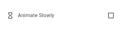 /// @@ -59,8 +58,8 @@ /// return CheckboxListTile( /// title: const Text('Animate Slowly'), /// value: timeDilation != 1.0, -/// onChanged: (bool value) { -/// setState(() { timeDilation = value ? 10.0 : 1.0; }); +/// onChanged: (bool? value) { +/// setState(() { timeDilation = value! ? 10.0 : 1.0; }); /// }, /// secondary: const Icon(Icons.hourglass_empty), /// ); @@ -85,7 +84,7 @@ /// into one. Therefore, it may be necessary to create a custom radio tile /// widget to accommodate similar use cases. /// -/// {@tool sample --template=stateful_widget_scaffold_center_no_null_safety} +/// {@tool sample --template=stateful_widget_scaffold_center} /// /// 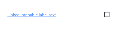 /// @@ -99,10 +98,10 @@ /// ```dart preamble /// class LinkedLabelCheckbox extends StatelessWidget { /// const LinkedLabelCheckbox({ -/// this.label, -/// this.padding, -/// this.value, -/// this.onChanged, +/// required this.label, +/// required this.padding, +/// required this.value, +/// required this.onChanged, /// }); /// /// final String label; @@ -133,7 +132,7 @@ /// ), /// Checkbox( /// value: value, -/// onChanged: (bool newValue) { +/// onChanged: (bool? newValue) { /// onChanged(newValue); /// }, /// ), @@ -169,7 +168,7 @@ /// combining [Checkbox] with other widgets, such as [Text], [Padding] and /// [InkWell]. /// -/// {@tool dartpad --template=stateful_widget_scaffold_center_no_null_safety} +/// {@tool dartpad --template=stateful_widget_scaffold_center} /// /// 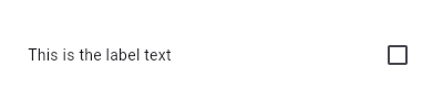 /// @@ -179,10 +178,10 @@ /// ```dart preamble /// class LabeledCheckbox extends StatelessWidget { /// const LabeledCheckbox({ -/// this.label, -/// this.padding, -/// this.value, -/// this.onChanged, +/// required this.label, +/// required this.padding, +/// required this.value, +/// required this.onChanged, /// }); /// /// final String label; @@ -203,7 +202,7 @@ /// Expanded(child: Text(label)), /// Checkbox( /// value: value, -/// onChanged: (bool newValue) { +/// onChanged: (bool? newValue) { /// onChanged(newValue); /// }, /// ),
diff --git a/packages/flutter/lib/src/material/dropdown.dart b/packages/flutter/lib/src/material/dropdown.dart
index fea4fea..aa4fea6 100644
--- a/packages/flutter/lib/src/material/dropdown.dart
+++ b/packages/flutter/lib/src/material/dropdown.dart
@@ -728,7 +728,7 @@
 /// dropdown's value. It should also call [State.setState] to rebuild the
 /// dropdown with the new value.
 ///
-/// {@tool dartpad --template=stateful_widget_scaffold_center_no_null_safety}
+/// {@tool dartpad --template=stateful_widget_scaffold_center}
 ///
 /// This sample shows a `DropdownButton` with a large arrow icon,
 /// purple text style, and bold purple underline, whose value is one of "One",
@@ -753,9 +753,9 @@
 ///       height: 2,
 ///       color: Colors.deepPurpleAccent,
 ///     ),
-///     onChanged: (String newValue) {
+///     onChanged: (String? newValue) {
 ///       setState(() {
-///         dropdownValue = newValue;
+///         dropdownValue = newValue!;
 ///       });
 ///     },
 ///     items: <String>['One', 'Two', 'Free', 'Four']
@@ -912,7 +912,7 @@
   /// from the list corresponds to the [DropdownMenuItem] of the same index
   /// in [items].
   ///
-  /// {@tool dartpad --template=stateful_widget_scaffold_no_null_safety}
+  /// {@tool dartpad --template=stateful_widget_scaffold}
   ///
   /// This sample shows a `DropdownButton` with a button with [Text] that
   /// corresponds to but is unique from [DropdownMenuItem].
@@ -927,7 +927,7 @@
   ///     padding: const EdgeInsets.symmetric(horizontal: 12.0),
   ///     child: DropdownButton<String>(
   ///       value: selectedItem,
-  ///       onChanged: (String string) => setState(() => selectedItem = string),
+  ///       onChanged: (String? string) => setState(() => selectedItem = string!),
   ///       selectedItemBuilder: (BuildContext context) {
   ///         return items.map<Widget>((String item) {
   ///           return Text(item);
@@ -963,7 +963,7 @@
   /// To use a separate text style for selected item when it's displayed within
   /// the dropdown button, consider using [selectedItemBuilder].
   ///
-  /// {@tool dartpad --template=stateful_widget_scaffold_no_null_safety}
+  /// {@tool dartpad --template=stateful_widget_scaffold}
   ///
   /// This sample shows a `DropdownButton` with a dropdown button text style
   /// that is different than its menu items.
@@ -979,9 +979,9 @@
   ///     color: Colors.blue,
   ///     child: DropdownButton<String>(
   ///       value: dropdownValue,
-  ///       onChanged: (String newValue) {
+  ///       onChanged: (String? newValue) {
   ///         setState(() {
-  ///           dropdownValue = newValue;
+  ///           dropdownValue = newValue!;
   ///         });
   ///       },
   ///       style: TextStyle(color: Colors.blue),
diff --git a/packages/flutter/lib/src/material/floating_action_button.dart b/packages/flutter/lib/src/material/floating_action_button.dart
index a1a7949..d1fdb66 100644
--- a/packages/flutter/lib/src/material/floating_action_button.dart
+++ b/packages/flutter/lib/src/material/floating_action_button.dart
@@ -58,7 +58,7 @@
 /// disabled. Consider changing the [backgroundColor] if disabling the floating
 /// action button.
 ///
-/// {@tool dartpad --template=stateless_widget_material_no_null_safety}
+/// {@tool dartpad --template=stateless_widget_material}
 /// This example shows how to display a [FloatingActionButton] in a
 /// [Scaffold], with a pink [backgroundColor] and a thumbs up [Icon].
 ///
@@ -85,7 +85,7 @@
 /// ```
 /// {@end-tool}
 ///
-/// {@tool dartpad --template=stateless_widget_material_no_null_safety}
+/// {@tool dartpad --template=stateless_widget_material}
 /// This example shows how to make an extended [FloatingActionButton] in a
 /// [Scaffold], with a  pink [backgroundColor], a thumbs up [Icon] and a
 /// [Text] label that reads "Approve".
diff --git a/packages/flutter/lib/src/material/radio.dart b/packages/flutter/lib/src/material/radio.dart
index 5a3d52e..f21e3bb 100644
--- a/packages/flutter/lib/src/material/radio.dart
+++ b/packages/flutter/lib/src/material/radio.dart
@@ -30,7 +30,7 @@
 /// will respond to [onChanged] by calling [State.setState] to update the
 /// radio button's [groupValue].
 ///
-/// {@tool dartpad --template=stateful_widget_scaffold_center_no_null_safety}
+/// {@tool dartpad --template=stateful_widget_scaffold_center}
 ///
 /// Here is an example of Radio widgets wrapped in ListTiles, which is similar
 /// to what you could get with the RadioListTile widget.
@@ -52,7 +52,7 @@
 /// ```
 ///
 /// ```dart
-/// SingingCharacter _character = SingingCharacter.lafayette;
+/// SingingCharacter? _character = SingingCharacter.lafayette;
 ///
 /// Widget build(BuildContext context) {
 ///   return Column(
@@ -62,7 +62,7 @@
 ///         leading: Radio(
 ///           value: SingingCharacter.lafayette,
 ///           groupValue: _character,
-///           onChanged: (SingingCharacter value) {
+///           onChanged: (SingingCharacter? value) {
 ///             setState(() { _character = value; });
 ///           },
 ///         ),
@@ -72,7 +72,7 @@
 ///         leading: Radio(
 ///           value: SingingCharacter.jefferson,
 ///           groupValue: _character,
-///           onChanged: (SingingCharacter value) {
+///           onChanged: (SingingCharacter? value) {
 ///             setState(() { _character = value; });
 ///           },
 ///         ),
@@ -202,12 +202,12 @@
   ///
   /// The default is false.
   ///
-  /// {@tool dartpad --template=stateful_widget_scaffold_no_null_safety}
+  /// {@tool dartpad --template=stateful_widget_scaffold}
   /// This example shows how to enable deselecting a radio button by setting the
   /// [toggleable] attribute.
   ///
   /// ```dart
-  /// int groupValue;
+  /// int? groupValue;
   /// static const List<String> selections = <String>[
   ///   'Hercules Mulligan',
   ///   'Eliza Hamilton',
@@ -231,7 +231,7 @@
   ///                 // TRY THIS: Try setting the toggleable value to false and
   ///                 // see how that changes the behavior of the widget.
   ///                 toggleable: true,
-  ///                 onChanged: (int value) {
+  ///                 onChanged: (int? value) {
   ///                   setState(() {
   ///                     groupValue = value;
   ///                   });
diff --git a/packages/flutter/lib/src/material/stepper.dart b/packages/flutter/lib/src/material/stepper.dart
index 2c05cdf..84d337f 100755
--- a/packages/flutter/lib/src/material/stepper.dart
+++ b/packages/flutter/lib/src/material/stepper.dart
@@ -122,7 +122,7 @@
 /// to this widget based on some logic triggered by the three callbacks that it
 /// provides.
 ///
-/// {@tool sample --template=stateful_widget_scaffold_center_no_null_safety}
+/// {@tool sample --template=stateful_widget_scaffold_center}
 ///
 /// ```dart
 /// int _index = 0;
@@ -247,14 +247,14 @@
   /// For example, keeping track of the [currentStep] within the callback can
   /// change the text of the continue or cancel button depending on which step users are at.
   ///
-  /// {@tool dartpad --template=stateless_widget_scaffold_no_null_safety}
+  /// {@tool dartpad --template=stateless_widget_scaffold}
   /// Creates a stepper control with custom buttons.
   ///
   /// ```dart
   /// Widget build(BuildContext context) {
   ///   return Stepper(
   ///     controlsBuilder:
-  ///       (BuildContext context, { VoidCallback onStepContinue, VoidCallback onStepCancel }) {
+  ///       (BuildContext context, { VoidCallback? onStepContinue, VoidCallback? onStepCancel }) {
   ///          return Row(
   ///            children: <Widget>[
   ///              TextButton(
diff --git a/packages/flutter/lib/src/material/switch_list_tile.dart b/packages/flutter/lib/src/material/switch_list_tile.dart
index ffd1ca0..db31602 100644
--- a/packages/flutter/lib/src/material/switch_list_tile.dart
+++ b/packages/flutter/lib/src/material/switch_list_tile.dart
@@ -10,7 +10,6 @@ import 'theme_data.dart'; // Examples can assume: -// // @dart = 2.9 // void setState(VoidCallback fn) { } // bool _isSelected; @@ -46,7 +45,7 @@ /// To show the [SwitchListTile] as disabled, pass null as the [onChanged] /// callback. /// -/// {@tool dartpad --template=stateful_widget_scaffold_center_no_null_safety} +/// {@tool dartpad --template=stateful_widget_scaffold_center} /// /// 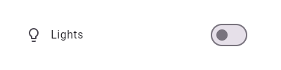 /// @@ -85,7 +84,7 @@ /// into one. Therefore, it may be necessary to create a custom radio tile /// widget to accommodate similar use cases. /// -/// {@tool dartpad --template=stateful_widget_scaffold_center_no_null_safety} +/// {@tool dartpad --template=stateful_widget_scaffold_center} /// /// 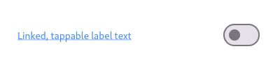 /// @@ -99,10 +98,10 @@ /// ```dart preamble /// class LinkedLabelSwitch extends StatelessWidget { /// const LinkedLabelSwitch({ -/// this.label, -/// this.padding, -/// this.value, -/// this.onChanged, +/// required this.label, +/// required this.padding, +/// required this.value, +/// required this.onChanged, /// }); /// /// final String label; @@ -169,7 +168,7 @@ /// combining [Switch] with other widgets, such as [Text], [Padding] and /// [InkWell]. /// -/// {@tool dartpad --template=stateful_widget_scaffold_center_no_null_safety} +/// {@tool dartpad --template=stateful_widget_scaffold_center} /// /// 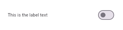 /// @@ -179,16 +178,14 @@ /// ```dart preamble /// class LabeledSwitch extends StatelessWidget { /// const LabeledSwitch({ -/// this.label, -/// this.padding, -/// this.groupValue, -/// this.value, -/// this.onChanged, +/// required this.label, +/// required this.padding, +/// required this.value, +/// required this.onChanged, /// }); /// /// final String label; /// final EdgeInsets padding; -/// final bool groupValue; /// final bool value; /// final Function onChanged; ///
diff --git a/packages/flutter/lib/src/material/tooltip.dart b/packages/flutter/lib/src/material/tooltip.dart
index 66dc9d2..db73084 100644
--- a/packages/flutter/lib/src/material/tooltip.dart
+++ b/packages/flutter/lib/src/material/tooltip.dart
@@ -30,7 +30,7 @@
 ///
 /// {@youtube 560 315 https://www.youtube.com/watch?v=EeEfD5fI-5Q}
 ///
-/// {@tool dartpad --template=stateless_widget_scaffold_center_no_null_safety}
+/// {@tool dartpad --template=stateless_widget_scaffold_center}
 ///
 /// This example show a basic [Tooltip] which has a [Text] as child.
 /// [message] contains your label to be shown by the tooltip when
@@ -47,7 +47,7 @@
 /// ```
 /// {@end-tool}
 ///
-/// {@tool dartpad --template=stateless_widget_scaffold_center_no_null_safety}
+/// {@tool dartpad --template=stateless_widget_scaffold_center}
 ///
 /// This example covers most of the attributes available in Tooltip.
 /// `decoration` has been used to give a gradient and borderRadius to Tooltip.