Perfetto UI
Perfetto UI enables you to view and analyze traces in the browser. It supports several different tracing formats, including the perfetto proto trace format and the legacy json trace format.
New Features
What features have come to the UI recently? See below.
Tabs V2
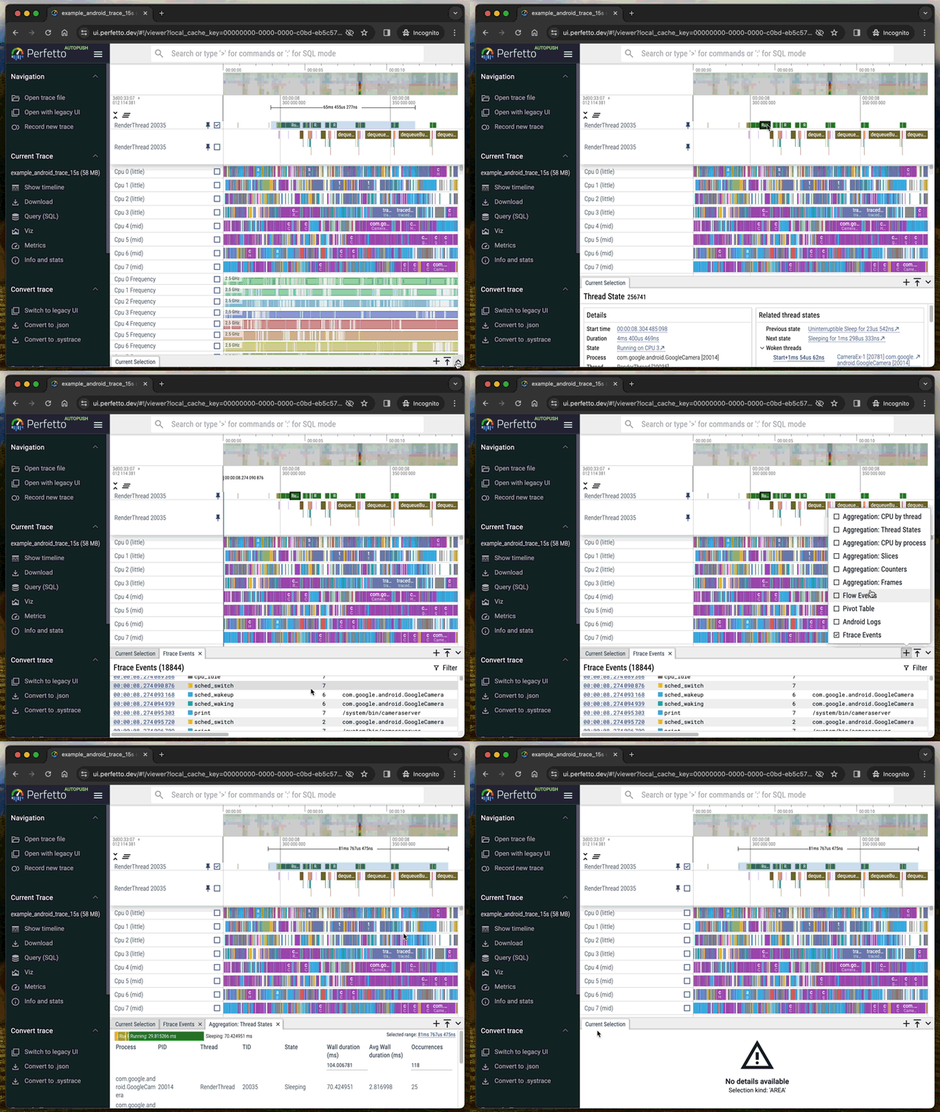
We've refreshed how the tabs in the details pane at the bottom of the timeline work.
NOTE: Temporarily you can use the previous tab implementation via setting the Tabs V2 feature flag to ‘Disabled’. Please file a bug with feedback on Tabs V2.
The update aimed to address a few major UX concerns with the existing implementation while also making tabs extensible via plugins.
UX concerns in TabsV1:
- Tabs disappear and reappear when the user changes the selection causing surprise and confusion.
- We try to guess the right tab to get focus and this guess is often incorrect.
- ‘Ephemeral tabs’ (query results and SQL tables) work differently from 'permanent tabs (‘Ftrace events’ and ‘Android Logs’). Ephemeral tabs can be closed while permanent tabs can not.
- ‘Current selection’ tabs work differently to both ‘ephemeral’ and ‘permanent’ tabs and there can only be a single ‘Current selection’ tab even when the current selection contains many different kinds of data.
- Ephemeral tabs are not persisted into permalinks.

TabsV2 is extensible via the plugin mechanism. Plugins can add new permanent and ephemeral tabs as well as new selection panels.
Custom visualisation with Vega and Vega-lite
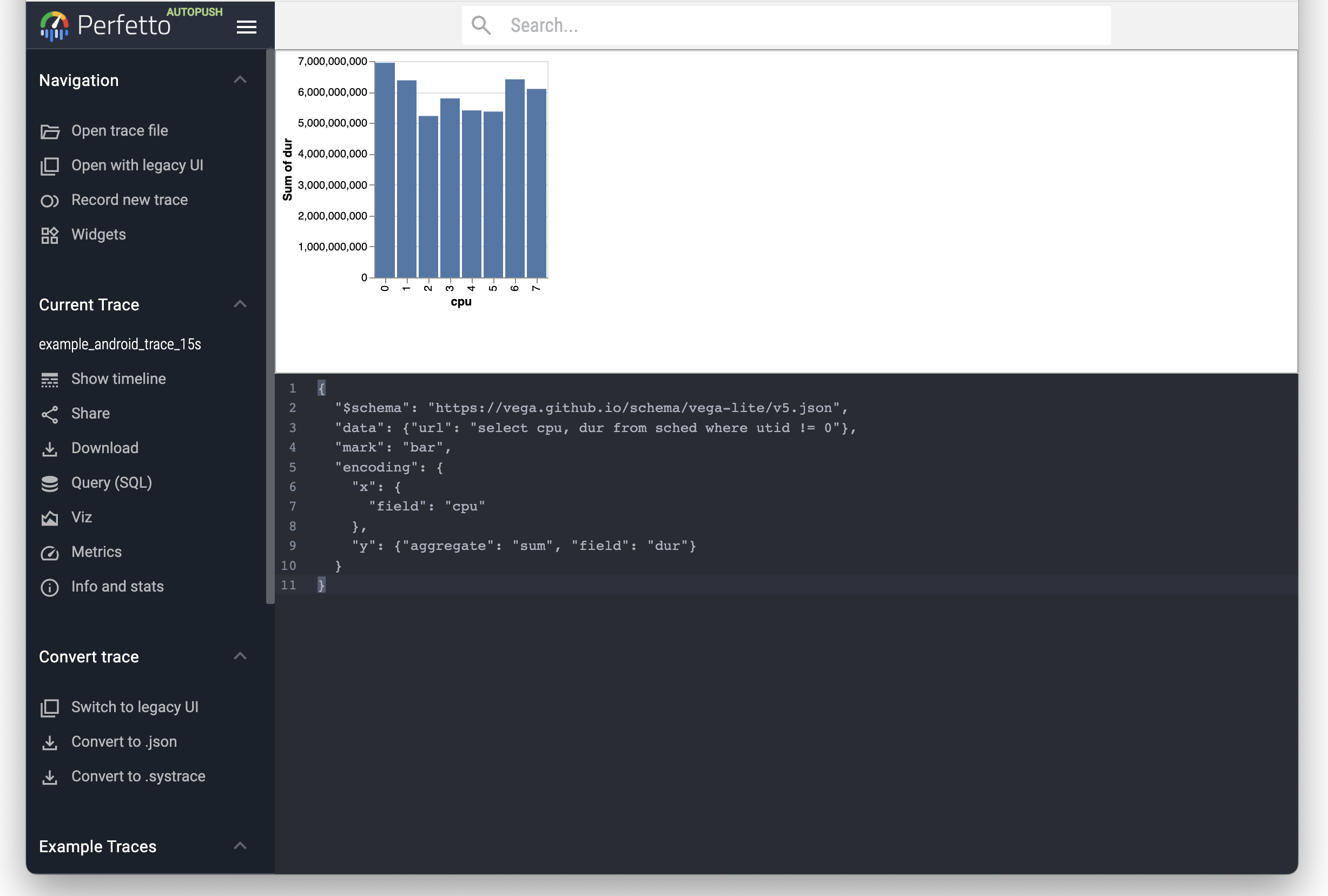
The Viz page available in the sidebar after you load the trace allows for custom visualisation using Vega or Vega-lite.
Type a Vega specification into the bottom editor pane and the visualisation will update in real time in the top pane. You can put arbitrary trace_processor SQL queries where the URL would go in a normal Vega visualisation.

Try the following visualisation with the Android example trace:
{
  "$schema": "https://vega.github.io/schema/vega-lite/v5.json",
  "data": {"url": "select cpu, dur from sched where utid != 0"},
  "mark": "bar",
  "encoding": {
    "x": {
      "field": "cpu"
    },
    "y": {"aggregate": "sum", "field": "dur"}
  }
}
Command Palette
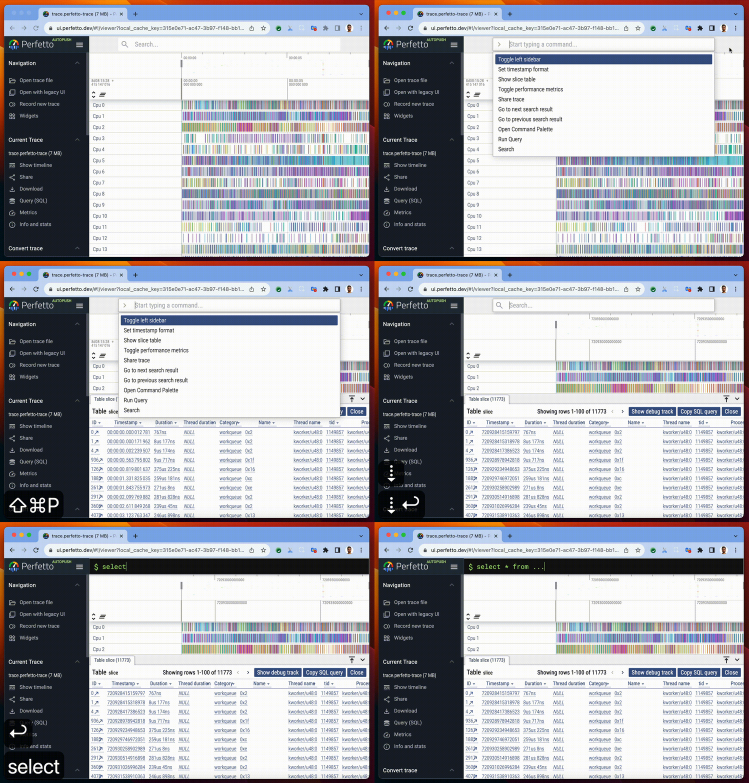
Tired of remembering the location of buttons in the Perfetto UI? Commands to the rescue!

Commands are:
- Discoverable & Searchable
- Keyboard driven
- Plugin-able
- Context sensitive
- ...with more added every day
Access the command palette via Ctrl-Shift-P or by typing > in the search bar.
Changing the time format and offset

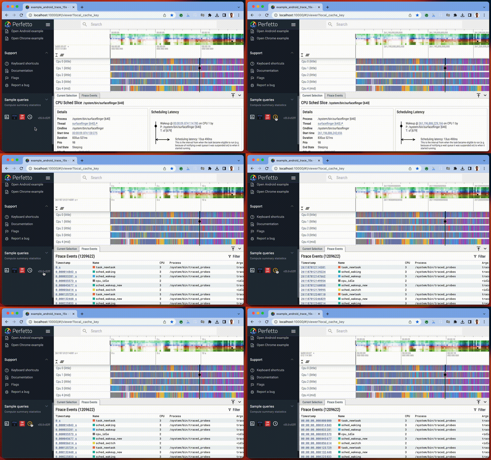
The displayed timestamp format can be changed globally, cycling between seconds, raw nanoseconds and a new “timecode” format. We also have a new TO_TIMECODE() function in Trace Processor to print timestamps in the timecode format.
UI Tips and Tricks
Pivot Tables
To use pivot tables in the Perfetto UI, you will need to enable the “Pivot tables” feature flag in the “Flags” tab under “Support” in the Sidebar. You can pop up a pivot table over the entire trace when clicking “p” on your keyboard. The “Edit” button opens a pop up window to add/remove and reorder columns and change the default sorting of aggregations.
Clicking on “Query” generates a table with the selected columns. Table cells with the expand icon can be expanded to show the next column values. The “name (stack)” column displays top level slices that can be expanded to show their descendants down to the last child.
Area selection pops up a pre-filled pivot table restricted over the selected timestamps and track ids.
Disabling metrics
Some metrics execute at trace load time to annotate the trace with additional tracks and events. You can stop these metrics from running by disabling them in the ‘Flags’ page: