| // Copyright 2014 The Flutter Authors. All rights reserved. |
| // Use of this source code is governed by a BSD-style license that can be |
| // found in the LICENSE file. |
| |
| /// @docImport 'color_scheme.dart'; |
| /// @docImport 'slider.dart'; |
| /// @docImport 'text_theme.dart'; |
| library; |
| |
| import 'dart:math' as math; |
| |
| import 'package:flutter/rendering.dart'; |
| import 'package:flutter/widgets.dart'; |
| |
| import 'colors.dart'; |
| import 'slider.dart'; |
| import 'slider_theme.dart'; |
| import 'slider_value_indicator_shape.dart'; |
| import 'theme.dart'; |
| |
| /// Base class for [Slider] tick mark shapes. |
| /// |
| /// Create a subclass of this if you would like a custom slider tick mark shape. |
| /// |
| /// The tick mark painting can be skipped by specifying [noTickMark] for |
| /// [SliderThemeData.tickMarkShape]. |
| /// |
| /// See also: |
| /// |
| /// * [RoundSliderTickMarkShape], which is the default [Slider]'s tick mark |
| /// shape that paints a solid circle. |
| /// * [SliderTrackShape], which can be used to create custom shapes for the |
| /// [Slider]'s track. |
| /// * [SliderComponentShape], which can be used to create custom shapes for |
| /// the [Slider]'s thumb, overlay, and value indicator and the |
| /// [RangeSlider]'s overlay. |
| abstract class SliderTickMarkShape { |
| /// This abstract const constructor enables subclasses to provide |
| /// const constructors so that they can be used in const expressions. |
| const SliderTickMarkShape(); |
| |
| /// Returns the preferred size of the shape. |
| /// |
| /// It is used to help position the tick marks within the slider. |
| /// |
| /// {@macro flutter.material.SliderComponentShape.paint.sliderTheme} |
| /// |
| /// {@template flutter.material.SliderTickMarkShape.getPreferredSize.isEnabled} |
| /// The `isEnabled` argument is false when [Slider.onChanged] is null and true |
| /// otherwise. When true, the slider will respond to input. |
| /// {@endtemplate} |
| Size getPreferredSize({required SliderThemeData sliderTheme, required bool isEnabled}); |
| |
| /// Paints the slider track. |
| /// |
| /// {@macro flutter.material.SliderComponentShape.paint.context} |
| /// |
| /// {@macro flutter.material.SliderComponentShape.paint.center} |
| /// |
| /// {@macro flutter.material.SliderComponentShape.paint.parentBox} |
| /// |
| /// {@macro flutter.material.SliderComponentShape.paint.sliderTheme} |
| /// |
| /// {@macro flutter.material.SliderComponentShape.paint.enableAnimation} |
| /// |
| /// {@macro flutter.material.SliderTickMarkShape.getPreferredSize.isEnabled} |
| /// |
| /// The `textDirection` argument can be used to determine how the tick marks |
| /// are painting depending on whether they are on an active track segment or |
| /// not. The track segment between the start of the slider and the thumb is |
| /// the active track segment. The track segment between the thumb and the end |
| /// of the slider is the inactive track segment. In LTR text direction, the |
| /// start of the slider is on the left, and in RTL text direction, the start |
| /// of the slider is on the right. |
| void paint( |
| PaintingContext context, |
| Offset center, { |
| required RenderBox parentBox, |
| required SliderThemeData sliderTheme, |
| required Animation<double> enableAnimation, |
| required Offset thumbCenter, |
| required bool isEnabled, |
| required TextDirection textDirection, |
| }); |
| |
| /// Special instance of [SliderTickMarkShape] to skip the tick mark painting. |
| /// |
| /// See also: |
| /// |
| /// * [SliderThemeData.tickMarkShape], which is the shape that the [Slider] |
| /// uses when painting tick marks. |
| static final SliderTickMarkShape noTickMark = _EmptySliderTickMarkShape(); |
| } |
| |
| /// Base class for slider track shapes. |
| /// |
| /// The slider's thumb moves along the track. A discrete slider's tick marks |
| /// are drawn after the track, but before the thumb, and are aligned with the |
| /// track. |
| /// |
| /// The [getPreferredRect] helps position the slider thumb and tick marks |
| /// relative to the track. |
| /// |
| /// See also: |
| /// |
| /// * [RoundedRectSliderTrackShape] for the default [Slider]'s track shape that |
| /// paints a stadium-like track. |
| /// * [SliderTickMarkShape], which can be used to create custom shapes for the |
| /// [Slider]'s tick marks. |
| /// * [SliderComponentShape], which can be used to create custom shapes for |
| /// the [Slider]'s thumb, overlay, and value indicator and the |
| /// [RangeSlider]'s overlay. |
| abstract class SliderTrackShape { |
| /// This abstract const constructor enables subclasses to provide |
| /// const constructors so that they can be used in const expressions. |
| const SliderTrackShape(); |
| |
| /// Returns the preferred bounds of the shape. |
| /// |
| /// It is used to provide horizontal boundaries for the thumb's position, and |
| /// to help position the slider thumb and tick marks relative to the track. |
| /// |
| /// The `parentBox` argument can be used to help determine the preferredRect relative to |
| /// attributes of the render box of the slider itself, such as size. |
| /// |
| /// The `offset` argument is relative to the caller's bounding box. It can be used to |
| /// convert gesture coordinates from global to slider-relative coordinates. |
| /// |
| /// {@macro flutter.material.SliderComponentShape.paint.sliderTheme} |
| /// |
| /// {@macro flutter.material.SliderTickMarkShape.getPreferredSize.isEnabled} |
| /// |
| /// {@macro flutter.material.SliderComponentShape.paint.isDiscrete} |
| Rect getPreferredRect({ |
| required RenderBox parentBox, |
| Offset offset = Offset.zero, |
| required SliderThemeData sliderTheme, |
| bool isEnabled, |
| bool isDiscrete, |
| }); |
| |
| /// Paints the track shape based on the state passed to it. |
| /// |
| /// {@macro flutter.material.SliderComponentShape.paint.context} |
| /// |
| /// The `offset` argument the offset of the origin of the `parentBox` to the |
| /// origin of its `context` canvas. This shape must be painted relative to |
| /// this offset. See [PaintingContextCallback]. |
| /// |
| /// {@macro flutter.material.SliderComponentShape.paint.parentBox} |
| /// |
| /// {@macro flutter.material.SliderComponentShape.paint.sliderTheme} |
| /// |
| /// {@macro flutter.material.SliderComponentShape.paint.enableAnimation} |
| /// |
| /// The `thumbCenter` argument is the offset of the center of the thumb |
| /// relative to the origin of the [PaintingContext.canvas]. It can be used as |
| /// the point that divides the track into 2 segments. |
| /// |
| /// The `secondaryOffset` argument is the offset of the secondary value |
| /// relative to the origin of the [PaintingContext.canvas]. |
| /// |
| /// If not null, the track is divided into 3 segments. |
| /// |
| /// {@macro flutter.material.SliderTickMarkShape.getPreferredSize.isEnabled} |
| /// |
| /// {@macro flutter.material.SliderComponentShape.paint.isDiscrete} |
| /// |
| /// The `textDirection` argument can be used to determine how the track |
| /// segments are painted depending on whether they are active or not. |
| /// |
| /// {@template flutter.material.SliderTrackShape.paint.trackSegment} |
| /// The track segment between the start of the slider and the thumb is the |
| /// active track segment. The track segment between the thumb and the end of the |
| /// slider is the inactive track segment. In [TextDirection.ltr], the start of |
| /// the slider is on the left, and in [TextDirection.rtl], the start of the |
| /// slider is on the right. |
| /// {@endtemplate} |
| void paint( |
| PaintingContext context, |
| Offset offset, { |
| required RenderBox parentBox, |
| required SliderThemeData sliderTheme, |
| required Animation<double> enableAnimation, |
| required Offset thumbCenter, |
| Offset? secondaryOffset, |
| bool isEnabled, |
| bool isDiscrete, |
| required TextDirection textDirection, |
| }); |
| |
| /// Whether the track shape is rounded. |
| /// |
| /// This is used to determine the correct position of the thumb in relation to the track. |
| bool get isRounded => false; |
| } |
| |
| /// Base track shape that provides an implementation of [getPreferredRect] for |
| /// default sizing. |
| /// |
| /// The height is set from [SliderThemeData.trackHeight] and the width of the |
| /// parent box less the larger of the widths of [SliderThemeData.thumbShape] and |
| /// [SliderThemeData.overlayShape]. |
| /// |
| /// See also: |
| /// |
| /// * [RectangularSliderTrackShape], which is a track shape with sharp |
| /// rectangular edges |
| /// * [RoundedRectSliderTrackShape], which is a track shape with round |
| /// stadium-like edges. |
| mixin BaseSliderTrackShape { |
| /// Returns a rect that represents the track bounds that fits within the |
| /// [Slider]. |
| /// |
| /// The width is the width of the [Slider] or [RangeSlider], but padded by |
| /// the max of the overlay and thumb radius. The height is defined by the |
| /// [SliderThemeData.trackHeight]. |
| /// |
| /// The [Rect] is centered both horizontally and vertically within the slider |
| /// bounds. |
| Rect getPreferredRect({ |
| required RenderBox parentBox, |
| Offset offset = Offset.zero, |
| required SliderThemeData sliderTheme, |
| bool isEnabled = false, |
| bool isDiscrete = false, |
| }) { |
| final double thumbWidth = sliderTheme.thumbShape!.getPreferredSize(isEnabled, isDiscrete).width; |
| final double overlayWidth = sliderTheme.overlayShape! |
| .getPreferredSize(isEnabled, isDiscrete) |
| .width; |
| double trackHeight = sliderTheme.trackHeight!; |
| assert(overlayWidth >= 0); |
| assert(trackHeight >= 0); |
| |
| // If the track colors are transparent, then override only the track height |
| // to maintain overall Slider width. |
| if (sliderTheme.activeTrackColor == Colors.transparent && |
| sliderTheme.inactiveTrackColor == Colors.transparent) { |
| trackHeight = 0; |
| } |
| |
| final double trackLeft = |
| offset.dx + (sliderTheme.padding == null ? math.max(overlayWidth / 2, thumbWidth / 2) : 0); |
| final double trackTop = offset.dy + (parentBox.size.height - trackHeight) / 2; |
| final double trackRight = |
| trackLeft + |
| parentBox.size.width - |
| (sliderTheme.padding == null ? math.max(thumbWidth, overlayWidth) : 0); |
| final double trackBottom = trackTop + trackHeight; |
| // If the parentBox's size less than slider's size the trackRight will be less than trackLeft, so switch them. |
| return Rect.fromLTRB( |
| math.min(trackLeft, trackRight), |
| trackTop, |
| math.max(trackLeft, trackRight), |
| trackBottom, |
| ); |
| } |
| |
| /// Whether the track shape is rounded. This is used to determine the correct |
| /// position of the thumb in relation to the track. Defaults to false. |
| bool get isRounded => false; |
| } |
| |
| /// A [Slider] track that's a simple rectangle. |
| /// |
| /// It paints a solid colored rectangle, vertically centered in the |
| /// `parentBox`. The track rectangle extends to the bounds of the `parentBox`, |
| /// but is padded by the [RoundSliderOverlayShape] radius. The height is defined |
| /// by the [SliderThemeData.trackHeight]. The color is determined by the |
| /// [Slider]'s enabled state and the track segment's active state which are |
| /// defined by: |
| /// [SliderThemeData.activeTrackColor], |
| /// [SliderThemeData.inactiveTrackColor], |
| /// [SliderThemeData.disabledActiveTrackColor], |
| /// [SliderThemeData.disabledInactiveTrackColor]. |
| /// |
| /// {@macro flutter.material.SliderTrackShape.paint.trackSegment} |
| /// |
| /// 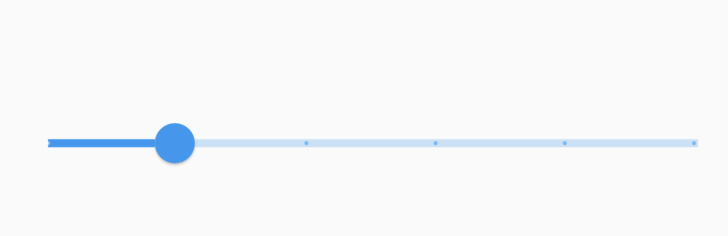 |
| /// |
| /// See also: |
| /// |
| /// * [Slider], for the component that is meant to display this shape. |
| /// * [SliderThemeData], where an instance of this class is set to inform the |
| /// slider of the visual details of the its track. |
| /// * [SliderTrackShape], which can be used to create custom shapes for the |
| /// [Slider]'s track. |
| /// * [RoundedRectSliderTrackShape], for a similar track with rounded edges. |
| class RectangularSliderTrackShape extends SliderTrackShape with BaseSliderTrackShape { |
| /// Creates a slider track that draws 2 rectangles. |
| const RectangularSliderTrackShape(); |
| |
| @override |
| void paint( |
| PaintingContext context, |
| Offset offset, { |
| required RenderBox parentBox, |
| required SliderThemeData sliderTheme, |
| required Animation<double> enableAnimation, |
| required TextDirection textDirection, |
| required Offset thumbCenter, |
| Offset? secondaryOffset, |
| bool isDiscrete = false, |
| bool isEnabled = false, |
| }) { |
| assert(sliderTheme.disabledActiveTrackColor != null); |
| assert(sliderTheme.disabledInactiveTrackColor != null); |
| assert(sliderTheme.activeTrackColor != null); |
| assert(sliderTheme.inactiveTrackColor != null); |
| assert(sliderTheme.thumbShape != null); |
| // If the slider [SliderThemeData.trackHeight] is less than or equal to 0, |
| // then it makes no difference whether the track is painted or not, |
| // therefore the painting can be a no-op. |
| if (sliderTheme.trackHeight! <= 0) { |
| return; |
| } |
| |
| // Assign the track segment paints, which are left: active, right: inactive, |
| // but reversed for right to left text. |
| final activeTrackColorTween = ColorTween( |
| begin: sliderTheme.disabledActiveTrackColor, |
| end: sliderTheme.activeTrackColor, |
| ); |
| final inactiveTrackColorTween = ColorTween( |
| begin: sliderTheme.disabledInactiveTrackColor, |
| end: sliderTheme.inactiveTrackColor, |
| ); |
| final activePaint = Paint()..color = activeTrackColorTween.evaluate(enableAnimation)!; |
| final inactivePaint = Paint()..color = inactiveTrackColorTween.evaluate(enableAnimation)!; |
| final (Paint leftTrackPaint, Paint rightTrackPaint) = switch (textDirection) { |
| TextDirection.ltr => (activePaint, inactivePaint), |
| TextDirection.rtl => (inactivePaint, activePaint), |
| }; |
| |
| final Rect trackRect = getPreferredRect( |
| parentBox: parentBox, |
| offset: offset, |
| sliderTheme: sliderTheme, |
| isEnabled: isEnabled, |
| isDiscrete: isDiscrete, |
| ); |
| |
| final leftTrackSegment = Rect.fromLTRB( |
| trackRect.left, |
| trackRect.top, |
| thumbCenter.dx, |
| trackRect.bottom, |
| ); |
| if (!leftTrackSegment.isEmpty) { |
| context.canvas.drawRect(leftTrackSegment, leftTrackPaint); |
| } |
| final rightTrackSegment = Rect.fromLTRB( |
| thumbCenter.dx, |
| trackRect.top, |
| trackRect.right, |
| trackRect.bottom, |
| ); |
| if (!rightTrackSegment.isEmpty) { |
| context.canvas.drawRect(rightTrackSegment, rightTrackPaint); |
| } |
| |
| final bool showSecondaryTrack = |
| secondaryOffset != null && |
| switch (textDirection) { |
| TextDirection.rtl => secondaryOffset.dx < thumbCenter.dx, |
| TextDirection.ltr => secondaryOffset.dx > thumbCenter.dx, |
| }; |
| |
| if (showSecondaryTrack) { |
| final secondaryTrackColorTween = ColorTween( |
| begin: sliderTheme.disabledSecondaryActiveTrackColor, |
| end: sliderTheme.secondaryActiveTrackColor, |
| ); |
| final secondaryTrackPaint = Paint() |
| ..color = secondaryTrackColorTween.evaluate(enableAnimation)!; |
| final Rect secondaryTrackSegment = switch (textDirection) { |
| TextDirection.rtl => Rect.fromLTRB( |
| secondaryOffset.dx, |
| trackRect.top, |
| thumbCenter.dx, |
| trackRect.bottom, |
| ), |
| TextDirection.ltr => Rect.fromLTRB( |
| thumbCenter.dx, |
| trackRect.top, |
| secondaryOffset.dx, |
| trackRect.bottom, |
| ), |
| }; |
| if (!secondaryTrackSegment.isEmpty) { |
| context.canvas.drawRect(secondaryTrackSegment, secondaryTrackPaint); |
| } |
| } |
| } |
| } |
| |
| /// The default shape of a [Slider]'s track. |
| /// |
| /// It paints a solid colored rectangle with rounded edges, vertically centered |
| /// in the `parentBox`. The track rectangle extends to the bounds of the |
| /// `parentBox`, but is padded by the larger of [RoundSliderOverlayShape]'s |
| /// radius and [RoundSliderThumbShape]'s radius. The height is defined by the |
| /// [SliderThemeData.trackHeight]. The color is determined by the [Slider]'s |
| /// enabled state and the track segment's active state which are defined by: |
| /// [SliderThemeData.activeTrackColor], |
| /// [SliderThemeData.inactiveTrackColor], |
| /// [SliderThemeData.disabledActiveTrackColor], |
| /// [SliderThemeData.disabledInactiveTrackColor]. |
| /// |
| /// {@macro flutter.material.SliderTrackShape.paint.trackSegment} |
| /// |
| /// 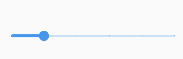 |
| /// |
| /// See also: |
| /// |
| /// * [Slider], for the component that is meant to display this shape. |
| /// * [SliderThemeData], where an instance of this class is set to inform the |
| /// slider of the visual details of the its track. |
| /// * [SliderTrackShape], which can be used to create custom shapes for the |
| /// [Slider]'s track. |
| /// * [RectangularSliderTrackShape], for a similar track with sharp edges. |
| class RoundedRectSliderTrackShape extends SliderTrackShape with BaseSliderTrackShape { |
| /// Create a slider track that draws two rectangles with rounded outer edges. |
| const RoundedRectSliderTrackShape(); |
| |
| @override |
| void paint( |
| PaintingContext context, |
| Offset offset, { |
| required RenderBox parentBox, |
| required SliderThemeData sliderTheme, |
| required Animation<double> enableAnimation, |
| required TextDirection textDirection, |
| required Offset thumbCenter, |
| Offset? secondaryOffset, |
| bool isDiscrete = false, |
| bool isEnabled = false, |
| double additionalActiveTrackHeight = 2, |
| }) { |
| assert(sliderTheme.disabledActiveTrackColor != null); |
| assert(sliderTheme.disabledInactiveTrackColor != null); |
| assert(sliderTheme.activeTrackColor != null); |
| assert(sliderTheme.inactiveTrackColor != null); |
| assert(sliderTheme.thumbShape != null); |
| // If the slider [SliderThemeData.trackHeight] is less than or equal to 0, |
| // then it makes no difference whether the track is painted or not, |
| // therefore the painting can be a no-op. |
| if (sliderTheme.trackHeight == null || sliderTheme.trackHeight! <= 0) { |
| return; |
| } |
| |
| // Assign the track segment paints, which are leading: active and |
| // trailing: inactive. |
| final activeTrackColorTween = ColorTween( |
| begin: sliderTheme.disabledActiveTrackColor, |
| end: sliderTheme.activeTrackColor, |
| ); |
| final inactiveTrackColorTween = ColorTween( |
| begin: sliderTheme.disabledInactiveTrackColor, |
| end: sliderTheme.inactiveTrackColor, |
| ); |
| final activePaint = Paint()..color = activeTrackColorTween.evaluate(enableAnimation)!; |
| final inactivePaint = Paint()..color = inactiveTrackColorTween.evaluate(enableAnimation)!; |
| final (Paint leftTrackPaint, Paint rightTrackPaint) = switch (textDirection) { |
| TextDirection.ltr => (activePaint, inactivePaint), |
| TextDirection.rtl => (inactivePaint, activePaint), |
| }; |
| |
| final Rect trackRect = getPreferredRect( |
| parentBox: parentBox, |
| offset: offset, |
| sliderTheme: sliderTheme, |
| isEnabled: isEnabled, |
| isDiscrete: isDiscrete, |
| ); |
| final trackRadius = Radius.circular(trackRect.height / 2); |
| final activeTrackRadius = Radius.circular((trackRect.height + additionalActiveTrackHeight) / 2); |
| final isLTR = textDirection == TextDirection.ltr; |
| final isRTL = textDirection == TextDirection.rtl; |
| |
| final bool drawInactiveTrack = |
| thumbCenter.dx < (trackRect.right - (sliderTheme.trackHeight! / 2)); |
| if (drawInactiveTrack) { |
| // Draw the inactive track segment. |
| context.canvas.drawRRect( |
| RRect.fromLTRBR( |
| thumbCenter.dx - (sliderTheme.trackHeight! / 2), |
| isRTL ? trackRect.top - (additionalActiveTrackHeight / 2) : trackRect.top, |
| trackRect.right, |
| isRTL ? trackRect.bottom + (additionalActiveTrackHeight / 2) : trackRect.bottom, |
| isLTR ? trackRadius : activeTrackRadius, |
| ), |
| rightTrackPaint, |
| ); |
| } |
| final bool drawActiveTrack = thumbCenter.dx > (trackRect.left + (sliderTheme.trackHeight! / 2)); |
| if (drawActiveTrack) { |
| // Draw the active track segment. |
| context.canvas.drawRRect( |
| RRect.fromLTRBR( |
| trackRect.left, |
| isLTR ? trackRect.top - (additionalActiveTrackHeight / 2) : trackRect.top, |
| thumbCenter.dx + (sliderTheme.trackHeight! / 2), |
| isLTR ? trackRect.bottom + (additionalActiveTrackHeight / 2) : trackRect.bottom, |
| isLTR ? activeTrackRadius : trackRadius, |
| ), |
| leftTrackPaint, |
| ); |
| } |
| |
| final bool showSecondaryTrack = |
| (secondaryOffset != null) && |
| (isLTR ? (secondaryOffset.dx > thumbCenter.dx) : (secondaryOffset.dx < thumbCenter.dx)); |
| |
| if (showSecondaryTrack) { |
| final secondaryTrackColorTween = ColorTween( |
| begin: sliderTheme.disabledSecondaryActiveTrackColor, |
| end: sliderTheme.secondaryActiveTrackColor, |
| ); |
| final secondaryTrackPaint = Paint() |
| ..color = secondaryTrackColorTween.evaluate(enableAnimation)!; |
| if (isLTR) { |
| context.canvas.drawRRect( |
| RRect.fromLTRBAndCorners( |
| thumbCenter.dx, |
| trackRect.top, |
| secondaryOffset.dx, |
| trackRect.bottom, |
| topRight: trackRadius, |
| bottomRight: trackRadius, |
| ), |
| secondaryTrackPaint, |
| ); |
| } else { |
| context.canvas.drawRRect( |
| RRect.fromLTRBAndCorners( |
| secondaryOffset.dx, |
| trackRect.top, |
| thumbCenter.dx, |
| trackRect.bottom, |
| topLeft: trackRadius, |
| bottomLeft: trackRadius, |
| ), |
| secondaryTrackPaint, |
| ); |
| } |
| } |
| } |
| |
| @override |
| bool get isRounded => true; |
| } |
| |
| /// The default shape of each [Slider] tick mark. |
| /// |
| /// Tick marks are only displayed if the slider is discrete, which can be done |
| /// by setting the [Slider.divisions] to an integer value. |
| /// |
| /// It paints a solid circle, centered in the on the track. |
| /// The color is determined by the [Slider]'s enabled state and track's active |
| /// states. These colors are defined in: |
| /// [SliderThemeData.activeTrackColor], |
| /// [SliderThemeData.inactiveTrackColor], |
| /// [SliderThemeData.disabledActiveTrackColor], |
| /// [SliderThemeData.disabledInactiveTrackColor]. |
| /// |
| ///  |
| /// |
| /// See also: |
| /// |
| /// * [Slider], which includes tick marks defined by this shape. |
| /// * [SliderTheme], which can be used to configure the tick mark shape of all |
| /// sliders in a widget subtree. |
| class RoundSliderTickMarkShape extends SliderTickMarkShape { |
| /// Create a slider tick mark that draws a circle. |
| const RoundSliderTickMarkShape({this.tickMarkRadius}); |
| |
| /// The preferred radius of the round tick mark. |
| /// |
| /// If it is not provided, then 1/4 of the [SliderThemeData.trackHeight] is used. |
| final double? tickMarkRadius; |
| |
| @override |
| Size getPreferredSize({required SliderThemeData sliderTheme, required bool isEnabled}) { |
| assert(sliderTheme.trackHeight != null); |
| // The tick marks are tiny circles. If no radius is provided, then the |
| // radius is defaulted to be a fraction of the |
| // [SliderThemeData.trackHeight]. The fraction is 1/4. |
| return Size.fromRadius(tickMarkRadius ?? sliderTheme.trackHeight! / 4); |
| } |
| |
| @override |
| void paint( |
| PaintingContext context, |
| Offset center, { |
| required RenderBox parentBox, |
| required SliderThemeData sliderTheme, |
| required Animation<double> enableAnimation, |
| required TextDirection textDirection, |
| required Offset thumbCenter, |
| required bool isEnabled, |
| }) { |
| assert(sliderTheme.disabledActiveTickMarkColor != null); |
| assert(sliderTheme.disabledInactiveTickMarkColor != null); |
| assert(sliderTheme.activeTickMarkColor != null); |
| assert(sliderTheme.inactiveTickMarkColor != null); |
| // The paint color of the tick mark depends on its position relative |
| // to the thumb and the text direction. |
| final double xOffset = center.dx - thumbCenter.dx; |
| final (Color? begin, Color? end) = switch (textDirection) { |
| TextDirection.ltr when xOffset > 0 => ( |
| sliderTheme.disabledInactiveTickMarkColor, |
| sliderTheme.inactiveTickMarkColor, |
| ), |
| TextDirection.rtl when xOffset < 0 => ( |
| sliderTheme.disabledInactiveTickMarkColor, |
| sliderTheme.inactiveTickMarkColor, |
| ), |
| TextDirection.ltr || TextDirection.rtl => ( |
| sliderTheme.disabledActiveTickMarkColor, |
| sliderTheme.activeTickMarkColor, |
| ), |
| }; |
| final paint = Paint()..color = ColorTween(begin: begin, end: end).evaluate(enableAnimation)!; |
| |
| // The tick marks are tiny circles that are the same height as the track. |
| final double tickMarkRadius = |
| getPreferredSize(isEnabled: isEnabled, sliderTheme: sliderTheme).width / 2; |
| if (tickMarkRadius > 0) { |
| context.canvas.drawCircle(center, tickMarkRadius, paint); |
| } |
| } |
| } |
| |
| /// A special version of [SliderTickMarkShape] that has a zero size and paints |
| /// nothing. |
| /// |
| /// This class is used to create a special instance of a [SliderTickMarkShape] |
| /// that will not paint any tick mark shape. A static reference is stored in |
| /// [SliderTickMarkShape.noTickMark]. When this value is specified for |
| /// [SliderThemeData.tickMarkShape], the tick mark painting is skipped. |
| class _EmptySliderTickMarkShape extends SliderTickMarkShape { |
| @override |
| Size getPreferredSize({required SliderThemeData sliderTheme, required bool isEnabled}) { |
| return Size.zero; |
| } |
| |
| @override |
| void paint( |
| PaintingContext context, |
| Offset center, { |
| required RenderBox parentBox, |
| required SliderThemeData sliderTheme, |
| required Animation<double> enableAnimation, |
| required Offset thumbCenter, |
| required bool isEnabled, |
| required TextDirection textDirection, |
| }) { |
| // no-op. |
| } |
| } |
| |
| /// The default shape of a [Slider]'s thumb. |
| /// |
| /// There is a shadow for the resting, pressed, hovered, and focused state. |
| /// |
| ///  |
| /// |
| /// See also: |
| /// |
| /// * [Slider], which includes a thumb defined by this shape. |
| /// * [SliderTheme], which can be used to configure the thumb shape of all |
| /// sliders in a widget subtree. |
| class RoundSliderThumbShape extends SliderComponentShape { |
| /// Create a slider thumb that draws a circle. |
| const RoundSliderThumbShape({ |
| this.enabledThumbRadius = 10.0, |
| this.disabledThumbRadius, |
| this.elevation = 1.0, |
| this.pressedElevation = 6.0, |
| }); |
| |
| /// The preferred radius of the round thumb shape when the slider is enabled. |
| /// |
| /// If it is not provided, then the Material Design default of 10 is used. |
| final double enabledThumbRadius; |
| |
| /// The preferred radius of the round thumb shape when the slider is disabled. |
| /// |
| /// If no disabledRadius is provided, then it is equal to the |
| /// [enabledThumbRadius] |
| final double? disabledThumbRadius; |
| double get _disabledThumbRadius => disabledThumbRadius ?? enabledThumbRadius; |
| |
| /// The resting elevation adds shadow to the unpressed thumb. |
| /// |
| /// The default is 1. |
| /// |
| /// Use 0 for no shadow. The higher the value, the larger the shadow. For |
| /// example, a value of 12 will create a very large shadow. |
| /// |
| final double elevation; |
| |
| /// The pressed elevation adds shadow to the pressed thumb. |
| /// |
| /// The default is 6. |
| /// |
| /// Use 0 for no shadow. The higher the value, the larger the shadow. For |
| /// example, a value of 12 will create a very large shadow. |
| final double pressedElevation; |
| |
| @override |
| Size getPreferredSize(bool isEnabled, bool isDiscrete) { |
| return Size.fromRadius(isEnabled ? enabledThumbRadius : _disabledThumbRadius); |
| } |
| |
| @override |
| void paint( |
| PaintingContext context, |
| Offset center, { |
| required Animation<double> activationAnimation, |
| required Animation<double> enableAnimation, |
| required bool isDiscrete, |
| required TextPainter labelPainter, |
| required RenderBox parentBox, |
| required SliderThemeData sliderTheme, |
| required TextDirection textDirection, |
| required double value, |
| required double textScaleFactor, |
| required Size sizeWithOverflow, |
| }) { |
| assert(sliderTheme.disabledThumbColor != null); |
| assert(sliderTheme.thumbColor != null); |
| |
| final Canvas canvas = context.canvas; |
| final radiusTween = Tween<double>(begin: _disabledThumbRadius, end: enabledThumbRadius); |
| final colorTween = ColorTween( |
| begin: sliderTheme.disabledThumbColor, |
| end: sliderTheme.thumbColor, |
| ); |
| |
| final Color color = colorTween.evaluate(enableAnimation)!; |
| final double radius = radiusTween.evaluate(enableAnimation); |
| |
| final elevationTween = Tween<double>(begin: elevation, end: pressedElevation); |
| |
| final double evaluatedElevation = elevationTween.evaluate(activationAnimation); |
| final path = Path() |
| ..addArc( |
| Rect.fromCenter(center: center, width: 2 * radius, height: 2 * radius), |
| 0, |
| math.pi * 2, |
| ); |
| |
| var paintShadows = true; |
| assert(() { |
| if (debugDisableShadows) { |
| _debugDrawShadow(canvas, path, evaluatedElevation); |
| paintShadows = false; |
| } |
| return true; |
| }()); |
| |
| if (paintShadows) { |
| canvas.drawShadow(path, Colors.black, evaluatedElevation, true); |
| } |
| |
| canvas.drawCircle(center, radius, Paint()..color = color); |
| } |
| } |
| |
| /// The default shape of a Material 3 [Slider]'s value indicator. |
| /// |
| /// See also: |
| /// |
| /// * [Slider], which includes a value indicator defined by this shape. |
| /// * [SliderTheme], which can be used to configure the slider value indicator |
| /// of all sliders in a widget subtree. |
| class DropSliderValueIndicatorShape extends SliderComponentShape { |
| /// Create a slider value indicator that resembles a drop shape. |
| const DropSliderValueIndicatorShape(); |
| |
| static const _DropSliderValueIndicatorPathPainter _pathPainter = |
| _DropSliderValueIndicatorPathPainter(); |
| |
| @override |
| Size getPreferredSize( |
| bool isEnabled, |
| bool isDiscrete, { |
| TextPainter? labelPainter, |
| double? textScaleFactor, |
| }) { |
| assert(labelPainter != null); |
| assert(textScaleFactor != null && textScaleFactor >= 0); |
| return _pathPainter.getPreferredSize(labelPainter!, textScaleFactor!); |
| } |
| |
| @override |
| void paint( |
| PaintingContext context, |
| Offset center, { |
| required Animation<double> activationAnimation, |
| required Animation<double> enableAnimation, |
| required bool isDiscrete, |
| required TextPainter labelPainter, |
| required RenderBox parentBox, |
| required SliderThemeData sliderTheme, |
| required TextDirection textDirection, |
| required double value, |
| required double textScaleFactor, |
| required Size sizeWithOverflow, |
| }) { |
| final Canvas canvas = context.canvas; |
| final double scale = activationAnimation.value; |
| _pathPainter.paint( |
| parentBox: parentBox, |
| canvas: canvas, |
| center: center, |
| scale: scale, |
| labelPainter: labelPainter, |
| textScaleFactor: textScaleFactor, |
| sizeWithOverflow: sizeWithOverflow, |
| backgroundPaintColor: sliderTheme.valueIndicatorColor!, |
| strokePaintColor: sliderTheme.valueIndicatorStrokeColor, |
| ); |
| } |
| } |
| |
| class _DropSliderValueIndicatorPathPainter { |
| const _DropSliderValueIndicatorPathPainter(); |
| |
| static const double _triangleHeight = 10.0; |
| static const double _labelPadding = 8.0; |
| static const double _preferredHeight = 32.0; |
| static const double _minLabelWidth = 20.0; |
| static const double _minRectHeight = 28.0; |
| static const double _rectYOffset = 6.0; |
| static const double _bottomTipYOffset = 16.0; |
| static const double _preferredHalfHeight = _preferredHeight / 2; |
| static const double _upperRectRadius = 4; |
| |
| Size getPreferredSize(TextPainter labelPainter, double textScaleFactor) { |
| final double width = |
| math.max(_minLabelWidth, labelPainter.width) + _labelPadding * 2 * textScaleFactor; |
| return Size(width, _preferredHeight * textScaleFactor); |
| } |
| |
| double getHorizontalShift({ |
| required RenderBox parentBox, |
| required Offset center, |
| required TextPainter labelPainter, |
| required double textScaleFactor, |
| required Size sizeWithOverflow, |
| required double scale, |
| }) { |
| assert(!sizeWithOverflow.isEmpty); |
| |
| const edgePadding = 8.0; |
| final double rectangleWidth = _upperRectangleWidth(labelPainter, scale); |
| |
| /// Value indicator draws on the Overlay and by using the global Offset |
| /// we are making sure we use the bounds of the Overlay instead of the Slider. |
| final Offset globalCenter = parentBox.localToGlobal(center); |
| |
| // The rectangle must be shifted towards the center so that it minimizes the |
| // chance of it rendering outside the bounds of the render box. If the shift |
| // is negative, then the lobe is shifted from right to left, and if it is |
| // positive, then the lobe is shifted from left to right. |
| final double overflowLeft = math.max(0, rectangleWidth / 2 - globalCenter.dx + edgePadding); |
| final double overflowRight = math.max( |
| 0, |
| rectangleWidth / 2 - (sizeWithOverflow.width - globalCenter.dx - edgePadding), |
| ); |
| |
| if (rectangleWidth < sizeWithOverflow.width) { |
| return overflowLeft - overflowRight; |
| } else if (overflowLeft - overflowRight > 0) { |
| return overflowLeft - (edgePadding * textScaleFactor); |
| } else { |
| return -overflowRight + (edgePadding * textScaleFactor); |
| } |
| } |
| |
| double _upperRectangleWidth(TextPainter labelPainter, double scale) { |
| final double unscaledWidth = math.max(_minLabelWidth, labelPainter.width) + _labelPadding; |
| return unscaledWidth * scale; |
| } |
| |
| BorderRadius _adjustBorderRadius(Rect rect) { |
| const rectness = 0.0; |
| return BorderRadius.lerp( |
| BorderRadius.circular(_upperRectRadius), |
| BorderRadius.all(Radius.circular(rect.shortestSide / 2.0)), |
| 1.0 - rectness, |
| )!; |
| } |
| |
| void paint({ |
| required RenderBox parentBox, |
| required Canvas canvas, |
| required Offset center, |
| required double scale, |
| required TextPainter labelPainter, |
| required double textScaleFactor, |
| required Size sizeWithOverflow, |
| required Color backgroundPaintColor, |
| Color? strokePaintColor, |
| }) { |
| if (scale == 0.0) { |
| // Zero scale essentially means "do not draw anything", so it's safe to just return. |
| return; |
| } |
| assert(!sizeWithOverflow.isEmpty); |
| final double rectangleWidth = _upperRectangleWidth(labelPainter, scale); |
| final double horizontalShift = getHorizontalShift( |
| parentBox: parentBox, |
| center: center, |
| labelPainter: labelPainter, |
| textScaleFactor: textScaleFactor, |
| sizeWithOverflow: sizeWithOverflow, |
| scale: scale, |
| ); |
| final upperRect = Rect.fromLTWH( |
| -rectangleWidth / 2 + horizontalShift, |
| -_rectYOffset - _minRectHeight, |
| rectangleWidth, |
| _minRectHeight, |
| ); |
| |
| final fillPaint = Paint()..color = backgroundPaintColor; |
| |
| canvas.save(); |
| canvas.translate(center.dx, center.dy - _bottomTipYOffset); |
| canvas.scale(scale, scale); |
| |
| final BorderRadius adjustedBorderRadius = _adjustBorderRadius(upperRect); |
| final RRect borderRect = adjustedBorderRadius |
| .resolve(labelPainter.textDirection) |
| .toRRect(upperRect); |
| final trianglePath = Path() |
| ..lineTo(-_triangleHeight, -_triangleHeight) |
| ..lineTo(_triangleHeight, -_triangleHeight) |
| ..close(); |
| trianglePath.addRRect(borderRect); |
| |
| if (strokePaintColor != null) { |
| final strokePaint = Paint() |
| ..color = strokePaintColor |
| ..strokeWidth = 1.0 |
| ..style = PaintingStyle.stroke; |
| canvas.drawPath(trianglePath, strokePaint); |
| } |
| |
| canvas.drawPath(trianglePath, fillPaint); |
| |
| // The label text is centered within the value indicator. |
| final double bottomTipToUpperRectTranslateY = -_preferredHalfHeight / 2 - upperRect.height; |
| canvas.translate(0, bottomTipToUpperRectTranslateY); |
| final boxCenter = Offset(horizontalShift, upperRect.height / 1.75); |
| final halfLabelPainterOffset = Offset(labelPainter.width / 2, labelPainter.height / 2); |
| final Offset labelOffset = boxCenter - halfLabelPainterOffset; |
| labelPainter.paint(canvas, labelOffset); |
| canvas.restore(); |
| } |
| } |
| |
| /// The bar shape of a [Slider]'s thumb. |
| /// |
| /// When the slider is enabled, the [ColorScheme.primary] color is used for the |
| /// thumb. When the slider is disabled, the [ColorScheme.onSurface] color with an |
| /// opacity of 0.38 is used for the thumb. |
| /// |
| /// The thumb bar shape width is reduced when the thumb is pressed. |
| /// |
| /// If [SliderThemeData.thumbSize] is null, then the thumb size is 4 pixels for the width |
| /// and 44 pixels for the height. |
| /// |
| /// This is the default thumb shape for [Slider]. If [ThemeData.useMaterial3] is false, |
| /// then the default thumb shape is [RoundSliderThumbShape]. |
| /// |
| /// See also: |
| /// |
| /// * [Slider], which includes an overlay defined by this shape. |
| /// * [SliderTheme], which can be used to configure the overlay shape of all |
| /// sliders in a widget subtree. |
| class HandleThumbShape extends SliderComponentShape { |
| /// Create a slider thumb that draws a bar. |
| const HandleThumbShape(); |
| |
| @override |
| Size getPreferredSize(bool isEnabled, bool isDiscrete) { |
| return const Size(4.0, 44.0); |
| } |
| |
| @override |
| void paint( |
| PaintingContext context, |
| Offset center, { |
| required Animation<double> activationAnimation, |
| required Animation<double> enableAnimation, |
| required bool isDiscrete, |
| required TextPainter labelPainter, |
| required RenderBox parentBox, |
| required SliderThemeData sliderTheme, |
| required TextDirection textDirection, |
| required double value, |
| required double textScaleFactor, |
| required Size sizeWithOverflow, |
| }) { |
| assert(sliderTheme.disabledThumbColor != null); |
| assert(sliderTheme.thumbColor != null); |
| assert(sliderTheme.thumbSize != null); |
| |
| final colorTween = ColorTween( |
| begin: sliderTheme.disabledThumbColor, |
| end: sliderTheme.thumbColor, |
| ); |
| final Color color = colorTween.evaluate(enableAnimation)!; |
| |
| final Canvas canvas = context.canvas; |
| final Size thumbSize = sliderTheme.thumbSize!.resolve( |
| <WidgetState>{}, |
| )!; // This is resolved in the paint method. |
| final rrect = RRect.fromRectAndRadius( |
| Rect.fromCenter(center: center, width: thumbSize.width, height: thumbSize.height), |
| Radius.circular(thumbSize.shortestSide / 2), |
| ); |
| canvas.drawRRect(rrect, Paint()..color = color); |
| } |
| } |
| |
| /// The gapped shape of a [Slider]'s track. |
| /// |
| /// The [GappedSliderTrackShape] consists of active and inactive |
| /// tracks. The active track uses the [SliderThemeData.activeTrackColor] and the |
| /// inactive track uses the [SliderThemeData.inactiveTrackColor]. |
| /// |
| /// The track shape uses circular corner radius for the edge corners and a corner radius |
| /// of 2 pixels for the inside corners. |
| /// |
| /// Between the active and inactive tracks there is a gap of size [SliderThemeData.trackGap]. |
| /// If the [SliderThemeData.thumbShape] is [HandleThumbShape] and the thumb is pressed, the thumb's |
| /// width is reduced; as a result, the track gap size in [GappedSliderTrackShape] |
| /// is also reduced. |
| /// |
| /// If [SliderThemeData.trackGap] is null, then the track gap size defaults to 6 pixels. |
| /// |
| /// This is the default track shape for [Slider]. If [ThemeData.useMaterial3] is false, |
| /// then the default track shape is [RoundedRectSliderTrackShape]. |
| /// |
| /// See also: |
| /// |
| /// * [Slider], which includes an overlay defined by this shape. |
| /// * [SliderTheme], which can be used to configure the overlay shape of all |
| /// sliders in a widget subtree. |
| class GappedSliderTrackShape extends SliderTrackShape with BaseSliderTrackShape { |
| /// Create a slider track that draws two rectangles with rounded outer edges. |
| const GappedSliderTrackShape(); |
| |
| @override |
| void paint( |
| PaintingContext context, |
| Offset offset, { |
| required RenderBox parentBox, |
| required SliderThemeData sliderTheme, |
| required Animation<double> enableAnimation, |
| required TextDirection textDirection, |
| required Offset thumbCenter, |
| Offset? secondaryOffset, |
| bool isDiscrete = false, |
| bool isEnabled = false, |
| double additionalActiveTrackHeight = 2, |
| }) { |
| assert(sliderTheme.disabledActiveTrackColor != null); |
| assert(sliderTheme.disabledInactiveTrackColor != null); |
| assert(sliderTheme.activeTrackColor != null); |
| assert(sliderTheme.inactiveTrackColor != null); |
| assert(sliderTheme.thumbShape != null); |
| assert(sliderTheme.trackGap != null); |
| assert(!sliderTheme.trackGap!.isNegative); |
| // If the slider [SliderThemeData.trackHeight] is less than or equal to 0, |
| // then it makes no difference whether the track is painted or not, |
| // therefore the painting can be a no-op. |
| if (sliderTheme.trackHeight == null || sliderTheme.trackHeight! <= 0) { |
| return; |
| } |
| |
| // Assign the track segment paints, which are left: active, right: inactive, |
| // but reversed for right to left text. |
| final activeTrackColorTween = ColorTween( |
| begin: sliderTheme.disabledActiveTrackColor, |
| end: sliderTheme.activeTrackColor, |
| ); |
| final inactiveTrackColorTween = ColorTween( |
| begin: sliderTheme.disabledInactiveTrackColor, |
| end: sliderTheme.inactiveTrackColor, |
| ); |
| final activePaint = Paint()..color = activeTrackColorTween.evaluate(enableAnimation)!; |
| final inactivePaint = Paint()..color = inactiveTrackColorTween.evaluate(enableAnimation)!; |
| final Paint leftTrackPaint; |
| final Paint rightTrackPaint; |
| switch (textDirection) { |
| case TextDirection.ltr: |
| leftTrackPaint = activePaint; |
| rightTrackPaint = inactivePaint; |
| case TextDirection.rtl: |
| leftTrackPaint = inactivePaint; |
| rightTrackPaint = activePaint; |
| } |
| |
| // Gap, starting from the middle of the thumb. |
| final double trackGap = sliderTheme.trackGap!; |
| |
| final Rect trackRect = getPreferredRect( |
| parentBox: parentBox, |
| offset: offset, |
| sliderTheme: sliderTheme, |
| isEnabled: isEnabled, |
| isDiscrete: isDiscrete, |
| ); |
| |
| final trackCornerRadius = Radius.circular(trackRect.shortestSide / 2); |
| const trackInsideCornerRadius = Radius.circular(2.0); |
| |
| final trackRRect = RRect.fromRectAndCorners( |
| trackRect, |
| topLeft: trackCornerRadius, |
| bottomLeft: trackCornerRadius, |
| topRight: trackCornerRadius, |
| bottomRight: trackCornerRadius, |
| ); |
| |
| final leftRRect = RRect.fromLTRBAndCorners( |
| trackRect.left, |
| trackRect.top, |
| math.max(trackRect.left, thumbCenter.dx - trackGap), |
| trackRect.bottom, |
| topLeft: trackCornerRadius, |
| bottomLeft: trackCornerRadius, |
| topRight: trackInsideCornerRadius, |
| bottomRight: trackInsideCornerRadius, |
| ); |
| |
| final rightRRect = RRect.fromLTRBAndCorners( |
| thumbCenter.dx + trackGap, |
| trackRect.top, |
| trackRect.right, |
| trackRect.bottom, |
| topRight: trackCornerRadius, |
| bottomRight: trackCornerRadius, |
| topLeft: trackInsideCornerRadius, |
| bottomLeft: trackInsideCornerRadius, |
| ); |
| |
| context.canvas |
| ..save() |
| ..clipRRect(trackRRect); |
| final bool drawLeftTrack = thumbCenter.dx > (leftRRect.left + (sliderTheme.trackHeight! / 2)); |
| final bool drawRightTrack = |
| thumbCenter.dx < (rightRRect.right - (sliderTheme.trackHeight! / 2)); |
| if (drawLeftTrack) { |
| context.canvas.drawRRect(leftRRect, leftTrackPaint); |
| } |
| if (drawRightTrack) { |
| context.canvas.drawRRect(rightRRect, rightTrackPaint); |
| } |
| |
| final isLTR = textDirection == TextDirection.ltr; |
| final bool showSecondaryTrack = |
| (secondaryOffset != null) && |
| switch (isLTR) { |
| true => secondaryOffset.dx > thumbCenter.dx + trackGap, |
| false => secondaryOffset.dx < thumbCenter.dx - trackGap, |
| }; |
| |
| if (showSecondaryTrack) { |
| final secondaryTrackColorTween = ColorTween( |
| begin: sliderTheme.disabledSecondaryActiveTrackColor, |
| end: sliderTheme.secondaryActiveTrackColor, |
| ); |
| final secondaryTrackPaint = Paint() |
| ..color = secondaryTrackColorTween.evaluate(enableAnimation)!; |
| if (isLTR) { |
| context.canvas.drawRRect( |
| RRect.fromLTRBAndCorners( |
| thumbCenter.dx + trackGap, |
| trackRect.top, |
| secondaryOffset.dx, |
| trackRect.bottom, |
| topLeft: trackInsideCornerRadius, |
| bottomLeft: trackInsideCornerRadius, |
| topRight: trackCornerRadius, |
| bottomRight: trackCornerRadius, |
| ), |
| secondaryTrackPaint, |
| ); |
| } else { |
| context.canvas.drawRRect( |
| RRect.fromLTRBAndCorners( |
| secondaryOffset.dx - trackGap, |
| trackRect.top, |
| thumbCenter.dx, |
| trackRect.bottom, |
| topLeft: trackInsideCornerRadius, |
| bottomLeft: trackInsideCornerRadius, |
| topRight: trackCornerRadius, |
| bottomRight: trackCornerRadius, |
| ), |
| secondaryTrackPaint, |
| ); |
| } |
| } |
| context.canvas.restore(); |
| |
| const stopIndicatorRadius = 2.0; |
| final double stopIndicatorTrailingSpace = sliderTheme.trackHeight! / 2; |
| final stopIndicatorOffset = Offset( |
| (textDirection == TextDirection.ltr) |
| ? trackRect.centerRight.dx - stopIndicatorTrailingSpace |
| : trackRect.centerLeft.dx + stopIndicatorTrailingSpace, |
| trackRect.center.dy, |
| ); |
| |
| final bool showStopIndicator = (textDirection == TextDirection.ltr) |
| ? thumbCenter.dx < stopIndicatorOffset.dx |
| : thumbCenter.dx > stopIndicatorOffset.dx; |
| if (showStopIndicator && !isDiscrete) { |
| final stopIndicatorRect = Rect.fromCircle( |
| center: stopIndicatorOffset, |
| radius: stopIndicatorRadius, |
| ); |
| context.canvas.drawCircle(stopIndicatorRect.center, stopIndicatorRadius, activePaint); |
| } |
| } |
| |
| @override |
| bool get isRounded => true; |
| } |
| |
| /// The rounded rectangle shape of a [Slider]'s value indicator. |
| /// |
| /// If the [SliderThemeData.valueIndicatorColor] is null, then the shape uses the [ColorScheme.inverseSurface] |
| /// color to draw the value indicator. |
| /// |
| /// If the [SliderThemeData.valueIndicatorTextStyle] is null, then the indicator label text style |
| /// defaults to [TextTheme.labelMedium] with the color set to [ColorScheme.onInverseSurface]. If the |
| /// [ThemeData.useMaterial3] is set to false, then the indicator label text style defaults to |
| /// [TextTheme.bodyLarge] with the color set to [ColorScheme.onInverseSurface]. |
| /// |
| /// If the [SliderThemeData.valueIndicatorStrokeColor] is provided, then the value indicator is drawn with a |
| /// stroke border with the color provided. |
| /// |
| /// This is the default value indicator shape for [Slider]. If [ThemeData.useMaterial3] is false, |
| /// then the default value indicator shape is [RectangularSliderValueIndicatorShape]. |
| /// |
| /// See also: |
| /// |
| /// * [Slider], which includes a value indicator defined by this shape. |
| /// * [SliderTheme], which can be used to configure the slider value indicator |
| /// of all sliders in a widget subtree. |
| class RoundedRectSliderValueIndicatorShape extends SliderComponentShape { |
| /// Create a slider value indicator that resembles a rounded rectangle. |
| const RoundedRectSliderValueIndicatorShape(); |
| |
| static const _RoundedRectSliderValueIndicatorPathPainter _pathPainter = |
| _RoundedRectSliderValueIndicatorPathPainter(); |
| |
| @override |
| Size getPreferredSize( |
| bool isEnabled, |
| bool isDiscrete, { |
| TextPainter? labelPainter, |
| double? textScaleFactor, |
| }) { |
| assert(labelPainter != null); |
| assert(textScaleFactor != null && textScaleFactor >= 0); |
| return _pathPainter.getPreferredSize(labelPainter!, textScaleFactor!); |
| } |
| |
| @override |
| void paint( |
| PaintingContext context, |
| Offset center, { |
| required Animation<double> activationAnimation, |
| required Animation<double> enableAnimation, |
| required bool isDiscrete, |
| required TextPainter labelPainter, |
| required RenderBox parentBox, |
| required SliderThemeData sliderTheme, |
| required TextDirection textDirection, |
| required double value, |
| required double textScaleFactor, |
| required Size sizeWithOverflow, |
| }) { |
| final Canvas canvas = context.canvas; |
| final double scale = activationAnimation.value; |
| _pathPainter.paint( |
| parentBox: parentBox, |
| canvas: canvas, |
| center: center, |
| scale: scale, |
| labelPainter: labelPainter, |
| textScaleFactor: textScaleFactor, |
| sizeWithOverflow: sizeWithOverflow, |
| backgroundPaintColor: sliderTheme.valueIndicatorColor!, |
| strokePaintColor: sliderTheme.valueIndicatorStrokeColor, |
| ); |
| } |
| } |
| |
| class _RoundedRectSliderValueIndicatorPathPainter { |
| const _RoundedRectSliderValueIndicatorPathPainter(); |
| |
| static const double _labelPadding = 10.0; |
| static const double _preferredHeight = 32.0; |
| static const double _minLabelWidth = 16.0; |
| static const double _rectYOffset = 10.0; |
| static const double _bottomTipYOffset = 16.0; |
| static const double _preferredHalfHeight = _preferredHeight / 2; |
| |
| Size getPreferredSize(TextPainter labelPainter, double textScaleFactor) { |
| final double width = |
| math.max(_minLabelWidth, labelPainter.width) + (_labelPadding * 2) * textScaleFactor; |
| return Size(width, _preferredHeight * textScaleFactor); |
| } |
| |
| double getHorizontalShift({ |
| required RenderBox parentBox, |
| required Offset center, |
| required TextPainter labelPainter, |
| required double textScaleFactor, |
| required Size sizeWithOverflow, |
| required double scale, |
| }) { |
| assert(!sizeWithOverflow.isEmpty); |
| |
| const edgePadding = 8.0; |
| final double rectangleWidth = _upperRectangleWidth(labelPainter, scale); |
| |
| /// Value indicator draws on the Overlay and by using the global Offset |
| /// we are making sure we use the bounds of the Overlay instead of the Slider. |
| final Offset globalCenter = parentBox.localToGlobal(center); |
| |
| // The rectangle must be shifted towards the center so that it minimizes the |
| // chance of it rendering outside the bounds of the render box. If the shift |
| // is negative, then the lobe is shifted from right to left, and if it is |
| // positive, then the lobe is shifted from left to right. |
| final double overflowLeft = math.max(0, rectangleWidth / 2 - globalCenter.dx + edgePadding); |
| final double overflowRight = math.max( |
| 0, |
| rectangleWidth / 2 - (sizeWithOverflow.width - globalCenter.dx - edgePadding), |
| ); |
| |
| if (rectangleWidth < sizeWithOverflow.width) { |
| return overflowLeft - overflowRight; |
| } else if (overflowLeft - overflowRight > 0) { |
| return overflowLeft - (edgePadding * textScaleFactor); |
| } else { |
| return -overflowRight + (edgePadding * textScaleFactor); |
| } |
| } |
| |
| double _upperRectangleWidth(TextPainter labelPainter, double scale) { |
| final double unscaledWidth = math.max(_minLabelWidth, labelPainter.width) + (_labelPadding * 2); |
| return unscaledWidth * scale; |
| } |
| |
| void paint({ |
| required RenderBox parentBox, |
| required Canvas canvas, |
| required Offset center, |
| required double scale, |
| required TextPainter labelPainter, |
| required double textScaleFactor, |
| required Size sizeWithOverflow, |
| required Color backgroundPaintColor, |
| Color? strokePaintColor, |
| }) { |
| if (scale == 0.0) { |
| // Zero scale essentially means "do not draw anything", so it's safe to just return. |
| return; |
| } |
| assert(!sizeWithOverflow.isEmpty); |
| |
| final double rectangleWidth = _upperRectangleWidth(labelPainter, scale); |
| final double horizontalShift = getHorizontalShift( |
| parentBox: parentBox, |
| center: center, |
| labelPainter: labelPainter, |
| textScaleFactor: textScaleFactor, |
| sizeWithOverflow: sizeWithOverflow, |
| scale: scale, |
| ); |
| |
| final upperRect = Rect.fromLTWH( |
| -rectangleWidth / 2 + horizontalShift, |
| -_rectYOffset - _preferredHeight, |
| rectangleWidth, |
| _preferredHeight, |
| ); |
| |
| final fillPaint = Paint()..color = backgroundPaintColor; |
| |
| canvas.save(); |
| // Prepare the canvas for the base of the tooltip, which is relative to the |
| // center of the thumb. |
| canvas.translate(center.dx, center.dy - _bottomTipYOffset); |
| canvas.scale(scale, scale); |
| |
| final rrect = RRect.fromRectAndRadius(upperRect, Radius.circular(upperRect.height / 2)); |
| if (strokePaintColor != null) { |
| final strokePaint = Paint() |
| ..color = strokePaintColor |
| ..strokeWidth = 1.0 |
| ..style = PaintingStyle.stroke; |
| canvas.drawRRect(rrect, strokePaint); |
| } |
| |
| canvas.drawRRect(rrect, fillPaint); |
| |
| // The label text is centered within the value indicator. |
| final double bottomTipToUpperRectTranslateY = -_preferredHalfHeight / 2 - upperRect.height; |
| canvas.translate(0, bottomTipToUpperRectTranslateY); |
| final boxCenter = Offset(horizontalShift, upperRect.height / 2.3); |
| final halfLabelPainterOffset = Offset(labelPainter.width / 2, labelPainter.height / 2); |
| final Offset labelOffset = boxCenter - halfLabelPainterOffset; |
| labelPainter.paint(canvas, labelOffset); |
| canvas.restore(); |
| } |
| } |
| |
| void _debugDrawShadow(Canvas canvas, Path path, double elevation) { |
| if (elevation > 0.0) { |
| canvas.drawPath( |
| path, |
| Paint() |
| ..color = Colors.black |
| ..style = PaintingStyle.stroke |
| ..strokeWidth = elevation * 2.0, |
| ); |
| } |
| } |