| // Copyright 2014 The Flutter Authors. All rights reserved. |
| // Use of this source code is governed by a BSD-style license that can be |
| // found in the LICENSE file. |
| |
| import 'dart:math' as math; |
| import 'dart:ui' show lerpDouble; |
| |
| import 'package:flutter/foundation.dart'; |
| import 'package:flutter/rendering.dart'; |
| import 'package:flutter/widgets.dart'; |
| |
| import 'color_scheme.dart'; |
| import 'colors.dart'; |
| import 'constants.dart'; |
| import 'input_border.dart'; |
| import 'material.dart'; |
| import 'material_state.dart'; |
| import 'text_theme.dart'; |
| import 'theme.dart'; |
| import 'theme_data.dart'; |
| |
| // Examples can assume: |
| // late Widget _myIcon; |
| |
| const Duration _kTransitionDuration = Duration(milliseconds: 200); |
| const Curve _kTransitionCurve = Curves.fastOutSlowIn; |
| const double _kFinalLabelScale = 0.75; |
| |
| // Defines the gap in the InputDecorator's outline border where the |
| // floating label will appear. |
| class _InputBorderGap extends ChangeNotifier { |
| double? _start; |
| double? get start => _start; |
| set start(double? value) { |
| if (value != _start) { |
| _start = value; |
| notifyListeners(); |
| } |
| } |
| |
| double _extent = 0.0; |
| double get extent => _extent; |
| set extent(double value) { |
| if (value != _extent) { |
| _extent = value; |
| notifyListeners(); |
| } |
| } |
| |
| @override |
| // ignore: avoid_equals_and_hash_code_on_mutable_classes, this class is not used in collection |
| bool operator ==(Object other) { |
| if (identical(this, other)) { |
| return true; |
| } |
| if (other.runtimeType != runtimeType) { |
| return false; |
| } |
| return other is _InputBorderGap |
| && other.start == start |
| && other.extent == extent; |
| } |
| |
| @override |
| // ignore: avoid_equals_and_hash_code_on_mutable_classes, this class is not used in collection |
| int get hashCode => Object.hash(start, extent); |
| |
| @override |
| String toString() => describeIdentity(this); |
| } |
| |
| // Used to interpolate between two InputBorders. |
| class _InputBorderTween extends Tween<InputBorder> { |
| _InputBorderTween({super.begin, super.end}); |
| |
| @override |
| InputBorder lerp(double t) => ShapeBorder.lerp(begin, end, t)! as InputBorder; |
| } |
| |
| // Passes the _InputBorderGap parameters along to an InputBorder's paint method. |
| class _InputBorderPainter extends CustomPainter { |
| _InputBorderPainter({ |
| required Listenable repaint, |
| required this.borderAnimation, |
| required this.border, |
| required this.gapAnimation, |
| required this.gap, |
| required this.textDirection, |
| required this.fillColor, |
| required this.hoverAnimation, |
| required this.hoverColorTween, |
| }) : super(repaint: repaint); |
| |
| final Animation<double> borderAnimation; |
| final _InputBorderTween border; |
| final Animation<double> gapAnimation; |
| final _InputBorderGap gap; |
| final TextDirection textDirection; |
| final Color fillColor; |
| final ColorTween hoverColorTween; |
| final Animation<double> hoverAnimation; |
| |
| Color get blendedColor => Color.alphaBlend(hoverColorTween.evaluate(hoverAnimation)!, fillColor); |
| |
| @override |
| void paint(Canvas canvas, Size size) { |
| final InputBorder borderValue = border.evaluate(borderAnimation); |
| final Rect canvasRect = Offset.zero & size; |
| final Color blendedFillColor = blendedColor; |
| if (blendedFillColor.alpha > 0) { |
| canvas.drawPath( |
| borderValue.getOuterPath(canvasRect, textDirection: textDirection), |
| Paint() |
| ..color = blendedFillColor |
| ..style = PaintingStyle.fill, |
| ); |
| } |
| |
| borderValue.paint( |
| canvas, |
| canvasRect, |
| gapStart: gap.start, |
| gapExtent: gap.extent, |
| gapPercentage: gapAnimation.value, |
| textDirection: textDirection, |
| ); |
| } |
| |
| @override |
| bool shouldRepaint(_InputBorderPainter oldPainter) { |
| return borderAnimation != oldPainter.borderAnimation |
| || hoverAnimation != oldPainter.hoverAnimation |
| || gapAnimation != oldPainter.gapAnimation |
| || border != oldPainter.border |
| || gap != oldPainter.gap |
| || textDirection != oldPainter.textDirection; |
| } |
| |
| @override |
| String toString() => describeIdentity(this); |
| } |
| |
| // An analog of AnimatedContainer, which can animate its shaped border, for |
| // _InputBorder. This specialized animated container is needed because the |
| // _InputBorderGap, which is computed at layout time, is required by the |
| // _InputBorder's paint method. |
| class _BorderContainer extends StatefulWidget { |
| const _BorderContainer({ |
| required this.border, |
| required this.gap, |
| required this.gapAnimation, |
| required this.fillColor, |
| required this.hoverColor, |
| required this.isHovering, |
| }) : assert(border != null), |
| assert(gap != null), |
| assert(fillColor != null); |
| |
| final InputBorder border; |
| final _InputBorderGap gap; |
| final Animation<double> gapAnimation; |
| final Color fillColor; |
| final Color hoverColor; |
| final bool isHovering; |
| |
| @override |
| _BorderContainerState createState() => _BorderContainerState(); |
| } |
| |
| class _BorderContainerState extends State<_BorderContainer> with TickerProviderStateMixin { |
| static const Duration _kHoverDuration = Duration(milliseconds: 15); |
| |
| late AnimationController _controller; |
| late AnimationController _hoverColorController; |
| late Animation<double> _borderAnimation; |
| late _InputBorderTween _border; |
| late Animation<double> _hoverAnimation; |
| late ColorTween _hoverColorTween; |
| |
| @override |
| void initState() { |
| super.initState(); |
| _hoverColorController = AnimationController( |
| duration: _kHoverDuration, |
| value: widget.isHovering ? 1.0 : 0.0, |
| vsync: this, |
| ); |
| _controller = AnimationController( |
| duration: _kTransitionDuration, |
| vsync: this, |
| ); |
| _borderAnimation = CurvedAnimation( |
| parent: _controller, |
| curve: _kTransitionCurve, |
| ); |
| _border = _InputBorderTween( |
| begin: widget.border, |
| end: widget.border, |
| ); |
| _hoverAnimation = CurvedAnimation( |
| parent: _hoverColorController, |
| curve: Curves.linear, |
| ); |
| _hoverColorTween = ColorTween(begin: Colors.transparent, end: widget.hoverColor); |
| } |
| |
| @override |
| void dispose() { |
| _controller.dispose(); |
| _hoverColorController.dispose(); |
| super.dispose(); |
| } |
| |
| @override |
| void didUpdateWidget(_BorderContainer oldWidget) { |
| super.didUpdateWidget(oldWidget); |
| if (widget.border != oldWidget.border) { |
| _border = _InputBorderTween( |
| begin: oldWidget.border, |
| end: widget.border, |
| ); |
| _controller |
| ..value = 0.0 |
| ..forward(); |
| } |
| if (widget.hoverColor != oldWidget.hoverColor) { |
| _hoverColorTween = ColorTween(begin: Colors.transparent, end: widget.hoverColor); |
| } |
| if (widget.isHovering != oldWidget.isHovering) { |
| if (widget.isHovering) { |
| _hoverColorController.forward(); |
| } else { |
| _hoverColorController.reverse(); |
| } |
| } |
| } |
| |
| @override |
| Widget build(BuildContext context) { |
| return CustomPaint( |
| foregroundPainter: _InputBorderPainter( |
| repaint: Listenable.merge(<Listenable>[ |
| _borderAnimation, |
| widget.gap, |
| _hoverColorController, |
| ]), |
| borderAnimation: _borderAnimation, |
| border: _border, |
| gapAnimation: widget.gapAnimation, |
| gap: widget.gap, |
| textDirection: Directionality.of(context), |
| fillColor: widget.fillColor, |
| hoverColorTween: _hoverColorTween, |
| hoverAnimation: _hoverAnimation, |
| ), |
| ); |
| } |
| } |
| |
| // Used to "shake" the floating label to the left to the left and right |
| // when the errorText first appears. |
| class _Shaker extends AnimatedWidget { |
| const _Shaker({ |
| required Animation<double> animation, |
| this.child, |
| }) : super(listenable: animation); |
| |
| final Widget? child; |
| |
| Animation<double> get animation => listenable as Animation<double>; |
| |
| double get translateX { |
| const double shakeDelta = 4.0; |
| final double t = animation.value; |
| if (t <= 0.25) { |
| return -t * shakeDelta; |
| } else if (t < 0.75) { |
| return (t - 0.5) * shakeDelta; |
| } else { |
| return (1.0 - t) * 4.0 * shakeDelta; |
| } |
| } |
| |
| @override |
| Widget build(BuildContext context) { |
| return Transform( |
| transform: Matrix4.translationValues(translateX, 0.0, 0.0), |
| child: child, |
| ); |
| } |
| } |
| |
| // Display the helper and error text. When the error text appears |
| // it fades and the helper text fades out. The error text also |
| // slides upwards a little when it first appears. |
| class _HelperError extends StatefulWidget { |
| const _HelperError({ |
| this.textAlign, |
| this.helperText, |
| this.helperStyle, |
| this.helperMaxLines, |
| this.errorText, |
| this.errorStyle, |
| this.errorMaxLines, |
| }); |
| |
| final TextAlign? textAlign; |
| final String? helperText; |
| final TextStyle? helperStyle; |
| final int? helperMaxLines; |
| final String? errorText; |
| final TextStyle? errorStyle; |
| final int? errorMaxLines; |
| |
| @override |
| _HelperErrorState createState() => _HelperErrorState(); |
| } |
| |
| class _HelperErrorState extends State<_HelperError> with SingleTickerProviderStateMixin { |
| // If the height of this widget and the counter are zero ("empty") at |
| // layout time, no space is allocated for the subtext. |
| static const Widget empty = SizedBox.shrink(); |
| |
| late AnimationController _controller; |
| Widget? _helper; |
| Widget? _error; |
| |
| @override |
| void initState() { |
| super.initState(); |
| _controller = AnimationController( |
| duration: _kTransitionDuration, |
| vsync: this, |
| ); |
| if (widget.errorText != null) { |
| _error = _buildError(); |
| _controller.value = 1.0; |
| } else if (widget.helperText != null) { |
| _helper = _buildHelper(); |
| } |
| _controller.addListener(_handleChange); |
| } |
| |
| @override |
| void dispose() { |
| _controller.dispose(); |
| super.dispose(); |
| } |
| |
| void _handleChange() { |
| setState(() { |
| // The _controller's value has changed. |
| }); |
| } |
| |
| @override |
| void didUpdateWidget(_HelperError old) { |
| super.didUpdateWidget(old); |
| |
| final String? newErrorText = widget.errorText; |
| final String? newHelperText = widget.helperText; |
| final String? oldErrorText = old.errorText; |
| final String? oldHelperText = old.helperText; |
| |
| final bool errorTextStateChanged = (newErrorText != null) != (oldErrorText != null); |
| final bool helperTextStateChanged = newErrorText == null && (newHelperText != null) != (oldHelperText != null); |
| |
| if (errorTextStateChanged || helperTextStateChanged) { |
| if (newErrorText != null) { |
| _error = _buildError(); |
| _controller.forward(); |
| } else if (newHelperText != null) { |
| _helper = _buildHelper(); |
| _controller.reverse(); |
| } else { |
| _controller.reverse(); |
| } |
| } |
| } |
| |
| Widget _buildHelper() { |
| assert(widget.helperText != null); |
| return Semantics( |
| container: true, |
| child: FadeTransition( |
| opacity: Tween<double>(begin: 1.0, end: 0.0).animate(_controller), |
| child: Text( |
| widget.helperText!, |
| style: widget.helperStyle, |
| textAlign: widget.textAlign, |
| overflow: TextOverflow.ellipsis, |
| maxLines: widget.helperMaxLines, |
| ), |
| ), |
| ); |
| } |
| |
| Widget _buildError() { |
| assert(widget.errorText != null); |
| return Semantics( |
| container: true, |
| liveRegion: true, |
| child: FadeTransition( |
| opacity: _controller, |
| child: FractionalTranslation( |
| translation: Tween<Offset>( |
| begin: const Offset(0.0, -0.25), |
| end: Offset.zero, |
| ).evaluate(_controller.view), |
| child: Text( |
| widget.errorText!, |
| style: widget.errorStyle, |
| textAlign: widget.textAlign, |
| overflow: TextOverflow.ellipsis, |
| maxLines: widget.errorMaxLines, |
| ), |
| ), |
| ), |
| ); |
| } |
| |
| @override |
| Widget build(BuildContext context) { |
| if (_controller.isDismissed) { |
| _error = null; |
| if (widget.helperText != null) { |
| return _helper = _buildHelper(); |
| } else { |
| _helper = null; |
| return empty; |
| } |
| } |
| |
| if (_controller.isCompleted) { |
| _helper = null; |
| if (widget.errorText != null) { |
| return _error = _buildError(); |
| } else { |
| _error = null; |
| return empty; |
| } |
| } |
| |
| if (_helper == null && widget.errorText != null) { |
| return _buildError(); |
| } |
| |
| if (_error == null && widget.helperText != null) { |
| return _buildHelper(); |
| } |
| |
| if (widget.errorText != null) { |
| return Stack( |
| children: <Widget>[ |
| FadeTransition( |
| opacity: Tween<double>(begin: 1.0, end: 0.0).animate(_controller), |
| child: _helper, |
| ), |
| _buildError(), |
| ], |
| ); |
| } |
| |
| if (widget.helperText != null) { |
| return Stack( |
| children: <Widget>[ |
| _buildHelper(), |
| FadeTransition( |
| opacity: _controller, |
| child: _error, |
| ), |
| ], |
| ); |
| } |
| |
| return empty; |
| } |
| } |
| |
| /// Defines **how** the floating label should behave. |
| /// |
| /// See also: |
| /// |
| /// * [InputDecoration.floatingLabelBehavior] which defines the behavior for |
| /// [InputDecoration.label] or [InputDecoration.labelText]. |
| /// * [FloatingLabelAlignment] which defines **where** the floating label |
| /// should displayed. |
| enum FloatingLabelBehavior { |
| /// The label will always be positioned within the content, or hidden. |
| never, |
| /// The label will float when the input is focused, or has content. |
| auto, |
| /// The label will always float above the content. |
| always, |
| } |
| |
| /// Defines **where** the floating label should be displayed within an |
| /// [InputDecorator]. |
| /// |
| /// See also: |
| /// |
| /// * [InputDecoration.floatingLabelAlignment] which defines the alignment for |
| /// [InputDecoration.label] or [InputDecoration.labelText]. |
| /// * [FloatingLabelBehavior] which defines **how** the floating label should |
| /// behave. |
| @immutable |
| class FloatingLabelAlignment { |
| const FloatingLabelAlignment._(this._x) : assert(_x != null), |
| assert(_x >= -1.0 && _x <= 1.0); |
| |
| // -1 denotes start, 0 denotes center, and 1 denotes end. |
| final double _x; |
| |
| /// Align the floating label on the leading edge of the [InputDecorator]. |
| /// |
| /// For left-to-right text ([TextDirection.ltr]), this is the left edge. |
| /// |
| /// For right-to-left text ([TextDirection.rtl]), this is the right edge. |
| static const FloatingLabelAlignment start = FloatingLabelAlignment._(-1.0); |
| /// Aligns the floating label to the center of an [InputDecorator]. |
| static const FloatingLabelAlignment center = FloatingLabelAlignment._(0.0); |
| |
| @override |
| int get hashCode => _x.hashCode; |
| |
| @override |
| bool operator ==(Object other) { |
| if (identical(this, other)) { |
| return true; |
| } |
| if (other.runtimeType != runtimeType) { |
| return false; |
| } |
| return other is FloatingLabelAlignment |
| && _x == other._x; |
| } |
| |
| static String _stringify(double x) { |
| if (x == -1.0) { |
| return 'FloatingLabelAlignment.start'; |
| } |
| if (x == 0.0) { |
| return 'FloatingLabelAlignment.center'; |
| } |
| return 'FloatingLabelAlignment(x: ${x.toStringAsFixed(1)})'; |
| } |
| |
| @override |
| String toString() => _stringify(_x); |
| } |
| |
| // Identifies the children of a _RenderDecorationElement. |
| enum _DecorationSlot { |
| icon, |
| input, |
| label, |
| hint, |
| prefix, |
| suffix, |
| prefixIcon, |
| suffixIcon, |
| helperError, |
| counter, |
| container, |
| } |
| |
| // An analog of InputDecoration for the _Decorator widget. |
| @immutable |
| class _Decoration { |
| const _Decoration({ |
| required this.contentPadding, |
| required this.isCollapsed, |
| required this.floatingLabelHeight, |
| required this.floatingLabelProgress, |
| required this.floatingLabelAlignment, |
| required this.border, |
| required this.borderGap, |
| required this.alignLabelWithHint, |
| required this.isDense, |
| required this.visualDensity, |
| this.icon, |
| this.input, |
| this.label, |
| this.hint, |
| this.prefix, |
| this.suffix, |
| this.prefixIcon, |
| this.suffixIcon, |
| this.helperError, |
| this.counter, |
| this.container, |
| }) : assert(contentPadding != null), |
| assert(isCollapsed != null), |
| assert(floatingLabelHeight != null), |
| assert(floatingLabelProgress != null), |
| assert(floatingLabelAlignment != null); |
| |
| final EdgeInsetsGeometry contentPadding; |
| final bool isCollapsed; |
| final double floatingLabelHeight; |
| final double floatingLabelProgress; |
| final FloatingLabelAlignment floatingLabelAlignment; |
| final InputBorder border; |
| final _InputBorderGap borderGap; |
| final bool alignLabelWithHint; |
| final bool? isDense; |
| final VisualDensity visualDensity; |
| final Widget? icon; |
| final Widget? input; |
| final Widget? label; |
| final Widget? hint; |
| final Widget? prefix; |
| final Widget? suffix; |
| final Widget? prefixIcon; |
| final Widget? suffixIcon; |
| final Widget? helperError; |
| final Widget? counter; |
| final Widget? container; |
| |
| @override |
| bool operator ==(Object other) { |
| if (identical(this, other)) { |
| return true; |
| } |
| if (other.runtimeType != runtimeType) { |
| return false; |
| } |
| return other is _Decoration |
| && other.contentPadding == contentPadding |
| && other.isCollapsed == isCollapsed |
| && other.floatingLabelHeight == floatingLabelHeight |
| && other.floatingLabelProgress == floatingLabelProgress |
| && other.floatingLabelAlignment == floatingLabelAlignment |
| && other.border == border |
| && other.borderGap == borderGap |
| && other.alignLabelWithHint == alignLabelWithHint |
| && other.isDense == isDense |
| && other.visualDensity == visualDensity |
| && other.icon == icon |
| && other.input == input |
| && other.label == label |
| && other.hint == hint |
| && other.prefix == prefix |
| && other.suffix == suffix |
| && other.prefixIcon == prefixIcon |
| && other.suffixIcon == suffixIcon |
| && other.helperError == helperError |
| && other.counter == counter |
| && other.container == container; |
| } |
| |
| @override |
| int get hashCode => Object.hash( |
| contentPadding, |
| floatingLabelHeight, |
| floatingLabelProgress, |
| floatingLabelAlignment, |
| border, |
| borderGap, |
| alignLabelWithHint, |
| isDense, |
| visualDensity, |
| icon, |
| input, |
| label, |
| hint, |
| prefix, |
| suffix, |
| prefixIcon, |
| suffixIcon, |
| helperError, |
| counter, |
| container, |
| ); |
| } |
| |
| // A container for the layout values computed by _RenderDecoration._layout. |
| // These values are used by _RenderDecoration.performLayout to position |
| // all of the renderer children of a _RenderDecoration. |
| class _RenderDecorationLayout { |
| const _RenderDecorationLayout({ |
| required this.boxToBaseline, |
| required this.inputBaseline, // for InputBorderType.underline |
| required this.outlineBaseline, // for InputBorderType.outline |
| required this.subtextBaseline, |
| required this.containerHeight, |
| required this.subtextHeight, |
| }); |
| |
| final Map<RenderBox?, double> boxToBaseline; |
| final double inputBaseline; |
| final double outlineBaseline; |
| final double subtextBaseline; // helper/error counter |
| final double containerHeight; |
| final double subtextHeight; |
| } |
| |
| // The workhorse: layout and paint a _Decorator widget's _Decoration. |
| class _RenderDecoration extends RenderBox with SlottedContainerRenderObjectMixin<_DecorationSlot> { |
| _RenderDecoration({ |
| required _Decoration decoration, |
| required TextDirection textDirection, |
| required TextBaseline textBaseline, |
| required bool isFocused, |
| required bool expands, |
| TextAlignVertical? textAlignVertical, |
| }) : assert(decoration != null), |
| assert(textDirection != null), |
| assert(textBaseline != null), |
| assert(expands != null), |
| _decoration = decoration, |
| _textDirection = textDirection, |
| _textBaseline = textBaseline, |
| _textAlignVertical = textAlignVertical, |
| _isFocused = isFocused, |
| _expands = expands; |
| |
| static const double subtextGap = 8.0; |
| |
| RenderBox? get icon => childForSlot(_DecorationSlot.icon); |
| RenderBox? get input => childForSlot(_DecorationSlot.input); |
| RenderBox? get label => childForSlot(_DecorationSlot.label); |
| RenderBox? get hint => childForSlot(_DecorationSlot.hint); |
| RenderBox? get prefix => childForSlot(_DecorationSlot.prefix); |
| RenderBox? get suffix => childForSlot(_DecorationSlot.suffix); |
| RenderBox? get prefixIcon => childForSlot(_DecorationSlot.prefixIcon); |
| RenderBox? get suffixIcon => childForSlot(_DecorationSlot.suffixIcon); |
| RenderBox? get helperError => childForSlot(_DecorationSlot.helperError); |
| RenderBox? get counter => childForSlot(_DecorationSlot.counter); |
| RenderBox? get container => childForSlot(_DecorationSlot.container); |
| |
| // The returned list is ordered for hit testing. |
| @override |
| Iterable<RenderBox> get children { |
| return <RenderBox>[ |
| if (icon != null) |
| icon!, |
| if (input != null) |
| input!, |
| if (prefixIcon != null) |
| prefixIcon!, |
| if (suffixIcon != null) |
| suffixIcon!, |
| if (prefix != null) |
| prefix!, |
| if (suffix != null) |
| suffix!, |
| if (label != null) |
| label!, |
| if (hint != null) |
| hint!, |
| if (helperError != null) |
| helperError!, |
| if (counter != null) |
| counter!, |
| if (container != null) |
| container!, |
| ]; |
| } |
| |
| _Decoration get decoration => _decoration; |
| _Decoration _decoration; |
| set decoration(_Decoration value) { |
| assert(value != null); |
| if (_decoration == value) { |
| return; |
| } |
| _decoration = value; |
| markNeedsLayout(); |
| } |
| |
| TextDirection get textDirection => _textDirection; |
| TextDirection _textDirection; |
| set textDirection(TextDirection value) { |
| assert(value != null); |
| if (_textDirection == value) { |
| return; |
| } |
| _textDirection = value; |
| markNeedsLayout(); |
| } |
| |
| TextBaseline get textBaseline => _textBaseline; |
| TextBaseline _textBaseline; |
| set textBaseline(TextBaseline value) { |
| assert(value != null); |
| if (_textBaseline == value) { |
| return; |
| } |
| _textBaseline = value; |
| markNeedsLayout(); |
| } |
| |
| TextAlignVertical get _defaultTextAlignVertical => _isOutlineAligned |
| ? TextAlignVertical.center |
| : TextAlignVertical.top; |
| TextAlignVertical get textAlignVertical => _textAlignVertical ?? _defaultTextAlignVertical; |
| TextAlignVertical? _textAlignVertical; |
| set textAlignVertical(TextAlignVertical? value) { |
| if (_textAlignVertical == value) { |
| return; |
| } |
| // No need to relayout if the effective value is still the same. |
| if (textAlignVertical.y == (value?.y ?? _defaultTextAlignVertical.y)) { |
| _textAlignVertical = value; |
| return; |
| } |
| _textAlignVertical = value; |
| markNeedsLayout(); |
| } |
| |
| bool get isFocused => _isFocused; |
| bool _isFocused; |
| set isFocused(bool value) { |
| assert(value != null); |
| if (_isFocused == value) { |
| return; |
| } |
| _isFocused = value; |
| markNeedsSemanticsUpdate(); |
| } |
| |
| bool get expands => _expands; |
| bool _expands = false; |
| set expands(bool value) { |
| assert(value != null); |
| if (_expands == value) { |
| return; |
| } |
| _expands = value; |
| markNeedsLayout(); |
| } |
| |
| // Indicates that the decoration should be aligned to accommodate an outline |
| // border. |
| bool get _isOutlineAligned { |
| return !decoration.isCollapsed && decoration.border.isOutline; |
| } |
| |
| @override |
| void visitChildrenForSemantics(RenderObjectVisitor visitor) { |
| if (icon != null) { |
| visitor(icon!); |
| } |
| if (prefix != null) { |
| visitor(prefix!); |
| } |
| if (prefixIcon != null) { |
| visitor(prefixIcon!); |
| } |
| |
| if (label != null) { |
| visitor(label!); |
| } |
| if (hint != null) { |
| if (isFocused) { |
| visitor(hint!); |
| } else if (label == null) { |
| visitor(hint!); |
| } |
| } |
| |
| if (input != null) { |
| visitor(input!); |
| } |
| if (suffixIcon != null) { |
| visitor(suffixIcon!); |
| } |
| if (suffix != null) { |
| visitor(suffix!); |
| } |
| if (container != null) { |
| visitor(container!); |
| } |
| if (helperError != null) { |
| visitor(helperError!); |
| } |
| if (counter != null) { |
| visitor(counter!); |
| } |
| } |
| |
| @override |
| bool get sizedByParent => false; |
| |
| static double _minWidth(RenderBox? box, double height) { |
| return box == null ? 0.0 : box.getMinIntrinsicWidth(height); |
| } |
| |
| static double _maxWidth(RenderBox? box, double height) { |
| return box == null ? 0.0 : box.getMaxIntrinsicWidth(height); |
| } |
| |
| static double _minHeight(RenderBox? box, double width) { |
| return box == null ? 0.0 : box.getMinIntrinsicHeight(width); |
| } |
| |
| static Size _boxSize(RenderBox? box) => box == null ? Size.zero : box.size; |
| |
| static BoxParentData _boxParentData(RenderBox box) => box.parentData! as BoxParentData; |
| |
| EdgeInsets get contentPadding => decoration.contentPadding as EdgeInsets; |
| |
| // Lay out the given box if needed, and return its baseline. |
| double _layoutLineBox(RenderBox? box, BoxConstraints constraints) { |
| if (box == null) { |
| return 0.0; |
| } |
| box.layout(constraints, parentUsesSize: true); |
| // Since internally, all layout is performed against the alphabetic baseline, |
| // (eg, ascents/descents are all relative to alphabetic, even if the font is |
| // an ideographic or hanging font), we should always obtain the reference |
| // baseline from the alphabetic baseline. The ideographic baseline is for |
| // use post-layout and is derived from the alphabetic baseline combined with |
| // the font metrics. |
| final double baseline = box.getDistanceToBaseline(TextBaseline.alphabetic)!; |
| |
| assert(() { |
| if (baseline >= 0) { |
| return true; |
| } |
| throw FlutterError.fromParts(<DiagnosticsNode>[ |
| ErrorSummary("One of InputDecorator's children reported a negative baseline offset."), |
| ErrorDescription( |
| '${box.runtimeType}, of size ${box.size}, reported a negative ' |
| 'alphabetic baseline of $baseline.', |
| ), |
| ]); |
| }()); |
| return baseline; |
| } |
| |
| // Returns a value used by performLayout to position all of the renderers. |
| // This method applies layout to all of the renderers except the container. |
| // For convenience, the container is laid out in performLayout(). |
| _RenderDecorationLayout _layout(BoxConstraints layoutConstraints) { |
| assert( |
| layoutConstraints.maxWidth < double.infinity, |
| 'An InputDecorator, which is typically created by a TextField, cannot ' |
| 'have an unbounded width.\n' |
| 'This happens when the parent widget does not provide a finite width ' |
| 'constraint. For example, if the InputDecorator is contained by a Row, ' |
| 'then its width must be constrained. An Expanded widget or a SizedBox ' |
| 'can be used to constrain the width of the InputDecorator or the ' |
| 'TextField that contains it.', |
| ); |
| |
| // Margin on each side of subtext (counter and helperError) |
| final Map<RenderBox?, double> boxToBaseline = <RenderBox?, double>{}; |
| final BoxConstraints boxConstraints = layoutConstraints.loosen(); |
| |
| // Layout all the widgets used by InputDecorator |
| boxToBaseline[icon] = _layoutLineBox(icon, boxConstraints); |
| final BoxConstraints containerConstraints = boxConstraints.copyWith( |
| maxWidth: boxConstraints.maxWidth - _boxSize(icon).width, |
| ); |
| boxToBaseline[prefixIcon] = _layoutLineBox(prefixIcon, containerConstraints); |
| boxToBaseline[suffixIcon] = _layoutLineBox(suffixIcon, containerConstraints); |
| final BoxConstraints contentConstraints = containerConstraints.copyWith( |
| maxWidth: containerConstraints.maxWidth - contentPadding.horizontal, |
| ); |
| boxToBaseline[prefix] = _layoutLineBox(prefix, contentConstraints); |
| boxToBaseline[suffix] = _layoutLineBox(suffix, contentConstraints); |
| |
| final double inputWidth = math.max( |
| 0.0, |
| constraints.maxWidth - ( |
| _boxSize(icon).width |
| + contentPadding.left |
| + _boxSize(prefixIcon).width |
| + _boxSize(prefix).width |
| + _boxSize(suffix).width |
| + _boxSize(suffixIcon).width |
| + contentPadding.right), |
| ); |
| // Increase the available width for the label when it is scaled down. |
| final double invertedLabelScale = lerpDouble(1.00, 1 / _kFinalLabelScale, decoration.floatingLabelProgress)!; |
| double suffixIconWidth = _boxSize(suffixIcon).width; |
| if (decoration.border.isOutline) { |
| suffixIconWidth = lerpDouble(suffixIconWidth, 0.0, decoration.floatingLabelProgress)!; |
| } |
| final double labelWidth = math.max( |
| 0.0, |
| constraints.maxWidth - ( |
| _boxSize(icon).width |
| + contentPadding.left |
| + _boxSize(prefixIcon).width |
| + suffixIconWidth |
| + contentPadding.right), |
| ); |
| boxToBaseline[label] = _layoutLineBox( |
| label, |
| boxConstraints.copyWith(maxWidth: labelWidth * invertedLabelScale), |
| ); |
| boxToBaseline[hint] = _layoutLineBox( |
| hint, |
| boxConstraints.copyWith(minWidth: inputWidth, maxWidth: inputWidth), |
| ); |
| boxToBaseline[counter] = _layoutLineBox(counter, contentConstraints); |
| |
| // The helper or error text can occupy the full width less the space |
| // occupied by the icon and counter. |
| boxToBaseline[helperError] = _layoutLineBox( |
| helperError, |
| contentConstraints.copyWith( |
| maxWidth: math.max(0.0, contentConstraints.maxWidth - _boxSize(counter).width), |
| ), |
| ); |
| |
| // The height of the input needs to accommodate label above and counter and |
| // helperError below, when they exist. |
| final double labelHeight = label == null |
| ? 0 |
| : decoration.floatingLabelHeight; |
| final double topHeight = decoration.border.isOutline |
| ? math.max(labelHeight - boxToBaseline[label]!, 0) |
| : labelHeight; |
| final double counterHeight = counter == null |
| ? 0 |
| : boxToBaseline[counter]! + subtextGap; |
| final bool helperErrorExists = helperError?.size != null |
| && helperError!.size.height > 0; |
| final double helperErrorHeight = !helperErrorExists |
| ? 0 |
| : helperError!.size.height + subtextGap; |
| final double bottomHeight = math.max( |
| counterHeight, |
| helperErrorHeight, |
| ); |
| final Offset densityOffset = decoration.visualDensity.baseSizeAdjustment; |
| boxToBaseline[input] = _layoutLineBox( |
| input, |
| boxConstraints.deflate(EdgeInsets.only( |
| top: contentPadding.top + topHeight + densityOffset.dy / 2, |
| bottom: contentPadding.bottom + bottomHeight + densityOffset.dy / 2, |
| )).copyWith( |
| minWidth: inputWidth, |
| maxWidth: inputWidth, |
| ), |
| ); |
| |
| // The field can be occupied by a hint or by the input itself |
| final double hintHeight = hint?.size.height ?? 0; |
| final double inputDirectHeight = input?.size.height ?? 0; |
| final double inputHeight = math.max(hintHeight, inputDirectHeight); |
| final double inputInternalBaseline = math.max( |
| boxToBaseline[input]!, |
| boxToBaseline[hint]!, |
| ); |
| |
| // Calculate the amount that prefix/suffix affects height above and below |
| // the input. |
| final double prefixHeight = prefix?.size.height ?? 0; |
| final double suffixHeight = suffix?.size.height ?? 0; |
| final double fixHeight = math.max( |
| boxToBaseline[prefix]!, |
| boxToBaseline[suffix]!, |
| ); |
| final double fixAboveInput = math.max(0, fixHeight - inputInternalBaseline); |
| final double fixBelowBaseline = math.max( |
| prefixHeight - boxToBaseline[prefix]!, |
| suffixHeight - boxToBaseline[suffix]!, |
| ); |
| // TODO(justinmc): fixBelowInput should have no effect when there is no |
| // prefix/suffix below the input. |
| // https://github.com/flutter/flutter/issues/66050 |
| final double fixBelowInput = math.max( |
| 0, |
| fixBelowBaseline - (inputHeight - inputInternalBaseline), |
| ); |
| |
| // Calculate the height of the input text container. |
| final double prefixIconHeight = prefixIcon?.size.height ?? 0; |
| final double suffixIconHeight = suffixIcon?.size.height ?? 0; |
| final double fixIconHeight = math.max(prefixIconHeight, suffixIconHeight); |
| final double contentHeight = math.max( |
| fixIconHeight, |
| topHeight |
| + contentPadding.top |
| + fixAboveInput |
| + inputHeight |
| + fixBelowInput |
| + contentPadding.bottom |
| + densityOffset.dy, |
| ); |
| final double minContainerHeight = decoration.isDense! || decoration.isCollapsed || expands |
| ? 0.0 |
| : kMinInteractiveDimension; |
| final double maxContainerHeight = boxConstraints.maxHeight - bottomHeight; |
| final double containerHeight = expands |
| ? maxContainerHeight |
| : math.min(math.max(contentHeight, minContainerHeight), maxContainerHeight); |
| |
| // Ensure the text is vertically centered in cases where the content is |
| // shorter than kMinInteractiveDimension. |
| final double interactiveAdjustment = minContainerHeight > contentHeight |
| ? (minContainerHeight - contentHeight) / 2.0 |
| : 0.0; |
| |
| // Try to consider the prefix/suffix as part of the text when aligning it. |
| // If the prefix/suffix overflows however, allow it to extend outside of the |
| // input and align the remaining part of the text and prefix/suffix. |
| final double overflow = math.max(0, contentHeight - maxContainerHeight); |
| // Map textAlignVertical from -1:1 to 0:1 so that it can be used to scale |
| // the baseline from its minimum to maximum values. |
| final double textAlignVerticalFactor = (textAlignVertical.y + 1.0) / 2.0; |
| // Adjust to try to fit top overflow inside the input on an inverse scale of |
| // textAlignVertical, so that top aligned text adjusts the most and bottom |
| // aligned text doesn't adjust at all. |
| final double baselineAdjustment = fixAboveInput - overflow * (1 - textAlignVerticalFactor); |
| |
| // The baselines that will be used to draw the actual input text content. |
| final double topInputBaseline = contentPadding.top |
| + topHeight |
| + inputInternalBaseline |
| + baselineAdjustment |
| + interactiveAdjustment |
| + densityOffset.dy / 2.0; |
| final double maxContentHeight = containerHeight - contentPadding.vertical - topHeight - densityOffset.dy; |
| final double alignableHeight = fixAboveInput + inputHeight + fixBelowInput; |
| final double maxVerticalOffset = maxContentHeight - alignableHeight; |
| final double textAlignVerticalOffset = maxVerticalOffset * textAlignVerticalFactor; |
| final double inputBaseline = topInputBaseline + textAlignVerticalOffset; |
| |
| // The three main alignments for the baseline when an outline is present are |
| // |
| // * top (-1.0): topmost point considering padding. |
| // * center (0.0): the absolute center of the input ignoring padding but |
| // accommodating the border and floating label. |
| // * bottom (1.0): bottommost point considering padding. |
| // |
| // That means that if the padding is uneven, center is not the exact |
| // midpoint of top and bottom. To account for this, the above center and |
| // below center alignments are interpolated independently. |
| final double outlineCenterBaseline = inputInternalBaseline |
| + baselineAdjustment / 2.0 |
| + (containerHeight - (2.0 + inputHeight)) / 2.0; |
| final double outlineTopBaseline = topInputBaseline; |
| final double outlineBottomBaseline = topInputBaseline + maxVerticalOffset; |
| final double outlineBaseline = _interpolateThree( |
| outlineTopBaseline, |
| outlineCenterBaseline, |
| outlineBottomBaseline, |
| textAlignVertical, |
| ); |
| |
| // Find the positions of the text below the input when it exists. |
| double subtextCounterBaseline = 0; |
| double subtextHelperBaseline = 0; |
| double subtextCounterHeight = 0; |
| double subtextHelperHeight = 0; |
| if (counter != null) { |
| subtextCounterBaseline = |
| containerHeight + subtextGap + boxToBaseline[counter]!; |
| subtextCounterHeight = counter!.size.height + subtextGap; |
| } |
| if (helperErrorExists) { |
| subtextHelperBaseline = |
| containerHeight + subtextGap + boxToBaseline[helperError]!; |
| subtextHelperHeight = helperErrorHeight; |
| } |
| final double subtextBaseline = math.max( |
| subtextCounterBaseline, |
| subtextHelperBaseline, |
| ); |
| final double subtextHeight = math.max( |
| subtextCounterHeight, |
| subtextHelperHeight, |
| ); |
| |
| return _RenderDecorationLayout( |
| boxToBaseline: boxToBaseline, |
| containerHeight: containerHeight, |
| inputBaseline: inputBaseline, |
| outlineBaseline: outlineBaseline, |
| subtextBaseline: subtextBaseline, |
| subtextHeight: subtextHeight, |
| ); |
| } |
| |
| // Interpolate between three stops using textAlignVertical. This is used to |
| // calculate the outline baseline, which ignores padding when the alignment is |
| // middle. When the alignment is less than zero, it interpolates between the |
| // centered text box's top and the top of the content padding. When the |
| // alignment is greater than zero, it interpolates between the centered box's |
| // top and the position that would align the bottom of the box with the bottom |
| // padding. |
| double _interpolateThree(double begin, double middle, double end, TextAlignVertical textAlignVertical) { |
| if (textAlignVertical.y <= 0) { |
| // It's possible for begin, middle, and end to not be in order because of |
| // excessive padding. Those cases are handled by using middle. |
| if (begin >= middle) { |
| return middle; |
| } |
| // Do a standard linear interpolation on the first half, between begin and |
| // middle. |
| final double t = textAlignVertical.y + 1; |
| return begin + (middle - begin) * t; |
| } |
| |
| if (middle >= end) { |
| return middle; |
| } |
| // Do a standard linear interpolation on the second half, between middle and |
| // end. |
| final double t = textAlignVertical.y; |
| return middle + (end - middle) * t; |
| } |
| |
| @override |
| double computeMinIntrinsicWidth(double height) { |
| return _minWidth(icon, height) |
| + contentPadding.left |
| + _minWidth(prefixIcon, height) |
| + _minWidth(prefix, height) |
| + math.max(_minWidth(input, height), _minWidth(hint, height)) |
| + _minWidth(suffix, height) |
| + _minWidth(suffixIcon, height) |
| + contentPadding.right; |
| } |
| |
| @override |
| double computeMaxIntrinsicWidth(double height) { |
| return _maxWidth(icon, height) |
| + contentPadding.left |
| + _maxWidth(prefixIcon, height) |
| + _maxWidth(prefix, height) |
| + math.max(_maxWidth(input, height), _maxWidth(hint, height)) |
| + _maxWidth(suffix, height) |
| + _maxWidth(suffixIcon, height) |
| + contentPadding.right; |
| } |
| |
| double _lineHeight(double width, List<RenderBox?> boxes) { |
| double height = 0.0; |
| for (final RenderBox? box in boxes) { |
| if (box == null) { |
| continue; |
| } |
| height = math.max(_minHeight(box, width), height); |
| } |
| return height; |
| // TODO(hansmuller): this should compute the overall line height for the |
| // boxes when they've been baseline-aligned. |
| // See https://github.com/flutter/flutter/issues/13715 |
| } |
| |
| @override |
| double computeMinIntrinsicHeight(double width) { |
| final double iconHeight = _minHeight(icon, width); |
| final double iconWidth = _minWidth(icon, iconHeight); |
| |
| width = math.max(width - iconWidth, 0.0); |
| |
| final double prefixIconHeight = _minHeight(prefixIcon, width); |
| final double prefixIconWidth = _minWidth(prefixIcon, prefixIconHeight); |
| |
| final double suffixIconHeight = _minHeight(suffixIcon, width); |
| final double suffixIconWidth = _minWidth(suffixIcon, suffixIconHeight); |
| |
| width = math.max(width - contentPadding.horizontal, 0.0); |
| |
| final double counterHeight = _minHeight(counter, width); |
| final double counterWidth = _minWidth(counter, counterHeight); |
| |
| final double helperErrorAvailableWidth = math.max(width - counterWidth, 0.0); |
| final double helperErrorHeight = _minHeight(helperError, helperErrorAvailableWidth); |
| double subtextHeight = math.max(counterHeight, helperErrorHeight); |
| if (subtextHeight > 0.0) { |
| subtextHeight += subtextGap; |
| } |
| |
| final double prefixHeight = _minHeight(prefix, width); |
| final double prefixWidth = _minWidth(prefix, prefixHeight); |
| |
| final double suffixHeight = _minHeight(suffix, width); |
| final double suffixWidth = _minWidth(suffix, suffixHeight); |
| |
| final double availableInputWidth = math.max(width - prefixWidth - suffixWidth - prefixIconWidth - suffixIconWidth, 0.0); |
| final double inputHeight = _lineHeight(availableInputWidth, <RenderBox?>[input, hint]); |
| final double inputMaxHeight = <double>[inputHeight, prefixHeight, suffixHeight].reduce(math.max); |
| |
| final Offset densityOffset = decoration.visualDensity.baseSizeAdjustment; |
| final double contentHeight = contentPadding.top |
| + (label == null ? 0.0 : decoration.floatingLabelHeight) |
| + inputMaxHeight |
| + contentPadding.bottom |
| + densityOffset.dy; |
| final double containerHeight = <double>[iconHeight, contentHeight, prefixIconHeight, suffixIconHeight].reduce(math.max); |
| final double minContainerHeight = decoration.isDense! || expands |
| ? 0.0 |
| : kMinInteractiveDimension; |
| return math.max(containerHeight, minContainerHeight) + subtextHeight; |
| } |
| |
| @override |
| double computeMaxIntrinsicHeight(double width) { |
| return computeMinIntrinsicHeight(width); |
| } |
| |
| @override |
| double computeDistanceToActualBaseline(TextBaseline baseline) { |
| return _boxParentData(input!).offset.dy + (input?.computeDistanceToActualBaseline(baseline) ?? 0.0); |
| } |
| |
| // Records where the label was painted. |
| Matrix4? _labelTransform; |
| |
| @override |
| Size computeDryLayout(BoxConstraints constraints) { |
| assert(debugCannotComputeDryLayout( |
| reason: 'Layout requires baseline metrics, which are only available after a full layout.', |
| )); |
| return Size.zero; |
| } |
| |
| @override |
| void performLayout() { |
| final BoxConstraints constraints = this.constraints; |
| _labelTransform = null; |
| final _RenderDecorationLayout layout = _layout(constraints); |
| |
| final double overallWidth = constraints.maxWidth; |
| final double overallHeight = layout.containerHeight + layout.subtextHeight; |
| |
| final RenderBox? container = this.container; |
| if (container != null) { |
| final BoxConstraints containerConstraints = BoxConstraints.tightFor( |
| height: layout.containerHeight, |
| width: overallWidth - _boxSize(icon).width, |
| ); |
| container.layout(containerConstraints, parentUsesSize: true); |
| final double x; |
| switch (textDirection) { |
| case TextDirection.rtl: |
| x = 0.0; |
| break; |
| case TextDirection.ltr: |
| x = _boxSize(icon).width; |
| break; |
| } |
| _boxParentData(container).offset = Offset(x, 0.0); |
| } |
| |
| late double height; |
| double centerLayout(RenderBox box, double x) { |
| _boxParentData(box).offset = Offset(x, (height - box.size.height) / 2.0); |
| return box.size.width; |
| } |
| |
| late double baseline; |
| double baselineLayout(RenderBox box, double x) { |
| _boxParentData(box).offset = Offset(x, baseline - layout.boxToBaseline[box]!); |
| return box.size.width; |
| } |
| |
| final double left = contentPadding.left; |
| final double right = overallWidth - contentPadding.right; |
| |
| height = layout.containerHeight; |
| baseline = _isOutlineAligned ? layout.outlineBaseline : layout.inputBaseline; |
| |
| if (icon != null) { |
| final double x; |
| switch (textDirection) { |
| case TextDirection.rtl: |
| x = overallWidth - icon!.size.width; |
| break; |
| case TextDirection.ltr: |
| x = 0.0; |
| break; |
| } |
| centerLayout(icon!, x); |
| } |
| |
| switch (textDirection) { |
| case TextDirection.rtl: { |
| double start = right - _boxSize(icon).width; |
| double end = left; |
| if (prefixIcon != null) { |
| start += contentPadding.left; |
| start -= centerLayout(prefixIcon!, start - prefixIcon!.size.width); |
| } |
| if (label != null) { |
| if (decoration.alignLabelWithHint) { |
| baselineLayout(label!, start - label!.size.width); |
| } else { |
| centerLayout(label!, start - label!.size.width); |
| } |
| } |
| if (prefix != null) { |
| start -= baselineLayout(prefix!, start - prefix!.size.width); |
| } |
| if (input != null) { |
| baselineLayout(input!, start - input!.size.width); |
| } |
| if (hint != null) { |
| baselineLayout(hint!, start - hint!.size.width); |
| } |
| if (suffixIcon != null) { |
| end -= contentPadding.left; |
| end += centerLayout(suffixIcon!, end); |
| } |
| if (suffix != null) { |
| end += baselineLayout(suffix!, end); |
| } |
| break; |
| } |
| case TextDirection.ltr: { |
| double start = left + _boxSize(icon).width; |
| double end = right; |
| if (prefixIcon != null) { |
| start -= contentPadding.left; |
| start += centerLayout(prefixIcon!, start); |
| } |
| if (label != null) { |
| if (decoration.alignLabelWithHint) { |
| baselineLayout(label!, start); |
| } else { |
| centerLayout(label!, start); |
| } |
| } |
| if (prefix != null) { |
| start += baselineLayout(prefix!, start); |
| } |
| if (input != null) { |
| baselineLayout(input!, start); |
| } |
| if (hint != null) { |
| baselineLayout(hint!, start); |
| } |
| if (suffixIcon != null) { |
| end += contentPadding.right; |
| end -= centerLayout(suffixIcon!, end - suffixIcon!.size.width); |
| } |
| if (suffix != null) { |
| end -= baselineLayout(suffix!, end - suffix!.size.width); |
| } |
| break; |
| } |
| } |
| |
| if (helperError != null || counter != null) { |
| height = layout.subtextHeight; |
| baseline = layout.subtextBaseline; |
| |
| switch (textDirection) { |
| case TextDirection.rtl: |
| if (helperError != null) { |
| baselineLayout(helperError!, right - helperError!.size.width - _boxSize(icon).width); |
| } |
| if (counter != null) { |
| baselineLayout(counter!, left); |
| } |
| break; |
| case TextDirection.ltr: |
| if (helperError != null) { |
| baselineLayout(helperError!, left + _boxSize(icon).width); |
| } |
| if (counter != null) { |
| baselineLayout(counter!, right - counter!.size.width); |
| } |
| break; |
| } |
| } |
| |
| if (label != null) { |
| final double labelX = _boxParentData(label!).offset.dx; |
| // +1 shifts the range of x from (-1.0, 1.0) to (0.0, 2.0). |
| final double floatAlign = decoration.floatingLabelAlignment._x + 1; |
| final double floatWidth = _boxSize(label).width * _kFinalLabelScale; |
| // When floating label is centered, its x is relative to |
| // _BorderContainer's x and is independent of label's x. |
| switch (textDirection) { |
| case TextDirection.rtl: |
| decoration.borderGap.start = lerpDouble(labelX + _boxSize(label).width, |
| _boxSize(container).width / 2.0 + floatWidth / 2.0, |
| floatAlign); |
| |
| break; |
| case TextDirection.ltr: |
| // The value of _InputBorderGap.start is relative to the origin of the |
| // _BorderContainer which is inset by the icon's width. Although, when |
| // floating label is centered, it's already relative to _BorderContainer. |
| decoration.borderGap.start = lerpDouble(labelX - _boxSize(icon).width, |
| _boxSize(container).width / 2.0 - floatWidth / 2.0, |
| floatAlign); |
| break; |
| } |
| decoration.borderGap.extent = label!.size.width * _kFinalLabelScale; |
| } else { |
| decoration.borderGap.start = null; |
| decoration.borderGap.extent = 0.0; |
| } |
| |
| size = constraints.constrain(Size(overallWidth, overallHeight)); |
| assert(size.width == constraints.constrainWidth(overallWidth)); |
| assert(size.height == constraints.constrainHeight(overallHeight)); |
| } |
| |
| void _paintLabel(PaintingContext context, Offset offset) { |
| context.paintChild(label!, offset); |
| } |
| |
| @override |
| void paint(PaintingContext context, Offset offset) { |
| void doPaint(RenderBox? child) { |
| if (child != null) { |
| context.paintChild(child, _boxParentData(child).offset + offset); |
| } |
| } |
| doPaint(container); |
| |
| if (label != null) { |
| final Offset labelOffset = _boxParentData(label!).offset; |
| final double labelHeight = _boxSize(label).height; |
| final double labelWidth = _boxSize(label).width; |
| // +1 shifts the range of x from (-1.0, 1.0) to (0.0, 2.0). |
| final double floatAlign = decoration.floatingLabelAlignment._x + 1; |
| final double floatWidth = labelWidth * _kFinalLabelScale; |
| final double borderWeight = decoration.border.borderSide.width; |
| final double t = decoration.floatingLabelProgress; |
| // The center of the outline border label ends up a little below the |
| // center of the top border line. |
| final bool isOutlineBorder = decoration.border != null && decoration.border.isOutline; |
| // Temporary opt-in fix for https://github.com/flutter/flutter/issues/54028 |
| // Center the scaled label relative to the border. |
| final double floatingY = isOutlineBorder ? (-labelHeight * _kFinalLabelScale) / 2.0 + borderWeight / 2.0 : contentPadding.top; |
| final double scale = lerpDouble(1.0, _kFinalLabelScale, t)!; |
| final double centeredFloatX = _boxParentData(container!).offset.dx + |
| _boxSize(container).width / 2.0 - floatWidth / 2.0; |
| final double floatStartX; |
| switch (textDirection) { |
| case TextDirection.rtl: // origin is on the right |
| floatStartX = labelOffset.dx + labelWidth * (1.0 - scale); |
| break; |
| case TextDirection.ltr: // origin on the left |
| floatStartX = labelOffset.dx; |
| break; |
| } |
| final double floatEndX = lerpDouble(floatStartX, centeredFloatX, floatAlign)!; |
| final double dx = lerpDouble(floatStartX, floatEndX, t)!; |
| final double dy = lerpDouble(0.0, floatingY - labelOffset.dy, t)!; |
| _labelTransform = Matrix4.identity() |
| ..translate(dx, labelOffset.dy + dy) |
| ..scale(scale); |
| layer = context.pushTransform( |
| needsCompositing, |
| offset, |
| _labelTransform!, |
| _paintLabel, |
| oldLayer: layer as TransformLayer?, |
| ); |
| } else { |
| layer = null; |
| } |
| |
| doPaint(icon); |
| doPaint(prefix); |
| doPaint(suffix); |
| doPaint(prefixIcon); |
| doPaint(suffixIcon); |
| doPaint(hint); |
| doPaint(input); |
| doPaint(helperError); |
| doPaint(counter); |
| } |
| |
| @override |
| bool hitTestSelf(Offset position) => true; |
| |
| @override |
| bool hitTestChildren(BoxHitTestResult result, { required Offset position }) { |
| assert(position != null); |
| for (final RenderBox child in children) { |
| // The label must be handled specially since we've transformed it. |
| final Offset offset = _boxParentData(child).offset; |
| final bool isHit = result.addWithPaintOffset( |
| offset: offset, |
| position: position, |
| hitTest: (BoxHitTestResult result, Offset transformed) { |
| assert(transformed == position - offset); |
| return child.hitTest(result, position: transformed); |
| }, |
| ); |
| if (isHit) { |
| return true; |
| } |
| } |
| return false; |
| } |
| |
| @override |
| void applyPaintTransform(RenderObject child, Matrix4 transform) { |
| if (child == label && _labelTransform != null) { |
| final Offset labelOffset = _boxParentData(label!).offset; |
| transform |
| ..multiply(_labelTransform!) |
| ..translate(-labelOffset.dx, -labelOffset.dy); |
| } |
| super.applyPaintTransform(child, transform); |
| } |
| } |
| |
| class _Decorator extends RenderObjectWidget with SlottedMultiChildRenderObjectWidgetMixin<_DecorationSlot> { |
| const _Decorator({ |
| required this.textAlignVertical, |
| required this.decoration, |
| required this.textDirection, |
| required this.textBaseline, |
| required this.isFocused, |
| required this.expands, |
| }) : assert(decoration != null), |
| assert(textDirection != null), |
| assert(textBaseline != null), |
| assert(expands != null); |
| |
| final _Decoration decoration; |
| final TextDirection textDirection; |
| final TextBaseline textBaseline; |
| final TextAlignVertical? textAlignVertical; |
| final bool isFocused; |
| final bool expands; |
| |
| @override |
| Iterable<_DecorationSlot> get slots => _DecorationSlot.values; |
| |
| @override |
| Widget? childForSlot(_DecorationSlot slot) { |
| switch (slot) { |
| case _DecorationSlot.icon: |
| return decoration.icon; |
| case _DecorationSlot.input: |
| return decoration.input; |
| case _DecorationSlot.label: |
| return decoration.label; |
| case _DecorationSlot.hint: |
| return decoration.hint; |
| case _DecorationSlot.prefix: |
| return decoration.prefix; |
| case _DecorationSlot.suffix: |
| return decoration.suffix; |
| case _DecorationSlot.prefixIcon: |
| return decoration.prefixIcon; |
| case _DecorationSlot.suffixIcon: |
| return decoration.suffixIcon; |
| case _DecorationSlot.helperError: |
| return decoration.helperError; |
| case _DecorationSlot.counter: |
| return decoration.counter; |
| case _DecorationSlot.container: |
| return decoration.container; |
| } |
| } |
| |
| @override |
| _RenderDecoration createRenderObject(BuildContext context) { |
| return _RenderDecoration( |
| decoration: decoration, |
| textDirection: textDirection, |
| textBaseline: textBaseline, |
| textAlignVertical: textAlignVertical, |
| isFocused: isFocused, |
| expands: expands, |
| ); |
| } |
| |
| @override |
| void updateRenderObject(BuildContext context, _RenderDecoration renderObject) { |
| renderObject |
| ..decoration = decoration |
| ..expands = expands |
| ..isFocused = isFocused |
| ..textAlignVertical = textAlignVertical |
| ..textBaseline = textBaseline |
| ..textDirection = textDirection; |
| } |
| } |
| |
| class _AffixText extends StatelessWidget { |
| const _AffixText({ |
| required this.labelIsFloating, |
| this.text, |
| this.style, |
| this.child, |
| }); |
| |
| final bool labelIsFloating; |
| final String? text; |
| final TextStyle? style; |
| final Widget? child; |
| |
| @override |
| Widget build(BuildContext context) { |
| return DefaultTextStyle.merge( |
| style: style, |
| child: AnimatedOpacity( |
| duration: _kTransitionDuration, |
| curve: _kTransitionCurve, |
| opacity: labelIsFloating ? 1.0 : 0.0, |
| child: child ?? (text == null ? null : Text(text!, style: style)), |
| ), |
| ); |
| } |
| } |
| |
| /// Defines the appearance of a Material Design text field. |
| /// |
| /// [InputDecorator] displays the visual elements of a Material Design text |
| /// field around its input [child]. The visual elements themselves are defined |
| /// by an [InputDecoration] object and their layout and appearance depend |
| /// on the `baseStyle`, `textAlign`, `isFocused`, and `isEmpty` parameters. |
| /// |
| /// [TextField] uses this widget to decorate its [EditableText] child. |
| /// |
| /// [InputDecorator] can be used to create widgets that look and behave like a |
| /// [TextField] but support other kinds of input. |
| /// |
| /// Requires one of its ancestors to be a [Material] widget. The [child] widget, |
| /// as well as the decorative widgets specified in [decoration], must have |
| /// non-negative baselines. |
| /// |
| /// See also: |
| /// |
| /// * [TextField], which uses an [InputDecorator] to display a border, |
| /// labels, and icons, around its [EditableText] child. |
| /// * [Decoration] and [DecoratedBox], for drawing arbitrary decorations |
| /// around other widgets. |
| class InputDecorator extends StatefulWidget { |
| /// Creates a widget that displays a border, labels, and icons, |
| /// for a [TextField]. |
| /// |
| /// The [isFocused], [isHovering], [expands], and [isEmpty] arguments must not |
| /// be null. |
| const InputDecorator({ |
| super.key, |
| required this.decoration, |
| this.baseStyle, |
| this.textAlign, |
| this.textAlignVertical, |
| this.isFocused = false, |
| this.isHovering = false, |
| this.expands = false, |
| this.isEmpty = false, |
| this.child, |
| }) : assert(decoration != null), |
| assert(isFocused != null), |
| assert(isHovering != null), |
| assert(expands != null), |
| assert(isEmpty != null); |
| |
| /// The text and styles to use when decorating the child. |
| /// |
| /// Null [InputDecoration] properties are initialized with the corresponding |
| /// values from [ThemeData.inputDecorationTheme]. |
| /// |
| /// Must not be null. |
| final InputDecoration decoration; |
| |
| /// The style on which to base the label, hint, counter, and error styles |
| /// if the [decoration] does not provide explicit styles. |
| /// |
| /// If null, [baseStyle] defaults to the `titleMedium` style from the |
| /// current [Theme], see [ThemeData.textTheme]. |
| /// |
| /// The [TextStyle.textBaseline] of the [baseStyle] is used to determine |
| /// the baseline used for text alignment. |
| final TextStyle? baseStyle; |
| |
| /// How the text in the decoration should be aligned horizontally. |
| final TextAlign? textAlign; |
| |
| /// {@template flutter.material.InputDecorator.textAlignVertical} |
| /// How the text should be aligned vertically. |
| /// |
| /// Determines the alignment of the baseline within the available space of |
| /// the input (typically a TextField). For example, TextAlignVertical.top will |
| /// place the baseline such that the text, and any attached decoration like |
| /// prefix and suffix, is as close to the top of the input as possible without |
| /// overflowing. The heights of the prefix and suffix are similarly included |
| /// for other alignment values. If the height is greater than the height |
| /// available, then the prefix and suffix will be allowed to overflow first |
| /// before the text scrolls. |
| /// {@endtemplate} |
| final TextAlignVertical? textAlignVertical; |
| |
| /// Whether the input field has focus. |
| /// |
| /// Determines the position of the label text and the color and weight of the |
| /// border. |
| /// |
| /// Defaults to false. |
| /// |
| /// See also: |
| /// |
| /// * [InputDecoration.hoverColor], which is also blended into the focus |
| /// color and fill color when the [isHovering] is true to produce the final |
| /// color. |
| final bool isFocused; |
| |
| /// Whether the input field is being hovered over by a mouse pointer. |
| /// |
| /// Determines the container fill color, which is a blend of |
| /// [InputDecoration.hoverColor] with [InputDecoration.fillColor] when |
| /// true, and [InputDecoration.fillColor] when not. |
| /// |
| /// Defaults to false. |
| final bool isHovering; |
| |
| /// If true, the height of the input field will be as large as possible. |
| /// |
| /// If wrapped in a widget that constrains its child's height, like Expanded |
| /// or SizedBox, the input field will only be affected if [expands] is set to |
| /// true. |
| /// |
| /// See [TextField.minLines] and [TextField.maxLines] for related ways to |
| /// affect the height of an input. When [expands] is true, both must be null |
| /// in order to avoid ambiguity in determining the height. |
| /// |
| /// Defaults to false. |
| final bool expands; |
| |
| /// Whether the input field is empty. |
| /// |
| /// Determines the position of the label text and whether to display the hint |
| /// text. |
| /// |
| /// Defaults to false. |
| final bool isEmpty; |
| |
| /// The widget below this widget in the tree. |
| /// |
| /// Typically an [EditableText], [DropdownButton], or [InkWell]. |
| final Widget? child; |
| |
| /// Whether the label needs to get out of the way of the input, either by |
| /// floating or disappearing. |
| /// |
| /// Will withdraw when not empty, or when focused while enabled. |
| bool get _labelShouldWithdraw => !isEmpty || (isFocused && decoration.enabled); |
| |
| @override |
| State<InputDecorator> createState() => _InputDecoratorState(); |
| |
| /// The RenderBox that defines this decorator's "container". That's the |
| /// area which is filled if [InputDecoration.filled] is true. It's the area |
| /// adjacent to [InputDecoration.icon] and above the widgets that contain |
| /// [InputDecoration.helperText], [InputDecoration.errorText], and |
| /// [InputDecoration.counterText]. |
| /// |
| /// [TextField] renders ink splashes within the container. |
| static RenderBox? containerOf(BuildContext context) { |
| final _RenderDecoration? result = context.findAncestorRenderObjectOfType<_RenderDecoration>(); |
| return result?.container; |
| } |
| |
| @override |
| void debugFillProperties(DiagnosticPropertiesBuilder properties) { |
| super.debugFillProperties(properties); |
| properties.add(DiagnosticsProperty<InputDecoration>('decoration', decoration)); |
| properties.add(DiagnosticsProperty<TextStyle>('baseStyle', baseStyle, defaultValue: null)); |
| properties.add(DiagnosticsProperty<bool>('isFocused', isFocused)); |
| properties.add(DiagnosticsProperty<bool>('expands', expands, defaultValue: false)); |
| properties.add(DiagnosticsProperty<bool>('isEmpty', isEmpty)); |
| } |
| } |
| |
| class _InputDecoratorState extends State<InputDecorator> with TickerProviderStateMixin { |
| late AnimationController _floatingLabelController; |
| late AnimationController _shakingLabelController; |
| final _InputBorderGap _borderGap = _InputBorderGap(); |
| |
| @override |
| void initState() { |
| super.initState(); |
| |
| final bool labelIsInitiallyFloating = widget.decoration.floatingLabelBehavior == FloatingLabelBehavior.always |
| || (widget.decoration.floatingLabelBehavior != FloatingLabelBehavior.never && |
| widget._labelShouldWithdraw); |
| |
| _floatingLabelController = AnimationController( |
| duration: _kTransitionDuration, |
| vsync: this, |
| value: labelIsInitiallyFloating ? 1.0 : 0.0, |
| ); |
| _floatingLabelController.addListener(_handleChange); |
| |
| _shakingLabelController = AnimationController( |
| duration: _kTransitionDuration, |
| vsync: this, |
| ); |
| } |
| |
| @override |
| void didChangeDependencies() { |
| super.didChangeDependencies(); |
| _effectiveDecoration = null; |
| } |
| |
| @override |
| void dispose() { |
| _floatingLabelController.dispose(); |
| _shakingLabelController.dispose(); |
| super.dispose(); |
| } |
| |
| void _handleChange() { |
| setState(() { |
| // The _floatingLabelController's value has changed. |
| }); |
| } |
| |
| InputDecoration? _effectiveDecoration; |
| InputDecoration get decoration => _effectiveDecoration ??= widget.decoration.applyDefaults(Theme.of(context).inputDecorationTheme); |
| |
| TextAlign? get textAlign => widget.textAlign; |
| bool get isFocused => widget.isFocused; |
| bool get isHovering => widget.isHovering && decoration.enabled; |
| bool get isEmpty => widget.isEmpty; |
| bool get _floatingLabelEnabled { |
| return decoration.floatingLabelBehavior != FloatingLabelBehavior.never; |
| } |
| |
| @override |
| void didUpdateWidget(InputDecorator old) { |
| super.didUpdateWidget(old); |
| if (widget.decoration != old.decoration) { |
| _effectiveDecoration = null; |
| } |
| |
| final bool floatBehaviorChanged = widget.decoration.floatingLabelBehavior != old.decoration.floatingLabelBehavior; |
| |
| if (widget._labelShouldWithdraw != old._labelShouldWithdraw || floatBehaviorChanged) { |
| if (_floatingLabelEnabled |
| && (widget._labelShouldWithdraw || widget.decoration.floatingLabelBehavior == FloatingLabelBehavior.always)) { |
| _floatingLabelController.forward(); |
| } else { |
| _floatingLabelController.reverse(); |
| } |
| } |
| |
| final String? errorText = decoration.errorText; |
| final String? oldErrorText = old.decoration.errorText; |
| |
| if (_floatingLabelController.isCompleted && errorText != null && errorText != oldErrorText) { |
| _shakingLabelController |
| ..value = 0.0 |
| ..forward(); |
| } |
| } |
| |
| Color _getDefaultM2BorderColor(ThemeData themeData) { |
| if (!decoration.enabled && !isFocused) { |
| return ((decoration.filled ?? false) && !(decoration.border?.isOutline ?? false)) |
| ? Colors.transparent |
| : themeData.disabledColor; |
| } |
| if (decoration.errorText != null) { |
| return themeData.colorScheme.error; |
| } |
| if (isFocused) { |
| return themeData.colorScheme.primary; |
| } |
| if (decoration.filled!) { |
| return themeData.hintColor; |
| } |
| final Color enabledColor = themeData.colorScheme.onSurface.withOpacity(0.38); |
| if (isHovering) { |
| final Color hoverColor = decoration.hoverColor ?? themeData.inputDecorationTheme.hoverColor ?? themeData.hoverColor; |
| return Color.alphaBlend(hoverColor.withOpacity(0.12), enabledColor); |
| } |
| return enabledColor; |
| } |
| |
| Color _getFillColor(ThemeData themeData, InputDecorationTheme defaults) { |
| if (decoration.filled != true) { // filled == null same as filled == false |
| return Colors.transparent; |
| } |
| if (decoration.fillColor != null) { |
| return MaterialStateProperty.resolveAs(decoration.fillColor!, materialState); |
| } |
| return MaterialStateProperty.resolveAs(defaults.fillColor!, materialState); |
| } |
| |
| Color _getHoverColor(ThemeData themeData) { |
| if (decoration.filled == null || !decoration.filled! || isFocused || !decoration.enabled) { |
| return Colors.transparent; |
| } |
| return decoration.hoverColor ?? themeData.inputDecorationTheme.hoverColor ?? themeData.hoverColor; |
| } |
| |
| Color _getIconColor(ThemeData themeData, InputDecorationTheme defaults) { |
| return MaterialStateProperty.resolveAs(decoration.iconColor, materialState) |
| ?? MaterialStateProperty.resolveAs(themeData.inputDecorationTheme.iconColor, materialState) |
| ?? MaterialStateProperty.resolveAs(defaults.iconColor!, materialState); |
| } |
| |
| Color _getPrefixIconColor(ThemeData themeData, InputDecorationTheme defaults) { |
| return MaterialStateProperty.resolveAs(decoration.prefixIconColor, materialState) |
| ?? MaterialStateProperty.resolveAs(themeData.inputDecorationTheme.prefixIconColor, materialState) |
| ?? MaterialStateProperty.resolveAs(defaults.prefixIconColor!, materialState); |
| } |
| |
| Color _getSuffixIconColor(ThemeData themeData, InputDecorationTheme defaults) { |
| return MaterialStateProperty.resolveAs(decoration.suffixIconColor, materialState) |
| ?? MaterialStateProperty.resolveAs(themeData.inputDecorationTheme.suffixIconColor, materialState) |
| ?? MaterialStateProperty.resolveAs(defaults.suffixIconColor!, materialState); |
| } |
| |
| // True if the label will be shown and the hint will not. |
| // If we're not focused, there's no value, labelText was provided, and |
| // floatingLabelBehavior isn't set to always, then the label appears where the |
| // hint would. |
| bool get _hasInlineLabel { |
| return !widget._labelShouldWithdraw |
| && (decoration.labelText != null || decoration.label != null) |
| && decoration.floatingLabelBehavior != FloatingLabelBehavior.always; |
| } |
| |
| // If the label is a floating placeholder, it's always shown. |
| bool get _shouldShowLabel => _hasInlineLabel || _floatingLabelEnabled; |
| |
| // The base style for the inline label when they're displayed "inline", |
| // i.e. when they appear in place of the empty text field. |
| TextStyle _getInlineLabelStyle(ThemeData themeData, InputDecorationTheme defaults) { |
| final TextStyle defaultStyle = MaterialStateProperty.resolveAs(defaults.labelStyle!, materialState); |
| |
| final TextStyle? style = MaterialStateProperty.resolveAs(decoration.labelStyle, materialState) |
| ?? MaterialStateProperty.resolveAs(themeData.inputDecorationTheme.labelStyle, materialState); |
| |
| return themeData.textTheme.titleMedium! |
| .merge(widget.baseStyle) |
| .merge(defaultStyle) |
| .merge(style) |
| .copyWith(height: 1); |
| } |
| |
| // The base style for the inline hint when they're displayed "inline", |
| // i.e. when they appear in place of the empty text field. |
| TextStyle _getInlineHintStyle(ThemeData themeData, InputDecorationTheme defaults) { |
| final TextStyle defaultStyle = MaterialStateProperty.resolveAs(defaults.hintStyle!, materialState); |
| |
| final TextStyle? style = MaterialStateProperty.resolveAs(decoration.hintStyle, materialState) |
| ?? MaterialStateProperty.resolveAs(themeData.inputDecorationTheme.hintStyle, materialState); |
| |
| return themeData.textTheme.titleMedium! |
| .merge(widget.baseStyle) |
| .merge(defaultStyle) |
| .merge(style); |
| } |
| |
| TextStyle _getFloatingLabelStyle(ThemeData themeData, InputDecorationTheme defaults) { |
| TextStyle defaultTextStyle = MaterialStateProperty.resolveAs(defaults.floatingLabelStyle!, materialState); |
| if (decoration.errorText != null && decoration.errorStyle?.color != null) { |
| defaultTextStyle = defaultTextStyle.copyWith(color: decoration.errorStyle?.color); |
| } |
| defaultTextStyle = defaultTextStyle.merge(decoration.floatingLabelStyle ?? decoration.labelStyle); |
| |
| final TextStyle? style = MaterialStateProperty.resolveAs(decoration.floatingLabelStyle, materialState) |
| ?? MaterialStateProperty.resolveAs(themeData.inputDecorationTheme.floatingLabelStyle, materialState); |
| |
| return themeData.textTheme.titleMedium! |
| .merge(widget.baseStyle) |
| .copyWith(height: 1) |
| .merge(defaultTextStyle) |
| .merge(style); |
| } |
| |
| TextStyle _getHelperStyle(ThemeData themeData, InputDecorationTheme defaults) { |
| return MaterialStateProperty.resolveAs(defaults.helperStyle!, materialState) |
| .merge(MaterialStateProperty.resolveAs(decoration.helperStyle, materialState)); |
| } |
| |
| TextStyle _getErrorStyle(ThemeData themeData, InputDecorationTheme defaults) { |
| return MaterialStateProperty.resolveAs(defaults.errorStyle!, materialState) |
| .merge(decoration.errorStyle); |
| } |
| |
| Set<MaterialState> get materialState { |
| return <MaterialState>{ |
| if (!decoration.enabled) MaterialState.disabled, |
| if (isFocused) MaterialState.focused, |
| if (isHovering) MaterialState.hovered, |
| if (decoration.errorText != null) MaterialState.error, |
| }; |
| } |
| |
| |
| InputBorder _getDefaultBorder(ThemeData themeData, InputDecorationTheme defaults) { |
| final InputBorder border = MaterialStateProperty.resolveAs(decoration.border, materialState) |
| ?? const UnderlineInputBorder(); |
| |
| if (decoration.border is MaterialStateProperty<InputBorder>) { |
| return border; |
| } |
| |
| if (border.borderSide == BorderSide.none) { |
| return border; |
| } |
| |
| if (themeData.useMaterial3) { |
| if (decoration.filled!) { |
| return border.copyWith( |
| borderSide: MaterialStateProperty.resolveAs(defaults.activeIndicatorBorder, materialState), |
| ); |
| } else { |
| return border.copyWith( |
| borderSide: MaterialStateProperty.resolveAs(defaults.outlineBorder, materialState), |
| ); |
| } |
| } |
| else{ |
| return border.copyWith( |
| borderSide: BorderSide( |
| color: _getDefaultM2BorderColor(themeData), |
| width: (decoration.isCollapsed || decoration.border == InputBorder.none || !decoration.enabled) |
| ? 0.0 |
| : isFocused ? 2.0 : 1.0, |
| ), |
| ); |
| } |
| } |
| |
| @override |
| Widget build(BuildContext context) { |
| final ThemeData themeData = Theme.of(context); |
| final InputDecorationTheme defaults = |
| Theme.of(context).useMaterial3 ? _InputDecoratorDefaultsM3(context) : _InputDecoratorDefaultsM2(context); |
| |
| final TextStyle labelStyle = _getInlineLabelStyle(themeData, defaults); |
| final TextBaseline textBaseline = labelStyle.textBaseline!; |
| |
| final TextStyle hintStyle = _getInlineHintStyle(themeData, defaults); |
| final String? hintText = decoration.hintText; |
| final Widget? hint = hintText == null ? null : AnimatedOpacity( |
| opacity: (isEmpty && !_hasInlineLabel) ? 1.0 : 0.0, |
| duration: _kTransitionDuration, |
| curve: _kTransitionCurve, |
| alwaysIncludeSemantics: true, |
| child: Text( |
| hintText, |
| style: hintStyle, |
| textDirection: decoration.hintTextDirection, |
| overflow: TextOverflow.ellipsis, |
| textAlign: textAlign, |
| maxLines: decoration.hintMaxLines, |
| ), |
| ); |
| |
| final bool isError = decoration.errorText != null; |
| InputBorder? border; |
| if (!decoration.enabled) { |
| border = isError ? decoration.errorBorder : decoration.disabledBorder; |
| } else if (isFocused) { |
| border = isError ? decoration.focusedErrorBorder : decoration.focusedBorder; |
| } else { |
| border = isError ? decoration.errorBorder : decoration.enabledBorder; |
| } |
| border ??= _getDefaultBorder(themeData, defaults); |
| |
| final Widget container = _BorderContainer( |
| border: border, |
| gap: _borderGap, |
| gapAnimation: _floatingLabelController.view, |
| fillColor: _getFillColor(themeData, defaults), |
| hoverColor: _getHoverColor(themeData), |
| isHovering: isHovering, |
| ); |
| |
| final Widget? label = decoration.labelText == null && decoration.label == null ? null : _Shaker( |
| animation: _shakingLabelController.view, |
| child: AnimatedOpacity( |
| duration: _kTransitionDuration, |
| curve: _kTransitionCurve, |
| opacity: _shouldShowLabel ? 1.0 : 0.0, |
| child: AnimatedDefaultTextStyle( |
| duration:_kTransitionDuration, |
| curve: _kTransitionCurve, |
| style: widget._labelShouldWithdraw |
| ? _getFloatingLabelStyle(themeData, defaults) |
| : labelStyle, |
| child: decoration.label ?? Text( |
| decoration.labelText!, |
| overflow: TextOverflow.ellipsis, |
| textAlign: textAlign, |
| ), |
| ), |
| ), |
| ); |
| |
| final Widget? prefix = decoration.prefix == null && decoration.prefixText == null ? null : |
| _AffixText( |
| labelIsFloating: widget._labelShouldWithdraw, |
| text: decoration.prefixText, |
| style: MaterialStateProperty.resolveAs(decoration.prefixStyle, materialState) ?? hintStyle, |
| child: decoration.prefix, |
| ); |
| |
| final Widget? suffix = decoration.suffix == null && decoration.suffixText == null ? null : |
| _AffixText( |
| labelIsFloating: widget._labelShouldWithdraw, |
| text: decoration.suffixText, |
| style: MaterialStateProperty.resolveAs(decoration.suffixStyle, materialState) ?? hintStyle, |
| child: decoration.suffix, |
| ); |
| |
| |
| final bool decorationIsDense = decoration.isDense ?? false; |
| final double iconSize = decorationIsDense ? 18.0 : 24.0; |
| |
| final Widget? icon = decoration.icon == null ? null : |
| Padding( |
| padding: const EdgeInsetsDirectional.only(end: 16.0), |
| child: IconTheme.merge( |
| data: IconThemeData( |
| color: _getIconColor(themeData, defaults), |
| size: iconSize, |
| ), |
| child: decoration.icon!, |
| ), |
| ); |
| |
| final Widget? prefixIcon = decoration.prefixIcon == null ? null : |
| Center( |
| widthFactor: 1.0, |
| heightFactor: 1.0, |
| child: ConstrainedBox( |
| constraints: decoration.prefixIconConstraints ?? themeData.visualDensity.effectiveConstraints( |
| const BoxConstraints( |
| minWidth: kMinInteractiveDimension, |
| minHeight: kMinInteractiveDimension, |
| ), |
| ), |
| child: IconTheme.merge( |
| data: IconThemeData( |
| color: _getPrefixIconColor(themeData, defaults), |
| size: iconSize, |
| ), |
| child: decoration.prefixIcon!, |
| ), |
| ), |
| ); |
| |
| final Widget? suffixIcon = decoration.suffixIcon == null ? null : |
| Center( |
| widthFactor: 1.0, |
| heightFactor: 1.0, |
| child: ConstrainedBox( |
| constraints: decoration.suffixIconConstraints ?? themeData.visualDensity.effectiveConstraints( |
| const BoxConstraints( |
| minWidth: kMinInteractiveDimension, |
| minHeight: kMinInteractiveDimension, |
| ), |
| ), |
| child: IconTheme.merge( |
| data: IconThemeData( |
| color: _getSuffixIconColor(themeData, defaults), |
| size: iconSize, |
| ), |
| child: decoration.suffixIcon!, |
| ), |
| ), |
| ); |
| |
| final Widget helperError = _HelperError( |
| textAlign: textAlign, |
| helperText: decoration.helperText, |
| helperStyle: _getHelperStyle(themeData, defaults), |
| helperMaxLines: decoration.helperMaxLines, |
| errorText: decoration.errorText, |
| errorStyle: _getErrorStyle(themeData, defaults), |
| errorMaxLines: decoration.errorMaxLines, |
| ); |
| |
| Widget? counter; |
| if (decoration.counter != null) { |
| counter = decoration.counter; |
| } else if (decoration.counterText != null && decoration.counterText != '') { |
| counter = Semantics( |
| container: true, |
| liveRegion: isFocused, |
| child: Text( |
| decoration.counterText!, |
| style: _getHelperStyle(themeData, defaults).merge(MaterialStateProperty.resolveAs(decoration.counterStyle, materialState)), |
| overflow: TextOverflow.ellipsis, |
| semanticsLabel: decoration.semanticCounterText, |
| ), |
| ); |
| } |
| |
| // The _Decoration widget and _RenderDecoration assume that contentPadding |
| // has been resolved to EdgeInsets. |
| final TextDirection textDirection = Directionality.of(context); |
| final EdgeInsets? decorationContentPadding = decoration.contentPadding?.resolve(textDirection); |
| |
| final EdgeInsets contentPadding; |
| final double floatingLabelHeight; |
| if (decoration.isCollapsed) { |
| floatingLabelHeight = 0.0; |
| contentPadding = decorationContentPadding ?? EdgeInsets.zero; |
| } else if (!border.isOutline) { |
| // 4.0: the vertical gap between the inline elements and the floating label. |
| floatingLabelHeight = (4.0 + 0.75 * labelStyle.fontSize!) * MediaQuery.textScaleFactorOf(context); |
| if (decoration.filled ?? false) { |
| contentPadding = decorationContentPadding ?? (decorationIsDense |
| ? const EdgeInsets.fromLTRB(12.0, 8.0, 12.0, 8.0) |
| : themeData.useMaterial3 |
| ? const EdgeInsets.fromLTRB(12.0, 12.75, 12.0, 12.75) |
| : const EdgeInsets.fromLTRB(12.0, 12.0, 12.0, 12.0)); |
| } else { |
| // Not left or right padding for underline borders that aren't filled |
| // is a small concession to backwards compatibility. This eliminates |
| // the most noticeable layout change introduced by #13734. |
| contentPadding = decorationContentPadding ?? (decorationIsDense |
| ? const EdgeInsets.fromLTRB(0.0, 8.0, 0.0, 8.0) |
| : themeData.useMaterial3 |
| ? const EdgeInsets.fromLTRB(0.0, 12.75, 0.0, 12.75) |
| : const EdgeInsets.fromLTRB(0.0, 12.0, 0.0, 12.0)); |
| } |
| } else { |
| floatingLabelHeight = 0.0; |
| contentPadding = decorationContentPadding ?? (decorationIsDense |
| ? const EdgeInsets.fromLTRB(12.0, 20.0, 12.0, 12.0) |
| : const EdgeInsets.fromLTRB(12.0, 24.0, 12.0, 16.0)); |
| } |
| |
| final _Decorator decorator = _Decorator( |
| decoration: _Decoration( |
| contentPadding: contentPadding, |
| isCollapsed: decoration.isCollapsed, |
| floatingLabelHeight: floatingLabelHeight, |
| floatingLabelAlignment: decoration.floatingLabelAlignment!, |
| floatingLabelProgress: _floatingLabelController.value, |
| border: border, |
| borderGap: _borderGap, |
| alignLabelWithHint: decoration.alignLabelWithHint ?? false, |
| isDense: decoration.isDense, |
| visualDensity: themeData.visualDensity, |
| icon: icon, |
| input: widget.child, |
| label: label, |
| hint: hint, |
| prefix: prefix, |
| suffix: suffix, |
| prefixIcon: prefixIcon, |
| suffixIcon: suffixIcon, |
| helperError: helperError, |
| counter: counter, |
| container: container |
| ), |
| textDirection: textDirection, |
| textBaseline: textBaseline, |
| textAlignVertical: widget.textAlignVertical, |
| isFocused: isFocused, |
| expands: widget.expands, |
| ); |
| |
| final BoxConstraints? constraints = decoration.constraints ?? themeData.inputDecorationTheme.constraints; |
| if (constraints != null) { |
| return ConstrainedBox( |
| constraints: constraints, |
| child: decorator, |
| ); |
| } |
| return decorator; |
| } |
| } |
| |
| /// The border, labels, icons, and styles used to decorate a Material |
| /// Design text field. |
| /// |
| /// The [TextField] and [InputDecorator] classes use [InputDecoration] objects |
| /// to describe their decoration. (In fact, this class is merely the |
| /// configuration of an [InputDecorator], which does all the heavy lifting.) |
| /// |
| /// {@tool dartpad} |
| /// This sample shows how to style a `TextField` using an `InputDecorator`. The |
| /// TextField displays a "send message" icon to the left of the input area, |
| /// which is surrounded by a border an all sides. It displays the `hintText` |
| /// inside the input area to help the user understand what input is required. It |
| /// displays the `helperText` and `counterText` below the input area. |
| /// |
| /// 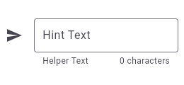 |
| /// |
| /// ** See code in examples/api/lib/material/input_decorator/input_decoration.0.dart ** |
| /// {@end-tool} |
| /// |
| /// {@tool dartpad} |
| /// This sample shows how to style a "collapsed" `TextField` using an |
| /// `InputDecorator`. The collapsed `TextField` surrounds the hint text and |
| /// input area with a border, but does not add padding around them. |
| /// |
| /// 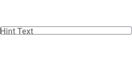 |
| /// |
| /// ** See code in examples/api/lib/material/input_decorator/input_decoration.1.dart ** |
| /// {@end-tool} |
| /// |
| /// {@tool dartpad} |
| /// This sample shows how to create a `TextField` with hint text, a red border |
| /// on all sides, and an error message. To display a red border and error |
| /// message, provide `errorText` to the [InputDecoration] constructor. |
| /// |
| /// 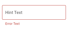 |
| /// |
| /// ** See code in examples/api/lib/material/input_decorator/input_decoration.2.dart ** |
| /// {@end-tool} |
| /// |
| /// {@tool dartpad} |
| /// This sample shows how to style a `TextField` with a round border and |
| /// additional text before and after the input area. It displays "Prefix" before |
| /// the input area, and "Suffix" after the input area. |
| /// |
| /// 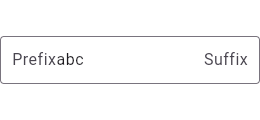 |
| /// |
| /// ** See code in examples/api/lib/material/input_decorator/input_decoration.3.dart ** |
| /// {@end-tool} |
| /// |
| /// {@tool dartpad} |
| /// This sample shows how to style a `TextField` with a prefixIcon that changes color |
| /// based on the `MaterialState`. The color defaults to gray, be blue while focused |
| /// and red if in an error state. |
| /// |
| /// ** See code in examples/api/lib/material/input_decorator/input_decoration.material_state.0.dart ** |
| /// {@end-tool} |
| /// |
| /// {@tool dartpad} |
| /// This sample shows how to style a `TextField` with a prefixIcon that changes color |
| /// based on the `MaterialState` through the use of `ThemeData`. The color defaults |
| /// to gray, be blue while focused and red if in an error state. |
| /// |
| /// ** See code in examples/api/lib/material/input_decorator/input_decoration.material_state.1.dart ** |
| /// {@end-tool} |
| /// |
| /// See also: |
| /// |
| /// * [TextField], which is a text input widget that uses an |
| /// [InputDecoration]. |
| /// * [InputDecorator], which is a widget that draws an [InputDecoration] |
| /// around an input child widget. |
| /// * [Decoration] and [DecoratedBox], for drawing borders and backgrounds |
| /// around a child widget. |
| @immutable |
| class InputDecoration { |
| /// Creates a bundle of the border, labels, icons, and styles used to |
| /// decorate a Material Design text field. |
| /// |
| /// Unless specified by [ThemeData.inputDecorationTheme], [InputDecorator] |
| /// defaults [isDense] to false and [filled] to false. The default border is |
| /// an instance of [UnderlineInputBorder]. If [border] is [InputBorder.none] |
| /// then no border is drawn. |
| /// |
| /// The [enabled] argument must not be null. |
| /// |
| /// Only one of [prefix] and [prefixText] can be specified. |
| /// |
| /// Similarly, only one of [suffix] and [suffixText] can be specified. |
| const InputDecoration({ |
| this.icon, |
| this.iconColor, |
| this.label, |
| this.labelText, |
| this.labelStyle, |
| this.floatingLabelStyle, |
| this.helperText, |
| this.helperStyle, |
| this.helperMaxLines, |
| this.hintText, |
| this.hintStyle, |
| this.hintTextDirection, |
| this.hintMaxLines, |
| this.errorText, |
| this.errorStyle, |
| this.errorMaxLines, |
| this.floatingLabelBehavior, |
| this.floatingLabelAlignment, |
| this.isCollapsed = false, |
| this.isDense, |
| this.contentPadding, |
| this.prefixIcon, |
| this.prefixIconConstraints, |
| this.prefix, |
| this.prefixText, |
| this.prefixStyle, |
| this.prefixIconColor, |
| this.suffixIcon, |
| this.suffix, |
| this.suffixText, |
| this.suffixStyle, |
| this.suffixIconColor, |
| this.suffixIconConstraints, |
| this.counter, |
| this.counterText, |
| this.counterStyle, |
| this.filled, |
| this.fillColor, |
| this.focusColor, |
| this.hoverColor, |
| this.errorBorder, |
| this.focusedBorder, |
| this.focusedErrorBorder, |
| this.disabledBorder, |
| this.enabledBorder, |
| this.border, |
| this.enabled = true, |
| this.semanticCounterText, |
| this.alignLabelWithHint, |
| this.constraints, |
| }) : assert(enabled != null), |
| assert(!(label != null && labelText != null), 'Declaring both label and labelText is not supported.'), |
| assert(!(prefix != null && prefixText != null), 'Declaring both prefix and prefixText is not supported.'), |
| assert(!(suffix != null && suffixText != null), 'Declaring both suffix and suffixText is not supported.'); |
| |
| /// Defines an [InputDecorator] that is the same size as the input field. |
| /// |
| /// This type of input decoration does not include a border by default. |
| /// |
| /// Sets the [isCollapsed] property to true. |
| const InputDecoration.collapsed({ |
| required this.hintText, |
| this.floatingLabelBehavior, |
| this.floatingLabelAlignment, |
| this.hintStyle, |
| this.hintTextDirection, |
| this.filled = false, |
| this.fillColor, |
| this.focusColor, |
| this.hoverColor, |
| this.border = InputBorder.none, |
| this.enabled = true, |
| }) : assert(enabled != null), |
| icon = null, |
| iconColor = null, |
| label = null, |
| labelText = null, |
| labelStyle = null, |
| floatingLabelStyle = null, |
| helperText = null, |
| helperStyle = null, |
| helperMaxLines = null, |
| hintMaxLines = null, |
| errorText = null, |
| errorStyle = null, |
| errorMaxLines = null, |
| isDense = false, |
| contentPadding = EdgeInsets.zero, |
| isCollapsed = true, |
| prefixIcon = null, |
| prefix = null, |
| prefixText = null, |
| prefixStyle = null, |
| prefixIconColor = null, |
| prefixIconConstraints = null, |
| suffix = null, |
| suffixIcon = null, |
| suffixText = null, |
| suffixStyle = null, |
| suffixIconColor = null, |
| suffixIconConstraints = null, |
| counter = null, |
| counterText = null, |
| counterStyle = null, |
| errorBorder = null, |
| focusedBorder = null, |
| focusedErrorBorder = null, |
| disabledBorder = null, |
| enabledBorder = null, |
| semanticCounterText = null, |
| alignLabelWithHint = false, |
| constraints = null; |
| |
| /// An icon to show before the input field and outside of the decoration's |
| /// container. |
| /// |
| /// The size and color of the icon is configured automatically using an |
| /// [IconTheme] and therefore does not need to be explicitly given in the |
| /// icon widget. |
| /// |
| /// The trailing edge of the icon is padded by 16dps. |
| /// |
| /// The decoration's container is the area which is filled if [filled] is |
| /// true and bordered per the [border]. It's the area adjacent to |
| /// [icon] and above the widgets that contain [helperText], |
| /// [errorText], and [counterText]. |
| /// |
| /// See [Icon], [ImageIcon]. |
| final Widget? icon; |
| |
| /// The color of the [icon]. |
| /// |
| /// If [iconColor] is a [MaterialStateColor], then the effective |
| /// color can depend on the [MaterialState.focused] state, i.e. |
| /// if the [TextField] is focused or not. |
| final Color? iconColor; |
| |
| /// Optional widget that describes the input field. |
| /// |
| /// {@template flutter.material.inputDecoration.label} |
| /// When the input field is empty and unfocused, the label is displayed on |
| /// top of the input field (i.e., at the same location on the screen where |
| /// text may be entered in the input field). When the input field receives |
| /// focus (or if the field is non-empty), depending on [floatingLabelAlignment], |
| /// the label moves above, either vertically adjacent to, or to the center of |
| /// the input field. |
| /// {@endtemplate} |
| /// |
| /// This can be used, for example, to add multiple [TextStyle]'s to a label that would |
| /// otherwise be specified using [labelText], which only takes one [TextStyle]. |
| /// |
| /// {@tool dartpad} |
| /// This example shows a `TextField` with a [Text.rich] widget as the [label]. |
| /// The widget contains multiple [Text] widgets with different [TextStyle]'s. |
| /// |
| /// ** See code in examples/api/lib/material/input_decorator/input_decoration.label.0.dart ** |
| /// {@end-tool} |
| /// |
| /// Only one of [label] and [labelText] can be specified. |
| final Widget? label; |
| |
| /// Optional text that describes the input field. |
| /// |
| /// {@macro flutter.material.inputDecoration.label} |
| /// |
| /// If a more elaborate label is required, consider using [label] instead. |
| /// Only one of [label] and [labelText] can be specified. |
| final String? labelText; |
| |
| /// {@template flutter.material.inputDecoration.labelStyle} |
| /// The style to use for [InputDecoration.labelText] when the label is on top |
| /// of the input field. |
| /// |
| /// If [labelStyle] is a [MaterialStateTextStyle], then the effective |
| /// text style can depend on the [MaterialState.focused] state, i.e. |
| /// if the [TextField] is focused or not. |
| /// |
| /// When the [InputDecoration.labelText] is above (i.e., vertically adjacent to) |
| /// the input field, the text uses the [floatingLabelStyle] instead. |
| /// |
| /// If null, defaults to a value derived from the base [TextStyle] for the |
| /// input field and the current [Theme]. |
| /// |
| /// Note that if you specify this style it will override the default behavior |
| /// of [InputDecoration] that changes the color of the label to the |
| /// [InputDecoration.errorStyle] color or [ColorScheme.error]. |
| /// |
| /// {@tool dartpad} |
| /// It's possible to override the label style for just the error state, or |
| /// just the default state, or both. |
| /// |
| /// In this example the [labelStyle] is specified with a [MaterialStateProperty] |
| /// which resolves to a text style whose color depends on the decorator's |
| /// error state. |
| /// |
| /// ** See code in examples/api/lib/material/input_decorator/input_decoration.label_style_error.0.dart ** |
| /// {@end-tool} |
| /// {@endtemplate} |
| final TextStyle? labelStyle; |
| |
| /// {@template flutter.material.inputDecoration.floatingLabelStyle} |
| /// The style to use for [InputDecoration.labelText] when the label is |
| /// above (i.e., vertically adjacent to) the input field. |
| /// |
| /// When the [InputDecoration.labelText] is on top of the input field, the |
| /// text uses the [labelStyle] instead. |
| /// |
| /// If [floatingLabelStyle] is a [MaterialStateTextStyle], then the effective |
| /// text style can depend on the [MaterialState.focused] state, i.e. |
| /// if the [TextField] is focused or not. |
| /// |
| /// If null, defaults to [labelStyle]. |
| /// |
| /// Note that if you specify this style it will override the default behavior |
| /// of [InputDecoration] that changes the color of the label to the |
| /// [InputDecoration.errorStyle] color or [ColorScheme.error]. |
| /// |
| /// {@tool dartpad} |
| /// It's possible to override the label style for just the error state, or |
| /// just the default state, or both. |
| /// |
| /// In this example the [floatingLabelStyle] is specified with a |
| /// [MaterialStateProperty] which resolves to a text style whose color depends |
| /// on the decorator's error state. |
| /// |
| /// ** See code in examples/api/lib/material/input_decorator/input_decoration.floating_label_style_error.0.dart ** |
| /// {@end-tool} |
| /// {@endtemplate} |
| final TextStyle? floatingLabelStyle; |
| |
| /// Text that provides context about the [InputDecorator.child]'s value, such |
| /// as how the value will be used. |
| /// |
| /// If non-null, the text is displayed below the [InputDecorator.child], in |
| /// the same location as [errorText]. If a non-null [errorText] value is |
| /// specified then the helper text is not shown. |
| final String? helperText; |
| |
| /// The style to use for the [helperText]. |
| /// |
| /// If [helperStyle] is a [MaterialStateTextStyle], then the effective |
| /// text style can depend on the [MaterialState.focused] state, i.e. |
| /// if the [TextField] is focused or not. |
| final TextStyle? helperStyle; |
| |
| /// The maximum number of lines the [helperText] can occupy. |
| /// |
| /// Defaults to null, which means that the [helperText] will be limited |
| /// to a single line with [TextOverflow.ellipsis]. |
| /// |
| /// This value is passed along to the [Text.maxLines] attribute |
| /// of the [Text] widget used to display the helper. |
| /// |
| /// See also: |
| /// |
| /// * [errorMaxLines], the equivalent but for the [errorText]. |
| final int? helperMaxLines; |
| |
| /// Text that suggests what sort of input the field accepts. |
| /// |
| /// Displayed on top of the [InputDecorator.child] (i.e., at the same location |
| /// on the screen where text may be entered in the [InputDecorator.child]) |
| /// when the input [isEmpty] and either (a) [labelText] is null or (b) the |
| /// input has the focus. |
| final String? hintText; |
| |
| /// The style to use for the [hintText]. |
| /// |
| /// If [hintStyle] is a [MaterialStateTextStyle], then the effective |
| /// text style can depend on the [MaterialState.focused] state, i.e. |
| /// if the [TextField] is focused or not. |
| /// |
| /// Also used for the [labelText] when the [labelText] is displayed on |
| /// top of the input field (i.e., at the same location on the screen where |
| /// text may be entered in the [InputDecorator.child]). |
| /// |
| /// If null, defaults to a value derived from the base [TextStyle] for the |
| /// input field and the current [Theme]. |
| final TextStyle? hintStyle; |
| |
| /// The direction to use for the [hintText]. |
| /// |
| /// If null, defaults to a value derived from [Directionality] for the |
| /// input field and the current context. |
| final TextDirection? hintTextDirection; |
| |
| /// The maximum number of lines the [hintText] can occupy. |
| /// |
| /// Defaults to the value of [TextField.maxLines] attribute. |
| /// |
| /// This value is passed along to the [Text.maxLines] attribute |
| /// of the [Text] widget used to display the hint text. [TextOverflow.ellipsis] is |
| /// used to handle the overflow when it is limited to single line. |
| final int? hintMaxLines; |
| |
| /// Text that appears below the [InputDecorator.child] and the border. |
| /// |
| /// If non-null, the border's color animates to red and the [helperText] is |
| /// not shown. |
| /// |
| /// In a [TextFormField], this is overridden by the value returned from |
| /// [TextFormField.validator], if that is not null. |
| final String? errorText; |
| |
| /// {@template flutter.material.inputDecoration.errorStyle} |
| /// The style to use for the [InputDecoration.errorText]. |
| /// |
| /// If null, defaults of a value derived from the base [TextStyle] for the |
| /// input field and the current [Theme]. |
| /// |
| /// By default the color of style will be used by the label of |
| /// [InputDecoration] if [InputDecoration.errorText] is not null. See |
| /// [InputDecoration.labelStyle] or [InputDecoration.floatingLabelStyle] for |
| /// an example of how to replicate this behavior if you have specified either |
| /// style. |
| /// {@endtemplate} |
| final TextStyle? errorStyle; |
| |
| |
| /// The maximum number of lines the [errorText] can occupy. |
| /// |
| /// Defaults to null, which means that the [errorText] will be limited |
| /// to a single line with [TextOverflow.ellipsis]. |
| /// |
| /// This value is passed along to the [Text.maxLines] attribute |
| /// of the [Text] widget used to display the error. |
| /// |
| /// See also: |
| /// |
| /// * [helperMaxLines], the equivalent but for the [helperText]. |
| final int? errorMaxLines; |
| |
| /// {@template flutter.material.inputDecoration.floatingLabelBehavior} |
| /// Defines **how** the floating label should behave. |
| /// |
| /// When [FloatingLabelBehavior.auto] the label will float to the top only when |
| /// the field is focused or has some text content, otherwise it will appear |
| /// in the field in place of the content. |
| /// |
| /// When [FloatingLabelBehavior.always] the label will always float at the top |
| /// of the field above the content. |
| /// |
| /// When [FloatingLabelBehavior.never] the label will always appear in an empty |
| /// field in place of the content. |
| /// {@endtemplate} |
| /// |
| /// If null, [InputDecorationTheme.floatingLabelBehavior] will be used. |
| /// |
| /// See also: |
| /// |
| /// * [floatingLabelAlignment] which defines **where** the floating label |
| /// should be displayed. |
| final FloatingLabelBehavior? floatingLabelBehavior; |
| |
| /// {@template flutter.material.inputDecoration.floatingLabelAlignment} |
| /// Defines **where** the floating label should be displayed. |
| /// |
| /// [FloatingLabelAlignment.start] aligns the floating label to the leftmost |
| /// (when [TextDirection.ltr]) or rightmost (when [TextDirection.rtl]), |
| /// possible position, which is vertically adjacent to the label, on top of |
| /// the field. |
| /// |
| /// [FloatingLabelAlignment.center] aligns the floating label to the center on |
| /// top of the field. |
| /// {@endtemplate} |
| /// |
| /// If null, [InputDecorationTheme.floatingLabelAlignment] will be used. |
| /// |
| /// See also: |
| /// |
| /// * [floatingLabelBehavior] which defines **how** the floating label should |
| /// behave. |
| final FloatingLabelAlignment? floatingLabelAlignment; |
| |
| /// Whether the [InputDecorator.child] is part of a dense form (i.e., uses less vertical |
| /// space). |
| /// |
| /// Defaults to false. |
| final bool? isDense; |
| |
| /// The padding for the input decoration's container. |
| /// |
| /// {@macro flutter.material.input_decorator.container_description} |
| /// |
| /// By default the [contentPadding] reflects [isDense] and the type of the |
| /// [border]. |
| /// |
| /// If [isCollapsed] is true then [contentPadding] is [EdgeInsets.zero]. |
| /// |
| /// If `isOutline` property of [border] is false and if [filled] is true then |
| /// [contentPadding] is `EdgeInsets.fromLTRB(12, 8, 12, 8)` when [isDense] |
| /// is true and `EdgeInsets.fromLTRB(12, 12, 12, 12)` when [isDense] is false. |
| /// If `isOutline` property of [border] is false and if [filled] is false then |
| /// [contentPadding] is `EdgeInsets.fromLTRB(0, 8, 0, 8)` when [isDense] is |
| /// true and `EdgeInsets.fromLTRB(0, 12, 0, 12)` when [isDense] is false. |
| /// |
| /// If `isOutline` property of [border] is true then [contentPadding] is |
| /// `EdgeInsets.fromLTRB(12, 20, 12, 12)` when [isDense] is true |
| /// and `EdgeInsets.fromLTRB(12, 24, 12, 16)` when [isDense] is false. |
| final EdgeInsetsGeometry? contentPadding; |
| |
| /// Whether the decoration is the same size as the input field. |
| /// |
| /// A collapsed decoration cannot have [labelText], [errorText], an [icon]. |
| /// |
| /// To create a collapsed input decoration, use [InputDecoration.collapsed]. |
| final bool isCollapsed; |
| |
| /// An icon that appears before the [prefix] or [prefixText] and before |
| /// the editable part of the text field, within the decoration's container. |
| /// |
| /// The size and color of the prefix icon is configured automatically using an |
| /// [IconTheme] and therefore does not need to be explicitly given in the |
| /// icon widget. |
| /// |
| /// The prefix icon is constrained with a minimum size of 48px by 48px, but |
| /// can be expanded beyond that. Anything larger than 24px will require |
| /// additional padding to ensure it matches the Material Design spec of 12px |
| /// padding between the left edge of the input and leading edge of the prefix |
| /// icon. The following snippet shows how to pad the leading edge of the |
| /// prefix icon: |
| /// |
| /// ```dart |
| /// prefixIcon: Padding( |
| /// padding: const EdgeInsetsDirectional.only(start: 12.0), |
| /// child: _myIcon, // _myIcon is a 48px-wide widget. |
| /// ) |
| /// ``` |
| /// |
| /// {@macro flutter.material.input_decorator.container_description} |
| /// |
| /// The prefix icon alignment can be changed using [Align] with a fixed `widthFactor` and |
| /// `heightFactor`. |
| /// |
| /// {@tool dartpad} |
| /// This example shows how the prefix icon alignment can be changed using [Align] with |
| /// a fixed `widthFactor` and `heightFactor`. |
| /// |
| /// ** See code in examples/api/lib/material/input_decorator/input_decoration.prefix_icon.0.dart ** |
| /// {@end-tool} |
| /// |
| /// See also: |
| /// |
| /// * [Icon] and [ImageIcon], which are typically used to show icons. |
| /// * [prefix] and [prefixText], which are other ways to show content |
| /// before the text field (but after the icon). |
| /// * [suffixIcon], which is the same but on the trailing edge. |
| /// * [Align] A widget that aligns its child within itself and optionally |
| /// sizes itself based on the child's size. |
| final Widget? prefixIcon; |
| |
| /// The constraints for the prefix icon. |
| /// |
| /// This can be used to modify the [BoxConstraints] surrounding [prefixIcon]. |
| /// |
| /// This property is particularly useful for getting the decoration's height |
| /// less than 48px. This can be achieved by setting [isDense] to true and |
| /// setting the constraints' minimum height and width to a value lower than |
| /// 48px. |
| /// |
| /// {@tool dartpad} |
| /// This example shows the differences between two `TextField` widgets when |
| /// [prefixIconConstraints] is set to the default value and when one is not. |
| /// |
| /// Note that [isDense] must be set to true to be able to |
| /// set the constraints smaller than 48px. |
| /// |
| /// If null, [BoxConstraints] with a minimum width and height of 48px is |
| /// used. |
| /// |
| /// ** See code in examples/api/lib/material/input_decorator/input_decoration.prefix_icon_constraints.0.dart ** |
| /// {@end-tool} |
| final BoxConstraints? prefixIconConstraints; |
| |
| /// Optional widget to place on the line before the input. |
| /// |
| /// This can be used, for example, to add some padding to text that would |
| /// otherwise be specified using [prefixText], or to add a custom widget in |
| /// front of the input. The widget's baseline is lined up with the input |
| /// baseline. |
| /// |
| /// Only one of [prefix] and [prefixText] can be specified. |
| /// |
| /// The [prefix] appears after the [prefixIcon], if both are specified. |
| /// |
| /// See also: |
| /// |
| /// * [suffix], the equivalent but on the trailing edge. |
| final Widget? prefix; |
| |
| /// Optional text prefix to place on the line before the input. |
| /// |
| /// Uses the [prefixStyle]. Uses [hintStyle] if [prefixStyle] isn't specified. |
| /// The prefix text is not returned as part of the user's input. |
| /// |
| /// If a more elaborate prefix is required, consider using [prefix] instead. |
| /// Only one of [prefix] and [prefixText] can be specified. |
| /// |
| /// The [prefixText] appears after the [prefixIcon], if both are specified. |
| /// |
| /// See also: |
| /// |
| /// * [suffixText], the equivalent but on the trailing edge. |
| final String? prefixText; |
| |
| /// The style to use for the [prefixText]. |
| /// |
| /// If [prefixStyle] is a [MaterialStateTextStyle], then the effective |
| /// text style can depend on the [MaterialState.focused] state, i.e. |
| /// if the [TextField] is focused or not. |
| /// |
| /// If null, defaults to the [hintStyle]. |
| /// |
| /// See also: |
| /// |
| /// * [suffixStyle], the equivalent but on the trailing edge. |
| final TextStyle? prefixStyle; |
| |
| /// Optional color of the prefixIcon |
| /// |
| /// Defaults to [iconColor] |
| /// |
| /// If [prefixIconColor] is a [MaterialStateColor], then the effective |
| /// color can depend on the [MaterialState.focused] state, i.e. |
| /// if the [TextField] is focused or not. |
| final Color? prefixIconColor; |
| |
| /// An icon that appears after the editable part of the text field and |
| /// after the [suffix] or [suffixText], within the decoration's container. |
| /// |
| /// The size and color of the suffix icon is configured automatically using an |
| /// [IconTheme] and therefore does not need to be explicitly given in the |
| /// icon widget. |
| /// |
| /// The suffix icon is constrained with a minimum size of 48px by 48px, but |
| /// can be expanded beyond that. Anything larger than 24px will require |
| /// additional padding to ensure it matches the Material Design spec of 12px |
| /// padding between the right edge of the input and trailing edge of the |
| /// prefix icon. The following snippet shows how to pad the trailing edge of |
| /// the suffix icon: |
| /// |
| /// ```dart |
| /// suffixIcon: Padding( |
| /// padding: const EdgeInsetsDirectional.only(end: 12.0), |
| /// child: _myIcon, // myIcon is a 48px-wide widget. |
| /// ) |
| /// ``` |
| /// |
| /// The decoration's container is the area which is filled if [filled] is |
| /// true and bordered per the [border]. It's the area adjacent to |
| /// [icon] and above the widgets that contain [helperText], |
| /// [errorText], and [counterText]. |
| /// |
| /// The suffix icon alignment can be changed using [Align] with a fixed `widthFactor` and |
| /// `heightFactor`. |
| /// |
| /// {@tool dartpad} |
| /// This example shows how the suffix icon alignment can be changed using [Align] with |
| /// a fixed `widthFactor` and `heightFactor`. |
| /// |
| /// ** See code in examples/api/lib/material/input_decorator/input_decoration.suffix_icon.0.dart ** |
| /// {@end-tool} |
| /// |
| /// See also: |
| /// |
| /// * [Icon] and [ImageIcon], which are typically used to show icons. |
| /// * [suffix] and [suffixText], which are other ways to show content |
| /// after the text field (but before the icon). |
| /// * [prefixIcon], which is the same but on the leading edge. |
| /// * [Align] A widget that aligns its child within itself and optionally |
| /// sizes itself based on the child's size. |
| final Widget? suffixIcon; |
| |
| /// Optional widget to place on the line after the input. |
| /// |
| /// This can be used, for example, to add some padding to the text that would |
| /// otherwise be specified using [suffixText], or to add a custom widget after |
| /// the input. The widget's baseline is lined up with the input baseline. |
| /// |
| /// Only one of [suffix] and [suffixText] can be specified. |
| /// |
| /// The [suffix] appears before the [suffixIcon], if both are specified. |
| /// |
| /// See also: |
| /// |
| /// * [prefix], the equivalent but on the leading edge. |
| final Widget? suffix; |
| |
| /// Optional text suffix to place on the line after the input. |
| /// |
| /// Uses the [suffixStyle]. Uses [hintStyle] if [suffixStyle] isn't specified. |
| /// The suffix text is not returned as part of the user's input. |
| /// |
| /// If a more elaborate suffix is required, consider using [suffix] instead. |
| /// Only one of [suffix] and [suffixText] can be specified. |
| /// |
| /// The [suffixText] appears before the [suffixIcon], if both are specified. |
| /// |
| /// See also: |
| /// |
| /// * [prefixText], the equivalent but on the leading edge. |
| final String? suffixText; |
| |
| /// The style to use for the [suffixText]. |
| /// |
| /// If [suffixStyle] is a [MaterialStateTextStyle], then the effective text |
| /// style can depend on the [MaterialState.focused] state, i.e. if the |
| /// [TextField] is focused or not. |
| /// |
| /// If null, defaults to the [hintStyle]. |
| /// |
| /// See also: |
| /// |
| /// * [prefixStyle], the equivalent but on the leading edge. |
| final TextStyle? suffixStyle; |
| |
| /// Optional color of the [suffixIcon]. |
| /// |
| /// Defaults to [iconColor] |
| /// |
| /// If [suffixIconColor] is a [MaterialStateColor], then the effective |
| /// color can depend on the [MaterialState.focused] state, i.e. |
| /// if the [TextField] is focused or not. |
| final Color? suffixIconColor; |
| |
| /// The constraints for the suffix icon. |
| /// |
| /// This can be used to modify the [BoxConstraints] surrounding [suffixIcon]. |
| /// |
| /// This property is particularly useful for getting the decoration's height |
| /// less than 48px. This can be achieved by setting [isDense] to true and |
| /// setting the constraints' minimum height and width to a value lower than |
| /// 48px. |
| /// |
| /// If null, a [BoxConstraints] with a minimum width and height of 48px is |
| /// used. |
| /// |
| /// {@tool dartpad} |
| /// This example shows the differences between two `TextField` widgets when |
| /// [suffixIconConstraints] is set to the default value and when one is not. |
| /// |
| /// Note that [isDense] must be set to true to be able to |
| /// set the constraints smaller than 48px. |
| /// |
| /// If null, [BoxConstraints] with a minimum width and height of 48px is |
| /// used. |
| /// |
| /// ** See code in examples/api/lib/material/input_decorator/input_decoration.suffix_icon_constraints.0.dart ** |
| /// {@end-tool} |
| final BoxConstraints? suffixIconConstraints; |
| |
| /// Optional text to place below the line as a character count. |
| /// |
| /// Rendered using [counterStyle]. Uses [helperStyle] if [counterStyle] is |
| /// null. |
| /// |
| /// The semantic label can be replaced by providing a [semanticCounterText]. |
| /// |
| /// If null or an empty string and [counter] isn't specified, then nothing |
| /// will appear in the counter's location. |
| final String? counterText; |
| |
| /// Optional custom counter widget to go in the place otherwise occupied by |
| /// [counterText]. If this property is non null, then [counterText] is |
| /// ignored. |
| final Widget? counter; |
| |
| /// The style to use for the [counterText]. |
| /// |
| /// If [counterStyle] is a [MaterialStateTextStyle], then the effective |
| /// text style can depend on the [MaterialState.focused] state, i.e. |
| /// if the [TextField] is focused or not. |
| /// |
| /// If null, defaults to the [helperStyle]. |
| final TextStyle? counterStyle; |
| |
| /// If true the decoration's container is filled with [fillColor]. |
| /// |
| /// When [InputDecorator.isHovering] is true, the [hoverColor] is also blended |
| /// into the final fill color. |
| /// |
| /// Typically this field set to true if [border] is an [UnderlineInputBorder]. |
| /// |
| /// {@template flutter.material.input_decorator.container_description} |
| /// The decoration's container is the area which is filled if [filled] is true |
| /// and bordered per the [border]. It's the area adjacent to [icon] and above |
| /// the widgets that contain [helperText], [errorText], and [counterText]. |
| /// {@endtemplate} |
| /// |
| /// This property is false by default. |
| final bool? filled; |
| |
| /// The base fill color of the decoration's container color. |
| /// |
| /// When [InputDecorator.isHovering] is true, the [hoverColor] is also blended |
| /// into the final fill color. |
| /// |
| /// By default the [fillColor] is based on the current |
| /// [InputDecorationTheme.fillColor]. |
| /// |
| /// {@macro flutter.material.input_decorator.container_description} |
| final Color? fillColor; |
| |
| /// The fill color of the decoration's container when it has the input focus. |
| /// |
| /// By default the [focusColor] is based on the current |
| /// [InputDecorationTheme.focusColor]. |
| /// |
| /// This [focusColor] is ignored by [TextField] and [TextFormField] because |
| /// they don't respond to focus changes by changing their decorator's |
| /// container color, they respond by changing their border to the |
| /// [focusedBorder], which you can change the color of. |
| /// |
| /// {@macro flutter.material.input_decorator.container_description} |
| final Color? focusColor; |
| |
| /// The color of the highlight for the decoration shown if the container |
| /// is being hovered over by a mouse. |
| /// |
| /// If [filled] is true, the [hoverColor] is blended with [fillColor] and |
| /// fills the decoration's container. |
| /// |
| /// If [filled] is false, and [InputDecorator.isFocused] is false, the color |
| /// is blended over the [enabledBorder]'s color. |
| /// |
| /// By default the [hoverColor] is based on the current [Theme]. |
| /// |
| /// {@macro flutter.material.input_decorator.container_description} |
| final Color? hoverColor; |
| |
| /// The border to display when the [InputDecorator] does not have the focus and |
| /// is showing an error. |
| /// |
| /// See also: |
| /// |
| /// * [InputDecorator.isFocused], which is true if the [InputDecorator]'s child |
| /// has the focus. |
| /// * [InputDecoration.errorText], the error shown by the [InputDecorator], if non-null. |
| /// * [border], for a description of where the [InputDecorator] border appears. |
| /// * [UnderlineInputBorder], an [InputDecorator] border which draws a horizontal |
| /// line at the bottom of the input decorator's container. |
| /// * [OutlineInputBorder], an [InputDecorator] border which draws a |
| /// rounded rectangle around the input decorator's container. |
| /// * [InputBorder.none], which doesn't draw a border. |
| /// * [focusedBorder], displayed when [InputDecorator.isFocused] is true |
| /// and [InputDecoration.errorText] is null. |
| /// * [focusedErrorBorder], displayed when [InputDecorator.isFocused] is true |
| /// and [InputDecoration.errorText] is non-null. |
| /// * [disabledBorder], displayed when [InputDecoration.enabled] is false |
| /// and [InputDecoration.errorText] is null. |
| /// * [enabledBorder], displayed when [InputDecoration.enabled] is true |
| /// and [InputDecoration.errorText] is null. |
| final InputBorder? errorBorder; |
| |
| /// The border to display when the [InputDecorator] has the focus and is not |
| /// showing an error. |
| /// |
| /// See also: |
| /// |
| /// * [InputDecorator.isFocused], which is true if the [InputDecorator]'s child |
| /// has the focus. |
| /// * [InputDecoration.errorText], the error shown by the [InputDecorator], if non-null. |
| /// * [border], for a description of where the [InputDecorator] border appears. |
| /// * [UnderlineInputBorder], an [InputDecorator] border which draws a horizontal |
| /// line at the bottom of the input decorator's container. |
| /// * [OutlineInputBorder], an [InputDecorator] border which draws a |
| /// rounded rectangle around the input decorator's container. |
| /// * [InputBorder.none], which doesn't draw a border. |
| /// * [errorBorder], displayed when [InputDecorator.isFocused] is false |
| /// and [InputDecoration.errorText] is non-null. |
| /// * [focusedErrorBorder], displayed when [InputDecorator.isFocused] is true |
| /// and [InputDecoration.errorText] is non-null. |
| /// * [disabledBorder], displayed when [InputDecoration.enabled] is false |
| /// and [InputDecoration.errorText] is null. |
| /// * [enabledBorder], displayed when [InputDecoration.enabled] is true |
| /// and [InputDecoration.errorText] is null. |
| final InputBorder? focusedBorder; |
| |
| /// The border to display when the [InputDecorator] has the focus and is |
| /// showing an error. |
| /// |
| /// See also: |
| /// |
| /// * [InputDecorator.isFocused], which is true if the [InputDecorator]'s child |
| /// has the focus. |
| /// * [InputDecoration.errorText], the error shown by the [InputDecorator], if non-null. |
| /// * [border], for a description of where the [InputDecorator] border appears. |
| /// * [UnderlineInputBorder], an [InputDecorator] border which draws a horizontal |
| /// line at the bottom of the input decorator's container. |
| /// * [OutlineInputBorder], an [InputDecorator] border which draws a |
| /// rounded rectangle around the input decorator's container. |
| /// * [InputBorder.none], which doesn't draw a border. |
| /// * [errorBorder], displayed when [InputDecorator.isFocused] is false |
| /// and [InputDecoration.errorText] is non-null. |
| /// * [focusedBorder], displayed when [InputDecorator.isFocused] is true |
| /// and [InputDecoration.errorText] is null. |
| /// * [disabledBorder], displayed when [InputDecoration.enabled] is false |
| /// and [InputDecoration.errorText] is null. |
| /// * [enabledBorder], displayed when [InputDecoration.enabled] is true |
| /// and [InputDecoration.errorText] is null. |
| final InputBorder? focusedErrorBorder; |
| |
| /// The border to display when the [InputDecorator] is disabled and is not |
| /// showing an error. |
| /// |
| /// See also: |
| /// |
| /// * [InputDecoration.enabled], which is false if the [InputDecorator] is disabled. |
| /// * [InputDecoration.errorText], the error shown by the [InputDecorator], if non-null. |
| /// * [border], for a description of where the [InputDecorator] border appears. |
| /// * [UnderlineInputBorder], an [InputDecorator] border which draws a horizontal |
| /// line at the bottom of the input decorator's container. |
| /// * [OutlineInputBorder], an [InputDecorator] border which draws a |
| /// rounded rectangle around the input decorator's container. |
| /// * [InputBorder.none], which doesn't draw a border. |
| /// * [errorBorder], displayed when [InputDecorator.isFocused] is false |
| /// and [InputDecoration.errorText] is non-null. |
| /// * [focusedBorder], displayed when [InputDecorator.isFocused] is true |
| /// and [InputDecoration.errorText] is null. |
| /// * [focusedErrorBorder], displayed when [InputDecorator.isFocused] is true |
| /// and [InputDecoration.errorText] is non-null. |
| /// * [enabledBorder], displayed when [InputDecoration.enabled] is true |
| /// and [InputDecoration.errorText] is null. |
| final InputBorder? disabledBorder; |
| |
| /// The border to display when the [InputDecorator] is enabled and is not |
| /// showing an error. |
| /// |
| /// See also: |
| /// |
| /// * [InputDecoration.enabled], which is false if the [InputDecorator] is disabled. |
| /// * [InputDecoration.errorText], the error shown by the [InputDecorator], if non-null. |
| /// * [border], for a description of where the [InputDecorator] border appears. |
| /// * [UnderlineInputBorder], an [InputDecorator] border which draws a horizontal |
| /// line at the bottom of the input decorator's container. |
| /// * [OutlineInputBorder], an [InputDecorator] border which draws a |
| /// rounded rectangle around the input decorator's container. |
| /// * [InputBorder.none], which doesn't draw a border. |
| /// * [errorBorder], displayed when [InputDecorator.isFocused] is false |
| /// and [InputDecoration.errorText] is non-null. |
| /// * [focusedBorder], displayed when [InputDecorator.isFocused] is true |
| /// and [InputDecoration.errorText] is null. |
| /// * [focusedErrorBorder], displayed when [InputDecorator.isFocused] is true |
| /// and [InputDecoration.errorText] is non-null. |
| /// * [disabledBorder], displayed when [InputDecoration.enabled] is false |
| /// and [InputDecoration.errorText] is null. |
| final InputBorder? enabledBorder; |
| |
| /// The shape of the border to draw around the decoration's container. |
| /// |
| /// If [border] is a [MaterialStateUnderlineInputBorder] |
| /// or [MaterialStateOutlineInputBorder], then the effective border can depend on |
| /// the [MaterialState.focused] state, i.e. if the [TextField] is focused or not. |
| /// |
| /// If [border] derives from [InputBorder] the border's [InputBorder.borderSide], |
| /// i.e. the border's color and width, will be overridden to reflect the input |
| /// decorator's state. Only the border's shape is used. If custom [BorderSide] |
| /// values are desired for a given state, all four borders – [errorBorder], |
| /// [focusedBorder], [enabledBorder], [disabledBorder] – must be set. |
| /// |
| /// The decoration's container is the area which is filled if [filled] is |
| /// true and bordered per the [border]. It's the area adjacent to |
| /// [InputDecoration.icon] and above the widgets that contain |
| /// [InputDecoration.helperText], [InputDecoration.errorText], and |
| /// [InputDecoration.counterText]. |
| /// |
| /// The border's bounds, i.e. the value of `border.getOuterPath()`, define |
| /// the area to be filled. |
| /// |
| /// This property is only used when the appropriate one of [errorBorder], |
| /// [focusedBorder], [focusedErrorBorder], [disabledBorder], or [enabledBorder] |
| /// is not specified. This border's [InputBorder.borderSide] property is |
| /// configured by the InputDecorator, depending on the values of |
| /// [InputDecoration.errorText], [InputDecoration.enabled], |
| /// [InputDecorator.isFocused] and the current [Theme]. |
| /// |
| /// Typically one of [UnderlineInputBorder] or [OutlineInputBorder]. |
| /// If null, InputDecorator's default is `const UnderlineInputBorder()`. |
| /// |
| /// See also: |
| /// |
| /// * [InputBorder.none], which doesn't draw a border. |
| /// * [UnderlineInputBorder], which draws a horizontal line at the |
| /// bottom of the input decorator's container. |
| /// * [OutlineInputBorder], an [InputDecorator] border which draws a |
| /// rounded rectangle around the input decorator's container. |
| final InputBorder? border; |
| |
| /// If false [helperText],[errorText], and [counterText] are not displayed, |
| /// and the opacity of the remaining visual elements is reduced. |
| /// |
| /// This property is true by default. |
| final bool enabled; |
| |
| /// A semantic label for the [counterText]. |
| /// |
| /// Defaults to null. |
| /// |
| /// If provided, this replaces the semantic label of the [counterText]. |
| final String? semanticCounterText; |
| |
| /// Typically set to true when the [InputDecorator] contains a multiline |
| /// [TextField] ([TextField.maxLines] is null or > 1) to override the default |
| /// behavior of aligning the label with the center of the [TextField]. |
| /// |
| /// Defaults to false. |
| final bool? alignLabelWithHint; |
| |
| /// Defines minimum and maximum sizes for the [InputDecorator]. |
| /// |
| /// Typically the decorator will fill the horizontal space it is given. For |
| /// larger screens, it may be useful to have the maximum width clamped to |
| /// a given value so it doesn't fill the whole screen. This property |
| /// allows you to control how big the decorator will be in its available |
| /// space. |
| /// |
| /// If null, then the ambient [ThemeData.inputDecorationTheme]'s |
| /// [InputDecorationTheme.constraints] will be used. If that |
| /// is null then the decorator will fill the available width with |
| /// a default height based on text size. |
| final BoxConstraints? constraints; |
| |
| /// Creates a copy of this input decoration with the given fields replaced |
| /// by the new values. |
| InputDecoration copyWith({ |
| Widget? icon, |
| Color? iconColor, |
| Widget? label, |
| String? labelText, |
| TextStyle? labelStyle, |
| TextStyle? floatingLabelStyle, |
| String? helperText, |
| TextStyle? helperStyle, |
| int? helperMaxLines, |
| String? hintText, |
| TextStyle? hintStyle, |
| TextDirection? hintTextDirection, |
| int? hintMaxLines, |
| String? errorText, |
| TextStyle? errorStyle, |
| int? errorMaxLines, |
| FloatingLabelBehavior? floatingLabelBehavior, |
| FloatingLabelAlignment? floatingLabelAlignment, |
| bool? isCollapsed, |
| bool? isDense, |
| EdgeInsetsGeometry? contentPadding, |
| Widget? prefixIcon, |
| Widget? prefix, |
| String? prefixText, |
| BoxConstraints? prefixIconConstraints, |
| TextStyle? prefixStyle, |
| Color? prefixIconColor, |
| Widget? suffixIcon, |
| Widget? suffix, |
| String? suffixText, |
| TextStyle? suffixStyle, |
| Color? suffixIconColor, |
| BoxConstraints? suffixIconConstraints, |
| Widget? counter, |
| String? counterText, |
| TextStyle? counterStyle, |
| bool? filled, |
| Color? fillColor, |
| Color? focusColor, |
| Color? hoverColor, |
| InputBorder? errorBorder, |
| InputBorder? focusedBorder, |
| InputBorder? focusedErrorBorder, |
| InputBorder? disabledBorder, |
| InputBorder? enabledBorder, |
| InputBorder? border, |
| bool? enabled, |
| String? semanticCounterText, |
| bool? alignLabelWithHint, |
| BoxConstraints? constraints, |
| }) { |
| return InputDecoration( |
| icon: icon ?? this.icon, |
| iconColor: iconColor ?? this.iconColor, |
| label: label ?? this.label, |
| labelText: labelText ?? this.labelText, |
| labelStyle: labelStyle ?? this.labelStyle, |
| floatingLabelStyle: floatingLabelStyle ?? this.floatingLabelStyle, |
| helperText: helperText ?? this.helperText, |
| helperStyle: helperStyle ?? this.helperStyle, |
| helperMaxLines : helperMaxLines ?? this.helperMaxLines, |
| hintText: hintText ?? this.hintText, |
| hintStyle: hintStyle ?? this.hintStyle, |
| hintTextDirection: hintTextDirection ?? this.hintTextDirection, |
| hintMaxLines: hintMaxLines ?? this.hintMaxLines, |
| errorText: errorText ?? this.errorText, |
| errorStyle: errorStyle ?? this.errorStyle, |
| errorMaxLines: errorMaxLines ?? this.errorMaxLines, |
| floatingLabelBehavior: floatingLabelBehavior ?? this.floatingLabelBehavior, |
| floatingLabelAlignment: floatingLabelAlignment ?? this.floatingLabelAlignment, |
| isCollapsed: isCollapsed ?? this.isCollapsed, |
| isDense: isDense ?? this.isDense, |
| contentPadding: contentPadding ?? this.contentPadding, |
| prefixIcon: prefixIcon ?? this.prefixIcon, |
| prefix: prefix ?? this.prefix, |
| prefixText: prefixText ?? this.prefixText, |
| prefixStyle: prefixStyle ?? this.prefixStyle, |
| prefixIconColor: prefixIconColor ?? this.prefixIconColor, |
| prefixIconConstraints: prefixIconConstraints ?? this.prefixIconConstraints, |
| suffixIcon: suffixIcon ?? this.suffixIcon, |
| suffix: suffix ?? this.suffix, |
| suffixText: suffixText ?? this.suffixText, |
| suffixStyle: suffixStyle ?? this.suffixStyle, |
| suffixIconColor: suffixIconColor ?? this.suffixIconColor, |
| suffixIconConstraints: suffixIconConstraints ?? this.suffixIconConstraints, |
| counter: counter ?? this.counter, |
| counterText: counterText ?? this.counterText, |
| counterStyle: counterStyle ?? this.counterStyle, |
| filled: filled ?? this.filled, |
| fillColor: fillColor ?? this.fillColor, |
| focusColor: focusColor ?? this.focusColor, |
| hoverColor: hoverColor ?? this.hoverColor, |
| errorBorder: errorBorder ?? this.errorBorder, |
| focusedBorder: focusedBorder ?? this.focusedBorder, |
| focusedErrorBorder: focusedErrorBorder ?? this.focusedErrorBorder, |
| disabledBorder: disabledBorder ?? this.disabledBorder, |
| enabledBorder: enabledBorder ?? this.enabledBorder, |
| border: border ?? this.border, |
| enabled: enabled ?? this.enabled, |
| semanticCounterText: semanticCounterText ?? this.semanticCounterText, |
| alignLabelWithHint: alignLabelWithHint ?? this.alignLabelWithHint, |
| constraints: constraints ?? this.constraints, |
| ); |
| } |
| |
| /// Used by widgets like [TextField] and [InputDecorator] to create a new |
| /// [InputDecoration] with default values taken from the [theme]. |
| /// |
| /// Only null valued properties from this [InputDecoration] are replaced |
| /// by the corresponding values from [theme]. |
| InputDecoration applyDefaults(InputDecorationTheme theme) { |
| return copyWith( |
| labelStyle: labelStyle ?? theme.labelStyle, |
| floatingLabelStyle: floatingLabelStyle ?? theme.floatingLabelStyle, |
| helperStyle: helperStyle ?? theme.helperStyle, |
| helperMaxLines : helperMaxLines ?? theme.helperMaxLines, |
| hintStyle: hintStyle ?? theme.hintStyle, |
| errorStyle: errorStyle ?? theme.errorStyle, |
| errorMaxLines: errorMaxLines ?? theme.errorMaxLines, |
| floatingLabelBehavior: floatingLabelBehavior ?? theme.floatingLabelBehavior, |
| floatingLabelAlignment: floatingLabelAlignment ?? theme.floatingLabelAlignment, |
| isCollapsed: isCollapsed, |
| isDense: isDense ?? theme.isDense, |
| contentPadding: contentPadding ?? theme.contentPadding, |
| prefixStyle: prefixStyle ?? theme.prefixStyle, |
| suffixStyle: suffixStyle ?? theme.suffixStyle, |
| counterStyle: counterStyle ?? theme.counterStyle, |
| filled: filled ?? theme.filled, |
| fillColor: fillColor ?? theme.fillColor, |
| focusColor: focusColor ?? theme.focusColor, |
| hoverColor: hoverColor ?? theme.hoverColor, |
| errorBorder: errorBorder ?? theme.errorBorder, |
| focusedBorder: focusedBorder ?? theme.focusedBorder, |
| focusedErrorBorder: focusedErrorBorder ?? theme.focusedErrorBorder, |
| disabledBorder: disabledBorder ?? theme.disabledBorder, |
| enabledBorder: enabledBorder ?? theme.enabledBorder, |
| border: border ?? theme.border, |
| alignLabelWithHint: alignLabelWithHint ?? theme.alignLabelWithHint, |
| constraints: constraints ?? theme.constraints, |
| ); |
| } |
| |
| @override |
| bool operator ==(Object other) { |
| if (identical(this, other)) { |
| return true; |
| } |
| if (other.runtimeType != runtimeType) { |
| return false; |
| } |
| return other is InputDecoration |
| && other.icon == icon |
| && other.iconColor == iconColor |
| && other.label == label |
| && other.labelText == labelText |
| && other.labelStyle == labelStyle |
| && other.floatingLabelStyle == floatingLabelStyle |
| && other.helperText == helperText |
| && other.helperStyle == helperStyle |
| && other.helperMaxLines == helperMaxLines |
| && other.hintText == hintText |
| && other.hintStyle == hintStyle |
| && other.hintTextDirection == hintTextDirection |
| && other.hintMaxLines == hintMaxLines |
| && other.errorText == errorText |
| && other.errorStyle == errorStyle |
| && other.errorMaxLines == errorMaxLines |
| && other.floatingLabelBehavior == floatingLabelBehavior |
| && other.floatingLabelAlignment == floatingLabelAlignment |
| && other.isDense == isDense |
| && other.contentPadding == contentPadding |
| && other.isCollapsed == isCollapsed |
| && other.prefixIcon == prefixIcon |
| && other.prefixIconColor == prefixIconColor |
| && other.prefix == prefix |
| && other.prefixText == prefixText |
| && other.prefixStyle == prefixStyle |
| && other.prefixIconConstraints == prefixIconConstraints |
| && other.suffixIcon == suffixIcon |
| && other.suffixIconColor == suffixIconColor |
| && other.suffix == suffix |
| && other.suffixText == suffixText |
| && other.suffixStyle == suffixStyle |
| && other.suffixIconConstraints == suffixIconConstraints |
| && other.counter == counter |
| && other.counterText == counterText |
| && other.counterStyle == counterStyle |
| && other.filled == filled |
| && other.fillColor == fillColor |
| && other.focusColor == focusColor |
| && other.hoverColor == hoverColor |
| && other.errorBorder == errorBorder |
| && other.focusedBorder == focusedBorder |
| && other.focusedErrorBorder == focusedErrorBorder |
| && other.disabledBorder == disabledBorder |
| && other.enabledBorder == enabledBorder |
| && other.border == border |
| && other.enabled == enabled |
| && other.semanticCounterText == semanticCounterText |
| && other.alignLabelWithHint == alignLabelWithHint |
| && other.constraints == constraints; |
| } |
| |
| @override |
| int get hashCode { |
| final List<Object?> values = <Object?>[ |
| icon, |
| iconColor, |
| label, |
| labelText, |
| floatingLabelStyle, |
| labelStyle, |
| helperText, |
| helperStyle, |
| helperMaxLines, |
| hintText, |
| hintStyle, |
| hintTextDirection, |
| hintMaxLines, |
| errorText, |
| errorStyle, |
| errorMaxLines, |
| floatingLabelBehavior, |
| floatingLabelAlignment, |
| isDense, |
| contentPadding, |
| isCollapsed, |
| filled, |
| fillColor, |
| focusColor, |
| hoverColor, |
| prefixIcon, |
| prefixIconColor, |
| prefix, |
| prefixText, |
| prefixStyle, |
| prefixIconConstraints, |
| suffixIcon, |
| suffixIconColor, |
| suffix, |
| suffixText, |
| suffixStyle, |
| suffixIconConstraints, |
| counter, |
| counterText, |
| counterStyle, |
| errorBorder, |
| focusedBorder, |
| focusedErrorBorder, |
| disabledBorder, |
| enabledBorder, |
| border, |
| enabled, |
| semanticCounterText, |
| alignLabelWithHint, |
| constraints, |
| ]; |
| return Object.hashAll(values); |
| } |
| |
| @override |
| String toString() { |
| final List<String> description = <String>[ |
| if (icon != null) 'icon: $icon', |
| if (iconColor != null) 'iconColor: $iconColor', |
| if (label != null) 'label: $label', |
| if (labelText != null) 'labelText: "$labelText"', |
| if (floatingLabelStyle != null) 'floatingLabelStyle: "$floatingLabelStyle"', |
| if (helperText != null) 'helperText: "$helperText"', |
| if (helperMaxLines != null) 'helperMaxLines: "$helperMaxLines"', |
| if (hintText != null) 'hintText: "$hintText"', |
| if (hintMaxLines != null) 'hintMaxLines: "$hintMaxLines"', |
| if (errorText != null) 'errorText: "$errorText"', |
| if (errorStyle != null) 'errorStyle: "$errorStyle"', |
| if (errorMaxLines != null) 'errorMaxLines: "$errorMaxLines"', |
| if (floatingLabelBehavior != null) 'floatingLabelBehavior: $floatingLabelBehavior', |
| if (floatingLabelAlignment != null) 'floatingLabelAlignment: $floatingLabelAlignment', |
| if (isDense ?? false) 'isDense: $isDense', |
| if (contentPadding != null) 'contentPadding: $contentPadding', |
| if (isCollapsed) 'isCollapsed: $isCollapsed', |
| if (prefixIcon != null) 'prefixIcon: $prefixIcon', |
| if (prefixIconColor != null) 'prefixIconColor: $prefixIconColor', |
| if (prefix != null) 'prefix: $prefix', |
| if (prefixText != null) 'prefixText: $prefixText', |
| if (prefixStyle != null) 'prefixStyle: $prefixStyle', |
| if (prefixIconConstraints != null) 'prefixIconConstraints: $prefixIconConstraints', |
| if (suffixIcon != null) 'suffixIcon: $suffixIcon', |
| if (suffixIconColor != null) 'suffixIconColor: $suffixIconColor', |
| if (suffix != null) 'suffix: $suffix', |
| if (suffixText != null) 'suffixText: $suffixText', |
| if (suffixStyle != null) 'suffixStyle: $suffixStyle', |
| if (suffixIconConstraints != null) 'suffixIconConstraints: $suffixIconConstraints', |
| if (counter != null) 'counter: $counter', |
| if (counterText != null) 'counterText: $counterText', |
| if (counterStyle != null) 'counterStyle: $counterStyle', |
| if (filled ?? false) 'filled: true', |
| if (fillColor != null) 'fillColor: $fillColor', |
| if (focusColor != null) 'focusColor: $focusColor', |
| if (hoverColor != null) 'hoverColor: $hoverColor', |
| if (errorBorder != null) 'errorBorder: $errorBorder', |
| if (focusedBorder != null) 'focusedBorder: $focusedBorder', |
| if (focusedErrorBorder != null) 'focusedErrorBorder: $focusedErrorBorder', |
| if (disabledBorder != null) 'disabledBorder: $disabledBorder', |
| if (enabledBorder != null) 'enabledBorder: $enabledBorder', |
| if (border != null) 'border: $border', |
| if (!enabled) 'enabled: false', |
| if (semanticCounterText != null) 'semanticCounterText: $semanticCounterText', |
| if (alignLabelWithHint != null) 'alignLabelWithHint: $alignLabelWithHint', |
| if (constraints != null) 'constraints: $constraints', |
| ]; |
| return 'InputDecoration(${description.join(', ')})'; |
| } |
| } |
| |
| /// Defines the default appearance of [InputDecorator]s. |
| /// |
| /// This class is used to define the value of [ThemeData.inputDecorationTheme]. |
| /// The [InputDecorator], [TextField], and [TextFormField] widgets use |
| /// the current input decoration theme to initialize null [InputDecoration] |
| /// properties. |
| /// |
| /// The [InputDecoration.applyDefaults] method is used to combine a input |
| /// decoration theme with an [InputDecoration] object. |
| @immutable |
| class InputDecorationTheme with Diagnosticable { |
| /// Creates a value for [ThemeData.inputDecorationTheme] that |
| /// defines default values for [InputDecorator]. |
| /// |
| /// The values of [isDense], [isCollapsed], [filled], [floatingLabelAlignment], |
| /// and [border] must not be null. |
| const InputDecorationTheme({ |
| this.labelStyle, |
| this.floatingLabelStyle, |
| this.helperStyle, |
| this.helperMaxLines, |
| this.hintStyle, |
| this.errorStyle, |
| this.errorMaxLines, |
| this.floatingLabelBehavior = FloatingLabelBehavior.auto, |
| this.floatingLabelAlignment = FloatingLabelAlignment.start, |
| this.isDense = false, |
| this.contentPadding, |
| this.isCollapsed = false, |
| this.iconColor, |
| this.prefixStyle, |
| this.prefixIconColor, |
| this.suffixStyle, |
| this.suffixIconColor, |
| this.counterStyle, |
| this.filled = false, |
| this.fillColor, |
| this.activeIndicatorBorder, |
| this.outlineBorder, |
| this.focusColor, |
| this.hoverColor, |
| this.errorBorder, |
| this.focusedBorder, |
| this.focusedErrorBorder, |
| this.disabledBorder, |
| this.enabledBorder, |
| this.border, |
| this.alignLabelWithHint = false, |
| this.constraints, |
| }) : assert(isDense != null), |
| assert(isCollapsed != null), |
| assert(floatingLabelAlignment != null), |
| assert(filled != null), |
| assert(alignLabelWithHint != null); |
| |
| /// {@macro flutter.material.inputDecoration.labelStyle} |
| final TextStyle? labelStyle; |
| |
| /// {@macro flutter.material.inputDecoration.floatingLabelStyle} |
| final TextStyle? floatingLabelStyle; |
| |
| /// The style to use for [InputDecoration.helperText]. |
| /// |
| /// If [helperStyle] is a [MaterialStateTextStyle], then the effective |
| /// text style can depend on the [MaterialState.focused] state, i.e. |
| /// if the [TextField] is focused or not. |
| final TextStyle? helperStyle; |
| |
| /// The maximum number of lines the [InputDecoration.helperText] can occupy. |
| /// |
| /// Defaults to null, which means that the [InputDecoration.helperText] will |
| /// be limited to a single line with [TextOverflow.ellipsis]. |
| /// |
| /// This value is passed along to the [Text.maxLines] attribute |
| /// of the [Text] widget used to display the helper. |
| /// |
| /// See also: |
| /// |
| /// * [errorMaxLines], the equivalent but for the [InputDecoration.errorText]. |
| final int? helperMaxLines; |
| |
| /// The style to use for the [InputDecoration.hintText]. |
| /// |
| /// If [hintStyle] is a [MaterialStateTextStyle], then the effective |
| /// text style can depend on the [MaterialState.focused] state, i.e. |
| /// if the [TextField] is focused or not. |
| /// |
| /// Also used for the [InputDecoration.labelText] when the |
| /// [InputDecoration.labelText] is displayed on top of the input field (i.e., |
| /// at the same location on the screen where text may be entered in the input |
| /// field). |
| /// |
| /// If null, defaults to a value derived from the base [TextStyle] for the |
| /// input field and the current [Theme]. |
| final TextStyle? hintStyle; |
| |
| /// {@macro flutter.material.inputDecoration.errorStyle} |
| final TextStyle? errorStyle; |
| |
| /// The maximum number of lines the [InputDecoration.errorText] can occupy. |
| /// |
| /// Defaults to null, which means that the [InputDecoration.errorText] will be |
| /// limited to a single line with [TextOverflow.ellipsis]. |
| /// |
| /// This value is passed along to the [Text.maxLines] attribute |
| /// of the [Text] widget used to display the error. |
| /// |
| /// See also: |
| /// |
| /// * [helperMaxLines], the equivalent but for the [InputDecoration.helperText]. |
| final int? errorMaxLines; |
| |
| /// {@macro flutter.material.inputDecoration.floatingLabelBehavior} |
| /// |
| /// Defaults to [FloatingLabelBehavior.auto]. |
| final FloatingLabelBehavior floatingLabelBehavior; |
| |
| /// {@macro flutter.material.inputDecoration.floatingLabelAlignment} |
| /// |
| /// Defaults to [FloatingLabelAlignment.start]. |
| final FloatingLabelAlignment floatingLabelAlignment; |
| |
| /// Whether the input decorator's child is part of a dense form (i.e., uses |
| /// less vertical space). |
| /// |
| /// Defaults to false. |
| final bool isDense; |
| |
| /// The padding for the input decoration's container. |
| /// |
| /// The decoration's container is the area which is filled if |
| /// [InputDecoration.filled] is true and bordered per the [border]. |
| /// It's the area adjacent to [InputDecoration.icon] and above the |
| /// [InputDecoration.icon] and above the widgets that contain |
| /// [InputDecoration.helperText], [InputDecoration.errorText], and |
| /// [InputDecoration.counterText]. |
| /// |
| /// By default the [contentPadding] reflects [isDense] and the type of the |
| /// [border]. If [isCollapsed] is true then [contentPadding] is |
| /// [EdgeInsets.zero]. |
| final EdgeInsetsGeometry? contentPadding; |
| |
| /// Whether the decoration is the same size as the input field. |
| /// |
| /// A collapsed decoration cannot have [InputDecoration.labelText], |
| /// [InputDecoration.errorText], or an [InputDecoration.icon]. |
| final bool isCollapsed; |
| |
| /// The Color to use for the [InputDecoration.icon]. |
| /// |
| /// If [iconColor] is a [MaterialStateColor], then the effective |
| /// color can depend on the [MaterialState.focused] state, i.e. |
| /// if the [TextField] is focused or not. |
| /// |
| /// If null, defaults to the [ColorScheme.primary]. |
| final Color? iconColor; |
| |
| /// The style to use for the [InputDecoration.prefixText]. |
| /// |
| /// If [prefixStyle] is a [MaterialStateTextStyle], then the effective |
| /// text style can depend on the [MaterialState.focused] state, i.e. |
| /// if the [TextField] is focused or not. |
| /// |
| /// If null, defaults to the [hintStyle]. |
| final TextStyle? prefixStyle; |
| |
| /// The Color to use for the [InputDecoration.prefixIcon]. |
| /// |
| /// If [prefixIconColor] is a [MaterialStateColor], then the effective |
| /// color can depend on the [MaterialState.focused] state, i.e. |
| /// if the [TextField] is focused or not. |
| /// |
| /// If null, defaults to the [ColorScheme.primary]. |
| final Color? prefixIconColor; |
| |
| /// The style to use for the [InputDecoration.suffixText]. |
| /// |
| /// If [suffixStyle] is a [MaterialStateTextStyle], then the effective |
| /// color can depend on the [MaterialState.focused] state, i.e. |
| /// if the [TextField] is focused or not. |
| /// |
| /// If null, defaults to the [hintStyle]. |
| final TextStyle? suffixStyle; |
| |
| /// The Color to use for the [InputDecoration.suffixIcon]. |
| /// |
| /// If [suffixIconColor] is a [MaterialStateColor], then the effective |
| /// color can depend on the [MaterialState.focused] state, i.e. |
| /// if the [TextField] is focused or not. |
| /// |
| /// If null, defaults to the [ColorScheme.primary]. |
| final Color? suffixIconColor; |
| |
| /// The style to use for the [InputDecoration.counterText]. |
| /// |
| /// If [counterStyle] is a [MaterialStateTextStyle], then the effective |
| /// text style can depend on the [MaterialState.focused] state, i.e. |
| /// if the [TextField] is focused or not. |
| /// |
| /// If null, defaults to the [helperStyle]. |
| final TextStyle? counterStyle; |
| |
| /// If true the decoration's container is filled with [fillColor]. |
| /// |
| /// Typically this field set to true if [border] is an |
| /// [UnderlineInputBorder]. |
| /// |
| /// The decoration's container is the area, defined by the border's |
| /// [InputBorder.getOuterPath], which is filled if [filled] is |
| /// true and bordered per the [border]. |
| /// |
| /// This property is false by default. |
| final bool filled; |
| |
| /// The color to fill the decoration's container with, if [filled] is true. |
| /// |
| /// By default the fillColor is based on the current [Theme]. |
| /// |
| /// The decoration's container is the area, defined by the border's |
| /// [InputBorder.getOuterPath], which is filled if [filled] is |
| /// true and bordered per the [border]. |
| final Color? fillColor; |
| |
| /// The borderSide of the OutlineInputBorder with `color` and `weight`. |
| final BorderSide? outlineBorder; |
| |
| /// The borderSide of the UnderlineInputBorder with `color` and `weight`. |
| final BorderSide? activeIndicatorBorder; |
| |
| /// The color to blend with the decoration's [fillColor] with, if [filled] is |
| /// true and the container has the input focus. |
| /// |
| /// By default the [focusColor] is based on the current [Theme]. |
| /// |
| /// The decoration's container is the area, defined by the border's |
| /// [InputBorder.getOuterPath], which is filled if [filled] is |
| /// true and bordered per the [border]. |
| final Color? focusColor; |
| |
| /// The color to blend with the decoration's [fillColor] with, if the |
| /// decoration is being hovered over by a mouse pointer. |
| /// |
| /// By default the [hoverColor] is based on the current [Theme]. |
| /// |
| /// The decoration's container is the area, defined by the border's |
| /// [InputBorder.getOuterPath], which is filled if [filled] is |
| /// true and bordered per the [border]. |
| /// |
| /// The container will be filled when hovered over even if [filled] is false. |
| final Color? hoverColor; |
| |
| /// The border to display when the [InputDecorator] does not have the focus and |
| /// is showing an error. |
| /// |
| /// See also: |
| /// |
| /// * [InputDecorator.isFocused], which is true if the [InputDecorator]'s child |
| /// has the focus. |
| /// * [InputDecoration.errorText], the error shown by the [InputDecorator], if non-null. |
| /// * [border], for a description of where the [InputDecorator] border appears. |
| /// * [UnderlineInputBorder], an [InputDecorator] border which draws a horizontal |
| /// line at the bottom of the input decorator's container. |
| /// * [OutlineInputBorder], an [InputDecorator] border which draws a |
| /// rounded rectangle around the input decorator's container. |
| /// * [InputBorder.none], which doesn't draw a border. |
| /// * [focusedBorder], displayed when [InputDecorator.isFocused] is true |
| /// and [InputDecoration.errorText] is null. |
| /// * [focusedErrorBorder], displayed when [InputDecorator.isFocused] is true |
| /// and [InputDecoration.errorText] is non-null. |
| /// * [disabledBorder], displayed when [InputDecoration.enabled] is false |
| /// and [InputDecoration.errorText] is null. |
| /// * [enabledBorder], displayed when [InputDecoration.enabled] is true |
| /// and [InputDecoration.errorText] is null. |
| final InputBorder? errorBorder; |
| |
| /// The border to display when the [InputDecorator] has the focus and is not |
| /// showing an error. |
| /// |
| /// See also: |
| /// |
| /// * [InputDecorator.isFocused], which is true if the [InputDecorator]'s child |
| /// has the focus. |
| /// * [InputDecoration.errorText], the error shown by the [InputDecorator], if non-null. |
| /// * [border], for a description of where the [InputDecorator] border appears. |
| /// * [UnderlineInputBorder], an [InputDecorator] border which draws a horizontal |
| /// line at the bottom of the input decorator's container. |
| /// * [OutlineInputBorder], an [InputDecorator] border which draws a |
| /// rounded rectangle around the input decorator's container. |
| /// * [InputBorder.none], which doesn't draw a border. |
| /// * [errorBorder], displayed when [InputDecorator.isFocused] is false |
| /// and [InputDecoration.errorText] is non-null. |
| /// * [focusedErrorBorder], displayed when [InputDecorator.isFocused] is true |
| /// and [InputDecoration.errorText] is non-null. |
| /// * [disabledBorder], displayed when [InputDecoration.enabled] is false |
| /// and [InputDecoration.errorText] is null. |
| /// * [enabledBorder], displayed when [InputDecoration.enabled] is true |
| /// and [InputDecoration.errorText] is null. |
| final InputBorder? focusedBorder; |
| |
| /// The border to display when the [InputDecorator] has the focus and is |
| /// showing an error. |
| /// |
| /// See also: |
| /// |
| /// * [InputDecorator.isFocused], which is true if the [InputDecorator]'s child |
| /// has the focus. |
| /// * [InputDecoration.errorText], the error shown by the [InputDecorator], if non-null. |
| /// * [border], for a description of where the [InputDecorator] border appears. |
| /// * [UnderlineInputBorder], an [InputDecorator] border which draws a horizontal |
| /// line at the bottom of the input decorator's container. |
| /// * [OutlineInputBorder], an [InputDecorator] border which draws a |
| /// rounded rectangle around the input decorator's container. |
| /// * [InputBorder.none], which doesn't draw a border. |
| /// * [errorBorder], displayed when [InputDecorator.isFocused] is false |
| /// and [InputDecoration.errorText] is non-null. |
| /// * [focusedBorder], displayed when [InputDecorator.isFocused] is true |
| /// and [InputDecoration.errorText] is null. |
| /// * [disabledBorder], displayed when [InputDecoration.enabled] is false |
| /// and [InputDecoration.errorText] is null. |
| /// * [enabledBorder], displayed when [InputDecoration.enabled] is true |
| /// and [InputDecoration.errorText] is null. |
| final InputBorder? focusedErrorBorder; |
| |
| /// The border to display when the [InputDecorator] is disabled and is not |
| /// showing an error. |
| /// |
| /// See also: |
| /// |
| /// * [InputDecoration.enabled], which is false if the [InputDecorator] is disabled. |
| /// * [InputDecoration.errorText], the error shown by the [InputDecorator], if non-null. |
| /// * [border], for a description of where the [InputDecorator] border appears. |
| /// * [UnderlineInputBorder], an [InputDecorator] border which draws a horizontal |
| /// line at the bottom of the input decorator's container. |
| /// * [OutlineInputBorder], an [InputDecorator] border which draws a |
| /// rounded rectangle around the input decorator's container. |
| /// * [InputBorder.none], which doesn't draw a border. |
| /// * [errorBorder], displayed when [InputDecorator.isFocused] is false |
| /// and [InputDecoration.errorText] is non-null. |
| /// * [focusedBorder], displayed when [InputDecorator.isFocused] is true |
| /// and [InputDecoration.errorText] is null. |
| /// * [focusedErrorBorder], displayed when [InputDecorator.isFocused] is true |
| /// and [InputDecoration.errorText] is non-null. |
| /// * [enabledBorder], displayed when [InputDecoration.enabled] is true |
| /// and [InputDecoration.errorText] is null. |
| final InputBorder? disabledBorder; |
| |
| /// The border to display when the [InputDecorator] is enabled and is not |
| /// showing an error. |
| /// |
| /// See also: |
| /// |
| /// * [InputDecoration.enabled], which is false if the [InputDecorator] is disabled. |
| /// * [InputDecoration.errorText], the error shown by the [InputDecorator], if non-null. |
| /// * [border], for a description of where the [InputDecorator] border appears. |
| /// * [UnderlineInputBorder], an [InputDecorator] border which draws a horizontal |
| /// line at the bottom of the input decorator's container. |
| /// * [OutlineInputBorder], an [InputDecorator] border which draws a |
| /// rounded rectangle around the input decorator's container. |
| /// * [InputBorder.none], which doesn't draw a border. |
| /// * [errorBorder], displayed when [InputDecorator.isFocused] is false |
| /// and [InputDecoration.errorText] is non-null. |
| /// * [focusedBorder], displayed when [InputDecorator.isFocused] is true |
| /// and [InputDecoration.errorText] is null. |
| /// * [focusedErrorBorder], displayed when [InputDecorator.isFocused] is true |
| /// and [InputDecoration.errorText] is non-null. |
| /// * [disabledBorder], displayed when [InputDecoration.enabled] is false |
| /// and [InputDecoration.errorText] is null. |
| final InputBorder? enabledBorder; |
| |
| /// The shape of the border to draw around the decoration's container. |
| /// |
| /// If [border] is a [MaterialStateUnderlineInputBorder] |
| /// or [MaterialStateOutlineInputBorder], then the effective border can depend on |
| /// the [MaterialState.focused] state, i.e. if the [TextField] is focused or not. |
| /// |
| /// The decoration's container is the area which is filled if [filled] is |
| /// true and bordered per the [border]. It's the area adjacent to |
| /// [InputDecoration.icon] and above the widgets that contain |
| /// [InputDecoration.helperText], [InputDecoration.errorText], and |
| /// [InputDecoration.counterText]. |
| /// |
| /// The border's bounds, i.e. the value of `border.getOuterPath()`, define |
| /// the area to be filled. |
| /// |
| /// This property is only used when the appropriate one of [errorBorder], |
| /// [focusedBorder], [focusedErrorBorder], [disabledBorder], or [enabledBorder] |
| /// is not specified. This border's [InputBorder.borderSide] property is |
| /// configured by the InputDecorator, depending on the values of |
| /// [InputDecoration.errorText], [InputDecoration.enabled], |
| /// [InputDecorator.isFocused] and the current [Theme]. |
| /// |
| /// Typically one of [UnderlineInputBorder] or [OutlineInputBorder]. |
| /// If null, InputDecorator's default is `const UnderlineInputBorder()`. |
| /// |
| /// See also: |
| /// |
| /// * [InputBorder.none], which doesn't draw a border. |
| /// * [UnderlineInputBorder], which draws a horizontal line at the |
| /// bottom of the input decorator's container. |
| /// * [OutlineInputBorder], an [InputDecorator] border which draws a |
| /// rounded rectangle around the input decorator's container. |
| final InputBorder? border; |
| |
| /// Typically set to true when the [InputDecorator] contains a multiline |
| /// [TextField] ([TextField.maxLines] is null or > 1) to override the default |
| /// behavior of aligning the label with the center of the [TextField]. |
| final bool alignLabelWithHint; |
| |
| /// Defines minimum and maximum sizes for the [InputDecorator]. |
| /// |
| /// Typically the decorator will fill the horizontal space it is given. For |
| /// larger screens, it may be useful to have the maximum width clamped to |
| /// a given value so it doesn't fill the whole screen. This property |
| /// allows you to control how big the decorator will be in its available |
| /// space. |
| /// |
| /// If null, then the decorator will fill the available width with |
| /// a default height based on text size. |
| /// |
| /// See also: |
| /// |
| /// * [InputDecoration.constraints], which can override this setting for a |
| /// given decorator. |
| final BoxConstraints? constraints; |
| |
| /// Creates a copy of this object but with the given fields replaced with the |
| /// new values. |
| InputDecorationTheme copyWith({ |
| TextStyle? labelStyle, |
| TextStyle? floatingLabelStyle, |
| TextStyle? helperStyle, |
| int? helperMaxLines, |
| TextStyle? hintStyle, |
| TextStyle? errorStyle, |
| int? errorMaxLines, |
| FloatingLabelBehavior? floatingLabelBehavior, |
| FloatingLabelAlignment? floatingLabelAlignment, |
| bool? isDense, |
| EdgeInsetsGeometry? contentPadding, |
| bool? isCollapsed, |
| Color? iconColor, |
| TextStyle? prefixStyle, |
| Color? prefixIconColor, |
| TextStyle? suffixStyle, |
| Color? suffixIconColor, |
| TextStyle? counterStyle, |
| bool? filled, |
| Color? fillColor, |
| BorderSide? activeIndicatorBorder, |
| BorderSide? outlineBorder, |
| Color? focusColor, |
| Color? hoverColor, |
| InputBorder? errorBorder, |
| InputBorder? focusedBorder, |
| InputBorder? focusedErrorBorder, |
| InputBorder? disabledBorder, |
| InputBorder? enabledBorder, |
| InputBorder? border, |
| bool? alignLabelWithHint, |
| BoxConstraints? constraints, |
| }) { |
| return InputDecorationTheme( |
| labelStyle: labelStyle ?? this.labelStyle, |
| floatingLabelStyle: floatingLabelStyle ?? this.floatingLabelStyle, |
| helperStyle: helperStyle ?? this.helperStyle, |
| helperMaxLines: helperMaxLines ?? this.helperMaxLines, |
| hintStyle: hintStyle ?? this.hintStyle, |
| errorStyle: errorStyle ?? this.errorStyle, |
| errorMaxLines: errorMaxLines ?? this.errorMaxLines, |
| floatingLabelBehavior: floatingLabelBehavior ?? this.floatingLabelBehavior, |
| floatingLabelAlignment: floatingLabelAlignment ?? this.floatingLabelAlignment, |
| isDense: isDense ?? this.isDense, |
| contentPadding: contentPadding ?? this.contentPadding, |
| iconColor: iconColor, |
| isCollapsed: isCollapsed ?? this.isCollapsed, |
| prefixStyle: prefixStyle ?? this.prefixStyle, |
| prefixIconColor: prefixIconColor ?? this.prefixIconColor, |
| suffixStyle: suffixStyle ?? this.suffixStyle, |
| suffixIconColor: suffixIconColor ?? this.suffixIconColor, |
| counterStyle: counterStyle ?? this.counterStyle, |
| filled: filled ?? this.filled, |
| fillColor: fillColor ?? this.fillColor, |
| activeIndicatorBorder: activeIndicatorBorder ?? this.activeIndicatorBorder, |
| outlineBorder: outlineBorder ?? this.outlineBorder, |
| focusColor: focusColor ?? this.focusColor, |
| hoverColor: hoverColor ?? this.hoverColor, |
| errorBorder: errorBorder ?? this.errorBorder, |
| focusedBorder: focusedBorder ?? this.focusedBorder, |
| focusedErrorBorder: focusedErrorBorder ?? this.focusedErrorBorder, |
| disabledBorder: disabledBorder ?? this.disabledBorder, |
| enabledBorder: enabledBorder ?? this.enabledBorder, |
| border: border ?? this.border, |
| alignLabelWithHint: alignLabelWithHint ?? this.alignLabelWithHint, |
| constraints: constraints ?? this.constraints, |
| ); |
| } |
| |
| @override |
| int get hashCode => Object.hash( |
| labelStyle, |
| floatingLabelStyle, |
| helperStyle, |
| helperMaxLines, |
| hintStyle, |
| errorStyle, |
| errorMaxLines, |
| floatingLabelBehavior, |
| floatingLabelAlignment, |
| isDense, |
| contentPadding, |
| isCollapsed, |
| iconColor, |
| prefixStyle, |
| prefixIconColor, |
| suffixStyle, |
| suffixIconColor, |
| counterStyle, |
| filled, |
| Object.hash( |
| fillColor, |
| activeIndicatorBorder, |
| outlineBorder, |
| focusColor, |
| hoverColor, |
| errorBorder, |
| focusedBorder, |
| focusedErrorBorder, |
| disabledBorder, |
| enabledBorder, |
| border, |
| alignLabelWithHint, |
| constraints, |
| ), |
| ); |
| |
| @override |
| bool operator ==(Object other) { |
| if (identical(this, other)) { |
| return true; |
| } |
| if (other.runtimeType != runtimeType) { |
| return false; |
| } |
| return other is InputDecorationTheme |
| && other.labelStyle == labelStyle |
| && other.floatingLabelStyle == floatingLabelStyle |
| && other.helperStyle == helperStyle |
| && other.helperMaxLines == helperMaxLines |
| && other.hintStyle == hintStyle |
| && other.errorStyle == errorStyle |
| && other.errorMaxLines == errorMaxLines |
| && other.isDense == isDense |
| && other.contentPadding == contentPadding |
| && other.isCollapsed == isCollapsed |
| && other.iconColor == iconColor |
| && other.prefixStyle == prefixStyle |
| && other.prefixIconColor == prefixIconColor |
| && other.suffixStyle == suffixStyle |
| && other.suffixIconColor == suffixIconColor |
| && other.counterStyle == counterStyle |
| && other.floatingLabelBehavior == floatingLabelBehavior |
| && other.floatingLabelAlignment == floatingLabelAlignment |
| && other.filled == filled |
| && other.fillColor == fillColor |
| && other.activeIndicatorBorder == activeIndicatorBorder |
| && other.outlineBorder == outlineBorder |
| && other.focusColor == focusColor |
| && other.hoverColor == hoverColor |
| && other.errorBorder == errorBorder |
| && other.focusedBorder == focusedBorder |
| && other.focusedErrorBorder == focusedErrorBorder |
| && other.disabledBorder == disabledBorder |
| && other.enabledBorder == enabledBorder |
| && other.border == border |
| && other.alignLabelWithHint == alignLabelWithHint |
| && other.constraints == constraints |
| && other.disabledBorder == disabledBorder; |
| } |
| |
| @override |
| void debugFillProperties(DiagnosticPropertiesBuilder properties) { |
| super.debugFillProperties(properties); |
| const InputDecorationTheme defaultTheme = InputDecorationTheme(); |
| properties.add(DiagnosticsProperty<TextStyle>('labelStyle', labelStyle, defaultValue: defaultTheme.labelStyle)); |
| properties.add(DiagnosticsProperty<TextStyle>('floatingLabelStyle', floatingLabelStyle, defaultValue: defaultTheme.floatingLabelStyle)); |
| properties.add(DiagnosticsProperty<TextStyle>('helperStyle', helperStyle, defaultValue: defaultTheme.helperStyle)); |
| properties.add(IntProperty('helperMaxLines', helperMaxLines, defaultValue: defaultTheme.helperMaxLines)); |
| properties.add(DiagnosticsProperty<TextStyle>('hintStyle', hintStyle, defaultValue: defaultTheme.hintStyle)); |
| properties.add(DiagnosticsProperty<TextStyle>('errorStyle', errorStyle, defaultValue: defaultTheme.errorStyle)); |
| properties.add(IntProperty('errorMaxLines', errorMaxLines, defaultValue: defaultTheme.errorMaxLines)); |
| properties.add(DiagnosticsProperty<FloatingLabelBehavior>('floatingLabelBehavior', floatingLabelBehavior, defaultValue: defaultTheme.floatingLabelBehavior)); |
| properties.add(DiagnosticsProperty<FloatingLabelAlignment>('floatingLabelAlignment', floatingLabelAlignment, defaultValue: defaultTheme.floatingLabelAlignment)); |
| properties.add(DiagnosticsProperty<bool>('isDense', isDense, defaultValue: defaultTheme.isDense)); |
| properties.add(DiagnosticsProperty<EdgeInsetsGeometry>('contentPadding', contentPadding, defaultValue: defaultTheme.contentPadding)); |
| properties.add(DiagnosticsProperty<bool>('isCollapsed', isCollapsed, defaultValue: defaultTheme.isCollapsed)); |
| properties.add(DiagnosticsProperty<Color>('iconColor', iconColor, defaultValue: defaultTheme.iconColor)); |
| properties.add(DiagnosticsProperty<Color>('prefixIconColor', prefixIconColor, defaultValue: defaultTheme.prefixIconColor)); |
| properties.add(DiagnosticsProperty<TextStyle>('prefixStyle', prefixStyle, defaultValue: defaultTheme.prefixStyle)); |
| properties.add(DiagnosticsProperty<Color>('suffixIconColor', suffixIconColor, defaultValue: defaultTheme.suffixIconColor)); |
| properties.add(DiagnosticsProperty<TextStyle>('suffixStyle', suffixStyle, defaultValue: defaultTheme.suffixStyle)); |
| properties.add(DiagnosticsProperty<TextStyle>('counterStyle', counterStyle, defaultValue: defaultTheme.counterStyle)); |
| properties.add(DiagnosticsProperty<bool>('filled', filled, defaultValue: defaultTheme.filled)); |
| properties.add(ColorProperty('fillColor', fillColor, defaultValue: defaultTheme.fillColor)); |
| properties.add(DiagnosticsProperty<BorderSide>('activeIndicatorBorder', activeIndicatorBorder, defaultValue: defaultTheme.activeIndicatorBorder)); |
| properties.add(DiagnosticsProperty<BorderSide>('outlineBorder', outlineBorder, defaultValue: defaultTheme.outlineBorder)); |
| properties.add(ColorProperty('focusColor', focusColor, defaultValue: defaultTheme.focusColor)); |
| properties.add(ColorProperty('hoverColor', hoverColor, defaultValue: defaultTheme.hoverColor)); |
| properties.add(DiagnosticsProperty<InputBorder>('errorBorder', errorBorder, defaultValue: defaultTheme.errorBorder)); |
| properties.add(DiagnosticsProperty<InputBorder>('focusedBorder', focusedBorder, defaultValue: defaultTheme.focusedErrorBorder)); |
| properties.add(DiagnosticsProperty<InputBorder>('focusedErrorBorder', focusedErrorBorder, defaultValue: defaultTheme.focusedErrorBorder)); |
| properties.add(DiagnosticsProperty<InputBorder>('disabledBorder', disabledBorder, defaultValue: defaultTheme.disabledBorder)); |
| properties.add(DiagnosticsProperty<InputBorder>('enabledBorder', enabledBorder, defaultValue: defaultTheme.enabledBorder)); |
| properties.add(DiagnosticsProperty<InputBorder>('border', border, defaultValue: defaultTheme.border)); |
| properties.add(DiagnosticsProperty<bool>('alignLabelWithHint', alignLabelWithHint, defaultValue: defaultTheme.alignLabelWithHint)); |
| properties.add(DiagnosticsProperty<BoxConstraints>('constraints', constraints, defaultValue: defaultTheme.constraints)); |
| } |
| } |
| |
| class _InputDecoratorDefaultsM2 extends InputDecorationTheme { |
| const _InputDecoratorDefaultsM2(this.context) |
| : super(); |
| |
| final BuildContext context; |
| |
| @override |
| TextStyle? get hintStyle => MaterialStateTextStyle.resolveWith((Set<MaterialState> states) { |
| if (states.contains(MaterialState.disabled)) { |
| return TextStyle(color: Theme.of(context).disabledColor); |
| } |
| return TextStyle(color: Theme.of(context).hintColor); |
| }); |
| |
| @override |
| TextStyle? get labelStyle => MaterialStateTextStyle.resolveWith((Set<MaterialState> states) { |
| if (states.contains(MaterialState.disabled)) { |
| return TextStyle(color: Theme.of(context).disabledColor); |
| } |
| return TextStyle(color: Theme.of(context).hintColor); |
| }); |
| |
| @override |
| TextStyle? get floatingLabelStyle => MaterialStateTextStyle.resolveWith((Set<MaterialState> states) { |
| if (states.contains(MaterialState.disabled)) { |
| return TextStyle(color: Theme.of(context).disabledColor); |
| } |
| if (states.contains(MaterialState.error)) { |
| return TextStyle(color: Theme.of(context).colorScheme.error); |
| } |
| if (states.contains(MaterialState.focused)) { |
| return TextStyle(color: Theme.of(context).colorScheme.primary); |
| } |
| return TextStyle(color: Theme.of(context).hintColor); |
| }); |
| |
| @override |
| TextStyle? get helperStyle => MaterialStateTextStyle.resolveWith((Set<MaterialState> states) { |
| final ThemeData themeData= Theme.of(context); |
| if (states.contains(MaterialState.disabled)) { |
| return themeData.textTheme.bodySmall!.copyWith(color: Colors.transparent); |
| } |
| |
| return themeData.textTheme.bodySmall!.copyWith(color: themeData.hintColor); |
| }); |
| |
| @override |
| TextStyle? get errorStyle => MaterialStateTextStyle.resolveWith((Set<MaterialState> states) { |
| final ThemeData themeData= Theme.of(context); |
| if (states.contains(MaterialState.disabled)) { |
| return themeData.textTheme.bodySmall!.copyWith(color: Colors.transparent); |
| } |
| return themeData.textTheme.bodySmall!.copyWith(color: themeData.colorScheme.error); |
| }); |
| |
| @override |
| Color? get fillColor => MaterialStateColor.resolveWith((Set<MaterialState> states) { |
| if (states.contains(MaterialState.disabled)) { |
| // dark theme: 5% white |
| // light theme: 2% black |
| switch (Theme.of(context).brightness) { |
| case Brightness.dark: |
| return const Color(0x0DFFFFFF); |
| case Brightness.light: |
| return const Color(0x05000000) ; |
| } |
| } |
| // dark theme: 10% white |
| // light theme: 4% black |
| switch (Theme.of(context).brightness) { |
| case Brightness.dark: return const Color(0x1AFFFFFF); |
| case Brightness.light:return const Color(0x0A000000) ; |
| } |
| }); |
| |
| @override |
| Color? get iconColor => MaterialStateColor.resolveWith((Set<MaterialState> states) { |
| if (states.contains(MaterialState.disabled) && !states.contains(MaterialState.focused)) { |
| return Theme.of(context).disabledColor; |
| } |
| if (states.contains(MaterialState.focused)) { |
| return Theme.of(context).colorScheme.primary; |
| } |
| switch (Theme.of(context).brightness) { |
| case Brightness.dark: |
| return Colors.white70; |
| case Brightness.light: |
| return Colors.black45; |
| } |
| }); |
| |
| @override |
| Color? get prefixIconColor => MaterialStateColor.resolveWith((Set<MaterialState> states) { |
| if (states.contains(MaterialState.disabled) && !states.contains(MaterialState.focused)) { |
| return Theme.of(context).disabledColor; |
| } |
| if (states.contains(MaterialState.focused)) { |
| return Theme.of(context).colorScheme.primary; |
| } |
| switch (Theme.of(context).brightness) { |
| case Brightness.dark: |
| return Colors.white70; |
| case Brightness.light: |
| return Colors.black45; |
| } |
| }); |
| |
| @override |
| Color? get suffixIconColor => MaterialStateColor.resolveWith((Set<MaterialState> states) { |
| if (states.contains(MaterialState.disabled) && !states.contains(MaterialState.focused)) { |
| return Theme.of(context).disabledColor; |
| } |
| if (states.contains(MaterialState.focused)) { |
| return Theme.of(context).colorScheme.primary; |
| } |
| switch (Theme.of(context).brightness) { |
| case Brightness.dark: |
| return Colors.white70; |
| case Brightness.light: |
| return Colors.black45; |
| } |
| }); |
| } |
| |
| // BEGIN GENERATED TOKEN PROPERTIES - InputDecorator |
| |
| // Do not edit by hand. The code between the "BEGIN GENERATED" and |
| // "END GENERATED" comments are generated from data in the Material |
| // Design token database by the script: |
| // dev/tools/gen_defaults/bin/gen_defaults.dart. |
| |
| // Token database version: v0_132 |
| |
| // Generated version v0_132 |
| class _InputDecoratorDefaultsM3 extends InputDecorationTheme { |
| _InputDecoratorDefaultsM3(this.context) |
| : super(); |
| |
| final BuildContext context; |
| |
| late final ColorScheme _colors = Theme.of(context).colorScheme; |
| late final TextTheme _textTheme = Theme.of(context).textTheme; |
| |
| @override |
| TextStyle? get hintStyle => MaterialStateTextStyle.resolveWith((Set<MaterialState> states) { |
| if (states.contains(MaterialState.disabled)) { |
| return TextStyle(color: Theme.of(context).disabledColor); |
| } |
| return TextStyle(color: Theme.of(context).hintColor); |
| }); |
| |
| @override |
| Color? get fillColor => MaterialStateColor.resolveWith((Set<MaterialState> states) { |
| if (states.contains(MaterialState.disabled)) { |
| return _colors.onSurface.withOpacity(0.04); |
| } |
| return _colors.surfaceVariant; |
| }); |
| |
| @override |
| BorderSide? get activeIndicatorBorder => MaterialStateBorderSide.resolveWith((Set<MaterialState> states) { |
| if (states.contains(MaterialState.error)) { |
| if (states.contains(MaterialState.hovered)) { |
| return BorderSide(color: _colors.onErrorContainer); |
| } |
| return BorderSide(color: _colors.error); |
| } |
| if (states.contains(MaterialState.hovered)) { |
| return BorderSide(color: _colors.onSurface); |
| } |
| if (states.contains(MaterialState.focused)) { |
| return BorderSide(color: _colors.primary); |
| } |
| if (states.contains(MaterialState.disabled)) { |
| return BorderSide(color: _colors.onSurface.withOpacity(0.38)); |
| } |
| return BorderSide(color: _colors.onSurfaceVariant); |
| }); |
| |
| @override |
| BorderSide? get outlineBorder => MaterialStateBorderSide.resolveWith((Set<MaterialState> states) { |
| if (states.contains(MaterialState.error)) { |
| if (states.contains(MaterialState.hovered)) { |
| return BorderSide(color: _colors.onErrorContainer); |
| } |
| return BorderSide(color: _colors.error); |
| } |
| if (states.contains(MaterialState.hovered)) { |
| return BorderSide(color: _colors.onSurface); |
| } |
| if (states.contains(MaterialState.focused)) { |
| return BorderSide(color: _colors.primary, width: 2.0); |
| } |
| if (states.contains(MaterialState.disabled)) { |
| return BorderSide(color: _colors.onSurface.withOpacity(0.12)); |
| } |
| return BorderSide(color: _colors.outline); |
| }); |
| |
| @override |
| Color? get iconColor => _colors.onSurfaceVariant; |
| |
| @override |
| Color? get prefixIconColor => MaterialStateColor.resolveWith((Set<MaterialState> states) { |
| if (states.contains(MaterialState.disabled)) { |
| return _colors.onSurface.withOpacity(0.38); |
| } |
| return _colors.onSurfaceVariant; |
| }); |
| |
| @override |
| Color? get suffixIconColor => MaterialStateColor.resolveWith((Set<MaterialState> states) { |
| if(states.contains(MaterialState.error)) { |
| if (states.contains(MaterialState.hovered)) { |
| return _colors.onErrorContainer; |
| } |
| return _colors.error; |
| } |
| if (states.contains(MaterialState.disabled)) { |
| return _colors.onSurface.withOpacity(0.38); |
| } |
| return _colors.onSurfaceVariant; |
| }); |
| |
| @override |
| TextStyle? get labelStyle => MaterialStateTextStyle.resolveWith((Set<MaterialState> states) { |
| final TextStyle textStyle= _textTheme.bodyLarge ?? const TextStyle(); |
| if(states.contains(MaterialState.error)) { |
| if (states.contains(MaterialState.hovered)) { |
| return textStyle.copyWith(color:_colors.onErrorContainer); |
| } |
| if (states.contains(MaterialState.focused)) { |
| return textStyle.copyWith(color:_colors.error); |
| } |
| return textStyle.copyWith(color:_colors.error); |
| } |
| if (states.contains(MaterialState.hovered)) { |
| return textStyle.copyWith(color:_colors.onSurfaceVariant); |
| } |
| if (states.contains(MaterialState.focused)) { |
| return textStyle.copyWith(color:_colors.primary); |
| } |
| if (states.contains(MaterialState.disabled)) { |
| return textStyle.copyWith(color:_colors.onSurface.withOpacity(0.38)); |
| } |
| return textStyle.copyWith(color:_colors.onSurfaceVariant); |
| }); |
| |
| @override |
| TextStyle? get floatingLabelStyle => MaterialStateTextStyle.resolveWith((Set<MaterialState> states) { |
| final TextStyle textStyle= _textTheme.bodyLarge ?? const TextStyle(); |
| if(states.contains(MaterialState.error)) { |
| if (states.contains(MaterialState.hovered)) { |
| return textStyle.copyWith(color:_colors.onErrorContainer); |
| } |
| if (states.contains(MaterialState.focused)) { |
| return textStyle.copyWith(color:_colors.error); |
| } |
| return textStyle.copyWith(color:_colors.error); |
| } |
| if (states.contains(MaterialState.hovered)) { |
| return textStyle.copyWith(color:_colors.onSurfaceVariant); |
| } |
| if (states.contains(MaterialState.focused)) { |
| return textStyle.copyWith(color:_colors.primary); |
| } |
| if (states.contains(MaterialState.disabled)) { |
| return textStyle.copyWith(color:_colors.onSurface.withOpacity(0.38)); |
| } |
| return textStyle.copyWith(color:_colors.onSurfaceVariant); |
| }); |
| |
| @override |
| TextStyle? get helperStyle => MaterialStateTextStyle.resolveWith((Set<MaterialState> states) { |
| final TextStyle textStyle= _textTheme.bodySmall ?? const TextStyle(); |
| if (states.contains(MaterialState.disabled)) { |
| return textStyle.copyWith(color:_colors.onSurface.withOpacity(0.38)); |
| } |
| return textStyle.copyWith(color:_colors.onSurfaceVariant); |
| }); |
| |
| @override |
| TextStyle? get errorStyle => MaterialStateTextStyle.resolveWith((Set<MaterialState> states) { |
| final TextStyle textStyle= _textTheme.bodySmall ?? const TextStyle(); |
| return textStyle.copyWith(color:_colors.error); |
| }); |
| } |
| |
| // END GENERATED TOKEN PROPERTIES - InputDecorator |