
Migrate some more material doc samples to null safety. (#72303)
diff --git a/packages/flutter/lib/src/material/animated_icons/animated_icons.dart b/packages/flutter/lib/src/material/animated_icons/animated_icons.dart
index 61f8872..bbea08d 100644
--- a/packages/flutter/lib/src/material/animated_icons/animated_icons.dart
+++ b/packages/flutter/lib/src/material/animated_icons/animated_icons.dart
@@ -10,8 +10,7 @@
 // generic vector graphics support in Flutter.

 // Examples can assume:
-// // @dart = 2.9
-// AnimationController controller;
+// late AnimationController controller;

 /// Shows an animated icon at a given animation [progress].
 ///
diff --git a/packages/flutter/lib/src/material/app.dart b/packages/flutter/lib/src/material/app.dart
index 4270250..6decc18 100644
--- a/packages/flutter/lib/src/material/app.dart
+++ b/packages/flutter/lib/src/material/app.dart
@@ -18,9 +18,6 @@
 import 'scaffold.dart' show ScaffoldMessenger, ScaffoldMessengerState;
 import 'theme.dart';

-// Examples can assume:
-// // @dart = 2.9
-
 /// [MaterialApp] uses this [TextStyle] as its [DefaultTextStyle] to encourage
 /// developers to be intentional about their [DefaultTextStyle].
 ///
@@ -591,7 +588,7 @@
   ///       LogicalKeySet(LogicalKeyboardKey.select): const ActivateIntent(),
   ///     },
   ///     color: const Color(0xFFFF0000),
-  ///     builder: (BuildContext context, Widget child) {
+  ///     builder: (BuildContext context, Widget? child) {
   ///       return const Placeholder();
   ///     },
   ///   );
@@ -624,7 +621,7 @@
   ///       ),
   ///     },
   ///     color: const Color(0xFFFF0000),
-  ///     builder: (BuildContext context, Widget child) {
+  ///     builder: (BuildContext context, Widget? child) {
   ///       return const Placeholder();
   ///     },
   ///   );
diff --git a/packages/flutter/lib/src/material/app_bar.dart b/packages/flutter/lib/src/material/app_bar.dart
index c23e295..15089fb 100644
--- a/packages/flutter/lib/src/material/app_bar.dart
+++ b/packages/flutter/lib/src/material/app_bar.dart
@@ -91,7 +91,7 @@
 /// to false. In that case a null leading widget will result in the middle/title widget
 /// stretching to start.
 ///
-/// {@tool dartpad --template=stateless_widget_material_no_null_safety}
+/// {@tool dartpad --template=stateless_widget_material}
 ///
 /// This sample shows an [AppBar] with two simple actions. The first action
 /// opens a [SnackBar], while the second action navigates to a new page.
@@ -1262,7 +1262,7 @@
 /// ```
 /// {@end-tool}
 ///
-/// {@tool dartpad --template=freeform_no_null_safety}
+/// {@tool dartpad --template=freeform}
 ///
 /// This sample shows a [SliverAppBar] and it's behaviors when using the [pinned], [snap] and [floating] parameters.
 ///
@@ -1274,7 +1274,7 @@
 /// void main() => runApp(MyApp());
 ///
 /// class MyApp extends StatefulWidget {
-///   const MyApp({Key key}) : super(key: key);
+///   const MyApp({Key? key}) : super(key: key);
 ///
 ///   @override
 ///   State<StatefulWidget> createState() => _MyAppState();
diff --git a/packages/flutter/lib/src/material/bottom_app_bar.dart b/packages/flutter/lib/src/material/bottom_app_bar.dart
index f52f3c9..6b663ca 100644
--- a/packages/flutter/lib/src/material/bottom_app_bar.dart
+++ b/packages/flutter/lib/src/material/bottom_app_bar.dart
@@ -13,8 +13,7 @@
 import 'theme.dart';

 // Examples can assume:
-// // @dart = 2.9
-// Widget bottomAppBarContents;
+// late Widget bottomAppBarContents;

 /// A container that is typically used with [Scaffold.bottomNavigationBar], and
 /// can have a notch along the top that makes room for an overlapping
diff --git a/packages/flutter/lib/src/material/chip.dart b/packages/flutter/lib/src/material/chip.dart
index 42c4fab..4a63ab9 100644
--- a/packages/flutter/lib/src/material/chip.dart
+++ b/packages/flutter/lib/src/material/chip.dart
@@ -23,9 +23,6 @@
 import 'theme_data.dart';
 import 'tooltip.dart';

-// Examples can assume:
-// // @dart = 2.9
-
 // Some design constants
 const double _kChipHeight = 32.0;
 const double _kDeleteIconSize = 18.0;
@@ -224,7 +221,7 @@
   /// that the user tapped the delete button. In order to delete the chip, you
   /// have to do something similar to the following sample:
   ///
-  /// {@tool dartpad --template=stateful_widget_scaffold_center_no_null_safety}
+  /// {@tool dartpad --template=stateful_widget_scaffold_center}
   ///
   /// This sample shows how to use [onDeleted] to remove an entry when the
   /// delete button is tapped.
@@ -926,7 +923,7 @@
 /// }
 ///
 /// class _MyThreeOptionsState extends State<MyThreeOptions> {
-///   int _value = 1;
+///   int? _value = 1;
 ///
 ///   @override
 ///   Widget build(BuildContext context) {
diff --git a/packages/flutter/lib/src/material/divider.dart b/packages/flutter/lib/src/material/divider.dart
index f91931c..c105f74 100644
--- a/packages/flutter/lib/src/material/divider.dart
+++ b/packages/flutter/lib/src/material/divider.dart
@@ -9,8 +9,7 @@
 import 'theme.dart';

 // Examples can assume:
-// // @dart = 2.9
-// BuildContext context;
+// late BuildContext context;

 /// A thin horizontal line, with padding on either side.
 ///
@@ -25,7 +24,7 @@
 /// The box's total height is controlled by [height]. The appropriate
 /// padding is automatically computed from the height.
 ///
-/// {@tool dartpad --template=stateless_widget_scaffold_no_null_safety}
+/// {@tool dartpad --template=stateless_widget_scaffold}
 ///
 /// This sample shows how to display a Divider between an orange and blue box
 /// inside a column. The Divider is 20 logical pixels in height and contains a
diff --git a/packages/flutter/lib/src/material/list_tile.dart b/packages/flutter/lib/src/material/list_tile.dart
index 45797a5..1addc88 100644
--- a/packages/flutter/lib/src/material/list_tile.dart
+++ b/packages/flutter/lib/src/material/list_tile.dart
@@ -416,7 +416,7 @@
 /// you're looking for, it's easy to create custom list items with a
 /// combination of other widgets, such as [Row]s and [Column]s.
 ///
-/// {@tool dartpad --template=stateless_widget_scaffold_no_null_safety}
+/// {@tool dartpad --template=stateless_widget_scaffold}
 ///
 /// Here is an example of a custom list item that resembles a YouTube-related
 /// video list item created with [Expanded] and [Container] widgets.
@@ -426,10 +426,10 @@
 /// ```dart preamble
 /// class CustomListItem extends StatelessWidget {
 ///   const CustomListItem({
-///     this.thumbnail,
-///     this.title,
-///     this.user,
-///     this.viewCount,
+///     required this.thumbnail,
+///     required this.title,
+///     required this.user,
+///     required this.viewCount,
 ///   });
 ///
 ///   final Widget thumbnail;
@@ -468,10 +468,10 @@
 ///
 /// class _VideoDescription extends StatelessWidget {
 ///   const _VideoDescription({
-///     Key key,
-///     this.title,
-///     this.user,
-///     this.viewCount,
+///     Key? key,
+///     required this.title,
+///     required this.user,
+///     required this.viewCount,
 ///   }) : super(key: key);
 ///
 ///   final String title;
@@ -537,7 +537,7 @@
 /// ```
 /// {@end-tool}
 ///
-/// {@tool dartpad --template=stateless_widget_scaffold_no_null_safety}
+/// {@tool dartpad --template=stateless_widget_scaffold}
 ///
 /// Here is an example of an article list item with multiline titles and
 /// subtitles. It utilizes [Row]s and [Column]s, as well as [Expanded] and
@@ -548,12 +548,12 @@
 /// ```dart preamble
 /// class _ArticleDescription extends StatelessWidget {
 ///   _ArticleDescription({
-///     Key key,
-///     this.title,
-///     this.subtitle,
-///     this.author,
-///     this.publishDate,
-///     this.readDuration,
+///     Key? key,
+///     required this.title,
+///     required this.subtitle,
+///     required this.author,
+///     required this.publishDate,
+///     required this.readDuration,
 ///   }) : super(key: key);
 ///
 ///   final String title;
@@ -623,13 +623,13 @@
 ///
 /// class CustomListItemTwo extends StatelessWidget {
 ///   CustomListItemTwo({
-///     Key key,
-///     this.thumbnail,
-///     this.title,
-///     this.subtitle,
-///     this.author,
-///     this.publishDate,
-///     this.readDuration,
+///     Key? key,
+///     required this.thumbnail,
+///     required this.title,
+///     required this.subtitle,
+///     required this.author,
+///     required this.publishDate,
+///     required this.readDuration,
 ///   }) : super(key: key);
 ///
 ///   final Widget thumbnail;
@@ -889,14 +889,14 @@
   /// By default the selected color is the theme's primary color. The selected color
   /// can be overridden with a [ListTileTheme].
   ///
-  /// {@tool dartpad --template=stateful_widget_scaffold_no_null_safety}
+  /// {@tool dartpad --template=stateful_widget_scaffold}
   ///
   /// Here is an example of using a [StatefulWidget] to keep track of the
   /// selected index, and using that to set the `selected` property on the
   /// corresponding [ListTile].
   ///
   /// ```dart
-  ///   int _selectedIndex;
+  ///   int _selectedIndex = 0;
   ///
   ///   @override
   ///   Widget build(BuildContext context) {
diff --git a/packages/flutter/lib/src/material/material_state.dart b/packages/flutter/lib/src/material/material_state.dart
index 9c86c96..f61fee1 100644
--- a/packages/flutter/lib/src/material/material_state.dart
+++ b/packages/flutter/lib/src/material/material_state.dart
@@ -179,7 +179,7 @@
 /// To use a [MaterialStateMouseCursor], you should create a subclass of
 /// [MaterialStateMouseCursor] and implement the abstract `resolve` method.
 ///
-/// {@tool dartpad --template=stateless_widget_scaffold_center_no_null_safety}
+/// {@tool dartpad --template=stateless_widget_scaffold_center}
 ///
 /// This example defines a mouse cursor that resolves to
 /// [SystemMouseCursors.forbidden] when its widget is disabled.
@@ -294,7 +294,7 @@
 /// To use a [MaterialStateBorderSide], you should create a subclass of a
 /// [MaterialStateBorderSide] and override the abstract `resolve` method.
 ///
-/// {@tool dartpad --template=stateful_widget_material_no_null_safety}
+/// {@tool dartpad --template=stateful_widget_material}
 ///
 /// This example defines a subclass of [MaterialStateBorderSide], that resolves
 /// to a red border side when its widget is selected.
@@ -302,7 +302,7 @@
 /// ```dart preamble
 /// class RedSelectedBorderSide extends MaterialStateBorderSide {
 ///   @override
-///   BorderSide resolve(Set<MaterialState> states) {
+///   BorderSide? resolve(Set<MaterialState> states) {
 ///     if (states.contains(MaterialState.selected)) {
 ///       return BorderSide(
 ///         width: 1,
@@ -352,7 +352,7 @@
 /// [OutlinedBorder] and implement [MaterialStateOutlinedBorder]'s abstract
 /// `resolve` method.
 ///
-/// {@tool dartpad --template=stateful_widget_material_no_null_safety}
+/// {@tool dartpad --template=stateful_widget_material}
 ///
 /// This example defines a subclass of [RoundedRectangleBorder] and an
 /// implementation of [MaterialStateOutlinedBorder], that resolves to
@@ -361,7 +361,7 @@
 /// ```dart preamble
 /// class SelectedBorder extends RoundedRectangleBorder implements MaterialStateOutlinedBorder {
 ///   @override
-///   OutlinedBorder resolve(Set<MaterialState> states) {
+///   OutlinedBorder? resolve(Set<MaterialState> states) {
 ///     if (states.contains(MaterialState.selected)) {
 ///       return RoundedRectangleBorder();
 ///     }
@@ -423,7 +423,7 @@
 /// of their current material state and [resolve] the button style's
 /// material state properties when their value is needed.
 ///
-/// {@tool dartpad --template=stateless_widget_scaffold_center_no_null_safety}
+/// {@tool dartpad --template=stateless_widget_scaffold_center}
 ///
 /// This example shows how you can override the default text and icon
 /// color (the "foreground color") of a [TextButton] with a
diff --git a/packages/flutter/lib/src/material/popup_menu.dart b/packages/flutter/lib/src/material/popup_menu.dart
index 801018d..84af479 100644
--- a/packages/flutter/lib/src/material/popup_menu.dart
+++ b/packages/flutter/lib/src/material/popup_menu.dart
@@ -21,11 +21,10 @@
 import 'tooltip.dart';

 // Examples can assume:
-// // @dart = 2.9
 // enum Commands { heroAndScholar, hurricaneCame }
 // dynamic _heroAndScholar;
 // dynamic _selection;
-// BuildContext context;
+// late BuildContext context;
 // void setState(VoidCallback fn) { }

 const Duration _kMenuDuration = Duration(milliseconds: 300);
diff --git a/packages/flutter/lib/src/material/range_slider.dart b/packages/flutter/lib/src/material/range_slider.dart
index 858be29..54581c1 100644
--- a/packages/flutter/lib/src/material/range_slider.dart
+++ b/packages/flutter/lib/src/material/range_slider.dart
@@ -18,7 +18,6 @@ import 'theme.dart'; // Examples can assume: -// // @dart = 2.9 // RangeValues _rangeValues = RangeValues(0.3, 0.7); // RangeValues _dollarsRange = RangeValues(50, 100); // void setState(VoidCallback fn) { } @@ -34,7 +33,7 @@ /// /// {@youtube 560 315 https://www.youtube.com/watch?v=ufb4gIPDmEs} /// -/// {@tool dartpad --template=stateful_widget_scaffold_no_null_safety} +/// {@tool dartpad --template=stateful_widget_scaffold} /// /// 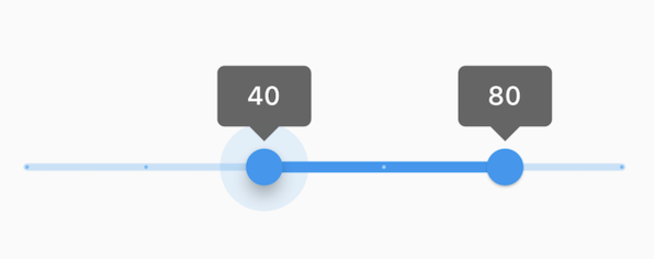
diff --git a/packages/flutter/lib/src/material/search.dart b/packages/flutter/lib/src/material/search.dart
index af9860c..74fa98a 100644
--- a/packages/flutter/lib/src/material/search.dart
+++ b/packages/flutter/lib/src/material/search.dart
@@ -17,9 +17,6 @@
 import 'text_field.dart';
 import 'theme.dart';

-// Examples can assume:
-// // @dart = 2.9
-
 /// Shows a full screen search page and returns the search result selected by
 /// the user when the page is closed.
 ///
@@ -107,7 +104,7 @@
   /// ```dart
   /// class CustomSearchHintDelegate extends SearchDelegate {
   ///   CustomSearchHintDelegate({
-  ///     String hintText,
+  ///     required String hintText,
   ///   }) : super(
   ///     searchFieldLabel: hintText,
   ///     keyboardType: TextInputType.text,
diff --git a/packages/flutter/lib/src/material/slider.dart b/packages/flutter/lib/src/material/slider.dart
index 7a60281..64f7f41 100644
--- a/packages/flutter/lib/src/material/slider.dart
+++ b/packages/flutter/lib/src/material/slider.dart
@@ -21,7 +21,6 @@ import 'theme.dart'; // Examples can assume: -// // @dart = 2.9 // int _dollars = 0; // int _duelCommandment = 1; // void setState(VoidCallback fn) { } @@ -40,7 +39,7 @@ /// /// {@youtube 560 315 https://www.youtube.com/watch?v=ufb4gIPDmEs} /// -/// {@tool dartpad --template=stateful_widget_scaffold_no_null_safety} +/// {@tool dartpad --template=stateful_widget_scaffold} /// /// 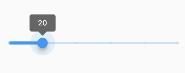
diff --git a/packages/flutter/lib/src/material/slider_theme.dart b/packages/flutter/lib/src/material/slider_theme.dart
index c86b17a..65367d5 100644
--- a/packages/flutter/lib/src/material/slider_theme.dart
+++ b/packages/flutter/lib/src/material/slider_theme.dart
@@ -13,9 +13,6 @@
 import 'theme.dart';
 import 'theme_data.dart';

-// Examples can assume:
-// // @dart = 2.9
-
 /// Applies a slider theme to descendant [Slider] widgets.
 ///
 /// A slider theme describes the colors and shape choices of the slider
@@ -93,7 +90,7 @@
   /// }
   ///
   /// class LaunchState extends State<Launch> {
-  ///   double _rocketThrust;
+  ///   double _rocketThrust = 0;
   ///
   ///   @override
   ///   Widget build(BuildContext context) {
@@ -253,7 +250,7 @@
   /// }
   ///
   /// class BlissfulState extends State<Blissful> {
-  ///   double _bliss;
+  ///   double _bliss = 0;
   ///
   ///   @override
   ///   Widget build(BuildContext context) {
diff --git a/packages/flutter/lib/src/material/text_form_field.dart b/packages/flutter/lib/src/material/text_form_field.dart
index f17bbac..ef43fdf 100644
--- a/packages/flutter/lib/src/material/text_form_field.dart
+++ b/packages/flutter/lib/src/material/text_form_field.dart
@@ -11,9 +11,6 @@

 export 'package:flutter/services.dart' show SmartQuotesType, SmartDashesType;

-// Examples can assume:
-// // @dart = 2.9
-
 /// A [FormField] that contains a [TextField].
 ///
 /// This is a convenience widget that wraps a [TextField] widget in a
@@ -59,18 +56,18 @@
 ///     hintText: 'What do people call you?',
 ///     labelText: 'Name *',
 ///   ),
-///   onSaved: (String value) {
+///   onSaved: (String? value) {
 ///     // This optional block of code can be used to run
 ///     // code when the user saves the form.
 ///   },
-///   validator: (String value) {
-///     return value.contains('@') ? 'Do not use the @ char.' : null;
+///   validator: (String? value) {
+///     return (value != null && value.contains('@')) ? 'Do not use the @ char.' : null;
 ///   },
 /// )
 /// ```
 /// {@end-tool}
 ///
-/// {@tool dartpad --template=stateful_widget_material_no_null_safety}
+/// {@tool dartpad --template=stateful_widget_material}
 /// This example shows how to move the focus to the next field when the user
 /// presses the SPACE key.
 ///
@@ -91,7 +88,7 @@
 ///           child: Form(
 ///             autovalidateMode: AutovalidateMode.always,
 ///             onChanged: () {
-///               Form.of(primaryFocus.context).save();
+///               Form.of(primaryFocus!.context!)!.save();
 ///             },
 ///             child: Wrap(
 ///               children: List<Widget>.generate(5, (int index) {
@@ -100,7 +97,7 @@
 ///                   child: ConstrainedBox(
 ///                     constraints: BoxConstraints.tight(const Size(200, 50)),
 ///                     child: TextFormField(
-///                       onSaved: (String value) {
+///                       onSaved: (String? value) {
 ///                         print('Value for field $index saved as "$value"');
 ///                       },
 ///                     ),