| // Copyright 2014 The Flutter Authors. All rights reserved. |
| // Use of this source code is governed by a BSD-style license that can be |
| // found in the LICENSE file. |
| |
| import 'package:flutter/widgets.dart'; |
| |
| import 'list_tile.dart'; |
| import 'list_tile_theme.dart'; |
| import 'material_state.dart'; |
| import 'switch.dart'; |
| import 'switch_theme.dart'; |
| import 'theme.dart'; |
| import 'theme_data.dart'; |
| |
| // Examples can assume: |
| // void setState(VoidCallback fn) { } |
| // bool _isSelected = true; |
| |
| enum _SwitchListTileType { material, adaptive } |
| |
| /// A [ListTile] with a [Switch]. In other words, a switch with a label. |
| /// |
| /// {@youtube 560 315 https://www.youtube.com/watch?v=0igIjvtEWNU} |
| /// |
| /// The entire list tile is interactive: tapping anywhere in the tile toggles |
| /// the switch. Tapping and dragging the [Switch] also triggers the [onChanged] |
| /// callback. |
| /// |
| /// To ensure that [onChanged] correctly triggers, the state passed |
| /// into [value] must be properly managed. This is typically done by invoking |
| /// [State.setState] in [onChanged] to toggle the state value. |
| /// |
| /// The [value], [onChanged], [activeColor], [activeThumbImage], and |
| /// [inactiveThumbImage] properties of this widget are identical to the |
| /// similarly-named properties on the [Switch] widget. |
| /// |
| /// The [title], [subtitle], [isThreeLine], and [dense] properties are like |
| /// those of the same name on [ListTile]. |
| /// |
| /// The [selected] property on this widget is similar to the [ListTile.selected] |
| /// property. This tile's [activeColor] is used for the selected item's text color, or |
| /// the theme's [SwitchThemeData.overlayColor] if [activeColor] is null. |
| /// |
| /// This widget does not coordinate the [selected] state and the |
| /// [value]; to have the list tile appear selected when the |
| /// switch button is on, use the same value for both. |
| /// |
| /// The switch is shown on the right by default in left-to-right languages (i.e. |
| /// in the [ListTile.trailing] slot) which can be changed using [controlAffinity]. |
| /// The [secondary] widget is placed in the [ListTile.leading] slot. |
| /// |
| /// This widget requires a [Material] widget ancestor in the tree to paint |
| /// itself on, which is typically provided by the app's [Scaffold]. |
| /// The [tileColor], and [selectedTileColor] are not painted by the |
| /// [SwitchListTile] itself but by the [Material] widget ancestor. In this |
| /// case, one can wrap a [Material] widget around the [SwitchListTile], e.g.: |
| /// |
| /// {@tool snippet} |
| /// ```dart |
| /// ColoredBox( |
| /// color: Colors.green, |
| /// child: Material( |
| /// child: SwitchListTile( |
| /// tileColor: Colors.red, |
| /// title: const Text('SwitchListTile with red background'), |
| /// value: true, |
| /// onChanged:(bool? value) { }, |
| /// ), |
| /// ), |
| /// ) |
| /// ``` |
| /// {@end-tool} |
| /// |
| /// ## Performance considerations when wrapping [SwitchListTile] with [Material] |
| /// |
| /// Wrapping a large number of [SwitchListTile]s individually with [Material]s |
| /// is expensive. Consider only wrapping the [SwitchListTile]s that require it |
| /// or include a common [Material] ancestor where possible. |
| /// |
| /// To show the [SwitchListTile] as disabled, pass null as the [onChanged] |
| /// callback. |
| /// |
| /// {@tool dartpad} |
| /// 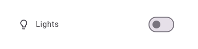 |
| /// |
| /// This widget shows a switch that, when toggled, changes the state of a [bool] |
| /// member field called `_lights`. |
| /// |
| /// ** See code in examples/api/lib/material/switch_list_tile/switch_list_tile.0.dart ** |
| /// {@end-tool} |
| /// |
| /// ## Semantics in SwitchListTile |
| /// |
| /// Since the entirety of the SwitchListTile is interactive, it should represent |
| /// itself as a single interactive entity. |
| /// |
| /// To do so, a SwitchListTile widget wraps its children with a [MergeSemantics] |
| /// widget. [MergeSemantics] will attempt to merge its descendant [Semantics] |
| /// nodes into one node in the semantics tree. Therefore, SwitchListTile will |
| /// throw an error if any of its children requires its own [Semantics] node. |
| /// |
| /// For example, you cannot nest a [RichText] widget as a descendant of |
| /// SwitchListTile. [RichText] has an embedded gesture recognizer that |
| /// requires its own [Semantics] node, which directly conflicts with |
| /// SwitchListTile's desire to merge all its descendants' semantic nodes |
| /// into one. Therefore, it may be necessary to create a custom radio tile |
| /// widget to accommodate similar use cases. |
| /// |
| /// {@tool dartpad} |
| /// 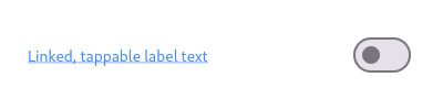 |
| /// |
| /// Here is an example of a custom labeled radio widget, called |
| /// LinkedLabelRadio, that includes an interactive [RichText] widget that |
| /// handles tap gestures. |
| /// |
| /// ** See code in examples/api/lib/material/switch_list_tile/switch_list_tile.1.dart ** |
| /// {@end-tool} |
| /// |
| /// ## SwitchListTile isn't exactly what I want |
| /// |
| /// If the way SwitchListTile pads and positions its elements isn't quite what |
| /// you're looking for, you can create custom labeled switch widgets by |
| /// combining [Switch] with other widgets, such as [Text], [Padding] and |
| /// [InkWell]. |
| /// |
| /// {@tool dartpad} |
| /// 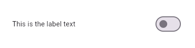 |
| /// |
| /// Here is an example of a custom LabeledSwitch widget, but you can easily |
| /// make your own configurable widget. |
| /// |
| /// ** See code in examples/api/lib/material/switch_list_tile/switch_list_tile.2.dart ** |
| /// {@end-tool} |
| /// |
| /// See also: |
| /// |
| /// * [ListTileTheme], which can be used to affect the style of list tiles, |
| /// including switch list tiles. |
| /// * [CheckboxListTile], a similar widget for checkboxes. |
| /// * [RadioListTile], a similar widget for radio buttons. |
| /// * [ListTile] and [Switch], the widgets from which this widget is made. |
| class SwitchListTile extends StatelessWidget { |
| /// Creates a combination of a list tile and a switch. |
| /// |
| /// The switch tile itself does not maintain any state. Instead, when the |
| /// state of the switch changes, the widget calls the [onChanged] callback. |
| /// Most widgets that use a switch will listen for the [onChanged] callback |
| /// and rebuild the switch tile with a new [value] to update the visual |
| /// appearance of the switch. |
| /// |
| /// The following arguments are required: |
| /// |
| /// * [value] determines whether this switch is on or off. |
| /// * [onChanged] is called when the user toggles the switch on or off. |
| const SwitchListTile({ |
| super.key, |
| required this.value, |
| required this.onChanged, |
| this.tileColor, |
| this.activeColor, |
| this.activeTrackColor, |
| this.inactiveThumbColor, |
| this.inactiveTrackColor, |
| this.activeThumbImage, |
| this.inactiveThumbImage, |
| this.title, |
| this.subtitle, |
| this.isThreeLine = false, |
| this.dense, |
| this.contentPadding, |
| this.secondary, |
| this.selected = false, |
| this.autofocus = false, |
| this.controlAffinity = ListTileControlAffinity.platform, |
| this.shape, |
| this.selectedTileColor, |
| this.visualDensity, |
| this.focusNode, |
| this.onFocusChange, |
| this.enableFeedback, |
| this.hoverColor, |
| }) : _switchListTileType = _SwitchListTileType.material, |
| assert(value != null), |
| assert(isThreeLine != null), |
| assert(!isThreeLine || subtitle != null), |
| assert(selected != null), |
| assert(autofocus != null); |
| |
| /// Creates a Material [ListTile] with an adaptive [Switch], following |
| /// Material design's |
| /// [Cross-platform guidelines](https://material.io/design/platform-guidance/cross-platform-adaptation.html). |
| /// |
| /// This widget uses [Switch.adaptive] to change the graphics of the switch |
| /// component based on the ambient [ThemeData.platform]. On iOS and macOS, a |
| /// [CupertinoSwitch] will be used. On other platforms a Material design |
| /// [Switch] will be used. |
| /// |
| /// If a [CupertinoSwitch] is created, the following parameters are |
| /// ignored: [activeTrackColor], [inactiveThumbColor], [inactiveTrackColor], |
| /// [activeThumbImage], [inactiveThumbImage]. |
| const SwitchListTile.adaptive({ |
| super.key, |
| required this.value, |
| required this.onChanged, |
| this.tileColor, |
| this.activeColor, |
| this.activeTrackColor, |
| this.inactiveThumbColor, |
| this.inactiveTrackColor, |
| this.activeThumbImage, |
| this.inactiveThumbImage, |
| this.title, |
| this.subtitle, |
| this.isThreeLine = false, |
| this.dense, |
| this.contentPadding, |
| this.secondary, |
| this.selected = false, |
| this.autofocus = false, |
| this.controlAffinity = ListTileControlAffinity.platform, |
| this.shape, |
| this.selectedTileColor, |
| this.visualDensity, |
| this.focusNode, |
| this.onFocusChange, |
| this.enableFeedback, |
| this.hoverColor, |
| }) : _switchListTileType = _SwitchListTileType.adaptive, |
| assert(value != null), |
| assert(isThreeLine != null), |
| assert(!isThreeLine || subtitle != null), |
| assert(selected != null), |
| assert(autofocus != null); |
| |
| /// Whether this switch is checked. |
| /// |
| /// This property must not be null. |
| final bool value; |
| |
| /// Called when the user toggles the switch on or off. |
| /// |
| /// The switch passes the new value to the callback but does not actually |
| /// change state until the parent widget rebuilds the switch tile with the |
| /// new value. |
| /// |
| /// If null, the switch will be displayed as disabled. |
| /// |
| /// The callback provided to [onChanged] should update the state of the parent |
| /// [StatefulWidget] using the [State.setState] method, so that the parent |
| /// gets rebuilt; for example: |
| /// |
| /// {@tool snippet} |
| /// ```dart |
| /// SwitchListTile( |
| /// value: _isSelected, |
| /// onChanged: (bool newValue) { |
| /// setState(() { |
| /// _isSelected = newValue; |
| /// }); |
| /// }, |
| /// title: const Text('Selection'), |
| /// ) |
| /// ``` |
| /// {@end-tool} |
| final ValueChanged<bool>? onChanged; |
| |
| /// The color to use when this switch is on. |
| /// |
| /// Defaults to [ColorScheme.secondary] of the current [Theme]. |
| final Color? activeColor; |
| |
| /// The color to use on the track when this switch is on. |
| /// |
| /// Defaults to [ThemeData.toggleableActiveColor] with the opacity set at 50%. |
| /// |
| /// Ignored if created with [SwitchListTile.adaptive]. |
| final Color? activeTrackColor; |
| |
| /// The color to use on the thumb when this switch is off. |
| /// |
| /// Defaults to the colors described in the Material design specification. |
| /// |
| /// Ignored if created with [SwitchListTile.adaptive]. |
| final Color? inactiveThumbColor; |
| |
| /// The color to use on the track when this switch is off. |
| /// |
| /// Defaults to the colors described in the Material design specification. |
| /// |
| /// Ignored if created with [SwitchListTile.adaptive]. |
| final Color? inactiveTrackColor; |
| |
| /// {@macro flutter.material.ListTile.tileColor} |
| final Color? tileColor; |
| |
| /// An image to use on the thumb of this switch when the switch is on. |
| final ImageProvider? activeThumbImage; |
| |
| /// An image to use on the thumb of this switch when the switch is off. |
| /// |
| /// Ignored if created with [SwitchListTile.adaptive]. |
| final ImageProvider? inactiveThumbImage; |
| |
| /// The primary content of the list tile. |
| /// |
| /// Typically a [Text] widget. |
| final Widget? title; |
| |
| /// Additional content displayed below the title. |
| /// |
| /// Typically a [Text] widget. |
| final Widget? subtitle; |
| |
| /// A widget to display on the opposite side of the tile from the switch. |
| /// |
| /// Typically an [Icon] widget. |
| final Widget? secondary; |
| |
| /// Whether this list tile is intended to display three lines of text. |
| /// |
| /// If false, the list tile is treated as having one line if the subtitle is |
| /// null and treated as having two lines if the subtitle is non-null. |
| final bool isThreeLine; |
| |
| /// Whether this list tile is part of a vertically dense list. |
| /// |
| /// If this property is null then its value is based on [ListTileThemeData.dense]. |
| final bool? dense; |
| |
| /// The tile's internal padding. |
| /// |
| /// Insets a [SwitchListTile]'s contents: its [title], [subtitle], |
| /// [secondary], and [Switch] widgets. |
| /// |
| /// If null, [ListTile]'s default of `EdgeInsets.symmetric(horizontal: 16.0)` |
| /// is used. |
| final EdgeInsetsGeometry? contentPadding; |
| |
| /// Whether to render icons and text in the [activeColor]. |
| /// |
| /// No effort is made to automatically coordinate the [selected] state and the |
| /// [value] state. To have the list tile appear selected when the switch is |
| /// on, pass the same value to both. |
| /// |
| /// Normally, this property is left to its default value, false. |
| final bool selected; |
| |
| /// {@macro flutter.widgets.Focus.autofocus} |
| final bool autofocus; |
| |
| /// If adaptive, creates the switch with [Switch.adaptive]. |
| final _SwitchListTileType _switchListTileType; |
| |
| /// Defines the position of control and [secondary], relative to text. |
| /// |
| /// By default, the value of [controlAffinity] is [ListTileControlAffinity.platform]. |
| final ListTileControlAffinity controlAffinity; |
| |
| /// {@macro flutter.material.ListTile.shape} |
| final ShapeBorder? shape; |
| |
| /// If non-null, defines the background color when [SwitchListTile.selected] is true. |
| final Color? selectedTileColor; |
| |
| /// Defines how compact the list tile's layout will be. |
| /// |
| /// {@macro flutter.material.themedata.visualDensity} |
| final VisualDensity? visualDensity; |
| |
| /// {@macro flutter.widgets.Focus.focusNode} |
| final FocusNode? focusNode; |
| |
| /// {@macro flutter.material.inkwell.onFocusChange} |
| final ValueChanged<bool>? onFocusChange; |
| |
| /// {@macro flutter.material.ListTile.enableFeedback} |
| /// |
| /// See also: |
| /// |
| /// * [Feedback] for providing platform-specific feedback to certain actions. |
| final bool? enableFeedback; |
| |
| /// The color for the tile's [Material] when a pointer is hovering over it. |
| final Color? hoverColor; |
| |
| @override |
| Widget build(BuildContext context) { |
| final Widget control; |
| switch (_switchListTileType) { |
| case _SwitchListTileType.adaptive: |
| control = Switch.adaptive( |
| value: value, |
| onChanged: onChanged, |
| activeColor: activeColor, |
| activeThumbImage: activeThumbImage, |
| inactiveThumbImage: inactiveThumbImage, |
| materialTapTargetSize: MaterialTapTargetSize.shrinkWrap, |
| activeTrackColor: activeTrackColor, |
| inactiveTrackColor: inactiveTrackColor, |
| inactiveThumbColor: inactiveThumbColor, |
| autofocus: autofocus, |
| onFocusChange: onFocusChange, |
| ); |
| break; |
| |
| case _SwitchListTileType.material: |
| control = Switch( |
| value: value, |
| onChanged: onChanged, |
| activeColor: activeColor, |
| activeThumbImage: activeThumbImage, |
| inactiveThumbImage: inactiveThumbImage, |
| materialTapTargetSize: MaterialTapTargetSize.shrinkWrap, |
| activeTrackColor: activeTrackColor, |
| inactiveTrackColor: inactiveTrackColor, |
| inactiveThumbColor: inactiveThumbColor, |
| autofocus: autofocus, |
| onFocusChange: onFocusChange, |
| ); |
| } |
| |
| Widget? leading, trailing; |
| switch (controlAffinity) { |
| case ListTileControlAffinity.leading: |
| leading = control; |
| trailing = secondary; |
| break; |
| case ListTileControlAffinity.trailing: |
| case ListTileControlAffinity.platform: |
| leading = secondary; |
| trailing = control; |
| break; |
| } |
| |
| final ThemeData theme = Theme.of(context); |
| final SwitchThemeData switchTheme = SwitchTheme.of(context); |
| final Set<MaterialState> states = <MaterialState>{ |
| if (selected) MaterialState.selected, |
| }; |
| final Color effectiveActiveColor = activeColor |
| ?? switchTheme.thumbColor?.resolve(states) |
| ?? theme.colorScheme.secondary; |
| return MergeSemantics( |
| child: ListTile( |
| selectedColor: effectiveActiveColor, |
| leading: leading, |
| title: title, |
| subtitle: subtitle, |
| trailing: trailing, |
| isThreeLine: isThreeLine, |
| dense: dense, |
| contentPadding: contentPadding, |
| enabled: onChanged != null, |
| onTap: onChanged != null ? () { onChanged!(!value); } : null, |
| selected: selected, |
| selectedTileColor: selectedTileColor, |
| autofocus: autofocus, |
| shape: shape, |
| tileColor: tileColor, |
| visualDensity: visualDensity, |
| focusNode: focusNode, |
| onFocusChange: onFocusChange, |
| enableFeedback: enableFeedback, |
| hoverColor: hoverColor, |
| ), |
| ); |
| } |
| } |