change expand icon to use default icon colors (#21328)
diff --git a/packages/flutter/lib/src/material/colors.dart b/packages/flutter/lib/src/material/colors.dart
index 3c71007..dcf3909 100644
--- a/packages/flutter/lib/src/material/colors.dart
+++ b/packages/flutter/lib/src/material/colors.dart
@@ -321,6 +321,19 @@ /// but with different opacities. static const Color white70 = Color(0xB3FFFFFF); + /// White with 54% opacity. + /// + /// 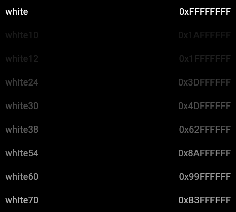 + /// + /// See also: + /// + /// * [ExpandIcon], which uses this color for dark themes. + /// * [Theme.of], which allows you to select colors from the current theme + /// rather than hard-coding colors in your build methods. + /// * [white, white30, white12, white10], which are variants on this color + /// but with different opacities. + static const Color white54 = Color(0x8AFFFFFF); + /// White with 32% opacity. /// /// Used for disabled radio buttons and the text of disabled flat buttons in dark themes.
diff --git a/packages/flutter/lib/src/material/expand_icon.dart b/packages/flutter/lib/src/material/expand_icon.dart
index ba7db38..57b2116 100644
--- a/packages/flutter/lib/src/material/expand_icon.dart
+++ b/packages/flutter/lib/src/material/expand_icon.dart
@@ -110,13 +110,14 @@
   Widget build(BuildContext context) {
     assert(debugCheckHasMaterial(context));
     final MaterialLocalizations localizations = MaterialLocalizations.of(context);
+    final ThemeData theme = Theme.of(context);
     final String onTapHint = widget.isExpanded ? localizations.expandedIconTapHint : localizations.collapsedIconTapHint;

     return new Semantics(
       onTapHint: widget.onPressed == null ? null : onTapHint,
       child: new IconButton(
         padding: widget.padding,
-        color: Colors.black38,
+        color: theme.brightness == Brightness.dark ? Colors.white54 : Colors.black54,
         onPressed: widget.onPressed == null ? null : _handlePressed,
         icon: new RotationTransition(
           turns: _iconTurns,