| // Copyright 2014 The Flutter Authors. All rights reserved. |
| // Use of this source code is governed by a BSD-style license that can be |
| // found in the LICENSE file. |
| |
| import 'dart:math' as math; |
| |
| import 'package:flutter/foundation.dart'; |
| import 'package:flutter/rendering.dart'; |
| import 'package:flutter/services.dart'; |
| import 'package:flutter/widgets.dart'; |
| |
| import 'app_bar_theme.dart'; |
| import 'back_button.dart'; |
| import 'color_scheme.dart'; |
| import 'constants.dart'; |
| import 'debug.dart'; |
| import 'flexible_space_bar.dart'; |
| import 'icon_button.dart'; |
| import 'icons.dart'; |
| import 'material.dart'; |
| import 'material_localizations.dart'; |
| import 'scaffold.dart'; |
| import 'tabs.dart'; |
| import 'text_theme.dart'; |
| import 'theme.dart'; |
| |
| const double _kLeadingWidth = kToolbarHeight; // So the leading button is square. |
| const double _kMaxTitleTextScaleFactor = 1.34; // TODO(perc): Add link to Material spec when available, https://github.com/flutter/flutter/issues/58769. |
| |
| // Bottom justify the toolbarHeight child which may overflow the top. |
| class _ToolbarContainerLayout extends SingleChildLayoutDelegate { |
| const _ToolbarContainerLayout(this.toolbarHeight); |
| |
| final double toolbarHeight; |
| |
| @override |
| BoxConstraints getConstraintsForChild(BoxConstraints constraints) { |
| return constraints.tighten(height: toolbarHeight); |
| } |
| |
| @override |
| Size getSize(BoxConstraints constraints) { |
| return Size(constraints.maxWidth, toolbarHeight); |
| } |
| |
| @override |
| Offset getPositionForChild(Size size, Size childSize) { |
| return Offset(0.0, size.height - childSize.height); |
| } |
| |
| @override |
| bool shouldRelayout(_ToolbarContainerLayout oldDelegate) => |
| toolbarHeight != oldDelegate.toolbarHeight; |
| } |
| |
| /// A material design app bar. |
| /// |
| /// An app bar consists of a toolbar and potentially other widgets, such as a |
| /// [TabBar] and a [FlexibleSpaceBar]. App bars typically expose one or more |
| /// common [actions] with [IconButton]s which are optionally followed by a |
| /// [PopupMenuButton] for less common operations (sometimes called the "overflow |
| /// menu"). |
| /// |
| /// App bars are typically used in the [Scaffold.appBar] property, which places |
| /// the app bar as a fixed-height widget at the top of the screen. For a scrollable |
| /// app bar, see [SliverAppBar], which embeds an [AppBar] in a sliver for use in |
| /// a [CustomScrollView]. |
| /// |
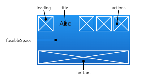
| /// The AppBar displays the toolbar widgets, [leading], [title], and [actions], |
| /// above the [bottom] (if any). The [bottom] is usually used for a [TabBar]. If |
| /// a [flexibleSpace] widget is specified then it is stacked behind the toolbar |
| /// and the bottom widget. The following diagram shows where each of these slots |
| /// appears in the toolbar when the writing language is left-to-right (e.g. |
| /// English): |
| /// |
| /// The [AppBar] insets its content based on the ambient [MediaQuery]'s padding, |
| /// to avoid system UI intrusions. It's taken care of by [Scaffold] when used in |
| /// the [Scaffold.appBar] property. When animating an [AppBar], unexpected |
| /// [MediaQuery] changes (as is common in [Hero] animations) may cause the content |
| /// to suddenly jump. Wrap the [AppBar] in a [MediaQuery] widget, and adjust its |
| /// padding such that the animation is smooth. |
| /// |
| ///  |
| /// |
| /// If the [leading] widget is omitted, but the [AppBar] is in a [Scaffold] with |
| /// a [Drawer], then a button will be inserted to open the drawer. Otherwise, if |
| /// the nearest [Navigator] has any previous routes, a [BackButton] is inserted |
| /// instead. This behavior can be turned off by setting the [automaticallyImplyLeading] |
| /// to false. In that case a null leading widget will result in the middle/title widget |
| /// stretching to start. |
| /// |
| /// {@tool dartpad --template=stateless_widget_material} |
| /// |
| /// This sample shows an [AppBar] with two simple actions. The first action |
| /// opens a [SnackBar], while the second action navigates to a new page. |
| /// |
| /// ```dart |
| /// Widget build(BuildContext context) { |
| /// return Scaffold( |
| /// appBar: AppBar( |
| /// title: const Text('AppBar Demo'), |
| /// actions: <Widget>[ |
| /// IconButton( |
| /// icon: const Icon(Icons.add_alert), |
| /// tooltip: 'Show Snackbar', |
| /// onPressed: () { |
| /// ScaffoldMessenger.of(context).showSnackBar( |
| /// const SnackBar(content: Text('This is a snackbar')) |
| /// ); |
| /// }, |
| /// ), |
| /// IconButton( |
| /// icon: const Icon(Icons.navigate_next), |
| /// tooltip: 'Go to the next page', |
| /// onPressed: () { |
| /// Navigator.push(context, MaterialPageRoute<void>( |
| /// builder: (BuildContext context) { |
| /// return Scaffold( |
| /// appBar: AppBar( |
| /// title: const Text('Next page'), |
| /// ), |
| /// body: const Center( |
| /// child: Text( |
| /// 'This is the next page', |
| /// style: TextStyle(fontSize: 24), |
| /// ), |
| /// ), |
| /// ); |
| /// }, |
| /// )); |
| /// }, |
| /// ), |
| /// ], |
| /// ), |
| /// body: const Center( |
| /// child: Text( |
| /// 'This is the home page', |
| /// style: TextStyle(fontSize: 24), |
| /// ), |
| /// ), |
| /// ); |
| /// } |
| /// ``` |
| /// {@end-tool} |
| /// |
| /// See also: |
| /// |
| /// * [Scaffold], which displays the [AppBar] in its [Scaffold.appBar] slot. |
| /// * [SliverAppBar], which uses [AppBar] to provide a flexible app bar that |
| /// can be used in a [CustomScrollView]. |
| /// * [TabBar], which is typically placed in the [bottom] slot of the [AppBar] |
| /// if the screen has multiple pages arranged in tabs. |
| /// * [IconButton], which is used with [actions] to show buttons on the app bar. |
| /// * [PopupMenuButton], to show a popup menu on the app bar, via [actions]. |
| /// * [FlexibleSpaceBar], which is used with [flexibleSpace] when the app bar |
| /// can expand and collapse. |
| /// * <https://material.io/design/components/app-bars-top.html> |
| /// * Cookbook: [Place a floating app bar above a list](https://flutter.dev/docs/cookbook/lists/floating-app-bar) |
| class AppBar extends StatefulWidget implements PreferredSizeWidget { |
| /// Creates a material design app bar. |
| /// |
| /// The arguments [primary], [toolbarOpacity], [bottomOpacity], |
| /// [backwardsCompatibility], and [automaticallyImplyLeading] must |
| /// not be null. Additionally, if [elevation] is specified, it must |
| /// be non-negative. |
| /// |
| /// Typically used in the [Scaffold.appBar] property. |
| AppBar({ |
| Key? key, |
| this.leading, |
| this.automaticallyImplyLeading = true, |
| this.title, |
| this.actions, |
| this.flexibleSpace, |
| this.bottom, |
| this.elevation, |
| this.shadowColor, |
| this.shape, |
| this.backgroundColor, |
| this.foregroundColor, |
| this.brightness, |
| this.iconTheme, |
| this.actionsIconTheme, |
| this.textTheme, |
| this.primary = true, |
| this.centerTitle, |
| this.excludeHeaderSemantics = false, |
| this.titleSpacing, |
| this.toolbarOpacity = 1.0, |
| this.bottomOpacity = 1.0, |
| this.toolbarHeight, |
| this.leadingWidth, |
| this.backwardsCompatibility, |
| this.toolbarTextStyle, |
| this.titleTextStyle, |
| this.systemOverlayStyle, |
| }) : assert(automaticallyImplyLeading != null), |
| assert(elevation == null || elevation >= 0.0), |
| assert(primary != null), |
| assert(toolbarOpacity != null), |
| assert(bottomOpacity != null), |
| preferredSize = Size.fromHeight(toolbarHeight ?? kToolbarHeight + (bottom?.preferredSize.height ?? 0.0)), |
| super(key: key); |
| |
| /// {@template flutter.material.appbar.leading} |
| /// A widget to display before the toolbar's [title]. |
| /// |
| /// Typically the [leading] widget is an [Icon] or an [IconButton]. |
| /// |
| /// Becomes the leading component of the [NavigationToolbar] built |
| /// by this widget. The [leading] widget's width and height are constrained to |
| /// be no bigger than [leadingWidth] and [toolbarHeight] respectively. |
| /// |
| /// If this is null and [automaticallyImplyLeading] is set to true, the |
| /// [AppBar] will imply an appropriate widget. For example, if the [AppBar] is |
| /// in a [Scaffold] that also has a [Drawer], the [Scaffold] will fill this |
| /// widget with an [IconButton] that opens the drawer (using [Icons.menu]). If |
| /// there's no [Drawer] and the parent [Navigator] can go back, the [AppBar] |
| /// will use a [BackButton] that calls [Navigator.maybePop]. |
| /// {@endtemplate} |
| /// |
| /// {@tool snippet} |
| /// |
| /// The following code shows how the drawer button could be manually specified |
| /// instead of relying on [automaticallyImplyLeading]: |
| /// |
| /// ```dart |
| /// AppBar( |
| /// leading: Builder( |
| /// builder: (BuildContext context) { |
| /// return IconButton( |
| /// icon: const Icon(Icons.menu), |
| /// onPressed: () { Scaffold.of(context).openDrawer(); }, |
| /// tooltip: MaterialLocalizations.of(context).openAppDrawerTooltip, |
| /// ); |
| /// }, |
| /// ), |
| /// ) |
| /// ``` |
| /// {@end-tool} |
| /// |
| /// The [Builder] is used in this example to ensure that the `context` refers |
| /// to that part of the subtree. That way this code snippet can be used even |
| /// inside the very code that is creating the [Scaffold] (in which case, |
| /// without the [Builder], the `context` wouldn't be able to see the |
| /// [Scaffold], since it would refer to an ancestor of that widget). |
| /// |
| /// See also: |
| /// |
| /// * [Scaffold.appBar], in which an [AppBar] is usually placed. |
| /// * [Scaffold.drawer], in which the [Drawer] is usually placed. |
| final Widget? leading; |
| |
| /// {@template flutter.material.appbar.automaticallyImplyLeading} |
| /// Controls whether we should try to imply the leading widget if null. |
| /// |
| /// If true and [leading] is null, automatically try to deduce what the leading |
| /// widget should be. If false and [leading] is null, leading space is given to [title]. |
| /// If leading widget is not null, this parameter has no effect. |
| /// {@endtemplate} |
| final bool automaticallyImplyLeading; |
| |
| /// {@template flutter.material.appbar.title} |
| /// The primary widget displayed in the app bar. |
| /// |
| /// Becomes the middle component of the [NavigationToolbar] built by this widget. |
| //. |
| /// Typically a [Text] widget that contains a description of the current |
| /// contents of the app. |
| /// {@endtemplate} |
| /// |
| /// The [title]'s width is constrained to fit within the remaining space |
| /// between the toolbar's [leading] and [actions] widgets. Its height is |
| /// _not_ constrained. The [title] is vertically centered and clipped to fit |
| /// within the toolbar, whose height is [toolbarHeight]. Typically this |
| /// isn't noticeable because a simple [Text] [title] will fit within the |
| /// toolbar by default. On the other hand, it is noticeable when a |
| /// widget with an intrinsic height that is greater than [toolbarHeight] |
| /// is used as the [title]. For example, when the height of an Image used |
| /// as the [title] exceeds [toolbarHeight], it will be centered and |
| /// clipped (top and bottom), which may be undesirable. In cases like this |
| /// the height of the [title] widget can be constrained. For example: |
| /// |
| /// ```dart |
| /// MaterialApp( |
| /// home: Scaffold( |
| /// appBar: AppBar( |
| /// title: SizedBox( |
| /// height: toolbarHeight, |
| /// child: Image.asset(logoAsset), |
| /// ), |
| /// toolbarHeight: toolbarHeight, |
| /// ), |
| /// ), |
| /// ) |
| /// ``` |
| final Widget? title; |
| |
| /// {@template flutter.material.appbar.actions} |
| /// A list of Widgets to display in a row after the [title] widget. |
| /// |
| /// Typically these widgets are [IconButton]s representing common operations. |
| /// For less common operations, consider using a [PopupMenuButton] as the |
| /// last action. |
| /// |
| /// The [actions] become the trailing component of the [NavigationToolbar] built |
| /// by this widget. The height of each action is constrained to be no bigger |
| /// than the [toolbarHeight]. |
| /// {@endtemplate} |
| /// |
| /// {@tool snippet} |
| /// |
| /// ```dart |
| /// Scaffold( |
| /// body: CustomScrollView( |
| /// primary: true, |
| /// slivers: <Widget>[ |
| /// SliverAppBar( |
| /// title: const Text('Hello World'), |
| /// actions: <Widget>[ |
| /// IconButton( |
| /// icon: const Icon(Icons.shopping_cart), |
| /// tooltip: 'Open shopping cart', |
| /// onPressed: () { |
| /// // handle the press |
| /// }, |
| /// ), |
| /// ], |
| /// ), |
| /// // ...rest of body... |
| /// ], |
| /// ), |
| /// ) |
| /// ``` |
| /// {@end-tool} |
| final List<Widget>? actions; |
| |
| /// {@template flutter.material.appbar.flexibleSpace} |
| /// This widget is stacked behind the toolbar and the tab bar. Its height will |
| /// be the same as the app bar's overall height. |
| /// |
| /// A flexible space isn't actually flexible unless the [AppBar]'s container |
| /// changes the [AppBar]'s size. A [SliverAppBar] in a [CustomScrollView] |
| /// changes the [AppBar]'s height when scrolled. |
| /// |
| /// Typically a [FlexibleSpaceBar]. See [FlexibleSpaceBar] for details. |
| /// {@endtemplate} |
| final Widget? flexibleSpace; |
| |
| /// {@template flutter.material.appbar.bottom} |
| /// This widget appears across the bottom of the app bar. |
| /// |
| /// Typically a [TabBar]. Only widgets that implement [PreferredSizeWidget] can |
| /// be used at the bottom of an app bar. |
| /// {@endtemplate} |
| /// |
| /// See also: |
| /// |
| /// * [PreferredSize], which can be used to give an arbitrary widget a preferred size. |
| final PreferredSizeWidget? bottom; |
| |
| /// {@template flutter.material.appbar.elevation} |
| /// The z-coordinate at which to place this app bar relative to its parent. |
| /// |
| /// This property controls the size of the shadow below the app bar. |
| /// |
| /// The value must be non-negative. |
| /// |
| /// If this property is null, then [AppBarTheme.elevation] of |
| /// [ThemeData.appBarTheme] is used. If that is also null, the |
| /// default value is 4. |
| /// {@endtemplate} |
| /// |
| /// See also: |
| /// |
| /// * [shadowColor], which is the color of the shadow below the app bar. |
| /// * [shape], which defines the shape of the app bar's [Material] and its |
| /// shadow. |
| final double? elevation; |
| |
| /// {@template flutter.material.appbar.shadowColor} |
| /// The of the shadow below the app bar. |
| /// |
| /// If this property is null, then [AppBarTheme.shadowColor] of |
| /// [ThemeData.appBarTheme] is used. If that is also null, the default value |
| /// is fully opaque black. |
| /// {@endtemplate} |
| /// |
| /// See also: |
| /// |
| /// * [elevation], which defines the size of the shadow below the app bar. |
| /// * [shape], which defines the shape of the app bar and its shadow. |
| final Color? shadowColor; |
| |
| /// {@template flutter.material.appbar.shape} |
| /// The shape of the app bar's material's shape as well as its shadow. |
| /// |
| /// A shadow is only displayed if the [elevation] is greater than |
| /// zero. |
| /// {@endtemplate} |
| /// |
| /// See also: |
| /// |
| /// * [elevation], which defines the size of the shadow below the app bar. |
| /// * [shadowColor], which is the color of the shadow below the app bar. |
| final ShapeBorder? shape; |
| |
| /// {@template flutter.material.appbar.backgroundColor} |
| /// The fill color to use for an app bar's [Material]. |
| /// |
| /// If null, then the [AppBarTheme.backgroundColor] is used. If that value is also |
| /// null, then [AppBar] uses the overall theme's [ColorScheme.primary] if the |
| /// overall theme's brightness is [Brightness.light], and [ColorScheme.surface] |
| /// if the overall theme's [brightness] is [Brightness.dark]. |
| /// {@endtemplate} |
| /// |
| /// See also: |
| /// |
| /// * [foregroundColor], which specifies the color for icons and text within |
| /// the app bar. |
| /// * [Theme.of], which returns the current overall Material theme as |
| /// a [ThemeData]. |
| /// * [ThemeData.colorScheme], the thirteen colors that most Material widget |
| /// default colors are based on. |
| /// * [ColorScheme.brightness], which indicates if the overall [Theme] |
| /// is light or dark. |
| final Color? backgroundColor; |
| |
| /// {@template flutter.material.appbar.foregroundColor} |
| /// The default color for [Text] and [Icon]s within the app bar. |
| /// |
| /// If null, then [AppBarTheme.foregroundColor] is used. If that |
| /// value is also null, then [AppBar] uses the overall theme's |
| /// [ColorScheme.onPrimary] if the overall theme's brightness is |
| /// [Brightness.light], and [ColorScheme.onSurface] if the overall |
| /// theme's [brightness] is [Brightness.dark]. |
| /// |
| /// This color is used to configure [DefaultTextStyle] that contains |
| /// the toolbar's children, and the default [IconTheme] widgets that |
| /// are created if [iconTheme] and [actionsIconTheme] are null. |
| /// {@endtemplate} |
| /// |
| /// See also: |
| /// |
| /// * [backgroundColor], which specifies the app bar's background color. |
| /// * [Theme.of], which returns the current overall Material theme as |
| /// a [ThemeData]. |
| /// * [ThemeData.colorScheme], the thirteen colors that most Material widget |
| /// default colors are based on. |
| /// * [ColorScheme.brightness], which indicates if the overall [Theme] |
| /// is light or dark. |
| final Color? foregroundColor; |
| |
| /// {@template flutter.material.appbar.brightness} |
| /// This property is obsolete, please use [systemOverlayStyle] instead. |
| /// |
| /// Determines the brightness of the [SystemUiOverlayStyle]: for |
| /// [Brightness.dark], [SystemUiOverlayStyle.light] is used and fo |
| /// [Brightness.light], [SystemUiOverlayStyle.dark] is used. |
| /// |
| /// If this value is null then [AppBarTheme.brightness] is used |
| /// and if that's null then overall theme's brightness is used. |
| /// |
| /// The AppBar is built within a `AnnotatedRegion<SystemUiOverlayStyle>` |
| /// which causes [SystemChrome.setSystemUIOverlayStyle] to be called |
| /// automatically. Apps should not enclose the AppBar with |
| /// their own [AnnotatedRegion]. |
| /// {@endtemplate} |
| /// |
| /// See also: |
| /// |
| /// * [Theme.of], which returns the current overall Material theme as |
| /// a [ThemeData]. |
| /// * [ThemeData.colorScheme], the thirteen colors that most Material widget |
| /// default colors are based on. |
| /// * [ColorScheme.brightness], which indicates if the overall [Theme] |
| /// is light or dark. |
| /// * [backwardsCompatibility], which forces AppBar to use this |
| /// obsolete property. |
| final Brightness? brightness; |
| |
| /// {@template flutter.material.appbar.iconTheme} |
| /// The color, opacity, and size to use for toolbar icons. |
| /// |
| /// If this property is null, then a copy of [ThemeData.iconTheme] |
| /// is used, with the [IconThemeData.color] set to the |
| /// app bar's [foregroundColor]. |
| /// {@endtemplate} |
| /// |
| /// See also: |
| /// |
| /// * [actionsIconTheme], which defines the appearance of icons in |
| /// in the [actions] list. |
| final IconThemeData? iconTheme; |
| |
| /// {@template flutter.material.appbar.actionsIconTheme} |
| /// The color, opacity, and size to use for the icons that appear in the app |
| /// bar's [actions]. |
| /// |
| /// This property should only be used when the [actions] should be |
| /// themed differently than the icon that appears in the app bar's [leading] |
| /// widget. |
| /// |
| /// If this property is null, then [AppBarTheme.actionsIconTheme] of |
| /// [ThemeData.appBarTheme] is used. If that is also null, then the value of |
| /// [iconTheme] is used. |
| /// {@endtemplate} |
| /// |
| /// See also: |
| /// |
| /// * [iconTheme], which defines the appearance of all of the toolbar icons. |
| final IconThemeData? actionsIconTheme; |
| |
| /// {@template flutter.material.appbar.textTheme} |
| /// The typographic styles to use for text in the app bar. Typically this is |
| /// set along with [brightness] [backgroundColor], [iconTheme]. |
| /// |
| /// If this property is null, then [AppBarTheme.textTheme] of |
| /// [ThemeData.appBarTheme] is used. If that is also null, then |
| /// [ThemeData.primaryTextTheme] is used. |
| /// {@endtemplate} |
| final TextTheme? textTheme; |
| |
| /// {@template flutter.material.appbar.primary} |
| /// Whether this app bar is being displayed at the top of the screen. |
| /// |
| /// If true, the app bar's toolbar elements and [bottom] widget will be |
| /// padded on top by the height of the system status bar. The layout |
| /// of the [flexibleSpace] is not affected by the [primary] property. |
| /// {@endtemplate} |
| final bool primary; |
| |
| /// {@template flutter.material.appbar.centerTitle} |
| /// Whether the title should be centered. |
| /// |
| /// If this property is null, then [AppBarTheme.centerTitle] of |
| /// [ThemeData.appBarTheme] is used. If that is also null, then value is |
| /// adapted to the current [TargetPlatform]. |
| /// {@endtemplate} |
| final bool? centerTitle; |
| |
| /// {@template flutter.material.appbar.excludeHeaderSemantics} |
| /// Whether the title should be wrapped with header [Semantics]. |
| /// |
| /// Defaults to false. |
| /// {@endtemplate} |
| final bool excludeHeaderSemantics; |
| |
| /// {@template flutter.material.appbar.titleSpacing} |
| /// The spacing around [title] content on the horizontal axis. This spacing is |
| /// applied even if there is no [leading] content or [actions]. If you want |
| /// [title] to take all the space available, set this value to 0.0. |
| /// |
| /// If this property is null, then [AppBarTheme.titleSpacing] of |
| /// [ThemeData.appBarTheme] is used. If that is also null, then the |
| /// default value is [NavigationToolbar.kMiddleSpacing]. |
| /// {@endtemplate} |
| final double? titleSpacing; |
| |
| /// {@template flutter.material.appbar.toolbarOpacity} |
| /// How opaque the toolbar part of the app bar is. |
| /// |
| /// A value of 1.0 is fully opaque, and a value of 0.0 is fully transparent. |
| /// |
| /// Typically, this value is not changed from its default value (1.0). It is |
| /// used by [SliverAppBar] to animate the opacity of the toolbar when the app |
| /// bar is scrolled. |
| /// {@endtemplate} |
| final double toolbarOpacity; |
| |
| /// {@template flutter.material.appbar.bottomOpacity} |
| /// How opaque the bottom part of the app bar is. |
| /// |
| /// A value of 1.0 is fully opaque, and a value of 0.0 is fully transparent. |
| /// |
| /// Typically, this value is not changed from its default value (1.0). It is |
| /// used by [SliverAppBar] to animate the opacity of the toolbar when the app |
| /// bar is scrolled. |
| /// {@endtemplate} |
| final double bottomOpacity; |
| |
| /// {@template flutter.material.appbar.preferredSize} |
| /// A size whose height is the sum of [toolbarHeight] and the [bottom] widget's |
| /// preferred height. |
| /// |
| /// [Scaffold] uses this size to set its app bar's height. |
| /// {@endtemplate} |
| @override |
| final Size preferredSize; |
| |
| /// {@template flutter.material.appbar.toolbarHeight} |
| /// Defines the height of the toolbar component of an [AppBar]. |
| /// |
| /// By default, the value of `toolbarHeight` is [kToolbarHeight]. |
| /// {@endtemplate} |
| final double? toolbarHeight; |
| |
| /// {@template flutter.material.appbar.leadingWidth} |
| /// Defines the width of [leading] widget. |
| /// |
| /// By default, the value of `leadingWidth` is 56.0. |
| /// {@endtemplate} |
| final double? leadingWidth; |
| |
| /// {@template flutter.material.appbar.backwardsCompatibility} |
| /// If true, preserves the original defaults for the [backgroundColor], |
| /// [iconTheme], [actionsIconTheme] properties, and the original use of |
| /// the [textTheme] and [brightness] properties. |
| /// |
| /// If this property is null, then [AppBarTheme.backwardsCompatibility] of |
| /// [ThemeData.appBarTheme] is used. If that is also null, the default |
| /// value is true. |
| /// |
| /// This is a temporary property. When setting it to false is no |
| /// longer considered a breaking change, it will be depreacted and |
| /// its default value will be changed to false. App developers are |
| /// encouraged to opt into the new features by setting it to false |
| /// and using the [foregroundColor] and [systemOverlayStyle] |
| /// properties as needed. |
| /// {@endtemplate} |
| final bool? backwardsCompatibility; |
| |
| /// {@template flutter.material.appbar.toolbarTextStyle} |
| /// The default text style for the AppBar's [leading], and |
| /// [actions] widgets, but not its [title]. |
| /// |
| /// If this property is null, then [AppBarTheme.toolbarTextStyle] of |
| /// [ThemeData.appBarTheme] is used. If that is also null, the default |
| /// value is a copy of the overall theme's [TextTheme.bodyText2] |
| /// [TextStyle], with color set to the app bar's [foregroundColor]. |
| /// {@endtemplate} |
| /// |
| /// See also: |
| /// |
| /// * [titleTextStyle], which overrides the default text style for the [title]. |
| /// * [DefaultTextStyle], which overrides the default text style for all of the |
| /// the widgets in a subtree. |
| final TextStyle? toolbarTextStyle; |
| |
| /// {@template flutter.material.appbar.titleTextStyle} |
| /// The default text style for the AppBar's [title] widget. |
| /// |
| /// If this property is null, then [AppBarTheme.titleTextStyle] of |
| /// [ThemeData.appBarTheme] is used. If that is also null, the default |
| /// value is a copy of the overall theme's [TextTheme.headline6] |
| /// [TextStyle], with color set to the app bar's [foregroundColor]. |
| /// {@endtemplate} |
| /// |
| /// See also: |
| /// |
| /// * [toolbarTextStyle], which is the default text style for the AppBar's |
| /// [title], [leading], and [actions] widgets, also known as the |
| /// AppBar's "toolbar". |
| /// * [DefaultTextStyle], which overrides the default text style for all of the |
| /// the widgets in a subtree. |
| final TextStyle? titleTextStyle; |
| |
| /// {@template flutter.material.appbar.systemOverlayStyle} |
| /// Specifies the style to use for the system overlays that overlap the AppBar. |
| /// |
| /// If this property is null, then [SystemUiOverlayStyle.light] is used if the |
| /// overall theme is dark, [SystemUiOverlayStyle.dark] otherwise. Theme brightness |
| /// is defined by [ColorScheme.brightness] for [ThemeData.colorScheme]. |
| /// |
| /// The AppBar's descendants are built within a |
| /// `AnnotatedRegion<SystemUiOverlayStyle>` widget, which causes |
| /// [SystemChrome.setSystemUIOverlayStyle] to be called |
| /// automatically. Apps should not enclose an AppBar with their |
| /// own [AnnotatedRegion]. |
| /// {@endtemplate} |
| // |
| /// See also: |
| /// * [SystemChrome.setSystemUIOverlayStyle] |
| final SystemUiOverlayStyle? systemOverlayStyle; |
| |
| |
| bool _getEffectiveCenterTitle(ThemeData theme) { |
| if (centerTitle != null) |
| return centerTitle!; |
| if (theme.appBarTheme.centerTitle != null) |
| return theme.appBarTheme.centerTitle!; |
| assert(theme.platform != null); |
| switch (theme.platform) { |
| case TargetPlatform.android: |
| case TargetPlatform.fuchsia: |
| case TargetPlatform.linux: |
| case TargetPlatform.windows: |
| return false; |
| case TargetPlatform.iOS: |
| case TargetPlatform.macOS: |
| return actions == null || actions!.length < 2; |
| } |
| } |
| |
| @override |
| _AppBarState createState() => _AppBarState(); |
| } |
| |
| class _AppBarState extends State<AppBar> { |
| static const double _defaultElevation = 4.0; |
| static const Color _defaultShadowColor = Color(0xFF000000); |
| |
| void _handleDrawerButton() { |
| Scaffold.of(context).openDrawer(); |
| } |
| |
| void _handleDrawerButtonEnd() { |
| Scaffold.of(context).openEndDrawer(); |
| } |
| |
| @override |
| Widget build(BuildContext context) { |
| assert(!widget.primary || debugCheckHasMediaQuery(context)); |
| assert(debugCheckHasMaterialLocalizations(context)); |
| final ThemeData theme = Theme.of(context); |
| final ColorScheme colorScheme = theme.colorScheme; |
| final AppBarTheme appBarTheme = AppBarTheme.of(context); |
| final ScaffoldState? scaffold = Scaffold.maybeOf(context); |
| final ModalRoute<dynamic>? parentRoute = ModalRoute.of(context); |
| |
| final bool hasDrawer = scaffold?.hasDrawer ?? false; |
| final bool hasEndDrawer = scaffold?.hasEndDrawer ?? false; |
| final bool canPop = parentRoute?.canPop ?? false; |
| final bool useCloseButton = parentRoute is PageRoute<dynamic> && parentRoute.fullscreenDialog; |
| |
| final double toolbarHeight = widget.toolbarHeight ?? kToolbarHeight; |
| final bool backwardsCompatibility = widget.backwardsCompatibility ?? appBarTheme.backwardsCompatibility ?? true; |
| |
| final Color backgroundColor = backwardsCompatibility |
| ? widget.backgroundColor |
| ?? appBarTheme.backgroundColor |
| ?? theme.primaryColor |
| : widget.backgroundColor |
| ?? appBarTheme.backgroundColor |
| ?? (colorScheme.brightness == Brightness.dark ? colorScheme.surface : colorScheme.primary); |
| |
| final Color foregroundColor = widget.foregroundColor |
| ?? appBarTheme.foregroundColor |
| ?? (colorScheme.brightness == Brightness.dark ? colorScheme.onSurface : colorScheme.onPrimary); |
| |
| IconThemeData overallIconTheme = backwardsCompatibility |
| ? widget.iconTheme |
| ?? appBarTheme.iconTheme |
| ?? theme.primaryIconTheme |
| : widget.iconTheme |
| ?? appBarTheme.iconTheme |
| ?? theme.iconTheme.copyWith(color: foregroundColor); |
| |
| IconThemeData actionsIconTheme = widget.actionsIconTheme |
| ?? appBarTheme.actionsIconTheme |
| ?? overallIconTheme; |
| |
| TextStyle? toolbarTextStyle = backwardsCompatibility |
| ? widget.textTheme?.bodyText2 |
| ?? appBarTheme.textTheme?.bodyText2 |
| ?? theme.primaryTextTheme.bodyText2 |
| : widget.toolbarTextStyle |
| ?? appBarTheme.toolbarTextStyle |
| ?? theme.textTheme.bodyText2?.copyWith(color: foregroundColor); |
| |
| TextStyle? titleTextStyle = backwardsCompatibility |
| ? widget.textTheme?.headline6 |
| ?? appBarTheme.textTheme?.headline6 |
| ?? theme.primaryTextTheme.headline6 |
| : widget.titleTextStyle |
| ?? appBarTheme.titleTextStyle |
| ?? theme.textTheme.headline6?.copyWith(color: foregroundColor); |
| |
| if (widget.toolbarOpacity != 1.0) { |
| final double opacity = const Interval(0.25, 1.0, curve: Curves.fastOutSlowIn).transform(widget.toolbarOpacity); |
| if (titleTextStyle?.color != null) |
| titleTextStyle = titleTextStyle!.copyWith(color: titleTextStyle.color!.withOpacity(opacity)); |
| if (toolbarTextStyle?.color != null) |
| toolbarTextStyle = toolbarTextStyle!.copyWith(color: toolbarTextStyle.color!.withOpacity(opacity)); |
| overallIconTheme = overallIconTheme.copyWith( |
| opacity: opacity * (overallIconTheme.opacity ?? 1.0), |
| ); |
| actionsIconTheme = actionsIconTheme.copyWith( |
| opacity: opacity * (actionsIconTheme.opacity ?? 1.0), |
| ); |
| } |
| |
| Widget? leading = widget.leading; |
| if (leading == null && widget.automaticallyImplyLeading) { |
| if (hasDrawer) { |
| leading = IconButton( |
| icon: const Icon(Icons.menu), |
| onPressed: _handleDrawerButton, |
| tooltip: MaterialLocalizations.of(context).openAppDrawerTooltip, |
| ); |
| } else { |
| if (!hasEndDrawer && canPop) |
| leading = useCloseButton ? const CloseButton() : const BackButton(); |
| } |
| } |
| if (leading != null) { |
| leading = ConstrainedBox( |
| constraints: BoxConstraints.tightFor(width: widget.leadingWidth ?? _kLeadingWidth), |
| child: leading, |
| ); |
| } |
| |
| Widget? title = widget.title; |
| if (title != null) { |
| bool? namesRoute; |
| switch (theme.platform) { |
| case TargetPlatform.android: |
| case TargetPlatform.fuchsia: |
| case TargetPlatform.linux: |
| case TargetPlatform.windows: |
| namesRoute = true; |
| break; |
| case TargetPlatform.iOS: |
| case TargetPlatform.macOS: |
| break; |
| } |
| |
| title = _AppBarTitleBox(child: title); |
| if (!widget.excludeHeaderSemantics) { |
| title = Semantics( |
| namesRoute: namesRoute, |
| child: title, |
| header: true, |
| ); |
| } |
| |
| title = DefaultTextStyle( |
| style: titleTextStyle!, |
| softWrap: false, |
| overflow: TextOverflow.ellipsis, |
| child: title, |
| ); |
| |
| // Set maximum text scale factor to [_kMaxTitleTextScaleFactor] for the |
| // title to keep the visual hierarchy the same even with larger font |
| // sizes. To opt out, wrap the [title] widget in a [MediaQuery] widget |
| // with [MediaQueryData.textScaleFactor] set to |
| // `MediaQuery.textScaleFactorOf(context)`. |
| final MediaQueryData mediaQueryData = MediaQuery.of(context); |
| title = MediaQuery( |
| data: mediaQueryData.copyWith( |
| textScaleFactor: math.min( |
| mediaQueryData.textScaleFactor, |
| _kMaxTitleTextScaleFactor, |
| ), |
| ), |
| child: title, |
| ); |
| } |
| |
| Widget? actions; |
| if (widget.actions != null && widget.actions!.isNotEmpty) { |
| actions = Row( |
| mainAxisSize: MainAxisSize.min, |
| crossAxisAlignment: CrossAxisAlignment.stretch, |
| children: widget.actions!, |
| ); |
| } else if (hasEndDrawer) { |
| actions = IconButton( |
| icon: const Icon(Icons.menu), |
| onPressed: _handleDrawerButtonEnd, |
| tooltip: MaterialLocalizations.of(context).openAppDrawerTooltip, |
| ); |
| } |
| |
| // Allow the trailing actions to have their own theme if necessary. |
| if (actions != null) { |
| actions = IconTheme.merge( |
| data: actionsIconTheme, |
| child: actions, |
| ); |
| } |
| |
| final Widget toolbar = NavigationToolbar( |
| leading: leading, |
| middle: title, |
| trailing: actions, |
| centerMiddle: widget._getEffectiveCenterTitle(theme), |
| middleSpacing: widget.titleSpacing ?? appBarTheme.titleSpacing ?? NavigationToolbar.kMiddleSpacing, |
| ); |
| |
| // If the toolbar is allocated less than toolbarHeight make it |
| // appear to scroll upwards within its shrinking container. |
| Widget appBar = ClipRect( |
| child: CustomSingleChildLayout( |
| delegate: _ToolbarContainerLayout(toolbarHeight), |
| child: IconTheme.merge( |
| data: overallIconTheme, |
| child: DefaultTextStyle( |
| style: toolbarTextStyle!, |
| child: toolbar, |
| ), |
| ), |
| ), |
| ); |
| if (widget.bottom != null) { |
| appBar = Column( |
| mainAxisAlignment: MainAxisAlignment.spaceBetween, |
| children: <Widget>[ |
| Flexible( |
| child: ConstrainedBox( |
| constraints: BoxConstraints(maxHeight: toolbarHeight), |
| child: appBar, |
| ), |
| ), |
| if (widget.bottomOpacity == 1.0) |
| widget.bottom! |
| else |
| Opacity( |
| opacity: const Interval(0.25, 1.0, curve: Curves.fastOutSlowIn).transform(widget.bottomOpacity), |
| child: widget.bottom, |
| ), |
| ], |
| ); |
| } |
| |
| // The padding applies to the toolbar and tabbar, not the flexible space. |
| if (widget.primary) { |
| appBar = SafeArea( |
| bottom: false, |
| top: true, |
| child: appBar, |
| ); |
| } |
| |
| appBar = Align( |
| alignment: Alignment.topCenter, |
| child: appBar, |
| ); |
| |
| if (widget.flexibleSpace != null) { |
| appBar = Stack( |
| fit: StackFit.passthrough, |
| children: <Widget>[ |
| Semantics( |
| sortKey: const OrdinalSortKey(1.0), |
| explicitChildNodes: true, |
| child: widget.flexibleSpace, |
| ), |
| Semantics( |
| sortKey: const OrdinalSortKey(0.0), |
| explicitChildNodes: true, |
| // Creates a material widget to prevent the flexibleSpace from |
| // obscuring the ink splashes produced by appBar children. |
| child: Material( |
| type: MaterialType.transparency, |
| child: appBar, |
| ), |
| ), |
| ], |
| ); |
| } |
| |
| final Brightness overlayStyleBrightness = widget.brightness ?? appBarTheme.brightness ?? colorScheme.brightness; |
| final SystemUiOverlayStyle overlayStyle = backwardsCompatibility |
| ? (overlayStyleBrightness == Brightness.dark ? SystemUiOverlayStyle.light : SystemUiOverlayStyle.dark) |
| : widget.systemOverlayStyle |
| ?? appBarTheme.systemOverlayStyle |
| ?? (colorScheme.brightness == Brightness.dark ? SystemUiOverlayStyle.light : SystemUiOverlayStyle.dark); |
| |
| return Semantics( |
| container: true, |
| child: AnnotatedRegion<SystemUiOverlayStyle>( |
| value: overlayStyle, |
| child: Material( |
| color: backgroundColor, |
| elevation: widget.elevation |
| ?? appBarTheme.elevation |
| ?? _defaultElevation, |
| shadowColor: widget.shadowColor |
| ?? appBarTheme.shadowColor |
| ?? _defaultShadowColor, |
| shape: widget.shape, |
| child: Semantics( |
| explicitChildNodes: true, |
| child: appBar, |
| ), |
| ), |
| ), |
| ); |
| } |
| } |
| |
| class _FloatingAppBar extends StatefulWidget { |
| const _FloatingAppBar({ Key? key, required this.child }) : super(key: key); |
| |
| final Widget child; |
| |
| @override |
| _FloatingAppBarState createState() => _FloatingAppBarState(); |
| } |
| |
| // A wrapper for the widget created by _SliverAppBarDelegate that starts and |
| // stops the floating app bar's snap-into-view or snap-out-of-view animation. |
| class _FloatingAppBarState extends State<_FloatingAppBar> { |
| ScrollPosition? _position; |
| |
| @override |
| void didChangeDependencies() { |
| super.didChangeDependencies(); |
| if (_position != null) |
| _position!.isScrollingNotifier.removeListener(_isScrollingListener); |
| _position = Scrollable.of(context)?.position; |
| if (_position != null) |
| _position!.isScrollingNotifier.addListener(_isScrollingListener); |
| } |
| |
| @override |
| void dispose() { |
| if (_position != null) |
| _position!.isScrollingNotifier.removeListener(_isScrollingListener); |
| super.dispose(); |
| } |
| |
| RenderSliverFloatingPersistentHeader? _headerRenderer() { |
| return context.findAncestorRenderObjectOfType<RenderSliverFloatingPersistentHeader>(); |
| } |
| |
| void _isScrollingListener() { |
| if (_position == null) |
| return; |
| |
| // When a scroll stops, then maybe snap the appbar into view. |
| // Similarly, when a scroll starts, then maybe stop the snap animation. |
| final RenderSliverFloatingPersistentHeader? header = _headerRenderer(); |
| if (_position!.isScrollingNotifier.value) |
| header?.maybeStopSnapAnimation(_position!.userScrollDirection); |
| else |
| header?.maybeStartSnapAnimation(_position!.userScrollDirection); |
| } |
| |
| @override |
| Widget build(BuildContext context) => widget.child; |
| } |
| |
| class _SliverAppBarDelegate extends SliverPersistentHeaderDelegate { |
| _SliverAppBarDelegate({ |
| required this.leading, |
| required this.automaticallyImplyLeading, |
| required this.title, |
| required this.actions, |
| required this.flexibleSpace, |
| required this.bottom, |
| required this.elevation, |
| required this.shadowColor, |
| required this.forceElevated, |
| required this.backgroundColor, |
| required this.foregroundColor, |
| required this.brightness, |
| required this.iconTheme, |
| required this.actionsIconTheme, |
| required this.textTheme, |
| required this.primary, |
| required this.centerTitle, |
| required this.excludeHeaderSemantics, |
| required this.titleSpacing, |
| required this.expandedHeight, |
| required this.collapsedHeight, |
| required this.topPadding, |
| required this.floating, |
| required this.pinned, |
| required this.vsync, |
| required this.snapConfiguration, |
| required this.stretchConfiguration, |
| required this.showOnScreenConfiguration, |
| required this.shape, |
| required this.toolbarHeight, |
| required this.leadingWidth, |
| required this.backwardsCompatibility, |
| required this.toolbarTextStyle, |
| required this.titleTextStyle, |
| required this.systemOverlayStyle, |
| }) : assert(primary || topPadding == 0.0), |
| assert( |
| !floating || (snapConfiguration == null && showOnScreenConfiguration == null) || vsync != null, |
| 'vsync cannot be null when snapConfiguration or showOnScreenConfiguration is not null, and floating is true', |
| ), |
| _bottomHeight = bottom?.preferredSize.height ?? 0.0; |
| |
| final Widget? leading; |
| final bool automaticallyImplyLeading; |
| final Widget? title; |
| final List<Widget>? actions; |
| final Widget? flexibleSpace; |
| final PreferredSizeWidget? bottom; |
| final double? elevation; |
| final Color? shadowColor; |
| final bool forceElevated; |
| final Color? backgroundColor; |
| final Color? foregroundColor; |
| final Brightness? brightness; |
| final IconThemeData? iconTheme; |
| final IconThemeData? actionsIconTheme; |
| final TextTheme? textTheme; |
| final bool primary; |
| final bool? centerTitle; |
| final bool excludeHeaderSemantics; |
| final double? titleSpacing; |
| final double? expandedHeight; |
| final double collapsedHeight; |
| final double topPadding; |
| final bool floating; |
| final bool pinned; |
| final ShapeBorder? shape; |
| final double? toolbarHeight; |
| final double? leadingWidth; |
| final bool? backwardsCompatibility; |
| final TextStyle? toolbarTextStyle; |
| final TextStyle? titleTextStyle; |
| final SystemUiOverlayStyle? systemOverlayStyle; |
| final double _bottomHeight; |
| |
| @override |
| double get minExtent => collapsedHeight; |
| |
| @override |
| double get maxExtent => math.max(topPadding + (expandedHeight ?? (toolbarHeight ?? kToolbarHeight) + _bottomHeight), minExtent); |
| |
| @override |
| final TickerProvider vsync; |
| |
| @override |
| final FloatingHeaderSnapConfiguration? snapConfiguration; |
| |
| @override |
| final OverScrollHeaderStretchConfiguration? stretchConfiguration; |
| |
| @override |
| final PersistentHeaderShowOnScreenConfiguration? showOnScreenConfiguration; |
| |
| @override |
| Widget build(BuildContext context, double shrinkOffset, bool overlapsContent) { |
| final double visibleMainHeight = maxExtent - shrinkOffset - topPadding; |
| final double extraToolbarHeight = math.max(minExtent - _bottomHeight - topPadding - (toolbarHeight ?? kToolbarHeight), 0.0); |
| final double visibleToolbarHeight = visibleMainHeight - _bottomHeight - extraToolbarHeight; |
| |
| final bool isPinnedWithOpacityFade = pinned && floating && bottom != null && extraToolbarHeight == 0.0; |
| final double toolbarOpacity = !pinned || isPinnedWithOpacityFade |
| ? (visibleToolbarHeight / (toolbarHeight ?? kToolbarHeight)).clamp(0.0, 1.0) |
| : 1.0; |
| |
| final Widget appBar = FlexibleSpaceBar.createSettings( |
| minExtent: minExtent, |
| maxExtent: maxExtent, |
| currentExtent: math.max(minExtent, maxExtent - shrinkOffset), |
| toolbarOpacity: toolbarOpacity, |
| child: AppBar( |
| leading: leading, |
| automaticallyImplyLeading: automaticallyImplyLeading, |
| title: title, |
| actions: actions, |
| flexibleSpace: (title == null && flexibleSpace != null && !excludeHeaderSemantics) |
| ? Semantics(child: flexibleSpace, header: true) |
| : flexibleSpace, |
| bottom: bottom, |
| elevation: forceElevated || overlapsContent || (pinned && shrinkOffset > maxExtent - minExtent) ? elevation : 0.0, |
| shadowColor: shadowColor, |
| backgroundColor: backgroundColor, |
| foregroundColor: foregroundColor, |
| brightness: brightness, |
| iconTheme: iconTheme, |
| actionsIconTheme: actionsIconTheme, |
| textTheme: textTheme, |
| primary: primary, |
| centerTitle: centerTitle, |
| excludeHeaderSemantics: excludeHeaderSemantics, |
| titleSpacing: titleSpacing, |
| shape: shape, |
| toolbarOpacity: toolbarOpacity, |
| bottomOpacity: pinned ? 1.0 : ((visibleMainHeight / _bottomHeight).clamp(0.0, 1.0)), |
| toolbarHeight: toolbarHeight, |
| leadingWidth: leadingWidth, |
| backwardsCompatibility: backwardsCompatibility, |
| toolbarTextStyle: toolbarTextStyle, |
| titleTextStyle: titleTextStyle, |
| systemOverlayStyle: systemOverlayStyle, |
| ), |
| ); |
| return floating ? _FloatingAppBar(child: appBar) : appBar; |
| } |
| |
| @override |
| bool shouldRebuild(covariant _SliverAppBarDelegate oldDelegate) { |
| return leading != oldDelegate.leading |
| || automaticallyImplyLeading != oldDelegate.automaticallyImplyLeading |
| || title != oldDelegate.title |
| || actions != oldDelegate.actions |
| || flexibleSpace != oldDelegate.flexibleSpace |
| || bottom != oldDelegate.bottom |
| || _bottomHeight != oldDelegate._bottomHeight |
| || elevation != oldDelegate.elevation |
| || shadowColor != oldDelegate.shadowColor |
| || backgroundColor != oldDelegate.backgroundColor |
| || foregroundColor != oldDelegate.foregroundColor |
| || brightness != oldDelegate.brightness |
| || iconTheme != oldDelegate.iconTheme |
| || actionsIconTheme != oldDelegate.actionsIconTheme |
| || textTheme != oldDelegate.textTheme |
| || primary != oldDelegate.primary |
| || centerTitle != oldDelegate.centerTitle |
| || titleSpacing != oldDelegate.titleSpacing |
| || expandedHeight != oldDelegate.expandedHeight |
| || topPadding != oldDelegate.topPadding |
| || pinned != oldDelegate.pinned |
| || floating != oldDelegate.floating |
| || vsync != oldDelegate.vsync |
| || snapConfiguration != oldDelegate.snapConfiguration |
| || stretchConfiguration != oldDelegate.stretchConfiguration |
| || showOnScreenConfiguration != oldDelegate.showOnScreenConfiguration |
| || forceElevated != oldDelegate.forceElevated |
| || toolbarHeight != oldDelegate.toolbarHeight |
| || leadingWidth != oldDelegate.leadingWidth |
| || backwardsCompatibility != oldDelegate.backwardsCompatibility |
| || toolbarTextStyle != oldDelegate.toolbarTextStyle |
| || titleTextStyle != oldDelegate.titleTextStyle |
| || systemOverlayStyle != oldDelegate.systemOverlayStyle; |
| } |
| |
| @override |
| String toString() { |
| return '${describeIdentity(this)}(topPadding: ${topPadding.toStringAsFixed(1)}, bottomHeight: ${_bottomHeight.toStringAsFixed(1)}, ...)'; |
| } |
| } |
| |
| /// A material design app bar that integrates with a [CustomScrollView]. |
| /// |
| /// An app bar consists of a toolbar and potentially other widgets, such as a |
| /// [TabBar] and a [FlexibleSpaceBar]. App bars typically expose one or more |
| /// common actions with [IconButton]s which are optionally followed by a |
| /// [PopupMenuButton] for less common operations. |
| /// |
| /// {@youtube 560 315 https://www.youtube.com/watch?v=R9C5KMJKluE} |
| /// |
| /// Sliver app bars are typically used as the first child of a |
| /// [CustomScrollView], which lets the app bar integrate with the scroll view so |
| /// that it can vary in height according to the scroll offset or float above the |
| /// other content in the scroll view. For a fixed-height app bar at the top of |
| /// the screen see [AppBar], which is used in the [Scaffold.appBar] slot. |
| /// |
| /// The AppBar displays the toolbar widgets, [leading], [title], and |
| /// [actions], above the [bottom] (if any). If a [flexibleSpace] widget is |
| /// specified then it is stacked behind the toolbar and the bottom widget. |
| /// |
| /// {@tool snippet} |
| /// |
| /// This is an example that could be included in a [CustomScrollView]'s |
| /// [CustomScrollView.slivers] list: |
| /// |
| /// ```dart |
| /// SliverAppBar( |
| /// expandedHeight: 150.0, |
| /// flexibleSpace: const FlexibleSpaceBar( |
| /// title: Text('Available seats'), |
| /// ), |
| /// actions: <Widget>[ |
| /// IconButton( |
| /// icon: const Icon(Icons.add_circle), |
| /// tooltip: 'Add new entry', |
| /// onPressed: () { /* ... */ }, |
| /// ), |
| /// ] |
| /// ) |
| /// ``` |
| /// {@end-tool} |
| /// |
| /// {@tool dartpad --template=stateful_widget_material} |
| /// This sample shows a [SliverAppBar] and it's behavior when using the |
| /// [pinned], [snap] and [floating] parameters. |
| /// |
| /// ```dart |
| /// bool _pinned = true; |
| /// bool _snap = false; |
| /// bool _floating = false; |
| /// |
| /// // [SliverAppBar]s are typically used in [CustomScrollView.slivers], which in |
| /// // turn can be placed in a [Scaffold.body]. |
| /// @override |
| /// Widget build(BuildContext context) { |
| /// return Scaffold( |
| /// body: CustomScrollView( |
| /// slivers: <Widget>[ |
| /// SliverAppBar( |
| /// pinned: _pinned, |
| /// snap: _snap, |
| /// floating: _floating, |
| /// expandedHeight: 160.0, |
| /// flexibleSpace: const FlexibleSpaceBar( |
| /// title: Text('SliverAppBar'), |
| /// background: FlutterLogo(), |
| /// ), |
| /// ), |
| /// const SliverToBoxAdapter( |
| /// child: SizedBox( |
| /// height: 20, |
| /// child: Center( |
| /// child: const Text('Scroll to see the SliverAppBar in effect.'), |
| /// ), |
| /// ), |
| /// ), |
| /// SliverList( |
| /// delegate: SliverChildBuilderDelegate( |
| /// (BuildContext context, int index) { |
| /// return Container( |
| /// color: index.isOdd ? Colors.white : Colors.black12, |
| /// height: 100.0, |
| /// child: Center( |
| /// child: Text('$index', textScaleFactor: 5), |
| /// ), |
| /// ); |
| /// }, |
| /// childCount: 20, |
| /// ), |
| /// ), |
| /// ], |
| /// ), |
| /// bottomNavigationBar: BottomAppBar( |
| /// child: ButtonBar( |
| /// alignment: MainAxisAlignment.spaceEvenly, |
| /// children: <Widget>[ |
| /// Row( |
| /// children: <Widget>[ |
| /// const Text('pinned'), |
| /// Switch( |
| /// onChanged: (bool val) { |
| /// setState(() { |
| /// _pinned = val; |
| /// }); |
| /// }, |
| /// value: _pinned, |
| /// ), |
| /// ], |
| /// ), |
| /// Row( |
| /// children: <Widget>[ |
| /// const Text('snap'), |
| /// Switch( |
| /// onChanged: (bool val) { |
| /// setState(() { |
| /// _snap = val; |
| /// // Snapping only applies when the app bar is floating. |
| /// _floating = _floating || _snap; |
| /// }); |
| /// }, |
| /// value: _snap, |
| /// ), |
| /// ], |
| /// ), |
| /// Row( |
| /// children: <Widget>[ |
| /// const Text('floating'), |
| /// Switch( |
| /// onChanged: (bool val) { |
| /// setState(() { |
| /// _floating = val; |
| /// _snap = _snap && _floating; |
| /// }); |
| /// }, |
| /// value: _floating, |
| /// ), |
| /// ], |
| /// ), |
| /// ], |
| /// ), |
| /// ), |
| /// ); |
| /// } |
| /// ``` |
| /// {@end-tool} |
| /// |
| /// ## Animated Examples |
| /// |
| /// The following animations show how app bars with different configurations |
| /// behave when a user scrolls up and then down again. |
| /// |
| /// * App bar with [floating]: false, [pinned]: false, [snap]: false: |
| /// {@animation 476 400 https://flutter.github.io/assets-for-api-docs/assets/material/app_bar.mp4} |
| /// |
| /// * App bar with [floating]: true, [pinned]: false, [snap]: false: |
| /// {@animation 476 400 https://flutter.github.io/assets-for-api-docs/assets/material/app_bar_floating.mp4} |
| /// |
| /// * App bar with [floating]: true, [pinned]: false, [snap]: true: |
| /// {@animation 476 400 https://flutter.github.io/assets-for-api-docs/assets/material/app_bar_floating_snap.mp4} |
| /// |
| /// * App bar with [floating]: true, [pinned]: true, [snap]: false: |
| /// {@animation 476 400 https://flutter.github.io/assets-for-api-docs/assets/material/app_bar_pinned_floating.mp4} |
| /// |
| /// * App bar with [floating]: true, [pinned]: true, [snap]: true: |
| /// {@animation 476 400 https://flutter.github.io/assets-for-api-docs/assets/material/app_bar_pinned_floating_snap.mp4} |
| /// |
| /// * App bar with [floating]: false, [pinned]: true, [snap]: false: |
| /// {@animation 476 400 https://flutter.github.io/assets-for-api-docs/assets/material/app_bar_pinned.mp4} |
| /// |
| /// The property [snap] can only be set to true if [floating] is also true. |
| /// |
| /// See also: |
| /// |
| /// * [CustomScrollView], which integrates the [SliverAppBar] into its |
| /// scrolling. |
| /// * [AppBar], which is a fixed-height app bar for use in [Scaffold.appBar]. |
| /// * [TabBar], which is typically placed in the [bottom] slot of the [AppBar] |
| /// if the screen has multiple pages arranged in tabs. |
| /// * [IconButton], which is used with [actions] to show buttons on the app bar. |
| /// * [PopupMenuButton], to show a popup menu on the app bar, via [actions]. |
| /// * [FlexibleSpaceBar], which is used with [flexibleSpace] when the app bar |
| /// can expand and collapse. |
| /// * <https://material.io/design/components/app-bars-top.html> |
| class SliverAppBar extends StatefulWidget { |
| /// Creates a material design app bar that can be placed in a [CustomScrollView]. |
| /// |
| /// The arguments [forceElevated], [primary], [floating], [pinned], [snap] |
| /// and [automaticallyImplyLeading] must not be null. |
| const SliverAppBar({ |
| Key? key, |
| this.leading, |
| this.automaticallyImplyLeading = true, |
| this.title, |
| this.actions, |
| this.flexibleSpace, |
| this.bottom, |
| this.elevation, |
| this.shadowColor, |
| this.forceElevated = false, |
| this.backgroundColor, |
| this.foregroundColor, |
| this.brightness, |
| this.iconTheme, |
| this.actionsIconTheme, |
| this.textTheme, |
| this.primary = true, |
| this.centerTitle, |
| this.excludeHeaderSemantics = false, |
| this.titleSpacing, |
| this.collapsedHeight, |
| this.expandedHeight, |
| this.floating = false, |
| this.pinned = false, |
| this.snap = false, |
| this.stretch = false, |
| this.stretchTriggerOffset = 100.0, |
| this.onStretchTrigger, |
| this.shape, |
| this.toolbarHeight = kToolbarHeight, |
| this.leadingWidth, |
| this.backwardsCompatibility, |
| this.toolbarTextStyle, |
| this.titleTextStyle, |
| this.systemOverlayStyle, |
| }) : assert(automaticallyImplyLeading != null), |
| assert(forceElevated != null), |
| assert(primary != null), |
| assert(floating != null), |
| assert(pinned != null), |
| assert(snap != null), |
| assert(stretch != null), |
| assert(toolbarHeight != null), |
| assert(floating || !snap, 'The "snap" argument only makes sense for floating app bars.'), |
| assert(stretchTriggerOffset > 0.0), |
| assert(collapsedHeight == null || collapsedHeight >= toolbarHeight, 'The "collapsedHeight" argument has to be larger than or equal to [toolbarHeight].'), |
| super(key: key); |
| |
| /// {@macro flutter.material.appbar.leading} |
| /// |
| /// This property is used to configure an [AppBar]. |
| final Widget? leading; |
| |
| /// {@macro flutter.material.appbar.automaticallyImplyLeading} |
| /// |
| /// This property is used to configure an [AppBar]. |
| final bool automaticallyImplyLeading; |
| |
| /// {@macro flutter.material.appbar.title} |
| /// |
| /// This property is used to configure an [AppBar]. |
| final Widget? title; |
| |
| /// {@macro flutter.material.appbar.actions} |
| /// |
| /// This property is used to configure an [AppBar]. |
| final List<Widget>? actions; |
| |
| /// {@macro flutter.material.appbar.flexibleSpace} |
| /// |
| /// This property is used to configure an [AppBar]. |
| final Widget? flexibleSpace; |
| |
| /// {@macro flutter.material.appbar.bottom} |
| /// |
| /// This property is used to configure an [AppBar]. |
| final PreferredSizeWidget? bottom; |
| |
| /// {@macro flutter.material.appbar.elevation} |
| /// |
| /// This property is used to configure an [AppBar]. |
| final double? elevation; |
| |
| /// {@macro flutter.material.appbar.shadowColor} |
| /// |
| /// This property is used to configure an [AppBar]. |
| final Color? shadowColor; |
| |
| /// Whether to show the shadow appropriate for the [elevation] even if the |
| /// content is not scrolled under the [AppBar]. |
| /// |
| /// Defaults to false, meaning that the [elevation] is only applied when the |
| /// [AppBar] is being displayed over content that is scrolled under it. |
| /// |
| /// When set to true, the [elevation] is applied regardless. |
| /// |
| /// Ignored when [elevation] is zero. |
| final bool forceElevated; |
| |
| /// {@macro flutter.material.appbar.backgroundColor} |
| /// |
| /// This property is used to configure an [AppBar]. |
| final Color? backgroundColor; |
| |
| /// {@macro flutter.material.appbar.foregroundColor} |
| /// |
| /// This property is used to configure an [AppBar]. |
| final Color? foregroundColor; |
| |
| /// {@macro flutter.material.appbar.brightness} |
| /// |
| /// This property is used to configure an [AppBar]. |
| final Brightness? brightness; |
| |
| /// {@macro flutter.material.appbar.iconTheme} |
| /// |
| /// This property is used to configure an [AppBar]. |
| final IconThemeData? iconTheme; |
| |
| /// {@macro flutter.material.appbar.actionsIconTheme} |
| /// |
| /// This property is used to configure an [AppBar]. |
| final IconThemeData? actionsIconTheme; |
| |
| /// {@macro flutter.material.appbar.textTheme} |
| /// |
| /// This property is used to configure an [AppBar]. |
| final TextTheme? textTheme; |
| |
| /// {@macro flutter.material.appbar.primary} |
| /// |
| /// This property is used to configure an [AppBar]. |
| final bool primary; |
| |
| /// {@macro flutter.material.appbar.centerTitle} |
| /// |
| /// This property is used to configure an [AppBar]. |
| final bool? centerTitle; |
| |
| /// {@macro flutter.material.appbar.excludeHeaderSemantics} |
| /// |
| /// This property is used to configure an [AppBar]. |
| final bool excludeHeaderSemantics; |
| |
| /// {@macro flutter.material.appbar.titleSpacing} |
| /// |
| /// This property is used to configure an [AppBar]. |
| final double? titleSpacing; |
| |
| /// Defines the height of the app bar when it is collapsed. |
| /// |
| /// By default, the collapsed height is [toolbarHeight]. If [bottom] widget is |
| /// specified, then its height from [PreferredSizeWidget.preferredSize] is |
| /// added to the height. If [primary] is true, then the [MediaQuery] top |
| /// padding, [EdgeInsets.top] of [MediaQueryData.padding], is added as well. |
| /// |
| /// If [pinned] and [floating] are true, with [bottom] set, the default |
| /// collapsed height is only the height of [PreferredSizeWidget.preferredSize] |
| /// with the [MediaQuery] top padding. |
| final double? collapsedHeight; |
| |
| /// The size of the app bar when it is fully expanded. |
| /// |
| /// By default, the total height of the toolbar and the bottom widget (if |
| /// any). If a [flexibleSpace] widget is specified this height should be big |
| /// enough to accommodate whatever that widget contains. |
| /// |
| /// This does not include the status bar height (which will be automatically |
| /// included if [primary] is true). |
| final double? expandedHeight; |
| |
| /// Whether the app bar should become visible as soon as the user scrolls |
| /// towards the app bar. |
| /// |
| /// Otherwise, the user will need to scroll near the top of the scroll view to |
| /// reveal the app bar. |
| /// |
| /// If [snap] is true then a scroll that exposes the app bar will trigger an |
| /// animation that slides the entire app bar into view. Similarly if a scroll |
| /// dismisses the app bar, the animation will slide it completely out of view. |
| /// |
| /// ## Animated Examples |
| /// |
| /// The following animations show how the app bar changes its scrolling |
| /// behavior based on the value of this property. |
| /// |
| /// * App bar with [floating] set to false: |
| /// {@animation 476 400 https://flutter.github.io/assets-for-api-docs/assets/material/app_bar.mp4} |
| /// * App bar with [floating] set to true: |
| /// {@animation 476 400 https://flutter.github.io/assets-for-api-docs/assets/material/app_bar_floating.mp4} |
| /// |
| /// See also: |
| /// |
| /// * [SliverAppBar] for more animated examples of how this property changes the |
| /// behavior of the app bar in combination with [pinned] and [snap]. |
| final bool floating; |
| |
| /// Whether the app bar should remain visible at the start of the scroll view. |
| /// |
| /// The app bar can still expand and contract as the user scrolls, but it will |
| /// remain visible rather than being scrolled out of view. |
| /// |
| /// ## Animated Examples |
| /// |
| /// The following animations show how the app bar changes its scrolling |
| /// behavior based on the value of this property. |
| /// |
| /// * App bar with [pinned] set to false: |
| /// {@animation 476 400 https://flutter.github.io/assets-for-api-docs/assets/material/app_bar.mp4} |
| /// * App bar with [pinned] set to true: |
| /// {@animation 476 400 https://flutter.github.io/assets-for-api-docs/assets/material/app_bar_pinned.mp4} |
| /// |
| /// See also: |
| /// |
| /// * [SliverAppBar] for more animated examples of how this property changes the |
| /// behavior of the app bar in combination with [floating]. |
| final bool pinned; |
| |
| /// {@macro flutter.material.appbar.shape} |
| /// |
| /// This property is used to configure an [AppBar]. |
| final ShapeBorder? shape; |
| |
| /// If [snap] and [floating] are true then the floating app bar will "snap" |
| /// into view. |
| /// |
| /// If [snap] is true then a scroll that exposes the floating app bar will |
| /// trigger an animation that slides the entire app bar into view. Similarly |
| /// if a scroll dismisses the app bar, the animation will slide the app bar |
| /// completely out of view. Additionally, setting [snap] to true will fully |
| /// expand the floating app bar when the framework tries to reveal the |
| /// contents of the app bar by calling [RenderObject.showOnScreen]. For |
| /// example, when a [TextField] in the floating app bar gains focus, if [snap] |
| /// is true, the framework will always fully expand the floating app bar, in |
| /// order to reveal the focused [TextField]. |
| /// |
| /// Snapping only applies when the app bar is floating, not when the app bar |
| /// appears at the top of its scroll view. |
| /// |
| /// ## Animated Examples |
| /// |
| /// The following animations show how the app bar changes its scrolling |
| /// behavior based on the value of this property. |
| /// |
| /// * App bar with [snap] set to false: |
| /// {@animation 476 400 https://flutter.github.io/assets-for-api-docs/assets/material/app_bar_floating.mp4} |
| /// * App bar with [snap] set to true: |
| /// {@animation 476 400 https://flutter.github.io/assets-for-api-docs/assets/material/app_bar_floating_snap.mp4} |
| /// |
| /// See also: |
| /// |
| /// * [SliverAppBar] for more animated examples of how this property changes the |
| /// behavior of the app bar in combination with [pinned] and [floating]. |
| final bool snap; |
| |
| /// Whether the app bar should stretch to fill the over-scroll area. |
| /// |
| /// The app bar can still expand and contract as the user scrolls, but it will |
| /// also stretch when the user over-scrolls. |
| final bool stretch; |
| |
| /// The offset of overscroll required to activate [onStretchTrigger]. |
| /// |
| /// This defaults to 100.0. |
| final double stretchTriggerOffset; |
| |
| /// The callback function to be executed when a user over-scrolls to the |
| /// offset specified by [stretchTriggerOffset]. |
| final AsyncCallback? onStretchTrigger; |
| |
| /// {@macro flutter.material.appbar.toolbarHeight} |
| /// |
| /// This property is used to configure an [AppBar]. |
| final double toolbarHeight; |
| |
| /// {@macro flutter.material.appbar.leadingWidth} |
| /// |
| /// This property is used to configure an [AppBar]. |
| final double? leadingWidth; |
| |
| /// {@macro flutter.material.appbar.backwardsCompatibility} |
| /// |
| /// This property is used to configure an [AppBar]. |
| final bool? backwardsCompatibility; |
| |
| /// {@macro flutter.material.appbar.toolbarTextStyle} |
| /// |
| /// This property is used to configure an [AppBar]. |
| final TextStyle? toolbarTextStyle; |
| |
| /// {@macro flutter.material.appbar.titleTextStyle} |
| /// |
| /// This property is used to configure an [AppBar]. |
| final TextStyle? titleTextStyle; |
| |
| /// {@macro flutter.material.appbar.systemOverlayStyle} |
| /// |
| /// This property is used to configure an [AppBar]. |
| final SystemUiOverlayStyle? systemOverlayStyle; |
| |
| @override |
| _SliverAppBarState createState() => _SliverAppBarState(); |
| } |
| |
| // This class is only Stateful because it owns the TickerProvider used |
| // by the floating appbar snap animation (via FloatingHeaderSnapConfiguration). |
| class _SliverAppBarState extends State<SliverAppBar> with TickerProviderStateMixin { |
| FloatingHeaderSnapConfiguration? _snapConfiguration; |
| OverScrollHeaderStretchConfiguration? _stretchConfiguration; |
| PersistentHeaderShowOnScreenConfiguration? _showOnScreenConfiguration; |
| |
| void _updateSnapConfiguration() { |
| if (widget.snap && widget.floating) { |
| _snapConfiguration = FloatingHeaderSnapConfiguration( |
| curve: Curves.easeOut, |
| duration: const Duration(milliseconds: 200), |
| ); |
| } else { |
| _snapConfiguration = null; |
| } |
| |
| _showOnScreenConfiguration = widget.floating & widget.snap |
| ? const PersistentHeaderShowOnScreenConfiguration(minShowOnScreenExtent: double.infinity) |
| : null; |
| } |
| |
| void _updateStretchConfiguration() { |
| if (widget.stretch) { |
| _stretchConfiguration = OverScrollHeaderStretchConfiguration( |
| stretchTriggerOffset: widget.stretchTriggerOffset, |
| onStretchTrigger: widget.onStretchTrigger, |
| ); |
| } else { |
| _stretchConfiguration = null; |
| } |
| } |
| |
| @override |
| void initState() { |
| super.initState(); |
| _updateSnapConfiguration(); |
| _updateStretchConfiguration(); |
| } |
| |
| @override |
| void didUpdateWidget(SliverAppBar oldWidget) { |
| super.didUpdateWidget(oldWidget); |
| if (widget.snap != oldWidget.snap || widget.floating != oldWidget.floating) |
| _updateSnapConfiguration(); |
| if (widget.stretch != oldWidget.stretch) |
| _updateStretchConfiguration(); |
| } |
| |
| @override |
| Widget build(BuildContext context) { |
| assert(!widget.primary || debugCheckHasMediaQuery(context)); |
| final double bottomHeight = widget.bottom?.preferredSize.height ?? 0.0; |
| final double topPadding = widget.primary ? MediaQuery.of(context).padding.top : 0.0; |
| final double collapsedHeight = (widget.pinned && widget.floating && widget.bottom != null) |
| ? (widget.collapsedHeight ?? 0.0) + bottomHeight + topPadding |
| : (widget.collapsedHeight ?? widget.toolbarHeight) + bottomHeight + topPadding; |
| |
| return MediaQuery.removePadding( |
| context: context, |
| removeBottom: true, |
| child: SliverPersistentHeader( |
| floating: widget.floating, |
| pinned: widget.pinned, |
| delegate: _SliverAppBarDelegate( |
| vsync: this, |
| leading: widget.leading, |
| automaticallyImplyLeading: widget.automaticallyImplyLeading, |
| title: widget.title, |
| actions: widget.actions, |
| flexibleSpace: widget.flexibleSpace, |
| bottom: widget.bottom, |
| elevation: widget.elevation, |
| shadowColor: widget.shadowColor, |
| forceElevated: widget.forceElevated, |
| backgroundColor: widget.backgroundColor, |
| foregroundColor: widget.foregroundColor, |
| brightness: widget.brightness, |
| iconTheme: widget.iconTheme, |
| actionsIconTheme: widget.actionsIconTheme, |
| textTheme: widget.textTheme, |
| primary: widget.primary, |
| centerTitle: widget.centerTitle, |
| excludeHeaderSemantics: widget.excludeHeaderSemantics, |
| titleSpacing: widget.titleSpacing, |
| expandedHeight: widget.expandedHeight, |
| collapsedHeight: collapsedHeight, |
| topPadding: topPadding, |
| floating: widget.floating, |
| pinned: widget.pinned, |
| shape: widget.shape, |
| snapConfiguration: _snapConfiguration, |
| stretchConfiguration: _stretchConfiguration, |
| showOnScreenConfiguration: _showOnScreenConfiguration, |
| toolbarHeight: widget.toolbarHeight, |
| leadingWidth: widget.leadingWidth, |
| backwardsCompatibility: widget.backwardsCompatibility, |
| toolbarTextStyle: widget.toolbarTextStyle, |
| titleTextStyle: widget.titleTextStyle, |
| systemOverlayStyle: widget.systemOverlayStyle, |
| ), |
| ), |
| ); |
| } |
| } |
| |
| // Layout the AppBar's title with unconstrained height, vertically |
| // center it within its (NavigationToolbar) parent, and allow the |
| // parent to constrain the title's actual height. |
| class _AppBarTitleBox extends SingleChildRenderObjectWidget { |
| const _AppBarTitleBox({ Key? key, required Widget child }) : assert(child != null), super(key: key, child: child); |
| |
| @override |
| _RenderAppBarTitleBox createRenderObject(BuildContext context) { |
| return _RenderAppBarTitleBox( |
| textDirection: Directionality.of(context), |
| ); |
| } |
| |
| @override |
| void updateRenderObject(BuildContext context, _RenderAppBarTitleBox renderObject) { |
| renderObject.textDirection = Directionality.of(context); |
| } |
| } |
| |
| class _RenderAppBarTitleBox extends RenderAligningShiftedBox { |
| _RenderAppBarTitleBox({ |
| RenderBox? child, |
| TextDirection? textDirection, |
| }) : super(child: child, alignment: Alignment.center, textDirection: textDirection); |
| |
| @override |
| Size computeDryLayout(BoxConstraints constraints) { |
| final BoxConstraints innerConstraints = constraints.copyWith(maxHeight: double.infinity); |
| final Size childSize = child!.getDryLayout(innerConstraints); |
| return constraints.constrain(childSize); |
| } |
| |
| @override |
| void performLayout() { |
| final BoxConstraints innerConstraints = constraints.copyWith(maxHeight: double.infinity); |
| child!.layout(innerConstraints, parentUsesSize: true); |
| size = constraints.constrain(child!.size); |
| alignChild(); |
| } |
| } |