| // Copyright 2014 The Flutter Authors. All rights reserved. |
| // Use of this source code is governed by a BSD-style license that can be |
| // found in the LICENSE file. |
| |
| import 'dart:math' as math; |
| import 'dart:ui' show window; |
| |
| import 'package:flutter/foundation.dart'; |
| import 'package:flutter/rendering.dart'; |
| import 'package:flutter/services.dart'; |
| import 'package:flutter/widgets.dart'; |
| |
| import 'button_theme.dart'; |
| import 'colors.dart'; |
| import 'constants.dart'; |
| import 'debug.dart'; |
| import 'icons.dart'; |
| import 'ink_well.dart'; |
| import 'input_decorator.dart'; |
| import 'material.dart'; |
| import 'material_localizations.dart'; |
| import 'scrollbar.dart'; |
| import 'shadows.dart'; |
| import 'theme.dart'; |
| |
| const Duration _kDropdownMenuDuration = Duration(milliseconds: 300); |
| const double _kMenuItemHeight = kMinInteractiveDimension; |
| const double _kDenseButtonHeight = 24.0; |
| const EdgeInsets _kMenuItemPadding = EdgeInsets.symmetric(horizontal: 16.0); |
| const EdgeInsetsGeometry _kAlignedButtonPadding = EdgeInsetsDirectional.only(start: 16.0, end: 4.0); |
| const EdgeInsets _kUnalignedButtonPadding = EdgeInsets.zero; |
| const EdgeInsets _kAlignedMenuMargin = EdgeInsets.zero; |
| const EdgeInsetsGeometry _kUnalignedMenuMargin = EdgeInsetsDirectional.only(start: 16.0, end: 24.0); |
| |
| typedef DropdownButtonBuilder = List<Widget> Function(BuildContext context); |
| |
| class _DropdownMenuPainter extends CustomPainter { |
| _DropdownMenuPainter({ |
| this.color, |
| this.elevation, |
| this.selectedIndex, |
| this.resize, |
| this.getSelectedItemOffset, |
| }) : _painter = BoxDecoration( |
| // If you add an image here, you must provide a real |
| // configuration in the paint() function and you must provide some sort |
| // of onChanged callback here. |
| color: color, |
| borderRadius: BorderRadius.circular(2.0), |
| boxShadow: kElevationToShadow[elevation], |
| ).createBoxPainter(), |
| super(repaint: resize); |
| |
| final Color color; |
| final int elevation; |
| final int selectedIndex; |
| final Animation<double> resize; |
| final ValueGetter<double> getSelectedItemOffset; |
| final BoxPainter _painter; |
| |
| @override |
| void paint(Canvas canvas, Size size) { |
| final double selectedItemOffset = getSelectedItemOffset(); |
| final Tween<double> top = Tween<double>( |
| begin: selectedItemOffset.clamp(0.0, size.height - _kMenuItemHeight) as double, |
| end: 0.0, |
| ); |
| |
| final Tween<double> bottom = Tween<double>( |
| begin: (top.begin + _kMenuItemHeight).clamp(_kMenuItemHeight, size.height) as double, |
| end: size.height, |
| ); |
| |
| final Rect rect = Rect.fromLTRB(0.0, top.evaluate(resize), size.width, bottom.evaluate(resize)); |
| |
| _painter.paint(canvas, rect.topLeft, ImageConfiguration(size: rect.size)); |
| } |
| |
| @override |
| bool shouldRepaint(_DropdownMenuPainter oldPainter) { |
| return oldPainter.color != color |
| || oldPainter.elevation != elevation |
| || oldPainter.selectedIndex != selectedIndex |
| || oldPainter.resize != resize; |
| } |
| } |
| |
| // Do not use the platform-specific default scroll configuration. |
| // Dropdown menus should never overscroll or display an overscroll indicator. |
| class _DropdownScrollBehavior extends ScrollBehavior { |
| const _DropdownScrollBehavior(); |
| |
| @override |
| TargetPlatform getPlatform(BuildContext context) => Theme.of(context).platform; |
| |
| @override |
| Widget buildViewportChrome(BuildContext context, Widget child, AxisDirection axisDirection) => child; |
| |
| @override |
| ScrollPhysics getScrollPhysics(BuildContext context) => const ClampingScrollPhysics(); |
| } |
| |
| // The widget that is the button wrapping the menu items. |
| class _DropdownMenuItemButton<T> extends StatefulWidget { |
| const _DropdownMenuItemButton({ |
| Key key, |
| @required this.padding, |
| @required this.route, |
| @required this.buttonRect, |
| @required this.constraints, |
| @required this.itemIndex, |
| }) : super(key: key); |
| |
| final _DropdownRoute<T> route; |
| final EdgeInsets padding; |
| final Rect buttonRect; |
| final BoxConstraints constraints; |
| final int itemIndex; |
| |
| @override |
| _DropdownMenuItemButtonState<T> createState() => _DropdownMenuItemButtonState<T>(); |
| } |
| |
| class _DropdownMenuItemButtonState<T> extends State<_DropdownMenuItemButton<T>> { |
| void _handleFocusChange(bool focused) { |
| bool inTraditionalMode; |
| switch (FocusManager.instance.highlightMode) { |
| case FocusHighlightMode.touch: |
| inTraditionalMode = false; |
| break; |
| case FocusHighlightMode.traditional: |
| inTraditionalMode = true; |
| break; |
| } |
| |
| if (focused && inTraditionalMode) { |
| final _MenuLimits menuLimits = widget.route.getMenuLimits( |
| widget.buttonRect, widget.constraints.maxHeight, widget.itemIndex); |
| widget.route.scrollController.animateTo( |
| menuLimits.scrollOffset, |
| curve: Curves.easeInOut, |
| duration: const Duration(milliseconds: 100), |
| ); |
| } |
| } |
| |
| void _handleOnTap() { |
| final DropdownMenuItem<T> dropdownMenuItem = widget.route.items[widget.itemIndex].item; |
| |
| if (dropdownMenuItem.onTap != null) { |
| dropdownMenuItem.onTap(); |
| } |
| |
| Navigator.pop( |
| context, |
| _DropdownRouteResult<T>(dropdownMenuItem.value), |
| ); |
| } |
| |
| static final Map<LogicalKeySet, Intent> _webShortcuts =<LogicalKeySet, Intent>{ |
| LogicalKeySet(LogicalKeyboardKey.enter): const Intent(ActivateAction.key), |
| }; |
| |
| @override |
| Widget build(BuildContext context) { |
| CurvedAnimation opacity; |
| final double unit = 0.5 / (widget.route.items.length + 1.5); |
| if (widget.itemIndex == widget.route.selectedIndex) { |
| opacity = CurvedAnimation(parent: widget.route.animation, curve: const Threshold(0.0)); |
| } else { |
| final double start = (0.5 + (widget.itemIndex + 1) * unit).clamp(0.0, 1.0) as double; |
| final double end = (start + 1.5 * unit).clamp(0.0, 1.0) as double; |
| opacity = CurvedAnimation(parent: widget.route.animation, curve: Interval(start, end)); |
| } |
| Widget child = FadeTransition( |
| opacity: opacity, |
| child: InkWell( |
| autofocus: widget.itemIndex == widget.route.selectedIndex, |
| child: Container( |
| padding: widget.padding, |
| child: widget.route.items[widget.itemIndex], |
| ), |
| onTap: _handleOnTap, |
| onFocusChange: _handleFocusChange, |
| ), |
| ); |
| if (kIsWeb) { |
| // On the web, enter doesn't select things, *except* in a <select> |
| // element, which is what a dropdown emulates. |
| child = Shortcuts( |
| shortcuts: _webShortcuts, |
| child: child, |
| ); |
| } |
| return child; |
| } |
| } |
| |
| class _DropdownMenu<T> extends StatefulWidget { |
| const _DropdownMenu({ |
| Key key, |
| this.padding, |
| this.route, |
| this.buttonRect, |
| this.constraints, |
| this.dropdownColor, |
| }) : super(key: key); |
| |
| final _DropdownRoute<T> route; |
| final EdgeInsets padding; |
| final Rect buttonRect; |
| final BoxConstraints constraints; |
| final Color dropdownColor; |
| |
| @override |
| _DropdownMenuState<T> createState() => _DropdownMenuState<T>(); |
| } |
| |
| class _DropdownMenuState<T> extends State<_DropdownMenu<T>> { |
| CurvedAnimation _fadeOpacity; |
| CurvedAnimation _resize; |
| |
| @override |
| void initState() { |
| super.initState(); |
| // We need to hold these animations as state because of their curve |
| // direction. When the route's animation reverses, if we were to recreate |
| // the CurvedAnimation objects in build, we'd lose |
| // CurvedAnimation._curveDirection. |
| _fadeOpacity = CurvedAnimation( |
| parent: widget.route.animation, |
| curve: const Interval(0.0, 0.25), |
| reverseCurve: const Interval(0.75, 1.0), |
| ); |
| _resize = CurvedAnimation( |
| parent: widget.route.animation, |
| curve: const Interval(0.25, 0.5), |
| reverseCurve: const Threshold(0.0), |
| ); |
| } |
| |
| @override |
| Widget build(BuildContext context) { |
| // The menu is shown in three stages (unit timing in brackets): |
| // [0s - 0.25s] - Fade in a rect-sized menu container with the selected item. |
| // [0.25s - 0.5s] - Grow the otherwise empty menu container from the center |
| // until it's big enough for as many items as we're going to show. |
| // [0.5s - 1.0s] Fade in the remaining visible items from top to bottom. |
| // |
| // When the menu is dismissed we just fade the entire thing out |
| // in the first 0.25s. |
| assert(debugCheckHasMaterialLocalizations(context)); |
| final MaterialLocalizations localizations = MaterialLocalizations.of(context); |
| final _DropdownRoute<T> route = widget.route; |
| final List<Widget> children = <Widget>[ |
| for (int itemIndex = 0; itemIndex < route.items.length; ++itemIndex) |
| _DropdownMenuItemButton<T>( |
| route: widget.route, |
| padding: widget.padding, |
| buttonRect: widget.buttonRect, |
| constraints: widget.constraints, |
| itemIndex: itemIndex, |
| ), |
| ]; |
| |
| return FadeTransition( |
| opacity: _fadeOpacity, |
| child: CustomPaint( |
| painter: _DropdownMenuPainter( |
| color: widget.dropdownColor ?? Theme.of(context).canvasColor, |
| elevation: route.elevation, |
| selectedIndex: route.selectedIndex, |
| resize: _resize, |
| // This offset is passed as a callback, not a value, because it must |
| // be retrieved at paint time (after layout), not at build time. |
| getSelectedItemOffset: () => route.getItemOffset(route.selectedIndex), |
| ), |
| child: Semantics( |
| scopesRoute: true, |
| namesRoute: true, |
| explicitChildNodes: true, |
| label: localizations.popupMenuLabel, |
| child: Material( |
| type: MaterialType.transparency, |
| textStyle: route.style, |
| child: ScrollConfiguration( |
| behavior: const _DropdownScrollBehavior(), |
| child: Scrollbar( |
| child: ListView( |
| controller: widget.route.scrollController, |
| padding: kMaterialListPadding, |
| shrinkWrap: true, |
| children: children, |
| ), |
| ), |
| ), |
| ), |
| ), |
| ), |
| ); |
| } |
| } |
| |
| class _DropdownMenuRouteLayout<T> extends SingleChildLayoutDelegate { |
| _DropdownMenuRouteLayout({ |
| @required this.buttonRect, |
| @required this.route, |
| @required this.textDirection, |
| }); |
| |
| final Rect buttonRect; |
| final _DropdownRoute<T> route; |
| final TextDirection textDirection; |
| |
| @override |
| BoxConstraints getConstraintsForChild(BoxConstraints constraints) { |
| // The maximum height of a simple menu should be one or more rows less than |
| // the view height. This ensures a tappable area outside of the simple menu |
| // with which to dismiss the menu. |
| // -- https://material.io/design/components/menus.html#usage |
| final double maxHeight = math.max(0.0, constraints.maxHeight - 2 * _kMenuItemHeight); |
| // The width of a menu should be at most the view width. This ensures that |
| // the menu does not extend past the left and right edges of the screen. |
| final double width = math.min(constraints.maxWidth, buttonRect.width); |
| return BoxConstraints( |
| minWidth: width, |
| maxWidth: width, |
| minHeight: 0.0, |
| maxHeight: maxHeight, |
| ); |
| } |
| |
| @override |
| Offset getPositionForChild(Size size, Size childSize) { |
| final _MenuLimits menuLimits = route.getMenuLimits(buttonRect, size.height, route.selectedIndex); |
| |
| assert(() { |
| final Rect container = Offset.zero & size; |
| if (container.intersect(buttonRect) == buttonRect) { |
| // If the button was entirely on-screen, then verify |
| // that the menu is also on-screen. |
| // If the button was a bit off-screen, then, oh well. |
| assert(menuLimits.top >= 0.0); |
| assert(menuLimits.top + menuLimits.height <= size.height); |
| } |
| return true; |
| }()); |
| assert(textDirection != null); |
| double left; |
| switch (textDirection) { |
| case TextDirection.rtl: |
| left = (buttonRect.right.clamp(0.0, size.width) as double) - childSize.width; |
| break; |
| case TextDirection.ltr: |
| left = buttonRect.left.clamp(0.0, size.width - childSize.width) as double; |
| break; |
| } |
| |
| return Offset(left, menuLimits.top); |
| } |
| |
| @override |
| bool shouldRelayout(_DropdownMenuRouteLayout<T> oldDelegate) { |
| return buttonRect != oldDelegate.buttonRect || textDirection != oldDelegate.textDirection; |
| } |
| } |
| |
| // We box the return value so that the return value can be null. Otherwise, |
| // canceling the route (which returns null) would get confused with actually |
| // returning a real null value. |
| class _DropdownRouteResult<T> { |
| const _DropdownRouteResult(this.result); |
| |
| final T result; |
| |
| @override |
| bool operator ==(Object other) { |
| return other is _DropdownRouteResult<T> |
| && other.result == result; |
| } |
| |
| @override |
| int get hashCode => result.hashCode; |
| } |
| |
| class _MenuLimits { |
| const _MenuLimits(this.top, this.bottom, this.height, this.scrollOffset); |
| final double top; |
| final double bottom; |
| final double height; |
| final double scrollOffset; |
| } |
| |
| class _DropdownRoute<T> extends PopupRoute<_DropdownRouteResult<T>> { |
| _DropdownRoute({ |
| this.items, |
| this.padding, |
| this.buttonRect, |
| this.selectedIndex, |
| this.elevation = 8, |
| this.theme, |
| @required this.style, |
| this.barrierLabel, |
| this.itemHeight, |
| this.dropdownColor, |
| }) : assert(style != null), |
| itemHeights = List<double>.filled(items.length, itemHeight ?? kMinInteractiveDimension); |
| |
| final List<_MenuItem<T>> items; |
| final EdgeInsetsGeometry padding; |
| final Rect buttonRect; |
| final int selectedIndex; |
| final int elevation; |
| final ThemeData theme; |
| final TextStyle style; |
| final double itemHeight; |
| final Color dropdownColor; |
| |
| final List<double> itemHeights; |
| ScrollController scrollController; |
| |
| @override |
| Duration get transitionDuration => _kDropdownMenuDuration; |
| |
| @override |
| bool get barrierDismissible => true; |
| |
| @override |
| Color get barrierColor => null; |
| |
| @override |
| final String barrierLabel; |
| |
| @override |
| Widget buildPage(BuildContext context, Animation<double> animation, Animation<double> secondaryAnimation) { |
| return LayoutBuilder( |
| builder: (BuildContext context, BoxConstraints constraints) { |
| return _DropdownRoutePage<T>( |
| route: this, |
| constraints: constraints, |
| items: items, |
| padding: padding, |
| buttonRect: buttonRect, |
| selectedIndex: selectedIndex, |
| elevation: elevation, |
| theme: theme, |
| style: style, |
| dropdownColor: dropdownColor, |
| ); |
| } |
| ); |
| } |
| |
| void _dismiss() { |
| navigator?.removeRoute(this); |
| } |
| |
| double getItemOffset(int index) { |
| double offset = kMaterialListPadding.top; |
| if (items.isNotEmpty && index > 0) { |
| assert(items.length == itemHeights?.length); |
| offset += itemHeights |
| .sublist(0, index) |
| .reduce((double total, double height) => total + height); |
| } |
| return offset; |
| } |
| |
| // Returns the vertical extent of the menu and the initial scrollOffset |
| // for the ListView that contains the menu items. The vertical center of the |
| // selected item is aligned with the button's vertical center, as far as |
| // that's possible given availableHeight. |
| _MenuLimits getMenuLimits(Rect buttonRect, double availableHeight, int index) { |
| final double maxMenuHeight = availableHeight - 2.0 * _kMenuItemHeight; |
| final double buttonTop = buttonRect.top; |
| final double buttonBottom = math.min(buttonRect.bottom, availableHeight); |
| final double selectedItemOffset = getItemOffset(index); |
| |
| // If the button is placed on the bottom or top of the screen, its top or |
| // bottom may be less than [_kMenuItemHeight] from the edge of the screen. |
| // In this case, we want to change the menu limits to align with the top |
| // or bottom edge of the button. |
| final double topLimit = math.min(_kMenuItemHeight, buttonTop); |
| final double bottomLimit = math.max(availableHeight - _kMenuItemHeight, buttonBottom); |
| |
| double menuTop = (buttonTop - selectedItemOffset) - (itemHeights[selectedIndex] - buttonRect.height) / 2.0; |
| double preferredMenuHeight = kMaterialListPadding.vertical; |
| if (items.isNotEmpty) |
| preferredMenuHeight += itemHeights.reduce((double total, double height) => total + height); |
| |
| // If there are too many elements in the menu, we need to shrink it down |
| // so it is at most the maxMenuHeight. |
| final double menuHeight = math.min(maxMenuHeight, preferredMenuHeight); |
| double menuBottom = menuTop + menuHeight; |
| |
| // If the computed top or bottom of the menu are outside of the range |
| // specified, we need to bring them into range. If the item height is larger |
| // than the button height and the button is at the very bottom or top of the |
| // screen, the menu will be aligned with the bottom or top of the button |
| // respectively. |
| if (menuTop < topLimit) |
| menuTop = math.min(buttonTop, topLimit); |
| |
| if (menuBottom > bottomLimit) { |
| menuBottom = math.max(buttonBottom, bottomLimit); |
| menuTop = menuBottom - menuHeight; |
| } |
| |
| // If all of the menu items will not fit within availableHeight then |
| // compute the scroll offset that will line the selected menu item up |
| // with the select item. This is only done when the menu is first |
| // shown - subsequently we leave the scroll offset where the user left |
| // it. This scroll offset is only accurate for fixed height menu items |
| // (the default). |
| final double scrollOffset = preferredMenuHeight <= maxMenuHeight ? 0 : |
| math.max(0.0, selectedItemOffset - (buttonTop - menuTop)); |
| |
| return _MenuLimits(menuTop, menuBottom, menuHeight, scrollOffset); |
| } |
| } |
| |
| class _DropdownRoutePage<T> extends StatelessWidget { |
| const _DropdownRoutePage({ |
| Key key, |
| this.route, |
| this.constraints, |
| this.items, |
| this.padding, |
| this.buttonRect, |
| this.selectedIndex, |
| this.elevation = 8, |
| this.theme, |
| this.style, |
| this.dropdownColor, |
| }) : super(key: key); |
| |
| final _DropdownRoute<T> route; |
| final BoxConstraints constraints; |
| final List<_MenuItem<T>> items; |
| final EdgeInsetsGeometry padding; |
| final Rect buttonRect; |
| final int selectedIndex; |
| final int elevation; |
| final ThemeData theme; |
| final TextStyle style; |
| final Color dropdownColor; |
| |
| @override |
| Widget build(BuildContext context) { |
| assert(debugCheckHasDirectionality(context)); |
| |
| // Computing the initialScrollOffset now, before the items have been laid |
| // out. This only works if the item heights are effectively fixed, i.e. either |
| // DropdownButton.itemHeight is specified or DropdownButton.itemHeight is null |
| // and all of the items' intrinsic heights are less than kMinInteractiveDimension. |
| // Otherwise the initialScrollOffset is just a rough approximation based on |
| // treating the items as if their heights were all equal to kMinInteractveDimension. |
| if (route.scrollController == null) { |
| final _MenuLimits menuLimits = route.getMenuLimits(buttonRect, constraints.maxHeight, selectedIndex); |
| route.scrollController = ScrollController(initialScrollOffset: menuLimits.scrollOffset); |
| } |
| |
| final TextDirection textDirection = Directionality.of(context); |
| Widget menu = _DropdownMenu<T>( |
| route: route, |
| padding: padding.resolve(textDirection), |
| buttonRect: buttonRect, |
| constraints: constraints, |
| dropdownColor: dropdownColor, |
| ); |
| |
| if (theme != null) |
| menu = Theme(data: theme, child: menu); |
| |
| return MediaQuery.removePadding( |
| context: context, |
| removeTop: true, |
| removeBottom: true, |
| removeLeft: true, |
| removeRight: true, |
| child: Builder( |
| builder: (BuildContext context) { |
| return CustomSingleChildLayout( |
| delegate: _DropdownMenuRouteLayout<T>( |
| buttonRect: buttonRect, |
| route: route, |
| textDirection: textDirection, |
| ), |
| child: menu, |
| ); |
| }, |
| ), |
| ); |
| } |
| } |
| |
| // This widget enables _DropdownRoute to look up the sizes of |
| // each menu item. These sizes are used to compute the offset of the selected |
| // item so that _DropdownRoutePage can align the vertical center of the |
| // selected item lines up with the vertical center of the dropdown button, |
| // as closely as possible. |
| class _MenuItem<T> extends SingleChildRenderObjectWidget { |
| const _MenuItem({ |
| Key key, |
| @required this.onLayout, |
| @required this.item, |
| }) : assert(onLayout != null), super(key: key, child: item); |
| |
| final ValueChanged<Size> onLayout; |
| final DropdownMenuItem<T> item; |
| |
| @override |
| RenderObject createRenderObject(BuildContext context) { |
| return _RenderMenuItem(onLayout); |
| } |
| |
| @override |
| void updateRenderObject(BuildContext context, covariant _RenderMenuItem renderObject) { |
| renderObject.onLayout = onLayout; |
| } |
| } |
| |
| class _RenderMenuItem extends RenderProxyBox { |
| _RenderMenuItem(this.onLayout, [RenderBox child]) : assert(onLayout != null), super(child); |
| |
| ValueChanged<Size> onLayout; |
| |
| @override |
| void performLayout() { |
| super.performLayout(); |
| onLayout(size); |
| } |
| } |
| |
| // The container widget for a menu item created by a [DropdownButton]. It |
| // provides the default configuration for [DropdownMenuItem]s, as well as a |
| // [DropdownButton]'s hint and disabledHint widgets. |
| class _DropdownMenuItemContainer extends StatelessWidget { |
| /// Creates an item for a dropdown menu. |
| /// |
| /// The [child] argument is required. |
| const _DropdownMenuItemContainer({ |
| Key key, |
| @required this.child, |
| }) : assert(child != null), |
| super(key: key); |
| |
| /// The widget below this widget in the tree. |
| /// |
| /// Typically a [Text] widget. |
| final Widget child; |
| |
| @override |
| Widget build(BuildContext context) { |
| return Container( |
| constraints: const BoxConstraints(minHeight: _kMenuItemHeight), |
| alignment: AlignmentDirectional.centerStart, |
| child: child, |
| ); |
| } |
| } |
| |
| /// An item in a menu created by a [DropdownButton]. |
| /// |
| /// The type `T` is the type of the value the entry represents. All the entries |
| /// in a given menu must represent values with consistent types. |
| class DropdownMenuItem<T> extends _DropdownMenuItemContainer { |
| /// Creates an item for a dropdown menu. |
| /// |
| /// The [child] argument is required. |
| const DropdownMenuItem({ |
| Key key, |
| this.onTap, |
| this.value, |
| @required Widget child, |
| }) : assert(child != null), |
| super(key: key, child: child); |
| |
| /// Called when the dropdown menu item is tapped. |
| final VoidCallback onTap; |
| |
| /// The value to return if the user selects this menu item. |
| /// |
| /// Eventually returned in a call to [DropdownButton.onChanged]. |
| final T value; |
| } |
| |
| /// An inherited widget that causes any descendant [DropdownButton] |
| /// widgets to not include their regular underline. |
| /// |
| /// This is used by [DataTable] to remove the underline from any |
| /// [DropdownButton] widgets placed within material data tables, as |
| /// required by the material design specification. |
| class DropdownButtonHideUnderline extends InheritedWidget { |
| /// Creates a [DropdownButtonHideUnderline]. A non-null [child] must |
| /// be given. |
| const DropdownButtonHideUnderline({ |
| Key key, |
| @required Widget child, |
| }) : assert(child != null), |
| super(key: key, child: child); |
| |
| /// Returns whether the underline of [DropdownButton] widgets should |
| /// be hidden. |
| static bool at(BuildContext context) { |
| return context.dependOnInheritedWidgetOfExactType<DropdownButtonHideUnderline>() != null; |
| } |
| |
| @override |
| bool updateShouldNotify(DropdownButtonHideUnderline oldWidget) => false; |
| } |
| |
| /// A material design button for selecting from a list of items. |
| /// |
| /// A dropdown button lets the user select from a number of items. The button |
| /// shows the currently selected item as well as an arrow that opens a menu for |
| /// selecting another item. |
| /// |
| /// The type `T` is the type of the [value] that each dropdown item represents. |
| /// All the entries in a given menu must represent values with consistent types. |
| /// Typically, an enum is used. Each [DropdownMenuItem] in [items] must be |
| /// specialized with that same type argument. |
| /// |
| /// The [onChanged] callback should update a state variable that defines the |
| /// dropdown's value. It should also call [State.setState] to rebuild the |
| /// dropdown with the new value. |
| /// |
| /// {@tool dartpad --template=stateful_widget_scaffold_center} |
| /// |
| /// This sample shows a `DropdownButton` with a large arrow icon, |
| /// purple text style, and bold purple underline, whose value is one of "One", |
| /// "Two", "Free", or "Four". |
| /// |
| /// 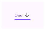 |
| /// |
| /// ```dart |
| /// String dropdownValue = 'One'; |
| /// |
| /// @override |
| /// Widget build(BuildContext context) { |
| /// return DropdownButton<String>( |
| /// value: dropdownValue, |
| /// icon: Icon(Icons.arrow_downward), |
| /// iconSize: 24, |
| /// elevation: 16, |
| /// style: TextStyle( |
| /// color: Colors.deepPurple |
| /// ), |
| /// underline: Container( |
| /// height: 2, |
| /// color: Colors.deepPurpleAccent, |
| /// ), |
| /// onChanged: (String newValue) { |
| /// setState(() { |
| /// dropdownValue = newValue; |
| /// }); |
| /// }, |
| /// items: <String>['One', 'Two', 'Free', 'Four'] |
| /// .map<DropdownMenuItem<String>>((String value) { |
| /// return DropdownMenuItem<String>( |
| /// value: value, |
| /// child: Text(value), |
| /// ); |
| /// }) |
| /// .toList(), |
| /// ); |
| /// } |
| /// ``` |
| /// {@end-tool} |
| /// |
| /// If the [onChanged] callback is null or the list of [items] is null |
| /// then the dropdown button will be disabled, i.e. its arrow will be |
| /// displayed in grey and it will not respond to input. A disabled button |
| /// will display the [disabledHint] widget if it is non-null. However, if |
| /// [disabledHint] is null and [hint] is non-null, the [hint] widget will |
| /// instead be displayed. |
| /// |
| /// Requires one of its ancestors to be a [Material] widget. |
| /// |
| /// See also: |
| /// |
| /// * [DropdownMenuItem], the class used to represent the [items]. |
| /// * [DropdownButtonHideUnderline], which prevents its descendant dropdown buttons |
| /// from displaying their underlines. |
| /// * [RaisedButton], [FlatButton], ordinary buttons that trigger a single action. |
| /// * <https://material.io/design/components/menus.html#dropdown-menu> |
| class DropdownButton<T> extends StatefulWidget { |
| /// Creates a dropdown button. |
| /// |
| /// The [items] must have distinct values. If [value] isn't null then it |
| /// must be equal to one of the [DropDownMenuItem] values. If [items] or |
| /// [onChanged] is null, the button will be disabled, the down arrow |
| /// will be greyed out, and the [disabledHint] will be shown (if provided). |
| /// If [disabledHint] is null and [hint] is non-null, [hint] will instead be |
| /// shown. |
| /// |
| /// The [elevation] and [iconSize] arguments must not be null (they both have |
| /// defaults, so do not need to be specified). The boolean [isDense] and |
| /// [isExpanded] arguments must not be null. |
| /// |
| /// The [dropdownColor] argument specifies the background color of the |
| /// dropdown when it is open. If it is null, the current theme's |
| /// [ThemeData.canvasColor] will be used instead. |
| DropdownButton({ |
| Key key, |
| @required this.items, |
| this.selectedItemBuilder, |
| this.value, |
| this.hint, |
| this.disabledHint, |
| @required this.onChanged, |
| this.onTap, |
| this.elevation = 8, |
| this.style, |
| this.underline, |
| this.icon, |
| this.iconDisabledColor, |
| this.iconEnabledColor, |
| this.iconSize = 24.0, |
| this.isDense = false, |
| this.isExpanded = false, |
| this.itemHeight = kMinInteractiveDimension, |
| this.focusColor, |
| this.focusNode, |
| this.autofocus = false, |
| this.dropdownColor, |
| }) : assert(items == null || items.isEmpty || value == null || |
| items.where((DropdownMenuItem<T> item) { |
| return item.value == value; |
| }).length == 1, |
| "There should be exactly one item with [DropdownButton]'s value: " |
| '$value. \n' |
| 'Either zero or 2 or more [DropdownMenuItem]s were detected ' |
| 'with the same value', |
| ), |
| assert(elevation != null), |
| assert(iconSize != null), |
| assert(isDense != null), |
| assert(isExpanded != null), |
| assert(autofocus != null), |
| assert(itemHeight == null || itemHeight >= kMinInteractiveDimension), |
| super(key: key); |
| |
| /// The list of items the user can select. |
| /// |
| /// If the [onChanged] callback is null or the list of items is null |
| /// then the dropdown button will be disabled, i.e. its arrow will be |
| /// displayed in grey and it will not respond to input. A disabled button |
| /// will display the [disabledHint] widget if it is non-null. If |
| /// [disabledHint] is also null but [hint] is non-null, [hint] will instead |
| /// be displayed. |
| final List<DropdownMenuItem<T>> items; |
| |
| /// The value of the currently selected [DropdownMenuItem]. |
| /// |
| /// If [value] is null and [hint] is non-null, the [hint] widget is |
| /// displayed as a placeholder for the dropdown button's value. |
| final T value; |
| |
| /// A placeholder widget that is displayed by the dropdown button. |
| /// |
| /// If [value] is null, this widget is displayed as a placeholder for |
| /// the dropdown button's value. This widget is also displayed if the button |
| /// is disabled ([items] or [onChanged] is null) and [disabledHint] is null. |
| final Widget hint; |
| |
| /// A message to show when the dropdown is disabled. |
| /// |
| /// Displayed if [items] or [onChanged] is null. If [hint] is non-null and |
| /// [disabledHint] is null, the [hint] widget will be displayed instead. |
| final Widget disabledHint; |
| |
| /// {@template flutter.material.dropdownButton.onChanged} |
| /// Called when the user selects an item. |
| /// |
| /// If the [onChanged] callback is null or the list of [items] is null |
| /// then the dropdown button will be disabled, i.e. its arrow will be |
| /// displayed in grey and it will not respond to input. A disabled button |
| /// will display the [disabledHint] widget if it is non-null. If |
| /// [disabledHint] is also null but [hint] is non-null, [hint] will instead |
| /// be displayed. |
| /// {@endtemplate} |
| final ValueChanged<T> onChanged; |
| |
| /// Called when the dropdown button is tapped. |
| /// |
| /// This is distinct from [onChanged], which is called when the user |
| /// selects an item from the dropdown. |
| /// |
| /// The callback will not be invoked if the dropdown button is disabled. |
| final VoidCallback onTap; |
| |
| /// A builder to customize the dropdown buttons corresponding to the |
| /// [DropdownMenuItem]s in [items]. |
| /// |
| /// When a [DropdownMenuItem] is selected, the widget that will be displayed |
| /// from the list corresponds to the [DropdownMenuItem] of the same index |
| /// in [items]. |
| /// |
| /// {@tool dartpad --template=stateful_widget_scaffold} |
| /// |
| /// This sample shows a `DropdownButton` with a button with [Text] that |
| /// corresponds to but is unique from [DropdownMenuItem]. |
| /// |
| /// ```dart |
| /// final List<String> items = <String>['1','2','3']; |
| /// String selectedItem = '1'; |
| /// |
| /// @override |
| /// Widget build(BuildContext context) { |
| /// return Padding( |
| /// padding: const EdgeInsets.symmetric(horizontal: 12.0), |
| /// child: DropdownButton<String>( |
| /// value: selectedItem, |
| /// onChanged: (String string) => setState(() => selectedItem = string), |
| /// selectedItemBuilder: (BuildContext context) { |
| /// return items.map<Widget>((String item) { |
| /// return Text(item); |
| /// }).toList(); |
| /// }, |
| /// items: items.map((String item) { |
| /// return DropdownMenuItem<String>( |
| /// child: Text('Log $item'), |
| /// value: item, |
| /// ); |
| /// }).toList(), |
| /// ), |
| /// ); |
| /// } |
| /// ``` |
| /// {@end-tool} |
| /// |
| /// If this callback is null, the [DropdownMenuItem] from [items] |
| /// that matches [value] will be displayed. |
| final DropdownButtonBuilder selectedItemBuilder; |
| |
| /// The z-coordinate at which to place the menu when open. |
| /// |
| /// The following elevations have defined shadows: 1, 2, 3, 4, 6, 8, 9, 12, |
| /// 16, and 24. See [kElevationToShadow]. |
| /// |
| /// Defaults to 8, the appropriate elevation for dropdown buttons. |
| final int elevation; |
| |
| /// The text style to use for text in the dropdown button and the dropdown |
| /// menu that appears when you tap the button. |
| /// |
| /// To use a separate text style for selected item when it's displayed within |
| /// the dropdown button,, consider using [selectedItemBuilder]. |
| /// |
| /// {@tool dartpad --template=stateful_widget_scaffold} |
| /// |
| /// This sample shows a `DropdownButton` with a dropdown button text style |
| /// that is different than its menu items. |
| /// |
| /// ```dart |
| /// List<String> options = <String>['One', 'Two', 'Free', 'Four']; |
| /// String dropdownValue = 'One'; |
| /// |
| /// @override |
| /// Widget build(BuildContext context) { |
| /// return Container( |
| /// alignment: Alignment.center, |
| /// color: Colors.blue, |
| /// child: DropdownButton<String>( |
| /// value: dropdownValue, |
| /// onChanged: (String newValue) { |
| /// setState(() { |
| /// dropdownValue = newValue; |
| /// }); |
| /// }, |
| /// style: TextStyle(color: Colors.blue), |
| /// selectedItemBuilder: (BuildContext context) { |
| /// return options.map((String value) { |
| /// return Text( |
| /// dropdownValue, |
| /// style: TextStyle(color: Colors.white), |
| /// ); |
| /// }).toList(); |
| /// }, |
| /// items: options.map<DropdownMenuItem<String>>((String value) { |
| /// return DropdownMenuItem<String>( |
| /// value: value, |
| /// child: Text(value), |
| /// ); |
| /// }).toList(), |
| /// ), |
| /// ); |
| /// } |
| /// ``` |
| /// {@end-tool} |
| /// |
| /// Defaults to the [TextTheme.subtitle1] value of the current |
| /// [ThemeData.textTheme] of the current [Theme]. |
| final TextStyle style; |
| |
| /// The widget to use for drawing the drop-down button's underline. |
| /// |
| /// Defaults to a 0.0 width bottom border with color 0xFFBDBDBD. |
| final Widget underline; |
| |
| /// The widget to use for the drop-down button's icon. |
| /// |
| /// Defaults to an [Icon] with the [Icons.arrow_drop_down] glyph. |
| final Widget icon; |
| |
| /// The color of any [Icon] descendant of [icon] if this button is disabled, |
| /// i.e. if [onChanged] is null. |
| /// |
| /// Defaults to [Colors.grey.shade400] when the theme's |
| /// [ThemeData.brightness] is [Brightness.light] and to |
| /// [Colors.white10] when it is [Brightness.dark] |
| final Color iconDisabledColor; |
| |
| /// The color of any [Icon] descendant of [icon] if this button is enabled, |
| /// i.e. if [onChanged] is defined. |
| /// |
| /// Defaults to [Colors.grey.shade700] when the theme's |
| /// [ThemeData.brightness] is [Brightness.light] and to |
| /// [Colors.white70] when it is [Brightness.dark] |
| final Color iconEnabledColor; |
| |
| /// The size to use for the drop-down button's down arrow icon button. |
| /// |
| /// Defaults to 24.0. |
| final double iconSize; |
| |
| /// Reduce the button's height. |
| /// |
| /// By default this button's height is the same as its menu items' heights. |
| /// If isDense is true, the button's height is reduced by about half. This |
| /// can be useful when the button is embedded in a container that adds |
| /// its own decorations, like [InputDecorator]. |
| final bool isDense; |
| |
| /// Set the dropdown's inner contents to horizontally fill its parent. |
| /// |
| /// By default this button's inner width is the minimum size of its contents. |
| /// If [isExpanded] is true, the inner width is expanded to fill its |
| /// surrounding container. |
| final bool isExpanded; |
| |
| /// If null, then the menu item heights will vary according to each menu item's |
| /// intrinsic height. |
| /// |
| /// The default value is [kMinInteractiveDimension], which is also the minimum |
| /// height for menu items. |
| /// |
| /// If this value is null and there isn't enough vertical room for the menu, |
| /// then the menu's initial scroll offset may not align the selected item with |
| /// the dropdown button. That's because, in this case, the initial scroll |
| /// offset is computed as if all of the menu item heights were |
| /// [kMinInteractiveDimension]. |
| final double itemHeight; |
| |
| /// The color for the button's [Material] when it has the input focus. |
| final Color focusColor; |
| |
| /// {@macro flutter.widgets.Focus.focusNode} |
| final FocusNode focusNode; |
| |
| /// {@macro flutter.widgets.Focus.autofocus} |
| final bool autofocus; |
| |
| /// The background color of the dropdown. |
| /// |
| /// If it is not provided, the theme's [ThemeData.canvasColor] will be used |
| /// instead. |
| final Color dropdownColor; |
| |
| @override |
| _DropdownButtonState<T> createState() => _DropdownButtonState<T>(); |
| } |
| |
| class _DropdownButtonState<T> extends State<DropdownButton<T>> with WidgetsBindingObserver { |
| int _selectedIndex; |
| _DropdownRoute<T> _dropdownRoute; |
| Orientation _lastOrientation; |
| FocusNode _internalNode; |
| FocusNode get focusNode => widget.focusNode ?? _internalNode; |
| bool _hasPrimaryFocus = false; |
| Map<LocalKey, ActionFactory> _actionMap; |
| FocusHighlightMode _focusHighlightMode; |
| |
| // Only used if needed to create _internalNode. |
| FocusNode _createFocusNode() { |
| return FocusNode(debugLabel: '${widget.runtimeType}'); |
| } |
| |
| @override |
| void initState() { |
| super.initState(); |
| _updateSelectedIndex(); |
| if (widget.focusNode == null) { |
| _internalNode ??= _createFocusNode(); |
| } |
| _actionMap = <LocalKey, ActionFactory>{ |
| ActivateAction.key: _createAction, |
| }; |
| focusNode.addListener(_handleFocusChanged); |
| final FocusManager focusManager = WidgetsBinding.instance.focusManager; |
| _focusHighlightMode = focusManager.highlightMode; |
| focusManager.addHighlightModeListener(_handleFocusHighlightModeChange); |
| } |
| |
| @override |
| void dispose() { |
| WidgetsBinding.instance.removeObserver(this); |
| _removeDropdownRoute(); |
| WidgetsBinding.instance.focusManager.removeHighlightModeListener(_handleFocusHighlightModeChange); |
| focusNode.removeListener(_handleFocusChanged); |
| _internalNode?.dispose(); |
| super.dispose(); |
| } |
| |
| void _removeDropdownRoute() { |
| _dropdownRoute?._dismiss(); |
| _dropdownRoute = null; |
| _lastOrientation = null; |
| } |
| |
| void _handleFocusChanged() { |
| if (_hasPrimaryFocus != focusNode.hasPrimaryFocus) { |
| setState(() { |
| _hasPrimaryFocus = focusNode.hasPrimaryFocus; |
| }); |
| } |
| } |
| |
| void _handleFocusHighlightModeChange(FocusHighlightMode mode) { |
| if (!mounted) { |
| return; |
| } |
| setState(() { |
| _focusHighlightMode = mode; |
| }); |
| } |
| |
| @override |
| void didUpdateWidget(DropdownButton<T> oldWidget) { |
| super.didUpdateWidget(oldWidget); |
| if (widget.focusNode != oldWidget.focusNode) { |
| oldWidget.focusNode?.removeListener(_handleFocusChanged); |
| if (widget.focusNode == null) { |
| _internalNode ??= _createFocusNode(); |
| } |
| _hasPrimaryFocus = focusNode.hasPrimaryFocus; |
| focusNode.addListener(_handleFocusChanged); |
| } |
| _updateSelectedIndex(); |
| } |
| |
| void _updateSelectedIndex() { |
| if (!_enabled) { |
| return; |
| } |
| |
| assert(widget.value == null || |
| widget.items.where((DropdownMenuItem<T> item) => item.value == widget.value).length == 1); |
| _selectedIndex = null; |
| for (int itemIndex = 0; itemIndex < widget.items.length; itemIndex++) { |
| if (widget.items[itemIndex].value == widget.value) { |
| _selectedIndex = itemIndex; |
| return; |
| } |
| } |
| } |
| |
| TextStyle get _textStyle => widget.style ?? Theme.of(context).textTheme.subtitle1; |
| |
| void _handleTap() { |
| final RenderBox itemBox = context.findRenderObject() as RenderBox; |
| final Rect itemRect = itemBox.localToGlobal(Offset.zero) & itemBox.size; |
| final TextDirection textDirection = Directionality.of(context); |
| final EdgeInsetsGeometry menuMargin = ButtonTheme.of(context).alignedDropdown |
| ? _kAlignedMenuMargin |
| : _kUnalignedMenuMargin; |
| |
| final List<_MenuItem<T>> menuItems = List<_MenuItem<T>>(widget.items.length); |
| for (int index = 0; index < widget.items.length; index += 1) { |
| menuItems[index] = _MenuItem<T>( |
| item: widget.items[index], |
| onLayout: (Size size) { |
| // If [_dropdownRoute] is null and onLayout is called, this means |
| // that performLayout was called on a _DropdownRoute that has not |
| // left the widget tree but is already on its way out. |
| // |
| // Since onLayout is used primarily to collect the desired heights |
| // of each menu item before laying them out, not having the _DropdownRoute |
| // collect each item's height to lay out is fine since the route is |
| // already on its way out. |
| if (_dropdownRoute == null) |
| return; |
| |
| _dropdownRoute.itemHeights[index] = size.height; |
| }, |
| ); |
| } |
| |
| assert(_dropdownRoute == null); |
| _dropdownRoute = _DropdownRoute<T>( |
| items: menuItems, |
| buttonRect: menuMargin.resolve(textDirection).inflateRect(itemRect), |
| padding: _kMenuItemPadding.resolve(textDirection), |
| selectedIndex: _selectedIndex ?? 0, |
| elevation: widget.elevation, |
| theme: Theme.of(context, shadowThemeOnly: true), |
| style: _textStyle, |
| barrierLabel: MaterialLocalizations.of(context).modalBarrierDismissLabel, |
| itemHeight: widget.itemHeight, |
| dropdownColor: widget.dropdownColor, |
| ); |
| |
| Navigator.push(context, _dropdownRoute).then<void>((_DropdownRouteResult<T> newValue) { |
| _removeDropdownRoute(); |
| if (!mounted || newValue == null) |
| return; |
| if (widget.onChanged != null) |
| widget.onChanged(newValue.result); |
| }); |
| |
| if (widget.onTap != null) { |
| widget.onTap(); |
| } |
| } |
| |
| Action _createAction() { |
| return CallbackAction( |
| ActivateAction.key, |
| onInvoke: (FocusNode node, Intent intent) { |
| _handleTap(); |
| }, |
| ); |
| } |
| |
| // When isDense is true, reduce the height of this button from _kMenuItemHeight to |
| // _kDenseButtonHeight, but don't make it smaller than the text that it contains. |
| // Similarly, we don't reduce the height of the button so much that its icon |
| // would be clipped. |
| double get _denseButtonHeight { |
| final double fontSize = _textStyle.fontSize ?? Theme.of(context).textTheme.subtitle1.fontSize; |
| return math.max(fontSize, math.max(widget.iconSize, _kDenseButtonHeight)); |
| } |
| |
| Color get _iconColor { |
| // These colors are not defined in the Material Design spec. |
| if (_enabled) { |
| if (widget.iconEnabledColor != null) |
| return widget.iconEnabledColor; |
| |
| switch (Theme.of(context).brightness) { |
| case Brightness.light: |
| return Colors.grey.shade700; |
| case Brightness.dark: |
| return Colors.white70; |
| } |
| } else { |
| if (widget.iconDisabledColor != null) |
| return widget.iconDisabledColor; |
| |
| switch (Theme.of(context).brightness) { |
| case Brightness.light: |
| return Colors.grey.shade400; |
| case Brightness.dark: |
| return Colors.white10; |
| } |
| } |
| |
| assert(false); |
| return null; |
| } |
| |
| bool get _enabled => widget.items != null && widget.items.isNotEmpty && widget.onChanged != null; |
| |
| Orientation _getOrientation(BuildContext context) { |
| Orientation result = MediaQuery.of(context, nullOk: true)?.orientation; |
| if (result == null) { |
| // If there's no MediaQuery, then use the window aspect to determine |
| // orientation. |
| final Size size = window.physicalSize; |
| result = size.width > size.height ? Orientation.landscape : Orientation.portrait; |
| } |
| return result; |
| } |
| |
| bool get _showHighlight { |
| switch (_focusHighlightMode) { |
| case FocusHighlightMode.touch: |
| return false; |
| case FocusHighlightMode.traditional: |
| return _hasPrimaryFocus; |
| } |
| return null; |
| } |
| |
| @override |
| Widget build(BuildContext context) { |
| assert(debugCheckHasMaterial(context)); |
| assert(debugCheckHasMaterialLocalizations(context)); |
| final Orientation newOrientation = _getOrientation(context); |
| _lastOrientation ??= newOrientation; |
| if (newOrientation != _lastOrientation) { |
| _removeDropdownRoute(); |
| _lastOrientation = newOrientation; |
| } |
| |
| // The width of the button and the menu are defined by the widest |
| // item and the width of the hint. |
| List<Widget> items; |
| if (_enabled) { |
| items = widget.selectedItemBuilder == null |
| ? List<Widget>.from(widget.items) |
| : widget.selectedItemBuilder(context); |
| } else { |
| items = widget.selectedItemBuilder == null |
| ? <Widget>[] |
| : widget.selectedItemBuilder(context); |
| } |
| |
| int hintIndex; |
| if (widget.hint != null || (!_enabled && widget.disabledHint != null)) { |
| Widget displayedHint = _enabled ? widget.hint : widget.disabledHint ?? widget.hint; |
| if (widget.selectedItemBuilder == null) |
| displayedHint = _DropdownMenuItemContainer(child: displayedHint); |
| |
| hintIndex = items.length; |
| items.add(DefaultTextStyle( |
| style: _textStyle.copyWith(color: Theme.of(context).hintColor), |
| child: IgnorePointer( |
| ignoringSemantics: false, |
| child: displayedHint, |
| ), |
| )); |
| } |
| |
| final EdgeInsetsGeometry padding = ButtonTheme.of(context).alignedDropdown |
| ? _kAlignedButtonPadding |
| : _kUnalignedButtonPadding; |
| |
| // If value is null (then _selectedIndex is null) or if disabled then we |
| // display the hint or nothing at all. |
| final int index = _enabled ? (_selectedIndex ?? hintIndex) : hintIndex; |
| Widget innerItemsWidget; |
| if (items.isEmpty) { |
| innerItemsWidget = Container(); |
| } else { |
| innerItemsWidget = IndexedStack( |
| index: index, |
| alignment: AlignmentDirectional.centerStart, |
| children: widget.isDense ? items : items.map((Widget item) { |
| return widget.itemHeight != null |
| ? SizedBox(height: widget.itemHeight, child: item) |
| : Column(mainAxisSize: MainAxisSize.min, children: <Widget>[item]); |
| }).toList(), |
| ); |
| } |
| |
| const Icon defaultIcon = Icon(Icons.arrow_drop_down); |
| |
| Widget result = DefaultTextStyle( |
| style: _textStyle, |
| child: Container( |
| decoration: _showHighlight |
| ? BoxDecoration( |
| color: widget.focusColor ?? Theme.of(context).focusColor, |
| borderRadius: const BorderRadius.all(Radius.circular(4.0)), |
| ) |
| : null, |
| padding: padding.resolve(Directionality.of(context)), |
| height: widget.isDense ? _denseButtonHeight : null, |
| child: Row( |
| mainAxisAlignment: MainAxisAlignment.spaceBetween, |
| mainAxisSize: MainAxisSize.min, |
| children: <Widget>[ |
| if (widget.isExpanded) |
| Expanded(child: innerItemsWidget) |
| else |
| innerItemsWidget, |
| IconTheme( |
| data: IconThemeData( |
| color: _iconColor, |
| size: widget.iconSize, |
| ), |
| child: widget.icon ?? defaultIcon, |
| ), |
| ], |
| ), |
| ), |
| ); |
| |
| if (!DropdownButtonHideUnderline.at(context)) { |
| final double bottom = (widget.isDense || widget.itemHeight == null) ? 0.0 : 8.0; |
| result = Stack( |
| children: <Widget>[ |
| result, |
| Positioned( |
| left: 0.0, |
| right: 0.0, |
| bottom: bottom, |
| child: widget.underline ?? Container( |
| height: 1.0, |
| decoration: const BoxDecoration( |
| border: Border( |
| bottom: BorderSide( |
| color: Color(0xFFBDBDBD), |
| width: 0.0, |
| ), |
| ), |
| ), |
| ), |
| ), |
| ], |
| ); |
| } |
| |
| return Semantics( |
| button: true, |
| child: Actions( |
| actions: _actionMap, |
| child: Focus( |
| canRequestFocus: _enabled, |
| focusNode: focusNode, |
| autofocus: widget.autofocus, |
| child: GestureDetector( |
| onTap: _enabled ? _handleTap : null, |
| behavior: HitTestBehavior.opaque, |
| child: result, |
| ), |
| ), |
| ), |
| ); |
| } |
| } |
| |
| /// A convenience widget that wraps a [DropdownButton] in a [FormField]. |
| class DropdownButtonFormField<T> extends FormField<T> { |
| /// Creates a [DropdownButton] widget wrapped in an [InputDecorator] and |
| /// [FormField]. |
| /// |
| /// The [DropdownButton] [items] parameters must not be null. |
| DropdownButtonFormField({ |
| Key key, |
| T value, |
| @required List<DropdownMenuItem<T>> items, |
| DropdownButtonBuilder selectedItemBuilder, |
| Widget hint, |
| @required this.onChanged, |
| VoidCallback onTap, |
| this.decoration = const InputDecoration(), |
| FormFieldSetter<T> onSaved, |
| FormFieldValidator<T> validator, |
| bool autovalidate = false, |
| Widget disabledHint, |
| int elevation = 8, |
| TextStyle style, |
| Widget icon, |
| Color iconDisabledColor, |
| Color iconEnabledColor, |
| double iconSize = 24.0, |
| bool isDense = true, |
| bool isExpanded = false, |
| double itemHeight, |
| }) : assert(items == null || items.isEmpty || value == null || |
| items.where((DropdownMenuItem<T> item) { |
| return item.value == value; |
| }).length == 1, |
| "There should be exactly one item with [DropdownButton]'s value: " |
| '$value. \n' |
| 'Either zero or 2 or more [DropdownMenuItem]s were detected ' |
| 'with the same value', |
| ), |
| assert(decoration != null), |
| assert(elevation != null), |
| assert(iconSize != null), |
| assert(isDense != null), |
| assert(isExpanded != null), |
| assert(itemHeight == null || itemHeight > 0), |
| super( |
| key: key, |
| onSaved: onSaved, |
| initialValue: value, |
| validator: validator, |
| autovalidate: autovalidate, |
| builder: (FormFieldState<T> field) { |
| final _DropdownButtonFormFieldState<T> state = field as _DropdownButtonFormFieldState<T>; |
| final InputDecoration effectiveDecoration = decoration.applyDefaults( |
| Theme.of(field.context).inputDecorationTheme, |
| ); |
| return InputDecorator( |
| decoration: effectiveDecoration.copyWith(errorText: field.errorText), |
| isEmpty: state.value == null, |
| child: DropdownButtonHideUnderline( |
| child: DropdownButton<T>( |
| value: state.value, |
| items: items, |
| selectedItemBuilder: selectedItemBuilder, |
| hint: hint, |
| onChanged: onChanged == null ? null : state.didChange, |
| onTap: onTap, |
| disabledHint: disabledHint, |
| elevation: elevation, |
| style: style, |
| icon: icon, |
| iconDisabledColor: iconDisabledColor, |
| iconEnabledColor: iconEnabledColor, |
| iconSize: iconSize, |
| isDense: isDense, |
| isExpanded: isExpanded, |
| itemHeight: itemHeight, |
| ), |
| ), |
| ); |
| }, |
| ); |
| |
| /// {@macro flutter.material.dropdownButton.onChanged} |
| final ValueChanged<T> onChanged; |
| |
| /// The decoration to show around the dropdown button form field. |
| /// |
| /// By default, draws a horizontal line under the dropdown button field but can be |
| /// configured to show an icon, label, hint text, and error text. |
| /// |
| /// Specify null to remove the decoration entirely (including the |
| /// extra padding introduced by the decoration to save space for the labels). |
| final InputDecoration decoration; |
| |
| @override |
| FormFieldState<T> createState() => _DropdownButtonFormFieldState<T>(); |
| } |
| |
| class _DropdownButtonFormFieldState<T> extends FormFieldState<T> { |
| @override |
| DropdownButtonFormField<T> get widget => super.widget as DropdownButtonFormField<T>; |
| |
| @override |
| void didChange(T value) { |
| super.didChange(value); |
| assert(widget.onChanged != null); |
| widget.onChanged(value); |
| } |
| |
| @override |
| void didUpdateWidget(DropdownButtonFormField<T> oldWidget) { |
| super.didUpdateWidget(oldWidget); |
| if (oldWidget.initialValue != widget.initialValue) { |
| setValue(widget.initialValue); |
| } |
| } |
| } |