| // Copyright 2018 The Chromium Authors. All rights reserved. |
| // Use of this source code is governed by a BSD-style license that can be |
| // found in the LICENSE file. |
| |
| import 'package:flutter/foundation.dart'; |
| import 'package:flutter/painting.dart'; |
| |
| import 'typography.dart'; |
| |
| /// Material design text theme. |
| /// |
| /// Definitions for the various typographical styles found in material design |
| /// (e.g., button, caption). Rather than creating a [TextTheme] directly, |
| /// you can obtain an instance as [Typography.black] or [Typography.white]. |
| /// |
| /// To obtain the current text theme, call [Theme.of] with the current |
| /// [BuildContext] and read the [ThemeData.textTheme] property. |
| /// |
| /// The Material Design typography scheme was significantly changed in the |
| /// current (2018) version of the specification |
| /// (https://material.io/design/typography). |
| /// |
| /// The 2018 spec has thirteen text styles: |
| /// ``` |
| /// NAME SIZE WEIGHT SPACING |
| /// headline1 96.0 light -1.5 |
| /// headline2 60.0 light -0.5 |
| /// headline3 48.0 normal 0.0 |
| /// headline4 34.0 normal 0.25 |
| /// headline5 24.0 normal 0.0 |
| /// headline6 20.0 medium 0.15 |
| /// subtitle1 16.0 normal 0.15 |
| /// subtitle2 14.0 medium 0.1 |
| /// body1 16.0 normal 0.5 |
| /// body2 14.0 normal 0.25 |
| /// button 14.0 medium 0.75 |
| /// caption 12.0 normal 0.4 |
| /// overline 10.0 normal 1.5 |
| /// |
| /// ``` |
| /// Where "light" is `FontWeight.w300`, "normal" is `FontWeight.w400` and |
| /// "medium" is `FontWeight.w500`. |
| /// |
| /// The [TextTheme] API is based on the original material (2014) |
| /// design spec, which used different text style names. For backwards |
| /// compatibility's sake, this API continues to use the original |
| /// names. The table below should help with understanding the API in |
| /// terms of the 2018 material spec. |
| /// |
| /// Each of the [TextTheme] text styles corresponds to one of the |
| /// styles from 2018 spec. By default, the font sizes, font weights |
| /// and letter spacings have not changed from their original, |
| /// 2014, values. |
| /// ``` |
| /// NAME SIZE WEIGHT SPACING 2018 NAME |
| /// display4 112.0 thin 0.0 headline1 |
| /// display3 56.0 normal 0.0 headline2 |
| /// display2 45.0 normal 0.0 headline3 |
| /// display1 34.0 normal 0.0 headline4 |
| /// headline 24.0 normal 0.0 headline5 |
| /// title 20.0 medium 0.0 headline6 |
| /// subhead 16.0 normal 0.0 subtitle1 |
| /// body2 14.0 medium 0.0 body1 |
| /// body1 14.0 normal 0.0 body2 |
| /// caption 12.0 normal 0.0 caption |
| /// button 14.0 medium 0.0 button |
| /// subtitle 14.0 medium 0.0 subtitle2 |
| /// overline 10.0 normal 0.0 overline |
| /// ``` |
| /// |
| /// Where "thin" is `FontWeight.w100`, "normal" is `FontWeight.w400` and |
| /// "medium" is `FontWeight.w500`. Letter spacing for all of the original |
| /// text styles was 0.0. |
| /// |
| /// To configure a [Theme] for the new sizes, weights, and letter spacings, |
| /// initialize its [ThemeData.typography] value with a [Typography] that |
| /// object that specifies the 2018 versions of the geometry themes: |
| /// [Typography.englishLike2018], [Typography.dense2018], |
| /// and [Typography.tall2018]. |
| /// |
| /// The following image [from the material design |
| /// specification](https://material.io/go/design-typography#typography-styles) |
| /// shows the recommended styles for each of the properties of a [TextTheme]. |
| /// This image uses the `Roboto` font, which is the font used on Android. On |
| /// iOS, the [San Francisco |
| /// font](https://developer.apple.com/ios/human-interface-guidelines/visual-design/typography/) |
| /// is automatically used instead. |
| /// |
| /// 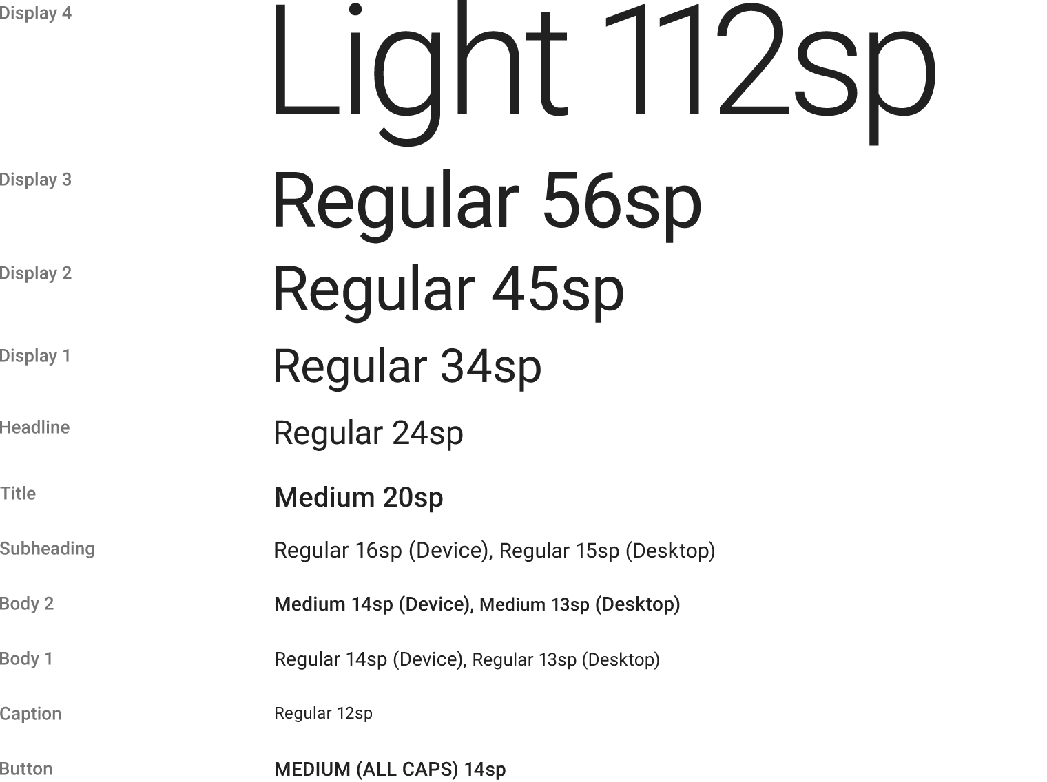 |
| /// |
| /// See also: |
| /// |
| /// * [Typography], the class that generates [TextTheme]s appropriate for a platform. |
| /// * [Theme], for other aspects of a material design application that can be |
| /// globally adjusted, such as the color scheme. |
| /// * <https://material.io/design/typography/> |
| @immutable |
| class TextTheme extends Diagnosticable { |
| /// Creates a text theme that uses the given values. |
| /// |
| /// Rather than creating a new text theme, consider using [Typography.black] |
| /// or [Typography.white], which implement the typography styles in the |
| /// material design specification: |
| /// |
| /// <https://material.io/design/typography/#type-scale> |
| /// |
| /// If you do decide to create your own text theme, consider using one of |
| /// those predefined themes as a starting point for [copyWith] or [apply]. |
| const TextTheme({ |
| this.display4, |
| this.display3, |
| this.display2, |
| this.display1, |
| this.headline, |
| this.title, |
| this.subhead, |
| this.body2, |
| this.body1, |
| this.caption, |
| this.button, |
| this.subtitle, |
| this.overline, |
| }); |
| |
| /// Extremely large text. |
| /// |
| /// The font size is 112 pixels. |
| final TextStyle display4; |
| |
| /// Very, very large text. |
| /// |
| /// Used for the date in the dialog shown by [showDatePicker]. |
| final TextStyle display3; |
| |
| /// Very large text. |
| final TextStyle display2; |
| |
| /// Large text. |
| final TextStyle display1; |
| |
| /// Used for large text in dialogs (e.g., the month and year in the dialog |
| /// shown by [showDatePicker]). |
| final TextStyle headline; |
| |
| /// Used for the primary text in app bars and dialogs (e.g., [AppBar.title] |
| /// and [AlertDialog.title]). |
| final TextStyle title; |
| |
| /// Used for the primary text in lists (e.g., [ListTile.title]). |
| final TextStyle subhead; |
| |
| /// Used for emphasizing text that would otherwise be [body1]. |
| final TextStyle body2; |
| |
| /// Used for the default text style for [Material]. |
| final TextStyle body1; |
| |
| /// Used for auxiliary text associated with images. |
| final TextStyle caption; |
| |
| /// Used for text on [RaisedButton] and [FlatButton]. |
| final TextStyle button; |
| |
| /// For medium emphasis text that's a little smaller than [subhead]. |
| final TextStyle subtitle; |
| |
| /// The smallest style, |
| /// |
| /// Typically used for captions or to introduce a (larger) headline. |
| final TextStyle overline; |
| |
| /// Creates a copy of this text theme but with the given fields replaced with |
| /// the new values. |
| /// |
| /// Consider using [Typography.black] or [Typography.white], which implement |
| /// the typography styles in the material design specification, as a starting |
| /// point. |
| /// |
| /// {@tool sample} |
| /// |
| /// ```dart |
| /// /// A Widget that sets the ambient theme's title text color for its |
| /// /// descendants, while leaving other ambient theme attributes alone. |
| /// class TitleColorThemeCopy extends StatelessWidget { |
| /// TitleColorThemeCopy({Key key, this.child, this.titleColor}) : super(key: key); |
| /// |
| /// final Color titleColor; |
| /// final Widget child; |
| /// |
| /// @override |
| /// Widget build(BuildContext context) { |
| /// final ThemeData theme = Theme.of(context); |
| /// return Theme( |
| /// data: theme.copyWith( |
| /// textTheme: theme.textTheme.copyWith( |
| /// title: theme.textTheme.title.copyWith( |
| /// color: titleColor, |
| /// ), |
| /// ), |
| /// ), |
| /// child: child, |
| /// ); |
| /// } |
| /// } |
| /// ``` |
| /// {@end-tool} |
| /// |
| /// See also: |
| /// |
| /// * [merge] is used instead of [copyWith] when you want to merge all |
| /// of the fields of a TextTheme instead of individual fields. |
| TextTheme copyWith({ |
| TextStyle display4, |
| TextStyle display3, |
| TextStyle display2, |
| TextStyle display1, |
| TextStyle headline, |
| TextStyle title, |
| TextStyle subhead, |
| TextStyle body2, |
| TextStyle body1, |
| TextStyle caption, |
| TextStyle button, |
| TextStyle subtitle, |
| TextStyle overline, |
| }) { |
| return TextTheme( |
| display4: display4 ?? this.display4, |
| display3: display3 ?? this.display3, |
| display2: display2 ?? this.display2, |
| display1: display1 ?? this.display1, |
| headline: headline ?? this.headline, |
| title: title ?? this.title, |
| subhead: subhead ?? this.subhead, |
| body2: body2 ?? this.body2, |
| body1: body1 ?? this.body1, |
| caption: caption ?? this.caption, |
| button: button ?? this.button, |
| subtitle: subtitle ?? this.subtitle, |
| overline: overline ?? this.overline, |
| ); |
| } |
| |
| /// Creates a new [TextTheme] where each text style from this object has been |
| /// merged with the matching text style from the `other` object. |
| /// |
| /// The merging is done by calling [TextStyle.merge] on each respective pair |
| /// of text styles from this and the [other] text themes and is subject to |
| /// the value of [TextStyle.inherit] flag. For more details, see the |
| /// documentation on [TextStyle.merge] and [TextStyle.inherit]. |
| /// |
| /// If this theme, or the `other` theme has members that are null, then the |
| /// non-null one (if any) is used. If the `other` theme is itself null, then |
| /// this [TextTheme] is returned unchanged. If values in both are set, then |
| /// the values are merged using [TextStyle.merge]. |
| /// |
| /// This is particularly useful if one [TextTheme] defines one set of |
| /// properties and another defines a different set, e.g. having colors |
| /// defined in one text theme and font sizes in another, or when one |
| /// [TextTheme] has only some fields defined, and you want to define the rest |
| /// by merging it with a default theme. |
| /// |
| /// {@tool sample} |
| /// |
| /// ```dart |
| /// /// A Widget that sets the ambient theme's title text color for its |
| /// /// descendants, while leaving other ambient theme attributes alone. |
| /// class TitleColorTheme extends StatelessWidget { |
| /// TitleColorTheme({Key key, this.child, this.titleColor}) : super(key: key); |
| /// |
| /// final Color titleColor; |
| /// final Widget child; |
| /// |
| /// @override |
| /// Widget build(BuildContext context) { |
| /// ThemeData theme = Theme.of(context); |
| /// // This partialTheme is incomplete: it only has the title style |
| /// // defined. Just replacing theme.textTheme with partialTheme would |
| /// // set the title, but everything else would be null. This isn't very |
| /// // useful, so merge it with the existing theme to keep all of the |
| /// // preexisting definitions for the other styles. |
| /// TextTheme partialTheme = TextTheme(title: TextStyle(color: titleColor)); |
| /// theme = theme.copyWith(textTheme: theme.textTheme.merge(partialTheme)); |
| /// return Theme(data: theme, child: child); |
| /// } |
| /// } |
| /// ``` |
| /// {@end-tool} |
| /// |
| /// See also: |
| /// |
| /// * [copyWith] is used instead of [merge] when you wish to override |
| /// individual fields in the [TextTheme] instead of merging all of the |
| /// fields of two [TextTheme]s. |
| TextTheme merge(TextTheme other) { |
| if (other == null) |
| return this; |
| return copyWith( |
| display4: display4?.merge(other.display4) ?? other.display4, |
| display3: display3?.merge(other.display3) ?? other.display3, |
| display2: display2?.merge(other.display2) ?? other.display2, |
| display1: display1?.merge(other.display1) ?? other.display1, |
| headline: headline?.merge(other.headline) ?? other.headline, |
| title: title?.merge(other.title) ?? other.title, |
| subhead: subhead?.merge(other.subhead) ?? other.subhead, |
| body2: body2?.merge(other.body2) ?? other.body2, |
| body1: body1?.merge(other.body1) ?? other.body1, |
| caption: caption?.merge(other.caption) ?? other.caption, |
| button: button?.merge(other.button) ?? other.button, |
| subtitle: subtitle?.merge(other.subtitle) ?? other.subtitle, |
| overline: overline?.merge(other.overline) ?? other.overline, |
| ); |
| } |
| |
| /// Creates a copy of this text theme but with the given field replaced in |
| /// each of the individual text styles. |
| /// |
| /// The `displayColor` is applied to [display4], [display3], [display2], |
| /// [display1], and [caption]. The `bodyColor` is applied to the remaining |
| /// text styles. |
| /// |
| /// Consider using [Typography.black] or [Typography.white], which implement |
| /// the typography styles in the material design specification, as a starting |
| /// point. |
| TextTheme apply({ |
| String fontFamily, |
| double fontSizeFactor = 1.0, |
| double fontSizeDelta = 0.0, |
| Color displayColor, |
| Color bodyColor, |
| TextDecoration decoration, |
| Color decorationColor, |
| TextDecorationStyle decorationStyle, |
| }) { |
| return TextTheme( |
| display4: display4?.apply( |
| color: displayColor, |
| decoration: decoration, |
| decorationColor: decorationColor, |
| decorationStyle: decorationStyle, |
| fontFamily: fontFamily, |
| fontSizeFactor: fontSizeFactor, |
| fontSizeDelta: fontSizeDelta, |
| ), |
| display3: display3?.apply( |
| color: displayColor, |
| decoration: decoration, |
| decorationColor: decorationColor, |
| decorationStyle: decorationStyle, |
| fontFamily: fontFamily, |
| fontSizeFactor: fontSizeFactor, |
| fontSizeDelta: fontSizeDelta, |
| ), |
| display2: display2?.apply( |
| color: displayColor, |
| decoration: decoration, |
| decorationColor: decorationColor, |
| decorationStyle: decorationStyle, |
| fontFamily: fontFamily, |
| fontSizeFactor: fontSizeFactor, |
| fontSizeDelta: fontSizeDelta, |
| ), |
| display1: display1?.apply( |
| color: displayColor, |
| decoration: decoration, |
| decorationColor: decorationColor, |
| decorationStyle: decorationStyle, |
| fontFamily: fontFamily, |
| fontSizeFactor: fontSizeFactor, |
| fontSizeDelta: fontSizeDelta, |
| ), |
| headline: headline?.apply( |
| color: bodyColor, |
| decoration: decoration, |
| decorationColor: decorationColor, |
| decorationStyle: decorationStyle, |
| fontFamily: fontFamily, |
| fontSizeFactor: fontSizeFactor, |
| fontSizeDelta: fontSizeDelta, |
| ), |
| title: title?.apply( |
| color: bodyColor, |
| decoration: decoration, |
| decorationColor: decorationColor, |
| decorationStyle: decorationStyle, |
| fontFamily: fontFamily, |
| fontSizeFactor: fontSizeFactor, |
| fontSizeDelta: fontSizeDelta, |
| ), |
| subhead: subhead?.apply( |
| color: bodyColor, |
| decoration: decoration, |
| decorationColor: decorationColor, |
| decorationStyle: decorationStyle, |
| fontFamily: fontFamily, |
| fontSizeFactor: fontSizeFactor, |
| fontSizeDelta: fontSizeDelta, |
| ), |
| body2: body2?.apply( |
| color: bodyColor, |
| decoration: decoration, |
| decorationColor: decorationColor, |
| decorationStyle: decorationStyle, |
| fontFamily: fontFamily, |
| fontSizeFactor: fontSizeFactor, |
| fontSizeDelta: fontSizeDelta, |
| ), |
| body1: body1?.apply( |
| color: bodyColor, |
| decoration: decoration, |
| decorationColor: decorationColor, |
| decorationStyle: decorationStyle, |
| fontFamily: fontFamily, |
| fontSizeFactor: fontSizeFactor, |
| fontSizeDelta: fontSizeDelta, |
| ), |
| caption: caption?.apply( |
| color: displayColor, |
| decoration: decoration, |
| decorationColor: decorationColor, |
| decorationStyle: decorationStyle, |
| fontFamily: fontFamily, |
| fontSizeFactor: fontSizeFactor, |
| fontSizeDelta: fontSizeDelta, |
| ), |
| button: button?.apply( |
| color: bodyColor, |
| decoration: decoration, |
| decorationColor: decorationColor, |
| decorationStyle: decorationStyle, |
| fontFamily: fontFamily, |
| fontSizeFactor: fontSizeFactor, |
| fontSizeDelta: fontSizeDelta, |
| ), |
| subtitle: subtitle?.apply( |
| color: bodyColor, |
| decoration: decoration, |
| decorationColor: decorationColor, |
| decorationStyle: decorationStyle, |
| fontFamily: fontFamily, |
| fontSizeFactor: fontSizeFactor, |
| fontSizeDelta: fontSizeDelta, |
| ), |
| overline: overline?.apply( |
| color: bodyColor, |
| decoration: decoration, |
| decorationColor: decorationColor, |
| decorationStyle: decorationStyle, |
| fontFamily: fontFamily, |
| fontSizeFactor: fontSizeFactor, |
| fontSizeDelta: fontSizeDelta, |
| ), |
| ); |
| } |
| |
| /// Linearly interpolate between two text themes. |
| /// |
| /// {@macro flutter.material.themeData.lerp} |
| static TextTheme lerp(TextTheme a, TextTheme b, double t) { |
| assert(t != null); |
| return TextTheme( |
| display4: TextStyle.lerp(a?.display4, b?.display4, t), |
| display3: TextStyle.lerp(a?.display3, b?.display3, t), |
| display2: TextStyle.lerp(a?.display2, b?.display2, t), |
| display1: TextStyle.lerp(a?.display1, b?.display1, t), |
| headline: TextStyle.lerp(a?.headline, b?.headline, t), |
| title: TextStyle.lerp(a?.title, b?.title, t), |
| subhead: TextStyle.lerp(a?.subhead, b?.subhead, t), |
| body2: TextStyle.lerp(a?.body2, b?.body2, t), |
| body1: TextStyle.lerp(a?.body1, b?.body1, t), |
| caption: TextStyle.lerp(a?.caption, b?.caption, t), |
| button: TextStyle.lerp(a?.button, b?.button, t), |
| subtitle: TextStyle.lerp(a?.subtitle, b?.subtitle, t), |
| overline: TextStyle.lerp(a?.overline, b?.overline, t), |
| ); |
| } |
| |
| @override |
| bool operator ==(dynamic other) { |
| if (identical(this, other)) |
| return true; |
| if (other.runtimeType != runtimeType) |
| return false; |
| final TextTheme typedOther = other; |
| return display4 == typedOther.display4 |
| && display3 == typedOther.display3 |
| && display2 == typedOther.display2 |
| && display1 == typedOther.display1 |
| && headline == typedOther.headline |
| && title == typedOther.title |
| && subhead == typedOther.subhead |
| && body2 == typedOther.body2 |
| && body1 == typedOther.body1 |
| && caption == typedOther.caption |
| && button == typedOther.button |
| && subtitle == typedOther.subtitle |
| && overline == typedOther.overline; |
| } |
| |
| @override |
| int get hashCode { |
| // The hashValues() function supports up to 20 arguments. |
| return hashValues( |
| display4, |
| display3, |
| display2, |
| display1, |
| headline, |
| title, |
| subhead, |
| body2, |
| body1, |
| caption, |
| button, |
| subtitle, |
| overline, |
| ); |
| } |
| |
| @override |
| void debugFillProperties(DiagnosticPropertiesBuilder properties) { |
| super.debugFillProperties(properties); |
| final TextTheme defaultTheme = Typography(platform: defaultTargetPlatform).black; |
| properties.add(DiagnosticsProperty<TextStyle>('display4', display4, defaultValue: defaultTheme.display4)); |
| properties.add(DiagnosticsProperty<TextStyle>('display3', display3, defaultValue: defaultTheme.display3)); |
| properties.add(DiagnosticsProperty<TextStyle>('display2', display2, defaultValue: defaultTheme.display2)); |
| properties.add(DiagnosticsProperty<TextStyle>('display1', display1, defaultValue: defaultTheme.display1)); |
| properties.add(DiagnosticsProperty<TextStyle>('headline', headline, defaultValue: defaultTheme.headline)); |
| properties.add(DiagnosticsProperty<TextStyle>('title', title, defaultValue: defaultTheme.title)); |
| properties.add(DiagnosticsProperty<TextStyle>('subhead', subhead, defaultValue: defaultTheme.subhead)); |
| properties.add(DiagnosticsProperty<TextStyle>('body2', body2, defaultValue: defaultTheme.body2)); |
| properties.add(DiagnosticsProperty<TextStyle>('body1', body1, defaultValue: defaultTheme.body1)); |
| properties.add(DiagnosticsProperty<TextStyle>('caption', caption, defaultValue: defaultTheme.caption)); |
| properties.add(DiagnosticsProperty<TextStyle>('button', button, defaultValue: defaultTheme.button)); |
| properties.add(DiagnosticsProperty<TextStyle>('subtitle)', subtitle, defaultValue: defaultTheme.subtitle)); |
| properties.add(DiagnosticsProperty<TextStyle>('overline', overline, defaultValue: defaultTheme.overline)); |
| } |
| } |